本文由 F.O.G. 建筑事务所 授权mooool发表,欢迎转发,禁止以mooool编辑版本转载。
Thanks F.O.G. Architecture for authorizing the publication of the project on mooool, Text description provided by F.O.G. Architecture.
F.O.G. 建筑事务所:观夏北京旗舰店选址国子监街23号,这套建成于清代中期的三进四合院是观夏继“湖南路111号”后在中国完成修缮的第二座百年老宅,修复工作历时一年。面对这座拥有280年历史的古老建筑,如何权衡保护与开发的力度成为设计思路的发端。
F.O.G. Architecture: ToSummer’s new flagship store in Beijing is situated within a 500-square-meter quadrangle courtyard built during Mid-Qing dynasty, located at 23 Guozijian St. This is another historical building conservation project ToSummer has undertaken in China after “111 Hunan Rd.,” and the restoration alone took a year to finish. At the sight of this 280-year-old architecture, we began by asking ourselves to find a balance between conservation and development.
▽手绘鸟瞰图:国子监23号 Aerial view by hand
1.问题的提出 THINKING BEFORE DESIGN
勒杜和威廉·莫里斯针对旧建筑保护的不同主张最先为我们带来启发。在勒杜看来,设计师应借助传统建造工艺和贴近原建筑肌理的材料,在原始图纸基础上对旧建筑进行“修旧如旧”式的重建。无疑,这一设计策略符合《威尼斯宪章》所提出的“保护遗产真实性和完整性”原则,然而,在处理大量尚未遗产化的建筑遗存时,仅靠修旧如旧似乎难以完善新功能的置入,使旧建筑积极地融入现代城市生活。
Ledoux and William Morris’s contrary positions on heritage preservation fueled our thinking. Ledoux posits that when restoring an old building, architects should employ traditional methods of construction and materials congruent with its texture to “repair the old in adherence to its original appearance.” This approach certainly complies with the principle of preserving the authenticity and integrity of architectural heritages, as laid down by The Venice Charter. However, when applied to large-volume architectural remains that have been heritage, Ledoux’s approach seems insufficient for properly placing new functionalities or integrating old buildings into modern urban life.
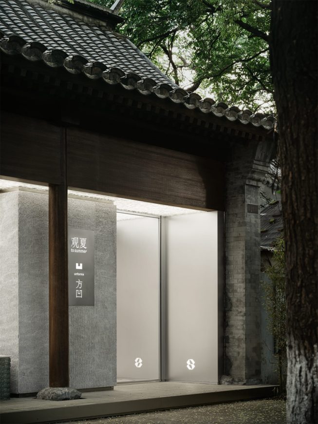
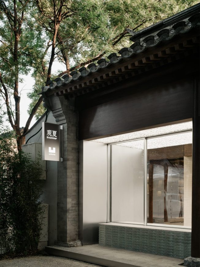
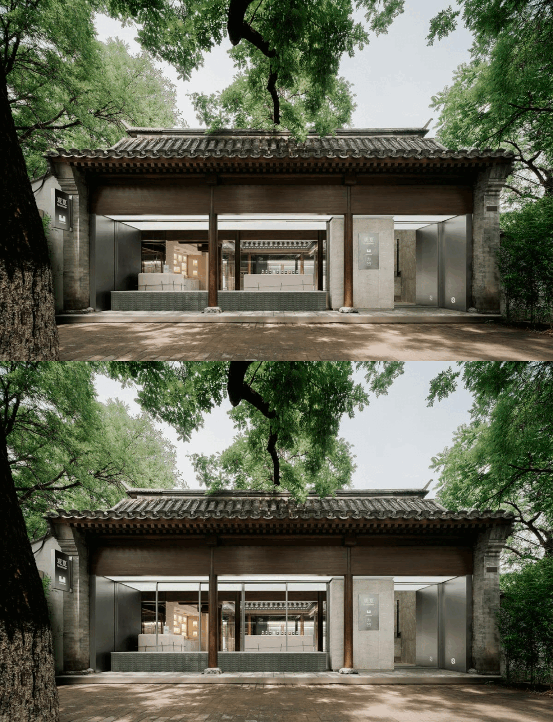
▽沿街立面 Street elevation
对照之下,莫里斯提出的建筑保护理论认为,建筑修缮需要依仗符合当下时代特征的工艺和材料进行,通过和原始结构形成鲜明对比凸显旧建筑的历史信息。
By contrast, Morris’s theory indicates that architects restore old buildings with methods and materials bearing attributes of the current age. To Morris, contrasts between the old and the new are a better way of accentuating the historical significance of old buildings.
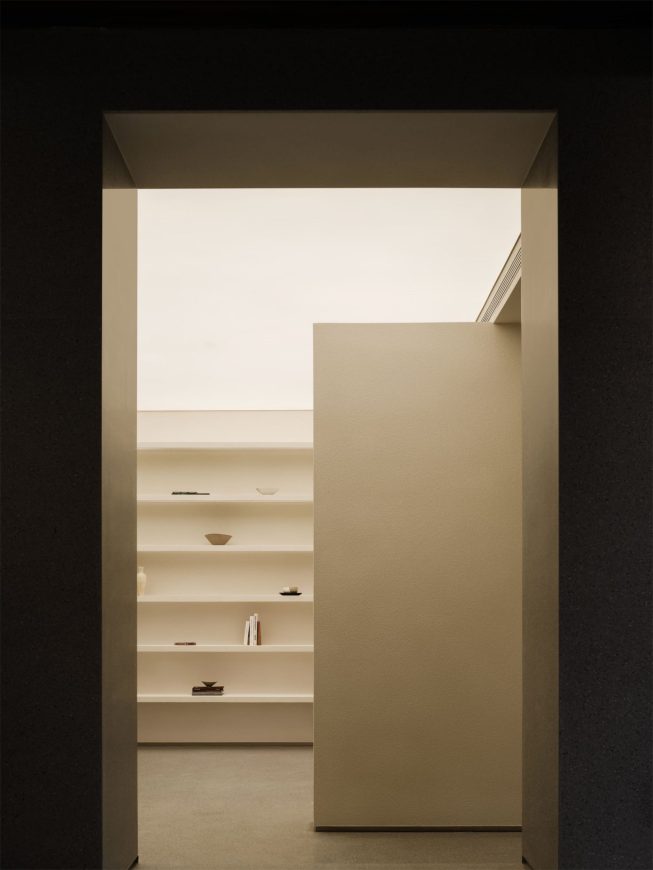
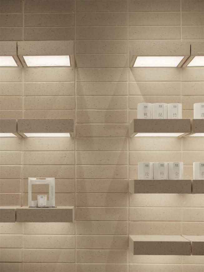
▽展陈区 Exhibition area
莫里斯的观点似乎为新设计介入提供了便利,实则引发了一系列更为深入的思考。首先是“保留”和“舍弃”的比例:四合院的哪些结构、部件和元素需要完存、替换或移除?如何体现其文化价值和历史特征?此类问题督促我们建立一套有关空间内构件的评判标准。
Morris’s view seemingly made it easier for us to justify the new design; however, it led us to ponder over some more concrete issues. First, how do we determine what structures, components, and elements of the quadrangle courtyard to keep, replace, or eliminate? How do we highlight the building’s cultural and historical significance? These questions urged us to establish design criteria.
▽古井和雨链:在对地面进行翻新时,施工队从第一进院院落左侧挖出一口百年古井,这也是国子监街上唯一一口甜水井,虽已干涸,但砌砖工整,严丝合缝。我们将其完整保留下来,并从屋顶悬挂了一条雨链垂至井口,强调水井功能的同时,寓意为四合院重新注入生命。Old Water Well & Rain Chain: When renovating the floor, the construction team excavated a hundred-year-old well in the first courtyard, which was later confirmed to be the only sweet water well on Guozijian St. We kept the well despite the fact that it had already dried up because the brickwork was so neatly done and well preserved. We also hung a rain chain from the roof to right above the well to emphasize its function; symbolically, it speaks to our wish to rejuvenate the Siheyuan.
▽柱基石翻新前后对比 Column Base Stone Before & After Renovation
其次是处理建筑新旧功能的起承转合,将庄严肃穆、作为私宅使用的古老合院,塑造成开放友好、能够连接四邻的公共商业空间。
Another challenge had to do with the building’s old and new functionalities – more specifically, how to transform this venerable courtyard which has stood for nearly 300 years as a private residence into a commercial space that is neighbourly, communal, and all-inclusive.
▽罕见地,这座四合院从未设有影壁墙,大门处留有一定开放性(一种解释是它曾经为“前店后宅”布局,需要方便迎客)。基于此,我们索性将沿街立面改成玻璃,让行人可以观察建筑内层层递进的院落。This Siheyuan is rare in that it has never had a spirit screen, and the gate is relatively wide open (One explanation is that it used to be a house and had this layout for the convenience of serving customers.). To build on this unique feature, we made the storefront glass windows so that passersby can observe the courtyards inside.
最后是围绕品牌特征的考量,利用天然存在的东方庭院元素,以最适度的触碰,渲染出一种能够展现观夏特色的空间情绪。
Finally, with an apt amount of intervention, how do we harness the innate oriental elements of the Siheyuan to develop a “spatial mood” in tune with ToSummer’s brand identity?
▽观夏国子监同时容纳旗下新品牌方凹 ToSummer Guozijian also houses its new child brand, Fang Ao.
2.既有空间的解构 DECONSTRUCTION OF THE ORIGINAL SPACE
如果说改造前的四合院是基于旧有功能之上完整且封闭的空间系统,那么想要引入新的结构就必须事先通过拆分和清理等手段,将四合院整体解构为一系列松散的子空间。挪用德里达对“解构主义”的阐释,当我们以解构的方式阅读原有的文本时,我们就会打破这一文本的界限,使它向我们无限开放,向其它文本无限开放,从而使原有的东西不断得到增生和替补。解构并非对空间的否定,而是在瓦解的同时进行积极的建设。
The original Siheyuan complex may be seen as an intact, enclosed spatial system built to accommodate its old functionalities. The installation of new ones must be preceded by the breakdown of the old system into a series of loosely connected sub-spaces. According to Derrida on deconstructionism, deconstruction is not a denial of the original space but positive reconstruction going hand-in-hand with demolition.
▽第二进庭院 Second courtyard
由此,我们开始了“认知”与“感知”两方面的探索,对空间知识的梳理首先帮助我们建立了有关四合院这一建筑类型的理性认知,从而对其进行有效拆解;同时,我们希望记录场地内材料、颜色、植物、温度、声音等不同空间组成对人们主观感受的影响。
We approached deconstruction from both an epistemic standpoint and an experiential standpoint. While studying Siheyuan helped us effectively deconstruct the space, we also intended to document the impacts of colours, materials, plants, temperatures, sounds, and other spatial constituents on people’s subjective experiences.
屋架和梁柱结构:屋架的主要功能是分担屋顶荷载,使之与架构之间富余出更多操作空间。这座四合院的屋架由木料制成,呈三角状,改造前被各种装饰性材料反复包裹,产生一种怪异的错位感。为表达对原始建筑形制的尊重,我们尝试复原东方古建的结构之美,通过祛除这些冗余材料(连同部分墙体)造成的视野障碍,使木屋架尽可能清晰展露。
Roof Truss & Beam Columns: The main purposes of roof trusses are bearing ceiling loads and enlarging the operative room between roofs and supporting structures. This Siheyuan has triangle-shaped timber roof trusses. Before the renovation, most of them had been covered in layers of decorating materials, sending out a strange sense of misplacement. Trying to recover the beauty of the original architecture, we removed these decorations along with some of the walls to get rid of any visual blockages and expose the wooden structure as much as possible.
▽屋架 Roof truss
我们以同一思路处理房屋的梁柱结构,让院子“清瘦”下来,让建筑的“骨骼”显露出来,以“柱阵”的形貌成为整个空间的视觉重心和界定其轮廓的重要结构系统。
The same method was applied to the beams and columns. Essentially, we “skimmed” the building to expose its “skeleton.” The resultant “column field” became the visual centre of gravity of the space as well as what defines its outline.
▽裸露出来的立柱 The exposed columns
当自然光经过柱阵投射在地面和墙壁之上,柱子的等距排列标记出明暗规律,光影取代高墙,给予空间纵深感。
When natural light passes the column field to hit the ground and the walls, the arrangement of the columns translates into rhythmic patterns of light and shadow, which now act in place of high walls to create depth for the space.
▽光影 Light and shadow
屋面:四合院屋顶由青砖瓦铺就,远看像青灰色的巨浪渐次推开,我们使用相同制式的瓦片,以“压六露四”的方式进行铺贴,并替换掉鸳鸯瓦中开裂损坏的部分。
Rooftop: The rooftop was originally made up of layers of grey brick tiles. From afar, they looked like waves rushing in and out on the shore. To keep it uniform, we used tiles of the same making and layered them by the same density. We also replaced the broken parts of the “yuanyang tiles.”
▽屋面 roof
同时,二楼的小亭子被改成廊桥,让人们可以在不同高度与屋面发生关系。阳光照射屋檐,透过连接屋面和廊桥的玻璃在地面留下水波纹影,标记着“水”元素在这座东方庭院中更为含蓄的表达。
Meanwhile, the pavilion on the second floor was remodelled into a lounge bridge on which people can view the roof. The roof and the bridge are connected by the glass. When sunlight shines on the roof edge and through the glass, a wavy shadow is left on the ground, marking a more subtle expression of the water element in this oriental courtyard.
▽廊桥 Corridor bridge
植物:场地内有一棵百年枣树,初次踏勘时,满树的枣子从视觉和嗅觉上给我们留下了深刻印象。为突出其存在,我们改变了楼梯的方位,引导行人环绕枣树拾级而上。
Plants: There is a hundred-year-old date tree planted in the back garden. We were impressed by its look and scent on our first visit. To highlight its presence, we repositioned the staircase to have people go up the stairs revolving around the date tree.
▽枣树和楼梯 Date trees and stairs
第二进庭院中还新栽了一棵松树。受气候约束,适合北方院子的景观植物有限,松树无论从生长习性还是气质来说都相对适宜,与百年前植于此的老槐树、枣树形成一种新旧延续。
We also planted a pine tree in the second courtyard. Limited by the weather conditions of northern cities, there are relatively fewer plant choices for landscaping. A pine tree is suitable because of its growing habits and aura. Together, the date tree, pine tree, and long-lived Chinese scholar tree form a continuation.
▽松树 Pine tree
3.新功能的置入 INSTALLATION OF NEW FUNCTIONALITIES
经过筛选的建筑构件和空间场景经过“二次曝光”呈现为一系列松散的平行结构,紧接着,如何重新梳理它们的关系、安置新的功能,从而架构另一个空间系统,是我们面临的第二考验。
The building components and spatial settings we chose to preserve underwent a “second-time exposure,” turning into a collection of loose, parallel structures. Immediately next, we faced the task of constructing a new spatial system by reorganizing these structures and introducing new functionalities.
▽轴测图 axonometry
传统四合院强调居住空间的私密性和院落之间的递进关系,从门屋、厅堂到私室、闺房,布局方正,主次分明。而由民居到公共商业空间的改造势必需要新的设计思维——我们几乎是用“反四合院”的方式,弱化了场地整体的封闭性以及院落之间的阻隔,围合房屋的墙体多数被玻璃取代,充当物理阻隔的同时让视线变得通透开敞,空间也摆脱了原本局促的尺度和动线。
The conventional layout of Siheyuan is rather secluded, prioritizing the privacy of the living areas and progression between courtyards. The transition from a private residence to a commercial space requires a new line of design logic: adopting a near “de-Siheyuan” approach, we weakened the enclosure of the site and separation between courtyards. The walls inside are mostly replaced by glass, which performs the functions of walls without obstructing light. By doing so, we also brought relief to the space’s dimension and traffic flow.
▽四合院多次易主,墙面历经改动破损严重,且存在局部渗漏问题。The owner of the courtyard has changed many times, and the wall has been changed and damaged seriously, and there are local leakage problems.
▽围合房屋的墙体多数被玻璃取代 The walls enclosing the houses were mostly replaced by glass
传统四合院基于尊卑、长幼、内外等礼法因素而划定的线性流线被调整为开放的自由平面,鸟瞰视角下,最终所呈现的空间更像是由一个个屋顶、天井、柱阵组成的功能和情绪场域。
The traditional linear route of Siheyuan regulated by age, status, affinity, and other ritualistic factors has been adjusted into a flat-open free space. Observed from above, it is closer to a function-emotion field consisting of yards, rooftops, and scatters of columns.
▽一层平面图 Ground floor plan
▽屋顶平面图 Roof plan
人们在玄关处净手后,依次进入占据第一、二进院的观夏展陈区和位于第三进院的观夏新品牌“方凹”。连接第二、三进院的廊桥即为整个空间的交通枢纽,亦象征向新品牌的过渡。一层展陈区域几乎全部围绕第一进院呈环形分布,对于动线没有严格限制,人们可以自由游走。
After washing their hands by the entry, one may explore the product display areas occupying the first and second courtyards and the third courtyard designated to ToSummer’s new child brand, Fang Ao. The bridge connecting the second and third courtyards is essentially the traffic center. Symbolically, it represents graduating from the past to the present. All display areas on the ground level wrap around the first courtyard like rings, forming no strict limitation to the traffic flow.
▽净手区 Clear hand area
▽第一进 First advance
▽第二进 Second advance
▽侧院 Side yard
▽第三进 Third advance
▽位于二层的会客茶室和观景露台 Reception tea room and viewing terrace located on the second floor
城市中还散布着大量像“国子监23号”这样未被纳入遗产保护名录的建筑遗存:宅院、筒子楼、板房甚至城中村,它们以独特的形态汇入城市发展史,为属于几代人的记忆提供注脚。因此,在我们看来,“建筑保护”并非口号,它本身就是一种以历史为源头、以文化创意力为导向的可实践的设计方法,提醒我们整旧如故、与古为新。
Cities are dispersed with architectural remains like “23 Guozijian” which have not been listed for heritage conservation: courtyards, tube-shaped apartment buildings, prefab houses, urban villages, and so on. Each in its own form, these aged buildings embody the city’s history and annotate generations of people’s memories. It is therefore our belief that building conservation could be its own viable design method finding root in history and direction in cultural creativity. In the process, any attempt at restoration must be mindful of “the old,” and what is “old” can always bring new inspirations.
项目位置:北京
项目面积:500m²
项目状态:建成
设计团队:邹德静,吴雷蕾,王圣淇,唐墨,雷荣华,蒋璐,黄莺子,庄少凯,孙媛,张馨月,陈艺璇,郑以宁,陶辛未,曹筱袤,侯绍凯,熊爱杰,Khoon Choi(业主代表),詹迪,郑宇
项目管理:沈乾石(业主代表)
灯光设计:立本社,张旭
结构顾问:陶辛未,王海波
施工图设计:邦舍深化设计
工程总包:有龙金胜
空间摄影:言隅建筑空间摄影
撰稿:曹筱袤,白勺
Location: Beijing
Area: 500 m²
Status: Built
Design Team: Zou Dejing, Wu Leilei, Wang Shengqi, Tang Mo, Lei Ronghua, Jiang Lu, Huang Yingzi, Zhuang Shaokai, Sun Yuan, Zhang Xinyue, Chen Yixuan, Zheng Yining, Tao Xinwei, Cao Xiaomao, Hou Shaokai, Xiong Aijie,Khoon Choi,Zhan Di, Zheng Yu
Project Management: Shen Qianshi
Lighting Design: Zhang Xu (LB Design)
Structure Consultant: Tao Xinwei, Wang Haibo
Construction Drawing: BSD
Managing Contractor: Youlong Jinsheng(www.youlongjinsheng.com)
Photography: InSpace Architecture Photography
Article: Cao Xiaomao, Baishao
“ 设计将庄严肃穆、作为私宅使用的古老合院,塑造成开放友好、能够连接四邻的公共商业空间。”
审稿编辑:Maggie
更多read more about: F.O.G. 建筑事务所











这是家卖什么的店啊,十三香吗?瓶瓶罐罐都装满了~~