本文由迈德景观授权mooool发表,欢迎转发,禁止以mooool编辑版本转载。
Thanks MIND STUDIO for authorizing the publication of the project on mooool, Text description provided by MIND STUDIO.
迈德景观:青岛万象城位于青岛市市南区山东路,地处青岛繁华的商业中心,四周生活设施完善,交通出行便捷。2015年开业以后青岛万象城作为青岛的一张全新商业名片,不断引领时尚浪潮,为市民和游客提供了丰富的购物、餐饮、娱乐等多元化体验。近年来实体商业面临向体验式消费转型的大潮,面对这一变化,零售品牌及万象城作为商业地产的运营商,纷纷采取了迭代更新与创新的策略,以更好地满足消费者对场景化、沉浸式体验的需求。青岛万象城二期屋顶改造正是在这样的需求下开展的。
MIND STUDIO: Located on Shandong Road in the bustling commercial heart of Qingdao’s Southern District, MixC has redefined urban commerce since its opening in 2015. This vibrant hub offers an array of shopping, dining, and entertainment experiences, it has set trends and enriched the lives of both locals and tourists. Concerning the retail industry’s shift towards experiential consumption, MixC has innovated its space to better meet consumers’ demands for thematic and immersive experiences. The Phase II rooftop renovation of Qingdao MixC was initiated in response to these evolving consumer preferences.
▽项目夜景
▽花园边界
原貌Original Appearance
原貌的青岛万象城二期屋面是传统商场中最容易被忽视的末端商业,是客流量最少的流量凹地,现场在五面硬质构筑的围合中,成为最生硬、暴晒、不舒适的屋顶“沙漠”。
Previously, the rooftop of MixC Phase II was an overlooked commercial area with minimal foot traffic, resembling a harsh, sun-beaten ‘roof desert’ encased in rigid architectural forms.
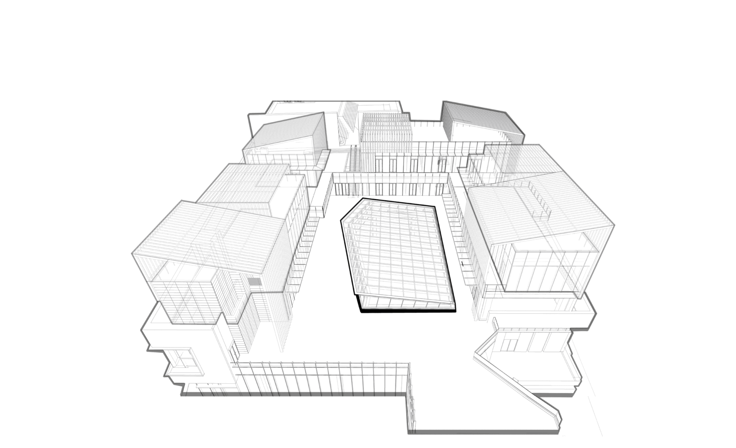
L3采光井占据了L4的中心,使得L4屋面成为回廊型空间,形成狭长型的的通道关系,商业外界面的拓展及景观功能的发挥受到局限性。屋面没有较好的覆土条件,加上狭长的空间关系,需要预留商业延展及通道,如何做到同时具备功能的需求与自然的界面,也存在巨大挑战。
The L3 skylight occupies the center of L4, transforming the rooftop into a corridor-like space and creating a lengthy passageway. This layout restricts the expansion of commercial facades and the full expression of landscape features.The rooftop lacks adequate soil cover, compounded by its elongated spatial arrangement which necessitates the reservation of space for commercial extension and thoroughfares. Balancing functional requirements with a natural aesthetic presents significant challenges.
▽围合的硬质界面
▽覆土和植物种植难度
设计的目标是要把这个特殊的位置转变为独具魅力的“呼吸”卖场,在这个精心打造的屋顶空间中,顾客不再受限于封闭的商业环境,而是能够近距离接触大自然,直接与天空对话,感受户外清新空气的疗愈与放松。对于沉浸式体验品牌而言,这个屋顶空间无疑是实现品牌理念与消费者情感共鸣的理想场所。品牌可以充分利用这一独特的环境优势,让顾客在享受购物乐趣的同时,也能深刻感受到品牌的独特魅力与价值主张。
The redesign aimed to transform this challenging location into an appealing ‘breathable’ marketplace, breaking free from traditional enclosed commercial environments to engage directly with nature and the sky, enhancing the therapeutic and relaxing qualities of fresh air. This rooftop space serves as an ideal venue for immersive experience brands, allowing them to resonate with consumer emotions and embody their philosophies. Brands can fully leverage this unique environmental advantage, allowing customers to enjoy the pleasures of shopping while deeply experiencing the distinctive charm and values of the brand.
▽设计分析
策略Strategy
这次设计的难点在于,场地没有完整的花园界面,只有围绕四层玻璃采光井得到的宽窄不一的回廊空间,因此设计中很难用超级符号的方式聚焦花园中心。首先我们对场地回廊空间的不同属性进行分析,我们发现其改造需要的差异。出入口位置需要强化聚焦的氛围符号;梯厅位置需要强化引导;狭窄的通道需要为店招展示烘托氛围;较宽的界面则为商业外摆营造条件;没有店铺的位置则作为公共花园,作为不断激发商业活力个性事件发生的容器。
The challenge in redesigning was the absence of a complete garden interface and dealing with the variable width of the corridor-like space around a four-story glass skylight. Our approach involved differentiating the corridor’s functions—enhancing the ambiance at entry points with focused symbols, guiding visitors at elevator lobbies, spotlighting storefronts in narrower passageways, and optimizing wider areas for outdoor commercial displays. Spaces without shops were transformed into public gardens, sparking ongoing commercial and cultural activities.
▽焕然一新的入口界面
主题Theme
在最接近天空的屋顶,飘来了山里的云,我们用云的颜色,云的语言构筑起场地的骨架,让松弛的白色,漂浮的自由形态构筑场地最松弛的结构空间,再把大山里的植物画面引进来,在山里,植物的分布往往呈现出明显的层次性。从山脚到山顶,随着海拔的升高和气候的变化,植物的种类和分布也会发生变化。山脚下,通常是低矮的灌木和草本植物,形成了一片绿色的海洋;随着海拔的升高,逐渐出现一些中小型的乔木,树冠层开始形成;再往上,高大的乔木成为主角,它们的树干挺拔,枝叶繁茂,为整个山林提供了浓密的树荫。层次丰富,慵懒舒展的组合,从低矮的草本到高大的乔木,从常见的野花野草到珍稀的蕨类与苔藓,它们共同构成了一个复杂的生态系统。不仅展现了生态的多样性和活力,也让人感受到一种宁静与和谐的美。
‘Atop the roof closest to the sky, clouds from the mountains’ inspired the space’s design. By employing the colors and forms of clouds, we aimed to create the most relaxed structural environment. We then introduced vegetation typical of mountainous terrains, where plant distribution naturally varies by elevation. In the mountains, the distribution of plants often exhibits a clear stratification. From the base to the summit, as altitude increases and the climate changes, the types and distribution of plants vary. At the mountain’s foot, low shrubs and herbaceous plants form a verdant sea; as the elevation rises, small to medium-sized trees begin to appear, creating an emerging canopy layer. Higher up, tall trees dominate, their sturdy trunks and lush foliage providing dense shade for the forest below. This rich layering, from low herbs to towering trees and from common wildflowers to rare ferns and mosses, forms a complex ecosystem. This not only displays the diversity and vitality of the ecology but also imparts a sense of tranquility and harmonious beauty to the observer.
▽鲜活的绿岛边界
▽松弛的植物
场景 Scences
入口部分,景观用松弛的植物和logo塑造出迎宾空间。这里既是通过型空间,也是场所访者第一印象节点。丛生紫薇、银叶婆婆纳、春鹃和芙蓉菊等种植组团形成品种丰富、体量感鲜明的组合,龟背式的修建,就像云朵的形状,松弛疗愈。精致又不失山林植物的野趣。
At the entrance, relaxed planting and a distinctive logo create a welcoming space that serves both as a transitional area and a first impression point. Clusters of Lagerstroemia, Plectranthus argentatus, Rhododendron, and Hibiscus rosa-sinensis are arranged to form a vibrant, voluminous display, shaped in a turtle-back style reminiscent of clouds, offering a soothing and natural ambiance.
▽出入口商业氛围
梯厅出口是一个相对比较狭长的巷道,店铺面对采光井的界面太硬,我们用了一组类似云朵柔软边界的白色花池弱化直线,用低矮的灌木和草本植物,利用地形营造和龟背修剪的方式,形成了一片绿色郁郁葱葱的植物海洋;稍宽阔的位置则点缀中小型的乔木,形成一些舒朗的树冠变奏线。
The stairwell exit leads into a relatively narrow alley where the storefronts face a rigid interface from the light well. To soften this harshness, cloud-like white planters with soft edges are used, along with low shrubs and herbaceous plants that, through terraced cultivation and turtle-back pruning, create a lush greenery. Wider areas are accentuated with medium-sized trees, introducing relaxed variations in the tree canopy.
▽电梯出入口空间
▽外摆空间
▽入口商业夜景氛围
更为宽敞的巷道,兼容通行与弹性外摆功能,圆润的白色云朵花池和林下座椅组合,提升了商业环境的艺术感和自然氛围。圆润的造型赋予了花池柔和而流畅的线条,与商业建筑的硬朗线条形成鲜明对比,成为吸引顾客目光的视觉焦点。白色作为主色调,简洁大方,能够反射周围的光线,营造出明亮而宽敞的空间感。植物组团构错落有致,有座椅的部分培植柔软膨出的植物如西伯利亚鸢尾、百子莲、锥形绣球和小叶天堂鸟,刻意营造空间被自然包裹的尺度和叶片触手可及的体验,在营造视觉丰富性的同时,也赋予商业良好的观赏面,还为顾客提供了亲近自然的体验。
In broader passages that accommodate both passage and flexible exterior displays, rounded white cloud-shaped planters and understory seating arrangements enhance the artistic and natural ambiance of the commercial setting. The rounded shapes of the planters provide smooth, flowing lines that contrast sharply with the commercial buildings’ rigid lines, drawing visitors’ eyes and brightening the area. White, as the primary color, reflects surrounding light to create a bright and spacious atmosphere. The seating areas feature soft, billowing plants like Siberian iris, balloon flower, conical hydrangeas, and dwarf birds of paradise, deliberately creating a space enveloped by nature, offering a tactile and visually rich experience.
▽夜景氛围下的林下座椅组合
公共区域是最惬意轻松的漫时光花园。又像小船又似云朵漂浮的树池座椅,高低层叠的龟背植物和中间串出来的调皮野趣的草花,如同山间小路中不守规矩长在路中的乔木歪斜地探出枝条。松弛的路径和随处可停留的休憩空间,就像把山林借着漂浮的云朵搬到城市,形成了鲜明而有趣的叙事画面。
The public area is designed as a leisurely, relaxing garden, where seating areas resembling small boats or floating clouds are interspersed with playful, wild flowers and plants. These elements mimic the whimsical growth of trees along mountain paths, leaning out whimsically. The relaxed pathways and ample resting spots evoke the essence of a mountain forest brought into the urban environment through floating clouds, creating a distinctive and engaging narrative scene.
▽公共区域
▽公共区域夜景
项目名称:青岛华润万象城二期屋顶改造
项目位置:山东省青岛市市南区山东路
项目面积:3000㎡
设计时间:2023年
建成时间:2024年
业主:华润置地北方大区
景观设计:MIND迈德景观
项目摄影:曾征
Project name:Phase II Rooftop Renovation of Qingdao MixC
Project address: China Resources Vientiane City, located on Shandong Road in the Shinan District of Qingdao City, Shandong Province.
Project area: 3000㎡
Completion Year: 2024
Clients:China Resources Northern region
Landscape design:MIND studio
Photographer: Zeng Zheng
“ 从生硬、暴晒、不舒适的屋顶“沙漠”,变成独具魅力的“呼吸”卖场。”
审稿编辑:junjun
更多 Read more about: MIND STUDIO迈德景观


0 Comments