本文由 ZSD卓时设计 授权mooool发表,欢迎转发,禁止以mooool编辑版本转载。
Thanks ZSD for authorizing the publication of the project on mooool, Text description provided by ZSD.
卓时设计:彼得·卒姆托曾说:“建筑总是这两个事情:地方和用途。你可以挑选一块你喜欢的地,以用途和功能为出发点来设计。如果你足够幸运的话,美就此产生。”
ZSD:Peter Zumthor once said: “Architecture always related two concepts: place and use. You can choose a place as you like and design it with purpose and function as the starting point. If you are lucky enough, beauty will happen here.”
绿城·南京深蓝生活体验中心是个基于4s店改造的售楼处项目,这是一个讲述建筑与自然重新建立联系,并模糊了建筑室内外空间,最后打破城市边界隔阂,建筑、景观、室内一体化的设计故事。
Green Town·Nanjing Deep Blue Life Experience Center is a sales office project based on 4S store transformation. This is a story about the re-establishment of the relationship between architecture and nature, which blurred the building’s interior and exterior space, and finally break the barriers between urban boundaries. A design story of architecture, landscape, interior integration.
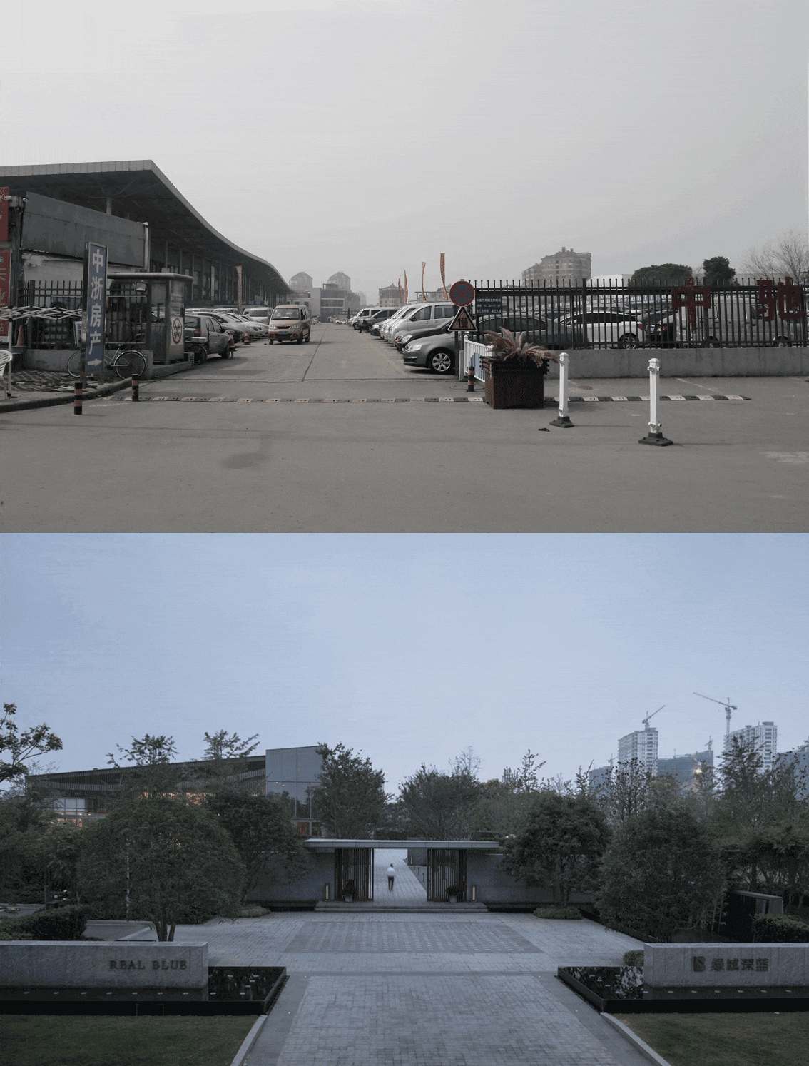
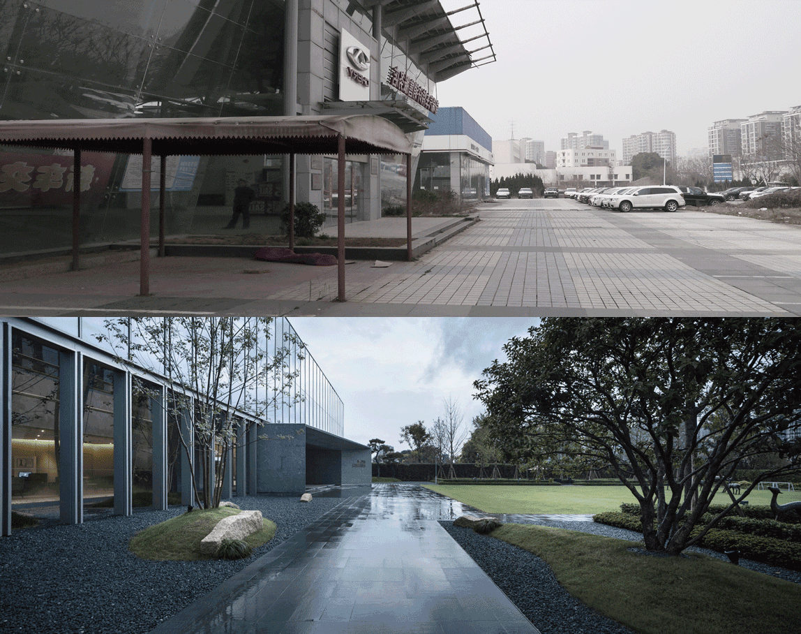
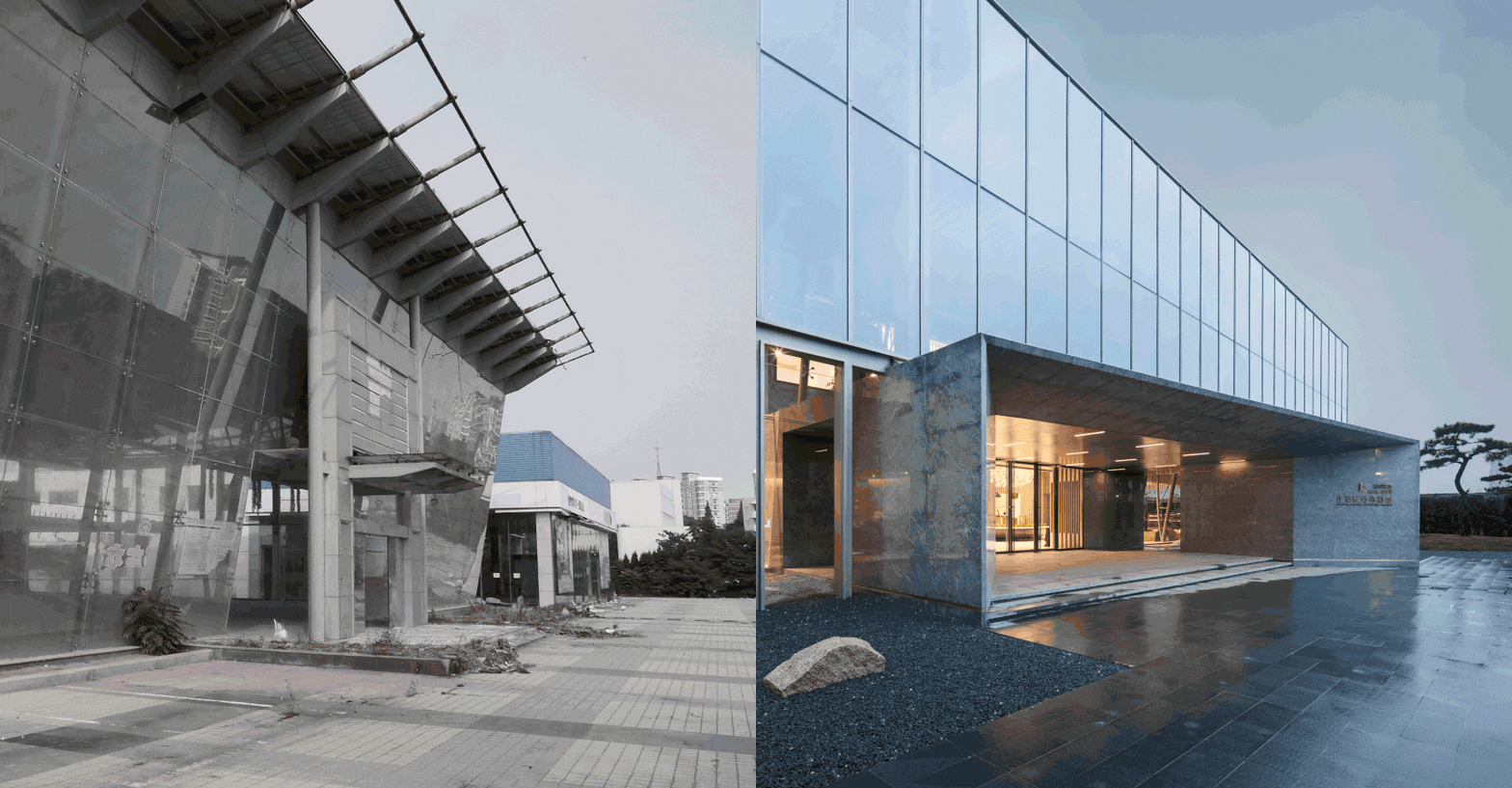
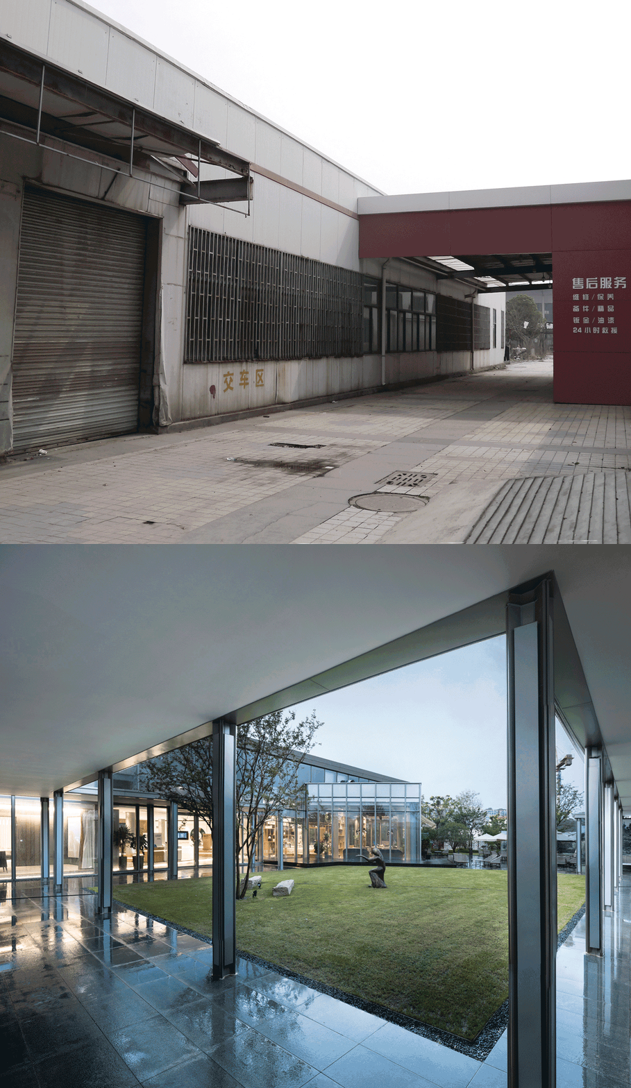
▼改造前后对比 Before and after
人们的城市活动主要依附着街道发生,所以建筑的边界自然而然被理解成临近街道的外界面。
绿城深蓝售楼处地处南京南站商圈,邻近喧闹的地理位置。
因此街道尺度和临街商业形式的滞后与否,会直接导致城市片区的失活性。
People’s urban activities are mainly dependent on the streets. So the boundary of the building is naturally understood as the outer surface of the street.
Green Town Deep Blue sales offices is located in NanJing South Railway Station business district, neighbouring noisy locations.
Therefore, the lag of street scale and storefront commercial form will directly lead to the inactivity of urban areas.
街廓内部虽然可观赏和进入,但是吸引度较低。
因此设计希望激活内部边界,通过围合的设计手法,在外部边际打造稳定的水院空间,同时绿化与市政道路分离,为市政界面城市街头树立标志建筑。
使人从不舒适的街道走入建筑内部,令建筑本身成为复兴片区的重要因素,反向去激活整个街区的展示性。
Although the interior of the street can be seen and entered, the attraction of it is rather low.
Therefore, by activating the internal boundaries, the design creates a stable waterfront space in the external margin through the design method of enclosure. Stable water court space was built outside. At the same time, greening is separated from municipal roads, which is a sign building for the streets of municipal interface.
This brings people into the interior of the building with uncomfortable streets. This makes the building itself an important factor in reviving the area and reversing the display of the whole block.
自然·无界 Nature · Boundless
景观设计的边界 Boundary of landscape design
设计师认为景观的气质、氛围营造应与建筑的风格、品相相匹配,两者的设计的协调一体是保证体验舒适感的重要条件。
景观空间设计采用四进空间,五重院落的布局方式,同时,围绕建筑穿插院落和植被,让人们在有限的建筑面积下感受到空间向环境的无限蔓延。
Designers believe that the quality and atmosphere of the landscape should be matched with the style and quality of the building. The coordination of these two is an important condition for ensuring comfort.
The layout of “space-in for four times, five kinds of courtyards” is adopted in landscape space design. At the same time, surrounded by courtyards and vegetation interspersed, people can feel the infinite spread of space to the environment in the limited building area.
▼体验中心总平面图 General Layout of Experience Center
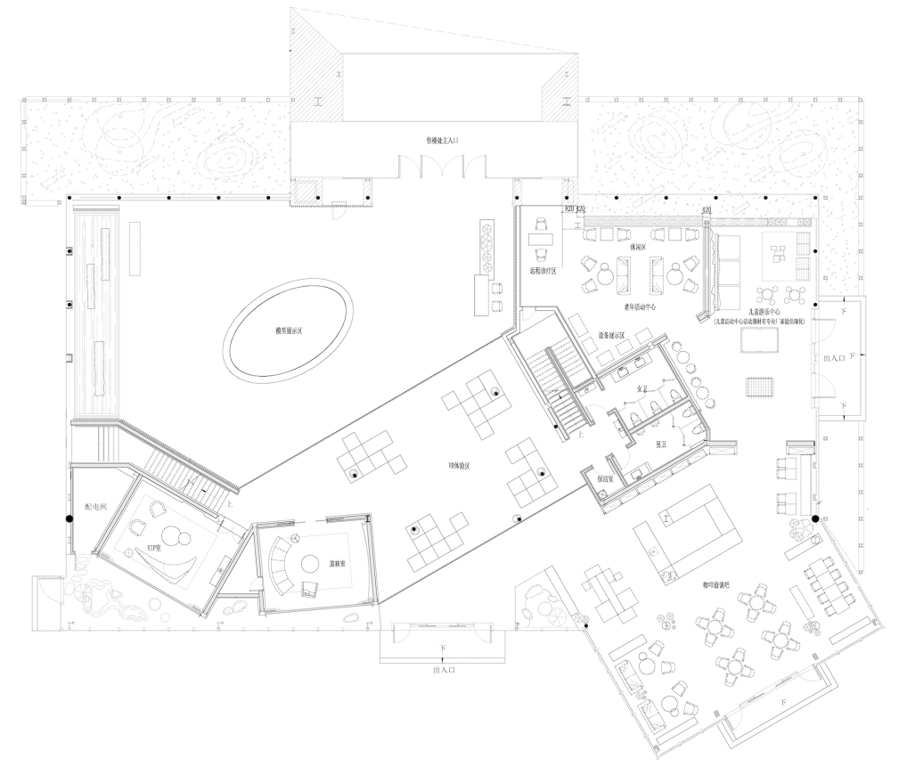
▼售楼处平面图 Plane Graph of Sales Office
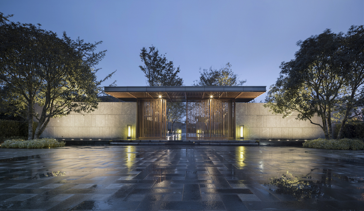
从大门处开辟路径动线连接售楼处主楼,行人道两侧种植一线的榉树树阵,与树丛中隐现的景观围墙营造仪式感十足的幽静胜景,参观者犹如行走在一幅完整和谐的画卷中。
A path is set up from the gate, which connected the main building of the sales office. A burst of beech trees is planted on both sides of the pavement, linking it up into a line, which creates a ceremonially quiet view with the hidden landscape fence in the bushes. Visitors are like walking in a picture of complete harmony.
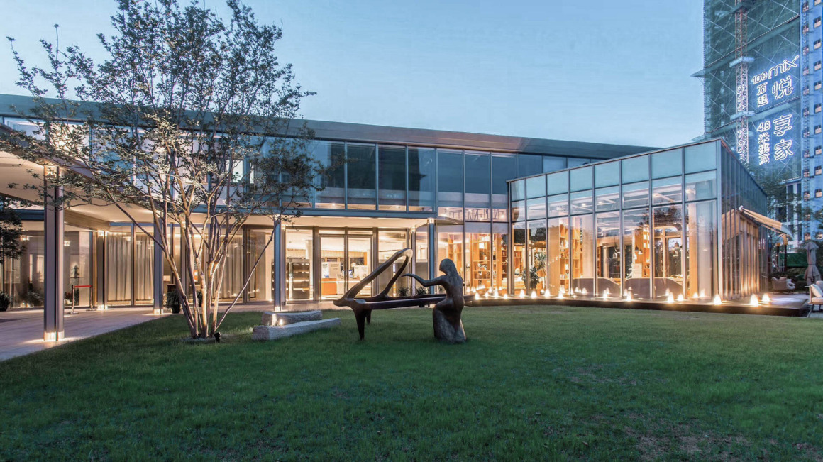
不规则的树木种植临近于建筑及其外围空间,与对面的开阔草坪建立了视觉联系,打造出建筑与自然的互相渗透、互相补充,从而融为一体。
Irregular tree planting is close to the building and its surrounding space, which establishes a visual connection with the open lawn opposite. The concept of interpenetration and complementation of architecture and nature has been created.
▼改造前后对比 Before and after
重构·共生 Reconstruction · Symbiosis
新旧冲突的边界 The boundary of conflicts between new and old
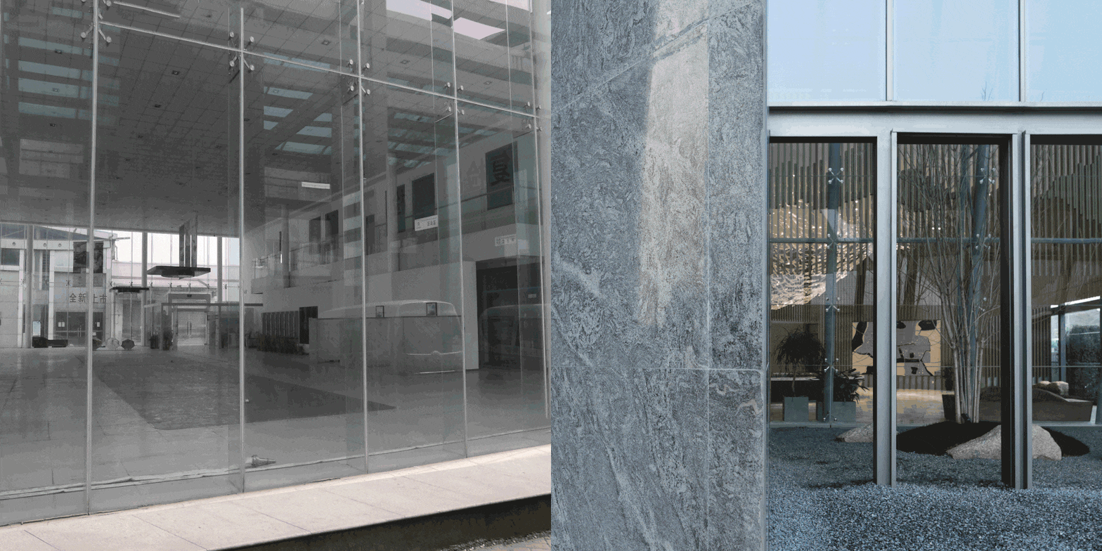
整个建筑的方正形态来自于原有旧的4S店,是个4面都是玻璃幕墙的空盒子。
已有建筑现有的框架产生的限制与约束是对设计提出了的思考,如何让一个老建筑的结构和空间适应新的功能需求,在较短的时间内完成,对项目、对设计师都是一个巨大的挑战。
The founder form of the whole building comes from the old 4S shop. This is an empty box with 4 facade of glass curtain wall.
The limitations and constraints existing in architectures are some new considerations proposed for design. It is is a great challenge both to the project and designers about how to adapt the structure and space of an old building to the new functional requirements and complete it in a shorter time.
设计希望不是全新的更替,而是保留原建筑的外围轮廓。通过内部植入灵动的功能体块,用新理念唤醒旧建筑。
因此设计师抛出了一个”BOX”的概念,想要巧妙的将售楼处及多种项目产品的展示串联到一起,将整个立面划分成几个有特有功能、不同材质的box区域,将原来生硬的方盒子体型活跃起来,形成鲜明的个性。
In this design, it hopes that this is not a brand-new replacement, but retaining the outline of the original building. By embedding smart functional blocks into the interior, old buildings can be awakened through new ideas.
So the designer created the concept of “BOX” and wanted to cleverly connect the sales office with the display of a variety of items. The whole facade is divided into several boxes with special functions and different materials, which will activate the original rigid box shape, with a distinct personality formed.
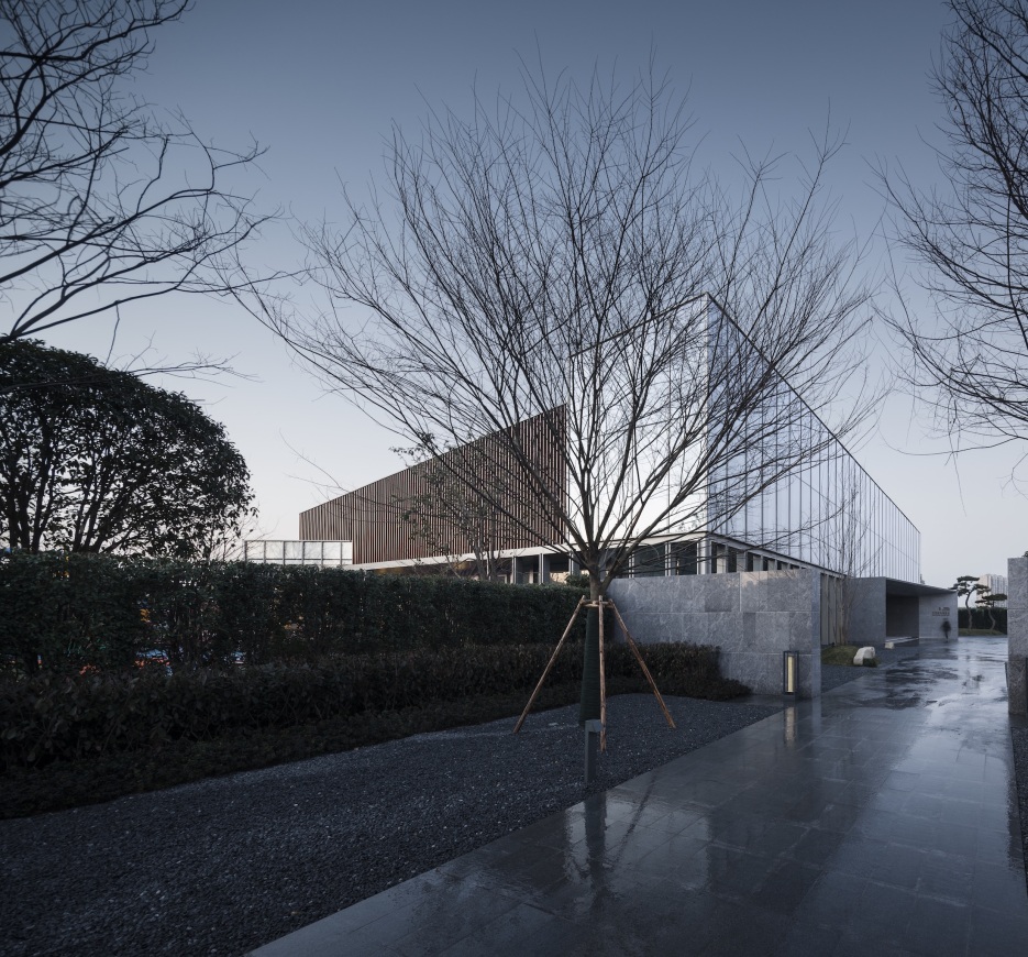
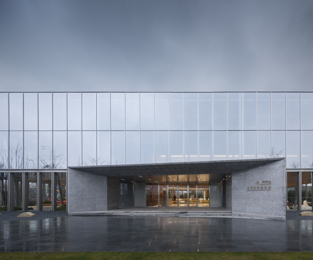
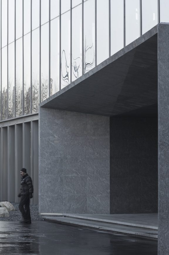
入口区域由深色石材组成,高雅华贵、向人流方向倾斜开口,增加了建筑活力,形成建筑有引导性的入口空间。
The entrance area is made of dark stone, which is elegant and luxurious. It tilts the opening to the direction of the flow of people, increasing the vitality of the building and forming a guiding entrance space for the building.
▼改造前后对比 Before and after
在4S店这个大盒子里,用三个box(两个纵向,一个横向)将一个大空间,划分为南北,东西,上下几个独立的空间,用层高的变化区分各个空间的功能。
In the big box of the 4S store, three boxes (two vertical and one horizontal) are used to divide a large space into North and South, East and west, up and down several separate spaces. The change of height is used to distinguish the functions of each space.
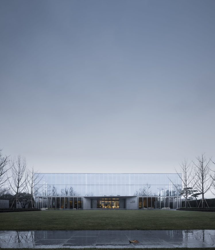
在建筑的上部用大体量干净整洁的高反射镀膜玻璃,掩盖内部原建筑的构件,同时也形成了大气简洁的建筑个性,如同整个建筑的名片,彰显了建筑的高端品质。
In the upper part of the building, a large amount of clean, tidy, highly reflective coated glass is used to hide the components of the original building. At the same time, it also forms a simple atmosphere of architectural personality. Like the entire building card, it highlights the high-end quality of the building.
▼改造前后对比 Before and after
巧于因借·精在体宜 Ingenious Support·Exquisite Form
户内户外的边界 Boundary between indoor and outdoor
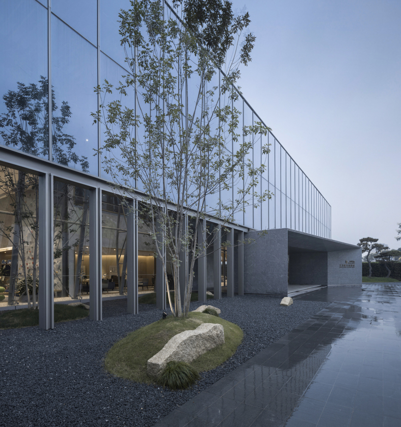
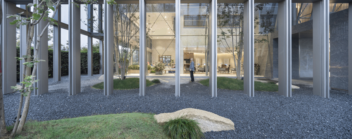
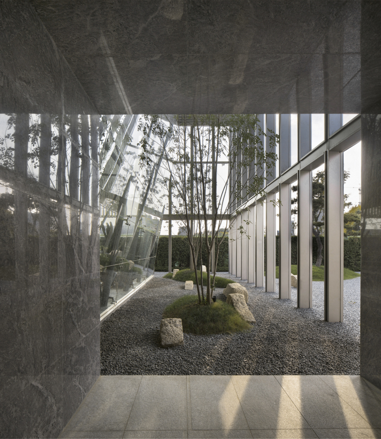
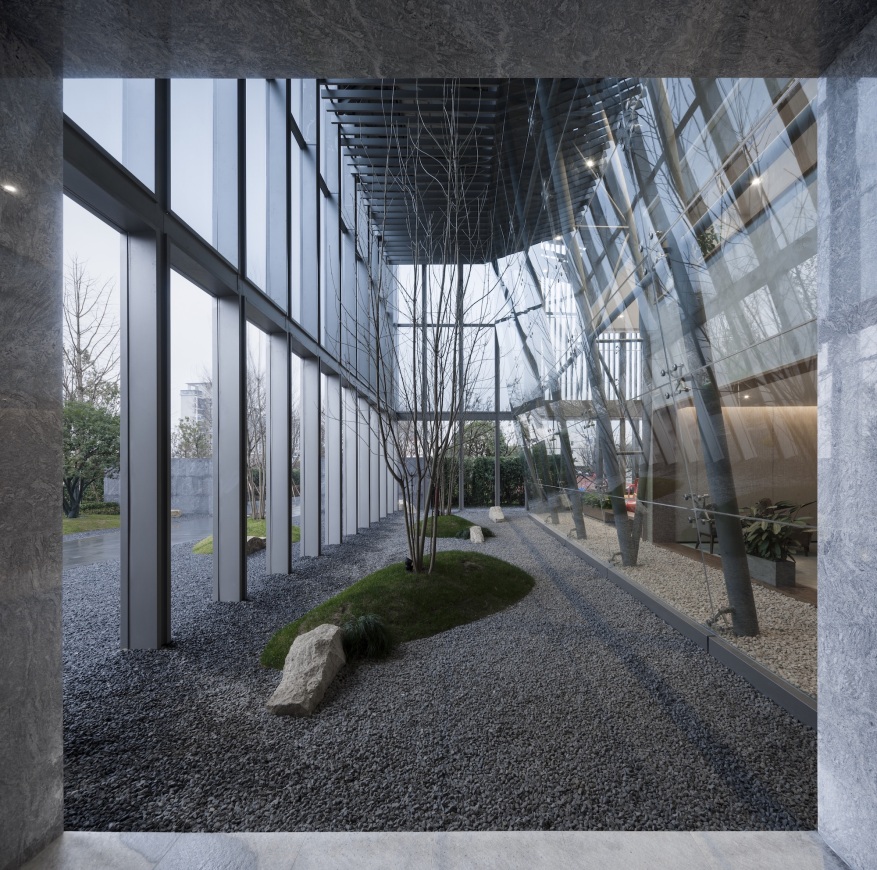
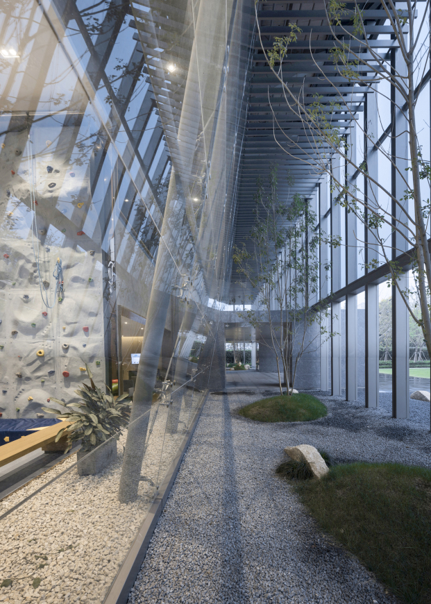
由于售楼处的建筑形态是个上大下小的形态,设计师便利用了这些不好处理的空间,在建筑的底层嵌入了柱廊组成的灰空间,并打造成景观带,柔化了原来建筑生硬的立面,使建筑和景观相辅相成。
Because the building form of the sales office is large above and small below, the designer facilitates these unmanageable spaces, embedding the gray space of the colonnade at the bottom of the building, with the landscape belt completed. This softens the stiff facade of the original building, complementing architecture and landscape.
光线透过玻璃幕墙投射进室内的同时,景观也倒映于玻璃上,似是为室内引入了景。
这番光影的互动,将室内和室外巧妙的连接在了一起,与户外安置的景观做了一个内外呼应,让景观不仅是室外的,更是室内的。
As light passes through the glass curtain wall into the interior, the landscape is also reflected on the glass, which seems to introduce a view into the interior.
The interaction between the light and the shadow cleverly connects the indoors and outdoors, which echoes the outdoor landscape. This makes the landscape not only belong to outdoor, but also to the part of indoor.
▼改造前后对比 Before and after
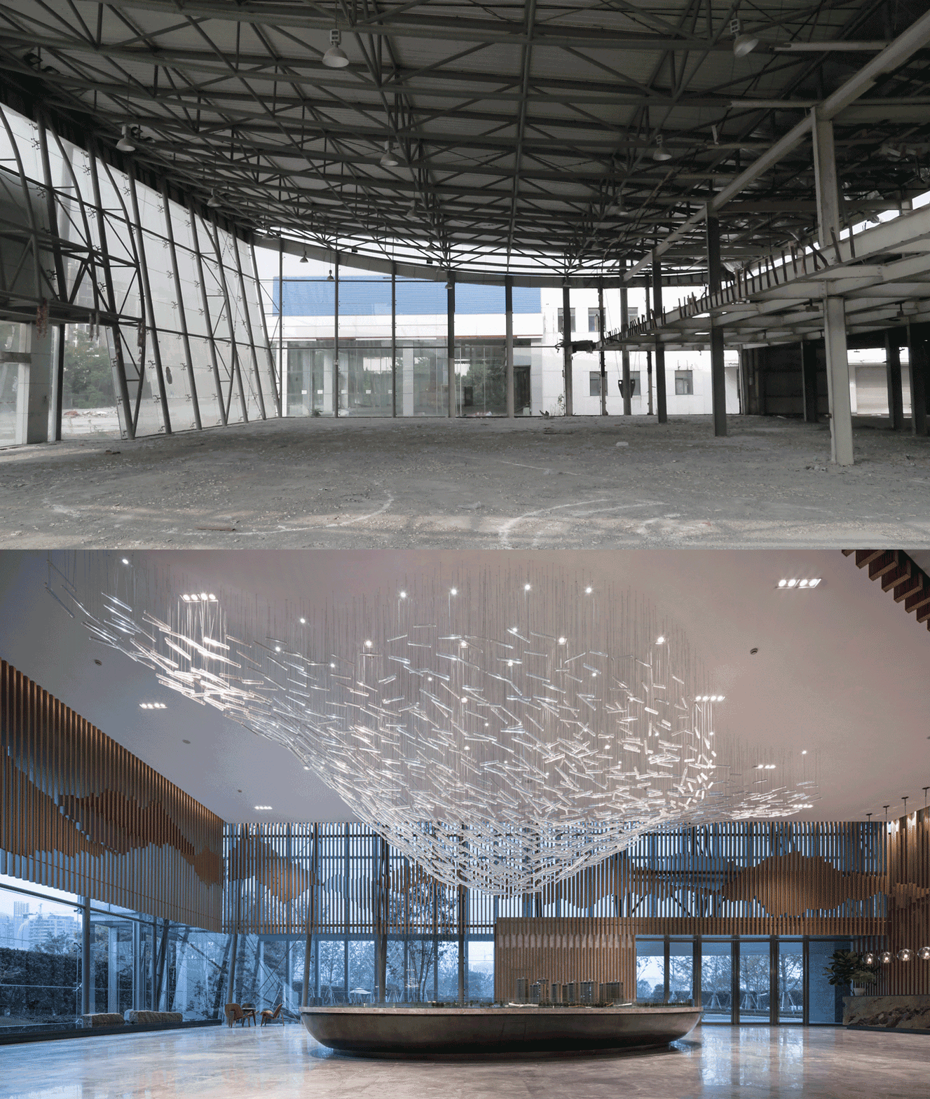
西北面的空间包含了售楼处的主入口及接待区和销售大厅,是整个售楼处层高最高的空间。
空间的主体是一个巨大的铜制沙盘和上方悬置的水晶吊灯。
The main entrance, reception area and sales hall of the sales office are included in the Northwest space, which is the highest floor space of the whole sales office.
The main body of the space is a huge copper sand table and a crystal chandelier suspended above.
▼改造前后对比 Before and after
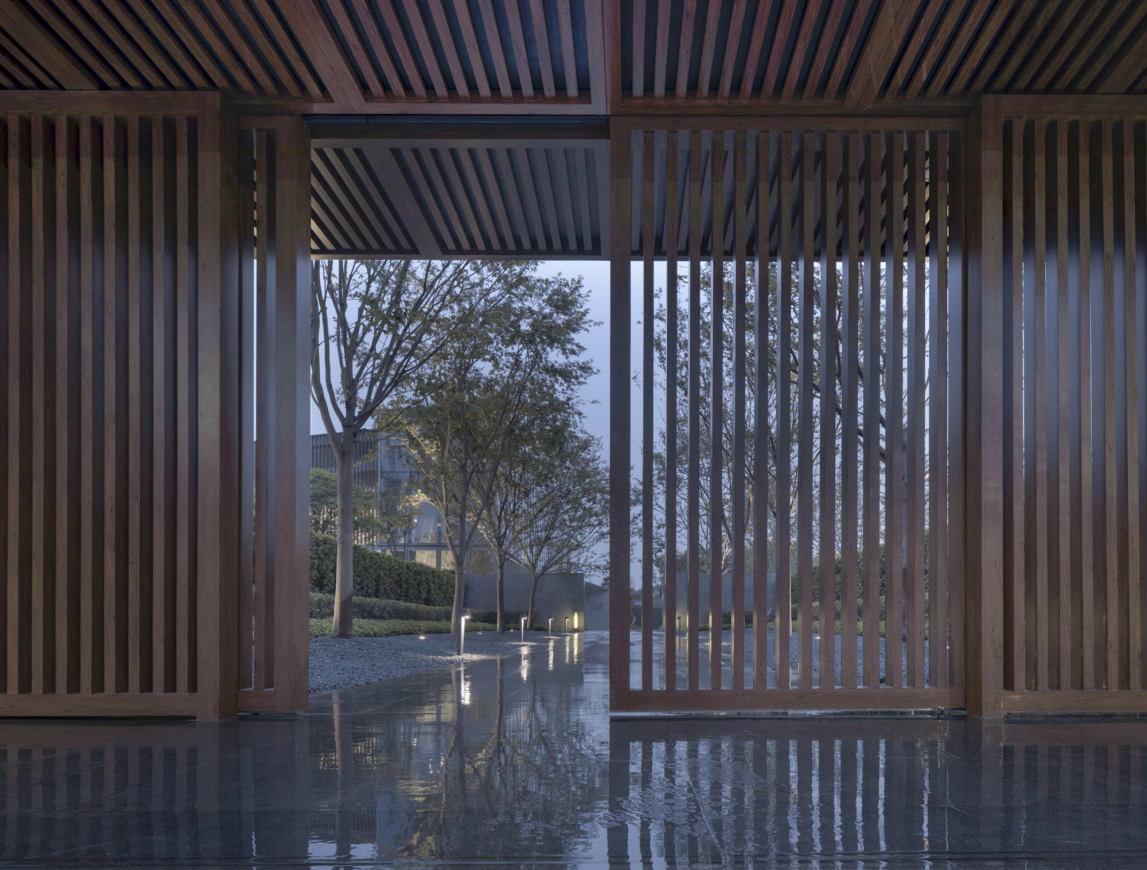
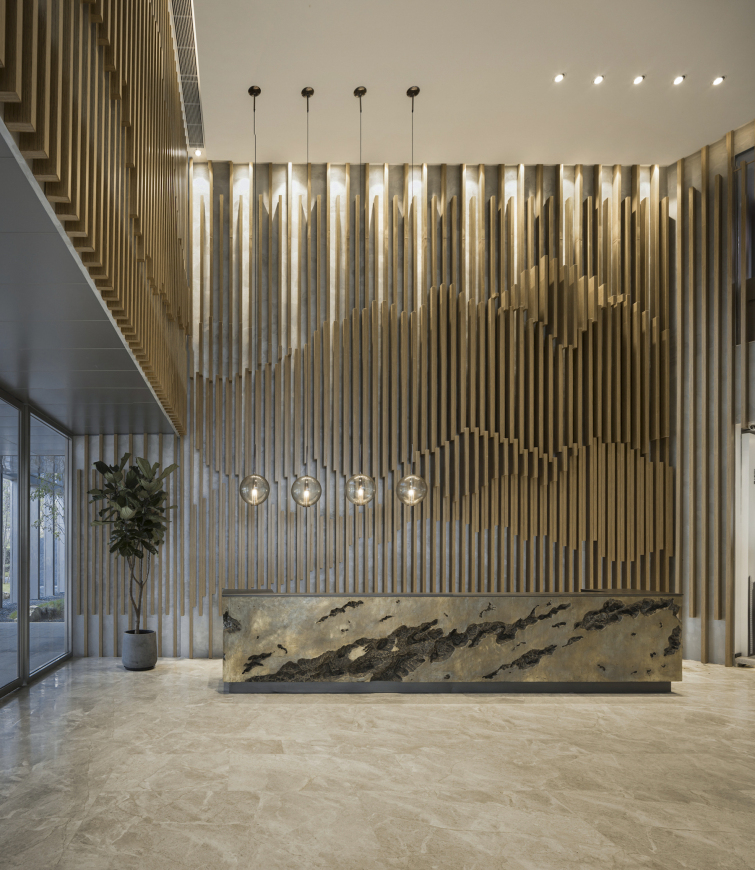
空间四面用悬挂的格栅排列组合成写意的抽象山水,恰与西面设置的镜面水景,倒影了格栅和室外景观以及昼夜变换的光影。
The four sides of the space are combined with hanging grille to form freehand abstract landscapes. It echoes the mirrored waterscape set in the west, reflecting the grille and outdoor landscape as well as the changing light and shadow day and night.
连接·蔓延 Link · Spread
活动空间的边界 Boundary of activity spaces
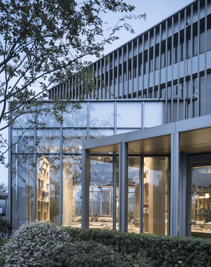
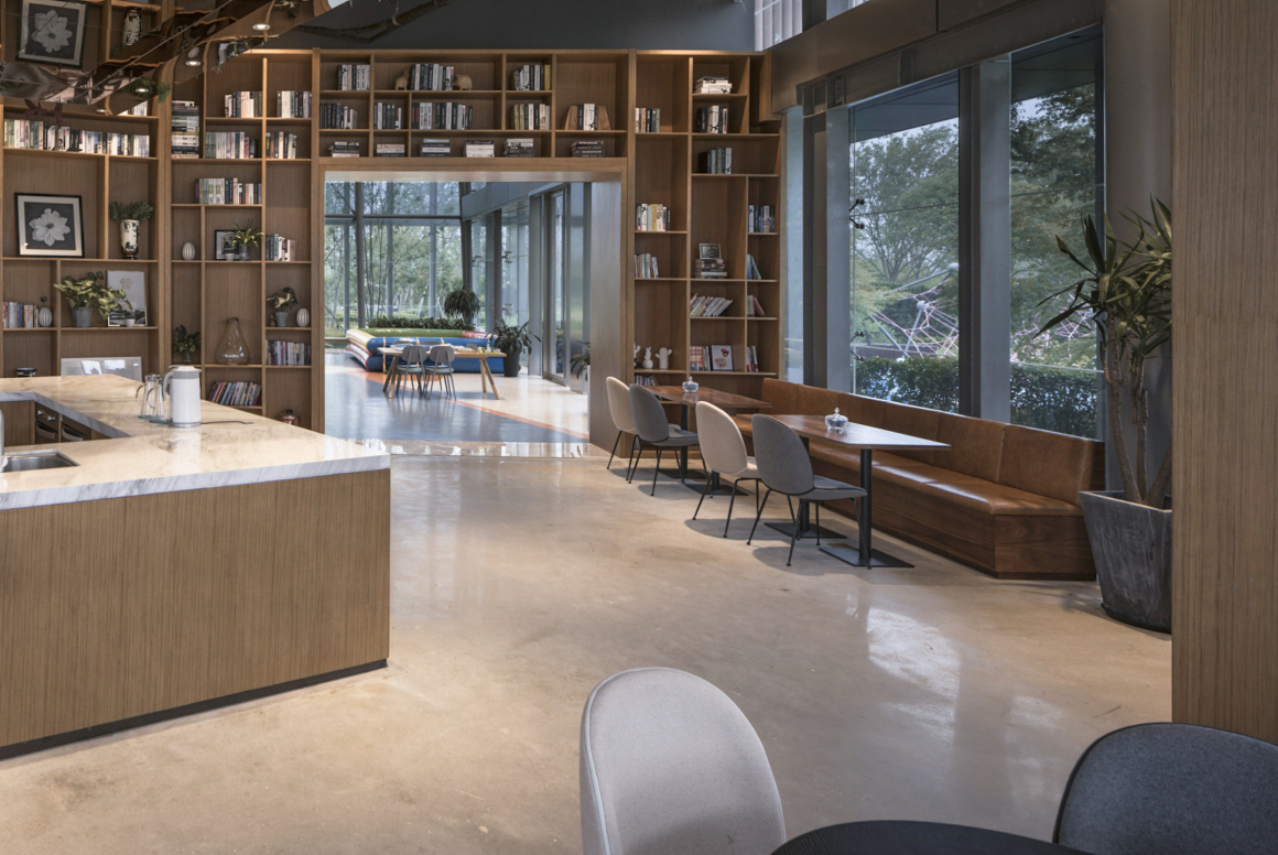
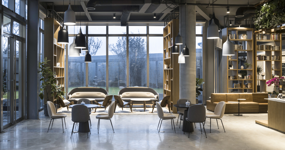
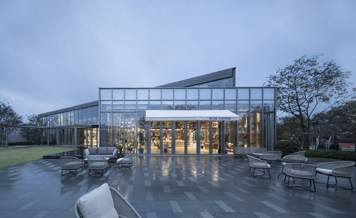
由于原先保留的4S店和样板房体量相差较大,在建筑南面,朝向样板区新增了一个倾斜的体块,并设置成与售楼处相连的洽谈区,为了弱化销售固有的氛围,设计师将洽谈区打造成了北欧风咖啡吧并结合书吧的空间。
Because the volume of the original 4S store differs greatly from that of the model room, a new tilted block is added to the south side of the building orientation the model area. Moreover, this is set up as a negotiation area connected with the sales office. In order to weaken the inherent atmosphere of sales, the designer made this negotiation area combined with a Nordic style cafe and book bar space.
以咖啡吧台为整个洽谈区的中心,挨着幕墙排布座位,身临其境于户外景观,再结合室内茂盛的绿植,蔓延出一个可以放松身心,在阳光和微风下可以享受时间、感受喜悦的场所。
The coffee bar is the center of the whole negotiation area, which arranged the seats next to the curtain wall for making the atmosphere of immersing oneself in the outdoor landscape. Combined with the lush greenery in the room, it spreads out a place where you can relax and enjoy leisure time in the sun and the breeze.
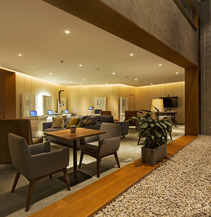
横跨东北西南角的是box的主体,这部分空间的层高比较低,主要分布了VIP室、影音室、老人区、卫生间、产品展示区、办公区等空间。
The main body of box is across the northeast corner horizontally. This part of the space is relatively low in height, mainly distributed VIP room, video room, elderly area, toilet, product display area, office space, etc.
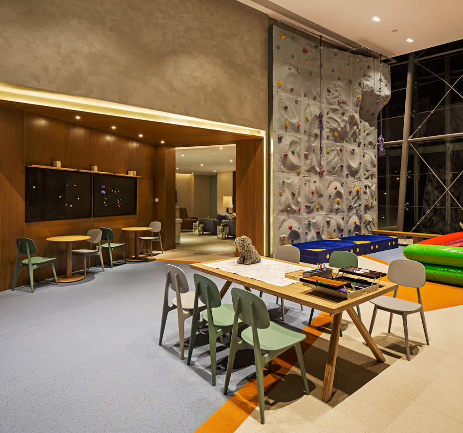
售楼处的东北角是一块面积充足的儿童区,儿童活动由静区和动区两个部分相结合:南面的近端为静区,主要考虑为儿童手工和阅读、写写画画的地方;北面为动区,利用7米的净空,设置了攀岩墙和攀爬架以及海洋球池。
The northeast corner of the sales office is a well built children’s district. Children’s activities are composed of two parts: the quiet zone and the activity zone.The southern end is quiet zone, mainly for children’s manual, reading, writing and painting. The northern part of the activity zone. Using 7 meters headroom, it set up a climbing wall and climbing rack and a marine pool.
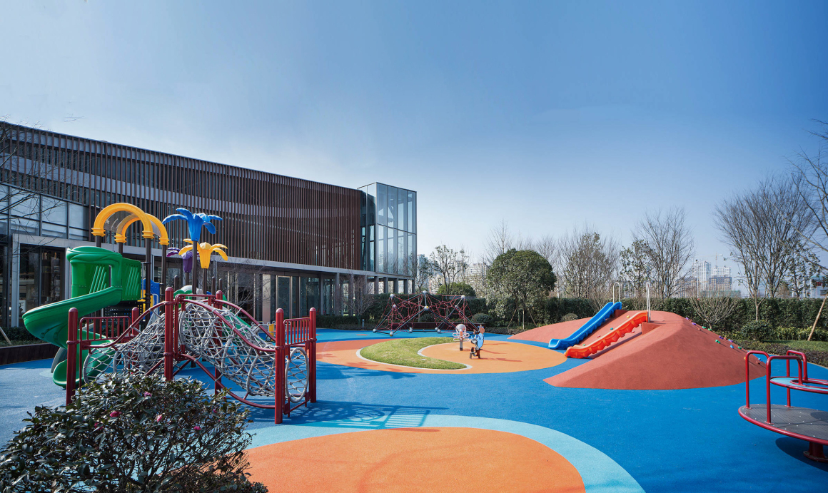
东侧空地作为儿童活动区域的延续,设置了一片仿木金属格栅组成的面,通过暖色调消减了原先建筑冷峻的立面,给儿童活动提供了一片温暖的背景。
The open space on the east side is a continuation of children’s activity area. The surface of a piece of imitation wood grille is set up here. The cold facades of the original building were weakened through warm colors, providing a warm background for children’s activities.
后场的整体空间通过连廊衔接样板间,中心大草坪留白为展示活动场地赋予更多的蔓延可能性,样板房区域与自然环境无缝对接,保证参观行动风雨无阻的同时,形成景观邻里生活的场景。
The overall space of the backcourt connects the model room through the corridor. The center lawn provides more possibilities for exhibition sites. The model room area seamlessly joins with the natural environment, guaranteeing the unimpeded visiting action, while the landscape neighborhood life scene can be formed.
▼改造前后对比 Before and after
同时,外延的广场空间,外摆与室内呼应的咖啡吧,由功能带动建筑内外边界的拓展,为来访者提供主动的人性化活动场地选择,使之感受展示区带来的无隔阂自在参观之旅。
At the same time, the extension of the square space as well as the pendulum and the indoor echo of the coffee bar are driven by the function of the building’s internal and external boundaries of the expansion. This provides visitors with the initiative to choose a humanized venue for activities, so that they can feel the exhibition area brought about by the estrangement of the tour.
关注场地、关注人,并在两者的对话与互动中创造全新的生活场景,这是一个生活体验中心,也是属于这个场所的故事。
Focus on the venue and living people, create a new life scene in the dialogue and interaction between these two. This is a life experience center indeed, but also belongs to the story of this venue.
项目名称:绿城·南京深蓝
项目类型:示范区
项目业主:南京中驰&绿城东方
项目地点:南京市宏运大道1468号
建筑面积: 1839㎡
景观面积:12942 ㎡
设计管理与统筹:ZSD卓时
整体策划与规划:ZSD卓时
建筑改造设计:九米设计
景观设计:ZSD卓时
室内设计:ZSD卓时
设计管理团队:王英毅、曾斌
设计团队:王薇薇 、王立诚、项斌、钭龙飞、鲁金清、滕富军、张海泉、陈莹、汪晓东
图片摄影:姚力、锦艺
Project Name: Green Town·Nanjing Deep Blue
Project Type: Demonstration Area
Project Owner: Nanjing Zhong Chi & GreenTown Dongfang
Project Location: No. 1468 Hongyun Avenue, Nanjing
Built-up Area: 1839㎡
Landscape Area: 12942 ㎡
Design Management and Co-ordination: ZSD
Overall Planning and Layout: ZSD
Design of Building Renovation: Jiumi Design
Landscape Design: ZSD
Interior Design: ZSD
Design Management team: Yingyi Wang, Bin Zeng
Design Team: Weiwei Wang, Licheng Wang, Bin Xiang, Longfei Dou, Jinqing Lu, Fujun Teng, Haiquan Zhang, Yin Chen, Xiaodong Wang
Photography by: Li Yao, Yi Jin
更多 Read more about: ZSD卓时设计













有改造前后对比
徐锦江