本文由 寸匠熊猫设计事务所 授权mooool发表,欢迎转发,禁止以mooool编辑版本转载。
Thanks CUN PANDA for authorizing the publication of the project on mooool, Text description provided by CUN PANDA.
寸匠熊猫设计事务所:在冰冷严苛的城市里打造一处柔软治愈之所,让步履匆匆的都市白领步入其间,褪去假面与铠甲,回归身体最本真柔软的状态。禾缦肌研美学中心位于福建漳州,熊猫NANA对其进行了整体的品牌升级打造,呈现了更加柔软通透而具有生命力的品牌视觉和美学空间。
CUN PANDA:Hoormem Muscle Research Aesthetics Center,located in zhangzhou, Fujian, with the aim of creating a soft and healing place in the cold and harsh city. It warmly welcomes white-collar workers to step in, put masks and armors down, and back to body. CUN PANDA remodel the whole brand vision, presenting an aesthetic space that is softer, more transparent, and full of vitality.
▽项目视频 Video
正如奥地利设计师荷尔格·卢比奇所说“柔软是美学的一种表现形式,它可以让我们的生活更加美好。”熊猫NANA从“柔软的身体”中汲取灵感,将“柔软”转译在空间之中。
Inspired by the concept of “the softness of the body” introduced by Austrian designer and architect Horst Rittel who once said, “Softness, as an expression of aesthetic, has the power to improve our life.” NANA translates this idea into its spatial design.
有机的可塑性 Plasticity can be organic
柔软,让身体有了更多的可塑性。这种可塑性让身体呈现出不同的姿势,以温柔的方式应对不同的环境。禾缦肌研美学中心,柔软从空间的外立面开始被感知。
Softness ehhances the flexibilty of the body, which enables us to deal with different environments in a gentle way by presenting different postures. At the Hoormem Muscle Research Aesthetics Center, softness is perceived from the exterior facade of the space.
不同于其他大开大合的商业空间,这是一个几乎密不透风的空间外立面,大面积米白色肌理石贴面覆盖着整面墙,以金色的金属洞口为原点的墙面上的圆弧线,在增加外立面层次丰富度的同时,以一种更加柔和的方式指引着人们进入空间探寻。
步入空间内部,难以看见棱角分明的空间体块,富有精美视觉体验的曲线感充斥着人们的视野,圆润的洞口如气泡一般,有机地衔接着不同的空间。
The airtight exterior facade differs Hoormem from other commercial spaces.
The entire wall is covered with large areas of milky white textured marble veneer, with arched lines on the wall that serve as golden metal opening, which not only enhances the richness of the facade but also serves as a gentle guide, inviting people to explore the space.
Stepping inside, distinct angular block is almost invisible, on the other hand, your eyes are feast with delightful display of delicated curves. The opening, round and smooth, resemble bubbles, organically connect various areas of the space.
▽层次丰富的空间探寻 Rich level of space exploration
灵活地联接 Connection can be flexible
双手交织,合二为一。柔软的手不仅在物理上灵活地联接,还在精神上连接着人与人的心灵,让人感到宁静和安定。
The gentle sense of hand clasping connect hearts and mind physically and spiritually, bringing a sense of tranquility and serenity.
空间中央的“标志物”以一种明确的存在,由上至下贯穿空间两层。这种由上至下的联通性让原本封闭的空间,形成共享的空间序列,让人们对周围的空间感到更加亲近、放松。和纸视觉感受上给人以柔和的质感,微黄的光亮透过和纸传递出温和、松弛的情绪。
The central “symbol”, a clear presence, vertically spanning across the two levels of the space. This top-to-bottom connectivity creates a shared spatial sequence within the originally enclosed space, making people feel closer and more relaxed in surroundings. The yellowish glow permeates through washi paper offers a soft visual experience and converys a gentle and relaxed ambiance.
▽贯穿上下空间的艺术装置 Art installations throughout the upper and lower Spaces
顺着内嵌扶手的光亮走到空间二层,二层并非封闭孤立的空间,更像是衔接不同空间的廊道。站在二层廊道可与一层空间许多角度对望,感受独立与亲密的空间关系。
Second level showed by itself by following the illuminated handrail. The second level is not an enclosed and isolated area but rather a corridor that connects different spaces. Standing on the corridor, one can gaze the spaces on the first level from various angles, experiencing a sense of both independence and intimacy in the spatial relationship.
▽二层廊道 Two-story gallery
柔软,一种有机的生命力 Life force can be soft and organic.
柔软并非懦弱,而是一种有机的生命力。富有弹力的可塑性,开放的连通性使柔软胜过死板的坚硬和秩序感,迸发出强有力、伟大的力量。激发了人们对变化的渴望,对美感和创新的追求。
Softness didn’t mean weakness; rather, it’s a kind of life force featured with organic. With its flexibility and connectivity, softness triumphs over rigid hardness and sense of order, unleashing power and magnificent force. It ignites a desire for change and fuels the pursuit of beauty and innovation.
正如耳熟能详的建筑家Frank Owen Gehry所言:”曲线并不意味着缺乏力量和决心,而是意味着力量和决心的惊人展示。”
As the renowned architect Frank Owen Gehry said, “Curves are not lack of strength or determination, but a stunning display of strength and determination.”
在禾缦肌研美学中心,熊猫NANA无意复刻自然中的优美,而是期待以一种有机、自然的设计语言勾勒出禾缦品牌的表达“点亮肌肤时刻”,帮人们找到心灵的憩息之所,唤醒美好自己的芳香疗法疗愈空间。
NANA is looking forward to outline the brand slogan“lighten the moment for skin”with the design language of organic and natural rather than copy the natural beauty. Creating a therapeutic space with aroma that helps people awake inner peace and beauty.
如同空间的自然过渡,在灯光设计方面,熊猫NANA没有粗暴直接地点亮空间某一处,而是以一种内敛的无主灯方式指引着人们的视觉,以线替点,让灯光作为更整体的形式描绘空间的曼妙身姿。
In terms of lighting design, Panda NANA employs the same transition as in space. Instead of directly illuminating specific areas, the lighting gently guides people’s vision through a restrained use of ambient lighting. Lines have replaced focal points, thus, the contours of the space is outlined by the overall lighting.
二维的视觉转换 Two-dimensional visual transformation
基于品牌特性和三维空间的打造,在品牌VI的设计上,熊猫NANA将“点亮肌肤时刻”的品牌表达与三维空间中的柔软语言相结合,从而进行二维的平面视觉转换。
Brand’s visual identity is based on the brand attribute and the creation of a three-dimensional space. Panda NANA integrates “lighten the moment for skin” with the language of softness in the three-dimensional space, thus result in a successful two-dimensional visual transformation.
▽极致的细节处理 Extreme detail handling
“Hoormem”采用有衬线字体,细而精致的曲线或直线,给字母带来了一种经典而优雅的艺术观感,正如三维空间中的光线成为空间中不可或缺的点缀。在中文的字体设计中,遵循着同样的设计原则。
无论是二维的平面设计,还是三维的空间设计,都是“禾缦”品牌的视觉表达。熊猫NANA将无形的品牌特性以一种艺术化的设计语言来进行品牌叙事,助力“禾缦”打造更好的品牌形象,呈现更好的品牌价值。更具辨识度的品牌,更容易赢得商业瞩目与转换。
“Hoormem” adopts serif with delicate curves or straight lines, giving letters an artistic sense of classic and elegant. Just as light serves as an essential embellishment in the three-dimensional space, the design of Chinese character also follows the same principle.
Both two-dimensional graphic design and three-dimensional spatial design serve as visual expressions of Hoormem. Panda NANA employs an artistic design language to narrate the intangible brand attributes, thus assisting Hoormem in presenting a stronger brand image and delivering greater brand value. A more recognizable brand is more likely to capture commercial attention and drive conversion.
灯光/功能/装置 lighting / function / installation
灯光 lighting
这是一场与自我的对话,让盎然和柔美注入内心。把光,健康,艺术三者结合,组成了禾缦空间展示体系。
外立面弧形洞门,运用地面光的反射,使得艺术涂料质感更加立体,六组离心圆层次叠加,灯光内外循环,营造了飘逸动态的美学效果。
接待区采用低亮度,低色温的手法,灯光氛围柔和且温润。展示区产品展示均为重点照明,突显产品特征。
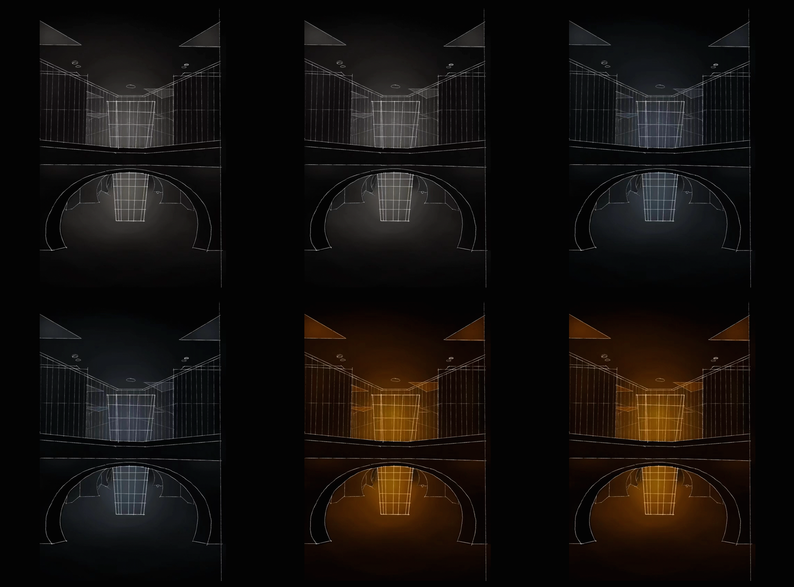
一楼装置区域。光柱编程为双色温光色流动,随着时间可变化冷暖,体现了品牌主题的新生和叠加。柱体基层大小不一致,透光内部框架,每层都需随柱体大小保持一致,保证光面亮度统一。顶面三角型软膜天光,提高光源安装高度,让光充分均匀发散后,融合到达地面,如一缕带纱的阳光。
This is a dialogue with inner self, allowing a sense of vitality and gentleness to flow into the heart. The display system of Hoormem is created by combining light, health and art.
The arch door at the facade takes the advantage of the reflection of the light on the ground, enhancing the three-dimensional texture of the art coating. Six groups of eccentric circles are layered and stacked. Light circulating both inside and outside, thus, a graceful and dynamic aesthetic effect is created.
The reception area employs a technique of low brightness and low color temperature, creating a soft and warm lighting atmosphere. In the display area, the features of products are highlighted with focused illumination.
The ground floor installed with light columns. Its dual-color temperature light is programmed to change in cold and warm over time. This represts the theme of the brand, renewal and layering. The size of the pillar base varies, with translucent internal frameworks. Each layer needs to be consistent with the size of the pillar to ensure that the brightness emitted from each surface remain the same. The triangular soft film skylights on the ceiling elevate the height of the installation, allowing the light to disperse fully and evenly before merging and reaching the ground, resembling a gentle ray of sunlight filtered through a sheer curtain.
▽设计分析 Design analysis
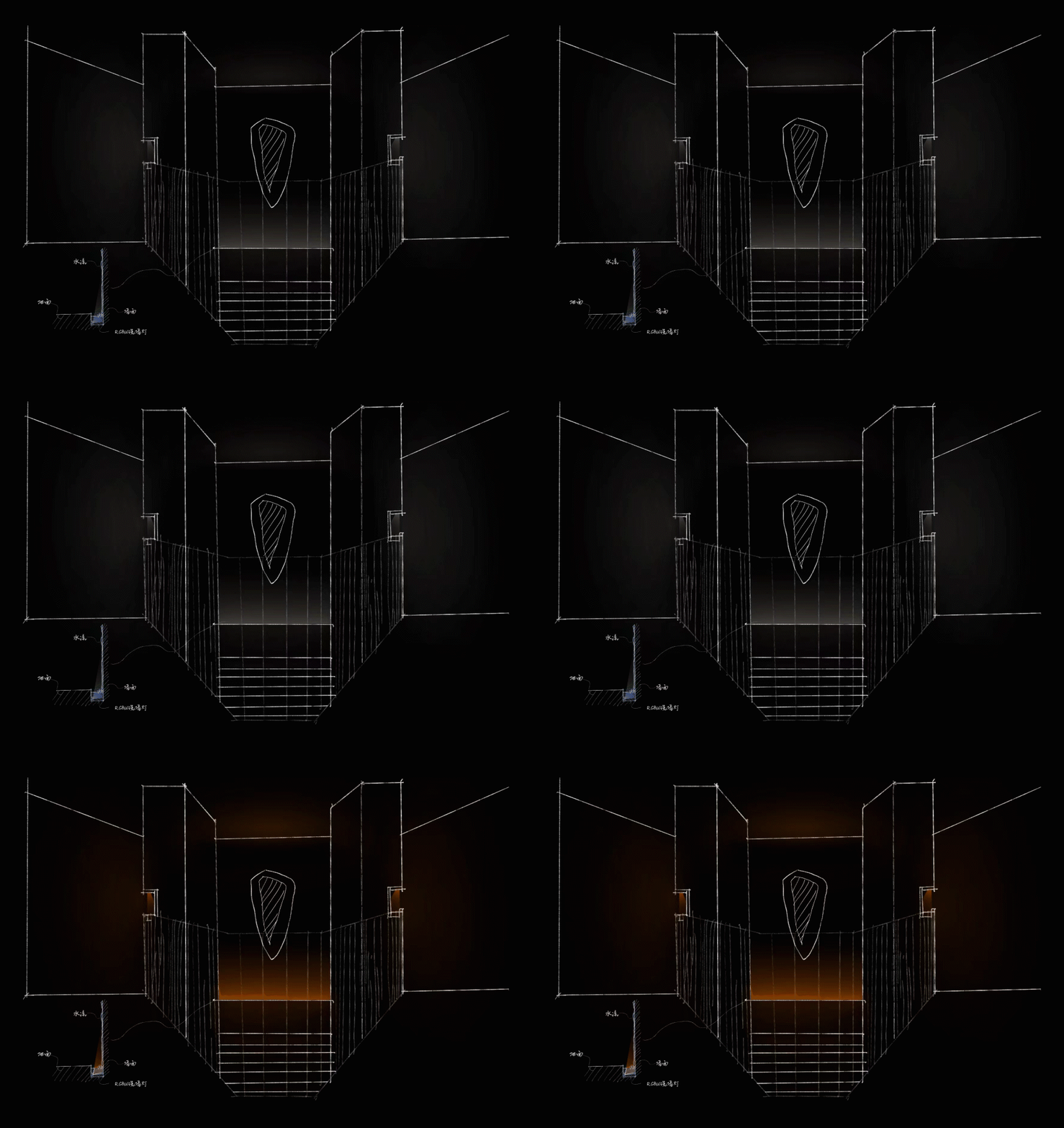
楼梯水幕墙的氛围光色,不同颜色的光氛围,对人们的情绪和心理有着不同的影响。水幕区域彩色灯光,调制成橘色,如同一面日出时的水墙,色彩差异的视觉化,给予过度的灰空间,能给顾客留一些许时间驻足停留。
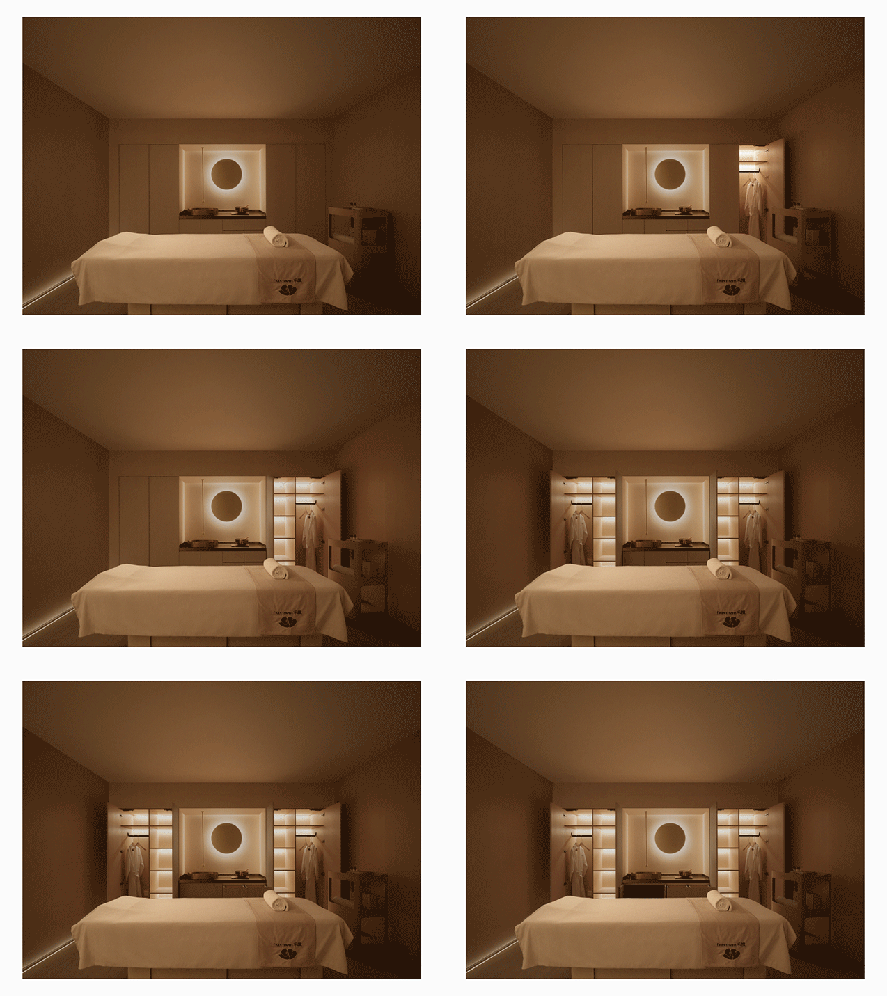
spa房间灯光没有直接照明,避免眩光,运用了多处低位中位高位灯带,墙面质感借用光的漫反射重新分配,房间利用无线智能系统,编写欢迎,护理,淋浴,打扫模式,匹配不同需求使用。
消毒室空间灯光结合光与健康的理念,顶面光保持正常色温和亮度的前提下,夜间可开启蓝光消毒模式。优化功能、空间氛围、视觉差异,也是品牌给予灯光,带给我们更多的思考。
The ambient lighting of the water curtain wall by the staircase are changing with various colors, which has different effects on emotions and psychology. The water curtain area is illuminated with modulated orange lights, remembling the glow of sunrise. Visually, the overused grey contrast against the bright colors such as orange, inviting customers to pause and linger for a while.
Multiple low, medium, and high-level light strips are used in the spa rooms strategically to aviod the glare caused by direct lighting. The texture of the walls is designed to redistribute light through diffused reflection. The rooms are equipped with a wireless smart system that allows for customized programming of welcome, treatment, shower, and cleaning modes, catering to different needs and requirements.
The lighting design of the disinfection room followed the principle of healthy. At night, blue light disinfection mode can be activated while ensuring the premise of maintaining normal color temperature and brightness. Indeed, how to optimize functionality, how to create an atmosphere, and how to introduce visual differentiation are all aspects that brands should think over.
▽功能分析 function
装置 installation
始于五感疗愈 Healing Starts from Five Senses
嗅觉(Smell):通过鼻子感知空气中的气味分子,使我们能够闻到食物、花朵和环境中散发的气味。嗅觉对于回忆和情感体验有很大的影响。
通过口腔感知食物中的化学物质,使我们能够尝到食物的味道,如酸、甜、苦、咸和鲜。味觉让我们能够享受美食,也是我们对食物安全的一种保护机制。
We are able to smell the scents from foods, flowers, and everthing around us by perceiving odor molecules in the air through nose. The smell has a big influence on the memory and emtional experiences.
we are able to taste the flavors, sourness, sweetness, bitterness, saltiness, and umami, by perceiving the food chemicls in our mouths. Smell not only enables us to enjoy cusine but also serves as a protective mechanism to test whether the food is safe or not.
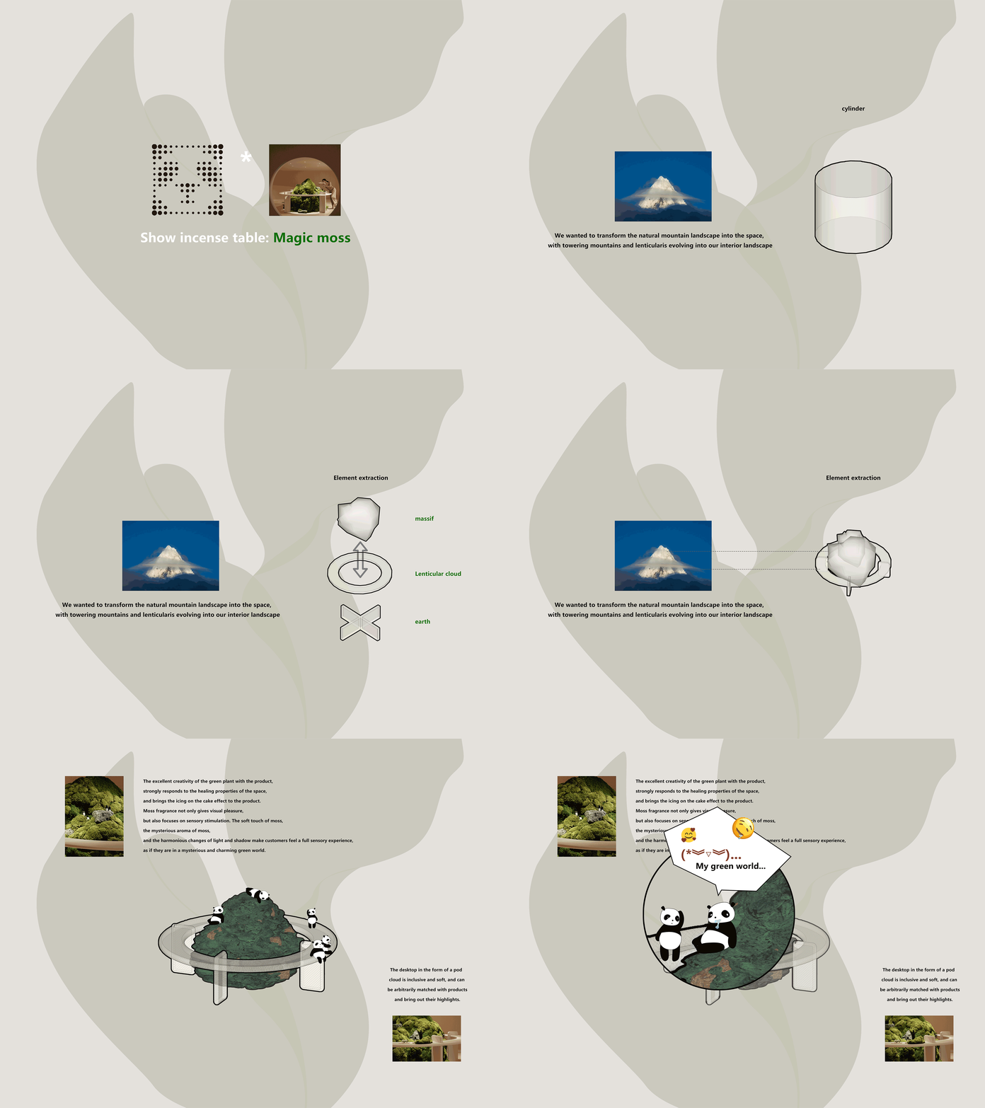
01 氤苔 Moss Installation
位置:大堂侧间 Location: side area of lobby
巨大的苔藓装置仿佛是一片绿洲,呈现出繁茂的苔藓和生机勃勃的气息。这个自然的装置给人带来一种亲近大自然的感觉,城市空间中自然的野趣不仅给予视觉上的愉悦,更注重感官的刺激。轻柔的苔藓触感,神秘的苔藓香气,贯通人体口鼻之间,嗅觉与味觉共同发声。和谐的光影变化,让顾客感受到全方位的感官体验,仿佛置身于一个神秘而迷人的绿色世界中。
The vibrant atmosphere of the enormous moss installation, like an oasis, evokes a sense of closeness to nature. It not only provides visual pleasure but also focuses on sensory stimulation. The gentle touch of the moss, the mysterious fragrance, permeates between the nose and mouth, creating a symphony of smell and taste. The harmonious interplay of light and shadow allows customers to indulge in a comprehensive sensory experience, as if they are immersed in a mysterious and enchanting world full of green.
▽设计演绎 Design deduction
视觉(Vision):通过眼睛感知光的反射和折射,使我们能够看到物体的形状、颜色和大小。视觉是我们主要的感知方式之一,也是我们对世界最直接的认知途径。
Vision: we are able to see the shapes, colors and sizes of an object by perceiving the reflection and refraction of light. Vision is one of our primary modes of perception and the most direct way we perceive the world.
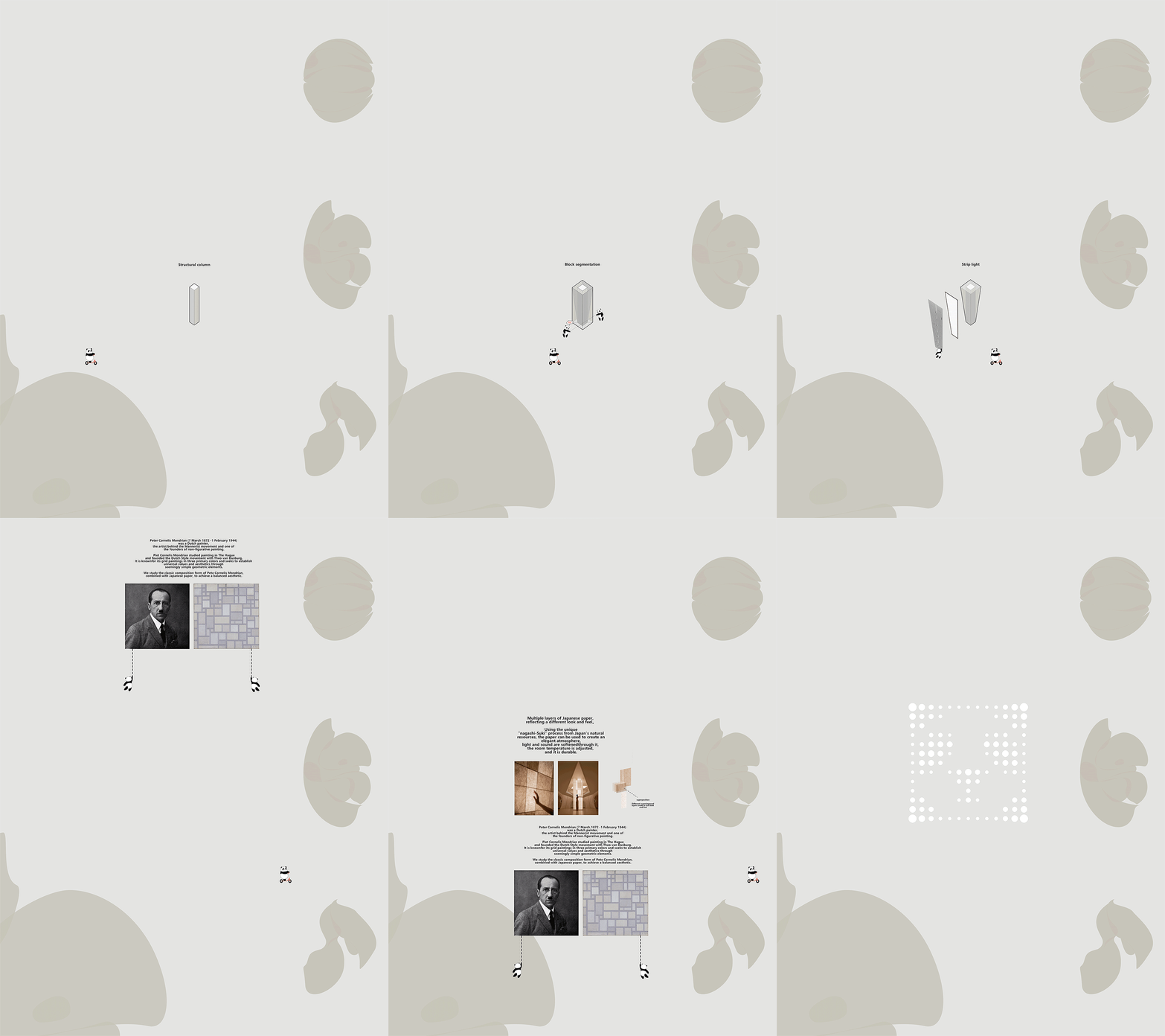
01 光之岛 Light Island
位置:大堂中心 Location: center of the lobby
用光将人体感官激活于空间之中。光之岛将成为人们远离喧嚣城市,踏入内心深处的灯塔,引领着每一个到来的人穿越喧闹与压力,找到宁静与治愈。
Due to light, five senses are activated within a space. Light Island will serve as a beacon, guiding people to step away from the bustling city and delve into their innermost selves. It will lead every visitor through the noise and stress, helping them find tranquility and thus heal the heart.
▽设计草图 Design sketch
“光之岛”以呼吸灯的形式实现渐变的节奏,如同柔和的呼吸,让人感受到自然的韵律。灯柱的外表采用质感柔和的和纸,温暖的光从柱体底部逐渐升腾,仿佛缕缕暖风拂过脸庞,让人感受到一种安心与平和。舒缓的光影变化带来愈合心灵的力量,人们可以在这里坐下或躺下,闭上眼睛,尽情感受“疗愈之光”带来的治愈效果,疗愈音乐伴随着呼吸灯的节奏轻轻响起,将人们带入一片宁静的境界。
“Light Island” utilizes the rhythm of gradient breathing lights, resembling a gentle breath, allowing people to experience the natural rhythms. The exterior of the light columns is covered in softly textured washi paper, and warm light gradually ascends from the base of the columns, as if a warm breeze gently brushes across the face, evoking a sense of tranquility and peace. The soothing changes in light and shadow bring forth the power to heal the soul. Here, people can sit or lie down, close their eyes, and fully experience the healing effects of the “healing light.” Accompanied by healing music synchronized with the rhythm of the breathing lights, individuals are brought into a realm of tranquility.
▽设计演绎 Design deduction
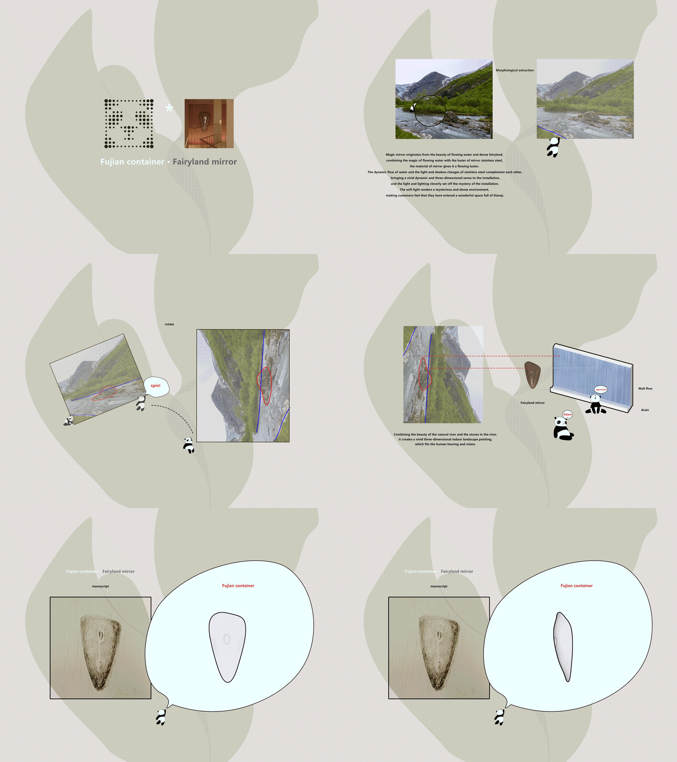
02闽中之器·氤镜 An Ethereal Mirror
位置:流水墙体位置 Location: waterfall wall
氤镜源自于流水的美妙与氤氲的仙境,镜面的材质赋予了它流动的光泽。光影交相辉映,为空间置入生机,光线和灯光巧妙地烘托了装置的神秘,氤氲之境,让顾客感到进入了一个充满仙气的奇妙空间。
流水的白噪音为顾客营造出一个和谐而宁静的氛围,让人心神沉浸其中,忘却城市的喧嚣,完全投入到疗愈的氛围之中。
The concept draws inspiration from the enchanting beauty of flowing water. The material endowed mirror with flowing luster. The interplay of light and shadow infuses vitality into the space, while the skillful use of lighting enhances the sense of mystery within the installation. The ethereal atmosphere invites customers into a heavenly wonderland.
The white noise of flowing water creates a harmonious and serene atmosphere for customers, allowing them to immerse in the therapy and forget the hustle and bustle of the city.
▽设计草图 Design sketch
▽设计演绎 Design deduction
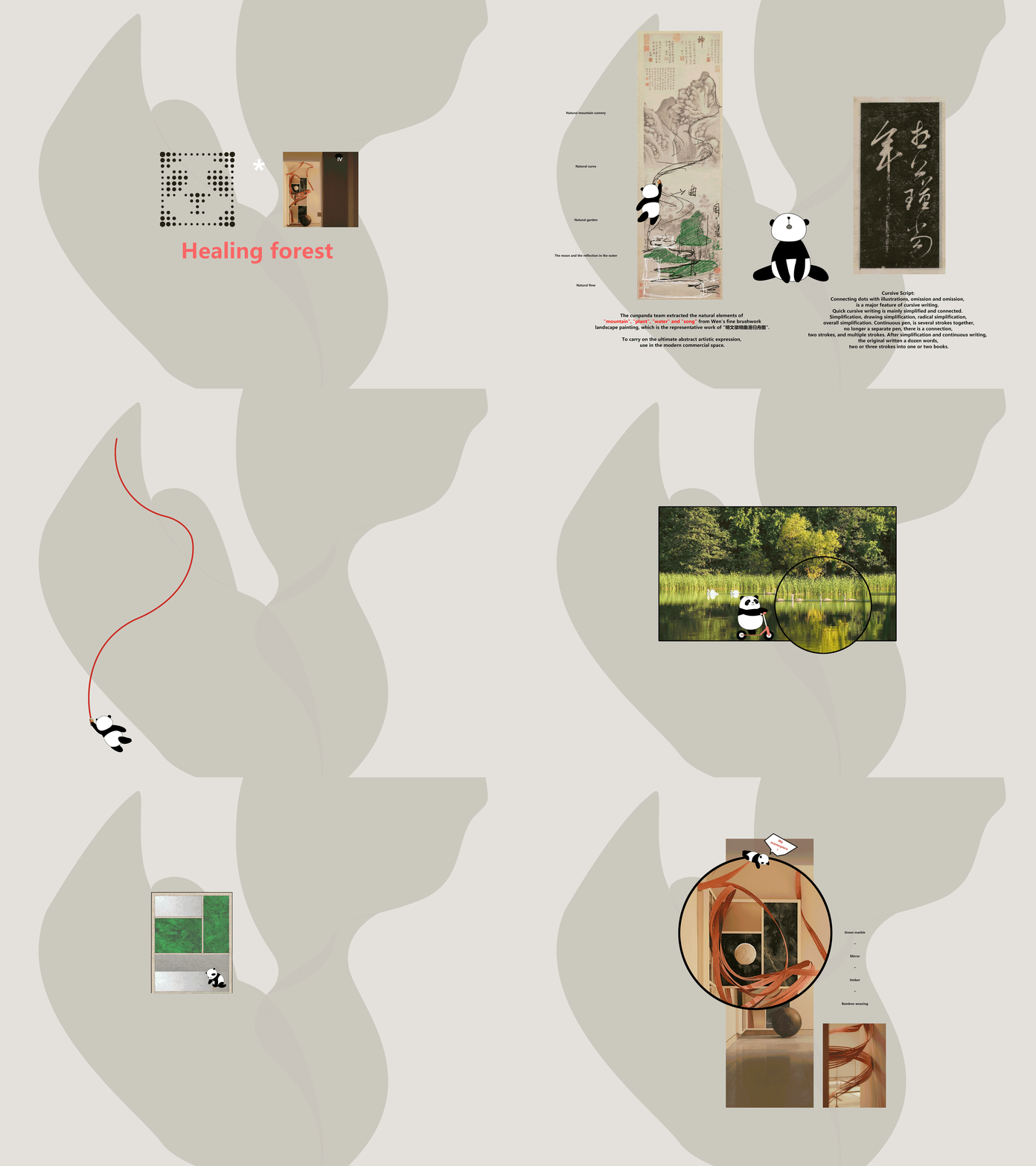
03 愈林 A forest for healing
位置:spa疗愈空间 Location: SPA rooms
曲山、幽林,带给人们始于基因的自然归属感。取于自然融于“自然”(暗指自然的医美),用艺术的语言通过抽象化的自然曲度置于疗愈空间的入口,好似“曲径通幽处,禅房花木深”,治愈的森林入口就在此处,半遮半掩,引导着来客领略这忘情尘俗的意境。
The curved mountain and tranquil forest evoke a sense of innate connection to nature. Inspired by nature and integrated into “natural” aesthetics (referring to natural aesthetics in the context of beauty and wellness), they are artistically expressed through abstract natural curves at the entrance of the healing space. It is as if entering a secluded path where the Zen room and lush flowers and trees reside. The entrance to the forest is partially concealed, guiding visitors to experience an ambiance that helps them forget worries and annoyance.
▽设计演绎 Design deduction
触觉(Touch):通过皮肤感知物体对我们身体的接触,使我们能够感受到物体的温度、质地和压力。触觉是我们与世界互动和交流的主要方式之一。
Touch: we are able to feel the tempature, texture and pressure by touching the objects. Touch is one of the primary ways to interact and communicate with the world.
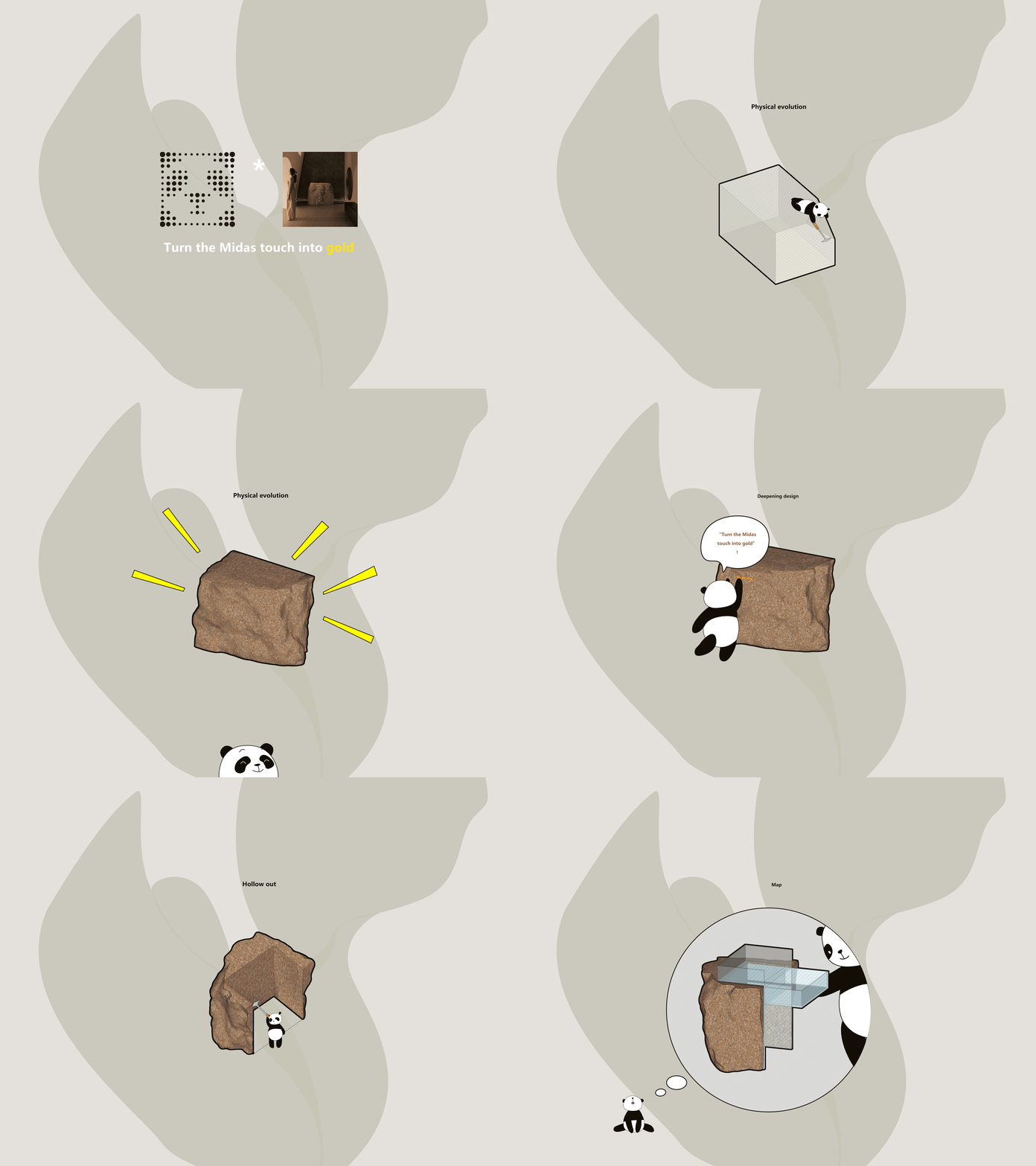
01点石成金 Turn stone into gold by touching
位置:入口处吧台 Location: the bar at the entrance
在自然的进化与演变中,“石”是时间流动的见证者,也是参与者,是自然万物中不可分割的一部分。通过艺术表现,在沉淀已久的“石”雕刻上人类文明中具有现实意义的“金”。
装置表面经过精心打磨,触感光滑细腻,仿佛触摸着一块真正的石头。金的部分光滑而温暖,石的部分凉爽而坚硬,这种触感上的对比,仿佛置身于自然中的小溪边,触摸着自然的永恒之美。
“Stone”, an inseparable part of the world, witnesses the flow of time in the process of evolution. Gold,a chemical element that has been endowed with realistic meaning in the process of civilization, is portrayed on the stone in an artistic manner. The surface is meticulously polished to leave the skin feeling smooth, as if touching a real one. The smooth and warm feeling of gold and cool and solid feeling of stone form a constrast, as if you are setting by the creek, feeling the eternal beauty of nature.
▽设计草图 Design sketch
▽设计演绎 Design deduction
听觉(Hearing):通过耳朵感知声波的振动,使我们能够听到声音和声乐的音调、音量和节奏。听觉让我们能够感受到世界的声音和音乐。
Hearing: we are able to hear sounds, tones, rhythm by listening to the frequency of the acoustic wave. Hearing enable us to appreciate the sound of nature and music of the world.
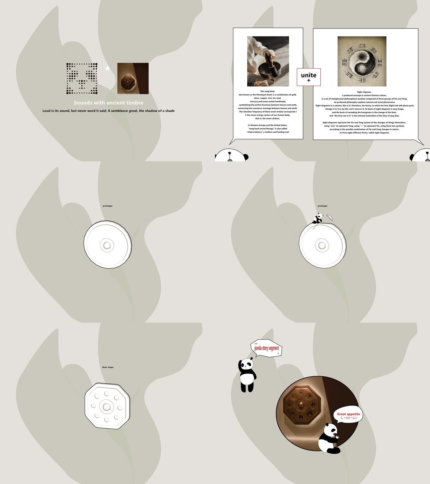
01古色之音·希声 Ancient tones
位置:入口处钵 Location: Ōryōki at the entrance
“大音希声,大象无形”追求的是艺术情感表达最高境界,即“此时无声胜有声”。器型由疗愈之器“钵”结合周易八卦演变而来,周易八卦的文化思想与禾缦的精神内核在禾缦空间载体中无意达到高度的契合。肌肤与器物碰撞之声净化掉内心的杂音,让身体和心灵得到瞬刻的放松,象征着“大音希声”的哲学思想,让人们体会到内在的空灵和内心的宁静。以简约的形式传递出深远的精神内涵,引导着人们超越形式,感受到宇宙之大与内心之静
In the pursuit of the highest level of artistic emotional expression, there is a saying, “The greatest sound is silence, and the greatest form is formless.” The prototype of the healing instrument “Ōryōki” at the entrance is eight trigrams in the Book of Changes (Yijing). The core of Yin Yang and the spiritual essence of Hoormem unintentionally achieve a profound harmony within the space. The inner noise is purified when skin touches the objects, relaxing the body and mind instantly. The deep spiritual connotations hidden within the minimalist form guides individuals to transcend mere forms and experience inner peace and the vastness of the universe.
▽设计草图 Design sketch
▽设计演绎 Design deduction
项目名称:禾缦Hoormem
项目地址:福建
项目面积:1000㎡
首席设计师:蔡泫娜 / 林嘉诚
设计师公司:寸匠熊猫NANA团队
设计网站:www.cunpanda.com
设计时间:2022.01
完工时间:2023.05
品牌设计:SAC 陈紫阳
插画设计:陈潇滢
装置设计:青骑士艺术社
灯光设计:光合共筑
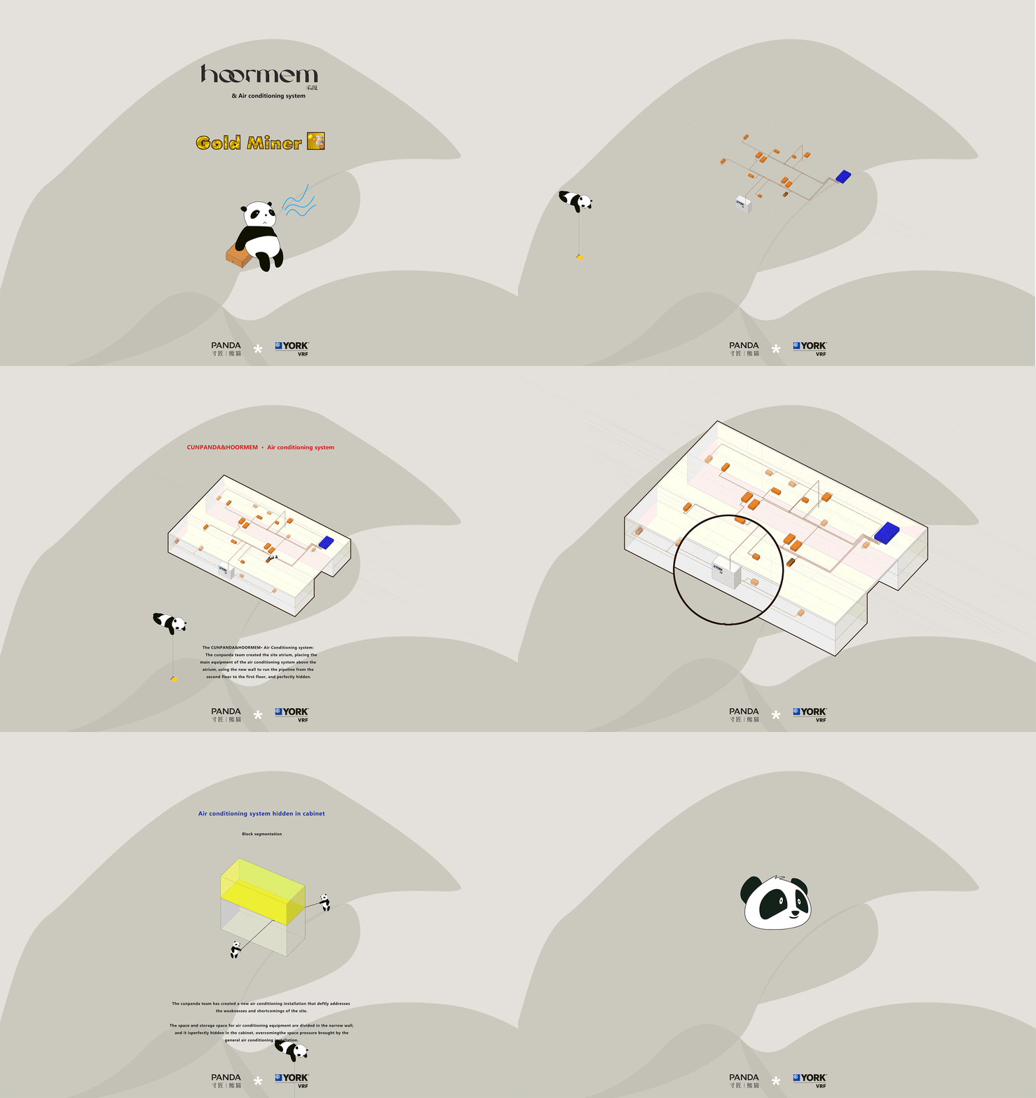
暖通设计:约克VRF中央空调
物料商:有料甄选 / 贝莱维斯艺术涂料 / 德国高仪(漳州) / 厦门聚合创设
摄影师:刘星昊 言隅建筑空间摄影 羽视觉
视频制作:1988 摄影工坊
Project Name: 禾缦Hoormem
Location: Fujian
Area: 1000㎡
Chief Designer: Cai Xuanna / Lin Jiacheng
Design Company: CUN PANDA NANA
Website: www.cunpanda.com
Design Time: 2022.01
Completion Time: 2023.05
Brand Design: Chen Ciyoung – SAC
Illustration Design: Chen Xiaoying
Installation: Knight Art Club
Lighting Design: Vidlux&Crisman
HVAC design: YORK VRF
Material Suppliers: Youliao Selection / Bella Vista/ GROHE (Zhangzhou) / Xiamen Juechuan Architectural Decoration Design Co., Ltd.
Photography: Liu Xinghao-INSPACE Feature Vision
Video: 1988 Photography Workshop
“ 在冰冷严苛的城市里打造一处柔软治愈之所,让步履匆匆的都市白领步入其间,褪去假面与铠甲,回归身体最本真柔软的状态。”
审稿编辑: Maggie
更多 Read more about: 寸匠熊猫设计事务所












0 Comments