本文由 会筑景观 授权mooool发表,欢迎转发,禁止以mooool编辑版本转载。
Thanks Collective Landscape Design for authorizing the publication of the project on mooool, Text description provided by Collective Landscape Design.
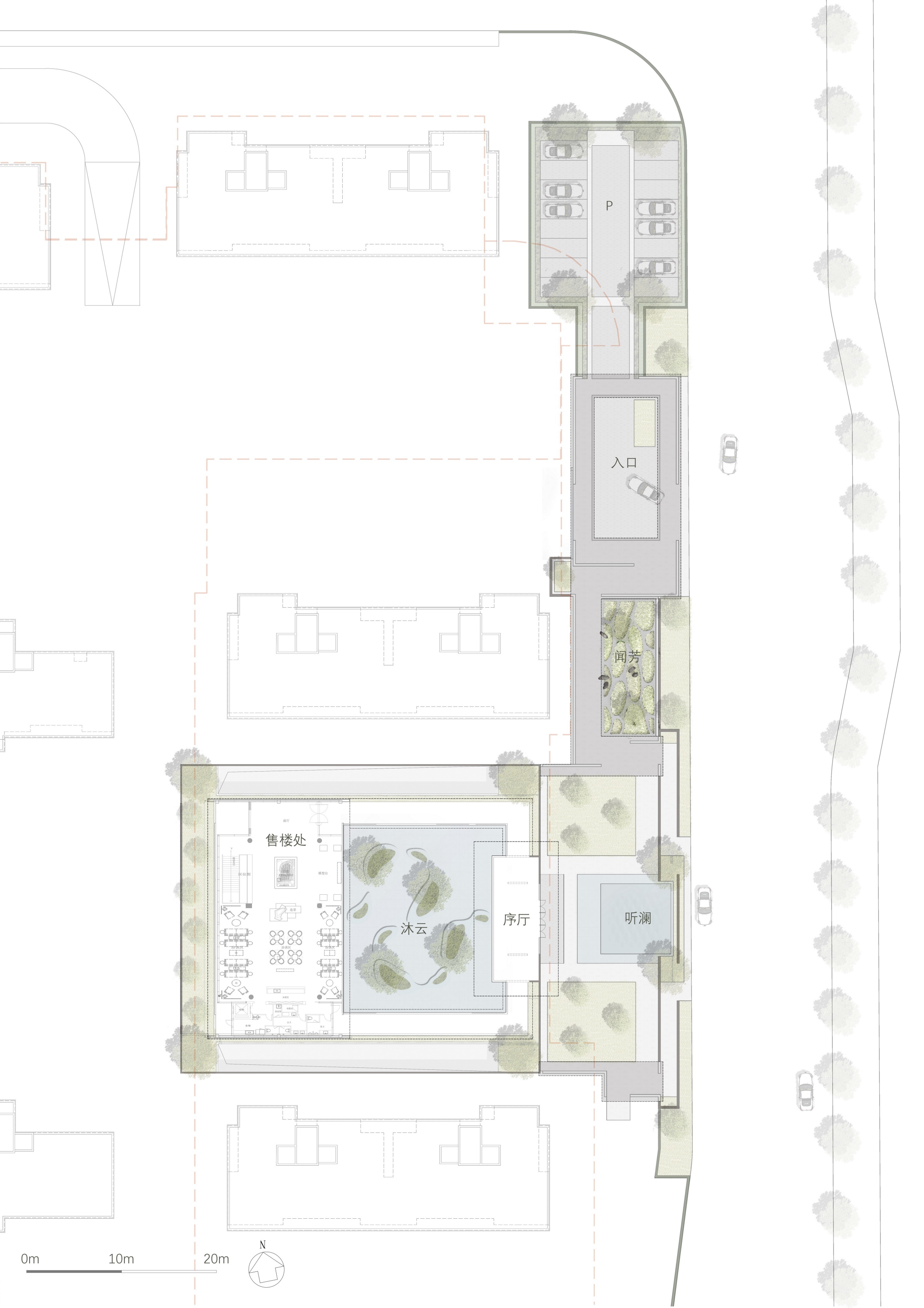
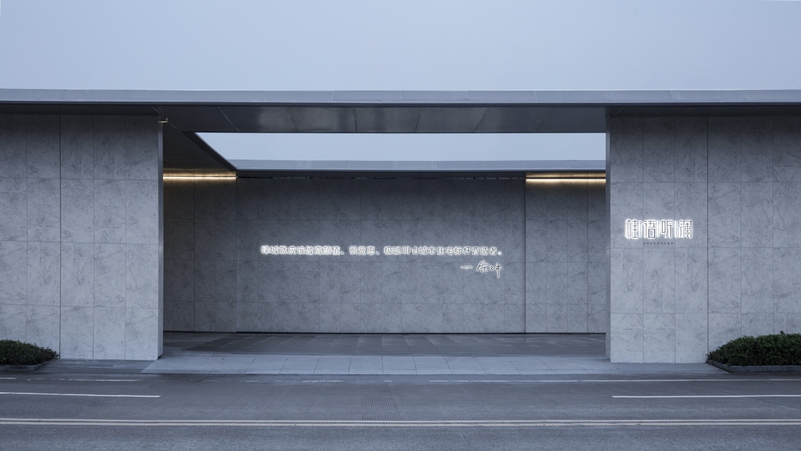
会筑景观:刚接触这个项目时了解到这是绿城在永康首个住宅项目,希望将绿城精致典雅的生活美学引入永康。真正着手设计时,发现留给景观的空间非常有限:西侧大区施工界面至道路边线一段宽仅15m,长约120m的狭长空间。而在其中,我们需要建立人与生活美学体验的连结。
Collective Landscape Design:This is Greentown’s first residential project in Yongkang is expected to bring the refined and elegant life aesthetics of Greentown into Yongkang. The space left for the landscape is very limited. There is merely a long and narrow space with a width of only 15 meters and a length of about 120 meters from the edge of the main construction area to the side of the road. The challenge is to establish a connection between people and the aesthetic experience of life.
▼项目视频 video
从感知出发 Start from perception
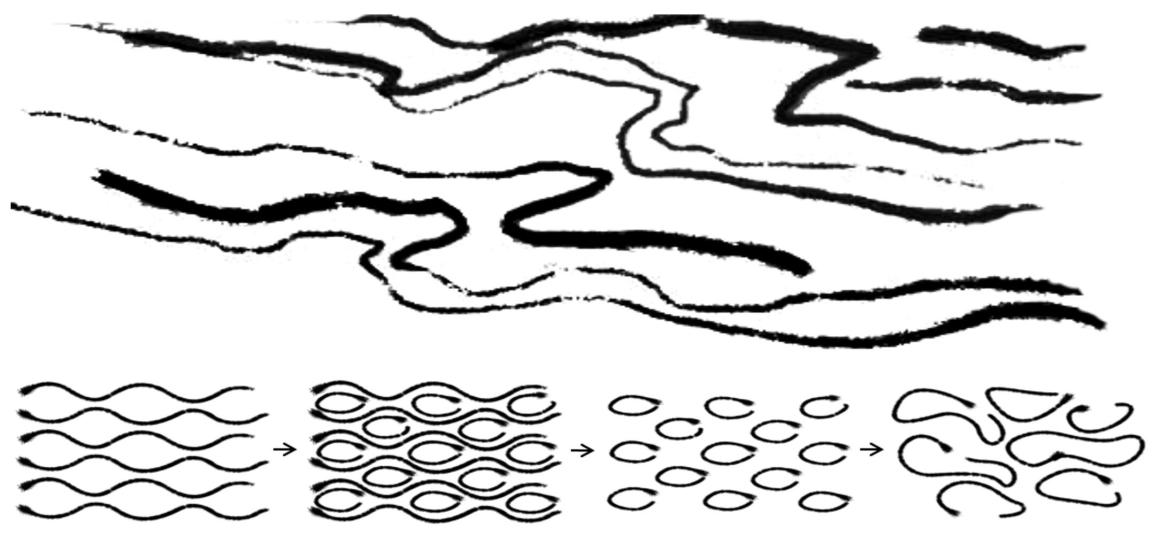
人与景观的连接我们希望不仅是在视觉上,还希望通过嗅觉、听觉、触觉等,我们从案名“桂语听澜”中提取“听澜”两字作为我们的概念起源,从五感角度去考虑人的空间感知,并借以“澜”的形态抽象,融入芳香植物(嗅觉)、高低的跌水(听觉)、光影的静水中庭(视觉)。
People and the landscape are not only visually connected but also from multi-sensory aspects such as smell, hearing, touch, etc. We extract the word “Tinglan” from the project name “Guiyu Tinglan” as inspiration to consider people’s spatial perception from the five senses. The abstract image of “Lan” incorporates the aromatic plants (olfactory), water cascading (hearing), light, and shadow in the still water courtyard (visual).
▼“听澜”概念形态演变 The evolution of the concept of “Ting Lan”
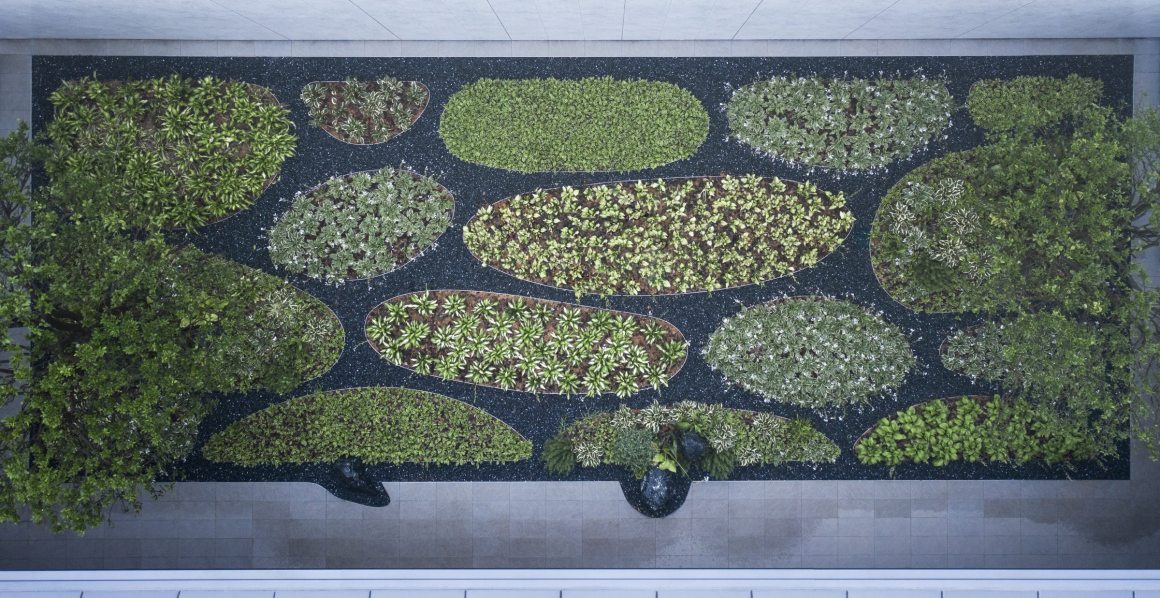
▼闻芳庭院 Wenfang Courtyard
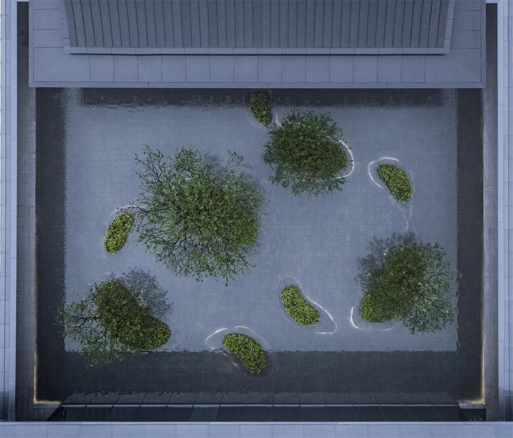
▼沐云水庭园 Muyun Garden
空间|空间 Space
为什么又是连廊?考虑到展示区1-2年的使用年限,届时必定伴随着西侧高层住宅的施工,我们希望重新建立一个顶界面,屏蔽施工的影响。同时由于用地的限制,顶界面能有效地丰富空间的层次,所以连廊成为了一个较优的选择。
Why there should have a corridor? Considering the temporary function of the exhibition area (1-2 years), it will be accompanied by the construction of high-rise residential buildings on the west side. We hope to re-establish a screen to shield the impact of construction. At the same time, due to the limitation of land use, the top screen can effectively enrich the spatial layers, so the corridor has become a better choice.
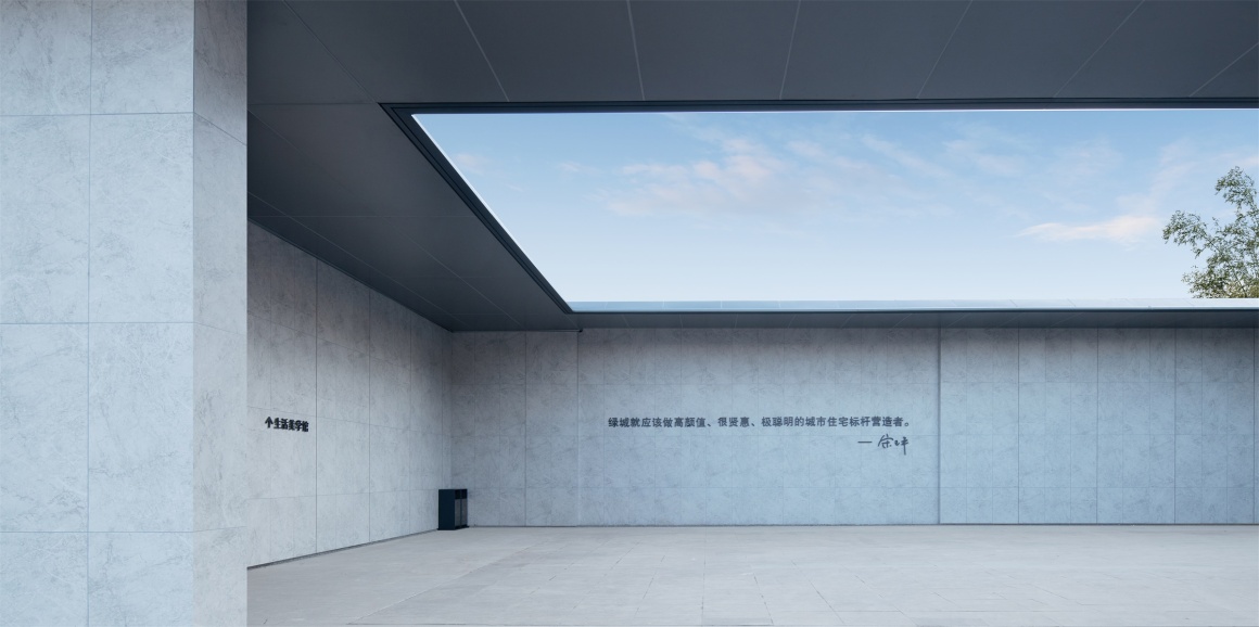
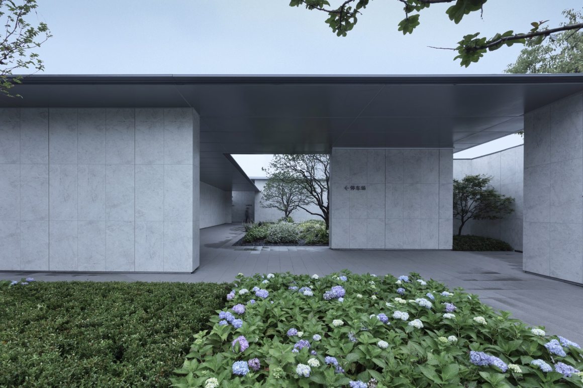
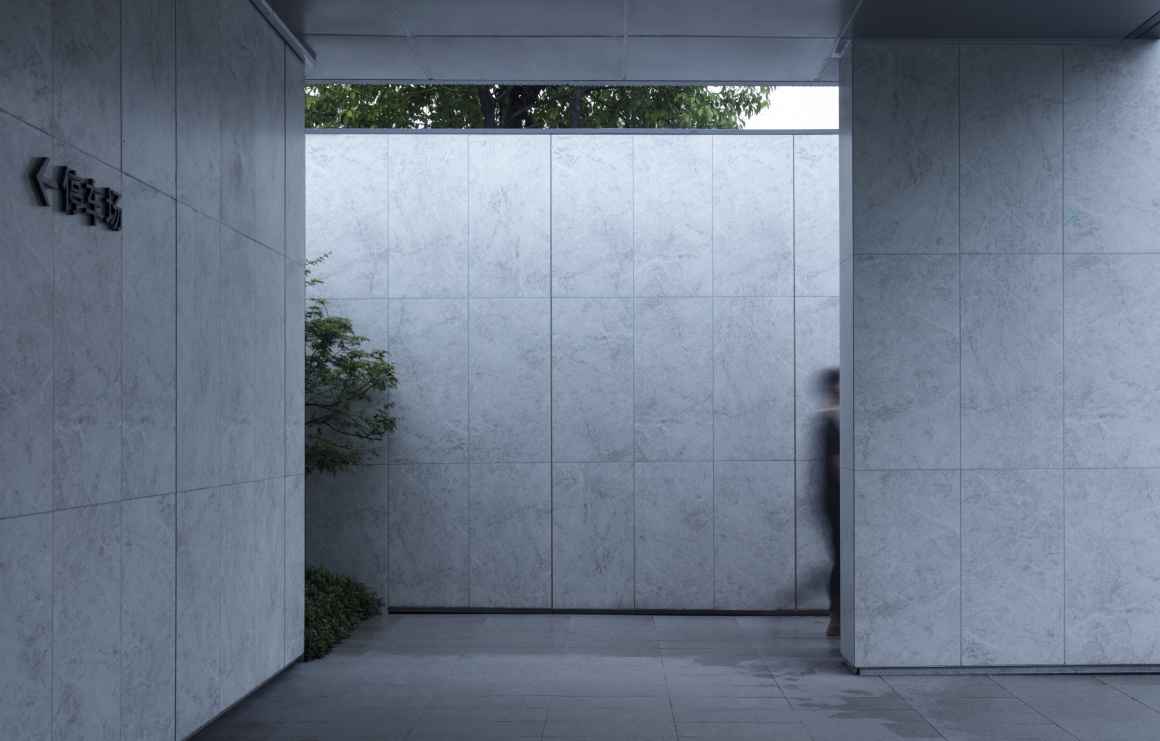
我们希望空间之间尽量没有完全固态化的边界(或者说是实体能触摸到的边界),空间感知是随着人的动态变化而改变的。原本场地空间是被建筑固定(序厅与售楼处),通过空间划分来建立景观空间层次,这种划分有可能是一片地面材质的变化,有可能是两棵乔木,或者是一片顶棚,是人在走近建筑或者是远离建筑的时候,都拥有舒适的空间尺度。
We don’t want objective boundaries or boundaries can be touched. The perception of space changes with the dynamic changes of people’s movement. The site was limited by the building (the prologue hall and the sales office), and the sequences of landscape space were established by the division of space. This division may be a change of the ground material, plantings, or a shield of the roof. People have a comfortable spatial scale when approaching or walking away from the building.
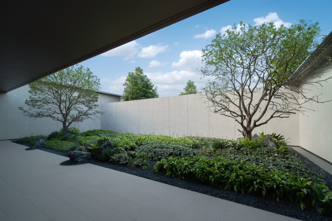
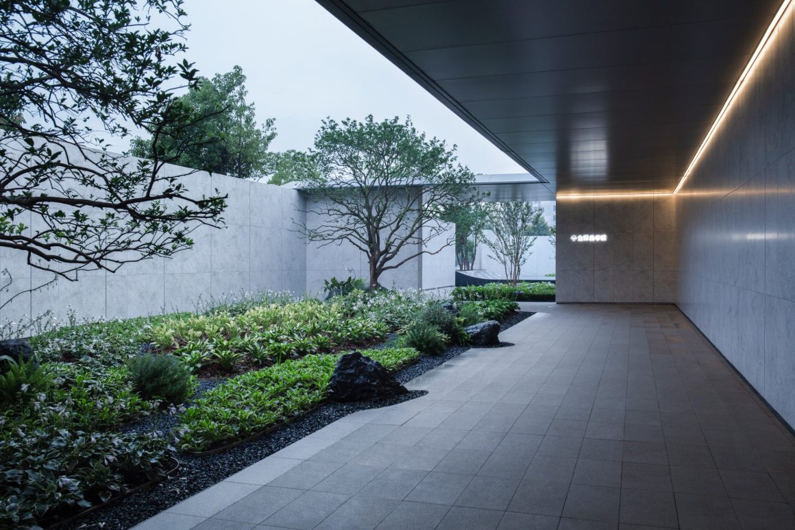
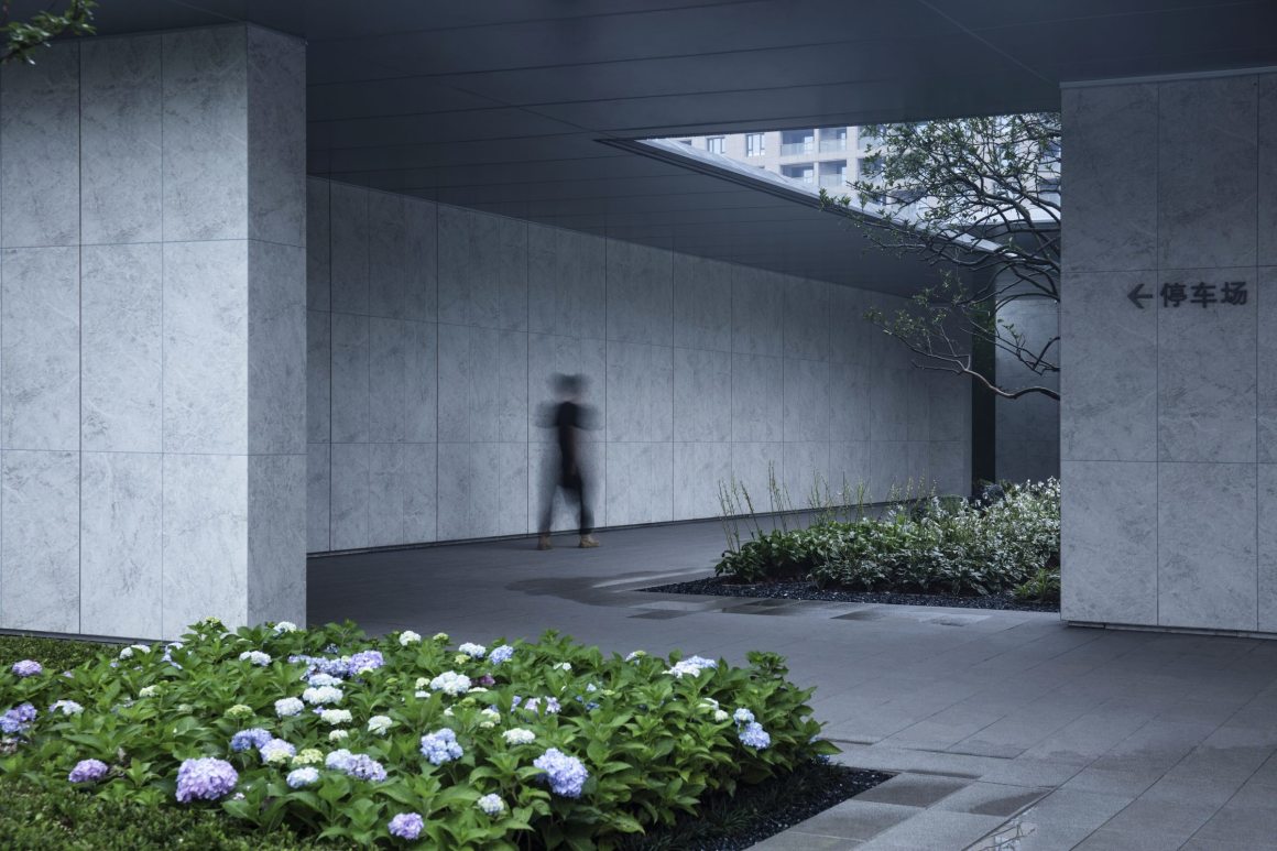
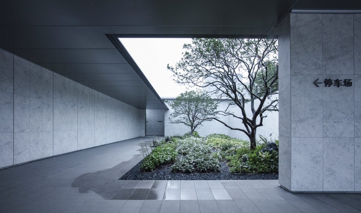
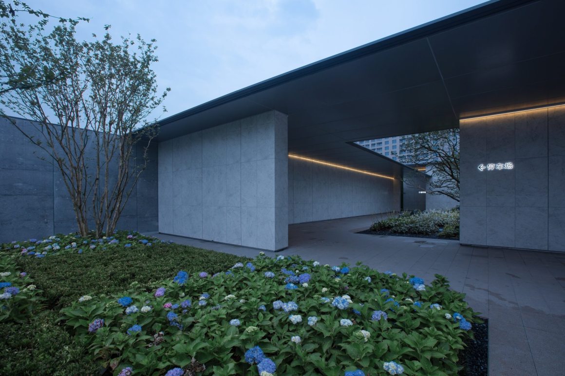
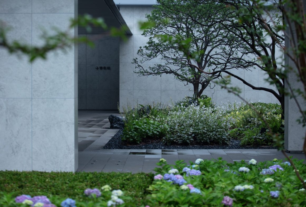
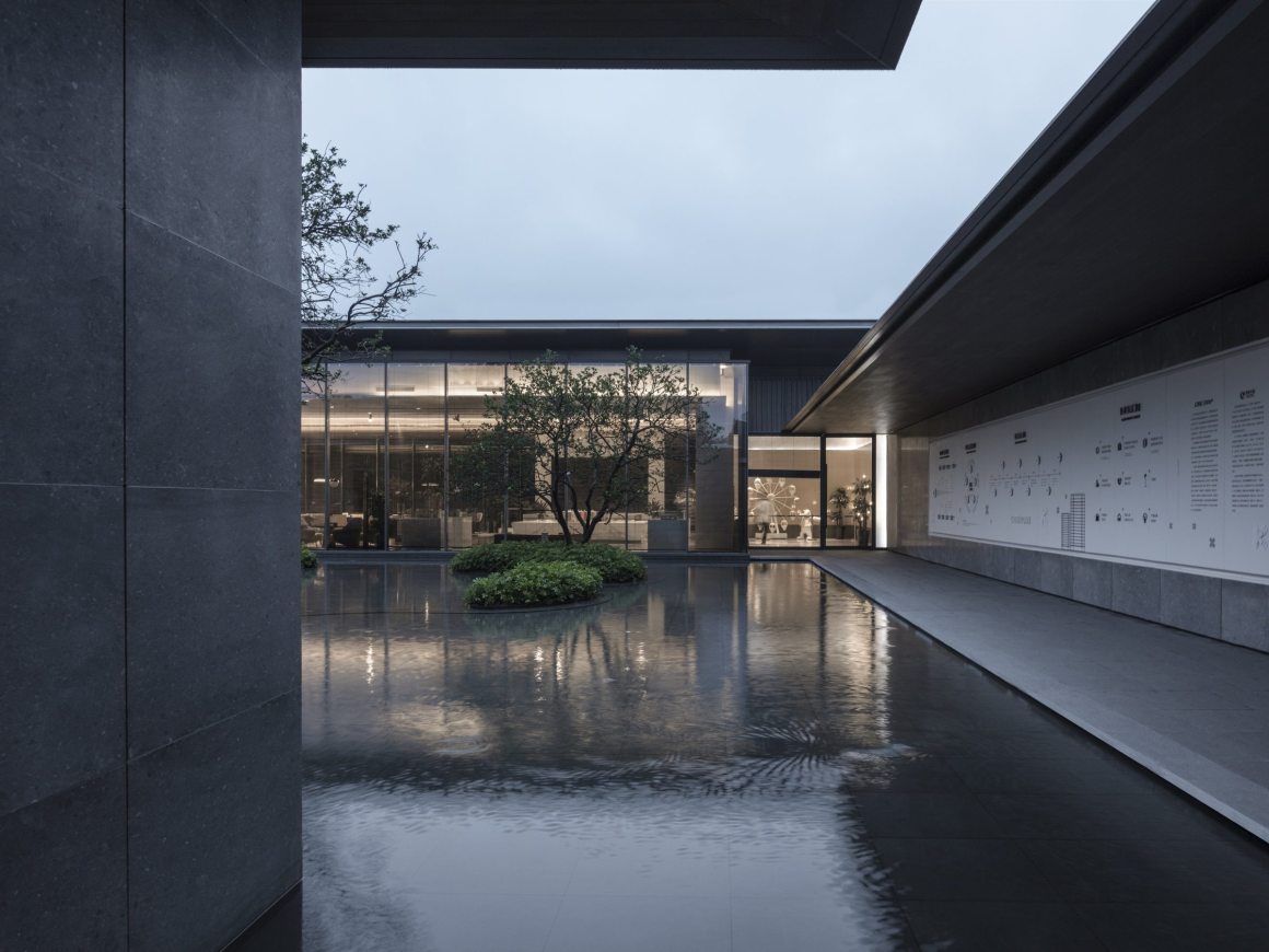
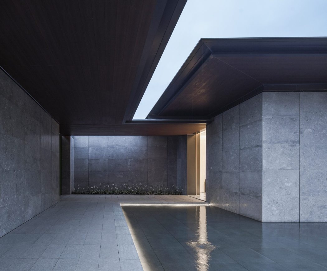
我们设计“闻芳”作为中间过渡的庭院空间。顶廊与片墙围合形成灰空间,加上芳香植物种植形成相互渗透的院落空间,庭院中每个种植小土丘坡度进行细节调整,并丰富高差变化与植物配置相配合。置石在施工阶段现场调整,打破廊道铺装边界,增强空间之间的联系。
“Wen Fang” as a transitional courtyard space. The top corridor and the wall are enclosed to form a gray space with the aromatic plants to form an interpenetrating courtyard space. The planting mounds with gentle slopes are planted with selected species in different height layers to enrich the spatial experience. The stone installation is adjusted on-site during the construction phase to break the corridor’s paving boundary and enhances the connection between spaces.

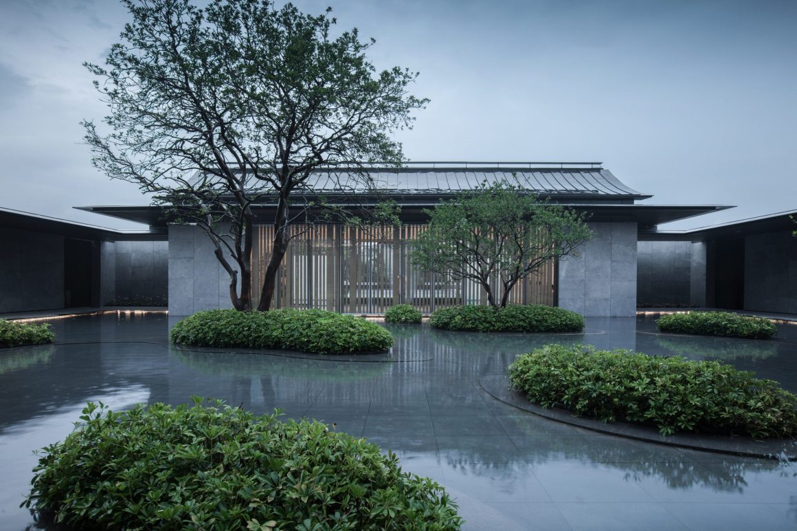
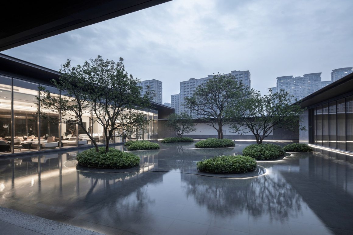
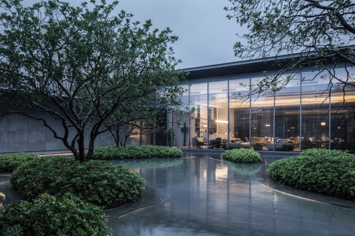
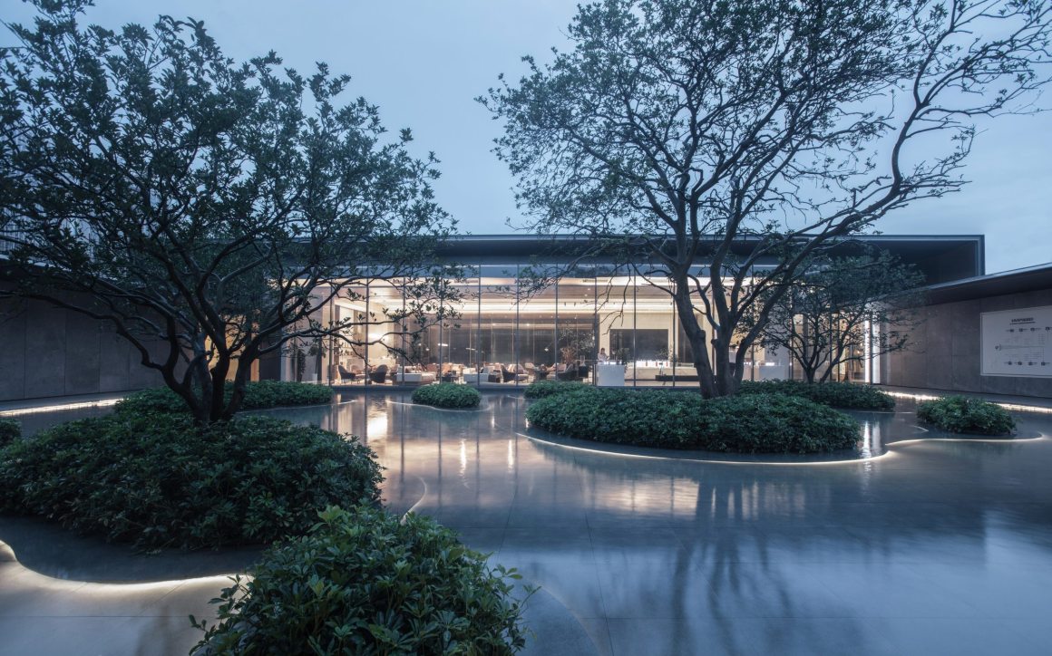
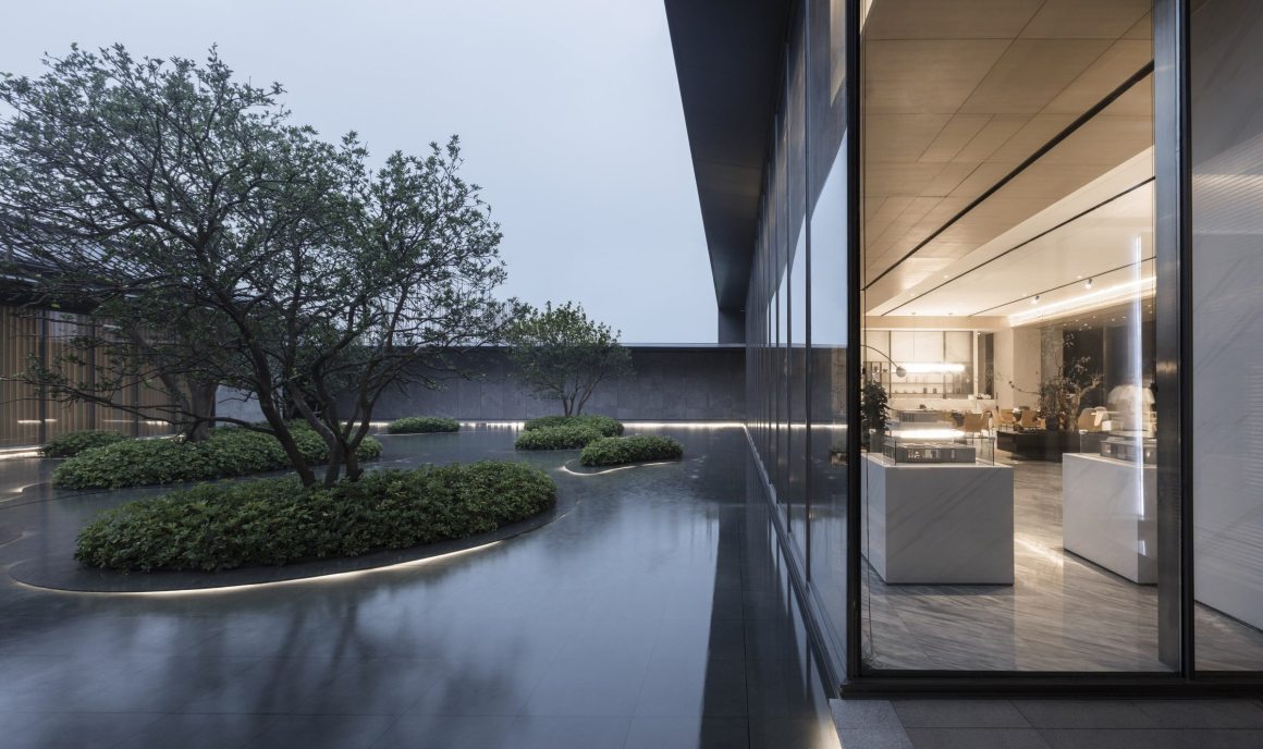
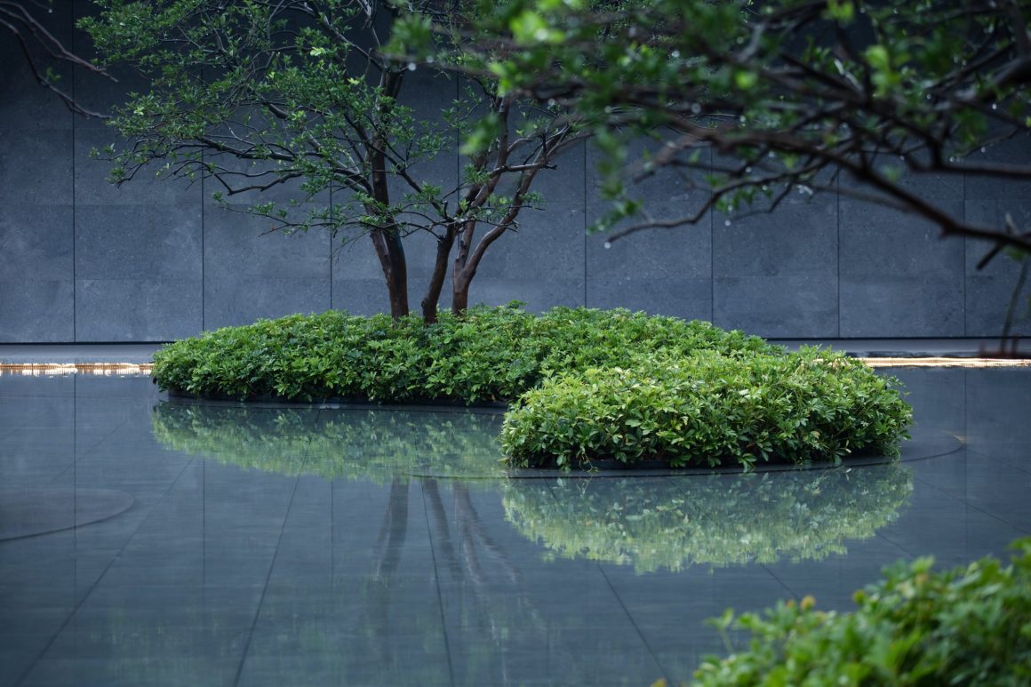
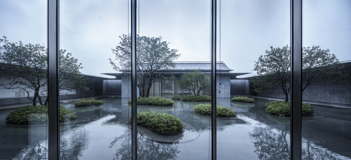
“沐云”水庭院,最初受到了永康当地的方岩地质景观启发,以植物拟山景,以水拟湖景,希望能以小见大表达本土文化。
The “Muyun” water courtyard was inspired by the local Fangyan geological landscape in Yongkang. The design uses plants to imitate mountains, uses water to echo lake, to express the local culture in the micro-landscape.
▼庭院中种植台,潜藏于水下,加上光影营造漂浮感 The planting platform in the courtyard is hidden under the water. The light and shadow create a floating effect.
从展示区到大区 From the display area to the main area
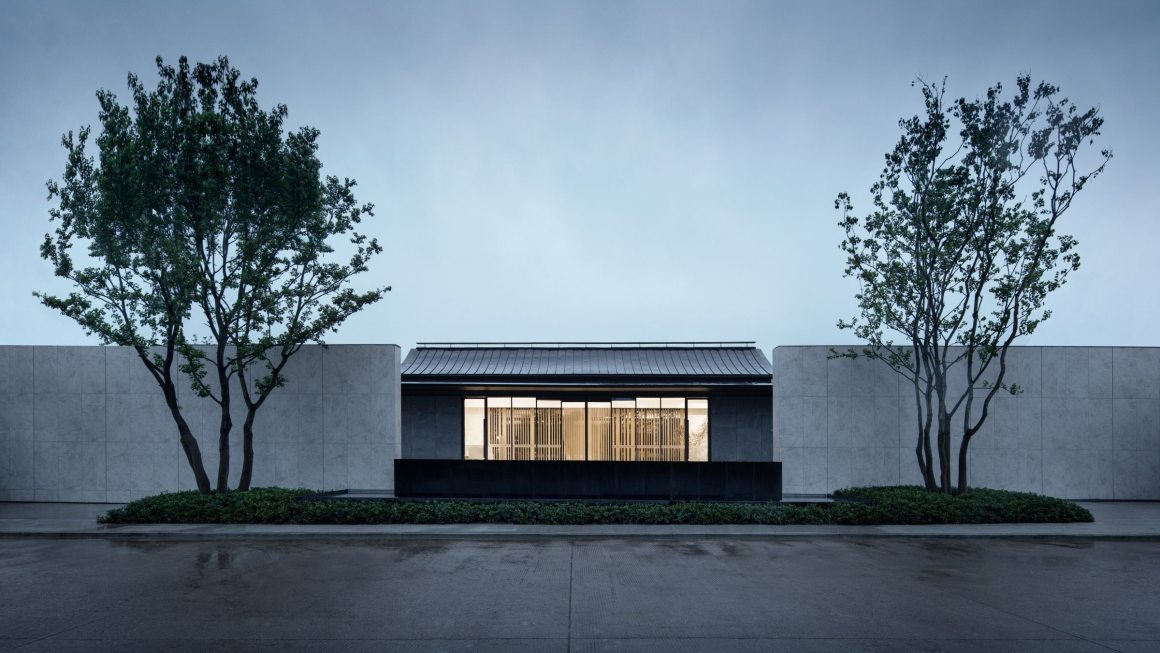
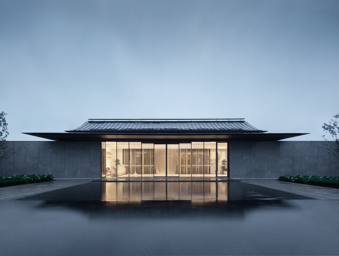
序厅、售楼处与其围合而成的沐云庭院将永久使用,在大区交房后,售楼处将成为社区会所,序厅则作为社区东入口门厅使用。
The prologue hall, the sales office, and the enclosed Muyun courtyard will be used permanently. After the delivery of the main area, the sales office will become a community club, and the prologue hall will be used as the east entrance hall of the community.
▼未来会所视角 The perspective of future clubs
▼改造后序厅将作为未来大区东入口门厅 The preface hall will be used as the entrance hall of the east entrance of the future district.
▼细节设计 Detailed design
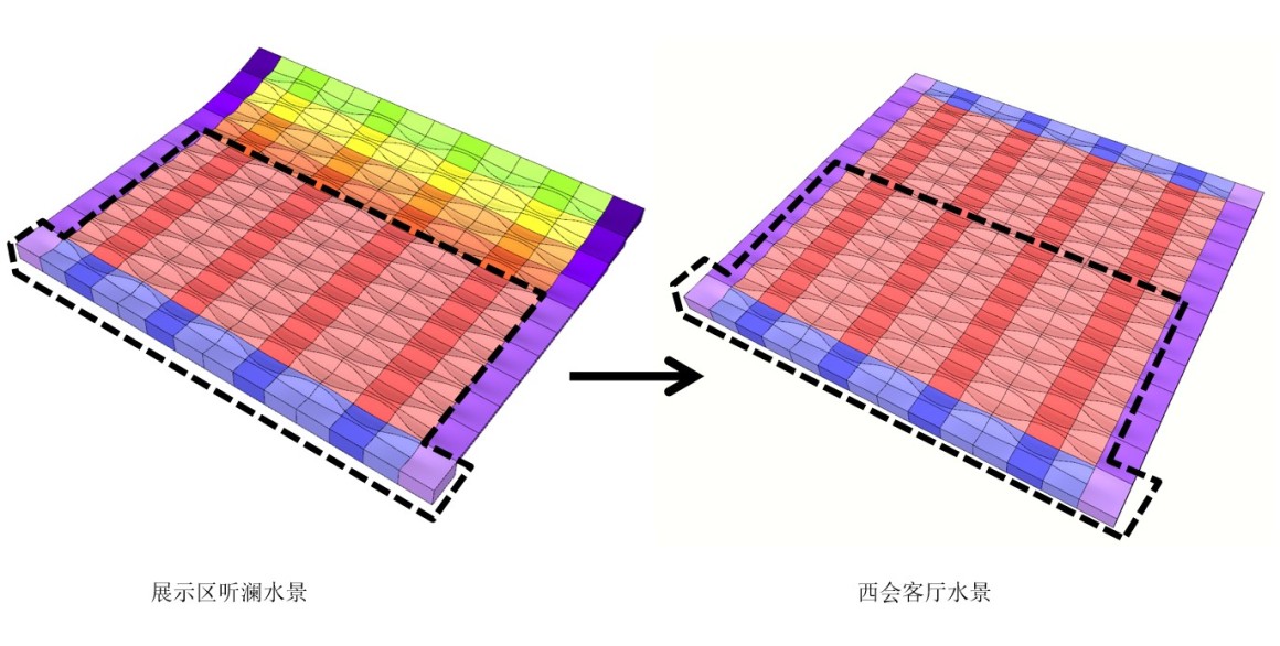
▼展示区听澜水景和西会客厅水景 Water feature analysis
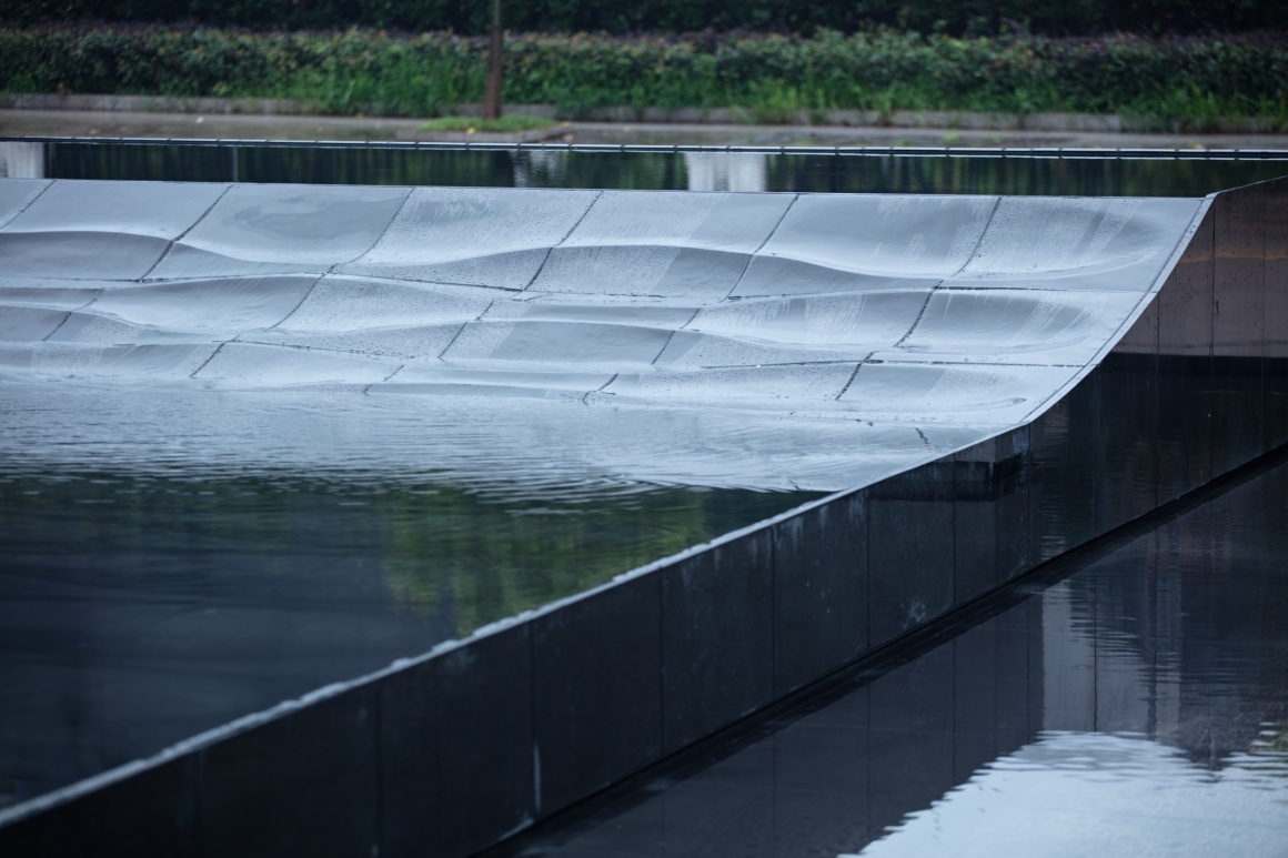
听澜跌水与建筑坡屋顶相呼应,雕塑细部是“波澜”抽象而成。共加工18种模块,经过拼接,抛光打磨最终成形。超过60%的异形加工石材将会在未来大区中重复使用,其中包括闻芳庭院的五块置石,它们将在大区架空层中再次利用,这将有效地避免了石材的浪费,当然更重要的是能直观地在未来大区中延续展示区的设计美学。
The falling water of Tinglan echoes the sloping roof of the building, and the details of the sculpture are abstracted from “waves”. A total of 18 types of modules are processed, spliced, polished. More than 60% of the special-shaped processed stone will be reused in the future, including the five stones in the Wenfang courtyard. They will be recycled in the overhead layer of the main area, effectively avoiding the waste of stone. The important thing is to intuitively continue the design aesthetics of the display area in the future.
项目名称:绿城永康桂语听澜生活美学馆
建成时间:2020年6月
景观设计:会筑景观
设计团队:张浩青、刘琨、滕婉、倪恺
建筑设计:九米建筑
室内设计:HWCD
景观施工单位:森科园林
地址:浙江永康
业主:绿城集团&交投集团
摄影:未特别注明照片为直译建筑摄影
Project Name::Greentown Yongkang Guiyu Tinglan Experience Area
Completion Time: June 2020
Landscape Design: Collective Landscape Design
Design Team: Zhang Haoqing Zhang, Kun Liu, Wan Teng, Kai Ni
Architectural Design: 9m design
Interior Design: HWCD
Landscape Construction: Senke Garden
Location: Yongkang, Zhejiang, China
Clients: Greentown & Zhejiang Communlcations Investment Group
Photo Credits : Photos were taken by Archi -Translator if no special indication
更多 Read more about: 会筑景观






廊架下面的种植 杂,乱,为了套概念而去套,人视角一言难尽,水景铺砖颜色太浅 镜面水效果不好,水景里的种植池更是不知所云,看不懂是个啥 也没啥美感存在,甚至感觉有点多余。如果不是建筑还可以这个景观真心看不到啥可以学习的地方 灯光也丑