本文由 深圳市自组空间设计有限公司 授权mooool发表,欢迎转发,禁止以mooool编辑版本转载。
Thanks Zizu studio for authorizing the publication of the project on mooool, Text description provided by Zizu studio.
自组空间:项目位于蛇口新街与后海大道交汇处,作为市政公共绿化带兼社区的出入口,这里是社区居民每天进出的必经空间。
Zizu studio: The project is located at the intersection of Shekou New Street and Houhai Avenue. It serves as a municipal public green and the community entrance, the only space where residents walk in and out every day.


现状问题 Existed Issues
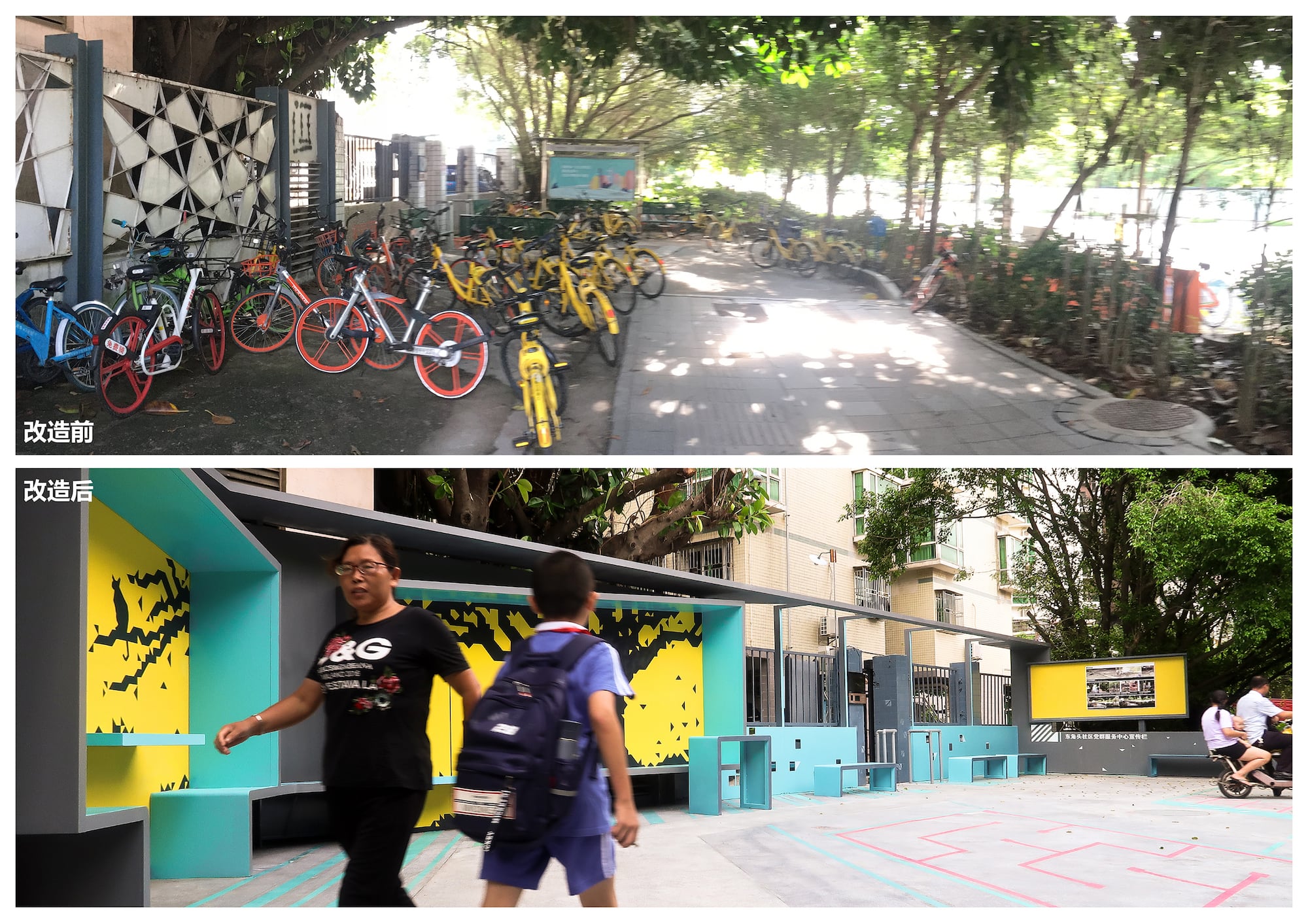
场地是一处内向而封闭的角落空间,场地外部边缘被绿化带完全隔开,从城市的界面难以被发现,
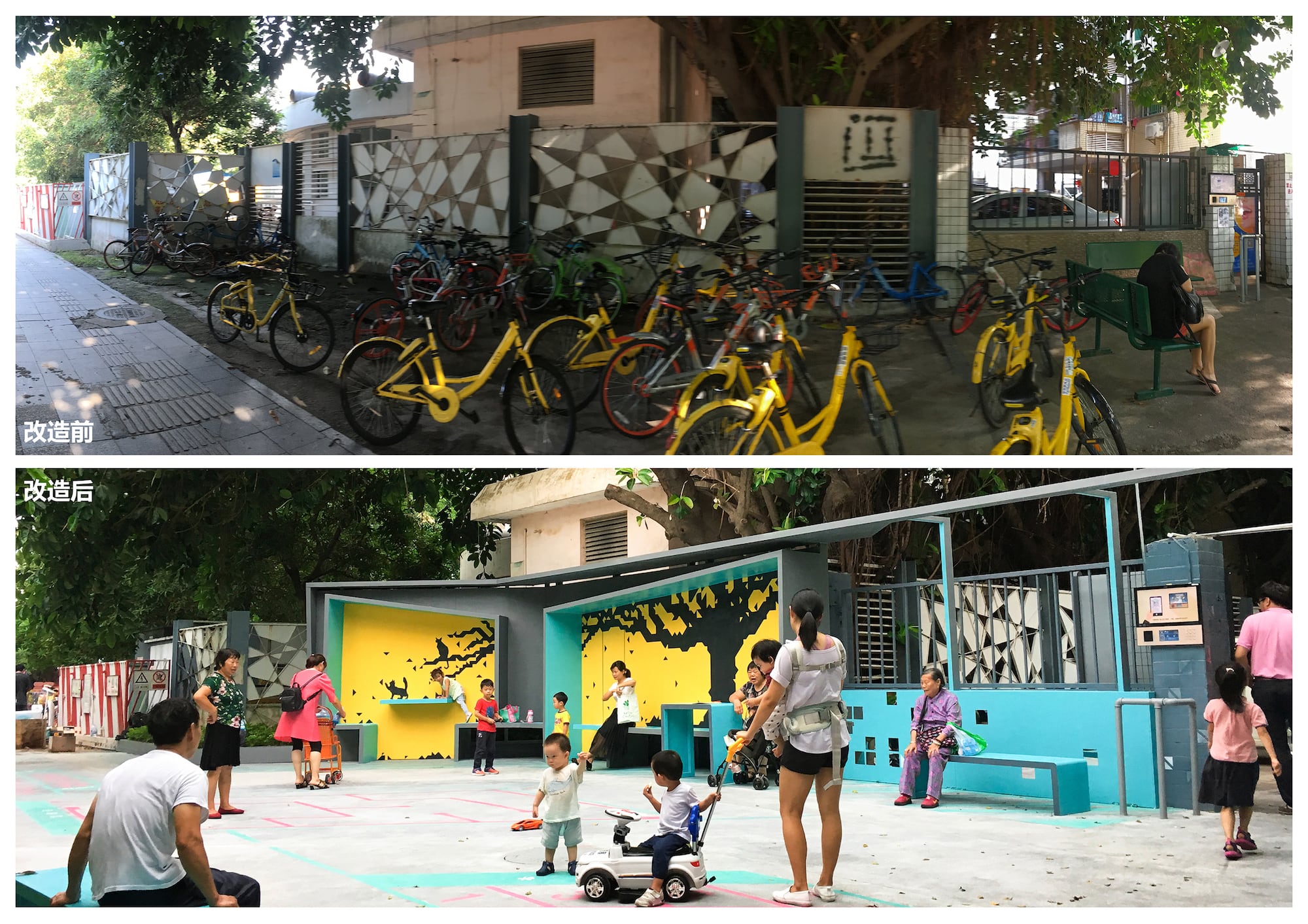
内部同时被管网柜、树木、围墙所包围,显得非常阴暗与消极,尤其上下班高峰期都被大量共享单车所占领,场地没能发挥更大的公共服务价值。。
The site was originally an inwardly closed corner space edged by green belts and was separated to be nearly an inaccessible space in the city.
The interior of the site was surrounded by pipe network cabinets, trees and walls. It was a very dim and negative space especially during peak hours when it was occupied by a large number of shared bicycles. The venue was not able to show its value as a public space.
▼改造前后 Before& after the reconstruction
设计概念:“定格的风景” Design Concept ” Captured Scenes ”
社区是80年代初建设的旧小区,有非常多的老人与小孩,但内部却非常缺乏活动空间,仅有的架空层及广场都成为了停车的区域,场地作为居民每天必经的场所,由于破旧及功能单一,大多居民在此匆匆而过,只剩零散的几个老人在此闲坐,小孩也无处活动。
The community is an old one built in the early 1980s. Now a large number of people and children are living here, but in the community it is not sufficient space for activities. The only overhead floors and squares have become parking areas. The site is in everyday routine of residents, yet there is rarely anyone stopping by because of the dilapidated and single-functioned decoration. Most people just rushed past here, only a few old people you could find sitting around, no space for children to play.
▼社区居民每天进出的必经空间 The necessary space for community residents to enter and exit every day

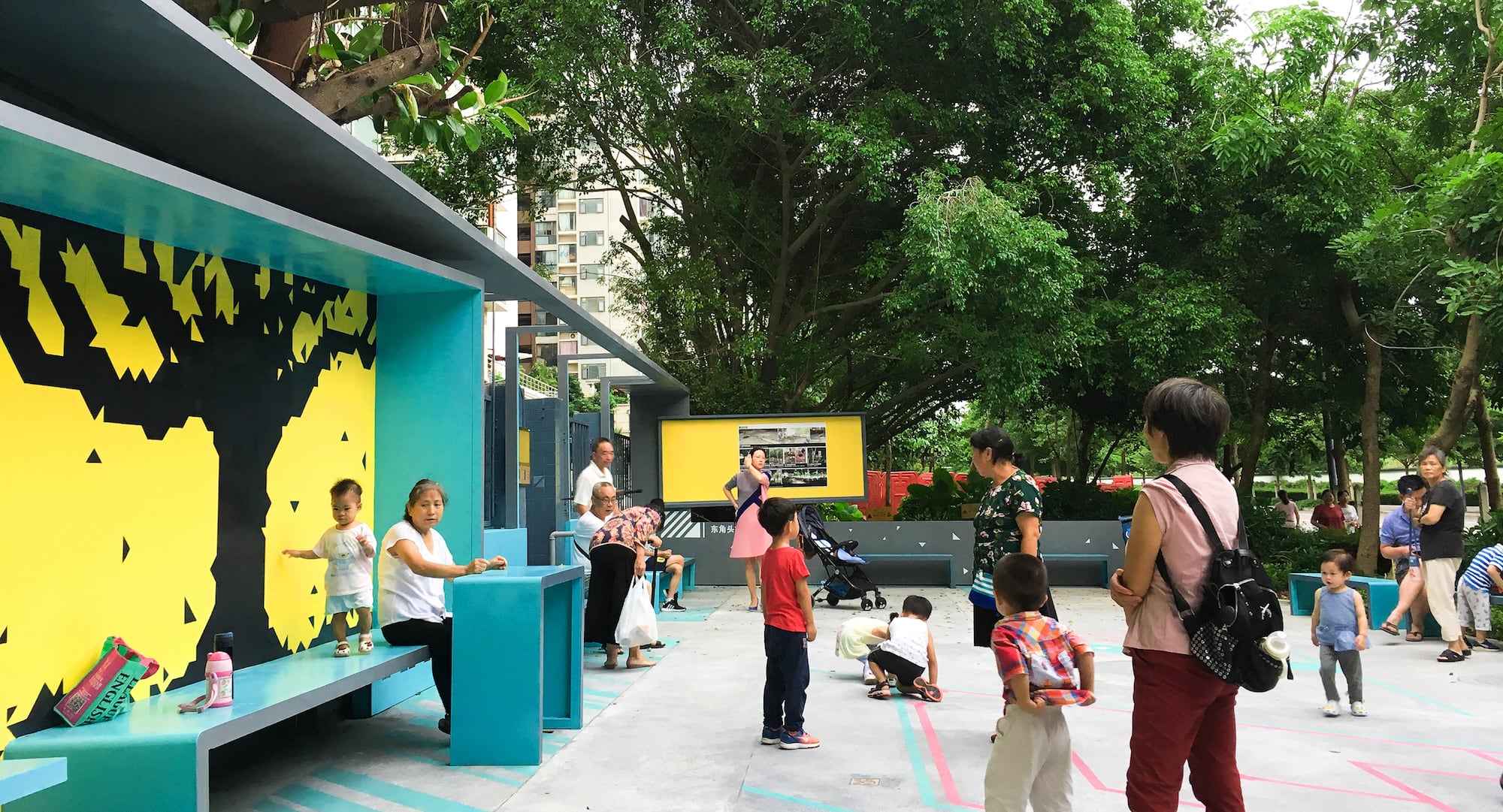
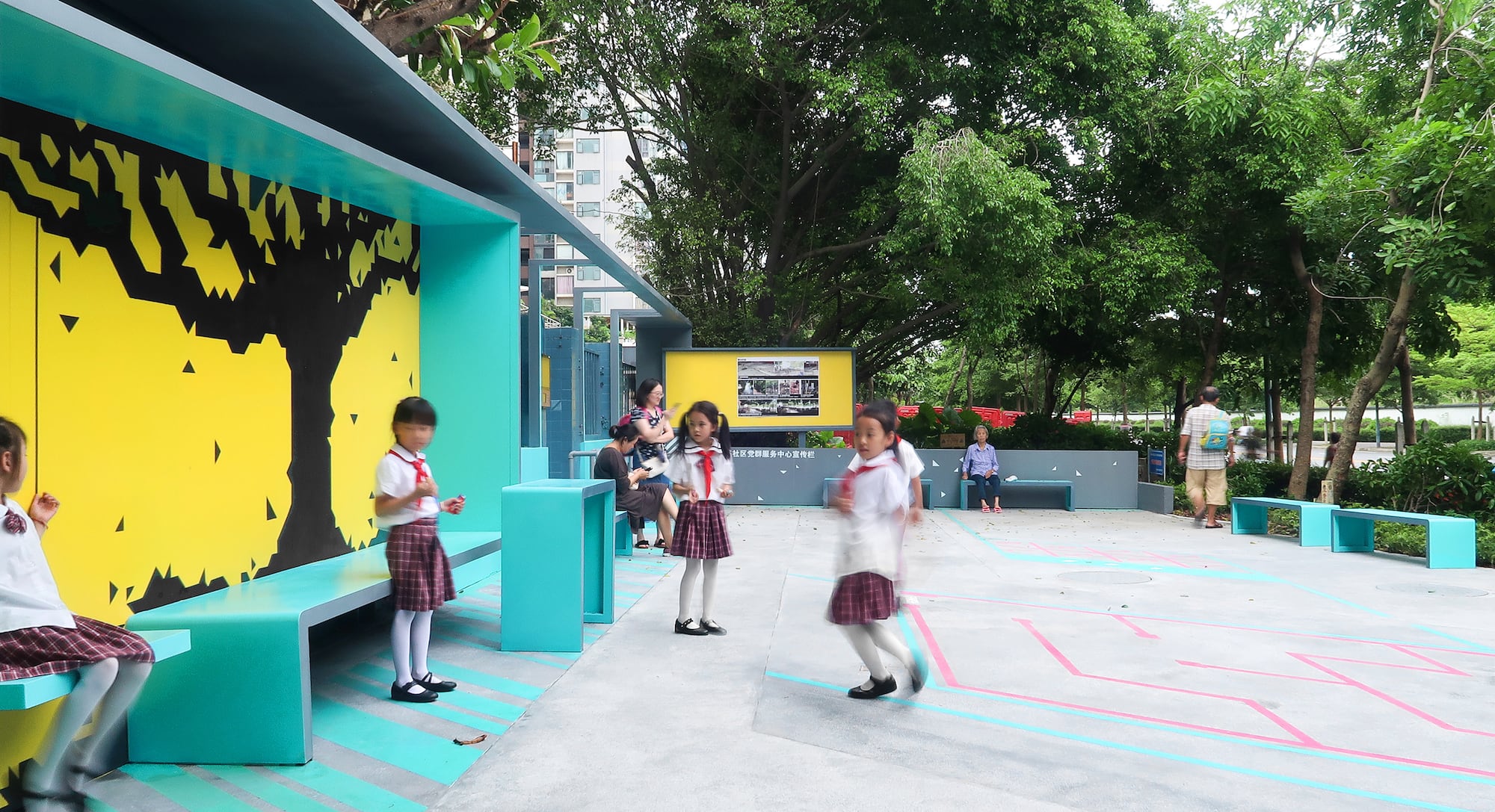
我们希望社区居民与场地产生互动,而不仅仅是匆匆而过的社区出入口广场,设计通过划分交通与停留的区域,在流动的空间内创造“定格的风景”,流动中的人群与被定格的风景,共同构成场地独特的记忆点,利用现状小区围墙植入一条连续的折廊整合空间,把稍纵即逝的风景定格在墙框内,而往来人群成为了动态的风景,被吸引,或停留,或行走,或闲座,或交谈,与背景墙框形成动态与静态交融的连续画面,也成为了城市界面的一抹色彩,从而改变场地原本功能单纯一且封闭的角落空间,成为供邻里聊天、闲坐等候、儿童片刻玩耍,来往人群休息的公共开放空间。
We hope that the venue will interact with residents, not just as an entrance to walk in and out in rush. By deviding the space into traffic and stopping areas, it creats a “Captured Scene” in a flowing space and the two elements together constitute a unique memory point of the site. A continuous corridor is implanted along the existing wall to integrate th space, then the fleeting scences are fixed in the wall frame, and the crowds become dynamic scenery, who are attracted to be staying, walking, sitting, or talking on the site, forming a continuous picture of dynamic and static blending with the background wall frame. The space becomes a touch of color in the urban interface, thus changing the original function of the venue and the closed corner space, becoming a public open space where neighbors chat, sit and wait, children play for a while, and also a stopping place for passers-by.
▼往来人群成为了动态的风景 The crowd has become a dynamic landscape
▼邻里聊天交流的场所 Neighboring chat and exchange place
设计内容 Design Details
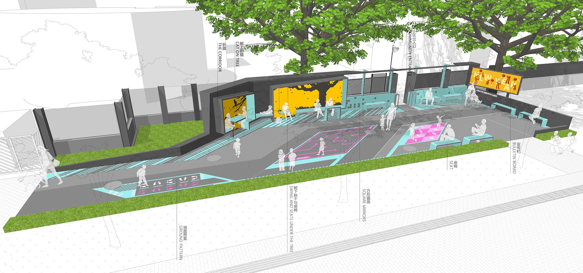
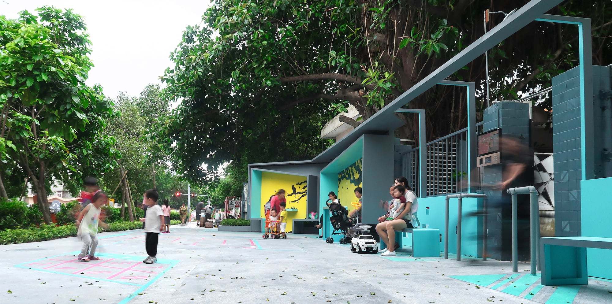
折廊:利用小区围墙的边界固定折廊减少占地空间 ,通过折廊串联绿化空间,休息空间、刷卡进出口与社区宣传栏,形成从地面起伏到框架连续的线性空间。
The Corridor:Using the boundary of community wall to fix the corridor in order to reduce the occupied space. The corridor links the green space, the relax space, card access entrance and the community propaganda column and forms a linear space from the ground to the continuous frame.
▼一条连续的折廊整合空间 A continuous folding corridor integration space
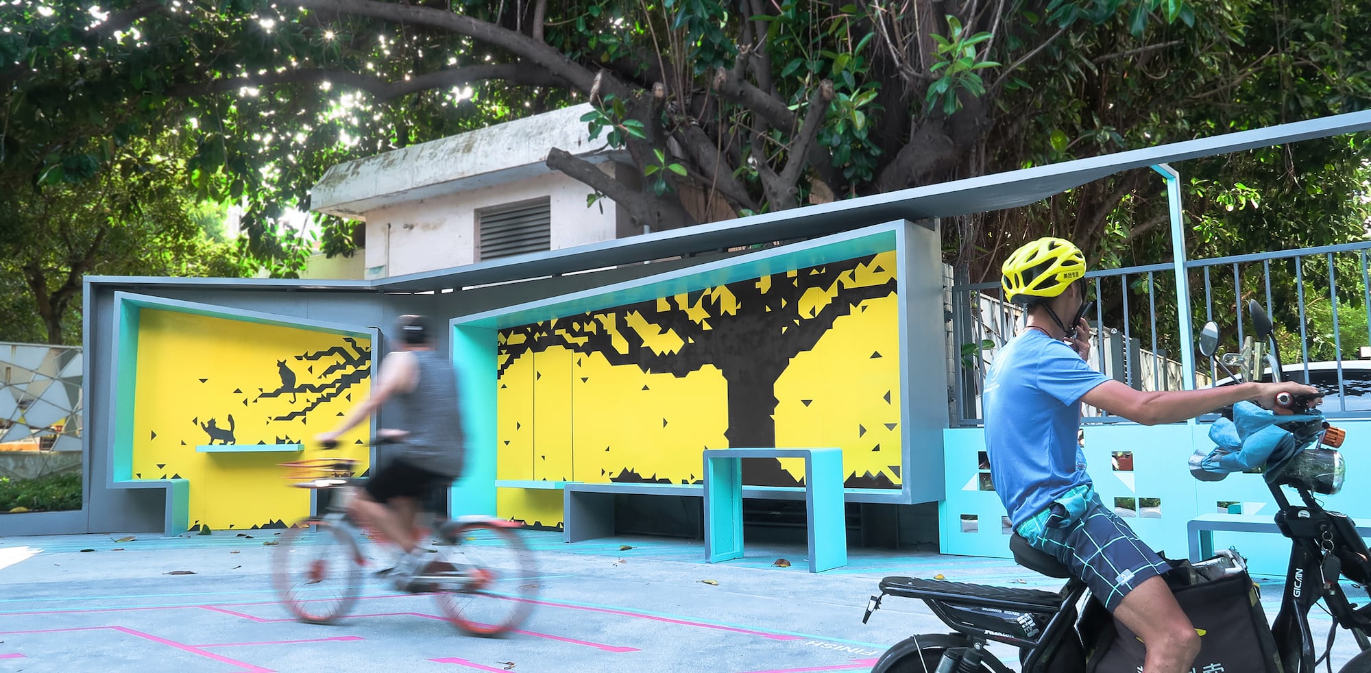
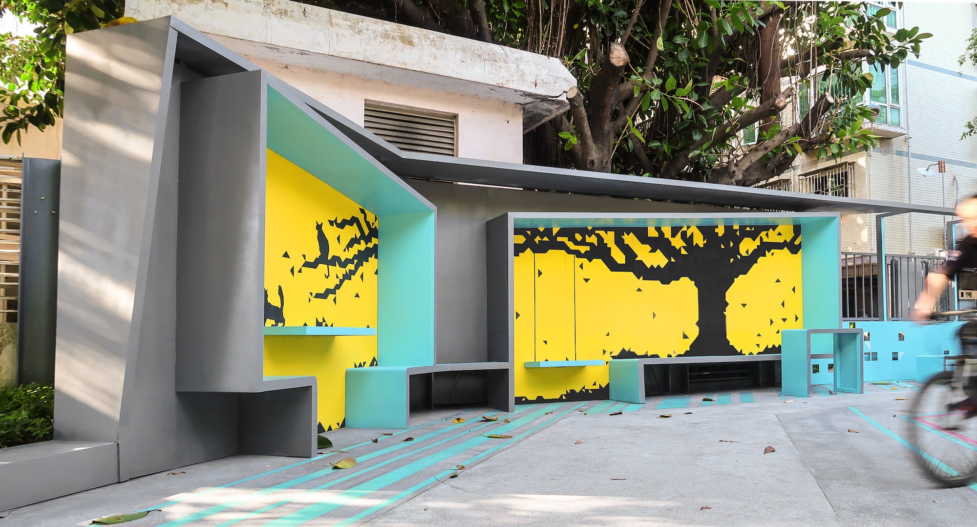
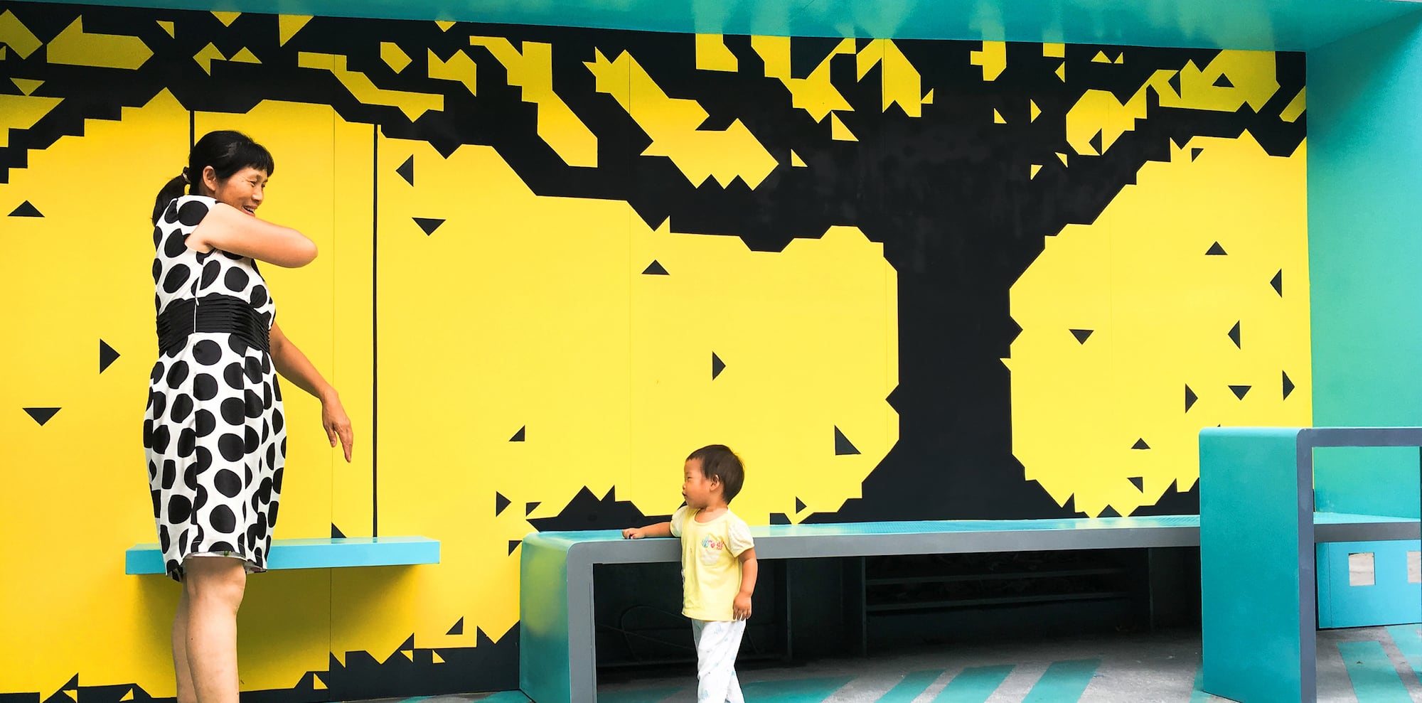
树下秋千与座椅:围墙背后有一颗多年生长的橡胶榕,大树为场地提供庇护与遮阴,但大树被隔壁地块围墙所隔离,失去完整的形象,把写意化的树干与落叶定格在墙框内,与背后现实的大树形成对比,把现实不可触碰的大树变成可接触的风景。
Swing and Seats under the Tree:Behind the wall is a rubber fig that has been growing for many years. The big tree provides shelter and shade for the site, but it is separated by the wall of the next block, losing the complete image. Animated trunks and fallen leaves are painted on the wall frame, creating contrast to the big real tree behind, turning the untouchable tree into touchable scenery.
▼树下秋千的意象 Image of the swing under the tree

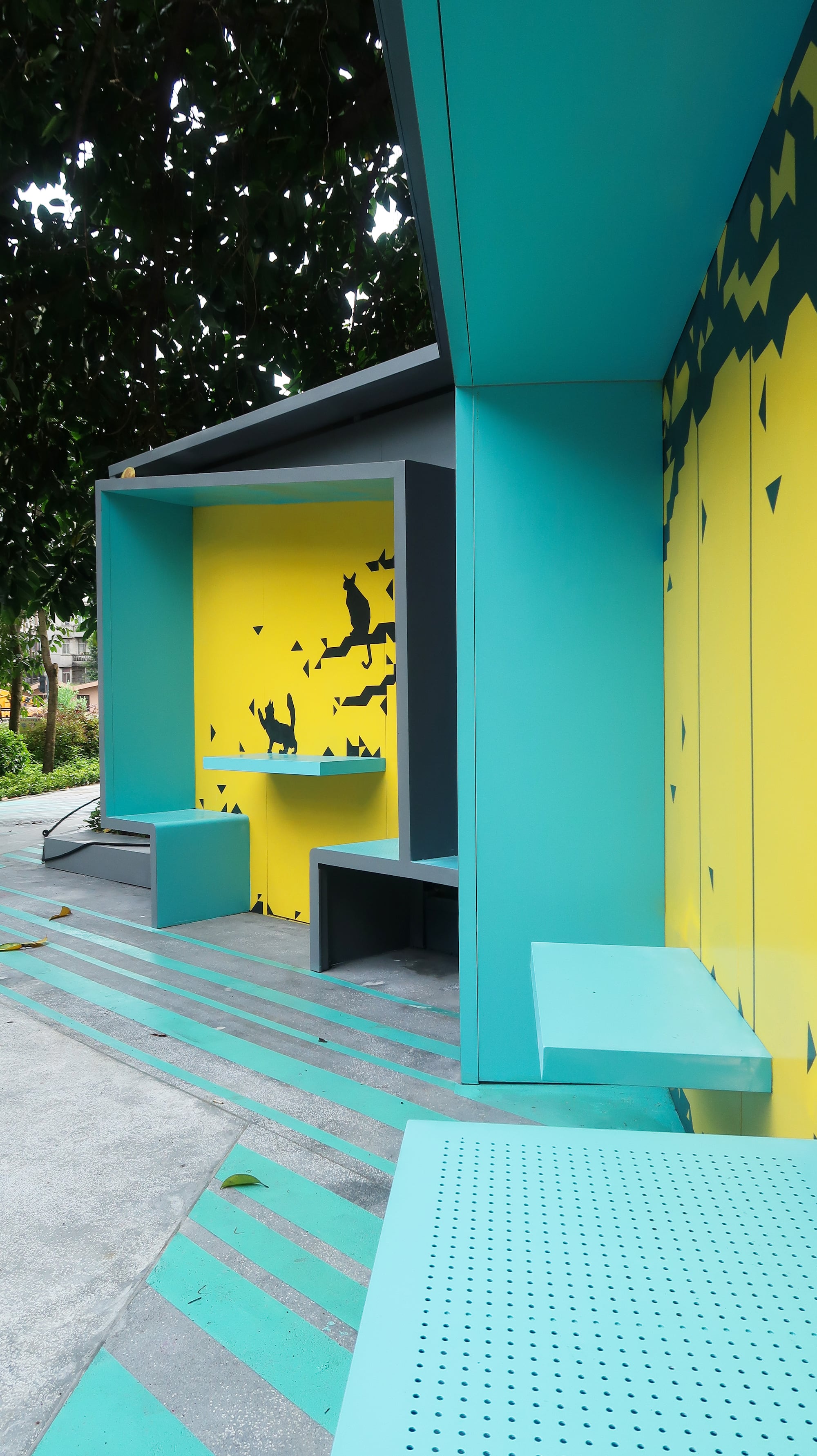
树上的猫:施工期间地面发现猫留下的脚印,原来场地一直有流浪猫在此安家,所以我们把猫与大树结合创造有趣的画面。
Cat on Tree:During construction, footprints cats were found on the ground. The site turned to be home for the stray cats, so we combine cats with big trees to create interesting pictures.
▼把流浪猫画到墙上 Paint stray cat to the wall

方形镜面:两侧围墙零星点缀的方形镜面反射周边形成不一样的风景,也折射出居民归家进出与场地之间的画面。
Square Mirrors:The square mirror reflections dotted around the walls on the two sides form different landscapes, and also reflect the picture homebound residents entering and leaving the site.

地面图案:简易的地面游戏图案,为非出行高峰时期的儿童及放学后的学生提供片刻自在欢乐的玩耍空间。。
Ground Pattern:The simple game pattern on the ground provides a moment of fun at off peak period for children and school boys and girls.
▼地面游戏图案 Ground game pattern
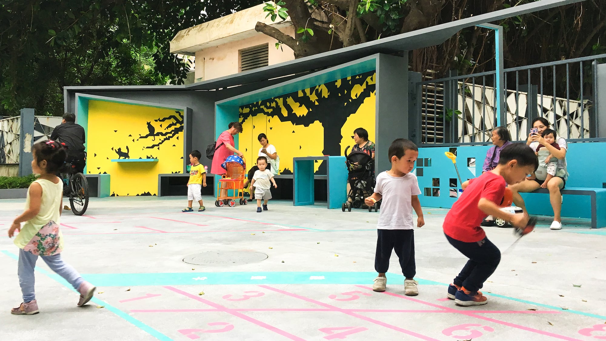

▼儿童片刻玩耍空间 Space for children to play
项目名称:定格的风景,东角头社区出入口景观
客户:蛇口街道办
项目地址:蛇口东角头社区出入口
项目设计&完成年份:2019.4-2019.6
设计面积:300㎡
设计公司:自组空间
主创及设计团队:梁瑞华、黄丹霞、杜梦碧、丁鹏、张立、梁妍
摄影:自组空间
Project name: Captured Scenes – Reconstruction of Dongjiaotou Community Entrance
Client: Shekou street office
Project address: Shekou Dongjiaotou community entrance
Project design & completion year: 2019.4-2019.6
Design area: 300㎡
Design company: Zizu studio
The creator and design team: Liang ruihua, Huang danxia, Du mengbi, Ding peng, Zhang li, Liang yan
Photography: Zizu studio
项目中的材料运用 Application of materials in this project
更多More:自组空间


“把写意化的树干与落叶定格在墙框内,与背后现实的大树形成对比,把现实不可触碰的大树变成可接触的风景。”这样的思想是我们设计师常用的,做一个景墙,总想在上面做点文章,就要找周边的文化元素。文中说想把被墙挡住的树干给补全,其实不必,挡住了树干对于街景而言会更整洁,只能看到树叶其实是个不错的景观。不可触碰的真树用假画表达就能接触了?这玩的是概念,但玩概念之前我们要看一下这景墙在远处看过来对于街景风貌而言是否需要增加图案装饰,如果只是干净的黄墙是不是会更整体纯粹。因为尺度很小,干净的几个色块的搭配就已经够用了,不必再装饰。而且我们可以考虑把现状大树的光影自然打在墙面上,这远比在墙上干画一个静止的图案要好的多。但总体来说,这个项目做得还是不错的,很有视觉感,又很讲究功能,是一个为城市加分的好项目。
写意树的颜色换成绿色是不是更舒心一些,黑色感觉有点压抑。
看到这位小姐姐的评论啦,所以我想说一下自己的想法,不做争执哈,个人认为,其大体的色调是明快的,其实对比起来,黑色所占的比例比黄色和蓝绿色要小,所以压抑的感觉其实还好。
乱花入个眼吧,少量的黑色剪影感觉和黄色更配,显得主体黄色更明快,如果是绿色反而和黄色拉不开距离,外面的湖绿色也不搭还得换配色,具象了一些。
一直都很喜欢自组的作品。有种公共艺术的感觉。公共性很足,强调作品的参与性,互动性。每一个作品所体现出的在地性不言而喻。