本文由 MIA Design Studio 授权mooool发表,欢迎转发,禁止以mooool编辑版本转载。
Thanks to MIA Design Studio for authorizing the publication of the project on mooool, Text descriptions and photos provided by MIA Design Studio.
MIA Design Studio:从人类早期开始,我们的祖先就使用绘画作为与周围实体交流的一种方式。 它被认为是人类最早表达欲望和思想的活动之一,尽管当时这种欲望和思想可能尚未形成。在学习和发展的过程中,文明被创造出来,随之而来的是规则、结构、规章制度等。因此,我们被现代生活所压得喘不过气来,常常发现自己走在人迹罕至的路上,而把创造的本能置于一旁。
MIA Design Studio:From the early day of humankind, our ancestors used drawings as a way to communicate with the surrounding entities. It is considered one of the first activities for human beings to express desires and thoughts, which might not have been formed yet. Through the process of learning and developing, civilizations were created, followed by rules, structures, regulations, etc. We are, therefore, overwhelmed by the modern life and often find ourself walking on the beaten paths and put aside our creative instinct.


设计师强烈渴望创造满足实际需求并充满自气息的项目,沉浸于在远离城市干扰的区域自由工作。在此区域内,他们可以在内置的玻璃面板上勾勒草图。通过调整适当的比例进行深入创作,在此过程中,玻璃板起到了尺子的作用。
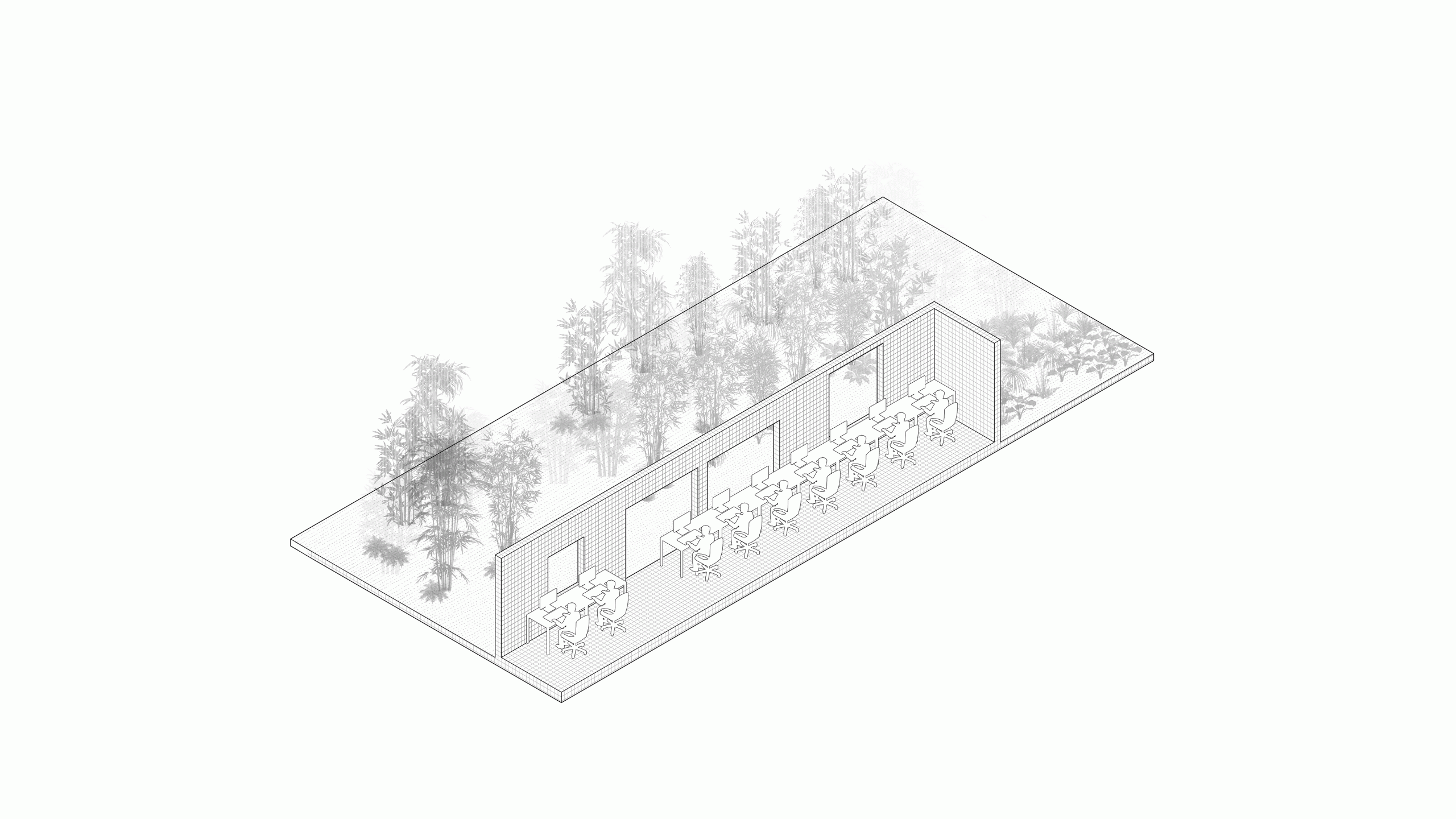
With a strong intention to create projects with harmonious combination of practical need with a breath of nature, architects are passionate to work freely in an area that is not affected by the pollution elements of the city. Within the area, they can draw their first lines of sketch on the built-in glass panels. With the appropriate proportions, the glass panels play the role of rulers so that the architects can visualize and estimate the actual dimensions of the buildings.


玻璃面板以A1大小的建筑设计图纸为模数成倍展开。为了最大限度地减少对竹园的影响,玻璃墙以垂直的方式错位建造,创造竖向气流,并增强花园般的体验感。
These glass panels are designed to be multiples of the A1 paper sheet – commonly used in architectural drawings. To minimize the impact on the bamboo garden, the glass walls are built vertically at the zig-zag position to create a vertical air flow and enhance the garden experience.


在花园一角,一套长桌和两条长凳相互隔开,创造了一种不对称的趣味体验,为设计师打造了共同工作、讨论、思考或享受自然的地方。
In a corner of the garden, a set of long tables and two benches are placed off each other to provide an interesting asymmetrical feeling. This is a place for architects to work and discuss with colleagues, cogitate or simply enjoy moments in nature.


该项目以玻璃为主要材料,由于其透明性,在充当隔离墙的同时不会产生空间分离的感觉。此外,它为公室创造了一个有趣的视野。
The primary material used for this project is glass. With transparent properties, this material serves as dividing walls, though does not bring forth the feeling of disconnected space. Additionally, it creates an interesting reflection viewing from the office.


▽灵感构思 Inspiration
▽平面图 Ground Plan

▽分析图 Diagram

▽项目鸟瞰图 Aerial view of the project
▽剖面图 Section

项目名称:创意天地
完成年份:2017
面积:132平方米
项目地点:越南 胡志明市 Binh Thanh区
景观/建筑公司:MIA Design Studio
网站:http://miadesignstudio.com/
联系邮箱:marketing.01@miadesignstudio.com
主创设计师:Nguyễn Hoàng Mạnh
概念设计:Nguyen The Huy、Nguyen Hong Quan
客户:MIA Design Studio
图片来源:Trieu Chien
Project name: Field of idea
Completion Year: 2017
Area: 132 m2
Project location: MIA Design Studio, 311B Binh Quoi, ward 28, Binh Thanh District, HCMC, Vietnam
Landscape/Architecture Firm: MIA Design Studio
Website: http://miadesignstudio.com/
Contact e-mail: marketing.01@miadesignstudio.com
Lead Architects: Nguyễn Hoàng Mạnh
Concept Design: Nguyen The Huy, Nguyen Hong Quan
Clients: MIA Design Studio
Photo credits: Trieu Chien
“ 错位分布的透明玻璃板尽可能多的扩大了空间感,光影婆娑的竹林后院成为设计师的一片创意天地。”
审稿编辑:Simin
更多 Read more about: MIA Design Studio


椅子如果不是玻璃的 感觉会好点 个人意见
同意