本文由 上景设计 授权mooool发表,欢迎转发,禁止以mooool编辑版本转载。
Thanks TOPSCAPE for authorizing the publication of the project on mooool, Text description provided by TOPSCAPE.
上景设计: 项目位于西安市未央区北辰路与环湖南路交汇处,是西安城北早期的别墅区。受城北高铁新城、经开板块、城东浐灞和港务区板块的多重发展促进,正迎来全新升级时代。项目用地面积4350㎡,城市界面良好,竖向平坦。项目的建设将促使西安东部形成全新的中央生态居住区,一种全新的风景生产力将进入到西安居住生活圈。
TOPSCAPE: The project is located in the intersection of Beichen Road and Huanhu South Road, Weiyang District, Xi’an city which is an early villa area in northern Xi’an. Affected by the completion of high-speed railway and multiple regional economic development, it is ushering in a new era of upgrading. The city has a good interface and the project covers more than 4,000 square meters. The construction of the project will promote the formation of a new central ecological residential area in eastern Xi’an, and a brand-new landscape productivity will enter the residential life circle of Xi’an.
设计思考
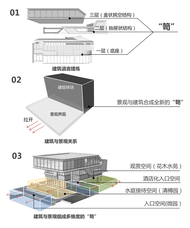
极致的空间感受来源于统一的建筑语言和景观设计语言。剖析建筑本身结构的语言,提炼了“笥”这个有着“容器”寓意的概念为景观设计的主旨,整体建筑结构犹如传统盛装东西的器物,在此之前,深化表达了不同的景观序列和空间功能的关系。
The ultimate feeling of the space comes from combination of the architectural language and landscape language. Analyze the language of the structure of the building itself, refining the concept of “Si” with the meaning of CONTAINER as the main theme of landscape design. From this, we try to deepen the relationship between the landscape sequence and spatial function.
设计呈现
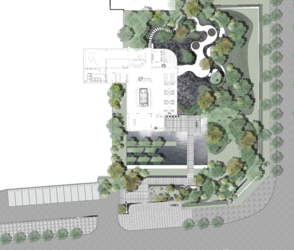
空间不大,分成前后两个不同的场所,两个“笥”功能不同,传递的情感也不同。没有复杂的故事,“笥”里装以草木、醉石,赋山水,起陶令;在西安这座底蕴深厚的城市,就用朴素的造园素材,取舍之间追求没有负担的精工,回归本源。
The limited space is divided into two parts with different functions and emotions. We put grass trees and stones into the yard, make it echo the traditional poetry. By using the simplest garden material, we look forward to finding ingenious craftsmanship without too much element to show the culture background of Xi’an.
初识 | 入口
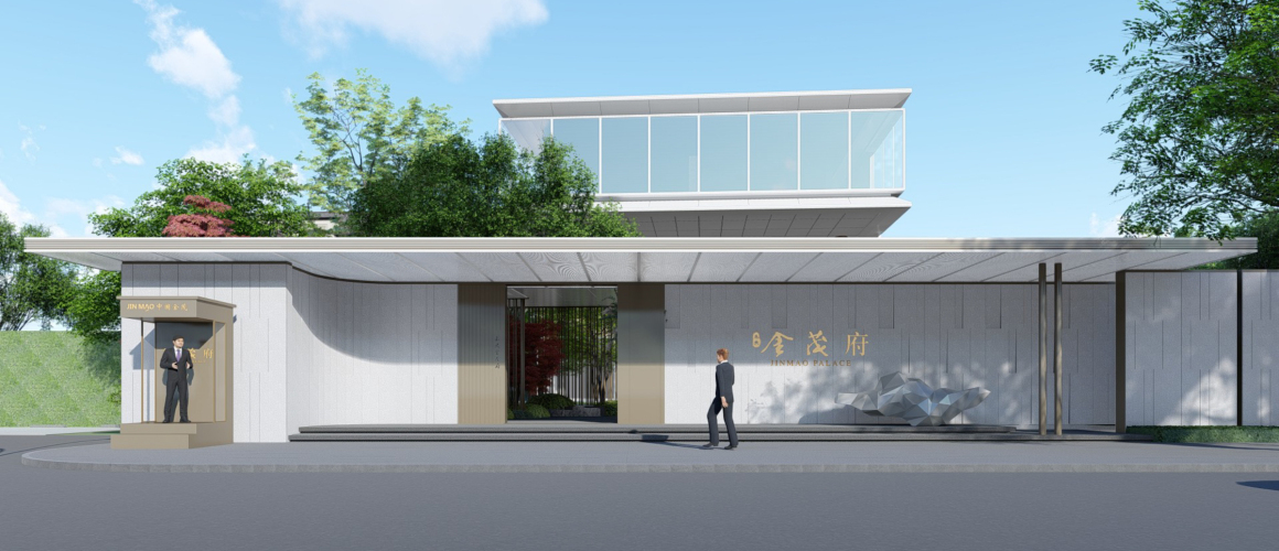
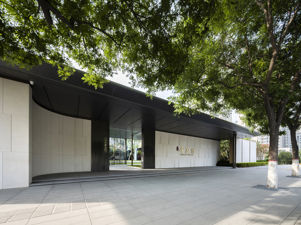
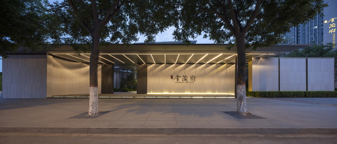
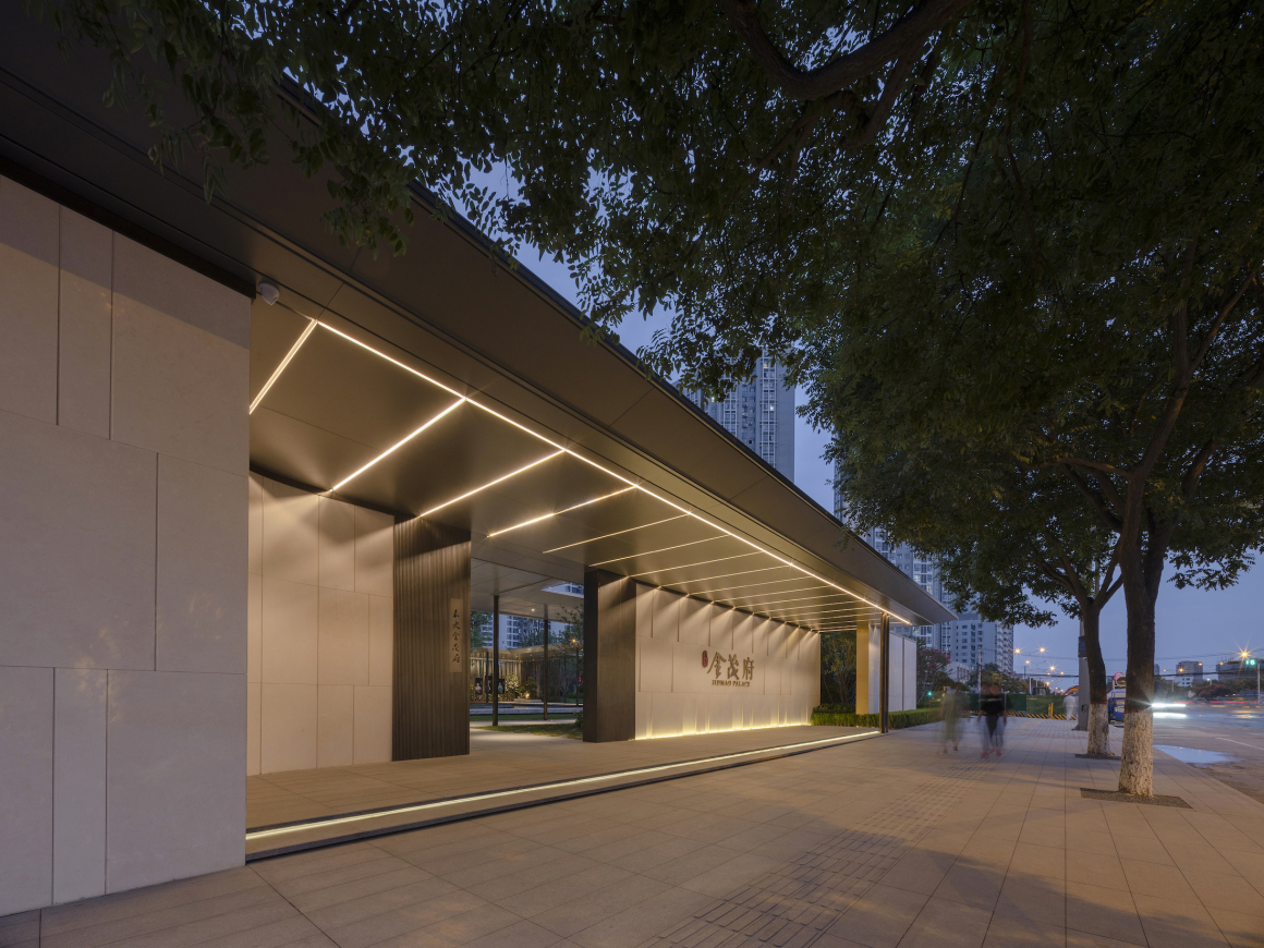
场地外延干扰因素较多,分车带内设有间隔50米电线杆和间隔30米的路灯距离十字路口较近有限高杆、红绿灯等, 唯一欣喜的是市政的行道树茂盛有态度。门和大树本身应该统一存在,立面弧线迎着人来的方向,形式为解决问题而来。一道墙将园外的喧嚣和院内的清幽雅隔离开来。
There are many interference factors outside the project. For example, there is a pole every 50 meters and street lights every 30 meters. Besides, there is a high limited pole over the crossroad. The only good condition is the municipal beautiful lush tree along the street. The form of the gate and the trees should be existed in unified way which is facing the direction of person coming in the arc wall. This form will solve the problem. One wall apart the noise outside and the elegance in the courtyard.
聆音 | 入口花园-微园
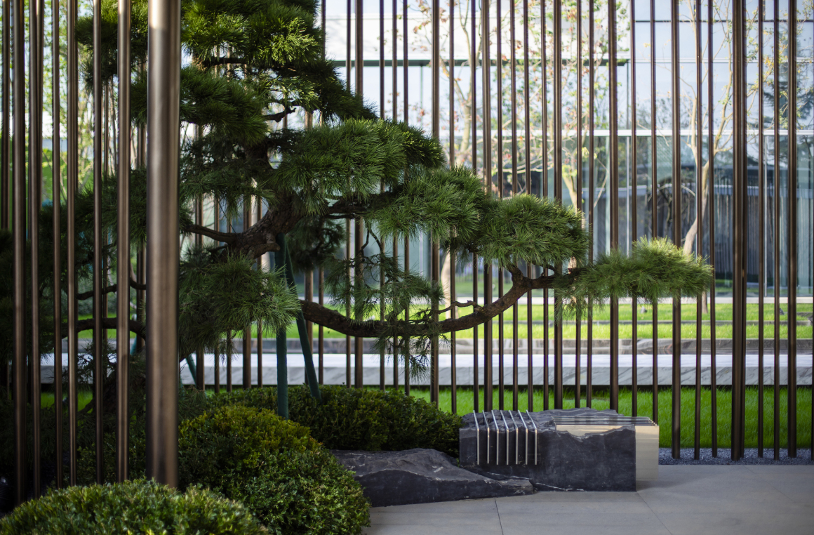
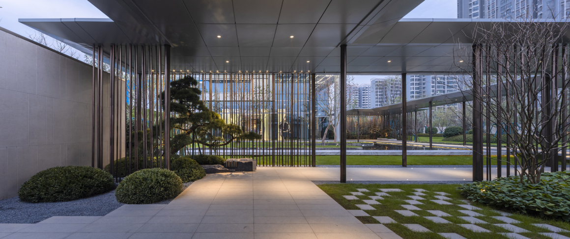
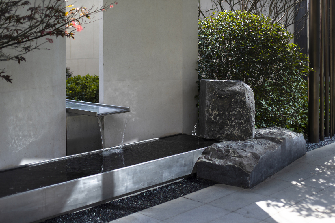
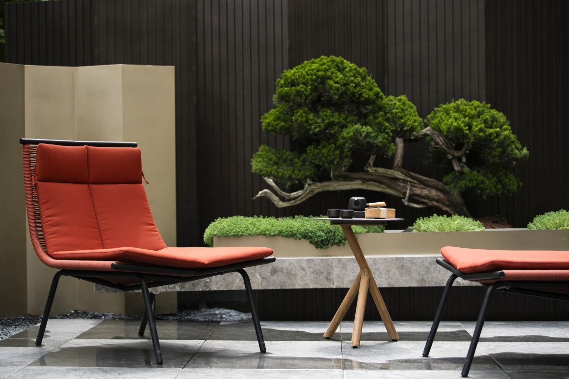
进入的方式体现空间层次的递进与视景的渗透,形成一石、一树、一框景。可以触碰的都是精工细节,栅格是为了捕捉更好的光而存在。
When entering the space, a feeling that is more sense of hierarchy in space step by stop will be touched. Additionally, a stone, a tree and a part of view will be formed at the same time. All the exquisite craft can be touched. Besides, the grid is for catching the better light.
破望 | 风雨连廊
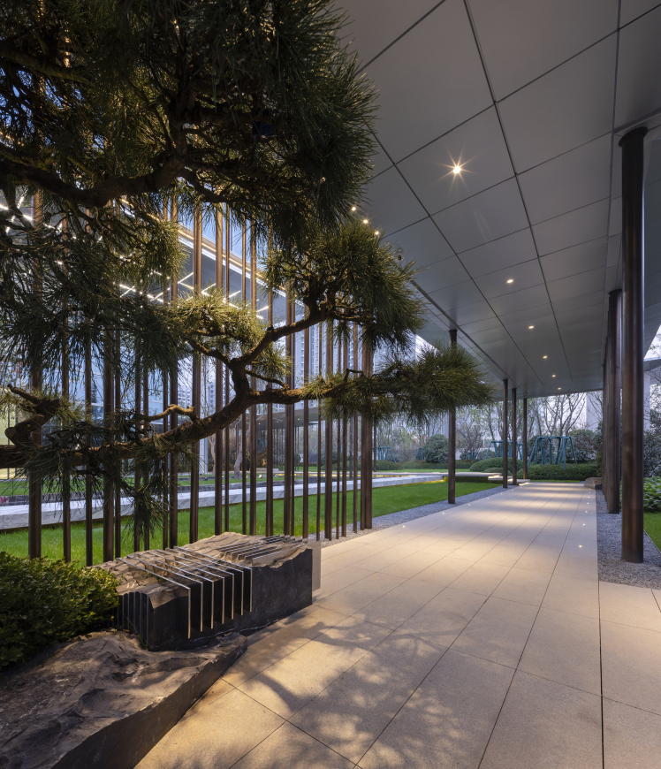
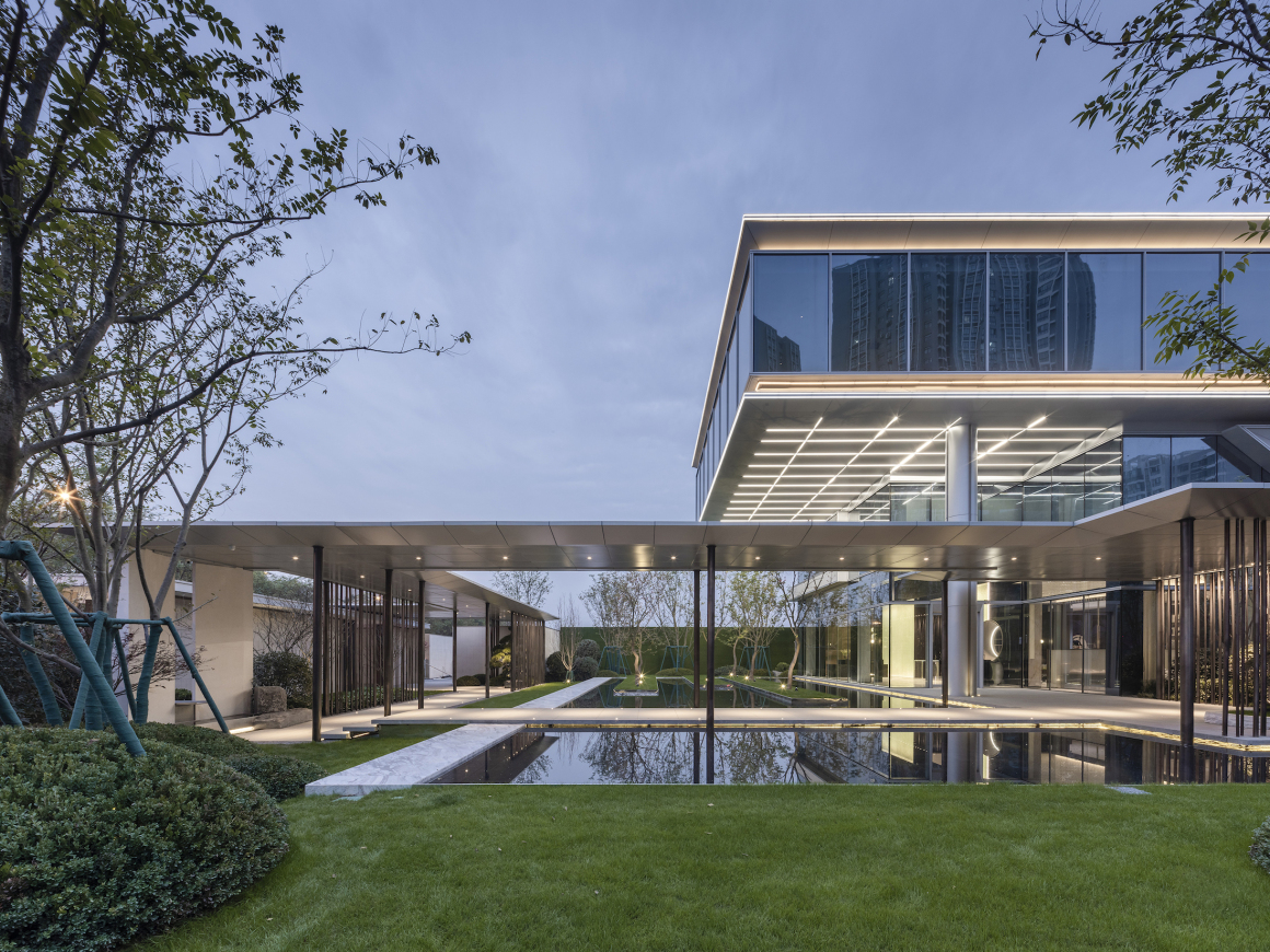
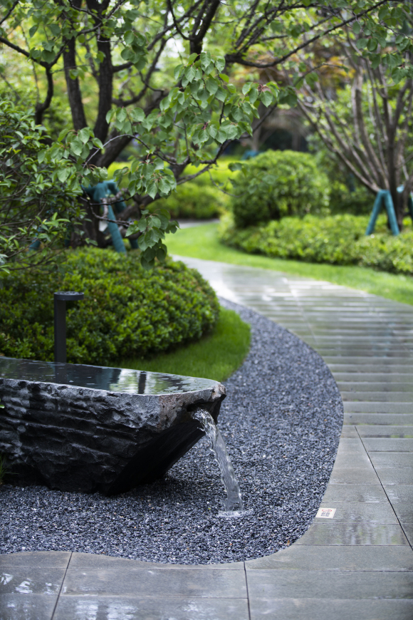
廊桥连接门和建筑,是第一个“笥”围合空间的重要素材。随廊前行,禅石、古松、流水,格栅的疏密层次增加光影的动态变化,规整严谨中随时间流动。
The first “SI” is the corridor which connects the gate and the structure. It is also an important material for space fence. Along the corridor, all the Dhyana stone the pine tree and the stream give the light different changes with the flowing time.
知微 | “笥” 中清樽
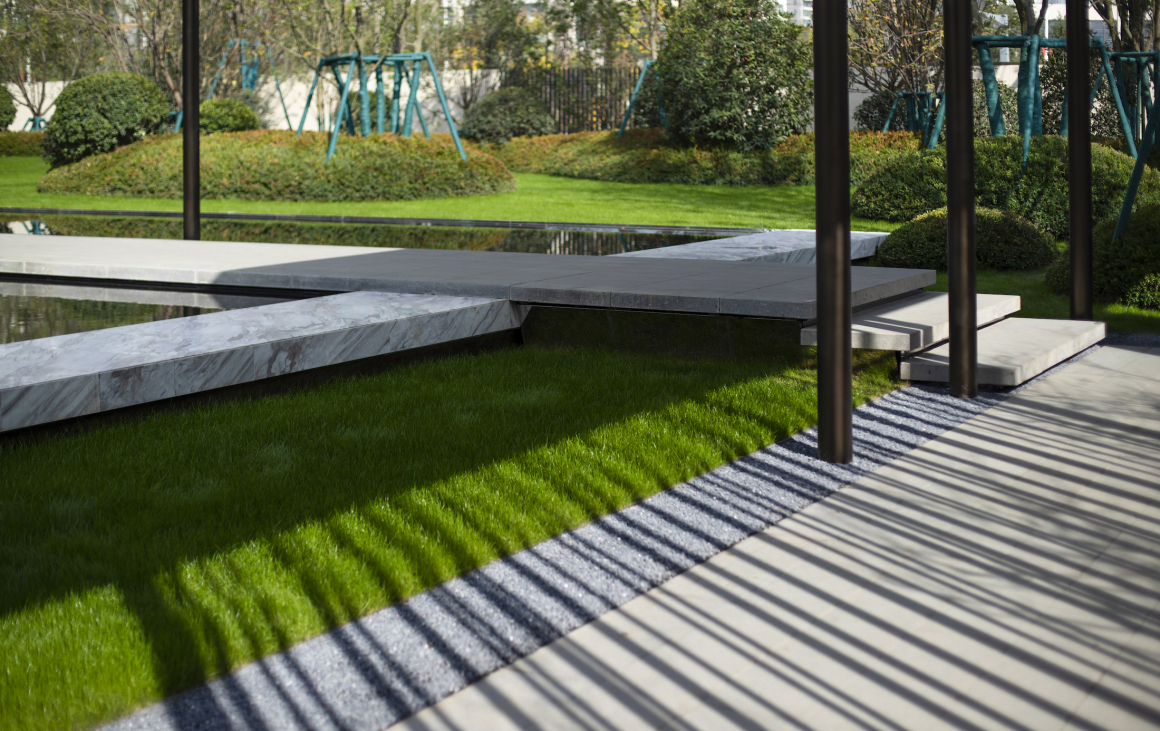
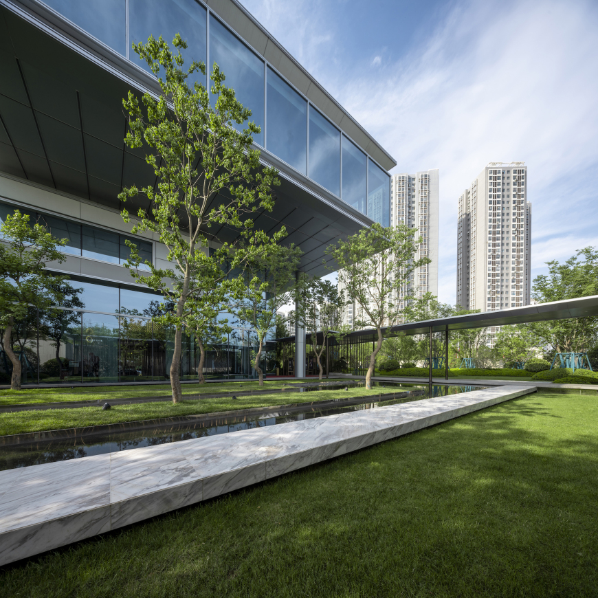
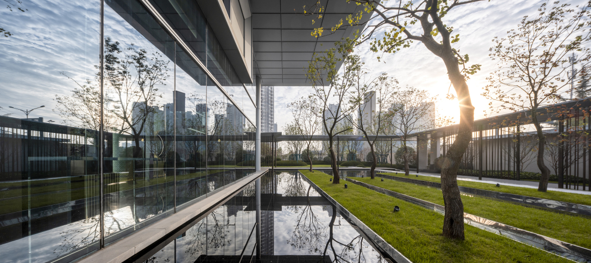
转过廊,水中错落的乌桕,柔化了建筑的形, 擅长诉说光影的故事,是笥中的主角。
Passing by the corridor, the shadow of the Chinese tallow tree in the water make the structure soft. The main role of “SI” is good at telling the story about the light and the shadow.
清晨的阳光透过淡淡的云层,倾泻在水面上,散落的波光,树影斑驳,与倒影相映成趣。
The morning light through the faint cloud shines on the surface of the water. Meanwhile, the scattered light waves and the mottled tree shadows with the inverted image are next to each other.
廊和建筑紧密咬接,语言一致。
In order to making the language in common, the corridor is close connected with the building.
舍归 | “笥” 中花木水苑
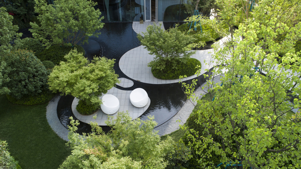
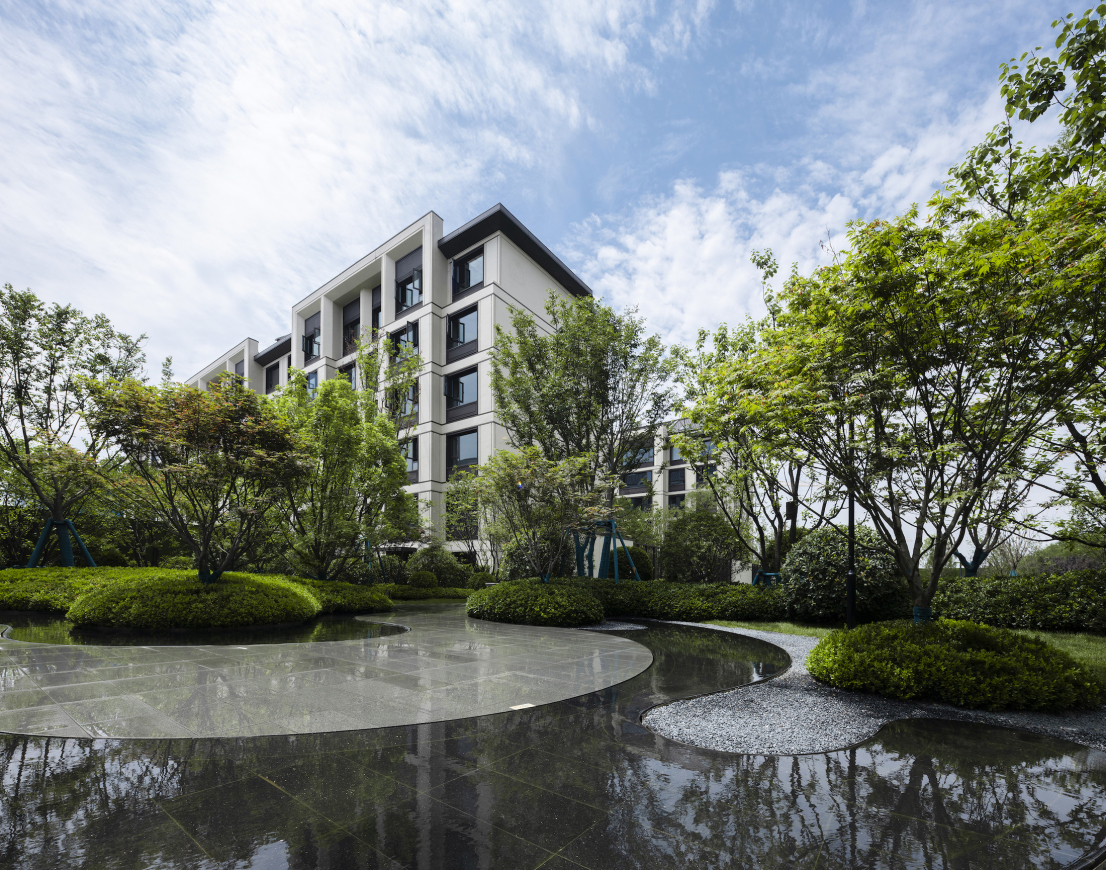
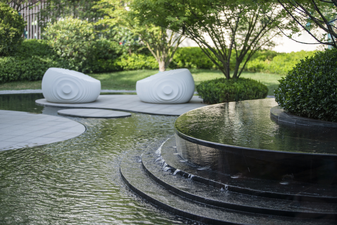
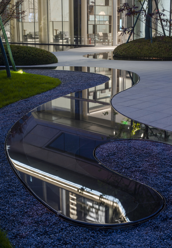
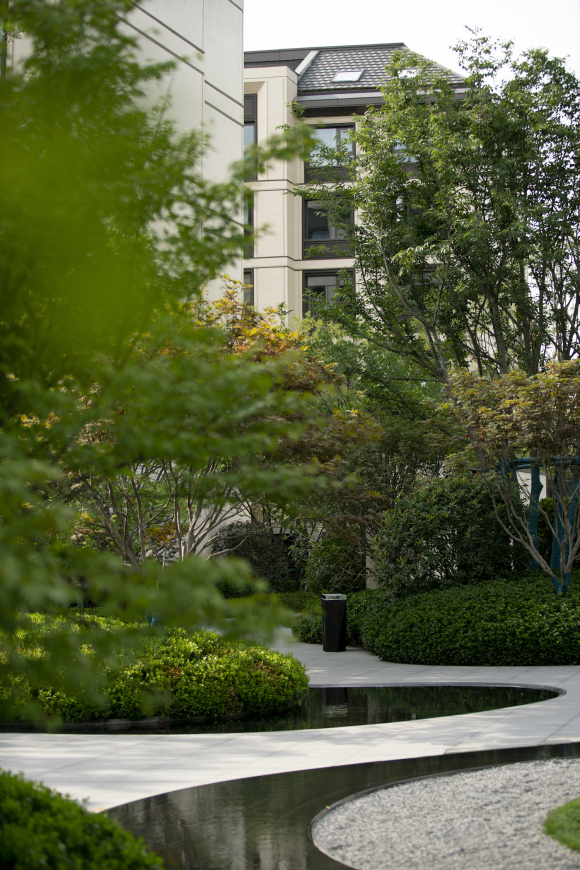
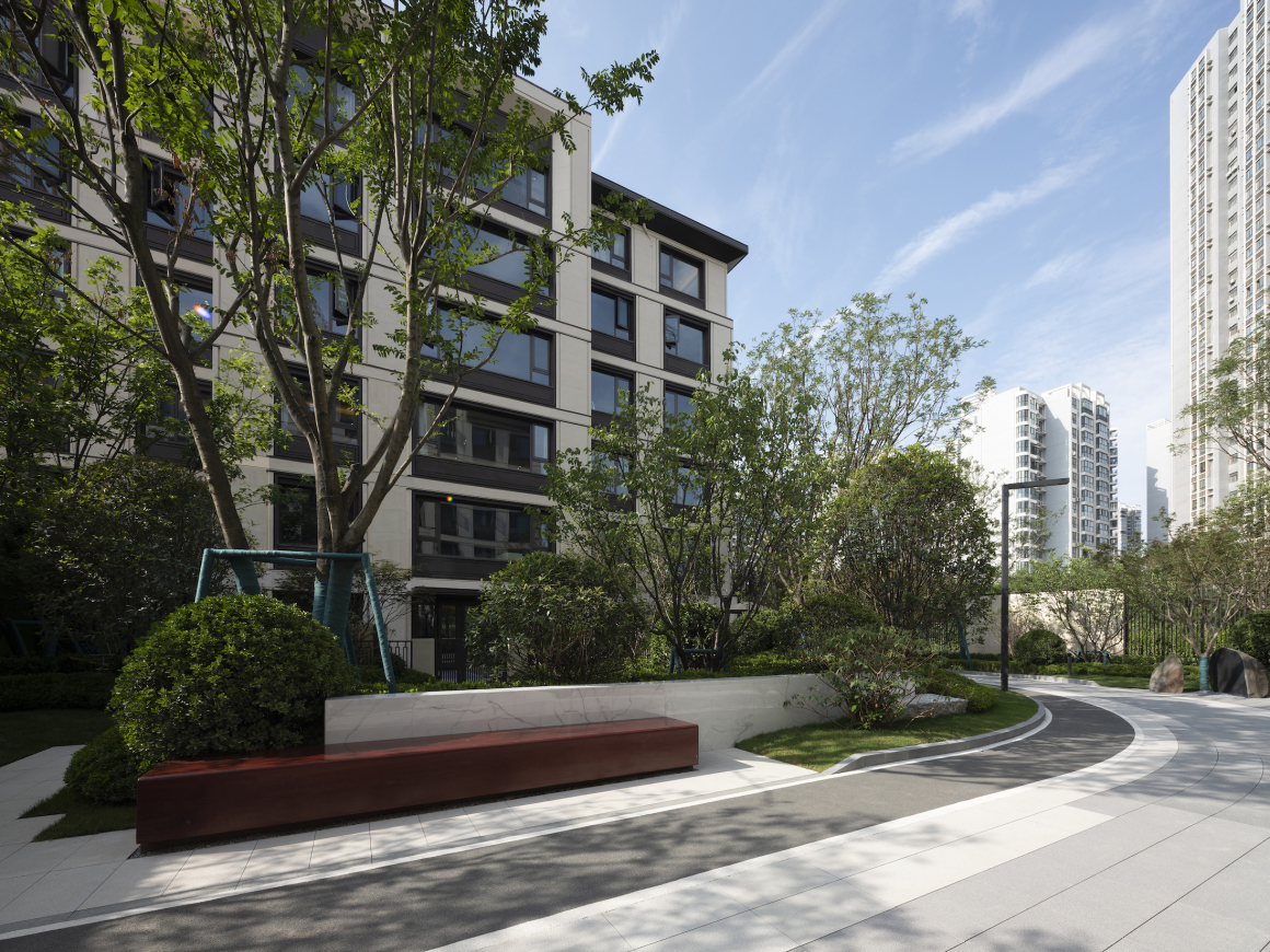
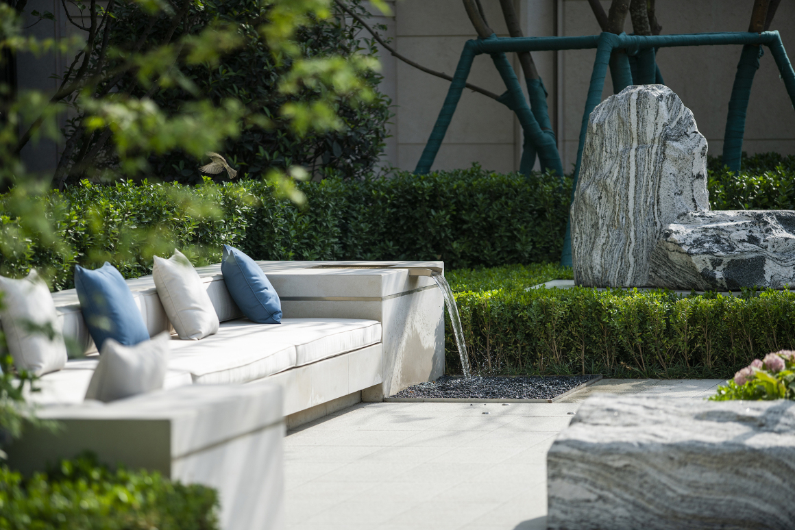
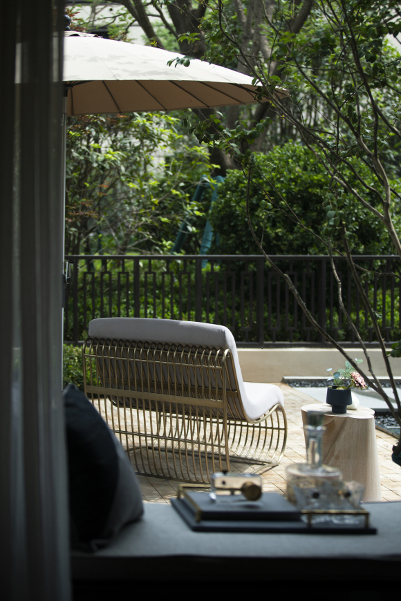
花繁草茂,一衣带水,步移景异。流淌的曲线,把本来的通过式的空间,用形式让人放慢脚步驻足停顿。对于设计的控制不仅是方案落地,软装家具一体化,配饰恰到好处点睛,是雕塑也是家具。
Keep walking, the lush flowers and grasses could be seen. With the curve design, we make a simple through passageway into a space which visitors can take their time and immerse themselves. As for the landscape design, it is not only the project landing successfully, but also the integration of soft decoration and landscape design which means the accessories are just the right touch. They are not only the sculpture but also the furniture.
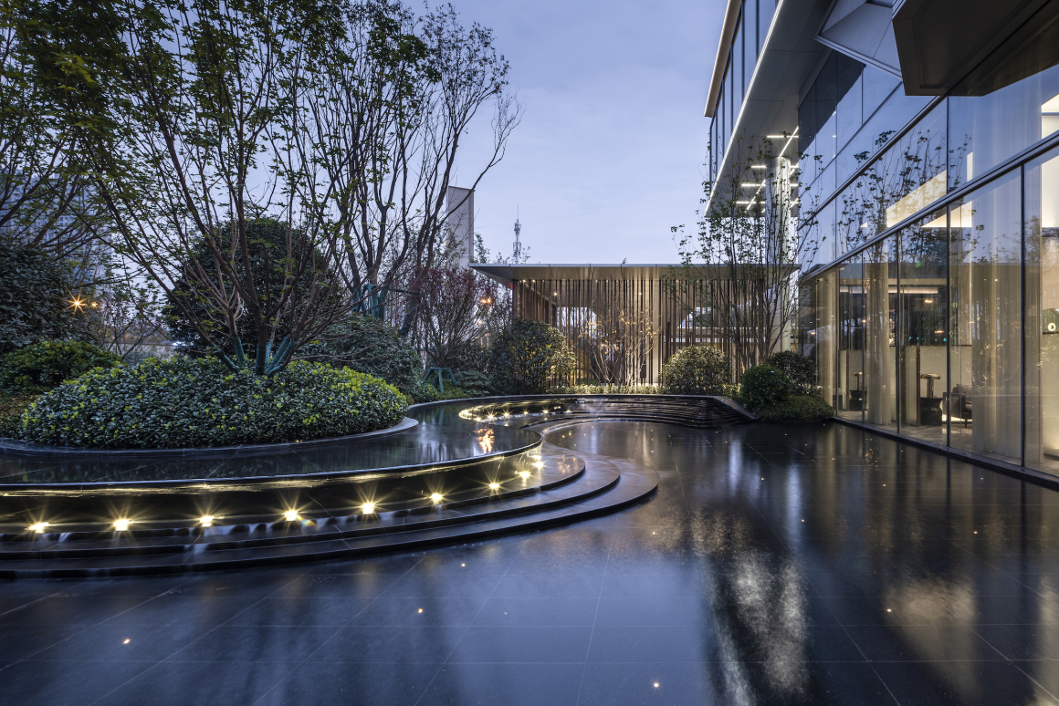
▼夜景下的景观叠水 The night view of waterscape
园居 | “笥” 中的光阴
大区实开是对住区常态的考验,抛却说教式的故事,真实的场景才是生活的本质。
The community live opening is a test for normalcy residence. Without stuffy telling story, the truly space is the essence of life.
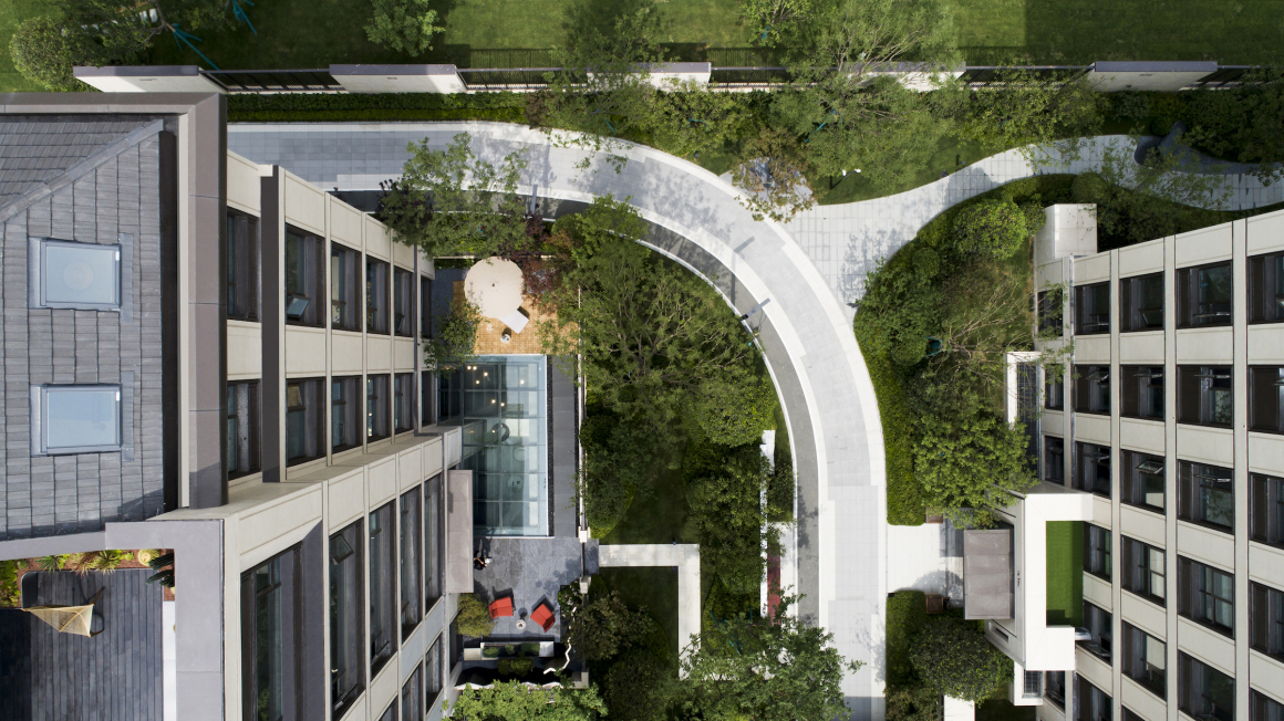
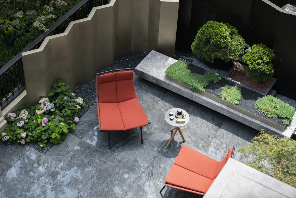
样板院,几尺见方的小院,中间有一个占地比例却大的采光天井,幸好设计总有顺势而为的好办法,取消掉原本的防护栏杆,将天井幻化成水面,成就一东一西两个小空间的连接,形成天然的动静分区的庭院设计。
The prototype yard is not a very large place. There is a relatively larger courtyard inside. Fortunately, it always has a good solution to adapt to the change. Canceling the original protective railings to make the courtyard looks like the surface of the water. This will become a link to the two small parts and also make the functional differentiation of landscape naturally.
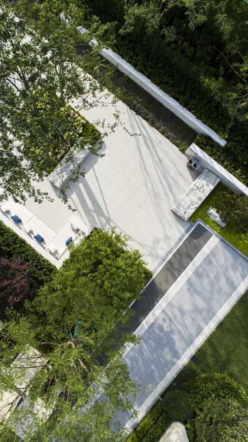
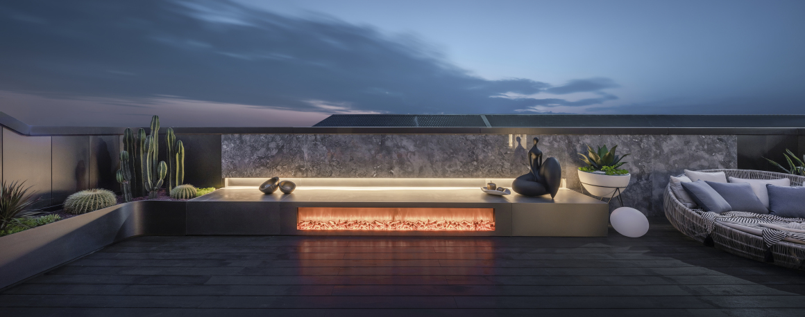
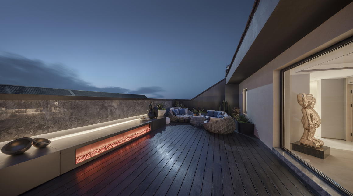
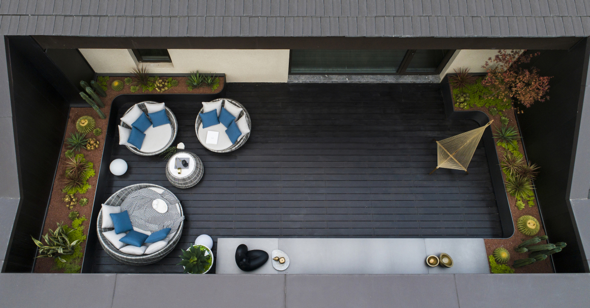
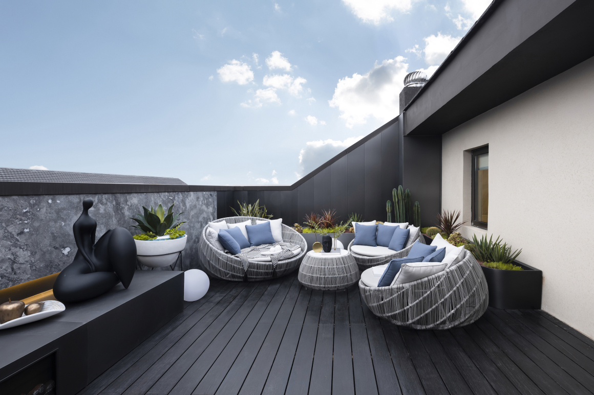
屋顶花园的呈现则是一个惊喜,放开手脚,原来景观的室外空间也可以大胆的配色与用材,当然最重要的依旧是对生活的体悟,如此才能有合适的空间。想像空间的营造是基本功,材质的考究是一门必修课,院落与屋顶花园的软装设计也是我们的专业团队一气呵成的安排。
The roof garden is a surprise, the bold use of color and materials are applied to the outdoor space. Absolutely, the most important thing is from the understanding of life. It is the basic skills for the imagination and design of pubic space. Apart from that, it is compulsory about thinking and the usage of materials. The soft decoration design of the landscape and roof garden are both from our team works.
上景设计:我们的设计灵感来源于建筑本身,利用曲线和直线的碰撞,表达出蕴含在传统园林里的韵味以及现代空间的舒朗。建成后的空间,实现了弧形与矩形的良好融合。我们希望通过追寻极致的品质感,引导人们对社区景观的需求向更高的层次发展,同时致力于成就更为良性和积极的人居生活。
TOPSCAPE: Our design inspiration base on the building itself, we try to use the curve and straight lines to present the traditional garden lingering charm and the modern space relaxed feeling. We also hope to guide people’s demand for community landscape to a higher level by pursuing the ultimate sense of quality, and we are committed to achieving a more benign and active human life.
项目地点:西安市未央区北辰路与环湖南路交汇处
项目类型:示范区
景观面积:4350㎡
设计时间:2019
竣工时间:2019
景观设计:凯盛上景(北京)景观规划设计有限公司
首席设计:路媛
设计团队:景观方案设计三组:刘雅泉、鲁东杰、王佳隆
施工图团队:施工图设计一组:王楠楠、刘胜强、王燕,张静,张希
软装设计:上景软装桢空间
综合专业团队:任立欢、李宁、李根、焉小娜
景观施工单位:四川罗汉园林工程有限公司
摄影团队:繁玺视觉
Project address: Beichen road and Huanhu South Road, Weiyang District, Xi’an city
Landscape area: 4350㎡
Design time: 2019
Built in: 2019
Landscape design: TOPSCAPE
Chief designer: Luyuan
Design team: The team three of landscape design, Liuyaquan, Ludongjie, Wangjialong
Construction design: The team one of construction design, Wangnannan, Liushengqiang, Wangyan, Zhangjing, Zhangxi
Soft decoration design: TOPSCAPE | ZHEN SPACE
Comprehensive design: Renlihuan Lining Ligen Yanxiaona
Construction unit: Sichuan Luohan Landscape Engineering Co., Ltd
Photos: Fancy Images
更多 Read more about: 上景设计 TOPSCAPE








棒