本文由 UAO瑞拓设计 授权mooool发表,欢迎转发,禁止以mooool编辑版本转载。
Thanks UAO Design for authorizing the publication of the project on mooool, Text description and images provided by UAO Design .
UAO瑞拓设计:武汉良友红坊文化艺术社区前身是1960年代的老厂房,1990年代又被作为建材市场使用;城市化的进程使得这个位于汉口三环线内的厂区逐步被边缘化:杂草丛生,建筑破旧,排水不畅等等问题困扰着这个原来的城市“棕地”,也使得这个节点如同一块城市伤疤,急需进行一场在地“手术”;但是,我们究竟是采取一场完全推倒重建的置换式“大手术“,还是如同某些老街改造式的美图秀秀式的“磨皮术”?这两种模式,也正是我们现在城市更新改造状态下的一些急功近利的惯用手段。
UAO Design :The predecessor of Wuhan Liangyou Red Town Cultural Art Community was an old factory building in the 1960s, and it was used as a material market in the 1990s. The process of urbanization has gradually marginalized this factory area within the third ring road of Hankou. Over grown with weeds, dilapidated buildings, drainage system blocked and other problems turned this place into original urban “brownfield”, and it also makes this node looks like an urban scar, which is in urgent need of a “surgery”; however, whether we are adopting a method that completely overthrows and rebuilds or “dermabrasion” like some old street reconstruction-style ? These two models are common used methods for quick success and quick profit in the current state of urban renewal and transformation.

2018年,上海红坊集团接手这个厂区的运营,立志将之改造为文化创意企业的办公园区;我们UAO受红坊委托,对园区的景观设计和核心建筑ADC艺术设计中心进行了改造设计。
In 2018, Shanghai Hongfang Group took over this area and determined to transform it into an office park for cultural and creative place. UAO was commissioned by Hongfang to renovate the park’s landscape design and core building ADC Art Design Center.
▽改造后的园区景观 The landscape of the park after transformation

我带领团队第一次看现场的时候,场地原有的法国梧桐,红砖厂房、坡屋顶红瓦屋面,内部松木桁架,园区里具有典型80年代的庭院设施(蘑菇形状的混凝土亭子,水池里的白鳍豚雕塑)、高耸的红砖烟囱、水塔等都给人留下了深刻的印象。这些在70-80年代“单位大院“里日常的物件或构筑物,突然出现在现代化大都市的核心区域内,莫名就产生了一种距离感,同时又带给UAO的70-80后的设计师一种”亲切感“:回到自己小时候那种单位大院里生活的一种亲切感。
When I led my team to see the site for the first time, the original red brick factory building, sloping red tile roof, internal pine truss, and typical garden facilities of the 1980s (the concrete pavilion in the shape of mushroom, dolphin sculptures in the pool), the towering red brick chimneys and water towers also impressed me. These objects were popular in “unit compound” in the 1970s and 1980s. When it appeared in the core area of a modern metropolis, it creating a sense of distance inexplicably, and at the same time it brought UAO’s post-70s-80s designer’s kind of “familiarity “: remind us of the “unit compound” life.
▽改造前的厂区原貌 The original appearance of the factory before transformation

厂房大院的这种距离感与亲切感,成为这一次景观改造的构思出发点——也回答了文章开头,我们既不能采用置换式的大手术,也不能采用磨皮式的美容术——我们采用的是保留亲切感的距离感:让来到这个文化园区的人感觉到:仿佛回到自己的小时候,细看之下却是置于当代艺术的环境之中;这种对比产生的距离,以及因此延续的厂区文脉,能给目前轰轰烈烈的城市更新提供一种新的方式——我调侃称之为:”滋补焕新术“。
This sense of distance and familiarity of the factory compound became the starting point for the conception of this landscape transformation—and also answered the beginning of the article. We can neither use replacement nor “beauty surgery” .we would like to make people who come to this place feel if they are returning to their childhood, but under closer inspection they recognized it is truly a contemporary art environment; the distance produced by this contrast, And the continued cultural heritage of the factory area can provide a new way for the current vigorous urban renewal, we call it: “Nourishing and Renewing Technique”.
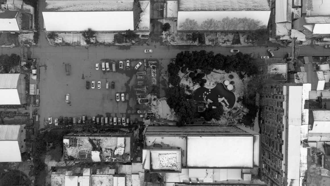
▽原场地中心区域
厂区的总体布局,是典型的行列式厂房布局,但各个厂房又是不同年代的建设产物:有60年代红砖、单层木桁架和瓦屋顶的厂房;有80年代多层砖混结构、水磨石外表面的厂房;还有1990年代瓷砖或小马赛克外表的楼房,更有后来各个租户自己发挥来加建的临时建筑;这些单层或多层建筑,被棋盘式的道路划分成一块块面积相对均衡的区域;
The overall layout of the factory area is a typical row-type factory layout, but each factory building is constructed in different eras: there are red bricks, single-story wood truss and tile roofs in the 1960s; there are multi-layer brick-concrete structures and terrazzo in the 1980s; factory buildings with tiles or small mosaics in the 1990s, and temporary buildings built by the tenants themselves. These single-story or multi-story buildings are divided into blocks of relatively large areas by checkerboard shape roads.


虽然场地密度大体均质,但也在场地的两块区域,出现了比较大的空地:一块是一进主门后,由原有小游园和大车停车场组合成的中心广场区域,一块是在场地东北侧原“板栗仓库“门前的卸货区域;后来的调查发现,中心广场区域,本身承载了场地原有停大卡车的功能,基础混凝土厚重,空间较大;而板栗仓库门前区域,因为其下是一个地下冷藏库,所以地上空地就在后来的”私自加建“过程中幸存下来。
Although the density of the site is generally homogeneous, there is also a relatively large open space in two areas of the site: one is the central square area formed by the original small amusement park and the large car parking lot after entering the main entrance, and the other is the unloading area in front of the original “chestnut warehouse” on the northeast side of the site. Later,we found that the central square area carried the function of parking large trucks , with heavy concrete foundation and large space; and the area in front of the chestnut warehouse , Because it was an underground cold storage, so the site survived.
板栗仓库建筑因为是冷库,具有和厂区其他建筑完全不同的特质:包裹着灰色水洗石的外立面封闭而厚重,主立面的电梯机房的实体墙面,正对着主入口的轴线。
Because the chestnut warehouse is a cold storage, it has completely different characteristics from other buildings in the factory area. The facade covered with gray washed stone and the solid wall of the elevator machine room on the main facade faces the axis of the main entrance.
▽中心广场区域 Central square area


我自然地构思了一条从主入口到老板栗仓库主墙面的轴线,这条轴线串起了主入口和两块主要的空地,因为是一条斜向轴线,也把中心广场区域划分成了两个三角形的场地:位于三角形北侧,是原有的花园,填掉花园小池塘,保留了高大的原生植物后,改造成了一个生态停车场;
I naturally conceived an axis from the main entrance to the main wall of the old chestnut warehouse. This axis strung the main entrance and two main open spaces. Because it is an oblique axis, it also divides the central square area into two. A triangular site: Located on the north side of the triangle, it is the original garden. After filling the small garden pond and retaining the tall native plants, it was transformed into an ecological parking lot;
▽入口生态停车场 Entrance Ecological car Park


斜轴线3米宽,用红砖铺筑;起点位于大门处,红砖叠砌的三角形景墙背后覆土,形成了对入口停车场的遮挡。终点直达板栗厂库的门前大草坪。中间横穿一个建筑。
The oblique axis is 3 meters wide and paved with red bricks; the starting point is at the gate, and the back of the triangular landscape wall of red bricks is covered with soil, forming a shelter for the entrance parking lot. The end goes straight to the large lawn in front of the chestnut factory warehouse. A building crosses in the middle.
▽红砖铺筑的3m宽斜轴线 3m wide oblique axis of red brick

▽红砖铺地 Red brick floor

▽良友红坊入口 Entrance to Red town

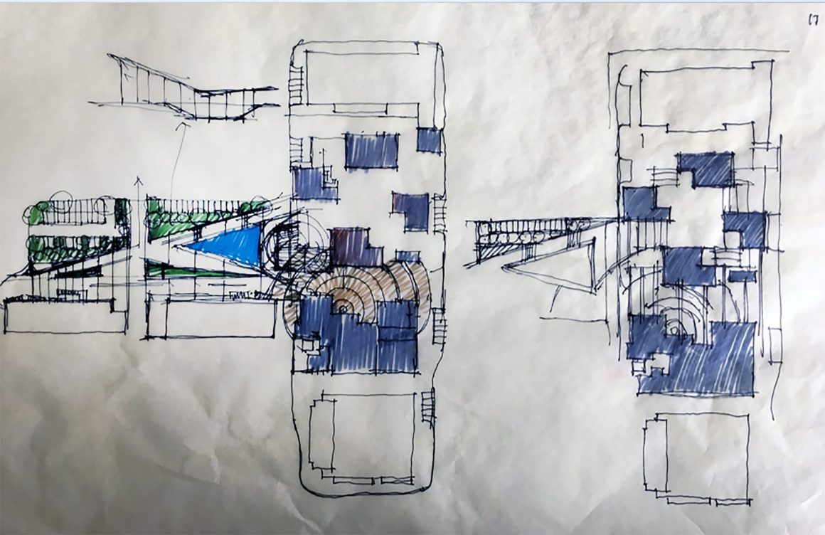
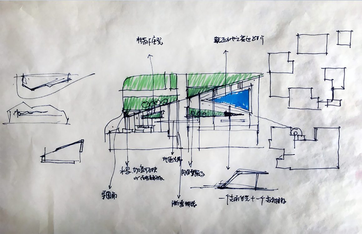
而斜轴线南侧三角形用地的方案历程,并不是直接就达到最理想的状态——因为每个设计师心中都会克制不住自己内心要“强加给予场地设计“的冲动。在最开始的方案中,南侧这个三角形用地,被设计成无边界水池,希望能够在场地中间,看到周边老建筑的倒影。
The plan of the triangular land on the south side of the oblique axis does not directly reach the ideal state—because every designer cannot restrain his inner impulse to “impose the site design”. In the original plan, the triangular site on the south side was designed as a borderless pool, hoping to see the reflection of the surrounding old buildings in the middle of the site.
▽设计过程手稿 Design Process manuscript
▽三角形景墙 Triangular view wall


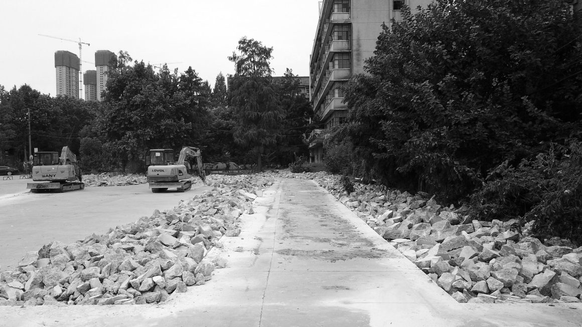
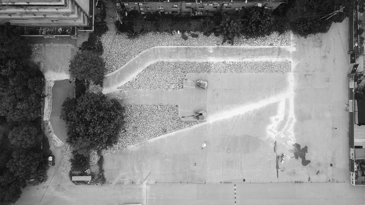
但这个方案其实是以设计师自我为中心的一种“倒影式“秀场设计。我总觉得不那么合适,但说实话:又不舍得这种作秀;在随后的破拆厂区混凝土广场改为绿化的过程中,挖掘机铿锵有力的声音,棱角分明的碎混凝土块,给了我另外一个灵感:那就是把这个原来停重型卡车的厚重混凝土整体保留下来,但是如何保留,才能让观者知道这个“保留”的这个设计意图?
But this scheme is actually a “reflection-style” show design centered on the designer’s self. I always feel that it is not so appropriate, but to be honest: I am not willing to be a show;
In the subsequent process of changing the concrete square in the demolished factory area to greening, the sonorous sound of the excavator and the sharply broken concrete blocks gave me another inspiration: that is to keep the heavy concrete that originally parked the heavy truck. , But how to retain so that the viewer can know the design intent of this “retention”?
▽切割混凝土 Cut concrete
中心广场方案的优化,随着红坊甲方把位于上海的“花草亭“搬到武汉再建,也逐渐清晰起来。
花草亭是明星建筑师柳亦春和知名艺术家展望合作的一个艺术景观构筑物。几片寓意为“太湖石”的不锈钢薄板,支撑着耐候钢板的屋顶,屋顶上覆土种植了花草;其构思巧妙之处在于不锈钢薄板与屋顶的连接若有若无。而屋顶耐候钢板的通过反梁的设计,使得悬挑出去的耐候钢板的轻巧又与屋顶厚重的覆土产生了不安稳的对比。所有的设计,用工业感和植物来对比和共生;用设计上的技巧,形成轻、薄的既视感,来“嘲笑”地球的重力的小儿科。
The optimization of the central square plan gradually became clear as the Red Square Party A moved the “Hua Cao Ting” in Shanghai to Wuhan and rebuilt it.
Huacao Pavilion is an artistic landscape structure in collaboration with star architect Liu Yichun and well-known artist Zhan Wang. Several stainless steel sheets meaning “Taihu Stone” support the weather-resistant steel roof, and the roof is covered with soil and planted with flowers and plants; the ingenious idea lies in the connection between the stainless steel sheet and the roof. The design of the weather-resistant steel plate on the roof through the reverse beam makes the lightness of the weather-resistant steel cantilevered and the heavy covering of the roof produce an unstable contrast. All designs use industrial sense and plants to contrast and symbiosis; use design techniques to form a light and thin sense of sight, to “ridicule” the pediatrics of the earth’s gravity.
▽艺术景观构筑物《花草亭》Art Landscape Structure


我们用什么样的场地,才能来承载这个“举重若轻”的艺术景观力学构筑物?
新的设计,从花草亭的支撑钢板的形状开始,将之拓扑到地面,把不规则的切割手法运用到地面的混凝土上;这种切割手法,也自然地回答了前面的问题,观者一下明白了这个混凝土是保留自原来的场地。
不规则切割后的宽窄不一的缝隙,回填土后种植草皮,自然延伸了花草亭的设计手法,也让花草亭感觉像就是存在于场地很多年的一件“亦新亦旧”的艺术品。
What kind of venue can we use to carry this “heavy weight” artistic landscape mechanics structure?
The new design starts from the shape of the supporting steel plate of the flower and grass pavilion, topological it to the ground, and applies the irregular cutting technique to the concrete on the ground; this cutting technique also naturally answers the previous question and brings the viewer I understood that this concrete was kept from the original site.
The gaps of different widths and narrows after irregular cutting, backfilling and planting of sod naturally extend the design of the flower pavilion, and also make the flower pavilion feel like a “new and old” art that has existed in the site for many years Product.
▽不规则切割的地面 An irregularly cut floor


花草亭的对位,除了处于广场的中心,它与UAO设计的园区的核心建筑ADC艺术设计中心的A字入口处于一条轴线上,ADC的中央光轴,也与花草亭的中心对上,这也体现了建筑景观室内一体化设计的优势。
The alignment of the Huacao Pavilion, in addition to being in the center of the square, is on the same axis as the A-shaped entrance of the ADC Art Design Center, the core building of the UAO-designed park. The central optical axis of ADC is also opposite to the center of the Huacao Pavilion. It also reflects the advantages of integrated interior design of architectural landscape.

▽ADC艺术设计中心 ADC Art and Design Center

亲切感的营造,场地的旧物利用、保留、改造功不可没;首先是保留:保留红砖烟囱,水塔、老的木桁架和瓦屋面,保留具有年代感的雕塑小品,如蘑菇亭、白鳍豚雕塑;
The creation of intimacy is indispensable to the use, preservation and transformation of old objects on the site; The first is to preserve: preserve the red brick chimneys, water towers, old wooden trusses and tiled roofs, preserve chronological sculptures, such as mushroom pavilions and baiji sculptures;
▽利用再造的白鳍豚雕塑 Make use of the reconstructed baiji dolphin sculpture


其次是利用再造,把蘑菇亭植入了霓虹灯管,把白鳍豚雕塑重新安置在集装箱里,用树脂补齐白鳍豚雕塑残缺掉的部分,一个兼具历史感和时代感的新作品就诞生了;包括对场地拆下来的红砖,重新组合成厂区内的花坛、景墙、以及铺地;也因为把中心广场周边区域划分成了步行区域,原来的破损的机动车道不再使用,混凝土路面分隔缝,历经风雨已然裂痕累累,我们用切割机将裂缝切开,重新铺上红砖,形成了材质保留和对比的一种亲切感。
Secondly, using reconstruction, the mushroom pavilion was implanted with neon tubes, the baiji sculpture was relocated in the container, and the missing part of the baiji sculpture was filled with resin. A new work with a sense of history and time was born; including The red bricks removed from the site are recombined into flower beds, scenery walls, and paving in the factory area; also because the area around the central square is divided into pedestrian areas, the original damaged motor vehicle lanes are no longer used, and the concrete pavement is separated by joints. After wind and rain, there are already many cracks. We cut the cracks with a cutting machine and re-layed the red bricks, forming a kind of intimacy of material retention and contrast.
▽红砖重新组合的花坛和树池 Red brick recombination of flower beds and tree pools


旧物保留,当然也少不了保留墙面的历史标语之类,但是这种表面式的手法,在“旧物再用“这种更高一级的表达方式面前,轰然碎成了渣。
项目于2019年底基本建成后,红坊甲方不断从上海搬运来更多的室外艺术作品,慢慢将整个园区填满成了一个处处都是艺术品的状态,也进一步加深了感知上的距离感。
The preservation of old objects, of course, is indispensable to the preservation of historical slogans on the walls, but this superficial approach, in front of a higher level of expression of “reusing old objects”, crashed into dregs.
After the project was basically completed at the end of 2019, Red Square Party A continued to carry more outdoor art works from Shanghai, and gradually filled the entire park into a state of art everywhere, which further deepened the perception. Sense of distance.

这种充分发掘场地的特性、对场地有限度的更新改造,对旧有材料的适当重复利用、其实是针对原有场地特质的“场所精神再造“,距离感与亲切感同在,我想我们为老工业遗产的更新改造提供了一条更适合的道路。
This kind of fully exploring the characteristics of the site, the limited renewal and reconstruction of the site, and the proper reuse of old materials are actually the “spiritual reconstruction” of the original site characteristics. The sense of distance and at the same time. I think we provides a more suitable path for the renewal and transformation of the old industrial heritage.
▽中心广场平面图 Plan of Central Square
项目名称:武汉良友红坊文化艺术社区景观改造
项目位置:江岸区丹水池汉黄路32号,武汉
主创设计师:李涛
参与设计师:胡炳盛、邹月勤、童亭、孔繁一、董昊
摄影:此间建筑摄影-赵奕龙
业主:武汉市良友红坊文化产业发展有限公司
中文:李涛、陈舒婷
英文:陈舒婷
Project name: Landscape reconstruction of Wuhan Liangyou Red Town Culture and Art Community
Location: No. 32 hanhuang Road, Dancii, Jiangan District, Wuhan
Chief designer: Li Tao
Participating designers: Hu Bingsheng, Zou Yueqin, Tong Ting, Kong Fanyi, Dong Hao
Photography: IN BETWEEN – Zhao Yilong
Owner: Wuhan Liangyou Hongfang Cultural Industry Development Co., LTD
Chinese : Li Tao, Chen Shuting
English: Chen Shuting
“ 保留老厂记忆和新增艺术作品的表达,把握亲切与距离的尺度。”
审稿编辑: Ashley Jen
更多 Read more about: UAO瑞拓设计





所以破开的混凝土块用到哪里去了,有点好奇