本文由 Studioninedots 授权mooool发表,欢迎转发,禁止以mooool编辑版本转载。
Thanks Studioninedots for authorizing the publication of the project on mooool, Text description provided by Studioninedots.
Studioninedots 将住房公司Lieven de Key在阿姆斯特丹的现有办公室改造成一个可持续的、面向未来的总部。该公司的两个分支机构被有效地整合到Hoogte Kadijk的现有建筑中,且在另一办公场地上为新的社会住房创造了空间。该新的总部获得了BREEAM In-Use “优秀”认证。
Studioninedots transformed the existing office of housing corporation Lieven de Key in Amsterdam into a sustainable and future-proof headquarters. The corporation’s two branches were efficiently merged into the existing building on the Hoogte Kadijk, additionally creating space for new social housing on the site of the other office. Lieven de Key’s new head office has a BREEAM In-Use rating of Excellent.


原有办公楼陈旧的内部结构已尽可能地改造为一个透明且非比寻常的办公环境,这符合Lieven de Key的现代化目标。新创造的空间为自发的互动和事件提供了空间,并具有应对开放活动的能力。灵活的办公理念、自然材料、充足的阳光以及建筑周围及内部的大量绿色植物为住房公司的未来发展做好了准备。
The outdated interior of the original office buildings has made way as much as possible for a transparent and surprising office environment, in line with Lieven de Key’s modern ambitions. The newly created spaces provide room for spontaneous interactions and happenings, and are subject to an open interpretation in terms of function. The flexible office concept, natural materials, an abundance of daylight and the plenty of greenery introduced around and in the building prepare the housing association for the future.


建筑新的外墙立面有一条特色的混凝土结构,它就像丝带一样将原来的建筑连接在一起,赋予了总部强烈的整体感。底层连续的窗户建立了内部空间和街道的联系。在建筑的中心有一个绿色的大中庭,四周充满了自然光线。
The new facades are characterised by the concrete structure that binds original buildings together like a ribbon, giving the headquarters a powerful presence. The continuous windows establish connection between the inner world and the street. In the large space at the heart of the building lies a green atrium flooded with natural light all around.


“连接的概念指导着设计:连接现有建筑、人与邻里。”
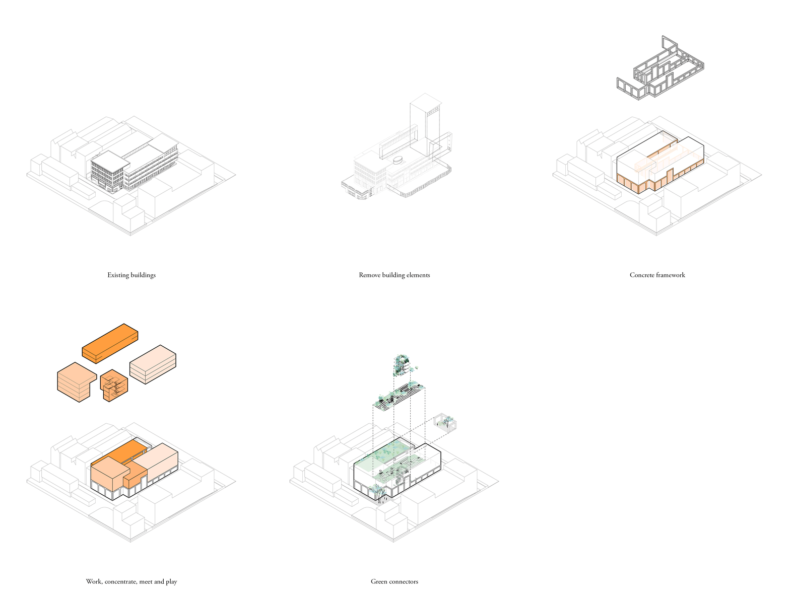
Studioninedots设计以连接为主题,意在连接人、现有建筑和社区。设计师将三座原有建筑连接在一起,有机会创造一个完全开放的底层和充满活力的景观,为联合会议和非正式互动提供令人振奋的空间。灵活的工作空间不仅为不同的项目和用户提供了便利,而且通过在同一栋建筑中容纳更多的人而提高了利用率。
“The concept of connection guides the design: connecting the existing buildings, connecting people and connecting with the neighbourhood.”
Studioninedots’ starting point for the design was the theme of connection – of people, of the existing buildings and with the neighbourhood. Linking the three original buildings together gave us the opportunity to create a fully opened ground floor, a dynamic landscape with inspiring spaces for joint meetings and informal interactions. The flexible workspaces not only facilitate diverse programmes and users, but promote efficiency by accommodating more people in the same buildings.
▽建筑改造方案过程 Process


“开放底层空间和办公区将不同的项目和用户联系起来,并将三个独立的建筑元素统一起来。”
中央楼梯穿过整个中庭高度,形成了建筑的绿肺和沿街面的醒目景观。楼梯采用典型的分层平台,可以作为一条便利通道和同事之间自发互动的新场所。考虑到楼梯处的动态通行特征,集体办公空间分布在楼梯周围,而需要更安静或更专注的活动场所则被安排在远处。
“Opening up the ground floor spaces and the office areas links the varying programmes and users, and unites the three separate building elements.”
Across the full height of the atrium rises the central staircase, the building’s green lung and an eye-catcher from the street. The staircase is typified by the split-level plateaus, which act as shortcuts and new places for spontaneous interactions between colleagues. Given the dynamics on the staircase, the collective work functions are grouped around it and the activities that require more quiet or concentration are placed at a distance.


一楼中心为一个郁郁葱葱的庭院花园。这片绿色空间似乎通过两侧的开放外墙延续到了Werklab和餐厅,并吸引了Nieuwe-Vaart运河边的游人目光。在天气好的时候,外墙可以全部打开,这样,花园也成为开放式底层的一部分。
At the heart of the ground floor is the lush courtyard garden. This green space seems to continue into the Werklab and restaurant via the open facades on either side, and catches the eye from the Nieuwe Vaart canal. In good weather, the facades can be opened all around, so that the garden also becomes an integral part of the open ground floor.


“新的内部和外部干预措施强调了联系和可持续性的指导主题。”
设计的目标不在于增加材料,而是尽可能多地去除材料。这不仅创造了更多无遮挡的高度和透明度,而且大大提高了建筑的可持续性。混凝土结构中的框架参考了周围建筑中特有的拱形元素,赋予了建筑特征。
“New internal and external interventions underline the guiding themes of connection and sustainability.”
Instead of adding materials, we aimed to remove as many as possible. This not only creates more unobstructed heights and transparency, but also contributes greatly to the building’s sustainability score. The frames in the concrete structure that provides the building with its identity refer to the characteristic arch elements in the buildings in the surrounding area.


▽建筑改造前后平面对比图 Plan comparison before and after transformation
项目名称:Lieven de Key HQ
地点:荷兰 阿姆斯特丹 Hoogte Kadijk
方案用途:再利用办公楼、餐厅、实验室和庭院花园
总建筑面积:5000平方米
证书:BREEAM-NL In-use优秀
设计周期:2017-2021
客户:Lieven de Key
设计团队:Albert Herder、Vincent van der Klei、Metin van Zijl、Bas van der Pol、Jurjen van der Horst、Sem Holweg、Rutger van der Meer、Gerty Daniels、Adan Cardak、Leire Baraja Rodriguez、Camille Moreau、Eva Souren、Stefanie Krietemeijer
合作伙伴:DELVA Landscape Architects | Urbanism、DZAP、Techniplan、Strackee、Cauberg Huygen、Wijngaarde&Partners、Skaal、Logge Circulair
摄影:Frans Parthesius
Project name: Lieven de Key HQ
Location: Hoogte Kadijk, Amsterdam, NL
Programme: Re-use of office building, restaurant, Lab and courtyard garden
GFA: 5.000m2
Certificate: BREEAM-NL In-use: Excellent
Design – realisation: 2017-2021
Client: Lieven de Key
Design Team: Albert Herder, Vincent van der Klei, Metin van Zijl, Bas van der Pol, Jurjen van der Horst, Sem Holweg, Rutger van der Meer, Gerty Daniels, Adan Cardak, Leire Baraja Rodriguez, Camille Moreau, Eva Souren, Stefanie Krietemeijer
Collaborators: DELVA Landscape Architects | Urbanism, DZAP, Techniplan, Strackee, Cauberg Huygen, Wijngaarde & Partners, Skaal, Logge Circulair
Photography: Frans Parthesius
“ 将建筑底层打通设计,塑造统一的中庭空间和庭院,使空间利用最大化。”
审稿编辑: SIM
更多 Read more about: Studioninedots


0 Comments