本文由 goa大象设计授权mooool发表,欢迎转发,禁止以mooool编辑版本转载。
Thanks GOA for authorizing the publication of the project on mooool, Text description provided by GOA.
goa大象设计:大规模综合开发中,秩序的“统一”和空间的“多样”,是互为制衡的“一体两面”,上海长风中心项目的实践过程,是对这二者的巧妙平衡。
GOA: In large-scale comprehensive development, the “unity” of order and the “diversity” of space are at “opposite ends of a scale”. The practice of Shanghai Changfeng Center,is a delicate balance between the two.
复合功能街区 A block with complex functions
三幅地块、一个街区 Three plots in one block
上海长风中心位于普陀区,地处中环与内环之间,毗邻长风公园,周边城市界面比较成熟。长风中心的诞生基于对这个成熟区域的提升与展望。在Foster+Partners所作城市设计的基础上,goa大象设计承担了整个10公顷地块的规划与建筑设计工作。
项目是一次综合开发,分三期完成,包括商业、甲级办公、总部办公、公寓等。地块形状不规则,上位规划中一条城市绿带从中间穿过。漫长的开发时序、分裂的场地现状给整个项目整体性的实现带来一定挑战。如何在此基础上仍然给城市带来一座吸引人的崭新街区,是设计的思考点。
Located between the middle ring and the inner ring in Putuo District, Shanghai Changfeng Center is adjacent to Changfeng Park and surrounded by mature urban facilities. It is born out of upgrades and expectations for this mature region. Based on the urban design of Foster + Partners, GOA worked on the planning and architectural design of the entire 10-hectare plot.
The project is a mixed-use project completed in three phases, including commercial space, Grade A office buildings, headquarters offices, and apartments. The plot is irregular in shape, with an urban green belt running through it in the higher-level planning. The lengthy development process and the scattered layout of sites pose challenges to the integrity of the project. Nonetheless, how to build an attractive new block is a point to be considered in the design.
▽建成实景:花园总部、街区式商业、甲级办公、公寓 Headquarters, Commercial Block, Grade A Office Building, Apartment

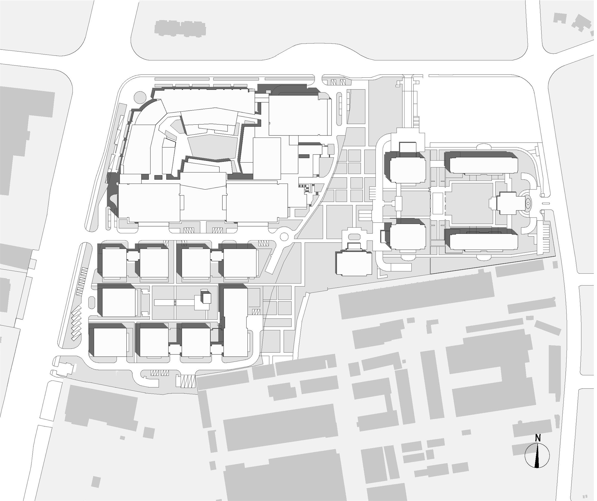
▽总平面图 Plan
规划思路很快被提出:“塑造三个带有院落的组团(尺度均在150m*250m左右),满足不同的开发分期和功能需求,同时以强有力的公共空间体系强化整个街区的空间秩序,加强各组团之间的联系。”三个组团分别是东侧的公寓&SOHO组团、西南角十二宫格结构的总部办公组团以及西北角的街区式商业&甲级办公组团。在最初的规划图纸上,各组团建筑和院落之间就被控制以严密的轴线对位关系。
The planning idea was soon proposed, “To shape three clusters with courtyards (about 150m*250m in size) in order to meet needs in different phases and serve certain functions, and strengthen the space order of the whole block and the links between clusters through a strong public space.” The three clusters are respectively the apartment & SOHO cluster on the east side, the headquarters office cluster in a twelve-grid pattern in the southwest corner, and the block commerce & Grade A office cluster in the northwest corner. In the initial planning drawings, the building clusters and courtyards were strictly aligned along the axis.
▽规划思路 Planning Ideas

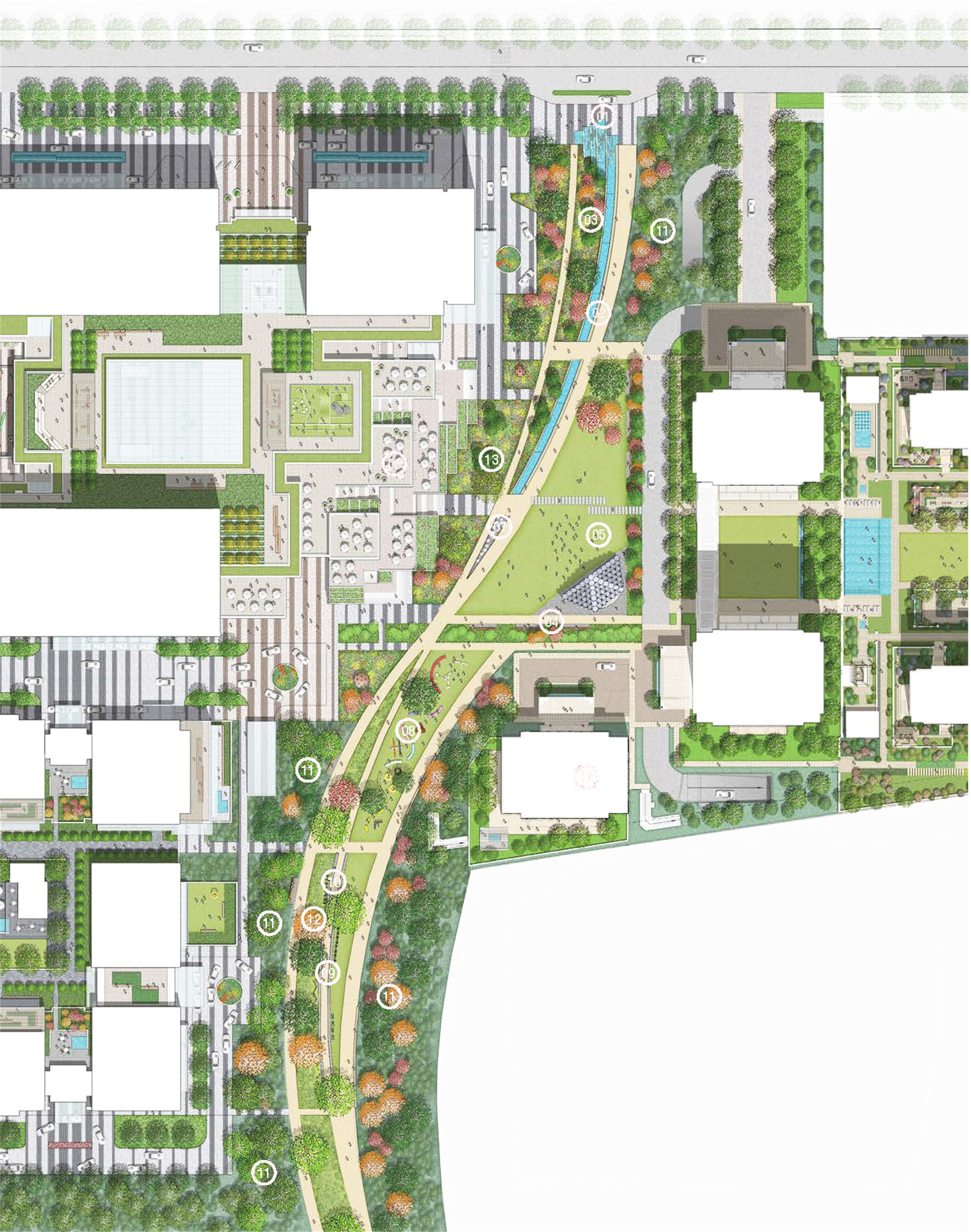
景观绿带成为整个街区的绿色交通枢纽,联系着三个组团,也是整个街区的绿核。从景观绿带到内向庭院,从宅间绿地到广场,公共空间被作为一个完整体系进行考虑。这样的思考方式一直坚持到三次分期全部落成,保证了完整街区的实现。
Connecting the three clusters, the landscape green belts constitute a green transportation hub of the whole block, and serve as the green core of the whole block. The public space is taken into account as a complete system, from landscape green belts to inner courtyards, from the green space between buildings to the square. This way of thinking has run through all three phases of the project, thus ensuring the integrity of the block.
景观渗透 Landscape permeation
柔软而多义的边界 Blurred and flexible boundary
公共空间承担着消解组团间边界的作用。建筑师着意以空间渗透的手法进行处理,绿色景观的渗透是一条尤为显著的线索。
The public space blurs the boundary between clusters. Architects dealt with it through space permeation, and the permeation of green landscape is a striking clue.
▽景观总图(概念) General layout of landscape(conception)
▽绿带与建筑之间的关系(概念)The relationship between the greenway and buildings(conception)
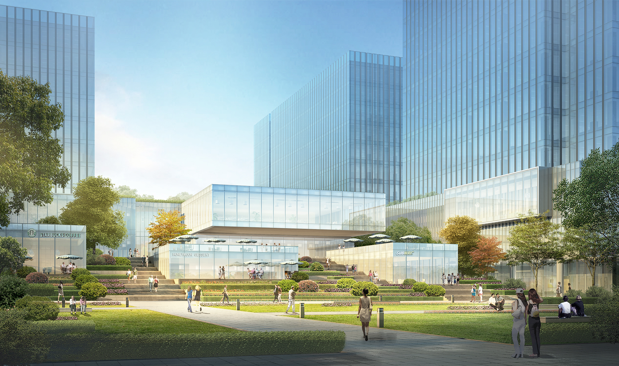
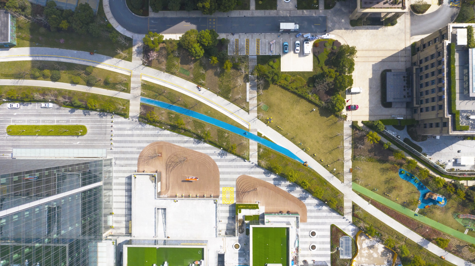
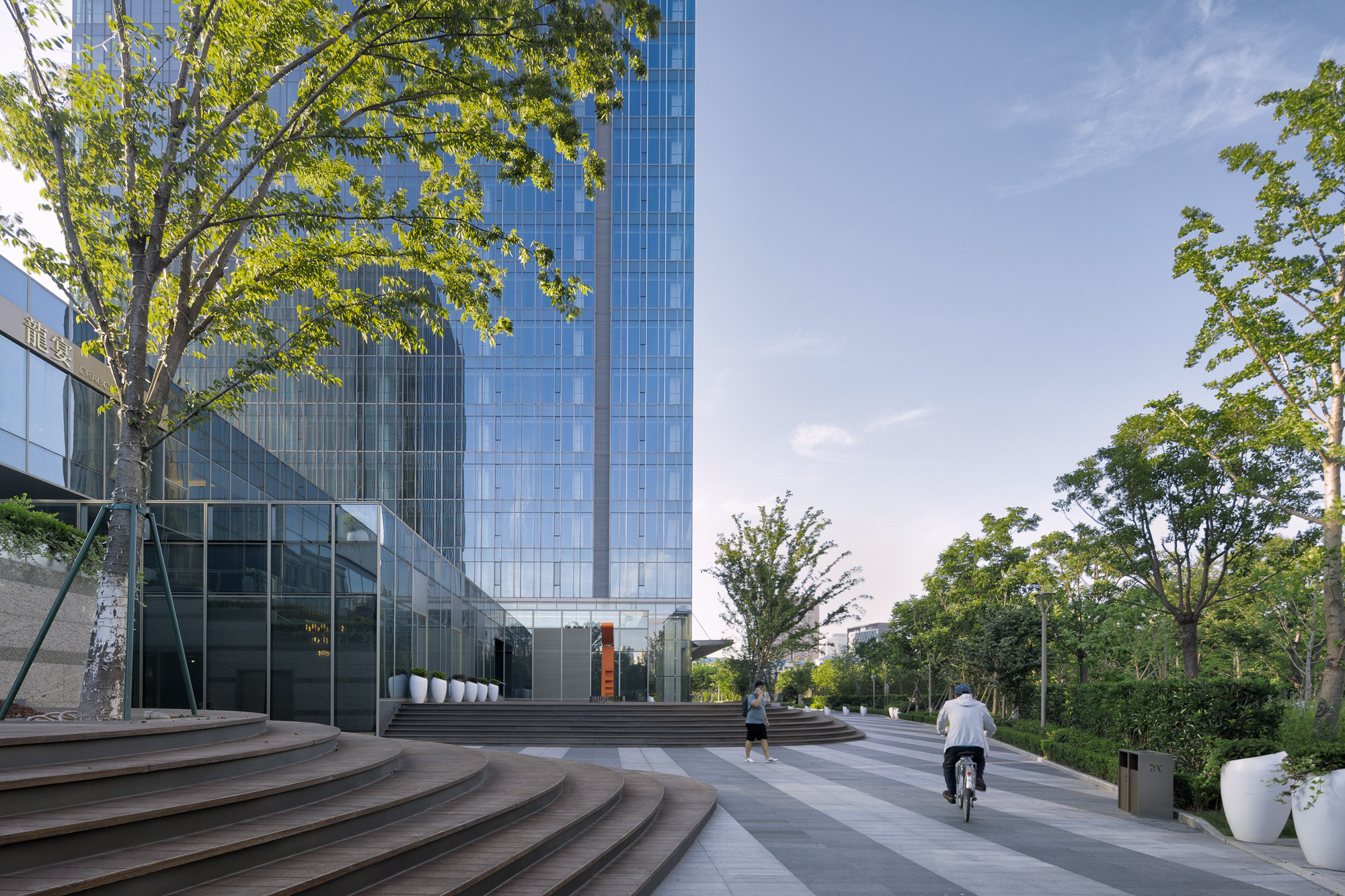
中央的绿带宽约30米,在北侧经过空间放大形成一处110m*90m的方形花园。方形花园的四周,建筑师对于裙房建筑体量进行“化整为零”的处理,以体量的切分、像素化、退台等手段,让建筑物与绿带之间的边界变得更为柔软。上上下下的立体路径引导人们在绿带与商业办公之间来回自如游走,并获取丰富的视线及步行感受。从公共绿带望向建筑集群,交错、悬挑、堆叠方盒子形成一组生动而亲切的画面。
The central green belt about 30m wide is enlarged into a 110m*90m garden on the north side. Around the garden, the architects “broke up” the annex buildings into parts, blurring their boundaries between the building and the green belt through volume segmentation, pixelated design, and terraces. The three-dimensional paths allow people to travel between the green belt and the commercial and office space, bringing them a wealth of views and feelings. Seen from the public green belt, the building clusters, like staggered, overhanging and stacked boxes, form a vivid and pleasant view.
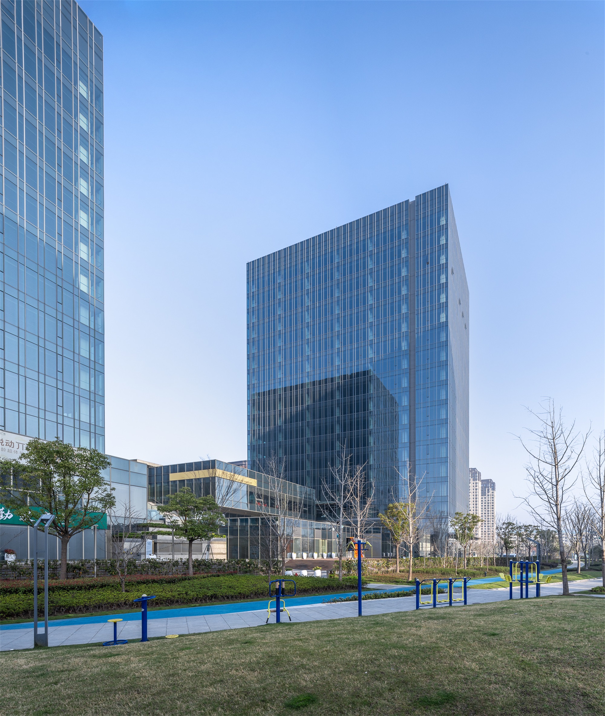
▽甲级办公实景 Photo of the Grade A Office BuildingThe relationship between the greenway and buildings(conception)

建筑消隐 Dissolved building
规整布局中的灵动感 Flexible in a neat layout
总部办公组团包含10座带有屋顶露台的四层点状小楼,采用十二宫格的格局进行布置,在个别部位加以连缀、错位以破除单调。这些楼栋共同围合成一个矩形的静谧花园,整组建筑与地面景观融合在一起。
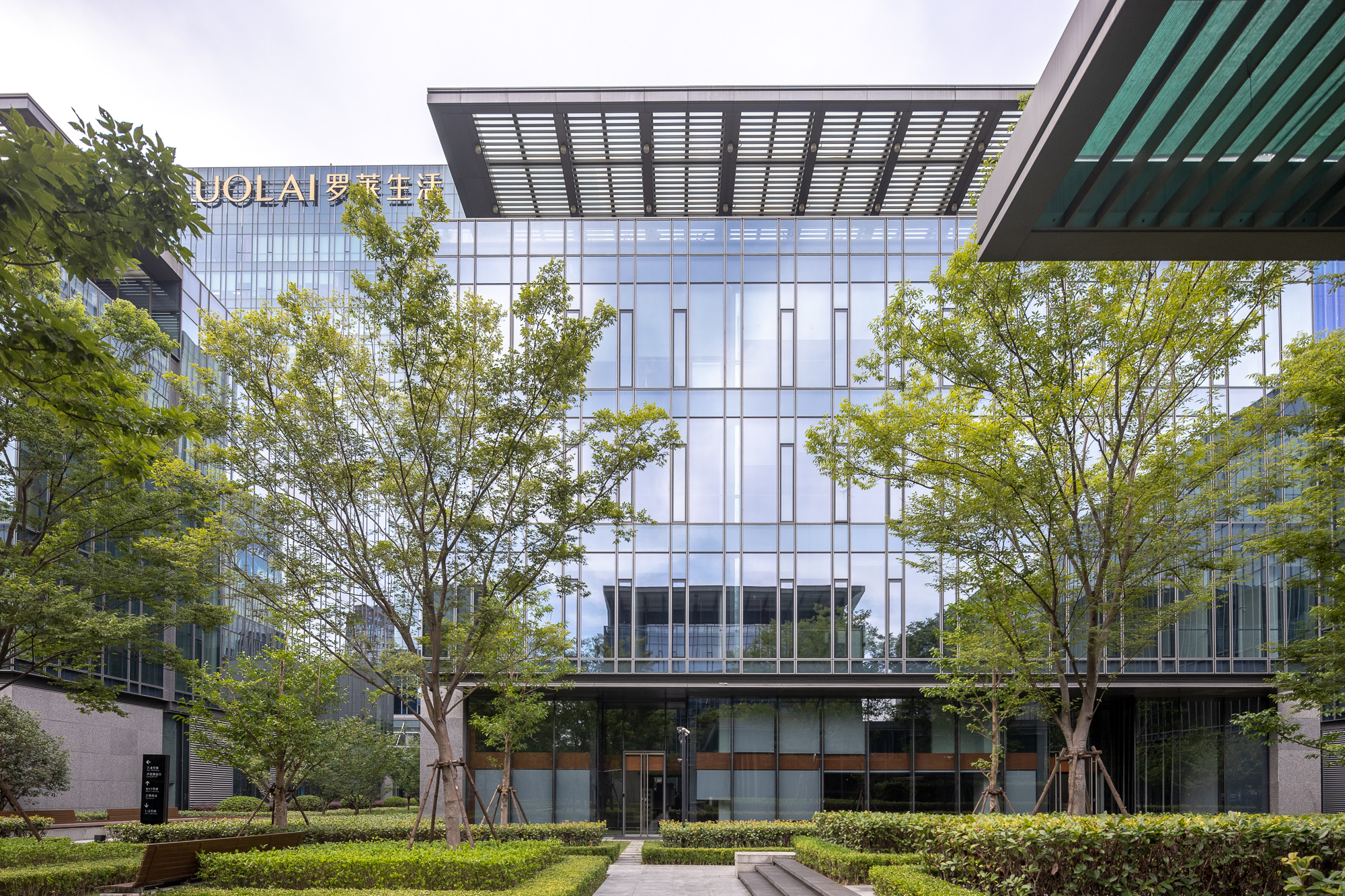
四层的高度与树冠的高度达成一种和谐,极为平坦的玻璃立面上,景观倒影成为了主角。在很多角度看,建筑群仿佛消隐在一片茂盛的绿色之中。建筑朝向绿带的位置设置有供人停留的灰空间,光和风可以穿过,花园景观绿植一直延伸到脚下。景观和视线的渗透模糊了室内外界限,给方盒子建筑物增添了优雅、灵动的氛围。
The headquarters office cluster consists of 10 four-storey dotted buildings with roof terraces, which are arranged in a twelve-grid pattern, connected and staggered in some parts to break the monotony. Together, these buildings enclose a tranquil rectangular garden and the whole cluster is integrated with the ground landscape.
The four-storey building is in perfect harmony with tree canopies of the same height, and the landscape is reflected in the extremely flat glass façade. From many perspectives, the buildings seem to disappear in a lush green. In the buildings, there are transition spaces facing the green belt where people can stay and light and wind can pass through, and the green plants in the garden extend to people’s feet. The infiltration of landscape and view blur the boundary between inside and outside, lending an elegant and flexible atmosphere to the box-like buildings.
▽总部办公实景 Photo of the Headquarters



全时活力 All-time vitality
商业作为城市街道的延伸 Commercial space as an extension of city streets
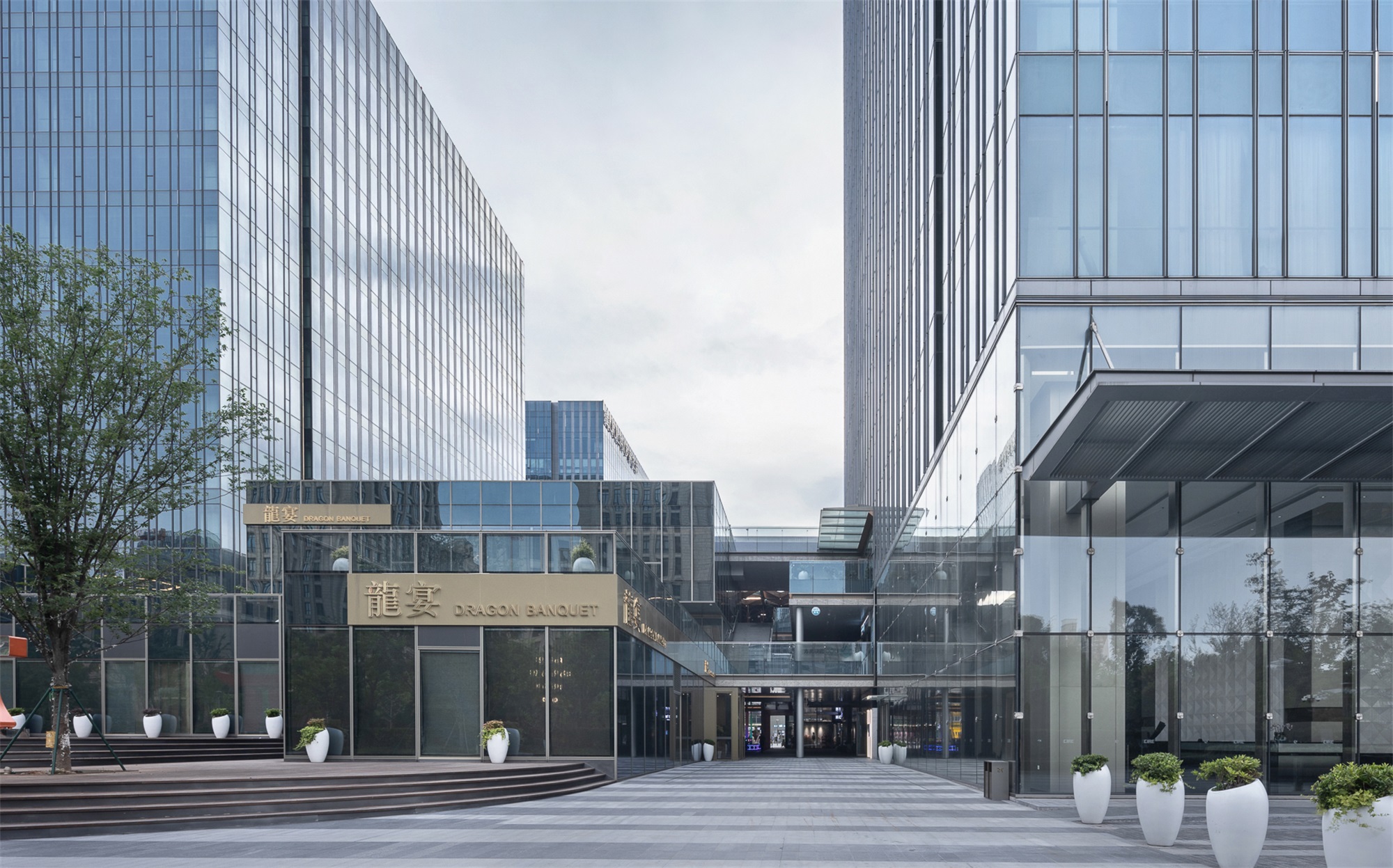
商业组团的体量约4万㎡,以服务街区内部办公人群、周边社区常住人口为主。延续整个项目中对于公共空间的关注,项目团队希望商业空间同样变得“透气”而非“封闭”,与外部具有充分的联系。“街区式”的布局方式因此被确定下来。相比于封闭的shopping mall,这种具有开放性的布局更“亲近”周边社区,也更满足上班族在一天内各个时段的购物休闲需求。动线围绕“活动广场——洄游式步行街”的层次展开,整个空间24小时全时开放,成为城市街道的延伸。
The commercial cluster covers an area of about 40,000m2, mainly serving the office workers in the block and the permanent residents in the surrounding communities. With the focus on public space throughout the project, the project team wanted the commercial space to be open rather than closed, with a full connection to the outside. A “block” layout was thus determined. Compared with a closed shopping mall, this open layout is “closer” to the surrounding communities, and can better meet the office workers’ needs for shopping and leisure at various times of the day. The route of movement unfolds along “square – loop pedestrian street”. The commercial space is open 24 hours a day as an extension of city streets.
▽街区式商业空间结构 Space Structure of the commercial block

▽街区式商业剖透视 Section and perspective of the commercial block
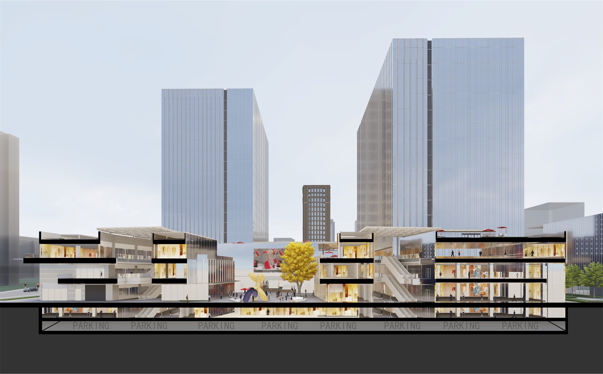
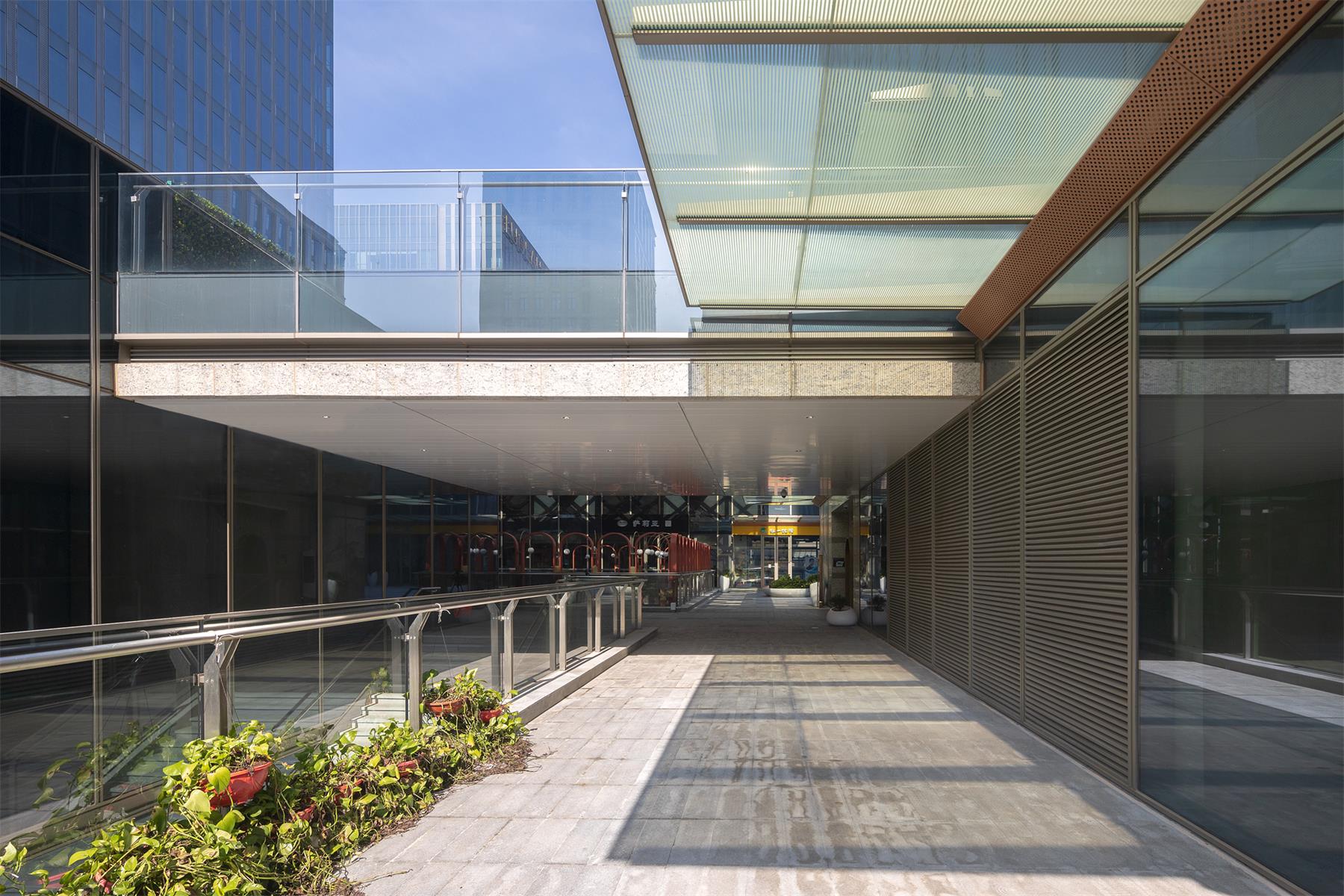
步行街内有阳光和新鲜空气。采光顶棚采用单元式金属格栅与玻璃拼装而成,在晴天具有强烈、明朗的光影效果。在这条步行街的两侧,基于商业运营逻辑,靠近城市道路的一侧是餐饮为主的、进深更大的主力店,而靠近内广场一侧则将空间打碎,容纳业态上更为轻量的店铺。
With sufficient sunlight and fresh air, the pedestrian street features lighting ceiling made of unit-typed metal grilles and glass for creating strong and bright lighting effects on sunny days. According to the commercial operation logics, the pedestrian street is arranged with anchor shops with larger depth, mainly restaurants on the side near the city street; while on the side near the inner square, the space is divided to accommodate smaller shops in terms of business type.
▽街区式商业实景 Photo of the Commercial Block

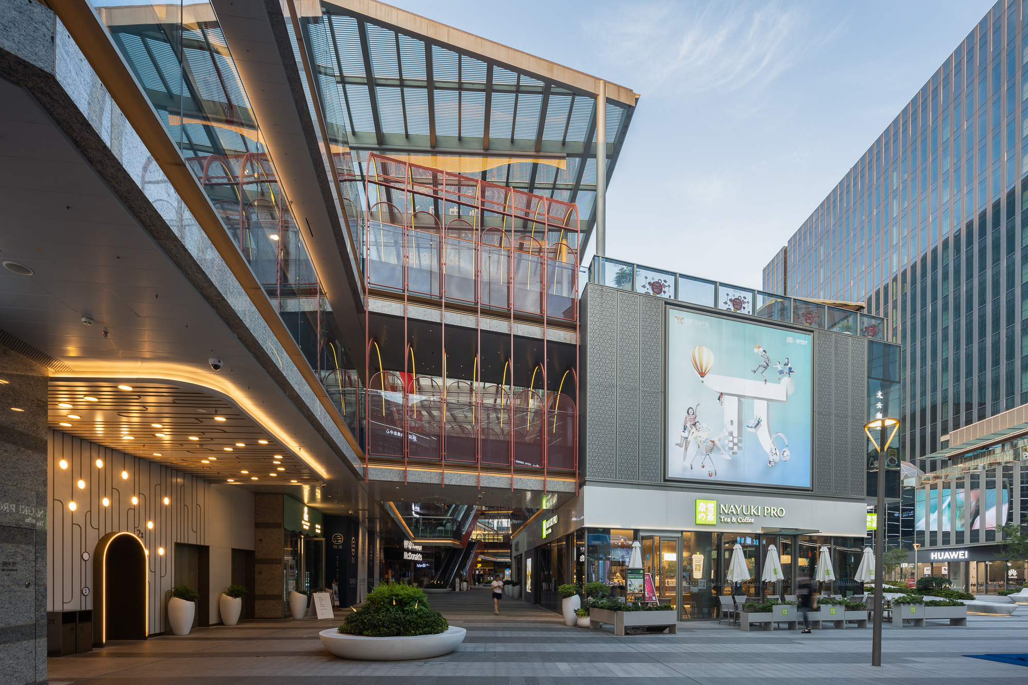

活动广场采用60m*30m的尺度与近1:3的高宽比,以硬质铺装的形式满足多种活动需求。商业的三层设有折线形的凸出露台,拟作为酒吧、轻餐饮的外摆空间,与广场地面具有良好的视线互动关系。
With a size of 60m*30m and a depth-width ratio of nearly 1:3, the square is paved with hard materials to meet the needs of diversified activities. The third floor of the commercial building features a protruding terrace with a folded contour, which is intended to be used as an outer space for bars and light food restaurants, and allows good visual interaction with the square floor.
▽街区式商业实景 Photo of the Commercial Block
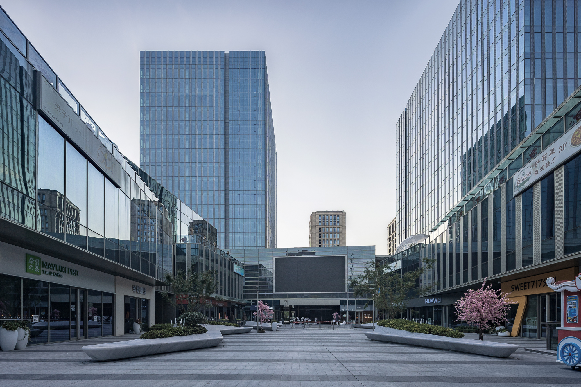
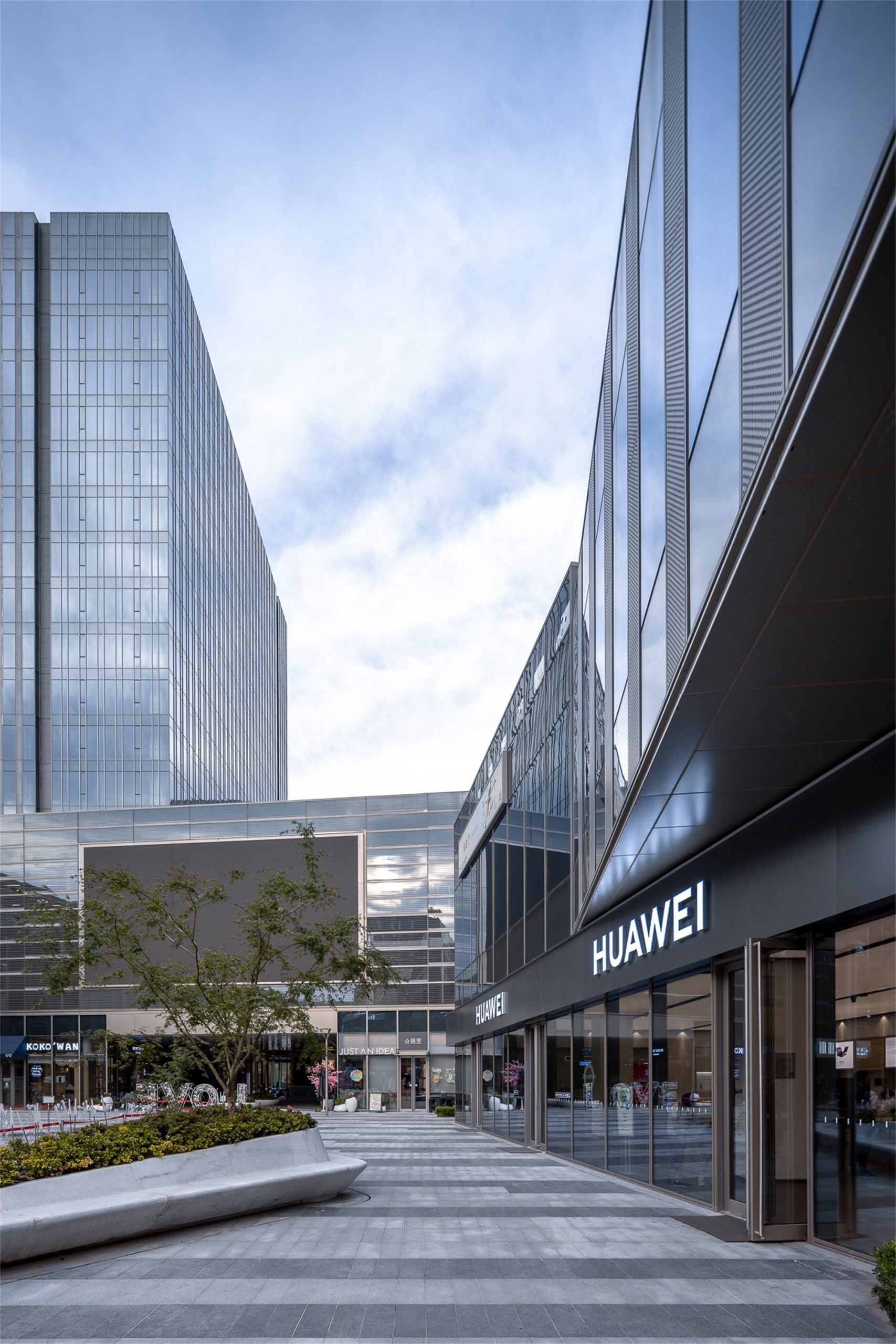
▽广场一角 View from a corner of the square

商环境设计阶段,整个商业空间中植入了更多的情景化营造。入口的拱门、红色金属格栅等如同一件件街道上的“家具”,强化了亲切、富有趣味的街道氛围。
During the design of commercial climate, more scenarios have been implanted into the commercial space. The arch at the entrance, red metal grilles and etc. are like “furniture” in the street, making the street more intimate and interesting.
▽街区式商业实景 Photo of the Commercial Block

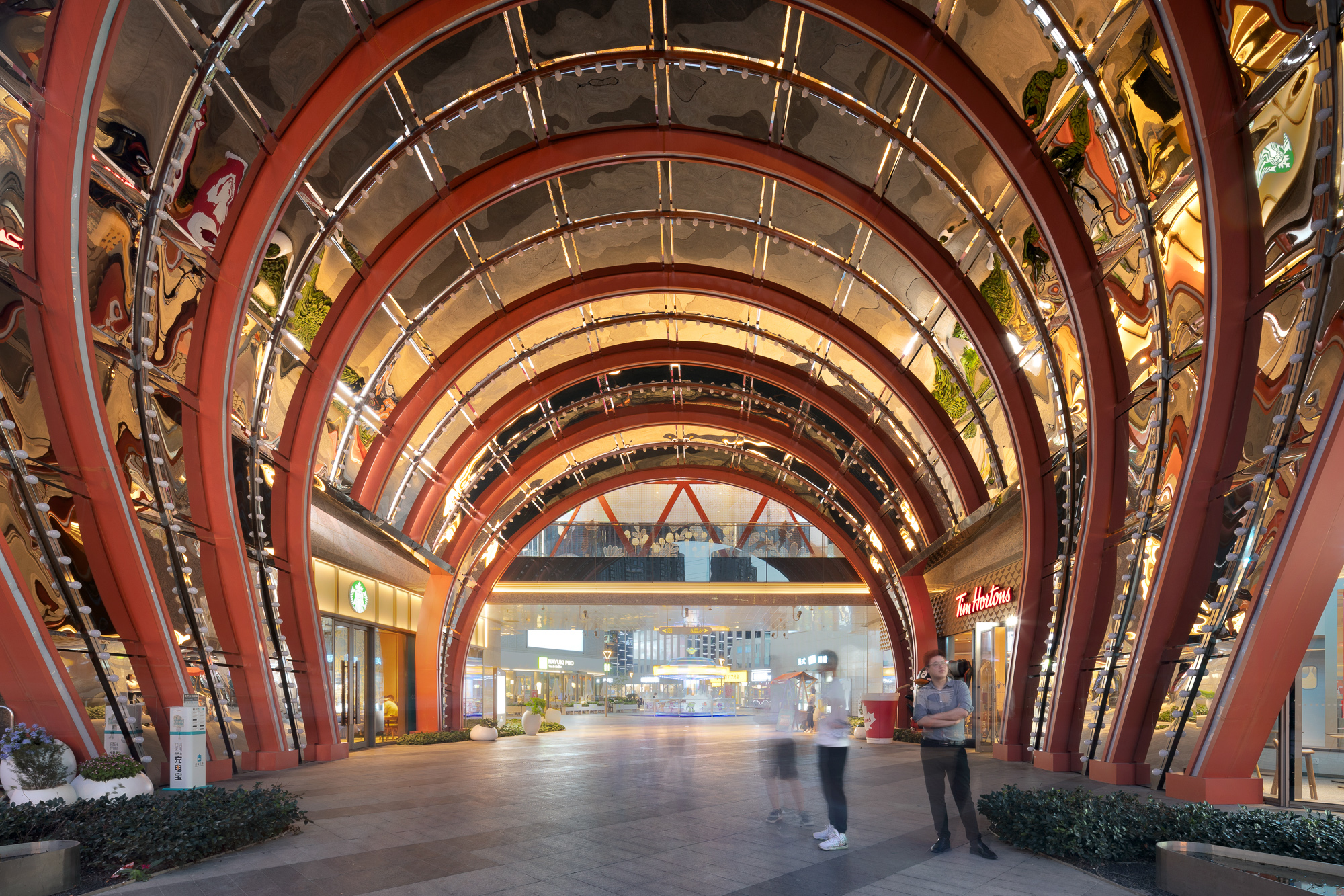
▽商环境情景化设计 Situational design of business environment

统一而丰富 Unified and rich
基本秩序中的节奏与变化 Rhythm and change in basic order
“在基本秩序中求变化”的设计思路,一直延伸到材料和细部的推敲过程中。所有材料模数都经过统一化控制,以保证整体的秩序感和领域感;与此同时,采用层次处理、局部引入多样材料的做法,向使用者传递丰富、活跃的氛围。
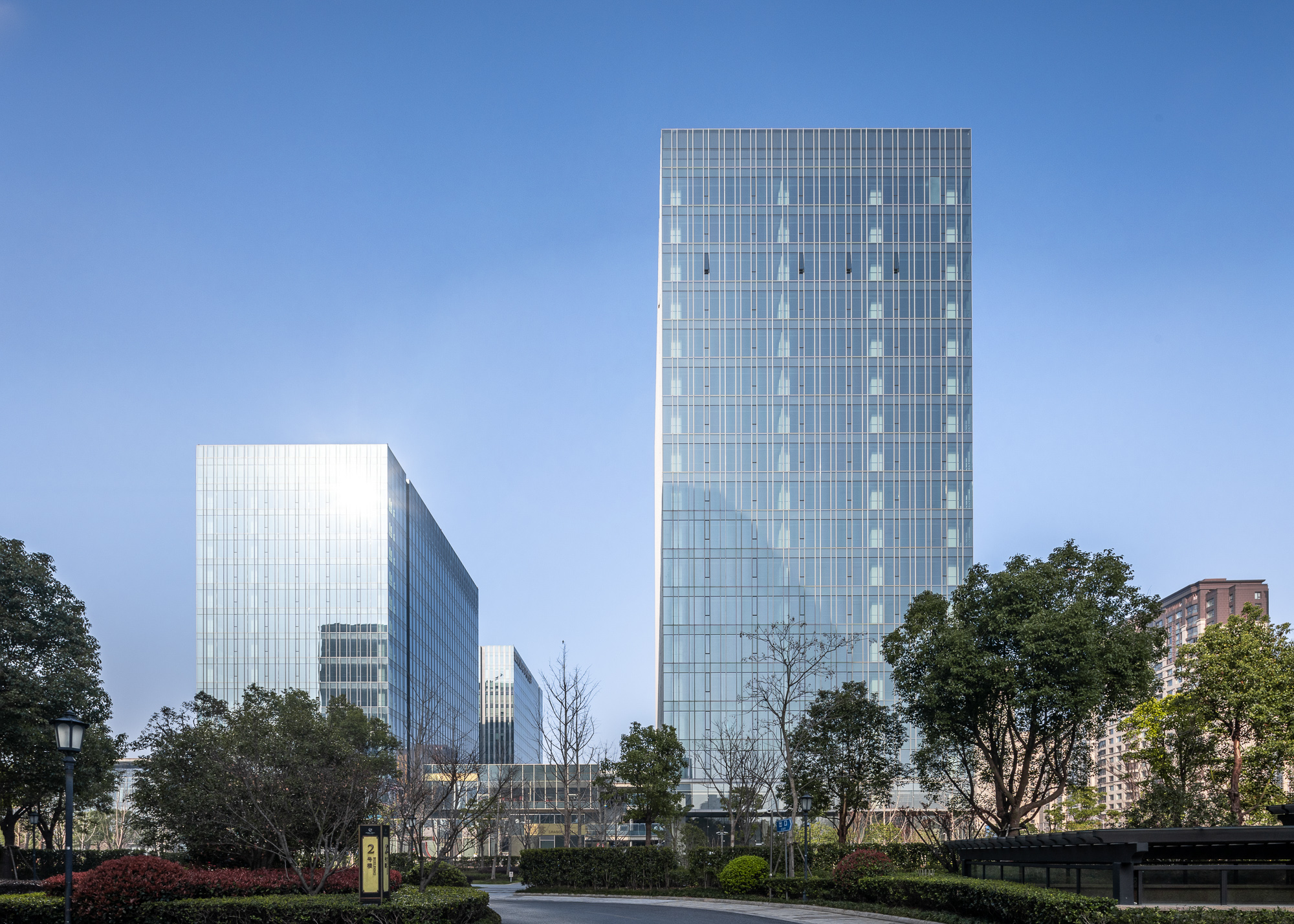
3幢甲级办公立面以蓝青色玻璃幕墙为主,有统一的分割模数。同时,通过穿孔铝板的设置形成两种开启扇部位做法,使得单一的玻璃幕墙立面呈现出虚实对比、节奏分明的状态。个别细部,包括地面悬浮钢雨棚、单元式幕墙的勾边处理等都传递出精致感。
The design idea of “making change in basic order” extends to the deliberation of materials and details. All material modulus has been controlled uniformly to ensure a sense of order and domain; meanwhile, hierarchical design and local introduction of diverse materials create a rich, lively atmosphere for users.
The façades of three Grade A office buildings are mainly indigo glass curtain walls, with unified partition modulus. Besides, the application of perforated aluminum plates allows for two ways of opening windows; in this way, the single glass curtain wall façade presents a distinct contrast between open and closed windows. Some details, including steel canopy suspended above the ground and crispening of the unit-typed curtain wall, convey a sense of delicacy.
▽立面节奏 Rhythm of the facade
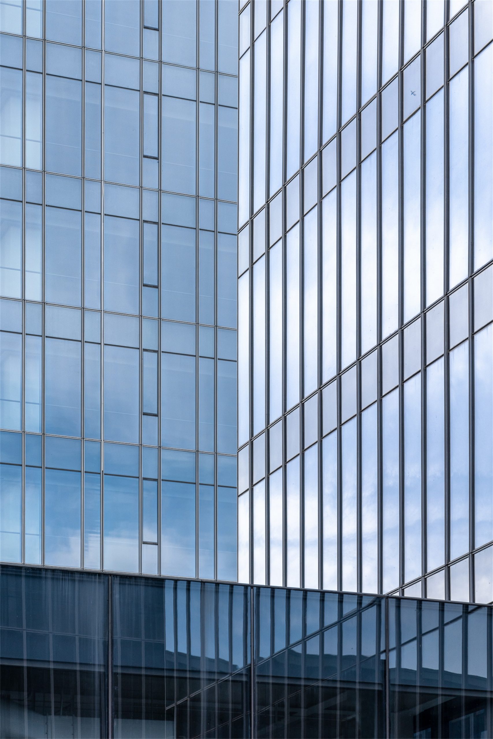
▽办公立面细部 Details of the Office building facade

总部办公建筑沿用了同甲级办公相同的分割模数。同时在近人尺度上增加石材面,更贴合内向花园的温馨氛围。在与景观相联通的部位,超白玻璃的运用满足视线穿透的需要。
The partition modulus for the headquarters office building are the same as that for the Grade A office building. Meanwhile, stone surfaces are used to make the design more approachable, more suitable for the warm atmosphere of the inner garden. In the parts connected with the landscape, the use of ultra-clear glass allows people to look through.
▽商业立面 Facade of commercial buildings
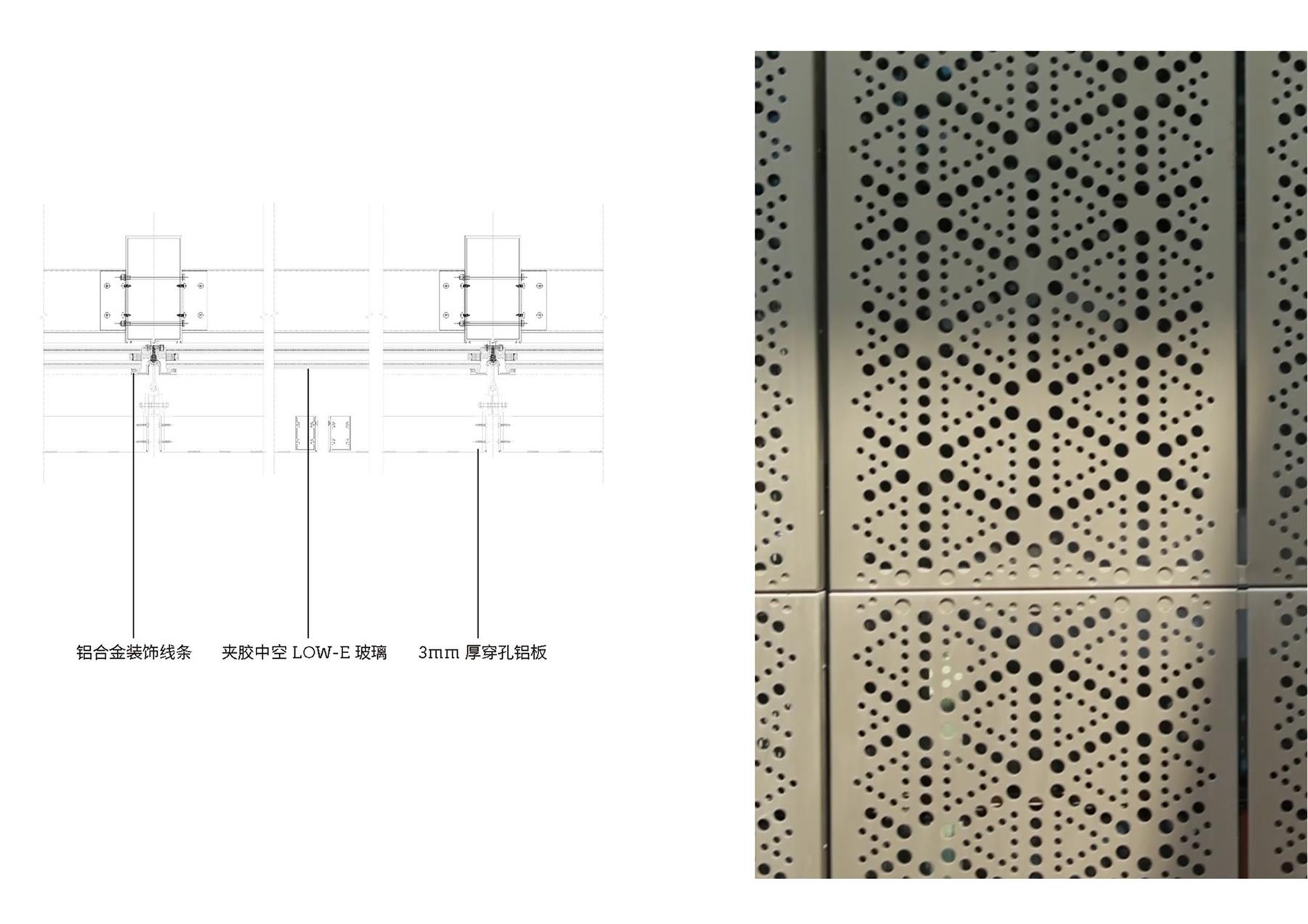
▽穿孔铝板细部 Details of perforated aluminium plate
▽采光顶细部 Details of the daylighting roof
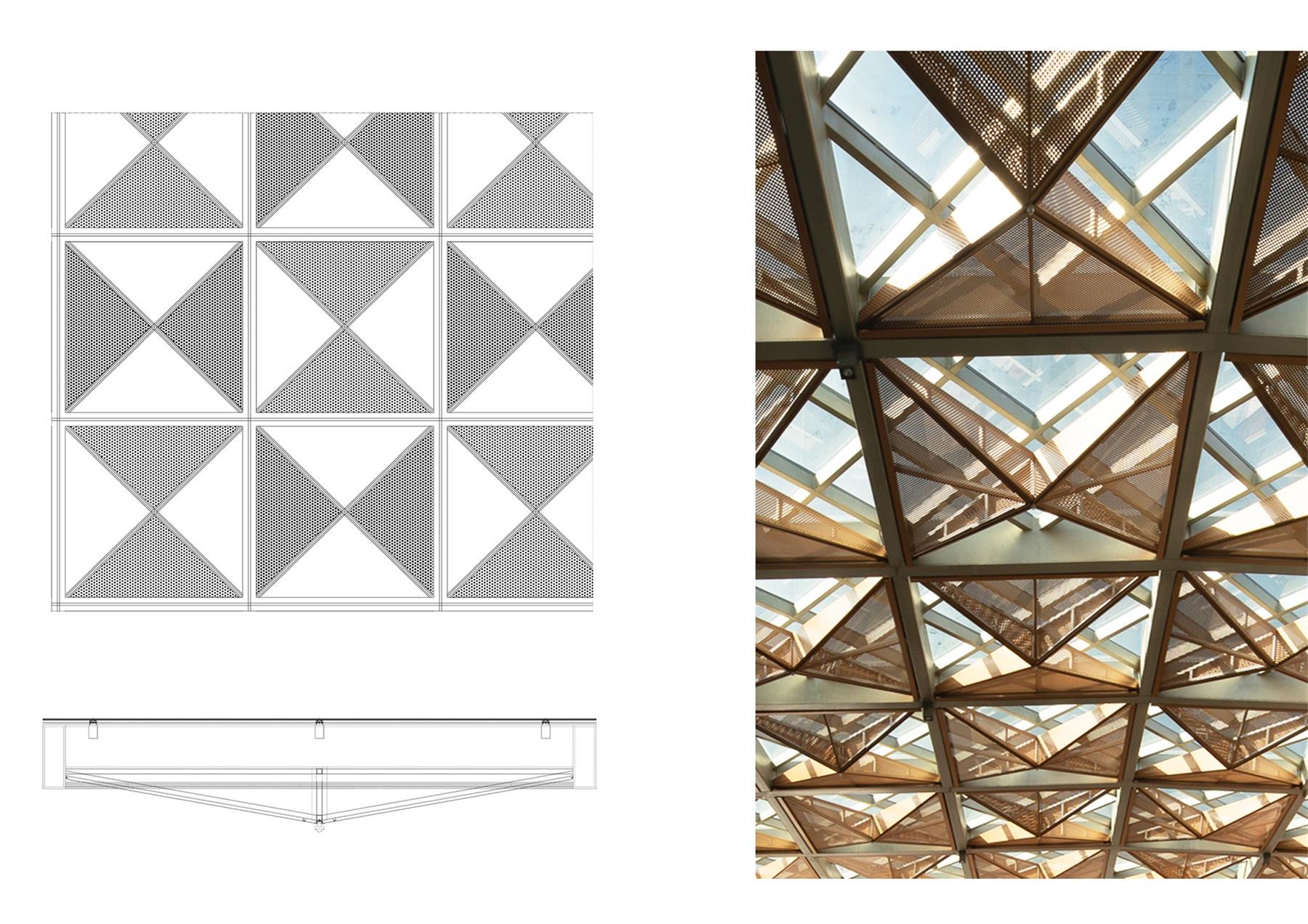
商业部分整体色调偏暖,重视以多样材料、多种颜色的拼贴组合营造活跃的氛围。仅玻璃一项即包括不同透光率、不同色调的中空Low-E玻璃、彩釉玻璃、高透玻璃等,此外还引入不同种类的石材、穿孔铝板等。多处穿孔铝板的运用不仅满足了城市设计规则中对于建筑玻墙比的要求,也满足灯光投射需求。
The commercial space features a warm tone, and the collage of various materials and colors creates a lively atmosphere. As far as glass is concerned, there are insulating low-E glass with different light transmittance and color, glazed glass, and high-transmittance glass. In addition, different kinds of stone and perforated aluminum plates are also introduced. The application of perforated aluminum plates at multiple parts not only meets the ratio of glass curtains to walls as required in urban design rules, but also meets the needs of light projection.
超越红线 Beyond the boundary line
整体性思考的力量 Power of holistic thinking
在长达9年之久、历经若干分期的开发历程中,保持初心、落实初心并非易事。这样的过程考验团队的全局视角,要求建筑师能够跨越单一地块红线的局限去思考问题。最终,项目团队对此交出了一份负责任的答卷。通过严谨的规划设计、公共空间的体系化梳理、空间细节的全程把控,为城市落成了一片“统一而丰富”的活力街区。
It is not easy to maintain and implement the original aspiration after nine years of development in several phases. This process requires the team to have a holistic view and the architects to think beyond the boundary line of a single plot. In the end, the project team delivered a responsible result. Through rigorous planning and design, systematic arrangement of public space, and whole-process control of spatial details, a “unified and rich” block full of vitality has been built for the city.
▽街景 Street view


▽剖立面 Section elevation
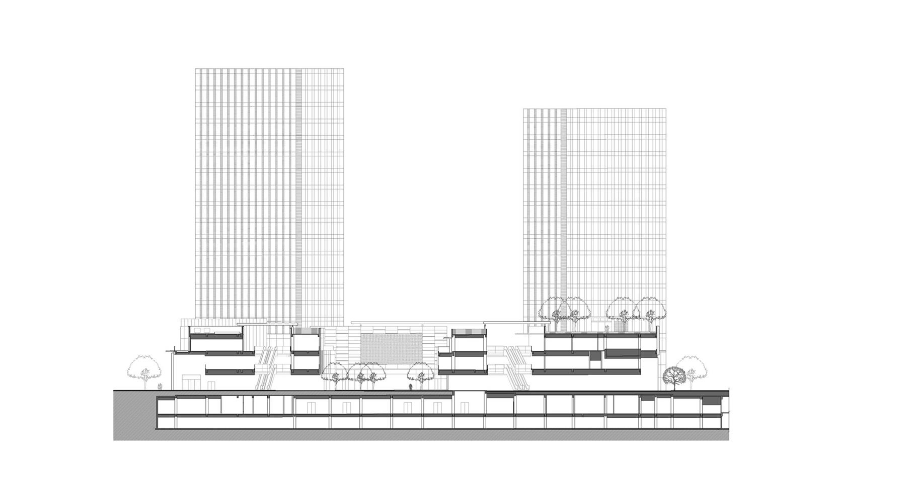
▽甲级办公&商业立面 Elevation of Grade A Office building & Commercial buildings

▽总部办公立面 Elevation of Headquarters

所在地:上海
设计/竣工:2012-2020
建筑面积:360,000 ㎡
图片版权:goa大象设计
Location: Shanghai
Design/Completion: 2012-2020
Floor Area: 360,000m2
Image Copyright: GOA
“ 用景观构建场地中不同板块间的联系。”
审稿编辑 王琪 – Maggie
更多 Read more about: goa大象设计





不得不说这个平面流线真是优美,联通的概念也很有噱头。但是得出来的效果却是将大空间给切碎成了一堆小空间塞在一个本来是一个大节点的框里,还有一条让人看上去觉得是周边啥都没有待提升的“道路”。