本文由 东大(深圳)设计有限公司 授权mooool发表,欢迎转发,禁止以mooool编辑版本转载。
Thanks DONGDA (SHENZHEN) DESIGN CO., LTD. for authorizing the publication of the project on mooool, Text description provided by DONGDA (SHENZHEN) DESIGN CO., LTD..
东大(深圳)设计有限公司:2020年4月,经过近一年的整治提升,由东大设计完成的涌头美丽幸福村居连片建设项目全面建成。该项目是由东莞市住建局发起的美丽乡村示范区建设行动,塑造了一个环境优美、满足现代人多元需求的社区生活空间。涌头社区面积约3平方公里,社区旧村、新村、厂房和村民自建房野蛮生长,密度高却品质低,停车混乱缺乏组织,社区公共空间及设施匮乏,导致社区活力低沉。涌头美丽村居连片建设以农林片区、工厂片区、旧村片区为核心,分区域进行旧村片区核心区提升、山水田园片区整治提升、工厂区整治提升工程,通过工厂、民房、农田等多要素“聚合升级”,实现了城中村“蜕变”,旧貌换新颜。对其它美丽乡村建设起到很好的示范作用,也是推动东莞城市品质提升的重要举措。
DONGDA (SHENZHEN) DESIGN CO., LTD.:In April 2020, after nearly a year of renovation and upgrading, the Chongtou Beautiful Village Residential Contiguous Construction Project designed and completed by Dongda was fully completed. The project is a beautiful rural demonstration area construction action initiated by Dongguan Municipal Housing and Construction Bureau, shaping a community living space with beautiful environment and meeting the diverse needs of modern people. Chongtou community covers an area of about 3 square kilometers. The old village, new village, workshop and villager’s self-built houses grow barbarously, with high density but low quality, disordered parking and lack of organization, and lack of public space and facilities in the community, leading to the low vitality of the community. Caps beautiful village in continuous construction in agriculture and forestry area, factory area, former area as the core, in above area core areas, landscape pastoral area renovation, ascension ascension factories regulation engineering, by many elements such as factories, houses, farmland “aggregation upgrade”, implement the “metamorphosis” village inside city, a completely new look. It plays a good demonstration role in the construction of other beautiful villages, and is also an important measure to promote the improvement of Dongguan’s urban quality.
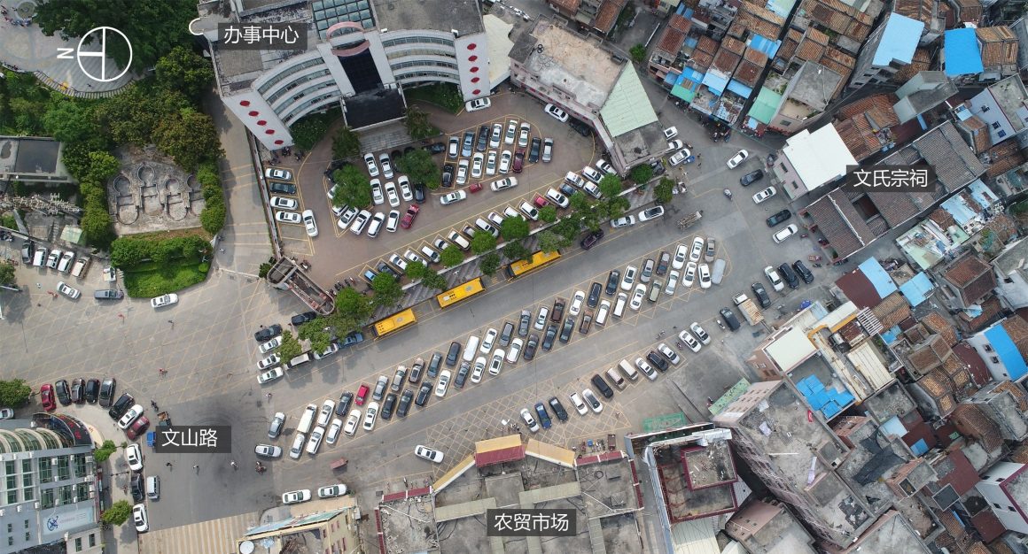
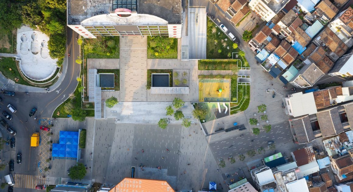
▼项目鸟瞰 The project have a bird’s eye view of
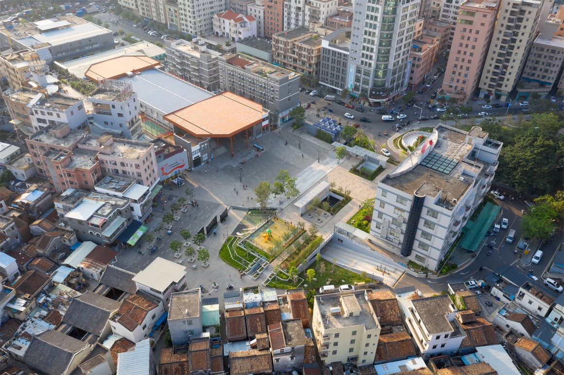
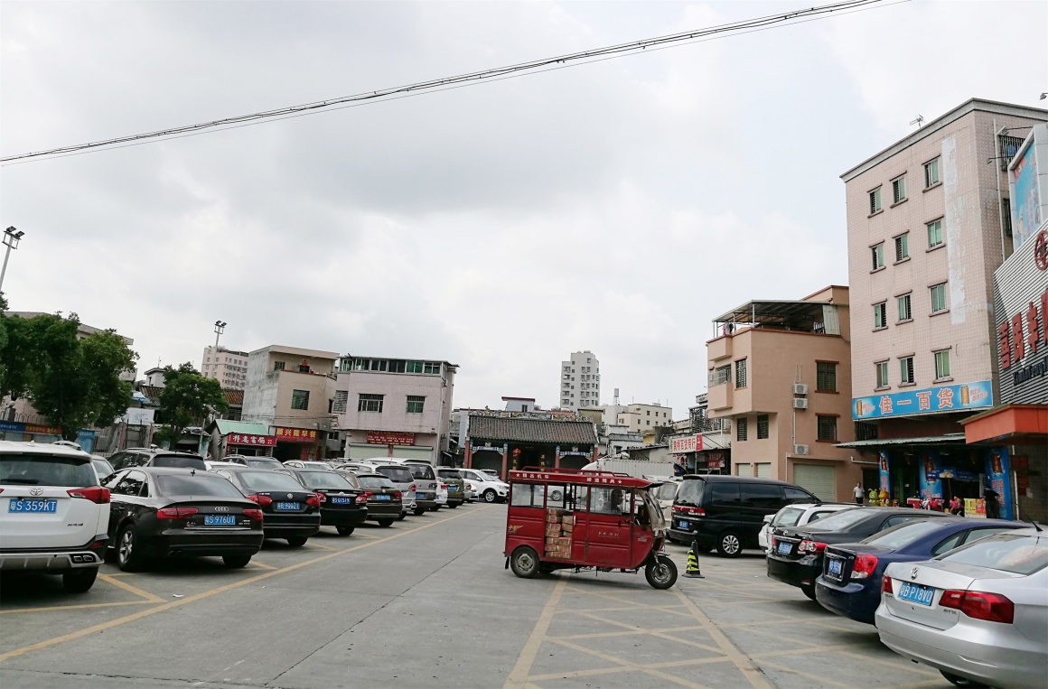
核心区环境综合改造设计是涌头连片建设旧村片区主要的提升内容,项目占地约1.5公顷,通过对片区停车、功能、空间、绿化、周边建筑、铺装、家具设施等全要素进行全面深度的整治提升,营造一个居民真正幸福生活的理想家园。项目北侧是社区主干道文山路,南端为文氏宗祠,涌头办事中心和农贸市场分据东西两侧。场地空间被停车占据,人车混行,安全隐患大,户外活动场地缺乏。设计团队对片区停车重新进行了统筹规划,设置半地下停车场,缓解片区停车压力。同时增设休闲空间,营造社交聚会的场所。
Core environmental comprehensive renovation design is pouring head shall build above for the main content of ascension, the project covers an area of about 1.5 hectares, through to the parking area, function, space, greening, surrounding buildings, shop, furniture facilities all elements increase the depth of a comprehensive regulation, build a residents really the ideal home of a happy life. On the north side of the project is Wenshan Road, the main road of the community, on the south side is Wenclan Ancestral Hall, and on the east and west sides are Chongtou Office Center and Farmer’s Market. The site space is occupied by parking, people and cars mixed, big safety risks, outdoor activities lack of space. The design team has carried on the overall planning for the parking in the area again, and set up a semi-underground parking lot to relieve the parking pressure in the area. At the same time additional leisure space, create a social gathering place.
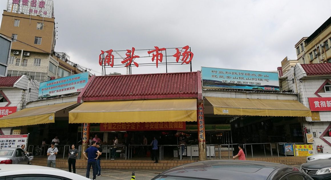
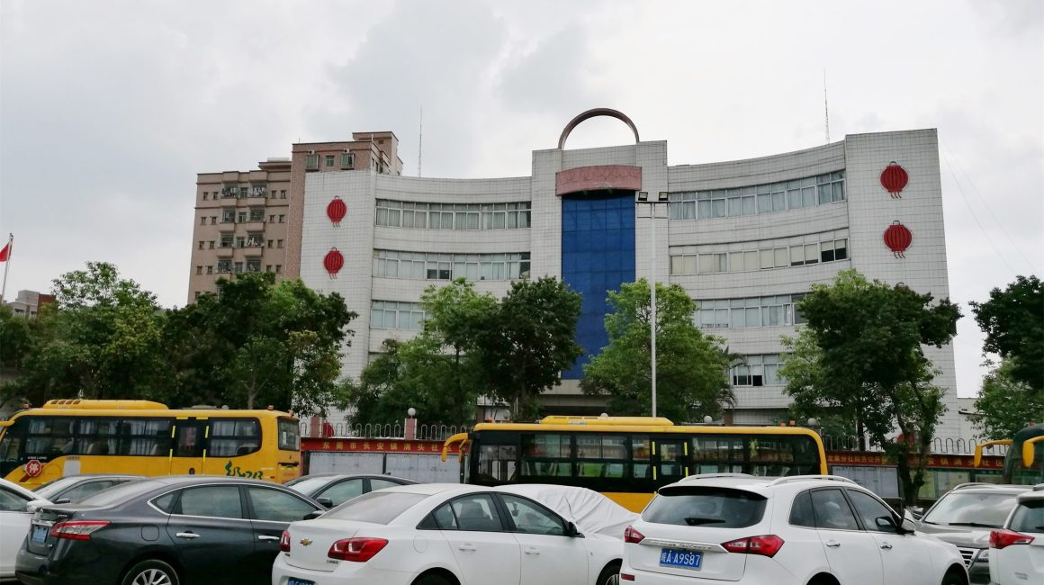
▼改造前照片 Photos Before Transformation
▼改造前后平面布局 Plan layout before and after transformation
设计在总体上尊重已有空间格局,保留现有周边建筑,重点改造农贸市场和办事中心。取消路面停车,原路面停车区域变为纯步行空间,形成中心广场。办事中心前的场地和中心广场存在高差,利用高差设置地下车库,同时车库屋顶自然形成为良好的观景和休闲平台。中心广场和平台之间的2.5米高差以形式优美的大台阶消化,满足步行交通联系的同时提供静坐交流休憩的场所。
The design respects the existing spatial pattern in general, preserves the existing surrounding buildings, and focuses on the transformation of the farmers’ market and office center. Cancel the pavement parking, the original pavement parking area into a pure pedestrian space, forming a central plaza. There is a height difference between the site in front of the office center and the central square, so the underground garage is set by the height difference. Meanwhile, the roof of the garage naturally forms a good viewing and leisure platform. The 2.5m height difference between the central square and the platform is digested by a large step in a graceful form, satisfying the pedestrian connection while providing a place for sitting, communication and rest.
▼项目鸟瞰 aerial view of the project
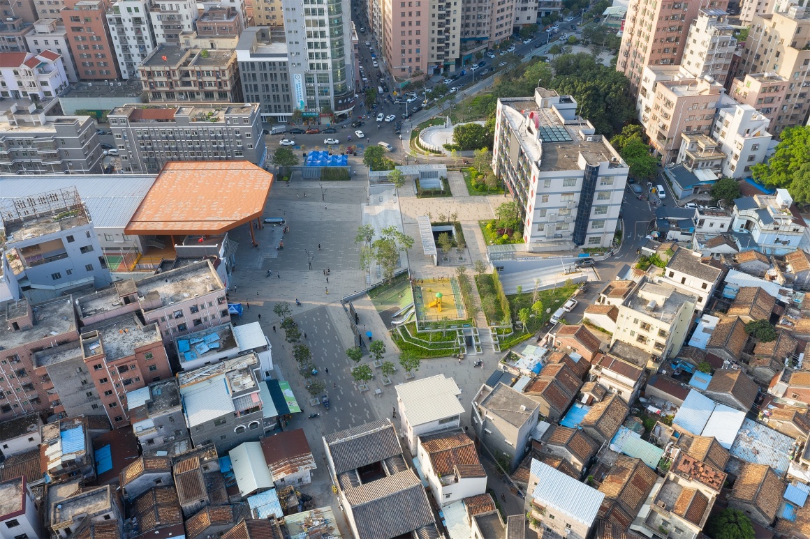
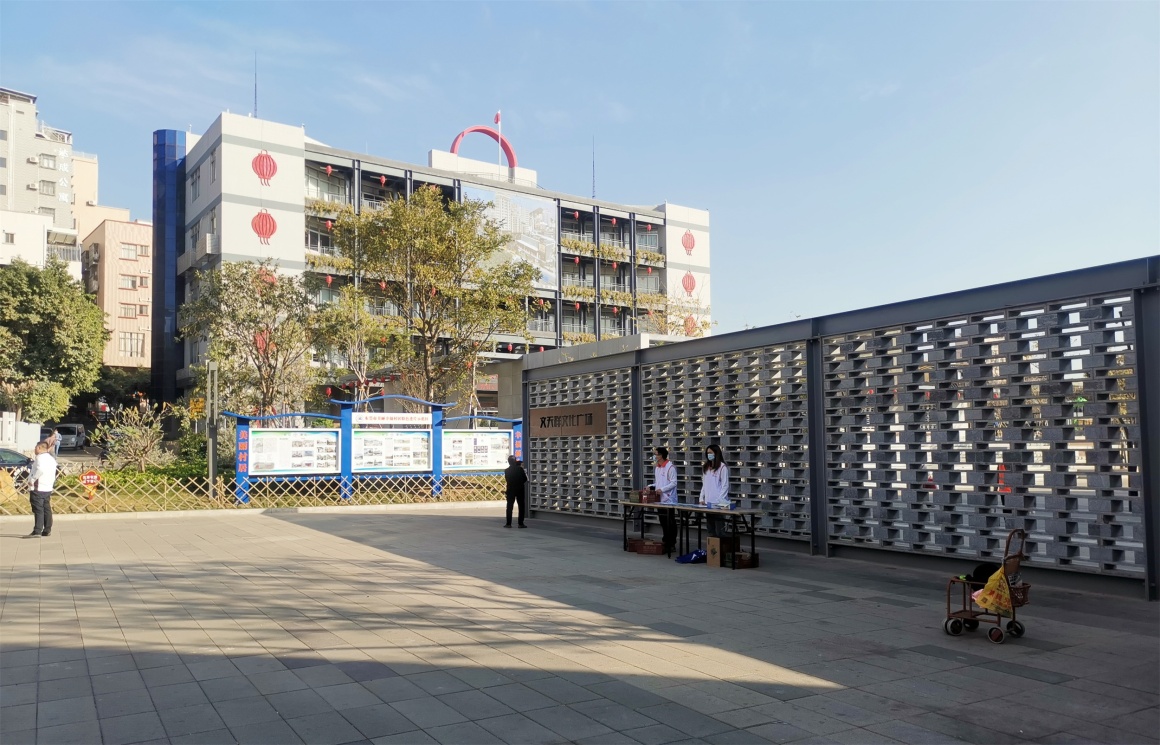
主要出入口设计通透景墙,形成内外空间的边界。景墙采用漏窗方式,由外往内看广场若隐若现,被赋予了一种神秘感。从广场由内往外看,景墙有效地遮挡了周边大体量建筑的不良视线影响。
The main entrance and exit set up a transparent view wall, forming the boundary between inside and outside space. The landscape wall adopts the way of leaky Windows, and looks at the square faintly and faintly from the outside to the inside, which gives a sense of mystery. Viewed from the inside of the square, the view wall effectively blocks the view from the surrounding large buildings.
▼入口景墙(由外往内看) View wall at entrance (from outside to inside)
▼入口景墙(由内往外看) View wall at entrance (from inside to outside)
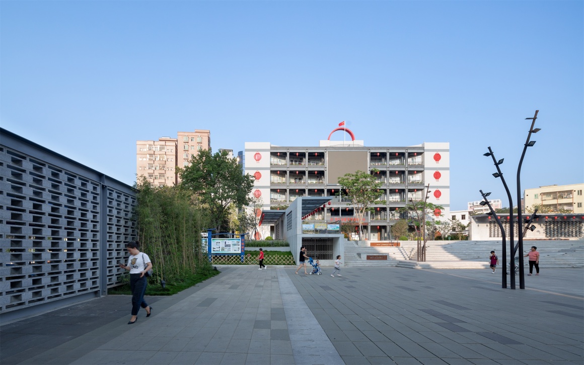
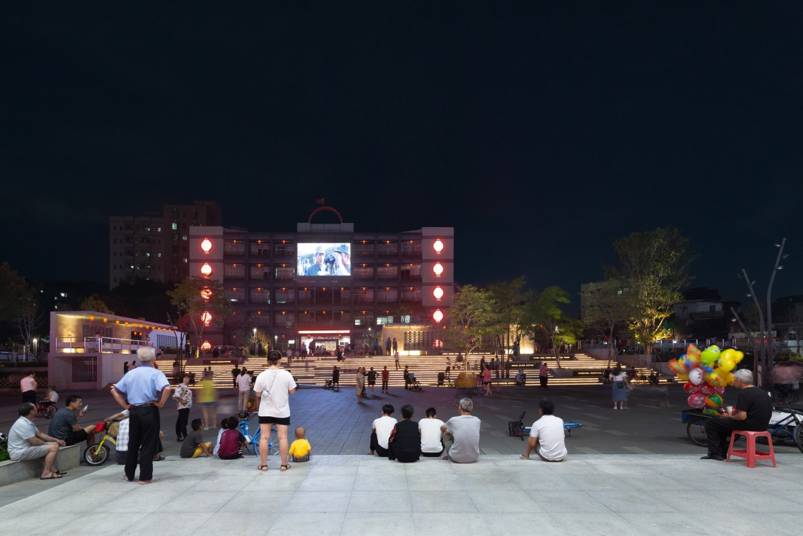
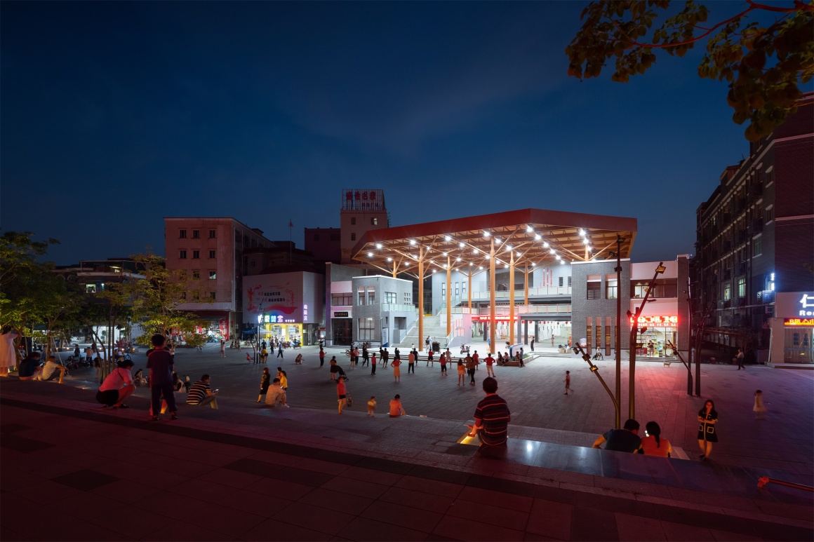
中心广场约1500平米,整个空间用留白的手法刻意做空,仅进行简洁的硬铺,整体感觉大气干净,并能满足居民在此进行的各种功能需要,激活社区活力,成为片区的聚焦点,建成后每天有很多居民到广场度过一段闲暇时光。
The central square is about 1500 square meters, the whole space is deliberately empty with blank space, only simple hard paving, the overall feeling of air clean, and can meet the needs of residents to carry out a variety of functions here, activate the vitality of the community, become the focal point of the area, after the completion of the square every day many residents to spend some leisure time.
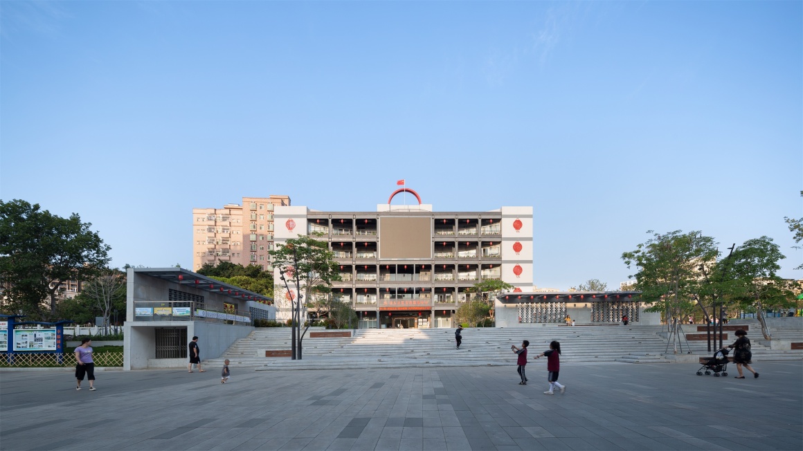
▼整体效果(广场往办事中心方向) Overall effect (plaza towards office center)

▼活力十足的广场空间 A vibrant square space
休闲平台和中心广场间的场地,尺度大且高逾2.5米。设计使用台阶形式消解高差,通过平面上的曲折变化、设计过渡平台及种植树木等手法,弱化了体量和压迫感。台阶既满足上下步行交通及无障碍坡道要求,也是安坐与观景之佳处。
The space between the leisure platform and the central square is large and over 2.5 meters high. The design uses the form of steps to eliminate the height difference. Through the twists and turns on the plane, the transitional platform and the planting of trees, the volume and the sense of pressure are weakened. Steps not only meet the requirements of pedestrian traffic and barrier-free ramps, but also a good place for sitting and viewing.
▼形式多变的大台阶 The great steps of variable form
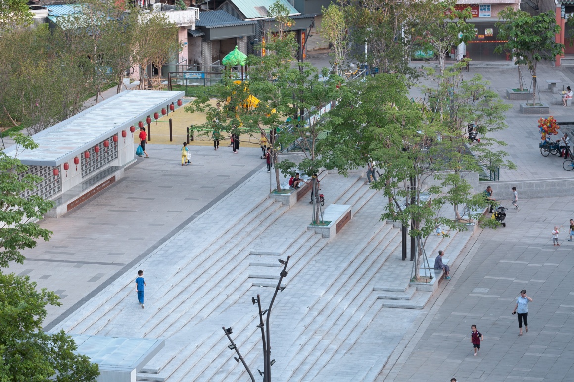
▼小孩在台阶上奔跑、嬉戏 Children are running and playing on the steps

▼老人们于台阶上静坐、交流 The old people sit quietly and communicate on the steps
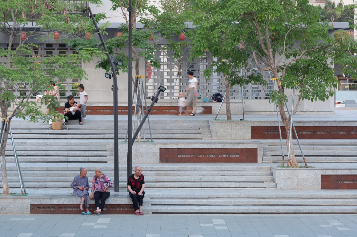
▼灯光亮起,满足基础照明的同时也凸显文化刻字 Lights are on to meet the basic lighting and highlight the cultural lettering
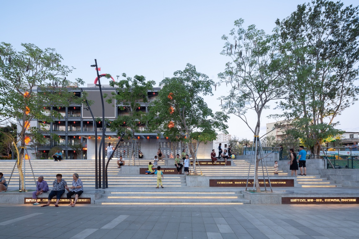
▼台阶夜景 The steps at night
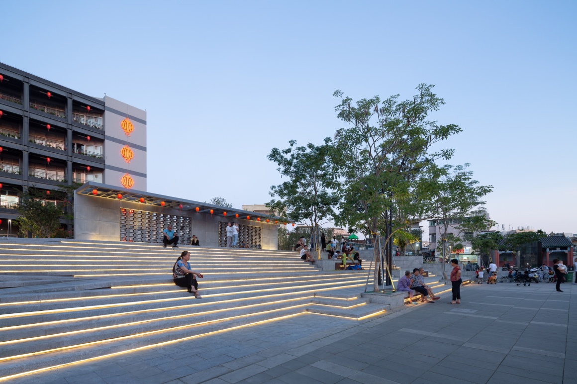
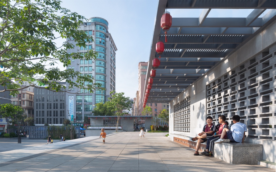
休闲平台面积与中心广场相近,通过廊架、树池分割成若干亲切宜人的小空间,与广场简洁的大空间形成对比。
The area of the leisure platform is similar to that of the central square, which is divided into a number of friendly and pleasant small Spaces through the gallery and tree pool, in contrast to the simple and large space of the square.
▼休闲平台廊下空间 Leisure terrace gallery space
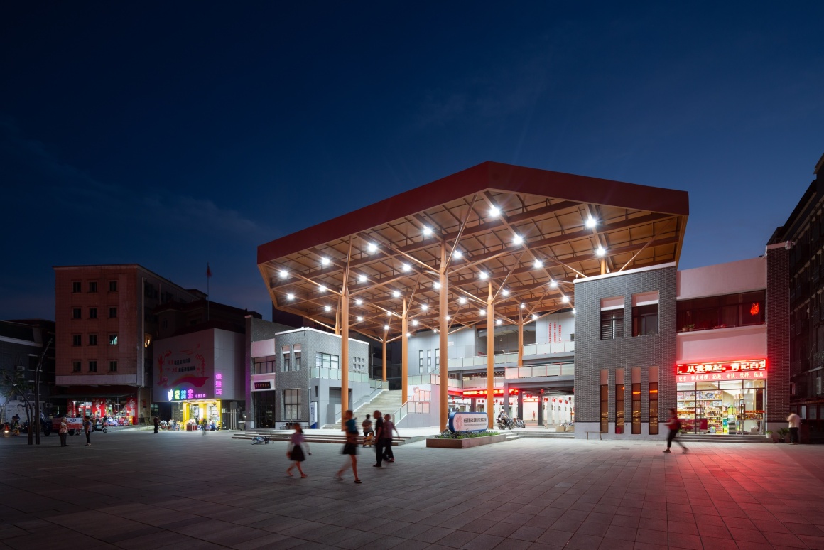
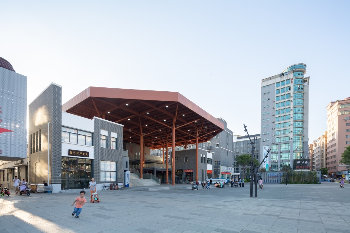
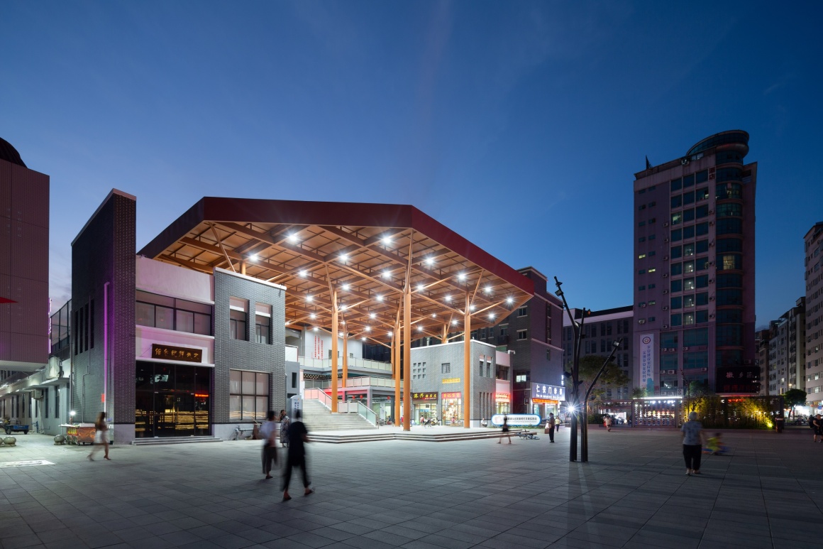
中心广场边的农贸市场,原先低矮破旧、功能单一、卫生不佳,利用率及效益低下。设计在保留主体结构的基础上,于入口处增设挑高大屋顶,完美衔接室内外空间。大屋顶下的大尺度灰空间,不但模糊了室内外空间的界限,还能消解建筑的压迫感。敞开式入口呈现出开放友好的姿态,再通过灰空间将室外空间渗透入建筑。
The farmers’ market near the central square was originally low and dilapidated, with single function, poor sanitation, low utilization rate and low benefit. On the basis of retaining the main structure, the design adds a tall roof at the entrance, which perfectly connects the indoor and outdoor space. Large-scale grey space under the big roof not only blurs the boundary between indoor and outdoor space, but also dispels the sense of oppression of the building. The open entrance presents an open and friendly attitude, and then the outdoor space is infiltrated into the building through the grey space.
▼改造前&改造后的农贸市场 Before and after the transformation of the farmers’ market
▼改造后的农贸市场夜景 Night view of the the farmer’s market after transforming
▼改造后的农贸市场日景 Day view of the farmer’s market after transformation
▼改造后的农贸市场夜景 Night view of the the farmer’s market after transforming
▼檐下空间 Under the space

原先的办事中心建于80年代,是典型的传统而略带威严的衙门形象。在完全保留原先建筑的基础上,设计采用简单的钢构架形成通透的网格”缝补“立面,不强调原来的对称形式,使建筑不再有形体上的凹凸,从而呈现出一种低调而开放的姿态,体现亲和力强的为民服务的办事机构形象。
The original office, built in the 1980s, is a classic example of traditional, slightly imposing yamen. On the basis of completely retaining the original building, the design uses a simple steel frame to form a transparent grid “stitching” facade, without emphasizing the original symmetrical form, so that the building no longer has the concave and convex shape, thus presenting a low-key and open posture, reflecting the affinity of strong service for the people office image.
▼办事中心改造前&改造后 Office center before and after renovation
从2018年初中标整体项目的设计开始,历经三年的细化设计和施工建设,涌头核心区已蜕变成一个理想的精彩之处,极大地提升了社区的环境品质,也增强了居民的归属感和凝聚力。涌头的实践也让我们从技术层面去做扎实的研究,以专业的情怀重塑了一个幸福的理想家园。
After three years of detailed design and construction, the core area of Chongtou has been transformed into an ideal wonderful place since the design of the overall project won the bidding at the beginning of 2018. It has greatly improved the environmental quality of the community and enhances residents’ sense of belonging and cohesion. The practice of chongtou also let us from the technical level to do a solid research, with professional feelings to reshape a happy ideal home.
▼活力十足的空间 A vibrant space
项目名称:涌头社区核心区环境综合改造设计
项目规模:占地约1.5公顷
设计公司:东大(深圳)设计有限公司
项目地点:东莞市长安镇涌头社区
设计时间:2018-2019
完成时间:2020
主创及设计团队:周永忠、邓新、白源、王德政、杨旭锋、张水先、麦欣穗、陈雪琼、刘英华、李蓉、李晓妍、梁淑凤
客户:东莞市住房和建设局(发起单位)/ 东莞市长安镇人民政府(主体单位)/ 东莞市长安镇住房和建设局(执行单位)/ 东莞市长安镇涌头社区居民委员会(执行单位)
Project name : Comprehensive environmental renovation design of core area of chongtou community
Project size : About 1.5 hectares
Design company : DONGDA (SHENZHEN) DESIGN CO., LTD.
Project location : Changan Town, Dongguan City, Chong Tou Community
Design year : 2018-2019
Completion Year : 2020
Leader designer & Team : Zhou Yongzhong, Deng Xin, Bai Yuan, Wang dezheng, Yang Xufeng, Zhang Shuixian, Mai Xinsui,Chen Xueqiong, Liu yinghua, Li rong, Li Xiaoyan, Liang Shufeng
Clients : Dongguan Housing and Construction Bureau (initiator) / People’s Government of Chang ‘an Town, Dongguan City (principal unit) / Housing and Construction Bureau of Chang ‘an Town, Dongguan City (executing unit) / Changan Town, Dongguan City, Chongtou Community Residents Committee (executing unit)
更多 Read more about: 东大(深圳)设计有限公司





大气的同时又很接地气 很棒