本文由 奥雅设计 L&A design 授权mooool发表,欢迎转发,禁止以mooool编辑版本转载。
Thanks L&A design for authorizing the publication of the project on mooool. Text description provided by L&A design.
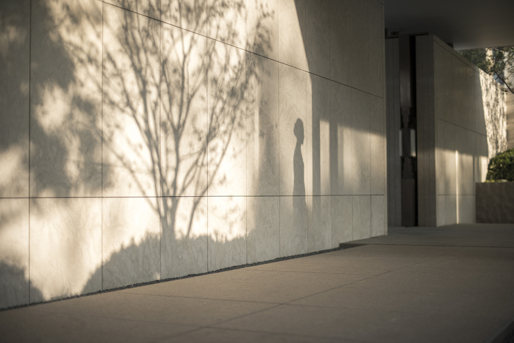
奥雅 :建筑选择了一个非常有意思的角度:光之舍。一切从最简单的光出发,满足城市人对自然最本真的渴望。通过一个最简单的光之中庭串联起从地下车库到地上三层的所有空间,所有的功能空间也围绕着这个核心再去展开。而在景观上设计师更多的是强调氛围和意境,所以也没有更多的去定义这是一个什么风格的项目。
L&A:Everything starts from the simplest light and meets the most genuine desire of urban people for nature. All the spaces from the underground garage to the three floors above the ground are connected in series through the simplest light intermediate court, and all the functional spaces are also expanded around this core. On the landscape, designers emphasize more on atmosphere and artistic conception, so there is no more to define what style of project this is.
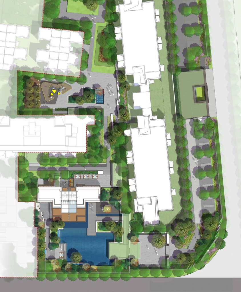
基地东侧是一个规划图上15米宽的代征绿地,一条在规划上应该有16米宽、但实际上被对面地块侵占而只剩下代征绿地里4米宽的一条土路。现场的复杂性导致设计师根本不知道这个展示的入口在哪里。后来他们通过一系列的现场草图找到了展示区入口应该在的位置、样板房与售楼处的选择以及最优的空间动线与功能结构形。
On the east side of the base is a 15 – meter – wide sign greenbelt on the plan. A dirt road that should be 16 meters wide in the plan but is actually occupied by the opposite plot and only 4 meters wide in the sign greenbelt is left. The complexity of the scene makes designers have no idea where the entrance to this exhibition is. Later, they found out the location of the entrance to the exhibition area, the choice of model houses and sales offices, and the optimal space moving line and functional structure through a series of on-site sketches.
总平面图 Master Plan
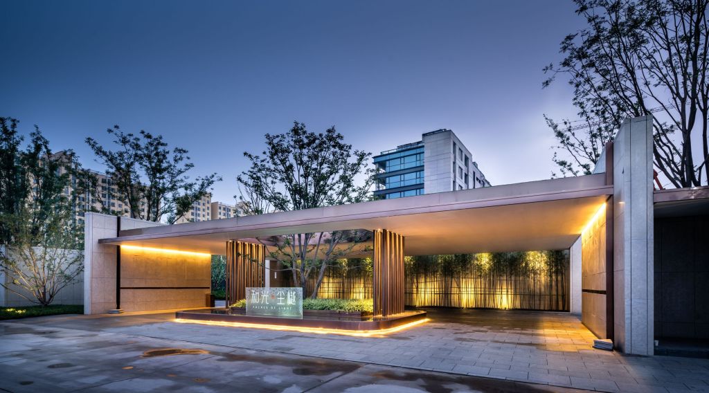
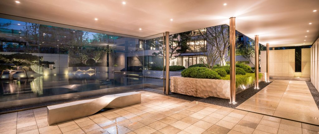
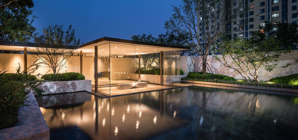
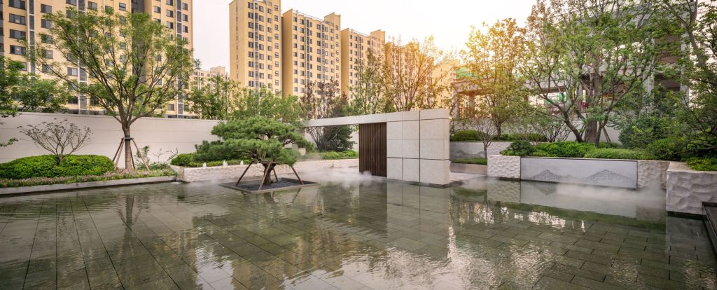
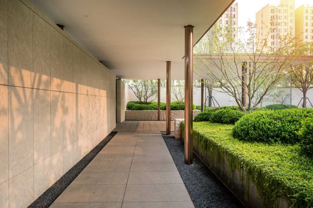
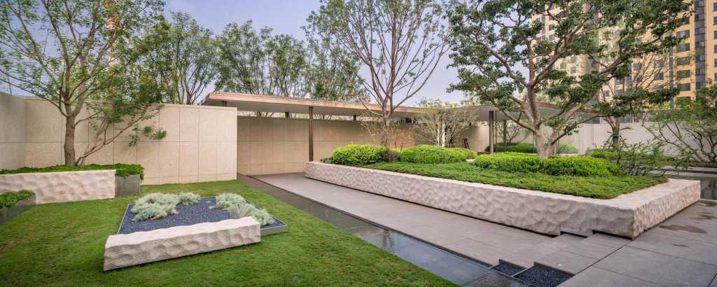
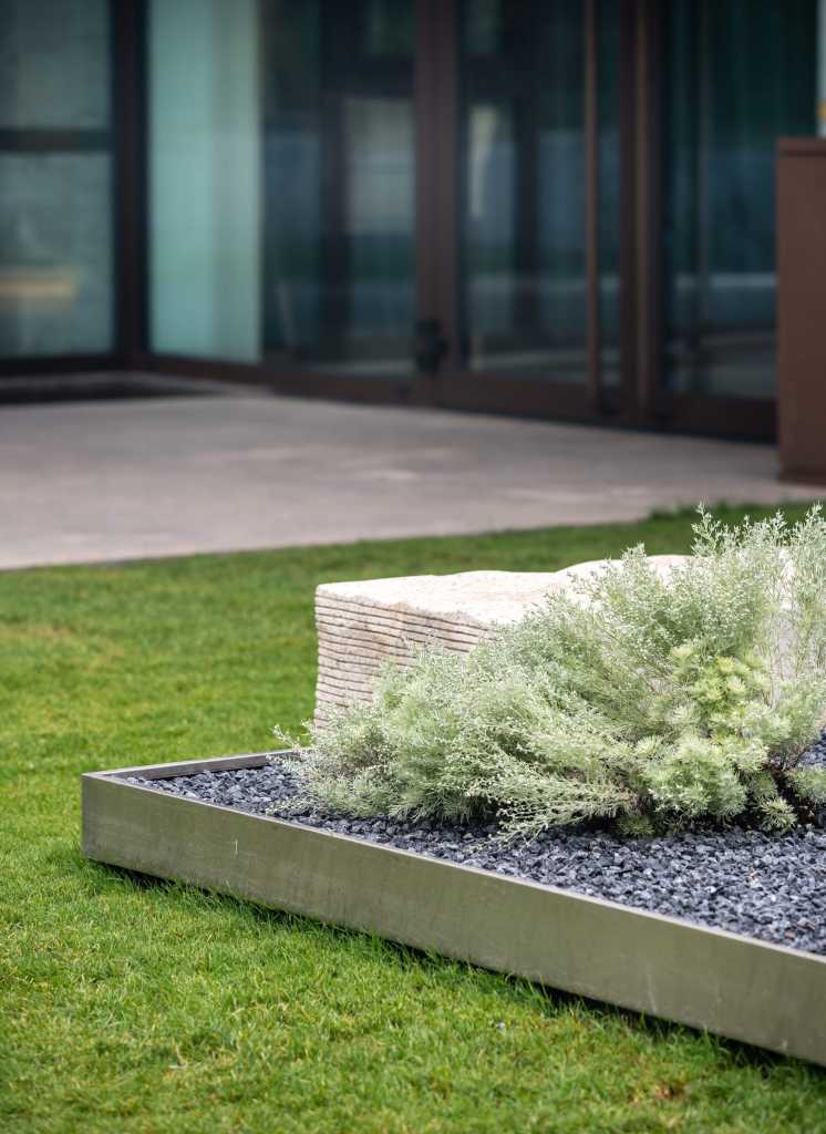
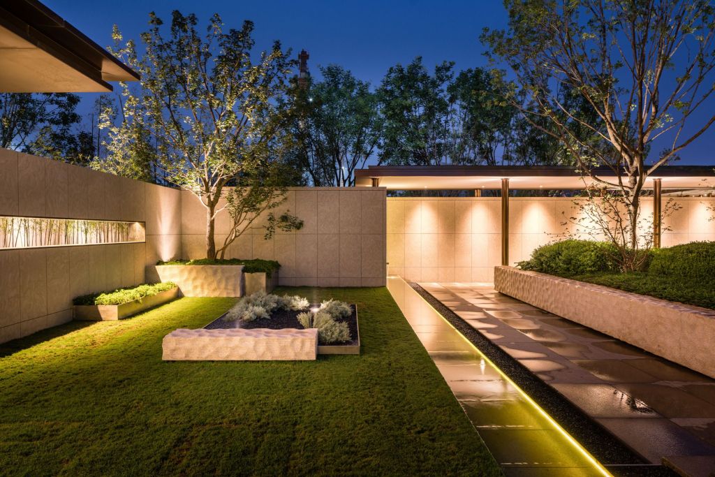
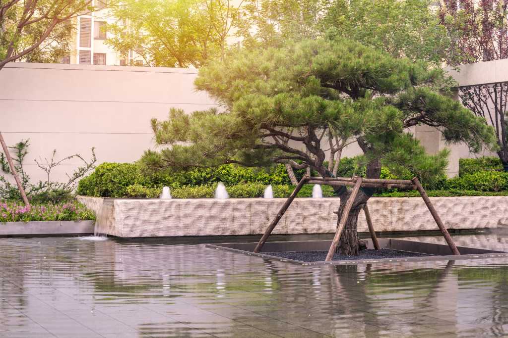
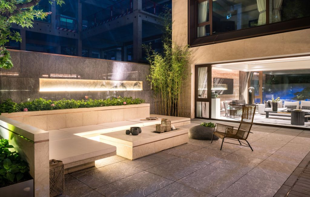
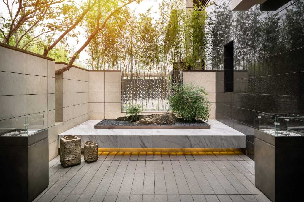
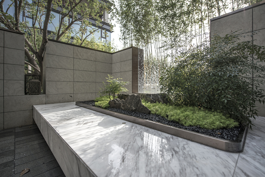
景观则强调氛围与意境,当你走进和光尘樾展示区,感受到的是传统园林的诗意,通过中心花园组织轩、堂、室的所有视线,欲扬先抑、步移景异。
The landscape emphasizes the atmosphere and artistic conception. when you walk into the display area, you feel the poetry of the traditional garden. the central garden organizes all the views of the porch, the hall and the room to achieve the goal of having a different view at each step.
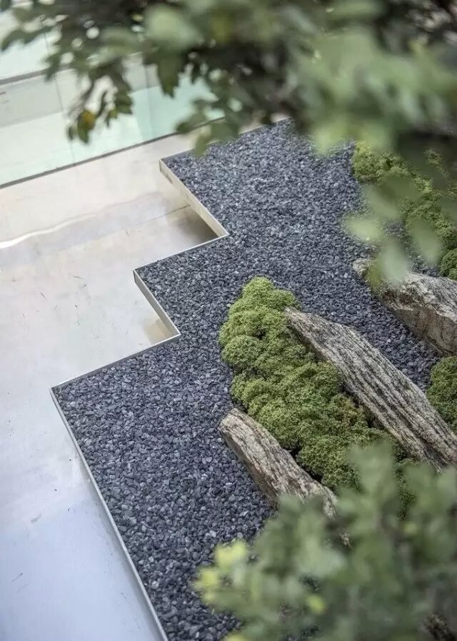
一草一木、一水一石,在时间里沉淀,静看无边光景一时新。以符合现代人的审美要求,诠释中国传统的美学艺术。
In order to meet the aesthetic requirements of modern people and interpret the traditional Chinese aesthetic arts.
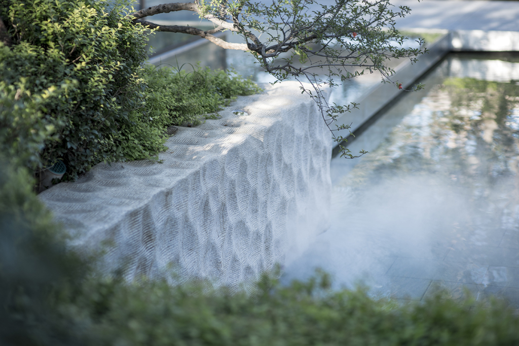
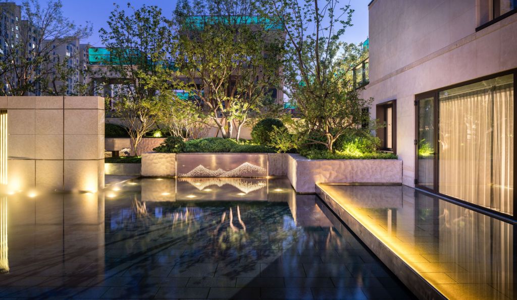
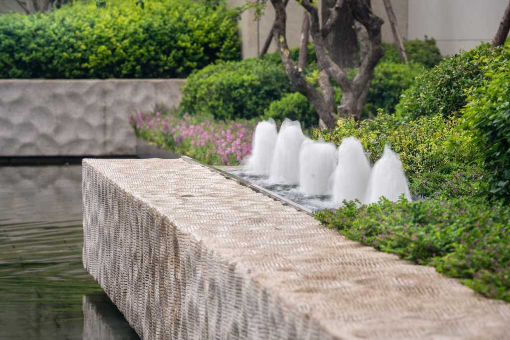
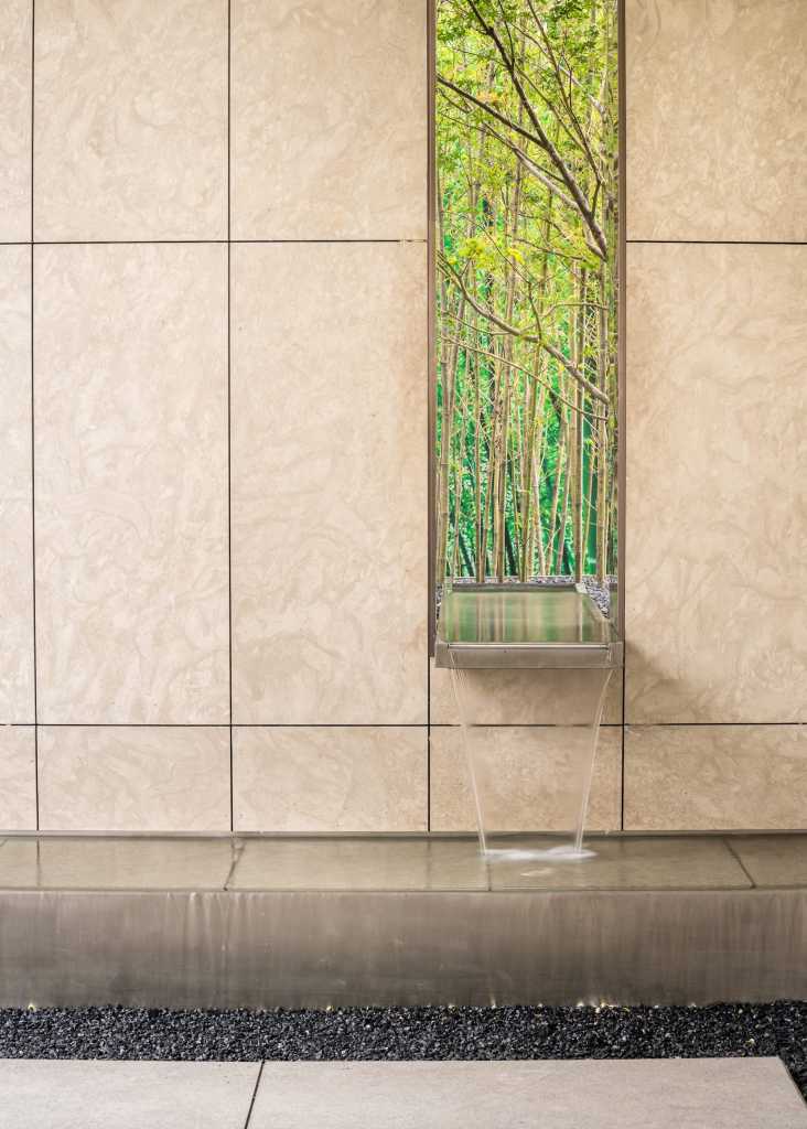
所有的材料、工艺却都是采用了最新技术。不管是石头的打磨,还是水景的呈现,都体现了国际化的设计水平和建筑技艺。
All the materials and processes have adopted the latest technology. Whether it is stone polishing or waterscape presentation, it embodies the international design level and architectural skills.
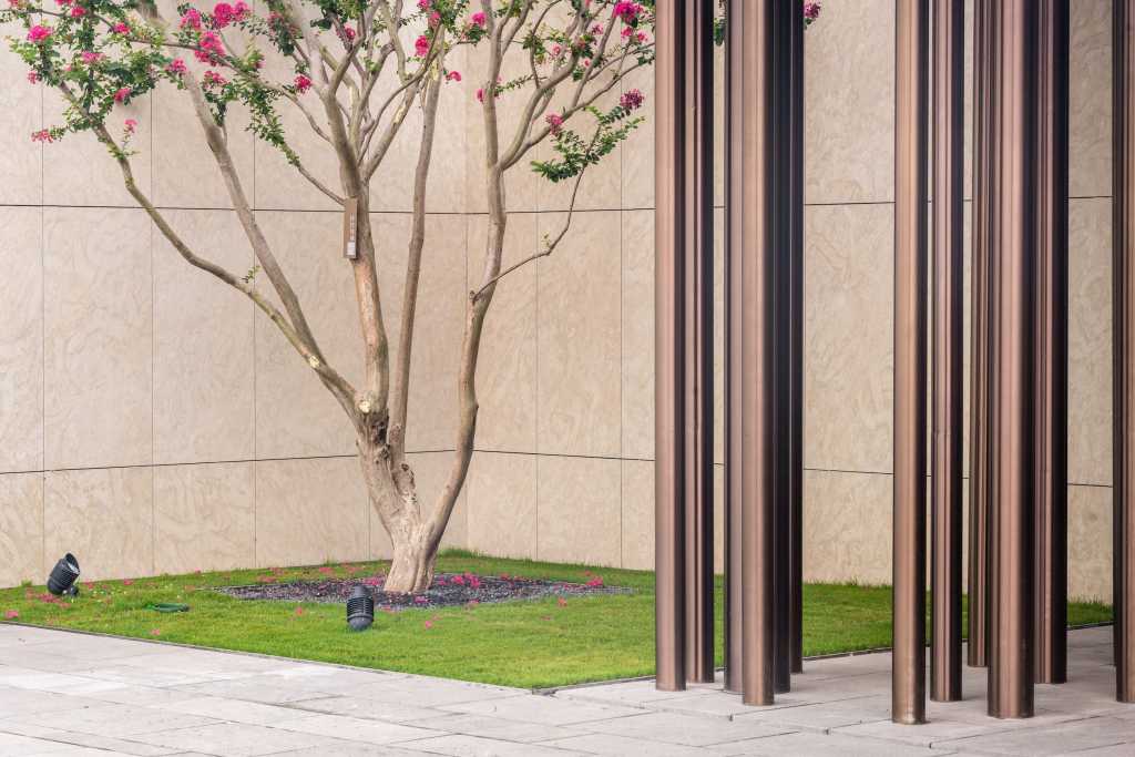
因此,当每个懂传统园林的人走进这个展示区,都会感觉舒服极了。因为我们有欲扬先抑,有步移景异,通过一个中心的花园组织了轩(入口)、堂(售楼处)、室(样板房)的所有视线,而这种舒服的感觉正是来自于场地所表现出的中式园林的氛围。但再看到所有的大样,材料,工艺都是最新的技术,这也是奥雅设计所倡导的“中式文脉,现代景观”最好的阐释。
Therefore, everyone who understands the traditional gardens will feel extremely comfortable when entering the display area. Through a central garden, we have organized all the lines of sight of the porch ( entrance ), the hall ( sales office ) and the room ( model room ), and this comfortable feeling comes from the atmosphere of Chinese gardens shown on the site. But seeing all the details, materials and techniques are the latest technologies, which is also the best explanation of ” Chinese culture, modern landscape” advocated by L&A design.
结语
北京保利·和光尘樾的建筑理性有序、景观有理有情,是建筑与景观的完美结合;取传统园林之格局,现代主义之手法,打造适合于此时此地的景观设计。这是奥雅设计所倡导“中式文脉,现代景观”的最好阐释。
Conclusion
The rational and orderly architecture and landscape of Palace Of Light are the perfect combination. Take the traditional landscape pattern and modernist methods to create a landscape design suitable for this time and place. This is the best explanation of ” Chinese culture, modern landscape” advocated by L&A design.
项目名称:保利和光尘樾
项目地点:北京东五环外
项目类型:展示区
占地面积:9656㎡
景观面积:9340㎡
设计时间:2016年
竣工时间:2017年
客户单位:北京知泰房地产开发责任有限公司
景观设计:奥雅设计北京公司项目九组
建筑设计:筑博设计
硬装设计:邱德光设计事务所
样板间软装设计:LSDCASA
Project name: Palace Of Light
Location: Beijing, China
Project type: Demonstration area
Floor area: 9656 ㎡
Landscape area: 9340 ㎡
Design time: 2016
Completion date: 2017
Client: Beijing Zhitai Real Estate Development Co., Ltd.
Landscape design: L&A Beijing company project group 9
Architectural design: ZHUBO Design
Hardpack design: T.K. CHU DESIGN LTD.
Soft suit design: LSDCASA
更多 Read more about:奥雅









密斯的德国馆呀~~