本文由 一域景观 授权mooool发表,欢迎转发,禁止以mooool编辑版本转载。
Thanks OneScape for authorizing the publication of the project on mooool, Text description provided by OneScape.
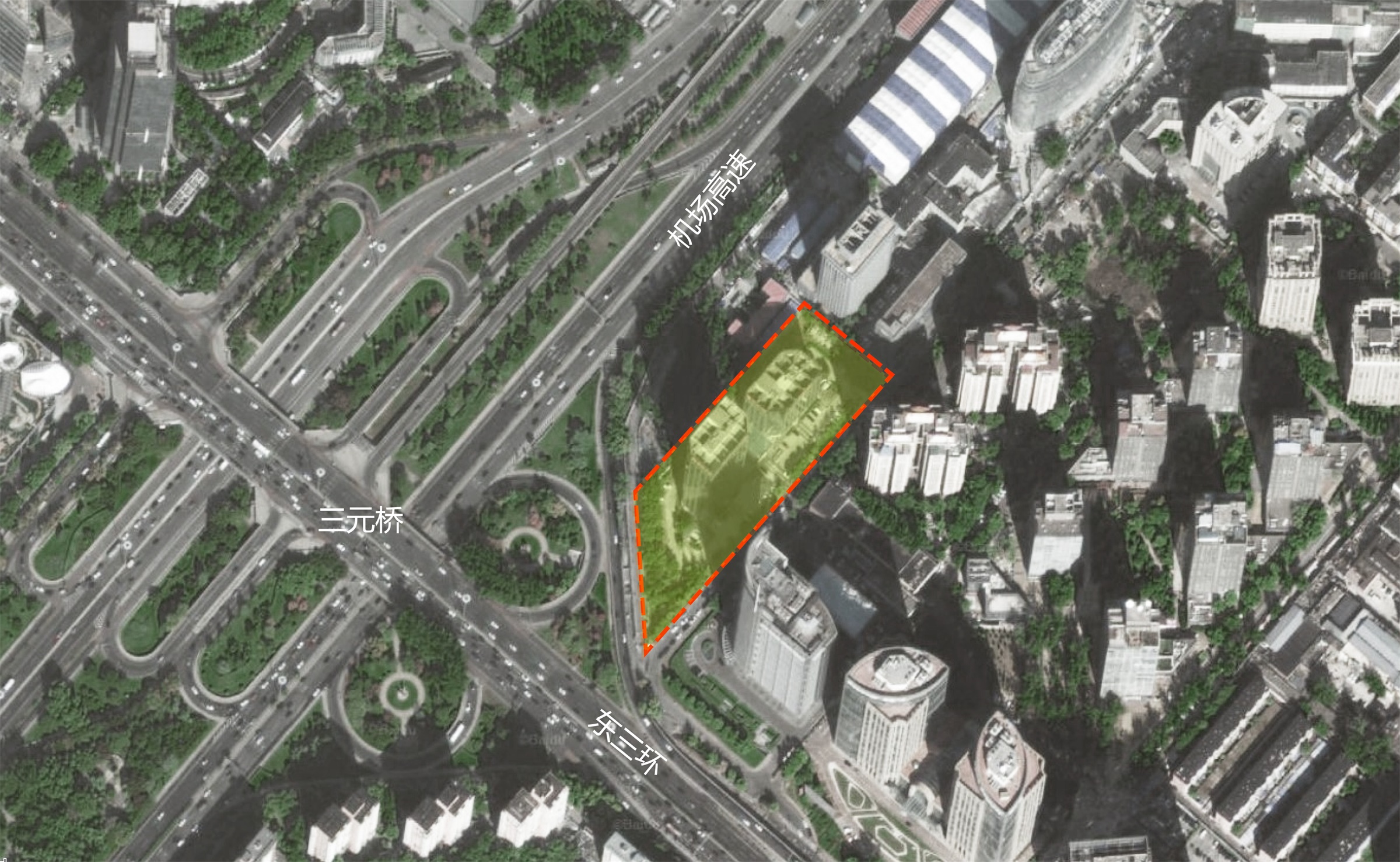
一域景观:万科时代中心—叁元,曾经的三元桥海航大厦,位于北京市朝阳区三元桥,东三环与机场高速东南金角位置。改造范围是海航大厦写字楼 和周边几个重要的城市界面之间的场地。
OneScape:Vanke Time Center – San Yuan, the original Hainan Airline Office Building, is located at San Yuan Qiao, Beijing. The site has a prime location between Airport Expressway and East Third Ring. The renovation scope is the main office building along with the urban space around it which works as important interface between the site and the complex urban context.
缘起 Origin
三元桥海航大厦投入使用已有10余年,周边环境已显陈旧破败,大厦首层及户外景观已满足不了新的商务写字楼的业态需求,写字楼城市形象及商务氛围亟需改善。建筑首层及景观的改造就在这样的背景下开始。
场地内两座宝石形办公建筑特征明确,繁茂的国槐和栾树林以及成型的银杏行道树延城市界面阵列,给场地留下了较好的自然基础环境;写字楼步行主入口空间局促,双子塔楼中间业态杂乱、缺乏城市形象;写字楼周边缺乏组织管理的车行流线和地面停车亟需调配提升还给公共空间。
HA office building has been in use for more than 10 years, the original site design cannot satisfy the needs of new business mode, emerging programs and current building tenants. The renovation aims to create a new urban image for the building, as well as a new site ambience to elevate the environment quality and to accommodate emerging programs.
The two diamond-shape office buildings have a strong character while the mature Scholar trees, Goldenrain and Ginkgo trees arrayed along the perimeter formed a very lush vegetation base. However, the main pedestrian entrance to the building was too cramped while the space between two buildings was messy and lack of focus. Vehicle and pedestrian circulation also needs redesign to improve safety and convenience while return the space occupied by parking to the public.
▼项目周边环境 Surrounding environment of the project
▼场地现状 Situation
总体设计 Overall Design
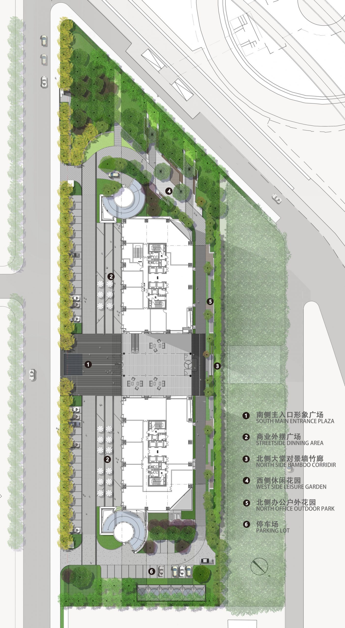
新的改造方案重新定义了场地特性,回应建筑功能分区及立面的改造设计,进行了从户内外空间功能布局到人车动线梳理的一体化处理,塑造写字楼大堂入口城市形象,利用现状良好的植物条件和原来的车位空地,营造多元的高端商务写字楼户外休闲活动空间。
The new landscape hasadopted an integrated design approach, responding to architecture’s new layout and façade, bringing indoor and outdoor space together, utilizing current planting base, embedding circulation into the overall layout, and eventually creating a diversified outdoor space in a high-end business setting.
▼项目总平面 Master Plan
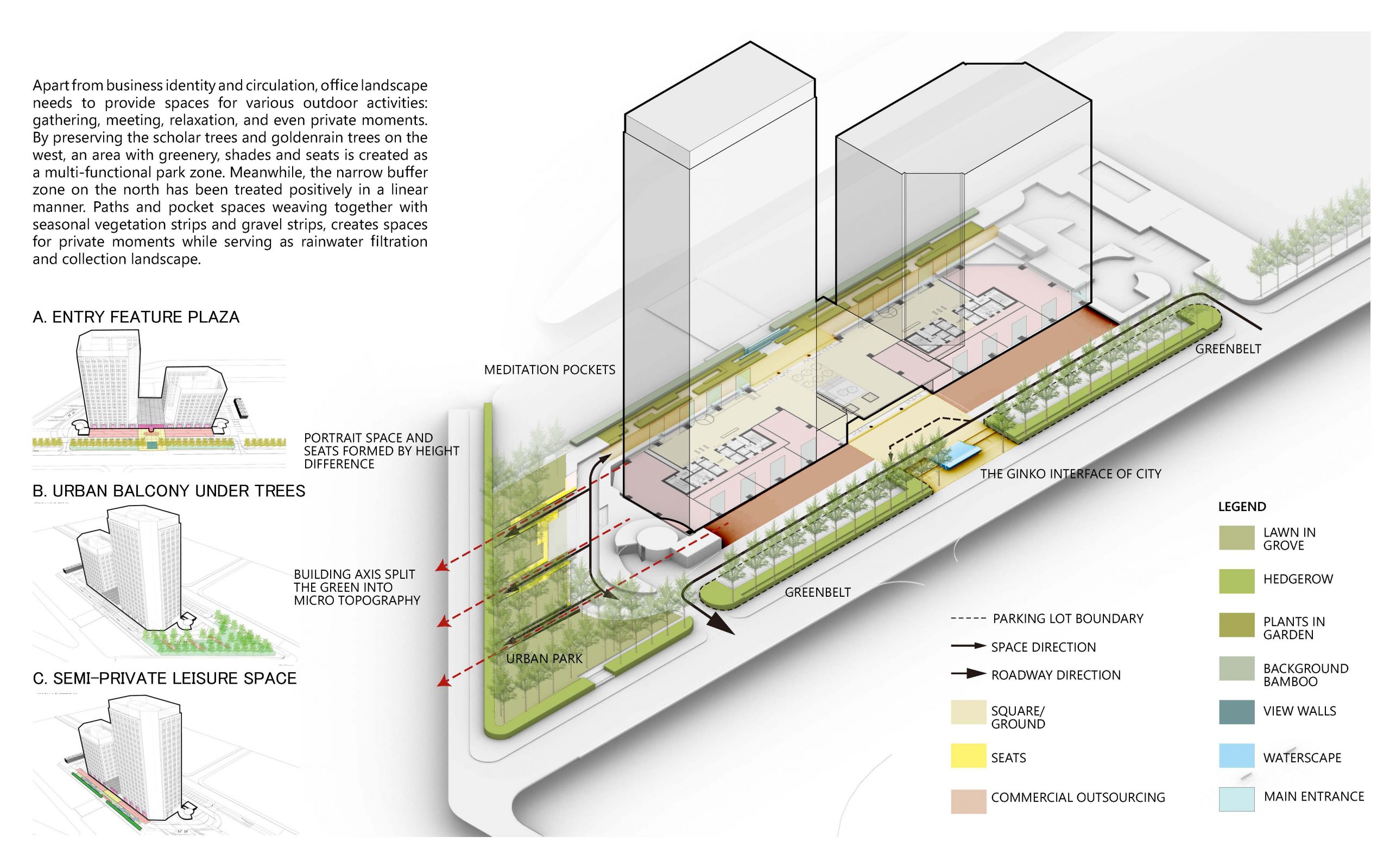
▼设计策略 Design Strategy
办公景观设计除了考虑商业标识和动线,还需提供多样户外活动空间:聚会、会面、放空,甚至私人时刻。保留西侧的槐树和无患子,树大成荫人来聚-此处将作为一个多功能的公园区,同时对北侧狭窄的缓冲区进行了积极的线性处理。小径、口袋空间、季相植被带与碎石带交织在一起,共同塑造空间。
Apart from business identity and circulation, the office landscape needs to provide spaces for various outdoor activities: gathering, meeting, relaxation, and even private moments. By preserving the scholar trees and golden rain trees on the west, an area with greenery, shades, and seats is created as a multi-functional park zone. Meanwhile, the narrow buffer zone on the north has been treated positively in a linear manner. Paths and pocket spaces weaving together with seasonal vegetation strips and gravel strips created space.
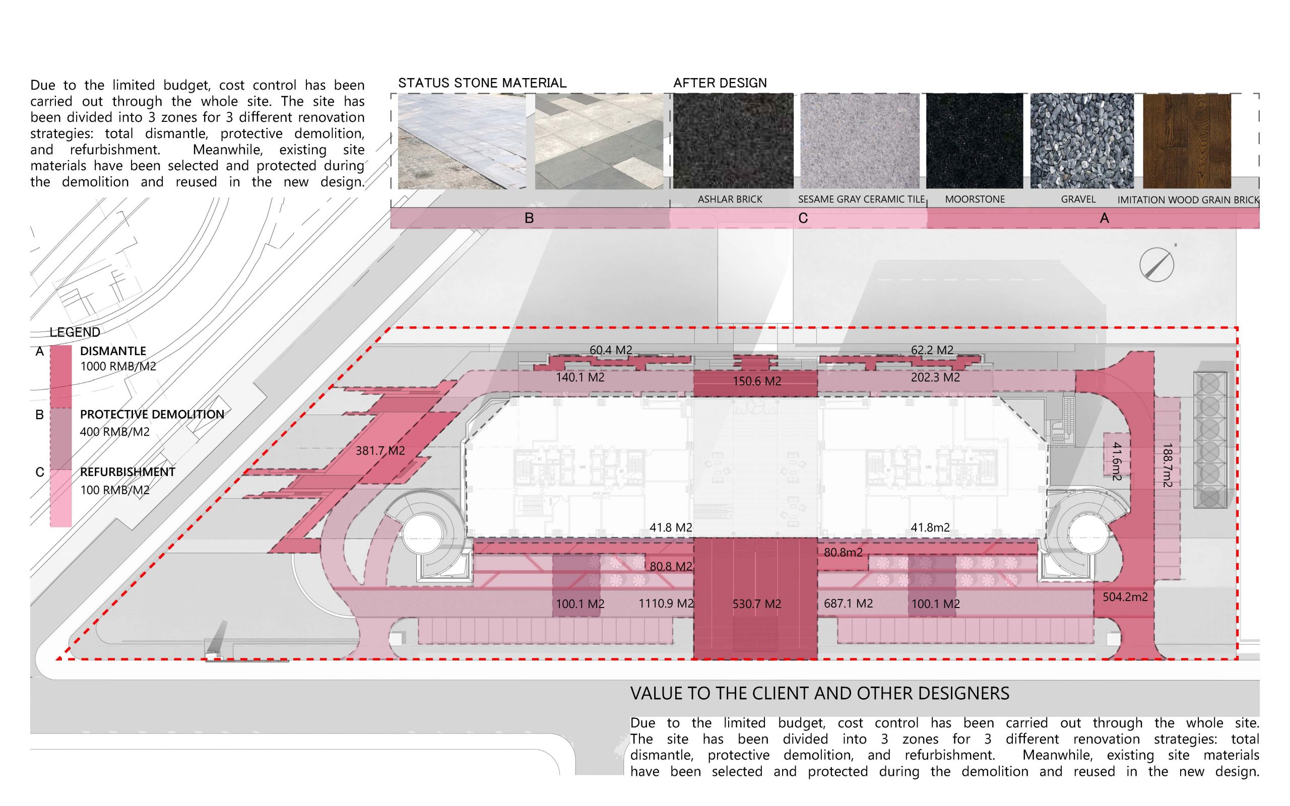
▼改造成本管控 COST Control
由于预算有限,整个场地都进行了成本控制,将场地划分为3个区域,以进行3种不同的翻新策略:全面拆除,保护性拆除和翻新;同时,对现有场地材料进行选择性保护。拆除过程中加以保留,并在新设计中复用。
Due to the limited budget, cost control has been carried out through the whole site. The site has been divided into 3 zones for 3 different renovation strategies: total dismantle, protective demolition, and refurbishment. Meanwhile, existing site materials have been selected and protected during the demolition and reused in the new design.
南侧商务办公入口广场 High-end Office Image EntryPlaza
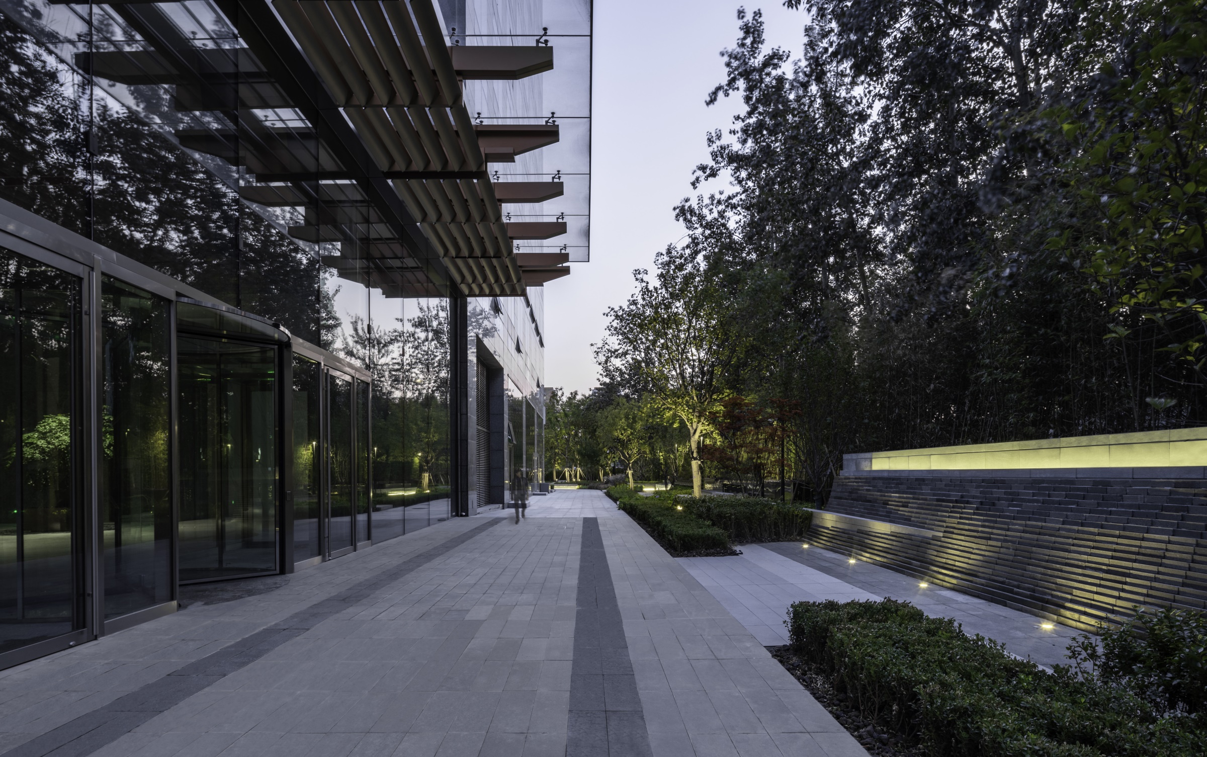
大厦首层的玻璃大堂如同一个透明体穿过建筑主体,削弱了室内外界限,强化了南北轴线的空间连续性,从而自然而然地在南北轴线的端头形成了两个面向建筑的视觉焦点。入口广场对应的南北轴线,做了全面拆除,景观设计希望通过对这两个节点的处理营造一个相对独立内向的办公场地氛围。
The lobby between two buildings behaves as a glass cube intruding into the major architectural mass,breaks indoor-outdoor boundary, reinforces north-south axis, and creates two focal point at the north and south ends. Landscape design addresses the two key nodes with special elements to create a relatively inward office space from being interrupted by urban chaos.
▼南侧入口广场 Entry Plaza
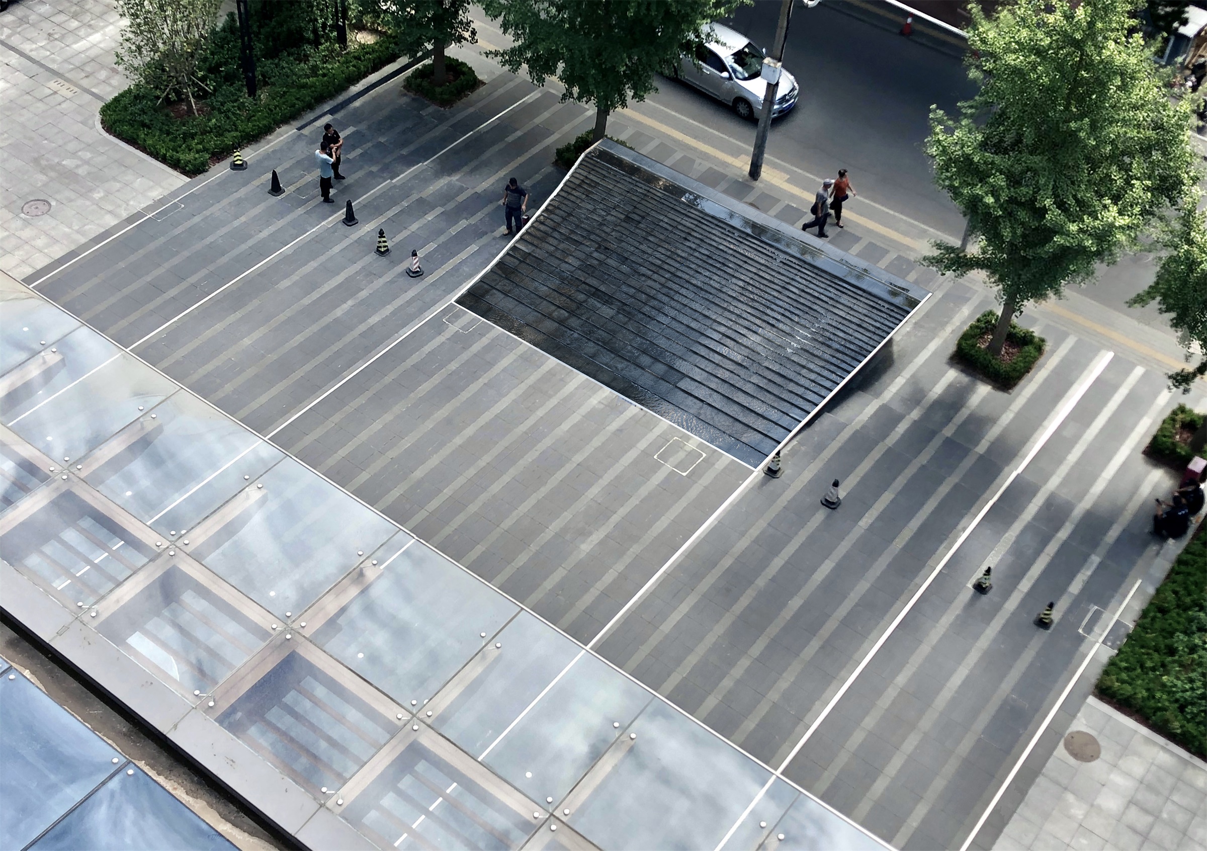
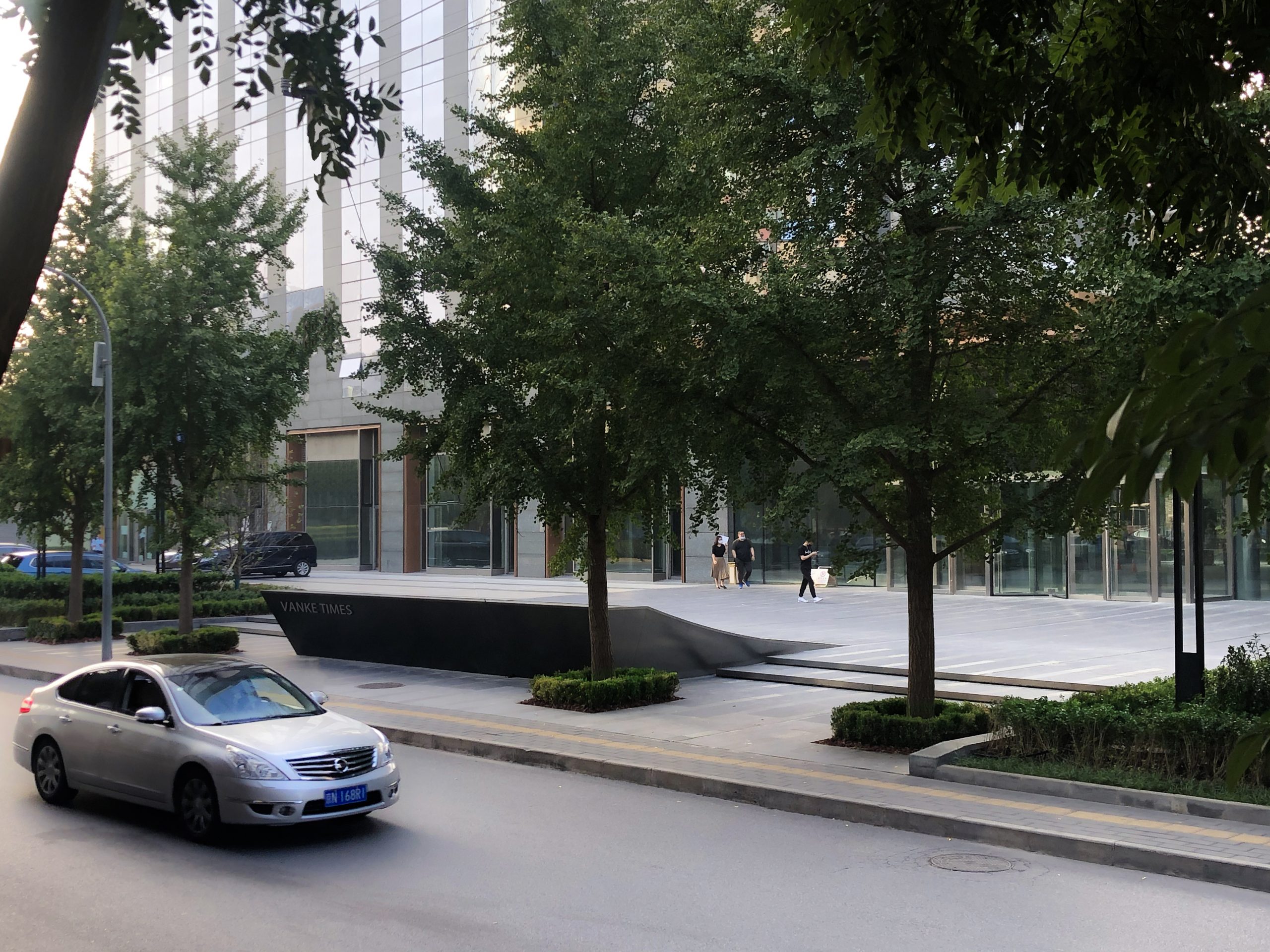
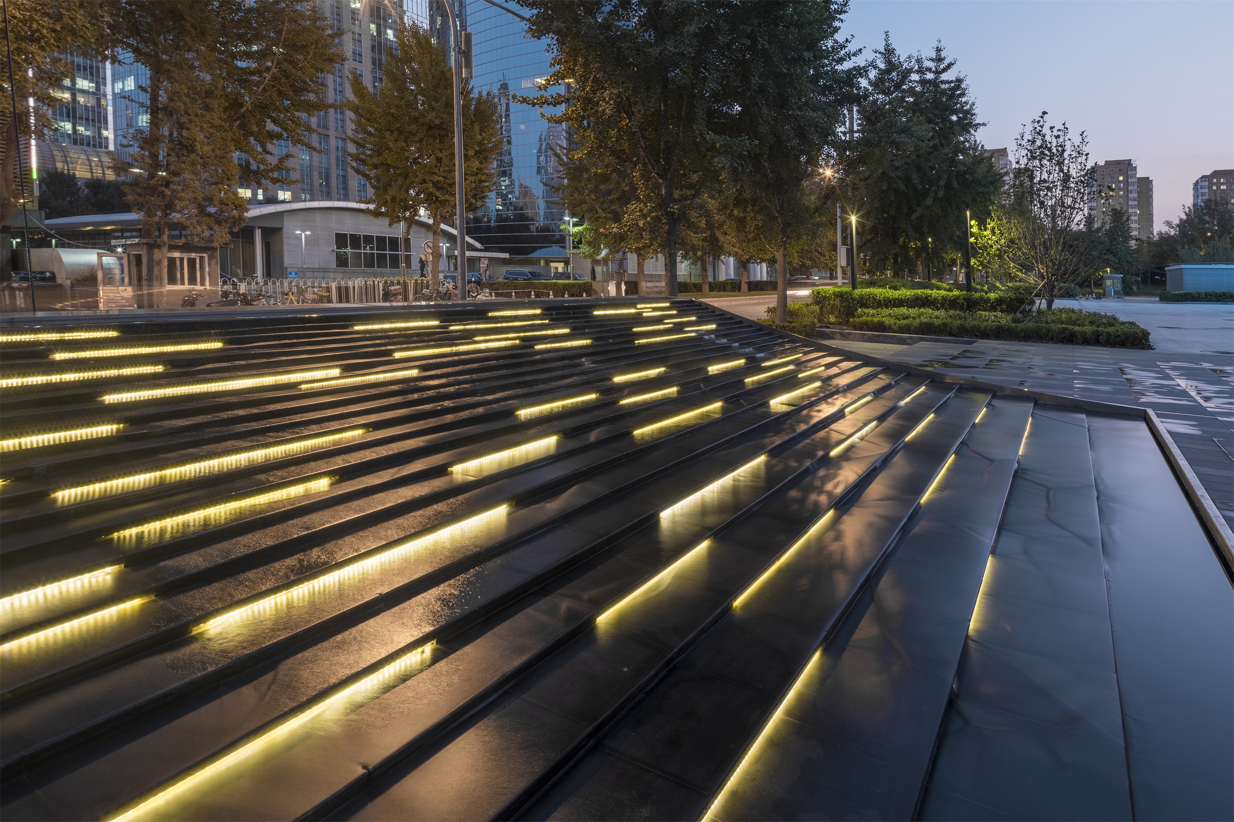
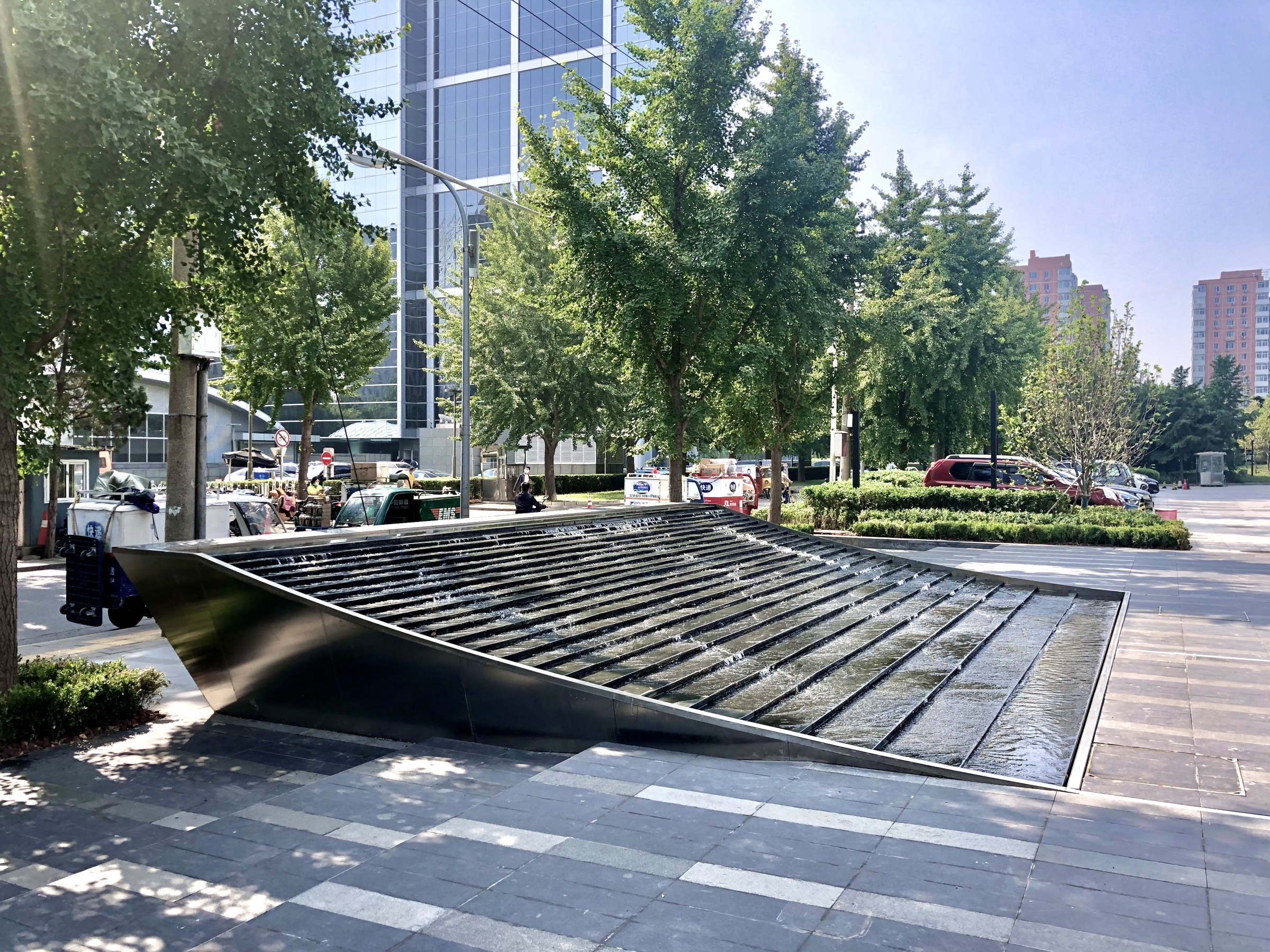
广场上的叠水景,作为场地与城市界面的分隔,在体量上设计师希望成为视线通廊的端头,阻隔嘈杂的城市界面,同时在流线上保留与城市的联结。
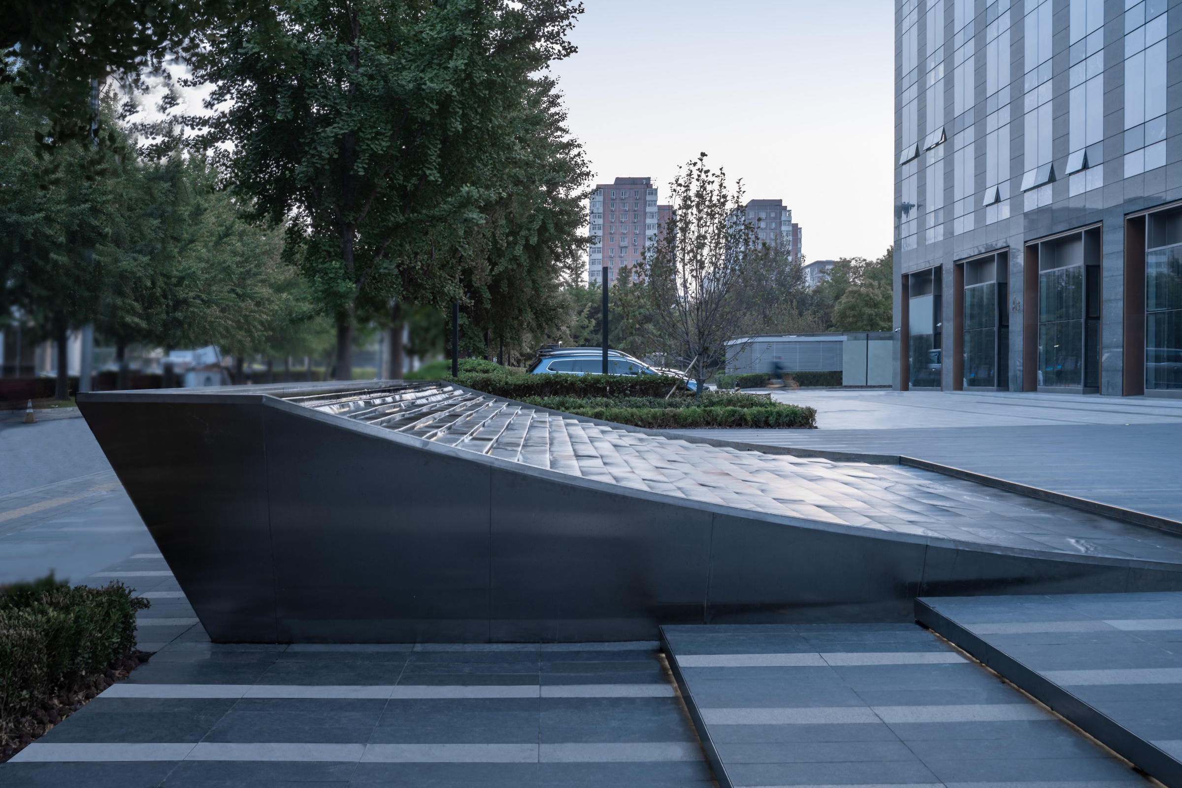
As the interface between site and its context, the entry water feature on the south forms a partial barrier to create a visual focal point blocking urban chaos from entering while allowing pedestrians to flow through.
▼南侧入口水景 SouthEntry Water Feature
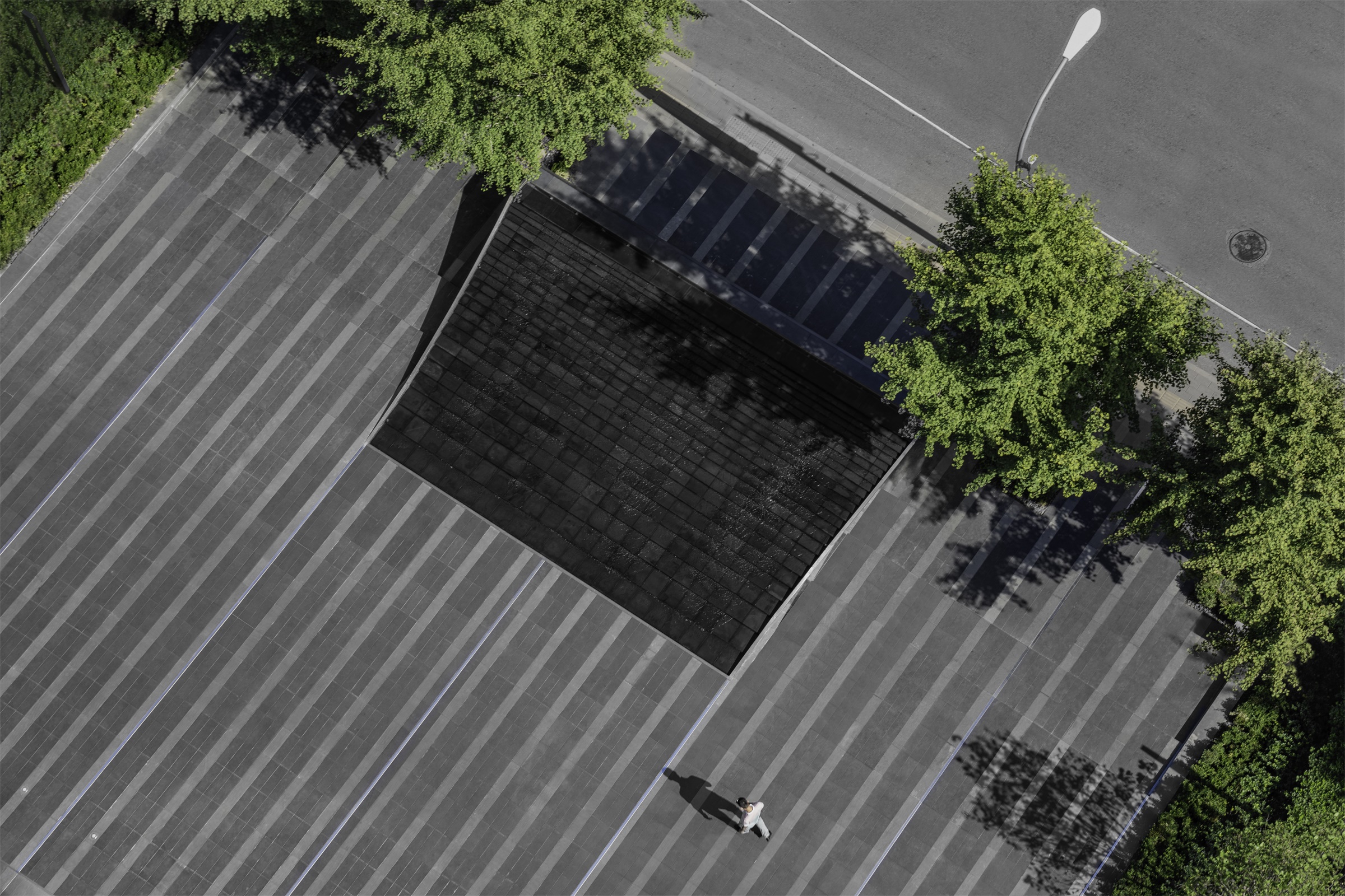
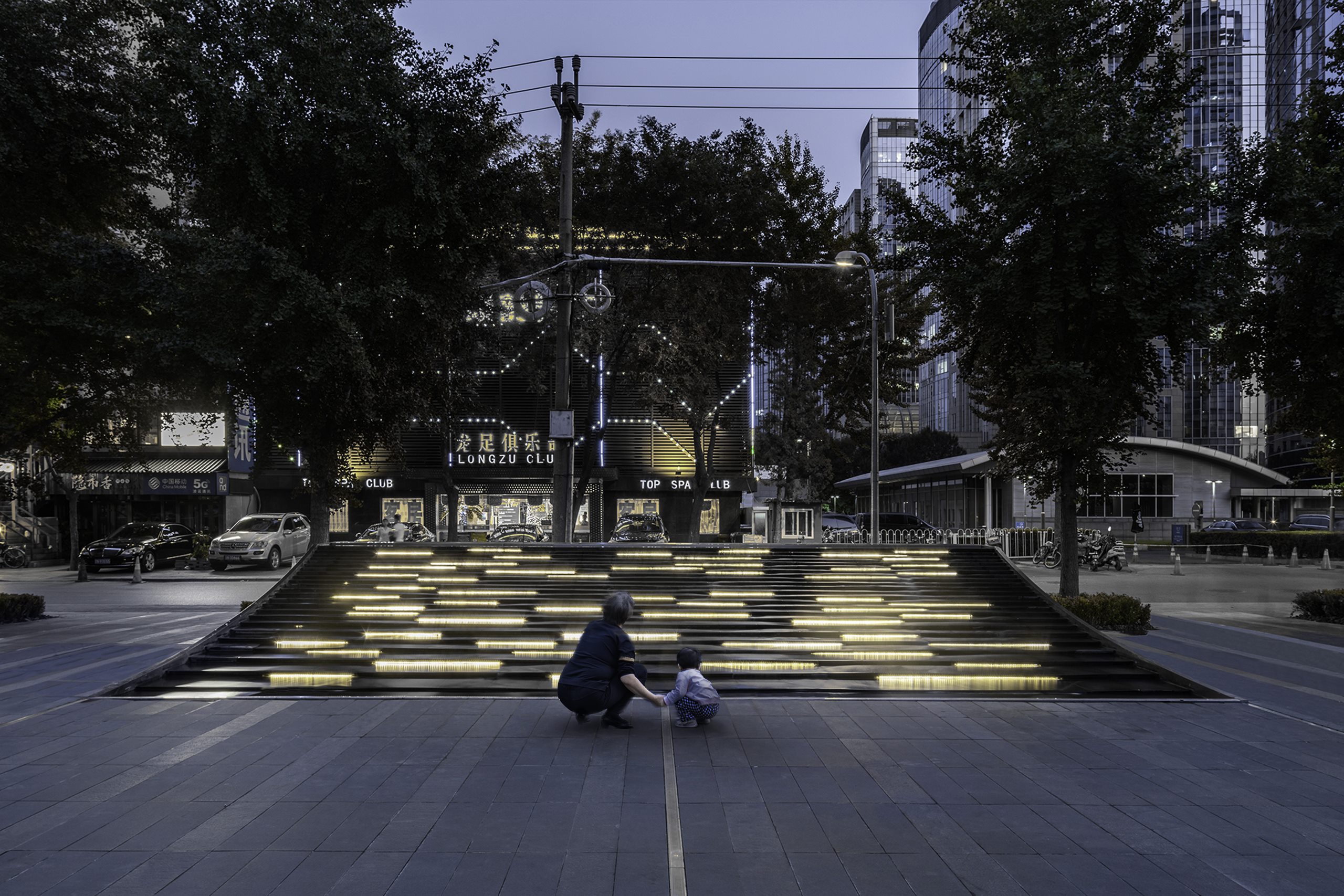
▼内凹的曲线造型作为主要叠水界面 The concave surface facing architecture behaves as a cascading water feature with gradient terraces
▼叠水涟漪细节 Waterscape profile
水景的剖面,以优雅的内凹曲线造型面向建筑,如同凹面镜一般,柔和地将场地的活动和视线反射并保留其中;同时以悬挑的内切斜面造型面向城市街道,形成内敛硬朗但不生硬的城市界面。
The water feature section has presented an elegant concave curve toward office plaza, reflecting and collecting all the content and keep them on the site. Meanwhile it presents an undercut wall element toward city to form a firm but not blunt edge.
内凹的曲线造型作为主要叠水界面,在平面上形成了由上至下,逐级变宽的叠水阶梯。这样的设置结合水流的自身特点,放大了水流自上而下的细微动态:从湍急至平缓。每一级跌水平台,通过调整不同石材模块的剖面坡度,来控制主要的落水口,形成错落有致的立面落水效果。
The concave surface facing architecture behaves as a cascading water feature with gradient terraces,widening up as the water flowing down. Such a gradient design responds to water’s own hydraulic characteristics, magnify the everchanging water dynamics.The stone module has been shaped in various sectional shape to control thewater spill outlet on each terrace to create a elevational water fall effectwith random rhythm.
▼叠水石材细部 Customized stone module detail
▼水景剖面(基础避开现状管线) Waterscape profile
北侧景墙 The feature wall
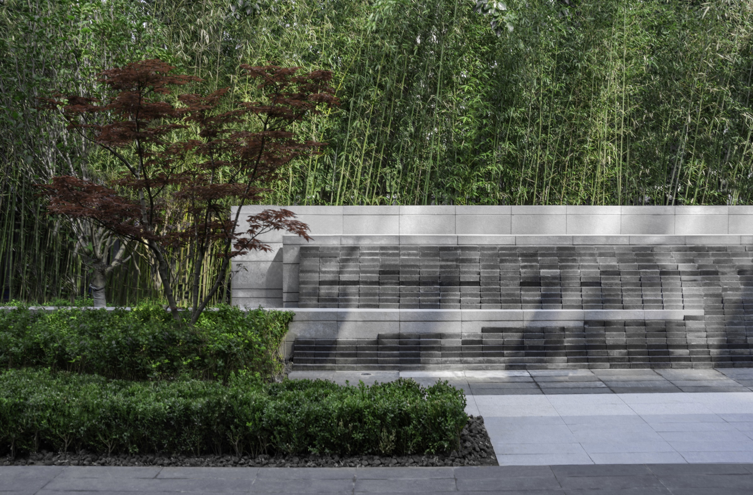
由于大厦首层的玻璃大堂,在视觉上使的南北轴线为一个连续性的空间。设计师在北侧景墙处理上,延续了南侧水景中的模块理念,将深浅不一的灰砖错位搭接,形成有细微曲面波动的砖墙。将传统的材料通过像素化处理,与周围的石墙、植栽错动穿插,创造出具有传统美学意境的现代景观设计。
The feature wall on north end has inherited the module concept from south water feature, stacking brickblocks with different gray shades to form a wall element with subtle curvature. The design approach interpreted as pixilation of traditional material to form an interlocking and sliding relationship with stone walls and vegetation bands around, therefore, to create a modern landscape with traditional Chinese aesthetics.
▼景墙正立面 The facade of feature wall
▼“云山 竹林 红枫” “Red Maple in Yunshan Bamboo Forest”
▼景墙细节 Feature wall details
▼石墙与植栽错动穿插 Stone wall and planting dislocation interspersed
北侧景墙两侧的休闲花园 North Garden
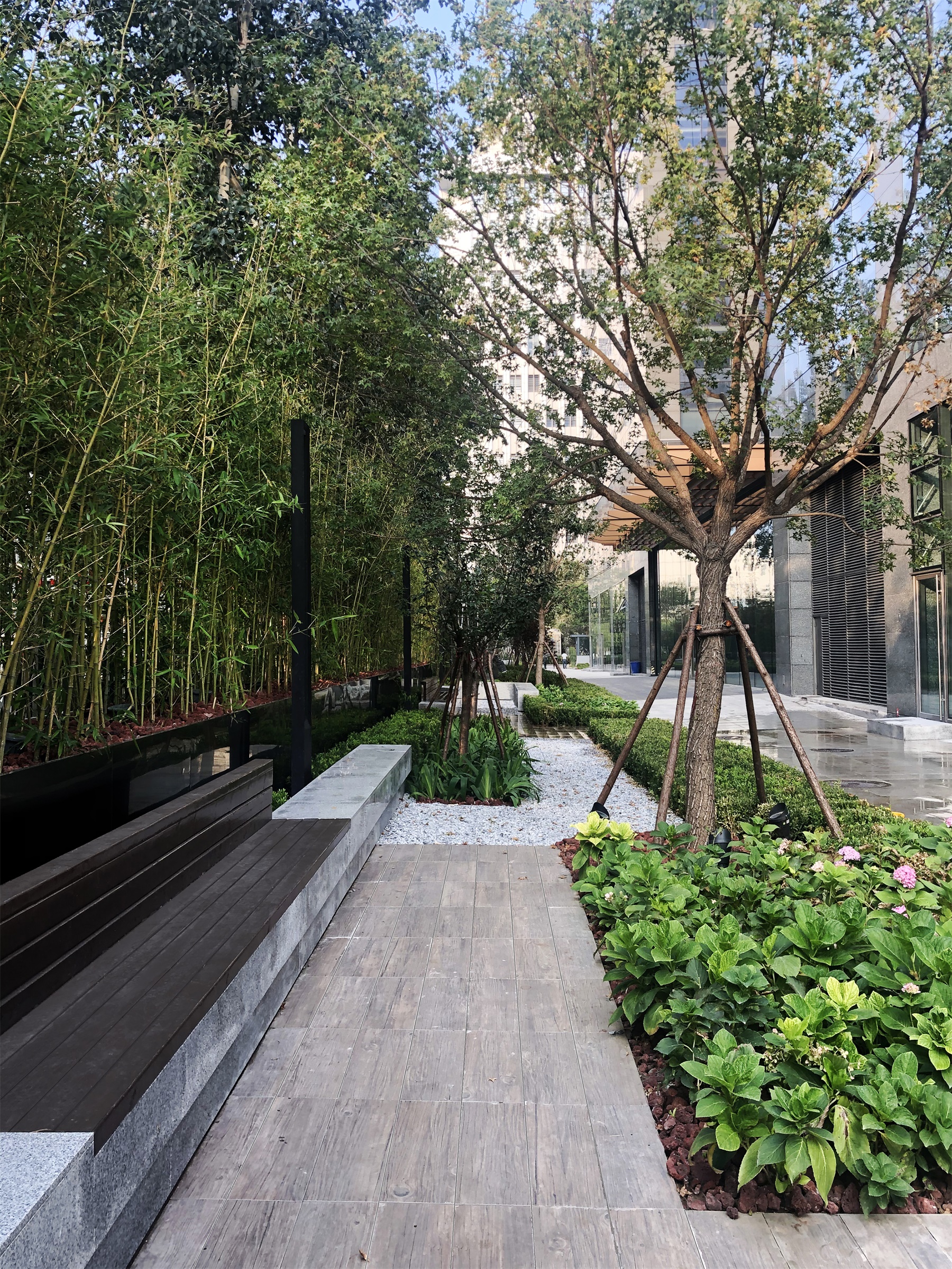
北侧景墙两侧的休闲花园,在线性空间营造亲人尺度的休闲花园。利用地被植物和较为低矮的花灌木和竹林营造植物环绕的停留空间,让人体味一丝静谧。
The linear garden next to feature wall on both sides aims to create a human-scale garden with certain intimacy. Lower flower shrubs and groundcover along with bamboo cluster have been utilized to create a quiet place for people to stop and savor the ZEN moment among busy office hours.
▼水处理 Water management
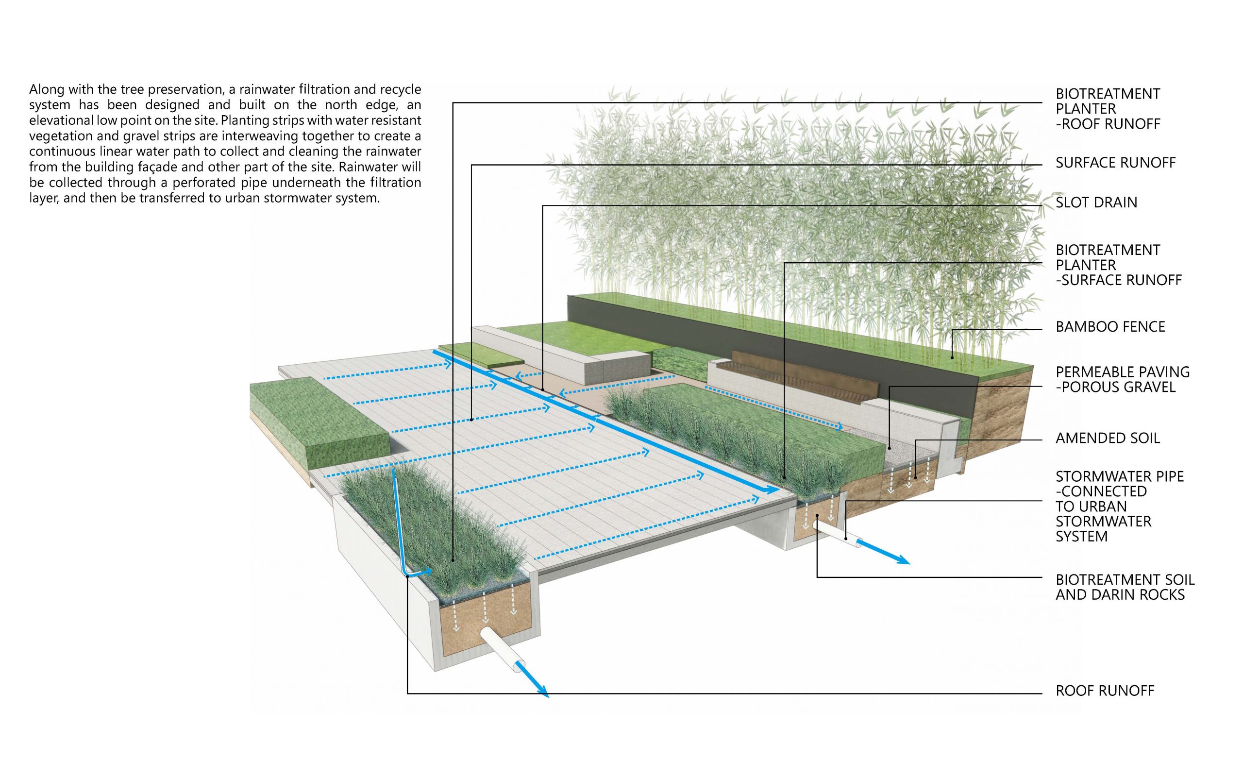
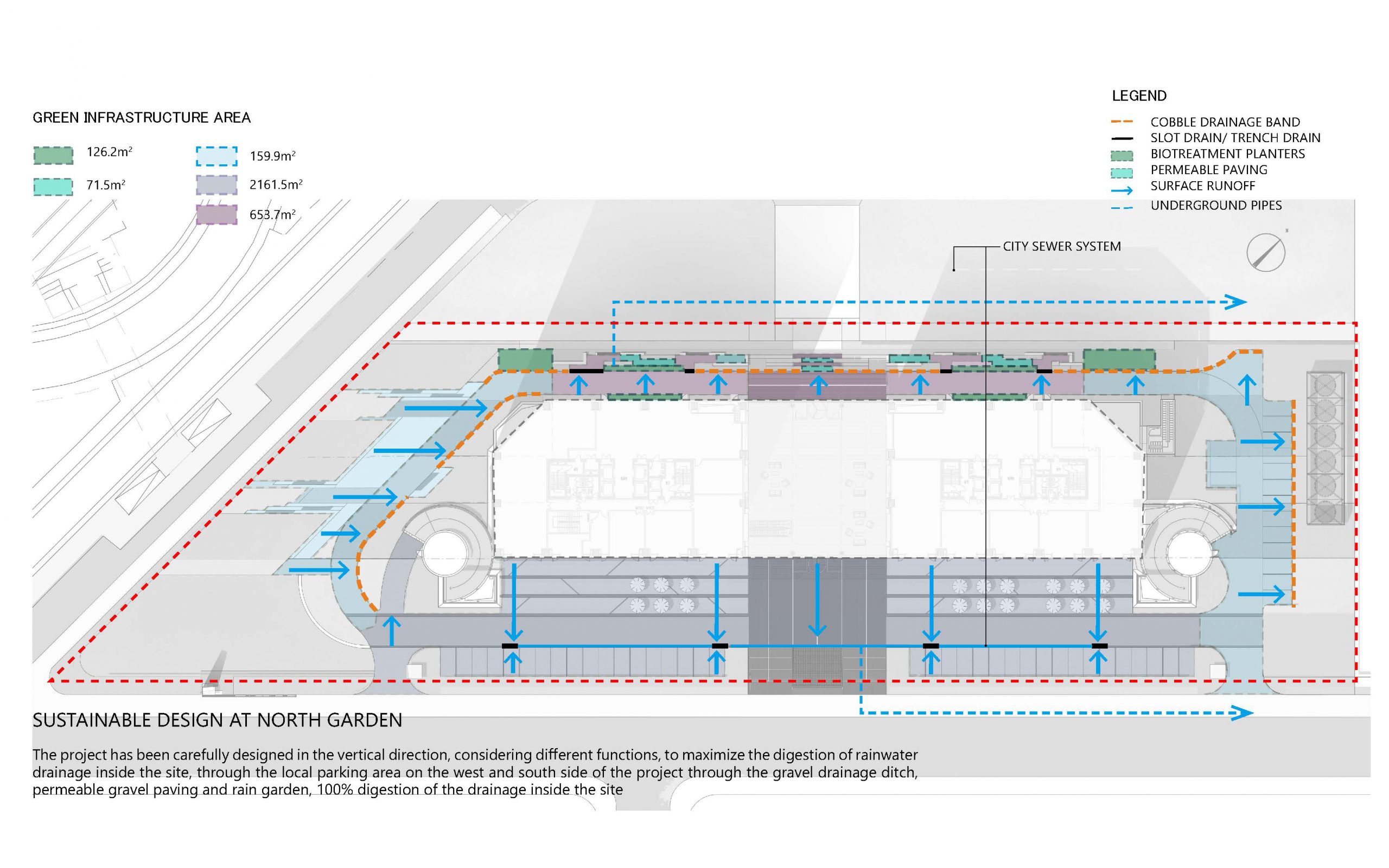 场地保留了树木同时还设计了雨水过滤回用系统,该系统安置于场地最低处,由耐水湿植物组成的植被带与砾石带相互交织在一起,从而形成了一条连续的线性水路,通过滤层下的多孔管收集雨水,最后转移到城市雨水系统。
Along with the tree preservation, a rainwater filtration and recycle system has been designed and built on the north edge, an elevational low point on the site. Planting strips with water resistant vegetation and gravel strips are interweaving together to create a continuous linear water path to collect and cleaning the rainwater from the building façade and other part of the site. Rainwater will be collected through a perforated pipe underneath the filtration layer, and then be transferred to urban stormwater system.
▼休闲花园鸟瞰 Aerial view of linear garden
▼休闲花园链接着后场的林荫广场 The linear garden connects with the west tree plaza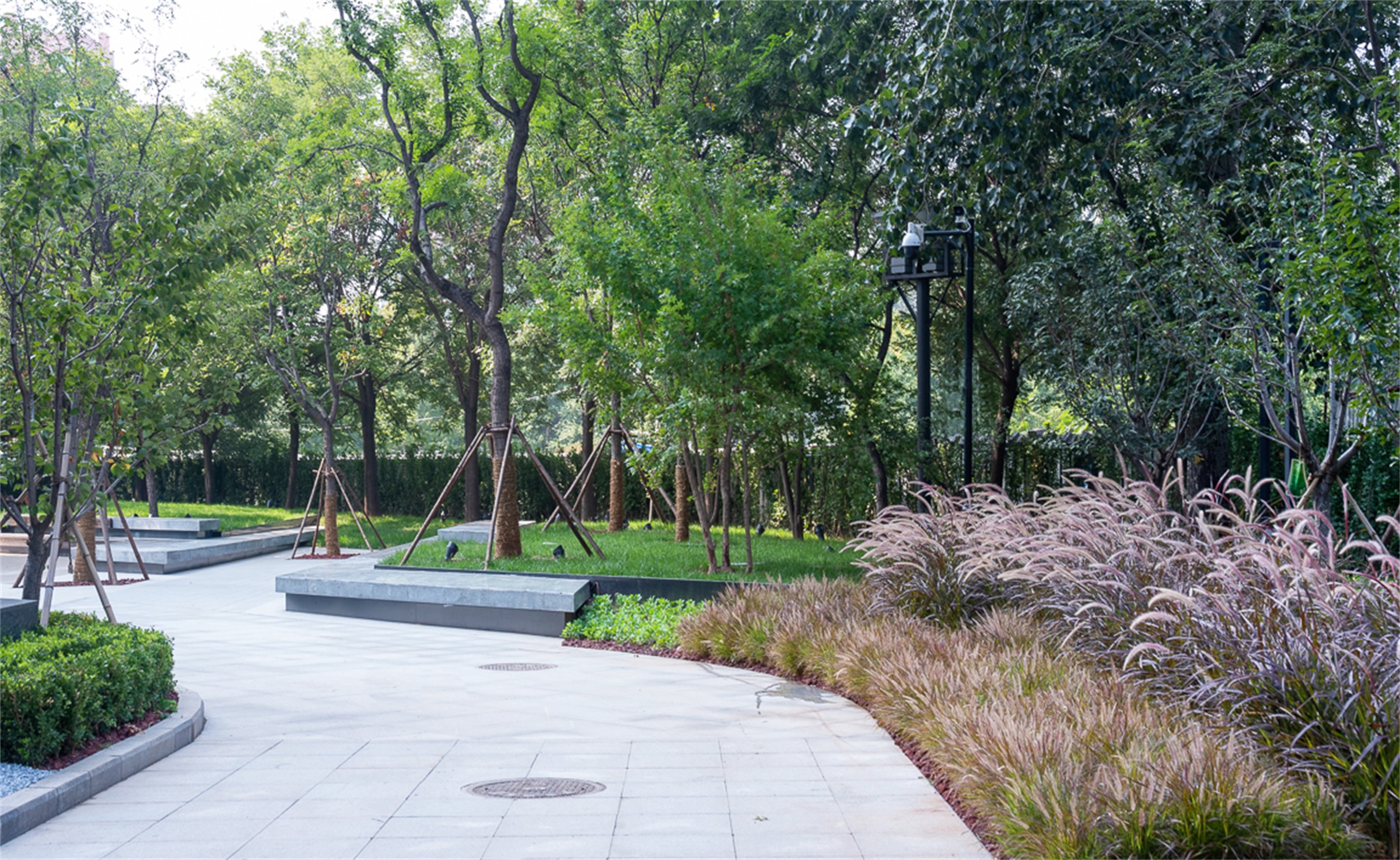
西侧休闲林荫广场 West Tree Plaza
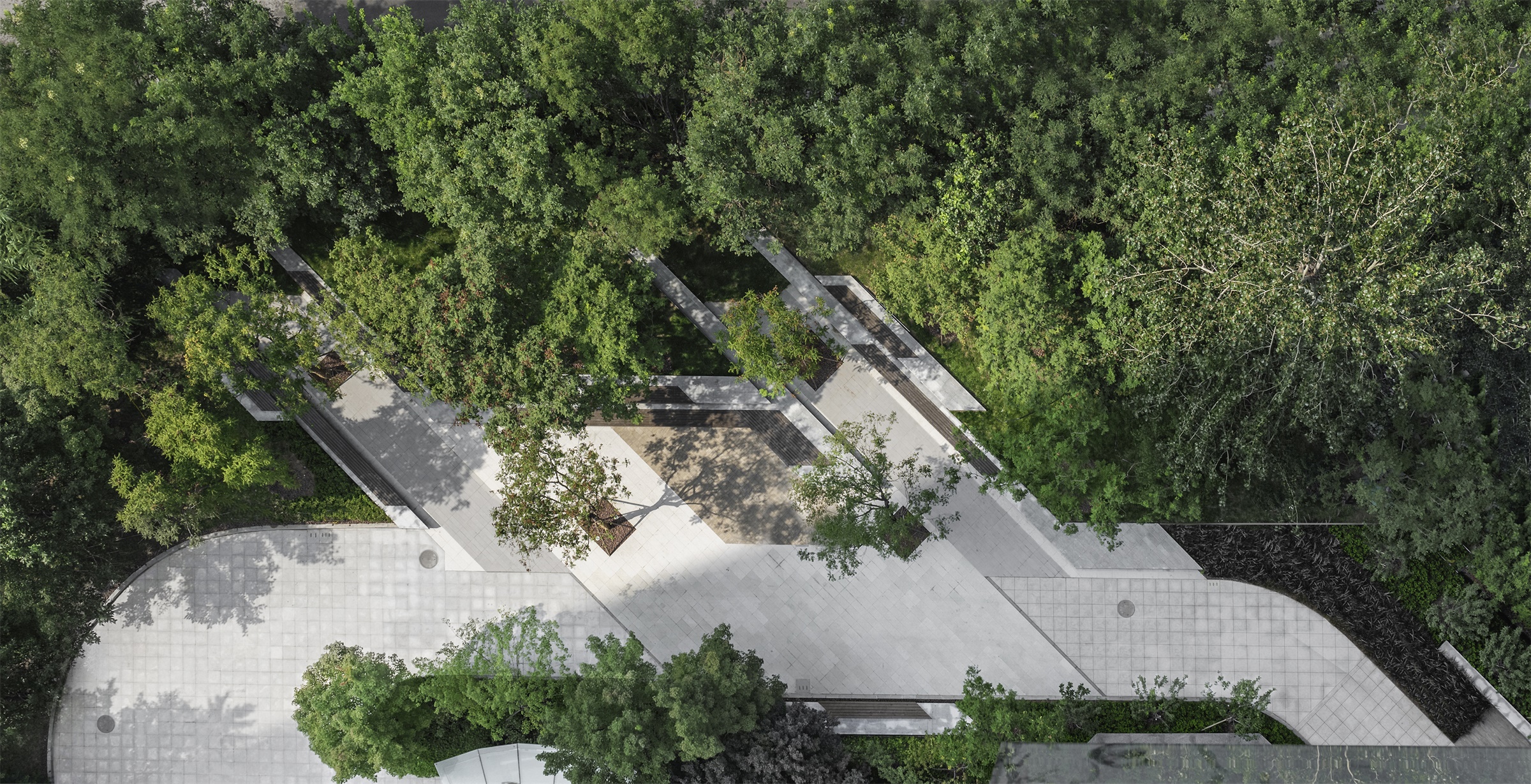
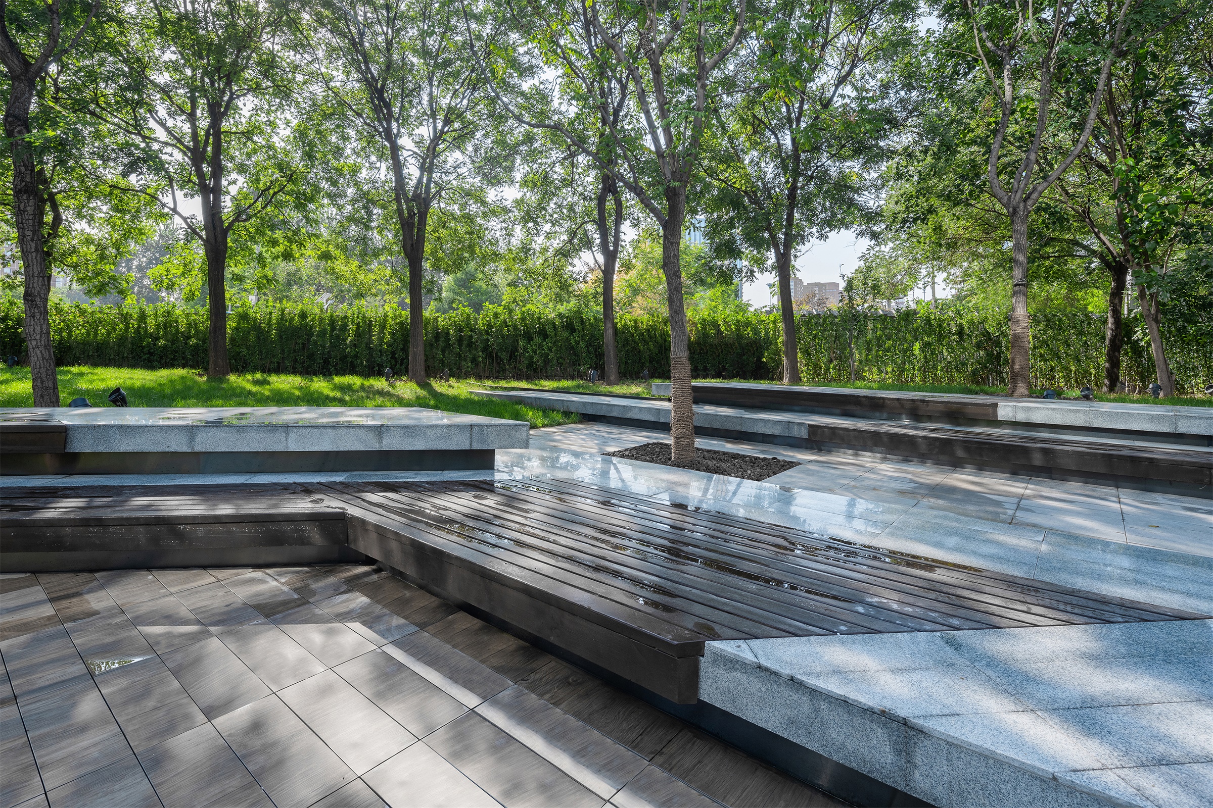
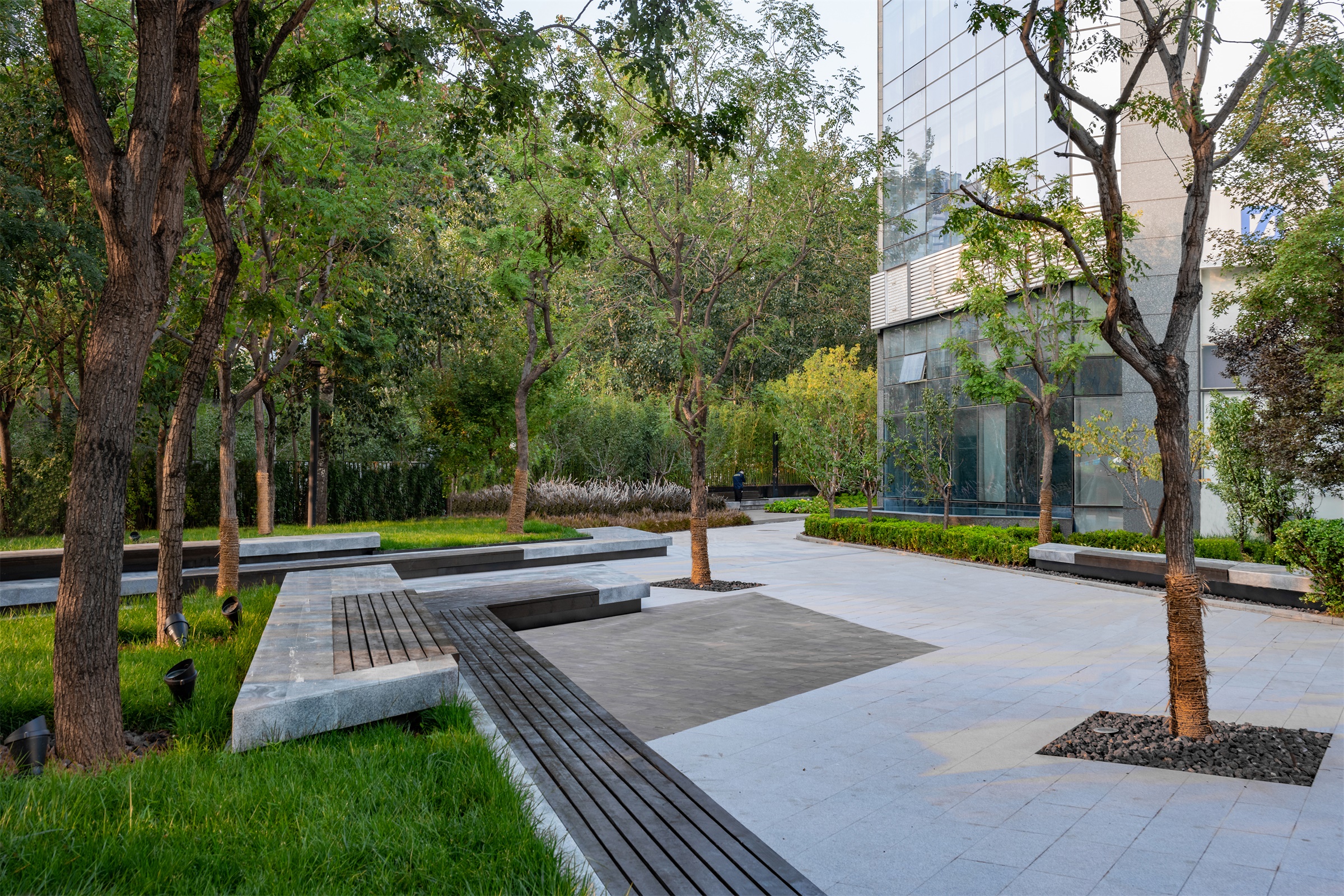
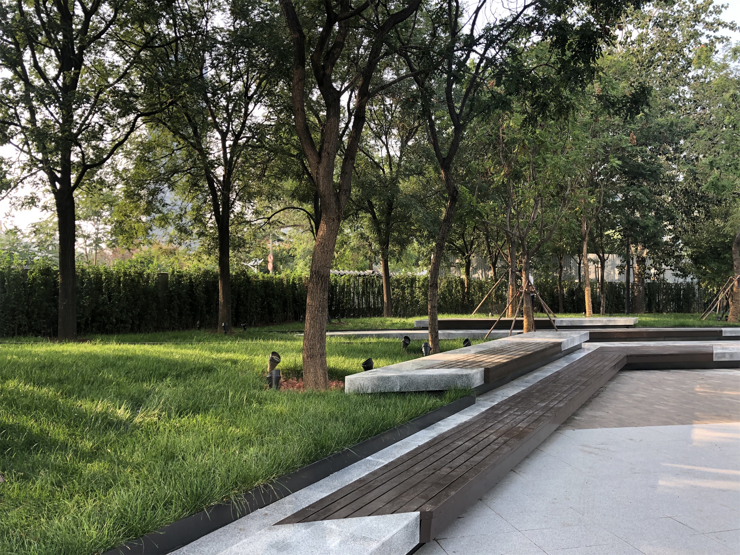
西侧林荫广场,保留之前现状较好的国槐、栾树林,由于树根土壤高于现状道路标高,西南角有地形植物林缓坡。故顺势而为:1,利用林下空间创造休闲停留场地。2,把休闲空间人的座向和视线转向西南自然绿色区域。并延伸建筑轴线作为林下场地的形式划分与建筑形成空间秩序的关系。
The original Goldenrain trees and Scholar trees preserved to form a semi-formal office plaza on the west. The existing root balls were higher than the existing road elevation and there was a vegetated slope on southwest corner. The new design works with the existing site condition instead of changing it. As a result: 1. A shaded plaza has been created under the existing tree canopies; 2. Direct the seat orientation and vision toward the vegetated area on southwest corner. The passages cutting into the grass slope are lines extended from building columns to form a more integrated relation between architecture and landscape.
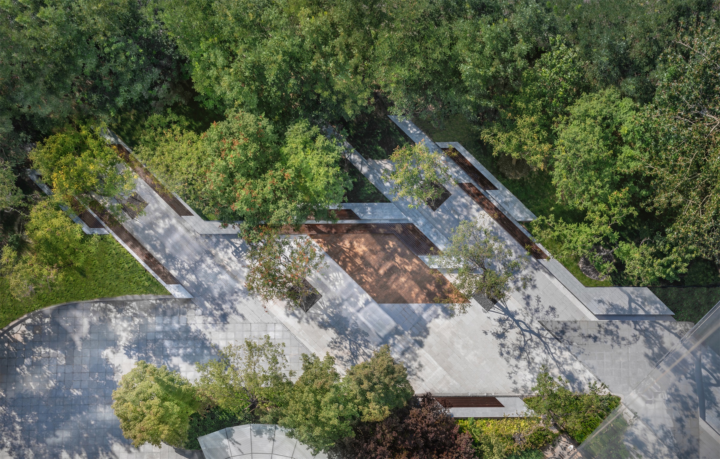
▼实景鸟瞰 Aerial View
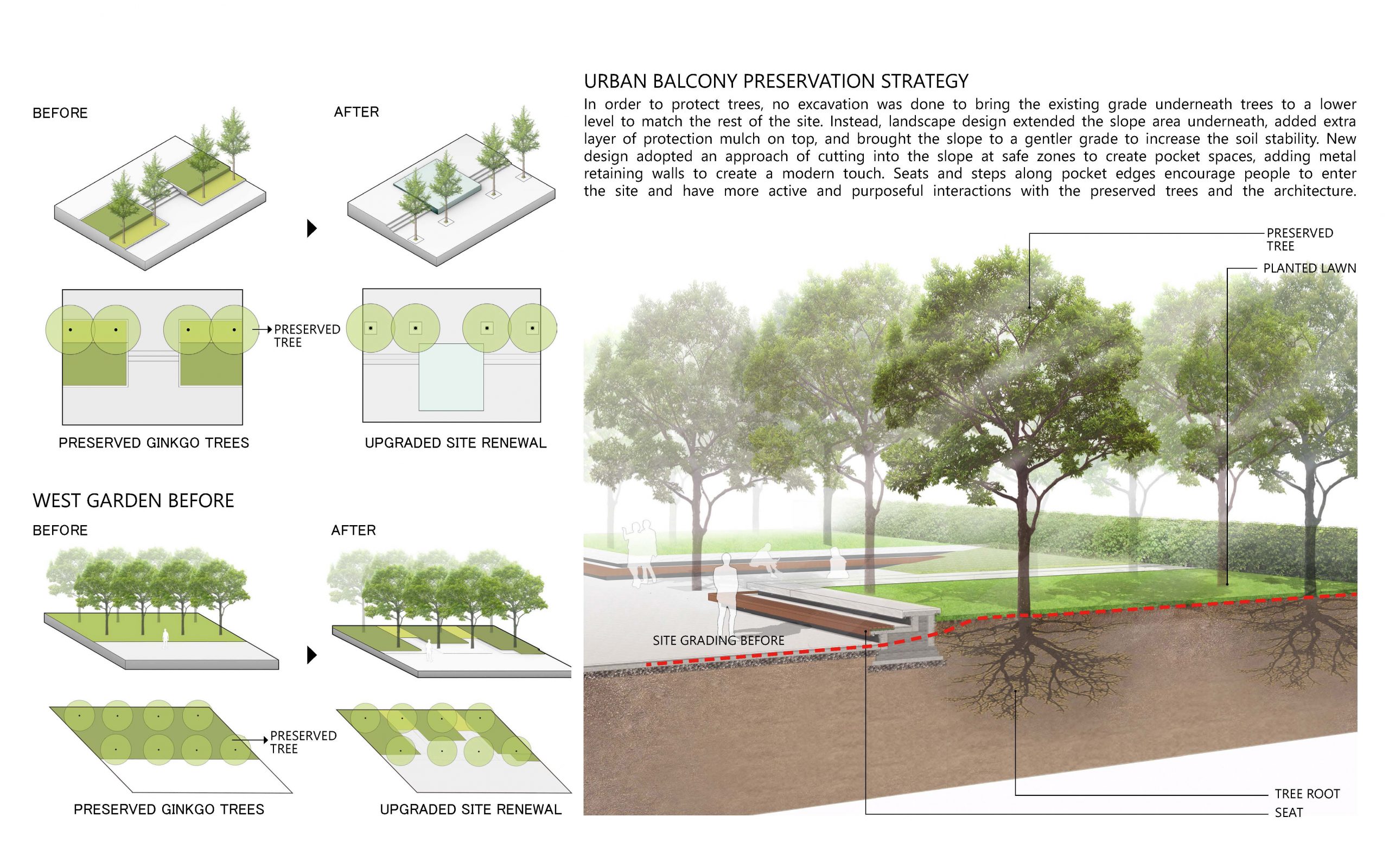
▼改造策略大树保留 Tree Preservation
出于保护现状乔木,场地内避免挖掘作业。设计将现有乔木下的标高降低,使其与场地的其余部分平齐。相反的,设计拓展了下方的斜坡区域,以在顶部增加额外的保护覆盖层,降低了坡度的同时增加了土壤稳定性。新设计在斜坡安全区切出嵌入式的口袋空间,增加金属挡墙以营造现代质感,沿口袋边缘布置的座椅和台阶鼓励人们进入该场所,并与完好保存的树木和建筑进行更积极、有目的的互动。
In order to protect trees, no excavation was done to bring the existing grade underneath trees to a lower level to match the rest of the site. Instead, landscape design extended the slope area underneath, added extra layer of protection mulch on top, and brought the slope to a gentler grade to increase the soil stability. New design adopted an approach of cutting into the slope at safe zones to create pocket spaces, adding metal retaining walls to create a modern touch. Seats and steps along pocket edges encourage people to enter the site and have more active and purposeful interactions with the preserved trees and the architecture.
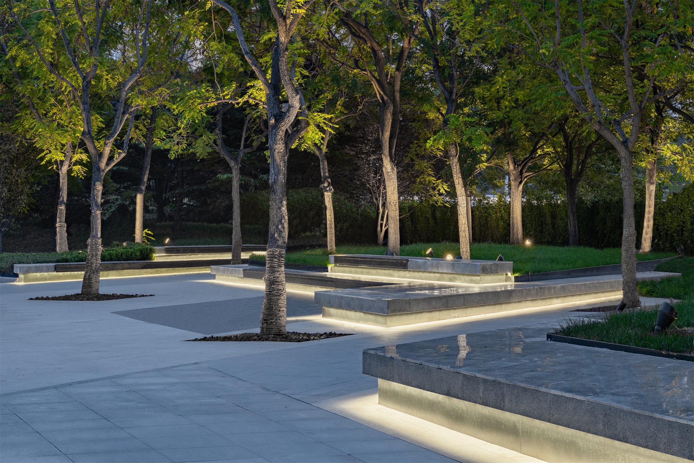
▼林下休闲广场 Tree plaza
▼清晨林下休闲广场 Tree plaza at sunrise
▼傍晚的林下休闲广场 Tree plaza at sunset
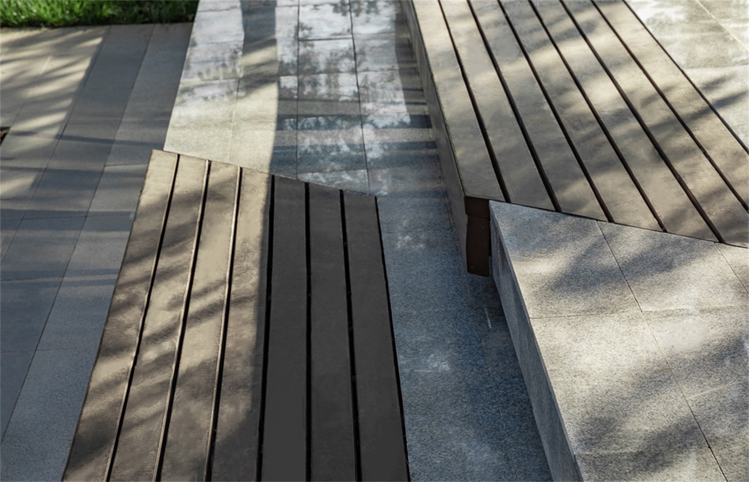
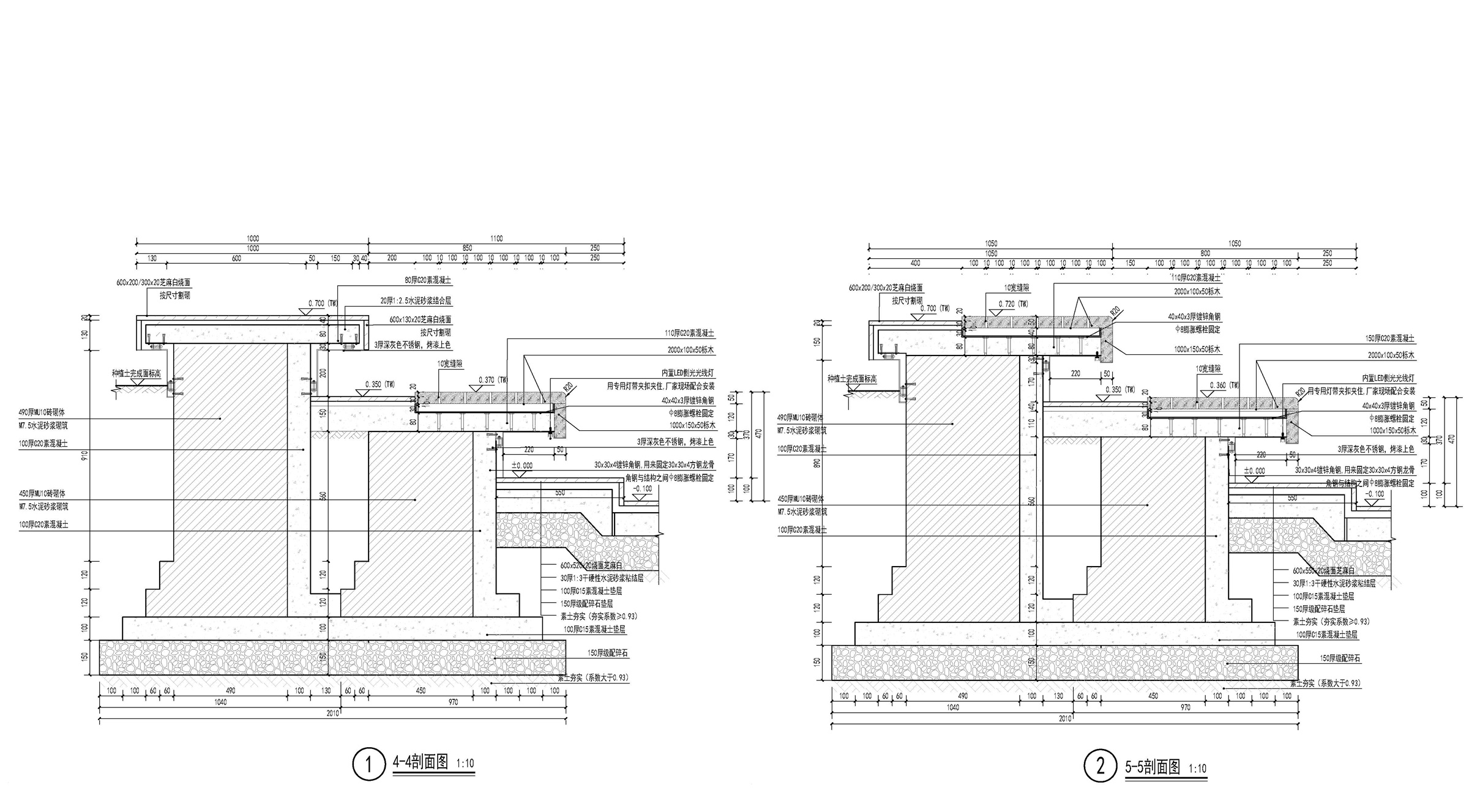
▼座墙细节 Seat wall details
项目名称:万科时代中心-叁元 三元桥海航大厦改造
项目地点:北京市朝阳区三元桥,中国
项目面积:8000平米
项目业主:北京万科
景观设计:OneScape 一域
主持设计师:彭路 郭菁
设计团队:李正阳 丰欣雨 曾逸民 鲍琪 崔雁新
建筑及室内改造团队:盛哲建筑设计、维拓建筑设计有限公司(施工图)
摄影师:栾祺
Project Name: Vanke Times Center – San Yuan
Location: San Yuan Qiao, Chaoyang District, Beijing, China
Design Scope: 8000 sqm
Project Client: Vanke BeijingLandscape Design: OnescapeLeading Designer: Peng Lu,
Landscape design: OneScape
Host designer: Peng Lu, guo Jing
Design Team: Li Zhengyang, FengXinyu, Zengyimin, Hanlu, Baoqi, Cui Yanxin
Architect: SZ Architecture, Weituo ArchitecturePhotographer: Luan Qi
Photographer: Luan Qi
更多 Read more about: OneScape 一域















彩平标注走廊的英文corridor拼错了哦
这点错误都不敢承认
感谢您的指正,这边将会与图文供稿方反映的哈~