本文由 TROP: terrains+open space 授权mooool发表,欢迎转发,禁止以mooool编辑版本转载。
Thanks T.R.O.P: terrains +open space for authorizing the publication of the project on mooool, Text description provided by TROP: terrains+open space.
TROP: terrains+open space:项目是一个位于沈阳市中心青年大街的改造类项目。改造内容主要分为2个板块:板块一为对地面现有的办公广场入口进行改造,以增加公寓入口功能及流线,同时提升入口的城市形象,为不同人群划分更清晰流畅的使用体验;而另一个板块是将原本顶层废弃的设备屋顶,改造为服务于两个顶层样板房的室外花园。
TROP: terrains+open space: The Yanlord Opus One stands as an urban renewal projects situated on Qingnian Street in the heart of Shenyang City. This mixed-use property consists of an office tower with a retail on the second floor and an apartment tower. The apartment landscape renovation contains two fundamental goals. One is to separate the residence circulation from the lively public and office route. And the other is to convert the equipment storage roof to two individual gardens for the mock-up rooms.
地面改造 GROUND TRANSFORMATION
地面改造的内容整体概念从现存的丹下健三的经典建筑立面出发,衍生出和立面呼应的盒子概念,用建筑的元素变成既具雕塑感同时兼具空间划分的新建筑立面。原本设计的秘境之盒、穿梭之盒、迎宾之盒和餐林之盒,由于业态的原因秘境之盒暂缓施工。
The inspiration for the ground floor renovation was drawn from this iconic building facade designed by Kenzō Tange. Here, a harmonious interplay of sculptural and spatial elements took shape. The original concept envisioned The Mystery Box, The Transition Box, The Lobby Box, and The Canteen Box. While, owing to the evolving business formats, the construction of The Mystery Box has been temporarily postponed.
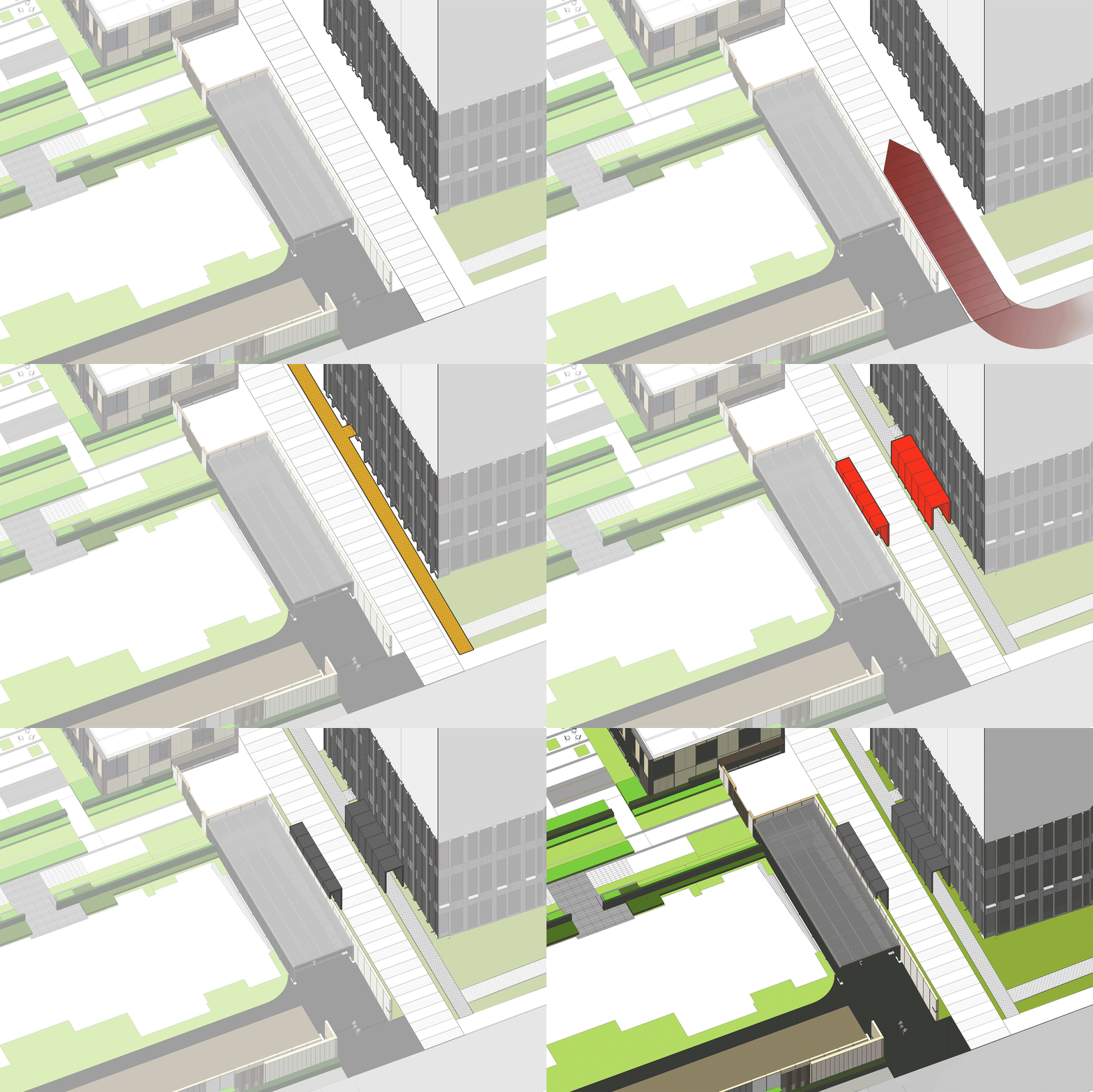
「穿梭之盒」成为了踏入场地的首个空间,高耸的尺度起到了入口昭示作用的同时,将原本相对混乱的人行和车行流线进行分流。漂浮在绿化之上的黑色金属网,带来了穿越时空的奇妙感受。
The Transition Box is the gateway to the site, where its height serves as an entrance signage, its layout separates the vehicular and pedestrian circulations. A floating black metal mesh, suspended above a verdant canopy, offers a slightly surreal experience that one would feel like traveling pass time and space.
▽入口昭示空间分析 The entrance indicates spatial analysis
▽黑色金属网盒子空间 Black metal mesh box space
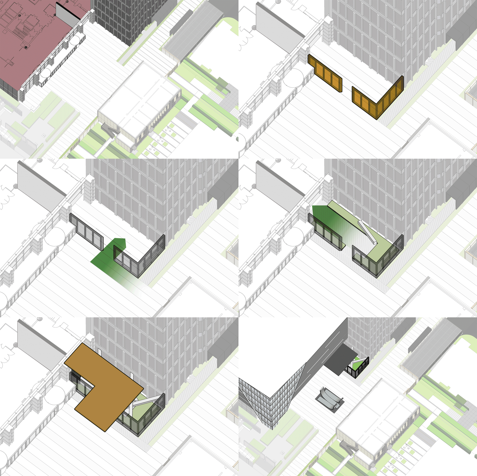
「迎宾之盒」为新增的仁恒源59的公寓入口,设计用半透的盒子在公共的办公广场中引入一个半私密的过渡空间。与开放且人流较密集的办公入口相反,迎宾之盒其静谧和隐奢的氛围,为住户营造出从外部的喧嚣中进入花园的独特入户体验。
The “Lobby Box” welcomes residents to walk into the newly established Yanlord Opus One apartment entrance. Adding a semi-transparent box as the entrance, the design creates a transitional space to separate the office visitors’ route from the returning home pathway. In stark contrast to the lively office entrance, the “Lobby Box” exudes serenity and opulence, calm residents down with a garden-like sanctuary amidst the urban frenzy.
▽入口空间场地分析 Entrance space site analysis
▽隐逸的入口空间 Secluded entrance space
设计利用原有的立面柱子,搭接斜撑的雕塑感新梁来支撑较大的屋檐,并巧妙地运用了金属网来隐藏新增的竖向支撑结构,让花园内部形成优雅的无柱空间。
By utilizing the existing columns and introducing sculptural beams with diagonal braces, the special elegance appears when the supporting structure was disappears in the metal mesh façade. Only exquisite remains.
▽错落有致的线性空间 Staggered linear Spaces
原本办公广场的中心较为空旷,缺少场地标识性及视觉焦点,因此在两个盒子之外我们还设计了中心水景雕塑。场地中大部分铺装需要保留,因此我们延续了原有的条状铺装的概念,从地面卷翘而起,形成极具雕塑感和艺术性的中心焦点的同时,也保证了整个设计体系的完整与统一。
To infuse identity and focus into the central office square, a captivating waterscape sculpture was conceived. Staying true to the original strip paving concept, it rises from the ground, manifesting as a sculptural masterpiece that unifies the entire design, thus elevating the site’s integrity.
▽改造前实景图 Actual view before renovation

▽改造后实景图 Real scene after transformation
▽从地面卷翘而起的中心水景雕塑,极具雕塑感和艺术性 The central waterscape sculpture that rises from the ground is very sculptural and artistic
屋顶改造 ROOFTOP TRANSFORMATION
屋顶改造我们遇到更多的挑战,第一次去现场时,通风管道几乎占满空间,虽然有非常好的视野,但由于外立面和内部结构的不统一,而显得杂乱不堪。老旧的现存梁柱限制了空间的发挥,且屋面并没有任何覆土预留。存在挑战的同时又充满了乐趣,局部三层的现有梁,为搭建提供了可能性,让可以发挥的不仅仅是一个平面,更可以是一个非常立体的三维花园。
The rooftop renovation presented a series of challenges. During our initial site visit, the prevalence of ventilation ducts dominated the scene, creating a palpable disruption in the harmonious blend between the interior and the exterior. The aging beams and columns imposed spatial constraints, left no room for planting. However, it was within these challenges that we discovered the true essence of our journey—a fusion of challenges and creative possibilities. The presence of pre-existing three-level beams sparked our imagination, transcending the confines of a flat panel and allowing us to envision the rooftop not as a surface but as a vibrant, three-dimensional garden of endless potential.
▽43层改造前实景图 Actual view of the 43rd floor before renovation

▽44层改造前实景图 Actual view of the 44th floor before renovation

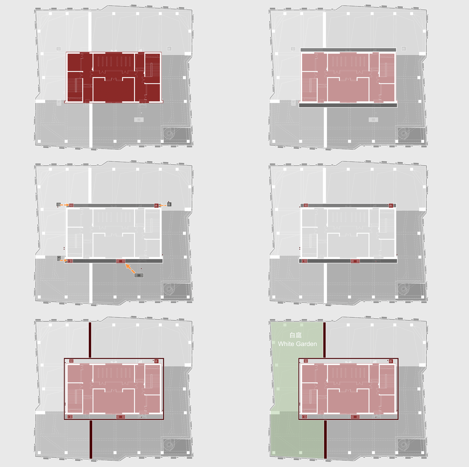
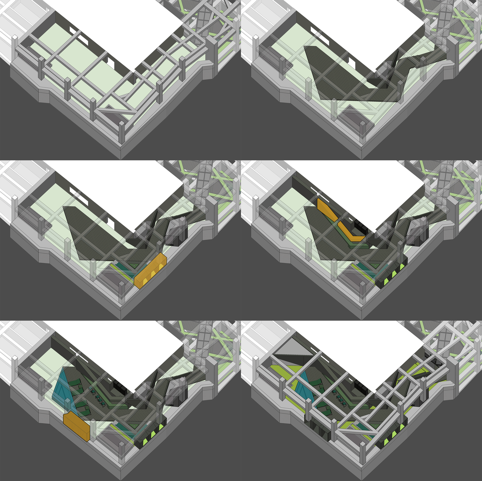
首先进行规整管道,我们将花园分为大小两个,利用花园之间的隔墙空间和核心筒顶部,隐藏和转换所有设备;在柱间增加和地面一致的金属网作为干净统一的新立面;同时将整个场地抬升0.45m, 加固底层结构,形成灌木种植条件。
The idea is to standardize pipelines, and creates two distinct gardens – one large and one small. By utilizing the space between the columns and the space above the core tube, the design finds a way to hide and transfer all the equipment. A metal mesh mirroring the ground was introduced between columns, unifying the new facade. The entire site was raised by 0.45m, reinforcing the foundation while providing the minimal soil depth for shrubs to grow.
▽屋顶花园场地空间分析 Spatial analysis of roof garden site
最后在原有的梁柱空间基础上,顺应不同户的室内设计风格,用两种完全不同的空间策略,创造出了黑白两个性格的花园,我们将他们叫做黑苑|白庭。
「黑苑」避开原有柱网,我们用折叠的方式将原有梁柱之间的空间串联,形成一气呵成犹如折纸般游走于柱网之间的三角形流动咬合空间,打造一个极具艺术感与雕塑性的折纸花园,运用黑色来体现极致的神秘及隐奢感。
As a result, the design applies two opposite strategies to create unique gardens that echo to each mock-up rooms’ interior design style. So we name it The Black Court and The White Court.
Black Court By bypassing the original column network, each room between the columns are interconnected by diagonal forms, conjuring a sculptural and artistic garden where black exudes mystery and opulence.
▽设计分析 Desgin analysis
▽改造前实景图 Actual view before renovation

▽改造后实景图 Real scene after transformation
设计最大化的利用2层空间,在梁的上方架出漂浮的连廊,形成立体的视线互动,也达到功能空间上的动静分离。
The design maximized the dual-level space, constructing a floating corridor above the beams for visual interaction and functional division.
入口连接室内客厅,形成被绿化包裹的室外下沉会客区,立面细节采用与平面三角元素呼应的方式。
The outdoor sunken reception area connects seamlessly to the indoor living room, establishing an enchanting ambiance. A triangular staircase space intertwines with hanging plants, adding depth and artistry to the design.
▽下沉会客区 Sinking reception area
流线分割出的两个空间分别形成功能相互补充的多人室外聚餐区和休憩区,视野最佳区域则取消金属网形成框景,为休憩区提供最好的景观。
The entrance seamlessly connects to the indoor living room, embraced by lush greenery. The facade details echo diagonal elements, dividing the space into an outdoor dining area and a relaxation zone. The optimal viewing spot eliminates metal mesh for the best view.
▽多人室外聚餐区和休憩区 Multiple outdoor dining area and recreation area
在原有的梁柱的基础上,局部增强了柱网的序列感,衍生出了和梁体量相似的空中种植盒,为竖向添上一抹东北地区少见的森森绿意,漫出的垂挂植物也像幔帐一样对不同功能空间增加界定,又兼具趣味性与层次感。
Enhancing the column grid created suspended planting boxes. The cascading greenery drapes gracefully, resembling nature’s own curtain, as if the outdoors itself were revealing glimpses of its inner beauty. It also adds a touch of rare greenery to the place in northern east region.
▽自然绿意的空中种植盒 Aerial planting box
尽端为连接上下两层的三角形楼梯空间,其独特的造型也极具雕塑及艺术感。
As one walked to the end, that triangular staircase serves as a closing of the artistic spatial exhibition.
▽连接上下层的楼梯空间 Stair space connecting the upper and lower levels
2层的漂浮连廊在视野较好的中部设置了休息平台,可以眺望远处。其通透的金属网也保证了下层空间的采光,并减少了压迫感。
The unique, sculptural staircase connects upper and lower levels. The second-floor floating corridor provides panoramic views and ample light to the lower space.
▽漂浮连廊空间分析 Spatial analysis of floating corridor
▽漂浮的连廊空间 Floating corridor space
连廊连接的是空间功能要求更多的温泉派对区,结合泡汤和私人派对的需求,设计增加了更衣室、卫生间、桑拿房三个室内空间。用立面折纸的方式,把绿植半包裹成为室内和室外都可以观赏的私密小花园。
Following the corridor is a spa & party area. To facilitate the use for private bath and party, the design proposed dressing rooms, restrooms, and a sauna. Applying the origami idea on the vertical dimension, the façade with greenery creates a private visual garden delighting both views from indoor and outdoor.
▽改造前实景图 Actual view before renovation

▽改造后实景图 Real scene after transformation
立面折叠形成独立的吧台区,另一侧则结合桑拿房形成抬高的温泉泡池,让雪天泡汤的场景不再只是人们的浪漫幻想。
The origami continues to become a kitchen island. It then dissolves like a fading fantasy, gently merging with the rim of the hot tub, sparking the romantic imaginations for people bathing especially on a snowy day.
▽自然光影下的吧台与温泉泡池 Bar and hot spring pool under natural light and shadow
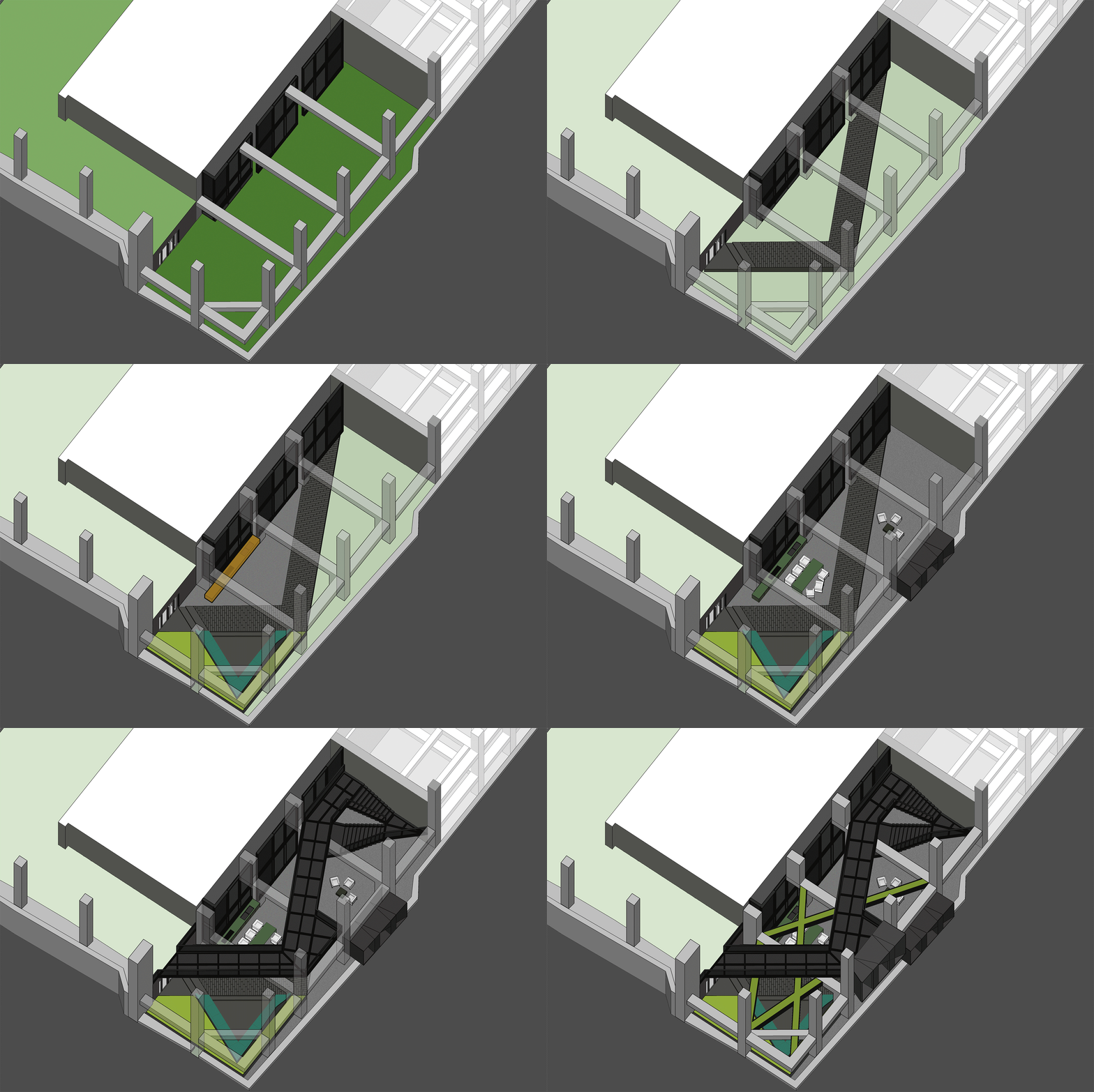
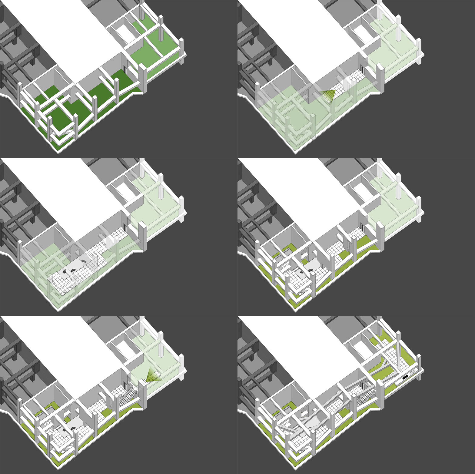
「白庭」不同于黑苑的空间串联,白庭用解构的理念充分利用原有的梁和柱,对其进行拆解、增置和呼应咬合,框设出一重又一重的院落体验,赋予其更为纯粹的艺术性和故事性。
The White Court In stark contrast to Black Court spatial series, Baiting Courtyard breathes new life into original beams and columns through deconstruction, crafting a layered, artful narrative.
▽院落空间设计分析 Courtyard space design analysis
白色的运用,则使得光与影的变化得到最大化的展示效果,提升了空间的明亮度和开阔感,使住户置身于纯净又梦幻的场景之中。
The thoughtful use of white amplifies light and shadow interplay, enhancing space’s luminosity and dreamy ambiance.
▽改造前实景图 Actual view before renovation

▽改造后实景图 Real scene after transformation
在每个被解构的梁柱之间形成了不同的功能。第一进来到是交通转换空间,轻盈的白色金属楼梯漂浮于植物之上,引导住户走向二层的空间。
Deconstructed beams and columns serve diverse functions. The entrance unveils a traffic transformation zone, where a light white metal staircase hovers above plants, guiding residents upward.
▽轻盈的白色金属楼梯漂浮于植物之上 A light white metal staircase floats above the plants
而另一侧根据风水要求,设置的枯山水观赏区。透过不同形式的片墙和框景,仿佛置身在不同的抽象山水画中,清新和艺术的氛围也能让使用者达到内心的宁静。
Adjacent, a Feng Shui-inspired dry landscape viewing area emulates abstract landscapes. It creates various feature walls and frames, so the one feels like standing in a Chinese stroll painting. The delightful and artistic vibe nurtures inner tranquility in return.
在尽头的转角处,则是功能与黑苑类似的下沉会客区,墙面的巧妙设置让这个空间在兼具私密性的同时,又可以局部观赏自然的花园及身姿曼妙的庭院树。
At the corner, a sunken reception area mirrors Black Court charm, offering privacy and glimpses of the natural garden.
▽下沉会客区 Sinking reception area
而楼上则是一个被自然种植包裹的露天聚餐烧烤空间,可容纳20人左右的聚会,漂浮在绿植上的大理石料理台,再次和原有的结构呼应。除了眺望远处的浑河及市中心的繁华,最独特的也在于每个花园都拥有一片属于自己的天空。
On the upper floor, an open-air dining and barbecue space, enveloped by natural gardens, accommodates 20 guests. The marble cooking table harmoniously aligns with the original structure, providing scenic views of the Hun River and the bustling city. Its uniqueness lies in the gardens, each one a portal to the boundless expanse of the open sky, inviting nature’s canvas to paint its masterpiece overhead.
▽自然烂漫的露天花园 Open air garden with natural splendor
在植物的营造上,我们和魏玛再次合作,突破以往北方植物设计搭配相对固定,品种选择比较单一的限制,大胆采用了真假混植的方式,以达到饱满、自然的效果的同时,又符合北方寒冷地区生长要求。各个不同功能及区块对应其独特性格,也给出了不同的植物氛围。乔木的种植由于荷载和覆土的极限限制,每一棵的位置根据空间的框景效果精心选择,并单独抬升种植深度,以达到在精不在多的要求。
Collaborating with Weimar, we defied constraints of fixed plant design and single species selection in the north. Boldly, we embraced mixed planting, combining real and artificial flora to achieve a lush, natural aesthetic while accommodating cold climate growth requirements. Each area and block exhibits unique plant atmospheres, with arbor planting meticulously tailored to frame the space and reduce overcrowding. Plant selection was a breakthrough, employing a mix of real and faux plants to adhere to northern growth requirements. Each function and block adopted unique flora, adding character and vibrancy.
▽植物效果与实景(黑苑) Plant Effects and Reality (Black Garden)
▽植物效果与实景(白庭) Plant Effects and Reality (White Court)
在施工的过程中,存在着层高限制和屋面顶板排水需求的双重矛盾,在无法按正常坡度排水的情况下,除绿化区域,硬质路面和砾石区底部均做了架空处理,底部面层做了防水找平以最大可能的保证雨水的流通。
Construction posed dual challenges: floor height restrictions and roof drainage. To address the latter, we elevated the hard pavement and gravel areas, ensuring efficient rainwater circulation, except for the green zone.
▽白庭基础施工过程 White court foundation construction process

而首层迎宾之盒也遭遇极限基础的问题,地面距离顶板厚度仅有0.3-0.8m而构筑高度高达6米,且现状建筑立面无法提供足够的外力支撑,水景雕塑无法满足水泵正常放置深度的需求。最终我们的解决策略是,利用条形基础形成闭环框架并利用局部植筋入地库顶板达到整体的稳定与平衡,对每片水景雕塑做了厚度调整,减少底部水膜的厚度,利用水景雕塑的底部空腔极限来满足水泵的放置需求。
The foundation for the first-floor Lobby Box, constrained by thin ground and a lofty building, required innovative solutions. Strip foundations formed a closed-loop frame, supplemented by roof reinforcements for stability. Waterscape sculpture thickness adjustments optimized water pump placement. Construction brought forth challenges such as floor height restrictions and roof drainage. The innovative use of modular segmentation facilitated transportation, while structural reinforcements ensured stability.
▽迎宾之盒结构施工过程 Welcome box structure construction process

▽雕塑基础结构施工过程 Sculpture infrastructure construction process

▽雕塑制作过程 Sculpture making process

▽雕塑现场安装过程 Sculpture installation process on site

在材料运输的过程中,改造项目的难度也可窥见一斑,不同于新项目可依赖塔吊,本项目屋顶花园的材料只能依靠货梯运输。因此我们采用模块化切分的方式,来适应货梯运输尺度,乔木选用较为舒展自然的小乔,在无法满足较大冠幅和高度需求的限制下,我们转向了尽可能展现植物姿态美的形式。
During the transportation process, the challenges of the renovation project are also evident. Unlike using tower cranes on the brand new sites, delivering materials for this renewed rooftop can only use the freight elevator. In this case, we created a modular segmentation approach to accommodate the limited dimensions of the elevator. Due to the ceiling height and topsoil constrains, the compact and naturally elegant little Maple trees were carefully selected to showcasing the beauty of the trunks and branches.
▽黑苑温泉派对区结构施工过程&黑苑连廊结构施工过程 Construction process of Heiyuan hot spring Party area & Construction process of Heiyuan corridor structure

仁恒源59是一个我们不常接触的项目类型,虽然面积还不到3000㎡,但其限制、挑战和不同功能的需求让这个项目比我们很多几万方的项目难度更大。虽然每个区域的需求不同,但是利用类似的材料和细节处理,让每个区域虽然有着不同的性格,但合在一起的时候,不管新旧,不管原本的经典优雅还是新增的现代自然,它依然是一个和谐统一且可以经历未来更多时代变化的精彩项目。
Yanlord Opus One is a project of exceptional complexity and creativity. Despite its modest footprint, which is less than 3000 ㎡, it marries classic elegance with contemporary flair, creating a harmonious and enduring masterpiece. In this urban oasis, the past and the future converge seamlessly, promising an ever-evolving experience for all who encounter it. Yanlord Opus One’s transformation, though compact, presented multifaceted challenges. Uniform materials and detail precision bestowed diverse areas with unique character, harmonizing old and new elements into an enduring masterpiece.
▽首层平面 Ground Floor Plan
▽屋顶平面 Roof Garden Plan
项目名称:仁恒源·59 | Yanlord Opus One
完成年份:2023.05
项目面积:2,950㎡
项目地点:中国沈阳
设计公司:TROP: terrains + open space
公司网址:http://www.trop.land https://www.facebook.com/TROP.terrains.openspace https://www.instagram.com/trop_terrains_openspace
联系邮箱:shanghai@tropstudios.com admin@trop.land
主创设计师:Pok Kobkongsanti
设计团队:任扶桑,银华梅,陆思怡,桑鹏涛
客户:仁恒置地沈阳公司
合作方:
景观施工图:魏玛景观
软装深化设计与实施:海然国际
景观施工:安徽康乐园林建设工程有限公司
建筑设计:日本丹下都市建筑设计事务所(前身为丹下健三设计研究所)
室内设计:意大利Pulina Exclusive室内设计事务所,邱德光设计事务所, T.K.Chu Design LTD, CCD香港郑中设计事务所
摄影师:河狸景观Holi
Project name: Yanlord Opus One
Year completed: 2023.05
Project area: 2,950㎡
Project location: Shenyang, China
Design company: TROP: terrains + open space
Company Website: http://www.trop.land https://www.facebook.com/TROP.terrains.openspace https://www.instagram.com/trop_terrains_openspace
Please contact us at shanghai@tropstudios.com, admin@trop.land
Lead Designer: Pok Kobkongsanti
Design team: Fusang Ren, Huamei Yin, Siyi Lu, Pengtao Sang
Customer: Shenyang Yanlord Land
Partner:
Landscape construction drawing: WEIMAR Landscape
Interior Decoration Design and Implementation: Hairan international trading (shanghai) ltd.
Contractor:Anhui Kangle Garden Construction
Architect:Tange Associates
Interior Design: Italy Pulina Exclusive Interior Design Office, Qiu Deguang Design Office, T.K.Hu Design LTD, CCD Hong Kong Zhengzhong Design Office
Photographer: Holi Studio
“ 景观更新与改造,将原本顶层废弃的场地空间演变为充满自然趣味和功能属性的公共空间。”
审稿编辑:Maggie
更多 Read more about:TROP: terrains+open space












好设计棒棒!