本文由 Cumulus Studio 授权mooool发表,欢迎转发,禁止以mooool编辑版本转载。
Thank Cumulus Studio for authorizing the publication of the project on mooool, Text description provided by Cumulus Studio.
Cumulus Studio:该项目位于摇篮山(Cradle Mountain),这里有原生雨林、起伏的草原和传说中漫游的塔西魔鬼,意料之中地吸引了大量的游客。游客中心是摇篮山旅游计划中开发的第一个项目,旨在在有限的空间里打造一个可以容纳许多游客的建筑,并提供一段充满意义的体验。
Cumulus Studio:With wild rainforests, rolling grasslands and roaming Tassie Devils, it’s no surprise Cradle Mountain entices a surging number of visitors. But how can you design a meaningful visitor experience in a footprint never intended to accommodate that number of guests? The Visitor Centre is the first development in a major plan to reimagine the iconic Cradle Mountain experience.
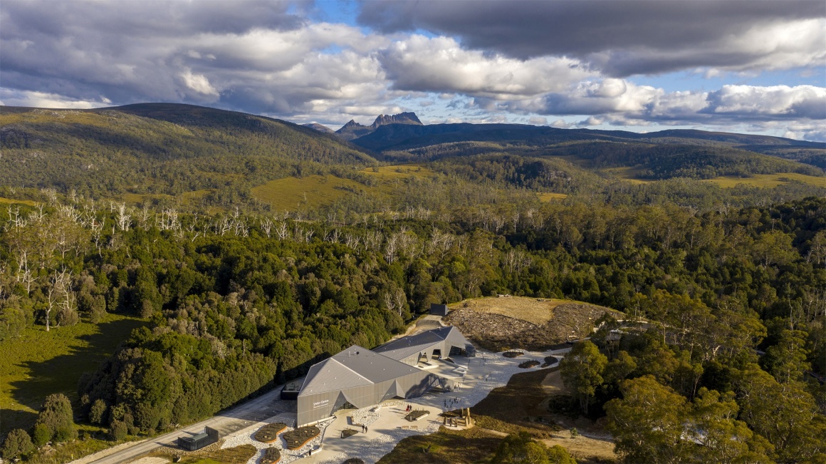
▼整体鸟瞰 Cradle Mountain Aerial
▼项目设计视频 Introduction video
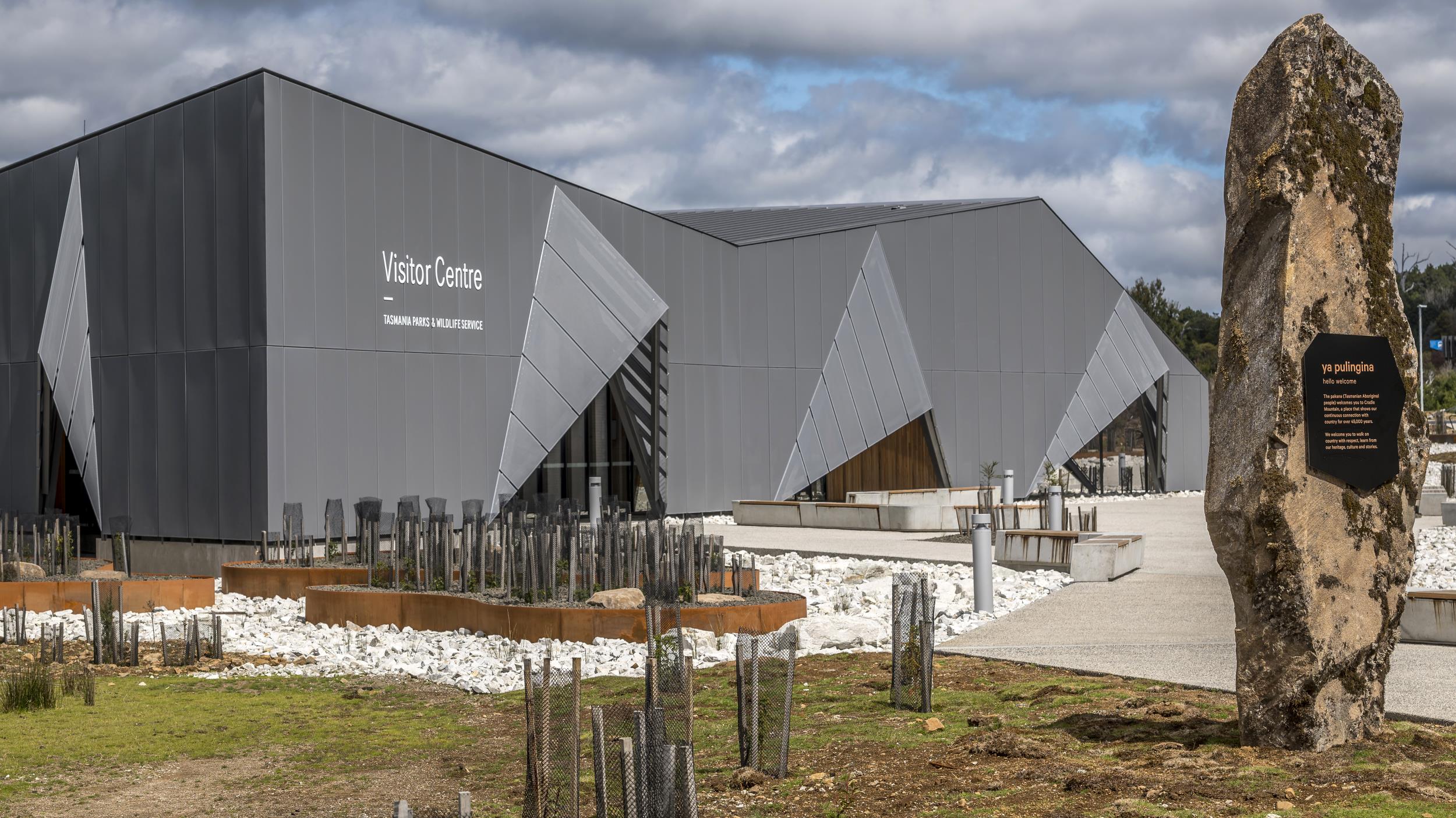
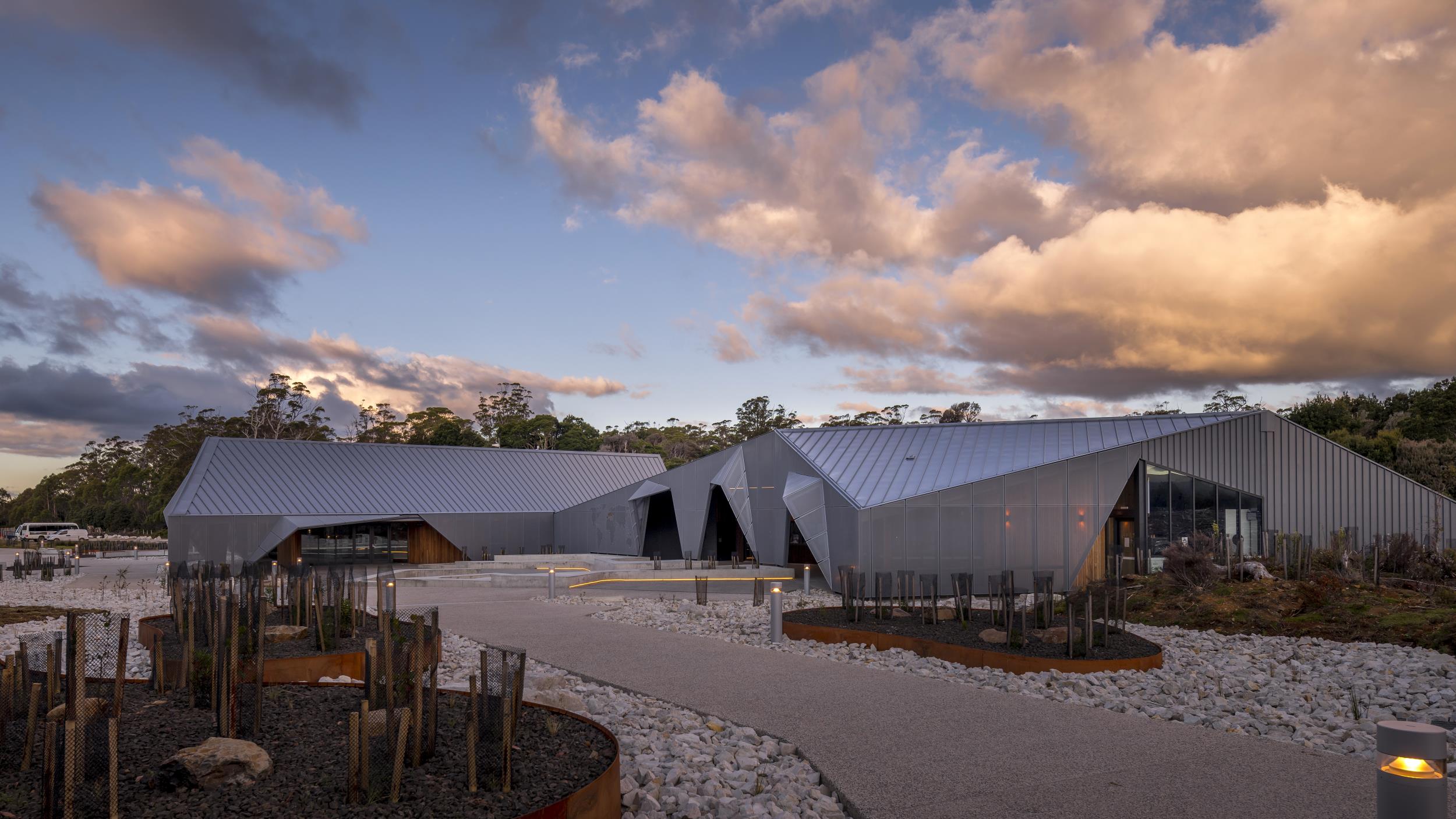
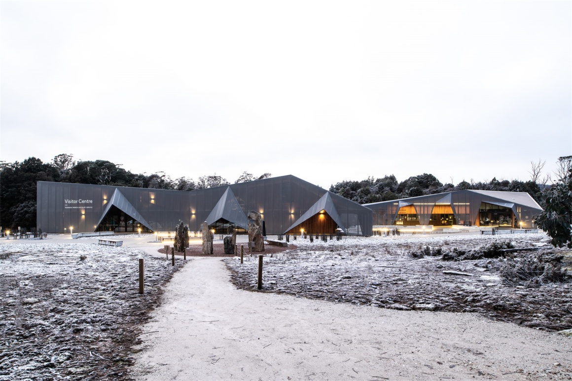
游客中心向到来的游客敞开温暖的怀抱以示欢迎,它的设计体现出一种强烈的期待感,并结合了摇篮山独特的地质地貌。建筑给人一种踏实的感觉,仿佛是在坚硬的岩石上雕刻而成。
The Visitor Centre offers a warm alpine welcome to reflect both the sense of rugged-up anticipation on arrival and the distinctive Cradle Mountain geology. We designed the buildings to feel grounded, as if carved from a solid rock by a glacier.
▼游客中心 Visitor Center
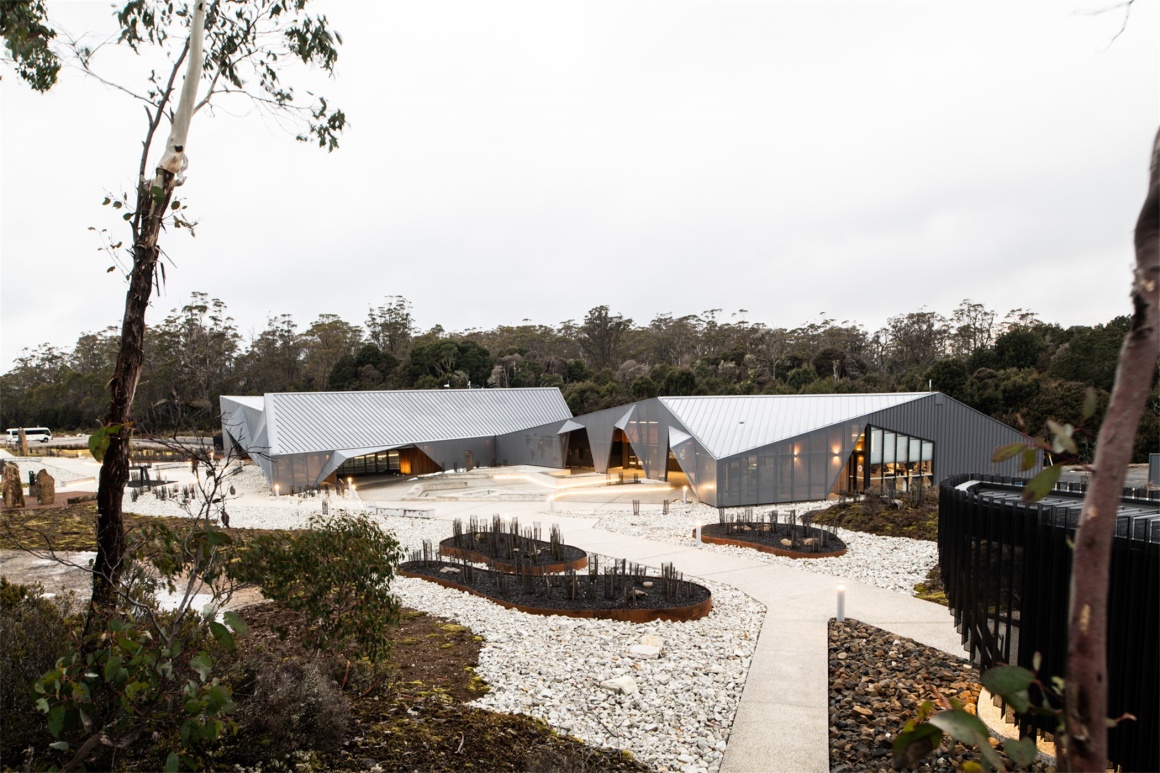
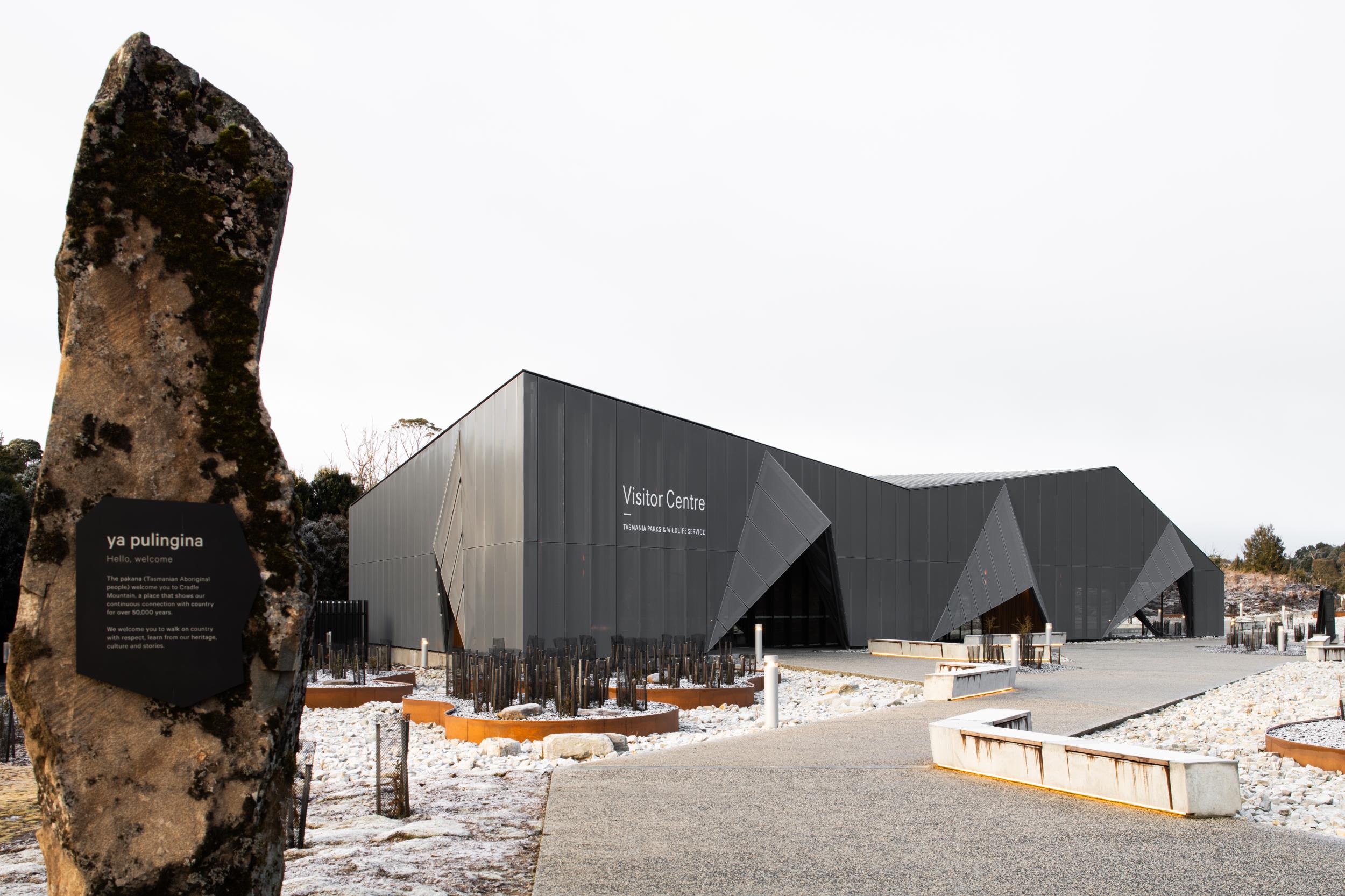
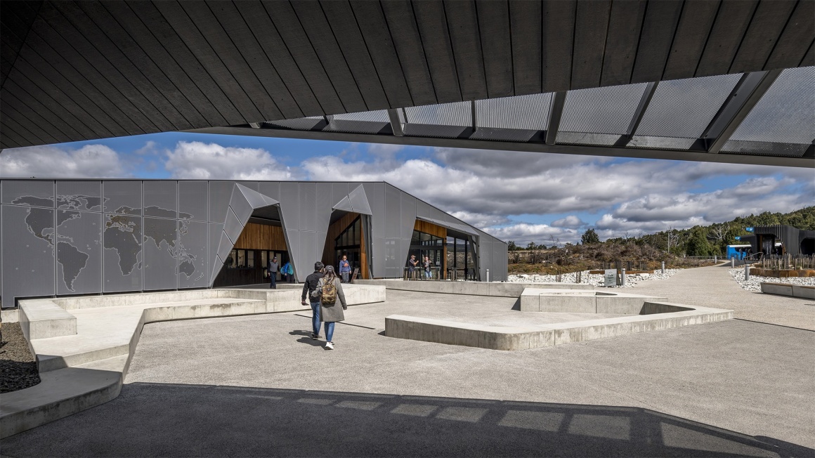
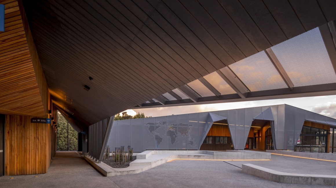
雨幕立面的折叠角度参考了场地的地质,并营造一种邀请游客进入仿佛洞穴一样的内部空间的感觉。建筑的每一个转折点都尊重这个世界闻名的国家公园的重要性和特殊性。
The umbrella rain-screen form references the folding angular geology of the site, inviting visitors into the cave-like timber interior. At every turn, we aimed to honour the significance and sensitivity of this worldrenowned national park.
▼夜景 Night view
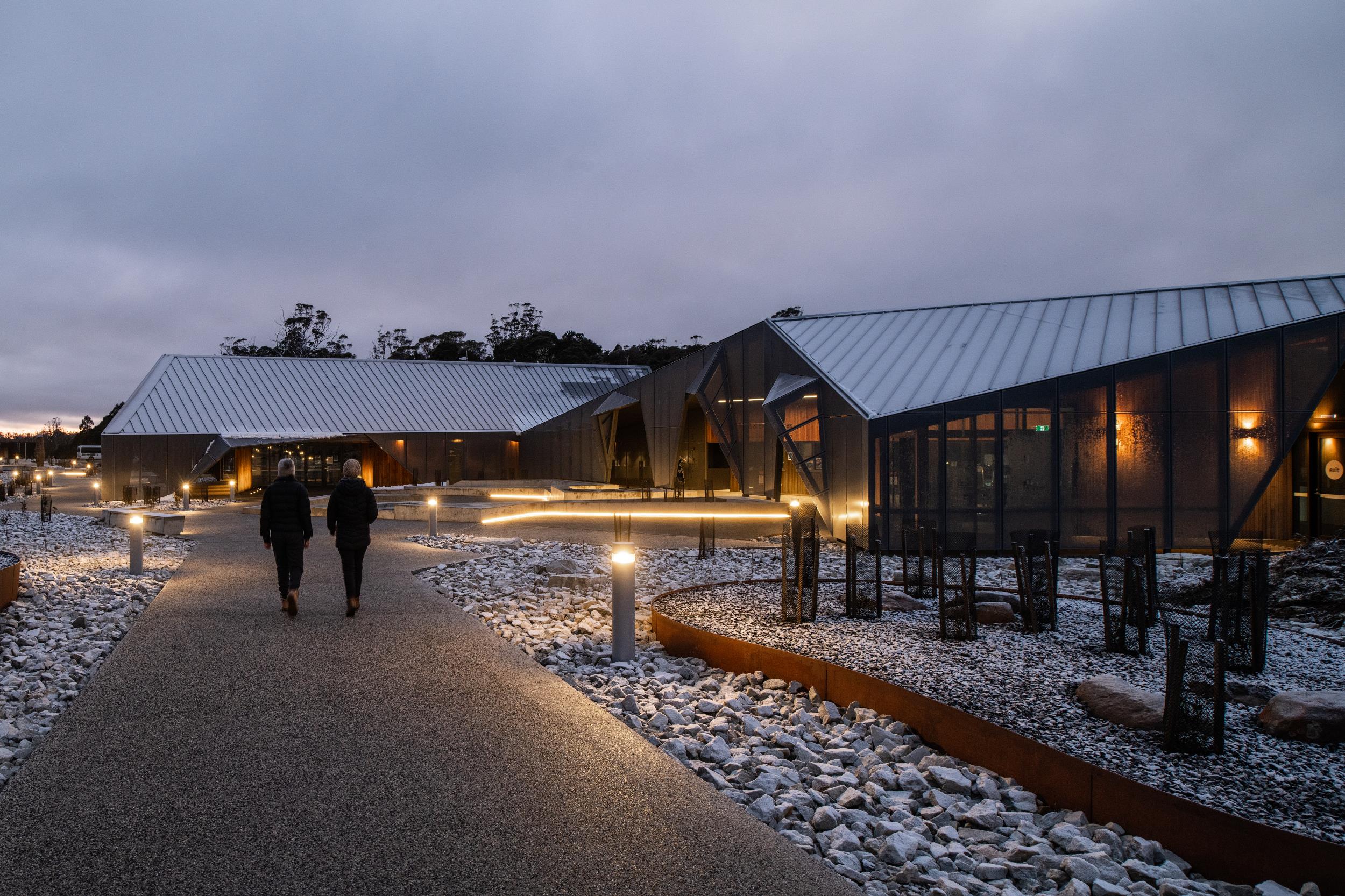
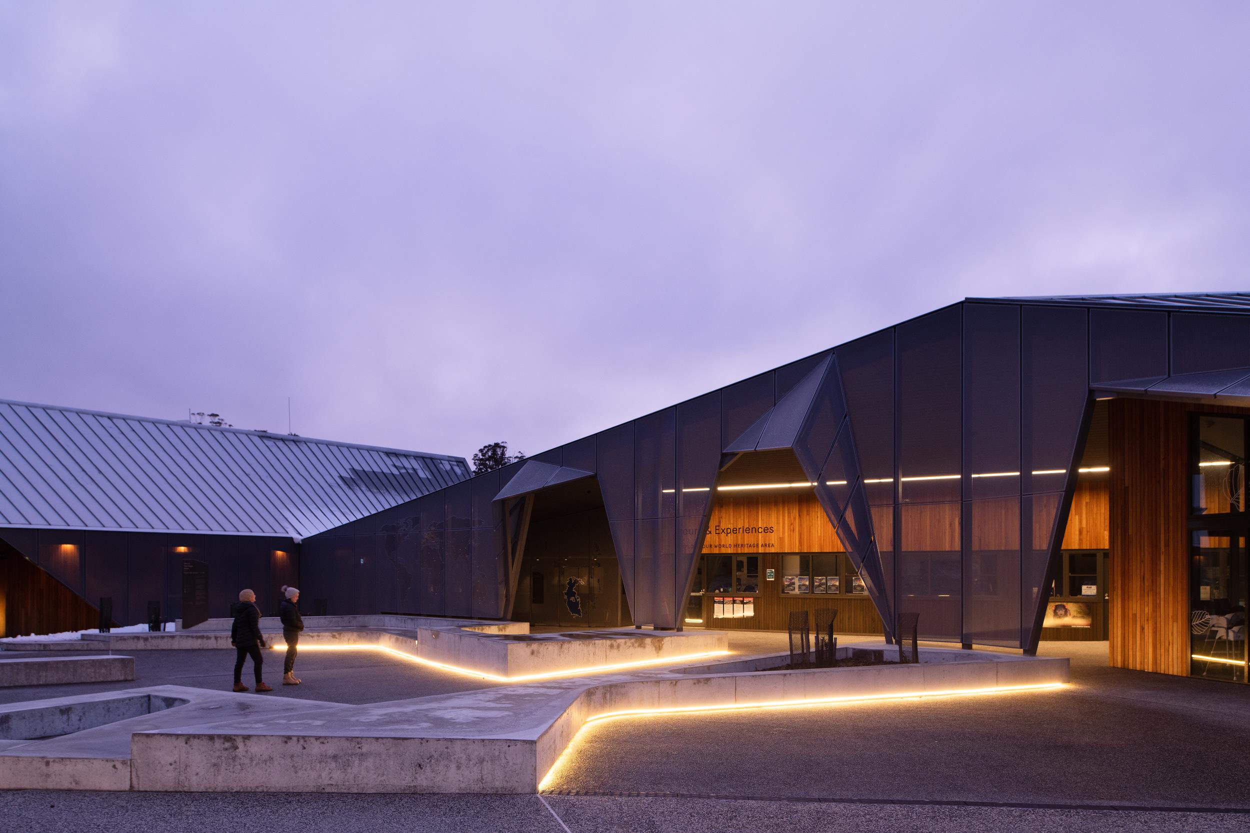
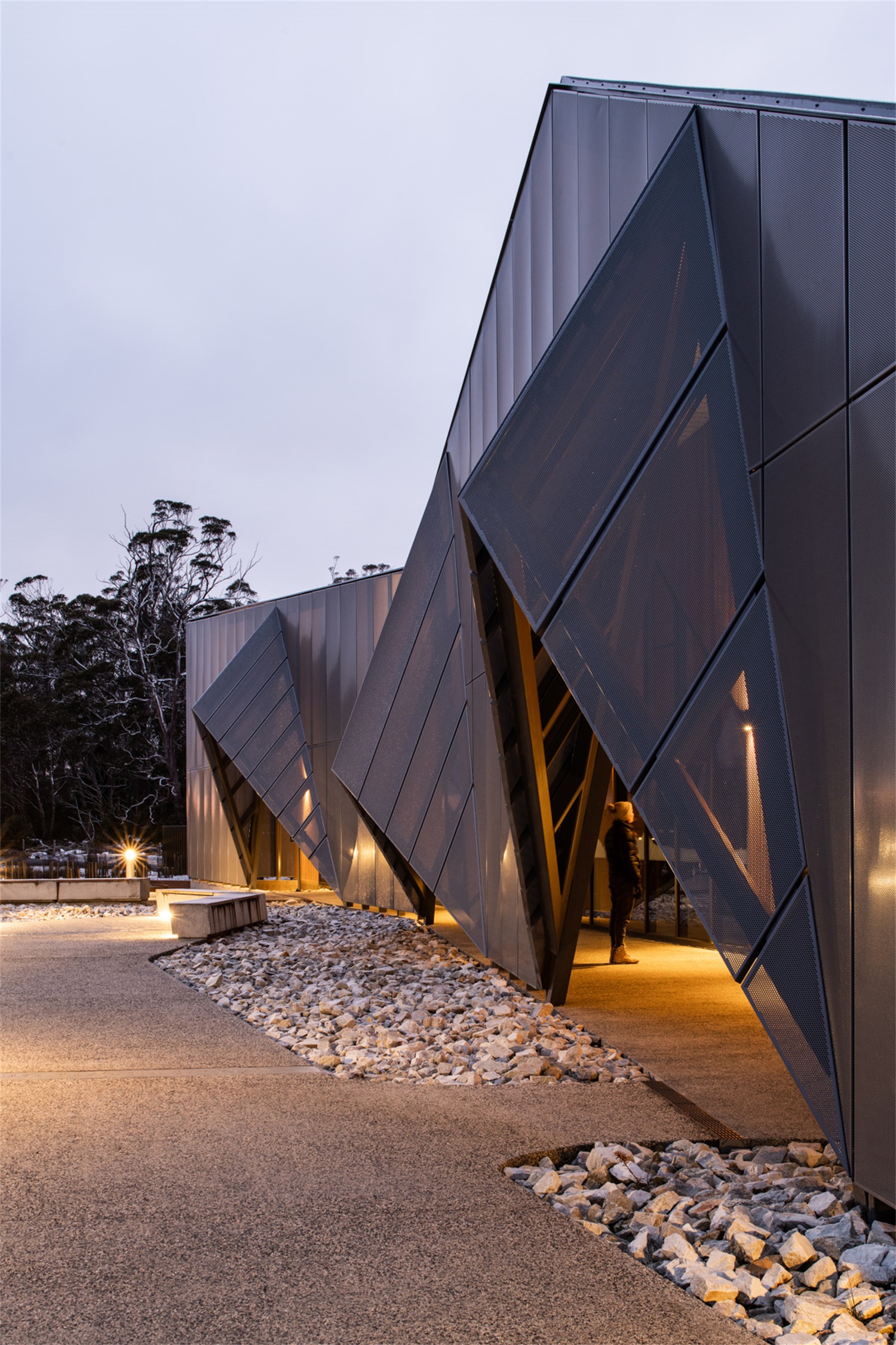
游客中心也是一个充满矛盾的建筑。它气势恢宏却很和谐,对自然进行了一种抽象的解释。它十分现代化,不受时间的影响。最令人惊讶的可能是粗犷的外观和温暖、柔软、精致的木材内衬之间的对比。
Cradle Mountain Visitor Centre is a building of contrasts. It’s imposing but harmonious. It’s an abstract interpretation of nature. And it’s modern with a rightness unrooted in time. Most surprising of all, perhaps, is how the raw exterior unwinds into a warm, soft, delicate timber lining.
室内木材的选择旨在体现这个地方的诗意和品质,天然的木材使客人感觉与自然相连,这是其他材料不可比的。
The choice of timber for the interior was about the poetics and qualities of the place. Because timber is natural, guests feel connected to nature. It often evokes a response other materials don’t.
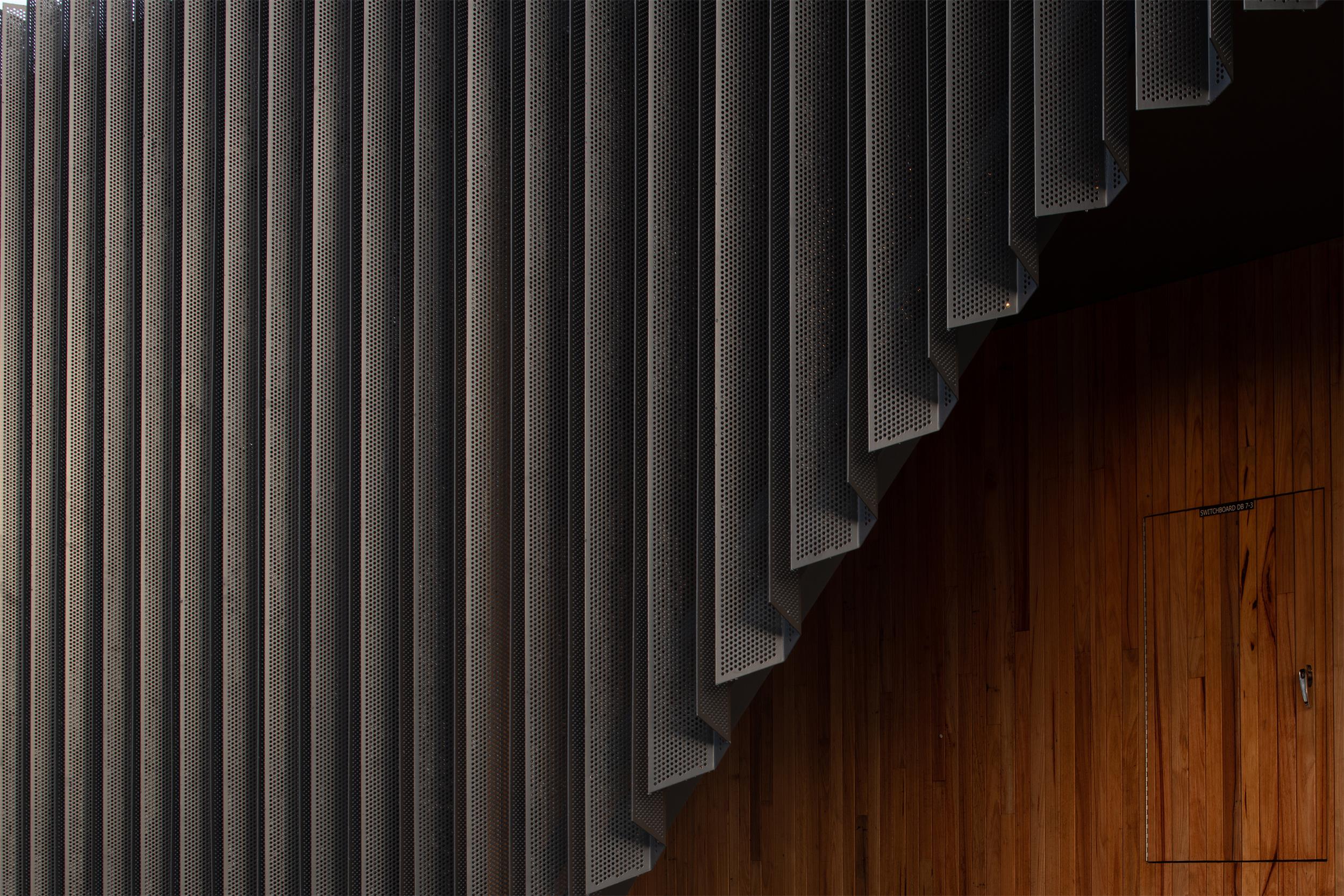
▼立面细节 Façade detail
▼室内艺术装置 Interior art piece
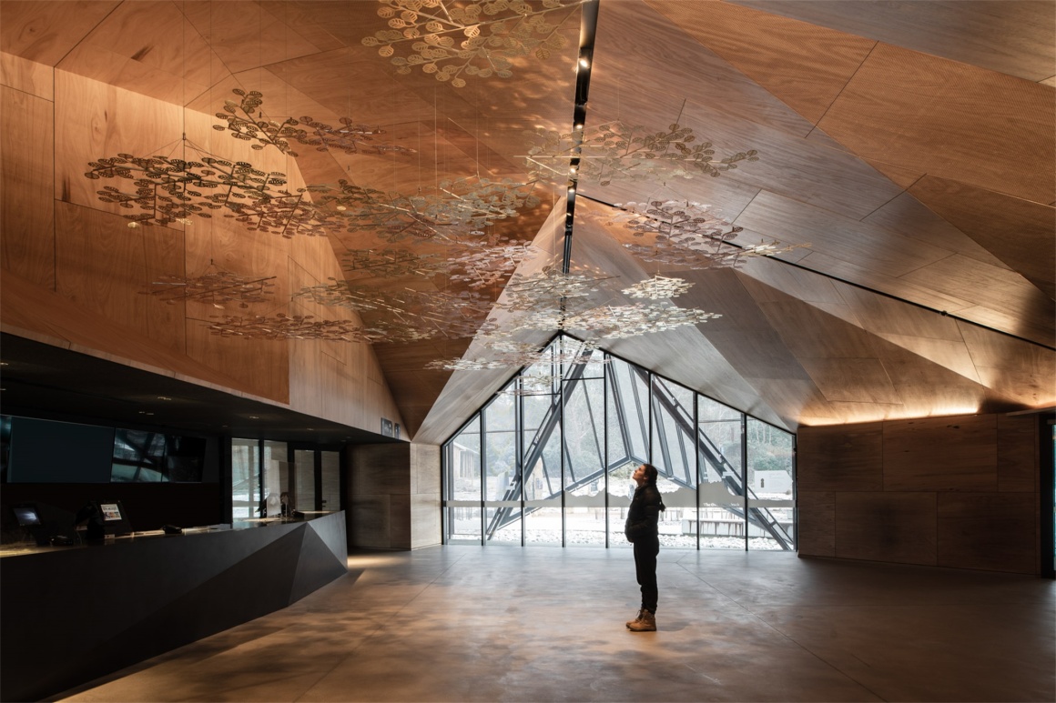
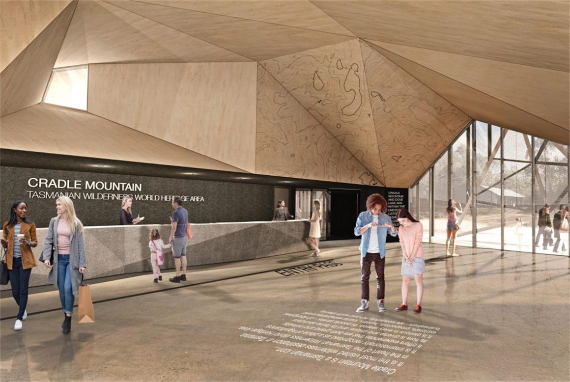
游客中心的设计经历了多次迭代,因为更多的利益相关者看到了这个项目的潜力。但是不管其他方面发生了多少变化,其本质和目标始终保持不变。穿过充满雕塑感洞穴入口,进入室内空间,木材内饰带给人一种意想不到的感觉。几何形状的木材体量是一个十分复杂的技术挑战,回想设计阶段艰苦的工作,再欣赏它,更感到分外满足。
The Visitor Centre design went through many iterations as more stakeholders saw the project’s potential. But we’re proud the essence and guiding goals remained constant throughout, even as other aspects shifted around them. It’s quite a feeling to walk inside the sculpted interior timber cave, a completely unexpected gem inside the building. Whilst the triangulated timber volume’s complex geometry proved a technical challenge, it’s all the more satisfying to admire it now knowing the hard work involved.
▼室内效果图 Interior render
这个雕塑般的、受荒野启发的建筑群包括接待、基础商业服务、公交车站和中转中心。设计深入考虑了游客在整个场地的活动轨迹,并且需要适应淡季和旺季之间游客数量的巨大差距,一年四季都不觉得冷清。
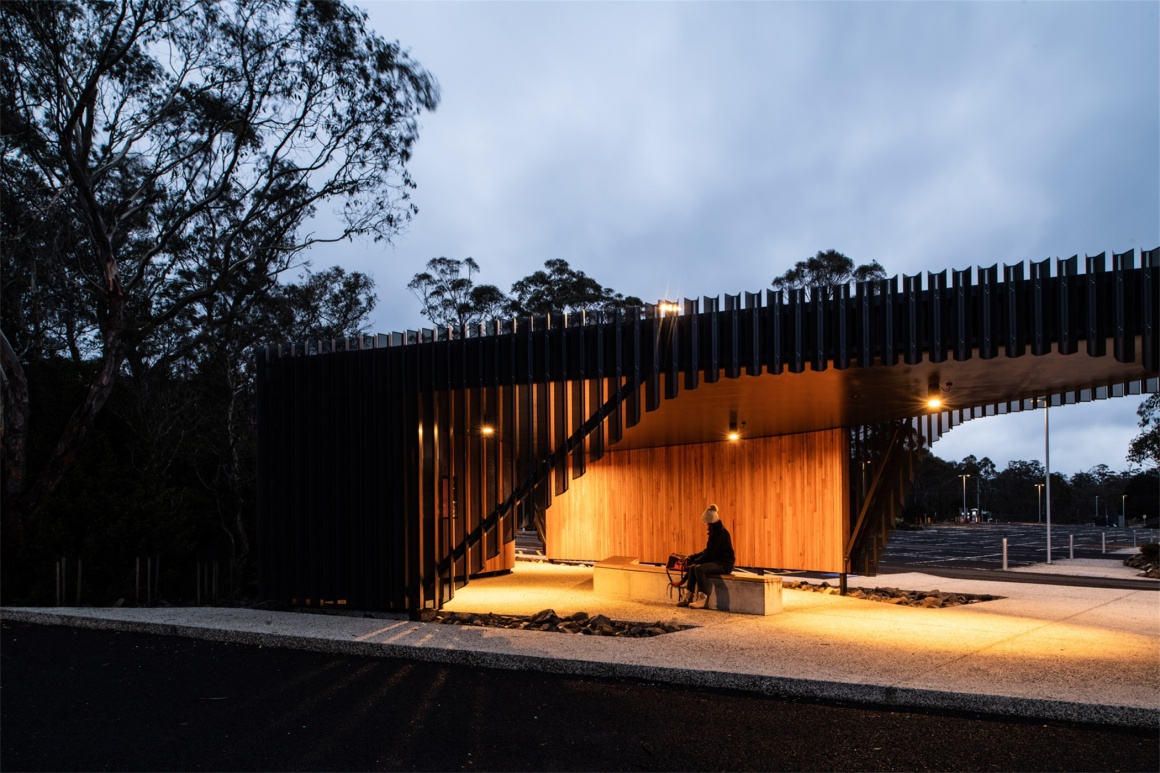
The sculptural, wilderness-inspired development includes an orientation building, commercial services base, shuttle bus shelter and coach transit centre. The design required an in-depth understanding of visitor movements across the site. It needed to accommodate the wide gap between peak and average visitor numbers and feel inviting in both cases.
▼公交车站 Bus shelter
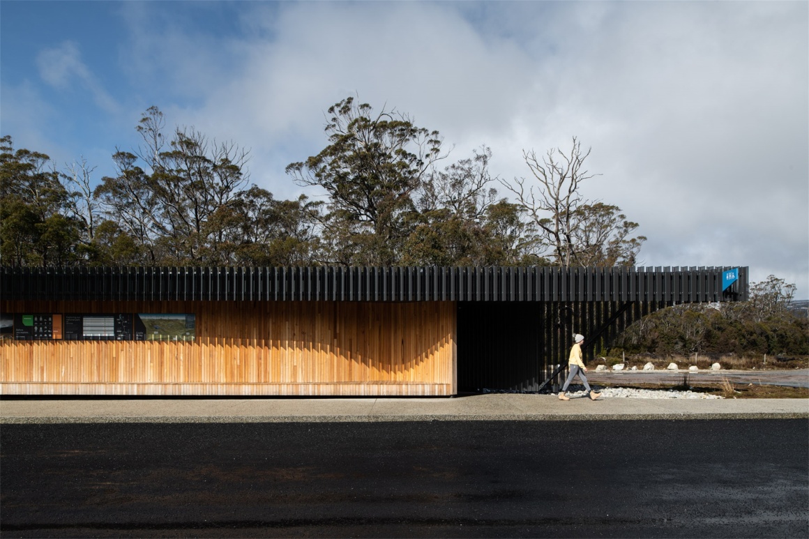
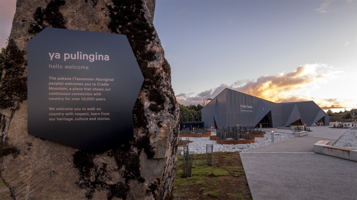
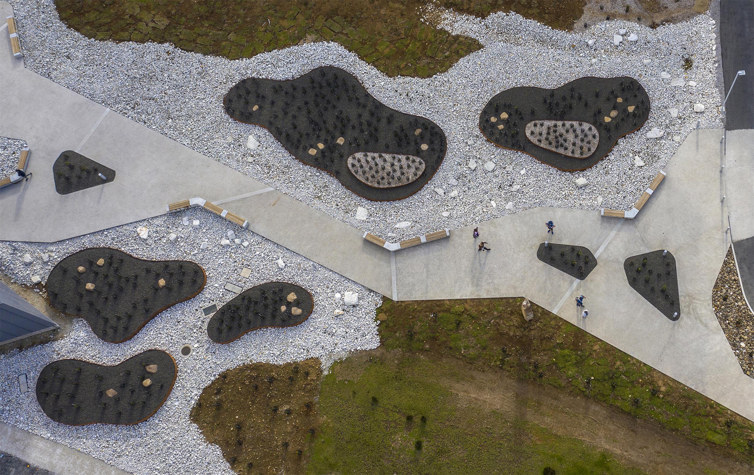
直观的路径导向巧妙地引导游客到达目的地,并且同时提供场地介绍和信息互动。空间层级鲜明但又保留了自然环境鲜明的特征。
Our intuitive way-finding strategy creates a flow to subtly guide visitors while they interact with site interpretation and visitor information. We used a hierarchy of space that organises services but lets the staggering natural setting sing out.
▼直观的路径引导 Intuitive way-finding strategy
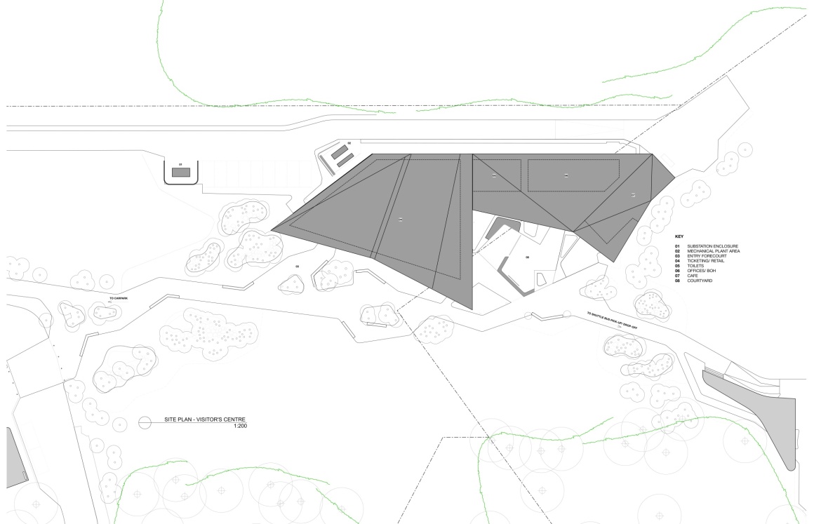
▼总平面图 Master plan
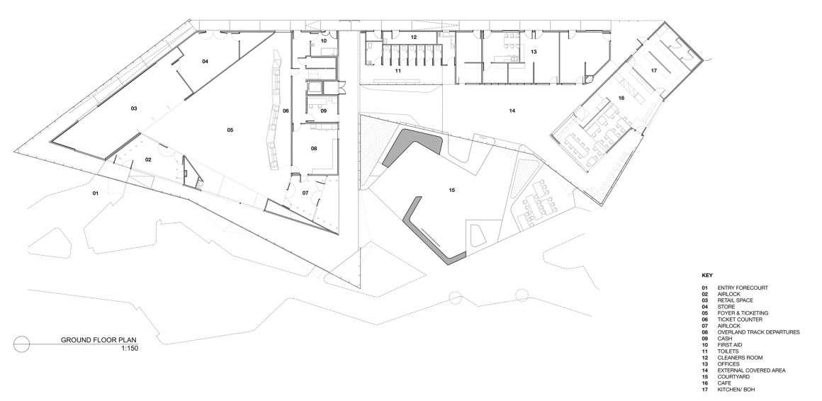
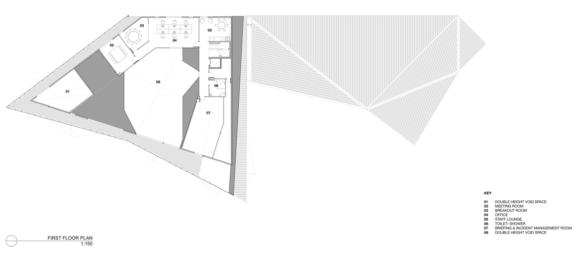
▼楼层平面图 Floor plan
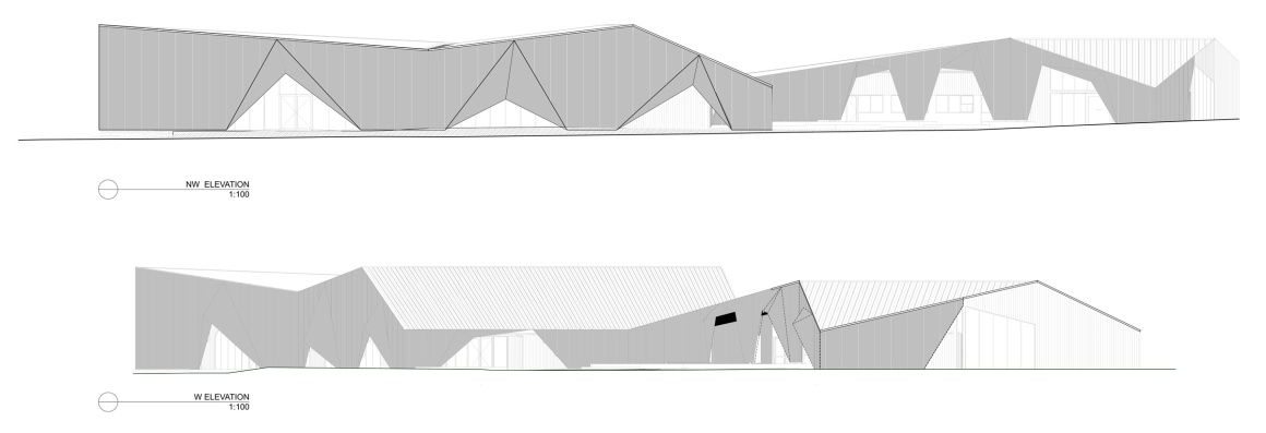
▼立面图 Elevation
▼剖面图 Section
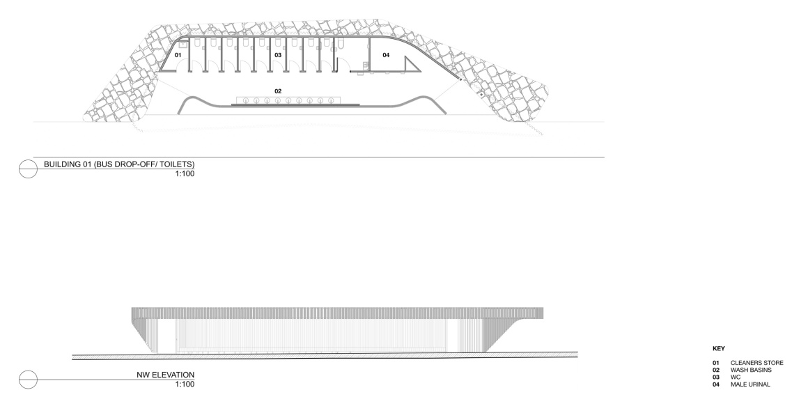
▼公交车站及卫生间平面&立面 Bus stop & Toilet
▼下车场地平面&立面 Car drop-off
项目名称:摇篮山游客中心
完成时间:2020年
地址:澳大利亚,塔斯马尼亚岛,摇篮山
设计公司:Cumulus Studio
主创建筑师:Peter Walker
设计团队:Andrew Geeves, Elizabeth Walsh, Luke Waldron, Todd Hender-son, Matt Green, Claire Austin, Jason Licht, Gary Fleming, Andrew Frangou
客户:Department of Primary Industries, Parks, Water and Environment, Tasmania
摄影:Anjie Blair,Rob Burnett
景观设计:Playstreet
标志设计:Futago
规划顾问:ERA Planning
市场顾问:Inspired by Marketing
内容管理:Creative Hat interpretation
艺术装置:Alex Miles
结构/土木/水利工程:Aldanmark
机械工程&能源审核:COVA
电力工程:Pitt & Sherry
建筑测量:Green Building Surveying
商用厨房设计:Green Design Group
项目管理:Stantec
土地测量:Cohen & Associates
声响工程:NVC Acoustics
建筑估算:WT Partnership
施工方:Fairbrother
编辑:寿江燕
Project name: Cradle Mountain Visitor Centre
Completion Year: 2020
Project location: Cradle Mountain, Tasmania, Australia
Design firm: Cumulus Studio
Lead Architect: Peter Walker
Design Team: Andrew Geeves (Project Architect), Elizabeth Walsh (Design Architect), Luke Waldron, Todd Henderson, Matt Green, Claire Austin, Jason Licht, Gary Fleming, Andrew Frangou
Clients: Department of Primary Industries, Parks, Water and Environment, Tasmania (Tasmania Parks & Wildlife Services)
Photo credits: Anjie Blair, Rob Burnett
Landscape Architects: Playstreet
Wayfinding and signage: Futago
Planning consultants: ERA Planning
Marketing consultant: Inspired by Marketing
Story curation: Creative Hat interpretation
Art installation: Alex Miles
Structural/ Civil/ Hydraulics Engineer: Aldanmark
Mechanical Engineer & Energy Assessors: COVA
Electrical Engineer: Pitt & Sherry
Building surveying: Green Building Surveying
Commercial kitchen design: Green Design Group
Project management: Stantec
Land surveyor: Cohen & Associates
Acoustic engineers: NVC Acoustics
Quantity Surveyor: WT Partnership
Construction company: Fairbrother
Editor: Jiangyan Shou
更多 Read more about:Cumulus Studio





0 Comments