本文由 LANDAU朗道 授权mooool发表,欢迎转发,禁止以mooool编辑版本转载。
Thanks LANDAU for authorizing the publication of the project on mooool, Text description provided by LANDAU.
朗道国际:住区的回归最终是人性的回归,放松与惬意是真正意义上的精神与肉体的需求,同时营造属于自己的私属空间,两者相加是一件看似简单其实很难的事情。
LANDAU:The return of the residential area is ultimately the return of human nature. Relaxation and comfort are the spiritual and physical needs in the real sense, and in creating private space, the combination of the two is seemingly simple but actually difficult.
聊设计之前,还是再次感谢一下“云梦别苑”的甲方们,很难得有项目能够真正遵循我们一直想要的“回归本质”的想法,真正意义上做到了多一点不多,少一点不少,不做过多的奢华堆砌,反而最终“简简单单”的空间呈现,让生活回归到了人性的本质——放松与惬意。
Before discussing design, gratitude should be expressed to Party A of “Yunmeng garden” again. It is of rare opportunity to have a project that can really follow the idea of “return to the” essence ” that we want. In real sense, it has achieved the state of appropriateness without too much luxury piles, but the presentation of finally” simple ” space, leading life to return to the human nature —— relaxation and comfort.
| 场地分析 Analysis on site
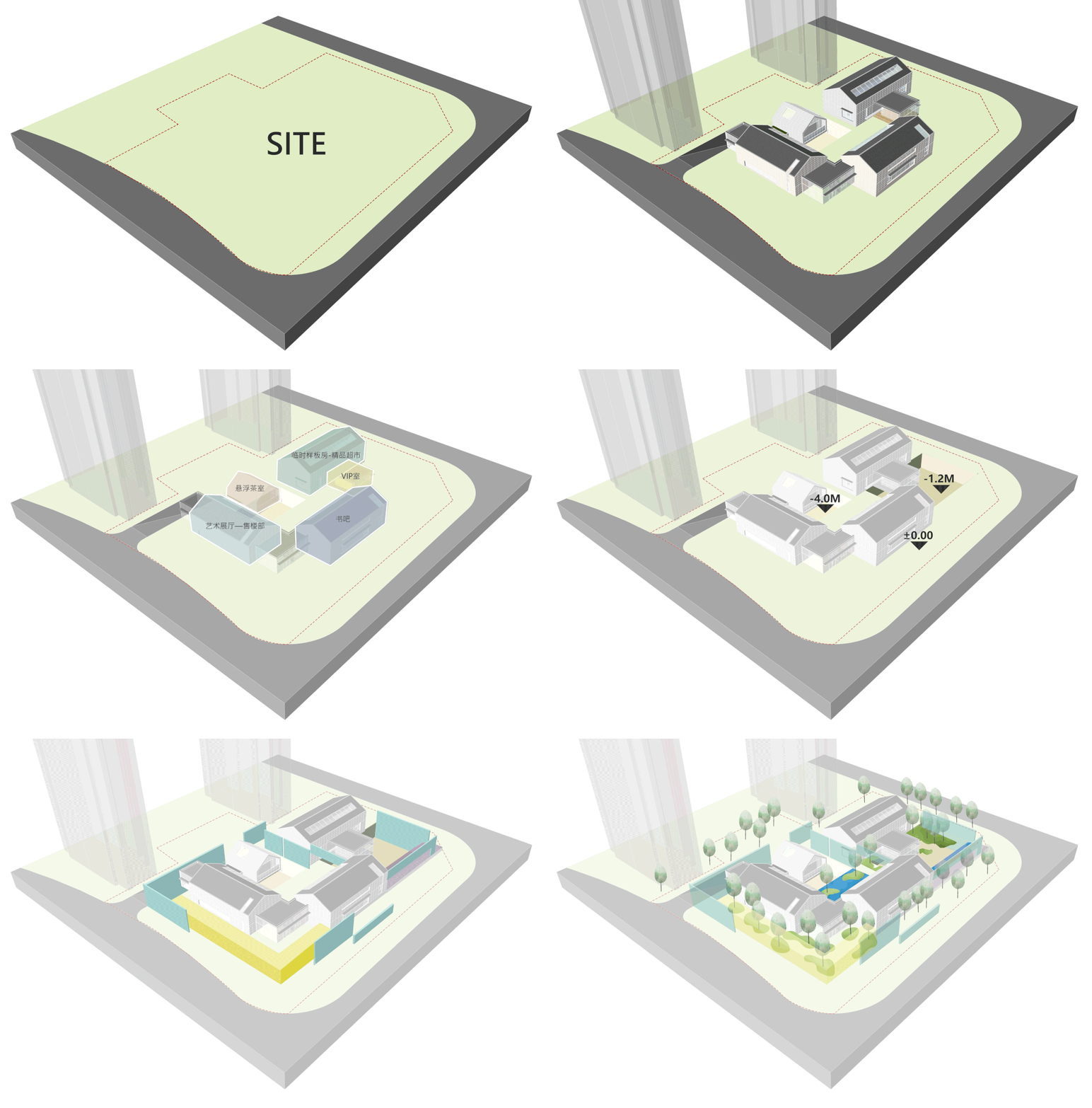
从场地来说,建筑预留的空间其实非常清晰明了,单薄的城市界面进深、不大的内庭围合尺度、幽深的下沉地库采光和紧贴街道的后场空间。如果用一个字去总结场地,“挤”最为精确。
In terms of the site, the space reserved for the building is actually very clear, with a deep thin urban interface, a moderate inner court enclosure scale, a deep and quiet sunken garage for lighting and a backcourt space close to the street. If we summarize the site in one word, “squeeze” is the most accurate.
▽设计分析动图 Design analyze gif
如果空间的“挤”已经深入人心,那在回归本质——“放松和惬意”之间,我们要做的第一步反而是“呼吸和透气”,并不是任何华丽的设计手法。有了这层关系界定之后,重新反观场地空间,原来脑海中的众多手法杂念逐渐开始消失,用“减法”来慢慢分析与剥离场地成了接下来两个星期的设计核心。
If the “squeeze” of a space has been deeply rooted in people’s hearts, the first step to return to the essence—— “relaxation and comfort” is to be “breathing and breathable”, instead of gorgeous design techniques. With the definition of this relationship, let’s reflect on the site space again. The many techniques and distractions in mind are gradually fading, and using “subtraction” to slowly analyze and peel off the site becomes the core of the design for the next two weeks.
▽空间分析 Spatial analysis
首先,第一个热烈讨论的是案名,案名有的时候看似简单,其实往往承载着设计师和甲方对于设计的情怀。对于本次的示范区,到底是“苑”还是“园”,其实我们探讨与博弈了许久,最终我们一致选定了云梦别“苑”,原因有几方面: 一方面是“苑”更显得放松化,就像自己家前后的一亩三分地,更加随自己的内心,而“园”相对正式一些,造景的紧凑与连续的引导,固然游起来是十分好的,但让人紧张了些许,我们还是希望能够达到真正的“放下”。另一方面是场地确实十分拥挤狭小,用“园”不免夸大其词,反而略显刻意,古代经典造园艺术之高,也不敢妄加模仿,仅以小“苑”自居,平易近人。
To begin with, the first heated discussion is on the name of the case, which sometimes seems to be simple, but in fact often carries the feelings of the designer and Party A for the design. For the demonstration area, , actually we had been discussing for a long time on whether it is the “garden” or “park”. Eventually, we unanimously selected “Yunmeng garden” for several reasons: on the one hand, “garden” seems to be more relaxed, like the land of our home that is more consistent with our heart while “park” is relatively formal. The compact landscape and continuous guidance are very good for use, but make people more nervous. Therefore, we hope to achieve the real “putting aside”. On the other hand, the site is really very crowded and narrow, the use of “park” inevitably exaggerates and slightly deliberates. The ancient classic garden art is remarkable, we dare not to imitate, only use a small “garden” to show our amiable and easy approach.
▽方案模型鸟瞰 Bird’s eye view of the scheme model
| 界面-朦胧与对话 Interface-haziness and dialogue
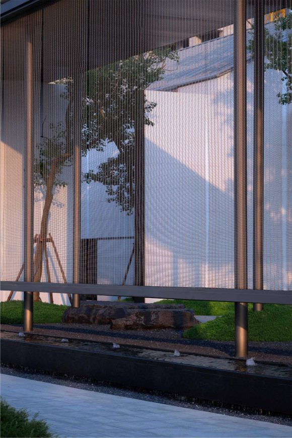
整体而言,最喜欢的应该是门口界面的朦胧感,五十多米长、六米通高的金属帘做了一个L形的包裹,像一层朦胧的诗,即将见面又万分含蓄。树影时晃,枝条载荣,吾在帘里,尔在帘外,彼此相望,独立存在,又相互映衬。
到了夜里,灯光逐渐亮起,包裹金属帘的界面又像是带妆的姑娘,被晕染被精致。走在外侧,心境变得更加微妙,近在咫尺的沉静与温馨,成了还未入“苑”之前的放松感,金属帘的细腻,让归家感第一次有了具象的触摸。
As a whole, the best-loved is the hazy sense of the gate interface. The metal curtain of more than 50 meters long and six meters high has been packed in an L-shaped package, like a layer of hazy poetry, from which, one is about to meet but feel extremely implicit. When the shadow of the tree sways, the branches carry glory, I am in the curtain, and you are outside the curtain, looking at each other, existing independently, and setting off each other.
When the night falls, the lights gradually are lit up, and the interface of the wrapped metal curtain is like a girl with makeup, being dyed and refined. Walking on the external side, the state of mind becomes more subtle. The tranquil and warmth close at hand become the relaxation before entering the “garden” . And the delicacy of metal curtain lets us to touch the feeling of returning home feeling concretely for the first time.
▽入口界面 Gateway interface
晨起,光会透过树梢打在金属帘上,泛着淡淡的金色,是阳光的颜色。轻风微抚,透过金属帘的缝隙,把树林的绿色散发出来,舒适的恰到好处,没有任何负担。
Waking up in the morning, the light will shine through the treetops on the metal curtain, with a light gold, the color of the sun. Light breeze slightly consoles, passing through the gap of the metal curtain, and the green of the forest radiates out, comfortable and proper, without any burden.
▽金属连廊 Metal nest
淡蓝的天空,冒出帘子的树梢,高高低低,有棱有角,形成唯一的天际界限。
The light blue sky, the treetops of the curtain, high and low, with edges and corners, forming the only sky boundary.
▽通过金属帘子印出美好的场景 A beautiful scene is printed through a metal curtain
| 内庭-回归与无界 Inner Chamber-return and unbounded
当扭转深入场地,我们希望用一面富有情感的墙来作为激活场地的钥匙。在视线界定的同时,内外空间隔而不断,气息通而不透。
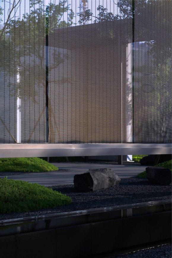
融入对空间交互链接的解构,自然的绿岛与现代简约的东方建筑相互融合,每一块卧石的形态或稳重或轻柔,或质朴或细腻。完美的诠释体块的穿插与空间的渗透,无界感使得场地成为了自然的延伸,柔和的过度亦是形成极致的视觉反差。一草一木,一石一影皆在传达寂静却又低调奢华的生活态度。
When turning deeply into the site, we want to use an emotional wall as the key to activate the site. While defining the line of sight at the same time, the internal and external space is separated but not isolated, and the breath is passed but not penetrated.
Fused with the deconstruction of spatial interactive links, the natural green island and modern and simple eastern architecture merge together, with each piece of lying stone form either steady or gentle, or plain or delicate, perfectly interpreting the block alternation and space penetration. The sense of no boundary makes the site a natural extension, and the soft excess also forms the ultimate visual contrast. Every tree and grass, every stone and shadow are all conveying a quiet but low-key and luxurious attitude towards life.
▽精致的墙面入口衔接内外庭院 Elaborate wall entrances connect the inner and outer courtyards
树影斑驳透过帷幔映射于墙面之上,自然的光线总会给人以无需多言的柔软与舒适感,辅以大面积的白色,静谧之意油然而生……
The tree shadow is mottled through the curtain mapping on the wall, and the natural light will always give people a soft and comfortable feeling without saying much, supplemented by a large area of white, the meaning of quiet arises spontaneously…
▽闲适静怡的内庭院景观 Leisurely and tranquil view of inner courtyard
| 下沉-静谧与本真 Sinking-quietness and authenticity
光,是憧憬是向往,是自然的馈赠;影,是厚重是凝练,是本真的见证。
光影是空间氛围最好的调味剂,循着步道与楼梯向前,下沉的庭院是室内环境向室外的延展,孤植的造型松无声的伫立,天光倾洒,时而虚影梦幻,时而斜影漫漫。建筑的轮廓被自然和解,摒弃繁杂,体验一方静谧空间的云淡风轻。
Light, longing and yearning, is the gift of nature; Shadow, massiness and conciseness, is the witness of authenticity.
Light and shadow are the best seasoning agents in the space atmosphere. Forwarding following the trail and stairs, the sunken courtyard is the extension of the indoor environment to the outdoor, and the shape of solitary planting is standing silently, the sky light is pouring, sometimes empty and illusionary, sometimes long and shadowy. The outline of the building is naturally reconciled, abandoning the complexity, so that we can experience the light clouds of a quiet space.
▽下沉的庭院是室内环境向室外的延展 The sunken courtyard is an extension of the interior environment to the outside
出挑的茶室形成半围合式的螯合空间,灼灼光影犹如时光记忆,在眼前铺陈开来。
The outstanding teahouse forms a semi-enclosed chelating space, burning the light and shadow just like a time memory spreading out in front of the eyes.
▽半围合式的螯合茶室空间 Semi-enclosed chelating teahouse space
| 后院-境界与包容 Backyard-realm and inclusion
巧妙的将建筑的悬挑与景观的框景手法结合,将空间的边界延伸至周围的环境中去。建筑本身与水影上下呼应,相互包容,形成和谐的统一。
错落的石条、层层的叠水,相互联系又各具特色,结合材质、色彩、植物等,将质朴自然与现代简约的设计手法进行融合,用最接近于自然的语言,带来生活的趣味与身心的放松。
Craftily combine the overhang of the building with the frame technique of the landscape, and extend the boundary of the space to the surrounding environment. The building itself echoes with the water shadow up and down, embracing each other, and forming a harmonious unity.
Random stone bars, layers of stacked water, interrelated with but each has its own characteristics. Combined with material, color, plants, the simple and natural and modern and simple design techniques are integrated. Using the language closest to nature, bring the fun of life and physical and mental relaxation.
▽后院夜景氛围 Backyard night view atmosphere
在这里,诉说着人与空间的对话、营造安静平和意境深远的氛围,人工精致与生态自然的共生,让疲于生活喧嚣的人们回归生活本真。
Here, it tells the dialogue between people and the space, and creates a quiet and peaceful atmosphere with profound artistic conception. The symbiosis between artificial delicacy and ecological nature enables people who are tired of the hustle and bustle of life to return to their true life.
▽安静平和意境深远的后院景观 Quiet and peaceful backyard landscape
| 细节-极致与匠心 Details-perfection and ingenuity
一切都是为了项目高质量的呈现。从挑选苗木到石材排版,力求对细节的和尺度的把控到达极致。多材料,多颜色的,打样比选出地面与墙体材质的最佳的质感和颜色组合关系。1:1的打样,检验金属细节及石材的组合关系。
Everything is for the high-quality presentation of the project. From the selection of seedlings to stone typesetting, and strive to control the details and scale to the extreme. Multi-material, multi-color, proofing ratio to select the ground and wall material of the best texture and color combination relationship.1:1 proofing, check the combination of metal details and stone.
▽极致与匠心的细节展示 Extreme and ingenious detail display
| 结语 Epilogue
项目伊始到落地呈现,诸多思考,初心未变,始终对应着当代人群追求的放松与惬意,寻觅空间的意义与哲学,共同构成了本项目的高端基因。绿意盎然,诗韵与适意从来都是有心人的奢侈品,望度山月与孝感的故事才刚刚开始,定义只属于孝感的隐奢生活方式。
From the beginning the project to the implementation, the project has been presented with a lot of considerations, but the original intention has not changed. It always corresponds to the relaxation and comfort of the contemporary people, and the meaning and philosophy of finding space, which together constitute the high-end gene of the project. Vegetation prevailing, poetry and adaptation are always the luxury of willing people. The story of moon and filial piety has just begun, defining the hidden luxury lifestyle that only belongs to filial piety.
项目名称:望度山月.云梦别苑
项目地址:湖北孝感
项目业主:武汉联投置业有限公司
建筑设计:水石设计
景观设计:LANDAU朗道国际设计
景观施工:湖北环瑞生态建设有限公司
景观摄影:河狸景观摄影
Project name: Looking at the mountain moon “Yunmeng garden”
Project address: Xiaogan, Hubei province
Project owner: Wuhan United Investments and Properties Co.,LTD
Architectural design: Shuishi Design
Landscape design: LANDAU Design
Landscape construction: Hubei Huanrui Ecological Construction Co., LTD
Landscape photography: Holi landscape photography
“ 设计将质朴自然与现代简约的设计手法进行融合,用最接近于自然的语言,带来生活的趣味与身心的放松。”
审稿编辑:Maggie
更多 Read more about:LANDAU朗道


0 Comments