本文由 栖城设计 授权mooool发表,欢迎转发,禁止以mooool编辑版本转载。
Thanks GN International Shanghai LLC for authorizing the publication of the project on mooool, Text description provided by GN International Shanghai LLC.
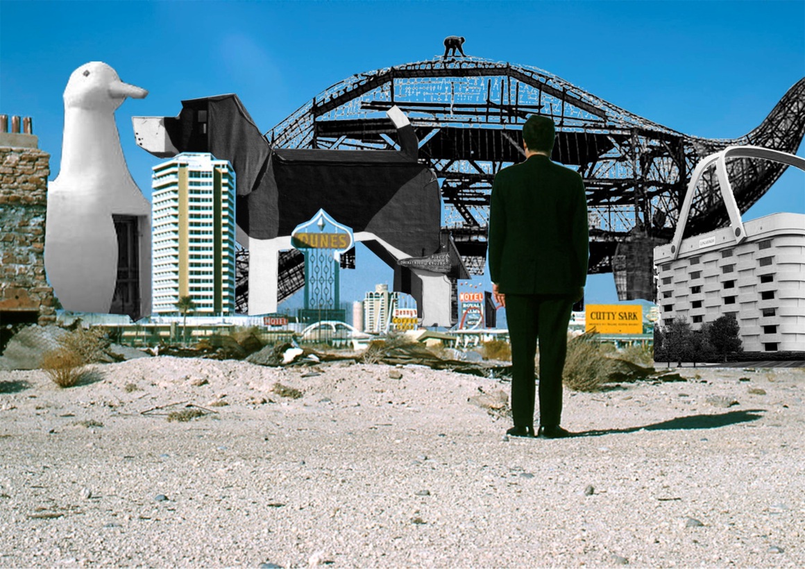
栖城设计:一年前我们在说那些福禄寿建筑,除了以专业人士自居而嘲笑劣质的审美,也想探究起因及民众反应。然后谈起鸭子建筑,30年代美国鸭场农夫建造了一座鸭子形状的建筑,用于贩卖鸭子和鸭蛋,这让他生意火爆,这个Big Duck后来进入了国家史迹名录。
GN International Shanghai LLC: A year ago, we, from professionals’ point of view, mocked at inferior aesthetics of those “Fu Lu Shou” architectures, but at the same time, we started to probe into reasons behind it also public’s reaction to them.
▽项目概览 Overall view

▽整体鸟瞰 Aerial view

我其实还挺喜欢鸭子建筑,因为设计本身很好解读,就着现在内卷严重的设计环境来说,就是不需要更多额外动作,能把自己的要说的表达明了。特别是建成后也不需要再次进行文学创作,把平庸伪装成深思熟虑。讨论结果是大家都很同意。
I actually quite like duck architecture, because the design itself is very good interpretation of its being. In a highly competitive design industry nowadays, this kind of design helps to introduce itself without the needs of extra writing to wrap it up after construction, where on most occasions excessive explanations will instead deliberately disguise mediocrity as thoughtfulness.Everyone agrees on the idea.
▽鸭子建筑 Duck Architecture
几天后融创青岛的阿朵小镇找到我们,说起亲子中心设计,这成了我们尝试的开始。后来我们提交的文件,21页的PPT也没有几个字。我们的想法是,不要解释,不要试图用说明意义,所见即是,保持大众能读懂的能力。对于这类设计,我们后来称其为大众建筑。这次结果是出人意料的有效,事实上这几年的经历表明,信息过载的现在,所有简化阅读剔除冗余都是正确,面对专业人士也不例外。
A few days later, Qingdao “Atour Town” project team of SUNAC contacted us and talked about they have a project of Parent-Kid Centre. This became our first attempt to present our ideas into our work. We presented a twenty-one pages PowerPoint clips, which only few words were included in. We decided not to explain much about the design. As seeing is believing, we hoped to make our design presentable by itself. For this kind of design, we later called it “Pop Architecture”.
The result was surprisingly effective. In fact, we experienced many examples in past years has proven that under the information overload phenomenon, it is right to present the work with simple words and images, this is also true among professionals.
▽从街道望向建筑 View from the street
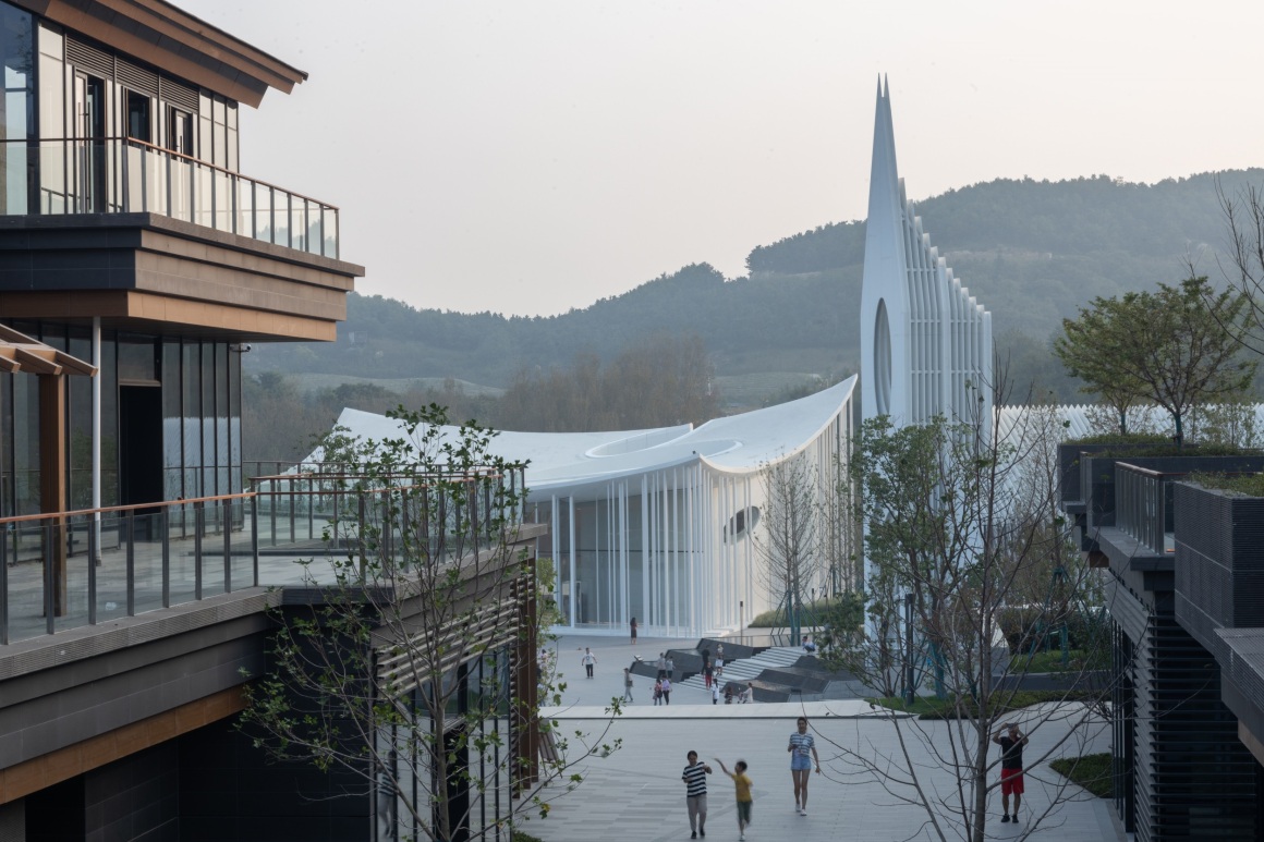
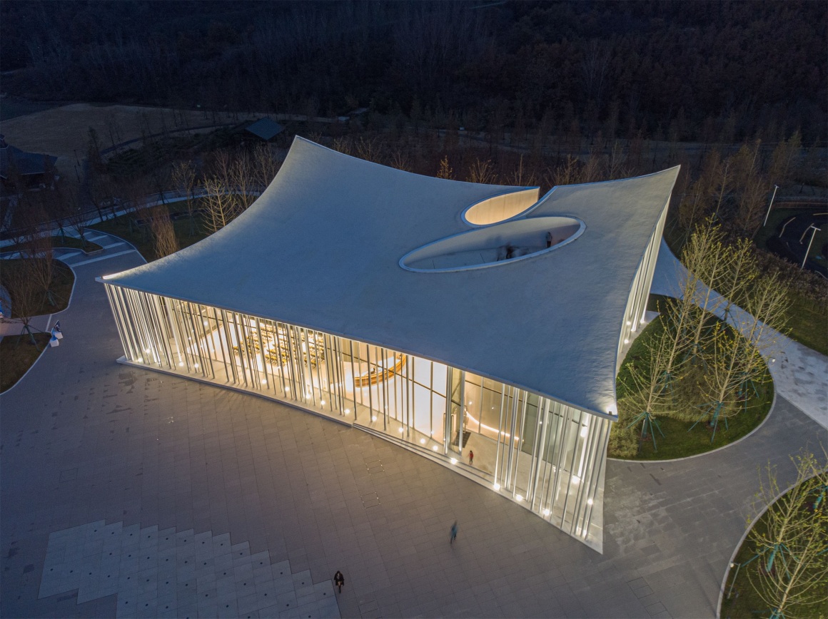
卷起的屋面和鸟视角 Curving roof and bird view
越来越多的孩子在城市里长大,山里的环境带给他们的是一个个新奇世界,还有他们对远方的遐想。虽然藏马山林已是最好的礼物,我总想造一个不一样的大玩具给他们,然后当他们站在房子前,会发出哇的夸张表情。
我小时候在乡村里度过,每个夏日的傍晚,就在太阳落山,天空未暗的时候,仰躺在竹榻上看鸟儿在空中滑翔,脑子里有很多迷思,其中一个会晕很久的念头是会想着鸟儿们从空中看到大地和我躺着的样子,这种念头一直是我对童年印象的重要部分。
With more and more kids growing up in the cities, the environment in the mountains will escort them to a brand-new world, as well as to their imagination of wonderland. Although the Cang Ma Mountain Forest is already the best gift for children, I always want to build a different big toy for them, imagine them standing in front of the building, and give an exaggerated mouth widely open wow looking .
I used to grow up in the countryside. At every sun set summer evening, I lied down on a bamboo mat watching the birds gliding in the air. I often imagined myself becoming one of them, flying above across the sky, seeing the earth and myself lying down there. This idea accompanied me on my journey into adulthood and has become one of the most important childhood memories of mine.
▽小飞毯 Flying Carpet
我们把这样的场景带进这个亲子中心的设计里,设计了一个卷起的地面,好像起飞的魔毯。然后把这部分抬拉起来,形成屋面,在这里只留下远山树林,天空和白色大地,好像鸟视角一样。屋面和地面间形成了一丝丝的粘连线,你可以想是撕开的奶酪,这些粘连线成为了白色丛林,立面的构成部分。这是重要的初始部分。
We brought this imaginative scene into our design of this Parent-Child Centre. We designed a rolled-up floor, imagine it as a magic carpet taking off, then we lift the carpet up and it became the form the roof. If you were standing on this magic carpet, just like a bird flying above, you would see the distant mountains and woods, the sky, and the white earth below. Between the magic carpet and the ground are adhesive strings, here you may imagine them as melted cheese, this is the white forest, work as façade.
▽藏马山的林子,卷起的屋面 Aerial view to the curving roof and the forest of Cang Ma Mountain

藏马山下的飞毯 A Flying Carpet in Cang Ma Mountain
从设计的开始,“飞毯”这个称呼成为了包括我们设计师和客户对于这个藏马山里的亲子中心代名词。从形式到功能,飞毯这个意向都清晰的告诉我们这个设计中的着力点在哪——上人的白色曲面屋顶。这种飞扬的曲面也多次出现在室内,在把传播性作为诉求之一的项目中,一个“人设”无疑是好办事的。
In the early stage of designing process, me and my coworkers and clients have been using the term “Flying Carpet” to refer to Cang Ma Mountain Parent-Child Centre. From its style to function, the Flying Carpet clearly tells us where the focus of this design should be – the white curved rooftop where people can walk on. The language of curved surface has been applied to multiple space within the interior. Setting up an iconic feature for our design is undoubtedly helpful, where media coverage plays quite a part in the project.
▽从广场望向建筑 View from the square
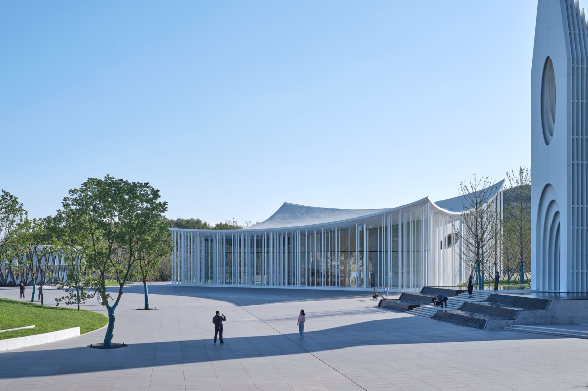
▽从附近绿地望向建筑 View from the adjacent green area
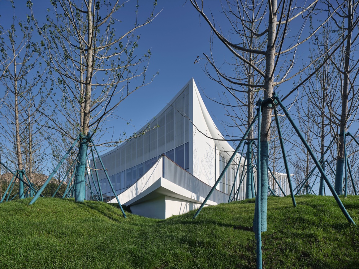
开始我们希望屋面是一个无边界的包裹的白色毯子,但因为始终没有很好解决安全的措施,做成了现在这样有限可达。这是非常遗憾的事,到建成后我们还在讨论这个措施,因为一个白色的屋面并没有意义,卷曲可以奔跑的屋顶才有意思,不幸之幸是屋面的整体感不错。
We hoped our rooftop to be a white carpet wrapped without borders where visitors can walk on. Due to the safety concern, only restrained area on rooftop can open to the public. We have been searching for alternatives even after the construction has completed, but to no avail. It is regrettable, as it would be lots of fun and meanings to run on a curved rooftop, but thankfully the execute of roof piece revealed fine sense of beauty.
▽俯瞰屋顶 Rooftop view

屋面面积有1000多平方,我们打算用真石质感的水刷石,这样卷起的地面感才成立,但是双曲面屋顶施工工艺又出现了问题,后来我们在景观材料室里找到了黏胶石,常用于海绵城市的铺设广场路面,非常适合整体性的屋面,这是个很好的尝试和经验,确信以后会继续用。
The rooftop has around 1,000 m2, we intended to use brush stone on rolled-up surface, but problems occurred when constructing the double curved surface roof. Then we found the viscose stone, a material commonly used in pavement selections, in our landscape material room, we found this material is suitable for the rooftop surface. It was a good tryout and I’m sure it will appear again in the future.
▽粘胶石屋面和嵌入的水滴中庭 The roof made from viscose stone and the drop-shaped courtyard
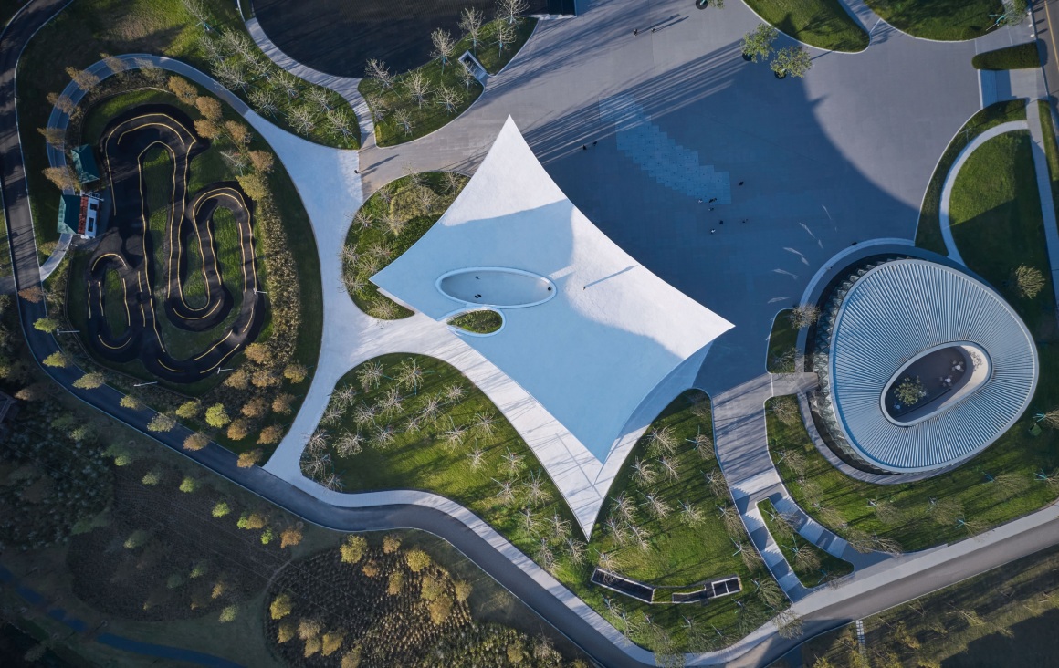
▽屋面和中庭细节 Detailed view
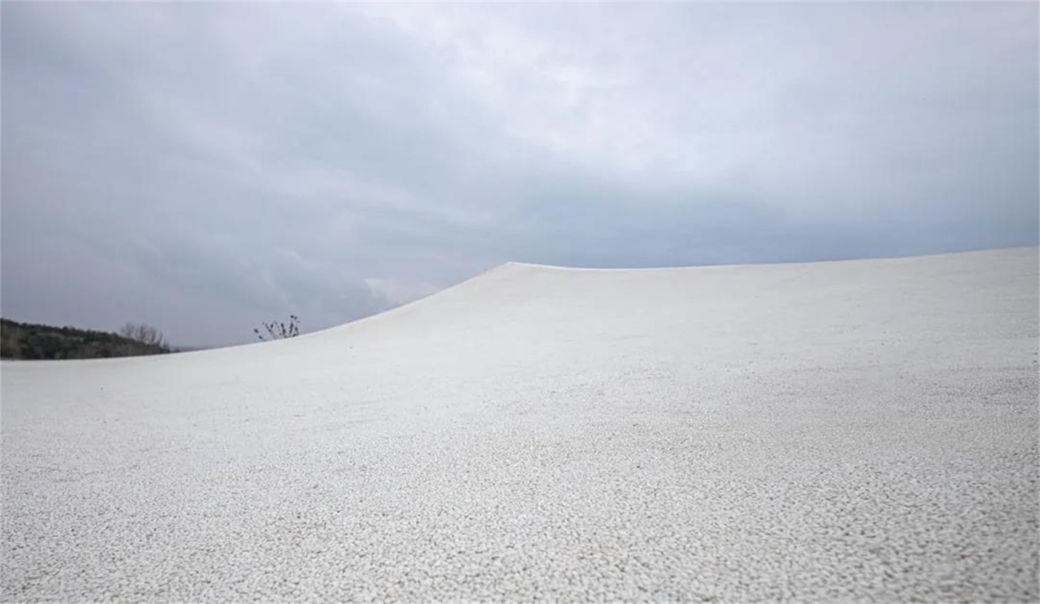
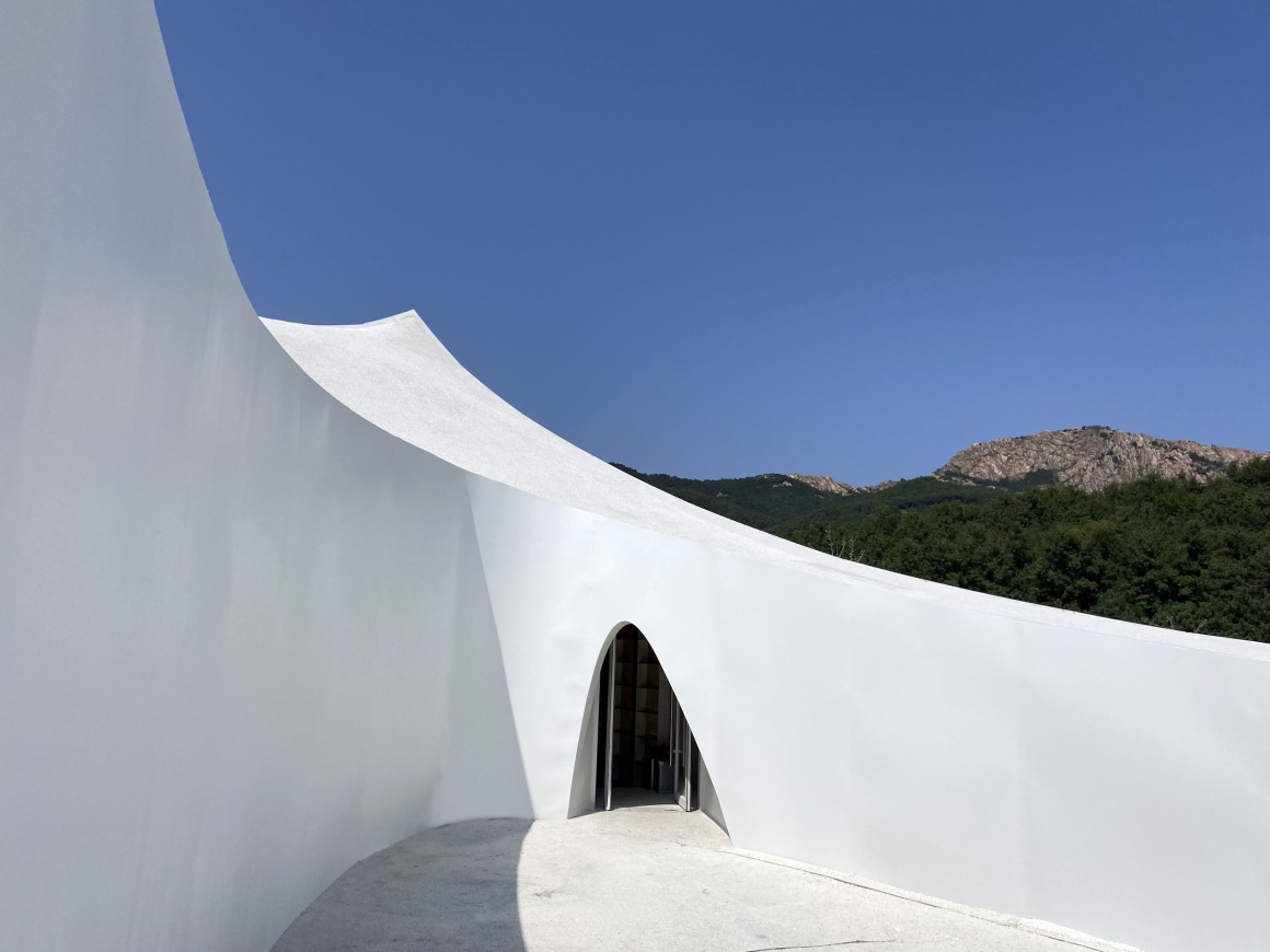
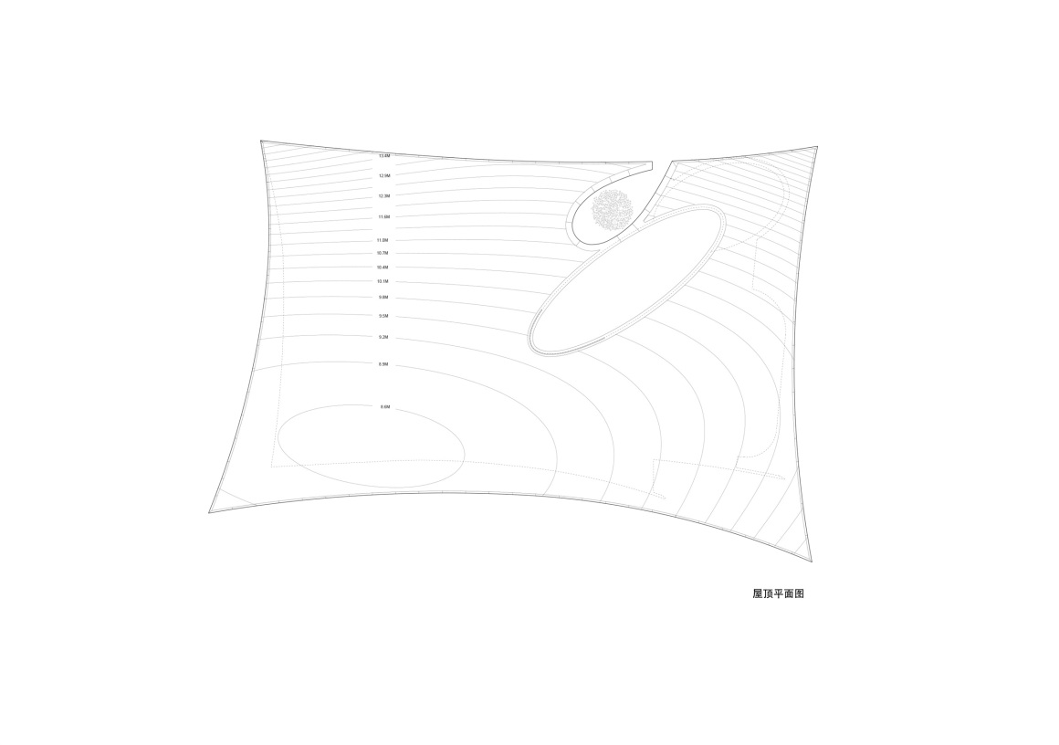
屋面排水设计最后采用1.5cm线型排水沟,沿着双曲面等高线设置排水沟,最低处设置虹吸;排水沟及虹吸的盖板采用不锈钢板加胶粘石,这样在人视觉上基本看不到集水沟。
We used 1.5cm line-type drainage ditch for our roof drainage, which is set alone the double-surface contour height, and we set siphon at the lowest part of the roof. Stainless steel plate and adhesive stone are used for covers of drains and siphon, to make them visually invisible.
▽分解图 Exploded axon

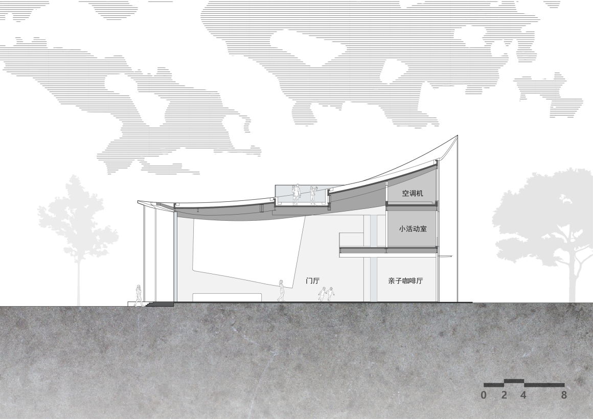
轻盈简洁的整个屋面,其实是由双曲面屋面和双曲面吊顶组成,中间是变截面弧梁及水平支撑,设备及管线利用梁与梁之间的空间敷设其中。一个建筑的建成,必然会生出许多的使用场景,会有一些美好的事将会在这里发生,即便是现在这样有限可达的屋顶,我也觉得它会成为青岛最美的露台。
The lucidity roof is composed of double-curved roof and double-surface ceiling, with variable-section arc beams and horizontal support in the middle, and equipment and pipelines are laid within the space between beams. Many wonderful things and memories will happen in this recent constructed architecture. I believe it will become the most beautiful terrace in Qindao.
▽建筑作为广场虚透的背景,檐下是行走和活动空间 The building serves as a backdrop for the square’s permeability, with walking and activity spaces under the eaves
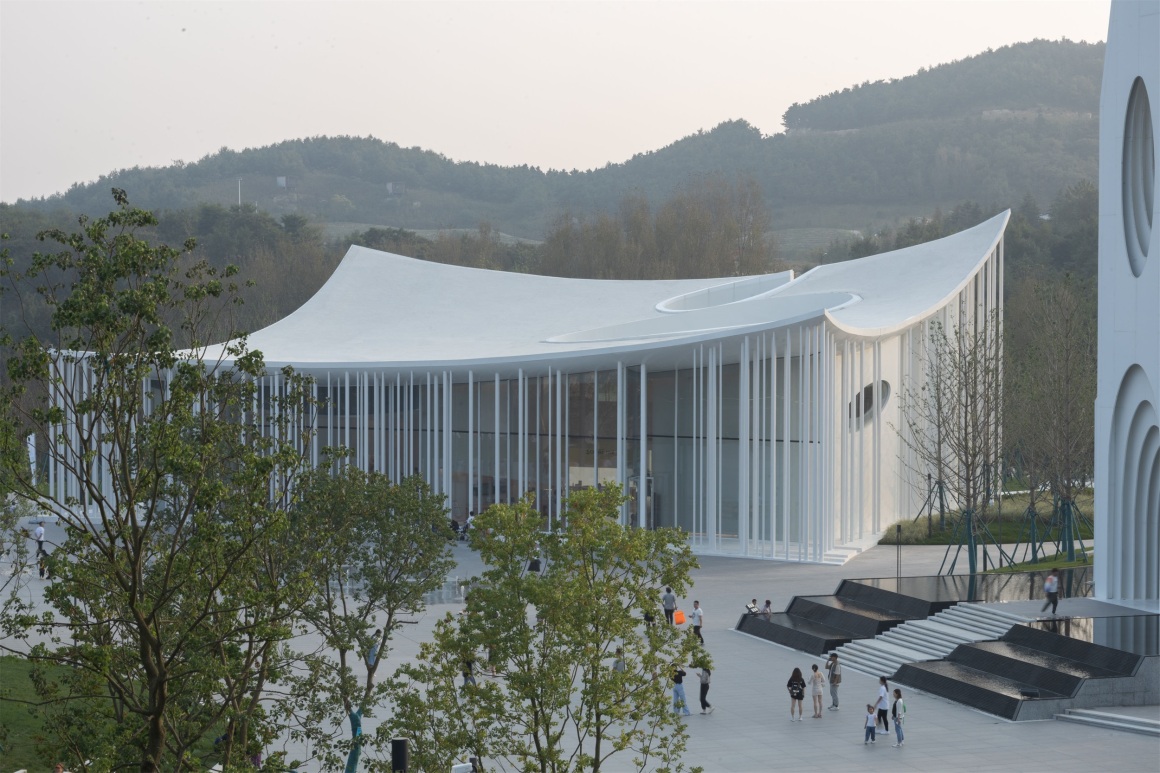
▽设备及管线隐藏在屋面和吊顶之间 Equipment and pipelines are laid within the space between the roof and ceiling

▽广场景观 Landscape of the square
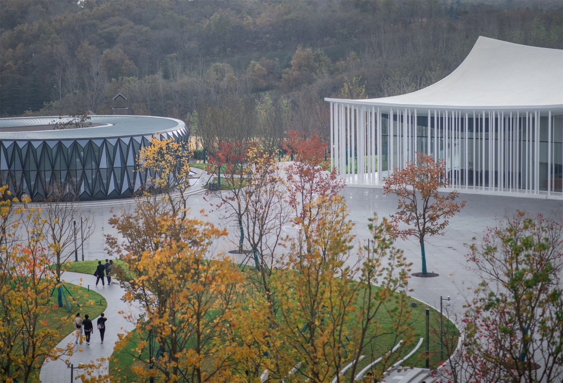
阳光洒进室内 Light into space
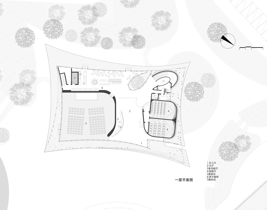
你对着一层平面看可以发现四个独立的功能体:多功能厅、影厅、楼梯、1918咖啡厅掩藏在大屋面之下,四个功能体的间隙形成了厅和过道。 这个设计中我们尝试着将建筑作为策展场景进行设计,每个功能空间和墙面、屋面都是展陈的一部分。
你看到建筑三面都是玻璃,这是为了光线有效进入,还有水滴型的玻璃院子,我们是想让自然光线射进来散落在室内曲面墙上,让室内更加阳光明快。基本上,白天的室内就是由光和曲面墙构成的白色艺术馆;而晚上,这些则成为建筑的立面。
At the ground floor plan, you can see four independent programs: a multi-use hall, two movie theaters, a staircase, and a 1918 cafe hidden under a large roof. The gap between the spaces forms the hall and aisles. In this design we tried to design the building as an exhibition space, with each functional space,wall and roof being part of the exhibition.
Three sides of the building are glass curtain walls, bringing light into the building efficiently, and there’s a water drop-shaped transparent yard, which we want more natural light to come in and scatter on the indoor curved walls to brightens up the interior. Basically, the interior during the day is a white art gallery filled with light and curved walls, while at night these become the façade.
▽水滴中庭 The water drop-shaped transparent yard
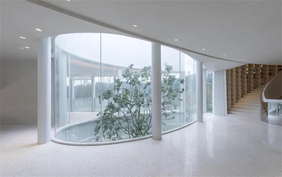
我们在室内还配有少量的定制金属和透明家具,我们没有去做色彩堆叠以及幼稚符号,觉得这会影响孩子们对美的认知。
在室内你看不到一根结构柱子,我们用了三种方式实现消隐。一是大柱藏在变截面的室内墙里;二是特殊截面设计的幕墙柱;三是隐藏在檐下的装饰柱丛里。所以整体看还是很干净的。
In interior design, a small amount of custom-made metal and transparent plastic furniture to décor the space. We avoid using color stacking nor childish symbols in interior designing, which we think they might become negative factor to children’s perception of beauty.
Theres no single structural pillar can be seeing indoors. Three ways were used to hiding the columns. First is to hide major column within indoor wall, the other is a curtain wall column with a special cross-section design, and the third is hidden under the eaves of decorative columns.
▽艺术馆化的室内,墙面和顶是展陈的主要部分 The gallery-like internal space, with its wall and ceiling as the main display area
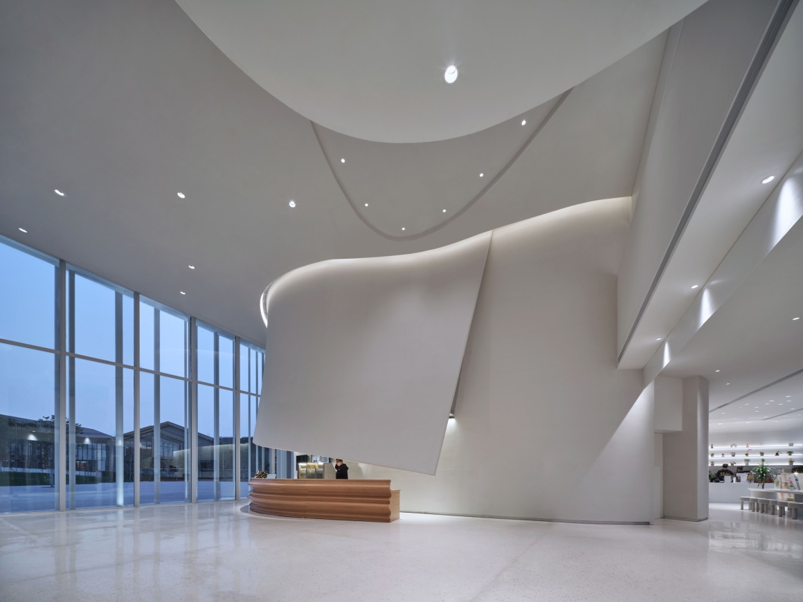
▽夜幕中室内的墙和顶都成为了建筑立面 The interior becomes the façade by night
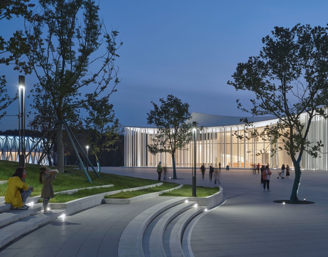
9月30日开业后的国庆假期里,飞毯在的阿朵小镇来了15万人。
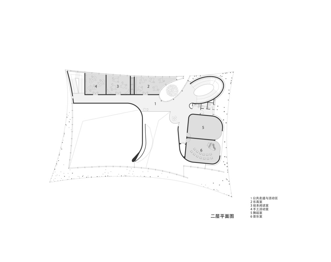
现场我们看到孩子们在“白色丛林”中穿行追逐,多功能厅在举办漫威展览,一楼的阿朵万达院线在上映,亲子家庭和老人在1918咖啡厅休憩,二层是孩子们专属的舞蹈室、绘画室等,结合室外场地的阿朵自然研学营地也已经开放,1000多方的小建筑构成了一个复合多样性的小生态。
The Atour town opened on September 30th. During the National Holiday, it greeted more than 150,000 visitors.
Children were chasing each other and playing in the white jungle, the functional hall was hosting the Marvel exhibition, the Atour movie theatre on the first floor were showing movies, young families and the elderly relaxing in the 1918 Café. On the second floor, there are dancing room and painting room exclusive for kids. Meanwhile, Atour Nature Research Camp were opened at outdoor venue of the building, the Flying Carpet has created itself a 1000m2 diverse functioned wonderland.
▽建筑夜间鸟瞰 Aerial view by night
▽广场夜景 The square by night

▽一层平面 Plan level 1
▽二层平面图 Plan level 2
▽屋顶平面 Roof plan
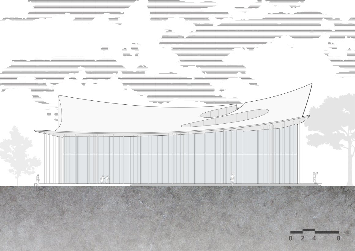
▽立面图 Elevation
▽剖面图 Section
项目名称:阿朵小镇亲子活动中心
设计方:栖城设计
公司网站:gn-int.com
联系邮箱: juan.xu@gn-int.com,wenyan.zhu@gn-int.com
项目设计 & 完成年份:2020.8(起始)/ 2021.9(建成)
主创及设计团队:沈利江,崔恒轩,丛燕飞,徐政,陆启跃,范志刚,邓腾腾,周川,范陶翔,陈学博,王语琪,魏明,黄玮菁,邱佳家
项目地址:中国 青岛 藏马山
建筑面积:1455 ㎡
摄影版权:摄影师:章勇,梁文军
景观设计:澳派景观设计
灯光顾问:北京光湖普瑞照明
客户:融创北京集团
品牌:胶粘石,纳米水泥,金磨石,GRG,金属板
Project name: Qingdao Atour Town Parent-Kid Centre, China
Design company: GN International Shanghai LLC
Company website: gn-int.com
Contact: juan.xu@gn-int.com, wenyan.zhu@gn-int.com
Project Design & Completion Year: 2020.8 (initial) / 2021.9 (Completed)
Creators and design team: Shen Lijiang, Cui Hengxuan, Cong Yanfei, Xu Zheng, Lu Qiyue, Fan Zhigang, Deng Teng, Zhou Chuan, Fan Taoxiang, Chen Xuebo, Wang Yuqi, Wei Ming, Huang Weijing, Qiu Jiajia
Project Address: Zangma Mountain, Qingdao, China
Construction area: 1455 square meters
Photography is by Zhang Yong, Liang Wenjun
Landscape design: ASPECT
Lighting Consultant: Beijing Guanghu Pului Lighting
Client: Sunac Beijing Group
Brand: Adhesive stone, nano cement, gold millstone, GRG, metal plate
“ 从形式到功能,这个亲子活动中心都满足了孩子们的奇妙幻想。”
审稿编辑 Ashley Jen
更多 Read more about: 上海栖城建筑规划设计




旁边那个教堂一样的建筑挺有意思,不知道是做什么的