本文由 三厘社 授权mooool发表,欢迎转发,禁止以mooool编辑版本转载。
Thanks TRIOSTUDIO for authorizing the publication of the project on mooool, Text description and images provided byTRIOSTUDIO.
三厘社:鸟焱·烧物位于南京华灯坊,辐射CBD商业受众。本案作为鸟焱品牌在南京布局的第三间门店,区别于首店的新日式风格,设计以酒馆气质为契,将别具一格的烟火气融入新店策划中,打造围合中央吧台传递日式烧鸟的独特体验,同时整体风格灵感取师于鸟居结构和式纸伞,在色彩搭配、内部装饰中延续新颖的用餐仪式感。
TRIOSTUDIO :As the third store of NIAOYAN in Nanjing, this case is mainly based on the tavern unit, integrating the breath of life into the space. At the same time, the style is inspired by the structure of the torii and the paper umbrella, which continues the novel Japanese ritual sense in the color and interior decoration.
▽空间概览 Space overview
从场地突围,构建别样日料酒场 Construct a different kind of Japanese cooking wine field
项目选址于商场地面一层的上行扶梯之下,面对采光不够、景观差与客流问题,如何从场地劣势中突围成为设计团队首要面临的难题。
Faced with the problems of insufficient lighting, poor landscape and passenger flow, how to break through the disadvantage of the site has become the primary problem faced by the design team.
▽店外立面与沿街建筑的关系 The relationship between the store facade and the buildings along the street
设计团队将日本鸟居结构中的“朱红”作为空间主体色,从外立面至餐厅内部环境的立面细部均以“秩序感”营造出空间的连续性,层叠的木构搭配引人注目的红色,营造出浓郁而有序的视觉效果。客人经过外摆区,进入室内空间,映入眼帘即是核心区域的中央吧台,精致酒柜以玫瑰金构架作为展陈,为空间注入复古感的生机,并契合流畅弧墙融入完整的空间色彩单元,在顶部伞型构架下,层次明亮的气韵在空间中流转。
The design team used “vermilion” in the torii structure as the main color. From the exterior facade to the interior environment of the restaurant, the “sense of order” creates the continuity of the space and has a strong visual effect. Guests pass through the outside area and enter the indoor space, and they are greeted by the central bar in the core area.
▽吧台设计bar design
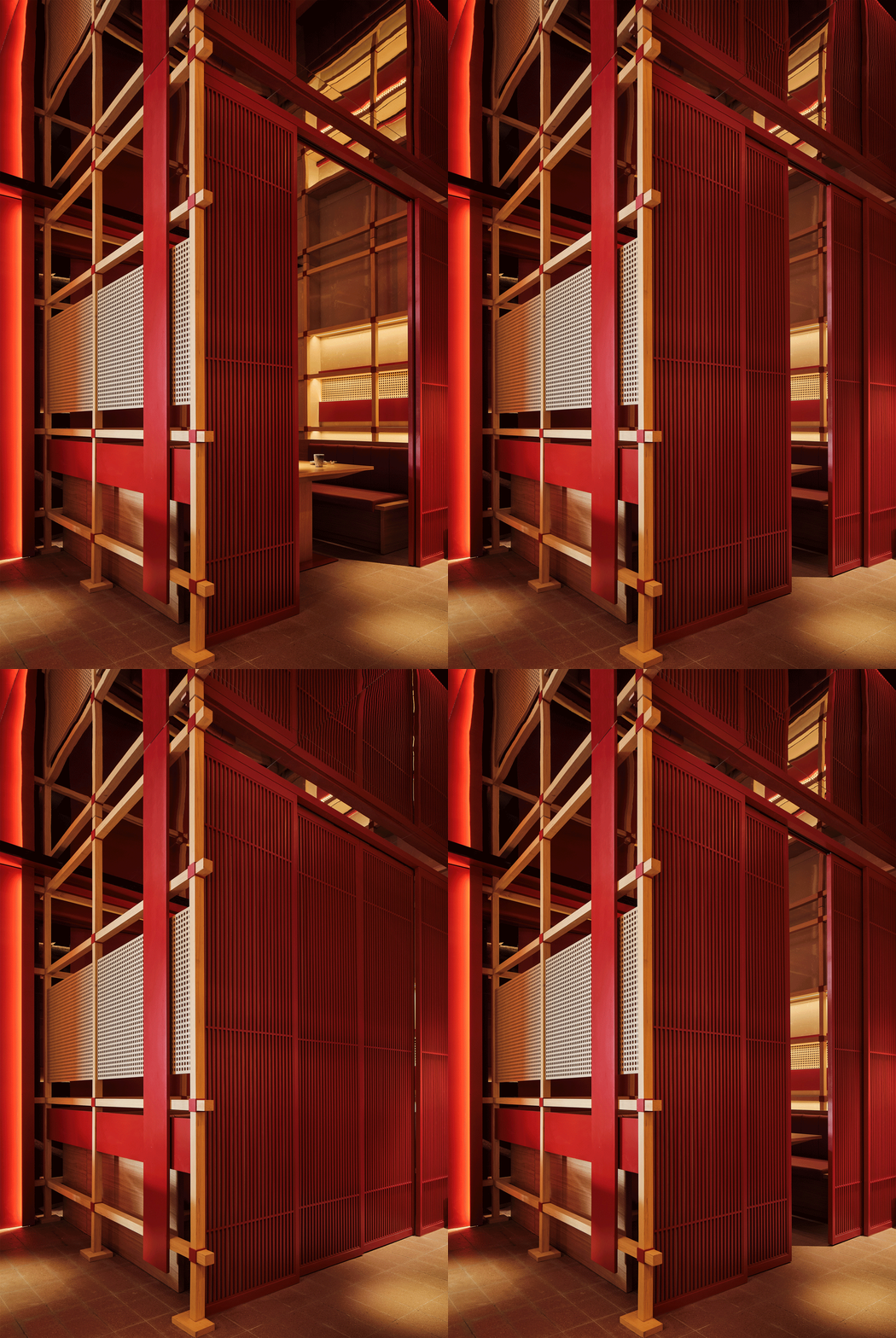
▽包间设计细节 Private room design details
景观的呼吸感 Breath of the Landscape
在空间外立面的设计中,利用弧面片墙间隔与局域造景,以材质交叠复现出视觉掩映的景观屏障,模糊化处理的边界让室内外有层通透的呼吸感,在半圆“伞面”延伸下的日式造景,让空间内的感受界线穿透物质隔墙,引导客人视线与室内环境琳琅相会。
In the design of the façade of the space, the arc wall and local landscaping are used to reproduce a barrier-like visual cover with overlapping materials. Blur the boundary and make the space have a sense of transparent breathing. The Japanese-style landscaping under the extension of the semi-circular “umbrella surface”, the boundary of feeling in the space penetrates the material partition wall, guiding the guests’ eyes to meet the space.
▽外立面细节facade details
▽从户外透过玻璃立面望向室内 Looking into the interior from the outside through the glass façade
▽门头立面设计 door facade design
▽室外造景细部Outdoor landscaping details
餐厅内部,设计团队利用核心吧台区域的顶层装饰架构与“和式纸伞”联系,纤细木构以序列形态的搭建融汇出现代材料的细腻渐次感。散座公域与单独包间的错落观感,在木构与顶部镜面折射出的多维空间中起承转合,制造出餐厅空间与来客交感、与品牌气场交感的邂逅篇章。
Inside the restaurant, the design team used the top-level decorative structure of the core bar area to connect with the “Japanese-style paper umbrella”. The scattered look and feel of the scattered public area and the separate private rooms are connected in the multi-dimensional space refracted by the wooden structure and the top mirror. The restaurant space interacts with guests and brands.
▽伞形顶部设计细节 Umbrella top design details
仪式,不止于鸟居 Ceremony, more than torii
设计团队在整体空间构造思路上,通过节点结构与精细选材来呈现鸟焱品牌与日料文化的契合度,在视觉性与功能性上呼应鸟居构造文化,创造出多重时空维度的场景体验,即“进入空间之时,所有来客行为皆需要特别注意”,设计团队亦是通过结构装饰的仿形来发出信号,踏入鸟焱即意味着跨入一个与现实世界泾渭分明的空间旅程,从而传递给食客更多精神文化层面的感受与体验。
In terms of construction ideas, the fit between NIAOYAN and Japanese material culture is highlighted through structure and material selection, and a unique scene experience is created. That is, “when entering the space, all guest behaviors require special attention”. This is the spatial signal: stepping into Toyoya means stepping into a journey that is distinct from the real world. In this way, more spiritual and cultural feelings and experiences can be conveyed to diners.
▽餐桌细节 dining table details
▽私密包间动图 A GIF of a private room
▽用餐环境 Dining environment
▽包间开合效果 Private room opening and closing effect
在结构致敬之外,场所的故事性也离不开光影的诠释,设计团队细心打磨许多耐人寻味的空间细节,为置身其中的纷纷宾客们,叙说渐入密境的空间意趣。
In addition to paying tribute to the structure, the story of the place is also inseparable from the interpretation of light and shadow. The design team carefully polished many intriguing spatial details to describe the spatial interest of gradually entering the secret environment for the guests who are in it.
▽空间细部 Spatial detail
▽平面图 Plan
▽外立面动效图 Dynamic rendering of the facade
项目名称:鸟焱·烧物
项目类型:餐饮空间
设计时间:2022.02-04
施工时间:2022.05-06
设计团队:TRIOSTUDIO三厘社
项目地址:江苏南京
项目状态:建成
建筑面积:142平方米
主要材料:瓷砖 石材 木饰面 不锈钢
公众号:TRIOSTUDIO三厘社
客户:鸟焱·烧物
摄影支持:ingallery
设计咨询:lx@triostudio.cn
媒体对接:media@triostudio.cn
Project name: Yan and Yan
Project type: Catering space
Design time: 2022.02-04
Construction time: 2022.05-06
Design team: triostudio
Project address: Nanjing, Jiangsu
Project status: Completed
Floor area: 142 square meters
Main material: ceramic tile stone wood veneer stainless steel
Official account: TRIOSTUDIO Sanli Club
Customer: Yan and Yan
Photography is by ingallery
Design consultation: lx@triostudio.cn
Media connection: media@triostudio.cn
“ 别具一格的设计与充满张力的色彩搭配,营造层次丰富的空间氛围。”
审稿编辑: Maggie
更多 Read more about: TRIOSTUDIO三厘社


0 Comments