本文由 TIDTANG STUDIO 授权mooool发表,欢迎转发,禁止以mooool编辑版本转载。
Thanks TIDTANG STUDIO for authorizing the publication of the project on mooool, Text description provided by TIDTANG STUDIO.
TIDTANG STUDIO:Busaba酒店是Busaba工艺设计公司的一项延伸业务。作为泰国生活方式品牌,其最初始于寻找代表泰国的手工物品,如丝巾、包、衣服、钥匙链等,随后,进一步发展为为每件物品增添时尚感,打造出专属的标志性外观。它最大的目标是将当代泰国时尚传播给新一代,希望他们能够认识并欣赏泰国艺术和文化之美。本着这个宗旨,我们在Busaba酒店设计中融入了“生活体验”这一概念,旨在让居民住进拥有50年历史的泰国传统住宅空间。建筑经过重新设计,添加了强调现代感的白色元素,与绿色的自然形成对比。
TIDTANG STUDIO:Busaba Design Hotel is an extension business from Busaba Craft & Design. It is a Thai lifestyle brand which started its brand by seeking crafted items that represent Thai such as silk scarves, bags, clothes, key chains. Then, Busaba further adds modenity to each item to create its own iconic appearance. Its largest goal is to spread out this contemporary Thai Fashion’ to the new generation, with the hope that they will realise and appreciate the beauty of Thai art and culture. With this strong intention, the design hotel “Busaba” was designed under the concept of “living experience” where the residents get to live in the original 50 year-old Thai house space. The building was redesigned by adding white elements to emphasize the modernity and contrast against the green colour of nature.
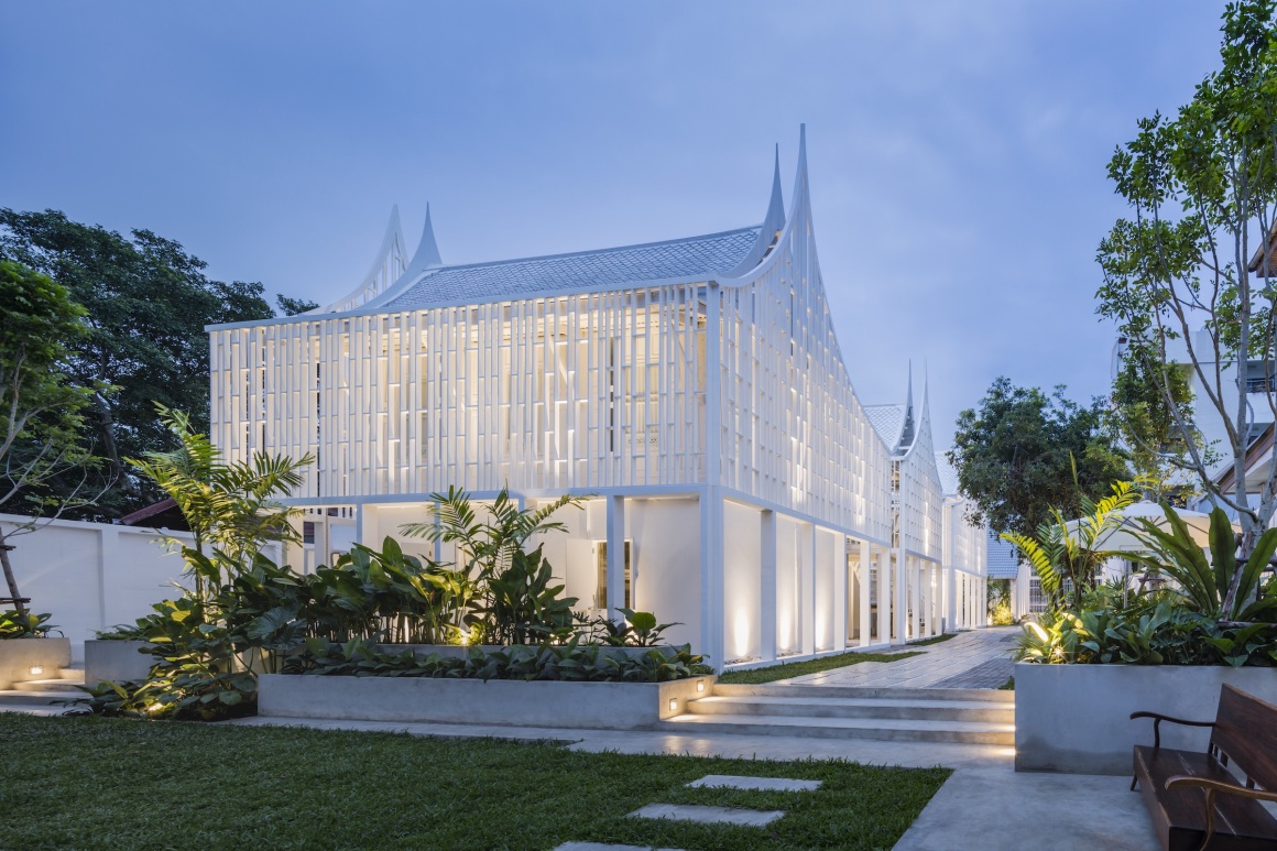
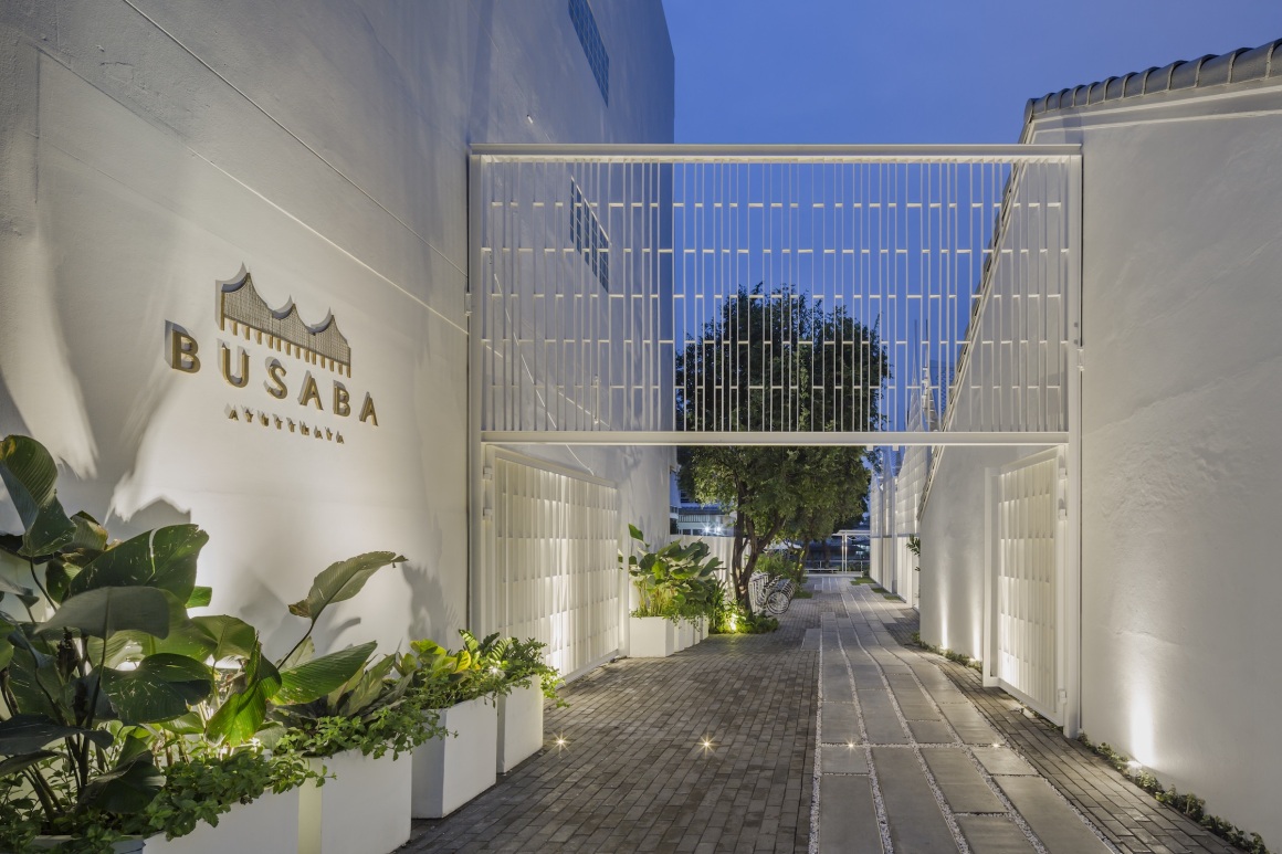
这个项目的主要要求是保持原有的传统泰宅空间,以便客人最大程度地体验泰国住宅的真实氛围。设计采用空间分层的方法,将公共区域和私人区域分开。私人空间位于公共空间的顶部,酒店底层由大堂、后勤办公室、茶水间、洗衣房、浴室、卫生间和客房组成。上层(私人区域)是更具私密性的豪华客房,内有一张单人床和室内浴室。
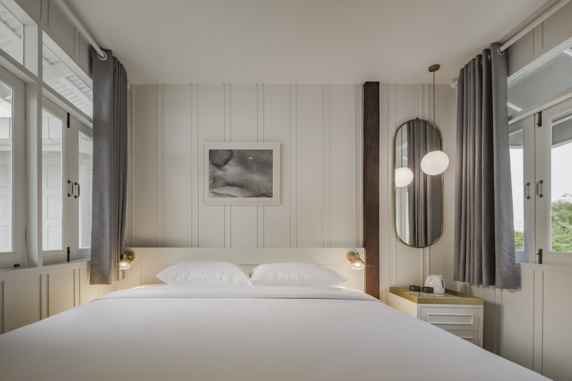
The main requirement of this project is to keep the same old space of the original Thai house. Therefore, the guests could experience the fullest extent of the authentic atmosphere of the Thai house. The method of space layering is used to separate public and private areas; the private space is on the top of the public space and the lower floor of the hotel consists of a lobby, back office, pantry, laundry, bathroom, toilet and guest dorm. The upper floor (private area) will be a deluxe room, which has more privacy, and also a private room with a single bed and in-room bathroom.
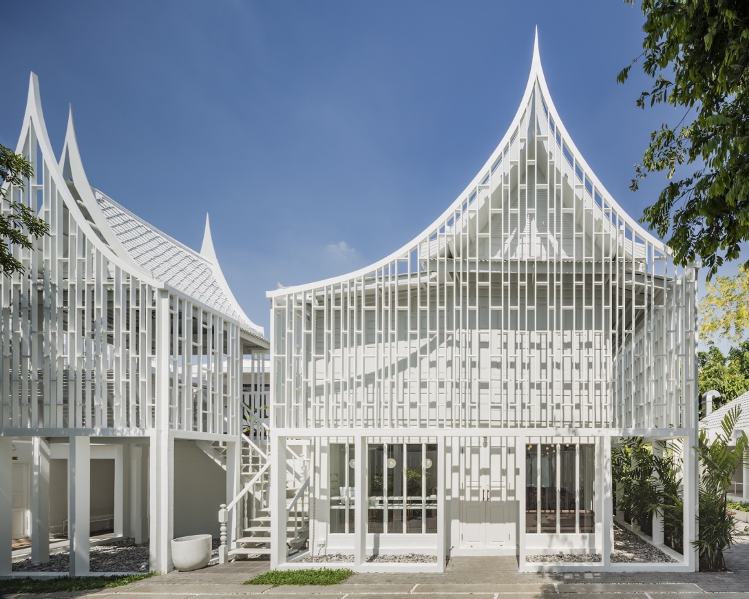
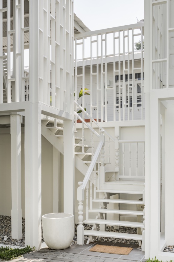
▼酒店一楼大堂 The lobby on lower floor
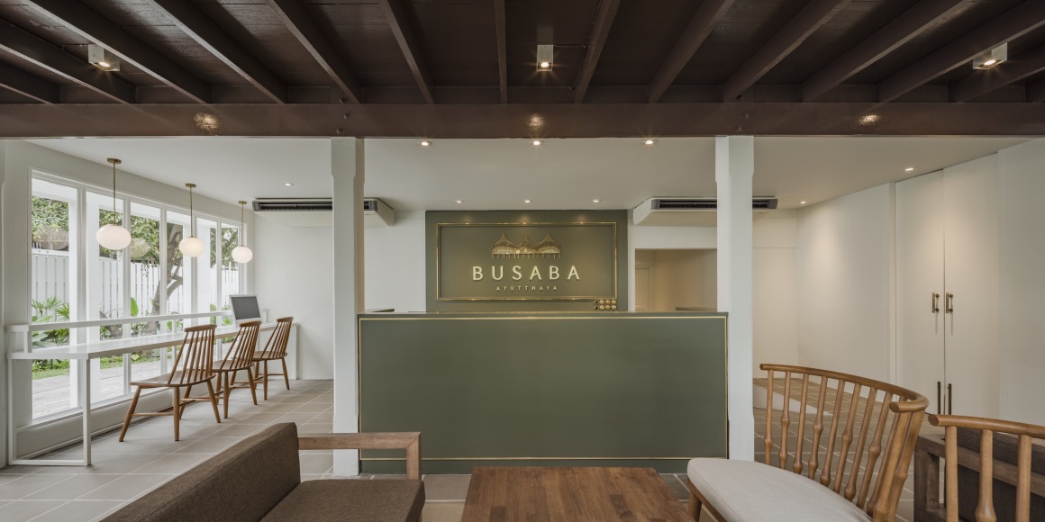
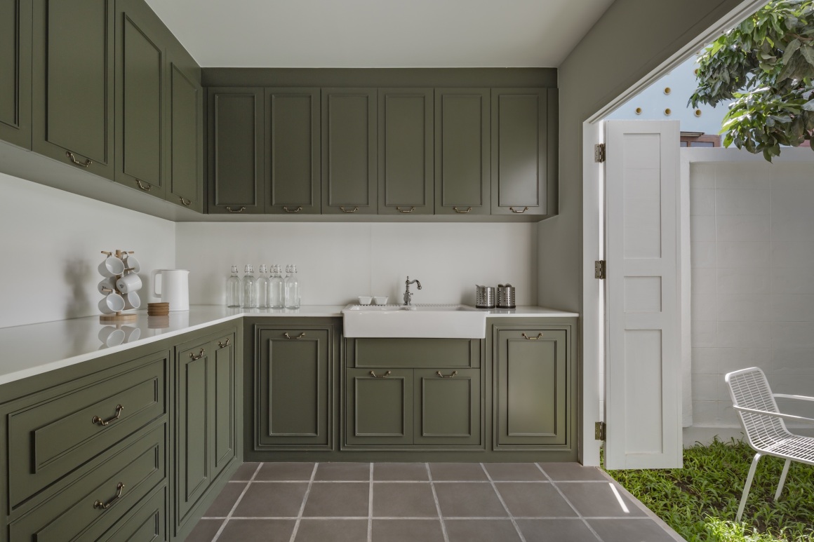
▼酒店一楼茶水间 The pantry on lower floor
▼酒店一楼卫生间 The toilet on lower floor

▼酒店一楼客房 The guest dorm on lower floor
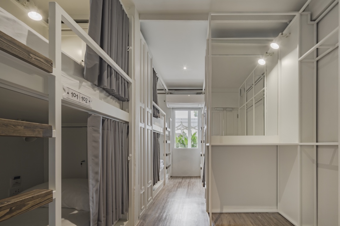
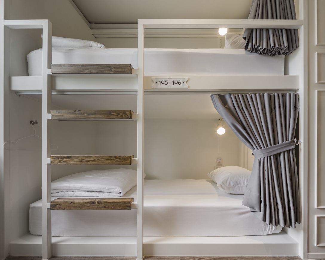
▼酒店二楼豪华套房 The deluxe room on upper floor
传统的泰国房屋通常会建成一个群居式住宅:根据泰国传统,同一地区至少要有两栋吊脚楼建筑,里面住着一个大家庭。一旦某一名成员结婚,他们就会扩建自己的房子,并通过露台将其与原来的大家庭建筑连在一起,这种露台就为所有家庭成员提供了充足的生活区域。在该项目案例中,老建筑就是一个由三栋吊脚楼组成的群组式建筑,拥有泰国传统房屋象征性的陡峭山形屋顶。
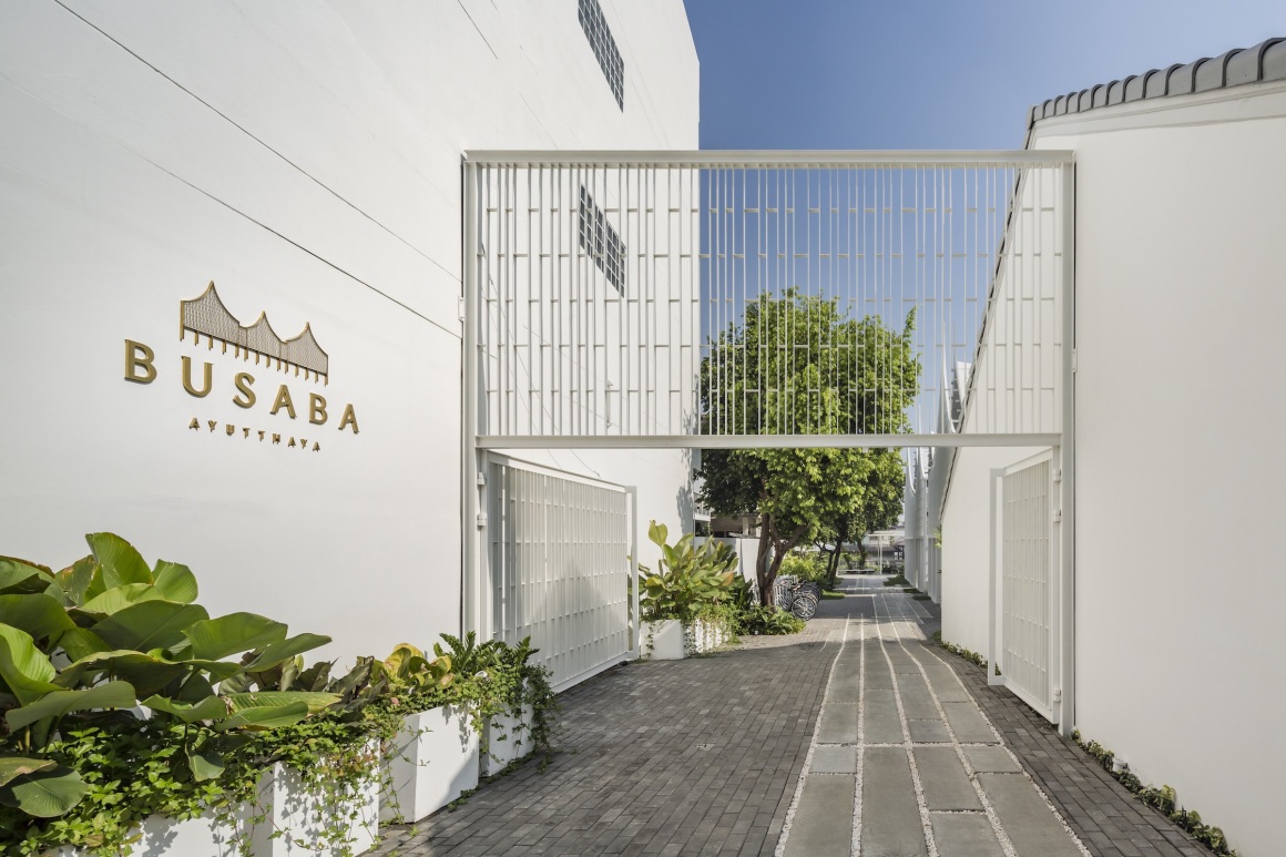
为了实现项目目标,让年轻一代以及更多的人群接触并了解,我们重新布局和简化了建筑元素,希望引领潮流,让每个人都能更容易地理解其内涵,这其中不仅仅是泰国人,当然还包括其他外国人。该项目决定使用立面作为主要组成部分,融入现代元素。立面通过简单的直线连接其轮廓,保留了传统建筑的主要特征。但是,为了创造更强的特色,我们还对中间的屋顶(从3个山形屋顶的轮廓)进行了旋转。
Traditional Thai house is likely to be built into a group-house: the stilt house that has at least two buildings in the same area due to Thai tradition, in which a large family lives. Once a member is getting married, they will extend their houses and connect them with the terrace, which offers a living area for all members. In Busaba’s case, the old building is a group-house with three buildings on stilts, and has a steep gable roof, which is the icon of Thai traditional houses.
To accomplish the project’s goal of reaching to the young generations and wider range of people, the building’s elements were rearranged and simplified to be beyond trends and likely to be comprehended easier by everyone; either Thai or Foreigner. The project decided to use the facade as the primary component to blend everything into the modern taste. The facade tends to keep the main characteristic of the old building by using the outline that is connected to one simple line. But, in order to create the memorable symbol, the middle roof (from the outline of 3 gable roofs) had to be rotated.
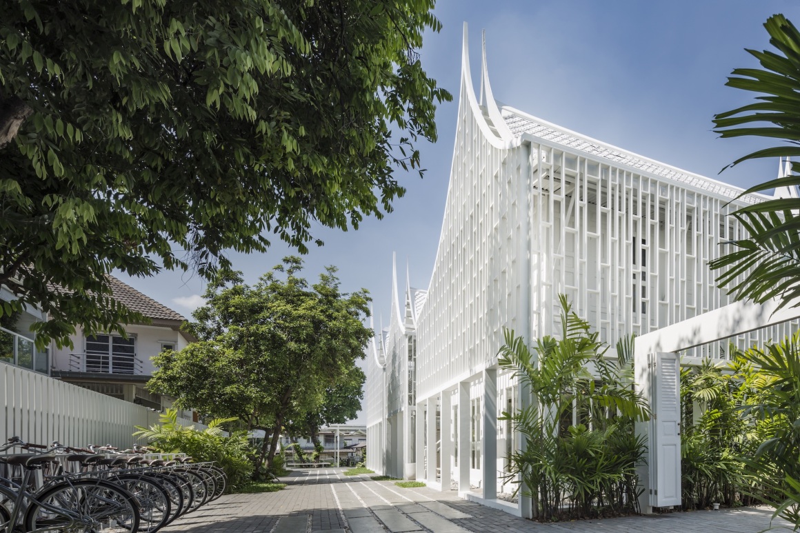
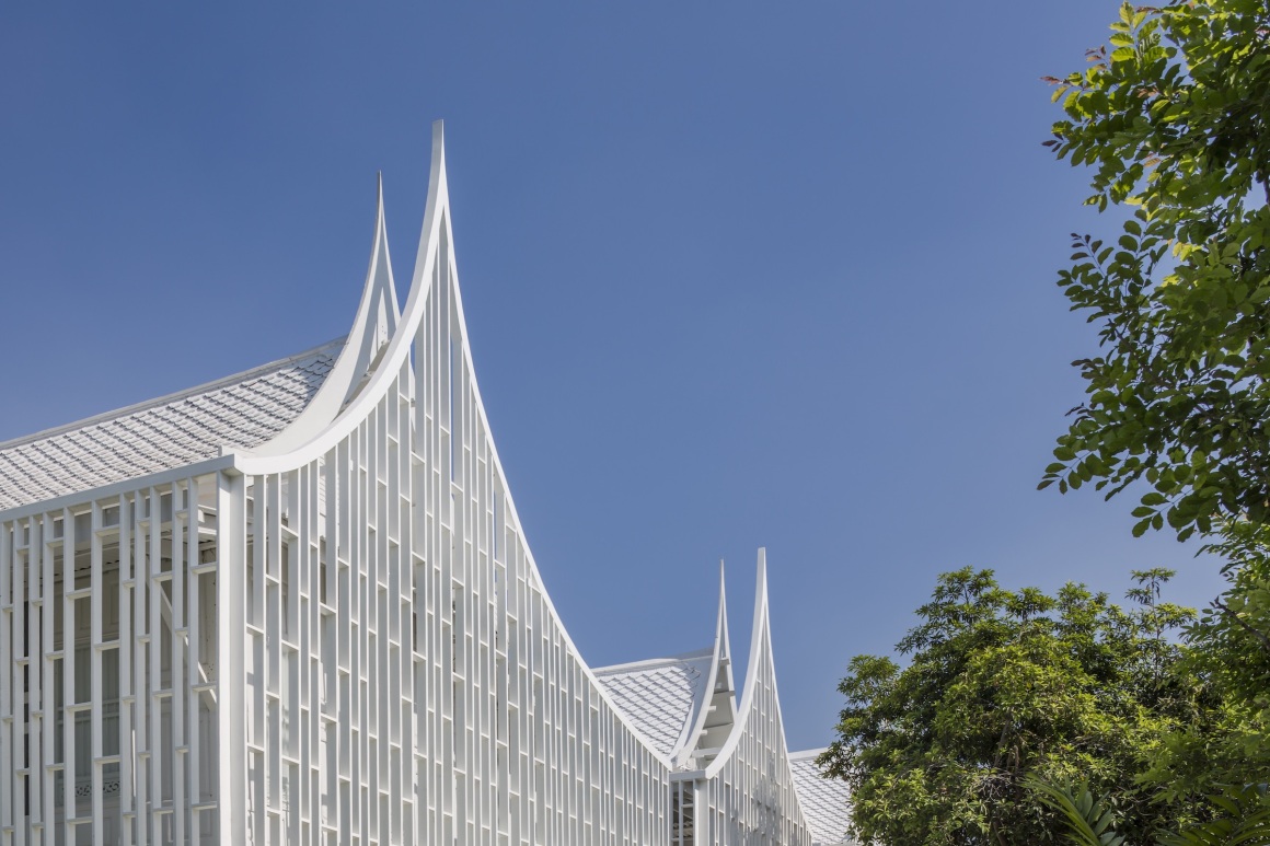
房子中间的露台仍然具备与传统泰国住宅相同的功能,充当建筑的公共区域。木质隔断上的图案通过创造一种紧密而不均匀的距离,形成变化万千的新图案,但仍然保留了泰式的特点。该设计还通过增加双层隔断覆盖了凸起的地下室,从而创造了明亮通风的生活感。
The terrace in the middle of the house still has the same function as the traditional Thai house, where it acts as a common area of the building. Wooden partition pattern leads to the new design of pattern by creating a close and uneven distance, which still keeps the characteristics of Thai. The design also covers the raised basement of the house by adding the double partition to create a light and airy feeling of living.

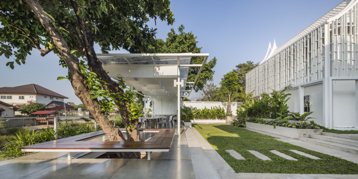
立面的图案灵感来自泰国木墙框架Phra Pra kon (whusenu)的现代化和重新布置。白天,建筑和立面之间的间隔创造了适当的距离,使阴影完美地投射在墙上,象征着现在和过去的重叠。
The pattern of the facade is inspired by modernization and rearrangement of Thai wooden wall frame, Phra Pra kon (whusenu). During the day, the spacing between building and facade creates a proper distance for shadow to be projected perfectly on the wall, which represents the overlapping of the present and the past.
项目名称:Busaba Ayutthaya
完成:2018年
面积:300平方米
项目地点:泰国大城府
建筑事务所:TIDTANG STUDIO
公司网址:www.tidtangstudio.com
联系邮箱:info.co@tidtangstudio.com
首席建筑师:Pattakorn Thanasanaksorn, Suppat Pornputtkul
设计团队:Penprapa Sutadsan, Chirapat Chomlek, Natsiyaporn Narintharangkul Na Ayuthdhaya
客户:Busaba Ayutthaya
摄影:W Worksapce
Project name: Busaba Ayutthaya
Completion Year: 2018
Size: 300 Sq.m.
Project location: Ayutthaya, Thaialand
Architecture Firm: TIDTANG STUDIO
Website: www.tidtangstudio.com
Contact e-mail: info.co@tidtangstudio.com
Lead Architects: Pattakorn Thanasanaksorn, Suppat Pornputtkul
Design Team: Penprapa Sutadsan, Chirapat Chomlek, Natsiyaporn Narintharangkul Na Ayuthdhaya
Clients: Busaba Ayutthaya
Photo credits: W Worksapce
更多 Read more about: TIDTANG STUDIO


今形古意