本文由 东仓建设 授权mooool发表,欢迎转发,禁止以mooool编辑版本转载。
Thanks DOMANI for authorizing the publication of the project on mooool, Text description provided by DOMANI.
东仓建设:初对‘食’有模糊轮廓的概念,是来自一篇儿时的课外阅读,陆文夫中篇小说《美食家》。印象颇深处是文中陆文夫借小说角色朱自治提出的两个见解:
一、做菜最大学问之处,是一个最简单的问题:放盐。
二、菜之顶流,是在极尽雕琢之后,呈现出来,一片风轻云淡,自然淡雅,这是食之真谛。
这见解模糊记忆至今,在初执笔设计高级中餐料理晶采轩时电光火石。
DOMANI: My initial concept of “food” was somewhat blurry, originating from a childhood reading of Lu Wenfu’s novella “The Gourmet.” What left a deep impression on me was the two insights proposed by the character Zhu Zizhi in the story:
First, the greatest wisdom in cooking lies in a simple question: salted.
Second, the pinnacle of a dish is achieved through meticulous craftsmanship, presenting a sense of lightness, natural elegance, and the true essence of food.
These insights have remained in my vague understanding and became a spark of inspiration when I began designing at Exquisite BOCUSE.
▽项目视频 Video
项目之初我曾采访过晶采轩中数位主厨及其他一二江湖名厨,想要从他们对于烹饪的见解中领略描摹出某些中餐环境的新意与真意。但在诸多试探中我所获的言辞其实都颇为简朴,不是在谈原始食材的重要及考究,就是在谈反哺传统,或论味本归真又或烹饪的基本功等。坦诚说,我竟没有获得任何惊世骇俗的听闻见解。于是反复筹谋后基本确凿了方向,这些听起来简单基础的道理或才是技艺的真谛。大象无形,大巧不工,技不炉火纯青,艺不返璞归真。
空间应如是。
故立笔之初,便生生收起所有心中万般花哨,抹掉非惊世骇俗的冲动。在中餐的万千气象中,只着笔于眼观,耳听,身触。
我用这个空间试‘放盐’,自品浓淡。
During the project’s inception, I interviewed renowned chefs, including those from Exquisite BOCUSE, to uncover insights into the essence of culinary art. Their straightforward responses emphasized using quality ingredients, upholding tradition, capturing flavors, and mastering cooking fundamentals. While not groundbreaking, these principles proved to be the core essence of culinary craftsmanship. True mastery extends beyond technical expertise, and artistic expression surpasses mere sophistication.
And so it should be for the space
Hence, I let go of extravagant ideas and resisted the urge to create something sensational at the start of the design process. Immersed in the richness of Chinese cuisine, I keenly observed, listened, and experienced. This space became a metaphorical “salted,” inviting everyone to savor its subtle nuances.
外观-在繁华闹市中见大味至淡,富贵风雅,画境疏朗,是外观的立形立意。
餐厅主打粤菜兼江南菜系的融合,菜品中的地方性在当代烹饪技艺的融合性之下。于是空间选择去历史、地理化叙事,将粤系的经典富贵与江南的风雅消隐于现代性的语境之后,存而含蓄。
Exterior of the restaurant-The restaurant’s exterior design embodies simplicity, elegance, and openness in the lively cityscape, conveying a sense of harmony and clarity that reflects the essence of “the path of simplicity.”
Specializing in a fusion of Cantonese and Jiangnan cuisine, the spatial design avoids historical and geographical references. Instead, it focuses on contemporary culinary techniques, allowing the timeless classics of Cantonese cuisine and the refined elegance of Jiangnan cuisine to coexist within a modern context. The atmosphere is present and understated, creating a space where these culinary traditions subtly thrive.
墨色木模混凝土板是为项目研发的外墙材料。强调质地,机理多样,耐污不显,手触润而坚实,挂装平整。它来自我们与双瑜混凝土的配合。其间诸多曲折:定模、制模、校色、校形、定厚、挂装、小样七八遍、大货一二轮。若非六七年的配合,恐没有材料供应商愿意任我们这样折腾。所幸,结果如期所愿。致谢!
Ink-colored wood formwork concrete panels were chosen as the exterior wall material, emphasizing their texture and versatility. This material offers stain resistance, a warm and solid touch, and a flawlessly smooth appearance once installed. Developed in collaboration with Sheungyu Civil Engineering and Architecture, the process involved setting the mold, creating the formwork, color calibration, shape adjustments, determining thickness, installation, and multiple iterations of small samples. Resulting in a final outcome that exceeded our expectations. We are sincerely grateful for their contribution.
序厅-贵而不豪,雅拙得当,浑然大气,是我对这个空间划分的客群象限。
序厅是宴客的头面,头面是礼,礼讲轻重见主人调性。
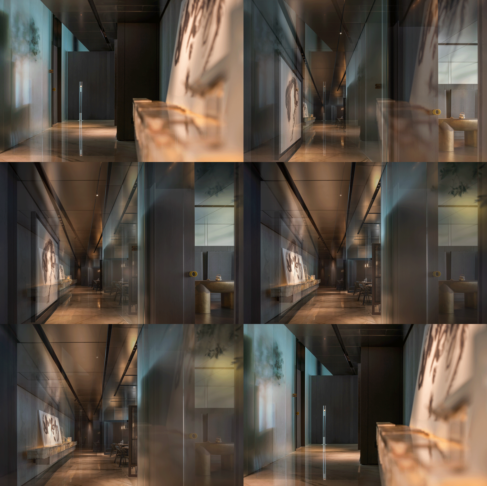
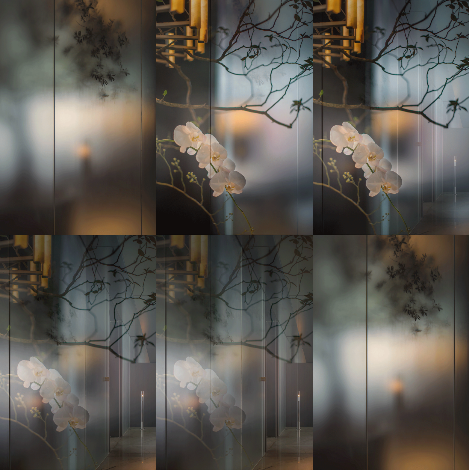
续外观的墨色一气缓缓到底。室内材质的形色皆舍,只留触感,收纳咨客等功能隐藏在各种精工门禁内。空间中三组玉石装置花了心思跳跃的。
The foyer-The objective is to achieve a luxurious ambiance that is tasteful and refined, striking a delicate balance between elegance and simplicity. It exudes grandeur and harmony.
The foyer serves as the welcoming face of the host for entertaining guests. It represents etiquette, emphasizing the importance of proper conduct that reflects the host’s demeanor.
Continuing the ink-colored theme from the exterior, the selection of interior materials prioritizes their tactile qualities over visual appearance. Thoughtfully designed cabinets cleverly conceal consultation and storage functions. Within the space, I have meticulously arranged three sets of jade installations, adding a dynamic element to the overall ambiance.
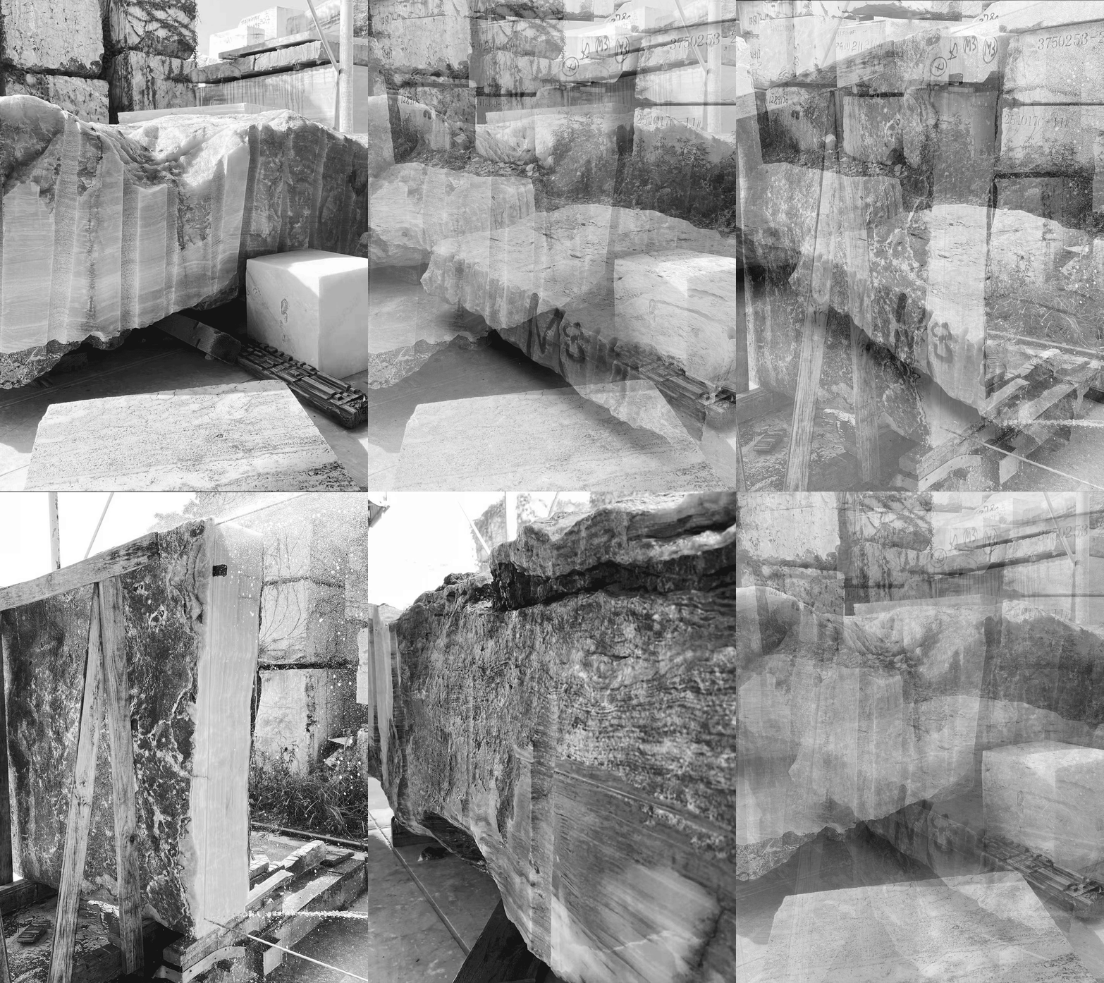
玉不琢不成器,玉太琢则油腻。一贯以精工著称的A2 STONE原石原筑配合我们完成了这组装置。描述艺术装置是艰难的,不是工艺难而是理解难。难以语言描述我们要如何将一块玉石保留原石朴拙质感同时又要表现极强的加工工艺达到人力与天成相映。于是从选择荒料起,近乎是一笔一划的在数块巨大的玉石荒料上选面、定厚、切片、扫描、建模、限定刀口、判断抛光面与抛光度、组装设计。成果令人惊喜。致谢!
A collaboration with A2 STONE, known for their meticulous craftsmanship, brought these exquisite jade installations to life. Describing art installations can be challenging, as it’s not just about the craftsmanship but also the difficulty in capturing their essence. We managed to preserve the raw and rustic texture of the jade while showcasing exquisite craftsmanship. The process began with the careful selection of rough jade materials, followed by meticulous steps such as surface selection, thickness determination, slicing, scanning, modeling, defining cutting edges, evaluating polishing surfaces and degree, and designing the assembly. Each step was executed with precision, like brushstrokes on a canvas. We extend our gratitude for their valuable contribution!
内厅-半开半合,若繁若寂,灵动有序。
散客与诸多交通动线相汇,即要保障散客区的恰当隐私,又要划定公共动线上的明确指向。
对于所有公共空间而言,隐私性都并不绝对。如高级中餐散客区,屏障过强,则过于考验客群安全感,缺少饮食男女的必要烟火气。屏障太弱,则市井气太盛吵闹干扰不堪。且对于高级中餐而言,散客区坐席往往以二至四人为组,人数再高便乐于消费独立包间,于是一个中小散客厅内往往多少交错六七组人,屏障的设置,又是一个分寸题。
The dining hall-The dining hall achieves a harmonious balance between liveliness and tranquility with its semi-open and semi-partitioned design. It combines dynamism with orderliness.
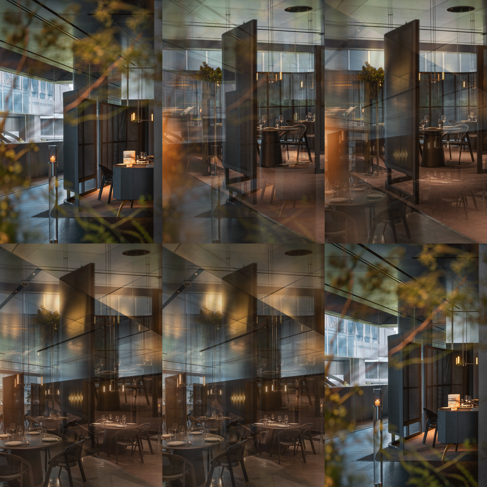
Intersecting with various traffic routes, the dining hall clearly defining public circulation paths. The goal is to ensure appropriate privacy for dining hall guests while establishing clear pathways for public movement.
For a high-end restaurant’s dining hall, overly enclosed partitions can challenge guests’ sense of security and compromise the lively dining atmosphere. On the other hand, weak partitions can lead to excessive noise and disruptions to the dining experience.
Moreover, high-end restaurants often seat guests in groups of two to four in the dining hall. This means a dining hall may have multiple tables with six to seven groups dining together. Therefore, the partition settings require careful consideration to strike the right balance.
交通-清晰明确中有节奏。
交通关系是餐厅中最难以组织的部分。客用动线重情景节奏;后勤、上菜、回餐则以厨房为核心放射;两部分功能既完全交叉又各自截然不可干扰,还受限于空间原生限制。
The traffic flow-Clarity and precision with a sense of rhythm are essential.
The organization of traffic flow is one of the most challenging aspects of restaurant design. The guest circulation emphasizes the rhythm of the dining experience, while the service flow for food delivery, clearing tables, and back-of-house logistics radiates from the kitchen as a central hub. These two flow paths may intersect at certain points but must remain distinct and independent from each other to avoid interference. Furthermore, they are constrained by the inherent limitations of the space itself, which can pose additional challenges to their design and implementation.
尤其以客用角度为例,我个人评价动线关系好坏只两点:
一、在没有咨客引导的情况下用户是否凭直觉能大致通达各个主要区域;
二、无论动线长短在行径过程中用户是否容易出现恍惚不明的负面情绪。
这两点,一考验设计技术上的‘守正’,二考验设计技术上的‘出奇’。
Especially from the perspective of customers, there are two main criteria for evaluating the effectiveness of traffic flow:
1.Without the assistance of staff, can customers intuitively navigate to the key areas of the restaurant?
2.Regardless of the length of the traffic routes, do customers experience negative emotions such as confusion or disorientation while walking?
These two aspects of evaluation test both the technical proficiency of the design, such as how to plan routes and implement signage to facilitate intuitive guidance, and the innovative aspects of design, such as creating delightful and surprising walking experiences through unique design elements and spatial layouts.
岫玉 Xiuyu
岫玉是中国传统首饰制作的重要材料,色介于青碧之间多变化,触感温润质地通透。初试将其演化贯穿为空间中手触眼观之物,保持当代审美格调,是件风雅有趣的事。我们引用了岫玉题材呈现在该项目的执手与灯具中,玉器雕琢工艺来自珠宝加工系统,与精工金属结构卯合,纵有微瑕,但瑕不掩瑜,致谢!
执手概念来自‘环佩’,观之灵动,触之温润。
Xiuyu Jade, widely used in traditional Chinese jewelry making, possesses a captivating range of colors between green and blue, along with a warm and smooth texture, and a transparent quality. In our project, we have integrated Xiuyu Jade into the design of door handles and lighting fixtures.The craftsmanship of jade carving, derived from jewelry manufacturing, beautifully complements the exquisite metal structures of MITOO Lighting. We are grateful for this collaboration.
The concept for the door handles draws inspiration from the “huanpei,” a type of jade ornament, evoking a lively visual appeal and a warm touch when held.
岫玉灯具形成星落有序的宏观空间的氛围照明,底座向下高显色性灯头则提供餐桌必要的桌面照明。
Xiuyu Jade lighting fixtures create a well-organized and scattered atmosphere lighting in the macro space. The high-color rendering light bulbs under the base provide essential tabletop illumination for the dining area.
台灯分为大小款,用玉石整料车璇制成。在部分餐台与雅座间作为氛围照明出现,客人可手触把玩。
The table lamps come in two sizes and are crafted from solid pieces of jade through precision machining. They are placed in specific areas within the seating areas to provide ambient lighting, creating a cozy atmosphere. Guests can also interact with the lamps by touching and admiring the jade material.
屏风 Screen partition
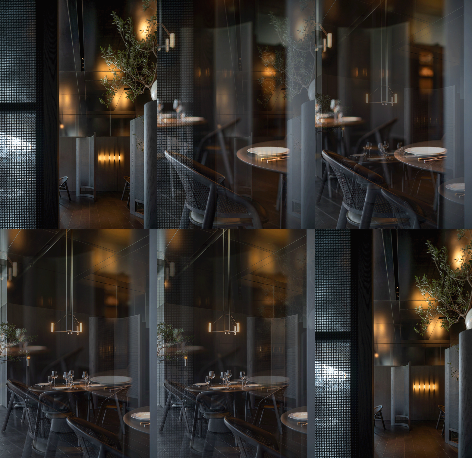
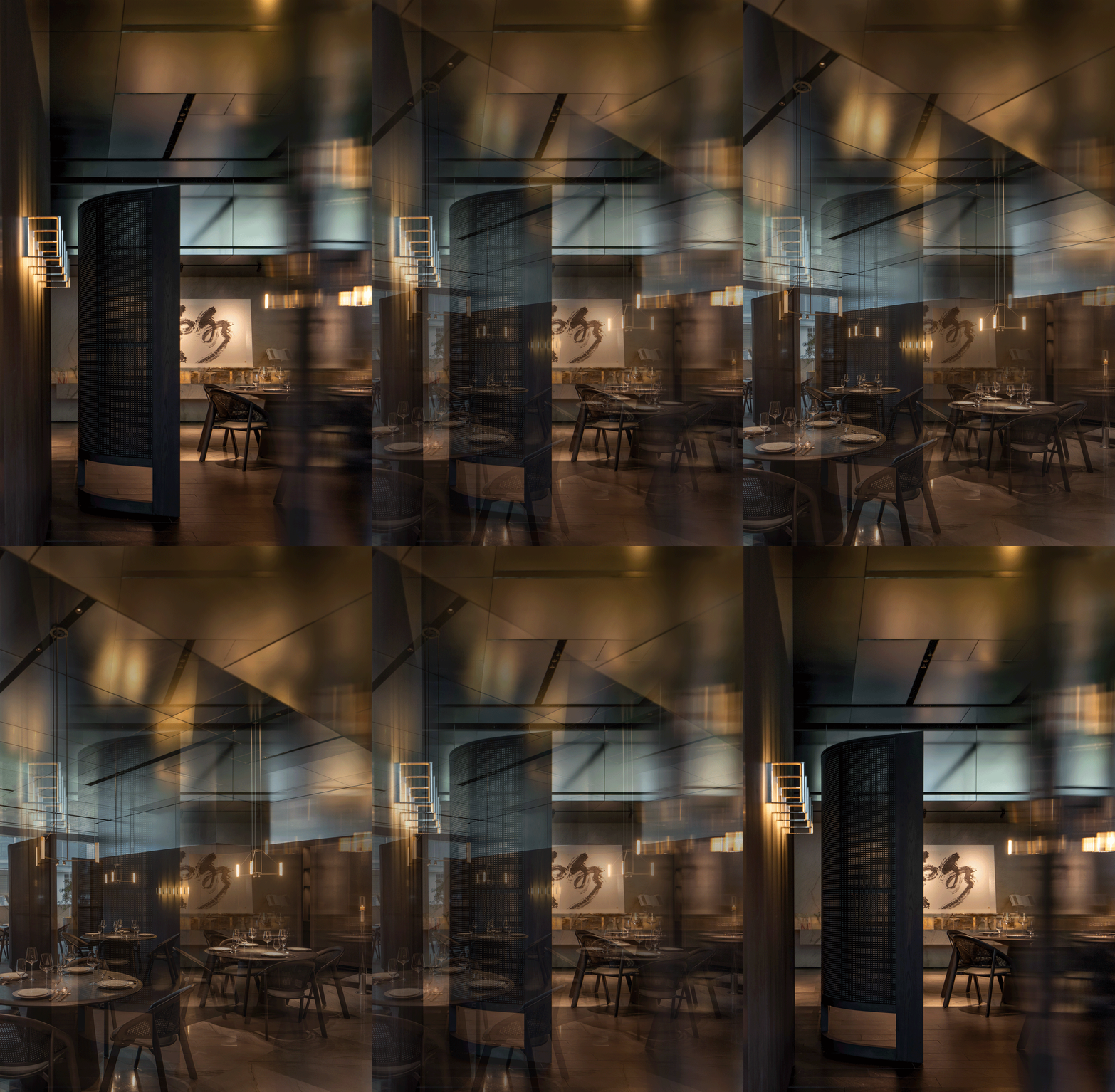
错落的墨色藤制屏风提供了明确但透气的屏障感,玉石质地的灯具在其中若隐若现的提示座间节奏与秩序。空通瘦漏本是园林中的要义,但将其置于一个散客交错的区域内,也显得得当有趣。
The ink-colored rattan screens, intricately arranged, create a clear yet transparent barrier, while the jade lighting fixtures, with their unique texture, subtly emerge within them, hinting at the rhythm and order of the seating area. The smooth flow of space, the interplay of void and solid, and the ever-changing scenery are fundamental principles in traditional Chinese ancient gardens. However, incorporating them into an indoor public dining area is a fitting and intriguing choice.
植物 Plants
空间基础是简练且硬朗的笔法,植物则成为软化空间显现气韵的一个重要因素。可见灯光烛火处,必有疏朗得当的枝叶相衬。室内植物多以小叶栀子与蓝叶橄榄为主,偶有几组盆柏,室外植物选型重蓬勃奇巧。
The spatial design of this project is based on simplicity and cleanliness, with plants playing a crucial role in softening the space and infusing it with vitality. In areas illuminated by lighting or candle flames, carefully placed plants create a balanced and harmonious atmosphere. Indoor plants predominantly include small-leaved gardenias and blue-leafed olive trees, occasionally accompanied by a few groupings of cypress bonsai. Outdoor plant selection prioritizes lushness, abundance, and unique shapes.
照明 Lighting
工程照明是用餐空间的权重项,其作用有三。
一、提供清晰的桌面菜品高显色性照明。确保菜品成色精准的同时提供用餐者良好的摄影环境条件;
二、必要功能通道指向性或强化性照明。其技术性在于灯光选型既需提供访客恰当的路径引导但还避免过度光影影响空间观感;
三、给定空间必要的氛围,或堂而皇之,或蔚然深秀,各有不同。
本项目中我们通过与Artelds 埃德尔斯照明的深入配合呈现一个理想的层次清晰丰富的餐饮空间照明。并在芯片参数及灯具安装技术性上有极其精确的应用。致谢!
In the dining space, lighting serves three main purposes:
1.Providing clear and high-color rendering lighting for tabletop dishes, ensuring accurate representation of colors and creating a pleasant environment for diners.
2.Offering well-defined and directional lighting for pathways, guiding visitors without causing glare that may affect spatial hierarchy and visual comfort.
3.Creating the desired ambiance, whether grand and majestic or serene and elegant, each with its unique characteristics.
For this project, we worked closely with Artelds Lighting to develop an ideal lighting scheme. We express our sincere gratitude to Artelds for their invaluable contribution.
开放性暗空间层次丰富的照明设定强化了聚落性与私密感。空间顶部的镀铬柔砂镜面板则以柔和丰富的折反射形成了与暗空间平衡的顶部体量。
The open dark space is beautifully illuminated with rich layers, enhancing the sense of clustering and intimacy in the spatial layout. Chrome-plated frosted mirror panels on the ceiling add a balanced volume and spatial dimension, with gentle diffraction and reflection that harmonize with the dark ambiance.
家具 Furniture
我们通过该项目针对高级中餐进行了全系列的餐桌椅家具设计。基于中餐的复杂的用餐习性,如:餐前茶饮家具需雅致,餐后酒饮家具需稳定,餐中杯盘数量摆置空间需宽裕,就餐时长以90分钟为例家具需强舒适度,风格观感需具备清晰的当代性及通用性——不尽赘述,每一个弧度都是炉火功夫。
Through this project, we have designed a complete range of dining table and chair furniture specifically tailored for upscale Chinese dining spaces. Taking into consideration the complex dining habits of Chinese cuisine, the furniture design goes beyond elegance and also focuses on comfort and stability. Ample space is provided on the tabletop for cups and dishes during the dining process. The style and appearance of the furniture exhibit a clear contemporary and universal aesthetic—without being redundant, every curve in the furniture design is meticulously crafted with utmost attention and expertise.
书法-自古书法高于画作,因其气韵兼备且抽象。
该项目中书法作品来自书法家许静大作,‘空’字作品安置于大包房广池,‘风’字作与‘如为何’自作安置于公区。三幅作品风骨俊逸!
Calligraphy-Since ancient times, calligraphy has been revered for its unique blend of artistic charm and abstract expression.
In this project, we collaborated with renowned calligrapher Xu Jing to create captivating calligraphic works. The character ‘空’ (kōng), representing ’emptiness’ or ‘void,’ takes center stage in the private dining room named Guangchi. In the public area, the characters ‘风’ (fēng), meaning ‘wind,’ and ‘如为何’ (rú wéi hé), meaning ‘how about’ or ‘what if,’ are beautifully showcased. Each of these three pieces exudes elegance and vitality, showcasing the calligrapher’s exquisite skill.
包房 Private room
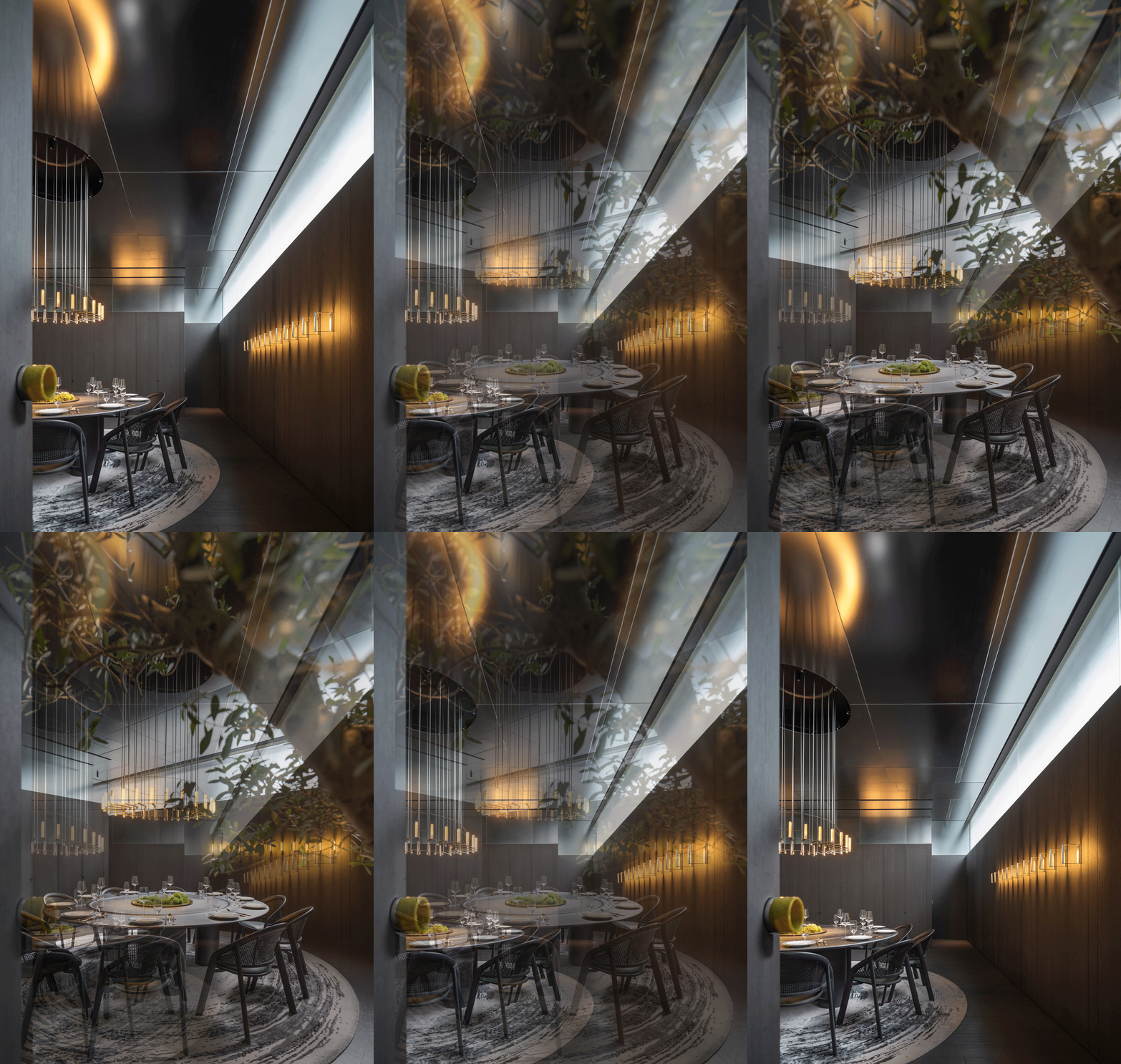
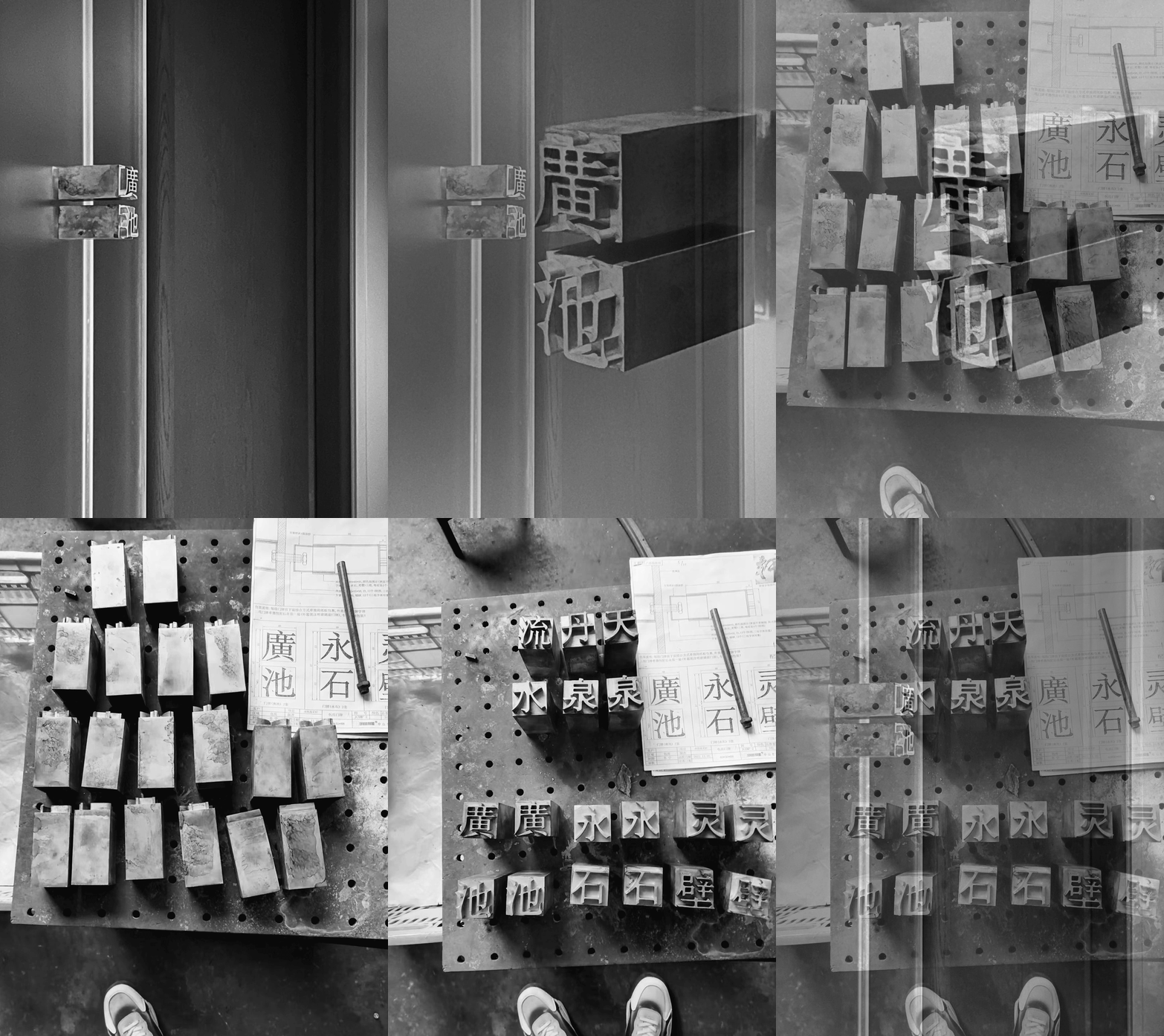
借《长物志》水石篇中十一名,天泉,流水、灵璧、丹泉,广池,永石……等,摹铅字板块做标识。天泉间重私密,容客10-12人,过水景岛台后入门,偏安一隅。
Taking inspiration from the “Water and Stone” section of the book “Chang Wu Zhi,” eleven names are borrowed: Tian Quan, Liu Shui, Ling Bi, Dan Quan, Guang Chi, Yong Shi, and others. Lead lettering plaques are used as signage within the restaurant.The private room Tian Quan emphasizes privacy and can accommodate 10-12 guests. It is accessed through the water landscape island platform, tucked away in a secluded corner.
流水、灵璧、丹泉间通透,各容客10-12人,各间外有露台园景贯穿,植被廊桥交错,园间茶座供各间食客餐前侯座餐后小憩。
The private rooms named “Liu Shui,” “Ling Bi,” and “Dan Quan” emphasize transparency. Each room can accommodate 10-12 guests, and each room has a terrace that integrates with the garden landscape.The vegetation and bridges intertwine, creating a harmonious atmosphere. Tea seats within the garden provide a place for diners to wait before the meal and relax after dining.
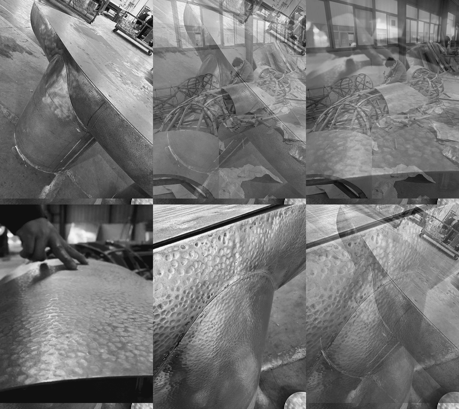
广池间配置最为完整,容客16-18人,内有一组铜质曲型长台用于餐前茶酒交谈,外有观景长廊供席间小叙。名作一副草行‘空’。
The private room, “Guangchi,” offers comprehensive facilities and can comfortably accommodate 16-18 guests for dining. Inside, a set of curved copper long tables provides a space for guests to enjoy pre-meal tea and engage in conversations. Outside the private room, a scenic corridor allows guests to have casual conversations during their dining experience. Adorning the wall is a renowned calligraphy masterpiece—a cursive script of the character “KONG,” symbolizing “emptiness.”
近水知鱼,近山识鸟,近厨辨食。
中国对饮食的重视与考究近乎于道,举世罕有可匹。不论是街头排档或者厅堂华室都各有各的风骨路数。而餐饮环境设计在五识(视、嗅、味、触、听)中已占其三,其起乎于礼,可探究处深不见底。我们通过一次‘大味至淡,放盐有度’的设计尝试来探讨当代高级中餐环境中的一种更抽象内敛的可能性,及呈现完整独特的用餐体验。
项目过程恰逢疫情,诸事曲折,幸得品牌方坚持不懈,谨以此文致谢!
Frequent exposure to something allows us to unconsciously grasp its habits and patterns.
China’s profound emphasis on food and dining is unmatched worldwide, from vibrant street food stalls to elegant dining halls, each with its own unique style and characteristics. Designing the dining environment is of utmost importance as it engages three of the five human senses (sight, smell, and taste). Adopting a “simplification of the essence” design approach, we aim to explore a more abstract and understated possibility within contemporary upscale Chinese dining environments, offering a complete and distinct dining experience.
The construction process of this project coincided with the challenges of the pandemic. We are fortunate and grateful for the unwavering dedication of Exquisite BOCUSE.
项目名称|放盐 · 晶采轩深圳黑金店
项目地址|中国 深圳
项目面积|1200平方米
项目业主|晶采轩
主创设计|余霖 / DOMANI东仓建设
项目统筹 | 郑敏茵 / DOMANI东仓建设
室内深化|张锦荣、李炎、王舒洁等 / DOMANI东仓建设
艺术陈设|A&V 桉和韦森
项目工程|江苏南通三建建筑装饰设计有限公司
主材供应|双瑜建筑艺术工程、原石原筑、埃德尔斯照明
传媒管理|黎颖欣 / DOMANI东仓建设
项目摄影|吴鉴泉
Project Name | Salted · Exquisite BOCUSE
Project Location | Shenzhen, China
Area | 1200㎡
Client | Exquisite BOCUSE
Interior Designer | Ann Yu@DOMANI Architcetural Concepts
Project Manager | Eva Zheng@DOMANI Architcetural Concepts
Assistant Designer | Jin Zhang, Lynn Li, Sue Wang@DOMANI Architcetural Concepts
Furniture Fixture & Equipment | A&V Exhibition Concepts
Architecture Construction | Jiangsu Nantong Construction Building Decoration Co.,Ltd.
Material Supplier | Sheungyu Civil Engineering and Architecture, A2STONE, Artelds archirtectural lighting
Public Relation | Emily Li / DOMANI Architcetural Concepts
Photographer | Vincent Wu
“ 设计通过一次‘大味至淡,放盐有度’的设计尝试来探讨当代高级中餐环境中的一种更抽象内敛的可能性。”
审稿编辑:Maggie
更多 Read more about: 东仓建设




















0 Comments