本文由MPG摩高设计授权mooool发表,欢迎转发,禁止以mooool编辑版本转载。
Thanks MPG Group for authorizing the publication of the project on mooool, Text description provided by MPG Group.
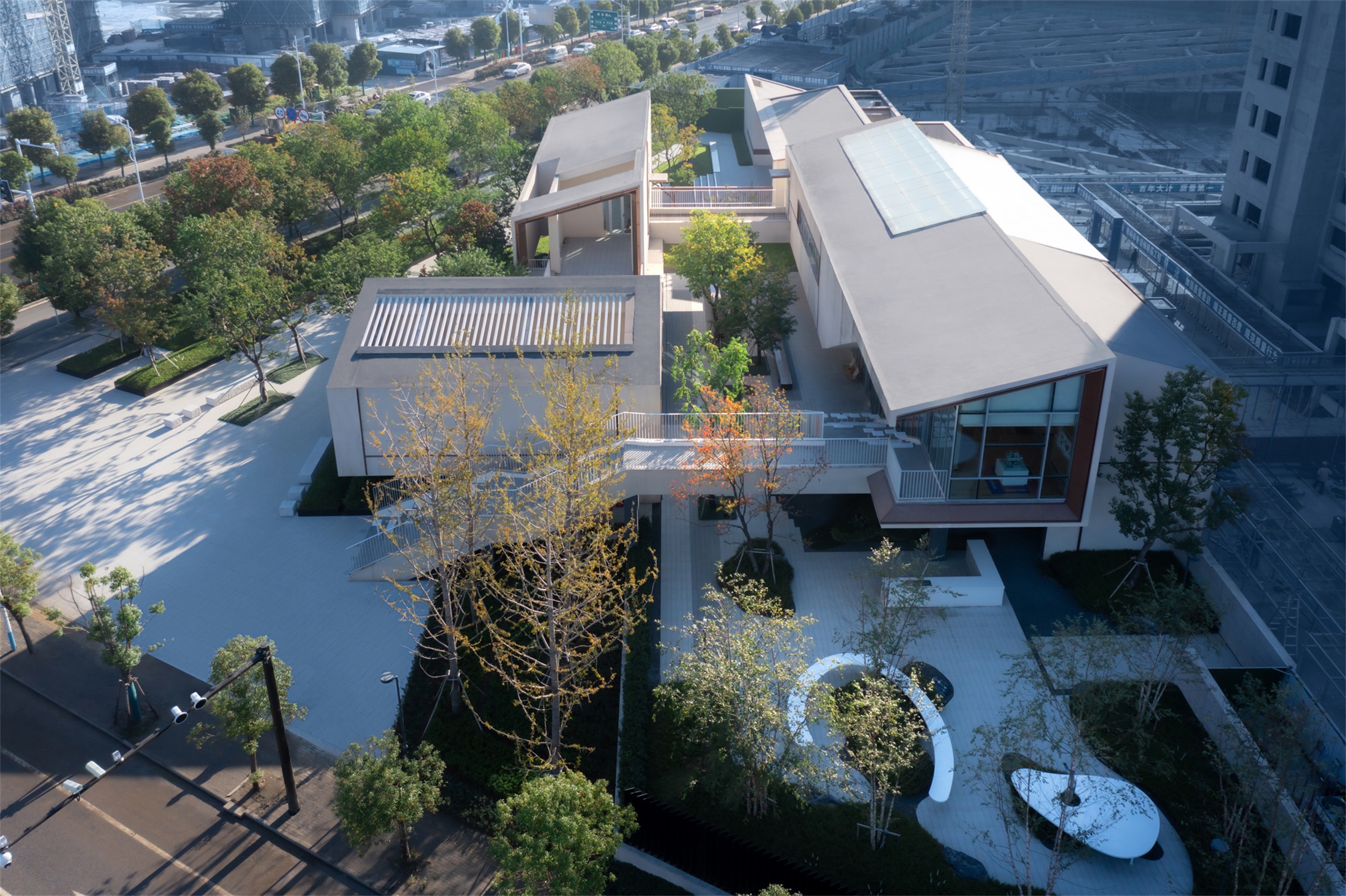
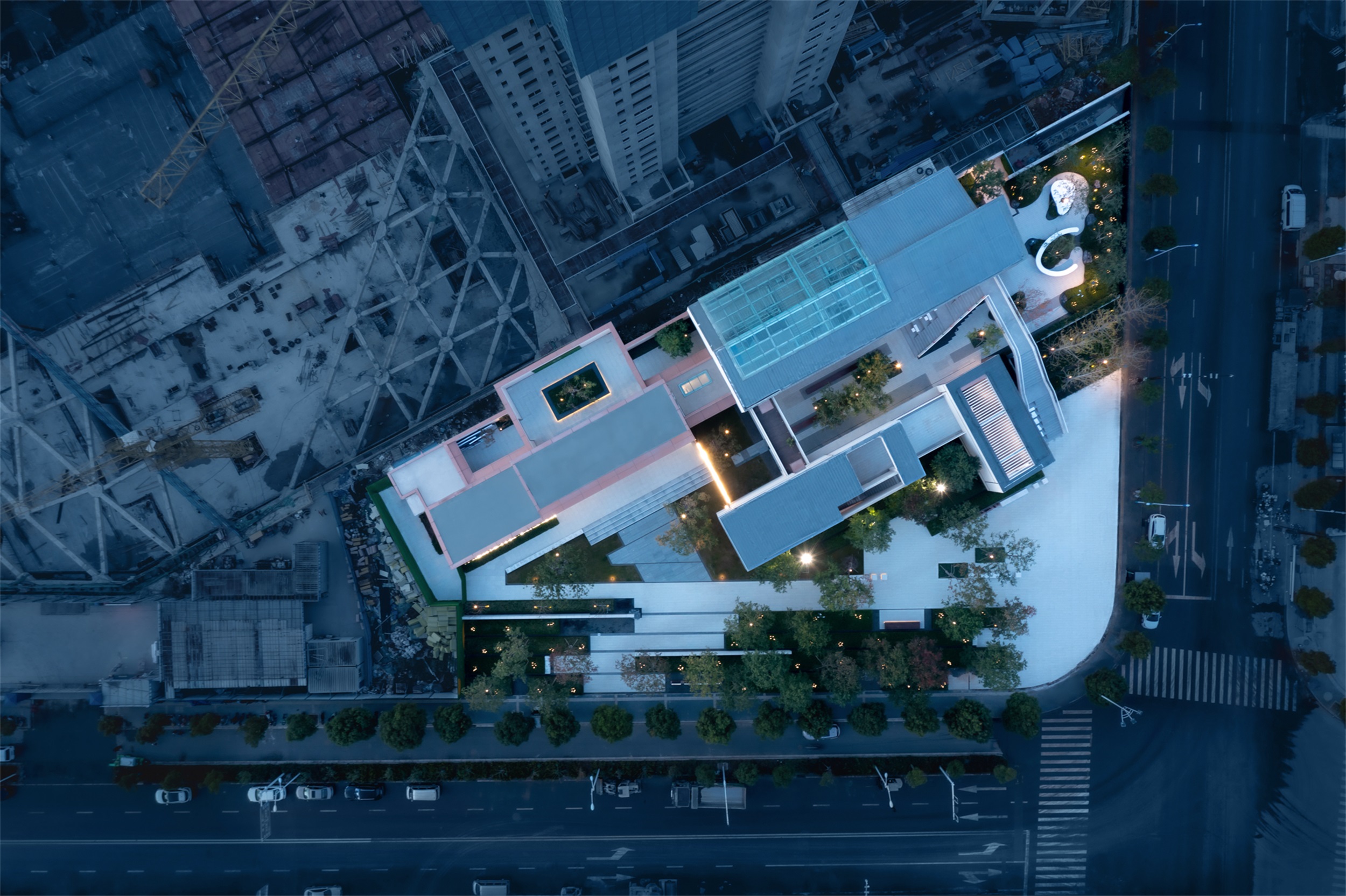
MPG摩高设计:这是一个永久性的展示区,基地处于两条市政道路交叉界面上,整个场地不仅服务于内部社区,也为周边居民提供了一个拥有精致设计语言的、环境优良的、可供漫步、停留的林下公共空间。我们最初的想法是根据建筑未来的业态和建筑与景观的穿插关系,打造实用性高的休闲停留空间,吸引年轻群体前来打卡。
MPG Group: This is a permanent exhibition area with a base at the intersection interface of two municipal roads. The entire site not only serves the internal community, but also provides the surrounding residents with a wooded public space with a sophisticated design language and an excellent environment for strolling and lingering. Our initial idea was to create a highly functional leisure stay space based on the future business of the building and the interspersed relationship between the building and the landscape to attract the young group to come and visit.
设计理念 Design concept
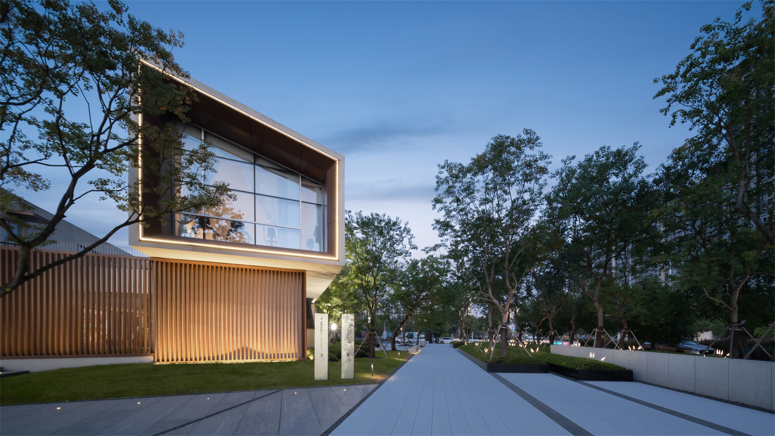
建筑设计理念:花园中的会客厅,阅读、游戏、交流的场所,建筑空间与环境空间的交织。当我们看到建筑体块与景观空间关系的时候,决定将这种交织延续下去,于是,我们想到了巴塞罗那德国馆的设计主旨“流动空间-自由灵活的空间组合”。
Architectural design concept: a meeting room in the garden, a place for reading, playing and communication, the interweaving of architectural space and environmental space. When we saw the relationship between the building block and the landscape space, we decided to continue this interweaving, so we came up with the design theme of the German Pavilion in Barcelona, “Flowing space – free and flexible space combination”.
▽设计分析 Design Analysis
场景呈现 Scene presentation
流动的空间使得景观成为生活空间的一部分,景观穿梭于建筑之间,通过功能构筑空间,形成的会客厅,花园是公共开放的,建筑是业主私享的。室内外的路径都有他们自己的观点与视角,看见不同的场景。
The flowing space makes the landscape a part of the living space, the landscape shuttles between the buildings, and the parlor formed through the functionally constructed space, the garden is public and open, and the building is private for the owners. The indoor and outdoor paths have their own views and perspectives, seeing different scenes.
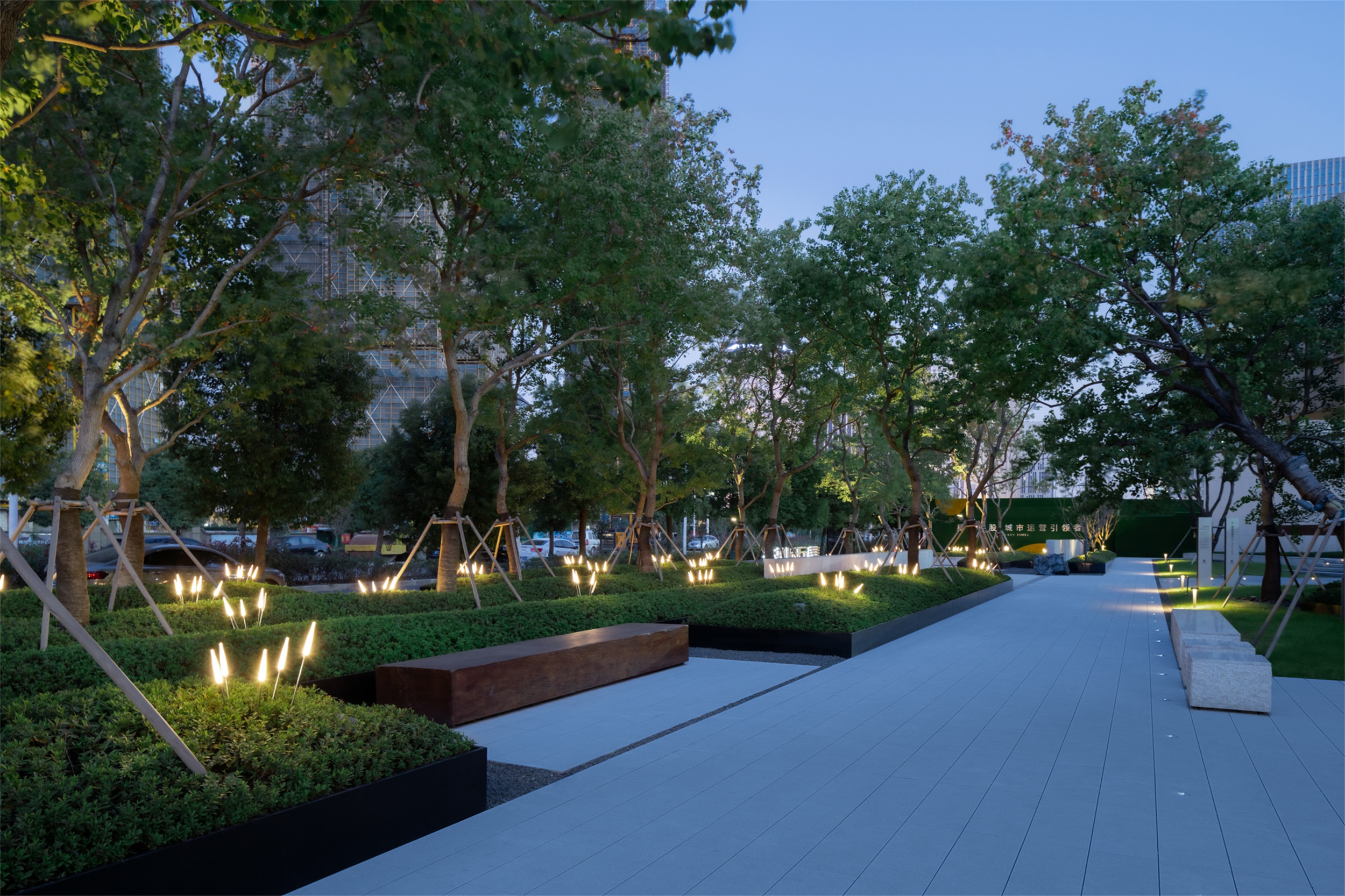
▽密林荫蔽的林下空间 Dense forest shaded space
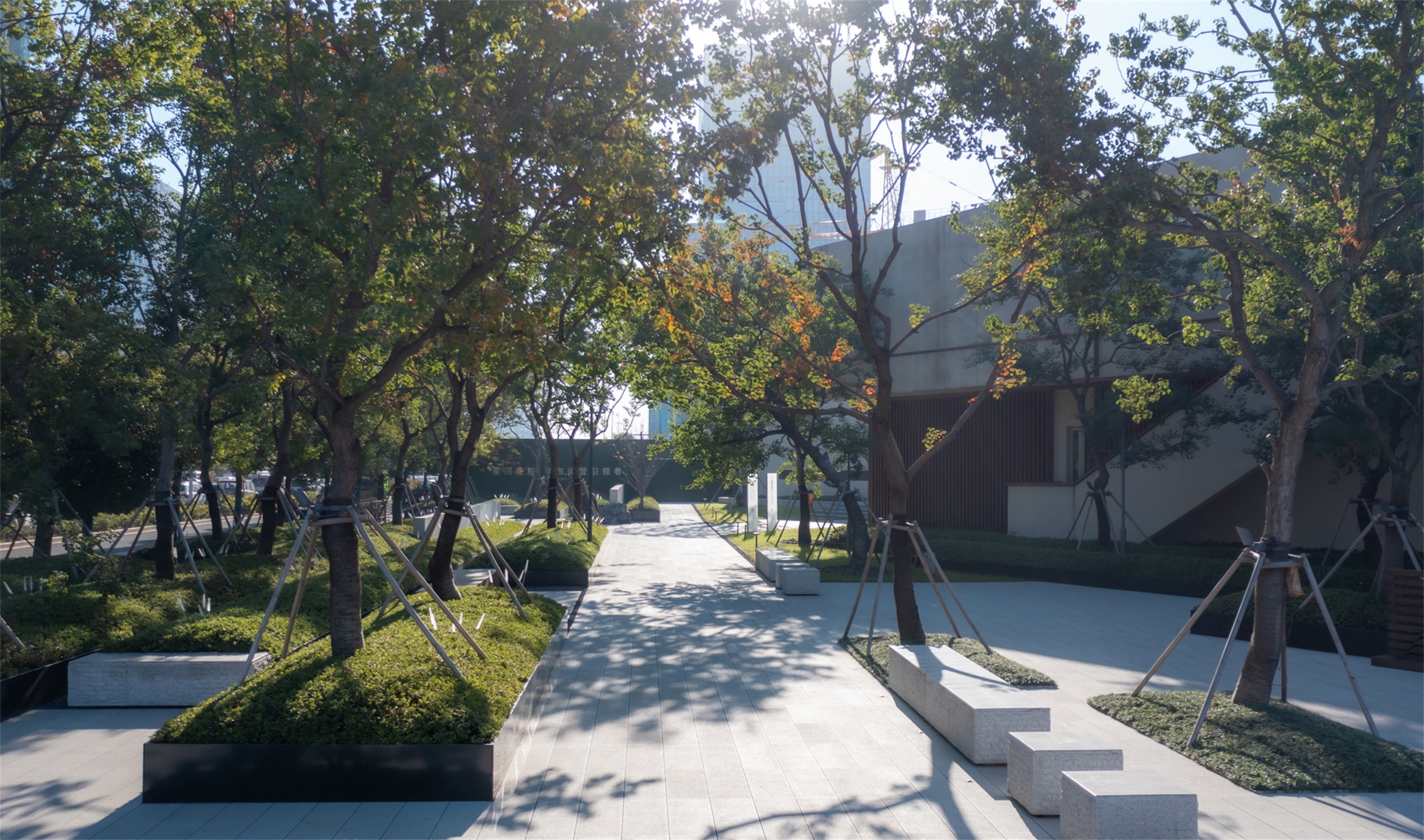
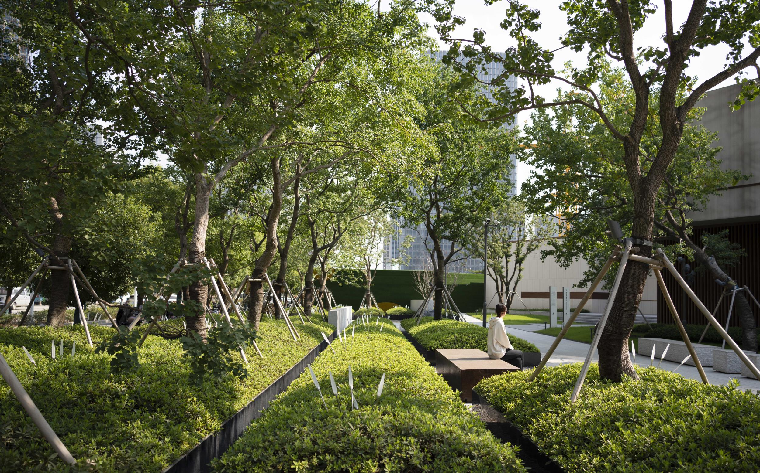
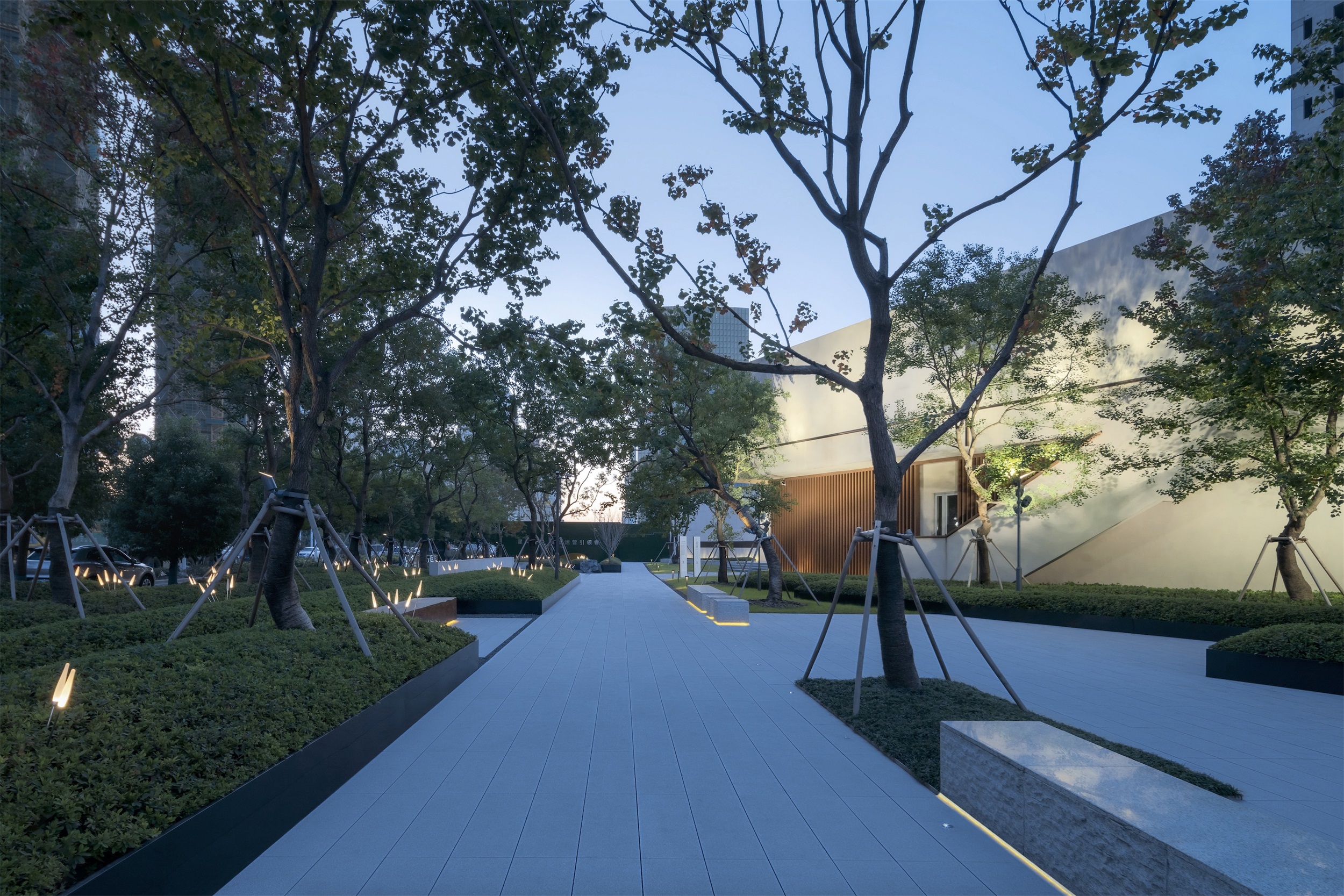
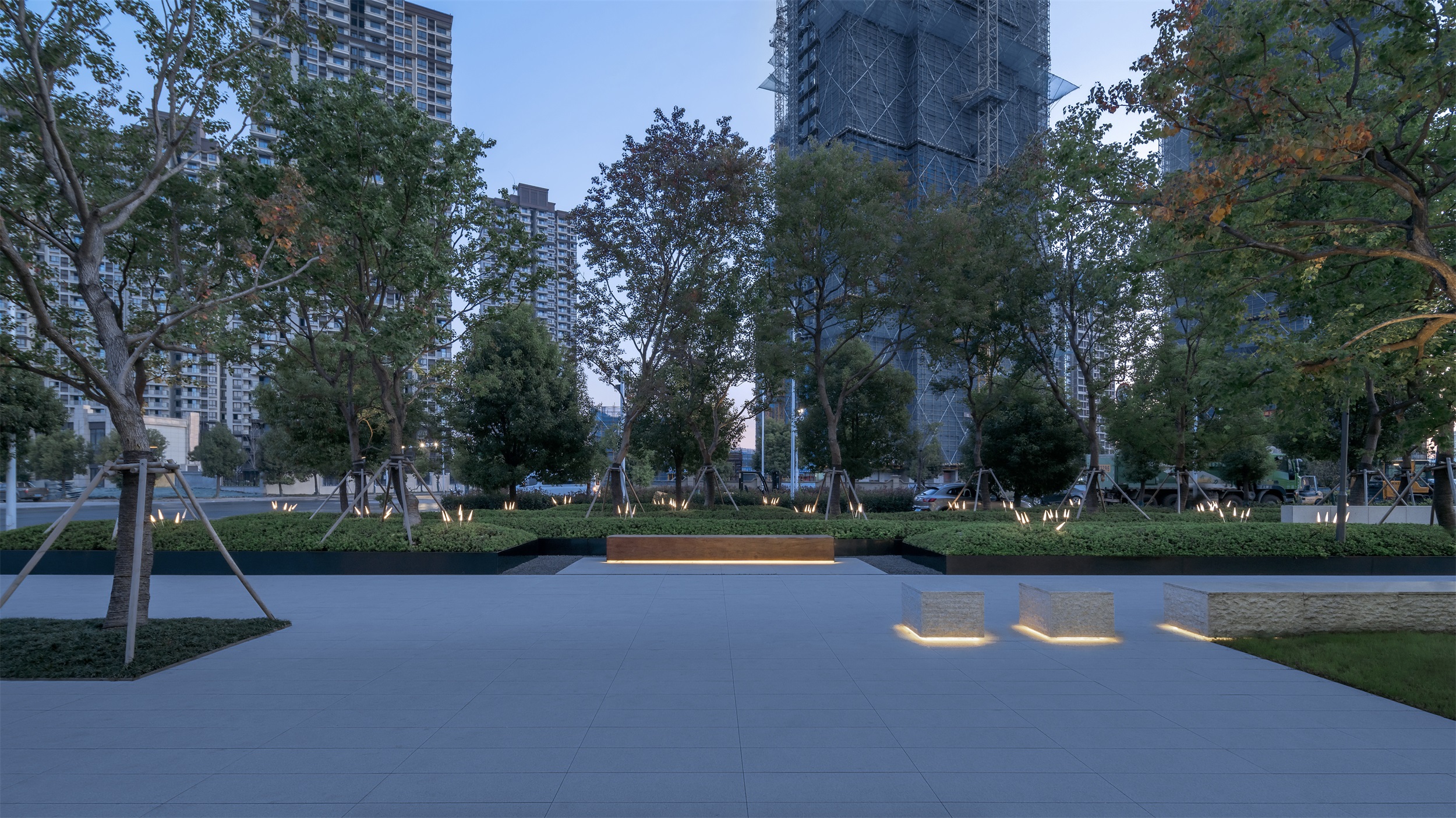
铁艺的种植池,加上带弧度的种植手法及人工的修剪,即使整个界面的灌木量较大,依旧给人精致的感觉。干净的植物层次让植物的生机做了最直白的表达,整个空间充满了亲和力,让人不自觉地想要驻足、停留。
The iron planting pool, together with the planting technique with curvature and manual pruning, still gives people a delicate feeling even though the whole interface has a large amount of shrubs. The clean planting level makes the most straightforward expression of the plant’s vitality, and the whole space is full of affinity, making people unconsciously want to stop and stay.
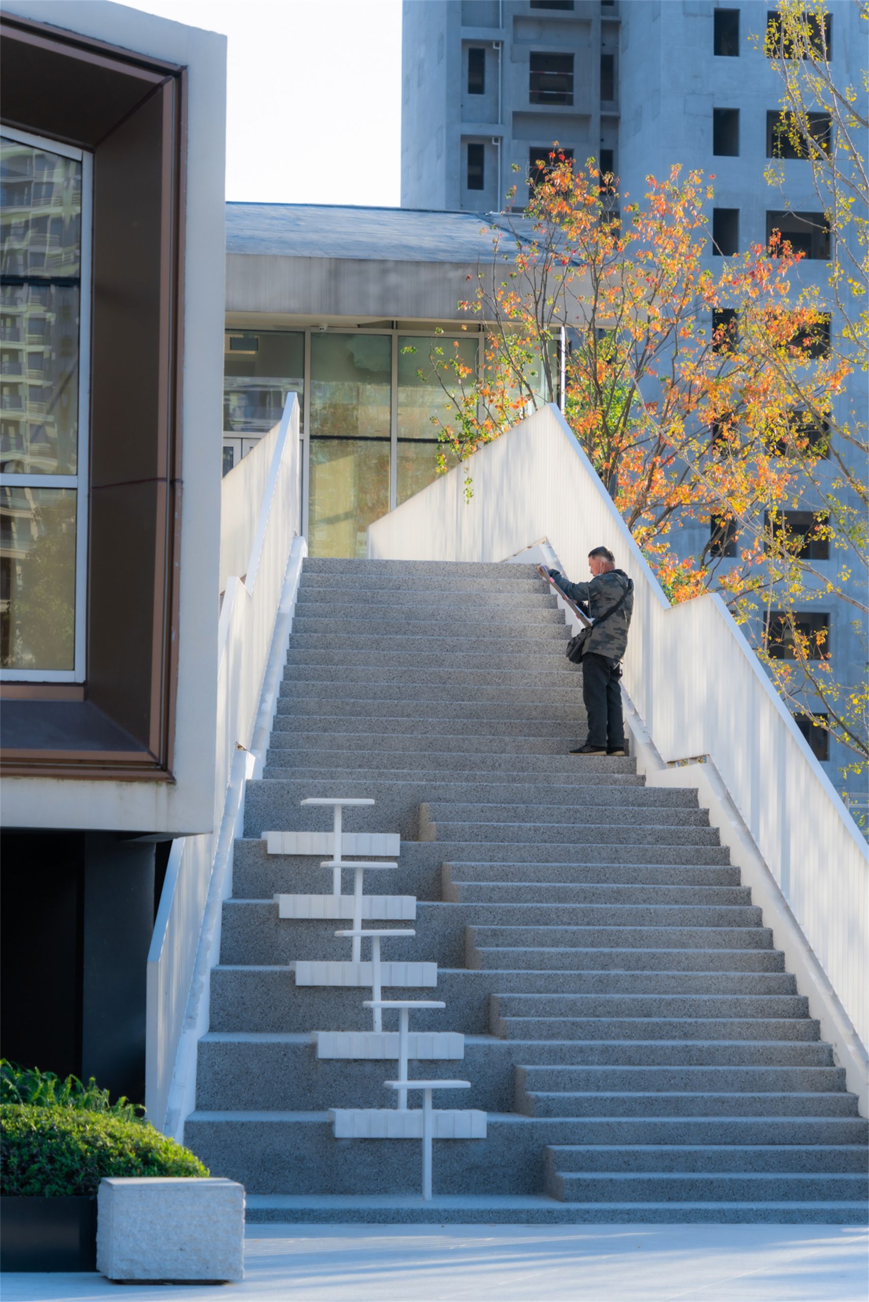
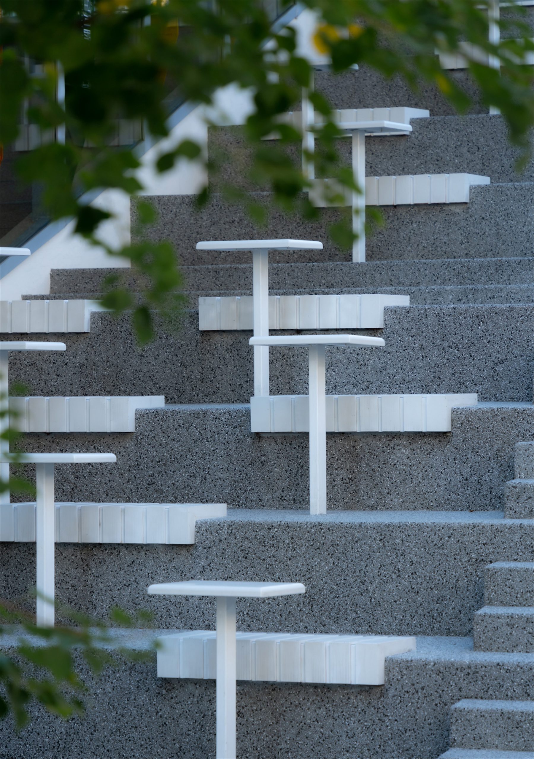
沿街面精选的乌桕,宛如一层绿色的屏障,将展示区隔离到一个从声音喧嚣、交通纷繁中抽离出来的场所——一个内向的可供漫步、停留的场所,而建筑盒子则掩映在树梢里。建筑在未来将用作商用,外来人员可经休闲阶梯上天桥直接到达内庭。
Selected Sapium sebiferum along the street surface acts as a green barrier, isolating the exhibition area into a place removed from the noise and traffic – an inward-looking place to stroll and linger, while the building boxes are hidden in the treetops. The building will be used commercially in the future, and outsiders will be able to access the inner courtyard via a leisurely staircase to a sky bridge.
▽光影交错的街角广场 The square with intertwined light and shadow
▽休闲阶梯 Leisure Ladder
林影·夕照-昭示引导,人流汇聚 Lin Ying·Xizhao-Show Guidance, Gather People
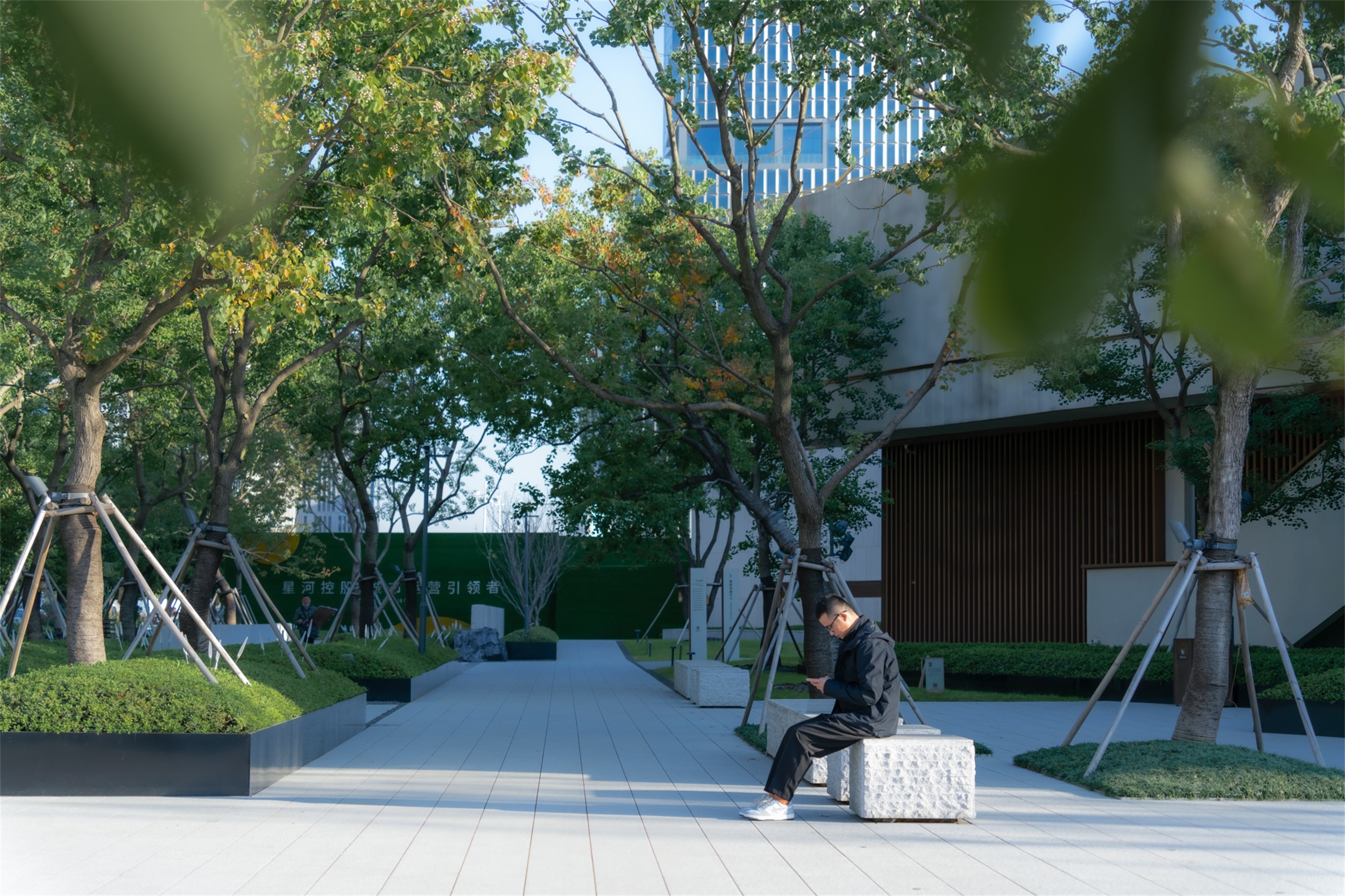
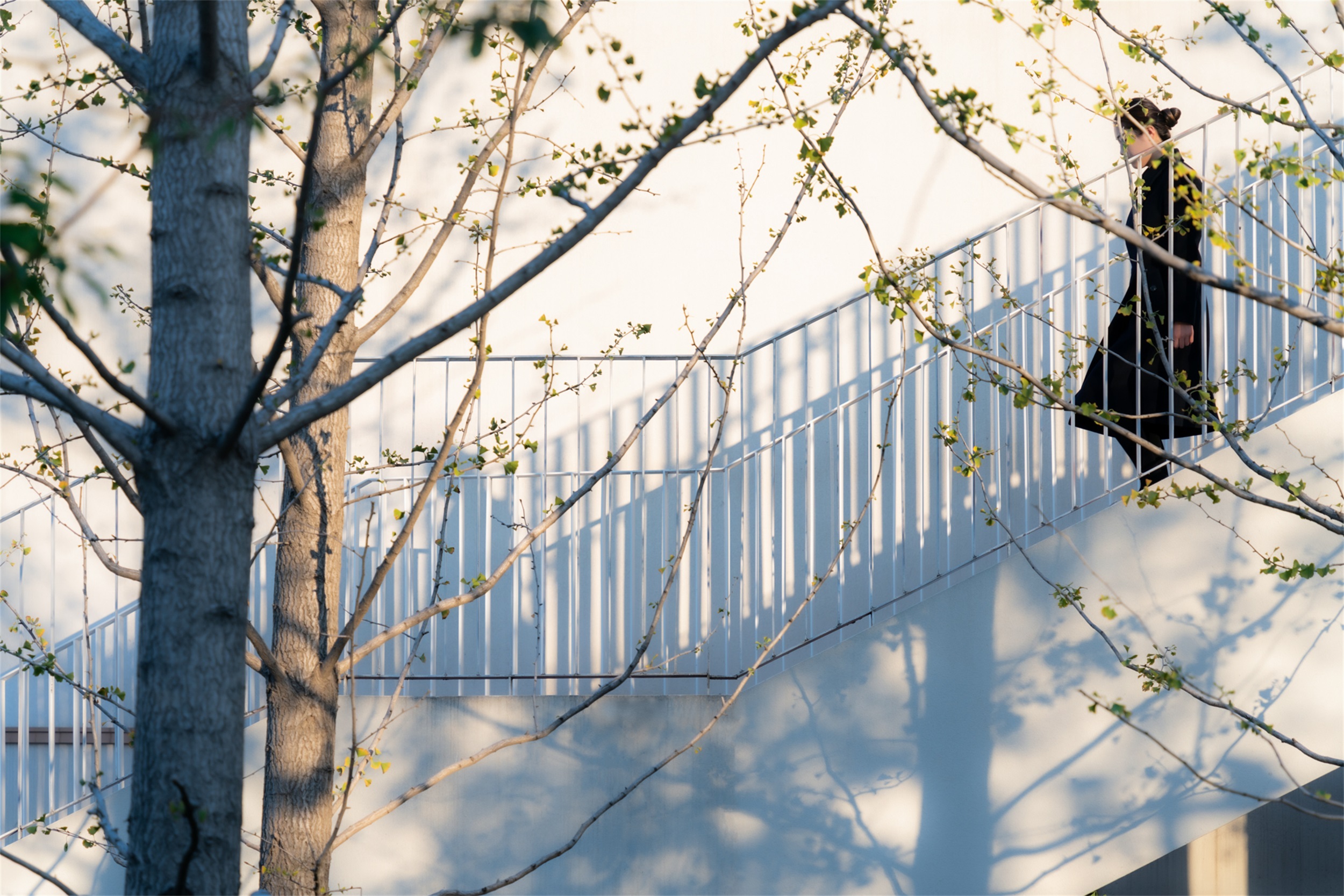
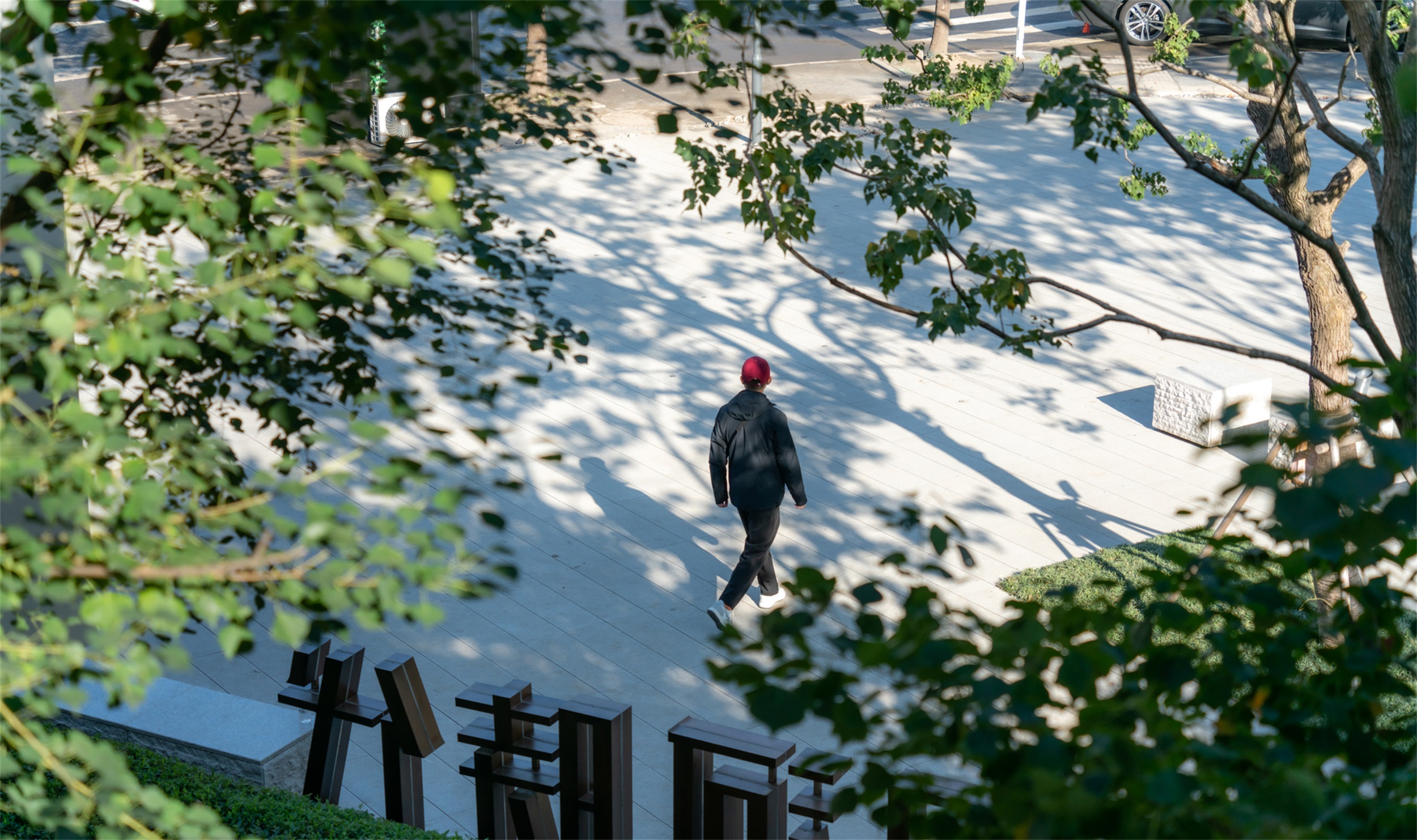
作为社区未来的人行入口,沿街的LOGO与景墙是很好的引导者,人流在此汇聚,秋日暖阳,风影摇曳,硬景的肌理与植物的柔美相互碰撞,以包容的姿态凝聚人流,给人从容静谧的归家体验。
As the future pedestrian entrance of the community, the LOGO and scenic wall along the street are good guides, where the flow of people converge, the warm autumn sun, the swaying wind and shadow, the texture of the hardscape and the soft beauty of the plants collide with each other, gathering the flow of people in an inclusive manner and giving people a calm and quiet homecoming experience.
▽未来社区入口 Community entrance
建筑墙面与地面铺装形成的大面留白上,光影在跳跃,让整个空间不再沉寂,富有情感。
Light and shadow are jumping on the large white surface formed by the building wall and floor pavement, which makes the whole space less silent and more emotional.
乐活·剧场-视觉无界,凝聚亲密 LOHAS Theater – Visual Boundless, Cohesion Intimacy
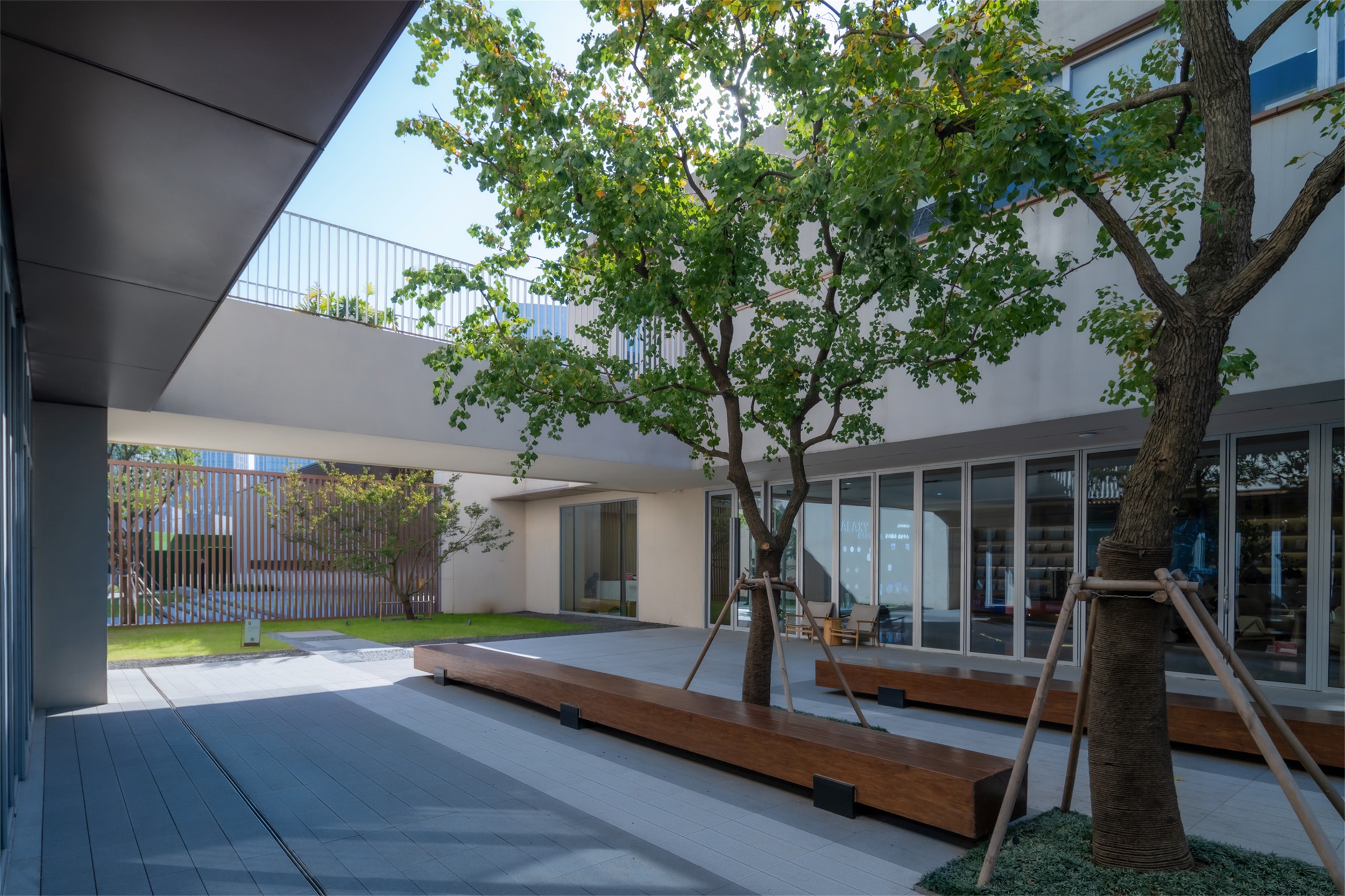
中庭四面围合空间有限,且多处可见,我们根据每个中庭的大小及性质营造开阔或是收拢的空间氛围。不需要太多复杂的元素,只要一棵树,即可得到一个除了光影的魅力,什么都不打扰的安静空间。
The atrium is surrounded by limited space on all sides and is visible from many places. We create an open or closed space atmosphere according to the size and nature of each atrium. Without too many complicated elements, just a tree, you can get a quiet space without disturbing anything except the charm of light and shadow.
▽充满生活气息的酒吧街 A bar street full of life
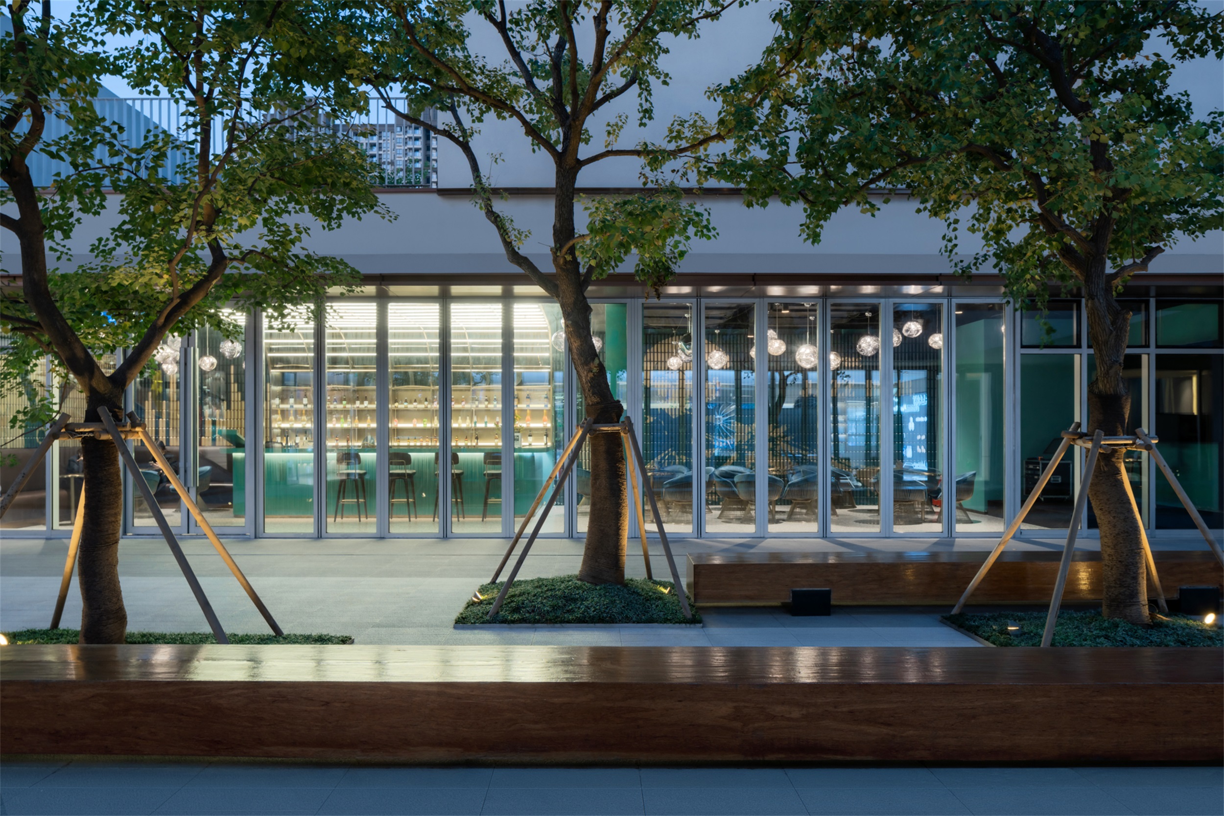
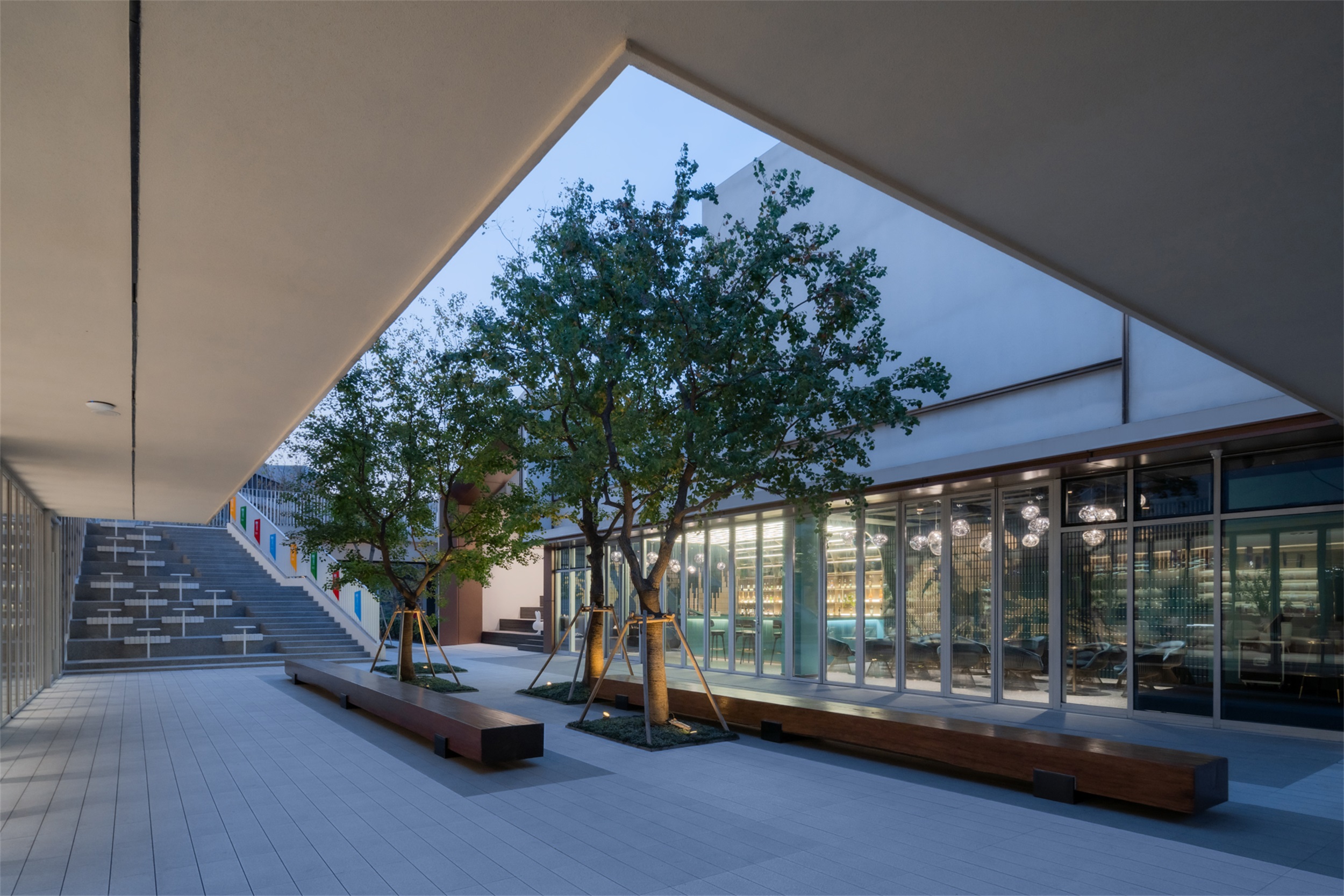
玻璃材质的建筑墙面模糊了建筑室内外的界限和公共空间的边界,让室内外不再有明显的隔离感,引入户外景观,可开展的活动内容也变得多样不再单一。旁边的休闲阶梯作为停留点的同时,也是通往外界的一条捷径。
The glass wall blurs the boundary between the interior and exterior of the building and the public space, so that there is no longer a clear sense of separation between the interior and exterior, and the outdoor landscape is introduced, so that the content of the activities that can be carried out becomes diverse and less homogeneous. The leisure staircase next to the building serves as a stopping point and a shortcut to the outside world.
绿林·寻踪-轻松舒适,纯粹自然 Green Forest · Pursuit – Relaxed and comfortable, pure and natural
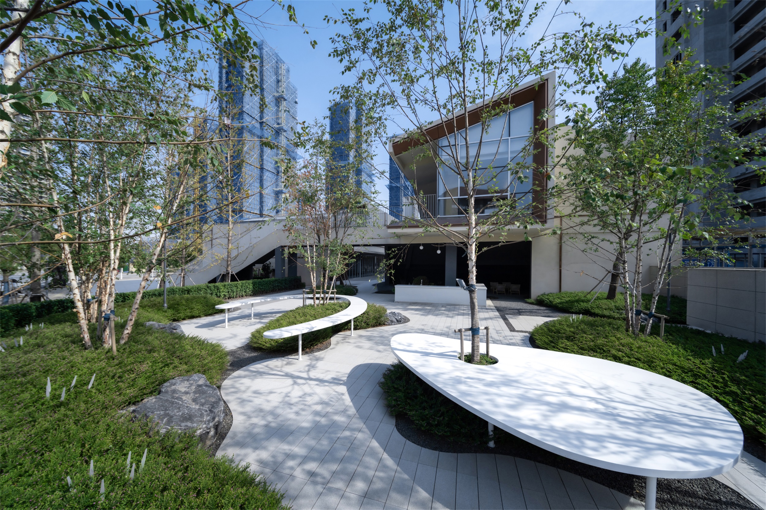
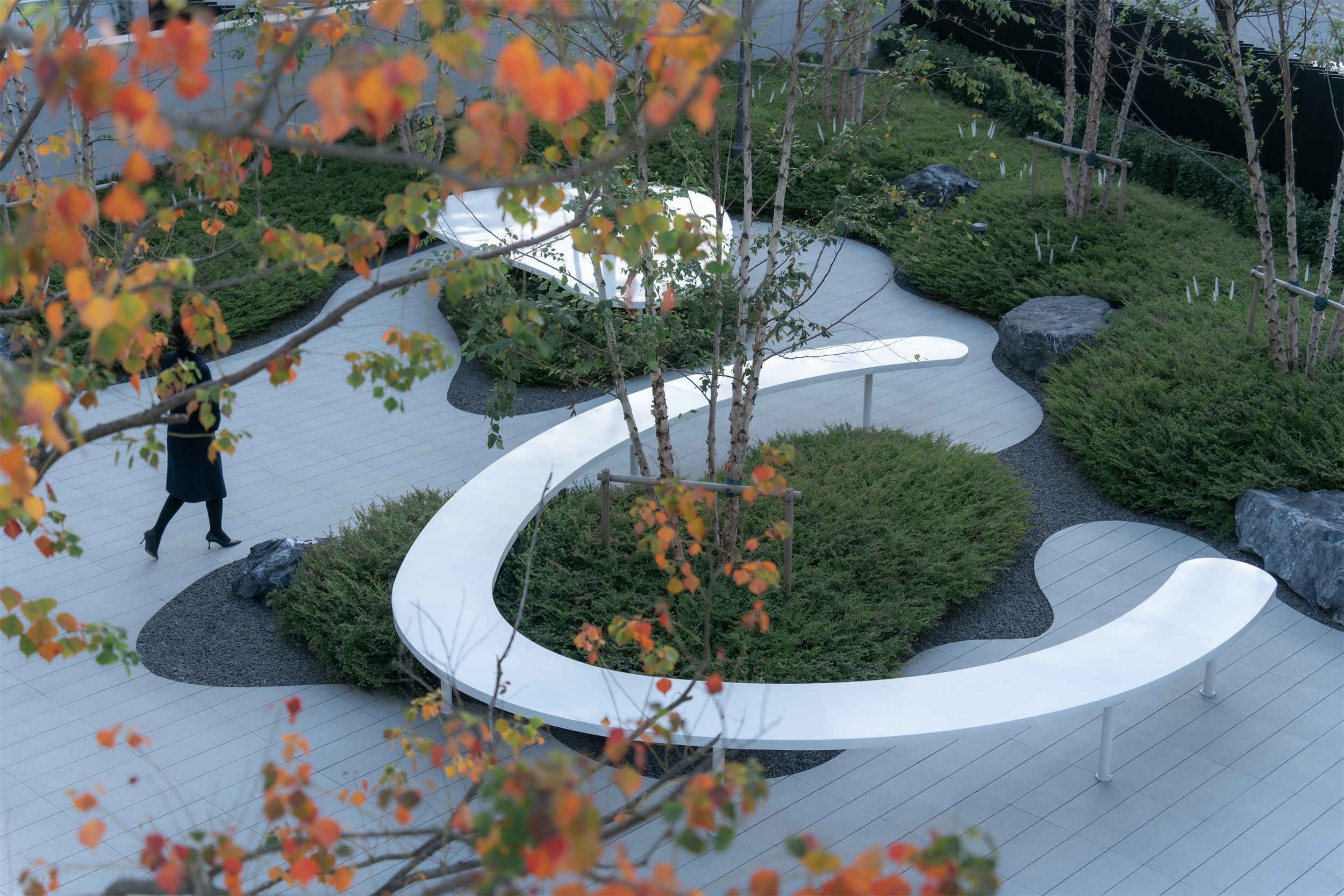
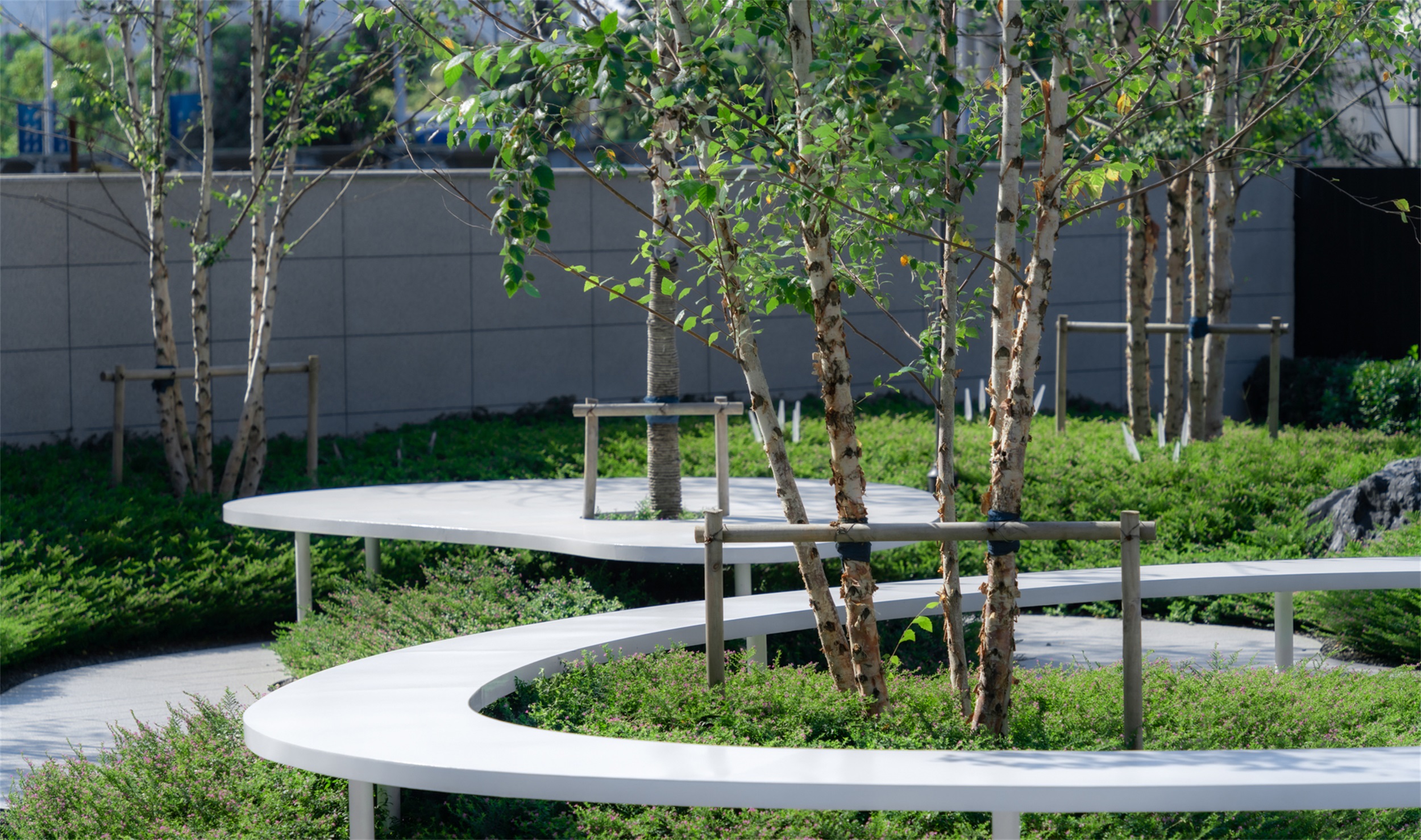
在后场的花园空间里,以极简的手法打造了一片树林,以开阔和舒朗贯穿格局,让景与物契合,借用自然的美学,激活花园的观赏功能与实用功能,人们可以在此处流畅的互动,在拓宽社交场域的同时沉浸地体验景观。
In the garden space at the back, a forest is created with a minimalist approach, with openness and relief running through the pattern, allowing the scene to fit with the object, borrowing the aesthetics of nature and activating the ornamental and practical functions of the garden, where people can interact fluidly and experience the landscape immersively while widening the social field.
▽自然葱郁的烧烤花园 The Nature Style BBQ Garden
后记 Postscript
流动空间的主旨是不把空间作为一种消极静止地存在,而是把它看做一种生动的力量。在空间设计中,避免孤立静止地体量组合,而追求连续的运动空间。我们用通透的空间,引导性的线型,流畅的行动路径,增强空间的流动感。
The main idea of flowing space is not to treat space as a negative static existence, but to see it as a lively force. In the design of space, we avoid isolated static volume combinations, but pursue continuous movement space. We enhance the sense of flow of space with permeable space, guiding line shape and smooth action path
▽场地动图 Venue animation
项目名称:南京·星河时代示范区
景观设计:MPG摩高设计
设计团队:徐梦红、马震、王冠、蓝丽娇、李聪、岳志豪、刘博、李婷、陈雨、张淑娟
开 发 商 :星河地产华东区域
甲方团队:梁一、丁云麟、王建、高俊、刘佳琦、王文丰、管光东、谢伟南、刘平、孙健、唐永强、郭翼
摄影团队:三棱镜
项目地点:江苏南京
设计面积:4827㎡
设计时间:2020年11月
建成时间:2021年05月
Project Name: Demonstration Zone of Nanjing Galaxy Times
Landscape Design: MPG Group
Design Team: Xu Menghong, Ma Zhen, Wang Guan, Lan Lijiao, Li Cong, Yue Zhihao, Liu Bo, Li Ting, Chen Yu, Zhang Shujuan
Developer: Galaxy Real Estate East China Region
Party A’s team: Liang Yi, Ding Yunlin, Wang Jian, Gao Jun, Liu Jiaqi, Wang Wenfeng, Guan Guangdong, Xie Weinan, Liu Ping, Sun Jian, Tang Yongqiang, Guo Yi
Photography Team: Prism
Project Location: Nanjing, Jiangsu
Design area: 4827㎡
Design time: November 2020
Completion time: May 2021
“ 设计以极简的手法和精致的设计语言将场地与建筑进行穿插交织,形成流动的空间场景延续场地景观。”
审稿编辑 王琪 – Maggie
更多 Read more about: MPG摩高设计













0 Comments