本文由 NOT BAD 授权mooool发表,欢迎转发,禁止以mooool编辑版本转载。
Thanks NOT BAD for authorizing the publication of the project on mooool, Text description provided by NOT BAD.
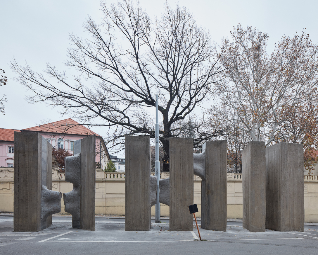
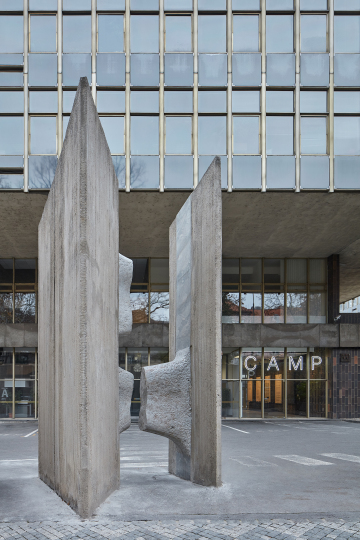
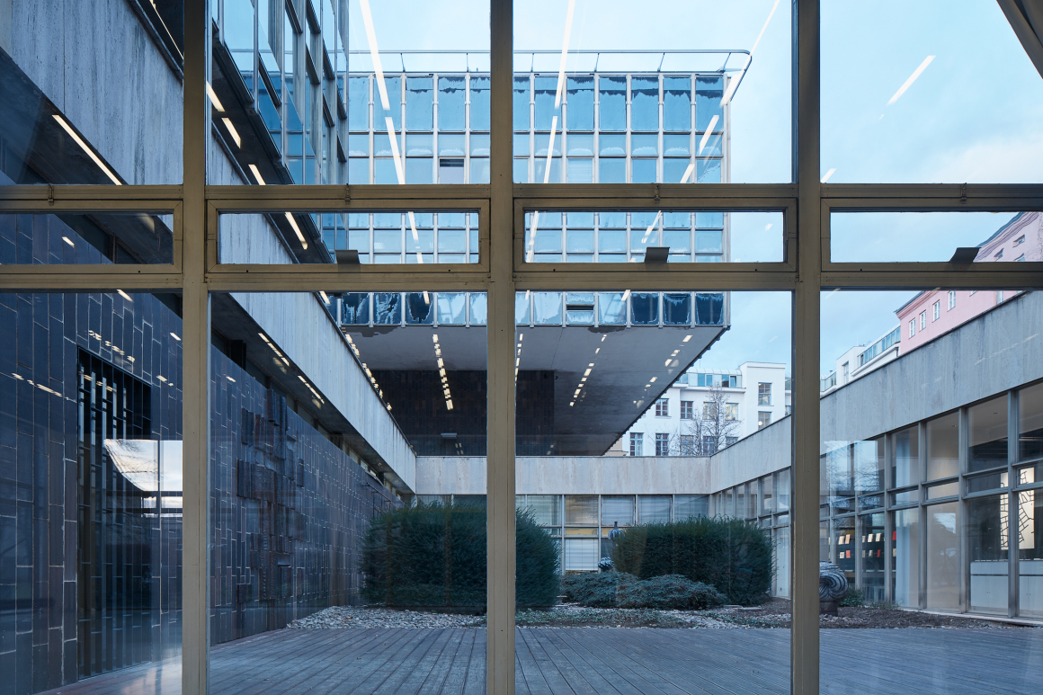
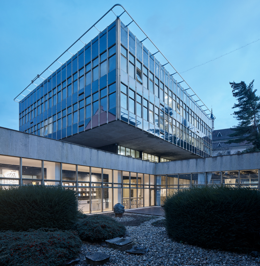
NOT BAD:该项目前身是上世纪70年代著名建筑师Karel Prager设计的布拉格设计院,历史上这里曾属于中世纪修道院建筑群的轰炸区。该建筑由“三个深色几何体”组成,其中上两个做出了挑高层,并且外观上采用了较底座颜色更浅的反光材质。90年代初在院内大型展览馆(“ Baucenter”)办过几次展览后,就一直闲置,CAMP的建立也旨在让它重获生机。
NOT BAD:The Center for Architecture and Metropolitan Planning resides in a building designed in the 60s and built in the 70s by the significant architect Karel Prager, located in the bombarded section of a medieval monastery complex. A set of three dark prisms with a light surface shell, elevated above the ground on top of two storey pedestals, served as a facility space for the Design Institute of the City of Prague. The Large exposition hall (the “Baucenter”) was already included in Prager’s concept, however apart from a few expositions in the early 90s, the space never served its original purpose until the opening of CAMP.
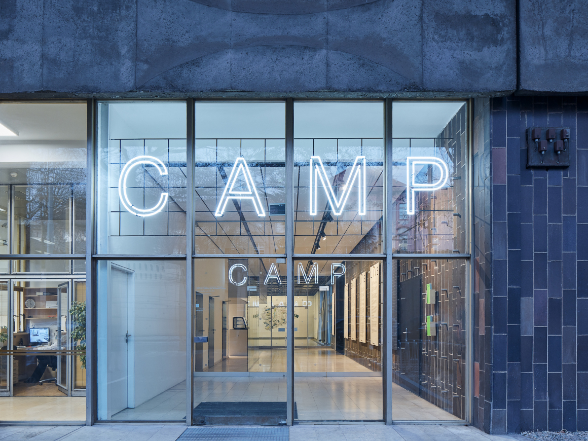
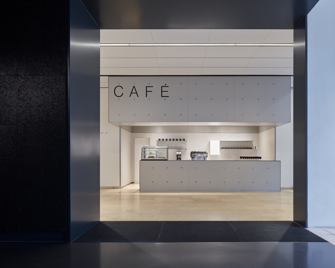
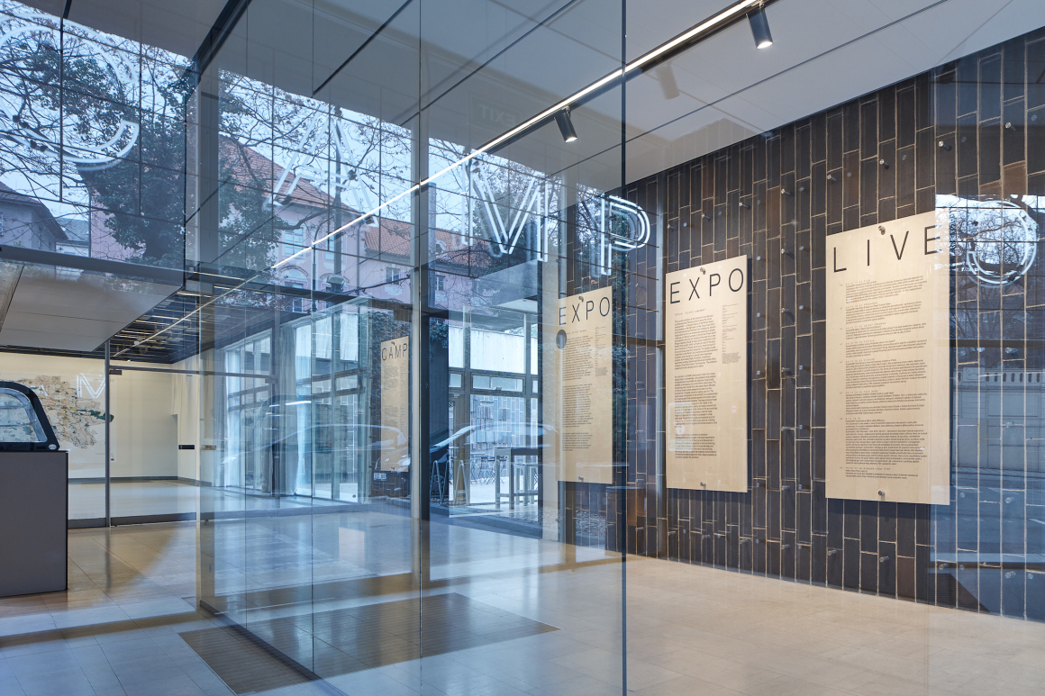
走近CAMP,映入眼帘的是入口大厅和咖啡厅,厅内视野通透且空间大,便于空间定向和分散人流。当面对大型活动时,还可对其加以利用,来弥补其他空间的不足。
The entrance hall and café are a node point for both halls and offer enough dispersion space, easing orientation and allowing a view into both halls. In case of a large event, this allows a “pouring” of a program from one space into another in order to allow their spatial qualities to synergically complement each other.
▼入口大厅和咖啡厅 the entrance hall & café
尽管该项目不是对建筑群的总体重建,但在CAMP的设计过程中,Karel Prager仍然非常重视原始建筑的保护。面对要重新设计两个大厅空间的情况,设计师们努力挖掘空间的可能性,最终确定设计两个作为CAMP核心使用的多功能厅。为了设计的落实首先需拆除现场的设施和隔断,并重新设计展览和服务空间。随着施工的进行,原有的瓷砖墙和石灰地板慢慢的被拆除,新的设计元素和肌理内容也一一增加。
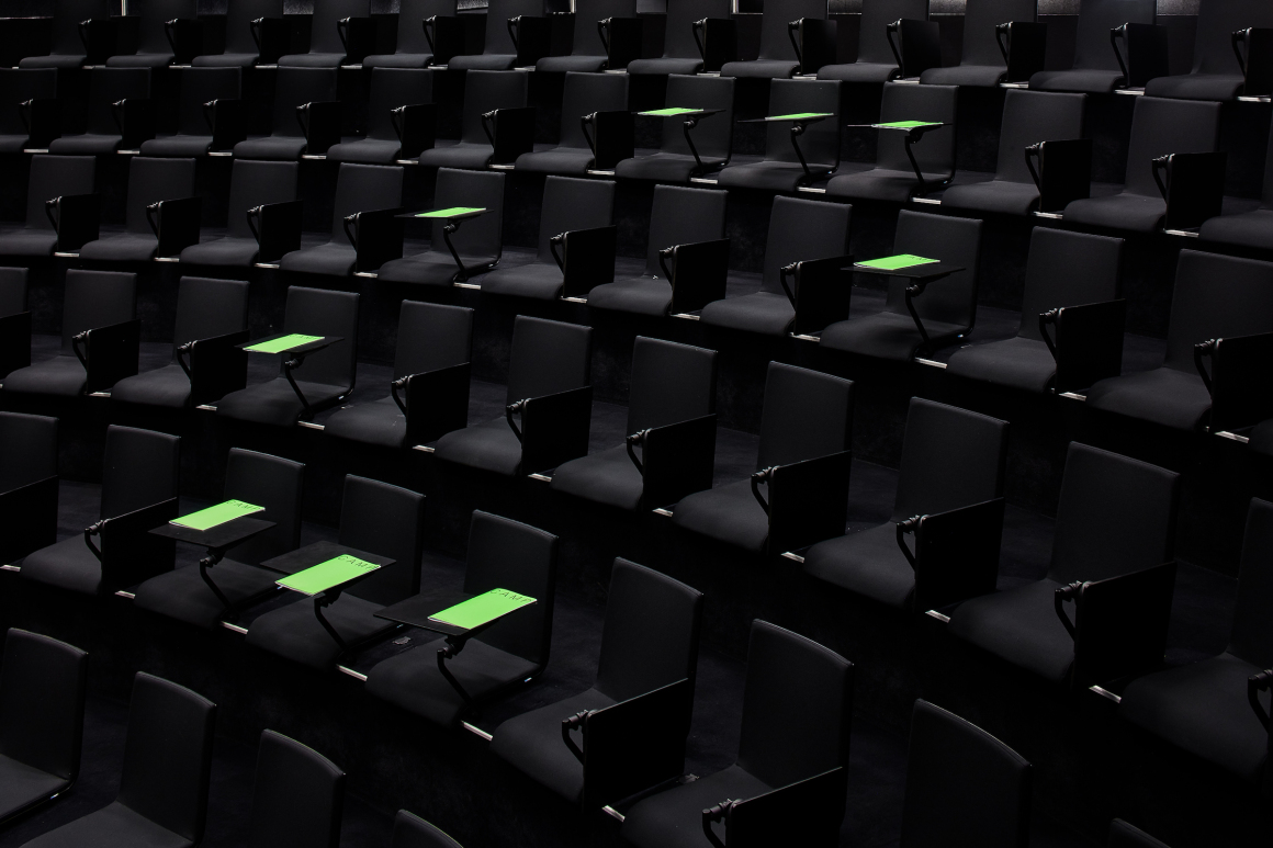
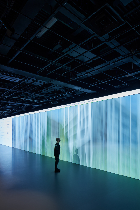
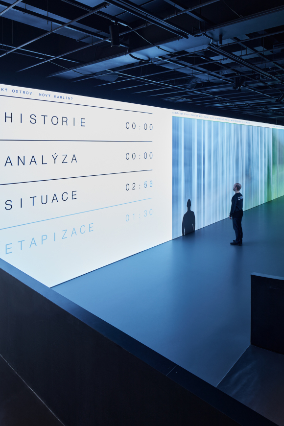
较大的“黑色”大厅可容纳250人,四周避光,且拥有分辨率高达8K,24×4米的全景投影。投影除了有供展览和讲座的视听功能外,还可有其他处理图像方面的功能,例如1:1比例的城市空间模拟。
Even though the project was not a general reconstruction of the building complex, during the process of designing CAMP, great importance was appointed to the conservation of the original architecture by Karel Prager. Notably, in the case of the two halls, a great deal of effort was given to make use of their generous spaces and to maximize the palette of usage they offered. Thus, two multi-functional halls that are the core of CAMP were created. First came the disposal of unintended installations and partitions and the designing of a new system of division into exposition and service spaces. The original high-quality materials of ceramic wall tiles and limestone floors emerging from the interior into the exterior were excavated from under layers of later-on additional installments. On the contrary, all the newly designed elements and layers were placed as clearly identifiable and contrasting.
The larger “black” hall with the capacity of up to 250 visitors, completely blocked of daylight, is dominated by a panorama projection surface of 24×4 meters with an 8K resolution. This projection surface offers new possibilities in terms of working with images and, aside from audiovisual tracks accompanying expositions and lectures, provides also, for example, a 1:1 scale simulation of an urban city space.
▼“黑色”大厅 The“black” hall
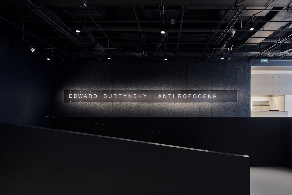
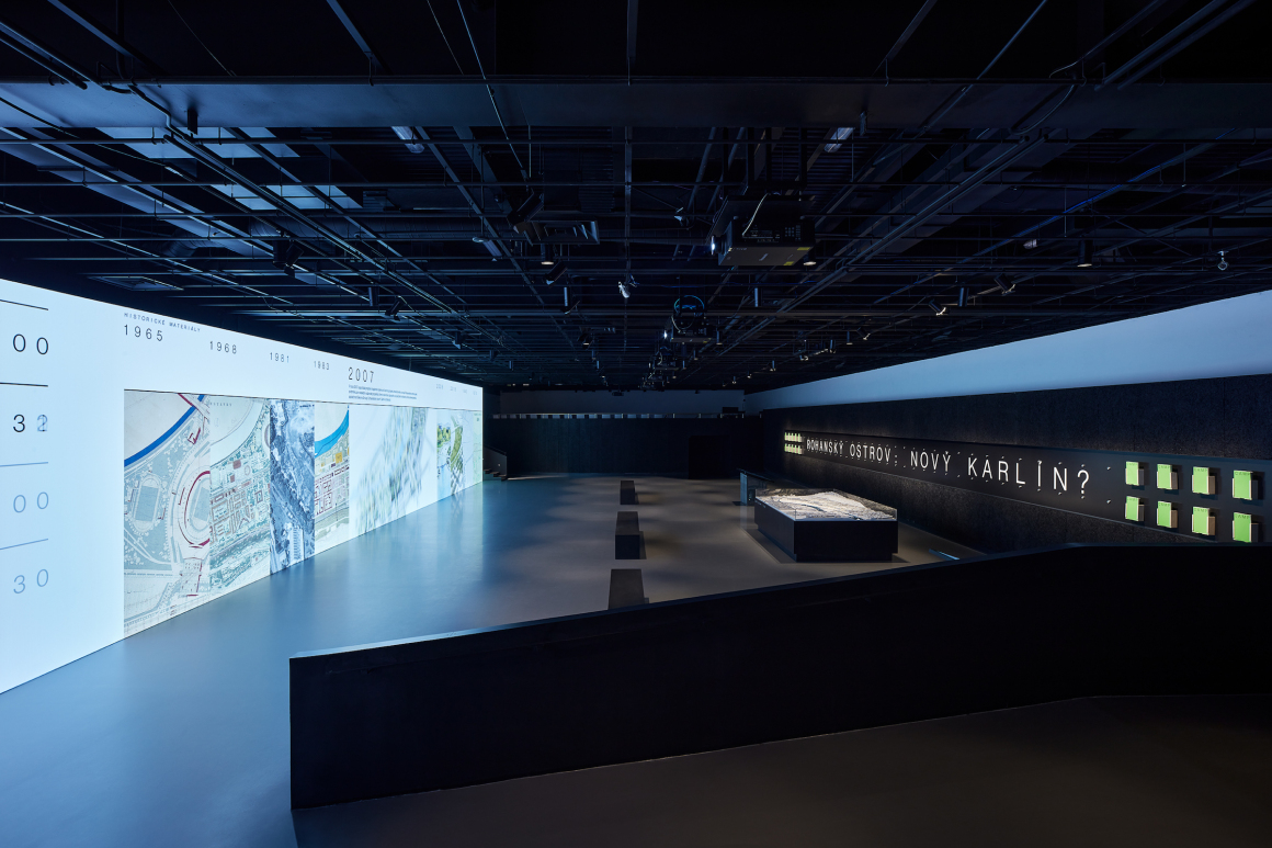
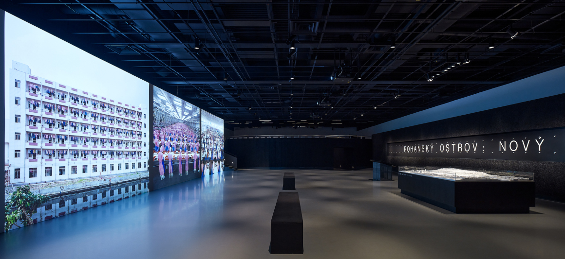
▼黑色大厅全景投影屏 The panorama projection in “black” hall
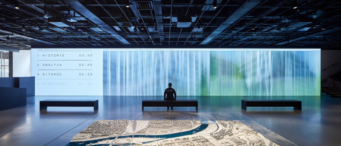
大厅旁边还有一个可用来平时讨论、演讲或看电影的偏厅。
Annexed to this hall is a small arena used for discussions, smaller lectures or a movie theater.
▼偏厅 the annexed hall

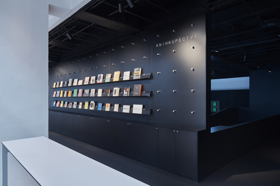
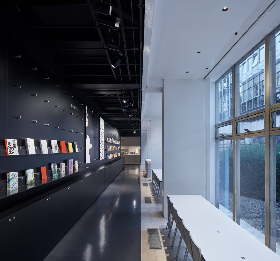
在投影墙的背面还紧连着一个书店,书店采用了大面积的玻璃幕墙,给平时的采光和阅读提供了良好的光线。
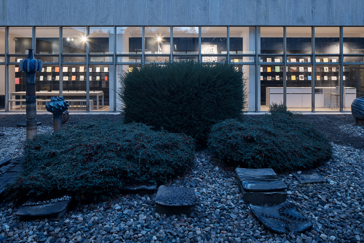
The library, along with the study hall and bookstore, is on the back side of the projection wall. It gets plenty of sunlight from the generous glass atrium that lies in the center of Prager’s blocks.
▼书店 the bookstore
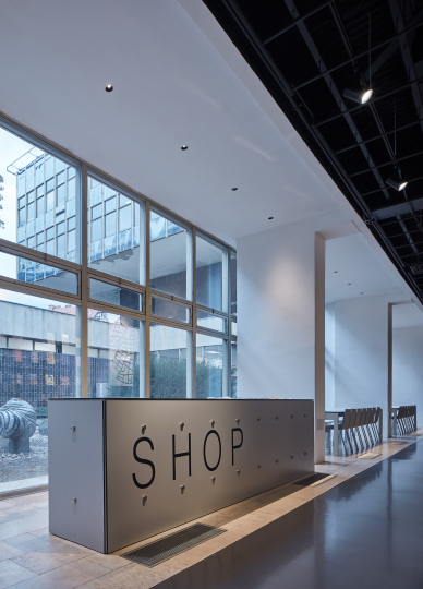
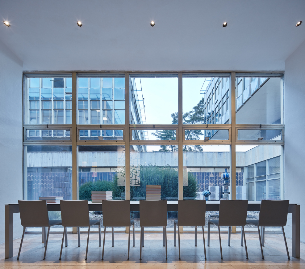
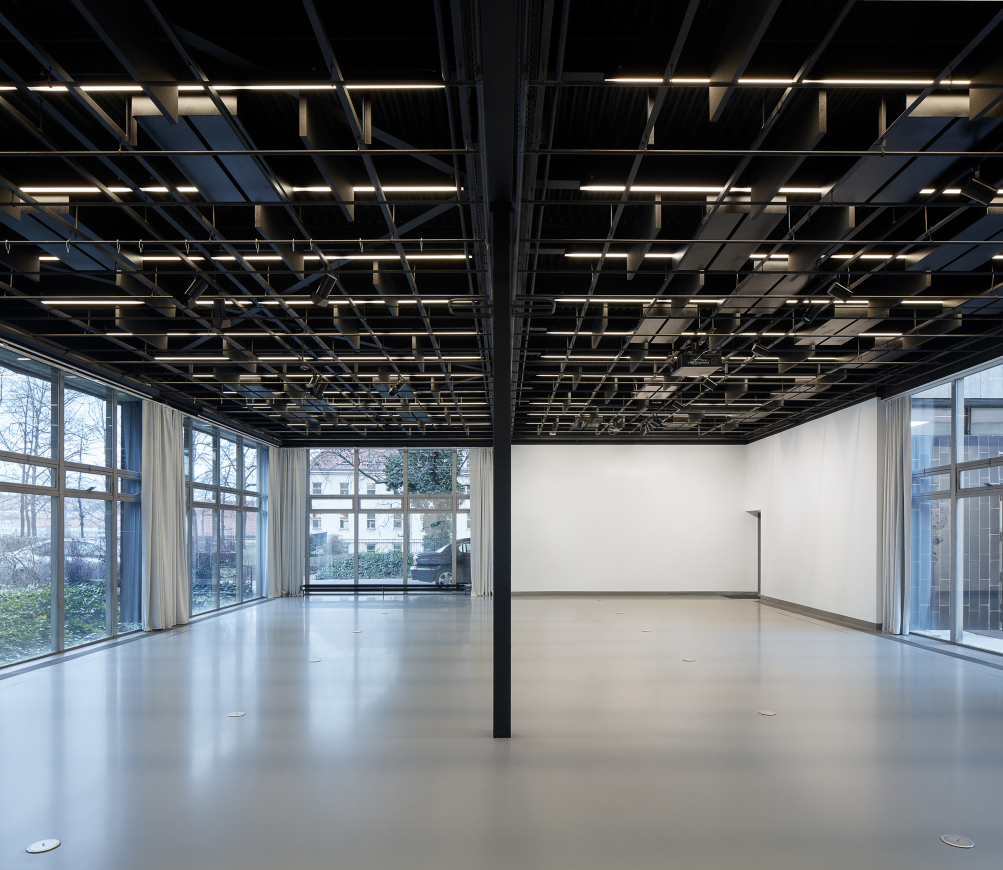
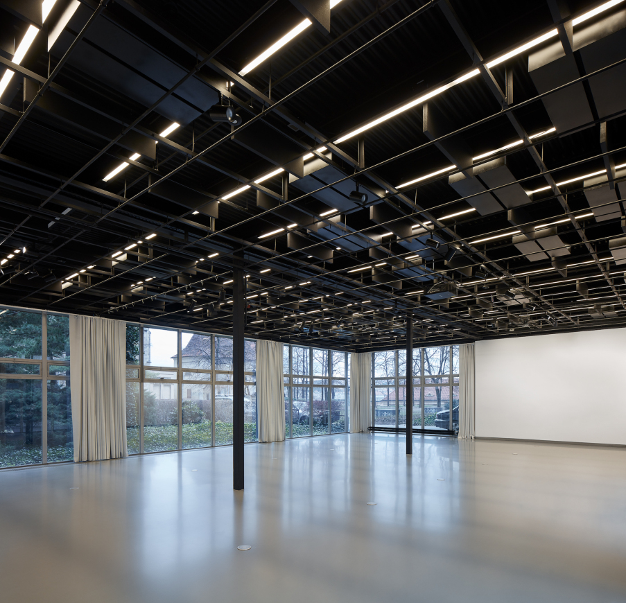
而“白色”大厅则采用了三面受光的做法,与“黑色”厅形成了一种有机平衡。这里光线充足,平时可作为小组会议,演示或特定博览会的空间。
The “white” conference hall is in a counterbalance to the dark exposition hall, with its munificent three-sided transparent surfaces. It is convenient for conferences, group meetings, presentations or specific expositions that can endure the flood of sunlight.
▼“白色”厅 the “white” hall
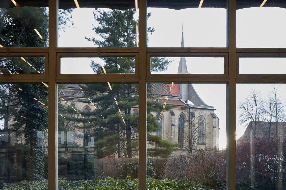
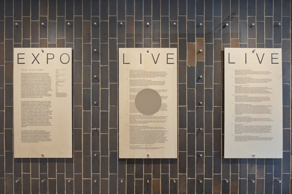
CAMP室内空间的使用是非常关键的,因此在设计之初还特意与专业的视觉设计师进行了合作探讨。具体的设计概念衍生于网格应用,生活中常见在具有比例和密度需求的工作之中,而在室内的应用则源于布拉格建筑最开始的瓷砖形式。网格中的节点由特制不锈钢螺钉和螺母具体化,从而形成亮眼的圆柱形接头,它们可用于展示板、家具接头或空间导航的锚定系统。
The interior of CAMP was created in a close collaboration with the authors of its visual identity and therefore can be considered its primary and key application. This concept is based on points in a square grid whose base subject is the work with scaling and density. The fundamental application of this grid in the interior is derived from the format of the original ceramic tiles, a dominant and authentic element of Prager’s architecture. Node points in the grid are materialized by atypical stainless steel screws and nuts creating shiny cylindrical joints. These serve as an anchor system for exposition panels, furniture joints or as space navigation.
▼书架的网格应用 grid
项目地点:Vyšehradská 51, Prague, Czech Republic
启动时间:2017
完成时间:2019
建筑总面积:1100 ㎡
概念作者:Adam Gebrian, Eugen Liška, Adam Švejda
建筑工作室:NOT BAD
建筑设计师:Benedikt Markel, Dominik Saitl
合作设计师:Martina Požárová, Vilém Kocáb
投资方:City of Prague
施工方:Prague Institute of Planning and Development | www.iprpraha.cz
摄影师:BoysPlayNice | www.boysplaynice.com | info@boysplaynice.com
视觉识别:Ex Lovers & Martin Groch
生产:CONTRACTIS
视听演示:st.dio (Josef Kortan, Jakub Roček)
灯光:Ateliér světlené techniky (Ladislav Tikovský)
电力:Apollo Art (Jaroslav Zuna)
Project location:Vyšehradská 51, Prague, Czech Republic
Project year:2017
Completion year:2019
Gross floor area:1100 ㎡
Concept authors :Adam Gebrian, Eugen Liška, Adam Švejda
Architectural studio:NOT BAD
Architects:Benedikt Markel, Dominik Saitl
Collaborators:Martina Požárová, Vilém Kocáb
Investor:City of Prague
Implementer:Prague Institute of Planning and Development | www.iprpraha.cz
Photo credits:BoysPlayNice | www.boysplaynice.com | info@boysplaynice.com
Visual identity:Ex Lovers & Martin Groch
Project:CONTRACTIS
AV presentation:st.dio (Josef Kortan, Jakub Roček)
Lighting:Ateliér světlené techniky (Ladislav Tikovský)
Electrics:Apollo Art (Jaroslav Zuna)
更多 Read more about:NOT BAD




0 Comments