本文由 异规设计 授权mooool发表,欢迎转发,禁止以mooool编辑版本转载。
Thanks Informal Design for authorizing the publication of the project on mooool, Text description and images provided by Informal Design.
异规设计:杭州西湘里文创园前身为玩具厂,位于杭州萧山老工业社区,后被整体改造成为一个复合性的创意园区。Informal异规设计希望通过此次healing pets的品牌全案设计,将那些喜爱宠物的人聚集在一起,通过人宠社区带来的温馨感和团结感来抵消城市的陌生感,相互交友与共同学习,编写新的城市人宠生活方式,推动人与人、狗与狗、人与狗共同成长。
Informal Design:The project is situated within West Lane Cultural and Creative Park—formerly a toy factory nestled in an old industrial neighborhood in Xiaoshan District, Hangzhou. Through conceiving a comprehensive brand design solution for the client healing pets, Informal Design aims to create a destination for pet lovers, fostering a warm human-pet community that counteracts the alienation often felt in urban life. The goal is to cultivate a new lifestyle for urban residents and their pets, promoting mutual growth among individuals, dogs, and the bond between humans and their pets.


Part 01 新旧交织,流动开放 The new and the old interweave for a fluid, open space
建筑场地条件决定了整体空间的设计基调,Informal异规设计秉持可持续性的设计理念,总体建筑的改造方向围绕新与旧的关系展开,保留原始建筑结构有价值的地方,将屋顶的主体结构裸露出来,植入新的结构贯穿连接,形成新旧交织的空间感。新旧空间的体块融合,营造出流动与开放的空间关系。
The overall space design aligns with the building’s existing conditions. Adhering to sustainable design principles, the architectural transformation centers around the relationship between the new and the old. Valuable elements of the original construction are preserved, with the main roof structure exposed and integrated with new additions, creating a interplay between the old and new. This blend of old and new volumes fosters a fluid, open spatial relationship.


Part 02 自然肌理,自然而然 Natural texture, natural approach
营造建筑的自然质感,将水洗石、砾石混凝土、马蹄石、肌理漆和海洋板等材料并置,使用天然材料让整体建筑具有生命力。
粗糙的水洗石被应用在室内吧台、座位与地面等地方,营造出自然的拙朴感。砾石混凝土的地面和灰色水洗墙面相呼应,继续深化空间自然的户外感。粗糙的材质可以起到宠物防滑的作用,也具有户外自然材料的耐用性和耐污性。采用拼色海洋板构建整个空间墙面零售系统和活动家具体系,营造出亲切温馨的空间氛围,与原始木构屋顶相辅相成。这些材料的巧妙选用,随着时间推移而自然风化的肌理,则进一步增强了建筑质感。
To create a natural texture in the building, materials such as washed stone, gravel concrete, granite cubes, textured paint and marine plywood are juxtaposed to infuse the building with life and a natural vibe.
Rough washed stone is used for the indoor bar counter, seating, and flooring, creating a simple, natural aesthetic. The gravel concrete flooring and gray washed walls complement each other, enhancing the outdoor feel of the space. The rough textures provide a non-slip surface for pets, while also offering the durability and stain resistance akin to outdoor natural materials. The retail display walls and movable furniture system are constructed using a collage of marine plywood panels, creating a warm and inviting atmosphere that complements the wooden ceiling. The clever selection of these materials, along with their natural weathering over time, will further enhance the building’s texture.
▽水洗石空间 Wash stone-clad space


▽宠物饮水处 Water station for pets

Part 03 品牌符号,完整体系 A complete brand VI system
设计团队将服务于宠物友好的斜坡结构作为视觉符号,并结合到建筑功能上,形成从二维到三维的品牌记忆。图形通过“立体化”和“体积感”的处理,打造更强的识别性与趣味性。
超级符号将人与宠物共享空间的理念与平面相融合,符号从二维平面到三维构成,再从形式语言到社区空间。符号中描绘了功能性与象征性,使品牌形象更加丰富和多维。将宠物敏感的蓝色与黄色作为品牌VI色,通过线与面的结合关系,传达出轻松活泼的时尚感。
The design team incorporated a pet-friendly ramp as a visual symbol, integrating it with the architectural space’s functionality to create a memorable brand identity. The graphic elements, designed with a three-dimension feel and a sense of volume, further articulate the space’s iconic and fun identity.
Various super visual symbols, crafted by the graphic design, seamlessly echo the concept of a shared space between people and pets. The three-dimensional visual design enriches the formal language in this community space. Blending functionality and symbolism, these symbols contribute to a more diverse and multi-dimensional brand image. The brand’s visual identity is further strengthened by using pet-sensitive colors, such as blue and yellow, which convey a lighthearted and fashionable vibe through the interplay of lines and planes.

▽LOGO 设计 LOGO design


品牌符号与空间功能相结合,设计了一系列品牌物料、空间标识、空间图形、装置细节。入口处设计了空间宠物地图,可以更好的帮助服务对象了解品牌空间功能;并巧妙的将门把手与营业信息组合排列,形成一个有趣的三维组合空间图形。通过品牌全案设计整合,使空间具有更强、更完整的品牌记忆感。
Combining brand symbols with space functionality, the design team crafted a series of branding materials, signage, graphics, and installations. A pet map at the entrance helps visitors better understand the spatial functions, while the door handle and business hours information are cleverly arranged to create an engaging three-dimensional graphic. This comprehensive brand design enhances the space with a stronger and more cohesive brand identity.
▽品牌符号设计 Brand symbol design


Part 04 结构布局,井然有序 Orderly and well-organized layout
巧妙利用建筑内部层高,构建出成两层空间,在确保空间的明亮与通透的同时,空间功能对应更加多元化。整体采用三段式布局:入口的咖啡区、中间的活动区、后面的功能区。既确保了空间功能的相对独立,又保障了空间动线井然有序。
By cleverly utilizing the building’s height, the design team creates a two-story space that ensures brightness and transparency while diversifying the spatial functions. The overall layout is composed of three sections: the cafe at the entrance, the activity area in the middle, and the functional area at the back. This maintains the relative independence of each functional space, and also ensures an orderly circulation.
▽两层空间结构 Two-story space structure

入口的咖啡区设计成一个景观庭院,由内而外形成景观式连廊,打破了原本局限的室内外边界。围绕中间的一棵大树形成一个半围合式的景观入口,整体用水洗石材质包裹,自然质感不断唤醒宠物心灵深处的生命力,给空间带来新鲜活力。
The cafe at the entrance is conceived as a landscaped courtyard, creating a continuous corridor that breaks the boundary between interior and exterior. A semi-enclosed landscape entrance is formed around a big tree, with the entire area wrapped in washed stones. These natural textures continually awaken the vitality in pets, bringing fresh energy into the space.
▽入口咖啡区 Cafe at the entrance


中间活动区域则保留了原始结构,用一个坡道将一楼与二楼宠物活动区域连接在一起,形成一个自然的小山坡,与入口连廊结构形成一个整体。公园街区式的长条形座位分布,尽可能留出更多宠物活动空间。顶部的自然采光,从清晨到黄昏,像时间一样游走在建筑内部,一天中可以感受到不同的光影变化。
The middle activity area retains the original spatial structure, with a ramp connecting the pet activity areas on the first and second floors, forming a natural hillside that seamlessly integrates with the entrance corridor. The park-style bench seating arrangement maximizes space for pet activities. Natural light filters through the building interior from morning to dusk, creating a dynamic play of light and shadow throughout the day.
▽中间活动区 Activity area in the middle


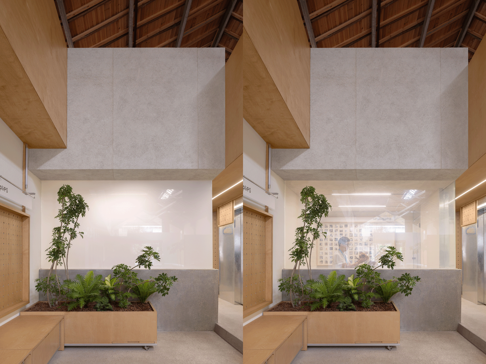
后面的功能区由几个堆叠的方形盒子组成,一楼为宠物酒店和宠物洗护美容间,隔断采用电容玻璃,可以根据需求切换展示美容间的工作状态。二楼为办公室区和宠物摄影棚,办公区域可以俯瞰整个空间,更好地进行工作沟通与管理。
The functional area at the back consists of several stacked boxes. The first level accommodates the pet hotel and grooming rooms, with capacitive glass partitions that can be flexibly adjusted to display the grooming room’s work status as needed. The second level features office spaces and a pet photography studio, with the offices offering a panoramic view of the entire space for improved communication and management.
▽后面功能区 Functional area at the back


Part 05 宠物友好,灵活多变 Pet-friendly, flexible design
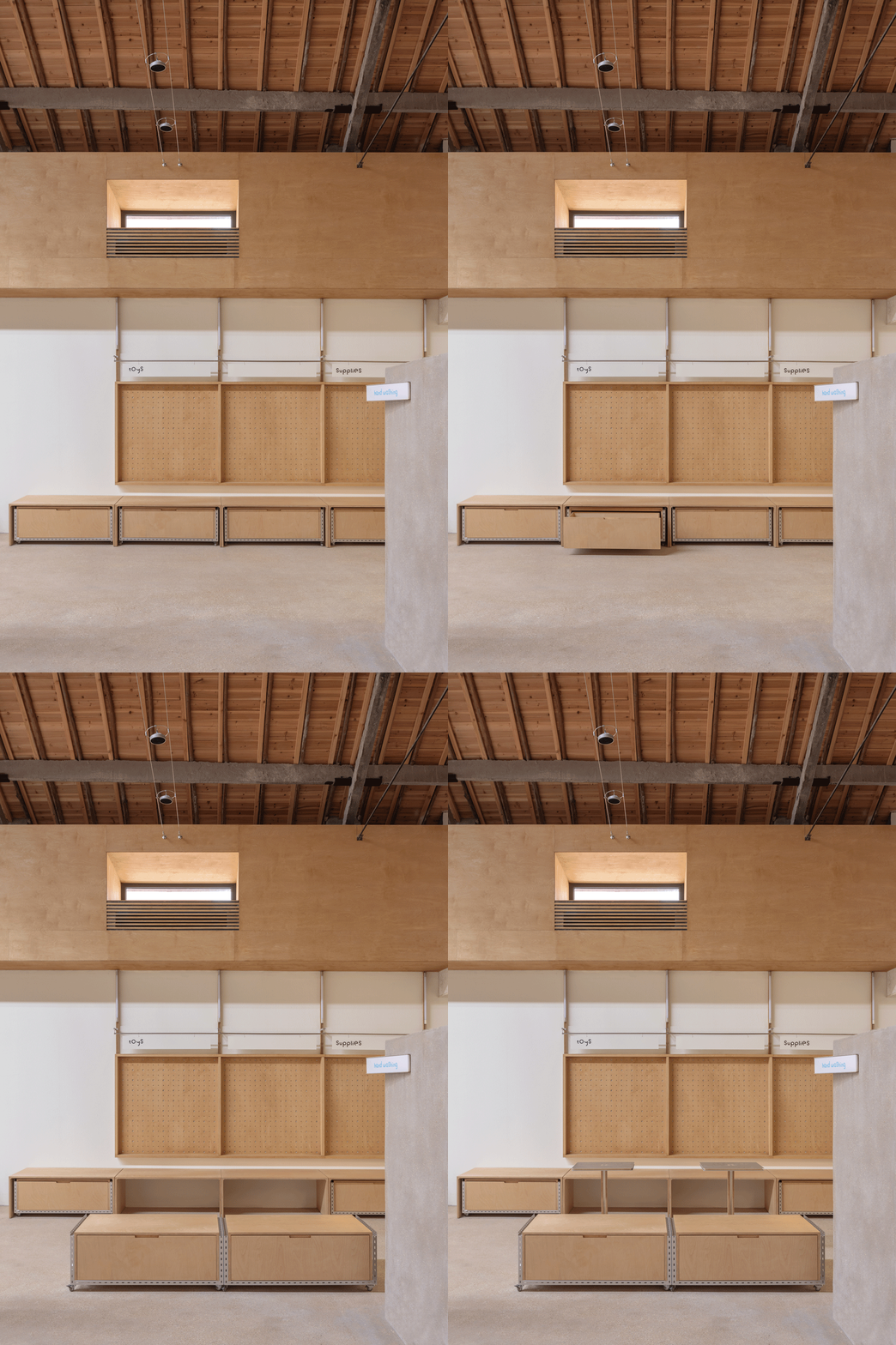
空间上的家具细节打造,为初次来到这里的宠物提供安全感,将座位下方空间留给小动物,安抚其来到陌生空间的情绪状态。而中间活动长凳下方的悬空设计,是为了尽可能减少对宠物玩耍的阻碍,无论是奔跑还是歇息,都能给宠物提供足够的自由度。
The furniture details within the space are thoughtfully crafted to provide a sense of security for pets visiting for the first time. Space is intentionally left under the seating areas to give small animals a safe spot to settle in and ease their anxiety in an unfamiliar environment. The suspended design beneath the movable central bench minimizes obstacles during play, allowing pets the freedom to run or rest.
▽灵活多变的家具细节设计 Brand symbol design Flexible furniture details design


固定的小圆桌与拴狗环则可以随时解放宠物主人的双手,自由的交谈与享受美食。墙面的大小洞板散落于空间,既可以作为零售陈列,也是装饰符号。全部可活动的家具设计,很好地满足了空间的灵活性,可以根据不同宠物主题需求来改变组合与布局。
Fixed small round tables, designed with the function of anchoring dog leashes, free pet owners’ hands, enabling them to chat and enjoy food at ease. The wall features pegboards, which serve both as retail displays and decorative elements. The space’s flexibility is further enhanced by fully movable furniture, allowing for easy reconfiguration to suit different pet-themed needs.


▽道具图 Fixture renderings

▽平面图 Plan

▽立面图 Elevation


▽轴测图 Axonometric drawings


项目名称:healing pets
项目业主:healing pets
项目类型:人宠社交空间
设计公司:Informal异规设计
联系邮箱:informaldesign@foxmail.com
设计内容:品牌、视觉、建筑、空间、家具
空间设计:王盛、罗志航、叶宁、程⻩英
平面设计:郑晶、刘彦宏
项目设计:2024年3月-2024年5月
完成年份:2024年8月
项目地址:浙江省杭州市萧山区⻄湘里文创园
建筑面积:300m²
空间拍摄:黑水
物料拍摄:骆驼牌工作室
Project name: healing pets
Client: healing pets
Project category: pet-friendly social space
Design team: Informal Design
Contact email: informaldesign@foxmail.com
Design scope: branding, VI, architecture, space, furniture
Spatial design: Sheng Wang, Zhihang Luo, Ning Ye, Huangying Cheng
Graphic design: Jing Zheng, Yanhong Liu
Design phase: March – May 2024
Completion time: August 2024
Location: West Lane Cultural and Creative Park, Xiaoshao District, Hangzhou
Area: 300 sqm
Spatial photos: Hei Shui
Branding materials photos: Rocky
“ 一个人宠友好互动的空间场所。”
审稿编辑: Maggie
更多 Read more about: Informal异规设计


0 Comments