本文由 KiKi建筑设计事务所 授权mooool发表,欢迎转发,禁止以mooool编辑版本转载。
Thanks KiKi ARCHi for authorizing the publication of the project on mooool, Text description provided by KiKi ARCHi.
KiKi建筑设计事务所:无论是基础照明、氛围营造,还是情绪渲染、人物塑造,光线的安排对一幅影像来说至关重要。从前期拍摄到后期制作,影视工作者通过控制光影的亮度、角度、色彩,形成符合情景的氛围,参与叙事和表意。而这种用光线创作,表达无法言传之感的艺术手法,同样被运用于空间设计。北京七棵树创意园区内,KiKi建筑设计事务所为一家专业的影视制作公司,打造了全新办公楼与展厅,设计师从“光”入手,借由其特质,将“色彩”以一种抽象的形式呈现。随着人在其中的自然往来,移步易景间,光影回响,亦真亦幻。
KiKi ARCHi: The arrangement of light is crucial to an image, whether it is in the basic lighting, atmosphere, mood rendering, characterization, etc.From pre-shooting to post-production, the video artists control the brightness, angle, and color of light to form an atmosphere that fits the scene, and participate in narrative and expression. And this artistic technique of creating with light and expressing the unspeakable feeling is also applied to interior design. In Beijing Qikeshu Creative Park, KiKi ARCHi has been invited by a professional film and television production company to transform a traditional industrial factory building into a personalized office and showroom. The team starts with ‘light’ and uses the virtue of its characteristics to present ‘color’ abstractly way. Along with the natural interaction of people in it, the picture changes subtly with moving, and light echoes are in-between reality and illusion.


颇具年代感的工业厂房摇身一变,成为现代企业入驻的办公空间。在现代材料的融合下,旧厂房的红砖建筑被白色格栅包裹起来,唤起了人们对于工业形式和材料的全新认知。建筑立面上,设计团队将部分红砖墙拆除,取而代之的是大面积的玻璃,为室内引入更多自然光线,其外部紧密的格栅,构筑“光束”造型,增加隐私感。这一手法不仅回应了概念元素中的“光”,又将主入口巧妙移至东侧,形成体验上的迂回缓行之感。
The factory building with a sense of history has been transformed into a modern office space for the enterprise. With the fusion of design, the red brick building is wrapped in white grilles, evoking a new perception of industrial forms and materials. In terms of the facade, the design team has removed part of the red brick wall and replaced it with a large area of glass to introduce more natural light into the interior. This approach not only responds to the conceptual element ‘light’ but also moves the main entrance to the east, creating a sense of detour in experience.
▽厂房外观-新与旧的元素碰撞 New and old elements collide


进入大厅,与白色外立面截然不同的大面积色筒装置,令人耳目一新。它以线成面,由面成棱,重复阵列,构建出三面特殊的彩色墙体,明媚的“暖色调”散发着波光粼粼的温暖感,是视觉记忆的延续,也是对旧厂房时光的追忆。这种非直接的色彩表达形式,带来流动起伏之感,也在无形中与外立面的造型交相呼应。在造型、色彩、光影的交融下,室内外空间与园区、城市、甚至是思想上,都产生了微妙的联系。经由南侧楼梯向上,来到企业公共走廊区域,人们可以看到色筒装置的另一幅“面孔”,它以深邃静谧的“冷色调”示人,制造沉稳的办公氛围。
Stepping into the lobby, the large-area color tube installation, which is completely different from the white facade, looks very refreshing. From lines to faces, and prisms, it repeats the array to construct three special colored walls. The bright warm scene provides a sparkling warmth, which is a continuation of visual memory and a recall of the old factory days. This indirect form of color expression brings a sense of flow and undulation, and also invisibly echoes the shape of the facade. Under the fusion of shape, color, light, and shadow, the indoor and outdoor spaces have a connection with the creative park, the city, and even people‘s thoughts. Going up the stairs on the south side to the public corridor area of the company, people can see another ‘face’ of the color tube installation. It shows with a deep and cold scene, creating a calm office atmosphere.
▽焕然一新的内部大厅 Inside the hall


▽以线成面的彩色墙体 The colored wall with the line into the face


色筒装置的不同质感(色调、亮度、饱和度)变化,将空间自然的分区开来,这种奇妙的观感,来自设计团队的多次实验。设计过程中,团队首先选择了轻盈通透的亚克力材料,制作棱形色筒单体;接着将特殊的3M反光彩膜,贴附于其中两个面上;最后以45度角的排列方式放置色筒,从而实现移动间的色彩变幻。当从前厅看去,整个装置通体映现暖色调,给人以包容舒适的体验,而从内部向外看,则是沉静的冷色调,营造平静的氛围感。
The textures of color tube installation (hue, brightness, saturation) divide the whole space naturally, this unique effect is based on many experiments and tests by the design team. For the first, light and transparent acrylic material is used to make a single prismatic color tube. Then a 3M reflective film is attached to 2 of 4 faces. Finally, the color tubes are placed at a 45-degree angle to realize color changes between movements. When people look at it from the front of the hall, the whole installation reflects warm tones, giving a comfortable experience, while from the inside, it is a cold tone, creating a calm atmosphere.
▽走廊空间看向装置 Corridor space looking towards the installation


▽色彩绚丽的亚克力 Colorful acrylic


色筒装置的两侧空间,是影视公司进行后期调色的办公区域,暗色调的廊道环境,为技术人员提供了辅助。在不锈钢墙面与灯带的映衬下,整个廊道如同艺廊一般,反射“光影”,制造“回响”。这种简洁的设计手法,不仅回应了主题,更兼具功能性与观赏性。
The space on both sides of the color tube installation is the office area for the technical staff who take color correction work, which means a dark-colored corridor environment is more conducive to work. Against the background of stainless steel walls and light strips, the entire corridor is like an art gallery, reflecting ‘light and shadow’ and creating ‘echoes’. This simple design approach not only responds to the theme but is also functional and ornamental.
▽走廊空间 The corridor space


装置的正下方,设计团队打造了一片供访客互动、沉浸的休憩区域。无数的钢线被直径2cm的透明亚克力圆柱包裹,它们连接天花与地面,疏密有致的排列其中,在上下灯光的衬托下,涌现自然、飘渺的光影之感,仿佛一个轻盈的载体,支撑起灿烂的梦想。
Below the installation, there is a rest area for visitors to interact and immerse themselves. Countless steel wires are wrapped by transparent 2cm acrylic cylinders. They connect the ceiling and the ground, while arranged in a dense and orderly manner. With the upper and lower lights, a natural and ethereal sense of light and shadow emerges, like a light carrier, supporting a brilliant dream.
▽下部互动、沉浸的休憩空间 Interactive and immersive rest space


从企业的属性与需求出发,KiKi建筑设计事务所为使用者创造了独一无二的归属型空间,从建筑立面到展示区,再到休憩空间与回廊,整个环境始终由“光”贯穿。“光”从不同物体上掠过——灵透的玻璃、绚丽的亚克力、镜面不锈钢等等,回响间,律动漫延至各处,人们在空间中的所思所想也得以遥远延伸。
Starting from the attributes and needs of the enterprise, KiKi ARCHi has created a unique belonging space for users. From the building facade to the front hall showroom, the rest space, and the corridor, the whole environment is always run through by ‘light’. Immersed in the ‘light echo’, the rhythm spreads everywhere, and people’s thoughts in the space also can be extended far away.
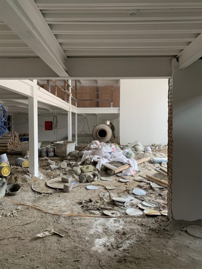
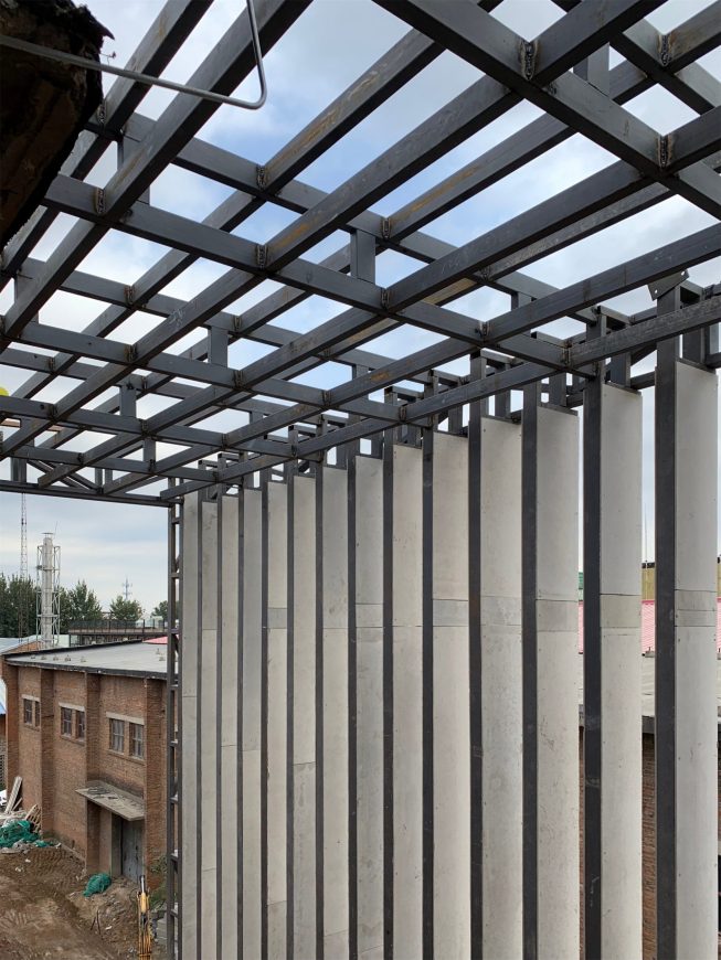
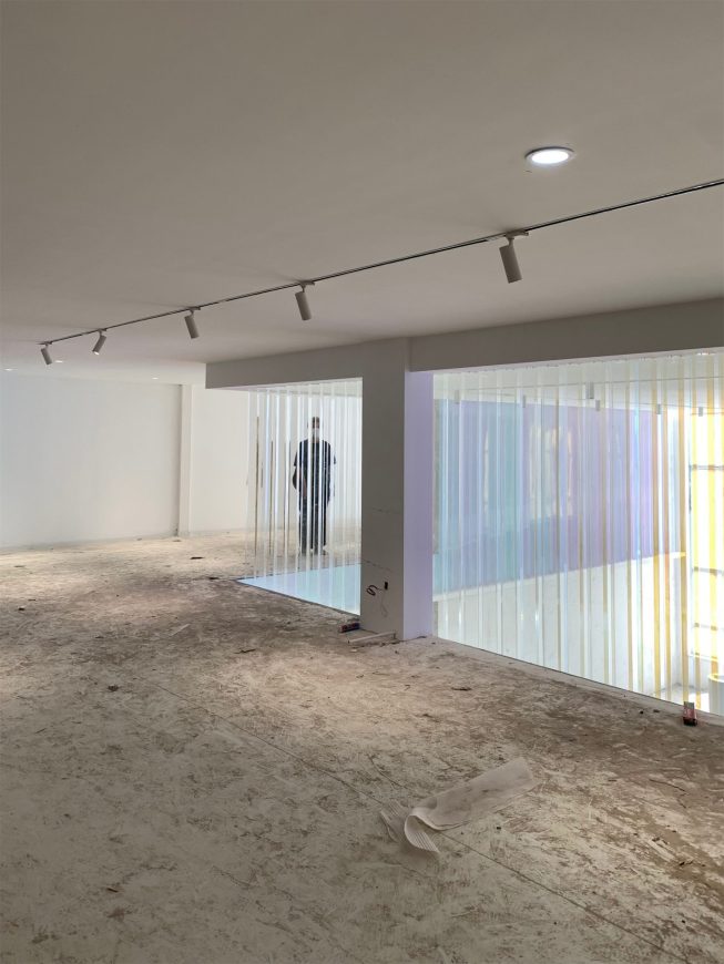
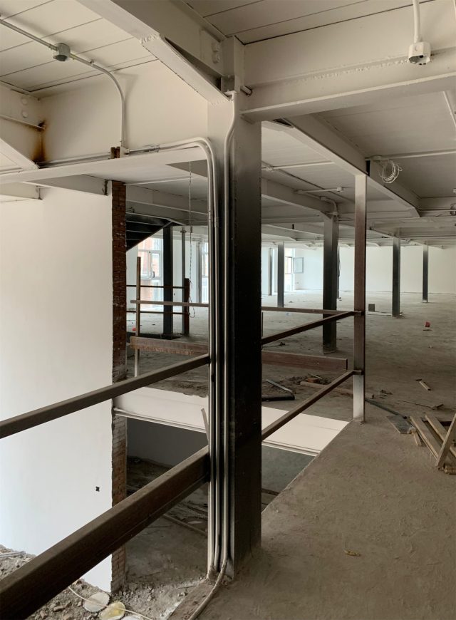
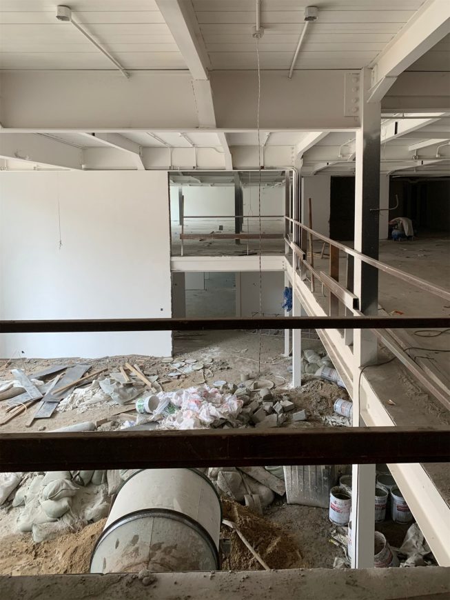
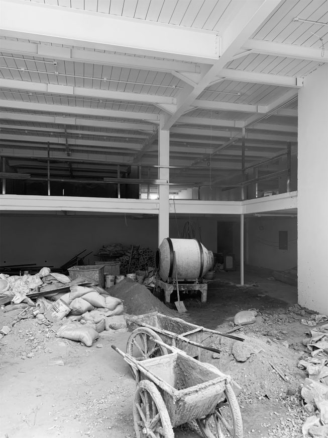
▽施工过程 The construction process
▽首层平面图 Plan
▽二层平面图 F2 Plan
项目名称:光影回响_TW展厅
项目位置:中国北京
项目业主:鼎盛佳和(北京)文化传播有限公司
设计公司:KiKi建筑设计事务所
主持设计师:关佳彦
设计团队:穐吉彩加,王天苹
建筑面积:620㎡
设计周期:2021.04.01 – 2021.06.01.
施工周期:2021.06.01 – 2021.11.01
材料与品牌:地胶-LG / 贴膜-3M / 白色乳胶漆-本杰明
摄影师:Eiichi Kano / 锐景摄影
Project Name: Light Echo_TW showroom
Project Location: Beijing, China
Client: Top Works
Design Firm: KiKi ARCHi
Director: Yoshihiko Seki
Design Team: Saika Akiyoshi, Tianping Wang
Building Area: 620㎡
Design Period: 2021.04.01 – 2021.06.01
Construction Period: 2021.06.01 – 2021.11.01
Material & Brands: PVC sheet-LG / Reflective film-3M / White latex paint-Benjamin
Photography Credit: Eiichi Kano / Ruijing-PhotoBeijing
“ 设计从“光”入手,借由其特质,将“色彩”以一种抽象的形式呈现,打造一个全新的办公楼与展厅。”
审稿编辑 Maggie
更多 Read more about: KiKi建筑设计事务所




0 Comments