本文由 东仓建设 授权mooool发表,欢迎转发,禁止以mooool编辑版本转载。
Thanks DOMANI for authorizing the publication of the project on mooool, Text description provided by DOMANI.
东仓建设:2023年,DOMANI东仓建设第八次操刀ROARINGWILD线下零售空间设计落地武汉天地。回顾市场变化与品牌成长的路径,我们见证并构建着线下消费场景的革新。
DOMANI: In 2023, DOMANI undertook the eighth project of implementing the ROARINGWILD offline retail space design in Wuhan. Reflecting on the market changes and the brand’s growth trajectory, we have witnessed and contributed to the innovation of offline consumer experiences.
线下体验店先行者 Pioneer of Offline Experience Stores
2017年前后,线上线下渠道融合的趋势爆发。“新零售”概念推动传统零售商布局线上,也催生了电商品牌开设实体终端的新浪潮。伴随“消费升级”,品牌的突出特质与新奇购物体验受到消费者青睐,新形态的线下体验店应运而生。同年,成立第7年的ROARINGWILD在深圳开出首家线下门店。DOMANI东仓建设从最初即深度参与,持续以先锋设计手法探索零售空间的边界,用6年八个项目,为市场树立了经典的新零售时期线下体验标杆。
Around 2017, there was an explosion in the trend of integrating online and offline channels. The concept of “New Retail” drove traditional retailers to expand their online presence and also gave rise to a new wave of e-commerce brands opening physical stores. With the emergence of “consumer upgrading,” brands with distinctive characteristics and novel shopping experiences gained popularity among consumers, leading to the emergence of new forms of offline experience stores.
In the same year, ROARINGWILD, in its 7th year of establishment, opened its first offline store in Shenzhen. DOMANI has been deeply involved since the beginning, continuously exploring the boundaries of retail space through pioneering design approaches. Through six years and eight projects, we have set a benchmark for offline retail experience during the classic era of the New Retail market.
▽项目视频 Video
2017 ep01「No More Silence」深圳 · 壹方城
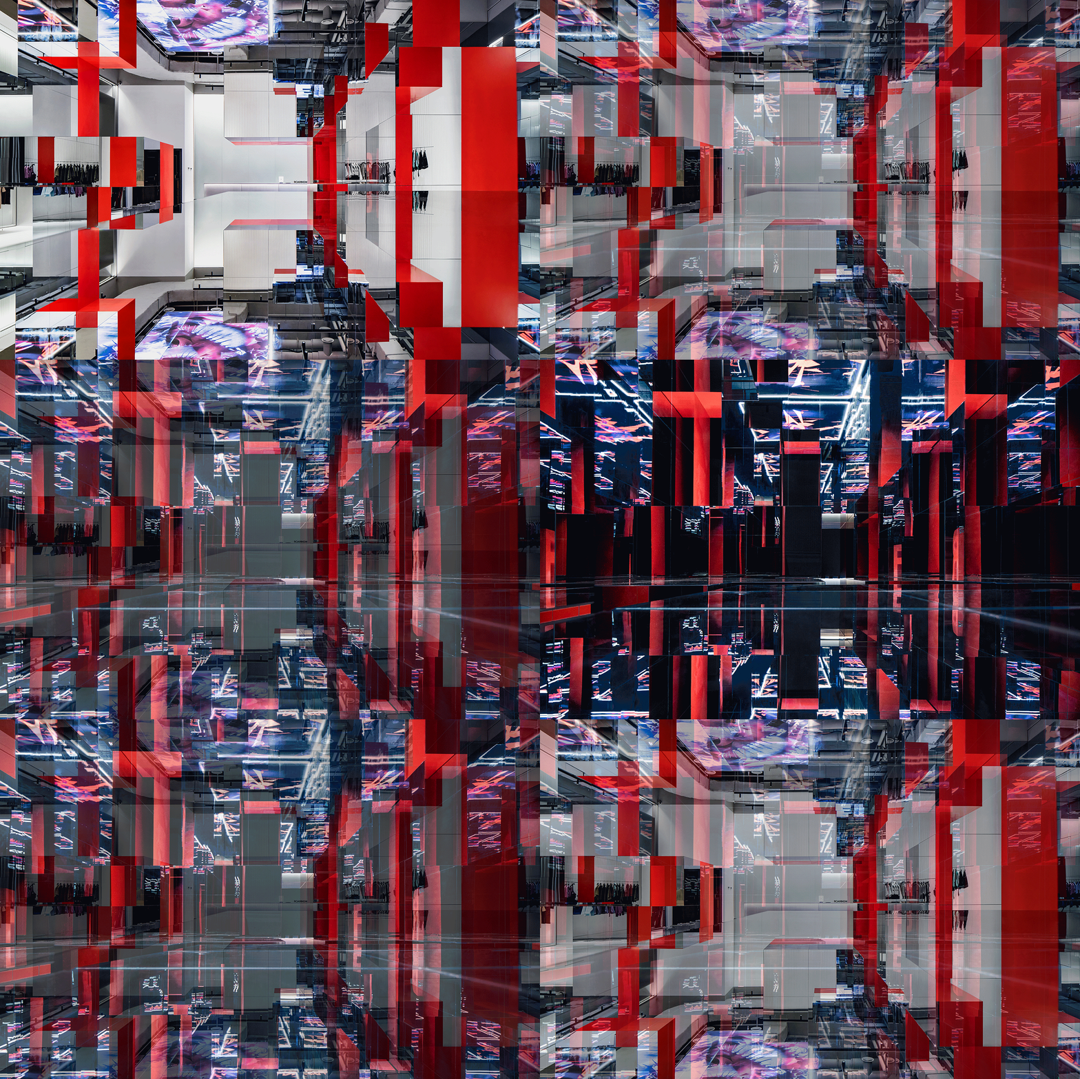
强烈的视觉冲击力源于巨型错视觉「R」装置、倾斜临界状态的张力与红黑撞色的对抗感。品牌于线下的首次发声意在展现代表年轻特质的独立个性与爆发力。
The strong visual impact is derived from the giant optical illusion “R” installation, the tension created by the tilted critical state, and the contrasting red-black collision. The brand’s first offline expression aims to showcase the independent personality and explosiveness that represents youthful qualities.
从最早奠定品牌线下空间基调的2017年「No More Silence」到2018年的独栋旗舰「野兽的另一面」,品牌对时尚与潮流的理解和态度转化为空间造型语言,在服饰零售市场中脱颖而出,两年间迅速聚集了广泛受众。
From the earliest establishment of the brand’s offline space ambiance with “No More Silence” in 2017 to the standalone flagship store “The Other Side of the Beast” in 2018, the brand’s understanding and attitude towards fashion and trends have been translated into spatial design language, setting it apart in the fashion retail market. Within two years, it has rapidly gathered a wide audience.
2018
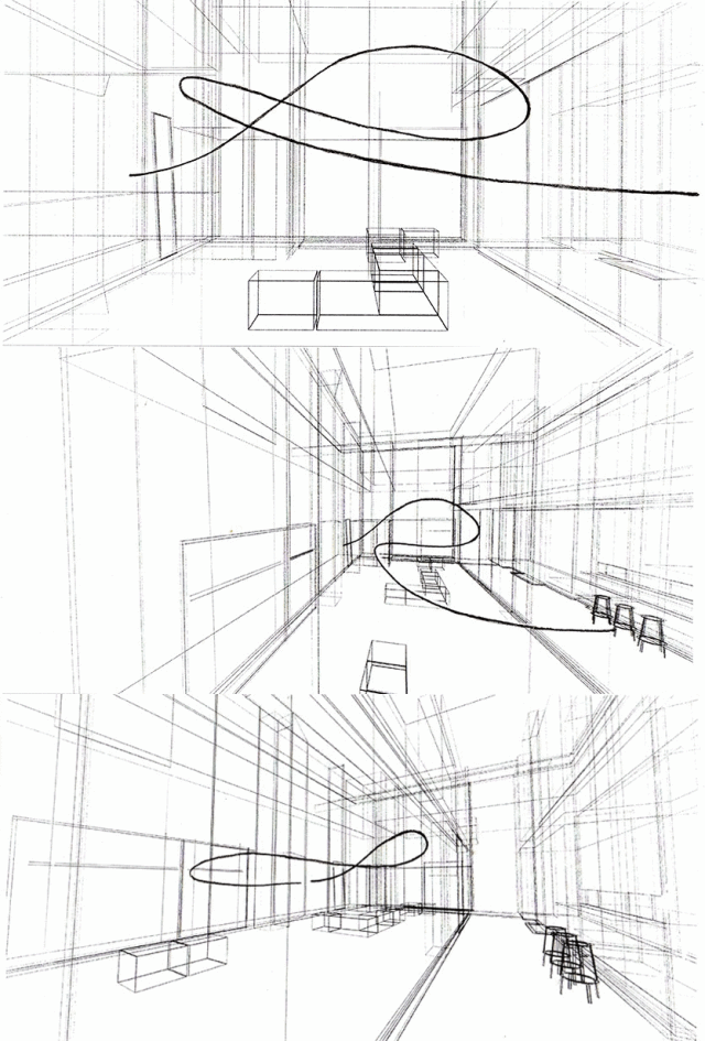
▽设计手稿 Design manuscript
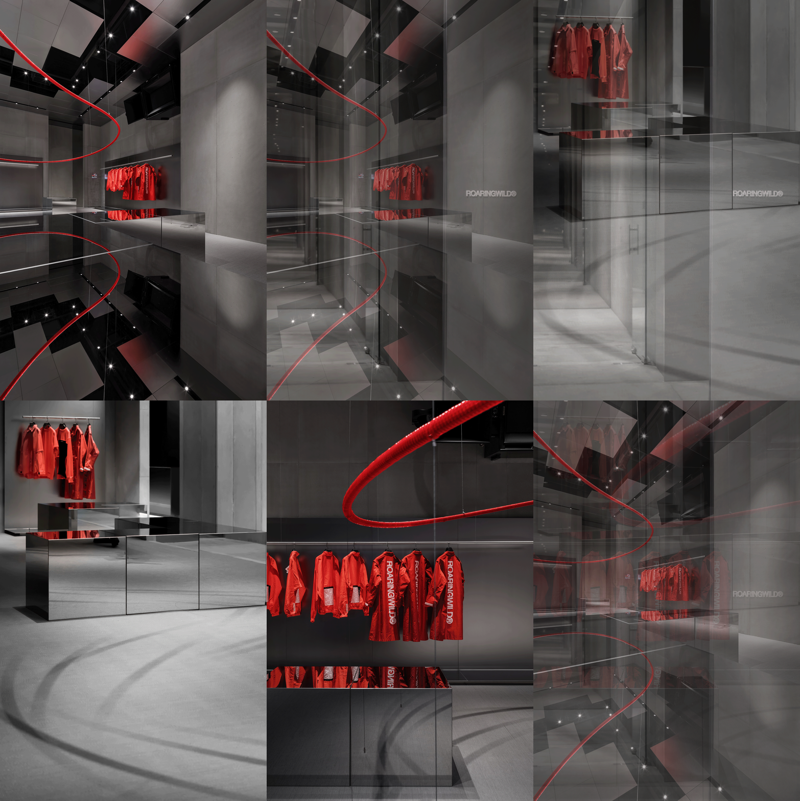
▽流畅的线条语言 Smooth line language
ep02「野兽的另一面」深圳 · 深业上城
落于城中最热的年轻时尚街区,独栋品牌旗舰店用更纯粹的体验感传达精神内核。「R」装置以软胶管缠绕钢筋的方式呈现,流畅的曲线与陈列相映。未来感、镜面、灰色调、红色装置、材料实验等丰富元素共同构建出品牌的多面性与可能性,并成为后续店面中最显著的特征。
Located in the hottest young fashion district in the city, the standalone flagship store conveys the brand’s core essence through a purer sense of experience. The “R” installation is presented by wrapping rubber hoses around steel bars, creating a seamless interplay between smooth curves and displays. Elements such as futuristic aesthetics, mirrors, grayscale tones, red installations, and material experiments come together to construct the brand’s versatility and possibilities, becoming the most prominent features in subsequent store designs.
▽场景动图 Scene GIF
▽外观 appearance
装置与陈列的新可能 Exploring new possibilities in installations and displays
从深圳去往上海,店面空间的进化记录着RW成长的新阶段。品牌的注意力边界向外拓展,在自我表达的同时也思考着品牌与城市文化的交互与联结,进一步为零售空间赋予社交价值,并展露千店千面的魅力。
From Shenzhen to Shanghai, the evolution of store spaces reflects a new stage of RW’s growth. The brand’s attention boundary expands outward, not only expressing itself but also contemplating the interaction and connection between the brand and urban culture. This further endows retail spaces with social value and showcases the charm of a thousand faces in a thousand stores.
2019 ep03「Magic Box」上海 · 无限极荟
契合“魔都”的“魔盒”主题,以目不暇接的变幻形态给人留下深刻印象。灵活的陈列系统可满足多产品线在不同主题下的陈列需求,更能让店面变形为活动现场,支持新的线下内容营销模式。
Matching the title of “Magic Box” that befits Shanghai’s “Magic City” nickname, the theme leaves a profound impression with its ever-changing and mesmerizing forms. The flexible display system caters to the display requirements of multiple product lines under different themes, allowing the store to transform into an event venue and support new offline content marketing models.
▽不断变化的盒子空间 Changing box space
装置艺术的置入使线下门店拥有了无可比拟的优势。无论是具象化的观念传达或是具有冲击力的沉浸体感,都让品牌深入人心。而在艺术性之外,装置与产品陈列乃至空间布局的整合设计也为功能需求提出了新的解法。
The integration of installation art gives offline stores an unparalleled advantage. Whether it’s conveying conceptual ideas in a tangible way or creating impactful immersive experiences, it deeply resonates with the audience, leaving a lasting impression. Beyond its artistic appeal, the integration of installations with product displays and even spatial layout design offers new solutions to functional needs.
2019 ep04「R Ray」上海 · 新鸿基
更为轻量的「R」装置在较小的店面中为品牌延续了空间识别特征。环绕型的纵向射线形态保持空间通透并增加层次,同时也构成了核心陈列道具。
The lighter “R” installation maintains the brand’s spatial identity in smaller stores. The surrounding vertical ray form provides transparency and adds layers to the space, while also serving as the core display prop.
▽环绕型的射线装置延续空间 The encircling ray device continues the space
空间识别成为品牌资产 Space identity becomes a brand asset
每开新店,独特各异的门店形象都能给市场带来惊喜,品牌也经社交媒体获得传播流量的红利。先锋、构成感、红黑撞色等显著特征让RW的店面空间始终保持高识别度,而在对效益要求更高的后疫情时代,这样的特质能使品牌更好地平衡创新与效率。
With each new store opening, the unique and diverse store images bring surprises to the market, and the brand gains the benefits of social media exposure and viral spread. The pioneering spirit, structural elements, and red-black contrast contribute to RW’s high level of spatial recognition. In the post-pandemic era, where efficiency is increasingly demanded, these characteristics allow the brand to strike a better balance between innovation and efficiency.
▽环绕型的射线装置延续空间 The encircling ray device continues the space
2021 ep05「红立方」深圳 · 万象前海
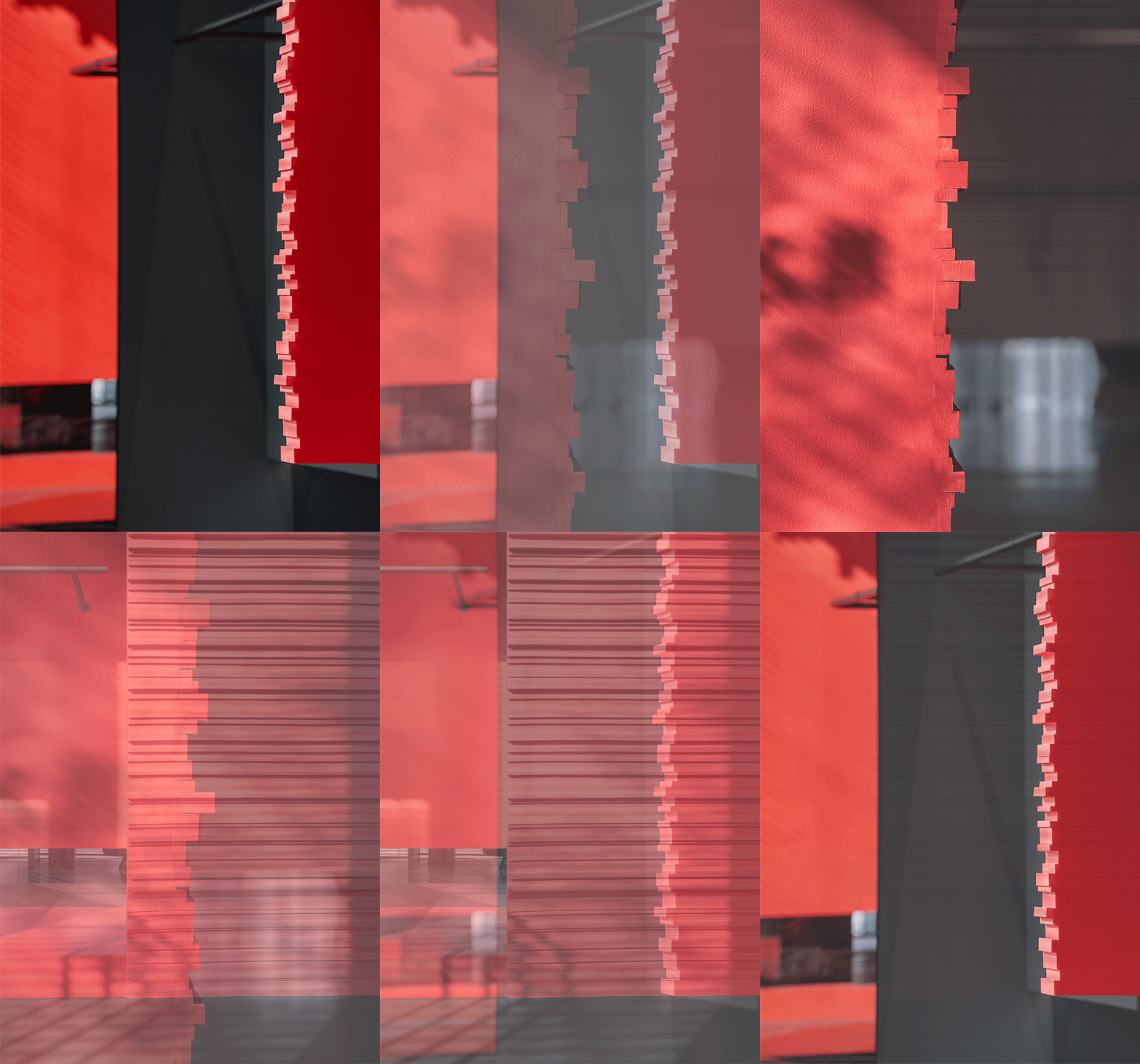
不同尺度的细长EVA阻燃泡沫板依次排布形成细密的线性肌理,理性的直线条和柔软触感形成对比,而肌理本身与内里的平滑表面亦形成对比。层叠效果在光影叠加下得到强化,令红色拥有明度与透明度层次。
Different sizes of slender EVA flame-retardant foam boards are arranged in a sequential manner, forming a dense linear texture. The rational straight lines and soft touch create a contrast, while the texture itself contrasts with the smooth surface underneath. The layered effect is enhanced by the interplay of light and shadow, giving the red color depth and transparency.
▽理性的直线条和柔软触感形成对比 The rational straight lines contrast with the soft touch
2022 ep06「格」深圳 · 中洲湾
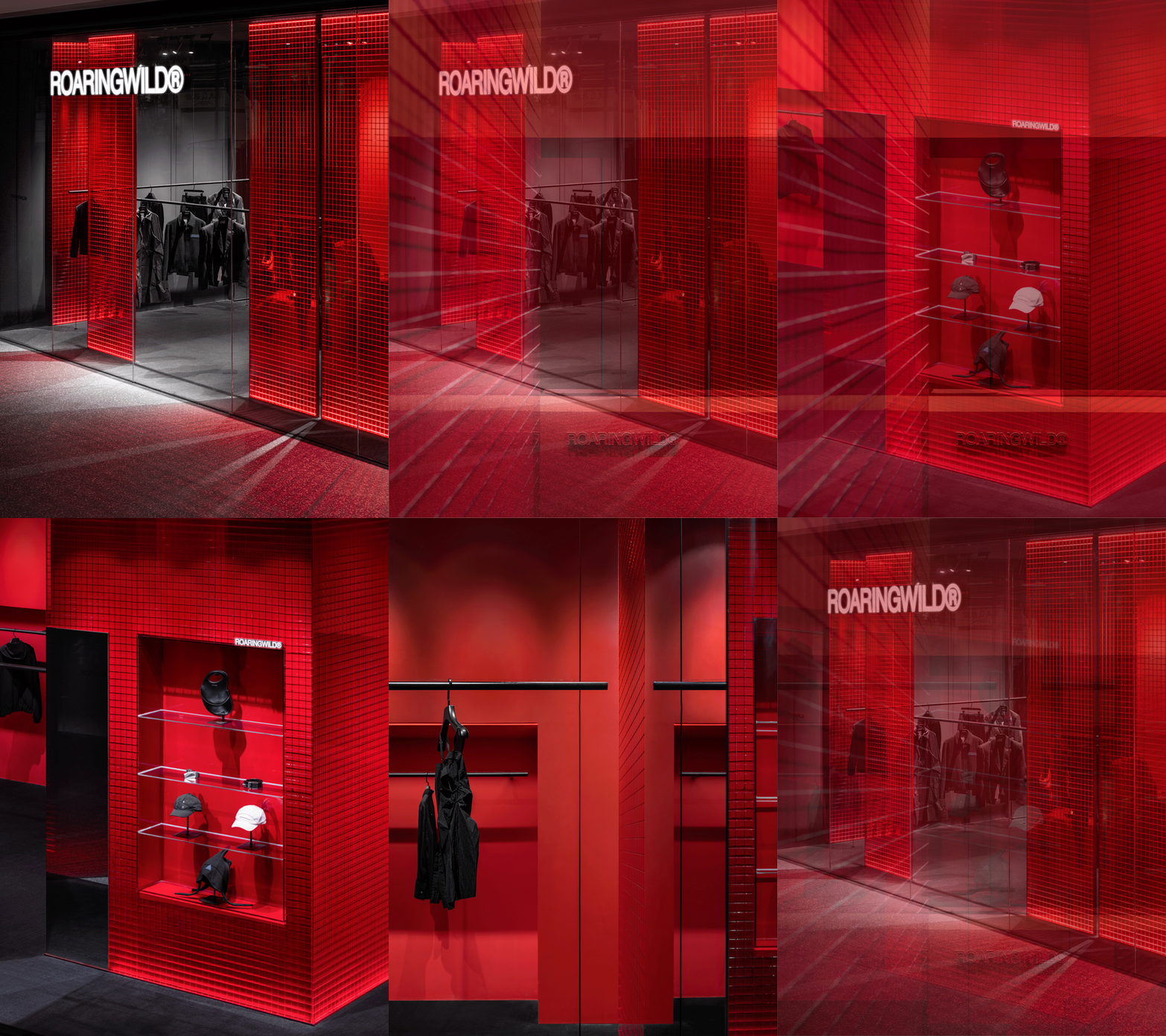
红色半透明亚克力隔墙与镜面在小空间中形成秩序和节奏,同时规划出层次丰富的服饰陈列系统。透出红色暗光的网格语言为店面注入赛博感。
The red semi-transparent acrylic partition walls and mirrors create order and rhythm in the small space, while also planning a multi-level clothing display system. The grid language with the red backlit adds a cyberpunk touch to the store.
▽红色半透明亚克力隔墙 Red translucent acrylic partition wall
在同一设计语言体系下,装置及空间构成可灵活适配场地条件,材质和肌理的差异则提升细节质感,为消费者呈现充满变化与可能性的「红」,这正与经过沉淀的品牌精神一致。
Within the same design language system, the adaptability of the installations and spatial composition allows for flexible adjustments to the site conditions. The differences in materials and textures enhance the quality of details, presenting consumers with a “red” experience full of changes and possibilities. This aligns perfectly with the well-established brand spirit and identity.
2022 ep07「城市心脏」广州 · 万菱汇
体块与管道的交错构成内建筑,在有限面积内提供了丰富的空间体验。此店首次融入新业态,与咖啡品牌的合作让零售门店更契合城市生活方式,为受众人群打造可休憩、可社交的交流碰撞发生地。
The interplay between blocks and pipelines forms the interior architecture, providing rich spatial experiences within a limited area. This store, for the first time, incorporates a new format by collaborating with a coffee brand, making the retail space more aligned with urban lifestyles. It creates a place where the audience can relax, socialize, and engage in meaningful interactions.
▽红色体块的堆叠 Stack of red blocks
面向未来的持续生命力 Sustained vitality towards the future
线下空间所能承载的独特社交形态,将在未来的零售场景营造中起到越来越重要的作用。RW华中地区首店,不仅联合轻餐品牌gaga形成复合业态,也与在地音乐团体及更多年轻潮流文化力量集结,以空间为载体,持续不断地输出内容。
The unique social forms that offline spaces can accommodate will play an increasingly important role in shaping future retail scenarios. RW’s first store in the Central China region not only forms a mixed-use format by partnering with a light dining brand like gaga but also collaborates with local music groups and other youthful trend-culture forces. Using the space as a platform, it continuously generates content and outputs cultural experiences.
2023 ep08「黑洞之瞳」武汉 · 武汉天地
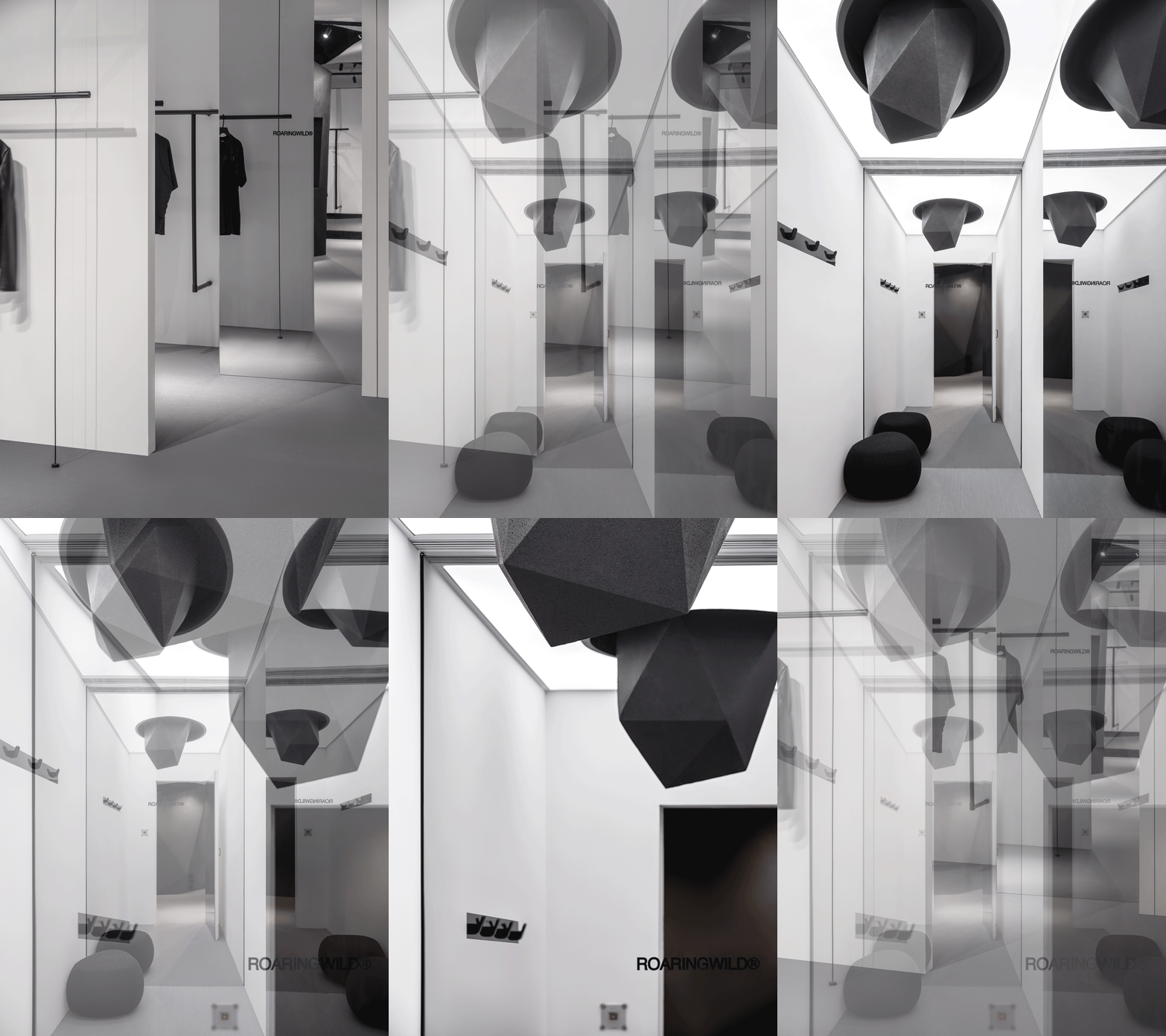
设计策略旨在为品牌打造可以不断生长的、孕育可能性的空间载体。纯粹的空间构成感适配更为成熟和开放的品牌形象,色彩饱和度降低,为未来更多的产品与内容留足包容度。
The design strategy aims to create a space carrier for the brand that can continuously grow and nurture possibilities. The pure spatial composition aligns with a more mature and open brand image, with reduced color saturation to allow more room for future products and content, accommodating a wide range of possibilities.
▽有别常规亮丽色彩的黑洞之瞳 The pupil of a black hole with a different normal bright color
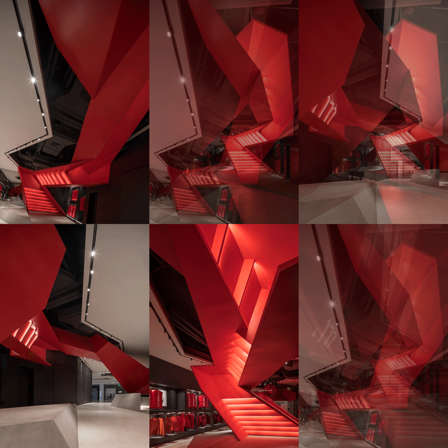
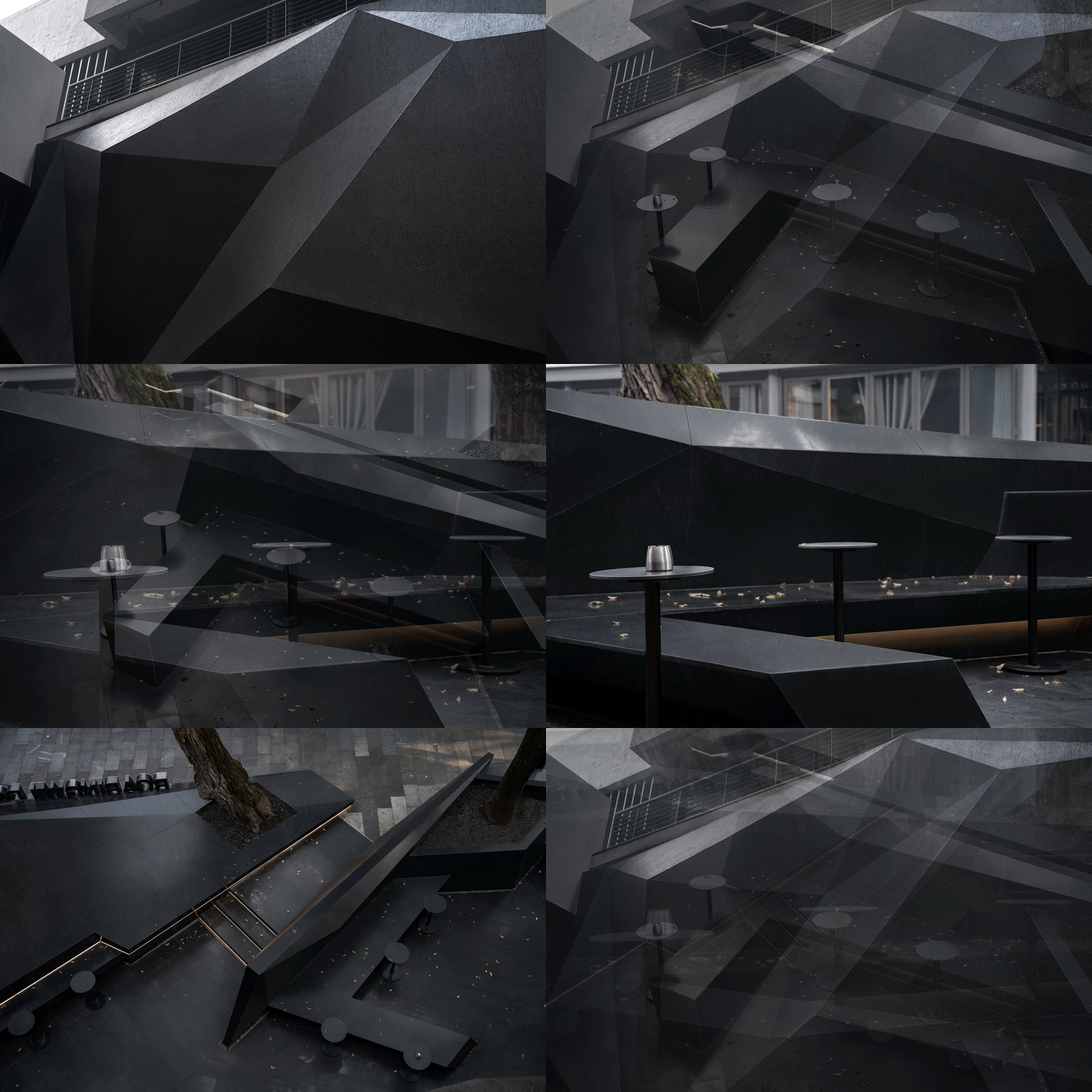
具有鲜明当代风格的多面体雕塑元素被沿用,将外立面及中央柜台打造为内外嵌套的“陨石”,以尺度对比形成超现实氛围。陨石、能量、神秘而强大的引力,浪漫主义题材与硬朗风格并存。
The distinctive contemporary style of the multifaceted sculpture elements is retained, with the facade and central counter designed as nested “meteorites,” creating a surreal atmosphere through scale contrast. The meteorites represent power, mystery, and a strong gravitational pull, combining romantic themes with a rugged style.
▽延续外观陨石的内部空间 The interior space of a meteorite continues in appearance
回看ROARINGWILD线下空间7年间的尝试、突破与演变,品牌经历过表达、探索、自我对话,与每一个个体的成长路径相通。每一次都走得更远,思考得更深入,最终又回归初心,获得持续的生命力。在变化与不变中,我们看到了属于这个时代的品牌精神,和这一代年轻人的态度与力量。
Looking back at the 7-year journey of ROARINGWILD’s offline spaces, we can witness the brand’s attempts, breakthroughs, and evolution. It has gone through phases of expression, exploration, and self-dialogue, connecting with the growth paths of individuals. With each step, it has gone farther, delved deeper into introspection, and ultimately returned to its original purpose, gaining sustained vitality. Amidst change and constancy, we see the brand spirit that belongs to this era, reflecting the attitude and power of the young generation.
▽极具特色的多面体雕塑元素 Very characteristic polyhedral sculpture elements
项目名称:ROARINGWILD概念店
项目地址:中国深圳、上海、广州、武汉
项目面积:130-200㎡
项目业主:ROARINGWILD
完成时间:2017.11-2023.10
主案设计:梁永钊/ DOMANI东仓建设
设计助理:唐嘉颖等 / DOMANI东仓建设
传媒管理:黎颖欣 / DOMANI东仓建设
设计撰文:洪加路
Name: ROARINGWILD flag Store
Location: ShenZhen, ShangHai, Guangzhou, Wuhan, China
Area: 130-200㎡
Client: ROARINGWILD
Completion: 2017.11-2023.10
Leading Designer: Kingson Leung/ DOMANI
Assistant Designer: Carving Tang/ DOMANI
PR Managment: Emily Li / DOMANI
Articles: Karo Hong
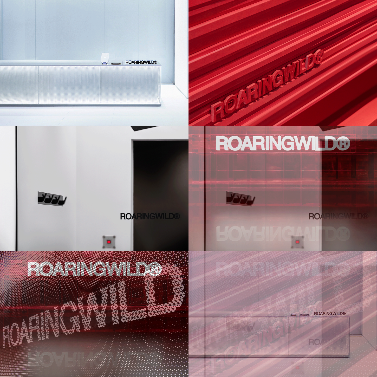
“ 鲜明的色彩与先锋的设计手法,打造独具特色的商业空间。”
审稿编辑:Maggie
更多 Read more about: 东仓建设



















0 Comments