本文由 唯想国际 授权mooool发表,欢迎转发,禁止以mooool编辑版本转载。
Thanks X+Living for authorizing the publication of the project on mooool, Text description provided by X+Living.
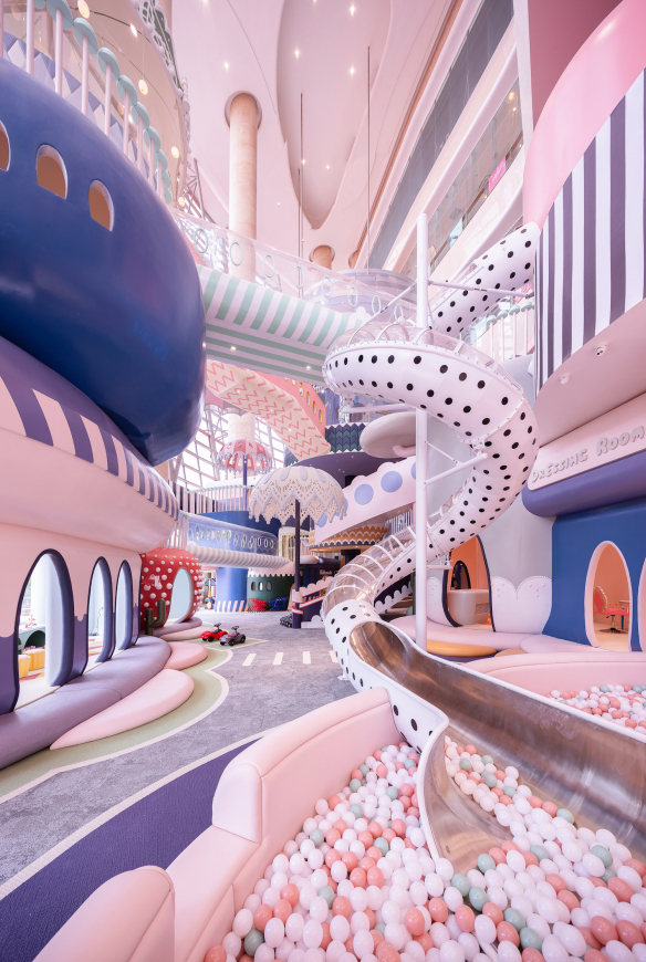
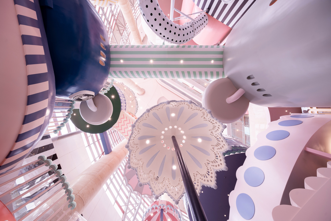
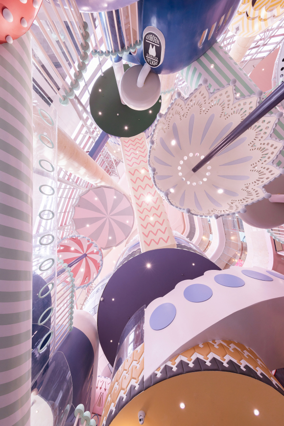
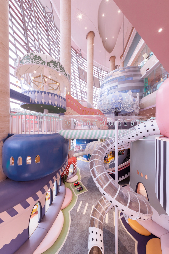
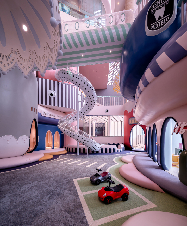
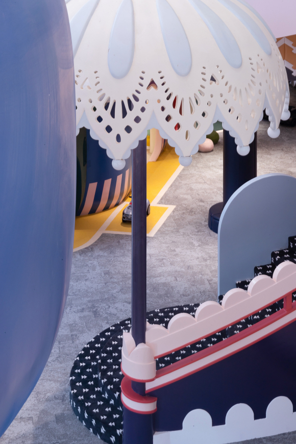
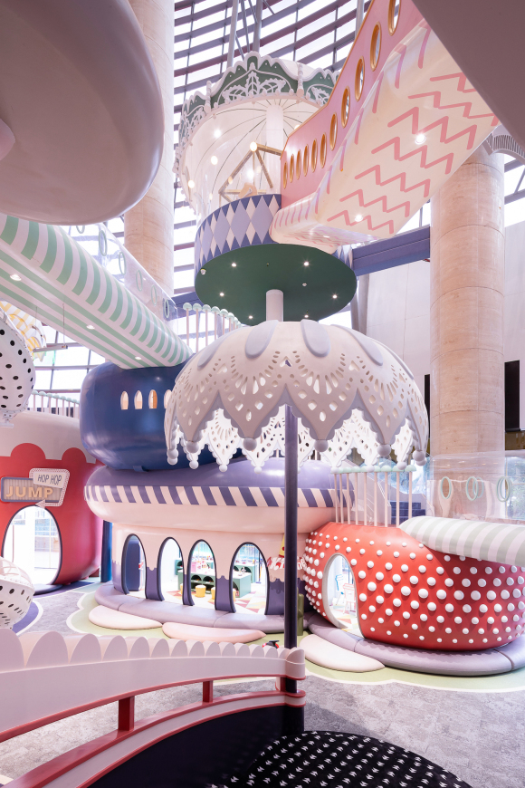
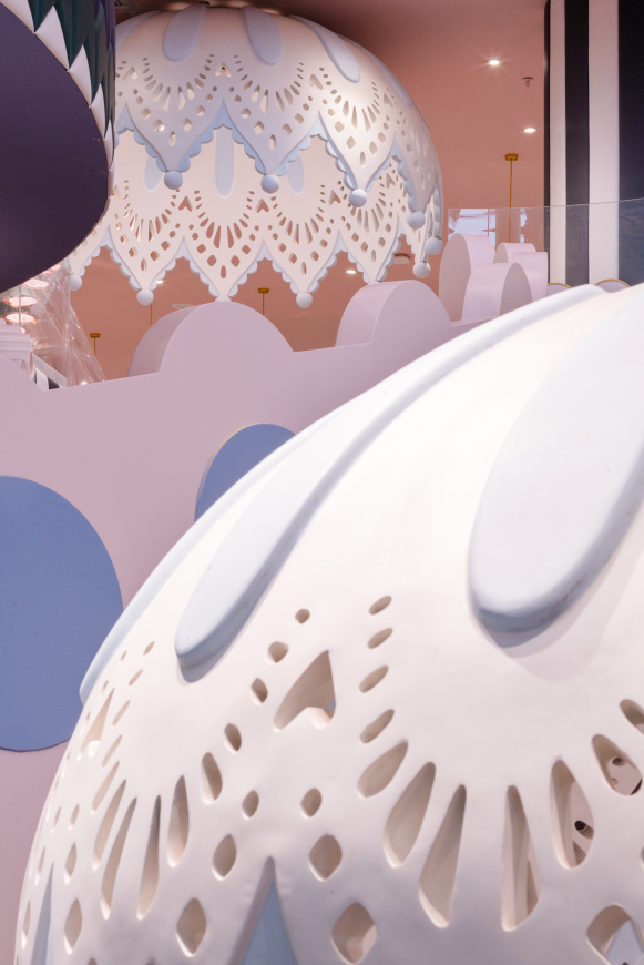
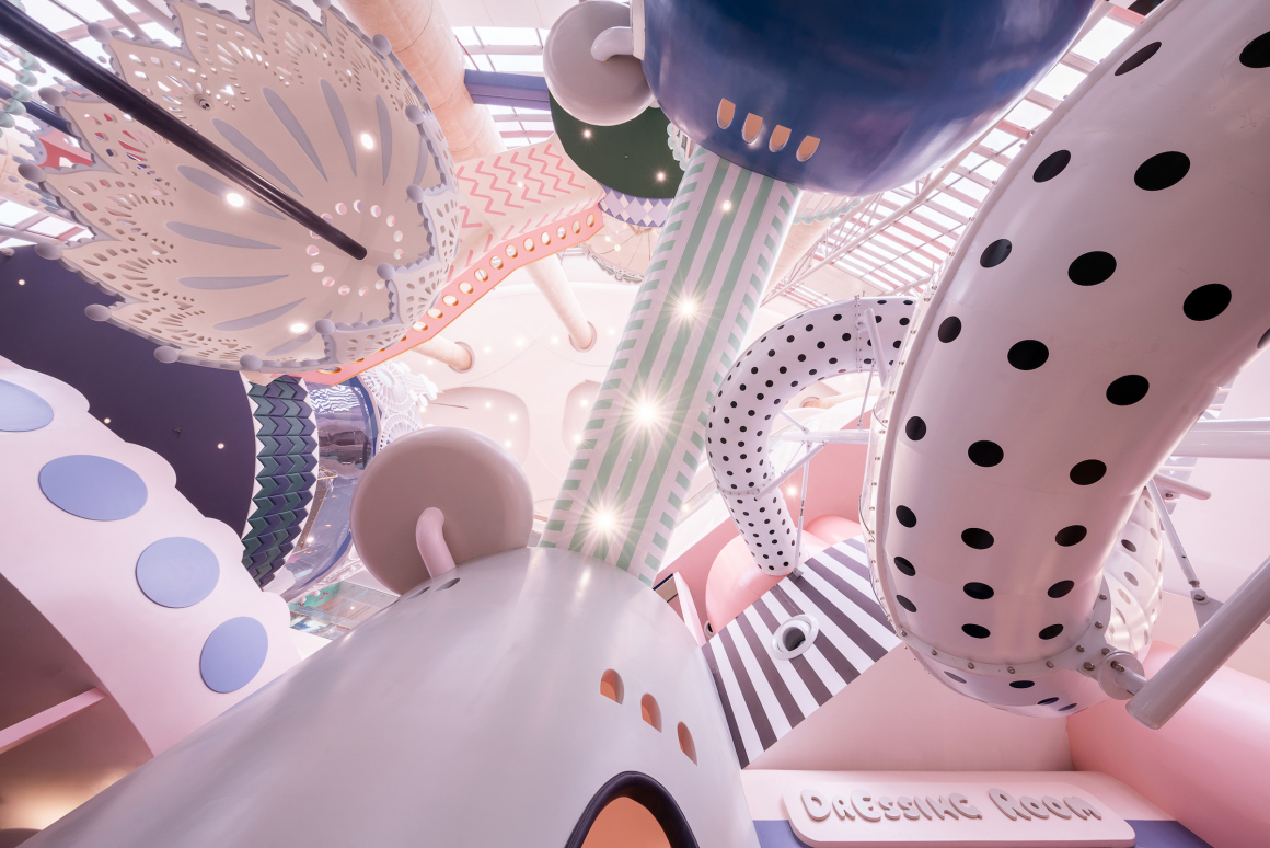
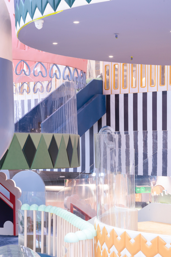
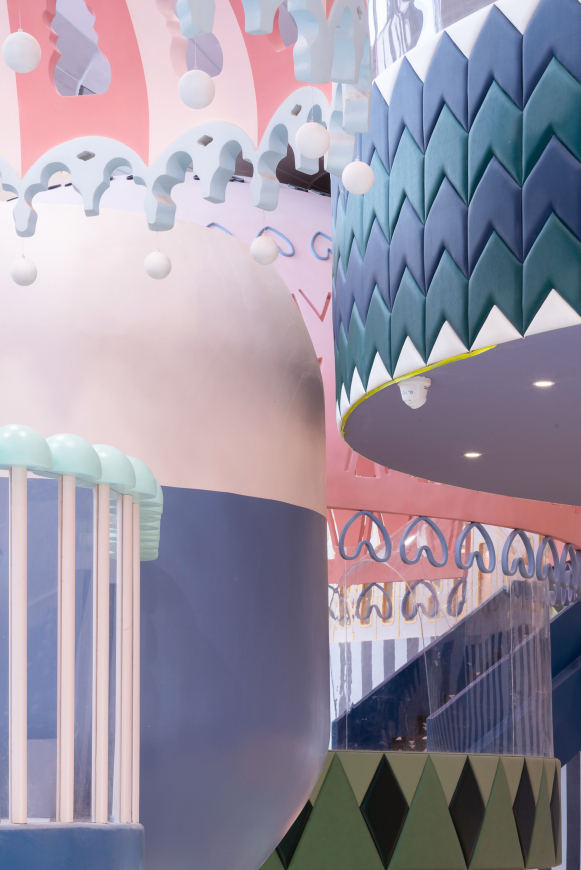
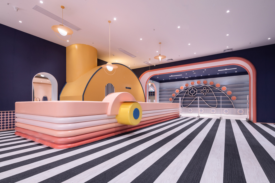
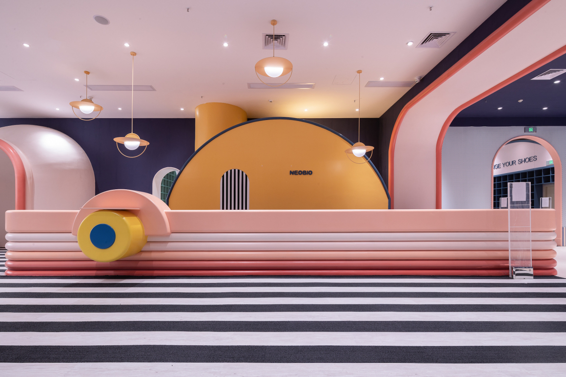
唯想国际:延续了奈尔宝一贯的设计风格,深圳店的设计亮点在于利用层高,巧妙安排空间。位于商场中庭部分的模拟城区域,设计师没有浪费空间,而是结合中庭的层高空间,巧妙地将模拟城搭建成一个空中的立体的城市。走廊,滑梯,空中吊顶等一系列的组件,撑起整个空间,打造一座梦幻的城市的同时将城市与商场原有的空间融为一体,两者和谐共处,相辅相成。
X+Living:The design style of Neobio in Shenzhen continue the consistent design style of Neobio brand. The design highlight of Shenzhen Store lies ingenious arrangement of space though the use of floor height. Sims city located in the atrium part of the shopping mall, the designer combined with the high-rise space of the atrium and skillfully built the Sims city into a three-dimensional city in the space rather than waste space. The whole space is supported by corridor, slide, aerial ceiling and a series of components, and create a dream city. At the same time, the Sims city and the original shopping mall space are mixed together.
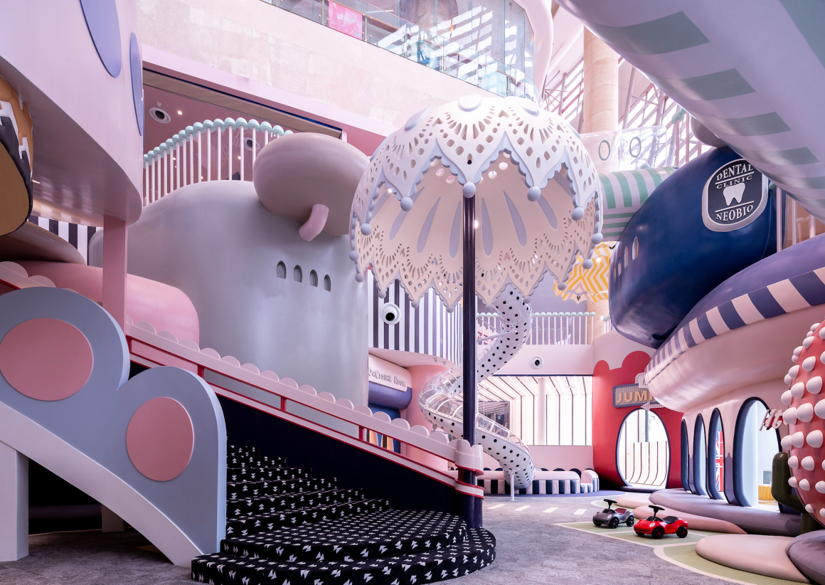
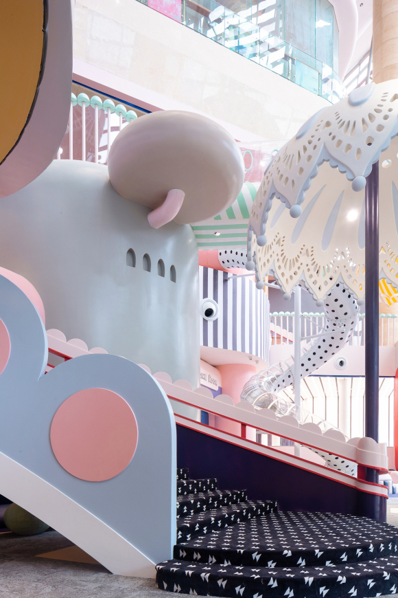
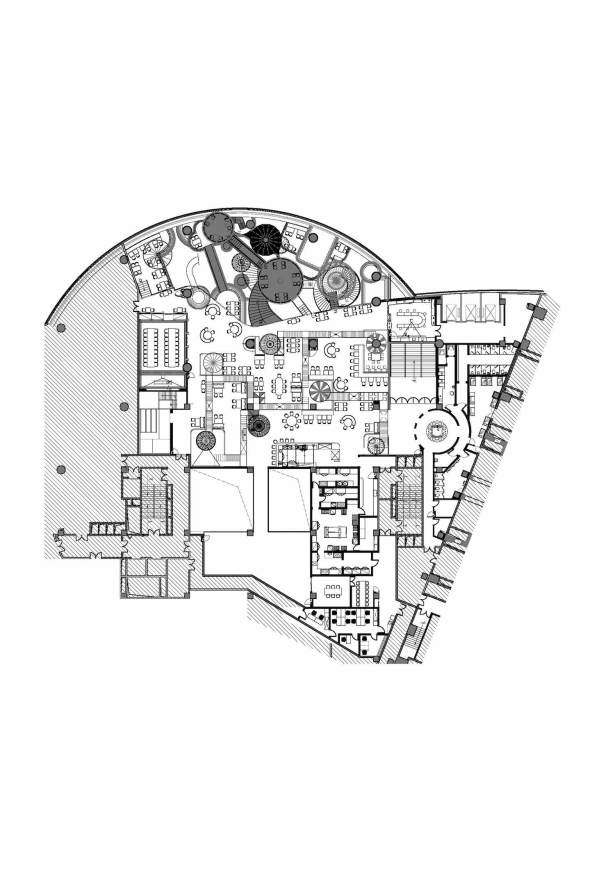
不同于以往的设计,在小树林图书区,石头模拟城与餐厅三个区域之间,采用不同区域之间的自然过渡,取消立墙,使用了无缝衔接的模式以消除隔阂感。在石头模拟城区域内,书架墙可以更直观简洁地指示方位,让小朋友清楚图书区的位置。
Different from the previous Neobio stores, Neobio in Shenzhen uses the natural transition and seamless connection model among Library Area, Stone Sims City and Restaurant, to avoid the vertical walls and eliminate the sense of estrangement. In the stone Sims city, the bookshelf wall could indicate the orientation more intuitively and concisely for children.
穿过小树林图书区的过道就是石头模拟城,两种区域的快速转换与实现得益于无缝衔接的设计。在餐厅与石头模拟城之间,同样没有立墙,凭借座椅的摆放和布局来实现不同区间的自然过渡。让消费者在就餐的过程中仍然可以欣赏到整个模拟城的构造,同时也方便家长照看在模拟城区域玩耍的孩子。
The passageway through the library area is the Stone Sims city. The rapid transformation of this two areas benefit from the seamless design. Between the restaurant and the Stone Sims city, the natural transition of different sections can be achieved by the placement and layout of seats without vertical wall. In restaurant, consumers can still enjoy the whole structure of the Sims city, and at the same time, it is convenient for parents to look after children when they playing in the Sims city.
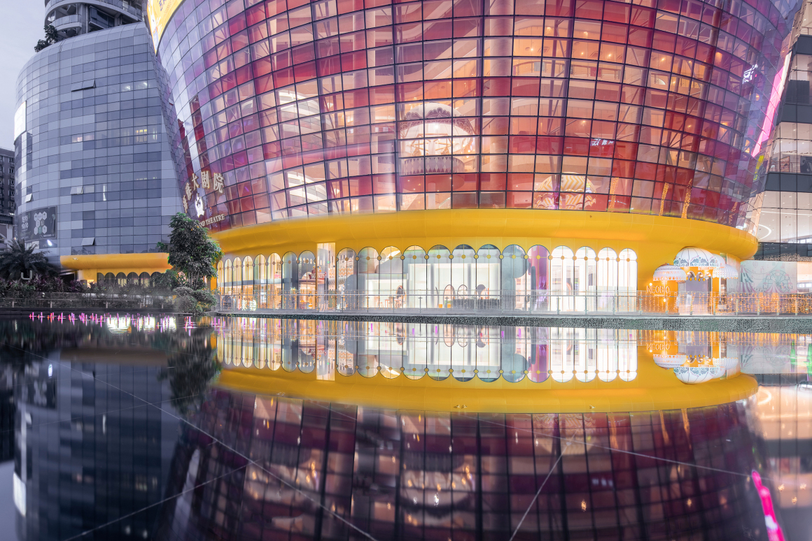
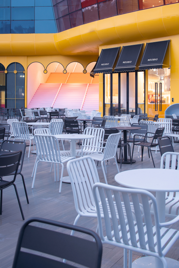
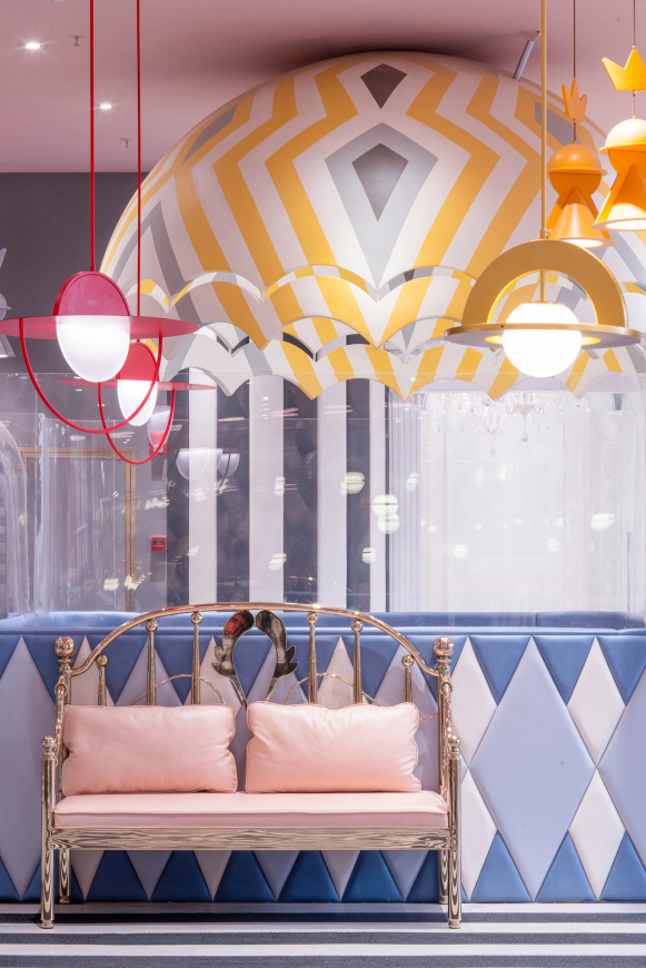
结合商场本身的玻璃幕墙构造,设计师将一层的外立面整体改造成吸引人眼球的亮黄色围廊。在景观池的映衬下,水中的倒影与实景连成一体,扩大了外立面的视觉效果,起到了广告宣传的效果。奈尔宝梦幻世界的入口就隐藏在黄色围廊中,4个标志性的伞状吊顶调动消费者的情绪,为接下来进入的梦幻世界做铺垫。
Combining with the glass curtain wall structure of the shopping mall outsides, designers transform the whole facade of the first floor into a bright yellow corridor to attracted visitors’ attention. Under the backdrop of the landscape pool, the reflection in the water is integrated with the real scene, which enlarges the visual effect of the facade and plays the role of advertising. The entrance to Neobio’s dreamland is hidden in the yellow corridor. There are four iconic umbrella ceiling arouse consumers’ emotions and prepare for the next dreamland.
▼平面图 Plan
项目名称:深圳奈尔宝家庭中心
完成年份:2020.8
项目面积:6000㎡
项目地点:中国深圳
设计公司:X+Living(唯想国际)
公司网址:www.xxxxxx.design
联系邮箱:press@xl-muse.com
主创设计师:李想
项目总监:任丽娇 吴锋
客户:上海奈尔宝企业管理有限公司
摄影师:邵峰
摄影师网址:http://www.sfap.com.cn/
Project name: Shenzhen Neobio Family Center
Completion: 2020.8
Area: 6000 square meters
Location: Shenzhen, China
Design Firm: X+Living
Website: www.xxxxxxxx.design
Contact: press@xl-muse.com
Chief designer: Li Xiang
Project Director: Ren Lijiao, Wu Feng
Client: Shanghai Neobio Enterprise Management Co., LTD
Photographer: Shao Feng
Photographer’s website: http://www.sfap.com.cn/
更多 Read more about: X+Living 唯想国际






0 Comments