本文由 穆氏建筑 授权mooool发表,欢迎转发,禁止以mooool编辑版本转载。
Thanks M Moser Architecture for authorizing the publication of the project on mooool, Text description provided by M Moser Architecture.
穆氏建筑:“建筑的一半依赖于思维,另一半则源自于存在与精神。”
一 安藤忠雄
M Moser Architecture: “Half of architecture depends on thinking, and the other half comes from existence and spirit.”
一 Tadao Ando
▽项目视频 Video
于艺术中心而言,它的场所精神与现实意义同等重要,不仅是时代下文化艺术的映射,更是一座城市国际化进展中的标杆之作,对此,巢·艺术中心的建造者希望它是一个内外兼修的城市符号,以“美”之张力实现空间的无限可能性。
当下,我们谈论美即生产力,无法取代的竞争力是为美的构成要素。在深圳这座国际化城市的雄心和抱负之下,巢·艺术中心的“美”具备了独一无二的意义,才能在时代的浪潮中勇往前行。
For art centers, their design aspirations – rooted as it is within its locale – is of equal importance to its attention to practical considerations. It is not only a reflection of contemporary movements in culture and art, but also a benchmark in the city’s progress on an international stage. Q-Plex’s developers hope that it will become an iconic symbol of the city, known for its refined qualities, both internal and external – and thereby create a fruitful tension between its spatial accomplishment and future potentials.
At the moment, we have come to recognize beauty as a productive force, as we believe a lively spirit of competitiveness is an essential element of beauty. In Shenzhen, an ambitious city with major international aspirations, the spatial and aesthetic qualities of the Nest Art Center present a unique image which encapsulates the spirit of the times, and provides a template for the city’s development in times to come.
1.为什么选择穆氏作建筑设计?Why was M Moser Associates Chosen to Design the Building?
设计之初,巢·艺术中心参考国际各大湾区的艺术发展史,从建筑、室内以及功能空间的设计理念上都塑造至国际高度,所以它不仅仅是一个艺术中心,更是一个时代的映射。
“在垂直建筑里融入造型有机的元素,这有助于在建筑和它所处的自然环境间营造共生的意境。” – Ramesh Subramaniam,Director @ 穆氏 M Moser Associates
也因此,我们选择了为google大楼、paypal办公、阿里和腾讯总部操刀的美国M Moser Associates穆氏(中国区)进行建筑与室内设计,将极致的创新性融入室内空间,在整个侨城坊的生态背景下,以科技感、未来感、时尚感贯穿建筑、室内以至整个人文环境。
From the earliest stage of its design, the Nest Art Center was conceived as a continuation of major art spaces established in cities around the Greater Bay Area (consisting of Hong Kong, Macao, and nine cities in Guangdong). Its architectural, interior, and functional space design concepts have been designed to an international standard, and it aspires to serve not simply as a place within which to view art, but as a significant emblem of the times itself.
“The placement of an organic element within a rectiliner structure creates a symbiotic relationship between the building and the surrounding natural environment.”– Ramesh Subramaniam, Design Director @ M Moser Associates
Following this, the American firm M Moser Associates (Shanghai branch) was selected for both the architectural and interior design. They have previously completed many prestigious projects including the headquarter buildings of Google in Malaysia, several offices of PayPal across Asia, and Tencent’s headquarters in Guangzhou. For this project, a thoroughly innovative approach was incorporated in the interior design blending indoor space with the context of the greater urban ecology in which the building stands. The spirit of current movements in technology, the future and fashion runs throughout the building, indoors and out, and even beyond into the realm of the city’s concept of culture and the built environment.
2. 破茧而出的“蛋” The “Egg” Emerging from the Cocoon
建筑的创新不仅仅是形式的创新,更是内在行为逻辑的创新,在此基础上,创造一种全新的美学价值和观念,让建筑真正散发出属于它自己的艺术价值。
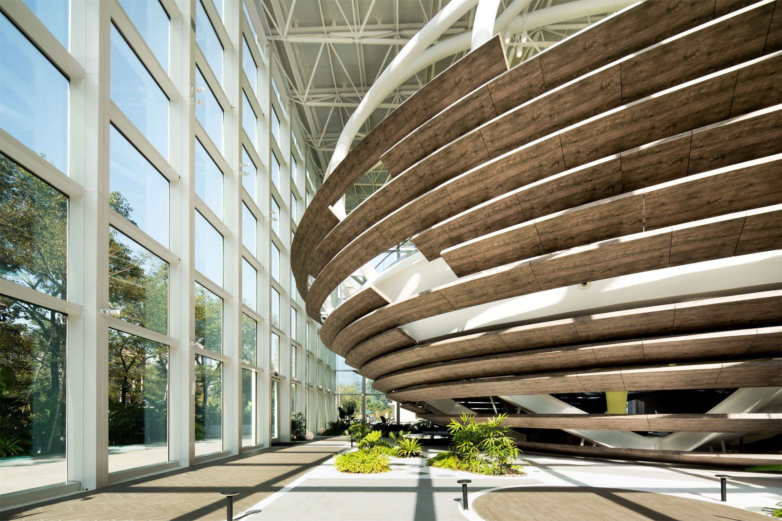
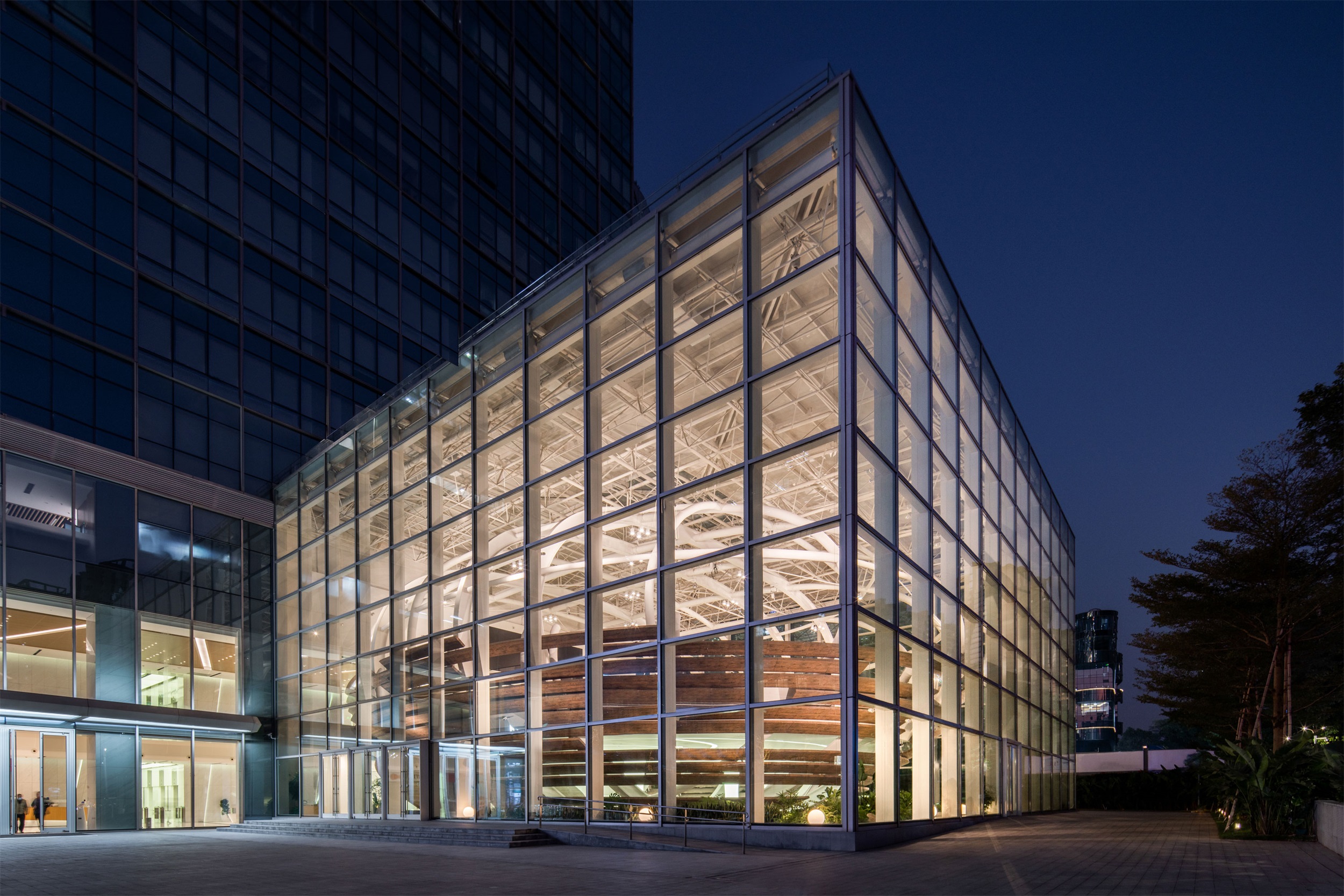
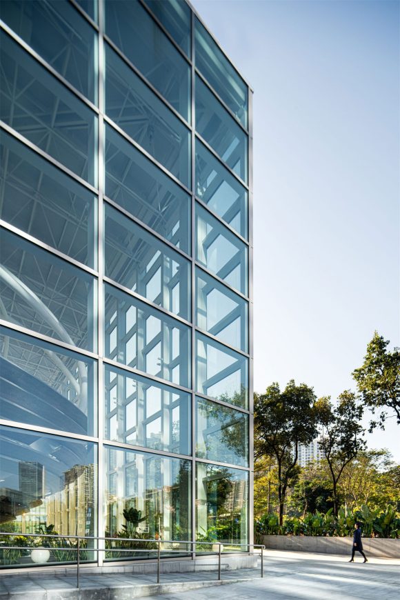
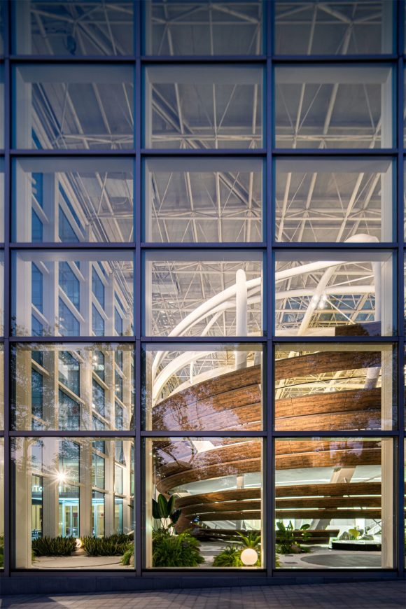
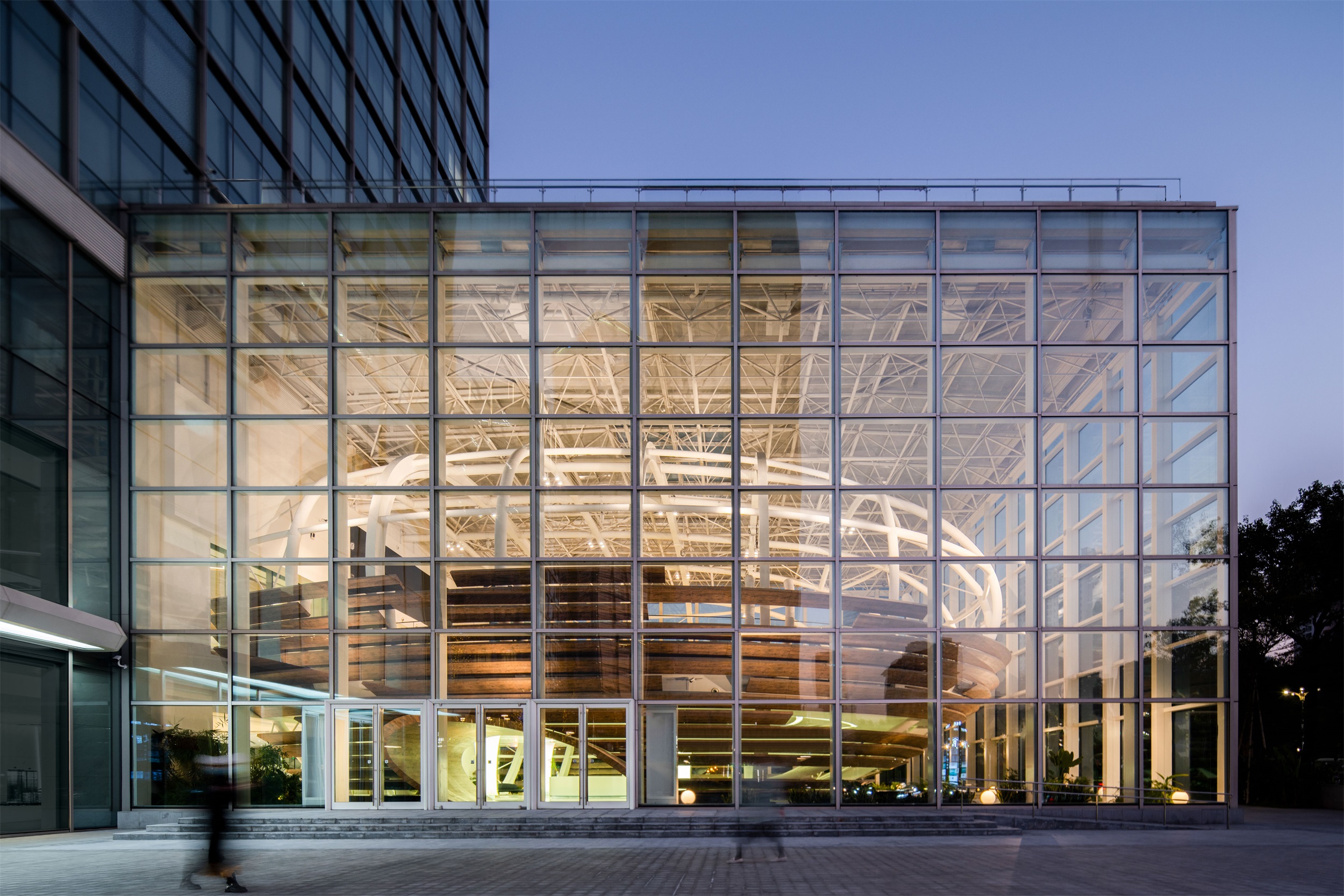
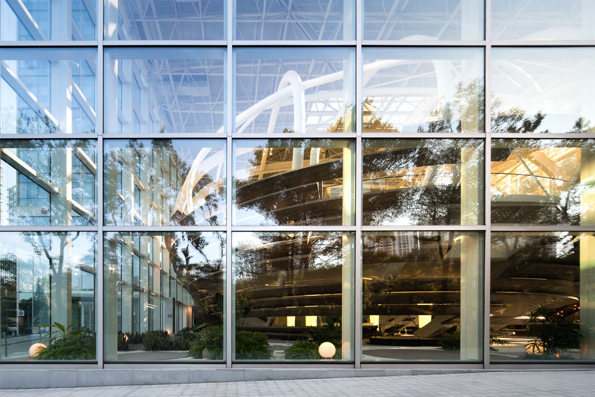
椭圆体玻璃建筑,我们常称它为“一个破茧而出的蛋”,与侨城坊之间形成一种独立而连结的关系,在开放、创新、自由、非常态的基调下,创造独具思想性的空间。同时,“蛋”的造型也与空间的功能使用不谋而合,艺术中心作为集企业发布会、路演展示、酒会交流等多元空间,旨在为企业发声的同时,成为企业真正的孵化器。
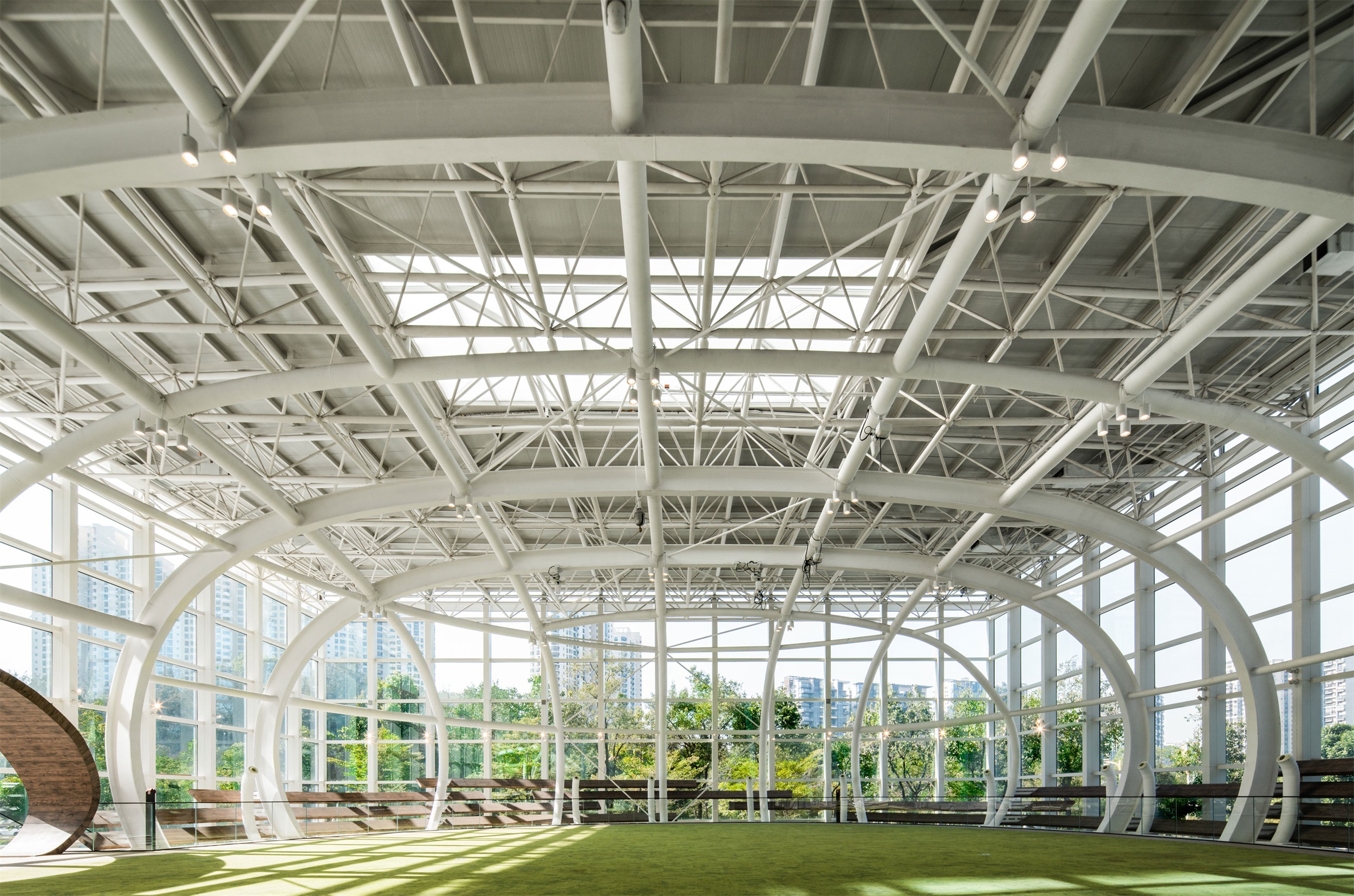
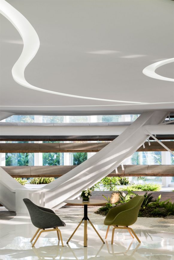
建筑内部白色线条柔和且流畅,从中生出一股浪漫,这理性与柔美的结合,与巢·艺术中心的特质不谋而合:一个内外兼修、具有长久生命力的城市标杆。
The innovation of architecture is not only about the new form, but also bringing forth new ideas in internal logic and activities. This approach enables the creation of new aesthetic concepts and meanings, so that every building project may truly fulfill and exemplify their own unique cultural values.
The architecture is easily recognized with its elliptical structure housed within a glazed frame facing the street, referred as “an egg emerging from a cocoon”, which forms an independent yet connected relationship with the surrounding area. It seeks to embody the ideals of innovation, freedom, and distinction, creating a unique, thoughtfully considered space. At the same time, the shape of the “egg” easily lends itself to the required function of the space. As a diversified building integrating corporate conferences, roadshows, cocktail parties, etc., the Center aims to be a true incubator for companies, and provide an outstanding platform from which to announce themselves.
Within the building, the interior design has also incorporated white flowing lines to lead the eye throughout the space. Such creates an elegant contrast of rational straight edges and gentle contours, which illustrates the main characteristics of the Nest Art Center – a city icon with long-term vitality, and possessed of both inner and outer refinement.
「巢」寓意着新生、希望与活力,在将艺术、建筑与生态结合的同时,项目时刻呼应着这座新生城市的独特气质,此外,饱含科技感的氛围将造就全球现象级艺术空间,成为深圳的人文艺术另类高地。
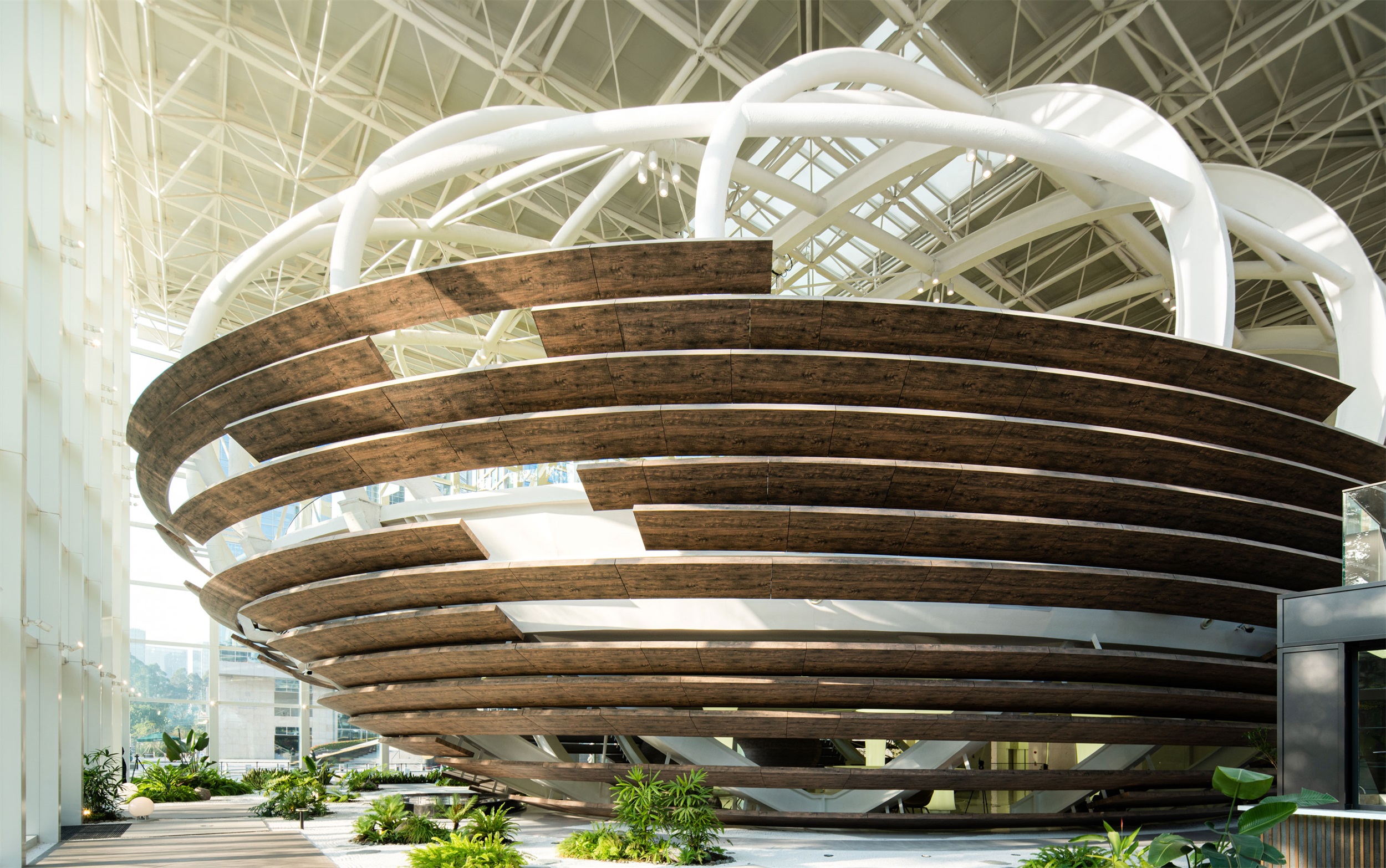
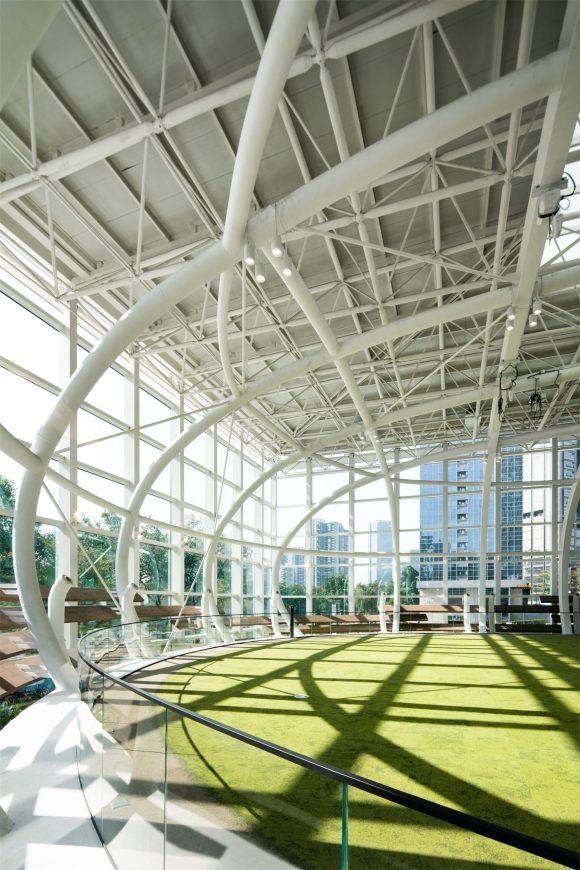
此外,建筑内部白色网格状结构层层相接,不断延伸、扩张之下,形成极具秩序感与仪式感的存在,带来的不仅是视觉上的震撼,更是文化语言的表达,是理性且科学的精神展现。
“Nest” implies a new life, hope, and vitality. In its combining of art, architecture and ecology, the project aims to echo the unique temperament of the new, vibrant city where it resides. The abundance of hi-tech and scientific research companies here has created a dynamic atmosphere, which provides a backdrop that contributes to Q-Plex’s attraction as an international-level space – an oasis of alternative arts and culture in Shenzhen.
In addition, the white grid-like structure inside the building extends throughout the project, which gives a continuous and cohesive order to the architecture as one moves through the various spaces. This provides a visually striking effect, while simultaneously giving expressions to a rational and scientific spirit.
▽椭圆的“巢”空间 Elliptical “nest” space
▽建筑内部层层的白色网格状 Layers of white grids inside the building
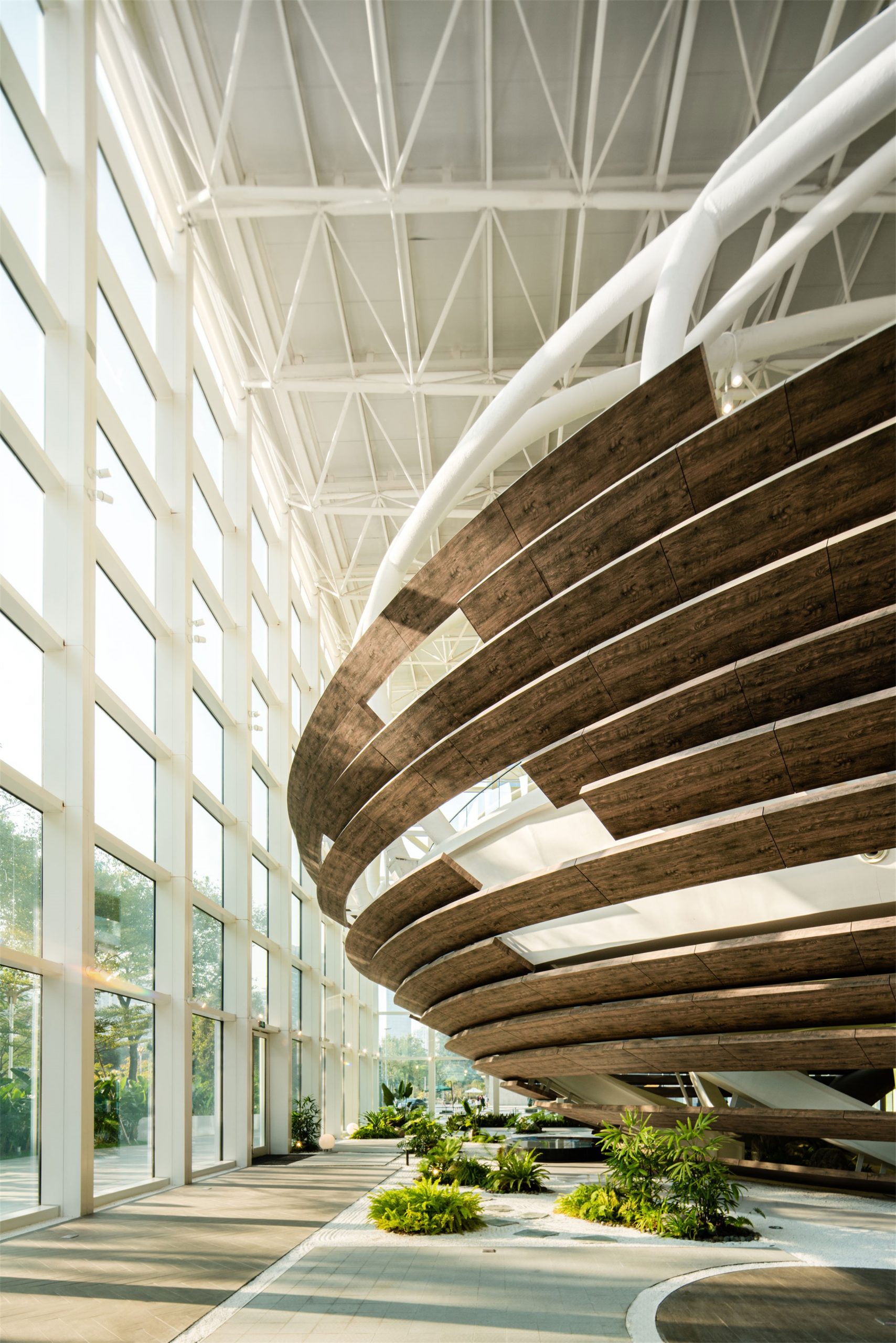
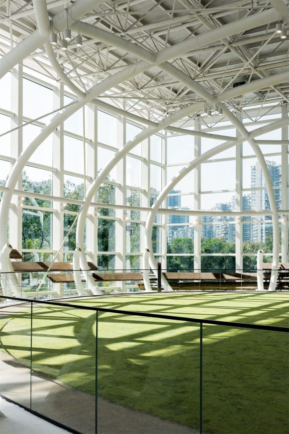
如果将建筑称之为艺术,那么光线必定有着不可替代的作用,它贯穿于建筑的形体,变幻着空间的节奏。在此,亦如此,玻璃幕墙与纯白色钢架结构增加通透感,光线游走其中,以自然的、流动的形态雕琢建筑尺度,造就了巢・艺术中心的建筑美学,也使其成为深圳独树一帜的地标性建筑。
If architecture is to reach the level of art, then light must have an intrinsic role in the defining of space. It runs through the shape of the building and changes its rhythm. Here, the circular glass curtain wall and pure white steel frame structure increase the sense of transparency within the space as light passes through it. As the architecture is sculpted by illumination, its nature-inspired flowing forms are accentuated, creating the defining aesthetic qualities of the Nest Art Center, now a well-known and outstanding landmark in Shenzhen.
3. 功能设计:以尺度丈量艺术的高度Functional Architectural Design:A Measurement of Beauty
空间的结构亦决定了功能的走向,虽为艺术中心,但项目建造者更希望它是一个综合性的宣发互动平台。
极具标志性的建筑外观以强烈的视觉符号奠定基调,而内部则以简洁、灵活的调性形成反差。为此,我们设定它是中性的,从艺术大展到私人酒会,空间灵活、多变而又有序,以此配合多种活动类型、塑造多种氛围、串联多家企业,它的未来具有无限的可能性。
作为一个国际化的活动场所,巢·艺术中心至今已举办众多展览活动,如当代街头艺术之父RON ENGLISH的展览、托尼诺·兰博基尼的新品发布会、劳斯莱斯VIP品鉴活动、TEDx2021年度大会、艺术家颜磊xPINKPUNK跨界艺术展“彩轮嘉年华”等等。于豁然开朗的舞台极目四望,幕墙外便是深圳最美天际线,整个空间仿佛融化在蓝天之中,日光下澈,不觉间心旷神怡,此刻,这才是对人、建筑与环境关系的最佳诠释。
A space’s structure to a large extent determines how the building will function in the future. The developer hopes that the Center will become a comprehensive business incubator.
The exterior design of this landmark building establishes a strong visual presence, while the interior, in contrast, presents a simple and flexible spatial character. We have set it up in such way as neutral, in order to better serve the art exhibitions, private cocktail parties, and other events as intended to host. The space is flexible, changeable, and precise, in order to seamlessly coordinate multiple types of activities, create multiple atmospheres, and connect multiple companies with each other, allowing for unlimited possibilities in the future.
As an international event venue, the Nest Art Center has thus far held multiple exhibitions and events, including but not limited to immersive art exhibitions by Ron English, who is known as the “Godfather of Street Art”, ROLLS-ROYCE NEW GHOST NATIONAL LAUNCH, Forums by TEDXShenzhen, COLOR WHEEL. Looking from the floodlit stage, out and beyond the glazed curtain wall to the city beyond, one may observe the beautiful skyline of Shenzhen. The space overhead seems to meld with the blue sky above, as the clarity of sunlight brings out more relaxation and refreshment. This is the moment for the interpretive relationship among people, architecture, and the environment at its peak.
▽综合型的互动场地空间 Comprehensive interactive venue space
▽流畅的白色曲线 Smooth white curve
▽场地装置 Venue installation
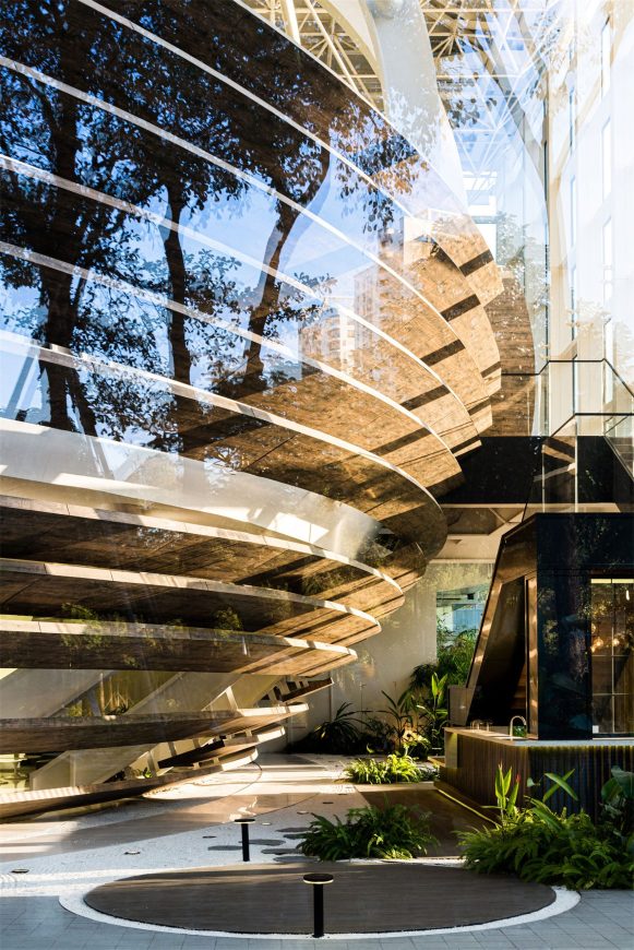
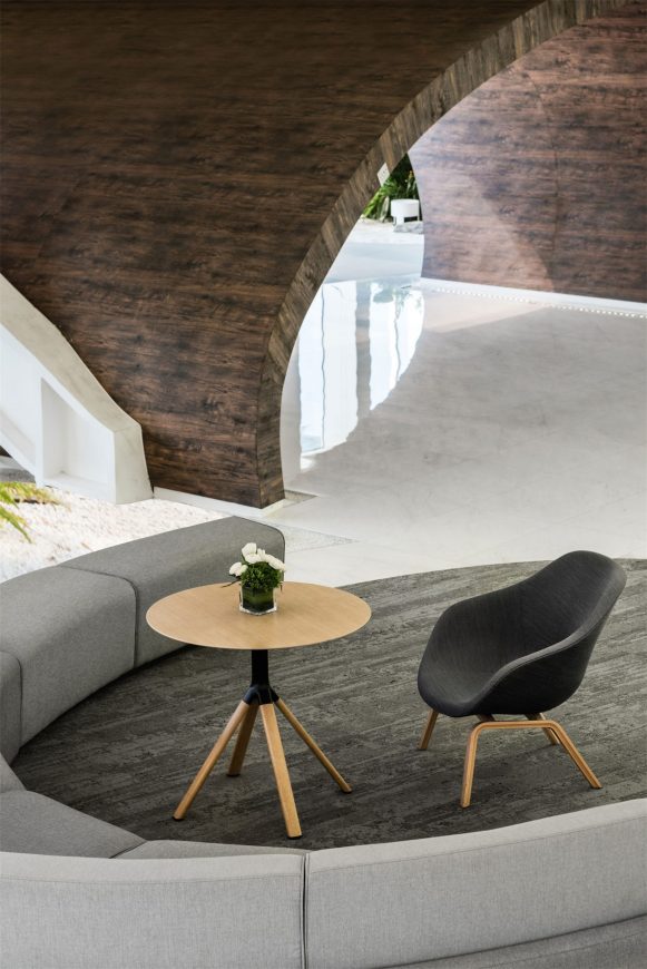
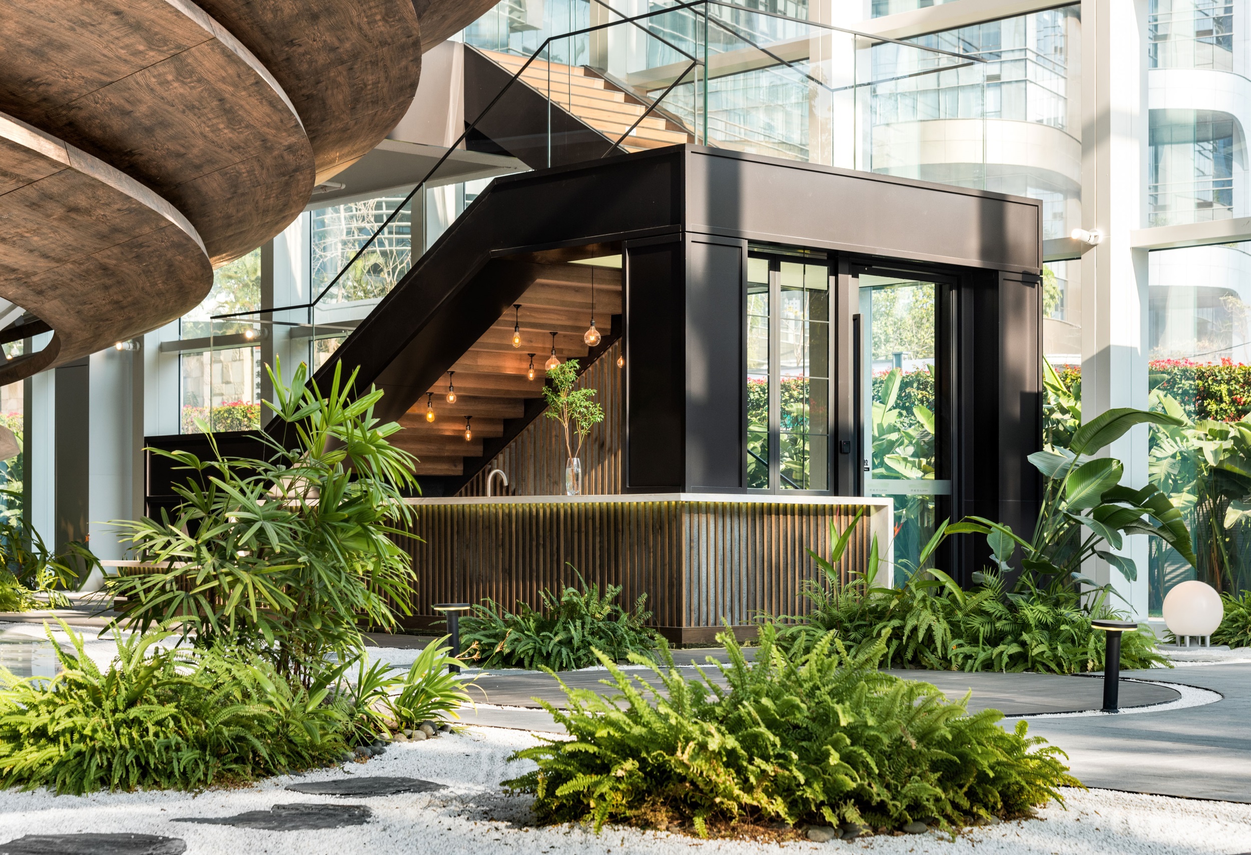
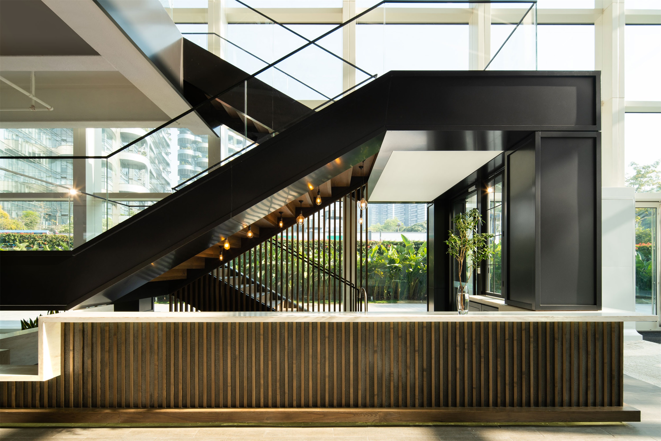
主会场位于上层,楼下是商务洽谈或是休闲的区域,吧台曲径通幽,缓步向上,愈发开阔,宁静而辽远,搭以西班牙老船木与苔藓植物相接,不失为都市里的花园谧境。 灵动的曲线运用于椭圆面中呈现几何之美,接待台、咖啡厅、活动空间的运用将实用主义融入建筑艺术之中,木百叶与外部庭院形成连通,引入和煦的自然光线。
The main venue is located on the upper floor, while the lower level is reserved for business conversations or leisure activities. The path to the bar is winding and relaxed, slowly leading to the upper level, gradually becoming wider and quieter the further away it gets from the bar. The pathway is aesthetically unified through the motifs of old Spanish boat timber and moss, which envokes a quiet garden environment in the city. Meanwhile, the main elliptical shape visible from the street presents the beauty of geometry, and the integration of the reception desk, cafe, and event space incorporates a dynamic pragmatism into the architectural design.
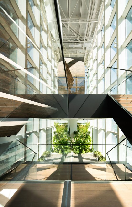
▽上层与下层连接空间 Connecting space between upper and lower floors
▽会议洽谈区 Conference negotiation area
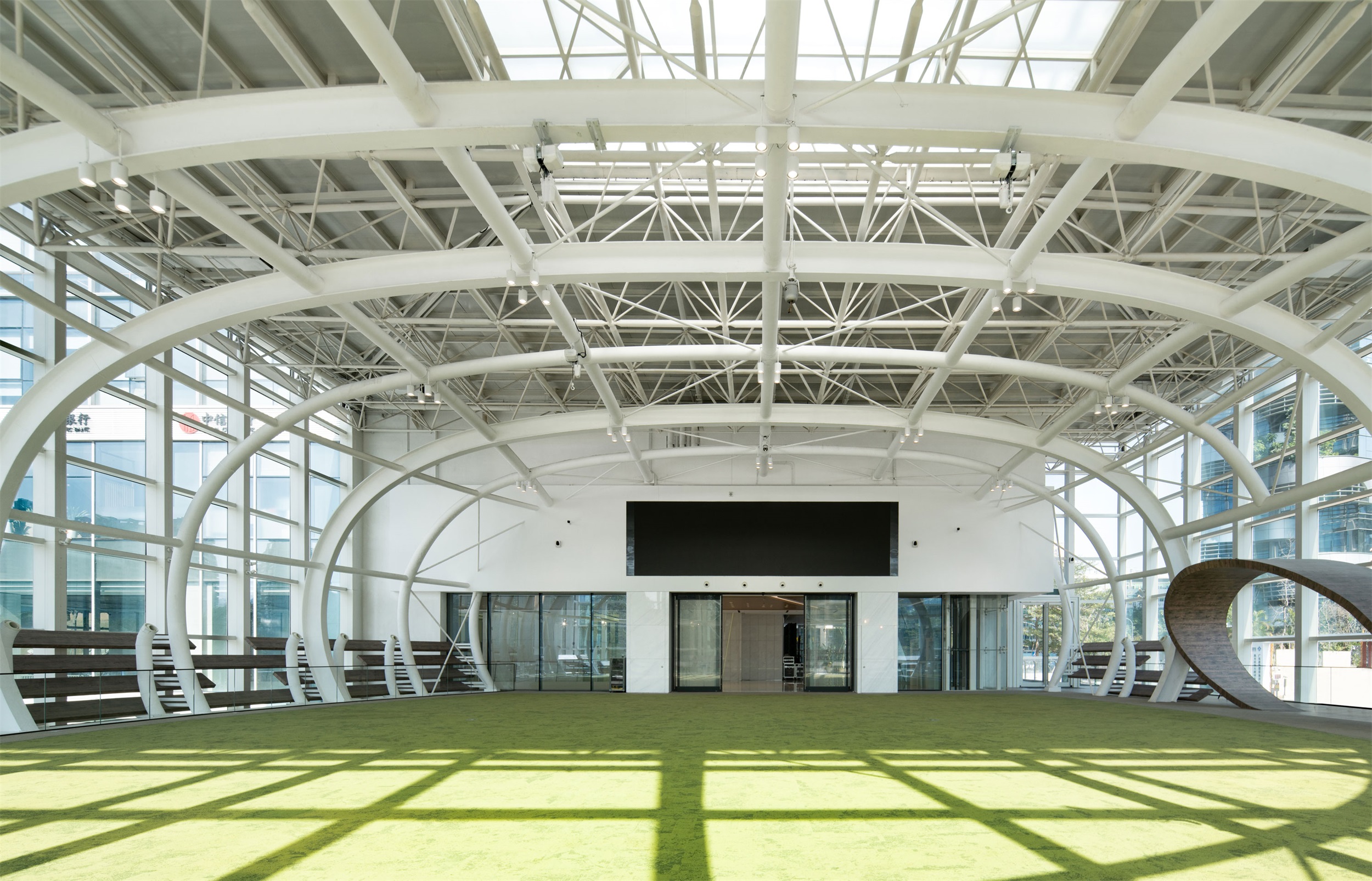
木百叶与外部庭院形成连通,引入和煦的自然光线。移步二层,地面被木质踏步包裹,呼应着椭圆木质入口,平台无梁柱的1200平米超大主会场,可容纳500人。
空间下部围合材料通过3D打印技术将木饰面雕刻于金属板面上,木质面特有的温柔细腻拉近了人与空间的距离,与金属的对比,也突出空间的层次感与肌理感,远远看去,如巨型的艺术装置,空间氛围艺术化。
Wooden shutters form a connection with the external courtyard, introducing warm natural light. Moving to the second level, the glazed stairwell has a flooring of wooden steps that echo the wood oval at the entrance area, which boasts a main venue with a platform of 1200 sqm free of beams and columns, with accommodation of up to 500 people.
The materials used in the ellipse’s lower portion consist of metal plates clad in wood veneer created with 3D printing technology. The unique nature of the wood-like surface draws people into the space, while the contrast with the metal also calls attention to a sense of layering and texture. From afar, it appears like an outsized art installation, and lends the building an atmosphere of aesthetic ambition and refinement.
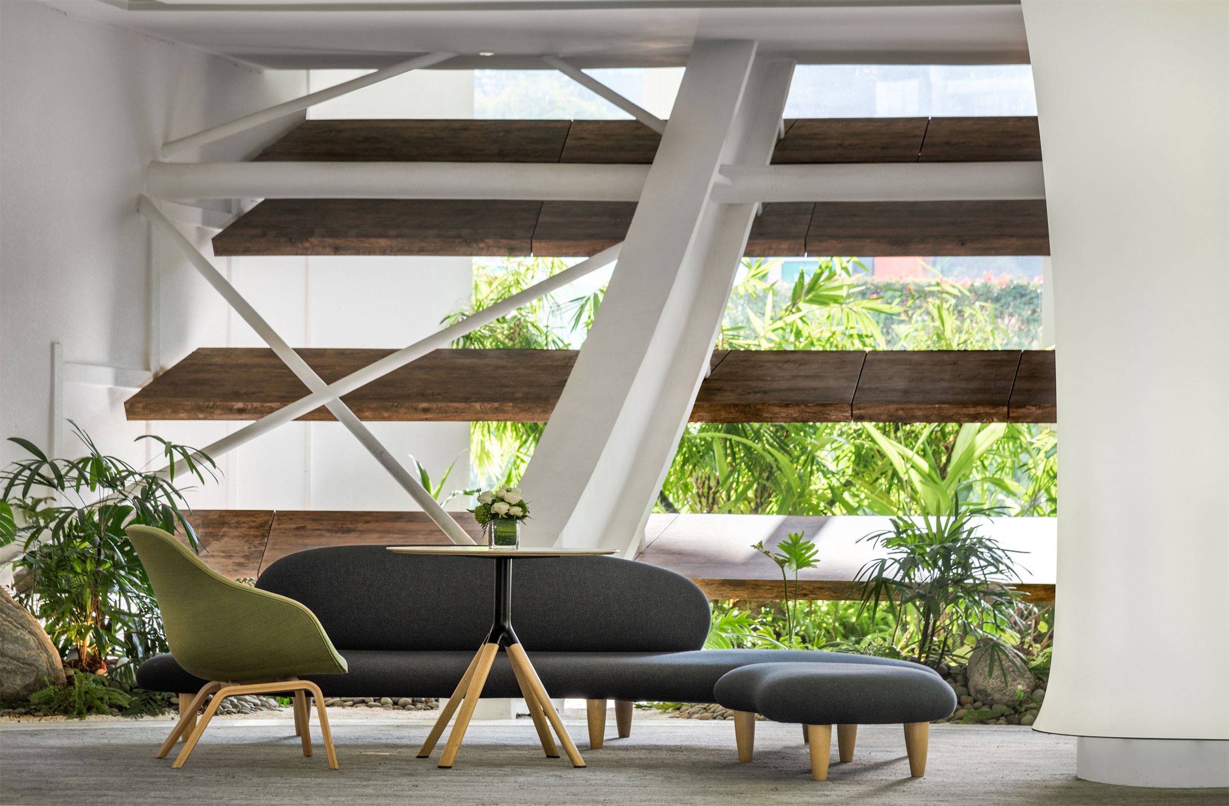
▽咖啡区 Coffee area
4. 流动的盛宴 A Flowing Feast
摈弃传统艺术空间惯用的木质、陶瓷地板,巢·艺术心中铺设人工草坪将自然引入室内,呼应侨城坊绿色园区理念,将美之纬度上升到另外一层境界:自然景观与艺术表现的结合是为美的天作之合。
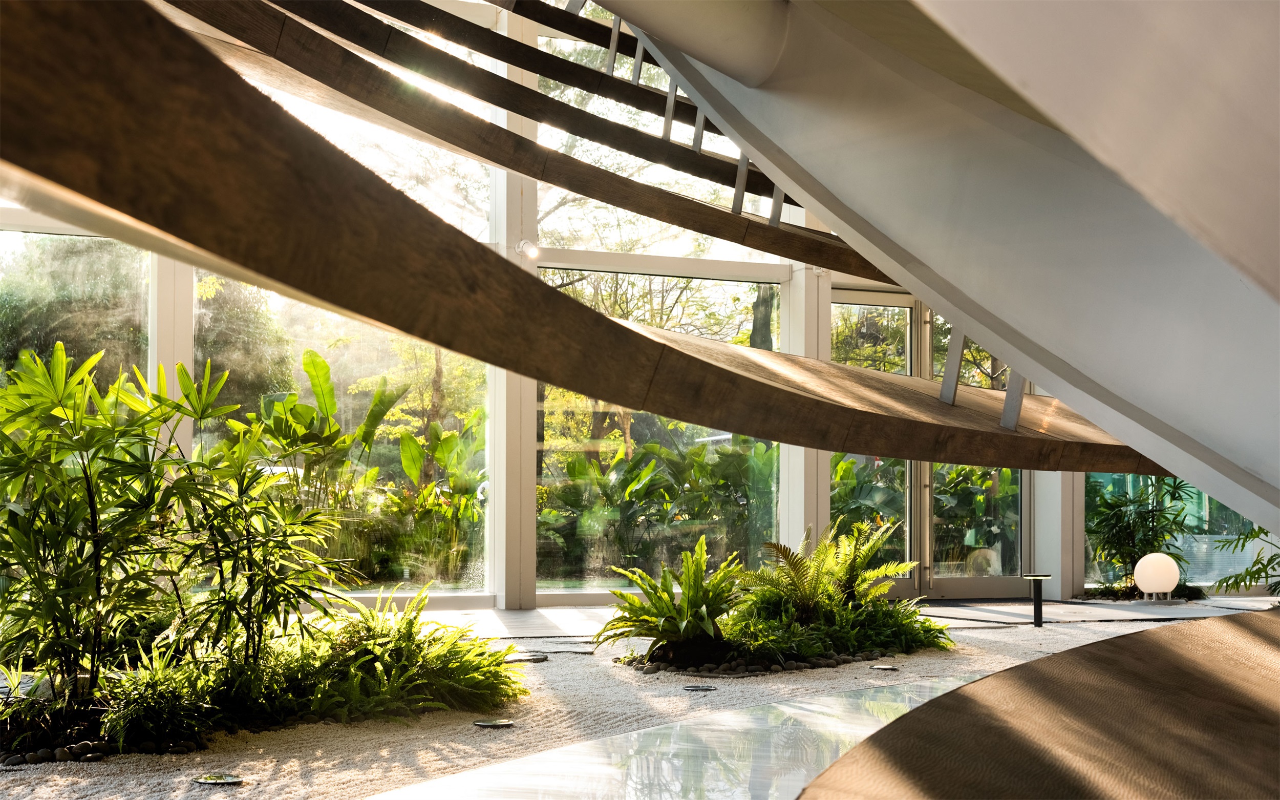
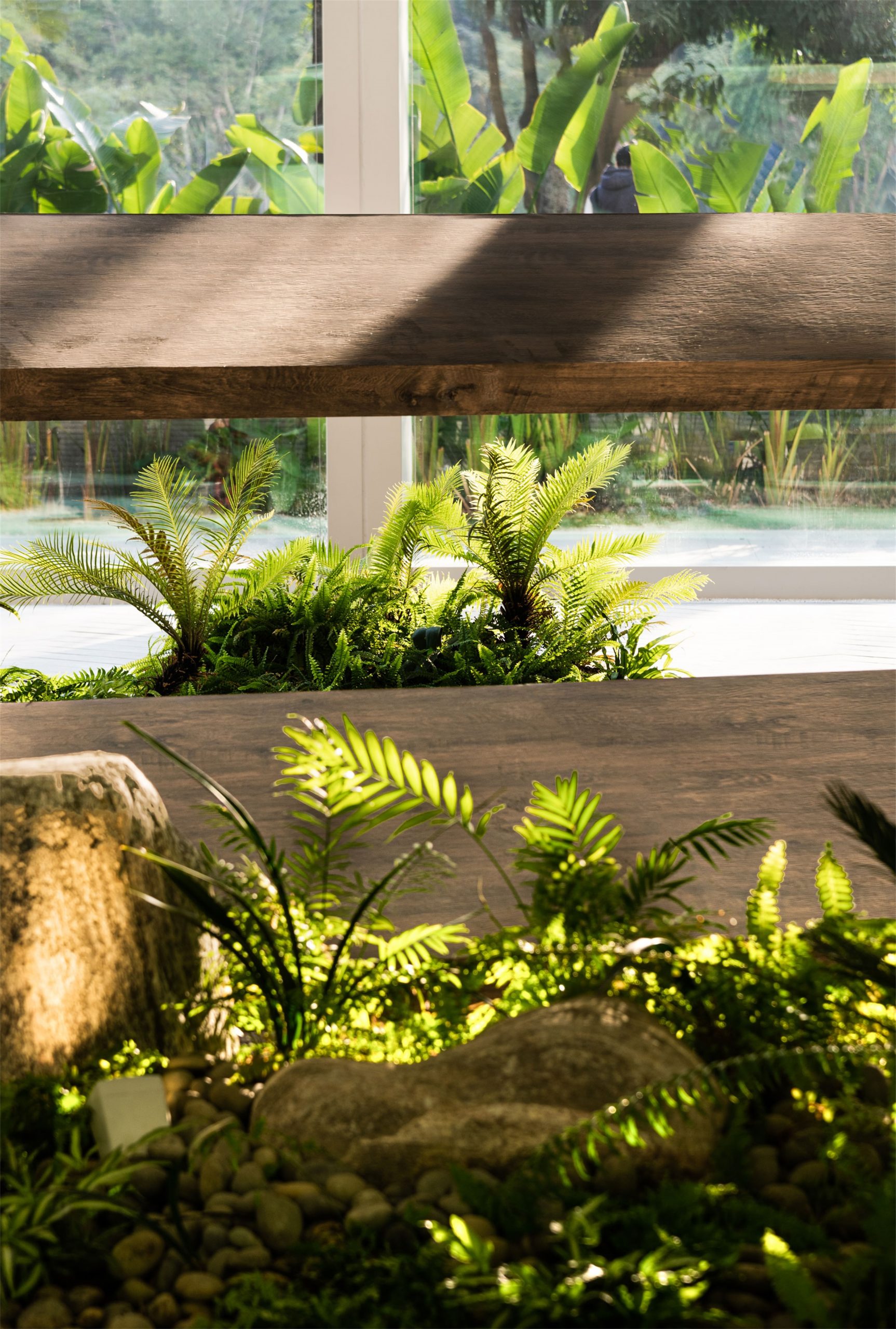
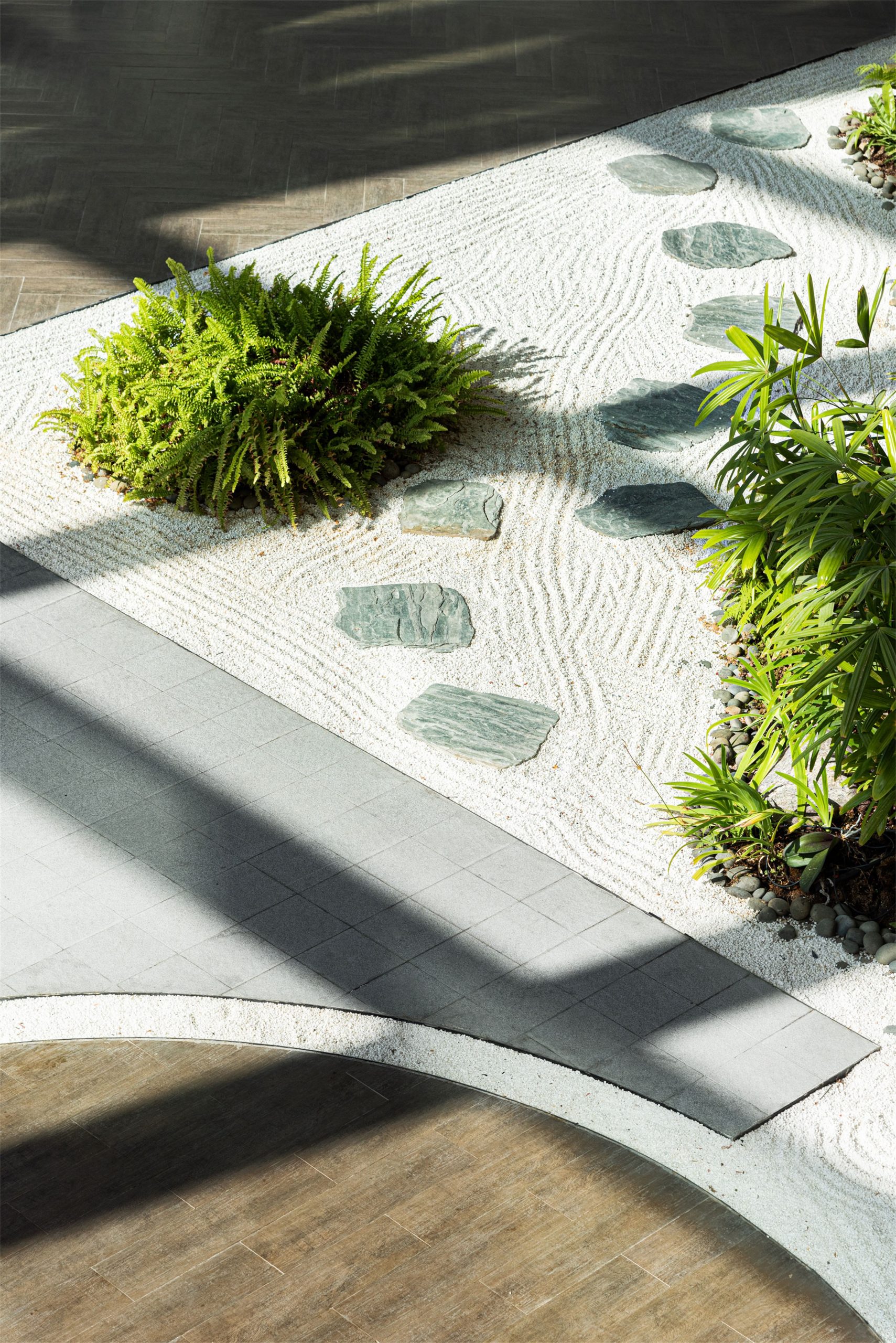
室内的绿意更添空间灵动,层层日光洒下,白色框架蜿蜒流动,颇有“虽由人作,宛自天开”的意味。“内庭园林”中不乏感性的文化气息,绿植在禅意的白沙上投下阴影,时间缓缓而逝。
Other than the wooden and ceramic floors used in traditional art spaces and laying artificial turf to introduce nature into the interior, the concept of urban green parks is echoed here, and raises the aesthetic quality: the fusion of natural landscape and artistic elements is a compelling match and sets a new standard for this type of space.
The indoor greenery is a prominent symbol of a larger landscape beyond, with layers of daylight filtered through the white frame, flowing onto and through the building – the total effect recalls the phrase, “Although made by humans, it seems to have come from the sky above”. This “inner garden” creates a dignified air of culture, with its green plants casting shadows on the Zen-like white sand, eloquently bearing witness to the gentle passing of time.
▽室内景观 Indoor landscape
▽光影下的禅意景观 Zen landscape under light and shadow
建筑设计师高迪曾经说过:“直线属于人类,而曲线归于上帝。” 曲线之美,与大自然最为相似,无可比拟。
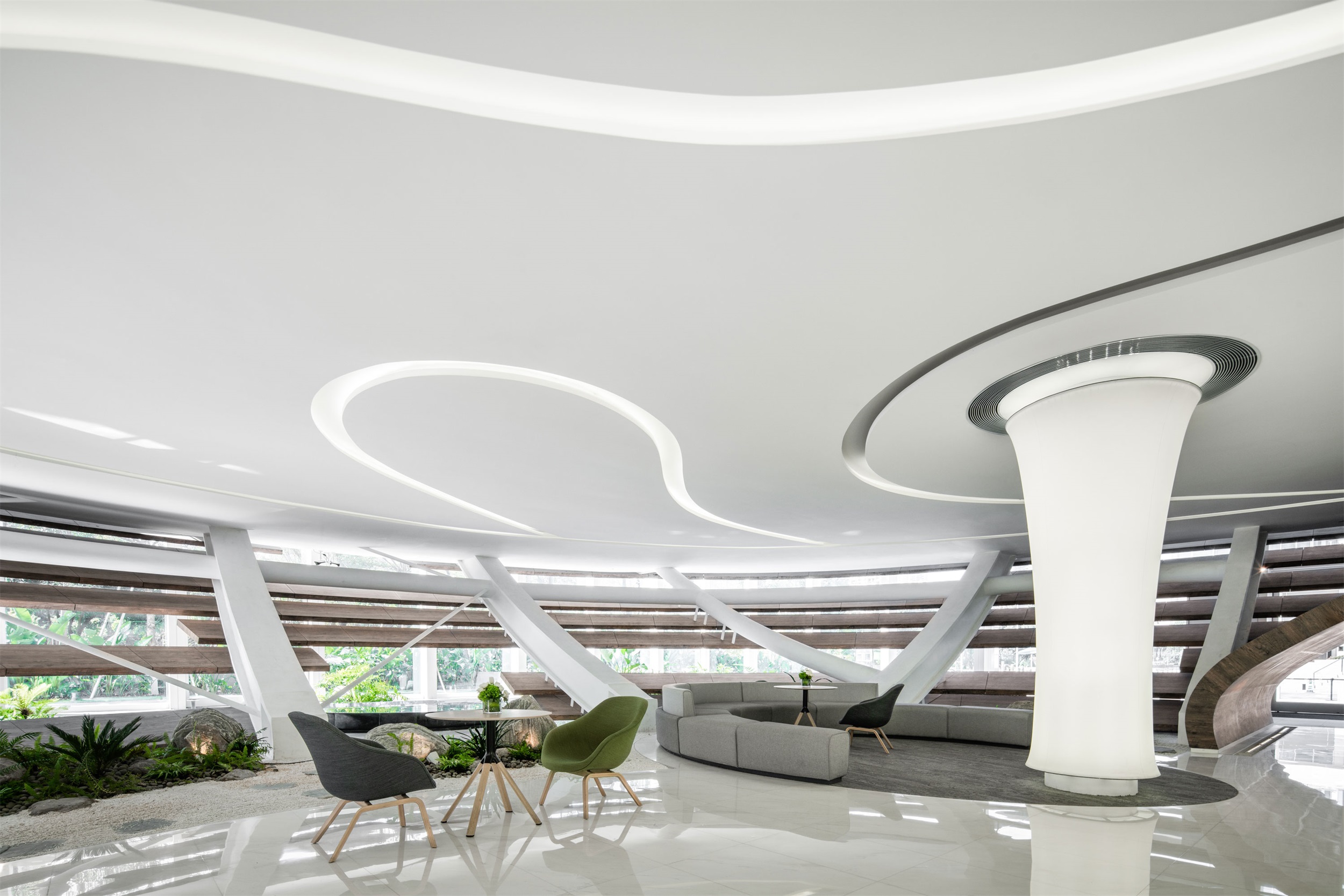
空间皆以曲线贯穿,每一条线都被赋予最大程度的张力,接待台作为下层空间的中心,以圆柱体造型聚焦视线,而分散在它周围的支柱系统,则被设计师作为发光薄膜灯具,顶部内嵌丝带形日光灯槽,穿插在柱子之间,勾勒灵动曲线。
The famed Spanish architect Antoni Gaudí once said, “The straight line belongs to man, the curve to God.” The beauty of non-linear contours lies in their similarity to the ones found in nature, fascinating in their uniqueness and unexpectedness.
The various interiors of the building are connected through a series of curves, with each one performing the task of creating a degree of spatial tension. The reception desk is the center of the main lower area, focusing on visitors’ sights with a cylindrical shape which narrows at the location of the desk. A system of pillars arranged around it are utilized by the designer as light-emitting membrane lamps. The ceiling is embedded with a ribbon-shaped fluorescent lamp slot which playfully winds its way between the pillars, leading the eye through the space.
▽接待中心 Reception center
5. 开发者说 Words from the Developer
深圳是中国最年轻的一线城市,它又以探索和创新成为国际化的大都市,巢·艺术中心亦是如此,它有着前瞻性的视角,朝气蓬勃的活力,在时代的步伐中,不断突破着既定的标准,串联起人、自然、建筑的关系,这不仅是一个艺术中心,更不仅是一座建筑,而是一个鲜活的城市景观。
任何角度的巢·艺术中心,都是明亮、通透且与外界浑然一体。因为在我们看来:美即生产力。这不仅仅是形态、材质,更是它所带来的舒适感、所呈现出来的精神、情怀,这样的建筑才是有意义的,才是一个完整的系统性的思维,否则,只徒有外表的皮毛,是没有生命力的。
设计本身是一个非常系统的过程,从商业的角度来看,设计要实现商业价值;从艺术的角度来看,设计要实现人文价值;从人性的角度来看,设计要实现个人价值。只有建设者与设计师共同倾力打造,才能呈现出一个跨越时代的好作品。
Shenzhen is the youngest first-tier city in China, and has become an international metropolis through its willingness to explore and innovate. The same is true for the Nest Art Center. It has a forward-looking perspective and its architectural design speaks of vigor and vitality. It seeks to symbolize these fast-paced times, which are embodied by the continual breaking through of established standards. At this moment, when the cost of real estate in the city is at a premium, the project aims to connect people, nature, and architecture, and aspires to be more than simply an art center or building, but rather a living, self-contained urban landscape.
Seen from any angle, the Nest Art Center retains a bright, transparent appearance, visually integrated with its external surroundings. In our view, beauty is a productive force. This concept applies not only to the form and materials of a building, but also to the comfort, spirit, and feelings it engenders. Without this larger, holistic architectural approach, which focuses on meaning and a complete, systematic process of thought, all efforts to create a vibrant design would only lead to style without substance.
Good design necessitates a thorough and systematic process. From a commercial point of view, design must achieve reasonable economic value; from an artistic point of view, design must achieve a recognizable humanistic value; and from a human perspective, design must realize a subjective personal value. It is only through the collaborative process of builders and designers working closely together that long-lasting works of universal excellence can be created.
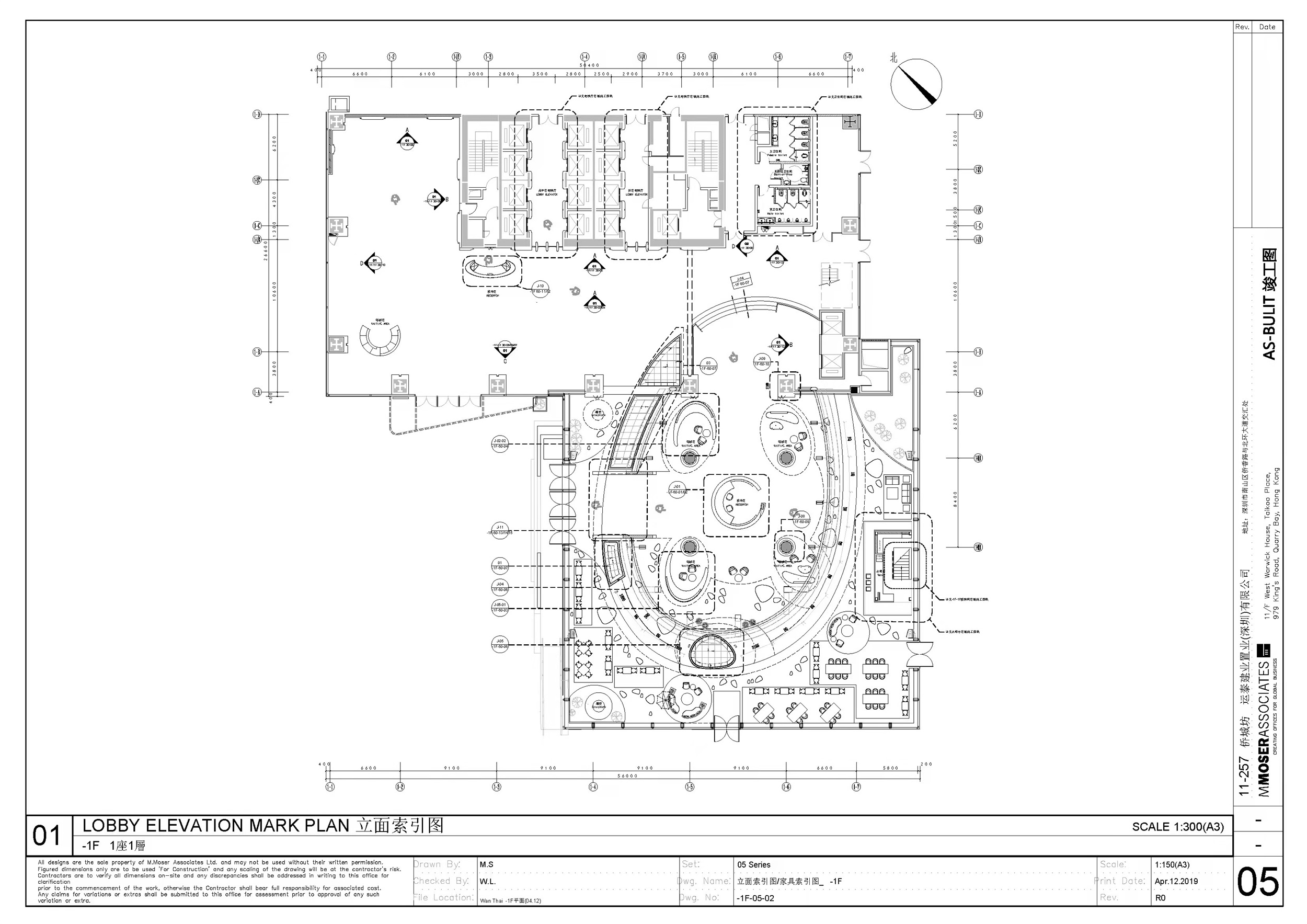
▽建筑1F Building 1F
▽建筑2F Building 2F
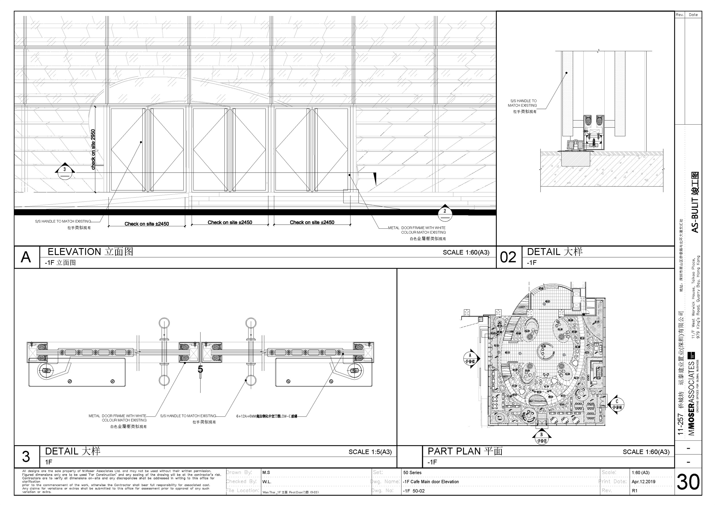
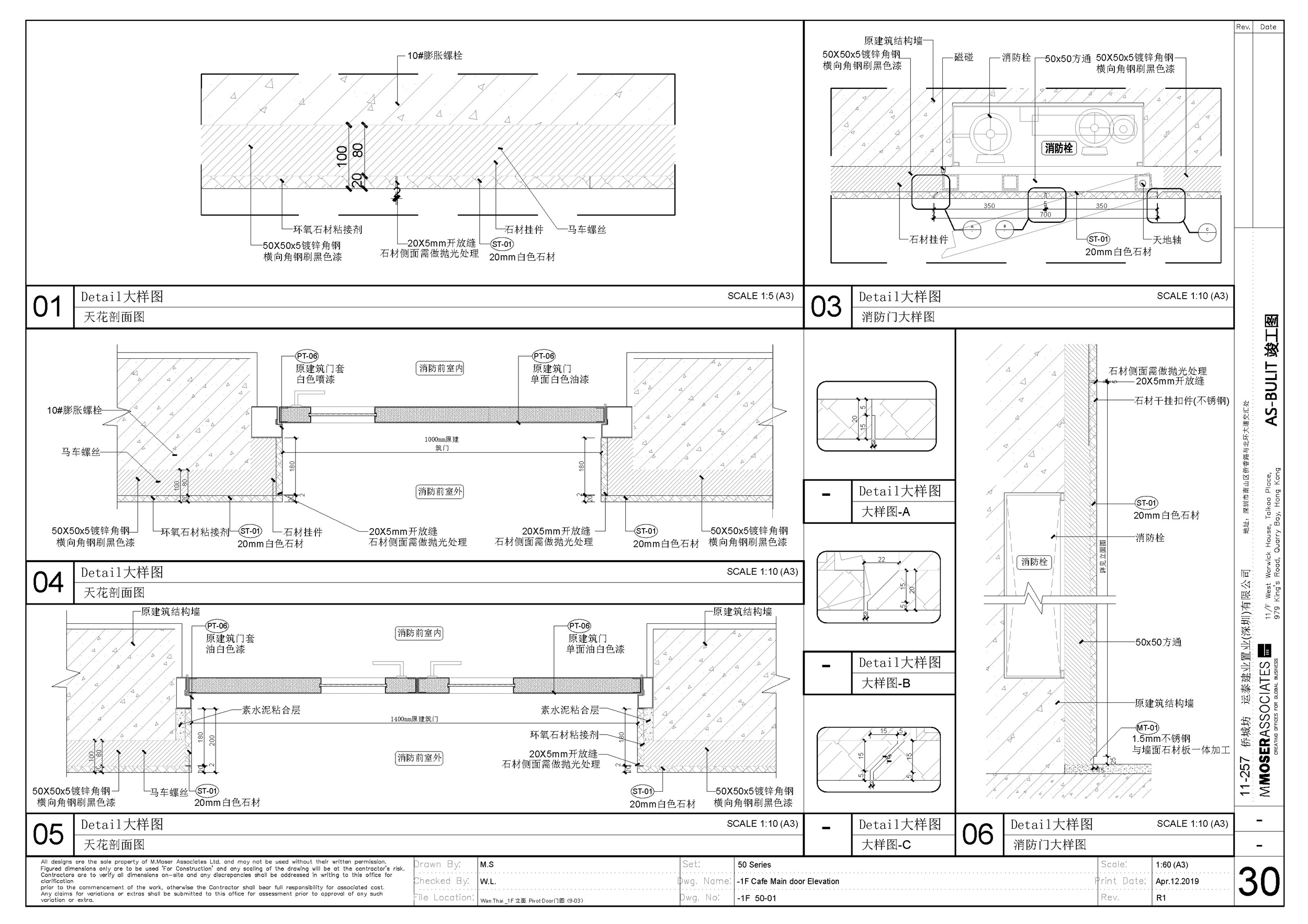
▽立面图 Elevation
▽剖面图 Section view
项目名称:巢·艺术中心 (The Nest Art Center)
项目地点:深圳南山区侨香路4080号侨城坊
项目类型:建筑设计、室内设计
项目状态:已建成
开发商:运泰建业置业(深圳)有限公司
主要材料:钢、玻璃、木等
建筑设计公司:穆氏建筑设计(上海)有限公司
主持设计师 : Ramesh Subramaniam
空间结构:独栋双层
建筑面积:2400m²
摄影:郑焰
视频:花生工作室
Project Name: The Nest Art Center
Project Location: Q-Plex, 4080 Qiao Xiang Road, Nanshan District, Shenzhen, China
Project Type: Architecture Design; Interior Design
Project Status: Built
Developer: Q-Plex
Main Materials: Steel, glass, wood, etc.
Architecture Design: M Moser Design and Architecture (Shanghai) Co., Ltd.
Principle Architect: Ramesh Subramaniam
Interior Area: 2280 sqm
Program: Public venue, leisure, food and beverage space, meeting rooms and office spaces
Photograph: Zheng Yan
Video: Huasheng Studio
“ 柔美的曲线归附于自然,流动的元素串联起人与自然与建筑共生。”
审稿编辑 王琪 – Maggie
更多 Read more about: 穆氏建筑











0 Comments