本文由 八荒设计 授权mooool发表,欢迎转发,禁止以mooool编辑版本转载。
Thanks STUDIO8 for authorizing the publication of the project on mooool, Text description and images provided by STUDIO8 .
八荒设计:八荒设计近日完成了上海西岸LOAM瓷屋咖啡的室内及立面改造设计。在这片亚洲最大规模的艺术集聚区之一,这座有着鲜明外立面的圆形瓷屋仿佛城市绿洲中的一座小岛。八荒的设计师们为LOAM顾客创造了一个非常规的休憩体验,让他们在有限的空间中感受自然,回归自然,成为自然的一部分。
STUDIO8: STUDIO8 recently completed the interior and facade renovation of LOAM cafe&bar on the West Bund of Shanghai. In one of the largest art clusters in Asia, this spiral-shaped porcelain house with a distinctive facade stands out like an island in an urban oasis. The designers of STUDIO8 created an unconventional leisure experience for LOAM’s customers, allowing them to experience a piece of nature within a confined space in the city, and to feel like they can connect with nature during their stay in the space.
▽咖啡周边被草坪包围“溶解”成一片城市绿洲 Loam around the cafe like an urban oasis
▽建筑立面改造前后对比 Facade before and after
▽半室外走廊与室内间的中庭前后对比 Inner courtyard before and after
我们接受这个项目时,面临了两个挑战:建筑功能的变化和原建筑立面的不完整。八荒接到的设计任务是将原来封闭的艺术展览空间改为咖啡厅兼酒吧功能,让空间在不同时段和举办特殊活动时,轻松完成功能和场景的转化。但是,如何将一栋(半)透明建筑的室内与外立面分开呢?八荒决定对建筑的外立面、室内、景观做整体再设计。
When STUDIO8 started on this project, they faced two challenges: the change in the building’s function and the incomplete facade of the original building. The design task STUDIO8 received was to transform the originally enclosed art exhibition space into a coffee shop and bar, allowing the space to easily change functions and scenes at different times and during special events. However, a big question was how to separate the interior and exterior facades of a (semi) transparent building? STUDIO8’s solution was to redesign the exterior, interior, and landscape of the building as a whole.
▽立面改造 – 溶解 Facade renovation
▽将原先闭合的瓷堂变为城市绿洲 Transform the previously closed porcelain house into an urban oasis
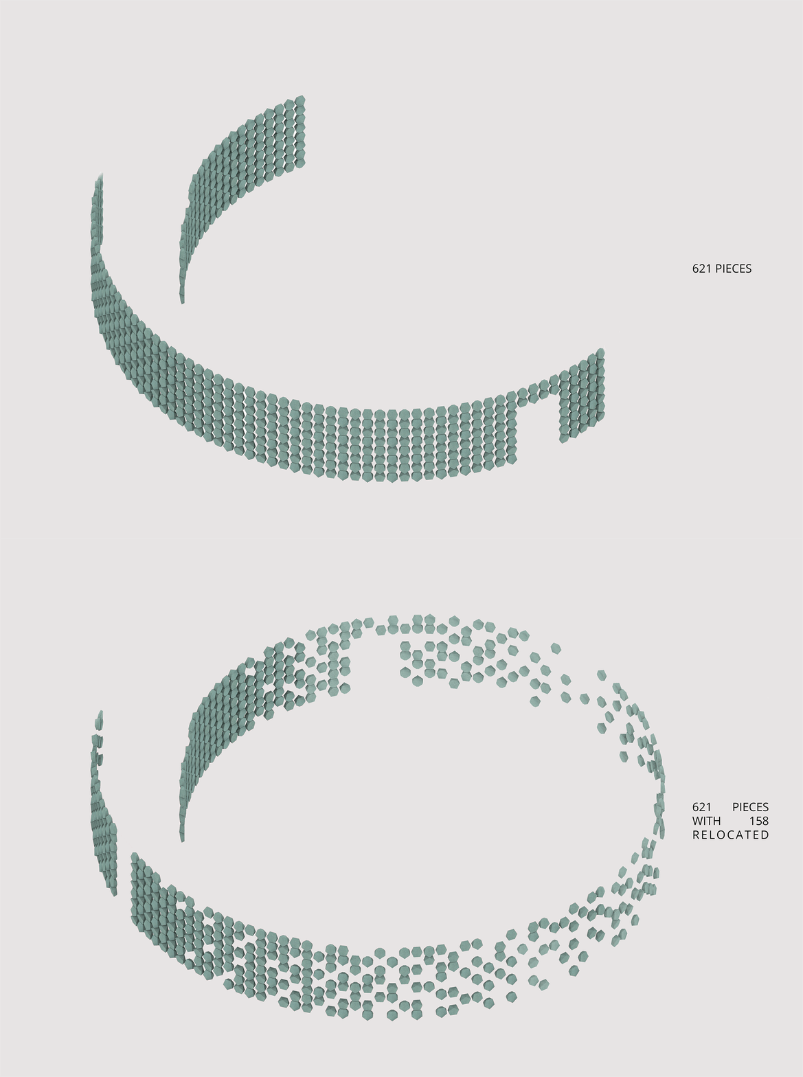
最初的建筑由一个才华横溢的团队设计,是一个独立的全周螺旋形建筑,立面覆盖着数百片绿色陶瓷片。然而,由于种种原因,原立面只有一半有瓷块,无法按照最初的构想完整呈现。八荒希望以与建筑最初愿景一致的方式完成立面。在仔细分析室内外空间后,最终决定不增加任何元素,仅靠重新分配现有立面的瓷块,来重新规划立面秩序。以入口为起点,渐渐减少瓷片排布的密度,创建一种渐变的效果,同时也最大程度上尊重原建筑师的愿景。瓷块能让每一个走近建筑的顾客感受到光影的游戏。
A talented design team designed the original building as an independent, full circle spiral structure with hundreds of green ceramic tiles covering the facade. However, due to various reasons, only half of the original facade had the porcelain blocks, which cannot fully present the original concept. STUDIO8 hoped to complete the facade in a manner consistent with the vision of the original design. After careful analysis of the interior and exterior spaces, the designers decided not to add additional elements, but only to redistribute the porcelain blocks of the existing facade to re-plan the facade order. Starting from the entrance, they gradually reduced the density of the ceramic tile layout, creating a gradient effect, while in turn also respected the original architect’s vision. The porcelain tiles cast playful shadows under the changing sunlight, adding natural elements into the space.
▽立面被重新排布的渐变的瓷块 Gradient redistributed porcelain blocks
▽入口处瓷块分布稀疏度不同 Different densities of porcelain blocks at the entrance
▽瓷块的排布前后对比 The arrangement of porcelian blocks before and after
设计最初灵感源自场地中间的一棵青枫,进入建筑的过程犹如一场围绕树的“旅程”,在树下写意、野餐、集会。最初,八荒想要创造一个“减速点”,鼓励人们停留欣赏,从而建立与周围环境的连接。为此,设计师在瓷屋的周围增加了一片草地,仿佛瓷屋溶解成了一片绿洲,然后在立面上打开一条视觉通道,对外面向街角、对内朝向枫树,以此连接室内与室外,获得清晰的视野;同时也与建筑外侧的草坪肌理交错,以开放的姿态融入在城市绿地中。
A green maple tree in the middle of the site initially inspired the design. STUDIO8 intended the process of entering LOAM to be like a “journey” around a tree – a gathering point where people can chat and have picnics. The designers wanted to first create a deceleration point that encouraged people to stay and enjoy the space, and in turn establish a connection with the surrounding environment. To achieve this, they added a lawn around the building to connect the porcelain structure to the surroundings, and opened a visual elevation passageway that faces the street corner outside and the maple tree inside, connecting the interior and exterior to obtain a clear view; the facade also intertwines with the texture of the lawn around the outside of the building, integrating the porcelain house into the urban green space.
▽设计草图 Design sketch
▽面向街角的立面瓷块间隙中露出中庭的枫树 Gap arranged on the facade to show the maple tree in the inner courtyard
▽半室外走廊与室内间的中庭 Inner courtyard between semi-open corridor and in-door space
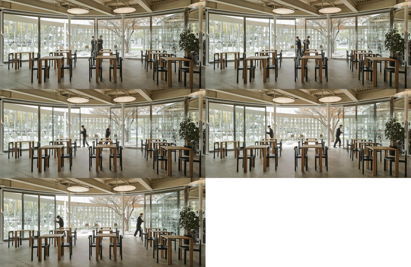
“旅程”从主入口的大枢轴门开始。轴门关闭时,能巧妙映射出瓷块,形成连续完整立面的错觉。来到半室外区域,面向青枫,一条小路围绕覆盖着白色砾石的庭院,顾客可以在此小憩。半开放的空间打通了内与外的边界,空间弧线流畅,光影交织时,内外空间的边界也渐渐模糊。
The “journey” begins with the large pivot door of the main entrance; when closed, it subtly reflects the porcelain pieces, creating the illusion of a continuous complete facade. Coming to the semi-outdoor area, customers face the green maple. A path surrounds the courtyard covered with white gravel, where people can take a rest. This space opens up the boundary between inside and outside. The moving light and shadows bring out the beauty of the smooth curves in the design, while blurring the indoor and outdoor spaces even further.
▽打开入口中轴大门 Entrance pivot door
▽内庭院走廊面对枫树的休闲座位 Stepping in inner courtyard corridor
▽围绕着枫树的休闲座位 Casual seatings around the tree
▽午后阳光下的中庭 Sunny afternoon courtyard in use
穿过通向内部空间的玻璃门,来到一个截然不同的氛围中。从沿着滑动门的休闲座椅,到一组圆弧形沙发,深入空间后是一个更为私密的区域,配有宽坐深的沙发和舒适的扶手椅,所有座椅都面向庭院,完整了这次通往树的“旅程”。座椅的设置与空间语言相契合,从快到慢,由开放至私密,同时与外立面联动,随着立面瓷块密度的排布渐疏,光线的透入度也逐渐变化,满足不同客群对小憩、聚会、独处的不同体验需求。
Through the glass doors that lead to the interior space, the customers are introduced to a different atmosphere, from casual seating along the sliding doors, to a set of round sofas, the space continues into a more intimate area with very deep seat sofas and comfortable armchairs – all facing the courtyard, completing this “journey” to the tree. The setting of seats is in line with the design language in each space, from fast to slow, from open to private. At the same time, it is linked with the facade. As the porcelains on the facade gradually disperse, the light levels also change respectively, accommodating different customers’ needs for resting, gathering or solitude.
▽咖啡室内空间 Cafe interior space
▽弧形玻璃移门边的桌椅 Seats along curved glass sliding doors
▽空间深处的慢速区 End of the space – slow area
▽弧形玻璃边的沙发椅 Sofa chairs near curved glass
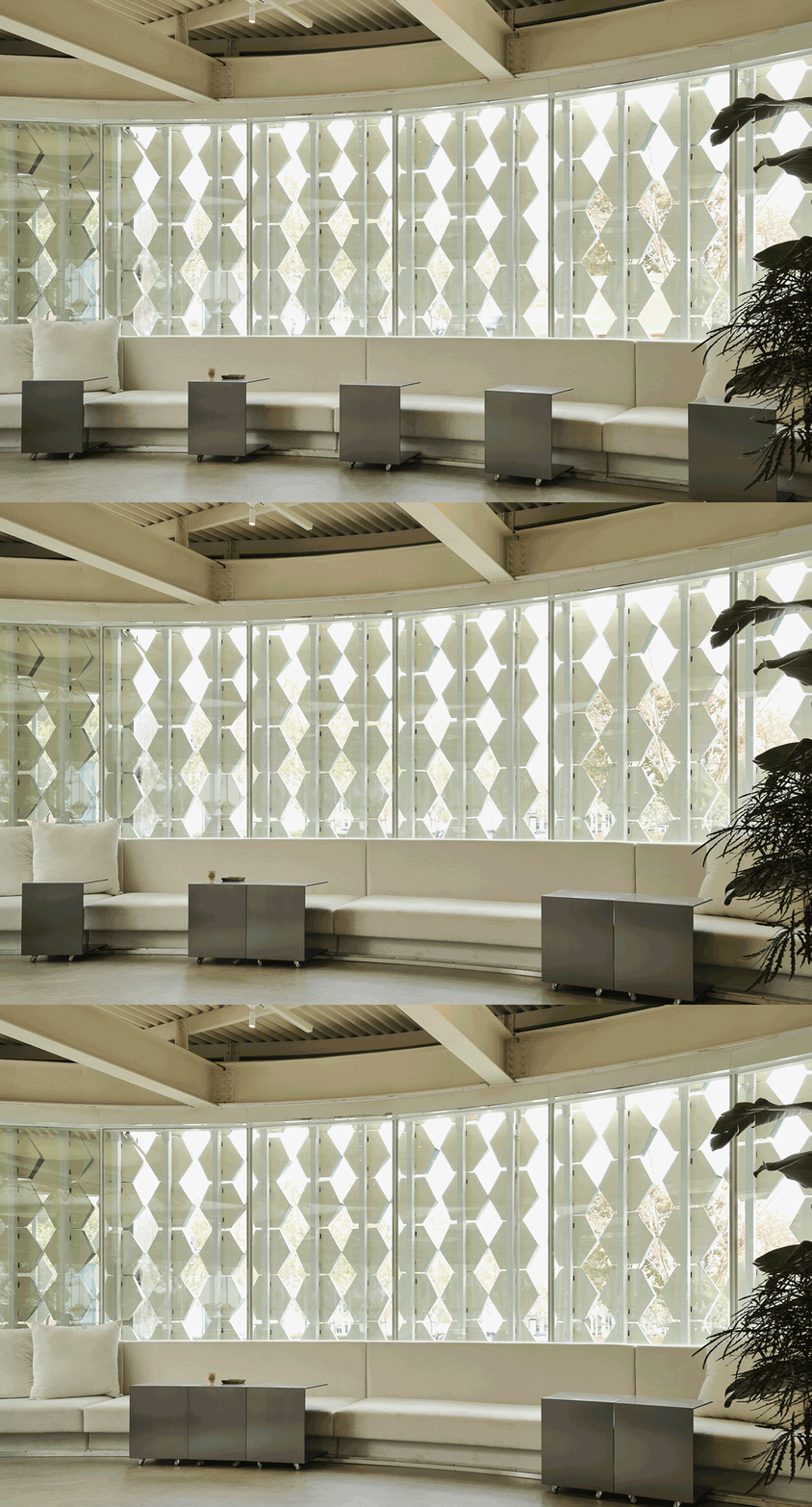
▽圆弧沙发和带轨道小桌 Round sofa with sliding side table
人与空间皆以交融和开放的互动模式交流,这也是本次设计的基础逻辑。八荒的设计师们遵循这一点,从外立面、室内空间、色彩、材质、照明、家具等多重维度叙事,旨在创造一个沉浸式体验“漫步大树下”之旅。天花部分没有过多装饰,最大限度垂直拉伸空间;同时,摒弃了一般室内场景使用大量顶灯的做法,专门构建了一个可以指向天花板的漫射光系统:设计团队开发了一组具有特殊表面处理的圆盘,当地板灯光指向天花时,可以形成一个均匀柔和的漫射光圈,从而突出整个场地里的几个重点区域。除此,沙发边的定制不锈钢边桌都由一个特殊的底部轨道系统连接,可随时根据使用场景位置变化,配合可以敞开的玻璃滑动门,彻底打通物理界限,连接空间和人。定制酒吧柜台与建筑有着同样流畅弧度,由特制的釉面混凝土建造,重现天然“瓷”的纹理。设计师特别添加了定制圆形瓷砖,使其与外立面的材质呼应,让室内与室外共同呼吸。
The underlying logic of this design is that people and space communicate in an interactive and open manner. Following this, the designers from STUDIO8 created an immersive experience of “walking under the tree” through multiple narratives such as facades, interior spaces, colors, materials, lighting, and furniture. The ceiling does not have any excessive decoration, maximizing the vertical space. Instead of using a large number of ceiling lights, a common practice in interior design, the designers constructed a diffuse light system that can point to the ceiling directly: they developed a set of discs with a special surface treatment that create a uniform and soft diffuse aperture when directed towards the ceiling, highlighting several key areas throughout the site. Customized steel side tables are connected by a special rail system on the bottom, allowing them to be adjustable. This, coupled with a glass sliding door that opens completely, breaks through the physical boundaries and thoroughly connects the people and the space. Constructed of specially made glazed concrete, a custom-made bar counter shares the same smooth curves with the architecture itself and reflects the texture of the natural “porcelain”. In particular, several custom circular tiles are added to echo the material of the exterior facade, emphasizing the indoor and outdoor connection.
▽天花反光板细节 Detail – reflective plate on ceiling
▽打开弧形玻璃移门面向中庭 Curved glass sliding doors opening up to the inner courtyard
▽空间深处的慢速区的弧形沙发与可滑动小桌 Curved sofa and slidable tables at the end of the space – slow area
▽吧台釉面水泥发泡瓷块和瓷砖细节 Detail – bar couter detail
▽吧台细节 Detail – bar couter detail
另外值得一提的是大门把手。八荒以融化的瓷块形状作为原型,将材质不同维度的形态渗入空间的细节设计,借此诠释原先闭合的展馆功能如今被城市绿地溶解打开,从多角度向公众开放。家具方面,设计师匠心定制了榫卯结构的木桌和再生发泡瓷材料堆砌成的可移动小桌,用各类新型材料演绎“瓷”更环保、创新的形态。
Another design detail of note is the door handle for the gate. It is based on the shape of melted porcelain blocks, introducing another dimension of material forms into the space. The originally closed exhibition hall is now dissolved into the urban green space, and is open to the public on various fronts. In terms of furniture, STUDIO8 customized a wooden table with a mortise and tenon structure and a movable table made of recycled foam ceramic materials, intentionally selecting a more environmentally friendly and innovative form of “porcelain”.
▽溶解瓷块形象的不锈钢门把手 Detail – Dissolved porcelain block door handle
▽多层板木桌特殊金属连接件细节 Detail – Plywood table connected by special metal joint
▽中庭中的泡沫瓷块小桌 Ceramic foam block table in inner courtyard
八荒此次跳脱寻常的空间体验,以空间自身的流动性和导向性完成场景转化,人与空间共为一体, 重新诠释了这座“瓷屋”,也为西岸这片文化绿洲带来些许新意。
Throughout the renovation of the “porcelain house”, STUDIO8 broke away from the ordinary design approach by taking advantage of the site’s existing features and integrating people’s experience into the spatial journey. The result is a re-interpretation and transformation of LOAM that sparks new ideas in the cultural oasis of West Bund Shanghai.
▽平面图 Plan
项目名称:树下的LOAM瓷屋咖啡
完成年份:2022年11月
项目面积:253 sqm
项目地点:上海西岸
设计公司:八荒建筑设计咨询(上海)有限公司
公司网址:http://www.studio8-sh.com/
主创设计师:Shirley Dong, Andrea Maira
设计团队:Angel Gekov, 八荒设计团队
客户:上海瓷屋企业管理有限公司
摄影师:张大齐
Project Name: Walking to the green maple
Completion Year: 2022
Project Location: Shanghai, China
Design Firm: STUDIO8
Website: http://www.studio8-sh.com/
Lead Architects: Shirley Dong, Andrea Maira
Team: Angel Gekov, STUDIO8 design team
Client:LOAM YARD, Huge
Photo Credits: Sven Zhang
“ 一个非常规的休憩体验咖啡厅,让人们在有限的空间中感受自然,回归自然,并成为自然的一部分。”
审稿编辑:Maggie
更多 Read more about: 八荒建筑设计咨询(上海)有限公司


0 Comments