本文由 创翌善策 授权mooool发表,欢迎转发,禁止以mooool编辑版本转载。
Thanks Chuangyi Shance for authorizing the publication of the project on mooool. Text description provided by Chuangyi Shance.
创翌善策:灞河,在西安古城东北方逶迤流过。与城内的古意盎然相较,这里已是一派蓄势待发的新区模样。两岸,有宽阔的城市绿化带,是由灞河延展开的风光。万科悦湾的展示区,伴在绿化带西侧,浮现。
Chuangyi Shance:The Bahe River flows through the northeast of the ancient city of Xi’an. Here is a new district with a historic context in the city. The green belt along the river provides an extending image of the city and the VankeCheerful Bay Exhibition Area is looming at the west side.
说“浮现”,是因为售楼处建筑的匠心:首层架空,接待大厅托举在二层的高度,正得以舒展视野,近观远眺缓缓流过的灞河与两岸的葱笼绿色。
The looming effect is from the design of the sales department: The first floor is cantilevered to raise the reception hall to the second level, providing an extending view of the landscape along the Bahe River.
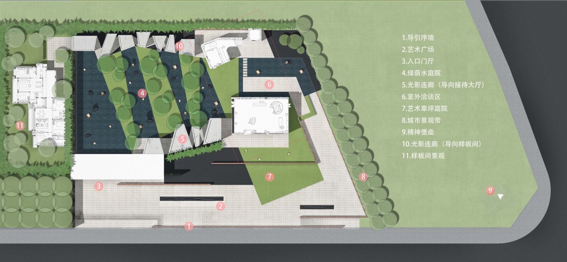
▼平面图 Master Plan
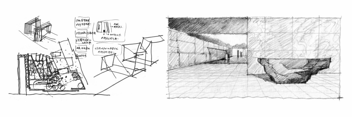
▼设计手稿 Sketch
展示区的入口在用地西南角,样板间设在更西侧,于是,来访动线成为一个环:自西南角入口进入、向东行至售楼处、上楼眺望河景与接洽、下楼西行至样板间。
内向围合、环形动线、内园景外借景,符合国中传统园子的结构套路。于是,这个展示区的景观被设想为一个有回廊的园子,隐隐地与不远处的古城脉博相呼应。
但,这个项目的风格是现代的,在古园的套路中,需要抽象提纯,以臻简洁。
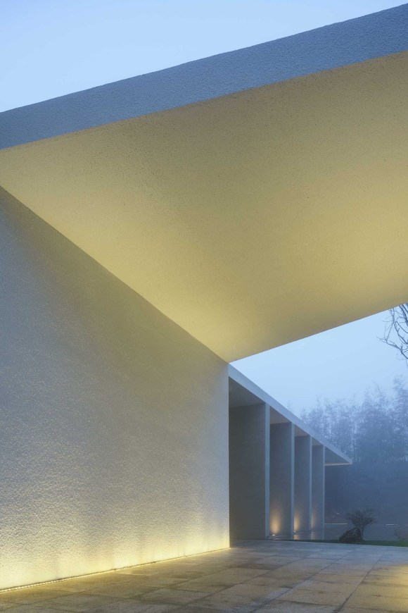
内向围合的园,有门、有墙。在此园,门与墙被抽象为水平与垂直交错的组合面,安安静静地呈现出园的所在。白与黑的石材,在正交线型的控制中,衬托那浮现并扭转并屋顶起翘的建筑的灵动。
The entrance of the exhibition area is in the southwest corner of the site, and the model room is located on the further west side. Therefore, the visiting movement line becomes a circle: enter from the southwest corner entrance, take the eastbound line to the sales office, go upstairs to view the river and reception hall, finally go downstairs to the model room in the west.
The design of the inward enclosure, circular movement lines, internal garden, and external borrowing scenes are in accordance with the structured routine of the traditional garden. Therefore, the landscape of this exhibition area is presumed to be a garden with a cloister, which echoes with the ancient city.
However, the style of this project is modern. In the routine of the classical garden, abstract purification is required to achieve simplicity.
The inwardly enclosed garden has doors and walls. In this garden, the door and the wall are abstracted as a horizontal and vertical interlaced plane, which quietly presents the existence of the garden. The white and black stone with orthogonal lines reflects the flowing shape of the building with a flying roof edge.
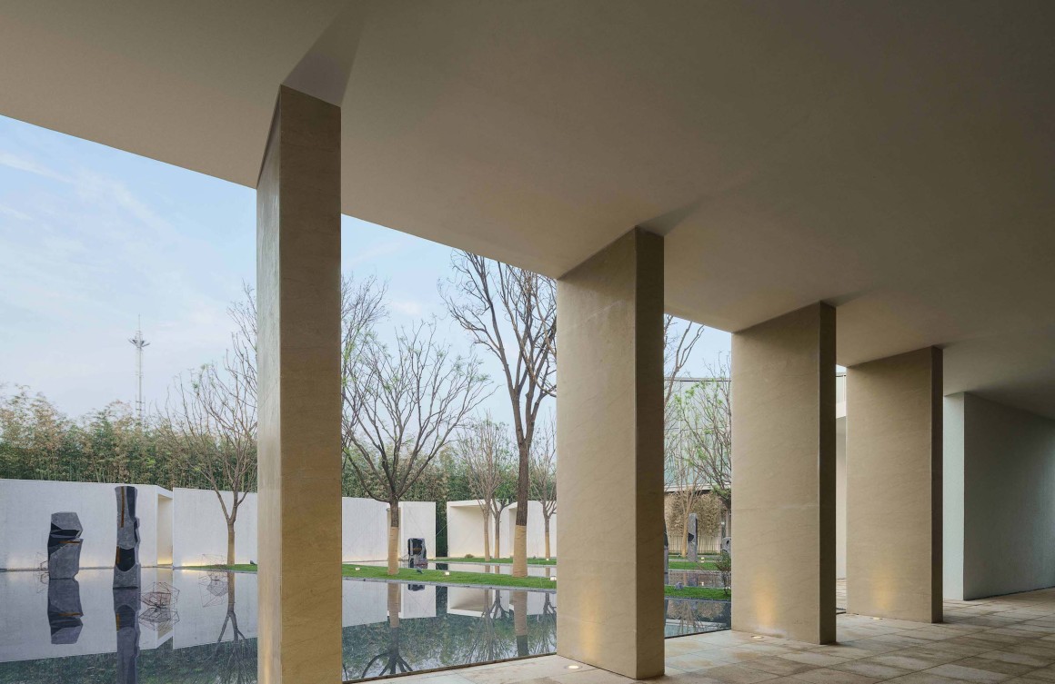
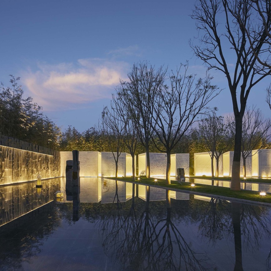
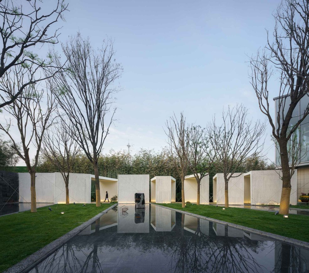
进门入园,一道毛石墙自园外穿过门头直入园内,墙面水帘垂流,为园子带来生动的音响。驻足门厅,可见回廓环抱中内庭空灵,只是池水倒映天光、草木透露生机、置石错落其间。但是,廊,成为这里的主角。
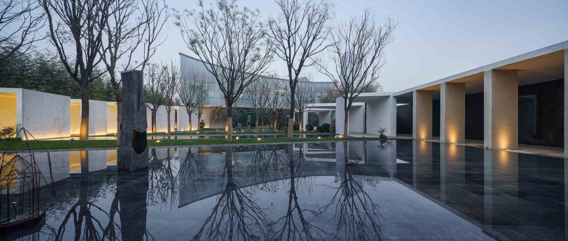
A rough stonewall across the entrance stands in the garden. The water curtain on the wall flows down, bringing vivid sound to the garden. The view of the inner garden is ethereal. The pool water reflects the sky, the vegetation reveals the vitality, and the stones stand sparsely among them. However, the corridor has become the main character here.
在这里,回廊是伴随前行的导游,也是彼岸相望的对景。如何让前行的路径历程更生动?如何不借助传统的亭台楼榭歪脖树,也有对景的呈现?我们需要改造廊。其实,传统的游廊从来就不是乏味的。
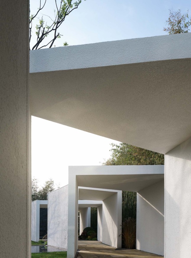
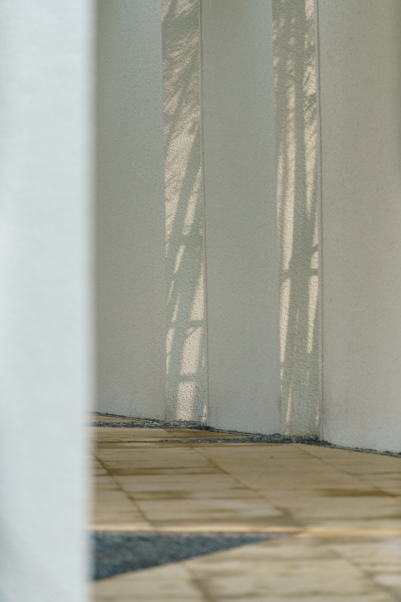
光与影,是对建筑最委婉有效的雕刻,对廊亦然。于是,我们引入光,廊因此而有了明暗,也分成了段落。
Here, the cloister serves as a guide and also is the opposite scene of the other side of the river. How to make the moving path more vivid? How to present the opposite scenery without the traditional design tricks such as the pavilion and leaning trees? We need to transform the corridor. In fact, traditional corridors are never boring.
Light and shadow are the most gentle and effective sculptures for architecture, as well as corridors. Thus, we introduced to light. Then the corridor has a changing effect of light and dark and was divided into different sequences.
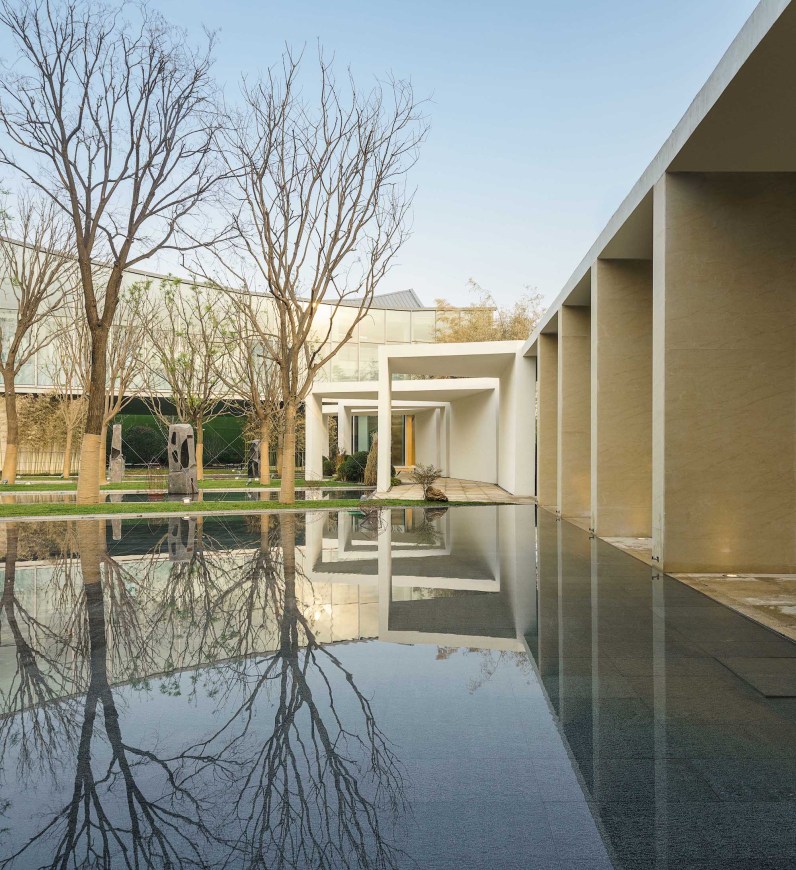
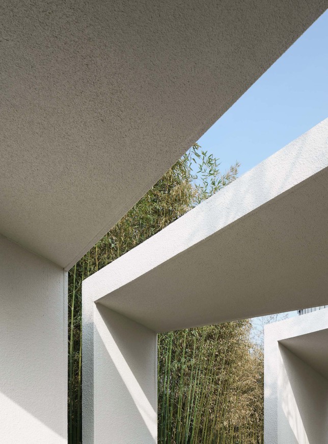
框景与对景,是古园子的经典视野组织。被分成段落的廊子,正好可以形成框与景:廊的段落在拉伸与扭转的设计中,不断呈现出交错分离的间隙,间隙有宽有窄,方向变化,由此,我们可以获得更多瞭望景框,就象古园的窗景,存意而不刻意。
Frame view and opposite view are the classic visual organization of traditional gardens. The pavilions in the sequence become frame and scenes: the different parts of the corridor was extended or stretched to present interlaced and departed spaces. Changes in width and direction provide the space more frames of scenes, just like the window view of the traditional gardens, humble and not over-exaggerated.
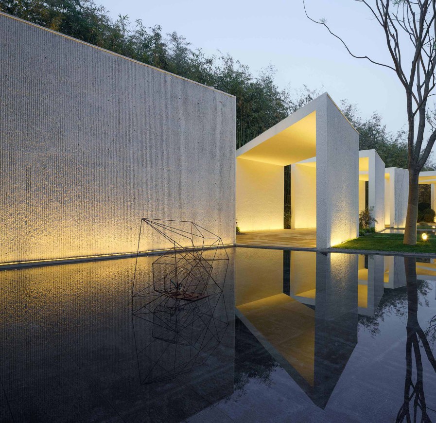
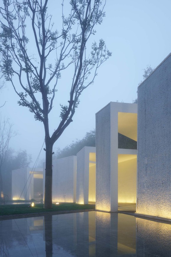
在廊的变形中,对景也自然生成:廊不再是一线连续,而是成为或凸或凹、或高或低的亭的组合。廊的侧墙是凿毛的白墙,竖向肌理似宣纸帘纹,对岸相望,象层次叠合的画纸,草色树影石组便被这画纸衬托出来,又倒影在池水间。
In the transformation of the corridor, the opposite scenery also naturally occurs: the corridor is no longer a continuous line, but a combination of the convex or concave, or high or low pavilion. The sidewall of the corridor is a white wall with a rough surface. The vertical texture is like a traditional Chinese paper curtain pattern. The landscape is like a painting on the paper responding to the other side of the river with grass, stone, trees, and shadows on the water surface at this side.
这是一个回环的园,也是一个以廊为主景的园:廊有墙,以墙为纸、以树为绘;廊有段,以光为笔、以影为绘。
廊说:要有光,便给它光。然后,回廊光影的环抱中,这个园子便在灞河畔自在生成。
This is a garden with a loop circulation, and a garden with a corridor as the main scene: the corridor has walls, with the walls as paper and trees as painting colors; the corridor has different sequences, with light as the pen and shadow as the painting colors.
The corridor said: let there be light. There was light. Then, surrounded by the light and shadow of the cloister, this garden was born along the Bahe River.
项目名称:西安万科悦湾展示区
完成年份:2018年10月
项目面积:5400平方米
项目地点:西安市未央区
景观设计:北京创翌善策景观设计
公司网址:http://www.chuangyishance.com
联系邮箱:1604245807@qq.com
主创设计师:周维
设计团队:赵凯 常磊 吴艳梅
开发商:西安万科
摄影师:三棱镜文化传播有限公司
Project name: Xi’an Vanke Cheerful Bay Exhibition Area
Year completed: October 2018
Project area: 5400 square meters
Project location: Weiyang District, Xi ‘an
Landscape design: Chuangyi Shance Landscape
Website: http://www.chuangyishance.com
Email: 1604245807@qq.com
Chief designer: Zhou Wei
Design team: Zhao Kai, Chang Lei, Wu Yanmei
Developer: Xi’an Vanke
Photographer: Prism Image
更多 Read more about: 创翌善策











0 Comments