本文由 B.L.U.E.建筑设计事务所 授权mooool发表,欢迎转发,禁止以mooool编辑版本转载。
Thanks B.L.U.E. Architecture Studio for authorizing the publication of the project on mooool, Text description provided by B.L.U.E. Architecture Studio.
B.L.U.E.建筑设计事务所:宽窄巷子始建于康熙年间,主要由三条西北-东南走向的街道组成,其间有多条小巷子相连,纵横交错。民国初期,三条主街道中宽一点的被命名为“宽巷子”,窄一点的为“窄巷子”,有一口井的就叫做“井巷子”,宽窄巷子因此得名。
B.L.U.E. Architecture Studio:First built during the Qing Dynasty’s Kangxi period in Chengdu, China, Kuanzhai Alley mainly consists of three northwest-southeast streets, which are connected by lots of small alleys in a crisscrossed pattern. During the early stage of the Republic of China period, among the three main streets, the wider street was named “Kuan Alley” (Wide Alley), the narrower street was named “Zhai Alley” (Narrow Alley), and the one with a well was named “Jing Alley” (Well Alley).
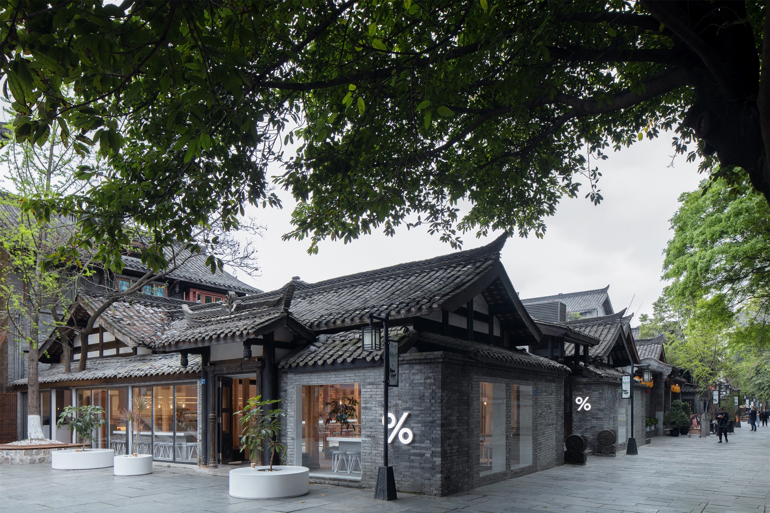
宽窄巷子作为成都的历史文化地标,人流熙攘,而井巷子因为只一侧有商铺,另一侧是围墙,在喧闹中别有一番清净。% Arabica咖啡的中国旗舰店就坐落在这里。
This is how the Kuanzhai Alley got its name. As a historical and cultural landmark in Chengdu, Kuanzhai Alley is a renowned busy commercial and cultural area. While Jing Alley features relatively peaceful and tranquil atmosphere in the midst of noise and bustle because it has shops only on one side and a street wall on the other.
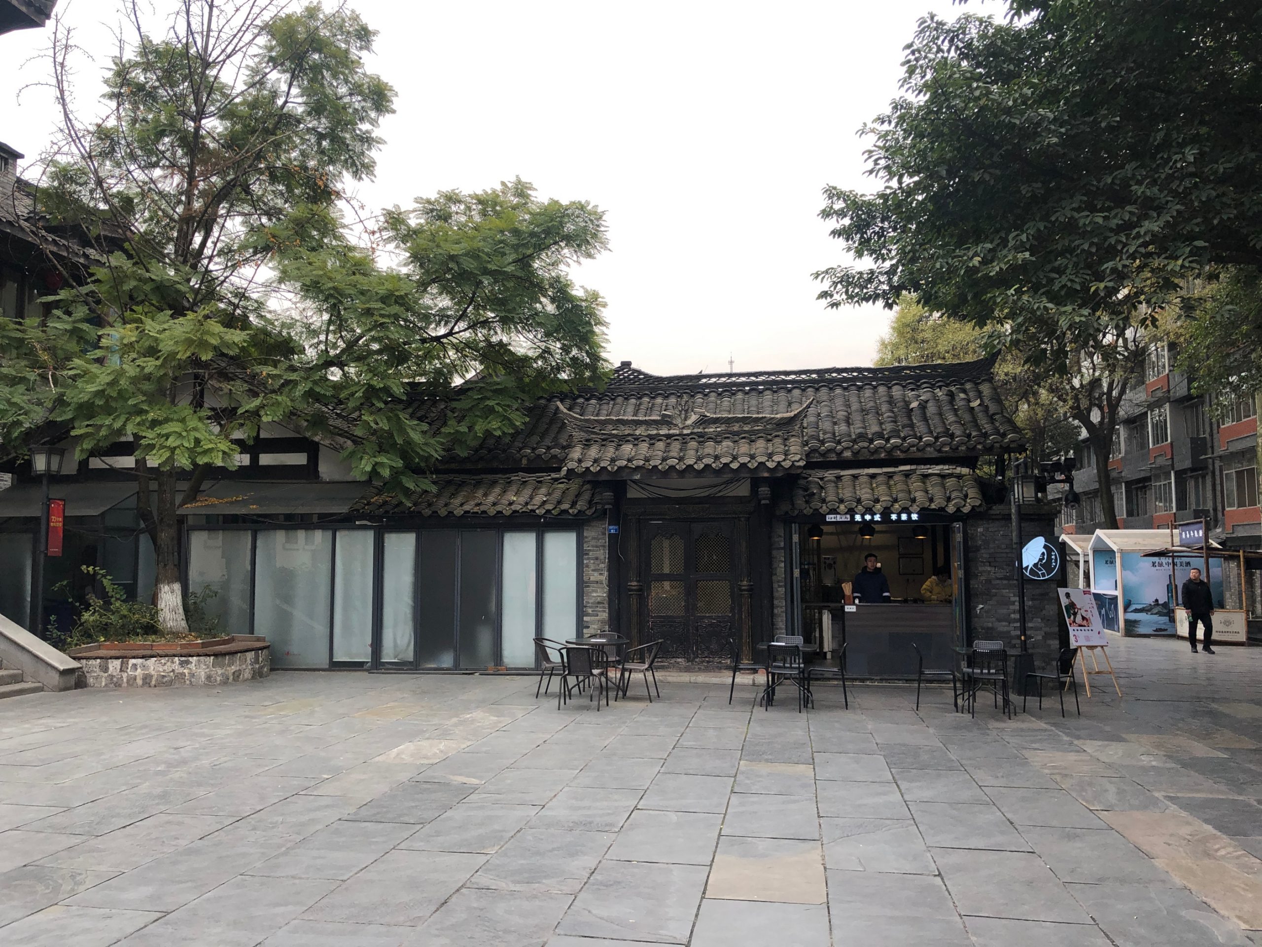
▽原始场地 Original venue
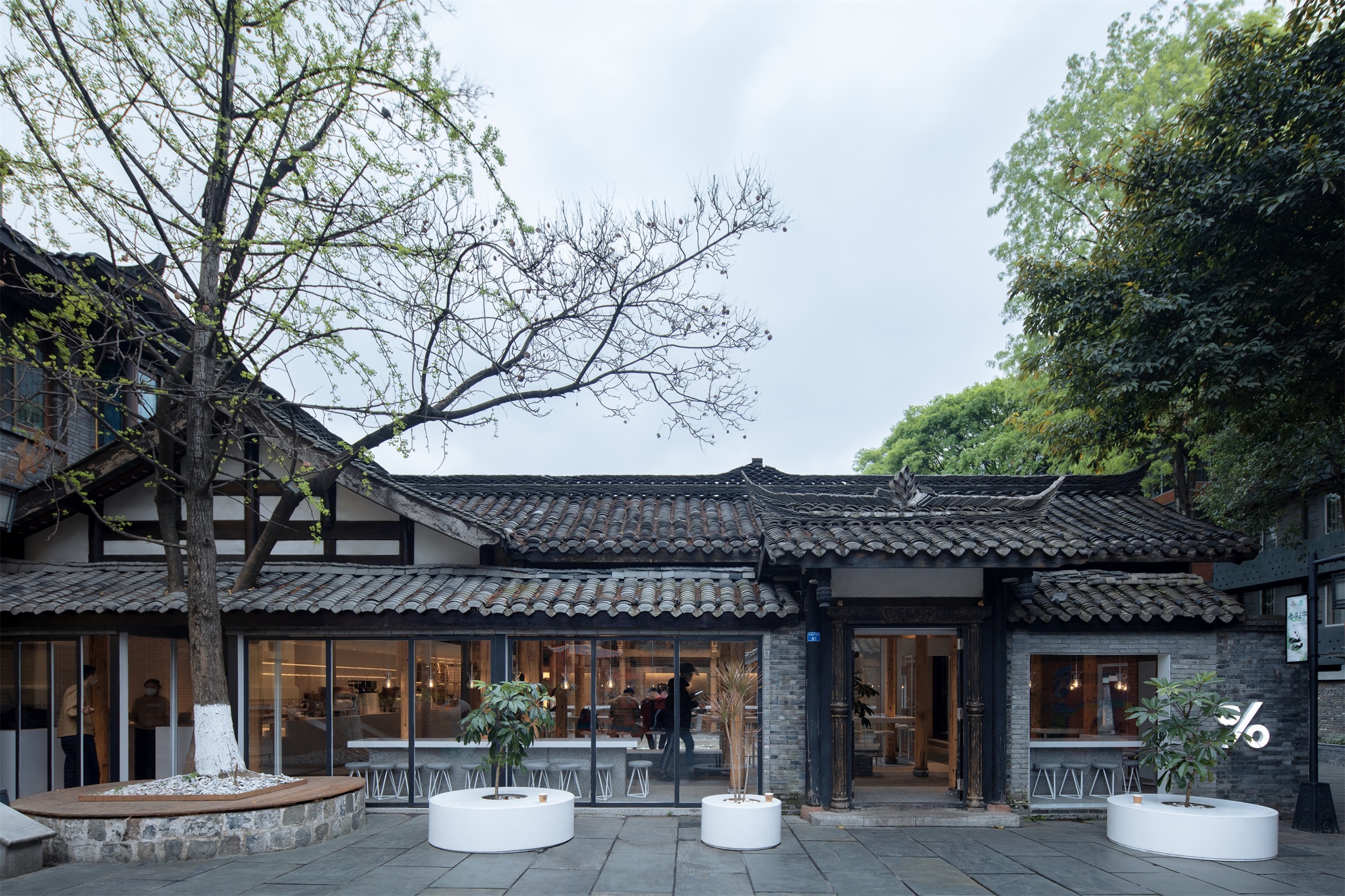
▽转角处的咖啡店 Coffee shop around the corner
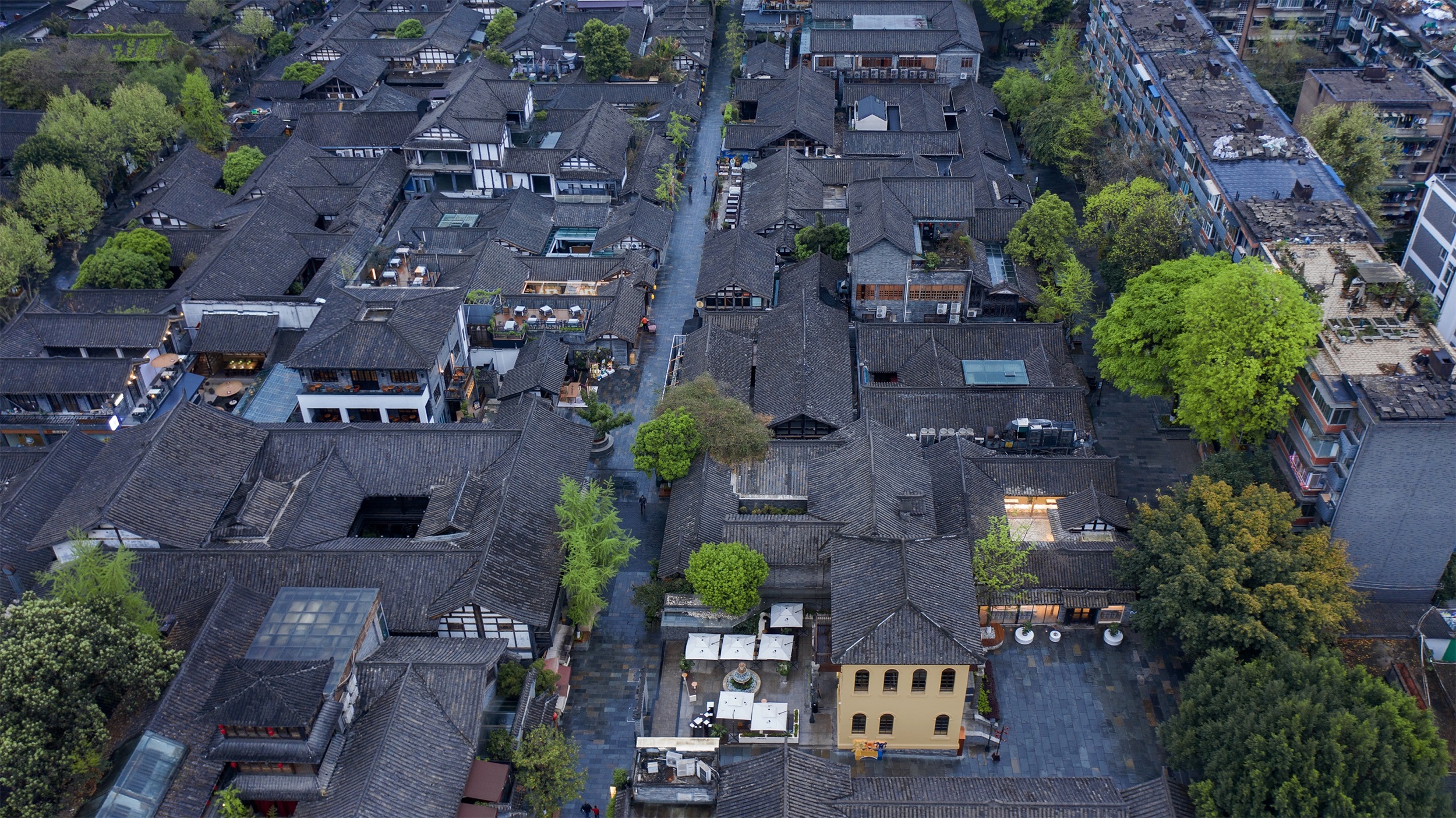
项目场地是一间传统的川西民居,位于在井巷子中段的一个小广场旁边。宅院共一进,有两侧厢房和正房。南侧和西侧是两个传统的木构门头,分别面向井巷子和广场。古建筑青砖黛瓦,古朴素雅,满是成都的记忆。很多原住民仍然生活在井巷子周边,这里仍有着地道老成都的生活状态。
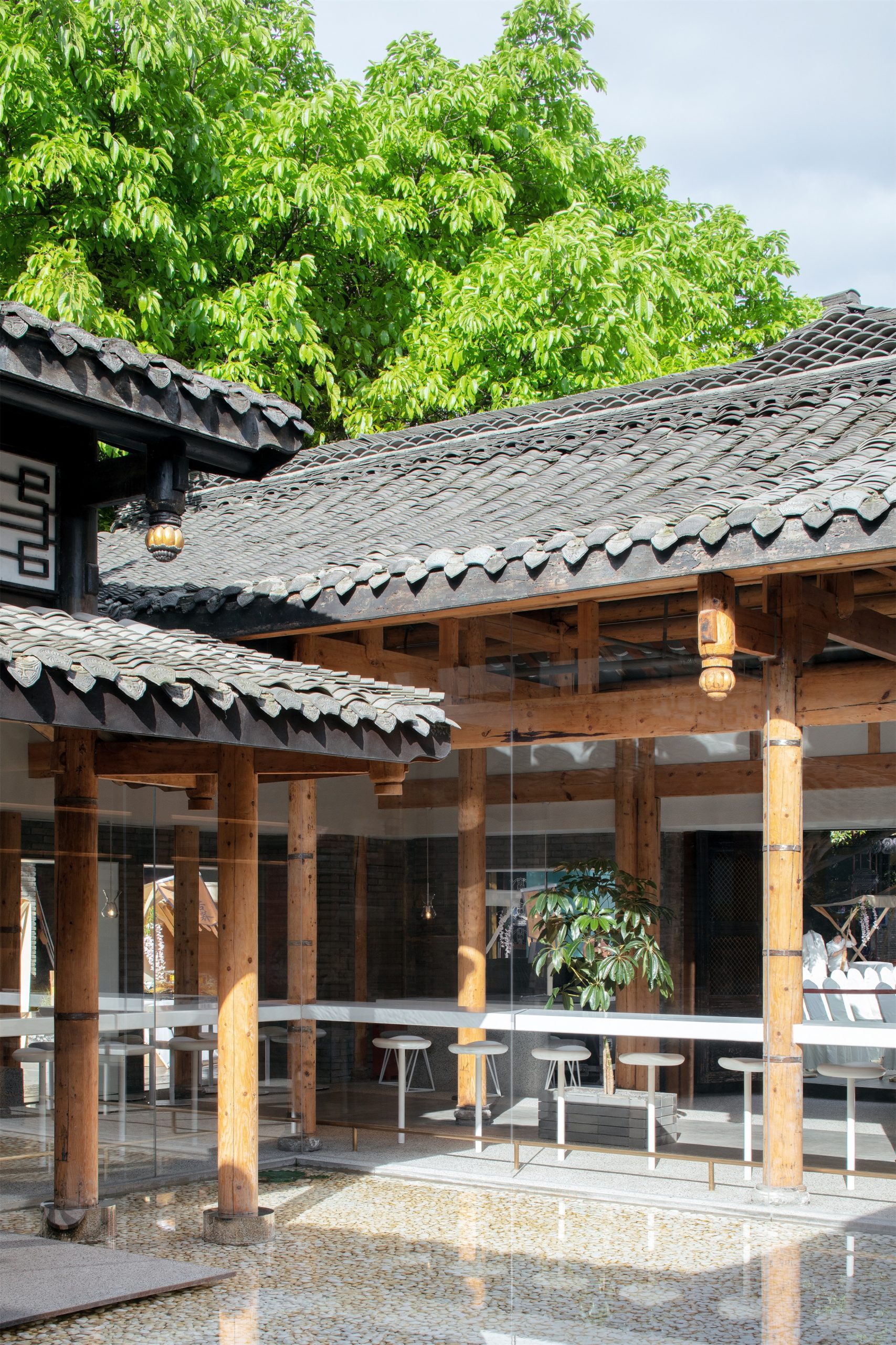
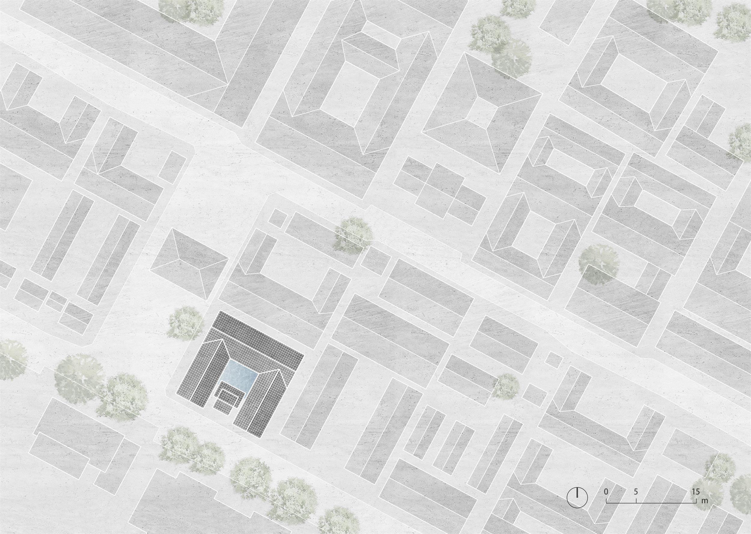
Sits next to a small square in the middle of Jing Alley, the project site is a traditional western-Sichuan residential architecture. The one-entry courtyard house has originally a main room with a courtyard and surrounding rooms on the two sides. The south and west sides of the architecture are featured with traditional wooden storefronts, respectively facing to Jing Alley and the square. The traditional architecture with grey bricks and black roof tiles is plain and elegant, reflecting the memories of the city of Chengdu. Today, a lot of natives still live around the Jing Alley, which helps the area maintain an authentic Chengdu lifestyle.
▽场地与周边环境鸟瞰 Aerial view of the site and surroundings
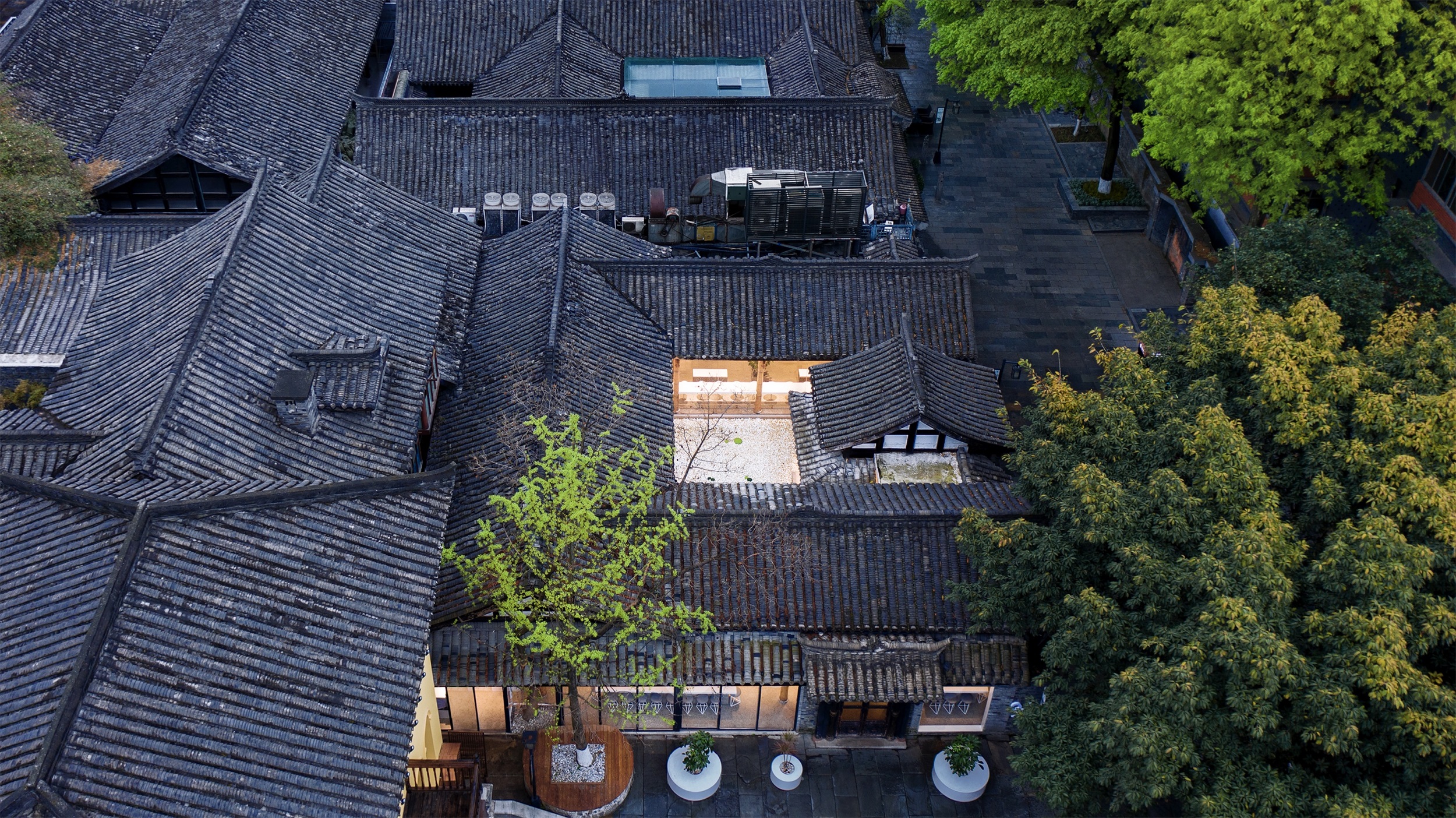
▽围合的屋顶与庭院 Enclosed roof and courtyard
设计理念 Design concept
面对富有历史底蕴的老宅,我们从尊重场地精神的角度出发,试图将成都独特的气质融入和延展在空间之中。宽窄巷子的市井烟火气息,老成都休闲的生活节奏,都对我们的设计产生了影响。
With a city full of historical and cultural heritage, we tried to integrate and extend the city’s unique characteristics into the space from a perspective of respecting the spirit of the site. The atmosphere of Kuanzhai Alley and the relaxed pace of life in Chengdu both have an impact on our design.
▽临街形象展示面 Street image display surface
▽内部庭院空间 Courtyard space
% Arabrica咖啡的理念是“see the world through coffee”,透过咖啡看世界,这和我们的设计理念也很契合。我们认为一个咖啡店提供的不仅仅是一杯饮品,更重要的是通过咖啡,让人们有机会相聚和交流,充分感受当地的城市文化。我们希望这间店铺成为小街区一般的场所,顾客在其间或漫步,或停留,可以没有拘束的活动和交流。让整个店铺成为动态的,有着丰富立体体验感的空间。这也是将巷子中生动的生活氛围延伸进室内,让空间既展现品牌的风格,也凝聚城市精神。
The philosophy of % Arabica is to “see the world through coffee,” which corresponds to our design philosophy. We believe that a café provides more than just a drink, more significantly, coffee provides opportunities for people to gather, communicate, and to fully experience the local urban culture. We hope the café to become a public space like a small neighborhood where people can either stroll or stay for a while and where people feel comfortable to walk and communicate. By extending the vibrant living and cultural atmosphere of the alley into the café, we renovated the site to make it a dynamic public space that provides a rich and solid spatial experience. Therefore, the café space is presenting the unique brand style while embodying the city spirit.
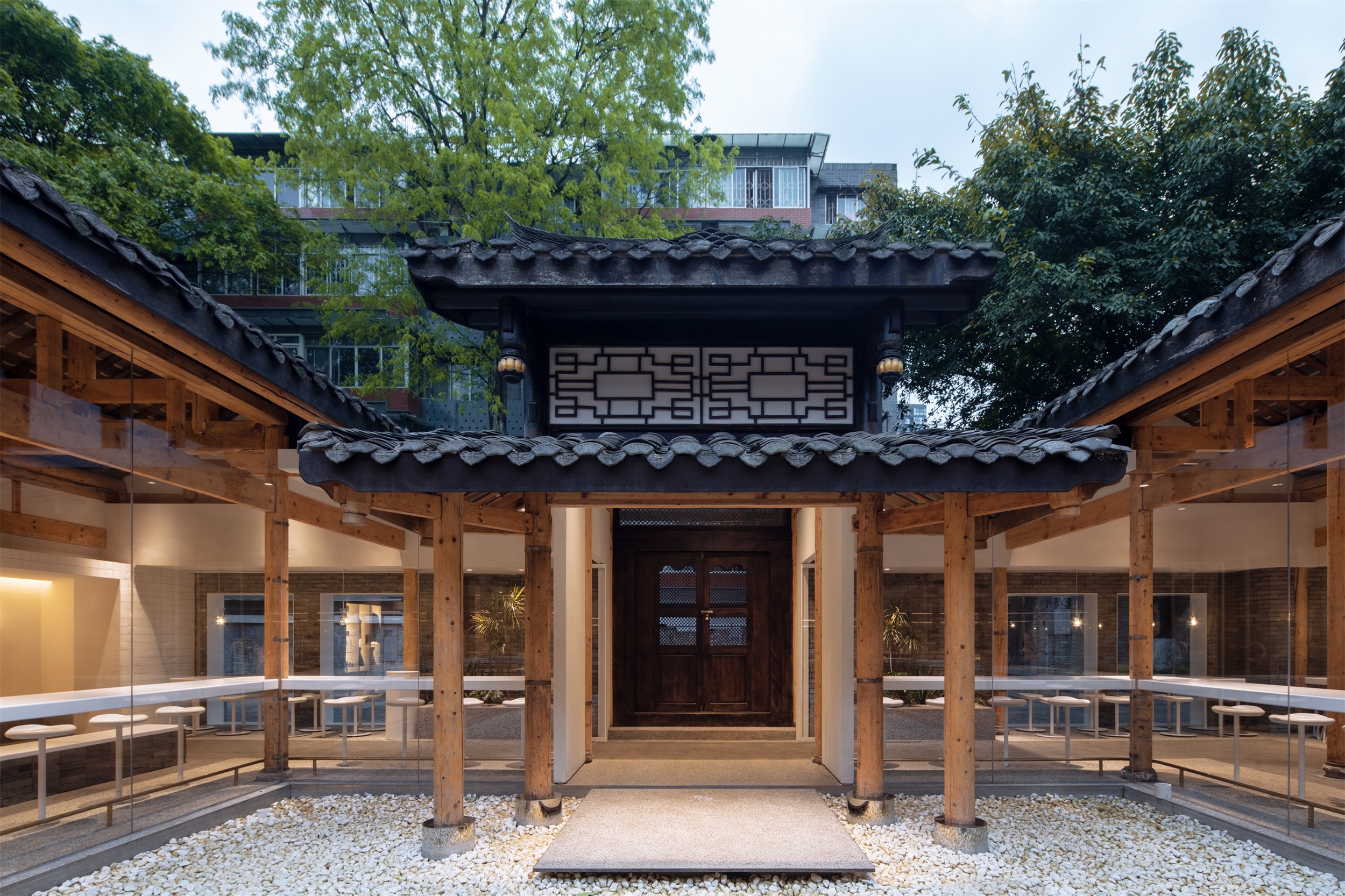
▽传统的木构门头 Traditional wooden door
▽入口与庭院的衔接关系 The connection between the entrance and the courtyard
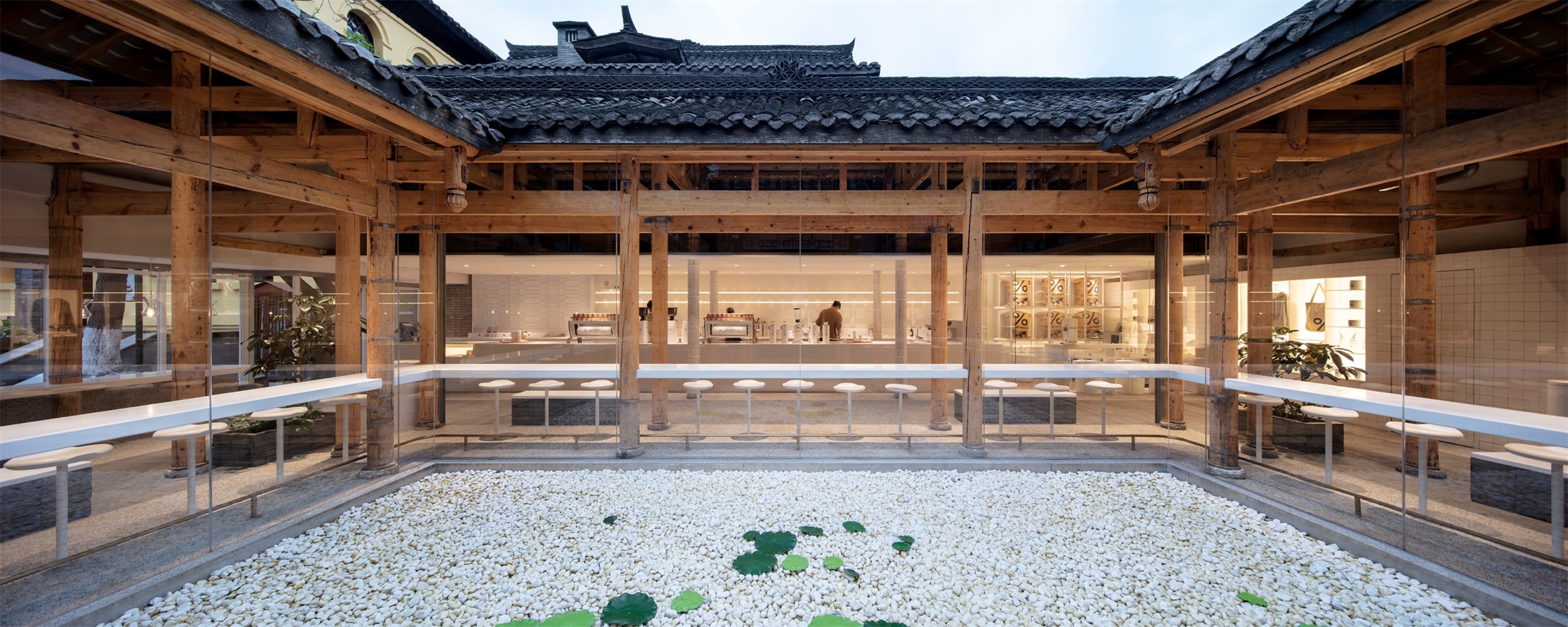
▽围绕水面水面的吧台座位 Bar seating around the water surface
空间特点 Spatial characteristic
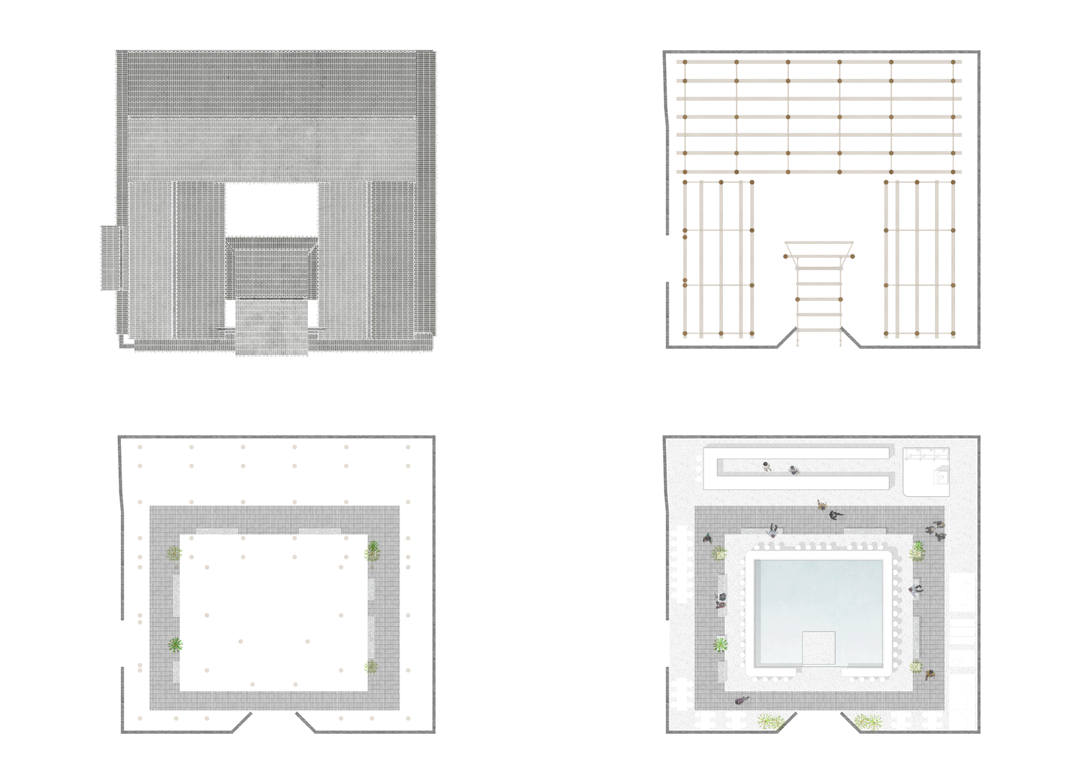
初次考察场地时,我们就决定将房屋中庭区域原先加建的屋顶去除,让老宅恢复三面房子围合内院的布局,这也为整体的空间设计奠定了基础。
When we first visited the site, we decided to remove the glass roof in the atrium area, which was latterly added by the previous owner, in order to help the architecture to restore its original layout of three sides of houses and an enclosed inner courtyard. Primarily, it sets the foundation for the overall spatial design.
▽概念推演动图 Concept deduction animation
▽室内空间布局 Concept street
▽整体统一的白色内部空间 Overall unified white interior space
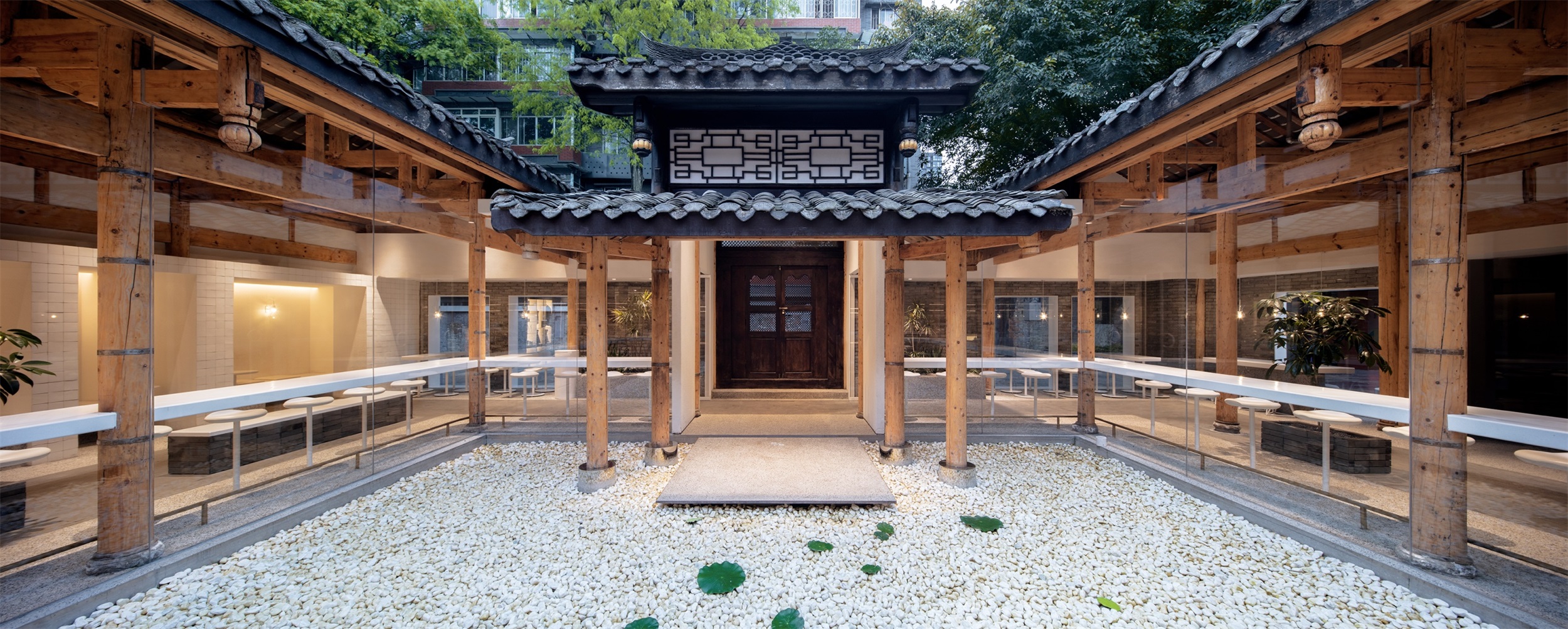
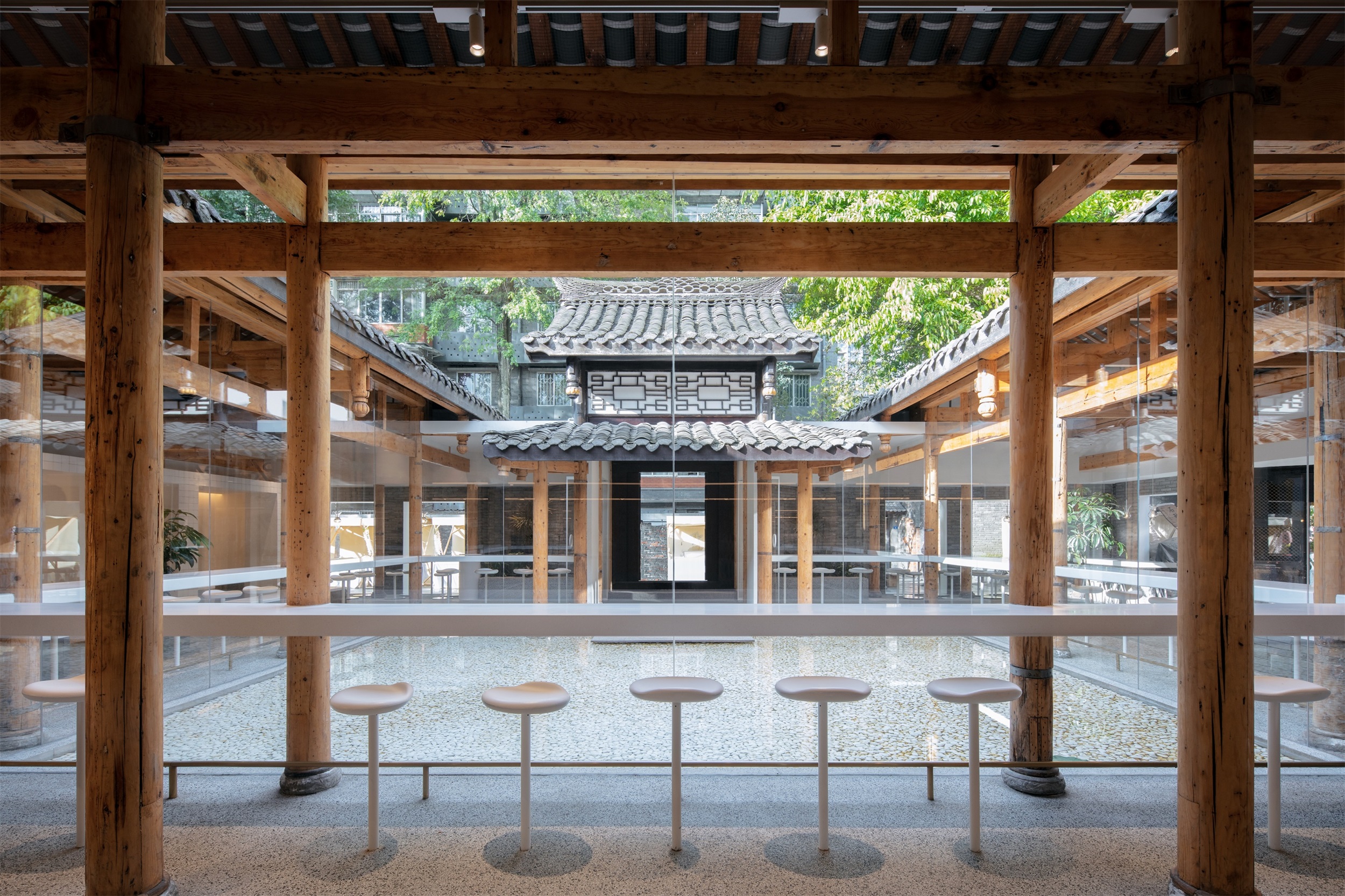
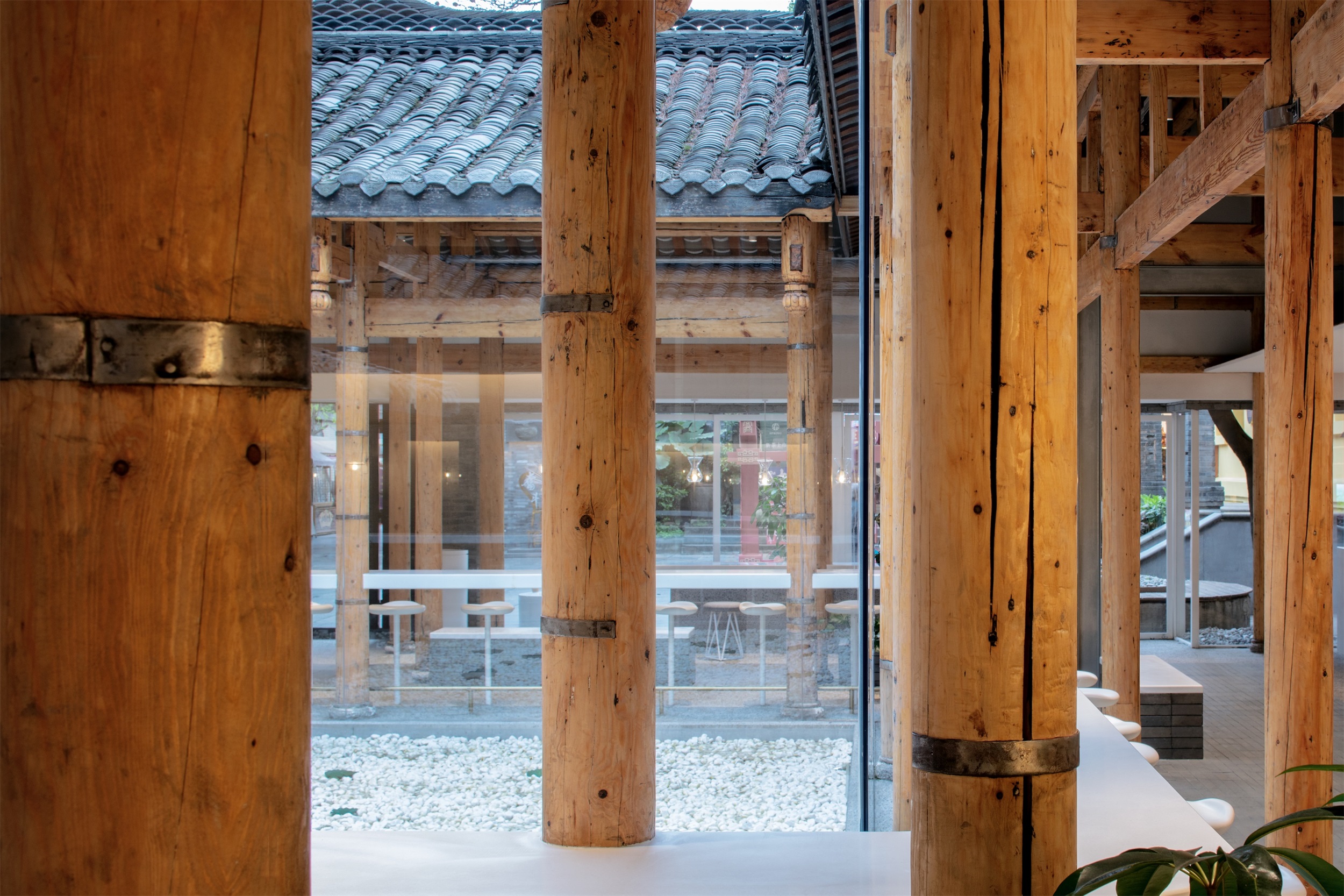
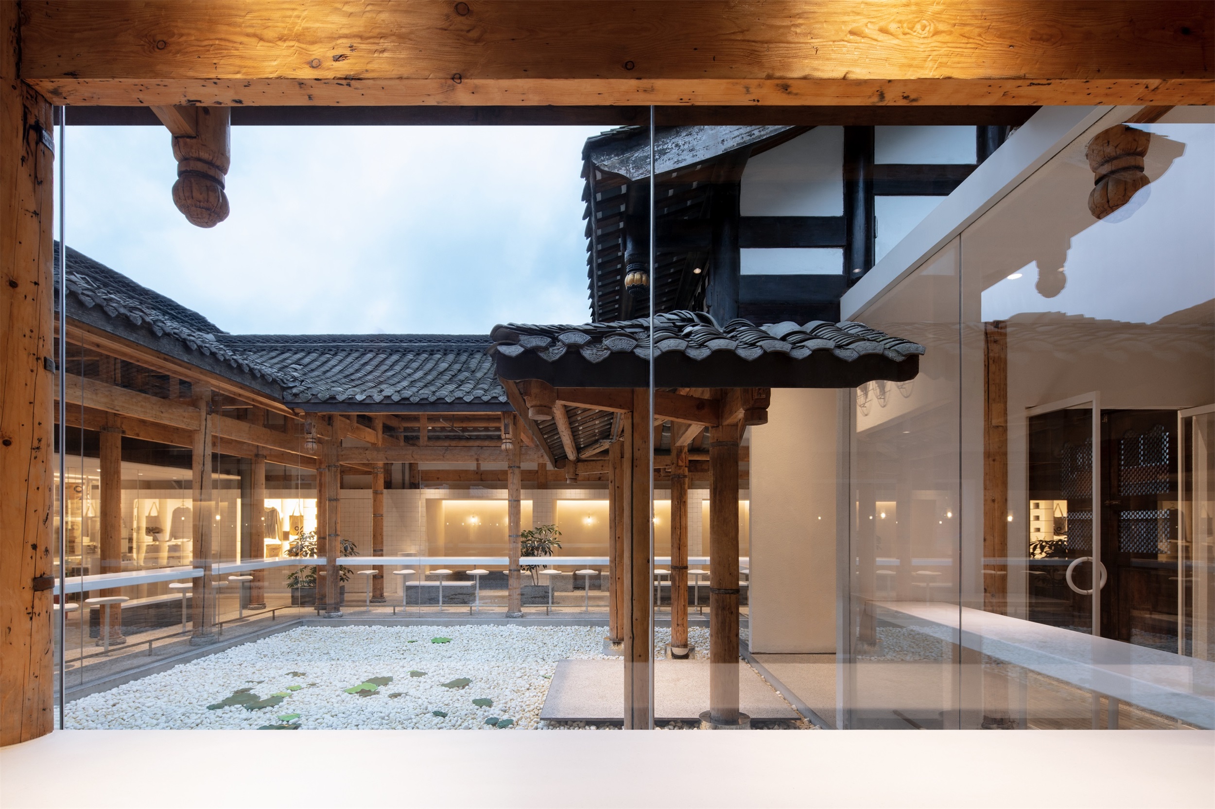
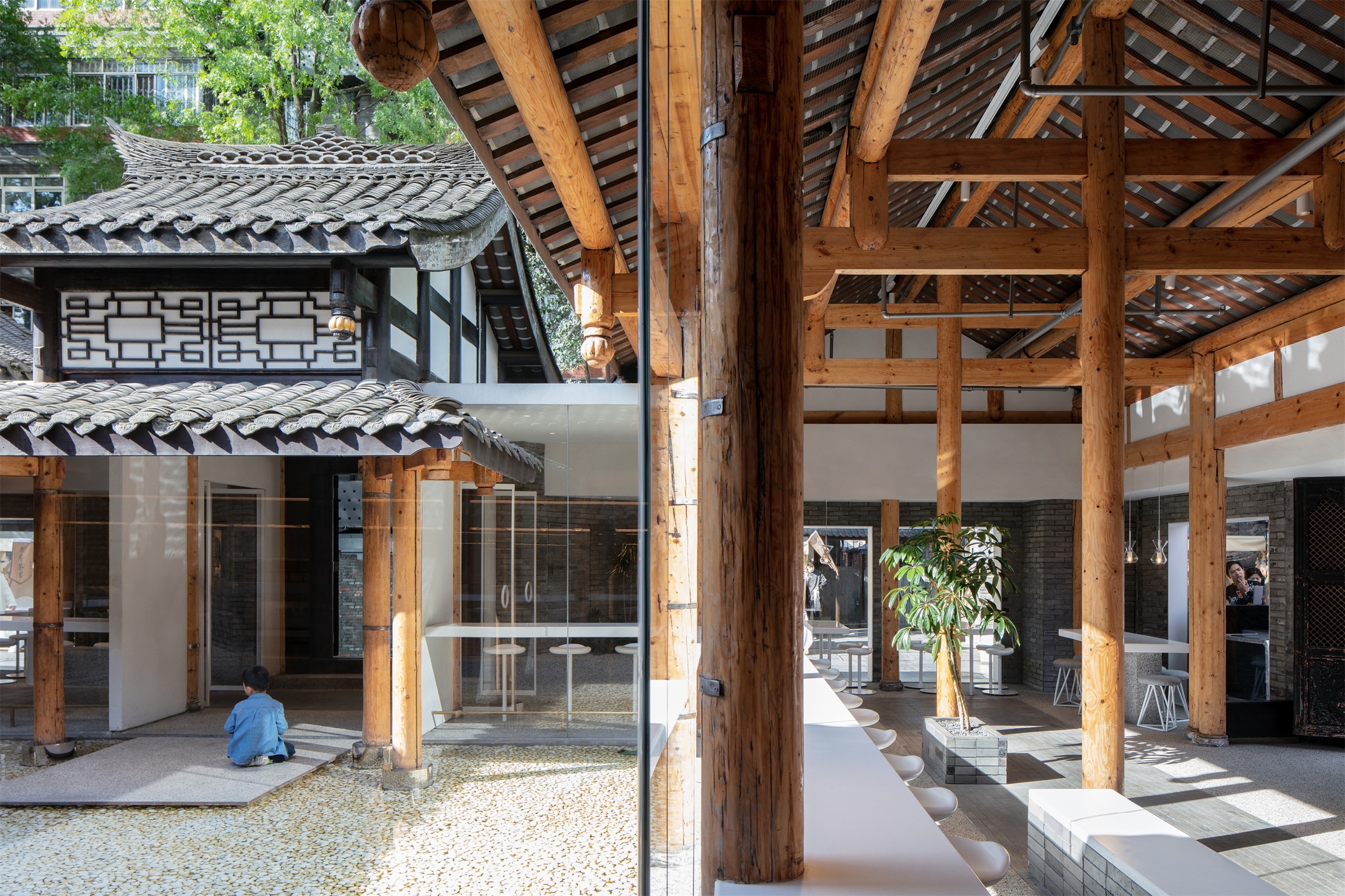
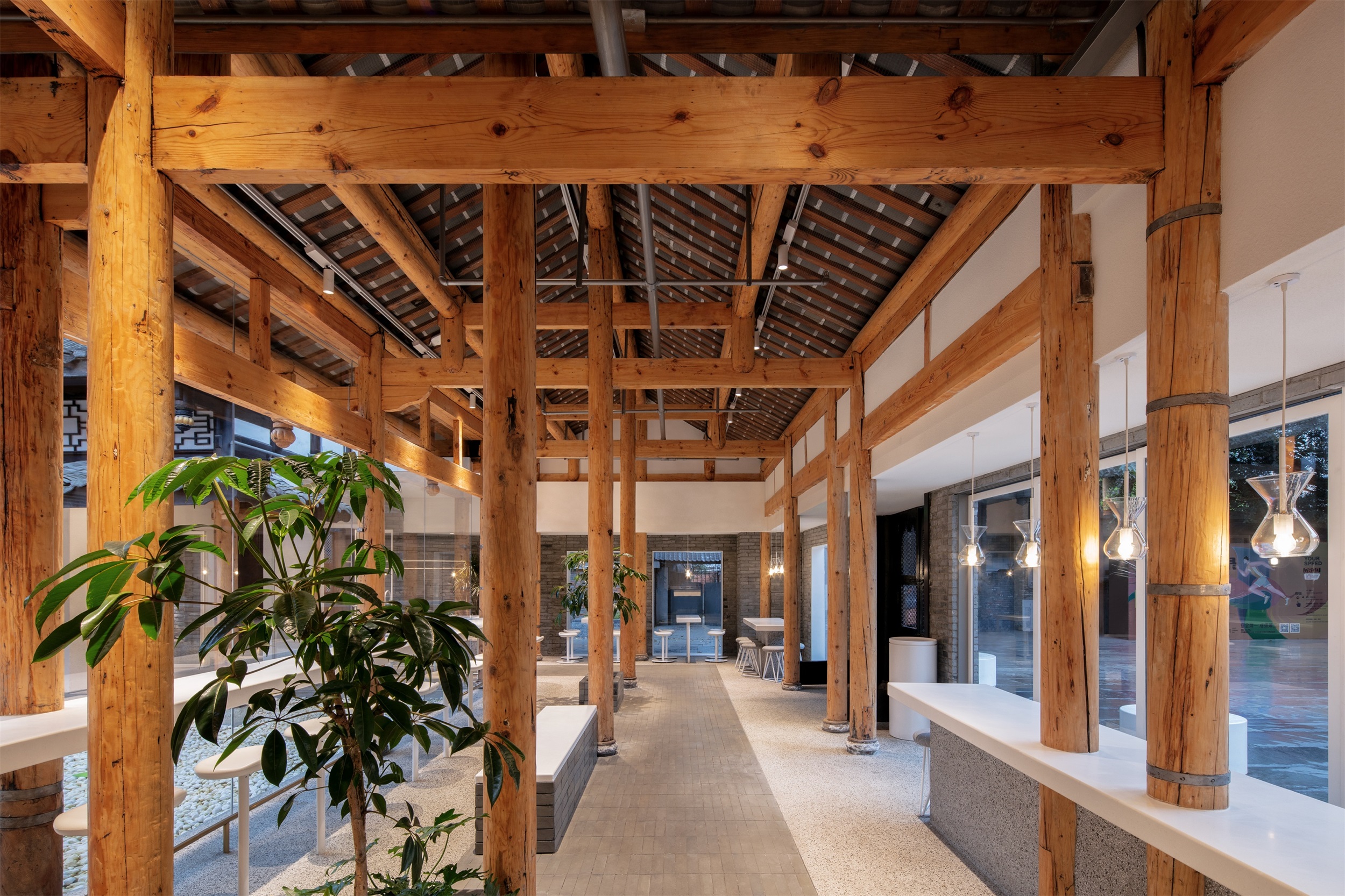
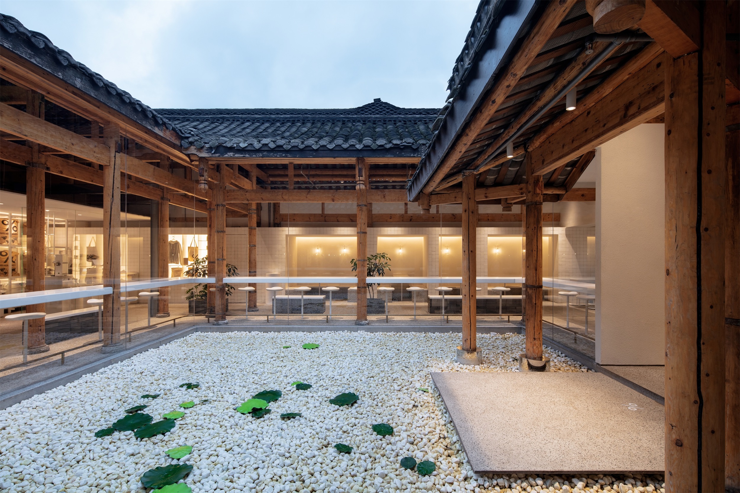
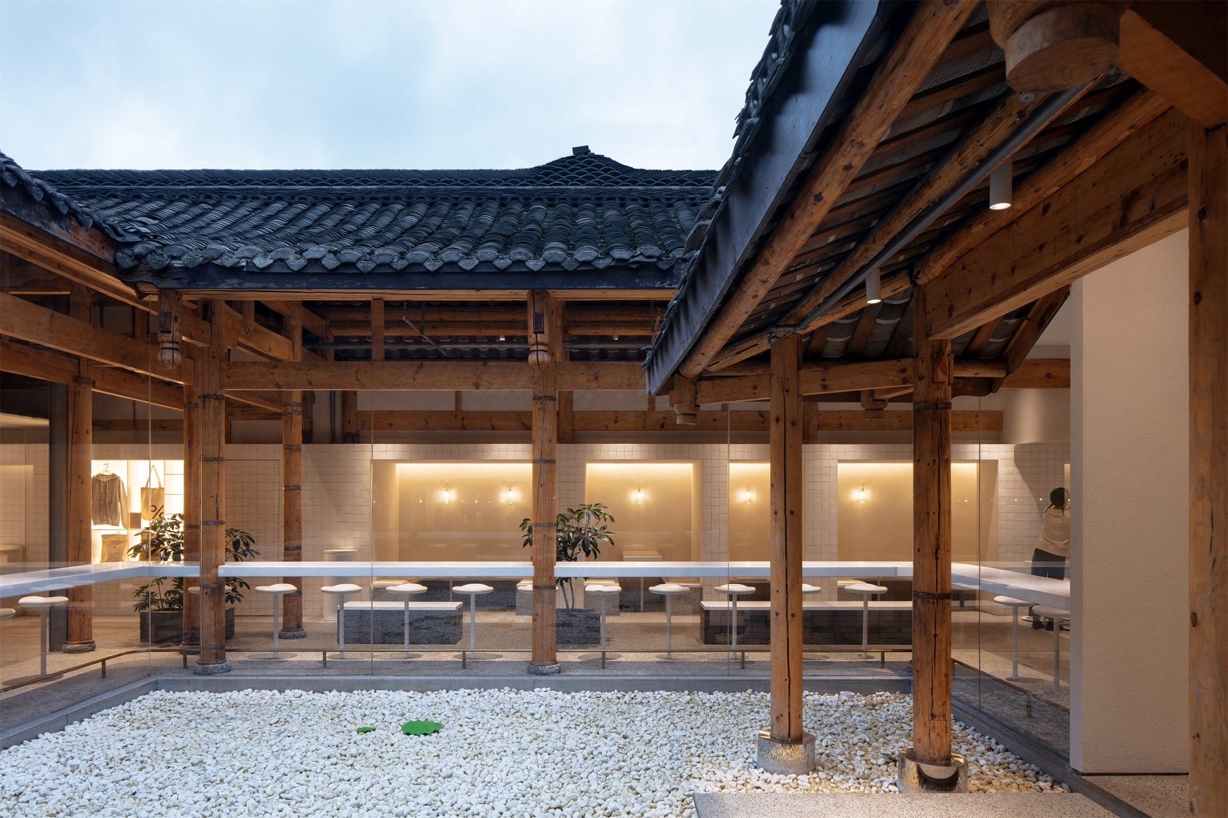
同时,我们将柱子表面的深色油漆打磨掉,呈现原木真实的颜色和质感,用金属构件对木结构进行局部加固。宅院初现它原本的样貌后,我们把整个中庭设计成简洁现代的白色水池,客人从主入口进入,眼前一池平静的水面,让人瞬间摆脱城市生活的喧嚣繁杂,一下子进入宁静安逸的空间氛围。
Meanwhile, we also chose to polish off the black paint on the surface of the columns to show the authentic color and texture of the timber, and partially reinforce the original timber structure by combining steel structure. After the building returned to its original layout, we transformed the entire courtyard into a simple and modern white pool.
▽柱子呈现原木真实的颜色和质感,并用金属构件得到局部加固 Columns take on the true color and texture of logs and are partially reinforced with metal elements
▽现代简洁的白色水池庭院 Modern simple white pool courtyard
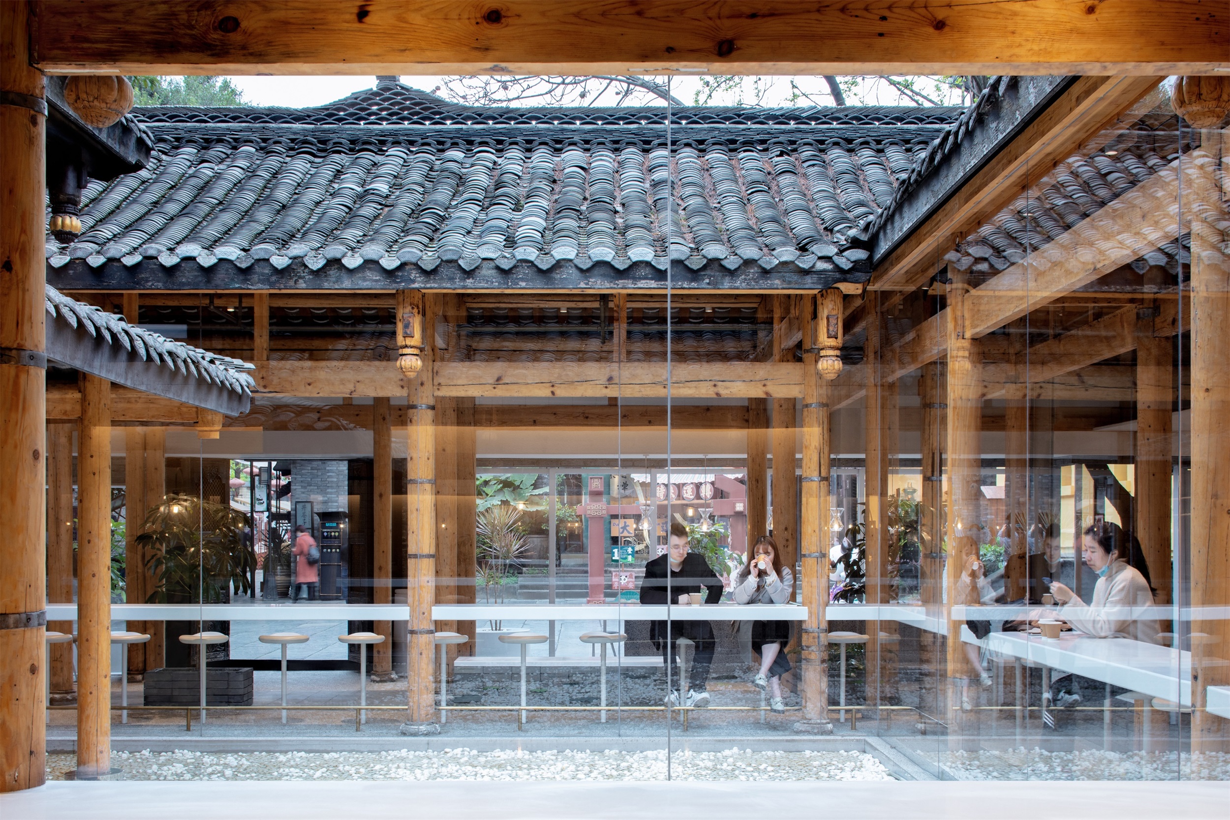
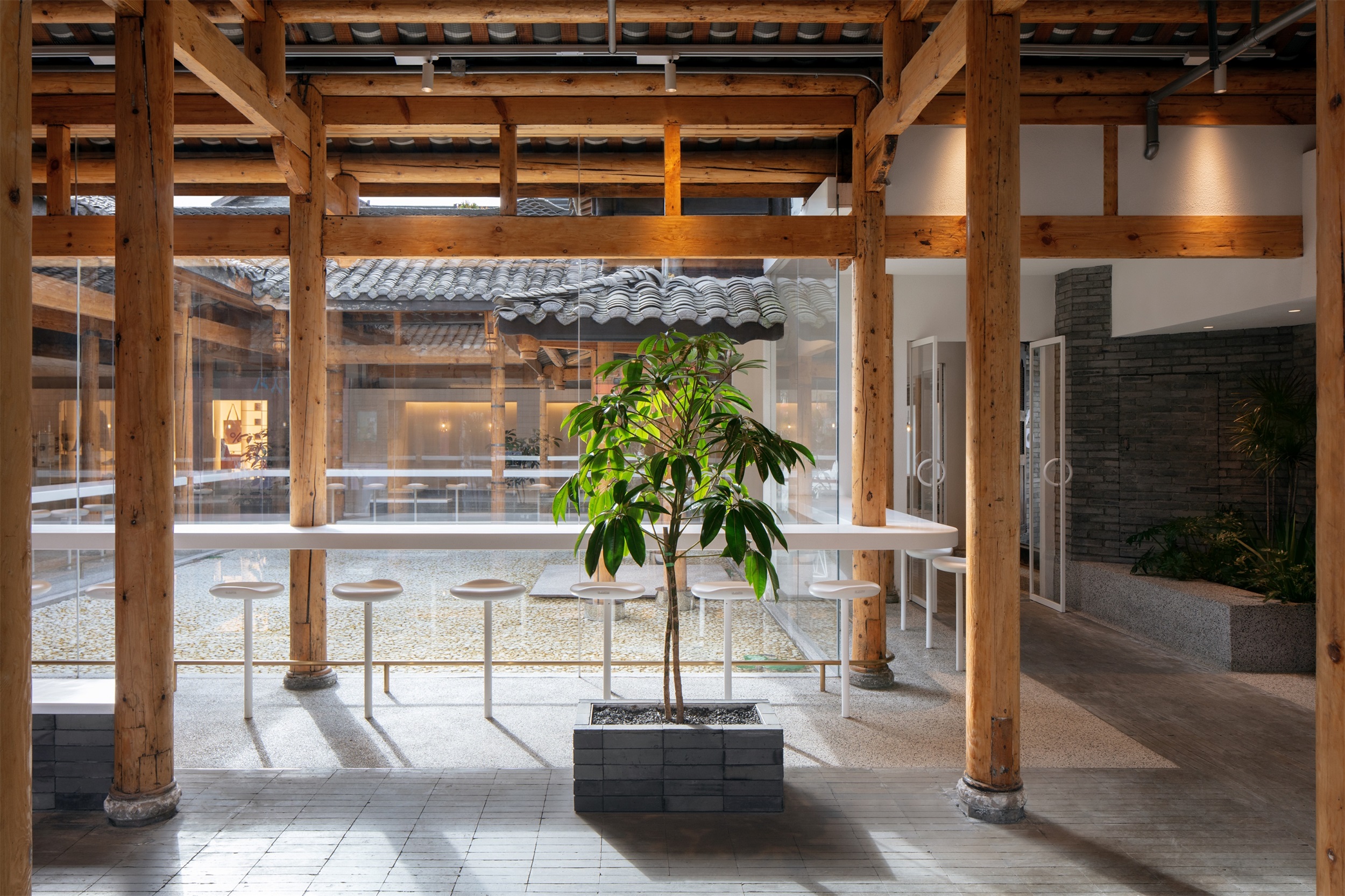
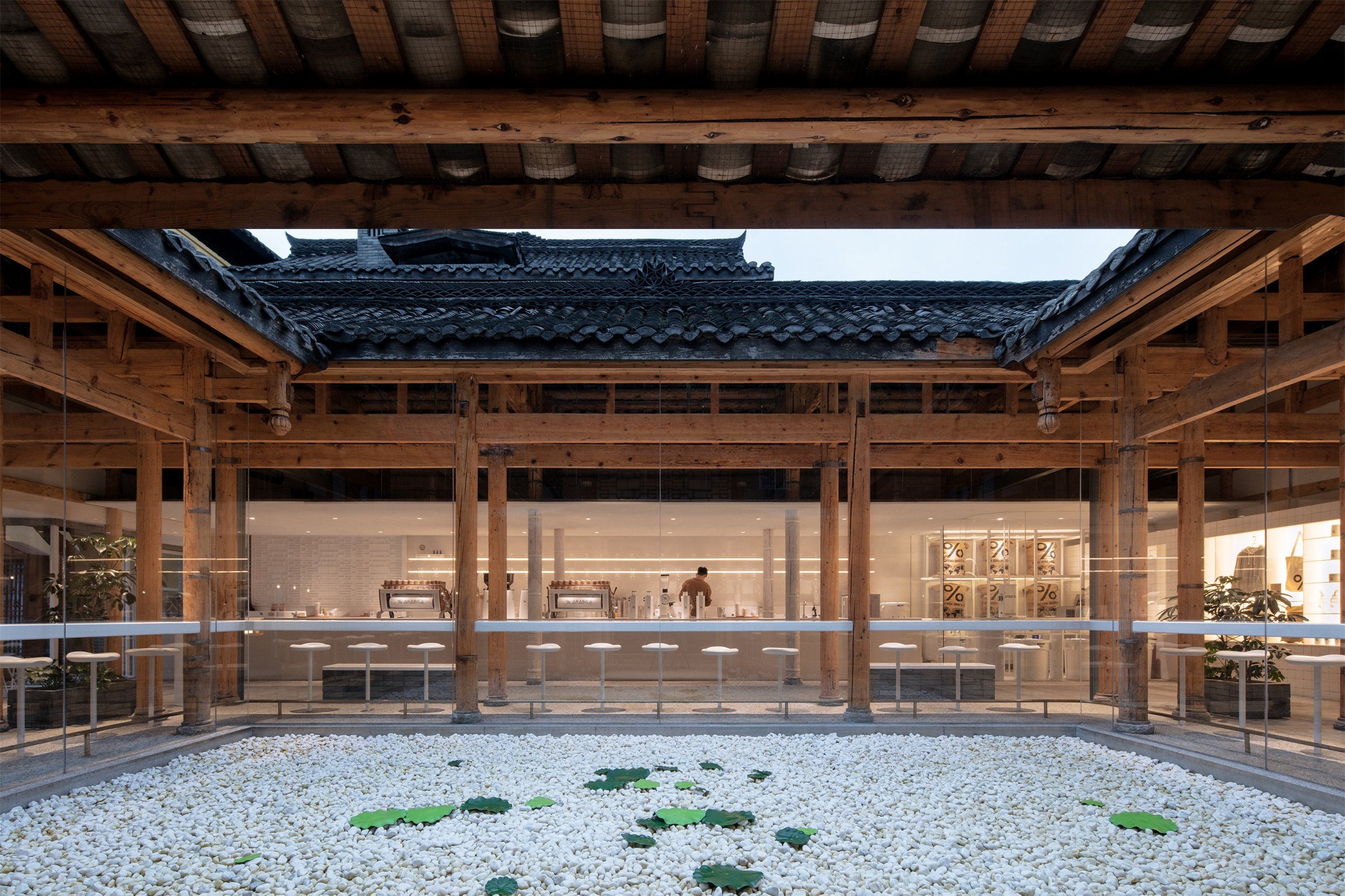
水池周围是一圈围合的落地玻璃,将自然光线最大化地引入室内, 空间整体的通透性也在视觉上带来一种流动感。这种做法虽然牺牲了一部分营业空间,但我们认为,室内外空间的充分融合,宅院自然灵动的气息, 是更宝贵的空间特质。围绕水面设有一圈吧台座位,客人围坐在中庭四周,彼此间形成了一种亲近的关系,而面前的水面又带给人一定的距离感,这样互相看到与被看到的特殊体验感,也增强了公共空间的趣味性。水池四周是一条环形的“室内街道”,街道两宽两窄,也呼应着宽窄巷子的空间特色。
People enter through the main entrance and the calm water sits right in front of them, inviting the guests to instantly get rid of the busy urban life and thus dive into a tranquil and comfortable atmosphere. The pool is surrounded by an enclosure of floor-to-ceiling glass, introducing natural lights into the interior at a maximum extent. Besides, the overall transparency of the space visually brings a sense of spatial fluidity. Although removing the existing glass roof has sacrificed a part of the retail space, we believe that the integration between the interior and the exterior and the natural and flexible atmosphere of the architecture are more precious spatial characteristics. There is a set of bar seatings around the water so that guests can sit around the water courtyard, forming an intimate relationship among each other. While the water in front of them brings a certain sense of distance. The specific experience of seeing and being seen helps to enhance the interest of the public space. Around the pool we designed a loop indoor street featuring with two wide sides and two narrow sides, which is to echo the characteristics of the Kuanzhai Alley.
走道地面用宽窄巷子里随处可见的老青砖铺装,和周边环境和谐的融为一体。 几个同样由青砖砌筑的座椅散落在道路两旁,供人随时慢下脚步休息片刻。尽头的巷道旁边设有半开放的小房间,作为私密座位区。
The floor of the looped street is paved with old grey bricks the can be seen everywhere in the Kuanzhai Alley, and it harmoniously blends into the context. Several seats, also made of grey bricks, are scattered around both sides of the path for people to slow down for a rest.
▽走廊尽头的半开放私密空间 Semi-open private space at the end of the corridor
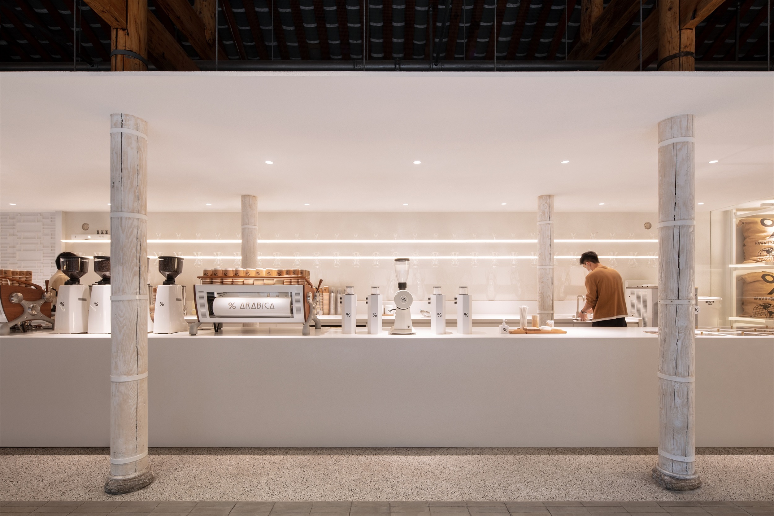
小房子表面为手工砖,其不规则的表面散发着朴拙自然的质感,传统手工艺和有历史感的老宅彼此映衬,相得益彰。在尽可能展现建筑的原始结构和传统元素的同时, 我们也尝试融入现代城市生活的精髓和品牌的极简美学。正对大门和水池是现代感的纯白色的吧台区,布置在一片轻盈的屋檐下,好像漫步街头时偶遇的路边小店,更增加了街巷般的体验和感受。
Next to the road at the end, we set a small semi-open room as a private seating area. The surface of the room is made of handcrafted bricks: the material’s irregular surface suggests a simple and natural texture. Traditional handicraft incorporates with the architecture with a strong sense of history, complementing each other. While showing the original structure and traditional elements of the architecture, we tried to integrate the essence of modern urban life and the minimalism aesthetics of the brand. The modern pure white bar counter area is introduced opposite the entrance and the pool, and is arranged under a light eave. Like a roadside shop people may encounter while strolling on the streets, the bar area helps to increase the street-like experience and feeling.
▽传统元素与现代极简美学的碰撞 The collision of traditional elements and modern minimalist aesthetics
改造后的空间,人的活动成为了最重要的元素,整体的空间体验感是动态的。人们自由的在咖啡馆中行走,停歇,细细的感受时光,这样的情景也是一种老成都生活的再现。
In this space, the overall spatial experience is dynamic and human activities have become the most important element. People walk, rest, and enjoy time freely in the café. The vibrant scene stands for a reappearance of life of old Chengdu.
▽现代简洁的白色水池庭院 Modern simple white pool courtyard
总结 The ongoing dialogue
我们认为空间设计不仅关乎视觉层面,处理人与自然、文化、生活的关系才是我们工作的核心内容。% Arabcia宽窄巷子店的室内空间再现了成都街巷里闲适的生活氛围,体现了对当地文化的尊重。这次改造的过程,像是一场与场地和历史的持续对话,同时也是我们对于城市空间公共性以及城市生活趣味性的探索。
We believe that spatial design is not just about the visual experience. The core concept of our work is to deal with the relationship between human and nature, culture and daily life. The interior space of % Arabica Kuanzhai Alley represents a leisurely and comfortable living atmosphere in the streets and neighborhoods of Chengdu, while reflecting respect for the native culture. The process of the renovation is a continuous dialogue with the site and history. It is also our exploration of the publicness of urban space and the playfulness of urban life.
▽ 总体规划 Master plan
▽总平面图 Plan
项目名称:成都宽窄巷子% Arabica咖啡店
项目所在地: 四川省成都市
项目类型: 店铺
建筑师: 青山周平,藤井洋子,刘凌子,邹德静,川岛雅矢 / B.L.U.E.建筑设计事务所
照明设计:B.L.U.E.建筑设计事务所
业主:% Arabica
规模:一层
用地面积: 320㎡
总建筑面积: 270㎡
设计周期:01. 2020 – 05. 2020
施工周期:05. 2020 – 08. 2020
摄影师:夏至
主要材料
墙面:肌理涂料 手工砖
地面:水洗石 青砖
吧台:杜邦可丽耐
Project Name:% Arabica, Wide & Narrow Alley in Chengdu
ProjectLocation:Chengdu, Sichuan Province, China
Project Type:Café,Architectural Renovation / Interior Design
Architect:Shuhei Aoyama, Yoko Fujii, Lingzi Liu, Dejing Zou, Masaya
Kawashima / B.L.U.E. Architecture Studio
Lighting Design:B.L.U.E. Architecture Studio
Client:% Arabica
Size:Single Floor
Site Area:320㎡
Gross Area:270㎡
Design Period:01. 2020 – 05. 2020
Construction Period:05. 2020 – 08. 2020
Photography Credit:Zhi Xia
Materials
Wall: stucco, handcrafted brick
Floor: grey brick, exposed aggregate concrete
Bar Counter: Dupont Corian
“ 设计尊重场地精神,以传统与现代融合的手法,将成都独特的气质融入和延展在空间之中。”
审稿编辑:王琪 -Maggie
更多 Read more about: B.L.U.E.建筑设计事务所













0 Comments