本文由 平介设计 授权mooool发表,欢迎转发,禁止以mooool编辑版本转载。
Thanks Parallect Design for authorizing the publication of the project on mooool, Text description provided by Parallect Design.
平介设计:项目位于上海市长宁区上生新所二楼,原场地为两个房间,中间可开洞联通,占地约130平方米,净层高仅2.4米。客户的要求满足多种接待区、艺术装置、仓库区、展示区及辅助功能空间等,对内保证实用,对外强调美观,并附有创造力。面对功能、空间与环境的多重矛盾关系,设计师需按照需求打通多余墙体,将大小两个房间做成一个店面,通过设计突破原有场地的限制,并在严格把控成本的基础上发挥出最好效果,打造一个集交流、展览、零售、打卡等功能于一体的商业空间,在有限的空间回应多种需求,给顾客带来最好的购物消费体验。
Parallect Design:Located in the second floor of a building named Columbia Circle in Changning District, Shanghai city, the area, covering 130m2 and measured at 2.4 meters high, includes two rooms which can be connected by breaking the wall in between. The client requires that the design can be adapted to a variety of reception areas, art installations, warehouse areas, exhibition areas and auxiliary space, etc., and it should be practical in usage and beautiful in design and have a sense of creativity. Be faced with the challenges of contradictions among functions, spaces and environment, the designer needs to get rid of unwanted walls and make the two rooms a whole one. He needs break out the chains of original area by designing and satisfies the client to the extreme on the basis of strictly controlling the cost, creating a commercial space with the function of communication, exhibition, retail, tourism, and other functions. The limited space with unlimited functions provides the customers with the best shopping experience.
设计概念——苏美尔星球KR-π铂金矿坑寻宝
The concept of design– Treasure hunt in the KR-π platinum mine on Sumer planet
宝石的意义不仅在于其本身价值,更在于其背后探索发现的过程。纵使悬崖峭壁,密洞深渊,采矿者也愿意去探索未知的、神秘的世界,最终得偿所愿。
铂金是梵誓品牌重要的元素,宇宙中铂金资源最充足的地方,就是苏美尔星球的KR-π铂金矿。因此设计师希望打造一个神秘的富有体验感的异形空间,模拟探险者登陆外星球铂金矿坑的体验,让每个进入梵誓的顾客都怀着好奇心去探索发现,找到属于自己的那款宝石。
The significance of gems lies not only in their own value, but also in the process of discovery behind them. Even with cliffs, dense caves and abysses, miners are willing to explore the unknown and mysterious world, and finally get what they want.
Platinum is an important element of the ONESWEAR brand. The place with the most abundant platinum resources in the universe is the KR-π platinum mine on the Sumer planet. Therefore, the designer hopes to create a mysterious and experiential alien space, simulating the experience of an explorer landing in a platinum mine on an outer planet, so that every customer who enters the Vow will explore and discover with curiosity and find his own gem.
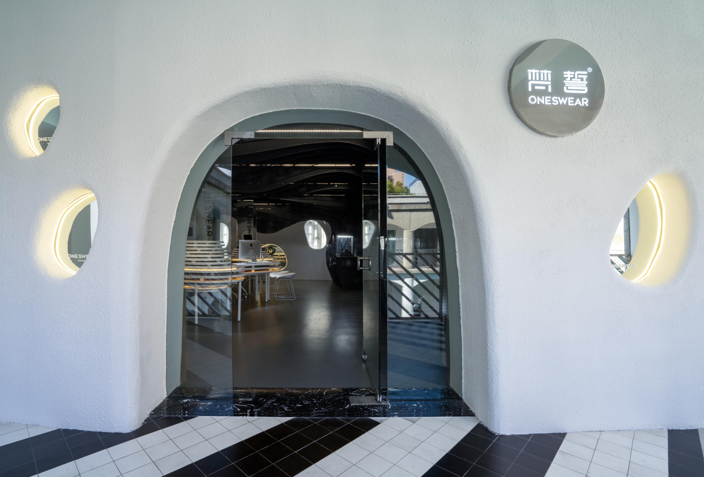
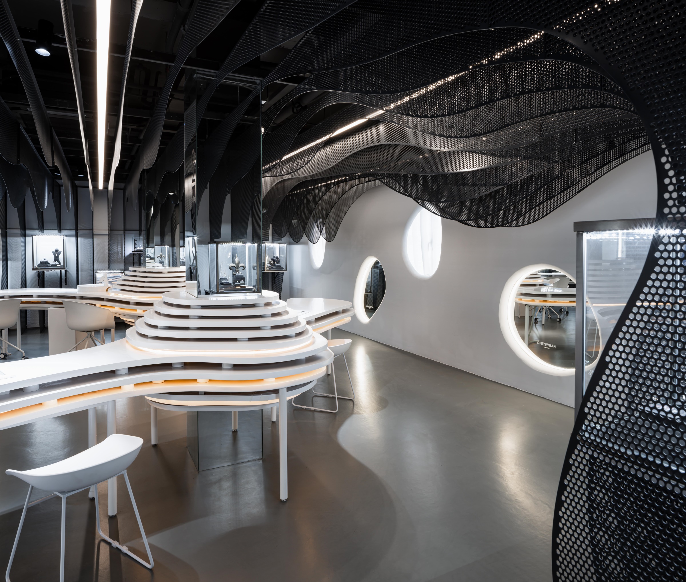
▼入口的空间的洞穴造型,为顾客营造出探险者登陆外星球铂金矿坑的体验。The cave shape of the space at the entrance creates the experience of an explorer landing in a platinum mine on an alien planet.
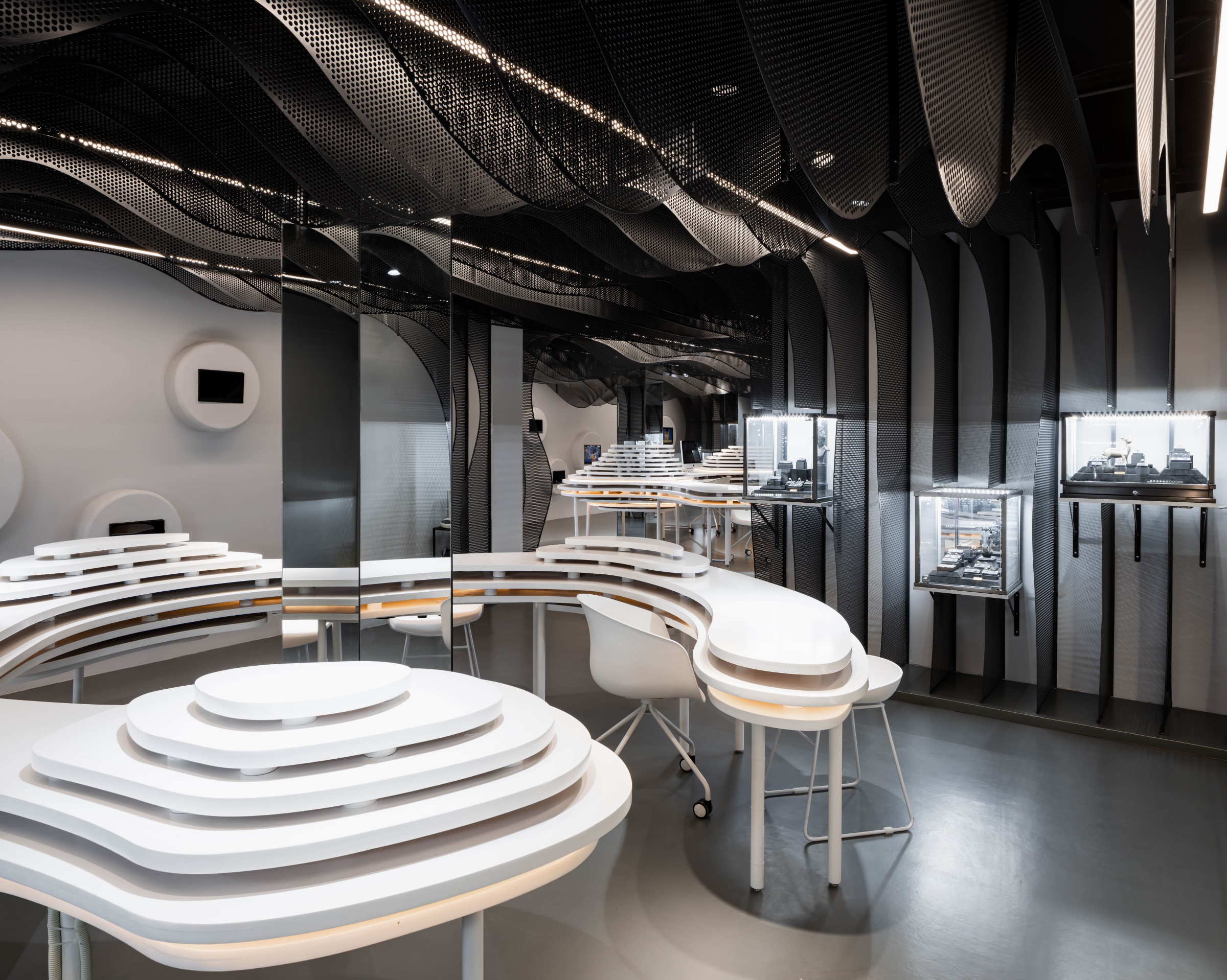
▼主展示区 The Main Exhibition Space
外墙面用真石漆刷成素白色,门的造型呼应洞穴概念。几个形态不一的流线型曲面造型的窗户在周围线性灯带的均匀的照射下泛着温暖的色彩,使空间视觉更具穿透性与连贯性,同时这些洞穴造型为新加厚突出装饰层打洞做出的效果,对原有墙面不会产生破坏。
The façade is painted plain white with natural stone coating, and the entry is designed to echo with the concept of caves. Several streamlined and curved windows of different shapes display the color of comforting with well-distributed illumination of the strings of lights surrounding them, making the space looks more integrated and coherent. Meanwhile, such design comes from newly-thickened walls to extrude the decoration part and will not damage the original wall.
▼入口门面 The entrance
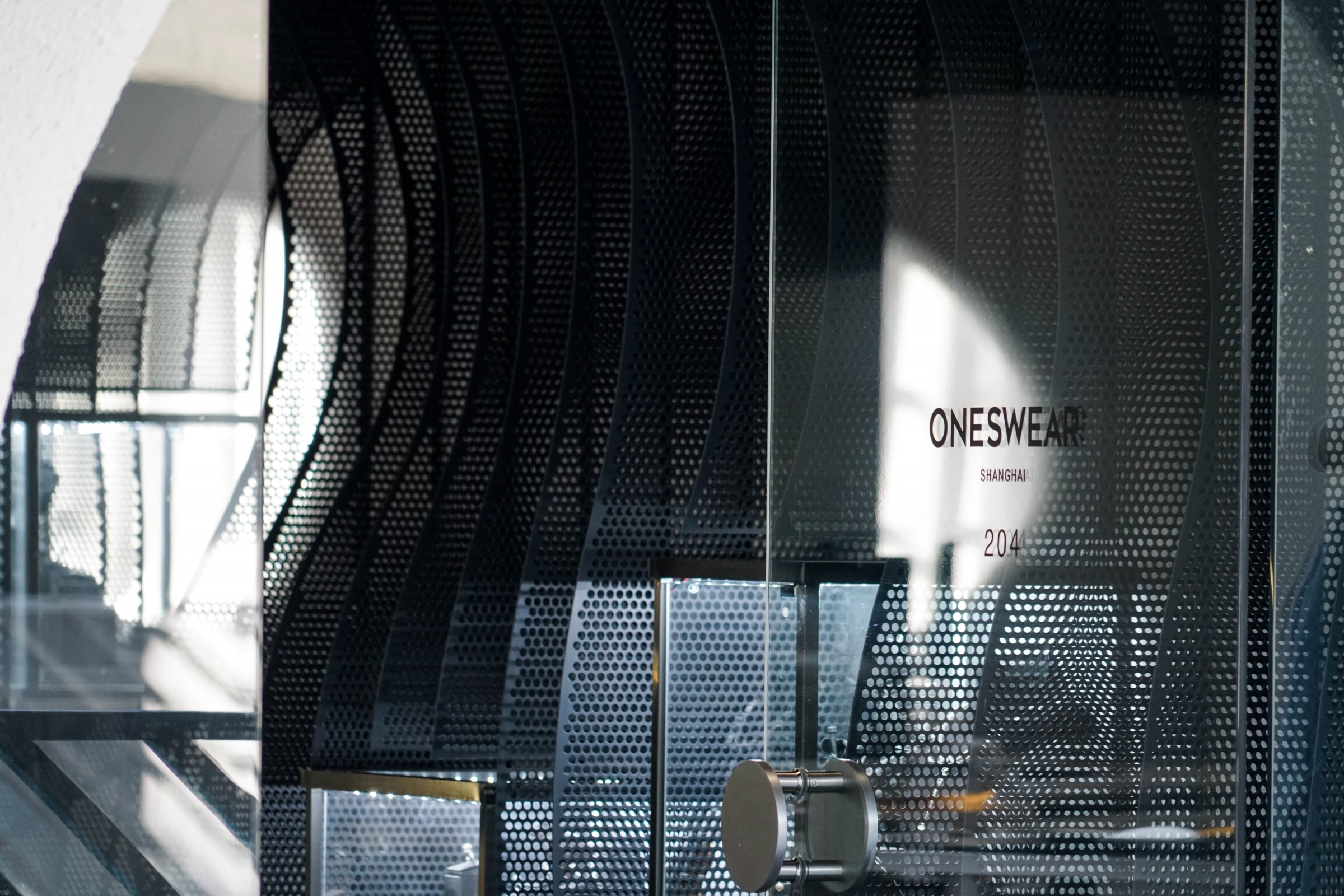
▼入口细节 Entrance Detail
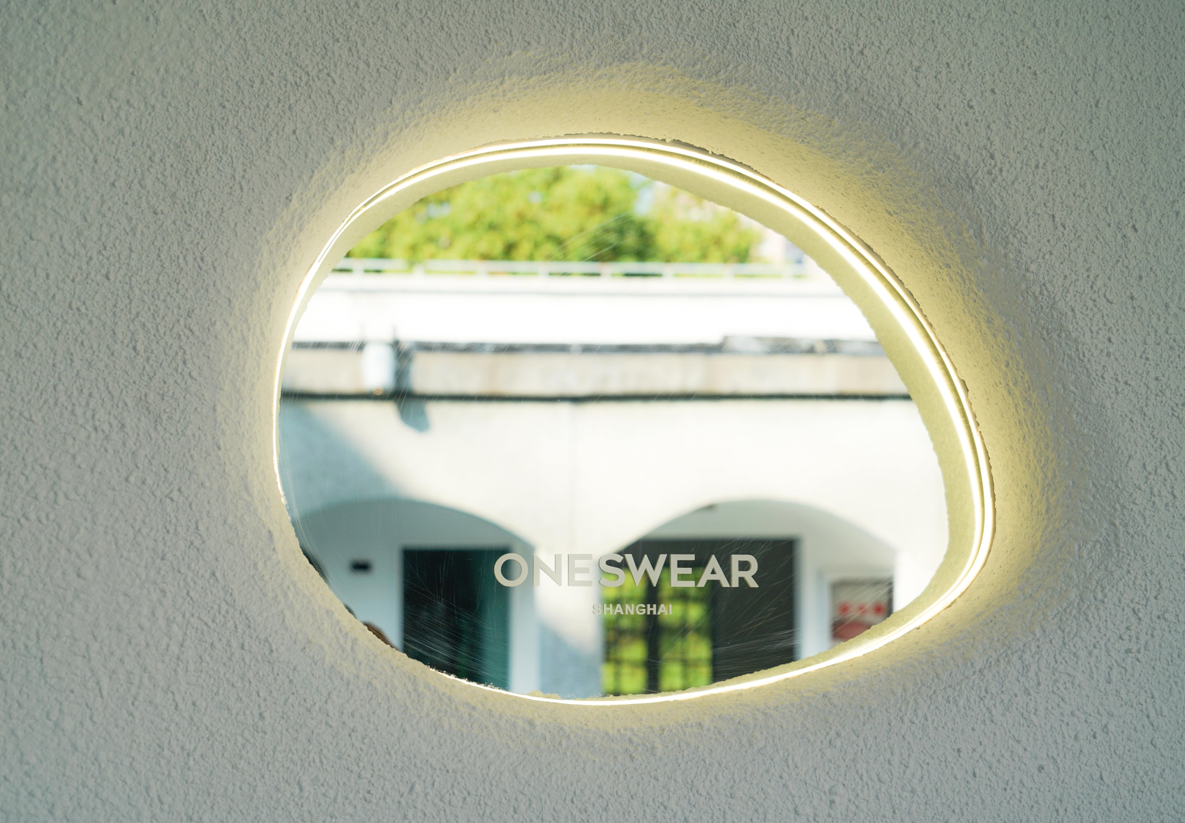
外立面上的异形洞底部安置了镜面,既可以反射周围上生新所优美独特的景色,又为来往游客提供了观光驻足,打卡拍照的素材。
A mirror is placed at the bottom of the special-shaped hole on the facade, which not only reflects the beautiful and unique scenery of the surrounding Columbia Circle, but also provides materials for tourists to stop and take photos.
▼外立面造型洞 Façade Mirror
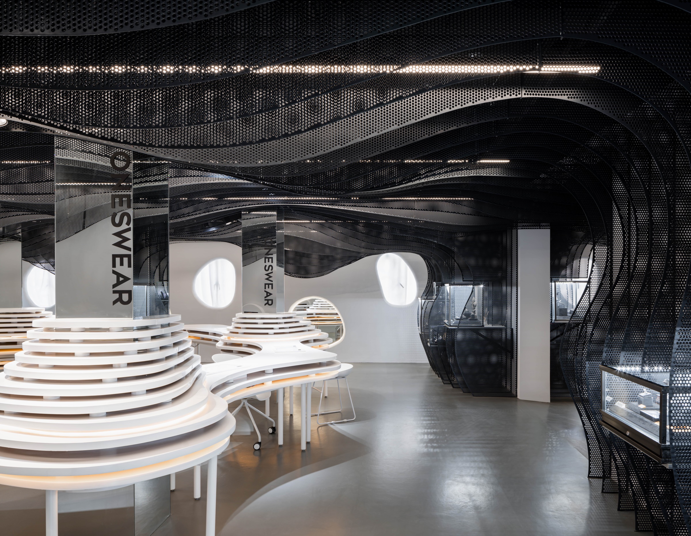
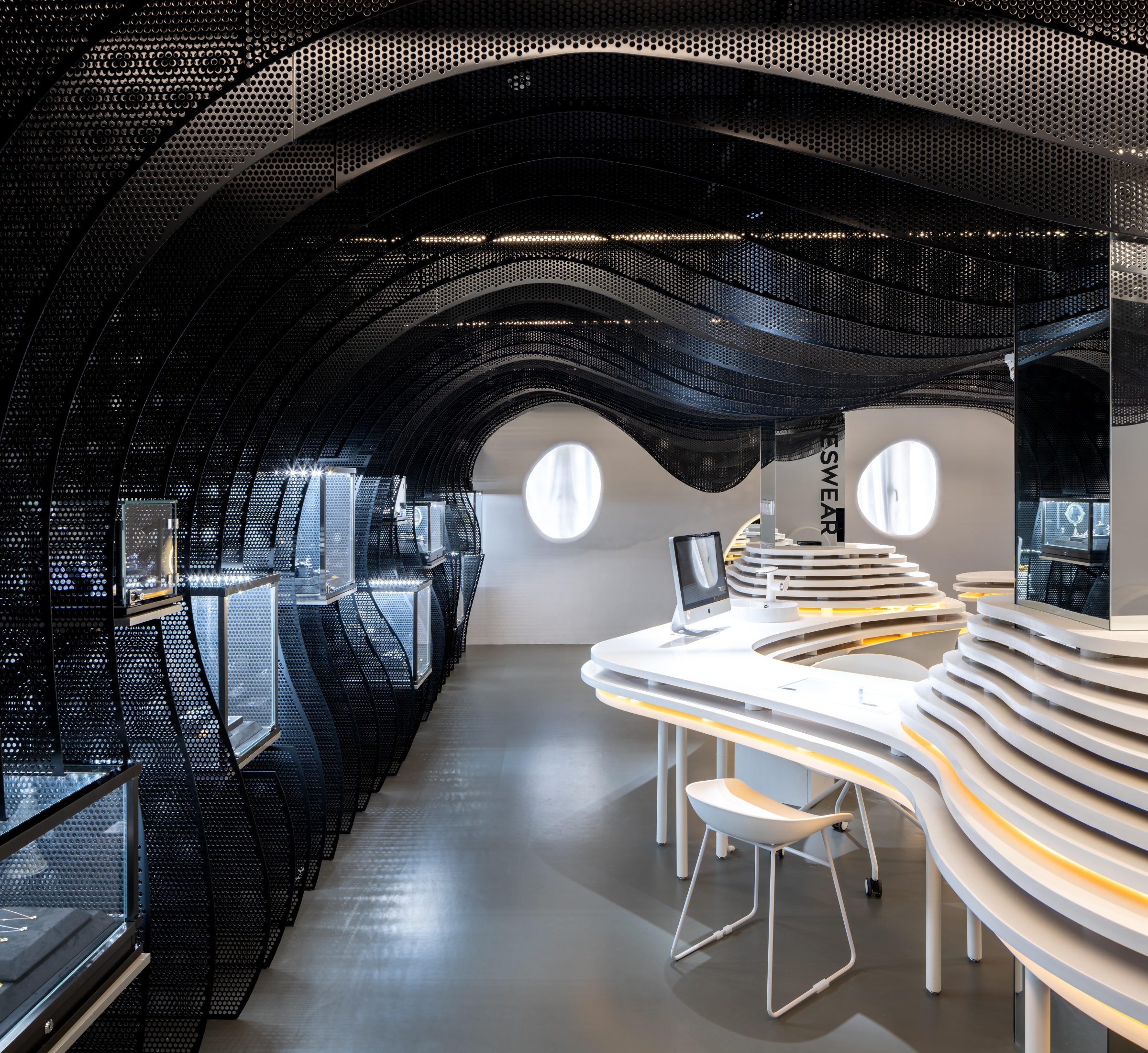
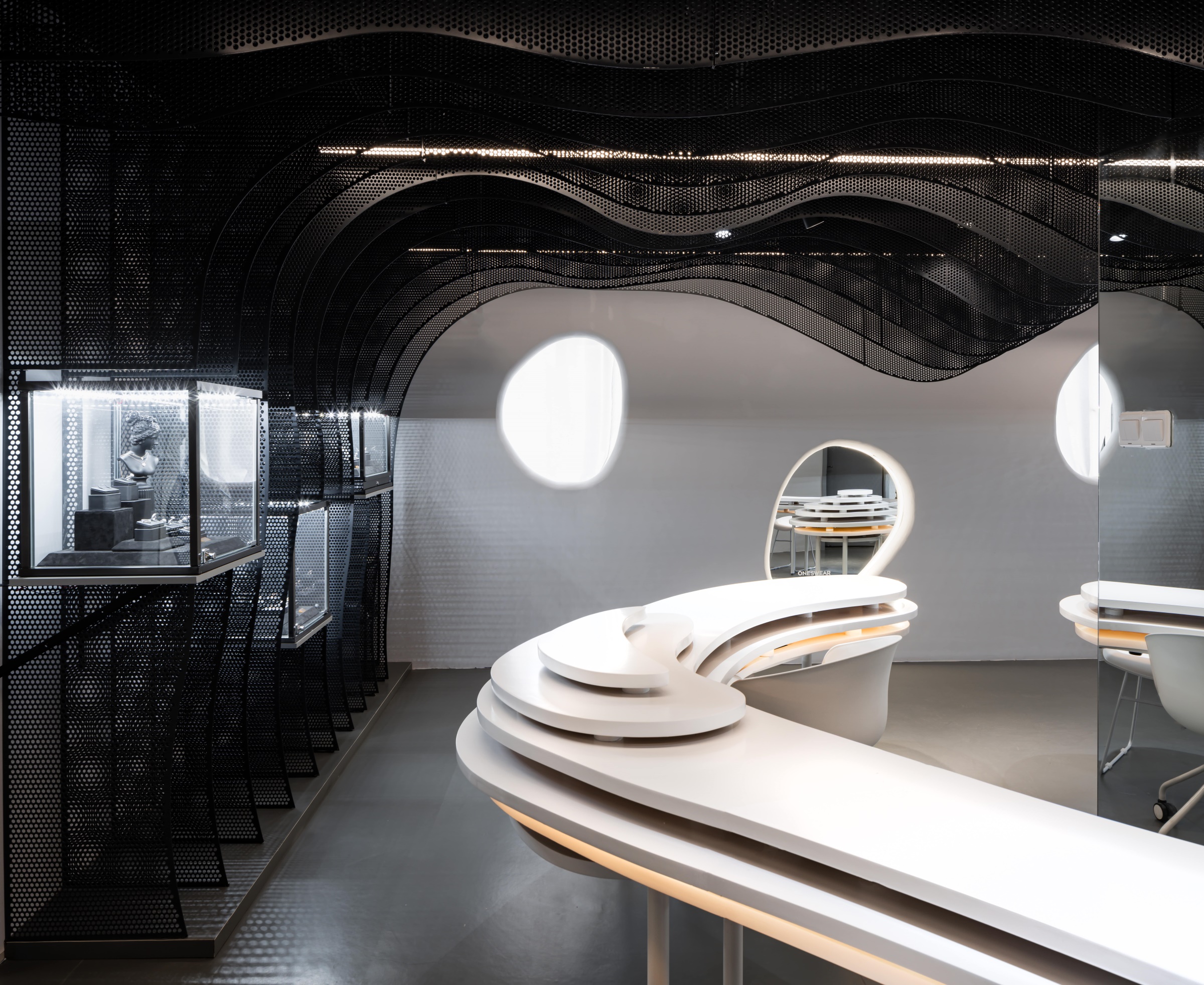
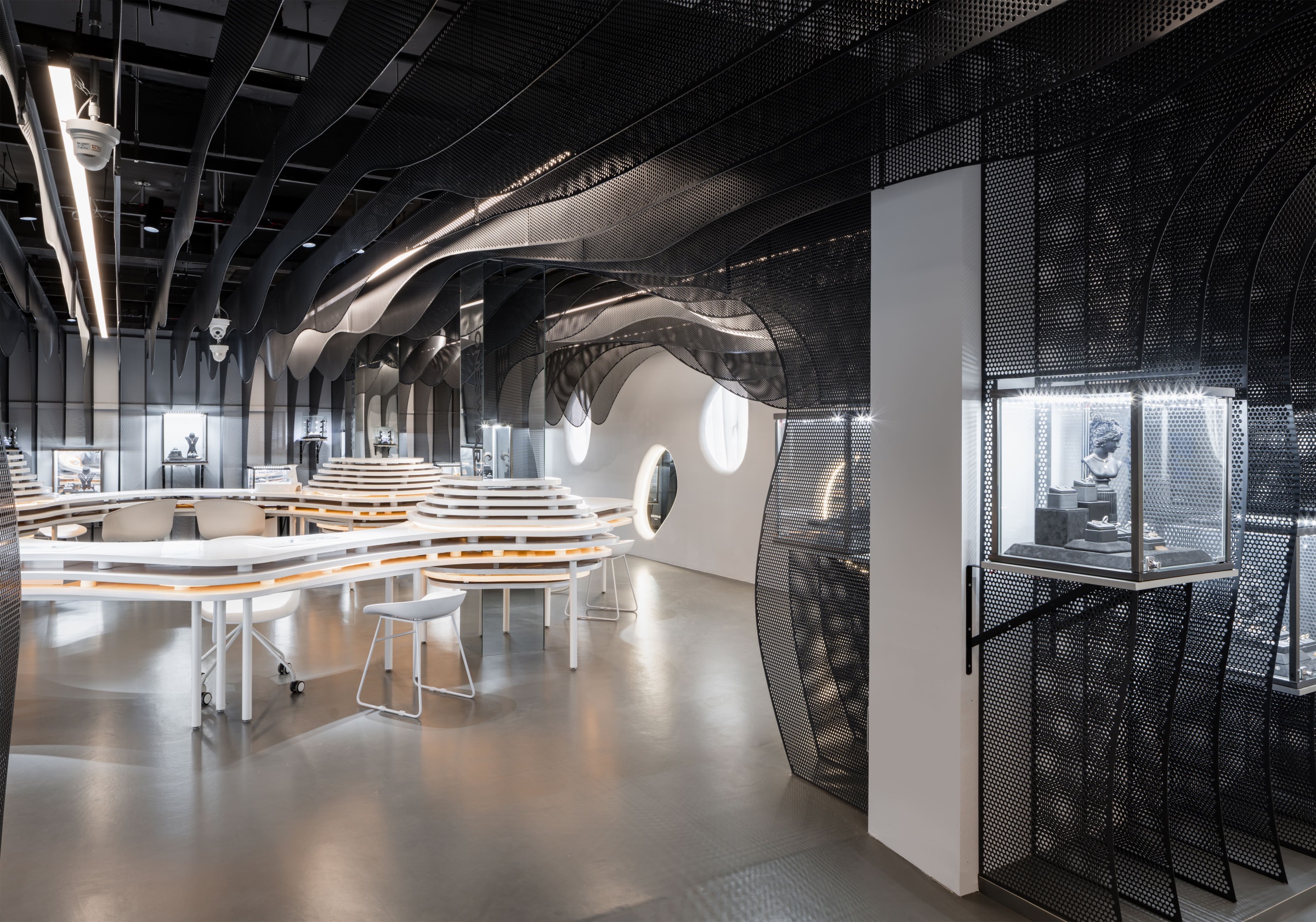
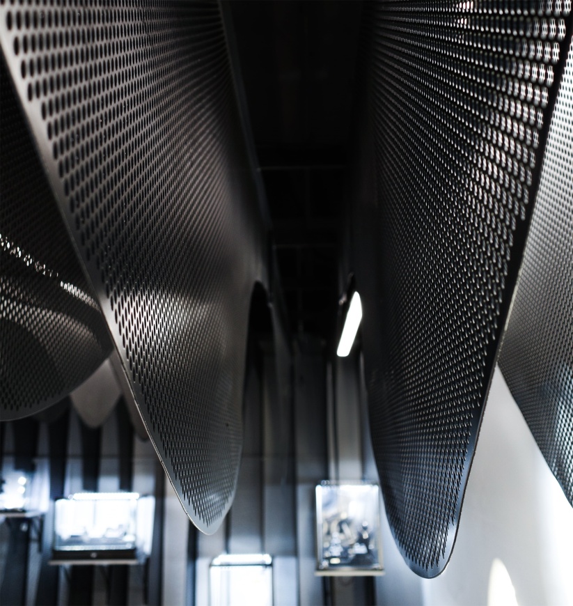
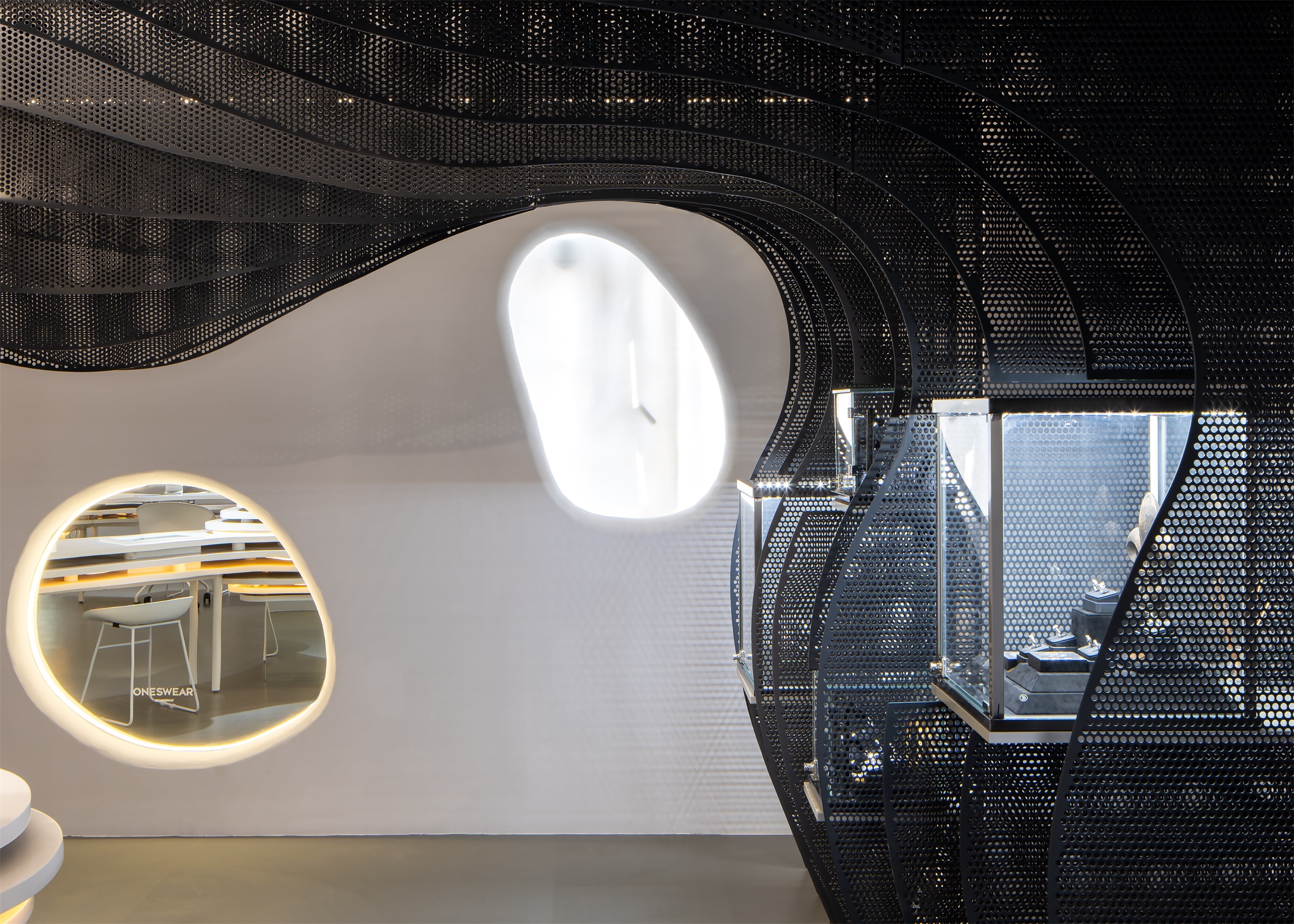
整个空间设计从展品的布置开始,因为考虑到业主提出要将原来店铺的珠宝盒重新利用放置在新店中,设计师将旧珠宝盒隐匿于墙面的穿孔板中,弱化了珠宝盒庞大的体量和方正的造型。同时,将珠宝盒嵌制于墙上也为中心流线型网红打卡装置节省出较大空间。墙面采用穿孔板切割成片状曲面,并满足一定防火等级要求。
The design of the whole space starts at the exhibition space. The designer directly combines showcases and walls, leaving much room for streamlined artwork for exhibition at the center. The wall is made up of perforated boards which are cut into curved surfaces in pieces and has relatively strong ability of fire-proof.
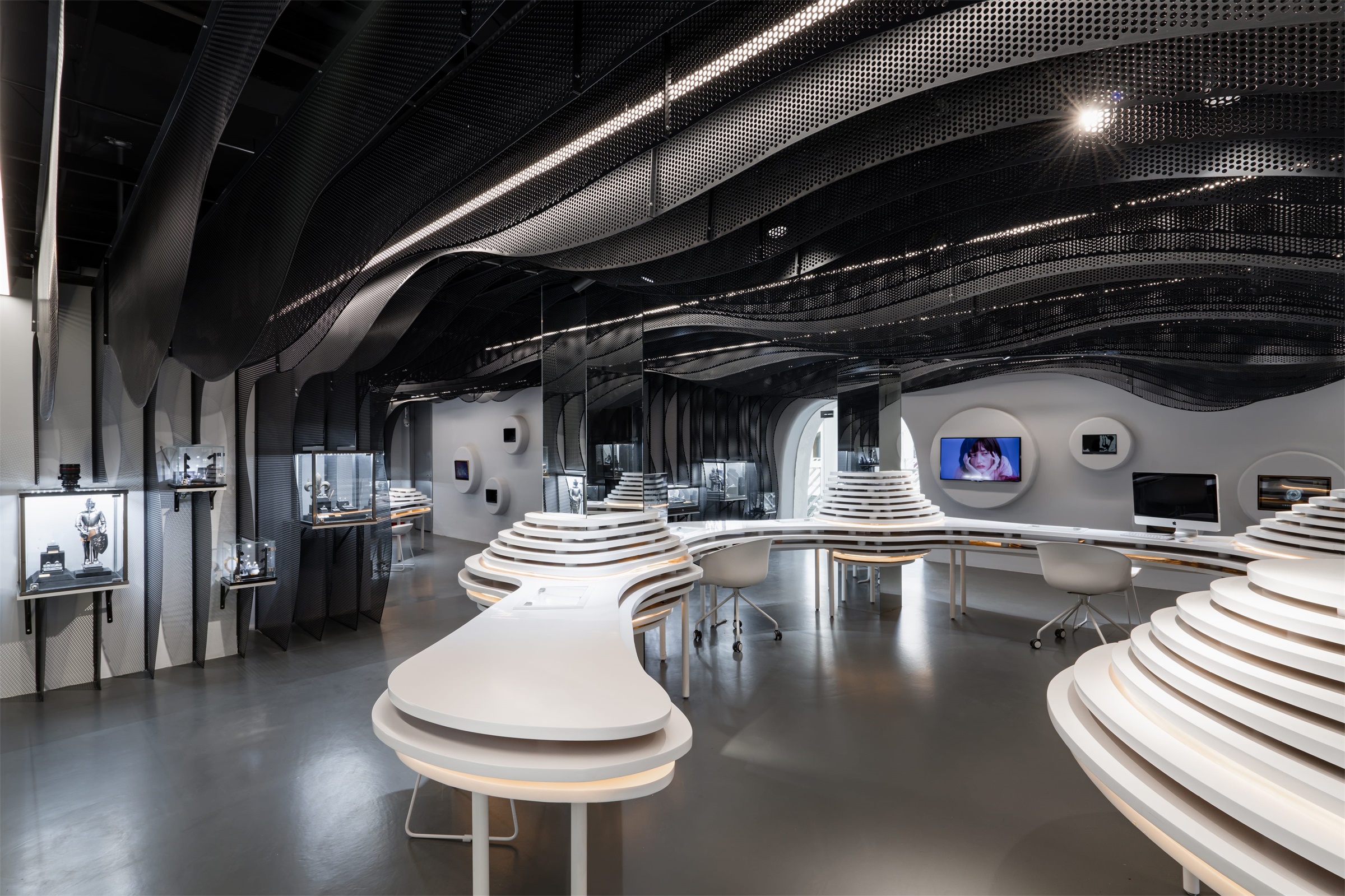
▼主展示区 Main Exhibition Space
曲线语汇贯穿整个空间结构与界面,按业主要求,墙面上布满方形的多媒体电视,设计采用连续的片状曲面墙面将这些多媒体电视和展柜柔化,将它们嵌入曲线凸出造型中。深灰色弯曲错落的铝板与展柜融合,过渡自然,模拟矿坑洞穴乱石嶙峋的效果,同时满足了展示珠宝的功能,增大空间利用率,也使室内空间更有流动感。
The curves are involved in the whole structure and appearance: the walls that used to be placed with full of square multimedia televisions are adapted to the continuous curved flakes which visually soften the edges of the televisions and showcases by embedding them in the shape of curves. The dark-gray curved and detached walls integrate with showcases makes a nature transition, a simulation of rocky coastlines in holes and caves. At the same time, the design meets the need of jewelry exhibition, improve space utilization and creates a visual sense of flow inside the space.
▼多功能打卡桌 Main Exhibition Desk
▼次展示区 Sub-Exhibition Space
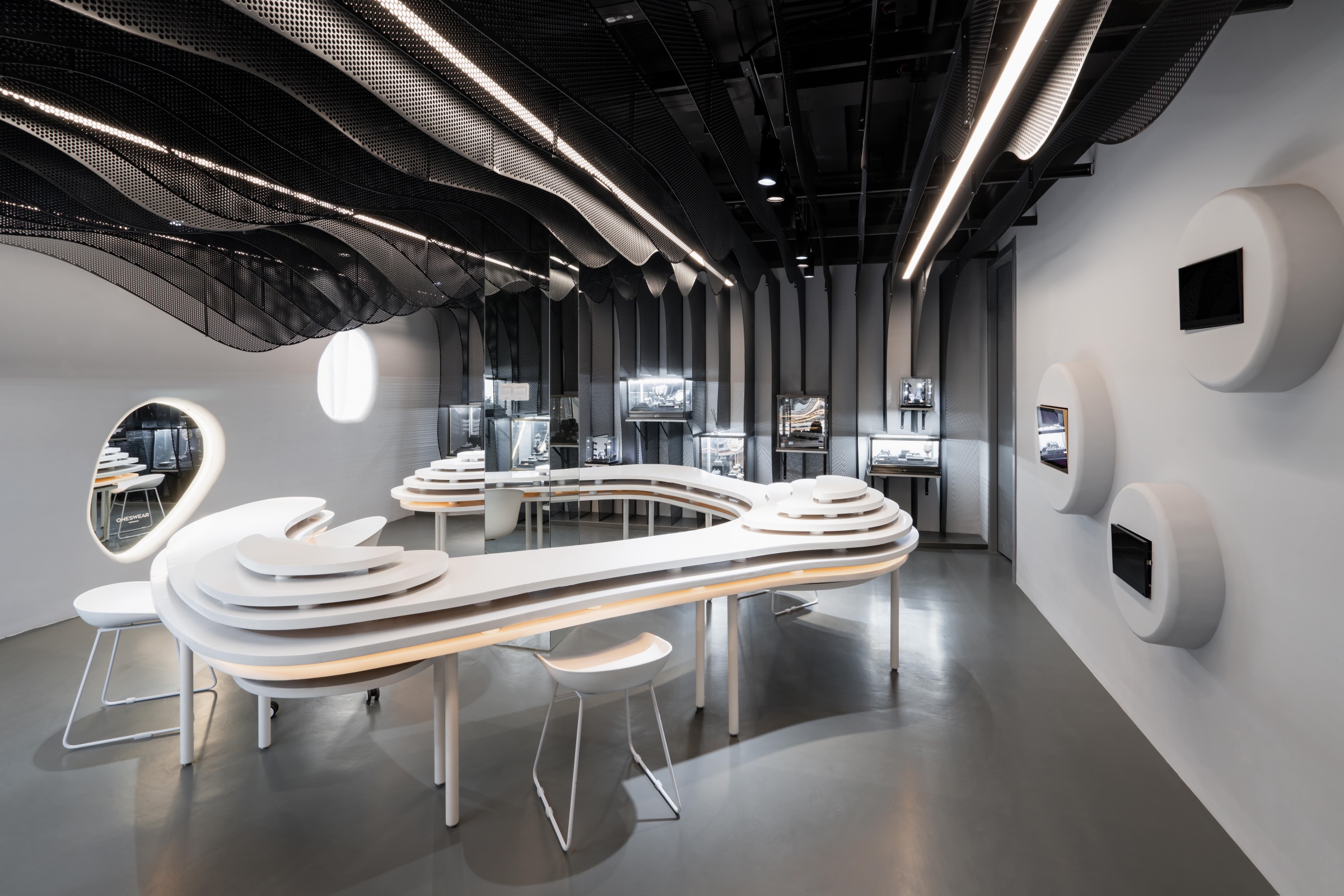
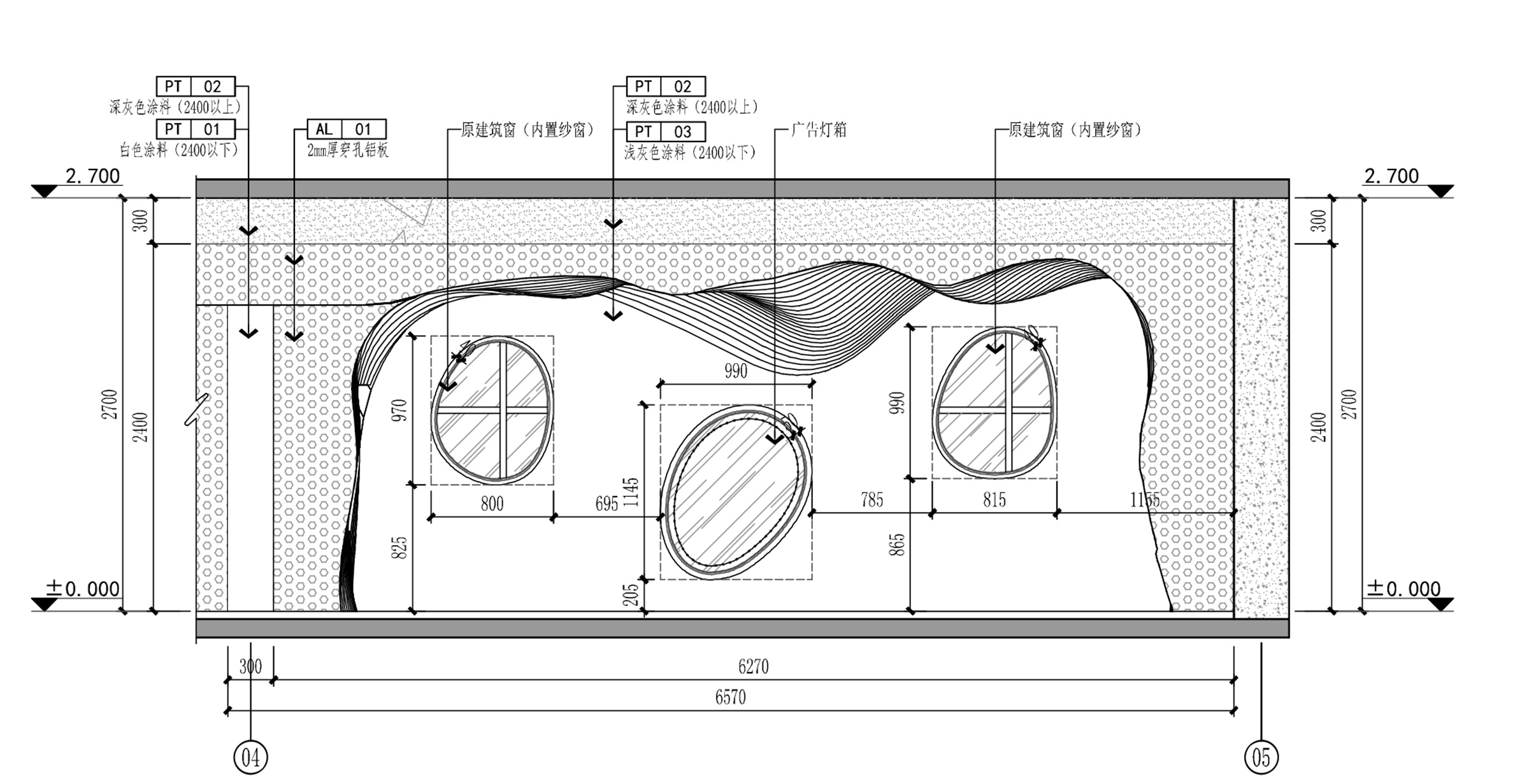
白色墙面上原本是方形窗户,为了统一设计语汇,设计师在墙里用轻钢龙骨新建一层隔墙,并在上面开异形的洞与外立面相呼应,同时弱化了原本方形的窗户形式,也使视线更加通透。室内空间中通过窗户引入自然光,并搭配专业照明系统,使空间在日光及人造光中形成完美平衡。
The white walls used to be decorated with square windows. To standardize the design language, the designer builds another barrier by using light steel joist inside the walls and creates anomaly holes on the top to fit in the outside design and smooth the vision of original square-like appearance of windows, making the overall arrangement more clear. The nature light let out through windows and professional lighting system achieves a perfect balance between sunlight and artificial light for this space.
▼主展示区 Main Exhibition Space
▼次展示区 Sub-Exhibition Space
▼室内墙面造型洞 Interior Mirror
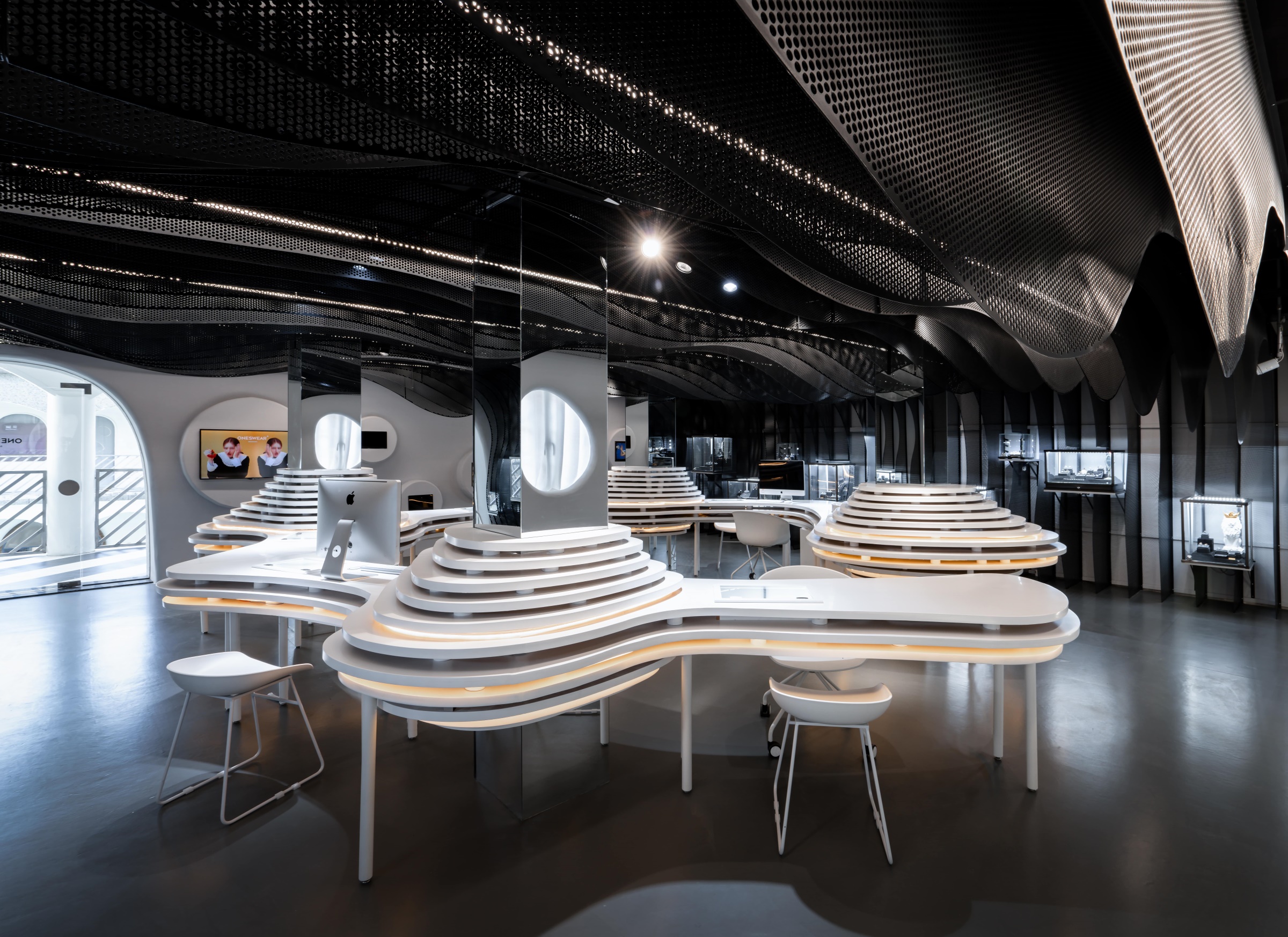
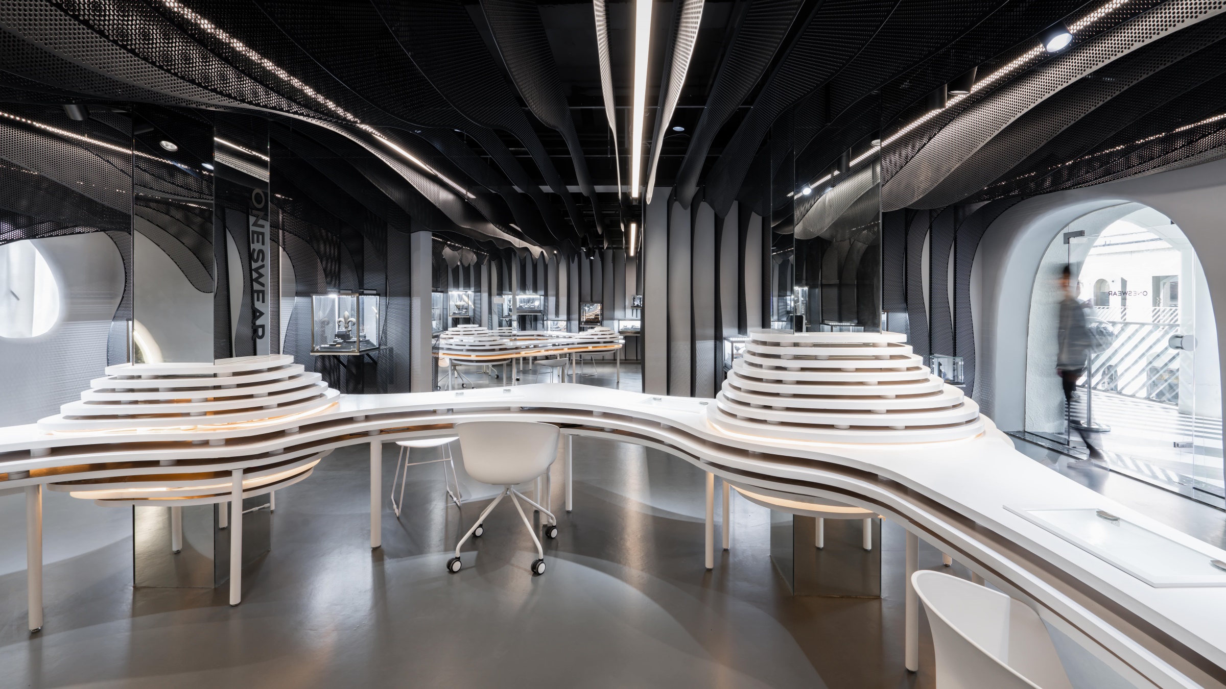
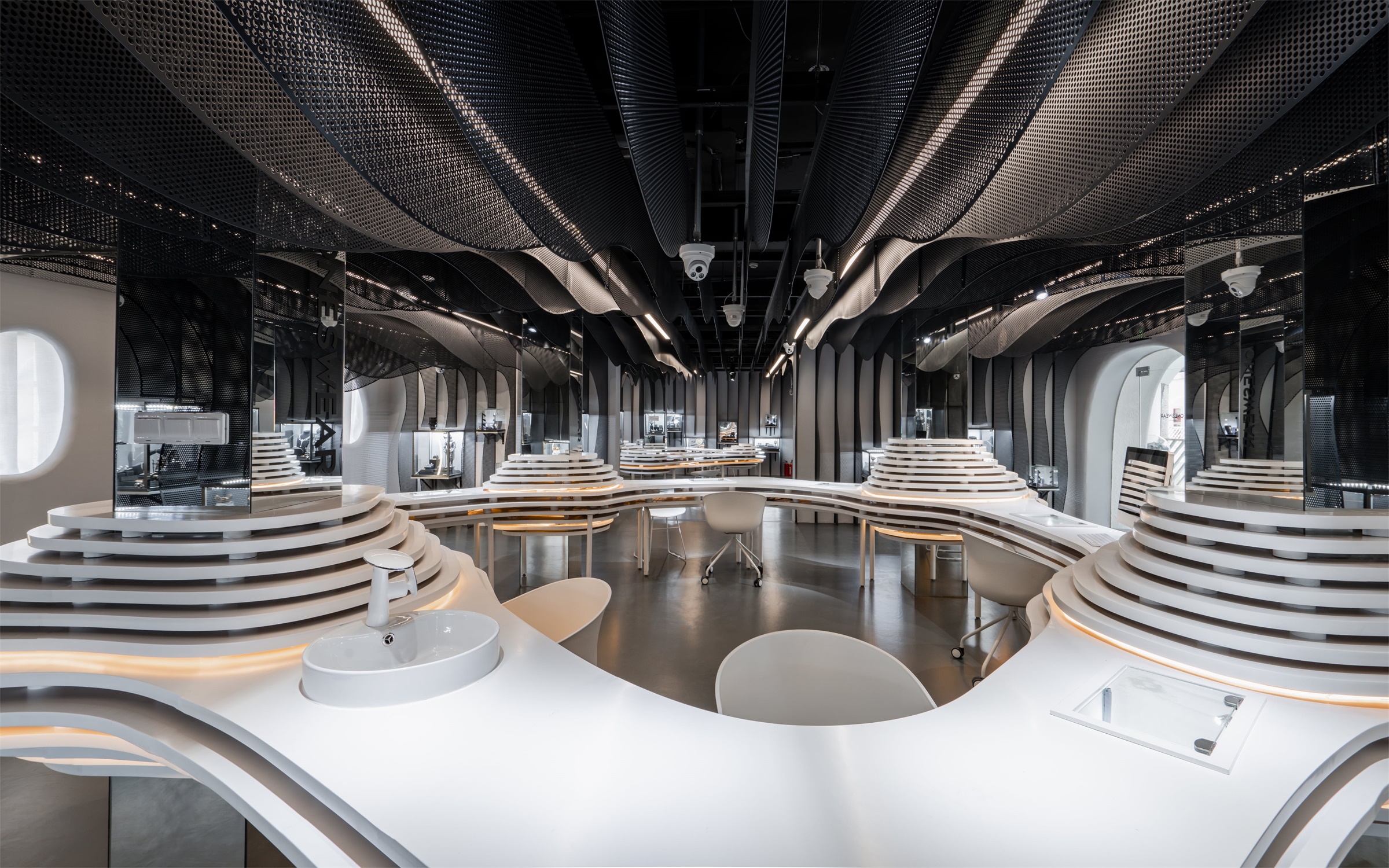
室内部分设计改变了原本单一、基础的空间形态,通过打造一个艺术装置成为空间的主展览区,并营造了展示、交流、打卡、销售等不同空间体验的多样性,达到了在有限空间内的无限延展形态,并且这些不同的功能顺应整个空间的流动线性形式也形成动态而连续的动线,让人们在逛店的过程中体会不同的空间感受。同时这个流线型艺术装置在适应不同类型的销售、展览和活动举办的同时,为顾客的观看动线赋予了更多的延续性与多样性,同时也成为当今年轻人热衷的网红打卡点。通过这样手段来塑造结构,是对功能布局的结构重组,也使得珠宝展销区域拥有更完整、纯粹的展示面,从而获得更清晰高效的流线与更大的空间视觉效果。
The indoor design has altered the tedious and simple spatial form to an artwork as the main exhibition area with a variety of functions such as exhibition, communication, tourism and sales, achieving unlimited forms within limited area. Moreover, various functions coordinate with the streamlines of the whole space and then also become dynamic and continuous moving lines, providing people with refreshing experience while they are shopping. As the streamlined artwork fit in with the sales, exhibition and activities, it offers the customers more continuity and variety in terms of viewing the moving lines, and it also become a poplar site for visiting among the young group. Such method of design restructures the function layout, and create a more complete and authentic space for jewelry sales, achieving a more clear and efficient streamlines and greater space visually.
▼主展示区 Main Exhibition Space
在元素的提取方面设计师选择采用同一种元素构造室内空间,用统一的设计手法营造出多样化的功能与空间。将片状曲面元素进行形式上的转译,将不同功能用相同的片状曲面元素实现,使整体统一,局部添加细节变化,并配合以细腻紧致的灯光,从而达到更为纯粹的空间。
As for the elements, the designer chooses the same element to construct the space and create multiple functions and spaces by the same method. The transformation of elements of curved flakes and the realization of the same curved flakes with different functions standardize the style of whole space and add details and variations to some parts, along with exquisite and compact lights, creating a rather authentic space.
▼主展示区 Main Exhibition Space
流线型桌面与墙面既交相呼应又独立分隔,在功能上对不同空间进行定位,将珠宝展示、洽谈区、销售区、洗手池等所有功能整合串联起来,满足门店所有需求,传达空间视觉连续性与统一性,并且桌椅的组合符合人体工程学的要求,让体验舒适度达到最大值。在平衡功能和形式的基础上,让顾客感受到流畅且充满未知感的购物体验。
The streamlined desktop and the walls fit in with each other but also stand alone on their own. Different spaces with different functions connect all the areas altogether such as jewelry exhibition area, negotiation area, sales area and washing basin to meet all the demand in the store and convey continuity and similarity of spatial vision. In addition, the design of complex of desks and chairs is in accordance with the Ergonomics and improve the level of comfort to the maximum. On the basis of balancing functions and forms, the design enables the customers to shop smoothly yet unpredictably.
▼多功能打卡桌 Main Exhibition Desk
咨询桌面采用白色的烤漆板,桌立面上的平行线条消解了视觉上带来的沉重感。地面工艺采用地胶,灰色调与整个空间相协调。
The information counter is made up of the white lacquer board, and the parallel lines on the table facade makes it look more comfortable. The badminton glue is used to build the floor, and its gray tone is coordinated with the whole space.
▼次展示区 Sub-Exhibition Space
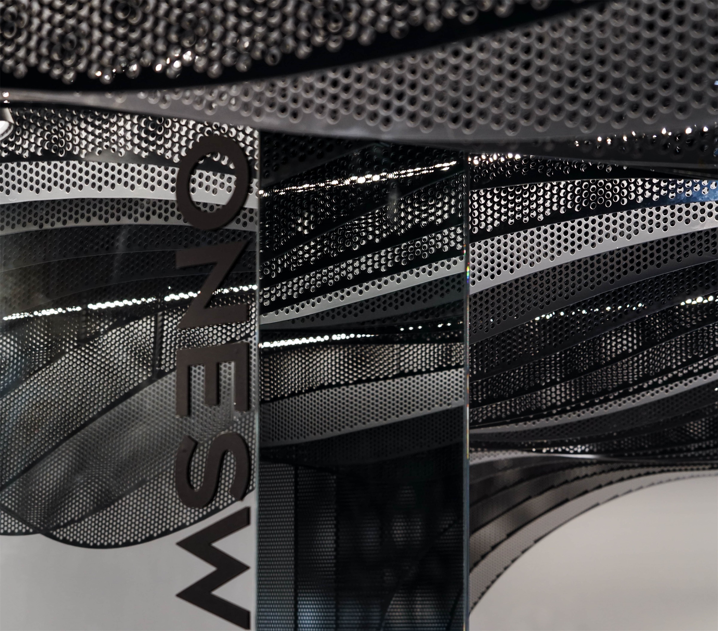
场地原本有四根较粗的柱体影响顾客的视线,设计师采用镜面材质包裹柱体,镜面反射错落的深灰色墙面和流线型装置,结合点点灯光,营造矿洞充满神秘感的效果,同时使室内空间更加有开阔感。
The four thick cylinders used to stand in the way when customers look at the space. Then the designer uses mirror materials to cover the cylinders on which the mirrors reflect the structure of dark-gray walls and streamlined artwork with spots of lights, creating an atmosphere of mystery and making the inner space “wider”.
▼主展示区 Main Exhibition Space
▼镜面柱子 Mirror Column
持续展开和流动的空间结构为室内空间赋予了最显著的特征。中心的网红打卡装置大大柔化了大空间的空旷感,展现了一种平衡之美。重复的片状曲面元素将打卡装置和墙面相统一。这一系列的设计最后让顾客恍如在洞穴中寻觅宝石,提供给顾客一个独有的纯粹的消费体验,一个不止于形式,也注重使用功能、人的参与及使用感受的空间解决方案。
The structure with continuity of expanding and flowing becomes the most distinctive feature of indoor space. The popular artwork at the center greatly relieves the hollowness of loads of rooms, showing a beauty of balance. The repeated curved elements of the artwork make it fit in with the style of walls. This series of design makes customer feel like an adventure of treasure hunt and provides them with unique and authentic shopping experience. Far from the forms, the space solution also attaches the importance to the functions, customers’ participation and experience.
▼展示墙 Exhibition Wall
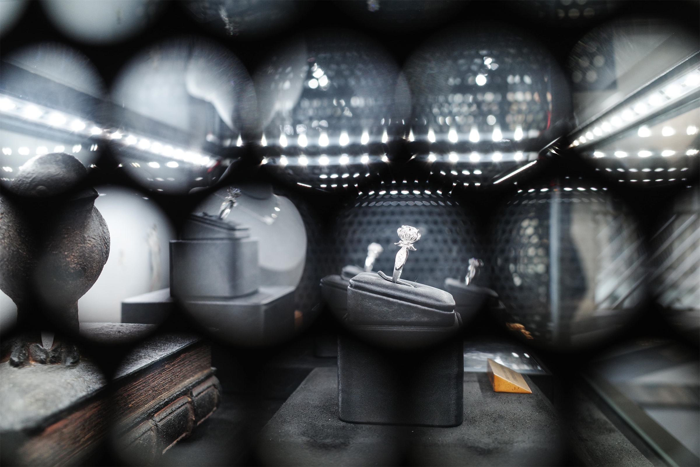
展柜创新地将艺术展示和零售两种功能融合在一起,展现了品牌特色并具有艺术性。饰品在深灰色盒子的映衬下如同宝石般发出耀眼夺目的光。
The showcases creatively integrate art exhibition and retail, revealing the brand’s characteristics and artistry. The accessories glow like gems against the dark gray box.
▼墙面展柜 Display Box
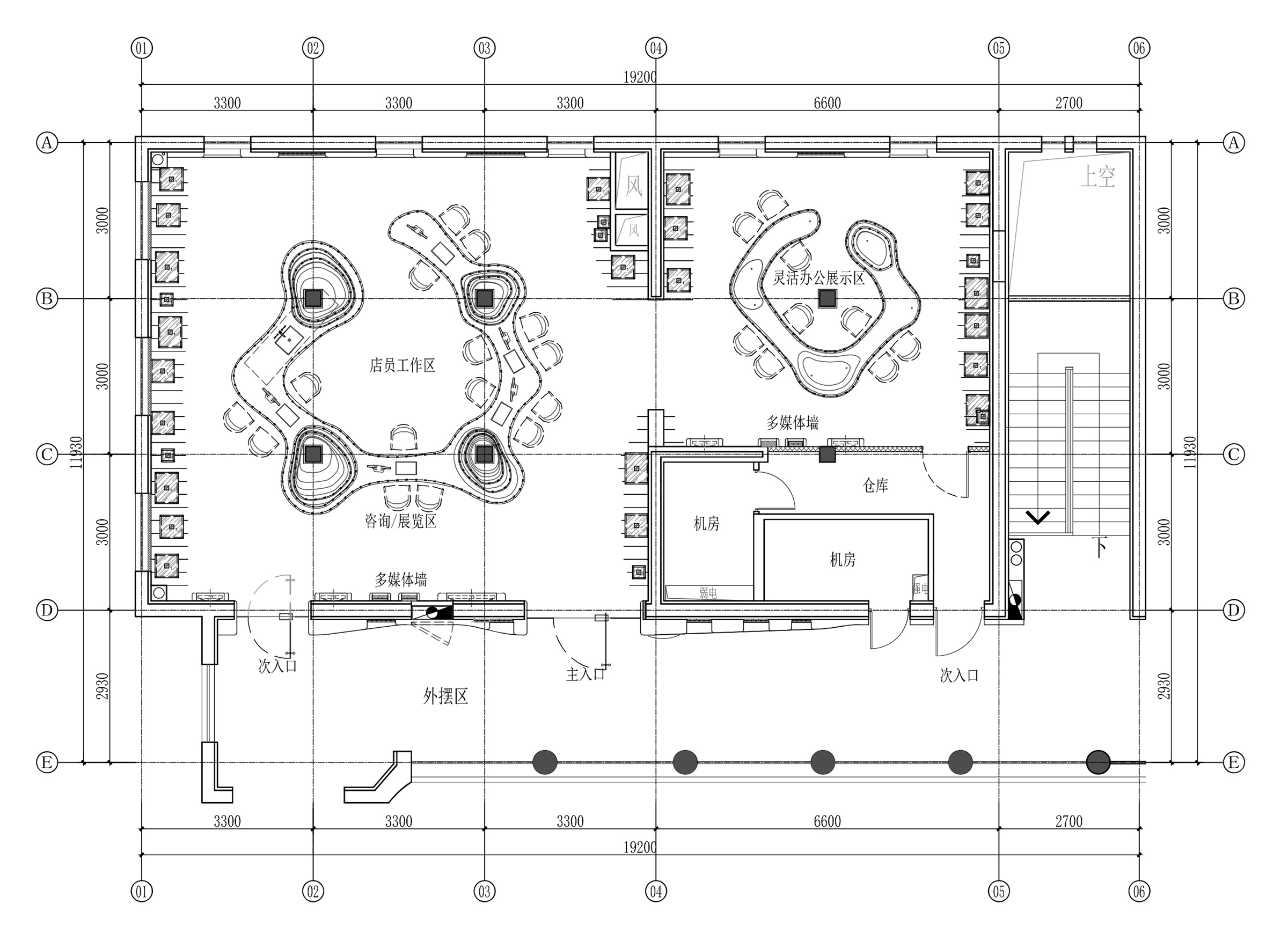
▼平面布置图 Plan
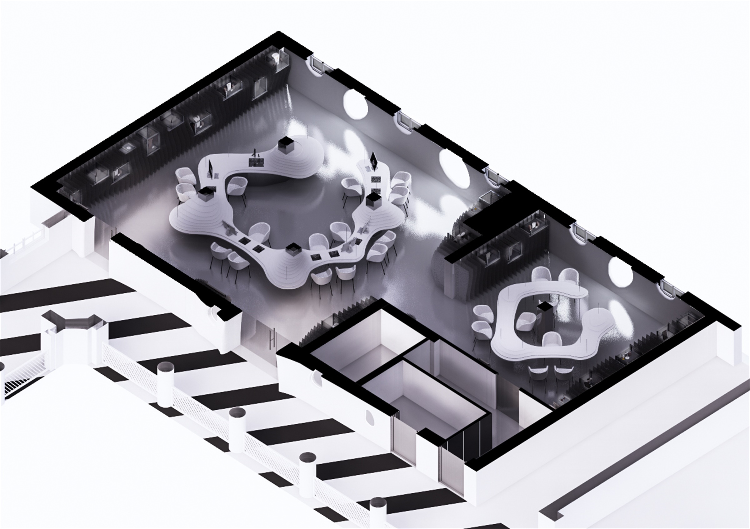
▼轴侧图 Axonometric
▼外立面图 Elevation
▼室内立面图 Elevation
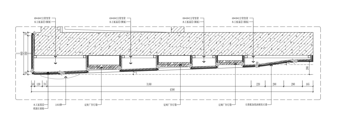
▼门头大样图 Detail
项目名称:梵誓珠宝上生新所店
设计方:平介设计(苏州平介建筑科技有限公司)
设计深化:上海衡泰建筑设计咨询有限公司
公司网站:parallect-design.com
联系邮箱: info@parallect-design.com
项目设计&完成年份:2020
主创及设计团队:王乙童,杨楠,段雅文,黄迪,肖明峰
项目地址:上海市长宁区延安西路1262号 上生新所6号楼 204-205室
建筑面积:130m2
客户:梵誓珠宝
摄影版权: 朱润资/林圭佳栋
Project Name: ONESWEAR SHANGHAI SHOP
Designer: Parallect Design
Detail Designer: Shanghai hengtai architectural design consulting co., LTD
Website: parallect-design.com
E-mail: info@parallect-design.com
Time of Design & Accomplishment: 2020
Main Designer and Design Team: Wang Yitong,Yang Nan, Duan Yawen, Huang Di, Xiao Mingfeng
Address: No. 1262, Columbia Circle , Yanan Xi Road, ChangNing District, Shanghai city
Covered Area: 130m2
Client: ONESWEAR
Copyright of Photography: Zhu Runzi/Lin Guijiadong
更多 Read more about:平介设计 Parallect Design










0 Comments