本文由 Group GSA 授权mooool发表,欢迎转发,禁止以mooool编辑版本转载。
Thanks Group GSA for authorizing the publication of the project on mooool, Text description provided by Group GSA.
Group GSA:伯克街公立学校(简称“BSPS”)是一所坐落在市内古文化建筑学校,成立于1880年。根据新的学习环境法教育方针的调研,GSA准备了可替换性概念方案。这些由DEC项目指导委员会认可,作为可替换性概念设计方案的准备指导工作。
Group GSA:Bourke Street Public School (BSPS) is an inner city school established in 1880 located in heritage classified buildings. The school caters for the needs of children from a diverse multicultural community and provides quality education in a safe and happy school environment. BSPS is a fast growing, dynamic school with increasing enrolments. GroupGSA prepared alternative concept design options following the completion of an Educational Principles study with New Learning Environments. These were endorsed by the DEC Project Steering Committee for guidance in the preparation of alternative design concepts for the proposed accommodation.
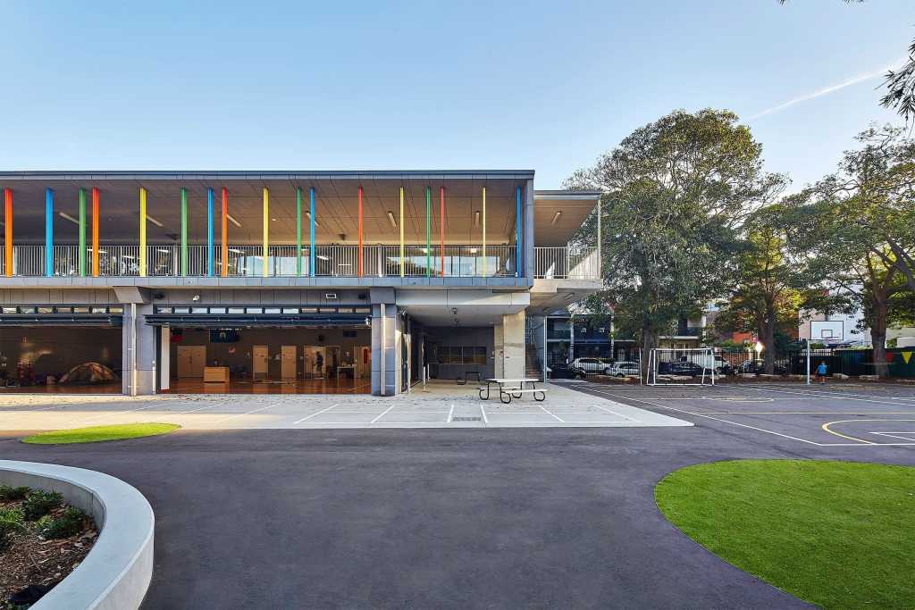
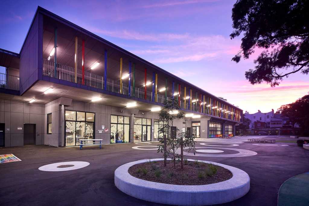
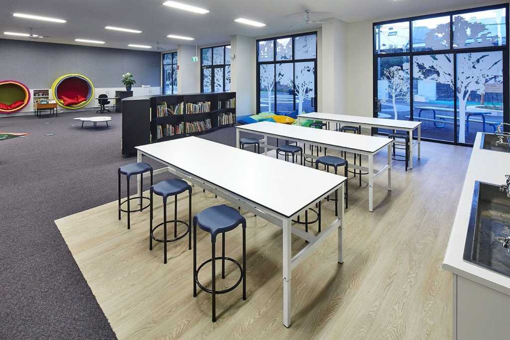
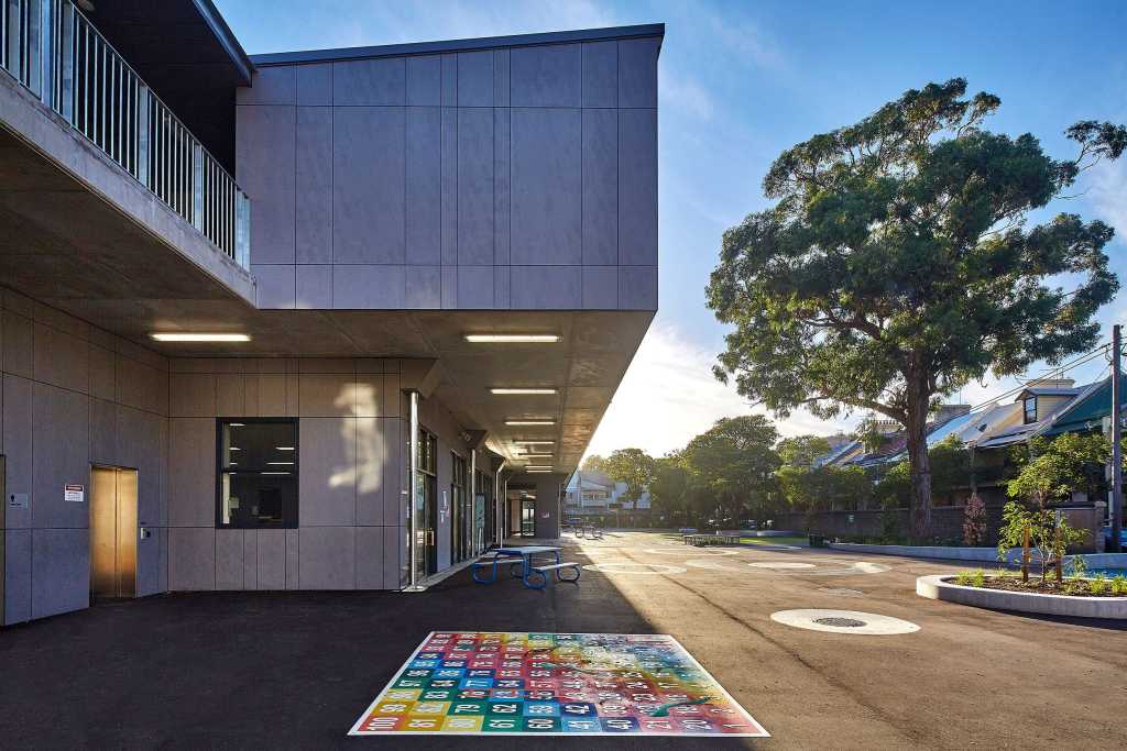
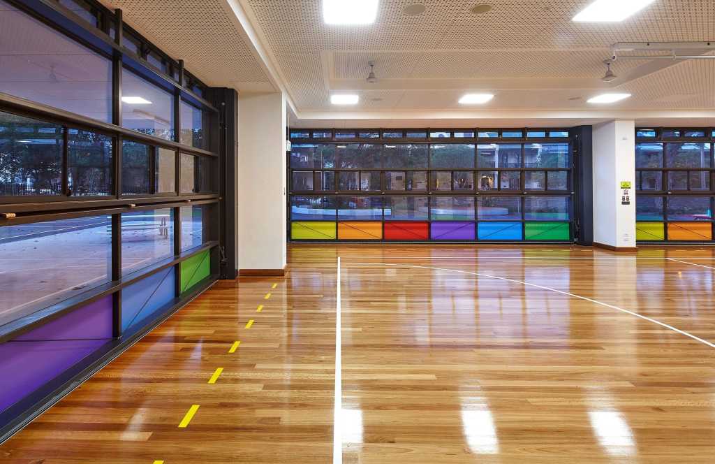
首选方案是两层,新的HomeBases位于大厅的二层。设计理念是保留开放的室外活动、学习以及未来发展有价值的场地。新HomeBases的关联空间主要集中在学习环境,而且富有弹性,能够适用于多种学习方式方法。新设施位置特别好,能够迎合当下及未来学校的发展需求,而且新的靠墙的COLA将成为整个学校社区的中心枢纽。新的“社区入口”直接连到COLA与餐厅。
The preferred option is a two level development with the new Home Bases located on the second level above the proposed Hall. The concept conserves valuable site area for open outdoor activities, learning and possible future development. The space associated with the new Home Bases will contribute to the learning environment and be flexible allowing customisation to suit the range of learning styles and teaching methods practiced in the school. The new facilities are located in an optimum position to meet immediate and near future needs of the school and the new COLA attached to the Hall will provide a Hub for the whole school community. The new “community entrance” will provide a direct connection to the COLA and canteen facilities.
GroupGSA平面设计团队进一步扩大学校内建筑和室内的工作。通过使用颜色和视觉语言,将“有趣元素”加入到学习环境中。是一个鼓励学生用视觉探索的很好的机会,同时给学校建筑增加一份视觉刺激。
The GroupGSA graphics team was included to further extend the architectural and interiors work being done on the school. The intention was to introduce “fun elements” into the learning environment, by using a combination of colour and visual learning cues. The initiative was a great opportunity to visually explore ways to engage with the students and give their new school building a visual boost.
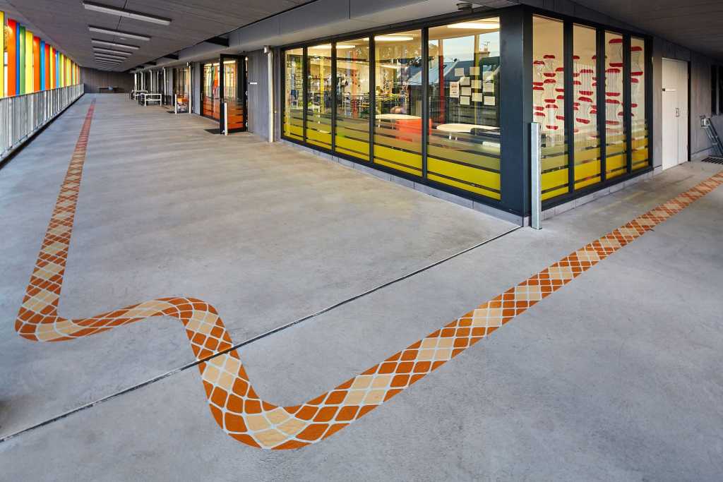
生成了一个多彩的蛇形平面,从地面开始,覆盖整个阳台区。不仅可以加固后面1米,防止儿童翻越扶栏;而且通过将阶梯分为“上”“下”部分,有助于改善阶梯狭窄区域的人流。
A multi-coloured serpent graphic was developed, starting on the ground floor and covering the entire balcony area. It not only reinforces a 1m setback so kids can’t climb over the balustrade, but it also helps improve traffic flow on the narrow stairways by dividing the stairs into “up” and “down” sections.
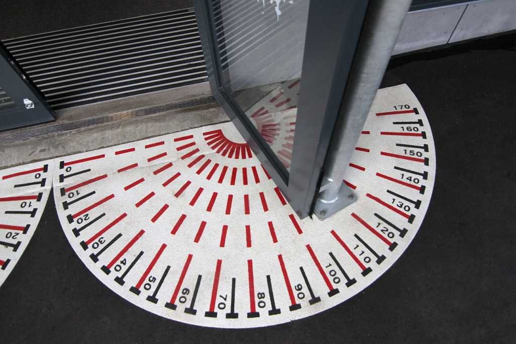
另外一个获得诸多好评的有趣元素是地板平面,尤其是半圆规形。每一次图书馆的门被打开,孩子们潜意识中轻松吸取教学信息。加上每天进进出出教学楼无数次,希望孩子通过图案更快更方便的学习文化知识。
Another fun element which has received a lot of positive feedback has been the floor graphics, and in particular the protractor. Every time the library doors are swung open, the kids are subconsciously taking in mathematical information, in a really relaxed way. Coupled with the repetitive nature of walking in and out of the building countless times a day, the kids hopefully grasp new concepts quicker and easier with the graphics in place.
地点:新南威尔士州,悉尼
Location: SURRY HILLS, NSW
更多 Read more about: Group GSA









0 Comments