本文由 黑白之间景观 授权mooool发表,欢迎转发,禁止以mooool编辑版本转载。
Thanks BW-lANDSCAPE PLANNING AND DESIGN for authorizing the publication of the project on mooool, Text description provided by BW-lANDSCAPE PLANNING AND DESIGN.
黑白之间景观:最令我心生欢喜的是森屿溪流,是晚风鸟啼,是你眼眸里、那亲近的烟火气。
BW-lANDSCAPE PLANNING AND DESIGN:What makes me happy is the stream of Senyu, the song of birds in the night wind and the close smoke in your eyes.
01 理念 Concept
从“最后的一公里”到“最亲近的一公里”
最近几年,社区商业的发展正抢占我们生活的“最后一公里”。生活,无法抽身于柴米油盐,也不会只有诗和远方。在这最后一公里内,商业配套与公园栖居的两全可望而不可及。然而,于居住者,生活的一公里,不应该是“最后”的坚守,更应该是“最亲近”的舒心;于黑白之间,将商业与公园合二为一,打造“最亲近的一公里”是我们的开始,从港汇天地开始。
港汇天地——最亲近的一公里,生活本应自然而美好。
From “the last kilometer” to “the closest kilometer”
In recent years, the community commerce has been metaphorically described as ‘the last mile’ of our lives. As for residents, it seems unrealistic to have both commercial function and park within the last kilometer. However, as for BWLA ( BW-LANDSCAPE PLANNING AND DESIGN) ,we want to transform the concept of the ‘last kilometers’ to ‘the closest’ kilometers. You may notice the very little difference between these two words, as it does not mean we have to compromise to the commercialization, but to create the ‘closest’ comfort space for people and our community.
Ganghui Tiandi——the closest nature,the beauty of life.
02 场地 Site
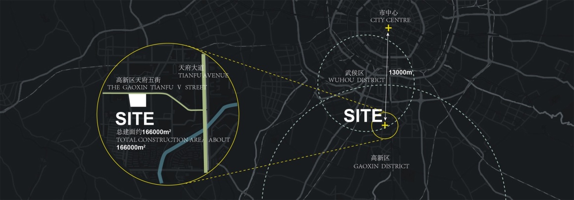
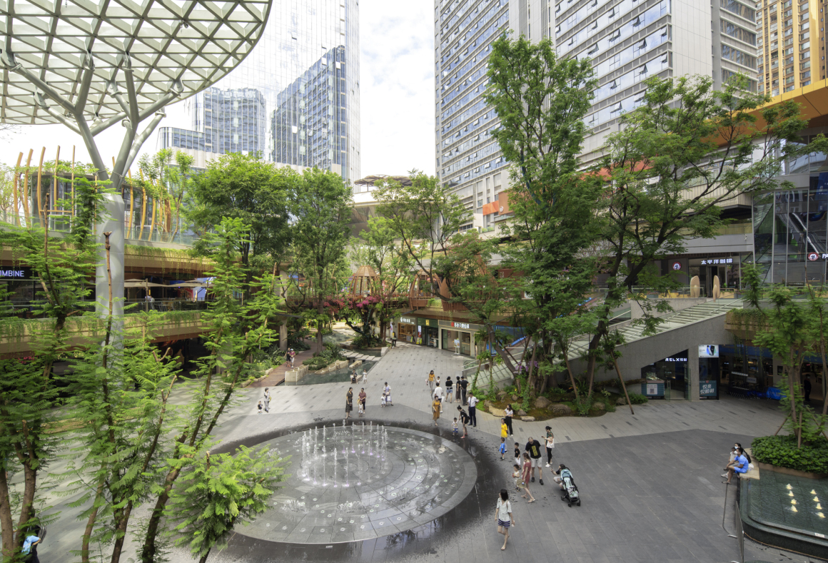
该项目位于成都高新区天府五街。总建筑面积约16.6万m² ,景观面积约3.4万m²。包括负一层、一层、二层,三个景观空间。以零售商业、超市、影院、公寓和酒店等聚合成内向型城市商业综合体空间。
The project is located at 5th Tianfu Street in Chengdu’s High-tech Zone. It has 3 landscape spaces from the basement level to the second level. The total construction area is about 166,000 m², and the landscape area is about 34,000 m². Retail businesses, supermarkets, cinemas, apartments and hotels are aggregated into an inward-looking urban commercial complex space.
▼区位分析 Location analysis
03 设计 Design
在传统思维下,商业与公园是相互独立、毫无关联的。商业具备可视性、昭示性,设置更多开敞的硬质活动空间;公园具备生态感,自然感,设置更多绿色环绕的活动空间。如何打破与平衡两者的关系,让其相互交融而又相辅相成?
一如既往,黑白之间关注人的需求、社区的需求、城市的需求,以港汇天地为开篇,探索建筑景观与商业运营的全新关系,开创“景观前置 吸引人流 赋能商业” 的理念。用景观设计的方式将生活与社区还给居民,将商业与公园合二为一。
Commerce and parks are independent and unrelated to each other under traditional thinking. The business has to be visible with more activity spaces, while the park needs a sense of ecology with more green surrounding activity spaces. The question here is, how does one break and balance the relationship between the two?
As always, based on the need of people, communities, and the city, our team explored a new relationship between architectural landscape and commercial operation. We created the concept by giving the priority to the landscape instead of business, which designed to attract people at first and then naturally empower the business. In the hope of using landscape design to return life and community to our residents, we combined commerce and parks into one .
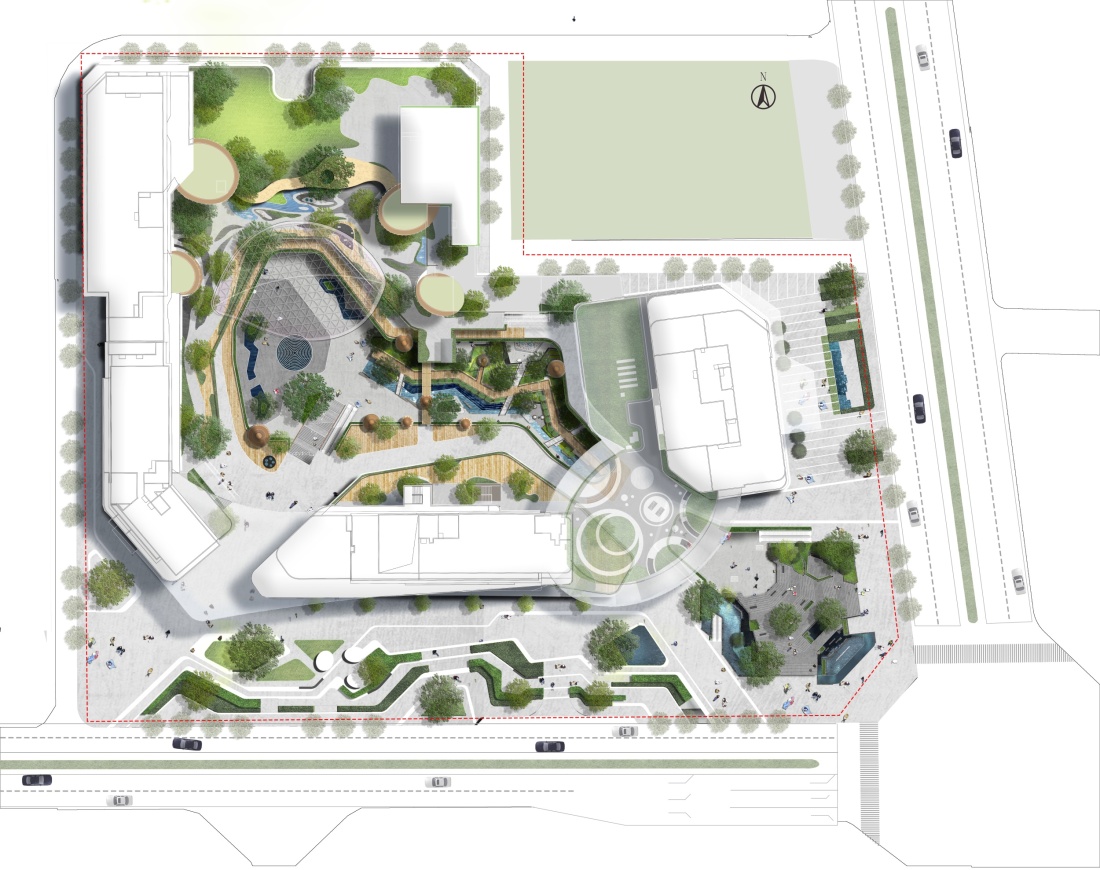
▼平面图 Plan
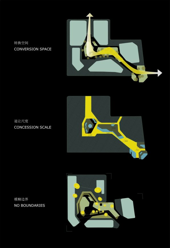
▼空间分析图 Spatial analysis map
我们在传统规划的基础上做了三个突破性的设计。
We made three breakthrough designs based on traditional planning.
转换 | 空间:打造双首层商业新模式 A new mode of dual first-tier
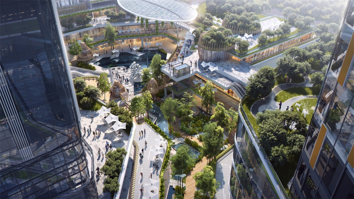
商业项目中,一层商业永远最具价值,负一层和二层商业由于人流量的影响,处境尴尬。于此,我们首次提出双首层商业模式的概念—规划了一条公园景观轴线,贯穿并连通负一层和二层街区。景观的连接增强了这两层商业界面的体验感和场地的舒适性。
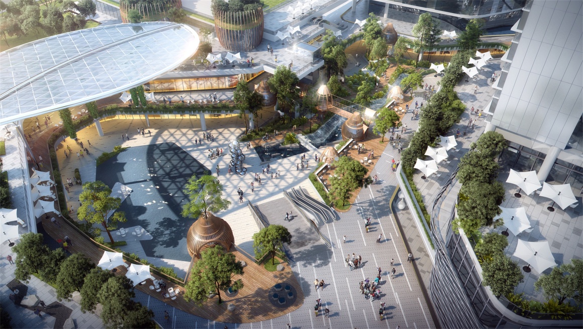
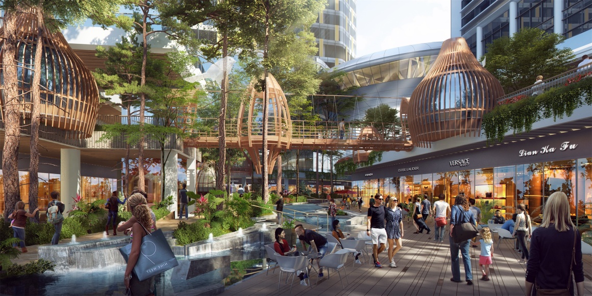
同时,我们尽可能扩大和突出负一层的下沉入口空间,把负一层变成感官体验上的首层,从而导入更多人流聚集,提升空间的商业价值。一层的商业界面,则最大化预留更多的外摆空间,环绕负一层公园景观,形成上、中、下三层相互间 “看与被看”、“景与对景”的独创性商业体验空间。
In general commercial project, the first-tier business is always the most valuable comparing to the negative and second-tier due to the influence of the flow of people. However, at this time, we first proposed the concept of ‘dual first-floor’ business model, planning a landscape axis that runs through and connects the negative and second-floor blocks. The connection of the landscape enhances the experience of the two commercial levels.
Meanwhile, we expanded and highlighted the sinking entrance space of the negative floor as much as possible, turning the negative floor into the first floor in sensory experience, so as to introduce more crowds and enhance the commercial value of the space. A unique experience of “seeing and being seen” is formed between the upper, middle and lower floors.
▼设计效果图 Design renderings
▼扩大空间吸引人流聚集 Expand space to attract people to gather
退让 | 尺度:以有形空间换无形价值 Give up spaces in exchange for value
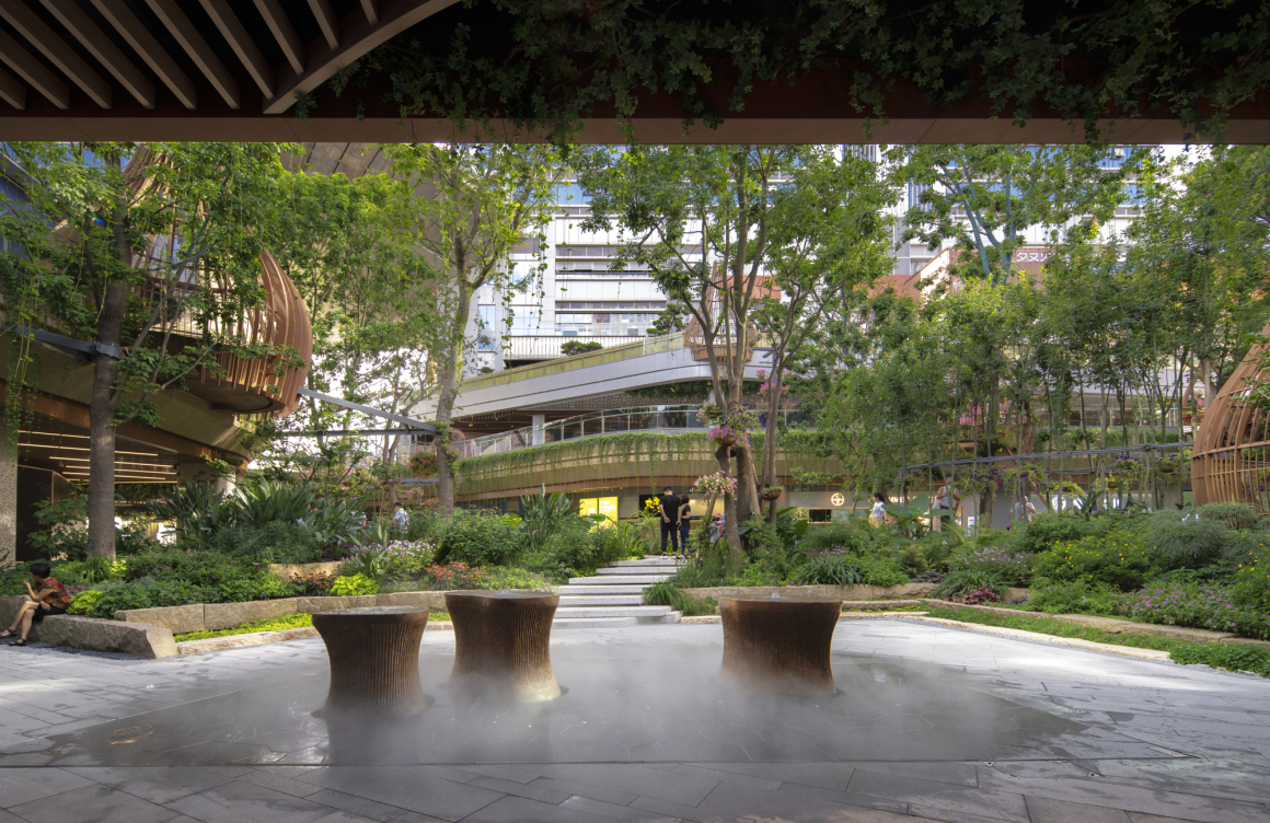
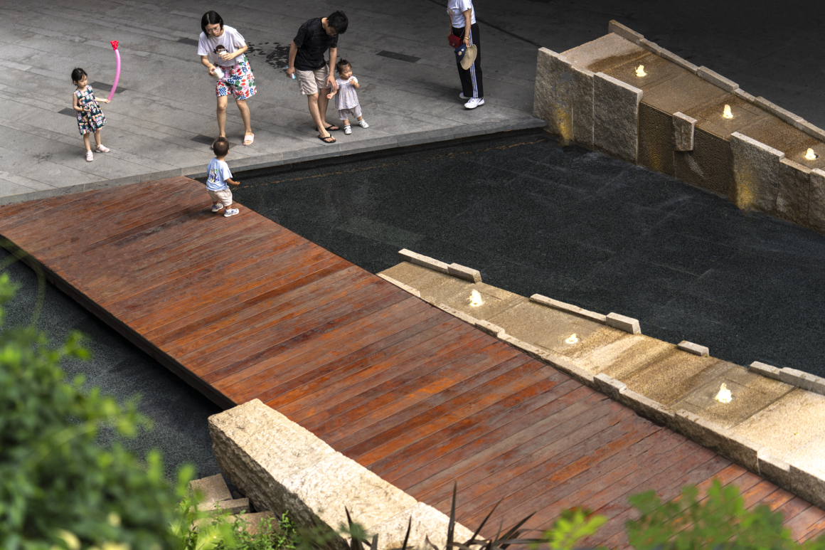
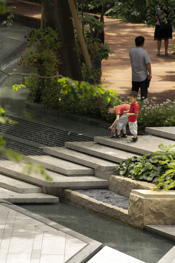
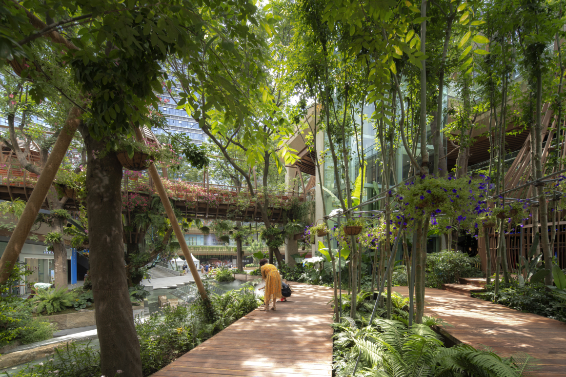
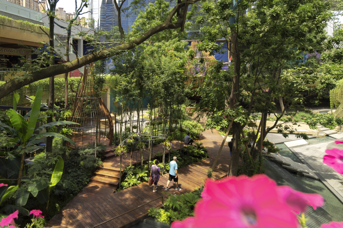
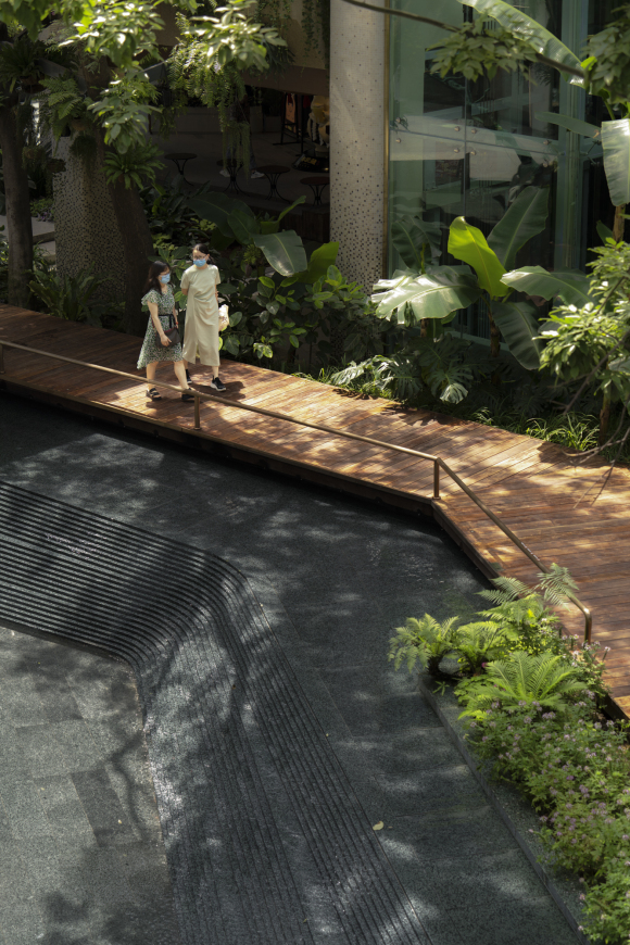
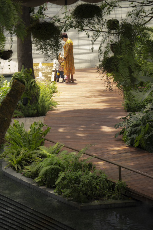
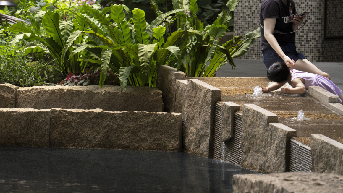
在负一层,为了让秘境丛林的景观体验感更自然舒适,我们把更多的商业空间退让给景观。走廊两侧取消商业外摆区域,只保留了3-4米的人行步道。沿步道设计多样化的水景主题空间,增强景观的互动体验感,营造自然美好生活画面。这种看似商业尺度的退让,实则将重心落在人的感受上。牺牲商业外摆空间所换来的优美户外景观环境,吸引了更多的人流,让负一层整体获得更多的商业价值。
On the negative floor, we gave up more commercial space to the landscape in return for making a natural and comfortable experience of the secret jungle. Commercial areas were cancelled on both sides of the corridor, and only 3-4 meters of pedestrian walkways were reserved. We also designed the diversified waterfront landscape along the trail to enhance the interactive experience and create a natural and beautiful life picture.This kind of abandon is intended to focus people’s feelings. The beautiful outdoor environment at the expense of commercial outdoor space attracts more people and allows the lower floor to gain more commercial value as a whole.
▼设计效果图 Design renderings
▼将商业空间还给景观 Return commercial space to the landscape
模糊 | 边界:延伸室内商业经营空间 Extend indoor commercial space
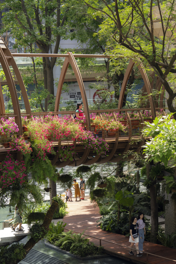
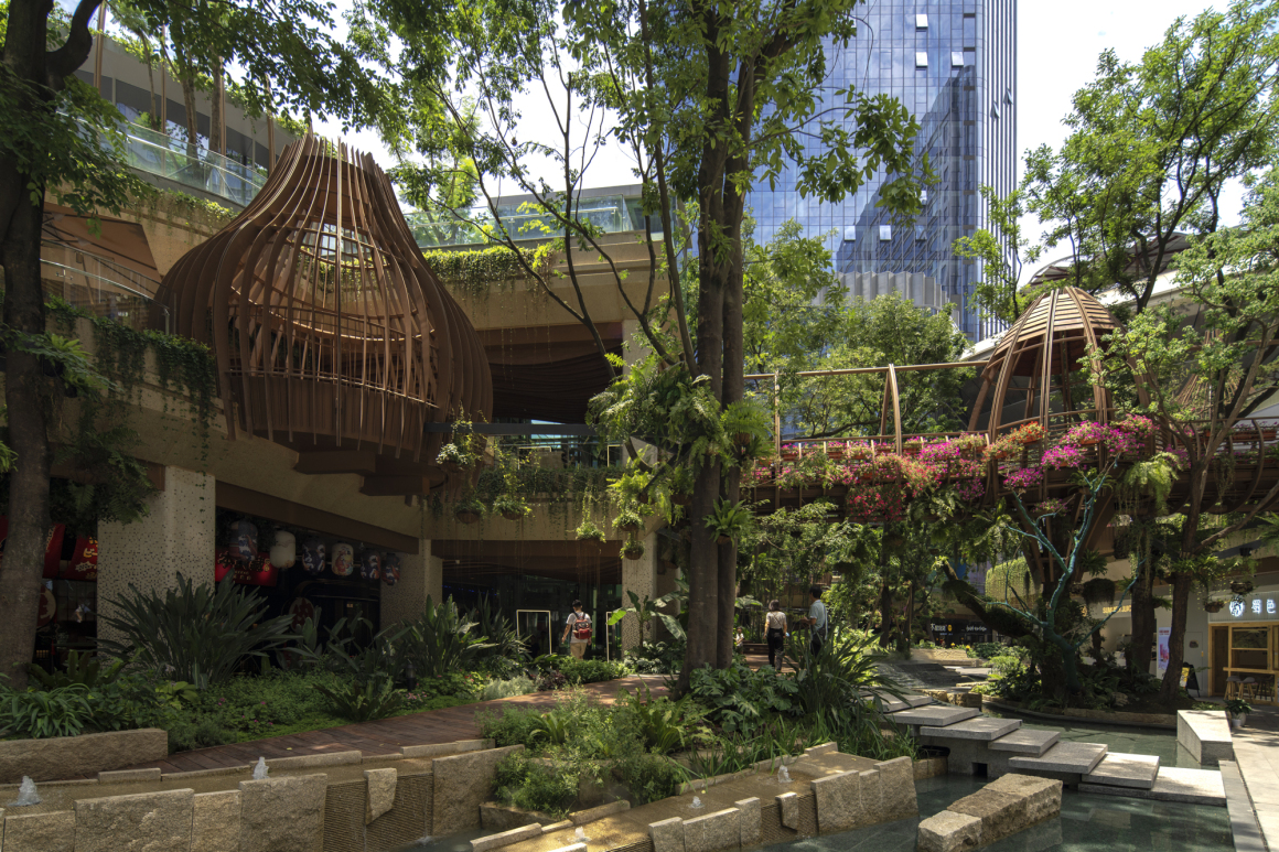
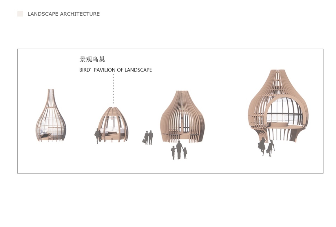
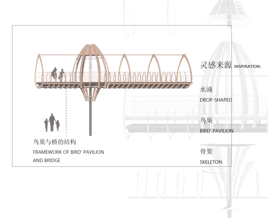
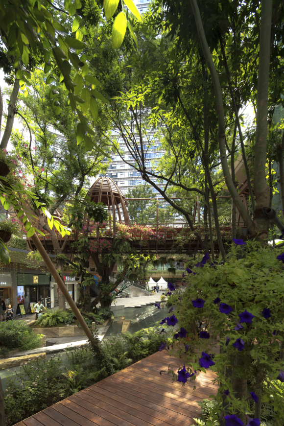
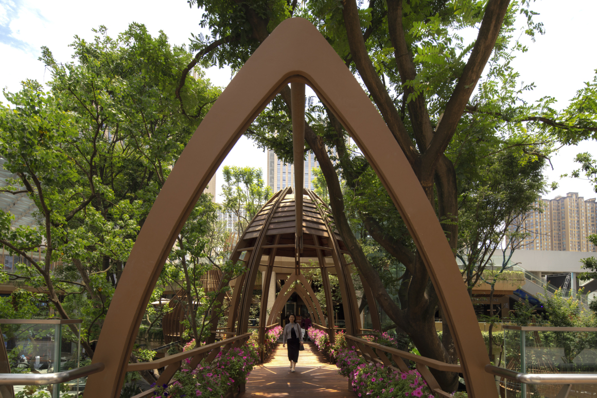
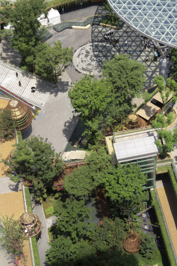
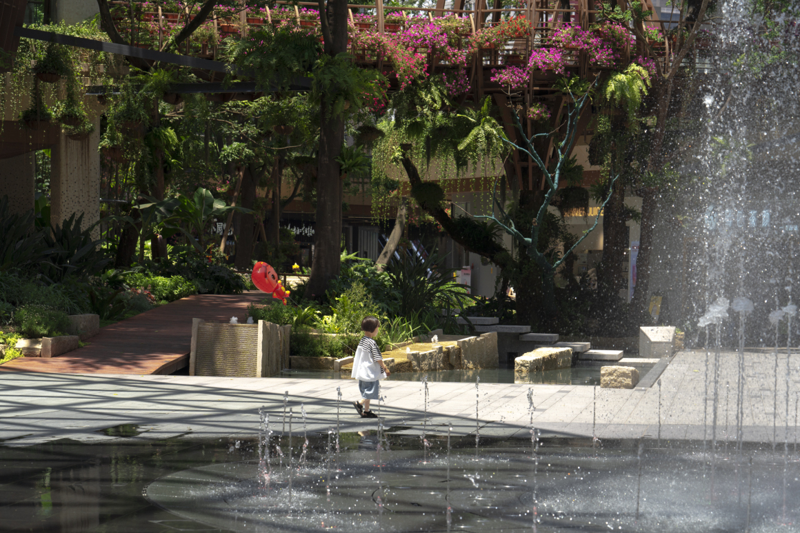
“巢栖”是港汇天地的一大记忆点。在负一层、一层和二层的商业界面,我们在林中沿走廊以及平台上错落布置大大小小的鸟巢构建,与树木枝叶交错,光影斑驳中自然形成了景观视线焦点,烘托了整体休闲浪漫的景观氛围。
鸟巢不仅作为景观的核心观赏元素,同时成为了后期商业运营点,可用于商业外摆空间、特色商业作坊、商业展示空间等商业用途。整体设计模糊了商业与公园的界面,拓展延伸了室内商业经营空间,让商业界面更融入于自然,让自然为商业赋能。
The bird’s nest is a highlight of Ganghui Tiandi. We randomly arranged different sizes of bird’s nests along the corridors and platforms in the forest that staggered with the branches and leaves of the trees, foiled relaxed and romantic atmosphere.
The bird’s nest is not only the core viewing element of the landscape, but also a later commercial operation point, which can be used for commercial purposes such as commercial outdoor space, characteristic commercial workshops, and commercial display spaces. The overall design blurs the interface between commerce and the park, expands and extends the indoor commercial operation space, makes the commercial interface more integrated with nature, and allows nature to empower commerce.
▼“巢栖”设计图 “Nest” design drawing
▼设计效果图 Design renderings
▼在山林烟雨间,自由,巢栖,呼吸 In the forest and rain, free, nest and breathe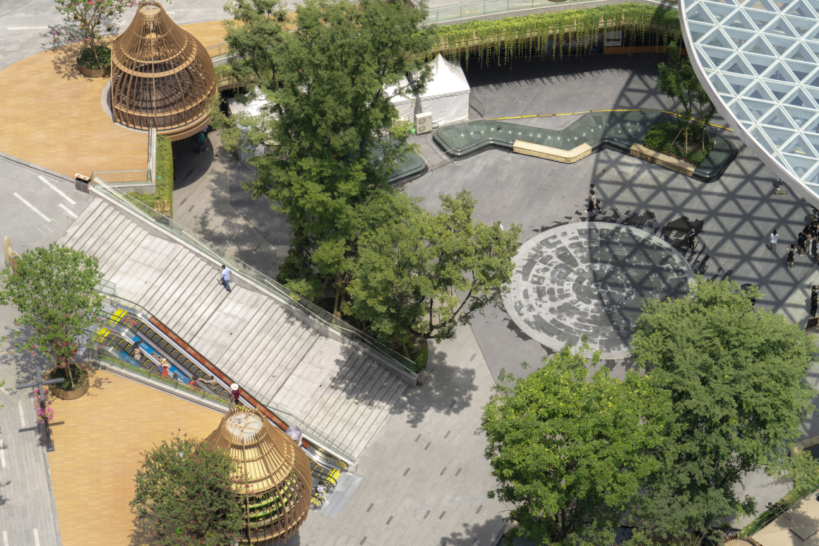
04 巧思 Ingenuity
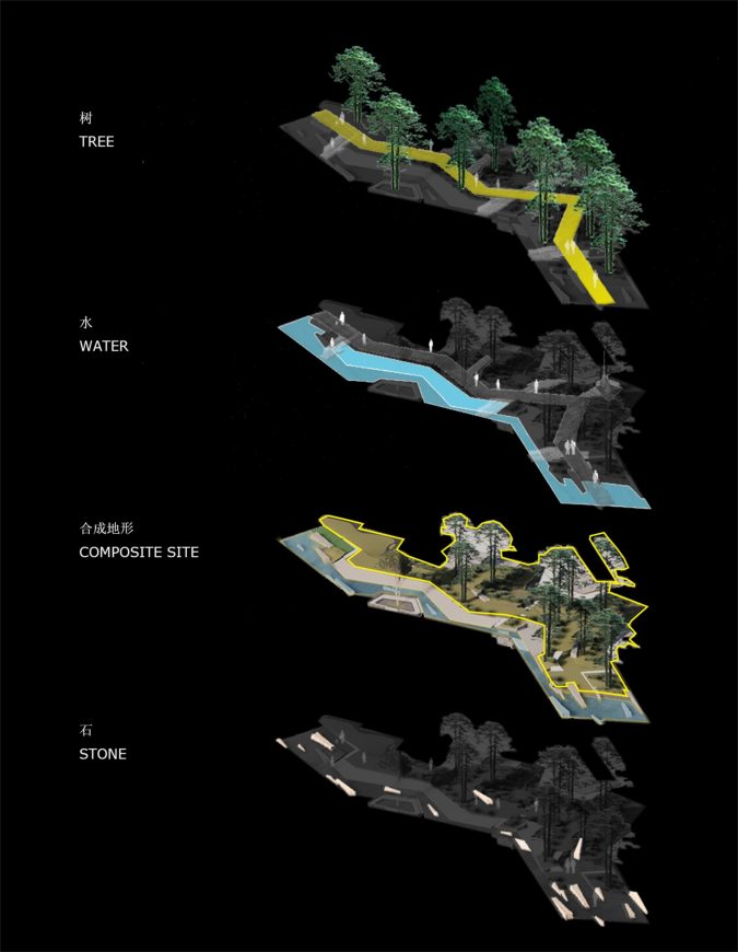
在项目过程中,关于树、石、水,我们还有很多有趣的设计故事。
During the project, we have some interesting design stories about trees, stones, and water.
巨树 | 生命 About Giant Tree
景观上,为了将3层商业结构联系起来,且保证下层商户的通透性,我们在全国范围内寻找20米以上的大树。由于桥、柱、鸟笼都被树缠绕包裹,因此,每一棵树从形状、角度、以及位置都需要精心筛选及考量。
In view of the landscape, in order to connect the three-tier commercial structure and ensure the visibility of the lower-level stores, we were looking for large trees over 20 meters across China. As for bridges, pillars, and bird nests are all wrapped by trees, each tree need to be carefully selected in terms of shape, angle and planting point.
绿石 | 如玉 About Greenstone
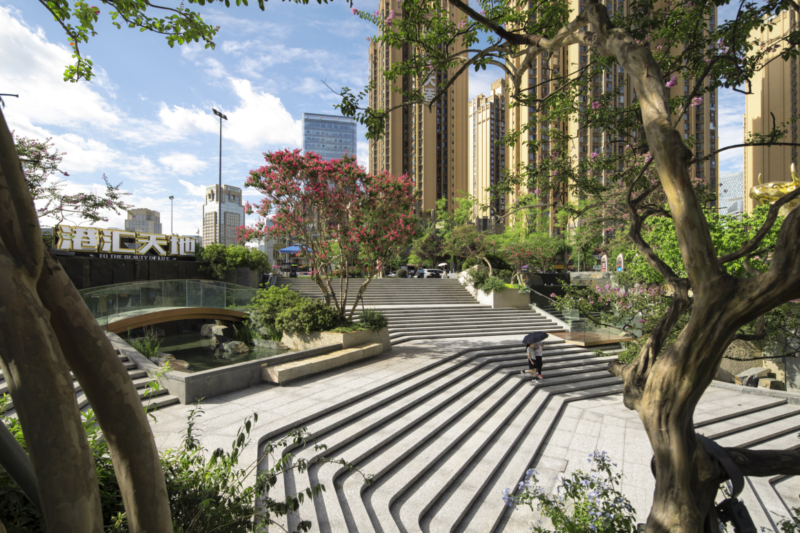
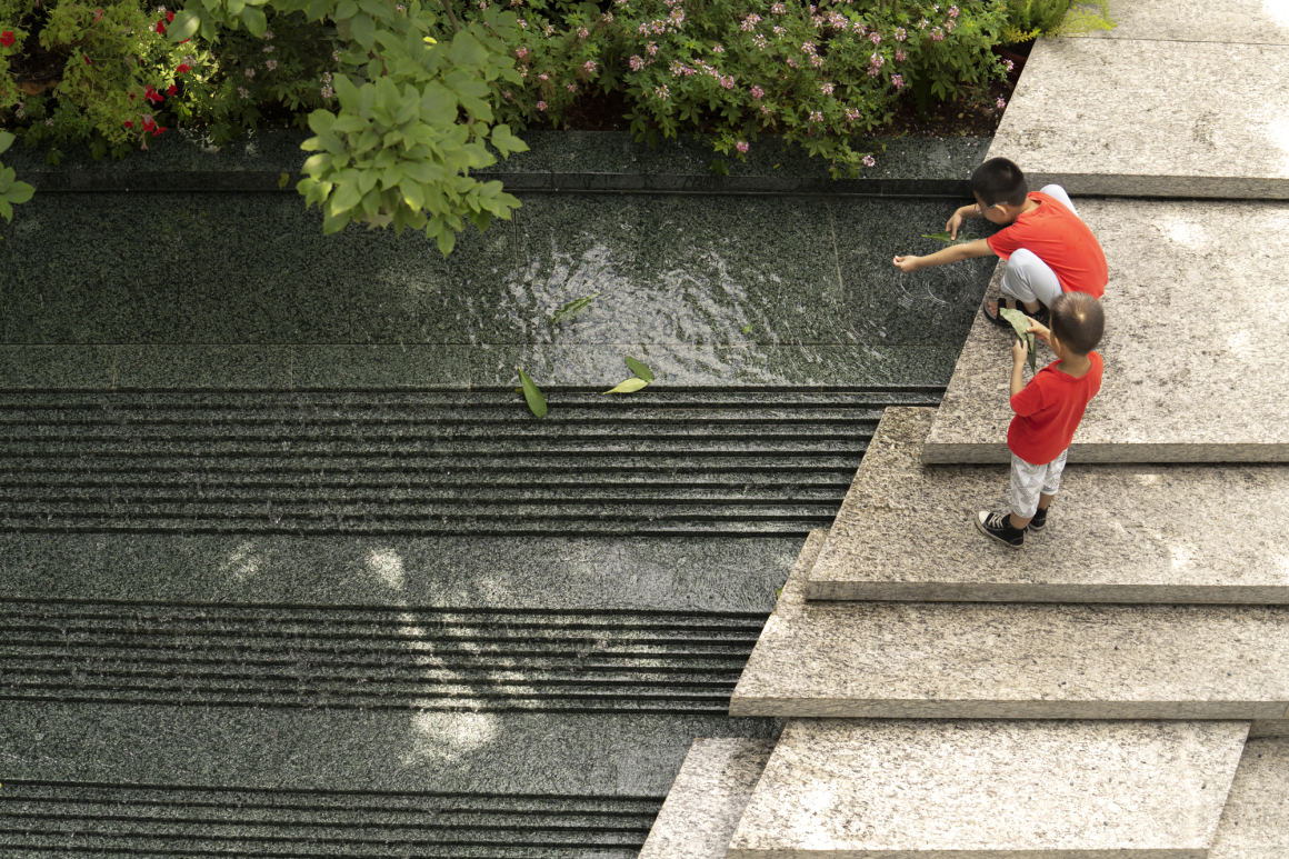
不同于一般商业采用的黑白石材,我们选用了大量的绿色的石材,复刻大自然的原景。每一块绿石都是营造“呼吸感”的关键。
由于石材多与水景结合,为了控制水的动态与流速,石头的硬度与密度需要足够高,且绿色石头本身较稀少,因此在挑选时,团队对于石材的纹理、花色、后期加工的可能性和整体材料的生命感进行了精心考量。最终,在雅安的矿山里,找到了这种新石材。
We chose large amount of green stone to create the original scenery of nature, rather than applying black and white stone in general commercial design. Each piece of green stone is the key to creating a “breathing sense”.
The process of selecting stone is tortuous. Firstly, the green stone itself is relatively rare; Secondly, as stone is mostly combined with waterscape, in order to control the movement and flow rate of water, the hardness and density of the stone need to be high enough. In addition, we also carefully considered the texture, color and the possibility of post processing. In the end, this new type of stone was found at a mine in Ya’an, Sichuan.
乐水 | 灵动 About Waterscape
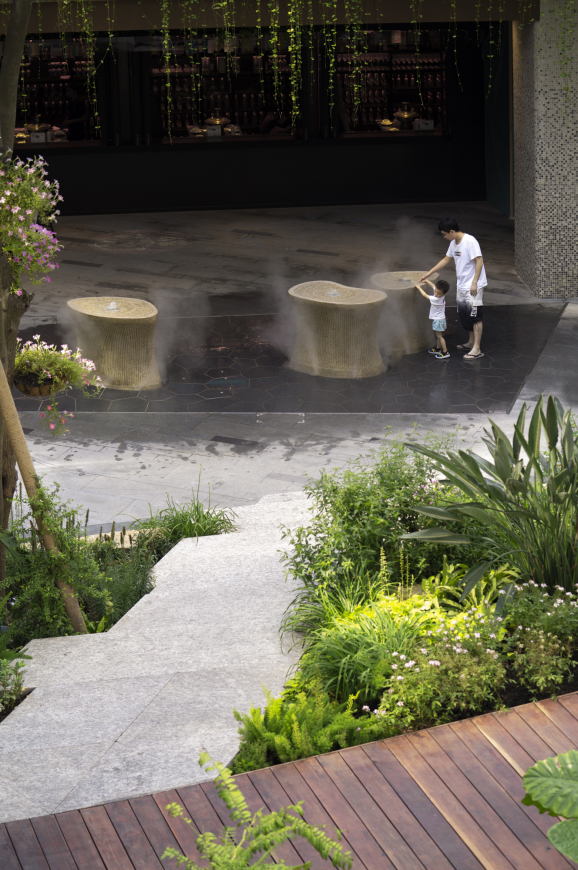
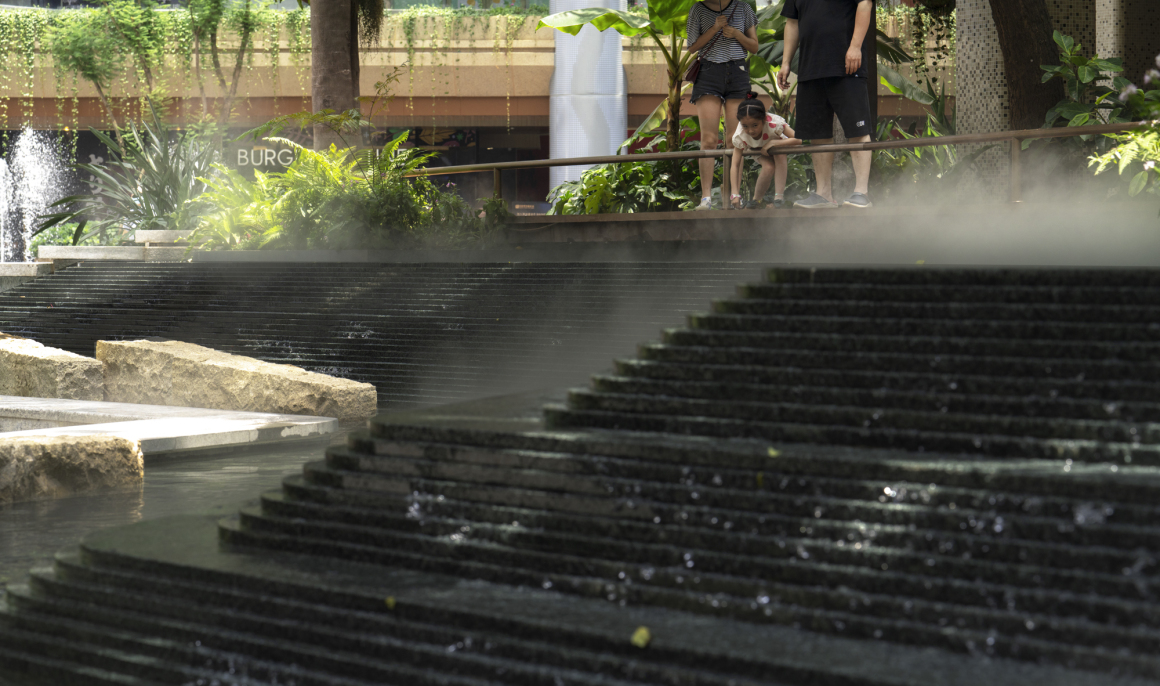
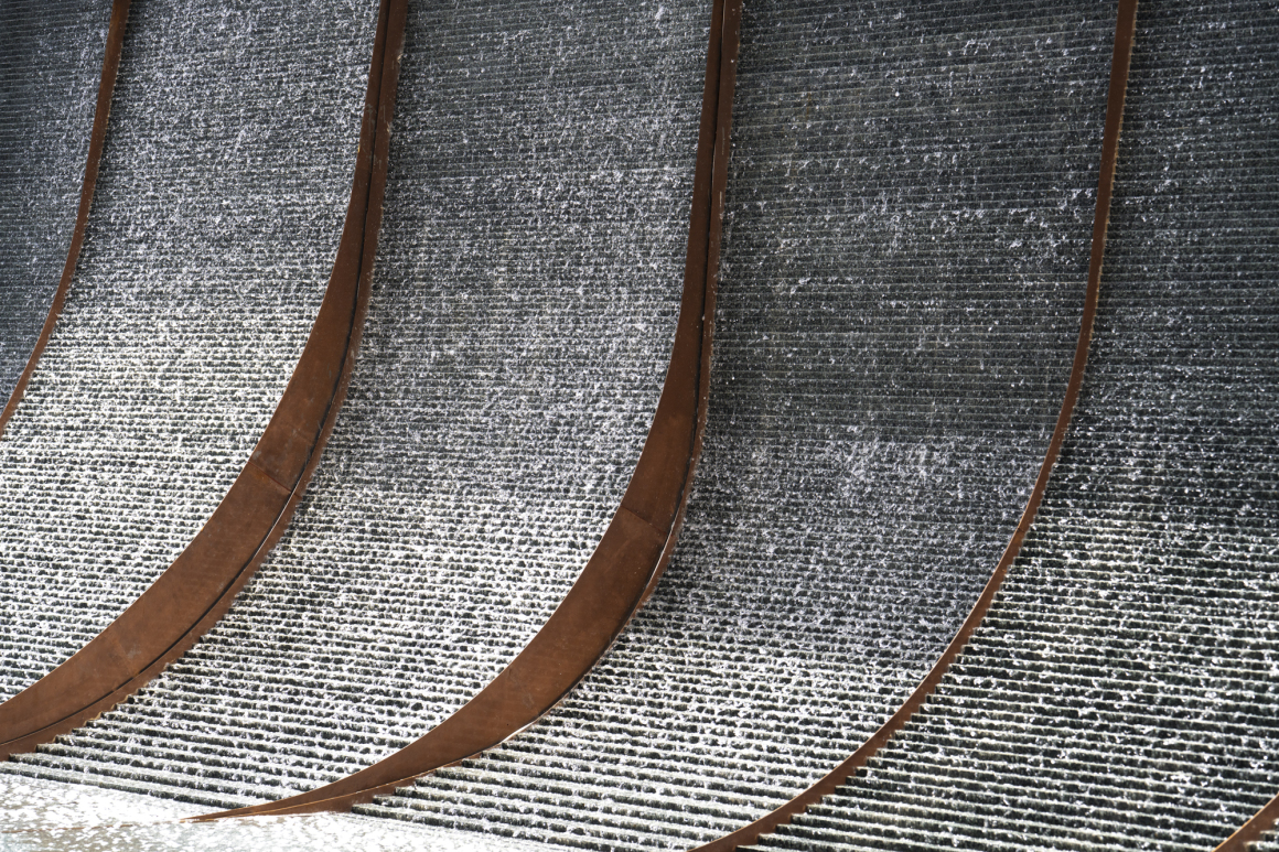
港汇的水景带给人一种自然灵动的感受。为了打造酒店门口的”珍珠滩”,设计团队从石材的纹理、硬度、拼装大小、安置角度进行了反复的实验,确保水珠的跳跃感及散落的层次感。最终,我们呈现出水珠如白银珍珠般落向大堂的视觉感受。
同样,每一处多形态、多层次的水景都源自我们团队的精心设计,期望给予人们全方位的亲近感与互动感,以自然的湿度调动人的温度,再反滋养于自然。
The waterscape of Ganghui gives people a natural and vivid feeling. In order to create the “Pearl Beach” at the entrance of the hotel, the design team conducted many experiments. By testing the texture, hardness, assembly size, and placement angle of the stone, we finally presented the visual experience of water drops falling into the lobby like silver pearls. The diverse forms of waterscape in Ganghui are all careful designed by our team, hoping to give people an all-round sense of intimacy and interaction.
05 后记 Postscript
黑白之间一直坚持站在“人的立场”来思考问题,打造景观。任何设计,只要其最终目的是让人用的、看的、听的、感受的,就都得在以人为本的前提下考虑。就像我们现在倡导的环境保护,其核心也不是单纯为了保护自然,而是让人类拥有一个可持续的、美好的、赖以生存的自然环境。这是人的私心,也是人最大的公心。
BWLA always insists on thinking from a humanistic perspective to create landscapes. Any design, as long as its ultimate purpose is to let people use, see, listen, and feel, it must be considered under the premise of people. Just like the environmental protection, its core is not purely to protect nature, but to allow human beings to have a sustainable, beautiful, and survival natural environment. This is for every single one of us, and in the mean time serves the best for all of us.
项目名称:港汇天地项目景观设计
项目地点:成都市高新区
项目规模:景观面积约3.4万m²
景观设计:黑白之间景观
设计时间:2018.6
建成时间:2021.5
摄 影:河狸-景观摄影
Project name: Ganghui Tiandi
Project location:Chengdu
Size: 34000 m²
Landscape Design:BWLA
Term of planning:2018.6
Completion Year: 2021.5
Photo credits:Holi Landscape photography
审稿编辑 任廷会 – Ashley Jen
更多 Read more about:黑白之间景观












0 Comments