本文由 K-Studio 授权mooool发表,欢迎转发,禁止以mooool编辑版本转载。
Thanks K-Studio for authorizing the publication of the project on mooool, Text description provided by K-Studio.
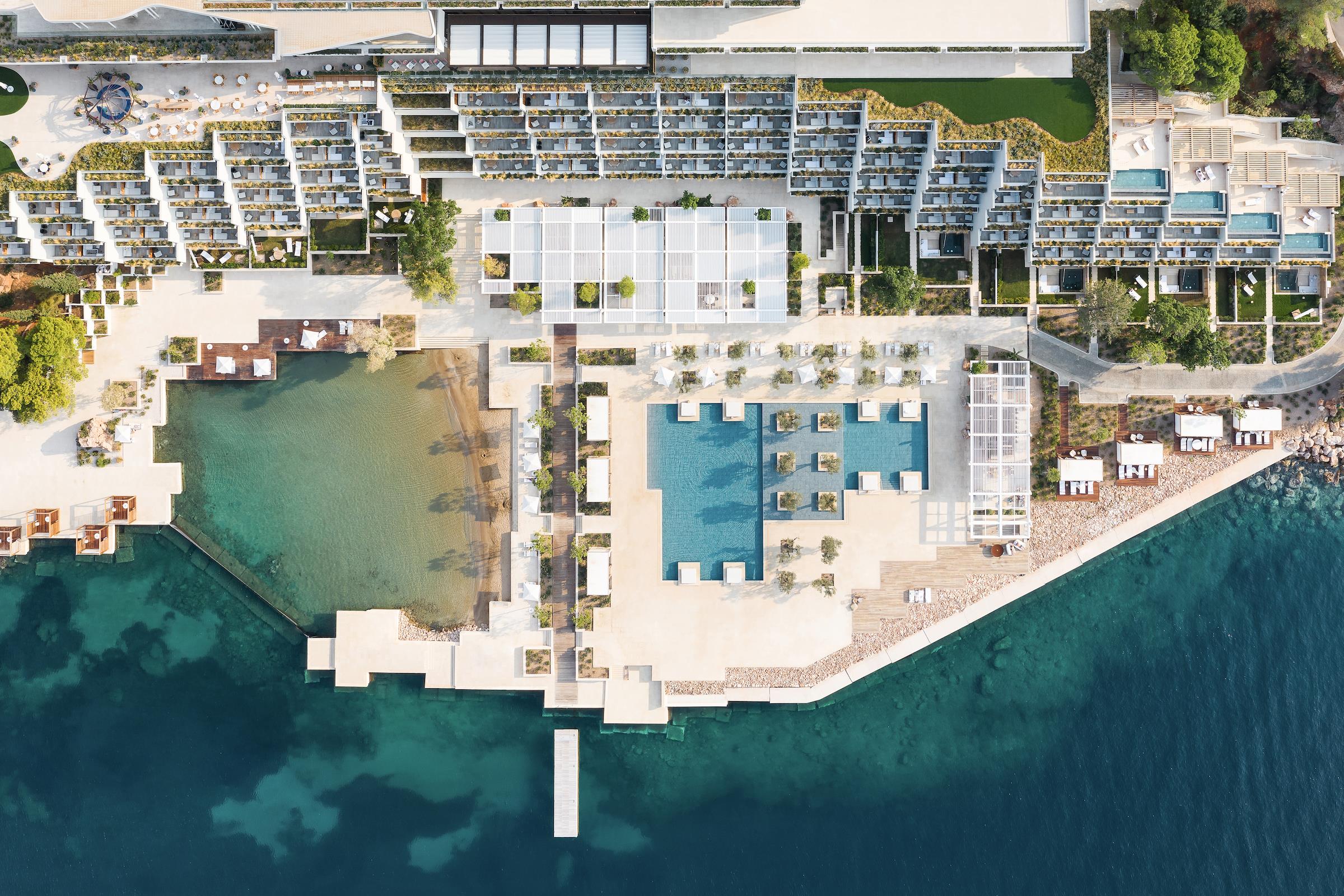
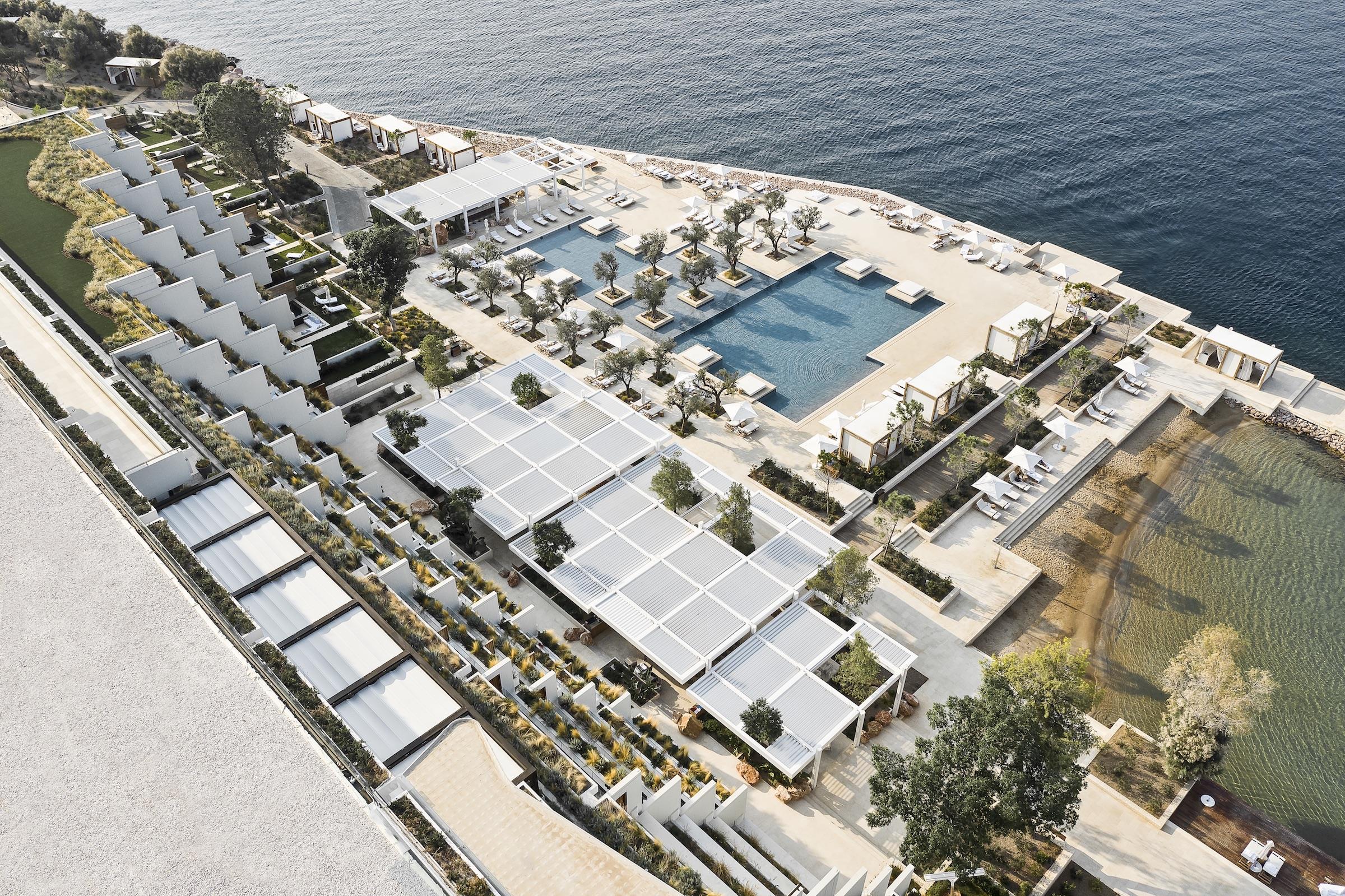
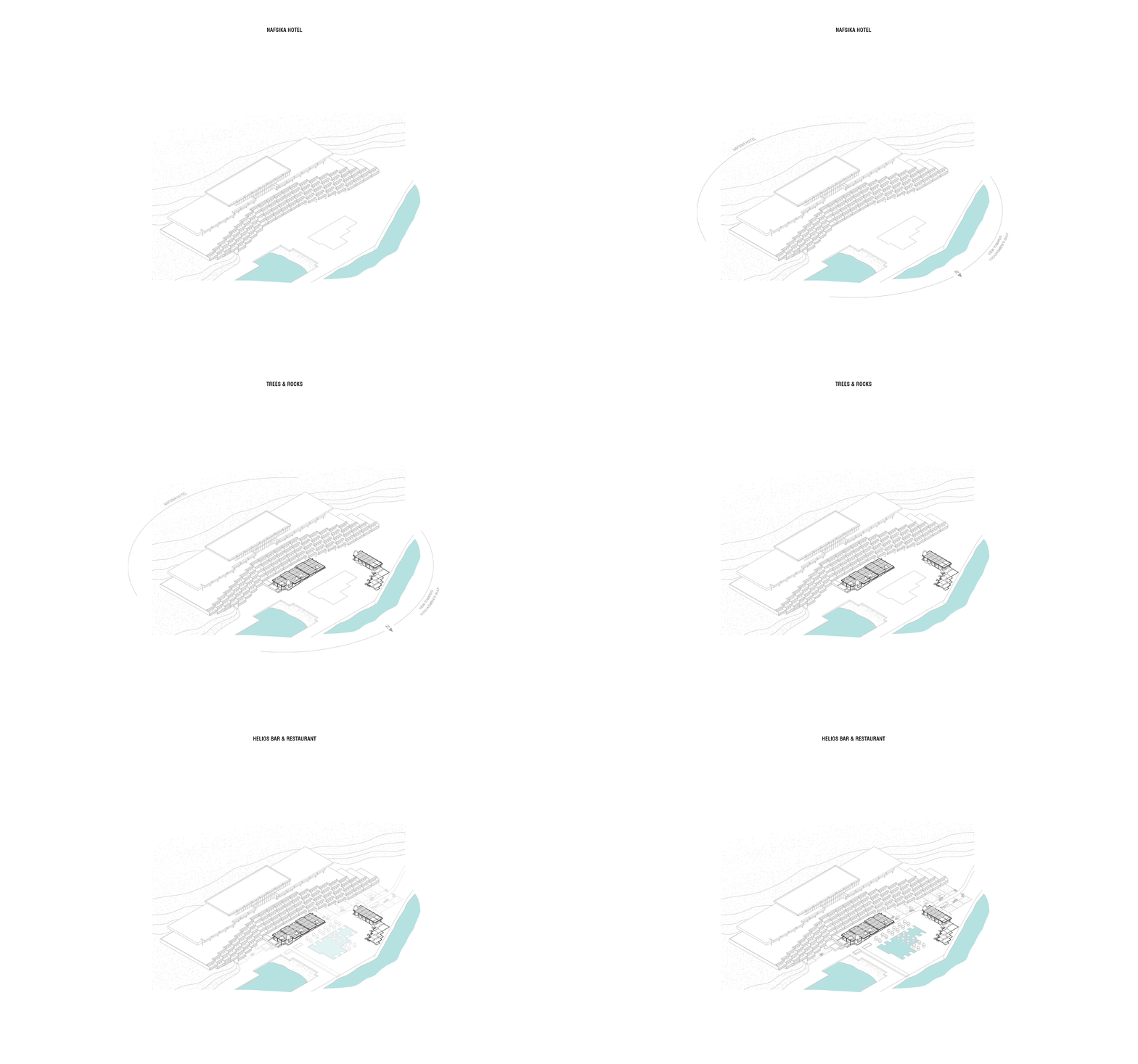
K-Studio:该项目位于雅典四季阿斯蒂尔宫度假酒店的Nafsika泳池区域,其一部分平行于泳池,位于酒店建筑前方,面朝大海,另一部分与游泳池垂直,呈L形环抱泳池,临于大海。离酒店最近的第一个结构是餐厅和酒吧,我们在此处的休息区、低价用餐区和标准用餐区共设置了180个座位。四季酒店的经营者希望这个地方成为像餐馆和酒吧一样可放松可休闲的场所。
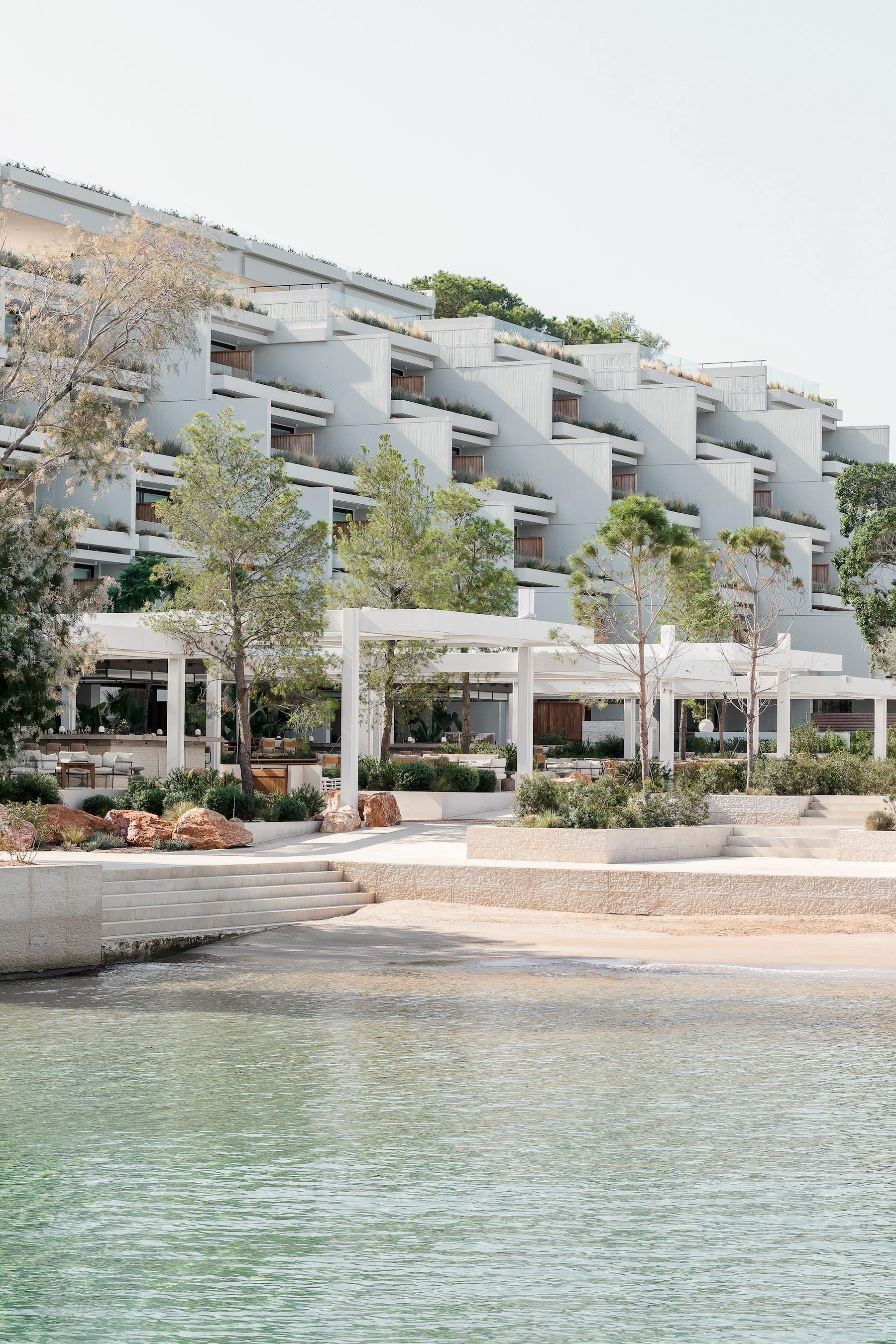
K-Studio:This project is located in Four Seasons Astir Palace Hotel, in the Nafsika Hotel pool area, with part of it positioned in front of the hotel building, parallel to the pool and looking to the sea, and the other placed perpendicular to it, in an L-shape cornering the pool and closer to the sea. The first structure, closest to the hotel, is the restaurant and bar for which we were asked to provide seating for 180 covers arranged in zones of lounge, low dining and standard dining. Four Seasons’ operators wanted this place to be as much a place of relaxation as it would be a restaurant and bar.
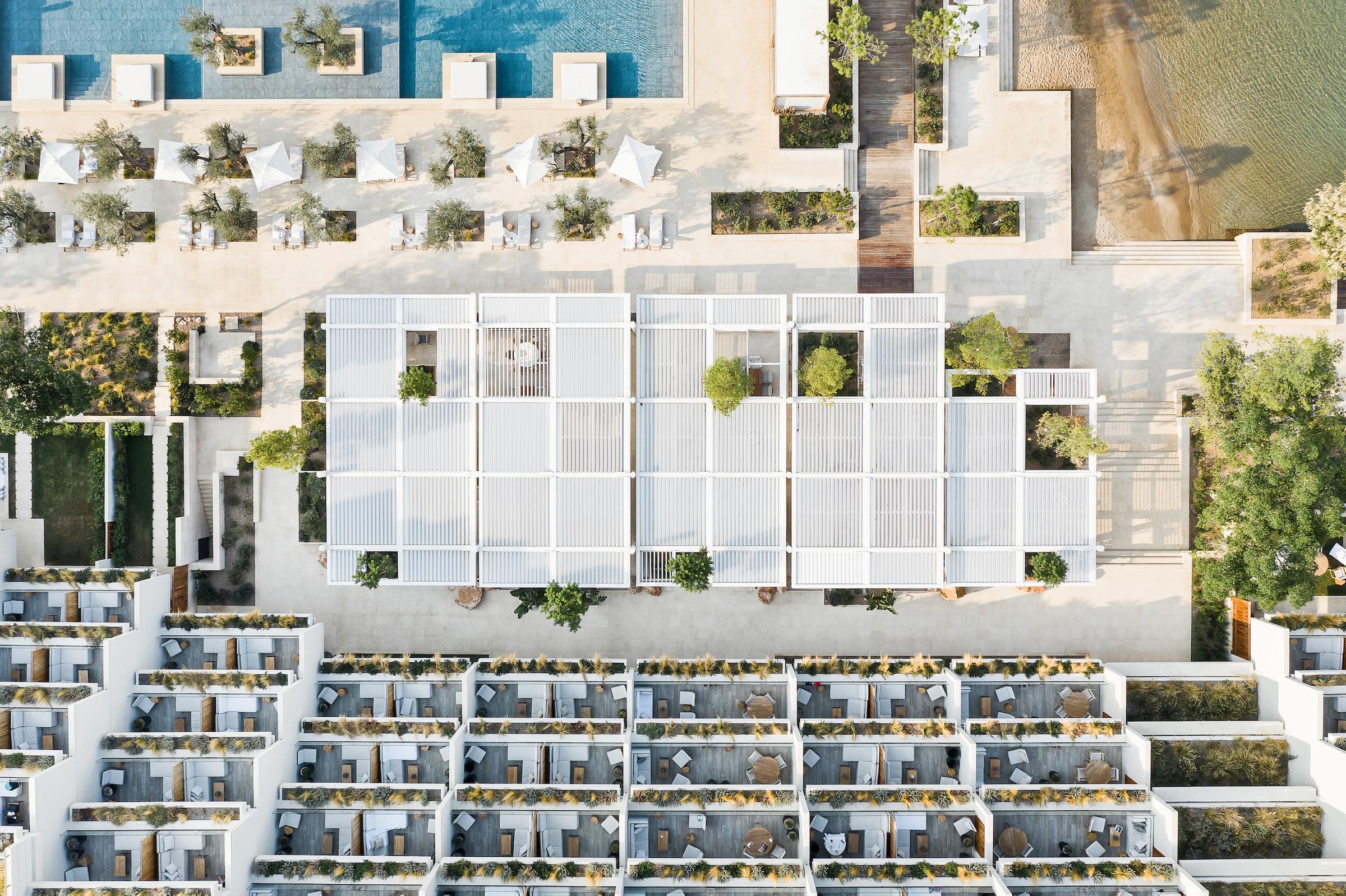
▼项目鸟瞰 Aerial view
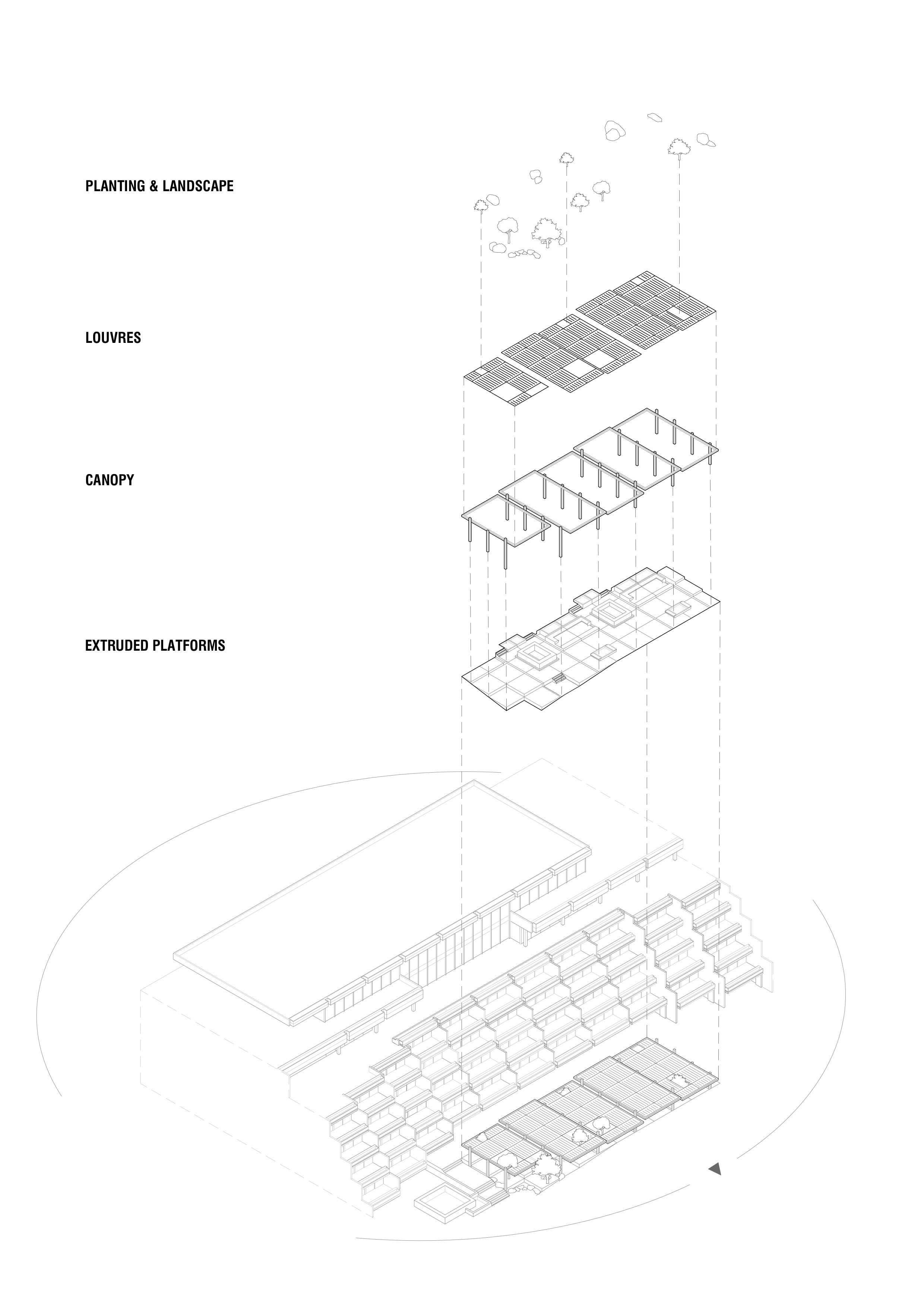
▼设计图纸 Design drawings
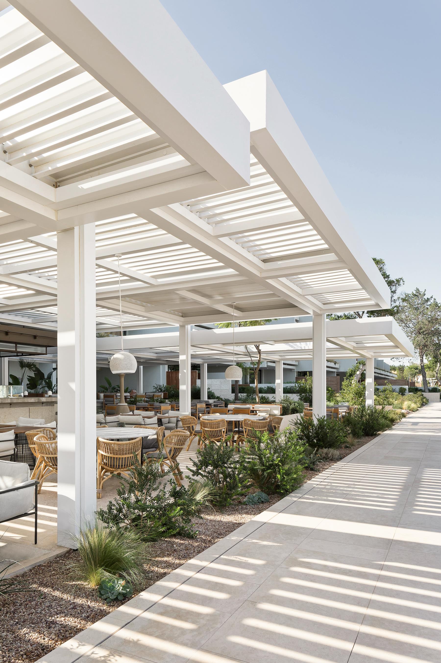
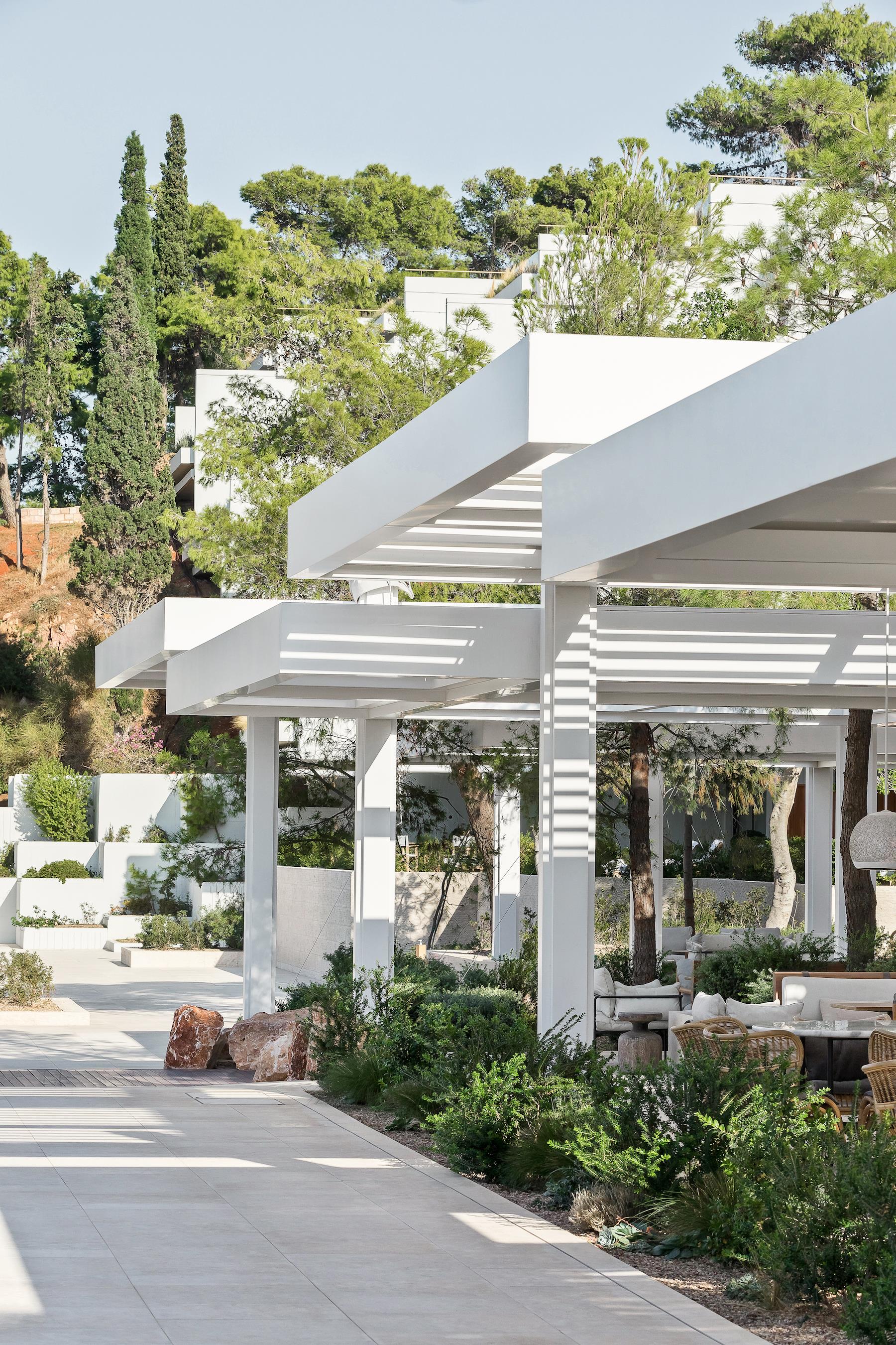
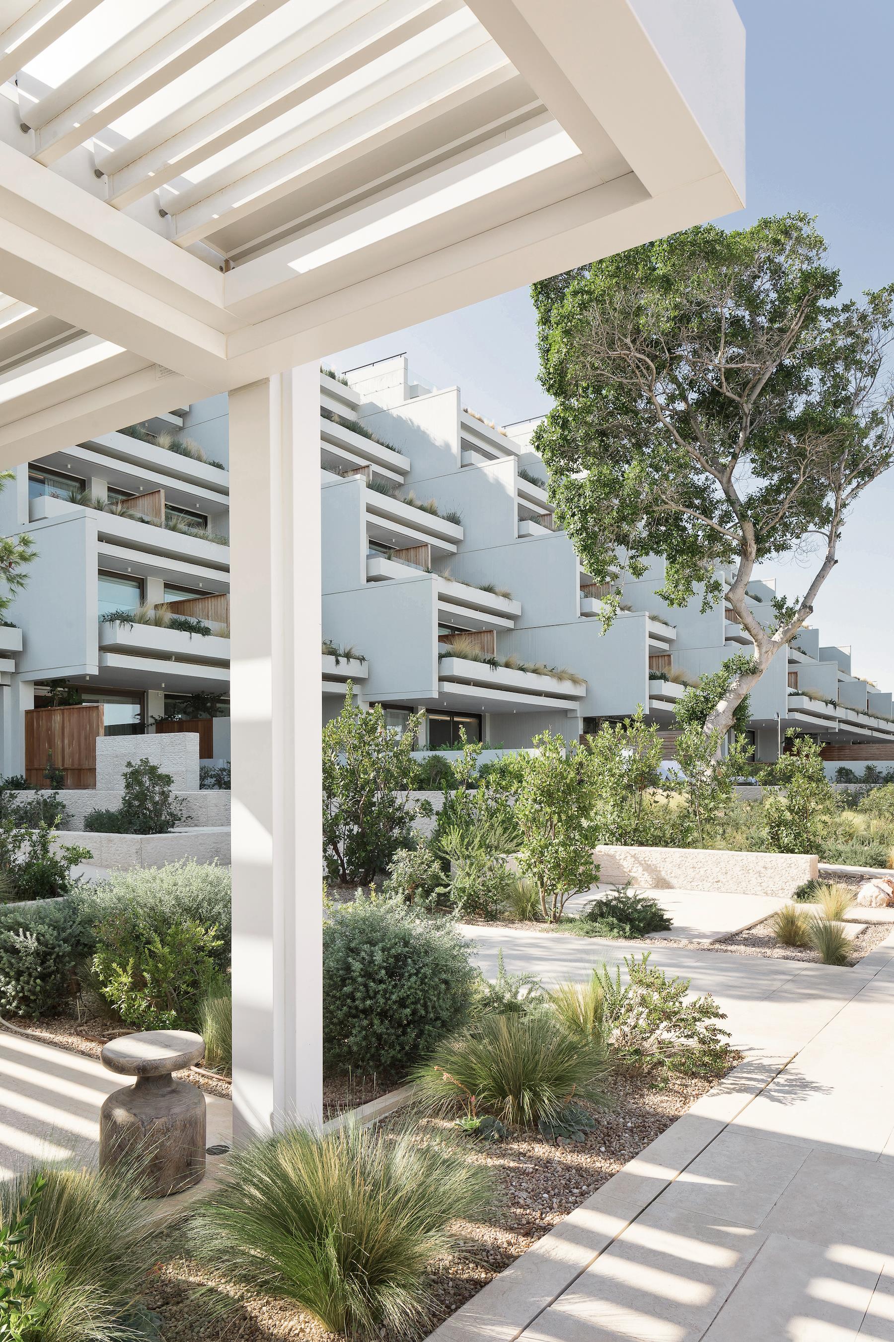
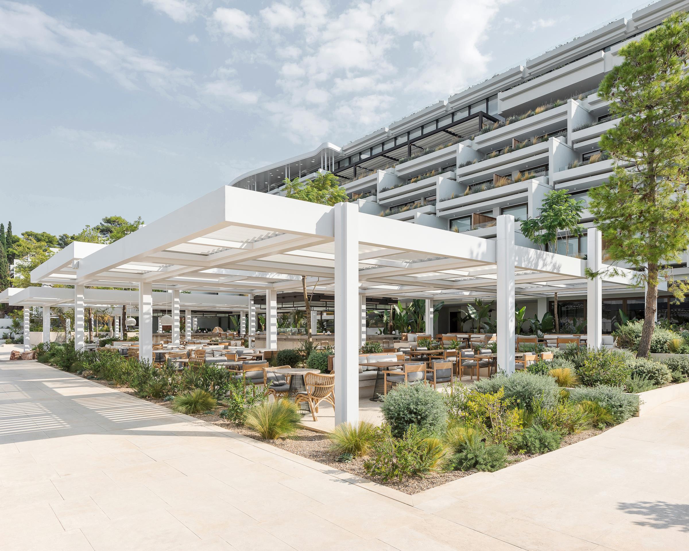
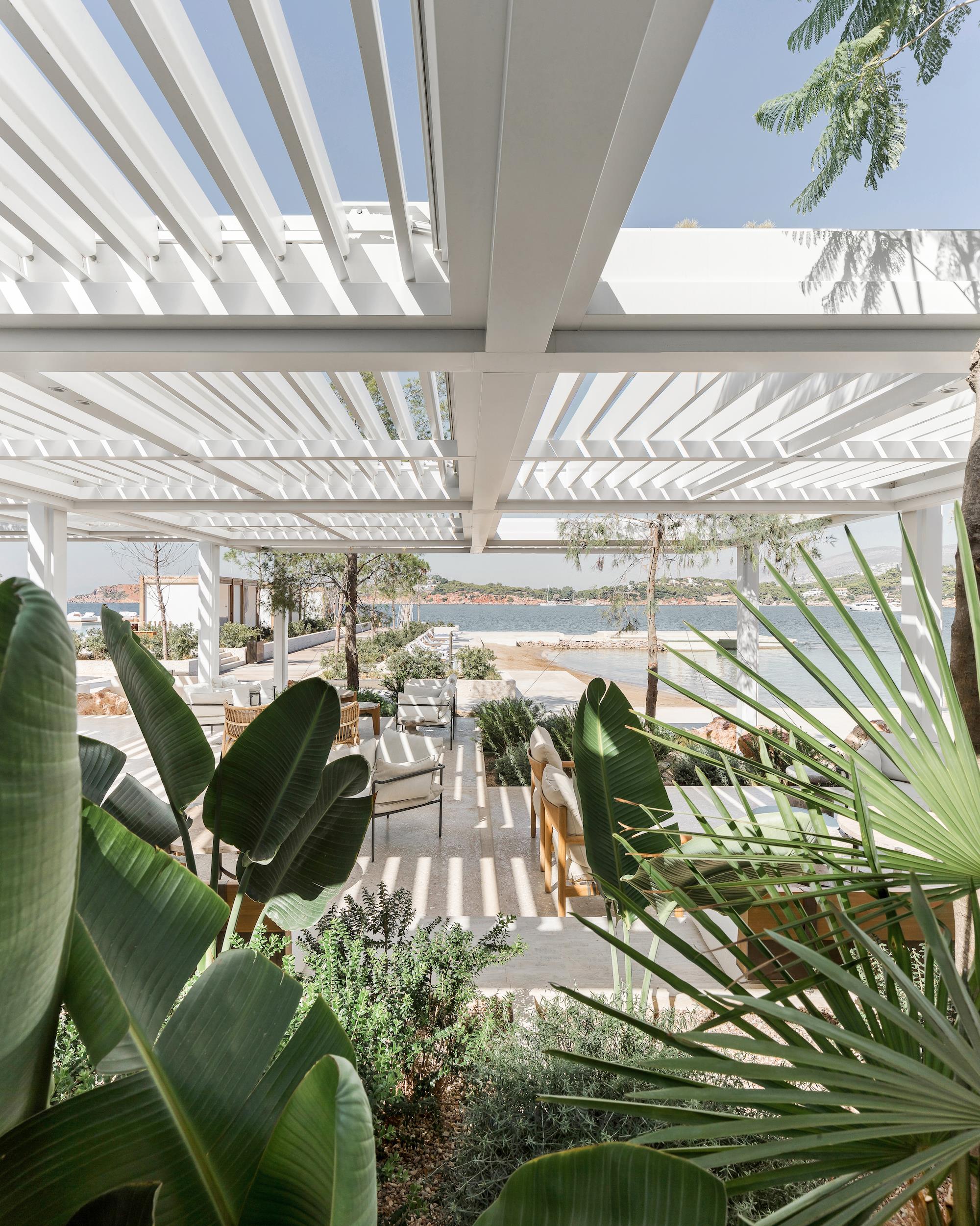
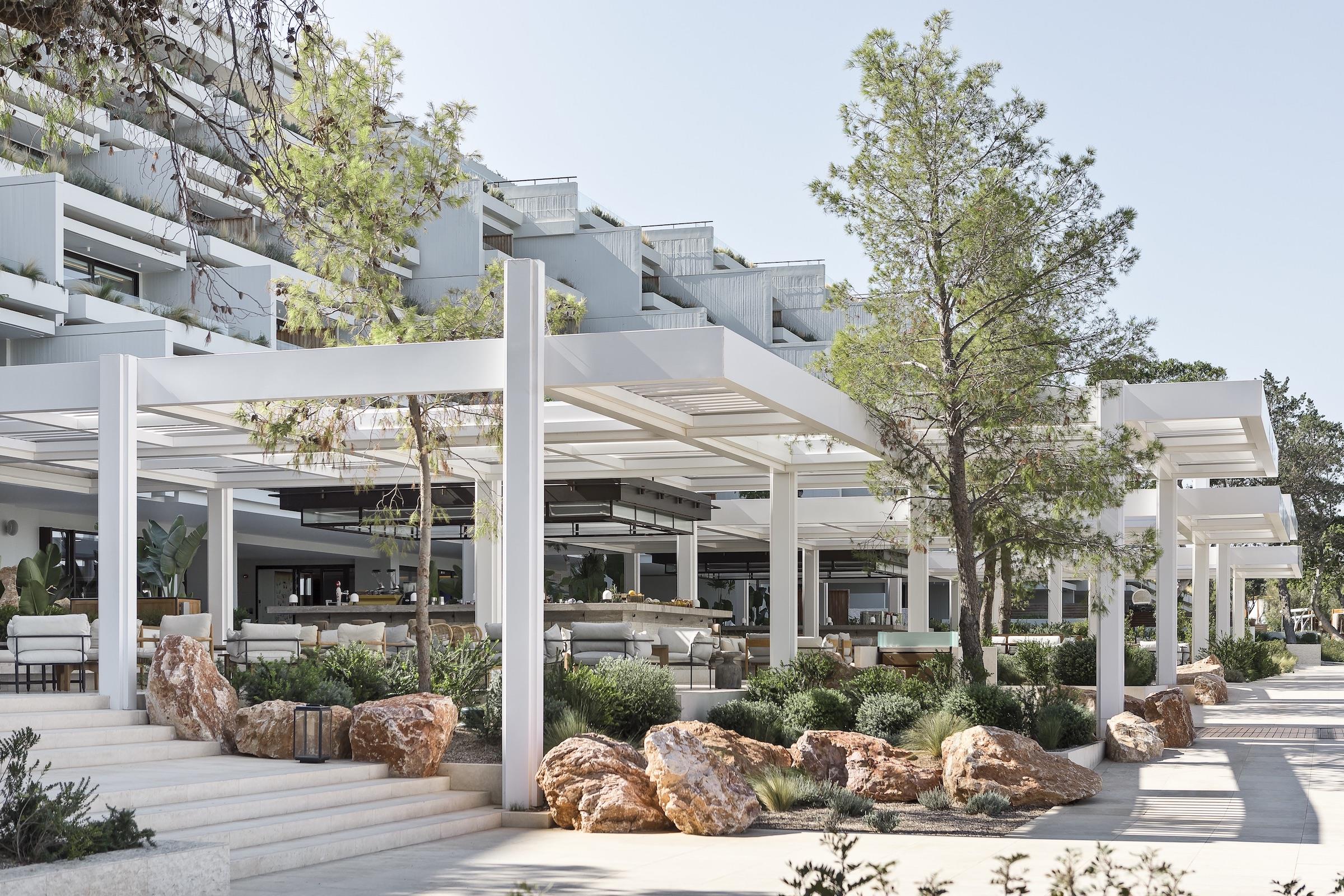
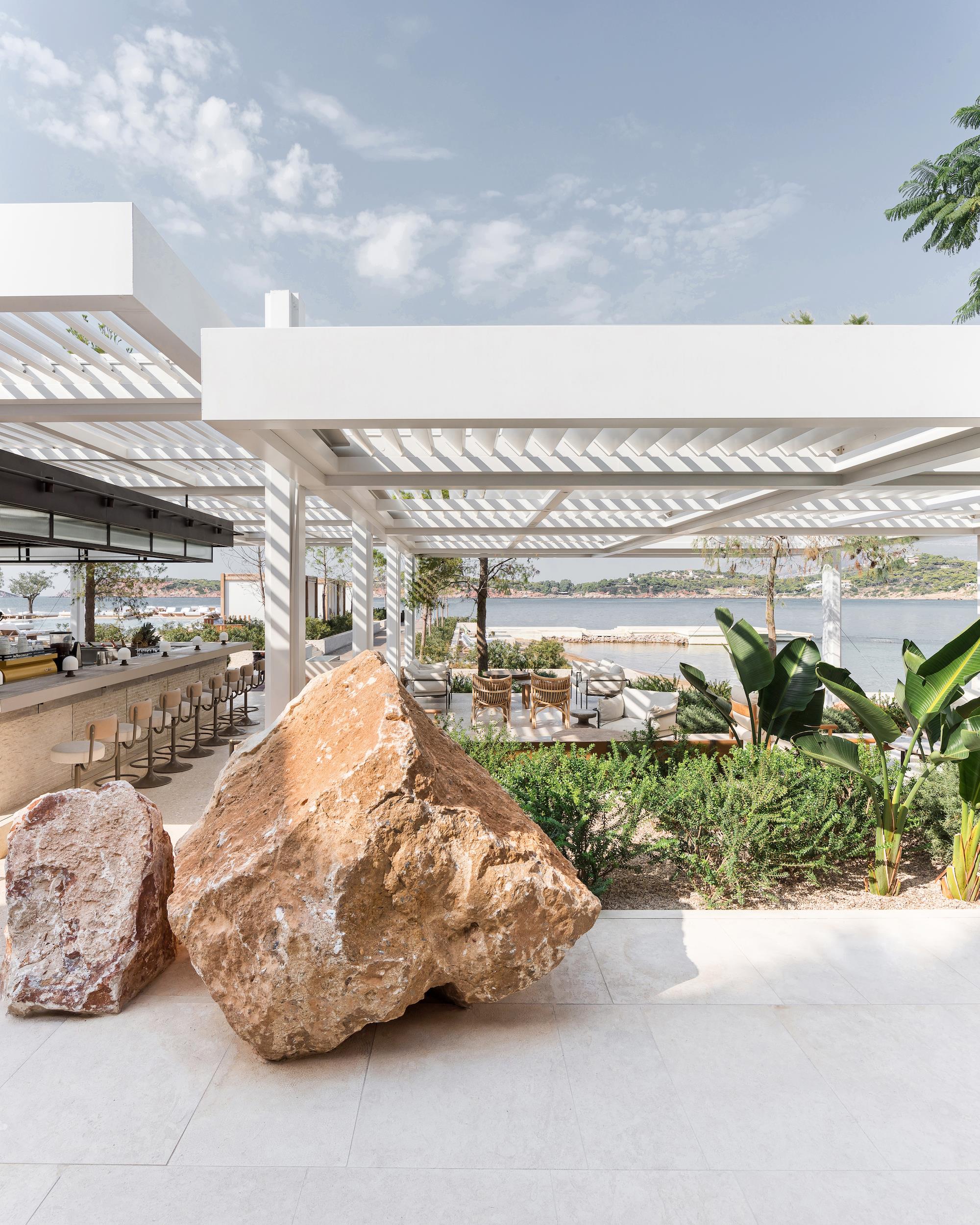
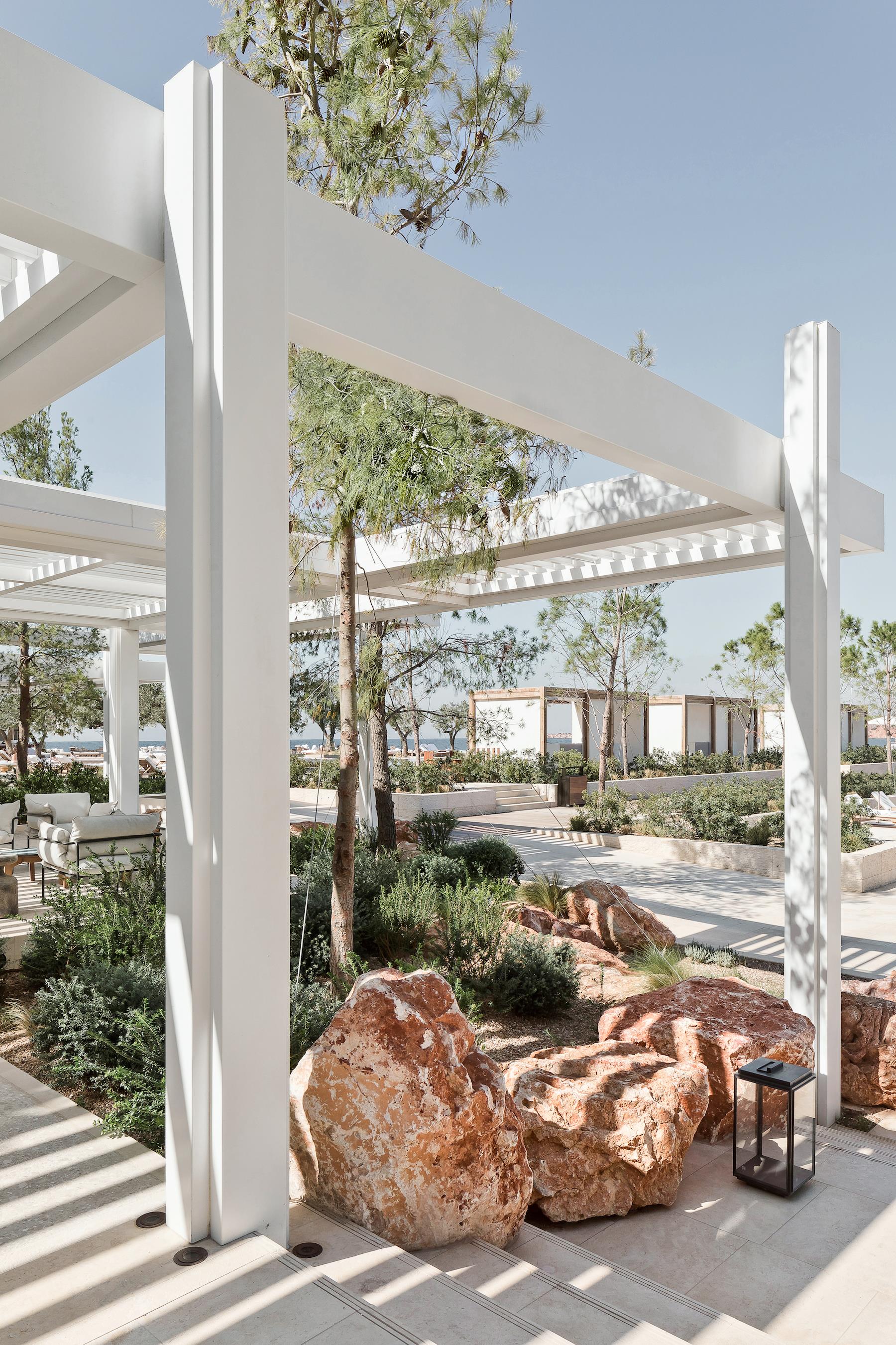
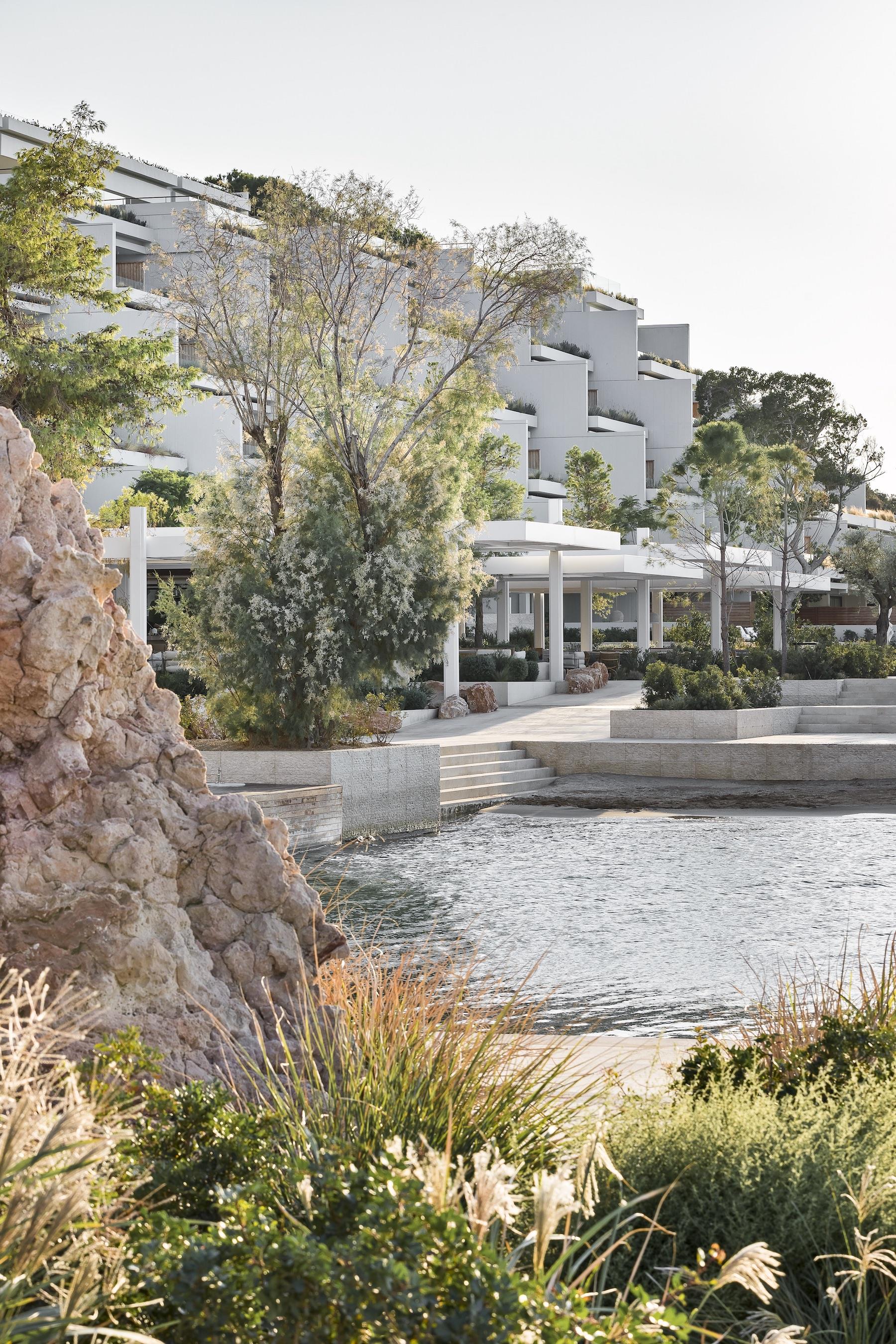
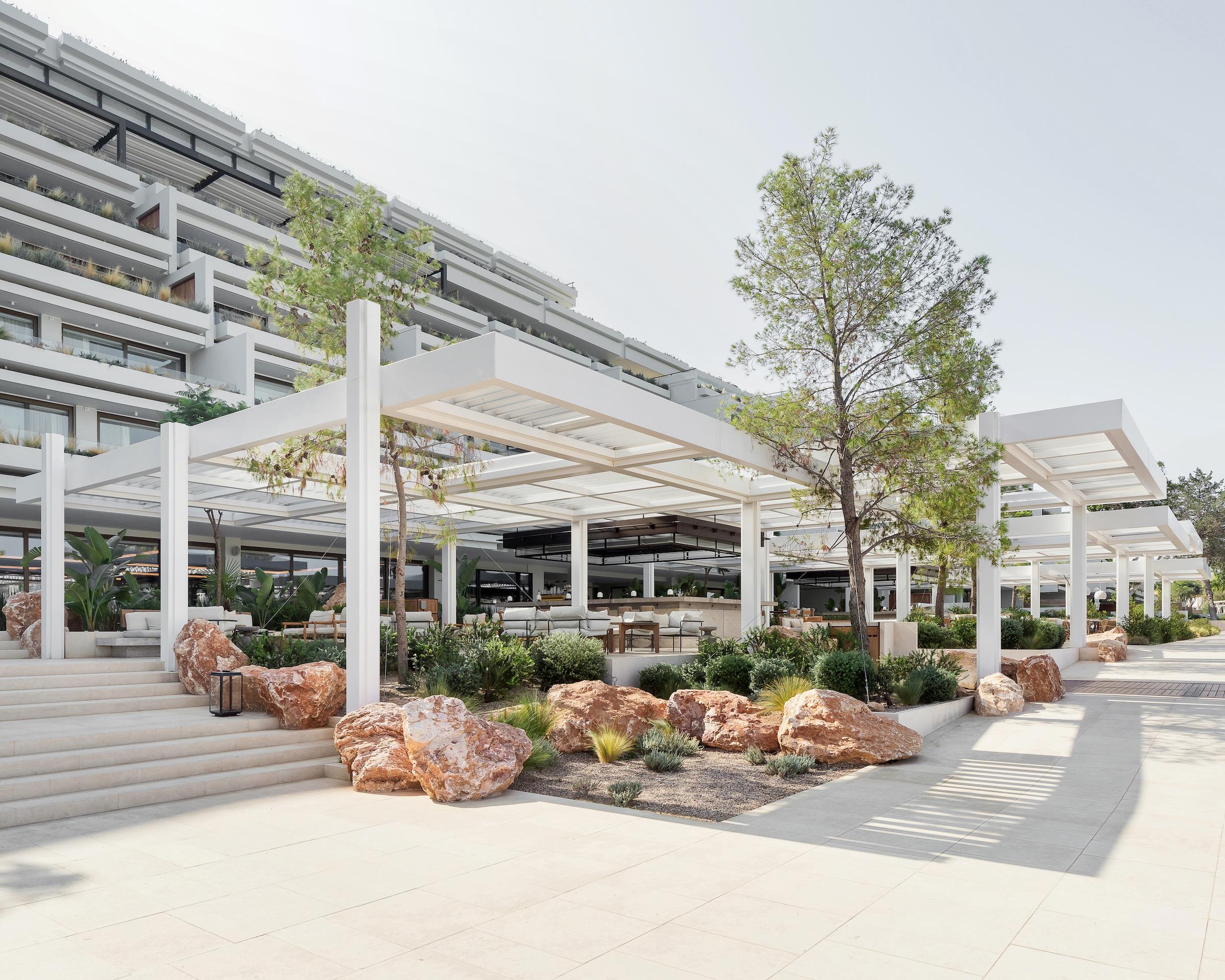
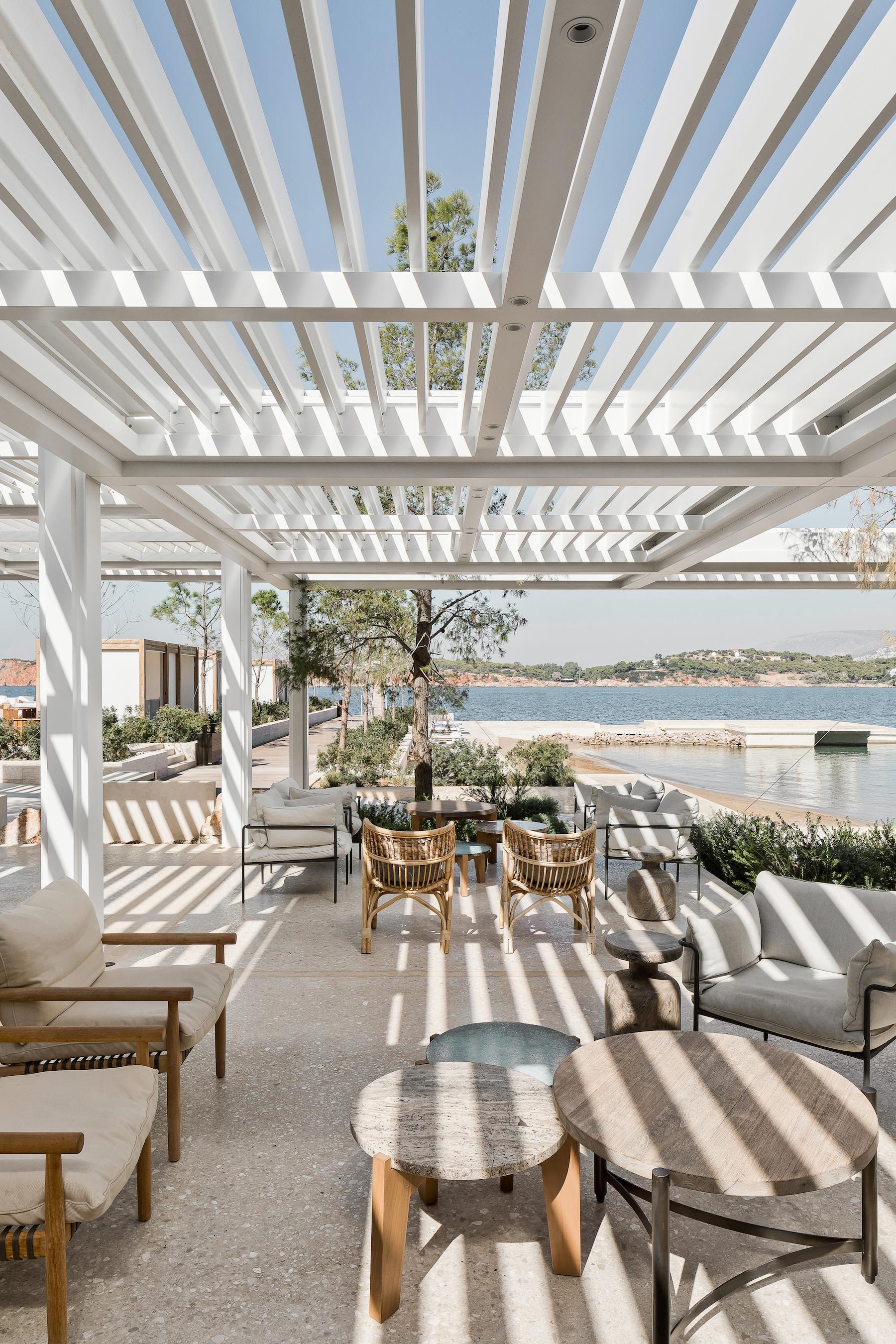
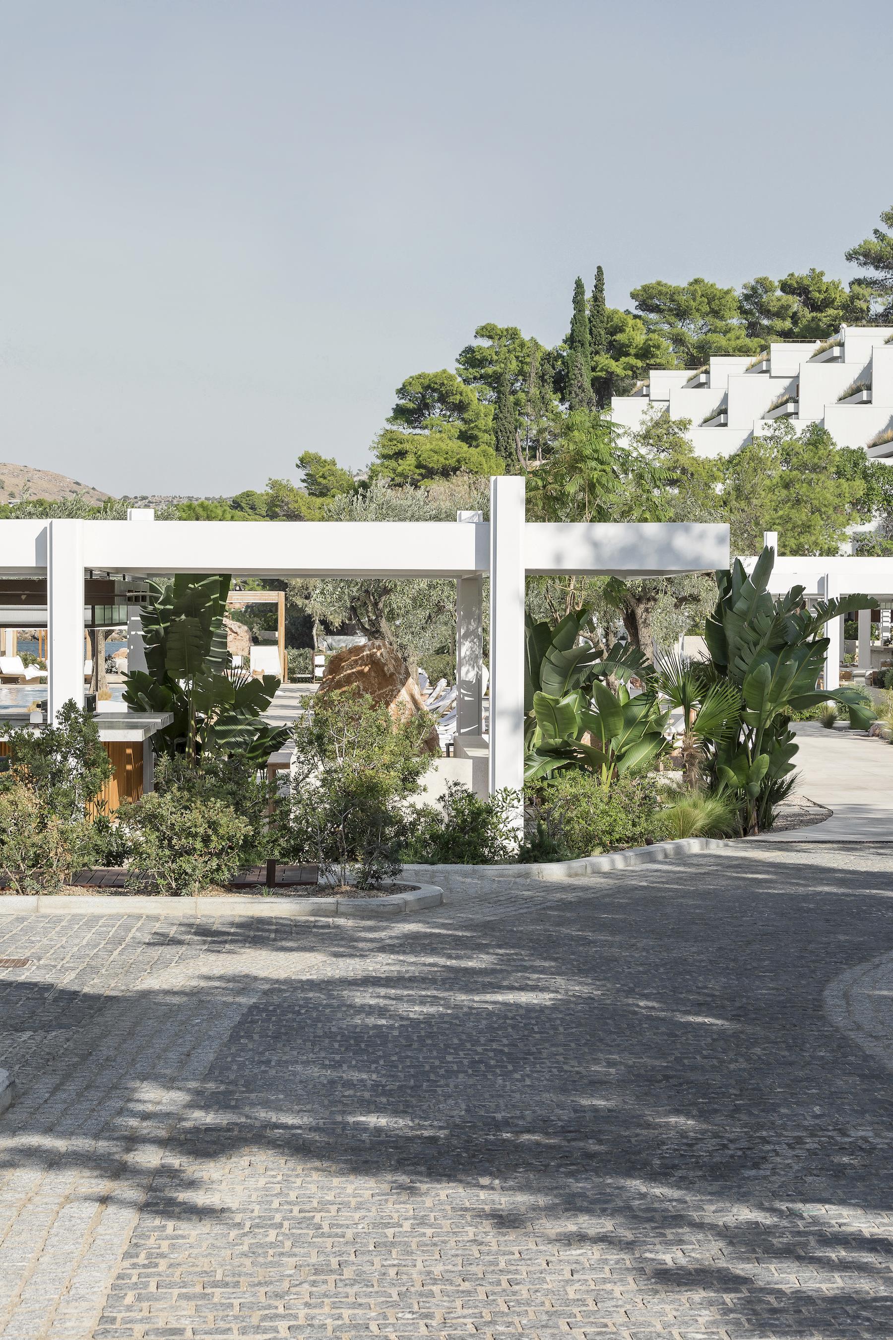
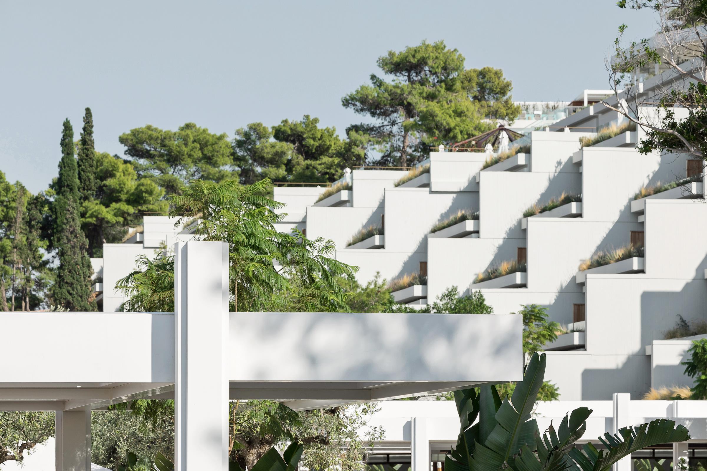
我们希望这些空间延续酒店现有标志性建筑的现代主义,于是延用了建筑中直角网格作为划分空间的指导元素,将其扩展到建筑内部,餐厅顶部放置的藤架,在泳池下方和周围创造出自由流动的空间,避免了与后面的建筑产生任何竞争关系。白色的铝制藤架网格,与建筑的线性、直角特征相融合。铝制的棚架不仅能够承受海边恶劣的磨蚀环境,在视觉上也比建筑轻得多。本项目中延用了一系列不同高度的藤架,每个藤架之间各有不同,在它们各自下方创建了活动区域。
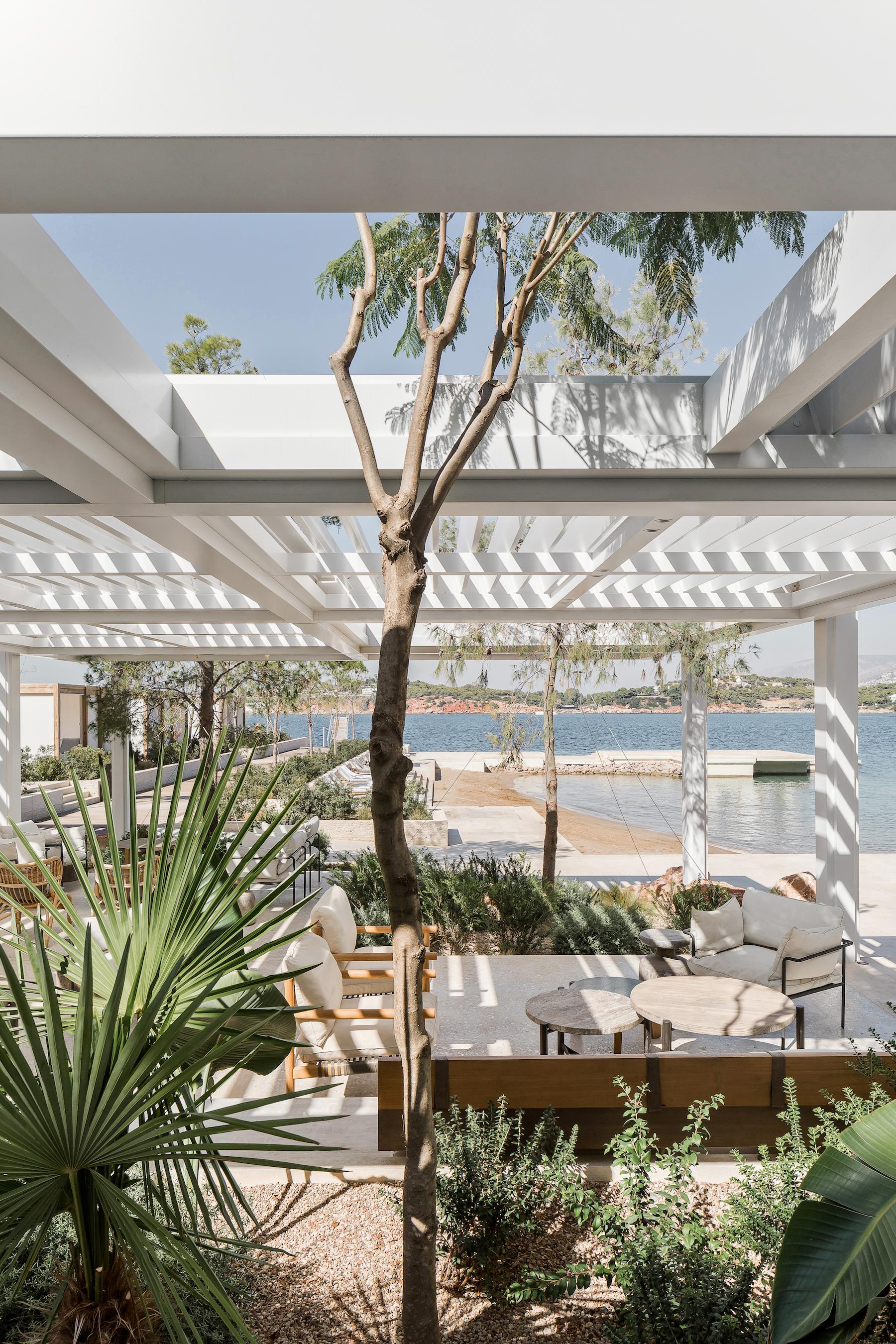
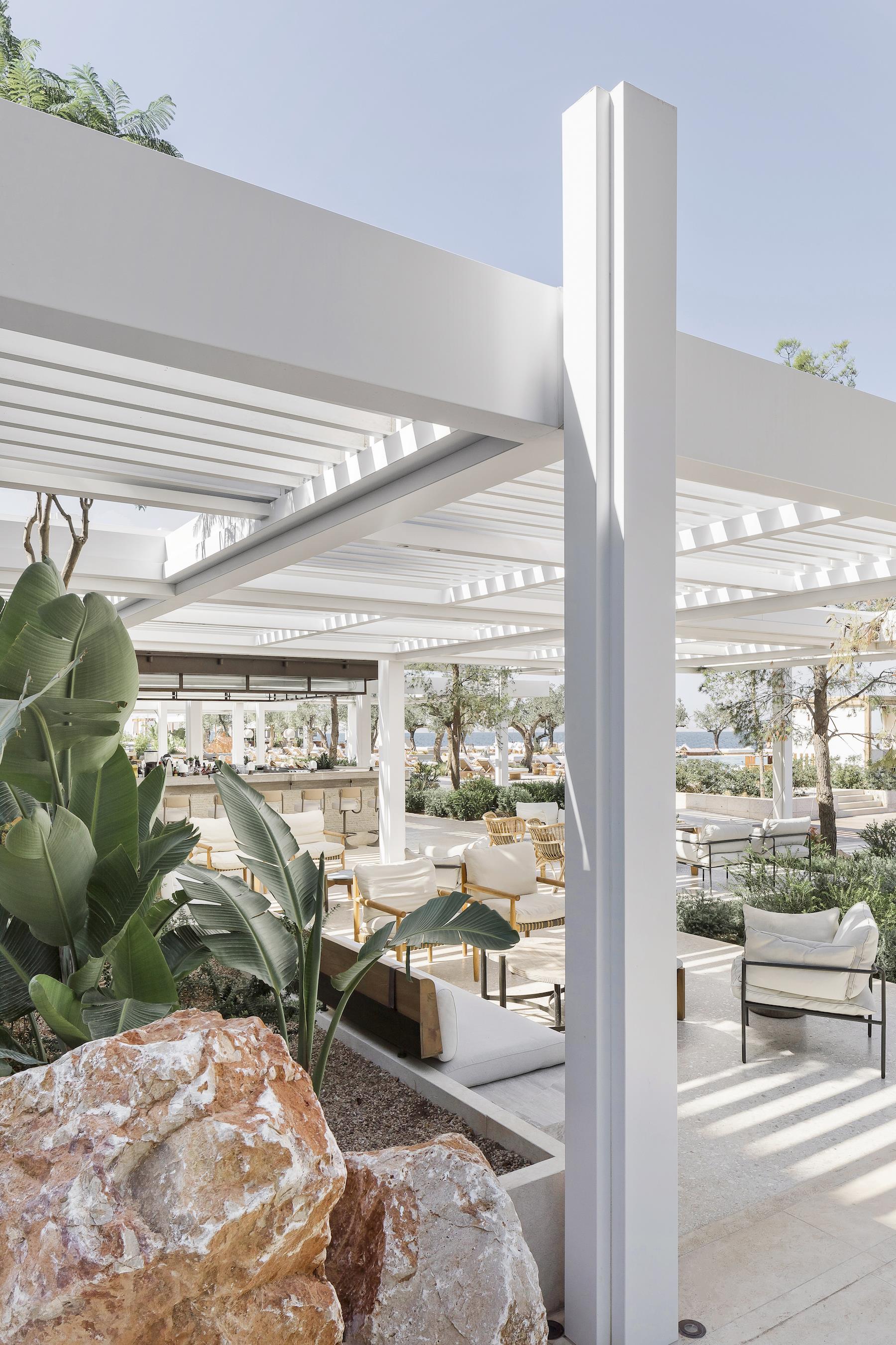
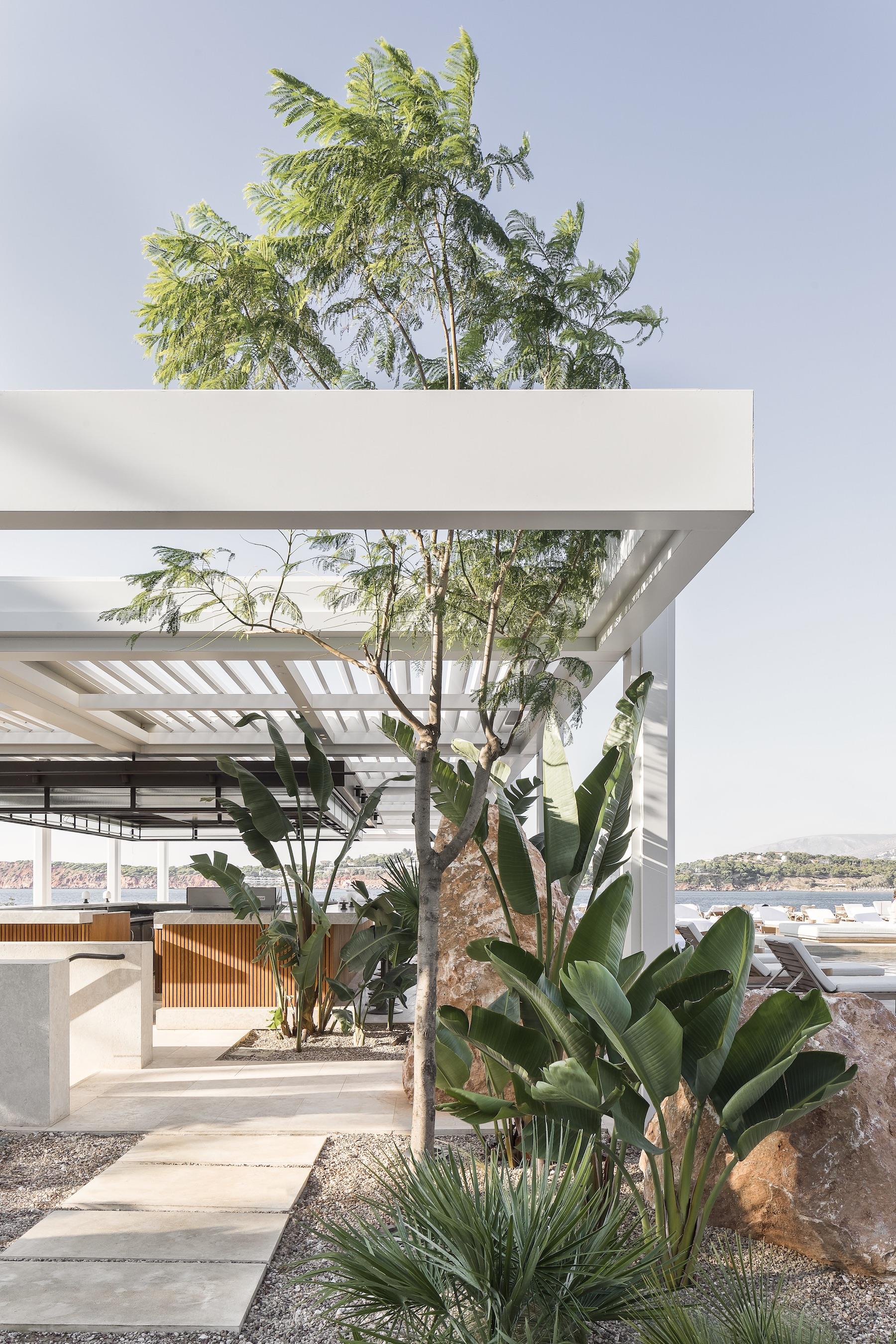
We wanted the identity of the spaces to be a continuation of the modernist architecture of the existing hotel building, an emblematic building with a strong orthogonal grid. We used this grid as a guide to zoning the spaces and extended it within our building, placing a pergola on top of it to create free-flowing space below and alongside the pool, and avoiding any competition with the building behind it. The white aluminium pergola respects the grid and integrates with the linear, orthogonal identity of the building. Making the pergola of aluminium allows it to withstand the abrasive seafront environment but also means it is visually a lot lighter than the building, like a sketch over it. This pergola quickly became a sequence of pergolas with varied heights to allow a distinction between each and creating the opportunity to create zones beneath them.
▼白色的结构形态优雅简洁 The white structure is elegant and simple
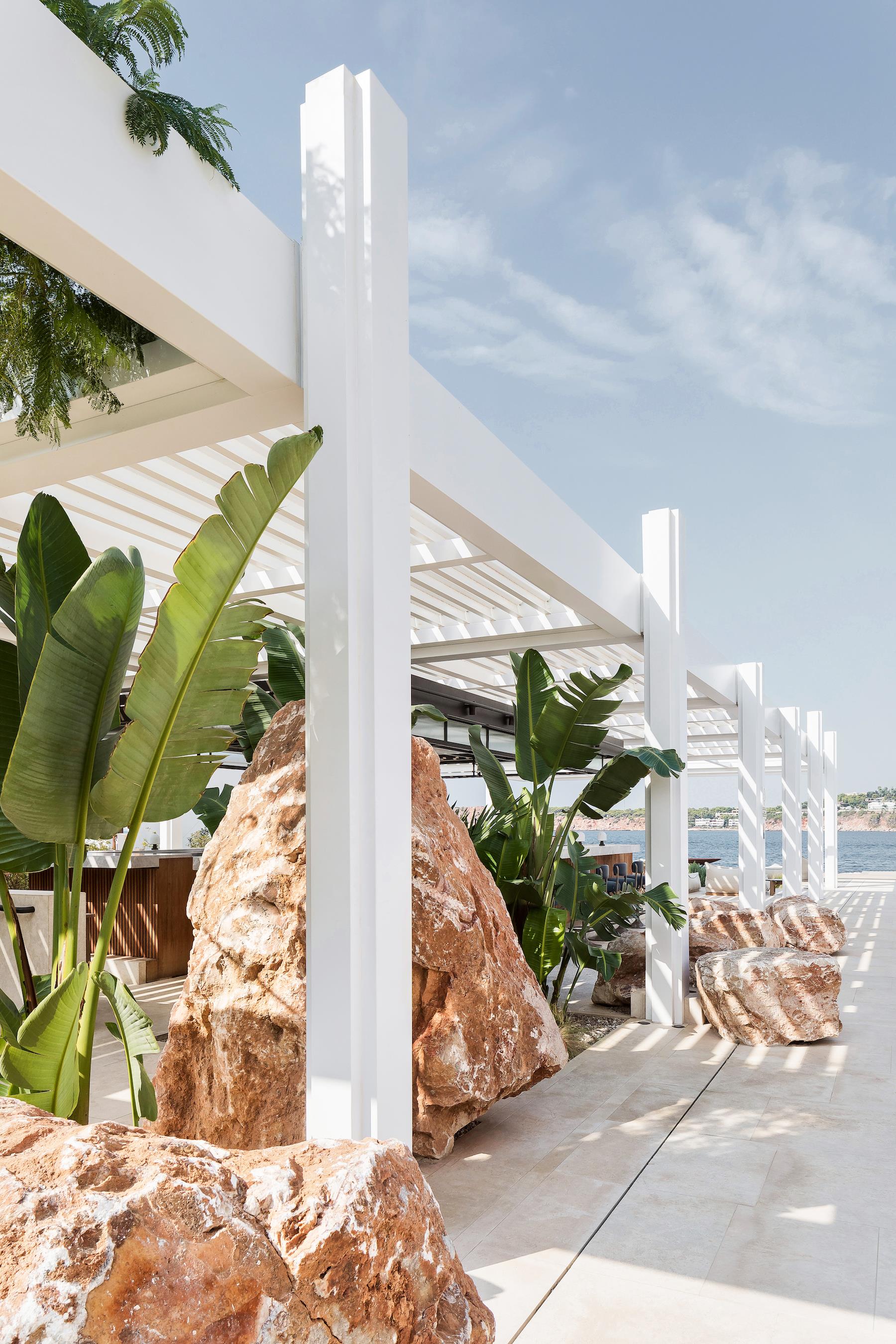
▼结构细节 Details of the structure
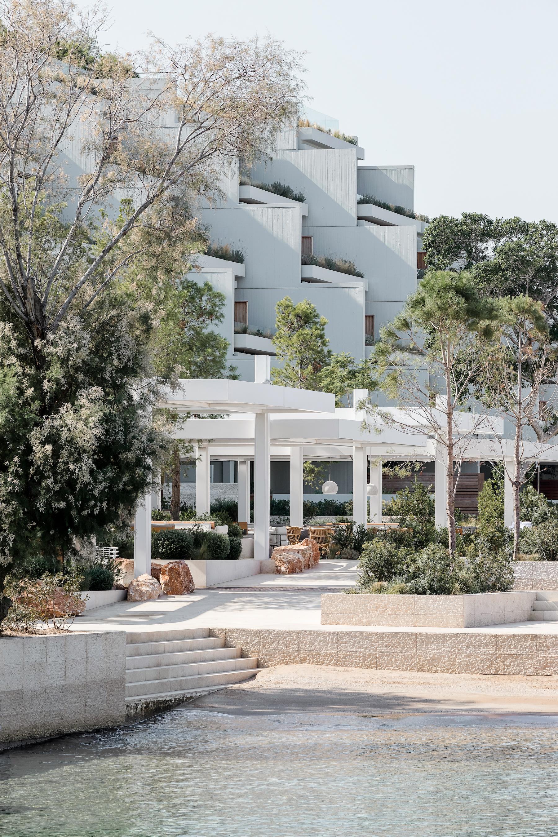
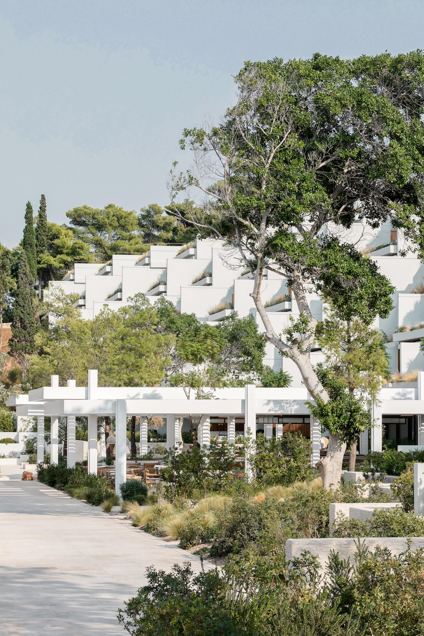
▼完美的延续了建筑的气质 The continuity of architecture
▼让建筑得到向室外的延伸 The building extends to the outside
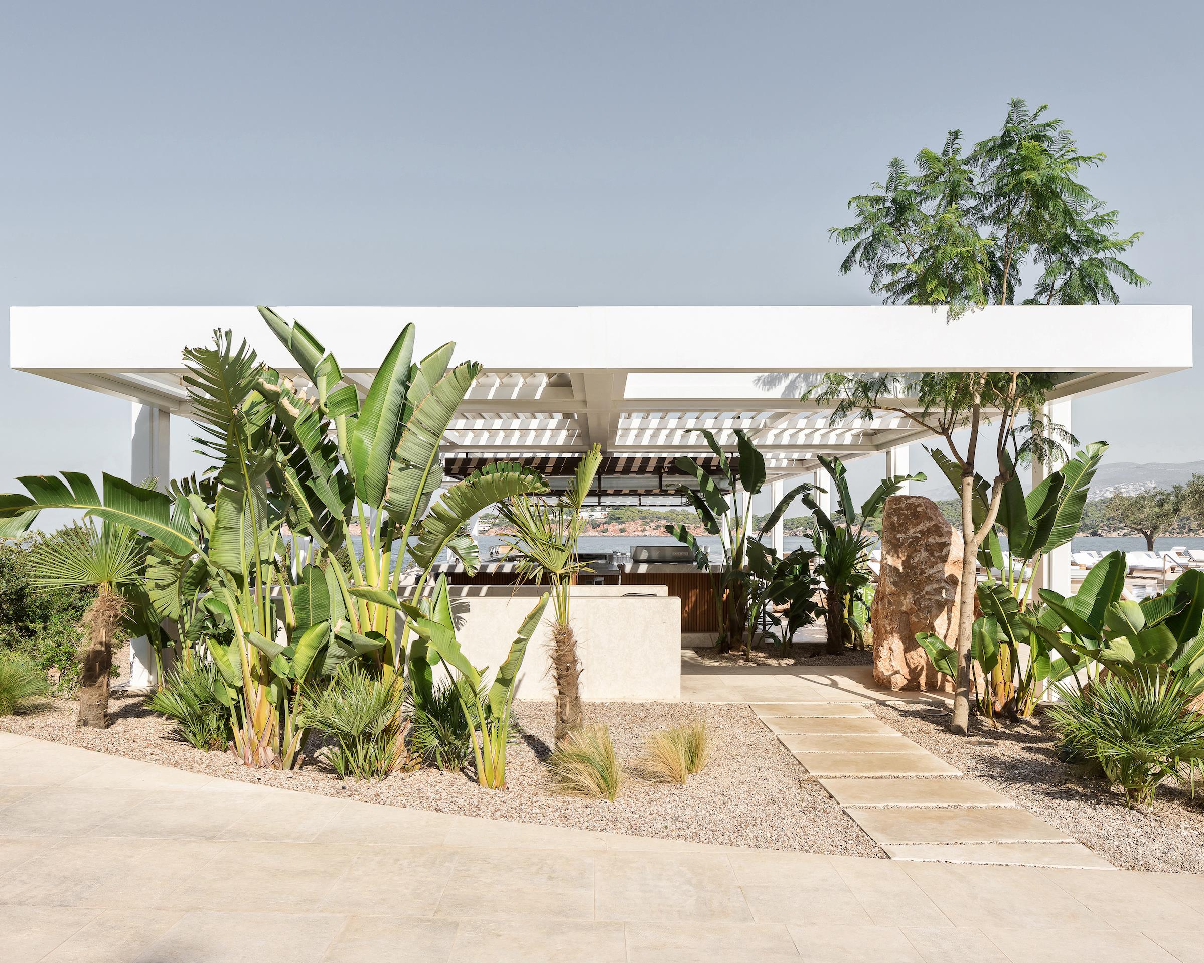
▼充满野性的植物填满了场地中的各个角落 Wild plants fill every corner of the site
▼高低错落的植物被混栽在一起,肆意的生长着 Plants strewn at random are mixed together, growing indiscriminately
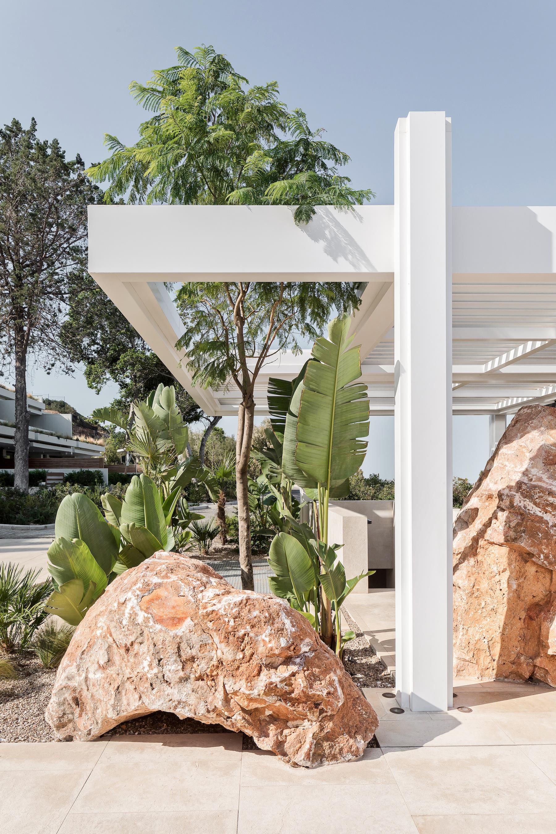
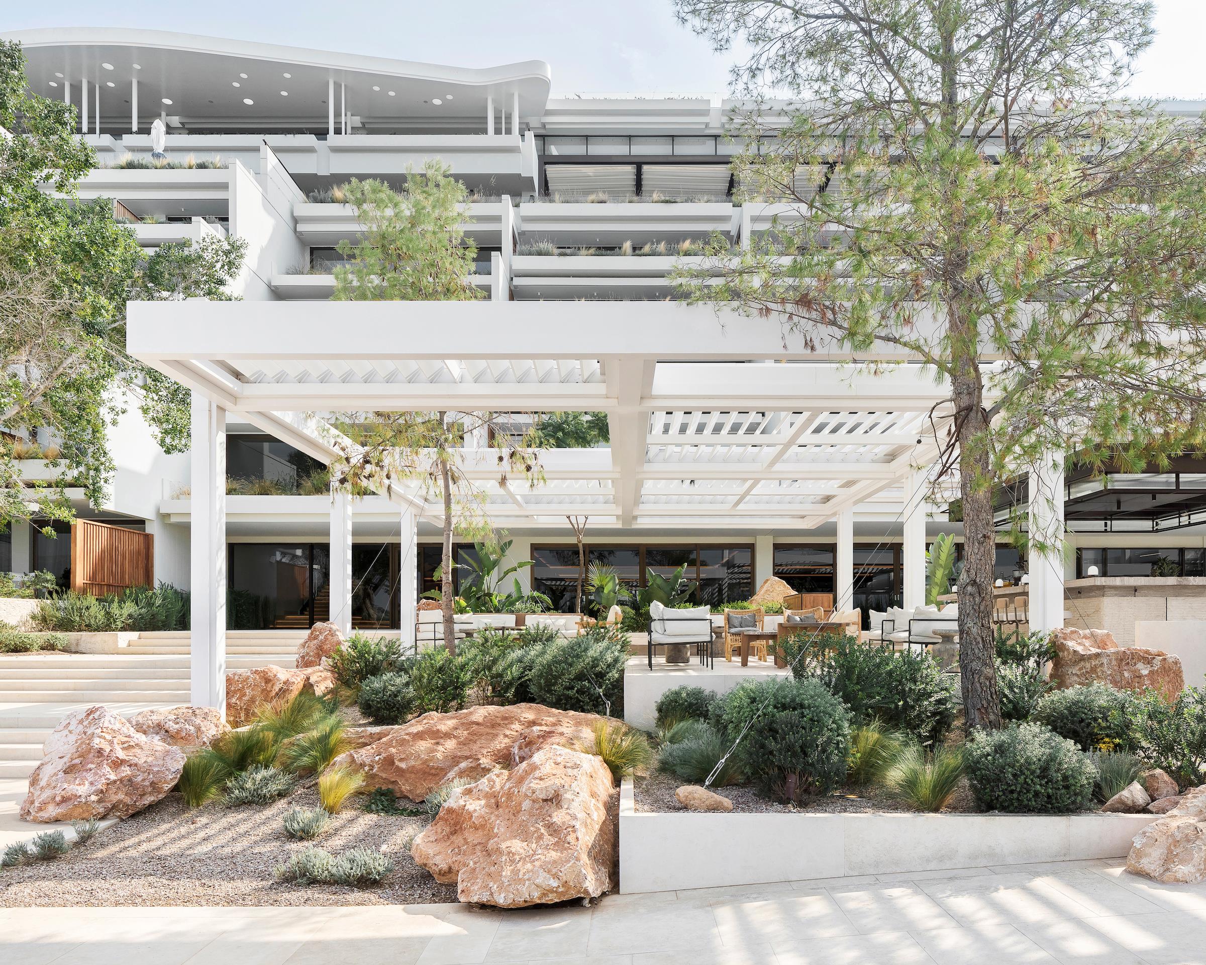
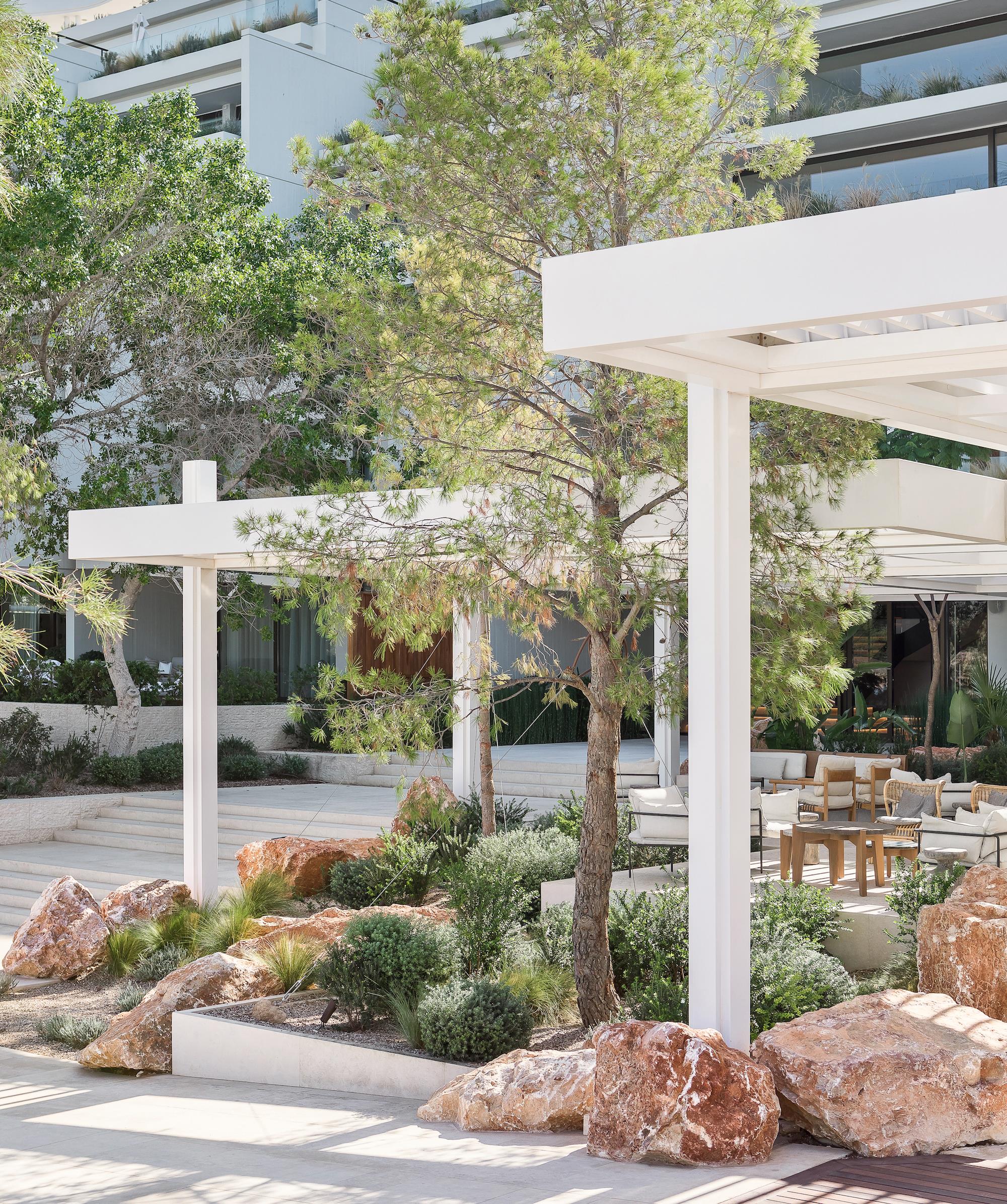
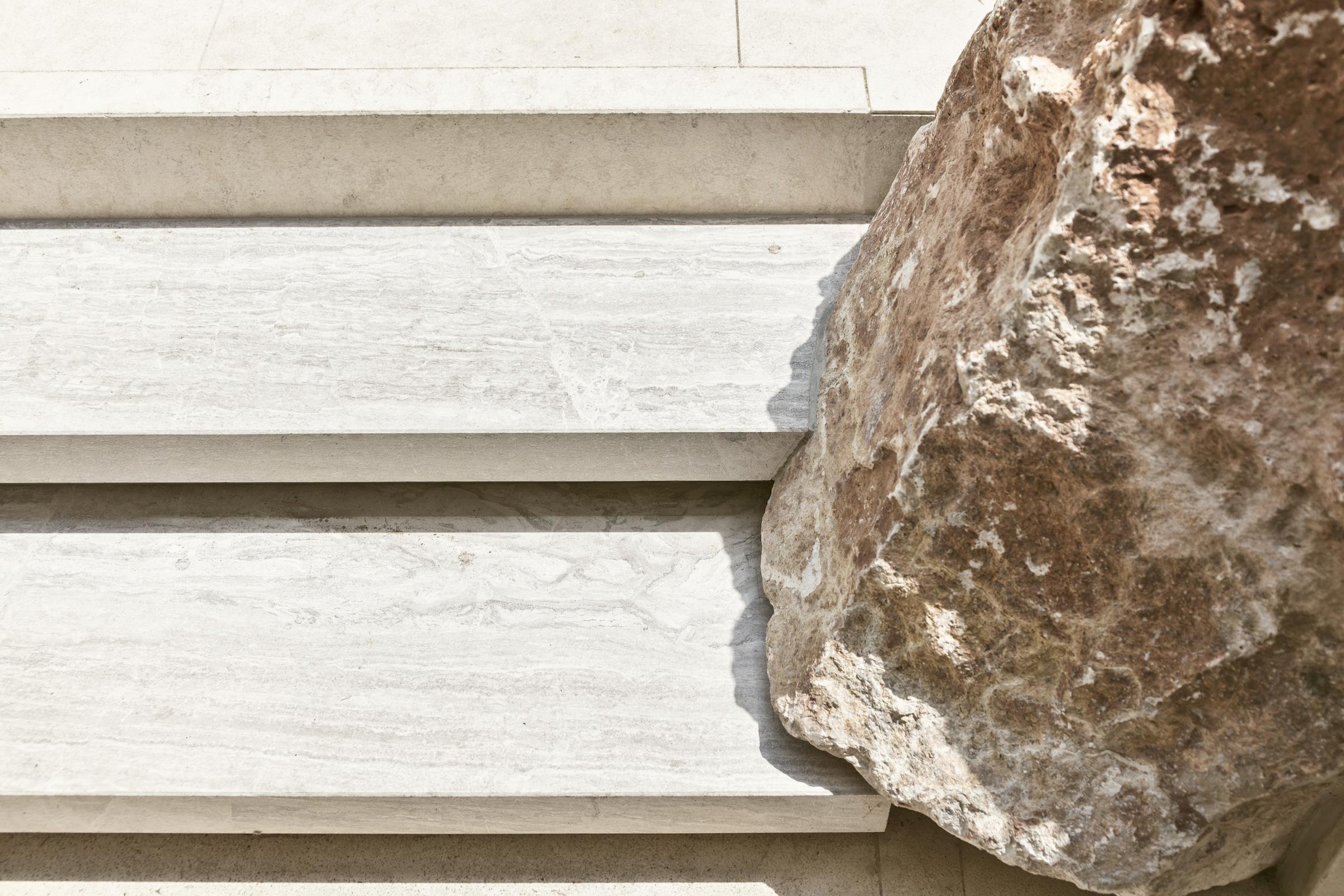
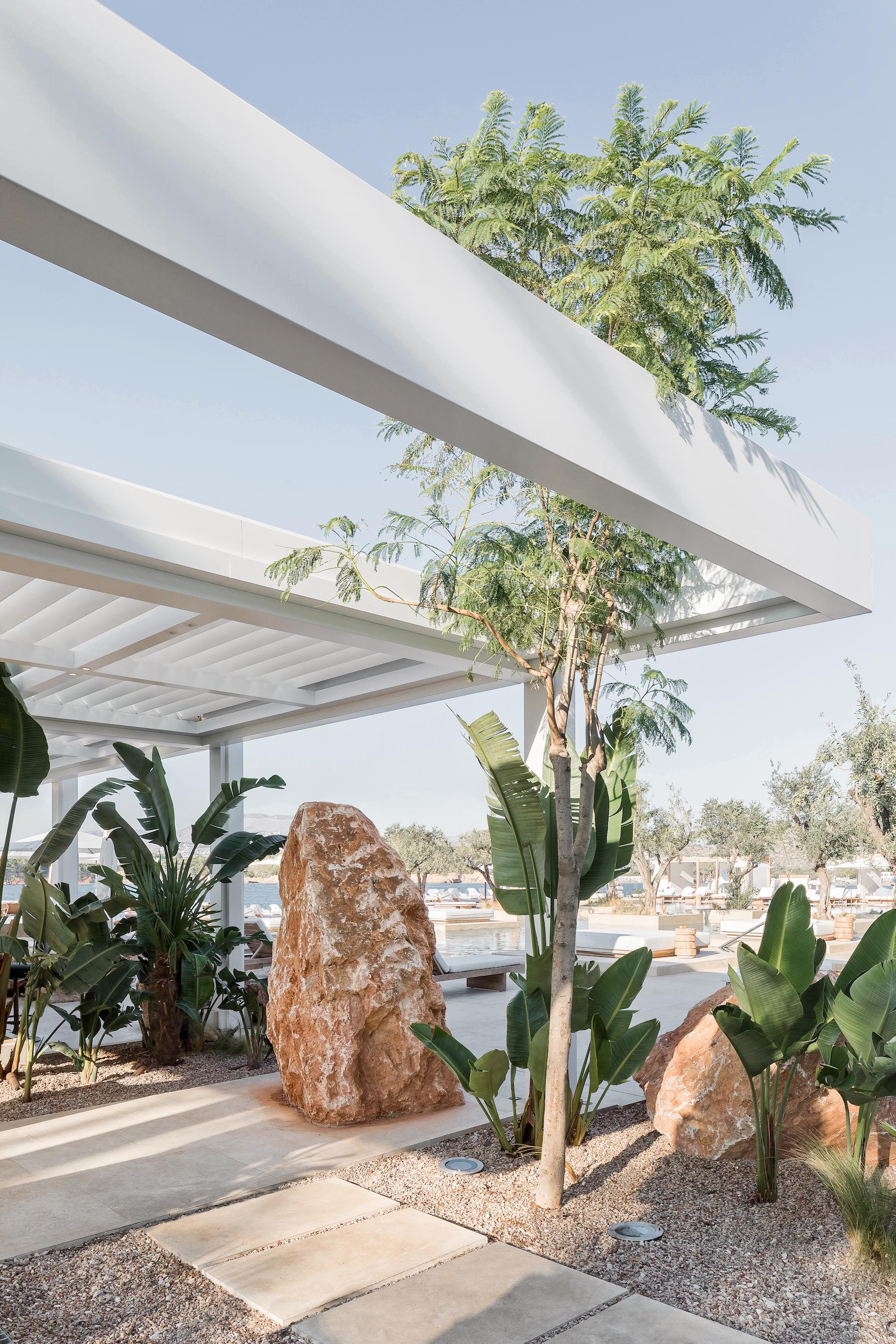
▼场地周围散布的原始粗糙感的红棕色置石,非常的引人注目 The reddish brown stones scattered around the site are very striking
▼置石和植物营造保留了当地的风貌 Stones and plants preserved the local style
▼具有非常强的视觉冲击力 It has a very strong visual impact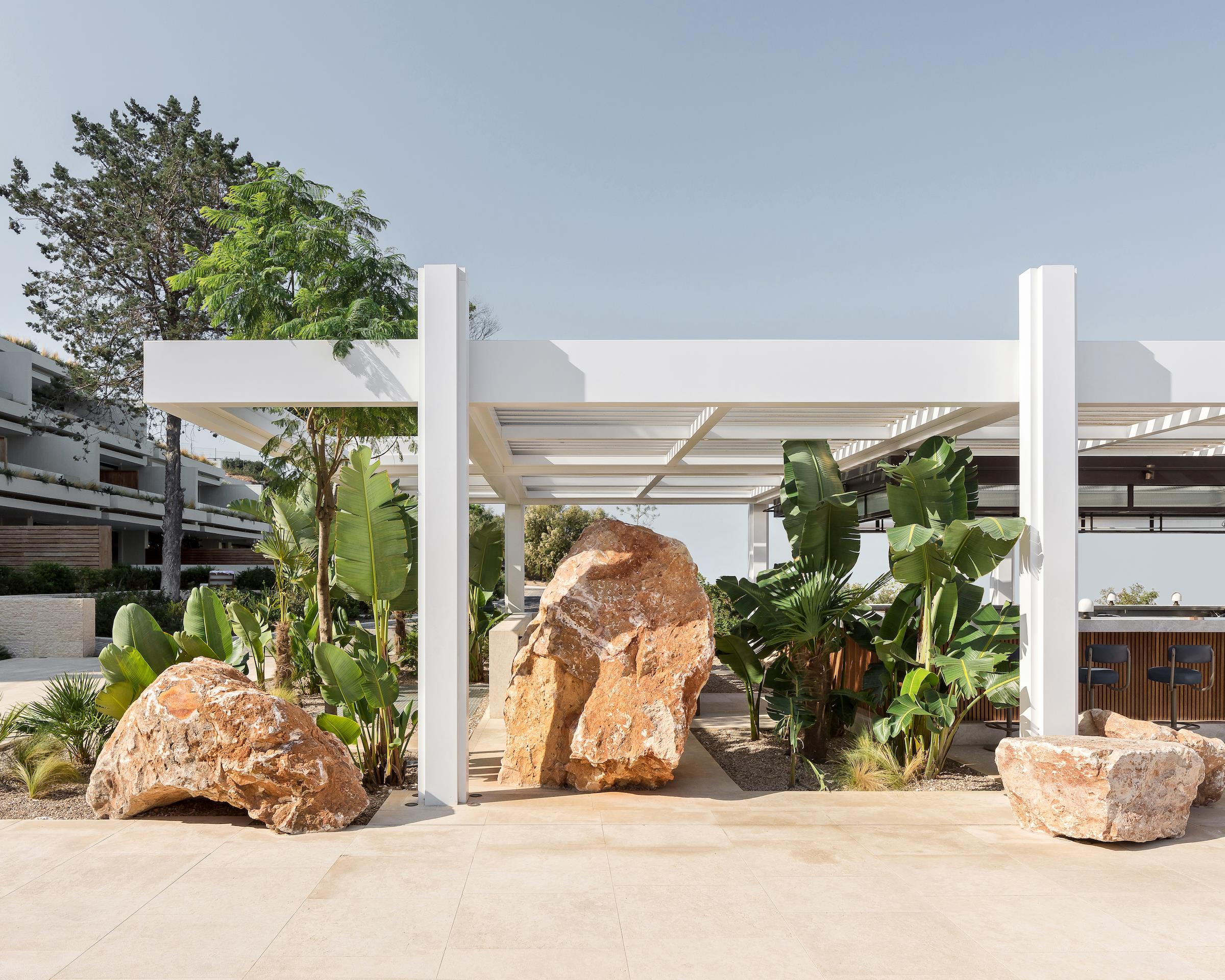
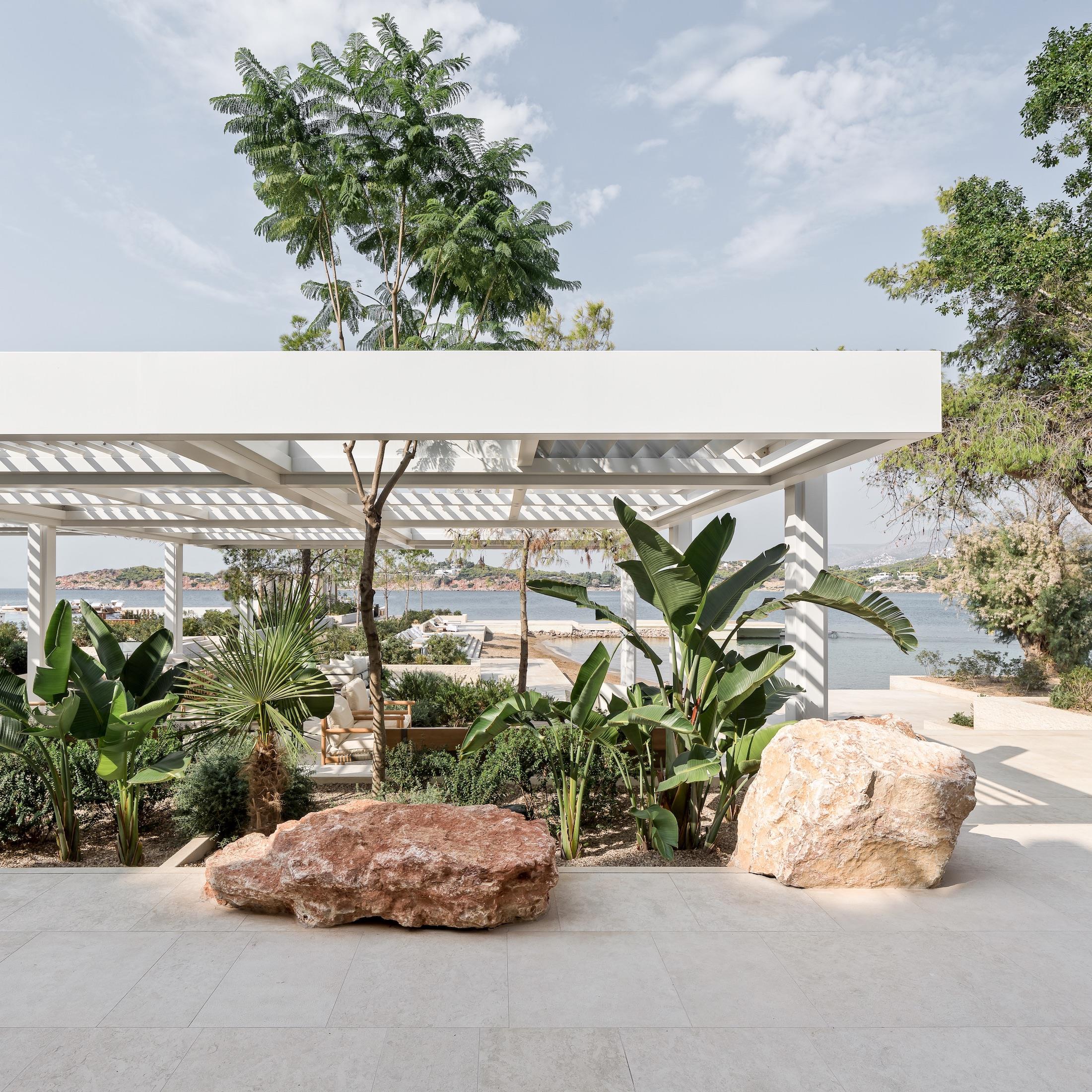
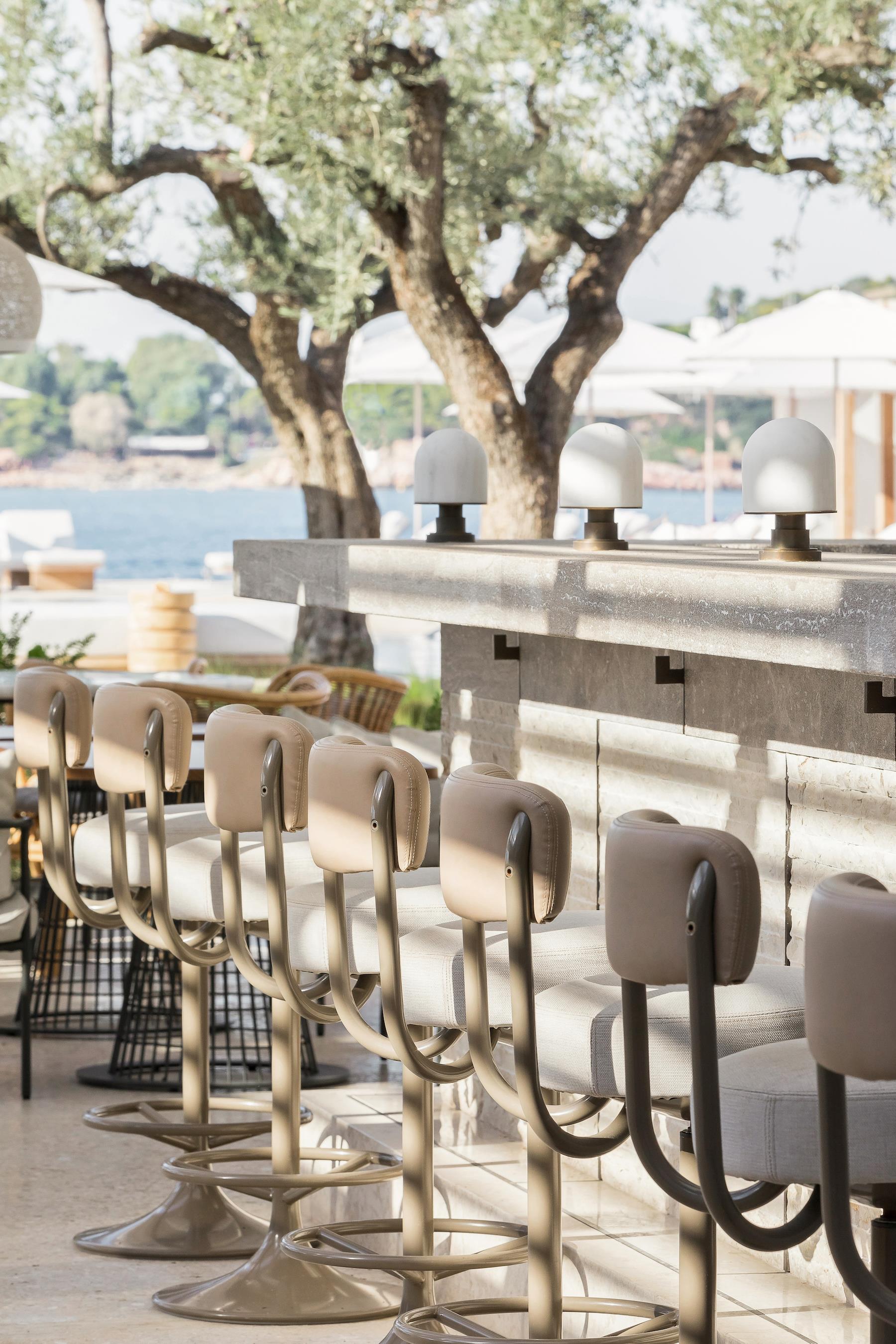
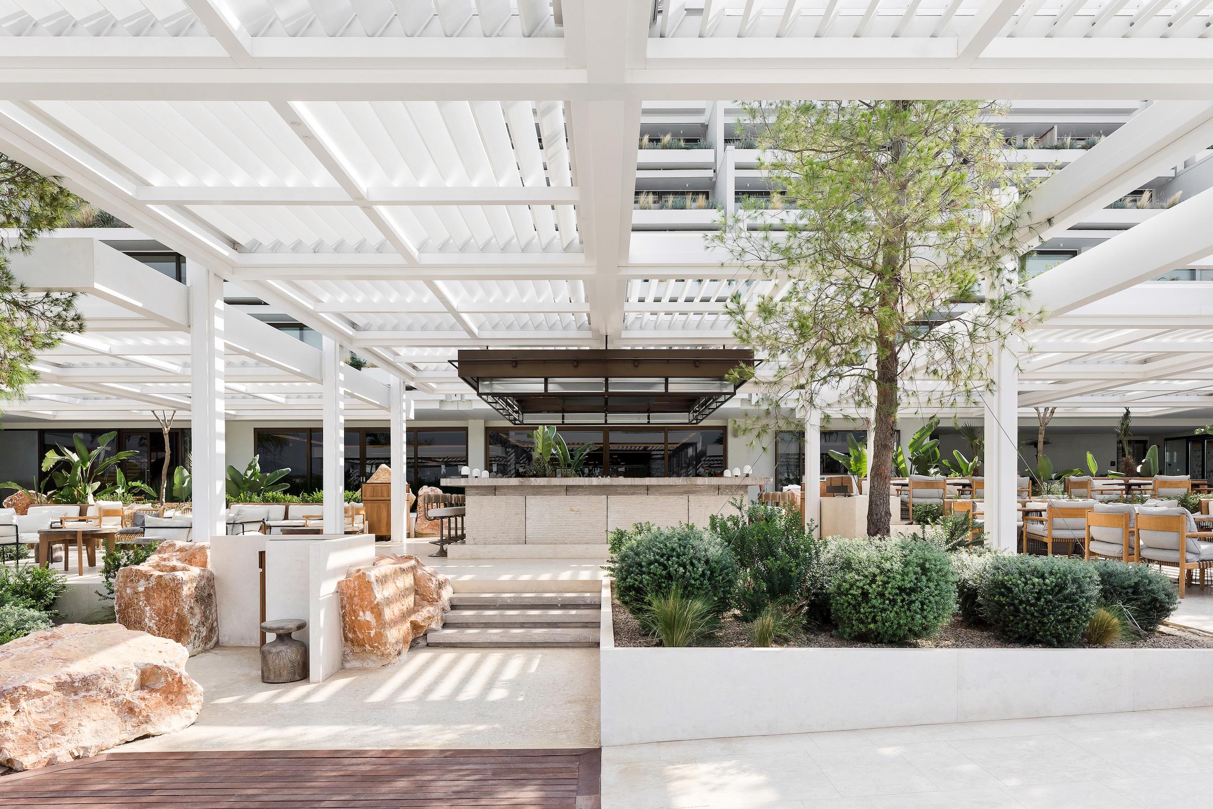
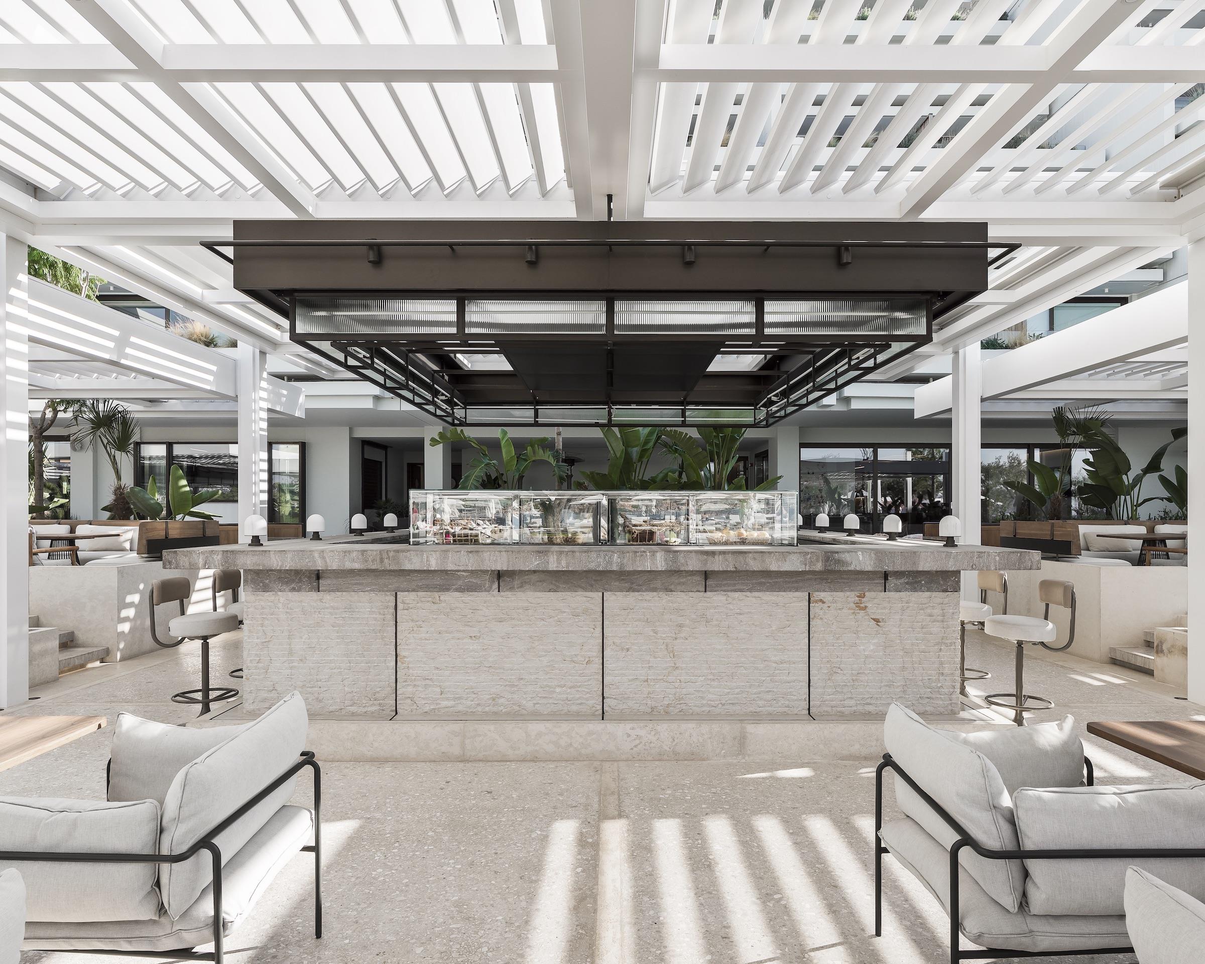
我们建立了两个核心场所:一个餐吧和一个饮料吧。这两个特色节点各有不同类型的座位,座位之间也各有自由流动的循环流线和视觉连接,巧妙地体现出了四季酒店品牌标志性的食物和饮料的艺术呈现。
We established two cores: a food bar and a drinks bar. These two attraction points have different types of seating either side of them and a free-flowing circulation and visual connection between them, showcasing the artful creation and presentation of food and drink that is a signature of the Four Seasons brand.
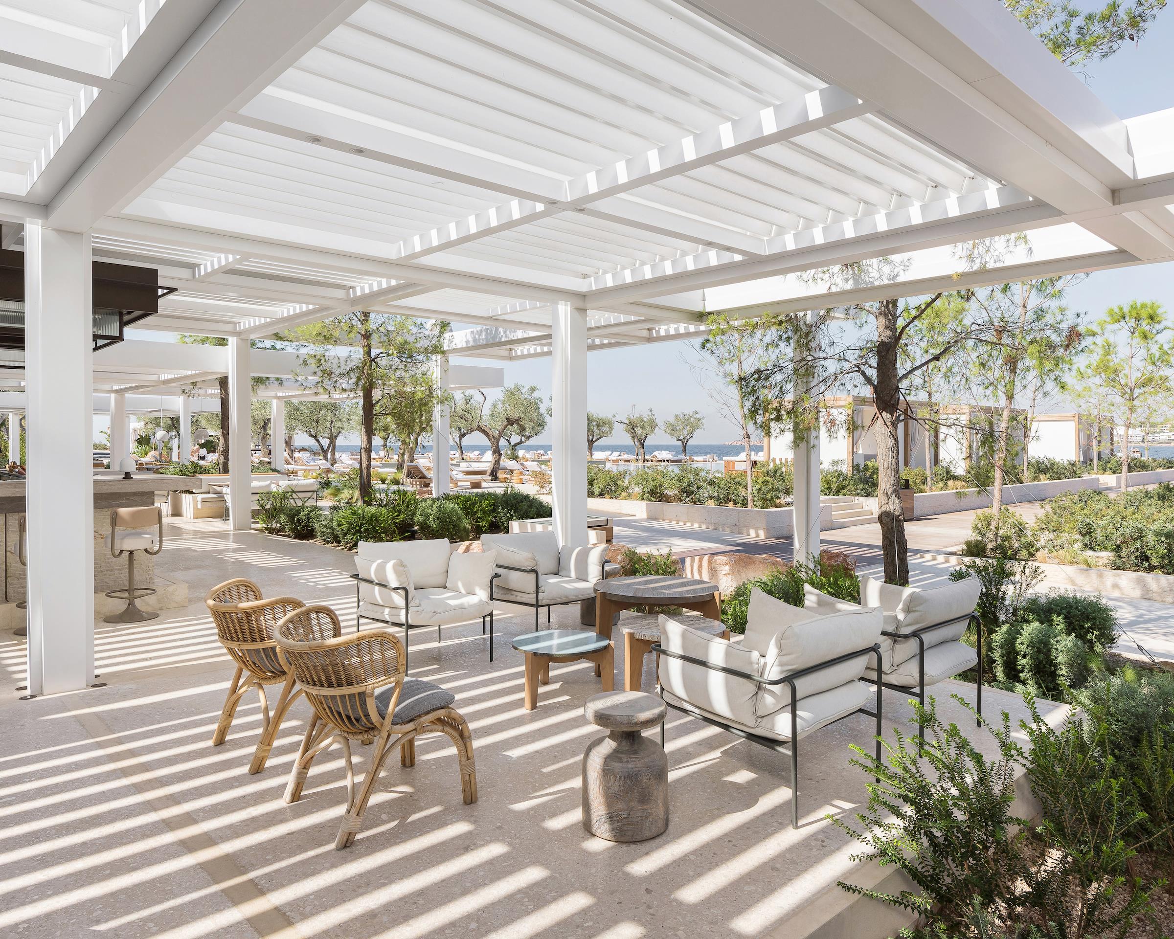
▼廊架下的空间充满了光影和律动 The space under the corridor is full of light and shadow
▼被植物包裹的散座区 Surrounded by plants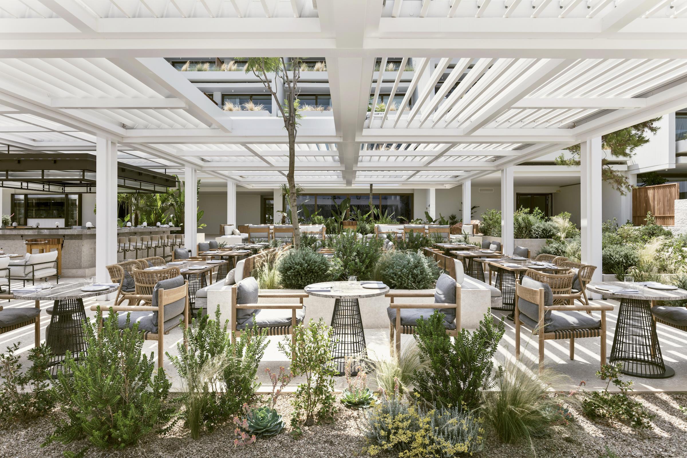

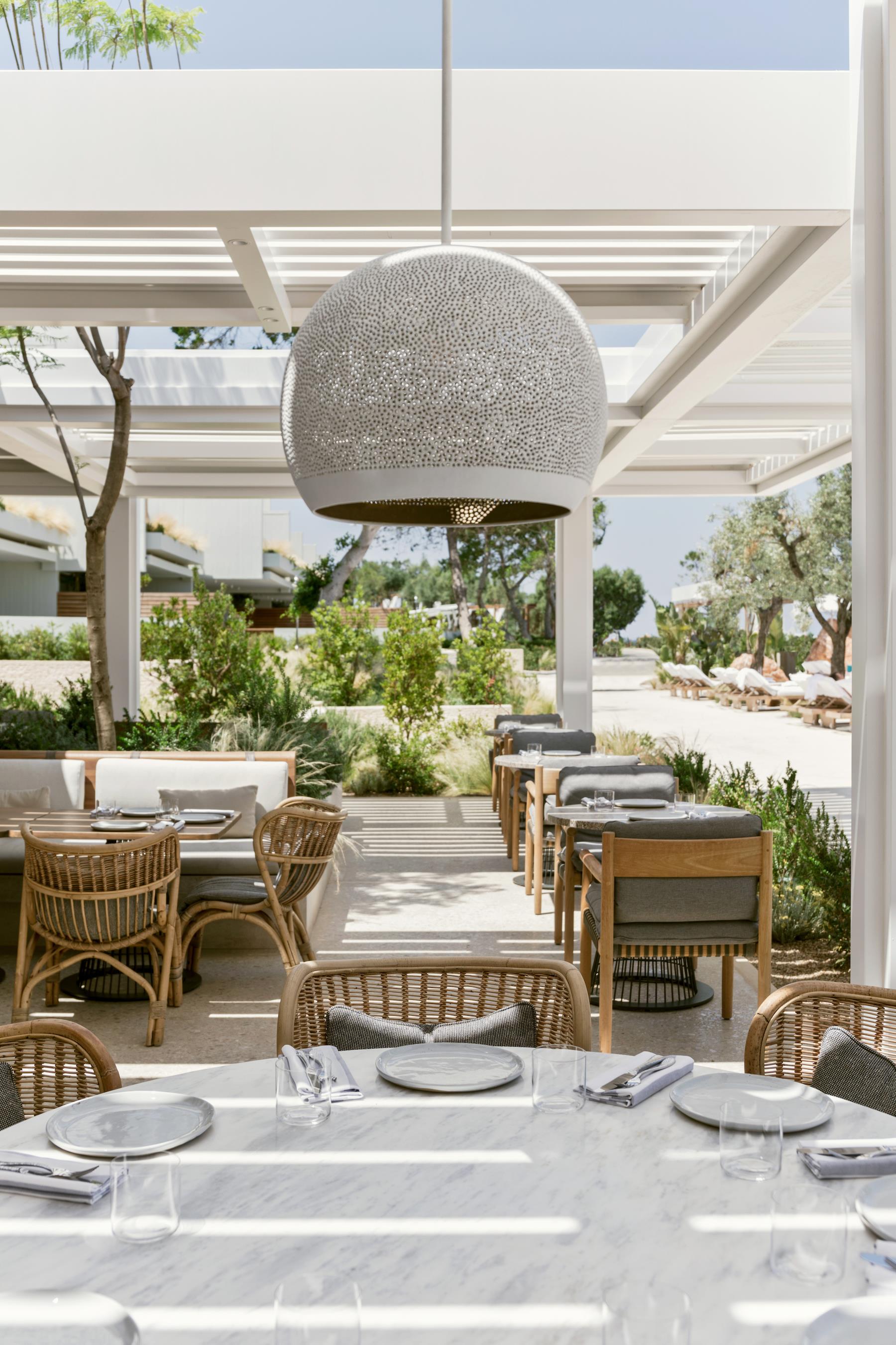
▼凉棚下的中心吧台区 Central bar area under the shed
▼鸡尾酒吧及其周围的休息区 Cocktail bar and surrounding rest area
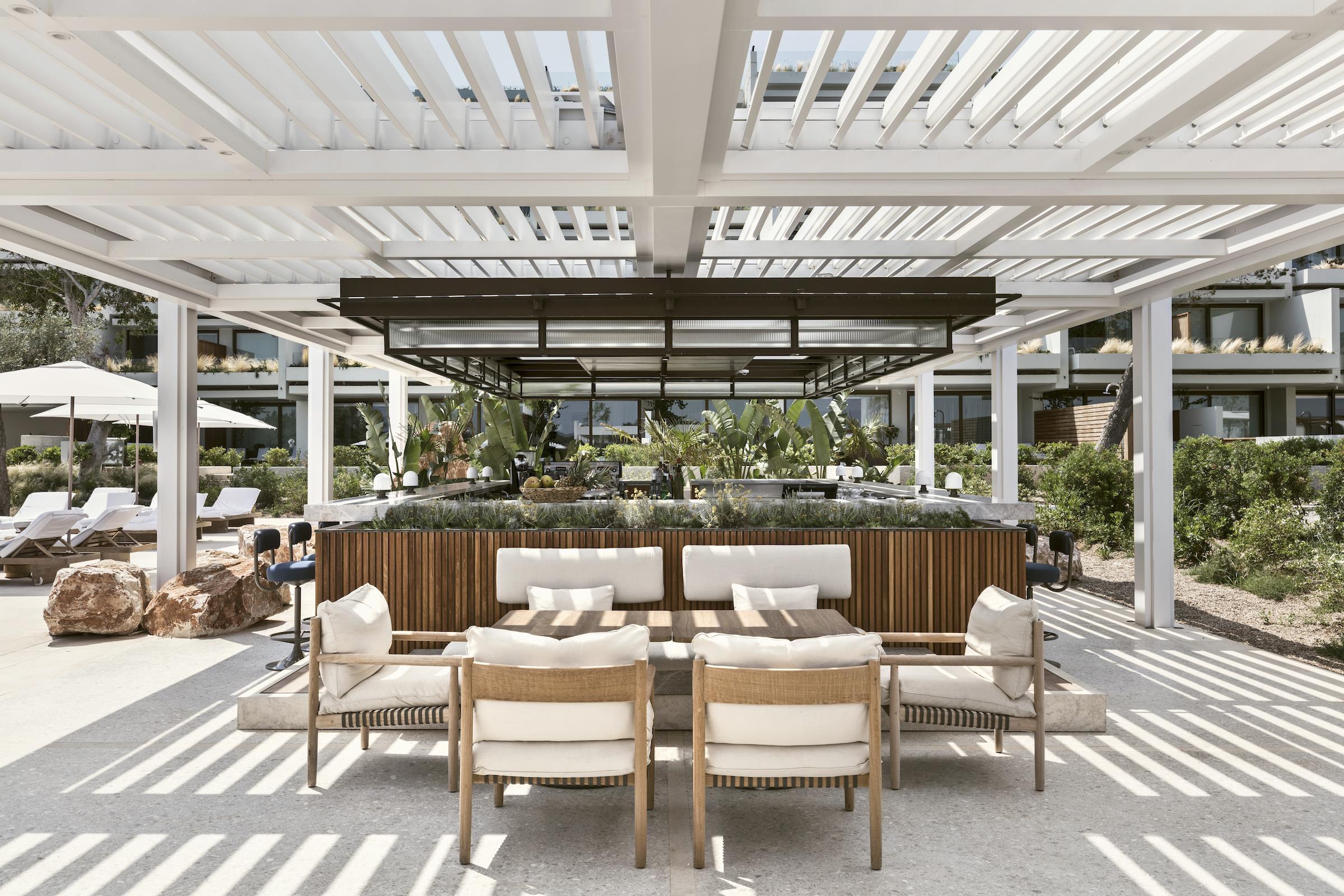
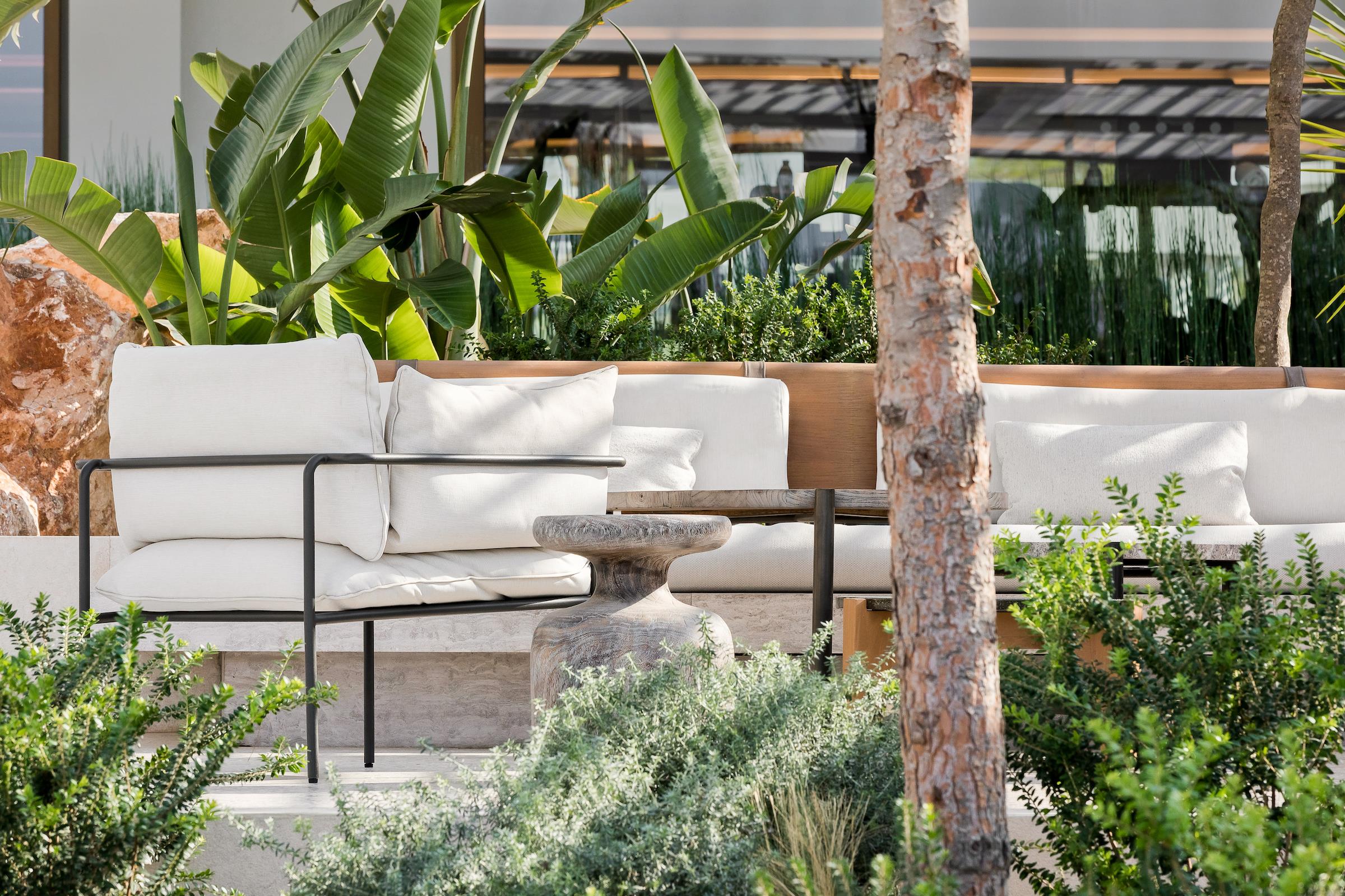
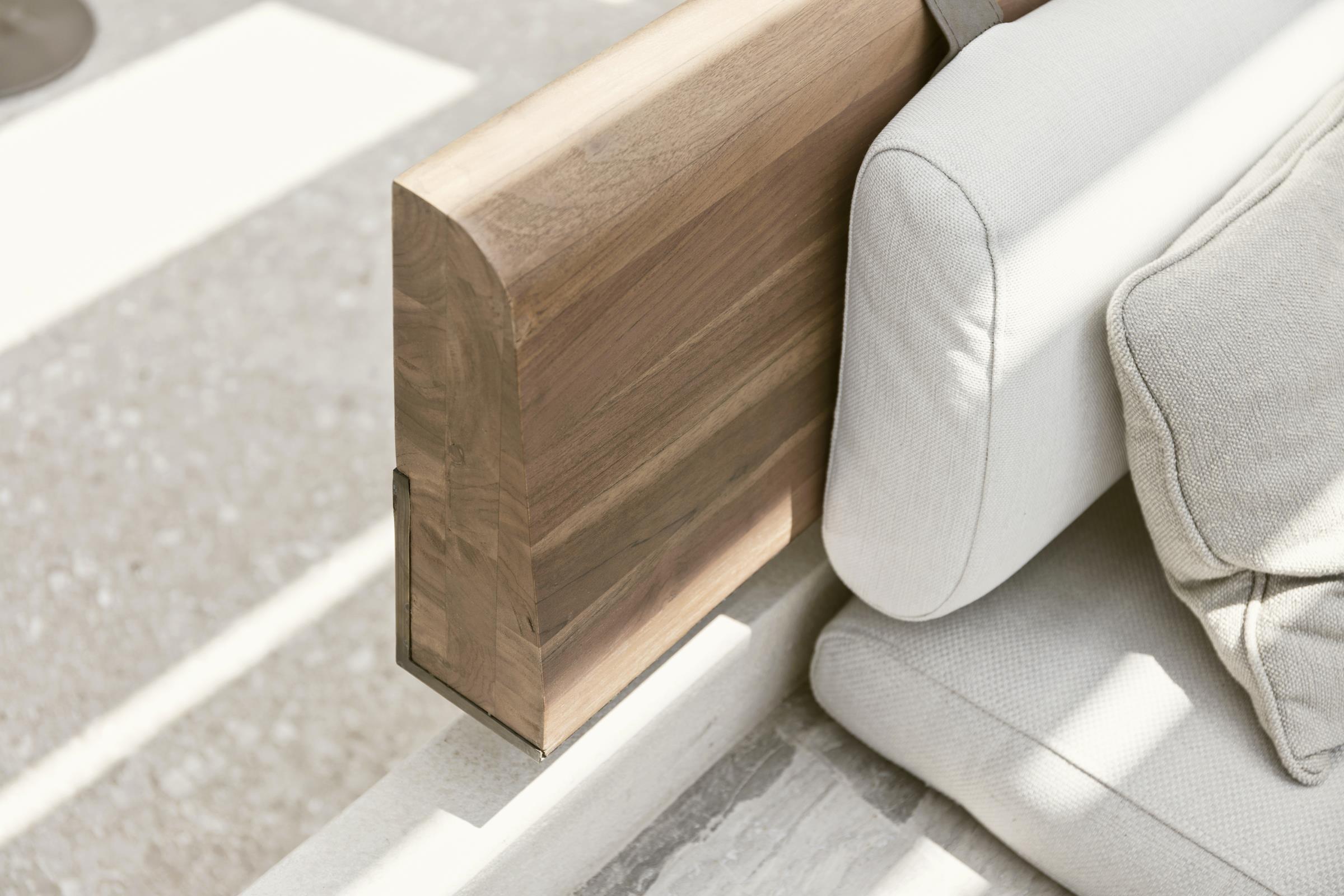
餐厅地面铺装将藤架划分成了两个区域,根据不同的高度分隔出了更小的空间以保证了开放空间的舒适性。简言之,藤架在连接空间的同时,地面铺装又隐形地将空间分隔开。藤架上悬挂的曼帘在区域之间创造了边界感,为空间增加了有趣的动感和舒适的隐秘感。而在鸡尾酒吧及其周围的休息区,地面铺装形式被打破一直延伸到前面的海滩上,形成了带火坑的小型休闲座位区域,供更休闲的聚会使用。我们还采取了额外的措施来整合现有的树木和岩层,从而使建筑更好地融入场地。人们仿佛感受到了建筑与廊架“合而为一”。
The floor divides the grid of the pergolas in half, creating smaller areas at varying heights to allow for cosiness within the openness. So whilst the pergola connects space, the floor separates it. A sequence of hanging curtains creates an ephemeral boundary between the zones, adds playful animation to the spaces and a soft sense of privacy. At the cocktail bar and its surrounding lounge area, the floor breaks up and spills out onto the beach in front, creating small areas of laid-back seating with fire pits, for even more casual gatherings. Extra care has been taken to incorporate the existing trees and rock formations thus integrating the building well into the site. The pergola is woven around and between them and allows them to push up through it in ‘stitching moments’.
项目延续了邻近建筑的设计、特色和气质,将形式主义的建筑延伸到一个充满了阳光和动感且更加具象的空间,形成了一个整体优雅的白色结构。
The overall impression is of an elegant white structure that celebrates the design, character and ethos of the adjacent building, extending its formalistic architecture into a more diagrammatic space, filled with light and movement.
项目名称:海洛斯餐厅
地点:希腊雅典武里亚格米尼,四季皇宫海滨度假胜地
状态:2019建成
面积:酒馆1700平方米,太阳神餐厅710平方米,太阳神酒吧410平方米
Name: Helios Restaurant
Location: Astir Palace, Vouliagmeni Athens
Status: Completed 2019
Area (m²): 1700m2 Taverna, 710m2 Helios restaurant, 410m2 Helios bar
设计团队 Design Team
K-Studio设计团队/K-Studio Design Team: Giorgos Mitrogiorgis, Alexis Chortogiannis,Christos Spetseris, Vassilis Eleftheriadis, Dimitra Pavlakou,Nantia Karampini, Eleni Aroni, Meni Gentimi, Thodoris Kantarelis, Stavros Kotsikas, Lila Simou
效果图/3D Visualisation: K-Studio
测量员/Surveyor: Topoanalysis
规划顾问/Planning Consultant: Periklis Konstantinidis / AETER
结构工程/Structural Engineer: Helliniki Meletitiki
机械工程/Mechanical Engineer: LDK Consultants Nektarios Kampanos, Spyros Kostopoulos, Themistoklis Alexakis
照明设计/Lighting Designer: LDG
声学顾问/Sound Consultant: Timagenis
景观设计/Landscape Architecture: doxiadis+ (Thomas Doxiadis, Aggeliki Mathiudaki)
厨房顾问/Kitchen Consultant: Humble Arnold Associated
承包商 Contractors
主要承包商/Main Contactor: AKTOR
金属制品/Metal works: Georgios Mitras
供应商 Suppliers
椅凳/Chairs and Stools: Mia Collection
织物/Fibres: Caneplex
厨房/Kitchen: Xenex
摄影师/Photographer: Peter Landers, Yiorgos Kordakis
更多 Read more about: K-Studio
















0 Comments