本文由 Red5studio 授权mooool发表,欢迎转发,禁止以mooool编辑版本转载。
Thanks Red5studio for authorizing the publication of the project on mooool, Text description provided by Red5studio.
Red5studio:每个人都经历过几次逃课,“我们”经常聚集的空间——网球场、更衣室、游泳池等要素是建筑的设计灵感来源。项目所处地区有许多大学,热闹欢快的气氛是这里的一大特色,Libe旗舰店也由此诞生。
Red5studio:Everyone has a few times skipping class. The spaces where “we” often gather – tennis courts, locker rooms, swimming pools, etc… are the construction’s design inspiration. The bustling, cheerful atmosphere is a characteristic feature of this project’s location – the area has many universities. Because of that special feature, the Libe ‘Flagship store was born.
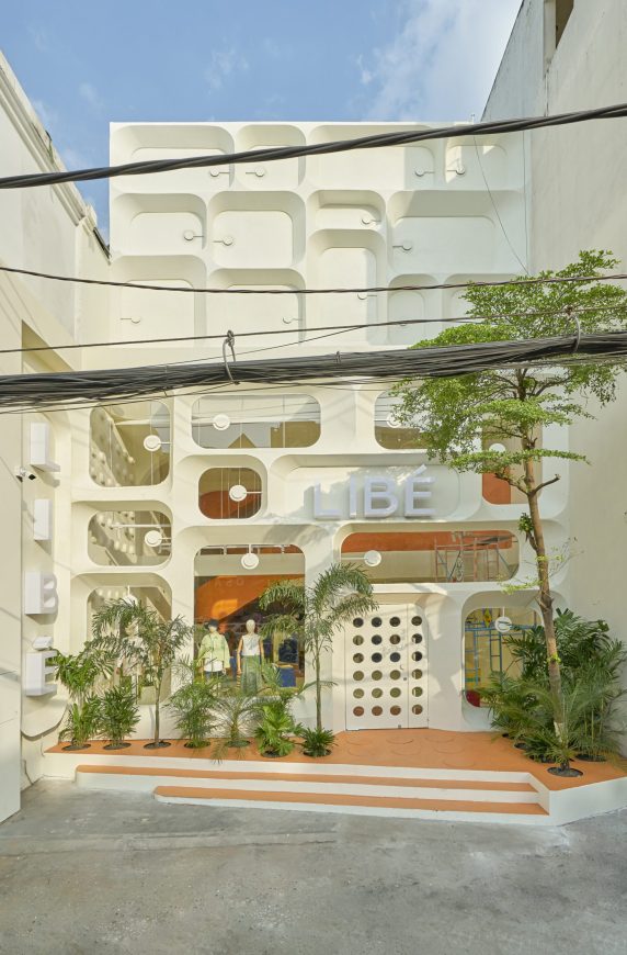
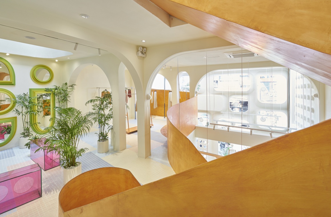
由于“Libe 品牌”面向年轻群体,设计方希望旗舰店呈现出年轻而充满活力的效果。在复古的色彩背景上结合颜色、线条、形状,在空间中创造乐趣,提升产品的价值。
We want to aim at the dynamic and youthful as the ‘Libe brand’ is giving young people. Combining colors, lines, shapes on a retro color background creates fun in the space and enhances the product’s value.
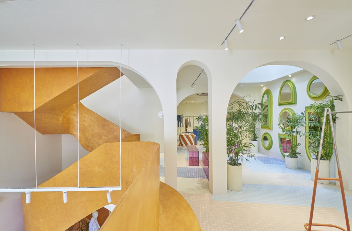
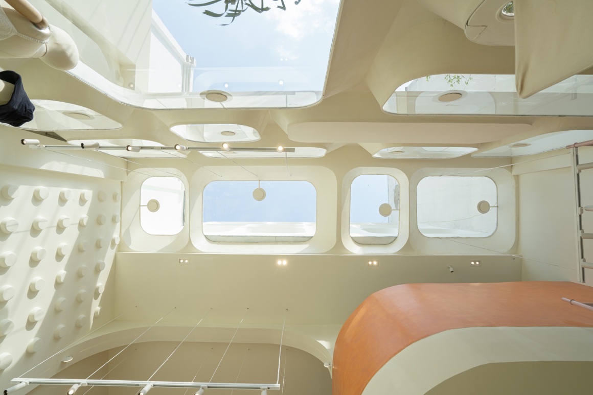
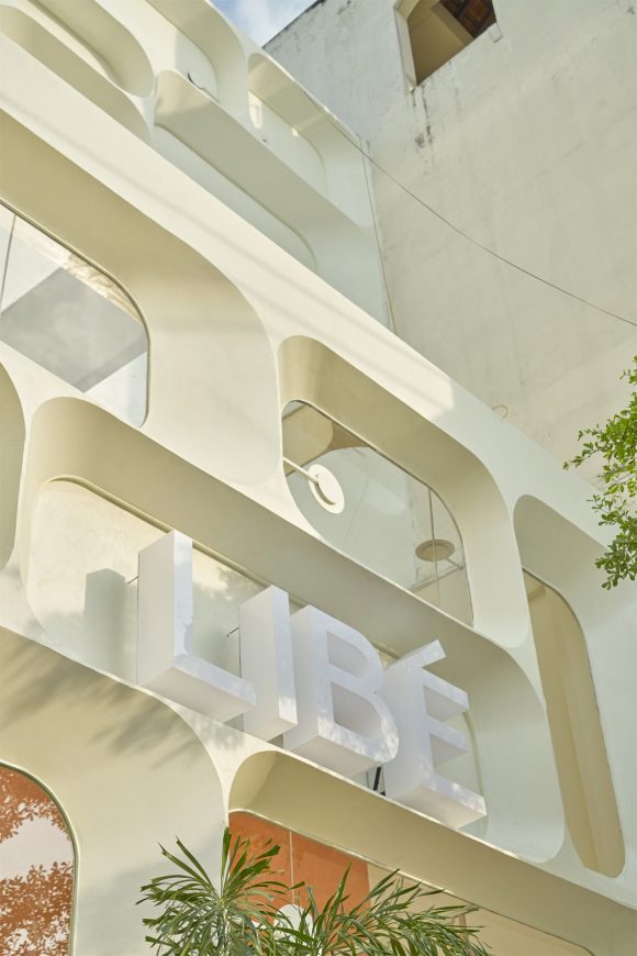
建筑的立面灵感源于由闪光涂料覆层的红色柱形钢所制成的复古立方体。
Our construction’s facade is inspired by retro cubes made of red post-shaped steel covered with an effect paint.

▽复古立方体 Retro cubes

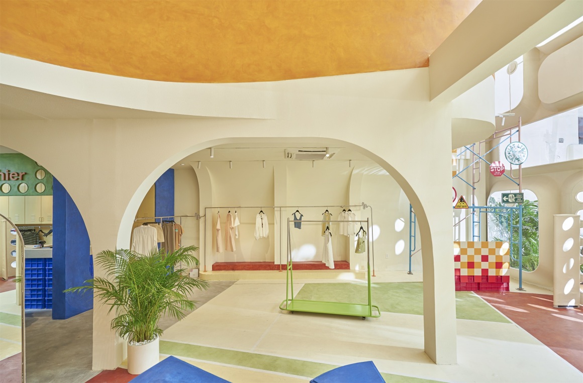
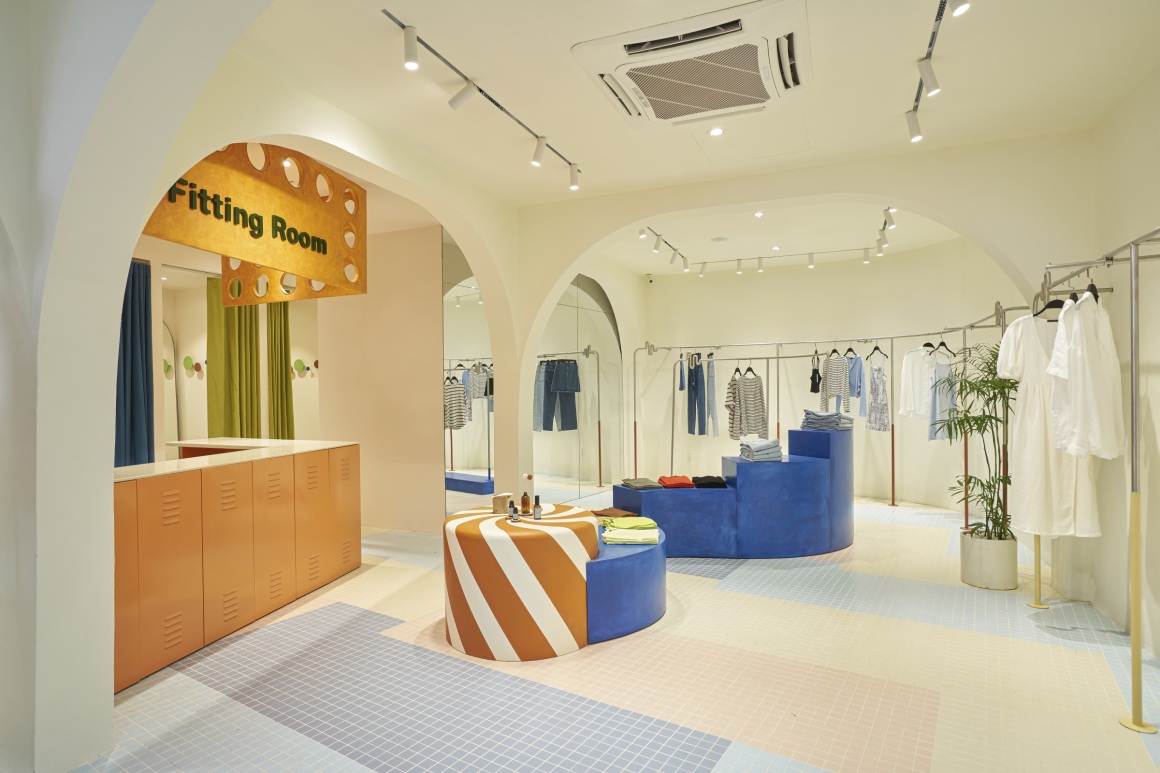
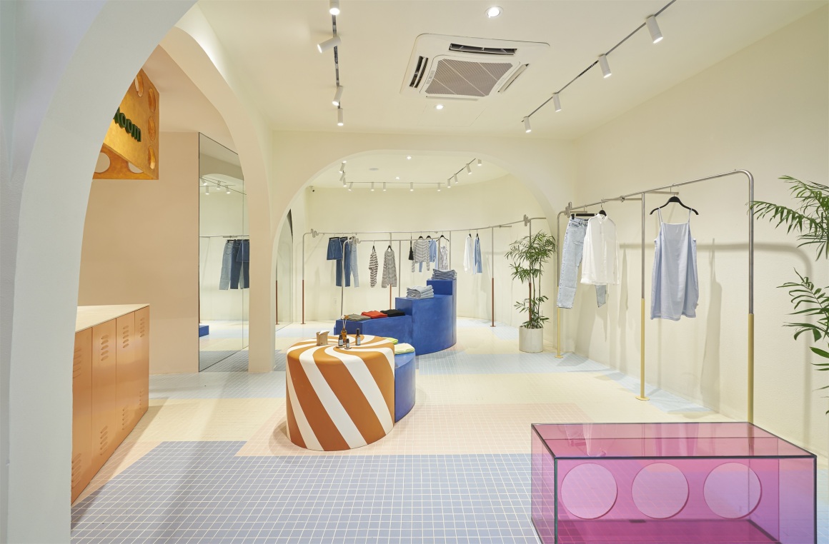
进入建筑,设计师想用多样化的色彩来改变Libe品牌固有的形象,用色彩来分割网球场风格的地板。
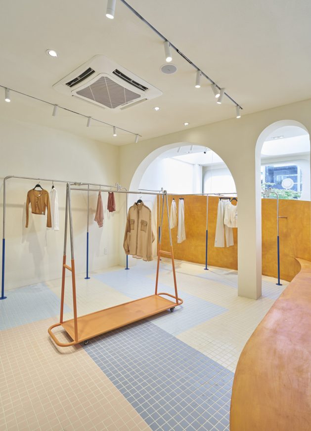
Coming into the construction, we want to change the familiar Libe brand’s look with colorful colors; the tennis court-inspired floor is cut out of color.
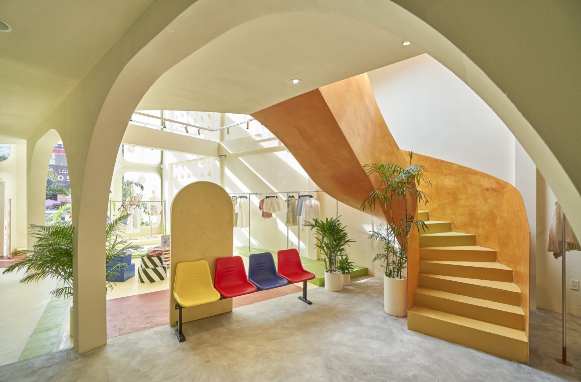
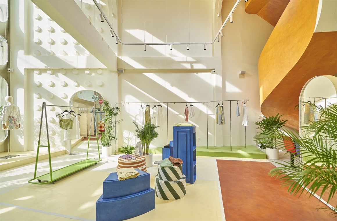
沿着墙壁摆放的固定晾衣架衬以灰白色背景来突出产品,除此之外,可移动晾衣架的设计灵感源于运动领域的产品。
The hanging furniture system along the walls is placed on an off-white color background to highlight the product. Our mobile hanging design is inspired by products containing tools in the sports field in addition to the fixed suspension system.
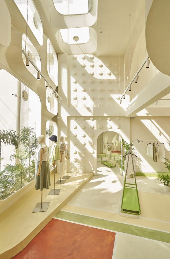
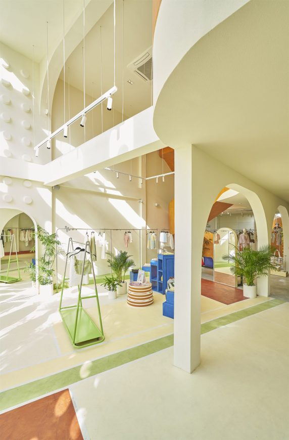
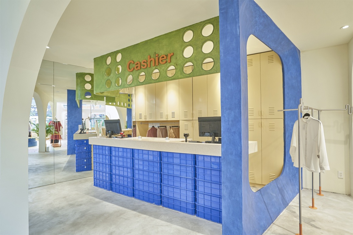
进入收银区,映入眼帘的是一个装有塑料箱和储物柜的货仓。
Entering the cashier area, the image we borrowed was a warehouse with plastic containers and storage cabinets.
▽收银区 Cashier area
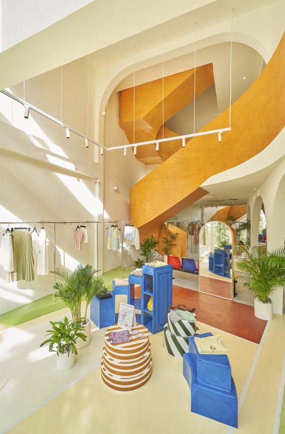
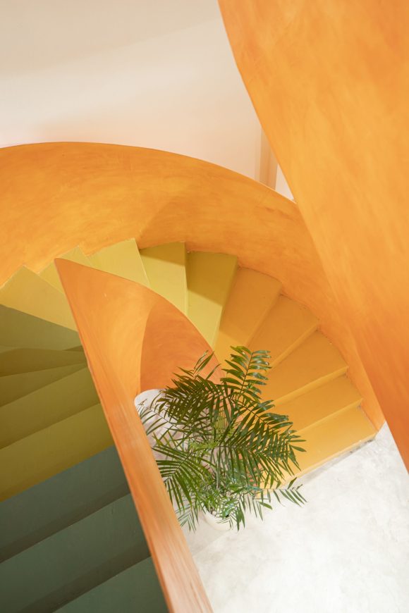
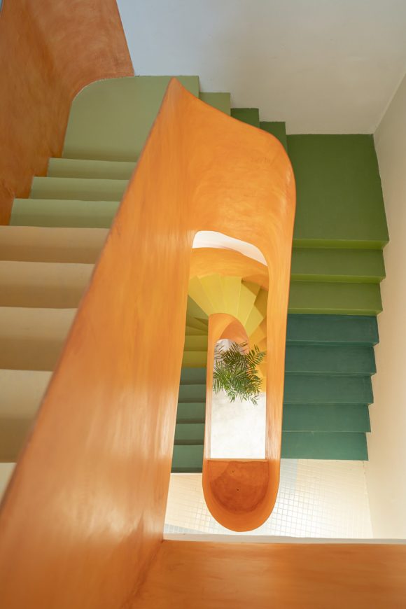
一楼与二楼以一段橙色的楼梯连接,以展现空间整体的青春活力,楼梯间通过阶梯的色彩体系营造出兴奋感。
The ground floor’s connecting point and the floor is a strip of stairs emphasized in orange to show the youthfulness leading in space, inside the staircase creating excitement by the color system moving along the stairs.
▽橙色楼梯 Orange stairs
在楼上,设计师用马赛克地砖来凸显快乐感,其灵感源于游泳池和茂密植被所带来的感觉。
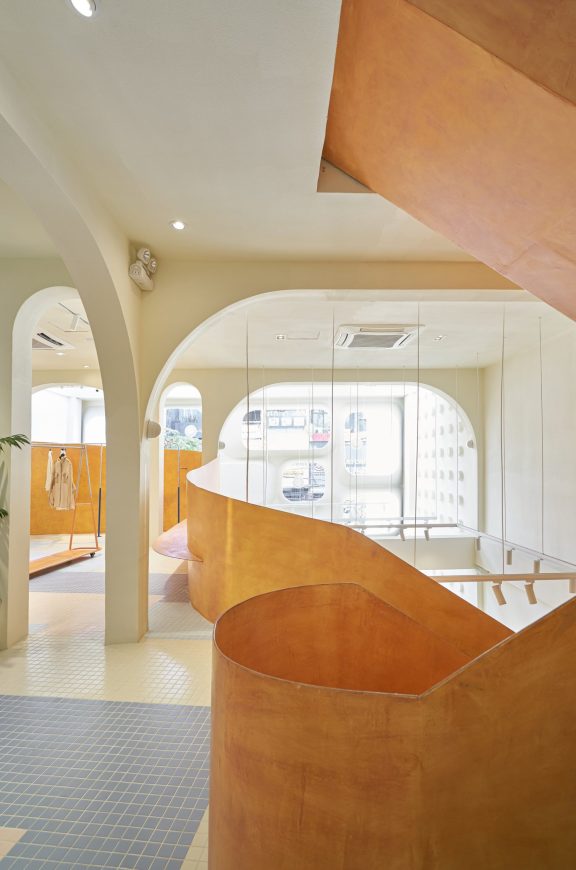
Upstairs we want to emphasize the joyfulness with mosaic floor tiles inspired by the feeling in a swimming pool and lush greenery.
▽马赛克地砖 Mosaic floor tiles
试衣间带有储物柜——因为这是人们存放物品和改造自己的地方,打开梳妆台就会变成一个派对女孩……
The fitting part is a locker – because that’s where people store their belongings and transform themselves, opening up the dresser a bit is turning into a party girl …
▽试衣间 The fitting part

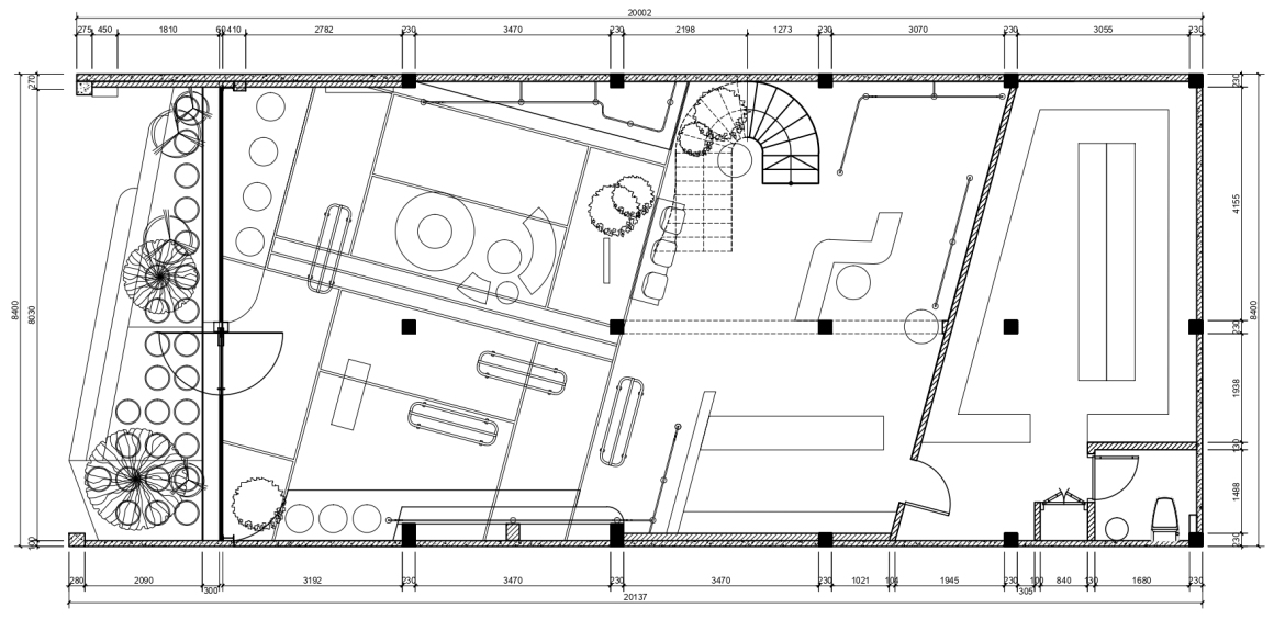
▽平面图 Plan

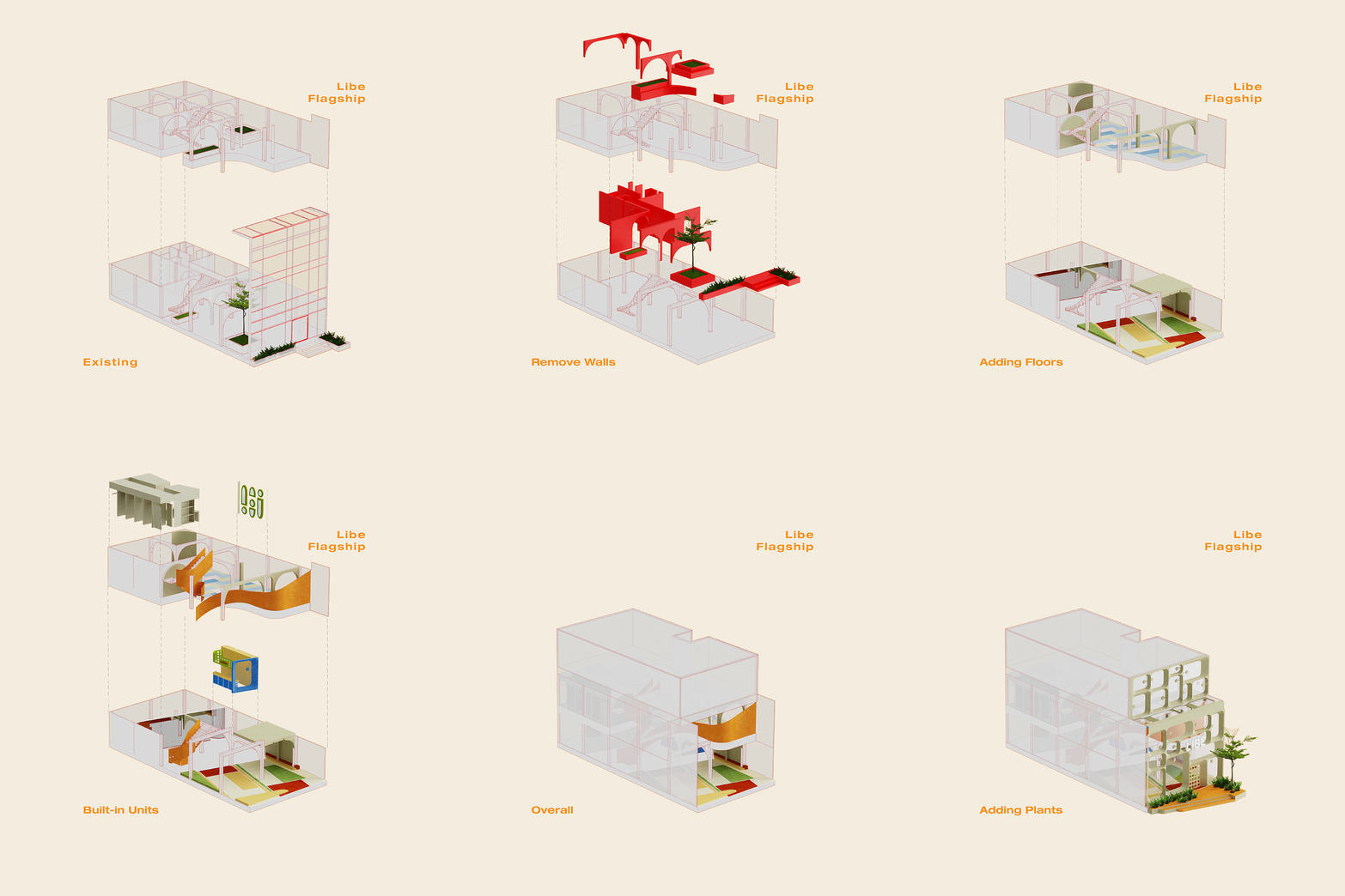
▽内部结构轴侧示意图 Diagram of internal structure
设计:Red5
建筑:Red5 + Ben Decor
客户:Libe ‘
合作伙伴:Ben Decor, Jati Tile, Light Art
面积:243平方米
地点:越南,胡志明市,平赞区,阮特里114号
图片来源:Do Sy
Design: Red5
Construction: Red5 + Ben Decor
Client: Libe ‘
Partner: Ben Decor, Jati Tile, Light Art
Area: 243m2
Location: 114 Nguyen Gia Tri, Binh Thanh District, Ho Chi Minh city
Photo: Do Sy
“ 大胆的色彩运用激发了建筑整体的年轻活力。”
审稿编辑: gentlebeats
更多 Read more about: Red5studio


0 Comments