
本文由 图石设计 授权mooool发表,欢迎转发,禁止以mooool编辑版本转载。
Thanks ToThree for authorizing the publication of the project on mooool, Text description provided by ToThree.
图石设计:水上行进的公园
仙踪公园位于成都麓湖最南端,是一处以手划船为主要活动方式的水上公园。狭长的水面、穿越林间的视线与蜿蜒的航道共同构成了这一独特的场域氛围:人不再只是观者,而成为风与水交融的一部分。
ToThree: A Water Park in Motion
Located at the southern edge of Luxelakes in Chengdu, Fairyland Park is a water park centered around hand-powered boating. Its elongated water surface, winding channels, and forest-framed views create a distinctive spatial atmosphere in which visitors become participants in the movement of wind and water.


双线交错的航道与星罗棋布的岛链,为划行赋予了探索的趣味。划行动线宛如一段徐徐展开的旅程,为环境视觉设计提供了天然的叙事骨架——让每一次划行,都成为通往远方的故事。
Interwoven waterways and scattered island chains introduce a sense of exploration. The paddling route unfolds like a journey, forming a natural narrative framework for the park’s environmental visual system—transforming each voyage into a story about heading toward the unknown.
▽成都麓湖全景 ©WANHUA GROUP

▽双线交错的航道与星罗棋布的岛链,为划行赋予了探索的趣味 ©WTD GROUP

“仙踪”:一次关于远方的命名
项目以“仙踪”为名,并不指向一个具体地点,而是一种关于迷幻感与奇境的描述。结合水上运动的特性,我们将设计关键词归纳为六个:奇幻、自由、冒险、欢乐、探索、远方。奇幻,是公园的主题;自由,是水上运动的呼吸;冒险,是桨叶切开波纹时的犹豫;欢乐,是身体在水面滑行的直觉;探索,是林间穿梭的好奇;远方,是这一切的终点。由此,我们希望环境视觉设计不止回答“去哪里”,更能唤起“为何出发”的情绪——以“Sail Away”作为启航语,展开一次关于超现实划行的体验构建。
Naming a Sense of Distance
The name “Fairyland” does not refer to a specific place but evokes an atmosphere of enchantment and discovery. In response to the character of water-based movement, the design concept is distilled into six key ideas: fantasy, freedom, adventure, joy, exploration, and distance. Fantasy frames the park’s theme. Freedom reflects the rhythm of movement on water. Adventure appears when paddles cut through ripples. Joy emerges from the instinctive pleasure of gliding. Exploration grows while weaving through the forest. Distance becomes the horizon toward which the journey points. Rather than only answering “where to go,” the visual system also suggests “why to depart.” The phrase “Sail Away” becomes the symbolic call to begin the voyage.

进入仙踪:导示作为“入口仪式”
园区入口处的“仙踪公园”字样由白色的圆柱折弯成型,呈现了信息在三维空间中的流动与交织,营造出一种轻松俏皮的环境氛围。
Wayfinding as Threshold
At the park entrance, the words “Fairyland Park” are formed from bent white cylindrical rods, creating flowing letterforms that appear to weave through space and establish a playful environmental tone.


航道入口的桥体上,我们设计了一道有仙踪公园标识形象的悬挂帘幕。穿过这道挂帘,仿佛进入了一个不同的世界——如《绿野仙踪》与《爱丽丝梦游仙境》那般奇幻之地,导示在此不再只是信息传递,而成为一种仪式性的转换。
At the bridge marking the start of the waterways, a suspended curtain bearing the park’s emblem acts as a threshold. Passing through it feels like entering another world—echoing the transitions of The Wizard of Oz or Alice’s Adventures in Wonderland. Here, wayfinding becomes a moment of spatial ritual rather than simply a functional marker.


反视觉常规的导示策略
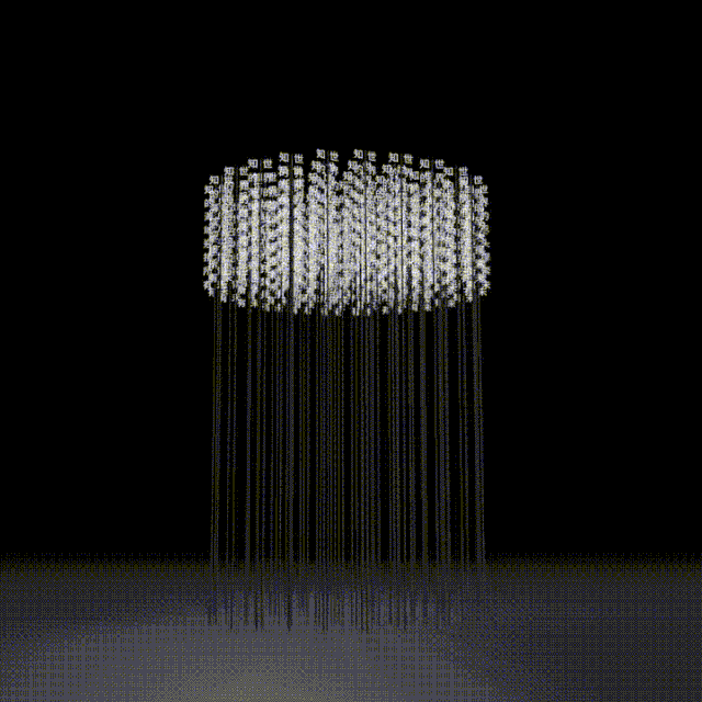
我们将导示从“贴地附着”的传统形式中解放出来,以轻盈、融合的方式介入环境。公园中最具辨识度的信息,是一组高达7米的标识,顶端设置白色配重图形的纤细杆体,随风轻微摆动。
Rethinking Signage
Instead of conventional ground-based signage, the system adopts a lighter and more integrated approach. The park’s most recognizable elements are a series of 7-meter-tall markers—slender poles topped with white counterweight forms that sway gently in the wind.

它们远看像林间的巨型芦苇,既可被远距离识别,又弱化了人造物的侵入感。轻微摆动是对场地状态的回应——它与水面船只的晃动、空气中流动的风同步共振,成为一种“自然生长的指引”。
From afar they resemble giant reeds growing among the trees, offering clear visibility while minimizing the intrusion of artificial structures. Their subtle movement resonates with boats drifting on the water and wind moving through the landscape, forming what we call “naturally grown guidance.”


标识顶部以不同的图形符号对应不同信息类型:地图信息、方向指引、摄影打卡与节点介绍等。向下箭头与圆点的组合指向地图信息,左右箭头用于提示航道方向,相机符号则标记景观节点。图形与钢杆之间清晰的穿插组合,呈现出清晰的构造逻辑。
Graphic symbols at the top of each marker correspond to different information types—maps, directional guidance, scenic viewpoints, and interpretive nodes. Arrows and dots indicate maps, directional arrows guide navigation, and camera icons mark photography points. The structural relationship between graphics and steel rods remains deliberately visible, creating a clear construction logic.

考虑到水面与陆地在识别距离与视线条件上的差异,信息尺度被有意放大,让人能够在晃动的水面准确完成识别。在各航道的禁行区域与航道端头,标识高度从7米降至约2.5米,以适应不同的水域使用。
Because visual conditions differ between land and water, information scales are enlarged to ensure readability from moving boats. In restricted channels and terminal zones, the height of the markers is reduced from 7 meters to approximately 2.5 meters.

在科普信息系统中,我们以折弯圆棒一体成型的文字结构呈现植物类信息。
Within the park’s interpretive system, plant information is presented through continuous metal rods bent into integrated typographic structures.


鸟类信息则通过将圆棒折弯为飞鸟造型形成装置,并在装置底部配置文字说明,使信息传达在层次与趣味之间取得平衡。
For bird interpretation, rods are shaped into flying bird silhouettes, forming sculptural installations with explanatory text placed below. The result balances educational clarity with spatial playfulness.


水岸草地上的总图和方向指引标识由数个散落的圆形组合而成。纤细的支杆将白色圆面轻轻托起,使其仿佛漂浮在草地之上,与地被铜钱草相映成趣。
Along the waterfront lawns, general maps and directional signs appear as clusters of circular panels supported by slender poles. The white discs seem to float lightly above the grass, visually echoing the surrounding groundcover.

信息面板与支杆通过弹簧连接,让标识能随自然的影响产生轻微晃动——我们希望这些岸边的环境信息,也如同从这片土地“长”出来的一样,自然地融入场地。
Spring connections allow the panels to sway gently with natural forces, reinforcing the idea that these informational elements feel as if they have grown out of the landscape.


从林间到水面:连续的信息序列
在航道之上,我们通过浮标系统建立航行的节奏与标记。浮标按距离长度形成序列:从起点开始,200米、400米、600米……将漫长航道转化为可被感知的刻度。但浮标的意义不止于计量,我们在有限的球面区域上控制信息密度,挑选与“远方、自由、探索”相关的短句,让航行成为一次可被阅读的体验。
从《老人与海》到《金银岛》《鲁滨逊漂流记》《海底两万里》,这些与水和航行相关的文学作品,在浮标上形成了一条诗意序列。我们希望它们不是环境软文式的赞美,而是与划行者的心理状态发生连接:在有限的湖面上,仍可以把方向指向更广阔的远方。
From Forest to Water
Along the waterways, a buoy system establishes rhythm and orientation. Distances are marked sequentially—200 m, 400 m, 600 m…—transforming the extended channel into a legible spatial sequence. Yet the buoys are more than measuring devices. Their limited surfaces carry carefully selected literary fragments related to distance, freedom, and exploration, turning the paddling route into a reading experience.
References range from The Old Man and the Sea, Treasure Island, Robinson Crusoe, and Twenty Thousand Leagues Under the Sea. These excerpts create a poetic narrative across the water.


《白鲸记》著名开篇“叫我以实玛利(Call me Ishmael)”——一句简短而有渊源的“出发宣言”,被放置在水面行进的时间里;也有来自航海者自述的句子,例如韦伯·奇尔斯的定义:“一个水手是一个以风为媒介的艺术家(A sailor is an artist whose medium is the wind)” 。
The famous opening of Moby-Dick,
“Call me Ishmael.”,appears as a concise declaration of departure. Another quote from sailor Webb Chiles reads: “A sailor is an artist whose medium is the wind.”

诗意的划行:让信息成为空间内容
在航道沿线,我们设置了一系列的装置,悬浮在林间与岛屿动线上,人可停留观察,也可在穿行中捕捉片段。装置“湍流”表达的是自然的流动,由数千片宽窄不一角度不同的叶片组成,像涓涓流动的水流,像带领人到达远方的风。
When Information Becomes Experience
A series of installations appear along the paddling route, hovering among forests and islands. Visitors may stop to observe them or encounter them in passing. The installation “Turbulence” visualizes natural flow through thousands of leaf-like pieces of varying angles and widths. Together they resemble currents of water—or winds guiding travelers toward distant horizons.


在装置”Moby-Dick”的表达当中,我们引入“划行密语”的线索,将旗语等航海信息系统转译为空间语言,在旗语中隐藏了 “Call me Ishmael.”这句话。当人尝试理解与解码,它们便成为一次关于自由与冒险的隐喻式学习。
In “Moby-Dick,” nautical signal flags are translated into spatial language. Hidden within the coded system is the phrase “Call me Ishmael.” Attempting to decode the message becomes a metaphorical act of learning about freedom and adventure.
▽装置《Moby-Dick》设计说明图和效果图


装置”风中诗”把关于远行与未知的句子从书里摘出来,悬在空中,像芦苇的花穗;细长的杆阵像芦秆,把语言“种”在地面与水岸之间。人走近时,文字从一团雾般的整体变成可阅读的句子——像在芦苇荡里拾起一段段关于冒险的声音。
The installation “Poetry in the Wind” suspends literary fragments about journeys and unknown horizons in the air like reed blossoms. From afar the text appears as a misty cluster; as visitors approach, individual sentences emerge—like discovering voices carried by the wind.
▽装置《风中诗》效果图


▽装置《风中诗》动态模拟图
仙踪公园的环境视觉设计尝试回答:当运动本身是一段旅程,信息是否也能成为体验的一部分?通过超高尺度的弱介入标识、可随风微弱摆动的结构、从林间到水面的连续序列,以及文学与密语的内容植入,我们希望每一次划行都不仅是行进,更是一次短暂的出走:在并不辽阔的水域里,启航仍然指向远方。
The environmental visual design of Fairyland Park explores a simple question:
When movement itself is a journey, can information become part of the experience?
Through tall yet subtle markers, wind-responsive structures, a continuous sequence from forest to water, and the integration of literature and coded language, each paddling route becomes more than a path. Even within a modest lake, the act of setting out can still point toward the distant.
项目:麓湖仙踪公园
地址:四川省成都市
客户:成都万华投资集团
设计管理:万华景观中心
设计公司:图石设计
完成时间:2025年6月
设计团队:何杨、张睿、张沛楠、刘磊、吕载龙、王政淇、李强来、黄子笑、高金笑、张琳娜、邹建宇、蒋旭慧
项目经理:沙守信
施工单位:华韵达雕塑、西里标识、蜀汉景观
景观设计:纬图设计
摄影:何杨、王政淇
图像编辑:王源徽、王子雄、李强来
内容编辑:王源徽
感谢万华集团和纬图设计提供文中图片的使用权,已做单独标注
Project:Fairyland Park, Luxelakes
Location:Chengdu, Sichuan, China
Client:Chengdu Wide Horizon Investment Group Co., Ltd.
Design Management:Luxelakes Landscape Center
Design Studio:Tothree Design Co., Ltd.
Completion:June 2025
Design Team:He Yang, Zhang Rui, Zhang Peinan, Liu Lei, Lü Zailong, Wang Zhengqi, Li Qianglai, Huang Zixiao, Gao Jinxiao, Zhang Linna, Zou Jianyu, Jiang Xuhui
Project Manager:Sha Shouxin
Construction:Huayunda Sculpture, Xili Signage, Shuhan Landscape
Landscape Design:WTD Group
Photography:He Yang, Wang Zhengqi
Image Editing:Wang Yuanhui, Wang Zixiong, Li Qianglai
Content Editing:Wang Yuanhui
Images courtesy of Wide Horizon Group and WTD Group.
“ 在这里,人不再只是观者,而成为风与水交融的一部分。”
审稿编辑:Maggie
更多 Read more about: To Three 图石设计


0 Comments