本文由SAOTA授权mooool发表,欢迎转发,禁止以mooool编辑版本转载。
Thanks SAOTA for authorizing the publication of the project on mooool, Text description provided by SAOTA.
SAOTA:SAOTA在洛杉矶的第一个竣工项目是一个住宅改造项目——Stradella。这个住宅是上世纪70年代就已经存在的建筑,它位于贝尔艾尔区一个景色宜人的海角上。
为了确保街道与住宅的私密性,原始的场地布局是经过精心规划的,能够展现洛杉矶盆地的壮丽景色,捕捉到从市中心到世纪城的全景。场地的东面是山脉,南面是海洋。
SAOTA:SAOTA’s first completed project in Los Angeles, Stradella, is a remodel of an existing 1970’s house on a beautiful promontory in Bel Air.
The original layout of site and dwelling were well planned to ensure privacy from the street and to address spectacular views over the LA basin, capturing the full panorama from Downtown to Century City, with mountains to the east and ocean to the south.
SAOTA决定将旧的房屋剥离回其木材骨架,最大限度地增加建筑面积,在必要时加固或扩建,同时重新创造大量的开口,将美丽的西海岸灯光、变幻的景色和翠绿的背景融入到设计之中。这种“引导外界景色进入设计”的决策体现在空间规划、立面、景观、照明设计、窗户配置和遮阳细节的方方面面。
SAOTA decided to strip the existing house back to its timber skeleton, maximize the square footage and, by reinforcing or extending where necessary, create generous openings to draw the beautiful West Coast light, the rolling vistas and the verdant setting deep into the floorplan. This concept of “inviting the outside in” encapsulates the SAOTA approach, and at Stradella these informed design decisions ranging from space planning to façade design, landscaping, lighting, window configuration and shading details.
▼日景 Day View
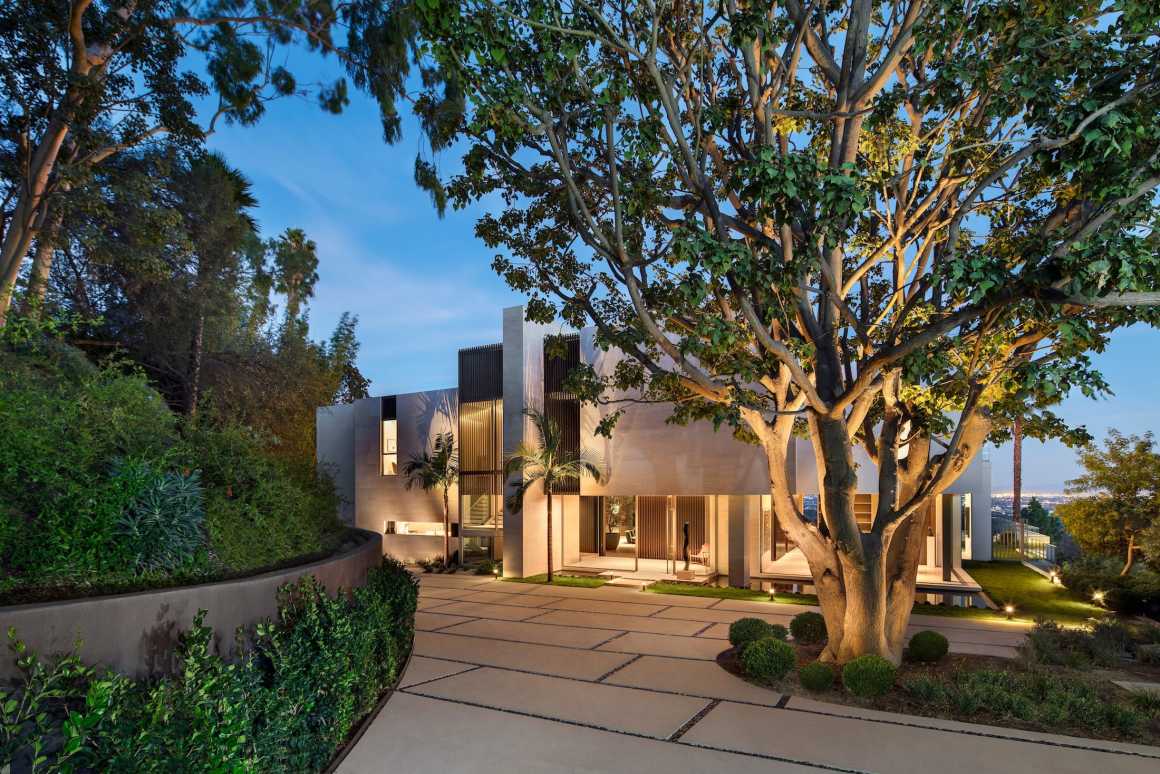
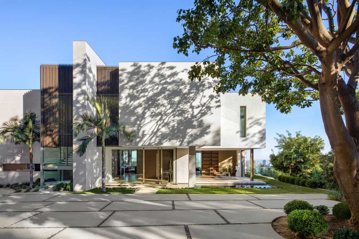
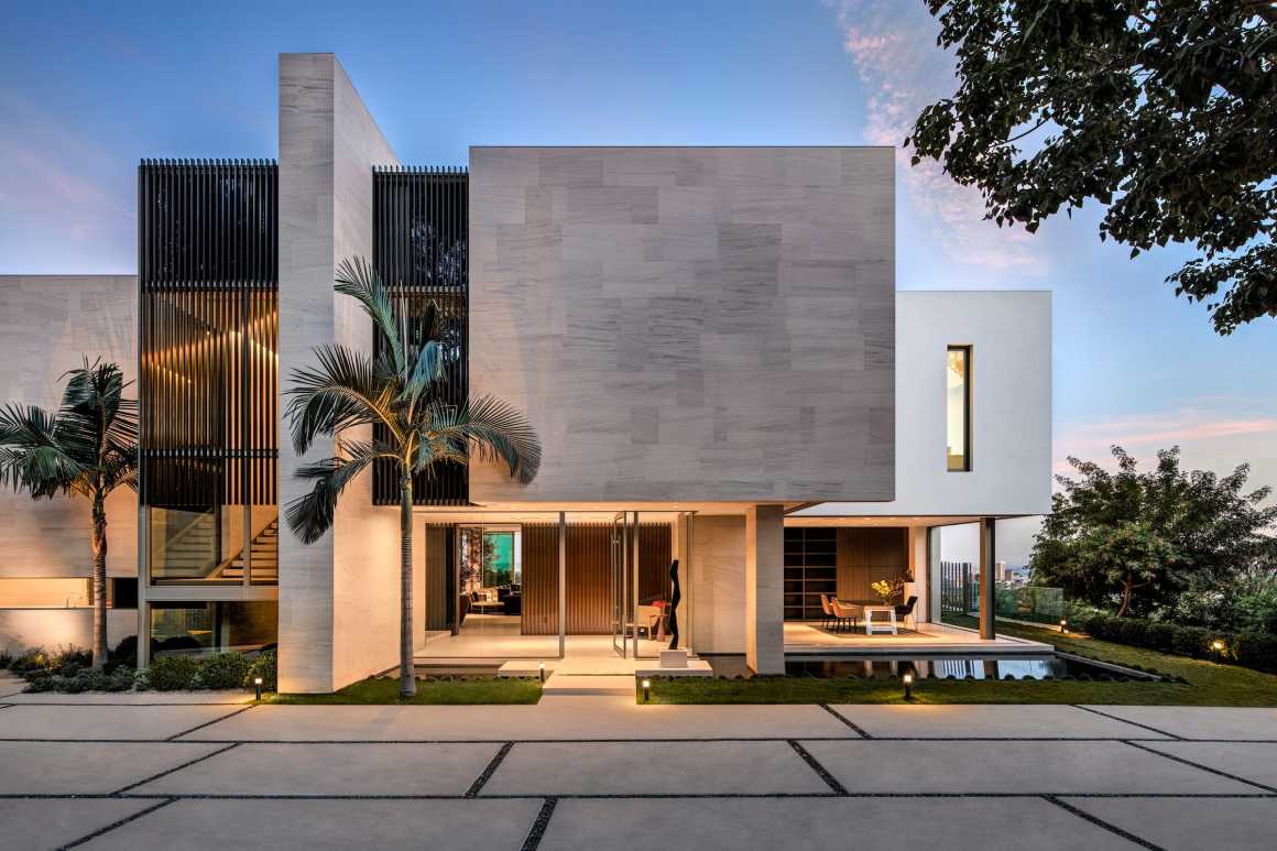
从一个绿意盎然的山坡到达一个荫蔽的前院后,住宅便会展现在眼前。一个巨大的扶壁将房子与山坡相连;简约的石墙和垂直面上悬浮的竖向长窗吸引着人们的目光。从入口大厅开始便贯穿了建筑的走廊通道使得城市天际线的景色不会被一眼望穿,同时较高的层高使天花板的线条与外面的景色形成框景。这是一个精心设计的过渡形式,山坡上的入口显得厚重,而建筑上方的悬空结构又显得轻巧灵活,这正好与城市风景形成了对齐的视图形式。
An attractive approach cut into deeply wooded hillside arrives at a leafy forecourt signaling the entrance of the house. The arrival façade is reimagined as a sculptural composition – a massive buttress ties the house into the hillside; blank, stone-faced walls, incised with vertical screens hover over glazing, inviting the eye in and through. From the entrance lobby, an asymmetrical passage carved through the main body of the house intentionally delays the reveal of the Downtown skyline, framed by the high ceilings of the great room. There is a deliberate transition as the weighty forms of the entrance, anchored into the hillside, give way to a lighter structure hanging vertiginously over it, aligning to the city grid and framing the views.
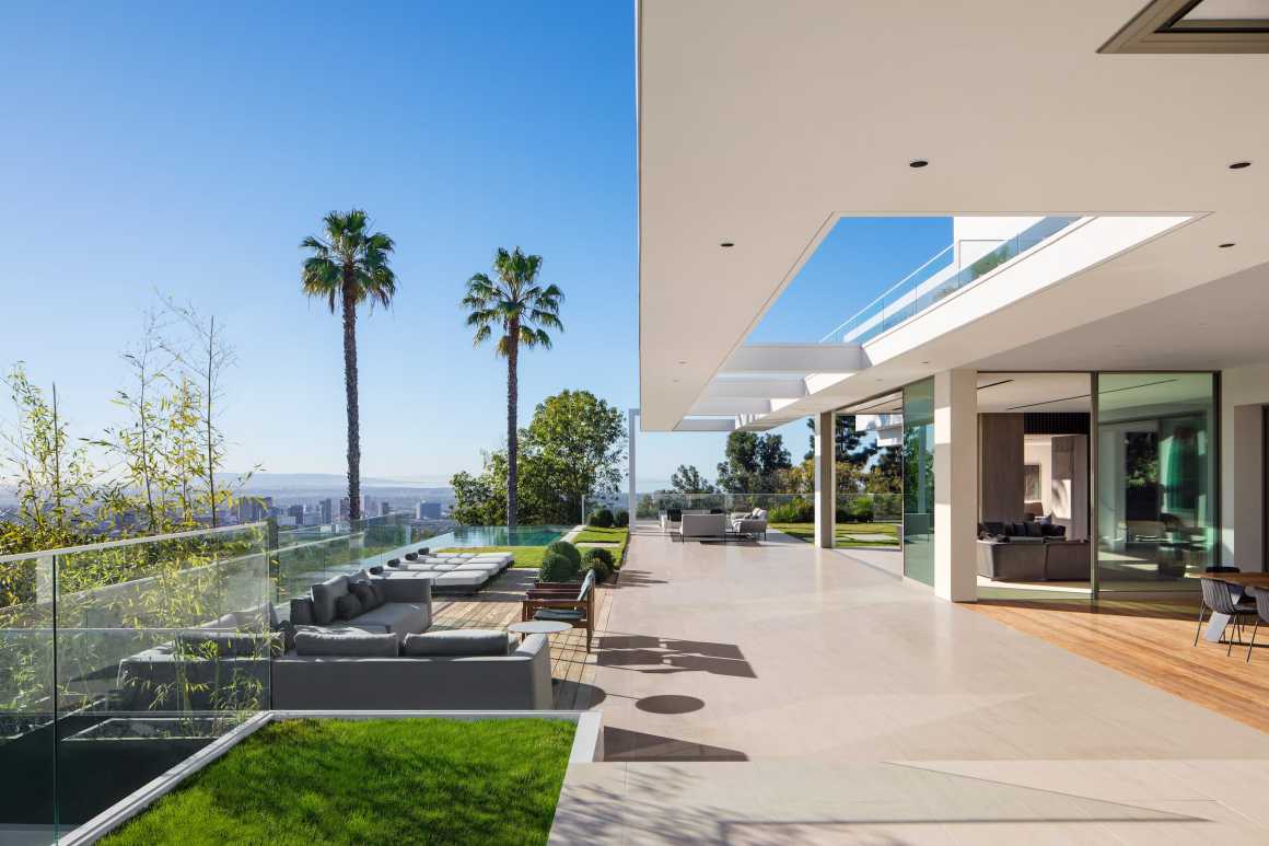
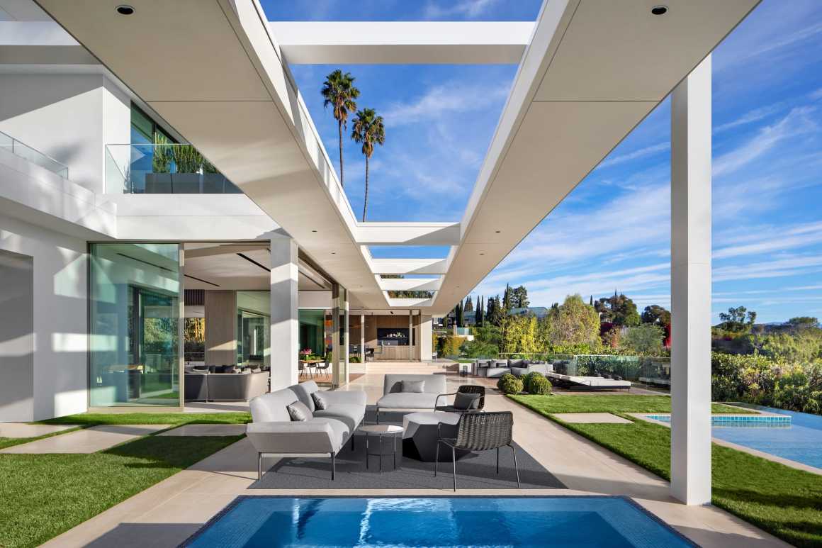
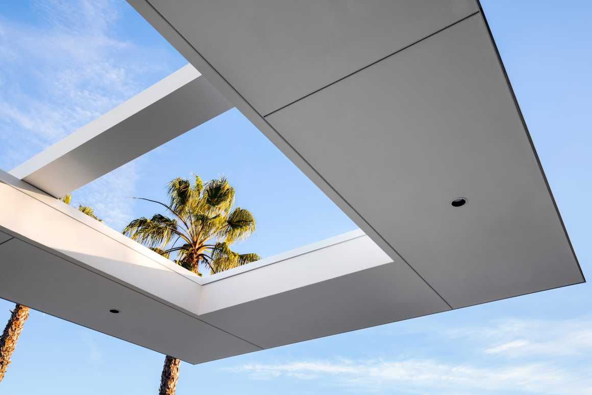
为了激活住宅内部的景观,露台上新建了一个水池和线性种植池。宽大的线性遮篷扩大了场地,使内部生活空间自然延伸,增强各房间功能上的互动流通,并为户外用餐和休闲提供了舒适的空间。这一标志性的40米( 131英尺)长的遮蔽顶棚轻盈的悬浮在东露台上,其纤细的结构让人想起柯尼格的斯塔尔住宅。与澄澈的蓝天和周围的棕榈树相匹配,精心绘制出了一幅美丽的画卷。它为旧住宅的元素改造带来了新的连贯性,也为场地北部的新剧场和餐厅增添了新的活力。
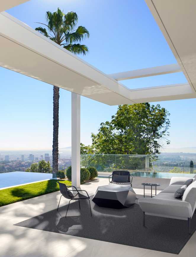
The lush wooded setting, so apparent in the approach to the house, seems to sweep through it to the front terrace which was reconfigured with a new pool and linear planters to animate views from within the house. A generous new linear canopy amplifies the width of the site, creating natural extensions of internal living spaces, improving flow between the various functions of the house, and providing comfortable spaces for outdoor dining and lounging. This iconic, 40m (131ft) long canopy – its skinny, expressed structure reminiscent of Koenig’s Stahl House – floats effortlessly over the east terrace as it draws a deliberate frame around the quintessential blue sky and palm trees. It lends new coherence to the remodelled elements of the former dwelling – and to a new theatre and dining wing to the north of the site.
景观设计可以说是“锦上添花”,增强了原本就丰富的外部环境的可观赏性。庭院种植空间是至关重要的,柔化了建筑的外观,让人们可以更好的体验这个绿意盎然的地方。现有的两棵棕榈树保留在泳池露台旁,在日光浴场和主卧套房外的景观中显得独具特色,露台的低种植和平整的草坪使室外景观看起来简约整洁。在场地的后面,新增的植物强化了林荫大道的荫蔽感,同时前院也保留了一棵成熟的大树,为书房和入口大厅创造了场所感和景观背景。
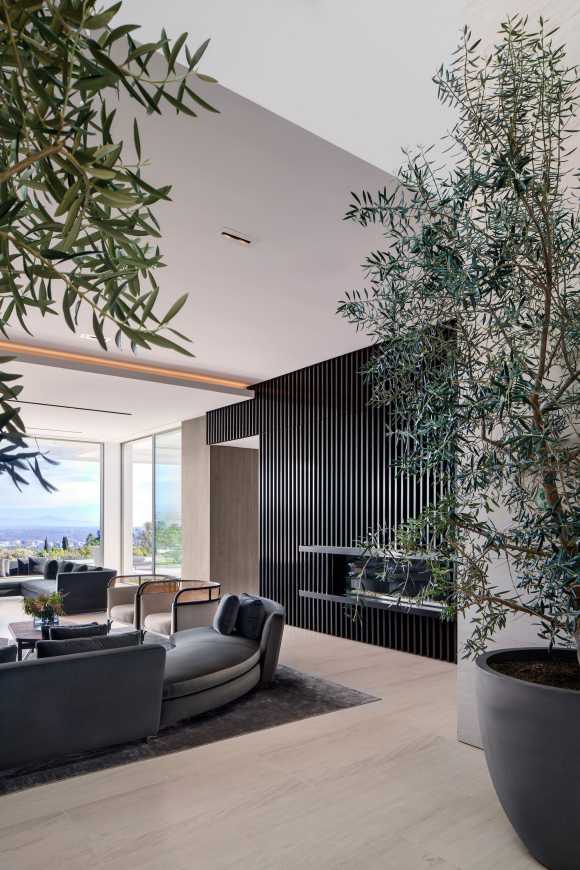
Landscaping was designed to enhance the already luxuriant setting. It was impossible to introduce a courtyard into the heart of the plan, and so the planted spaces were critical, softening the look and feel of the contemporary forms and allowing a more intimate experience of the leafy site. Existing twin palms were retained at the pool terrace and feature in views out of the solarium bar and master bedroom suite, whilst low level planting and lawn to the terraces ensure functional outdoor spaces and uncluttered views of the horizon. To the rear of the site additional planting enhanced the tree-lined drive whilst a characterful mature tree was retained in the forecourt providing a real sense of place and a backdrop for the study and entrance lobby.
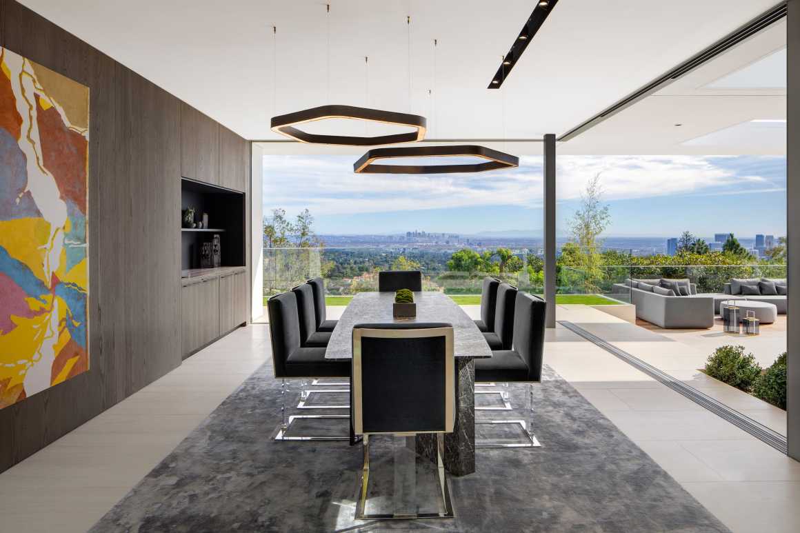
这种乌托邦式的加州现代主义设计旨在能够提炼出加州生活的精髓,建筑内部空间感觉轻盈、清新和开放,将现代家庭生活和各种娱乐功能联系在一起。在条件允许的情况下,尽量采用落地玻璃窗来代替厚重的墙壁,滑动窗户就能把它们堆叠起来,创造出开阔的观景视野。被重新设计的主卧和浴室延伸到了半悬挂的外部露台上,可以看到闪着光的城市夜景。
This nod to the utopian Californian Modernism of the Case Study Houses is reflected in the porous nature of the reconfigured floorplan which aims to capture the essence of Californian Living, with internal spaces feeling light, fresh and open, connecting the various functions of the house for modern family living and grand entertaining alike. Where possible, walls were replaced by full height glazing with sliding windows pocketing or stacking to create generous openings. Key bedrooms and bathrooms were re-designed to spill out onto external terraces suspended over the sparkling night skyline.
设计已经远远超出了传统的改造范畴,SAOTA彻底将其改造成了一个功能性极强的住宅,并在加州现代主义传统中建立了新的当代美学。
Going well beyond the remit of a traditional remodel, SAOTA has utterly transformed the existing house into a home that functions at the highest level and establishes a fresh contemporary aesthetic in the tradition of Californian Modernism.
项目名称: Stradella
项目地点: 美国洛杉矶
建筑/室内设计: SAOTA
项目建筑师: Mark Bullivant 和 Tom Burbidge
建筑记录: CM Peck
发展管理: PLUS Development
承包商: Gordon Gibson建设公司
结构工程师: JLA结构工程公司
经纪公司: Bond St Partners
照明顾问: Oculus灯光工作室
景观设计: Fiore景观设计
室内装饰: 洛杉矶MINOTTI
艺术品: Creative Art Partners
项目摄影师: Adam Letch
Project Name: Stradella
Project Location: Bel-Air, Los Angeles, United States
Design Architects & Interior Architecture: SAOTA
Project Architects: Mark Bullivant & Tom Burbidge
Architect of Record: CM Peck
Development Managers: PLUS Development
Contractor: Gordon Gibson Construction
Structural Engineers: JLA Structural Engineers
Brokering Company: Bond St Partners
Lighting Consultant: Oculus Light Studio
Landscaping: Fiore Landscape Design
Interior Décor: MINOTTI Los Angeles
Artwork: Creative Art Partners
Project Photographer: Adam Letch
更多 Read more about: SAOTA






0 Comments