本文由合风苍飞设计工作室授权mooool发表,欢迎转发,禁止以mooool编辑版本转载。
Thanks Soar Design Studio for authorizing the publication of the project on mooool, Text description provided by Soar Design Studio.
合風蒼飛設計工作室:Terra是一间巧克力专卖店,主厨探访世界各地搜寻各种可可豆,从南美洲、印度到亚洲等地, “From bean to bar”是该品牌的宗旨,让客户能品尝到可可最原始的风味开始,进而享用其衍生的甜点、饮品或巧克力酒等产品。
Soar Design Studio:Terra is a chocolate specialty store. The chef travels around the world to search for all kinds of cocoa beans, from South America, India to Asia and other places. “From bean to bar” is the brand’s purpose, allowing customers to taste the most original flavor of cocoa at the beginning, and to enjoy its derivative desserts and drinks or chocolate liquor and other products.
拆解探究巧克力甜点或饮品的本质,其实就是在“体验自然”,我们将大自然的果实-可可豆制作成各种食物,而各个国家、区域产出的果实味道不尽相同,体现了气候、土壤、日照等自然因素。除此之外,在访谈业主时,业主提及了曾在中南美洲参与农技教学团,并在森林里生活的经验,这些都诱发了我们希望能将此间设计更朝向“自然”的想法。
Dismantling and exploring the essence of chocolate desserts and drinks is actually “experiencing nature”. We turn cocoa beans, the fruit of nature, into various foods. The taste of the fruits produced in different countries and regions vary, reflecting the difference in climate and soil, sunshine and other natural factors. In addition, in the interview with the owner, the owner reflected his/her experience in the agricultural technology teaching group in Central and South America and living in the forest. These all induced our hope that the design of this room can be more “natural”.
概念|concept
我们以“自然入侵室内”及“雨林里的BAR”为主要概念着手设计这座落于老社区转角的30年公寓一楼,揉合各种自然特质与元素来呈现整体空间。
We started designing the first floor of this 30-year-old apartment building at the corner of the old community with the main concepts of “nature invading the indoors” and “BAR in the rainforest”, combining various natural characteristics and elements to present the overall space.
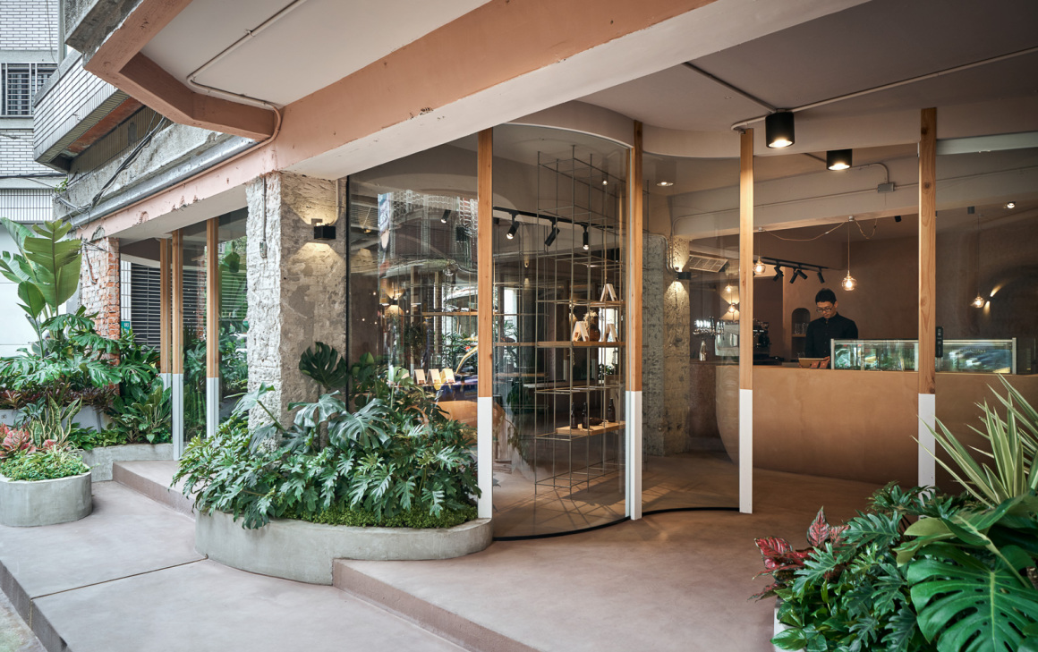
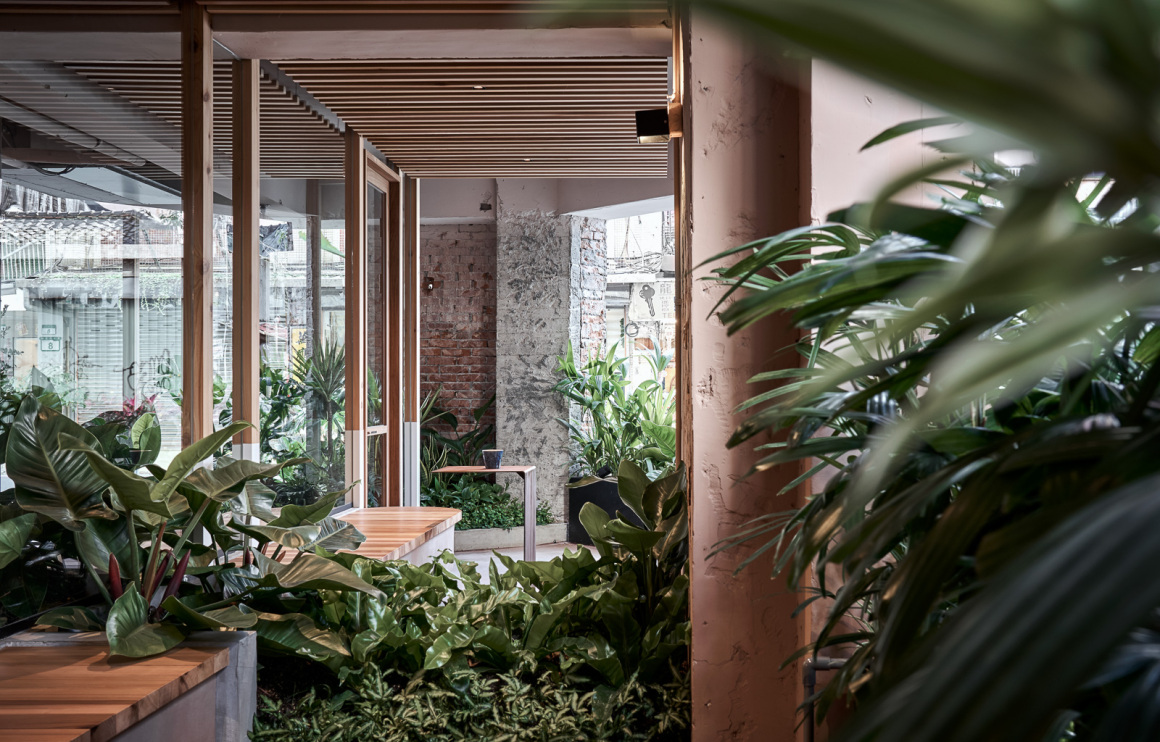
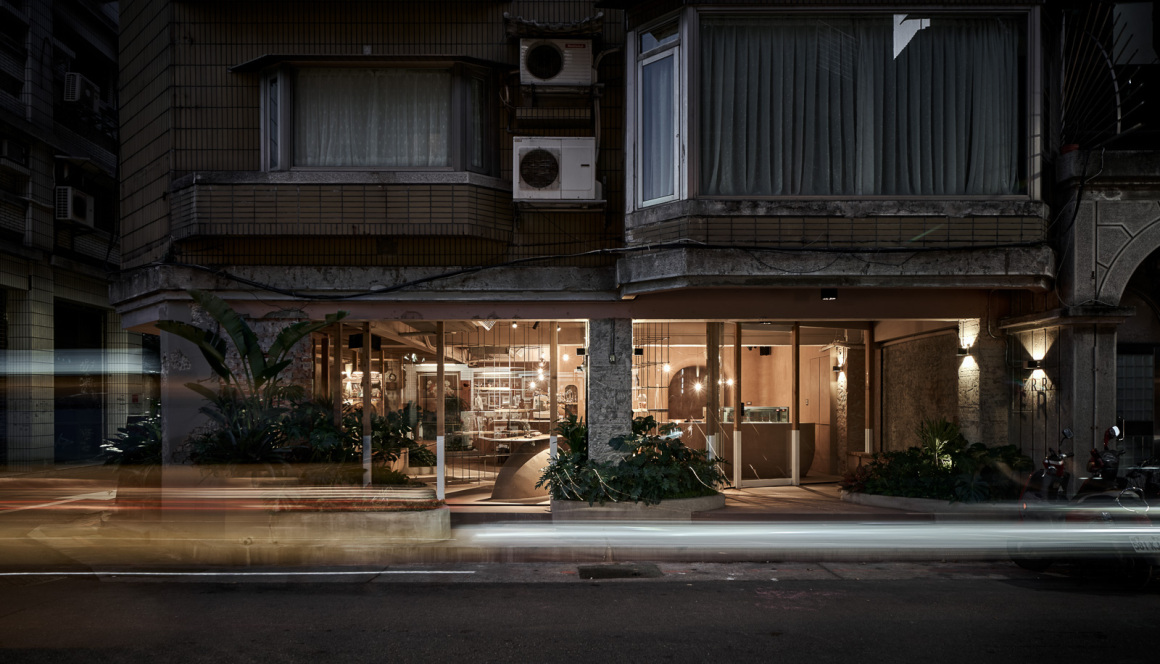
首先,我们将原本室内的范围退缩1.5至2米,堆砌土丘、种植植栽,运用软性设计手法创造老公寓地面层的花园般的空间,意欲将转角空间形象重塑、友善社区,为社区添加更多的绿意与景观,甚至留下了入口前院供社区居民驻足休息,让新品牌能以更亲切的形象与空间风貌参与社区,赋予商业空间更好的社区性与在地感。(让商业空间能更融入在地社区)
First, we recessed the original indoor area by 1.5 to 2 meters, piled up mounds, planted plants, and used soft design techniques to create a garden-like space on the ground floor of the old apartment. We intend to reshape the image of the corner space and be friendlier to the community. By adding more greenery and landscape, and even leaving the front yard entry for community residents to stop and rest, this allows the new brand to commingle with the community through an inviting image and spatial style, giving the commercial space a much warmer sense of community and locality. (Let the commercial space be more integrated into the local community)
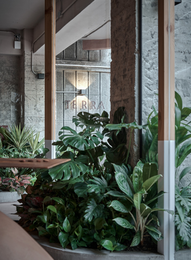
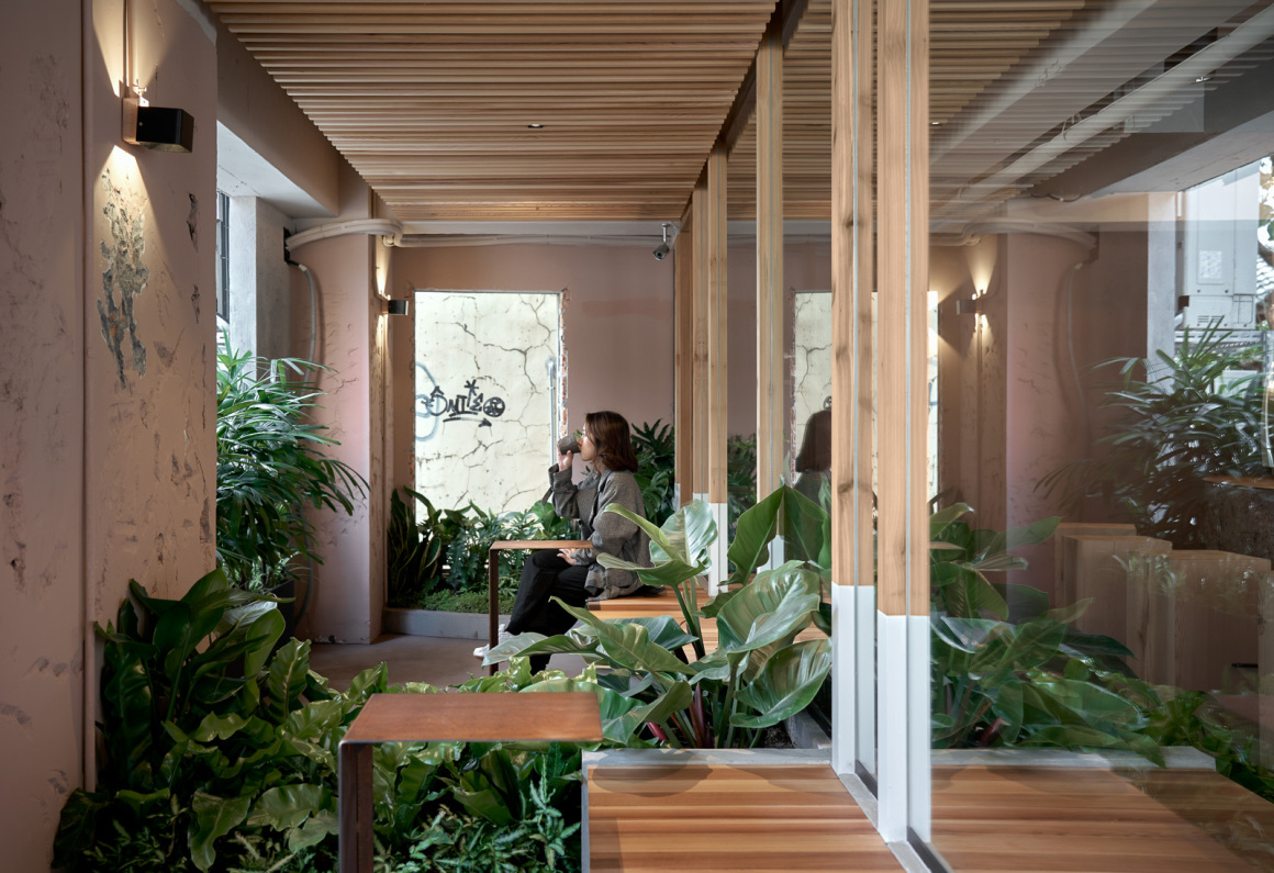
上述的退缩空间则成为此间的屋外用餐区,运用植物与土丘作为分界,让使用者能体验被自然包围的感受,但不过度的分化整体空间,就像在大自然里的感受般,空间看似有分界,但又彼此连结。如此,光与风透过推缩的环绕回廊,更容易进到基地内,阳光透过枝叶与气流自由的在空间中流动,创造了更舒适的基地微气候,也让使用者能在植物的包围下享受用餐时光。
The above-mentioned recess space becomes an outdoor dining area here, using plants and mounds as boundaries, allowing users to experience the feeling of being surrounded by nature, but not excessively dividing the overall space, just the feeling of being in nature. The space seems to have boundaries, but they are connected to each other. In this way, light and wind can easily enter the base through the retracted surrounding corridors. The sunlight flows freely in the space through branches and airflow, creating a more comfortable base microclimate and allowing users to be surrounded by plants and enjoy meal time.
▼屋外用餐区 outdoor dining area
与自然同行|Walking with Nature
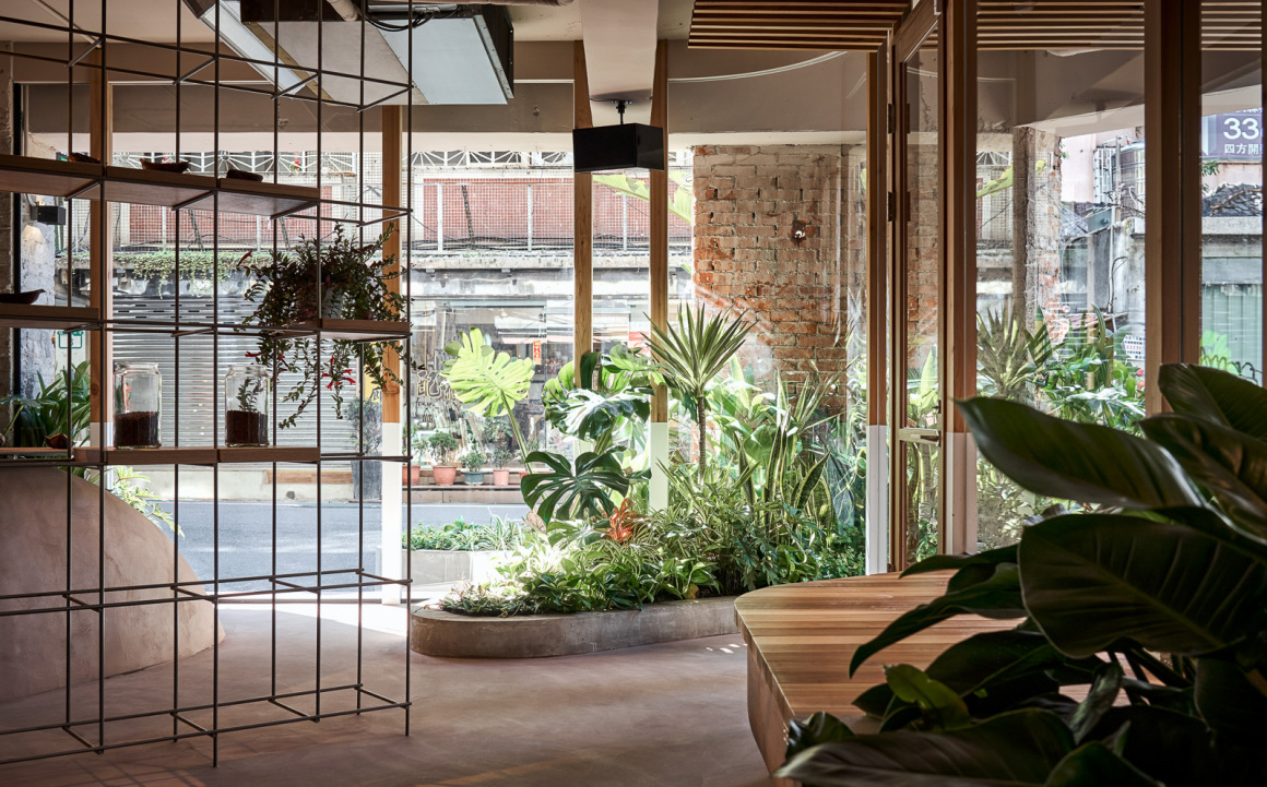
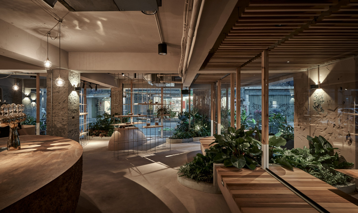
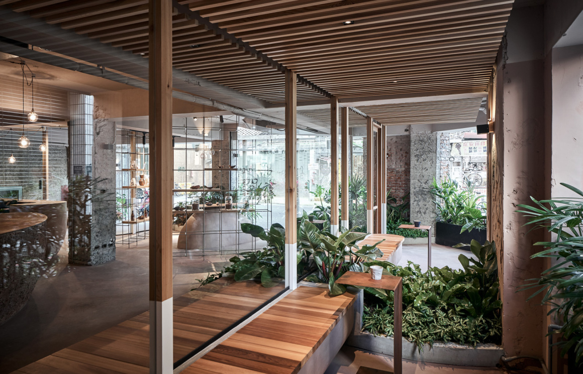
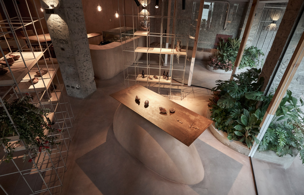
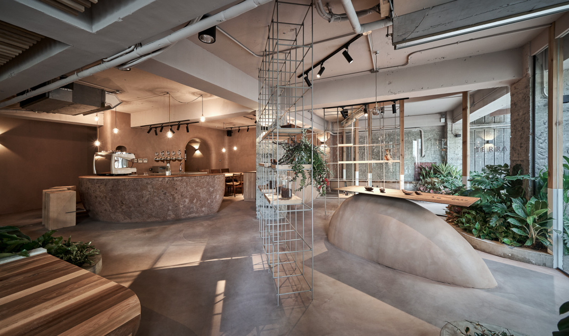
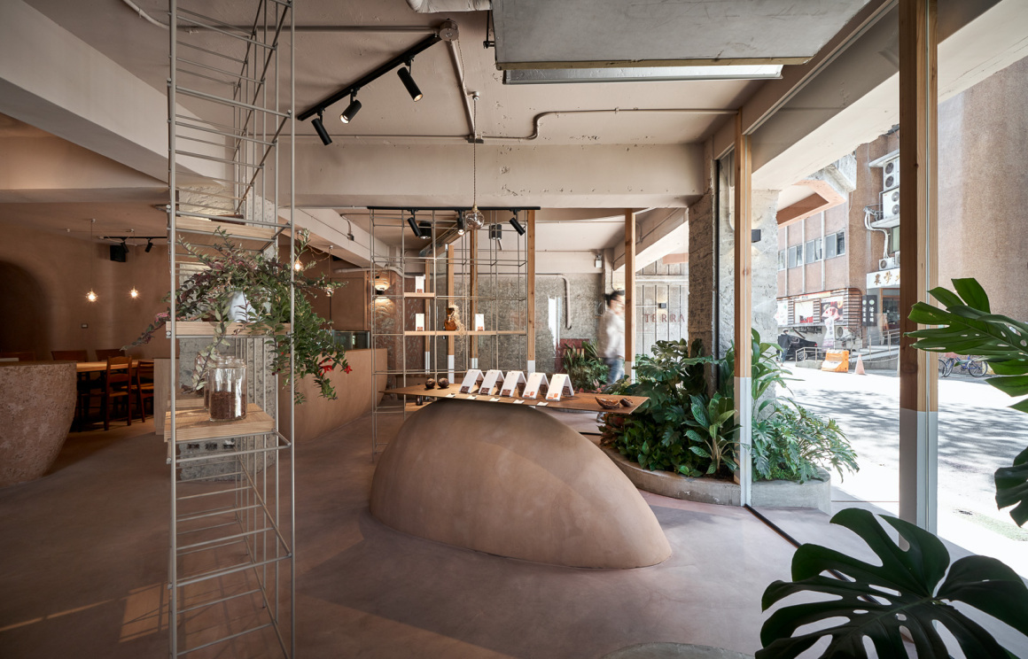
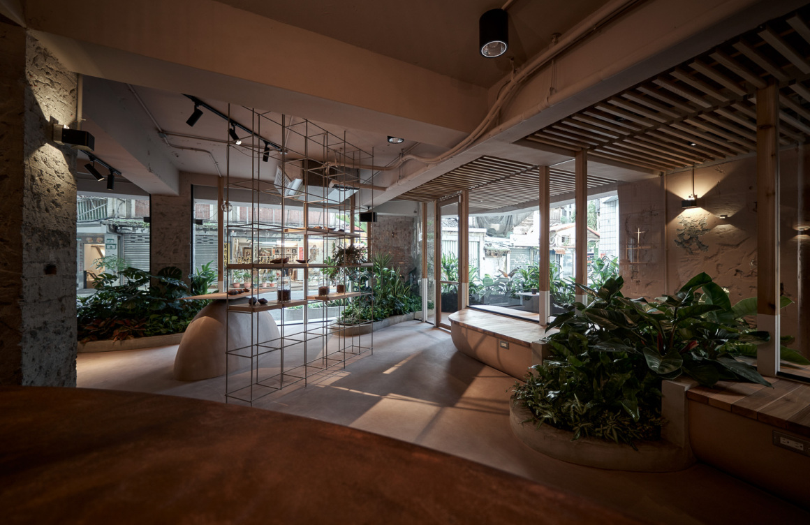
“自然入侵室内”这样的主题贯穿全场,我们让室外的植栽与土丘延伸进室内,借由“自然蔓延”的设计手法使室内的氛围更自然,并藉此模糊室内外的界线,延伸视觉感,制造室内使用者有“植物与自然从外部四面蔓延至内”以及“被自然包围”的感受。透过放射性的平面设计手法,让植栽土丘、展示架等都指向室内吧台,也可理解成以吧台为中心向外发散。这样的设计手法让室内的使用者视觉感能向外延伸,造成视觉的流动性,放大了空间感受让心境更为自由;而对室外的人员则造成了如单消点般的视觉吸引效果,增加了经过的人们的好奇心。我们刻意地让动线如同自然环境中的“雨林”路径般曲折、迂回,整体视为好几个回游动线的组合,藉由在空间内曲折的步行感受让人无法直接感受到空间范围,让行走的经验更自然、有趣,也让空间的流动性更好。
The theme of “Nature Invading the Indoors” runs through the entire venue. We let the outdoor plants and mounds extend into the interior, and the “Natural Spread” design technique makes the indoor atmosphere more natural and blurs the boundary between indoor and outdoor. This extends the sense of vision and creates the feeling of “plants and nature spreading from the outside to the inside” and “being surrounded by nature” for indoor users. Through radioactive graphic design techniques, the planting mounds, display racks, etc. are all directed to the indoor bar, which can also be understood as diverging from the bar as the center. This design technique allows the visual sense of the indoor users to extend outward, resulting in visual fluidity, magnifying the space experience and making the mood more free; while for the outdoor personnel, it creates a visual attraction effect like a single point of elimination, increasing the curiosity of passersby. We deliberately made the moving lines as twists and turns like the “rainforest” path in the natural environment, and the whole scheme is regarded as a combination of several circulating moving lines. The nonlinear walking path in the space makes people unable to directly feel the extent of the space. The walking experience is more natural and interesting, and it also makes the space more fluid.
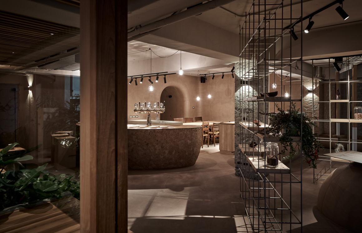
以透明材料(玻璃)作为外墙,强化室内外连结与模糊界线的设计意图,藉由实木窗框与透空展示架意喻自然森林的既视感,弧形玻璃外墙则体现空间的流动感。室内的整体色彩计划源自于“土壤”,呼应了自然果实的主题,并运用可可豆果实为发想设计展示台、蛋糕柜与吧台等造型,吧台更将可可豆的果实与壳绞碎揉合作为涂料,并邀请主厨与我们一起动手涂装,让造型更具手感,更自然、更有主题性。
延伸了品牌”Bean to bar”的概念,我们运用”从自然到空间”发展出各种设计手法,从创造友善社区空间、整体自然氛围、到更好的基地微气候,希望能为品牌空间与社区带来更多可能性。
The transparent material (glass) is used as the exterior wall to strengthen the design intent of the connection between the interior and the exterior and the blurring boundary. The solid wood window frames and the transparent display shelf symbolize the visual sense of the natural forest, and the curved glass exterior wall reflects the fluidity of the space. The overall color plan of the interior is derived from “soil”, echoing the theme of natural fruits, and used cocoa bean fruit to design display stands, cake cabinets and bar counters. The bar counter is also made using the ground fruits and shells of cocoa beans as paint, which we invited the chef to paint with us by hand, creating more natural texture and adhering to the natural theme.
Extending the concept of the brand “Bean to bar”, we used “from nature to space” to develop a variety of design techniques, from creating a friendly community space, an overall natural atmosphere, to a better base micro-climate, hoping to bring more possibilities to the space and the community.
项目名称:Terra 土然巧克力专卖店
完成年份:2020
项目面积:120平方公尺
项目地点:台北市大安区温州街7号
设计公司名称:SOAR DESIGN合風蒼飛設計工作室
公司网址:https://www.facebook.com/soar.design.tw/
联系邮箱:soardesign@livemail.tw
主创设计师:张育睿
设计团队:吴家勋
客户:Danny Yang
摄影师:hey! cheese
合作方:施工:刘贞贞
景观团队:GEOTW
Project Name: Terra Bean to Bar
Year completed: 2020
Project area: 120 square meters
Location: No. 7 wenzhou street, da an district, Taipei
Design Company Name: Soar Design Studio
Company website: https://www.facebook.com/soar.design.tw/
Contact: soardesign@livemail.tw
Chief designer: Zhang Yurui
Design team: Wu Jiaxun
Client: Danny Yang
Photographer: Hey! cheese
Partners: Construction unit: Liu Zhenzhen
Landscape Team: GEOTW
更多 Read more about: 合風蒼飛設計工作室Soar Design Studio







0 Comments