ARKHITEKTON:“山谷和环形山之间”(提案的名称)从最初的草图开始就一直在寻找一个创造公共空间的方法,这个公共空间能够产生一个连续的地面,能够节省工作区域呈现的高度差异(最大高差为6.20米)。利用其100%的表面,从而恢复了城市的剩余空间,这些空间集中了一系列独立的操作(停车、电气安装、通往上住宅区的巨大坡道……)
ARKHITEKTON:“Between valleys and craters” (the name of the proposal) has sought since its first sketches to create a public space able to generate a continuous ground plane capable of saving the large difference in level that the work area presented (6.20 meters in the worst part). Usable by 100% of its surface and, thus recovering a residual space in the city that had juxtaposed a series of independent operations (parking, electric installation, huge ramp to upper housing block…)
一旦项目被指定,建筑师们就开始进行实地工作,目的是收集项目的建议和未来用户的关注。餐馆老板和其他邻近企业提出了有价值的方法,最重要的是,存在的问题必须通过最终提案来解决。一些解决方案被重新安置,绿色植物被添加进来(最初,整个提案是一个由混凝土地板定义的广场,以满足竞争的需要)。它还能满足市议会的要求,确保用户的安全,并考虑到未来的经济维护。
Once the project was assigned, the architects did field work with the aim of collecting proposals and future users concerns for this project. Restaurateurs and other neighboring businesses proposed valuable approaches, above all, existing problems that had to be solved with the final proposal. Some solutions were relocated and greenery were added (at first, the whole proposal was a square defined by a concrete floor as the competition required). It also accomplishes the city councils demands, ensuring the safety of users and taking into account the economic maintenance for the future.
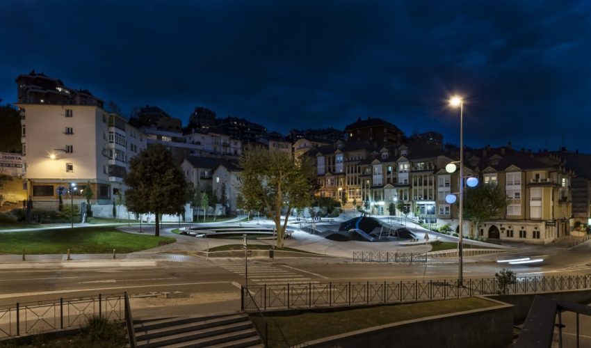
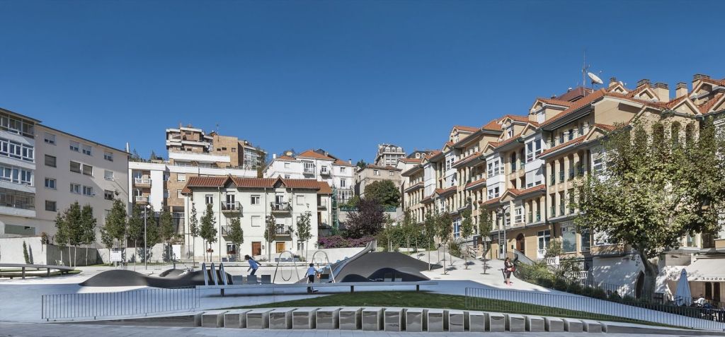
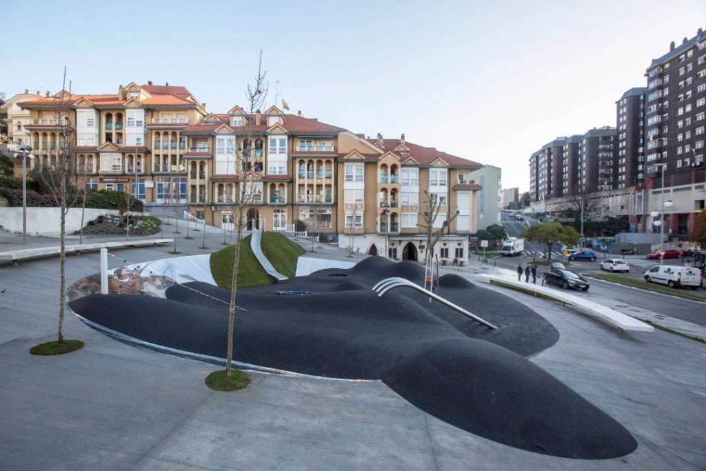
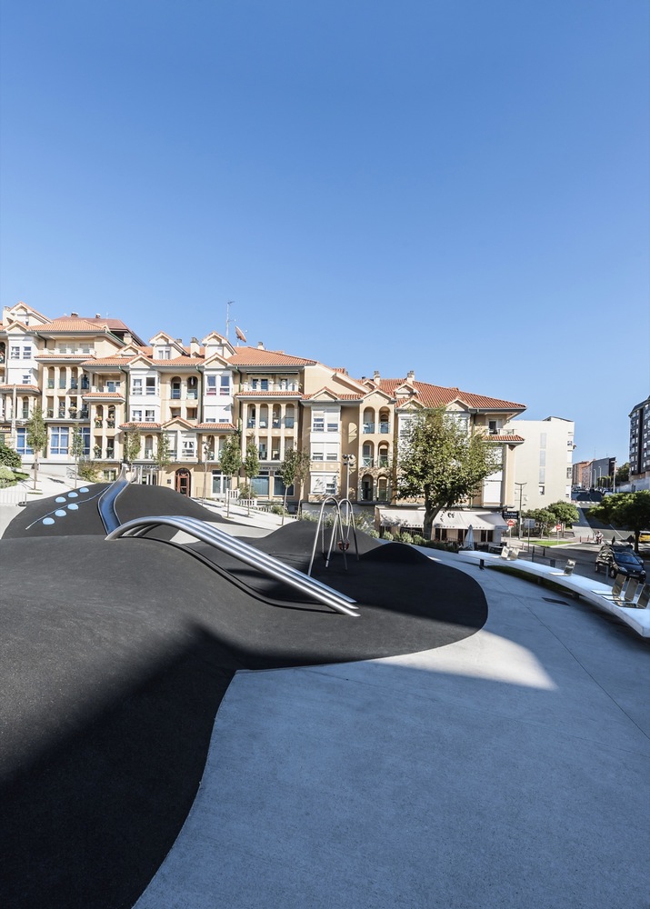
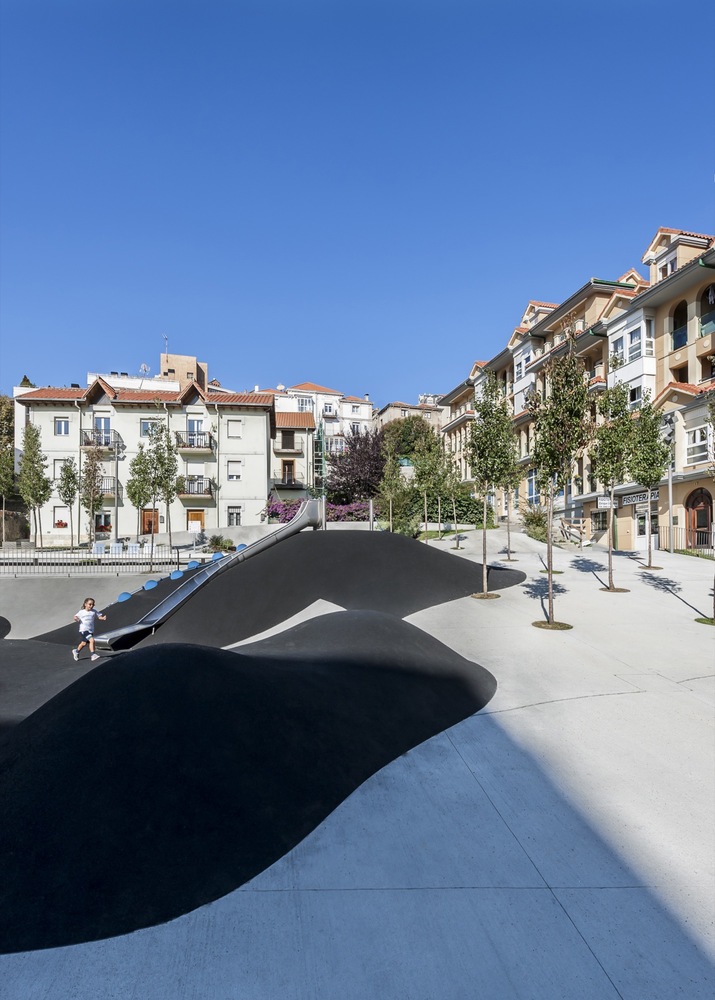
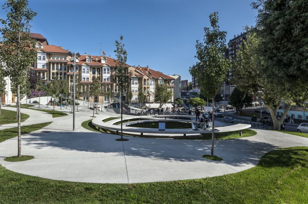
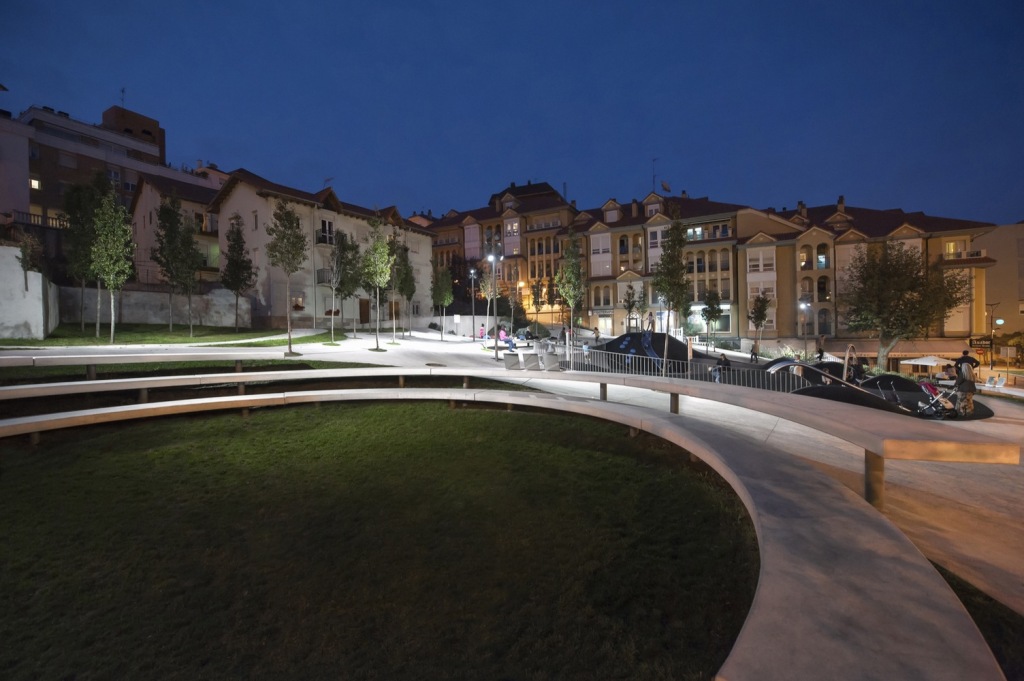
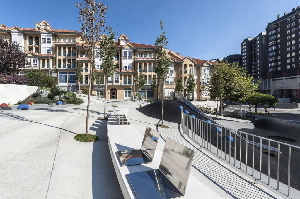
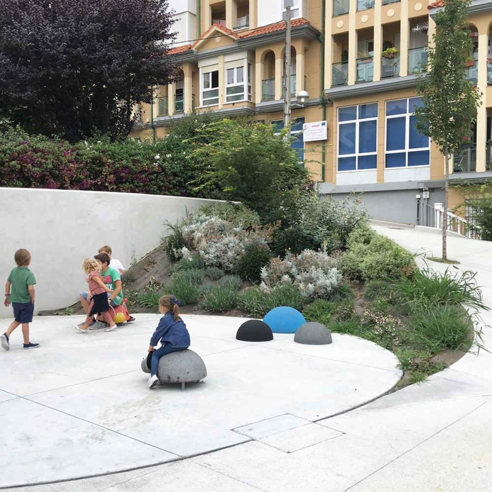
该项目设计了一个雕塑地形的地面,以其正式的解决方案,可到达更高的区域,避免坡道和扶手。为了达到这一目的,设计了一个调节平面来寻找几何中最简单的解决方案,使其能够满足无障碍标准的最小坡度。该计划采取的行动将导致广场被划分为“环形山”,组织活动和环流。视觉连接是在整体的所有部分之间实现的,但是允许每种用途的特定开发。这些陨石坑根据其用途以许多不同的方式出现。为露台区铺设的混凝土地面(对于现有企业而言),斜坡上有灌木,操场上有橡胶土,草地或其他类似于看台的设施。
The project has been designed with a ground plane as a sculpted topography, getting with its formal solution, accessible routes to higher areas of the square avoiding ramps and handrails. To this purpose, a regulating plane has been designed to find the easiest solution in its geometry getting minimal slopes capable of fulfilling the standards of accessibility. This plan applies actions which will result in a zoning of the square as “craters” that organize activities and circulations. A visual connection is achieved between all parts of the whole, but allowing the particular development of each of the uses. These craters are materialized in many different ways depending on their use. Concrete floors for terrace areas (for existing businesses) with shrubbery in their slopes, rubber soils in the playground, grass or other one occupied by a stands-like installation.
地点:Tetuán街,桑坦德,坎塔布里亚,西班牙
面积:2432.15平方米
年项目:2016年
建筑师:ARKHITEKTON
制造商:iGuzzini,KOMPAN,Urbes21
合作者:Eduardo Navarro,LauraFernández,AveliaChomón
摄影:David Montero
Location: Tetuán Street, Santander, Cantabria, Spain
Area: 2432.15 m2
Year Project: 2016
Architects: ARKHITEKTON
Manufacturers: iGuzzini, KOMPAN, Urbes21
Collaborators: Eduardo Navarro, Laura Fernández, Avelia Chomón
Photography: David Montero
更多:ARKHITEKTON






0 Comments