本文由 创浦景观 授权mooool发表,欢迎转发,禁止以mooool编辑版本转载。
Thanks T·Workshop for authorizing the publication of the project on mooool, Text description provided by T·Workshop.
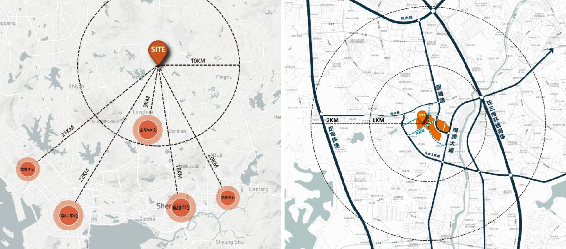
创浦景观: 本项目位于湾区中轴龙华区府圈,近地铁4号线长湖站,周边1KM范围享商圈、医疗、生态等丰富资源。项目为城市综合体,汇聚高端住宅、街区商业复合业态,将打造新一代城市街区生活示范样板。
T.Workshop: The project is located in the Fuhuan District, Longhua District, the central axis of the Bay Area, near the Changhu Station of Metro Line 4, and enjoys rich resources such as business circle, medical treatment and ecology within a radius of 1KM. The project is an urban complex, which gathers high-end residential and block commercial complex business forms, and will create a new generation of urban street life demonstration model.
▼规划背景 Planning Background
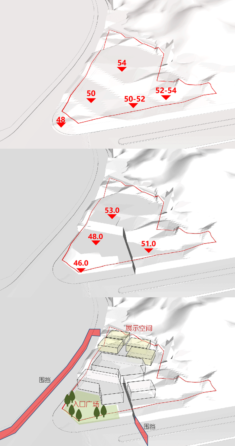
展示区开放时周边还是工地环境,无城市展示界面且基地地形存在7米左右高差。因此在设计手法中因地制宜,顺应场地高差,以“阶梯”的设计手法,层层上升,退让入口前广场,并在场地周边合理规划展示围挡范围,与周边环境隔开。
When the exhibition area is open, the surrounding area is still a construction site environment, there is no urban display interface and the terrain of the base has a height difference of about 7 meters. Therefore, the design method should be adapted to local conditions and the height difference of the site. With the “ladder” design method, the site rises layer by layer, retreats to the square in front of the entrance, and reasonably plans and displays the fenced area around the site to separate it from the surrounding environment.
▼项目现状 Project Status
设计定位 DESIGN POSITIONING
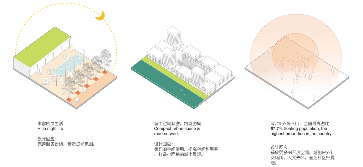
结合当地建筑文化特色以及人文生活习性,提取景观元素予以设计回应。
Combined with local architectural cultural characteristics and human life habits, landscape elements are extracted for design response.
▼灵感追溯 Inspiration
方案呈现 SCHEME PRESENTATION
▼总平图 Masterplan
入口安全长廊 ENTRANCE PROMENADE
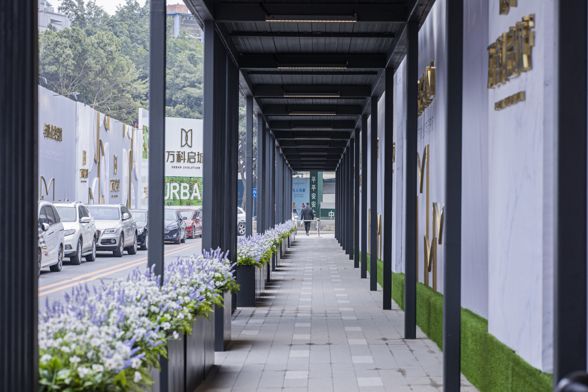
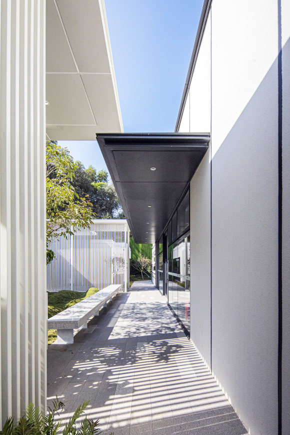
人行通道入口至销售中心入口步行距离约103米,因此在设计中利用场地现场条件,横向打造项目的视觉界面,再通过格栅和花箱引导人流和视线,形成行为界面。
The walking distance between the entrance of the pedestrian passageway and the entrance of the entry corridor sales center is about 103 meters. Therefore, the design utilizes the site conditions to create the visual interface of the project horizontally, and then guides the people and sight through the grille and flower box to form the behavioral interface.
活力街区 VITALITY STREET
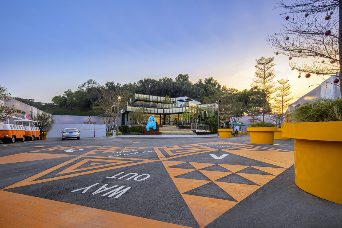
运用设计符号的演变图案、亮眼的色调,呈现在地面,时尚又具有视觉引导性同时提升街区的活跃气质。
The evolution patterns of design symbols and bright colors are presented on the ground, which is fashionable and visually instructive while enhancing the active temperament of the steetscape.
▼街角广场 Corner Square
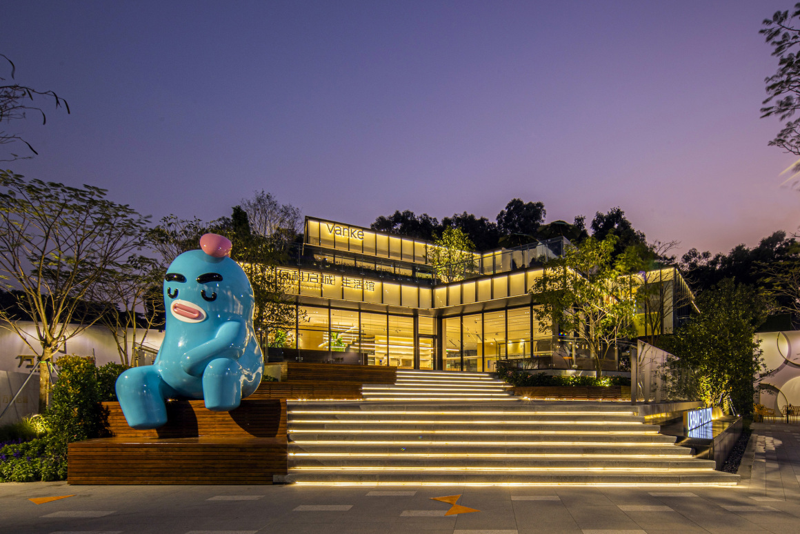
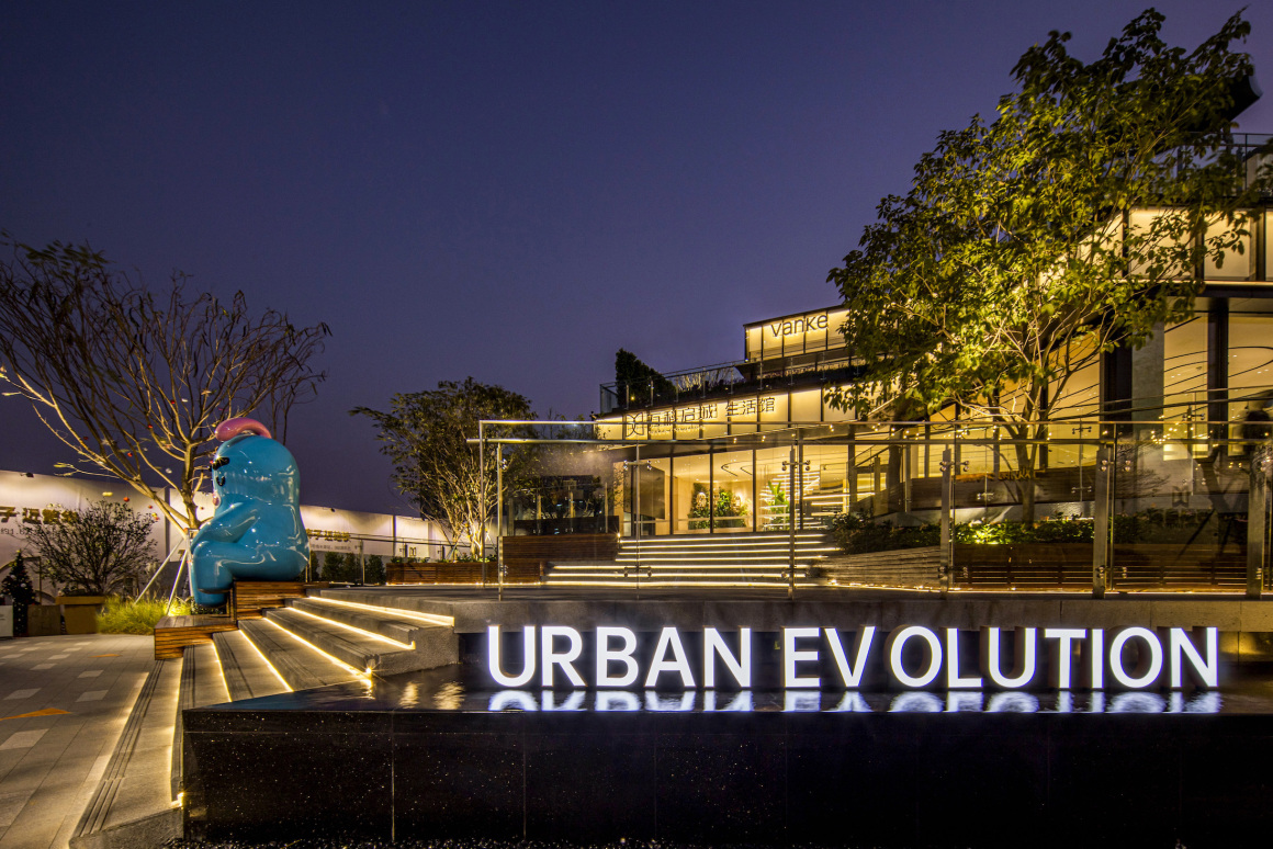
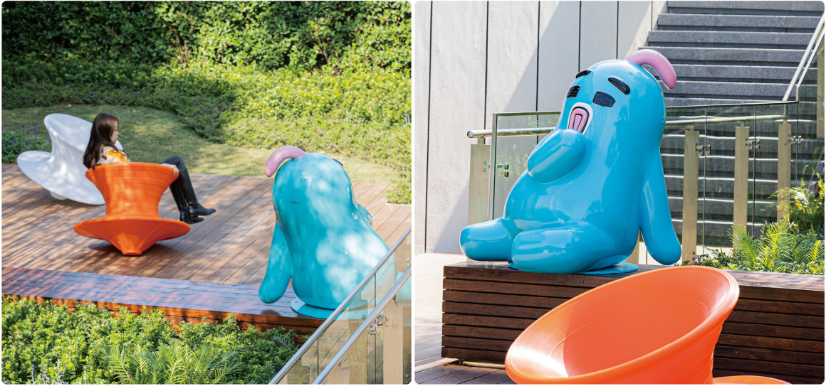
场地中选用极具代表性的IP形象,参与到场景中,极具昭示性及活力。
A representative IP image is selected in the site to participate in the scene, which is very clear and energetic.
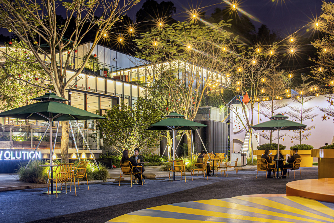
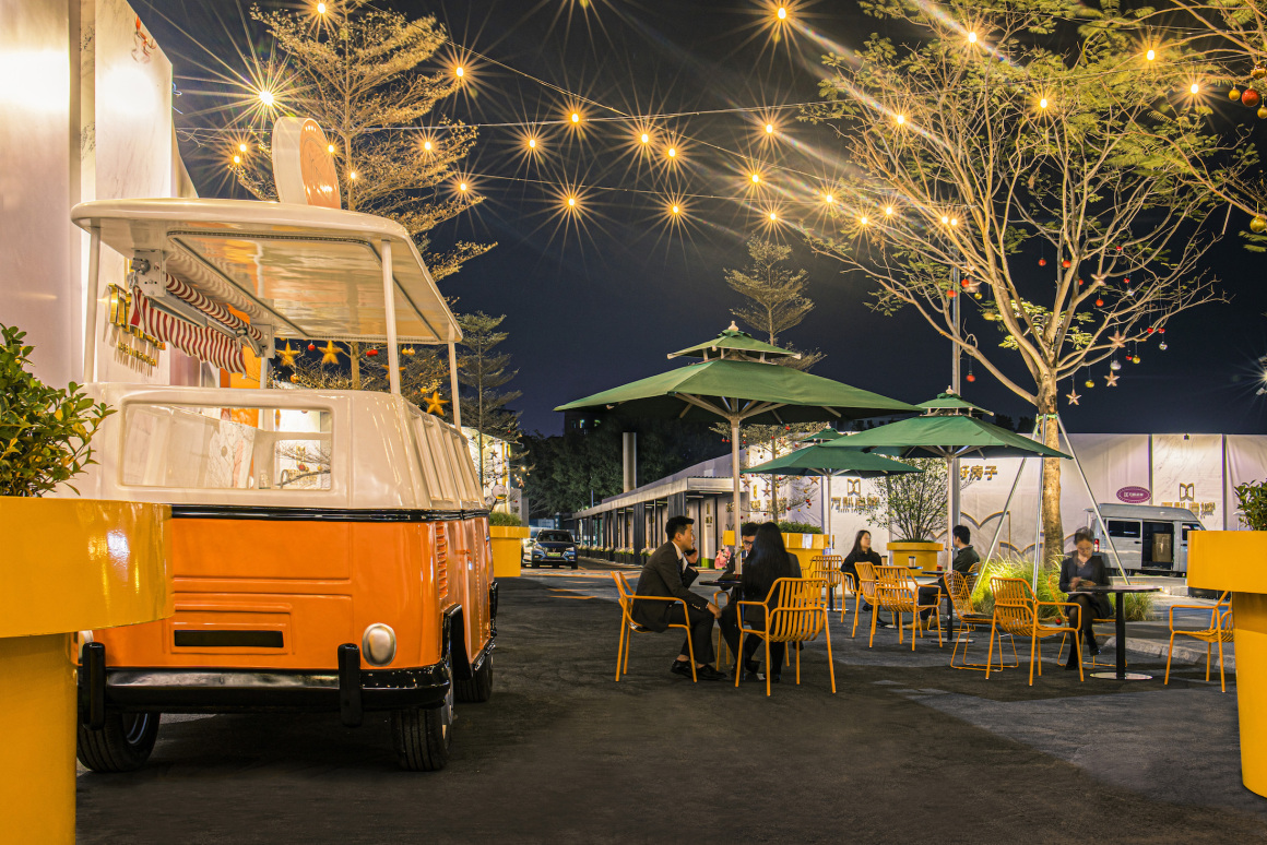
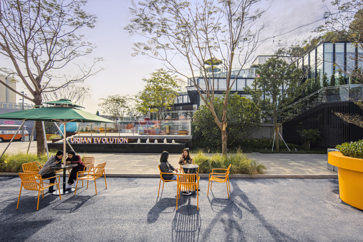
集市场景的呈现,结合餐饮外摆与悬挂灯等等,体现了街区商业氛围,给予未来生活街区美好的期待与想象。
The presentation of the market scene, combined with the restaurant spill-out and hanging lights, reflects the commercial atmosphere of the street and gives a better expectation and imagination to the future living street.
▼街区市集 Street Market
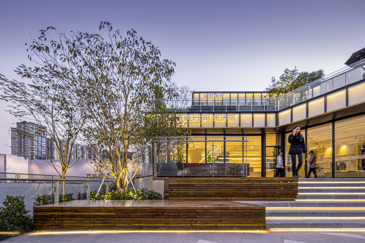
从街区到街角广场,空间逐层递进上升,景观与建筑相互呼应与契合。
From the street to the corner square, the space rises layer by layer, and the landscape and architecture echo and fit each other.
社交化开放空间 SOCIAL OPEN SPACE
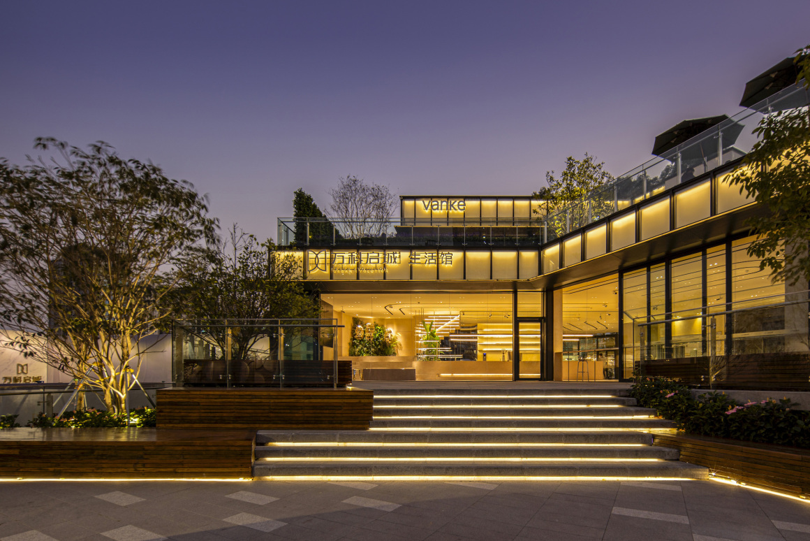
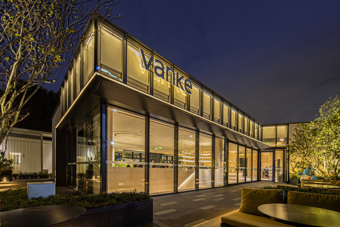
展示中心入口广场设计定义为公共广场属性,兼具室内餐饮业态的商业延伸空间。层层递进、水平开展的广场空间与建筑、室内视觉空间有效的衔接。
The design of the entrance square of the exhibition center is defined as a public square, which is a commercial extension space for indoor catering business. The square space is effectively connected with the building and the indoor visual space by progressive and horizontal development.
▼广场平台 Square Platform
广场上孤植的点景树、 形象雕塑形成了场所的景观点, 同时与场景功能产生联系与互动。 广场侧面的动态特色水景设计具有互动性,也是街景的点睛之笔。
The solitary landscape trees and image sculptures in the square form the landscape high-light point of the place, and at the same time have connection and interaction with the function of the scene. The dynamic characteristic waterscape design on the side of the square is interactive, and it is also the finishing touch of the streetscape.
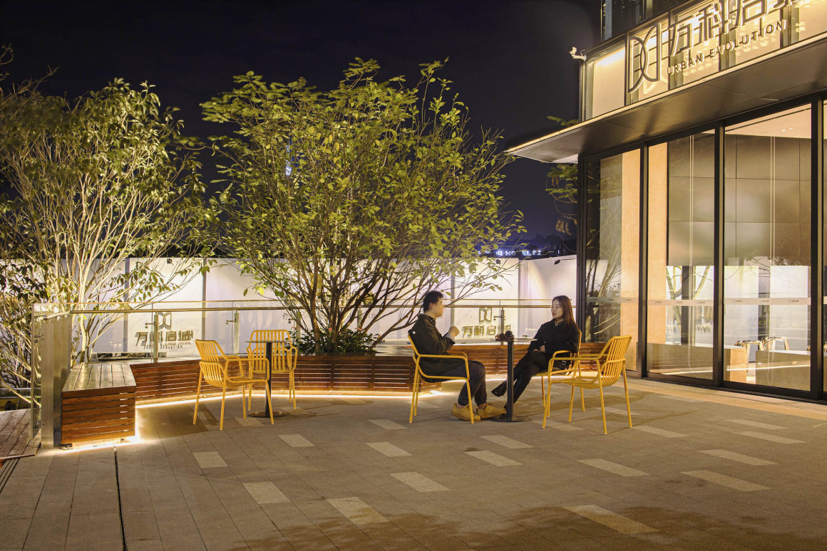
广场以大块面的平台设计提供室外休憩、交流的场所,木质坐凳为开敞的室外空间提供温暖、放松的调性,搭配软装家具,可以灵活转换活动场景。
The platform design of the square with large surface provides a place for outdoor rest and communication. The wooden benches provide a warm and relaxing tone for the open outdoor space. With movable furniture, the activity scene can be changed flexibly.
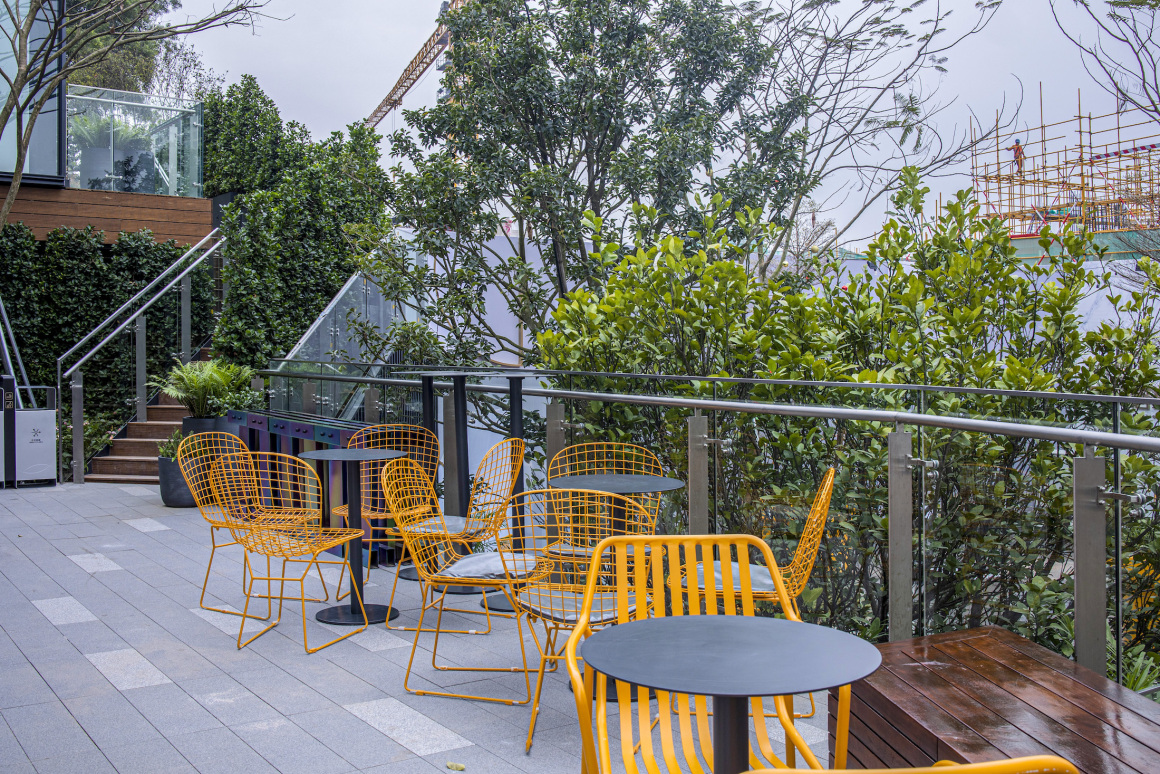
二楼屋顶露台进行局部空间围合,可做室内休闲餐饮的外延。利用IP形象演变,使用在二层露台、儿童游戏区外侧平台,在与地面场景相呼应同时,增强场所故事线及记忆点。
The roof terrace on the second floor is partially enclosed, which can be the extension of indoor leisure catering. IP image is used in the balcony on the second floor and the platform outside the children’s play area. While echoing the scene on the ground, the story line and memory points of the place are enhanced.
▼屋顶露台 Roof Terrace
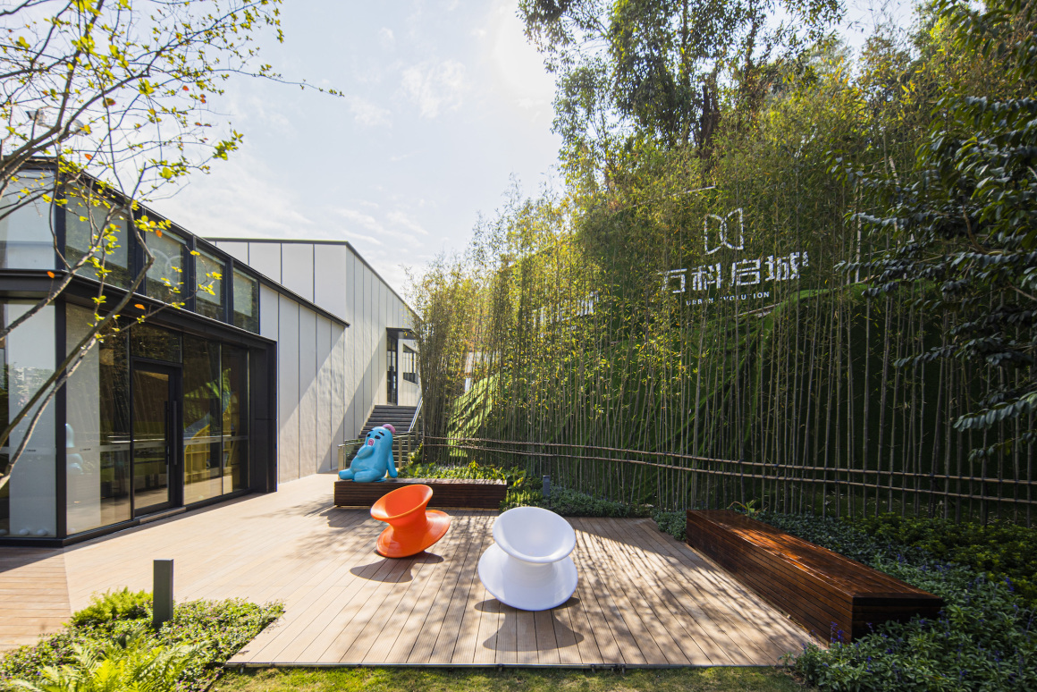
室内儿童游戏区外侧也设置了小型户外活动场所,配置了木质坐凳与旋转椅,此活动平台位于一层与二层室外参观路径的中间据点,是个小惊喜点,兼具趣味性和休憩功能。
Outside the indoor children’s play area, there is also a small outdoor activity place, equipped with wooden benches and rotating chairs. This activity platform is located in the middle of the outdoor visit path on the first floor and the second floor, which is a small surprise point, with fun and rest function.
▼趣味休闲 Fun and Leisure
精致花园空间 EXQUISITE GARDEN SPACE
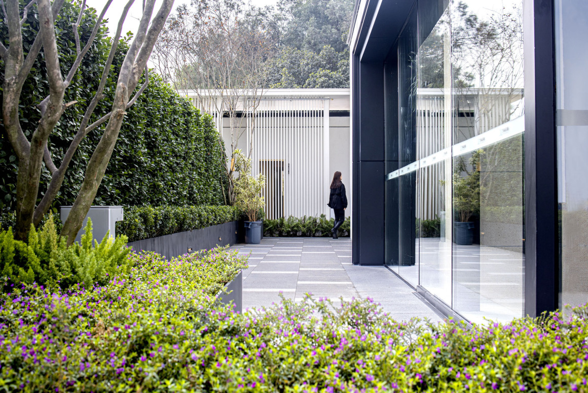
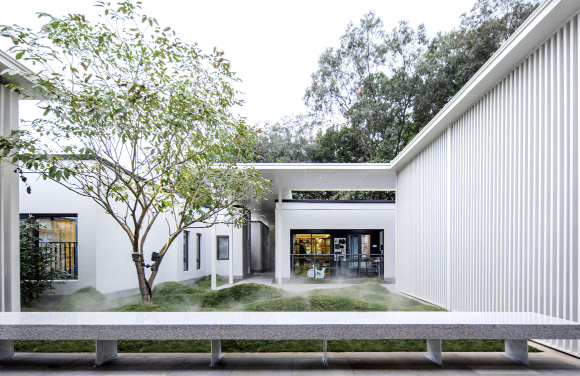
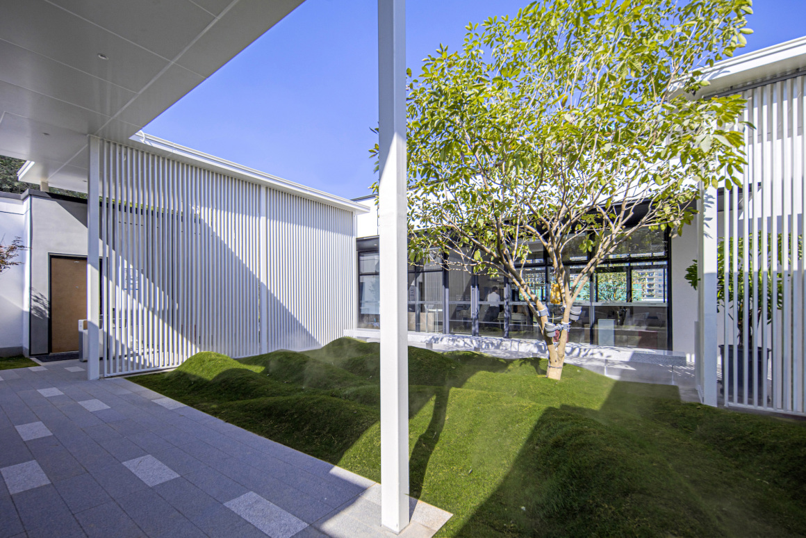
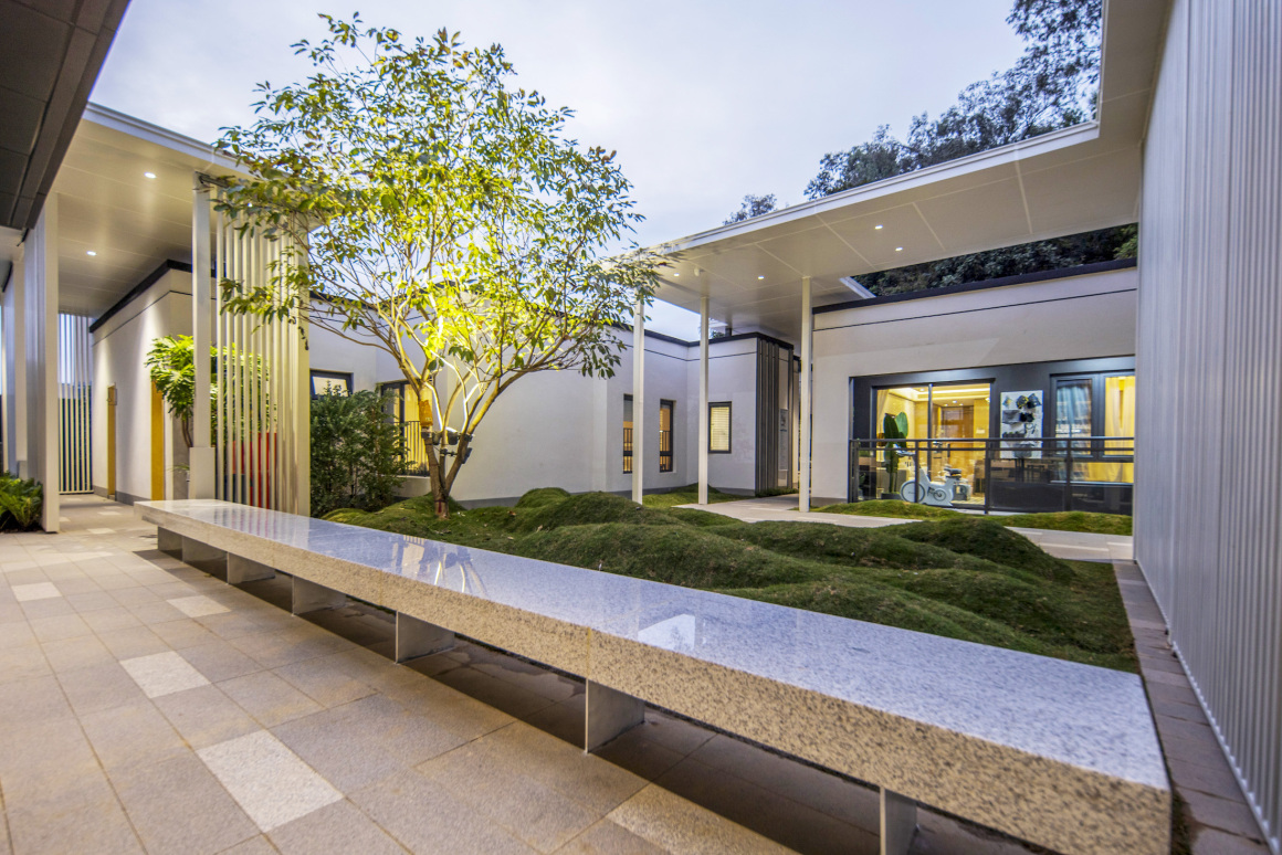
内庭院花园为参观路径的终点,在一系列欢愉、活跃的街道与广场空间体验之后,景观设计想营造的是一处能停下来歇息的静谧花园,从室内外观赏皆能静心欣赏的精致庭院。
The inner courtyard garden is the end of the tour path. After a series of pleasant and active street and square space experiences, the landscape design wanted to create a quiet garden that can stop and rest, and a delicate courtyard that can be appreciated from inside and outside.
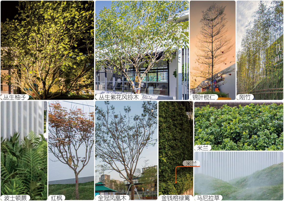
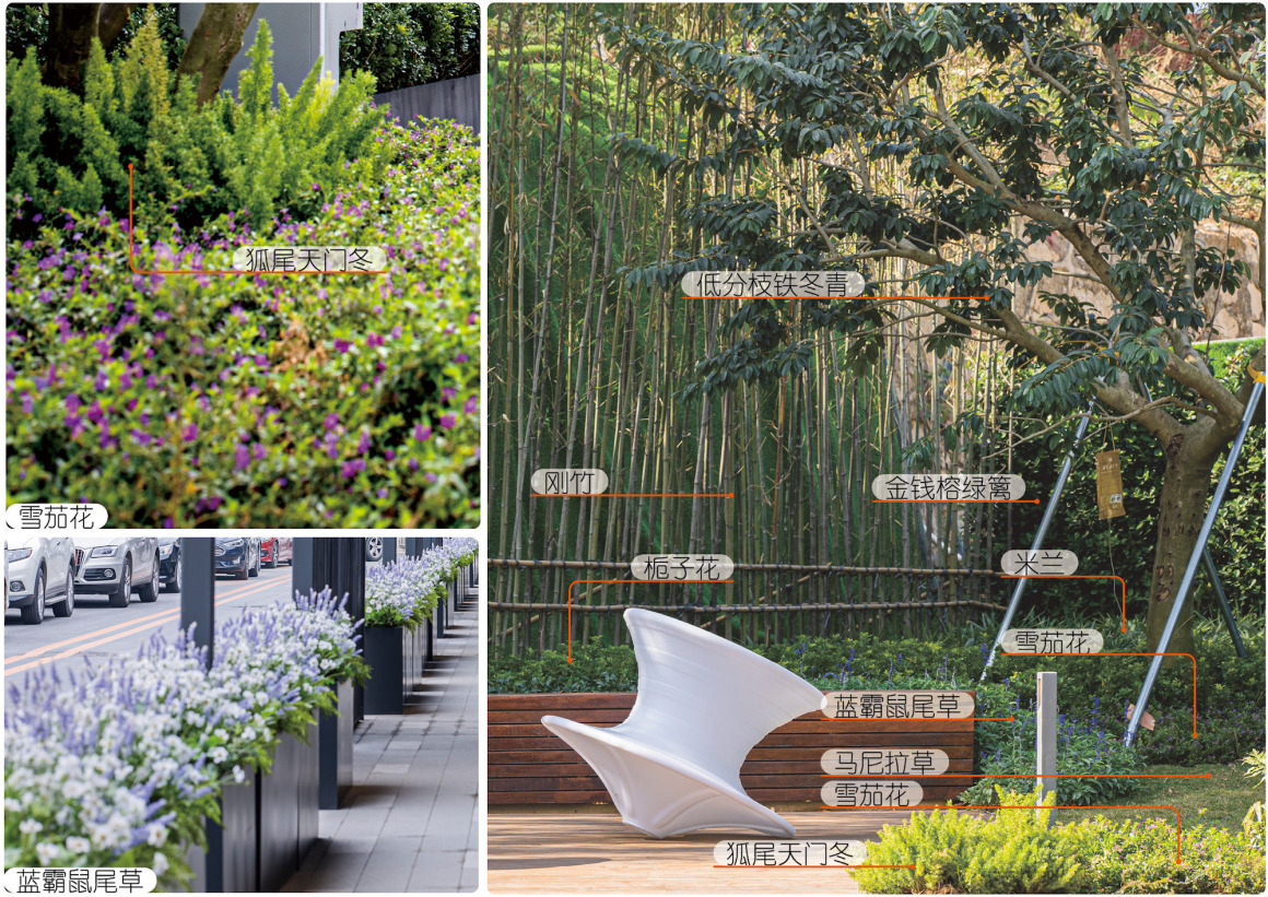
植物配置策略 PLANTING STRATEGY
植物设计根据空间营造出不同的氛围。
活力街区选用锦叶榄仁为背景植物。选择挺拔的植物,配以色彩鲜明的种植树箱,整齐的乔木及丰富饱满的灌木搭配,形成色彩明快、韵律分明的街区景观。
社交化开放空间以丛生乔木、特选造型乔木作为主景植物,使环境充满生机和美感。选用的植物在大小、形态、色彩、质地等特征上,都各有变化。它们丰富多彩的效果,为景观增添了活力与色彩。提升空间的观赏舒适性,增强景观感染力,为人们营造一个放松身心的良好环境。
精致花园空间适当地进行种植地形处理,增加园林空间层次,丰富空间景观特色,使植物景观更富于内涵。
The plant design creates a different atmosphere according to the space.
Olive nut is selected as the background plant in the vitality block. Choose tall and straight plants, with bright color planting boxes, neat trees and rich and full shrubs, to form a bright color, rhythm distinct street landscape.
The socialized open space uses clustered trees and specially selected shaped trees as the main plants, which makes the environment full of vitality and beauty. The selected plants vary in size, shape, color, texture and other characteristics. Their colorful effects add vitality and color to the landscape. Enhance the viewing comfort of the space, enhance the appeal of the landscape, and create a good environment for people to relax.
The delicate garden space is properly treated with planting terrain, which increases the garden space level, enriches the space landscape features and makes the planting design more rich in connotation.
室内一览 INTERIOR OVERVIEW
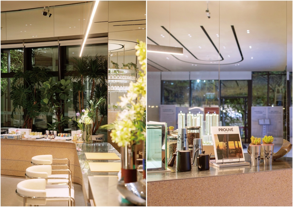
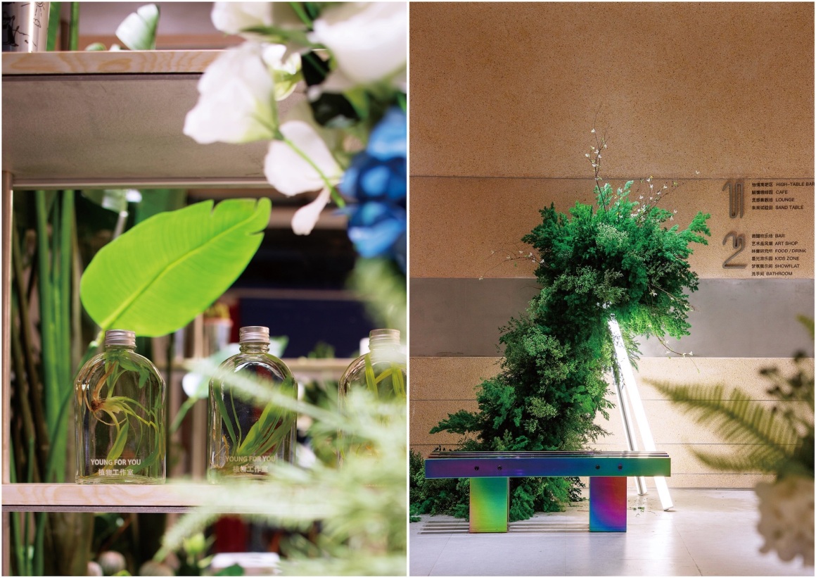
景观设计着重对于建筑、室内空间属性的理解,加强室内外场景的贯穿和互动,增加了视觉焦点同时,也有效延续和补充室内功能场所。
The landscape design focuses on the understanding of the attributes of architecture and indoor space, strengthens the penetration and interaction of indoor and outdoor scenes, increases the visual focus, and at the same time, effectively extends and complements the indoor function places.
以上仅为示范区内形象展示,并非项目装修标准。
The above is only for the demonstration area image display, not the project decoration standards.
设计师说 DESIGNER STATEMENT
开放活跃的街区布局,精致流畅的体验动线,万科启城展示区的景观设计让人体验室内外空间与功能可以相融合互通,景观设计与建筑可以紧密契合。在这里景观与建筑没有边界,交流的行为没有边界,公共空间正从“功能主义”向“人本主义”转变。让人走出自己“小家”,走入公共建筑空间,进入了一个意义更广泛的“大家”。由此展示区设计可窥见未来社区的美好场景,令人心生向往,与生活无界链接,共享城市精彩。
The open and active block layout, exquisite and smooth experience of the visit route, the landscape design of Urban Evolution exhibition area allows people to experience the integration of indoor and outdoor space and function, as well as the close combination of landscape design and architecture. There is no boundary between landscape and architecture, no boundary between communication behavior, and the public space is changing from “functionalism” to “humanism”. Let people out of their “small home”, into the public architectural space, into a wider meaning of “big home”. Therefore, the design of the exhibition area can glimpse the beautiful scene of the future community and make people yearn for it. It links with life unbounded and shares the splendor of the city.
项目名称:启城家园示范区
委托业主:深圳长湖置业发展有限公司
业主管理团队:胡爽、纪惠敏、张谢鑫、陈楠、周浩舟、周露曦
景观设计:创浦景观设计(上海)有限公司
景观设计团队:肖琳、李芳瑜、韩治凤、伊璟诺、葛则凤
景观施工图:深圳本末度景观设计有限公司
建筑设计:成都基准方中建筑设计有限公司深圳分公司
室内设计:dongqi 栋栖设计
室内软装设计:WED中熙设计
摄影师:王婷
项目地点:深圳长湖头
设计面积:4300㎡
设计时间:2020年8月
完成时间:2020年12月
Project name: Urban Evolution Demonstration Zone
Client Management Team: Hu Shuang, Ji Huimin, Zhang Xiexin, Chen Nan, Zhou Haozhou, Zhou Luxi
Landscape Design: T.Workshop
Landscape Design Team: Xiao Lin, Lee, Han Zhifeng,Yi Jingnuo, Ge Zefeng
Landscape construction drawing: shenzhen benmodu landscape design co., LTD
Landscape construction: shenzhen guoyi landscape construction co., LTD
Architectural Design: Chengdu Benchmark Fangzhong Architectural Design Co., Ltd., Shenzhen Branch
Interior design: Dongqi building design
Soft decoration design: Wed Zhongxi design
Photographer: Wang Ting
Project location: Shenzhen
Design area: 4300 square meters
Design Date: July 2020
Date of completion: December 2020
更多 Read more about: 创浦景观








0 Comments