

本文由Instinct Fabrication 本色营造设计事务所授权mooool发表,欢迎转发,禁止以mooool编辑版本转载。
Thanks Instinct Fabrication for authorizing the publication of the project on mooool, Text description provided by Instinct Fabrication.
本色营造设计事务所: 设计的初衷源于生活:中国是一个快速发展的国家,每个城市都在高速度运转着,广东佛山,亦是如此, 人们在这样一个喧嚣忙碌的大环境中工作和生活着,心境难免疲惫与烦躁,因此,在项目启动之初,与其说做一个充满“亮点和场景”的环境美化,我们更希望通过景观,来传递,感染和调剂人们的生活方式,心理状态以及与自然之间的关系,塑造一种帮助人们回归最简单真实状态的景观。而这样的出发点,对于一个江景高端产品来说,也许是恰到好处的:它的客户群相对来说是有一定品味和见识,到了一定人生高度,他们对于景观的理解和需求可能已经超出了市场所体现出来的常规形态,他们在追求一种更高内涵的,低调却不失品质和真实的未来生活。
Instinct Fabrication:Our design intent is based on the fact that people are livingunder such hustling and bustling in almost every single city of China, wherethings go fast and get complicated easily, where people feel exhausted frequently.Started with that thinking, for this project, we decided to deliver a landscapewith distinctive experience and appearance in contrast to the world outside ofthe community. We also believe landscape could be received by people not justvisually but also psychologically, in a way that people can feel retreated and relaxed backhome. Instead of being stuffed with too many picturesque decorative features,the landscape is conceived to make everything simple and slow for people andembrace them to escape the outside chaos.

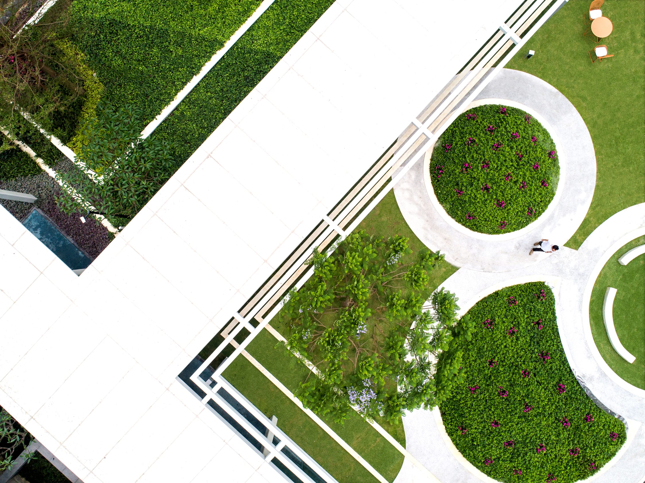
我们从三个方面入手开始方案构思:1.便捷快速的归家流线:我们用最直接的方式(而非曲折蜿蜒将人们与楼宇之间联系起来,形成快速归家,快速出门的通过性流线,把本身不大的庭院最大化和中心化;2.简约统一的材质和色调:从即视感出发, 首开区几乎只用了两种色调的表达- 绿色和白色(绿色是最令人放松的颜色,白色是最干净的颜色);3.弹性灵活的功能空间:我们认为未来是一个社交社会,居住区里亦是如此,因此在设计中我们尽可能预留一些可以用来聚会,交流的场所,而并不是靠繁复的绿化去填塞空间而牺牲了未来大量人流活动的可能性。
Then how do we do it? There were 3 things we looked into: easy circulation, simplified landscape color palette and flexible landscape programs.There won’t be any unnecessary detourbefore people get home. So, a straightforward loop connecting all residentialtowers sets up the basic framework of space. For color palette/texture, green and concrete white dominates theoverall landscape. Green is probably the most relaxing color and white makespeople feel clean and pure. Other than that, few colors are used. Lastly, we believe social is the key in acommunity environment and people love talking to each other and even love venting by him/herself in certain corner. Therefore, the design intended to reserve as much space as possible for people gathering, activities rather than brushing a trunk of chaotic vegetation,leaving little space for people.
五种空间
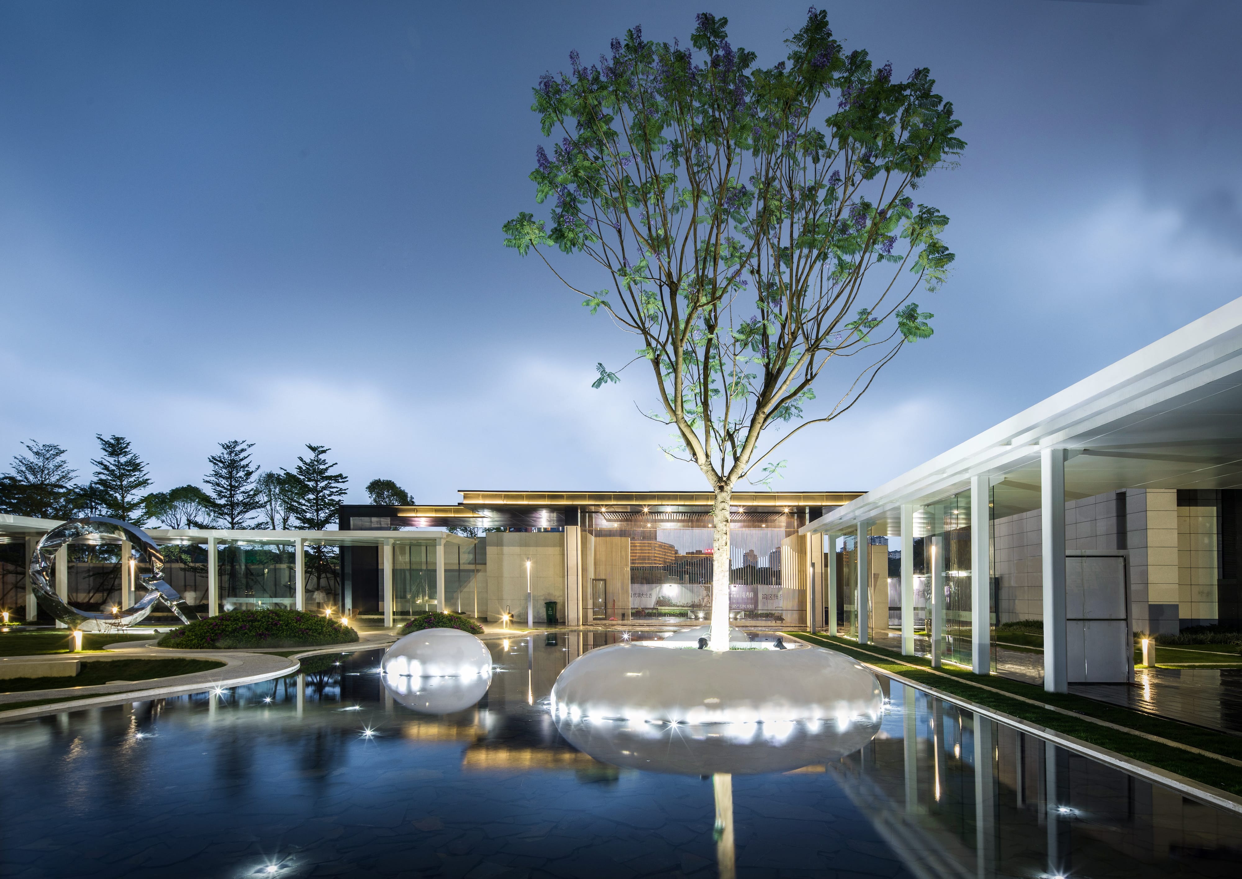
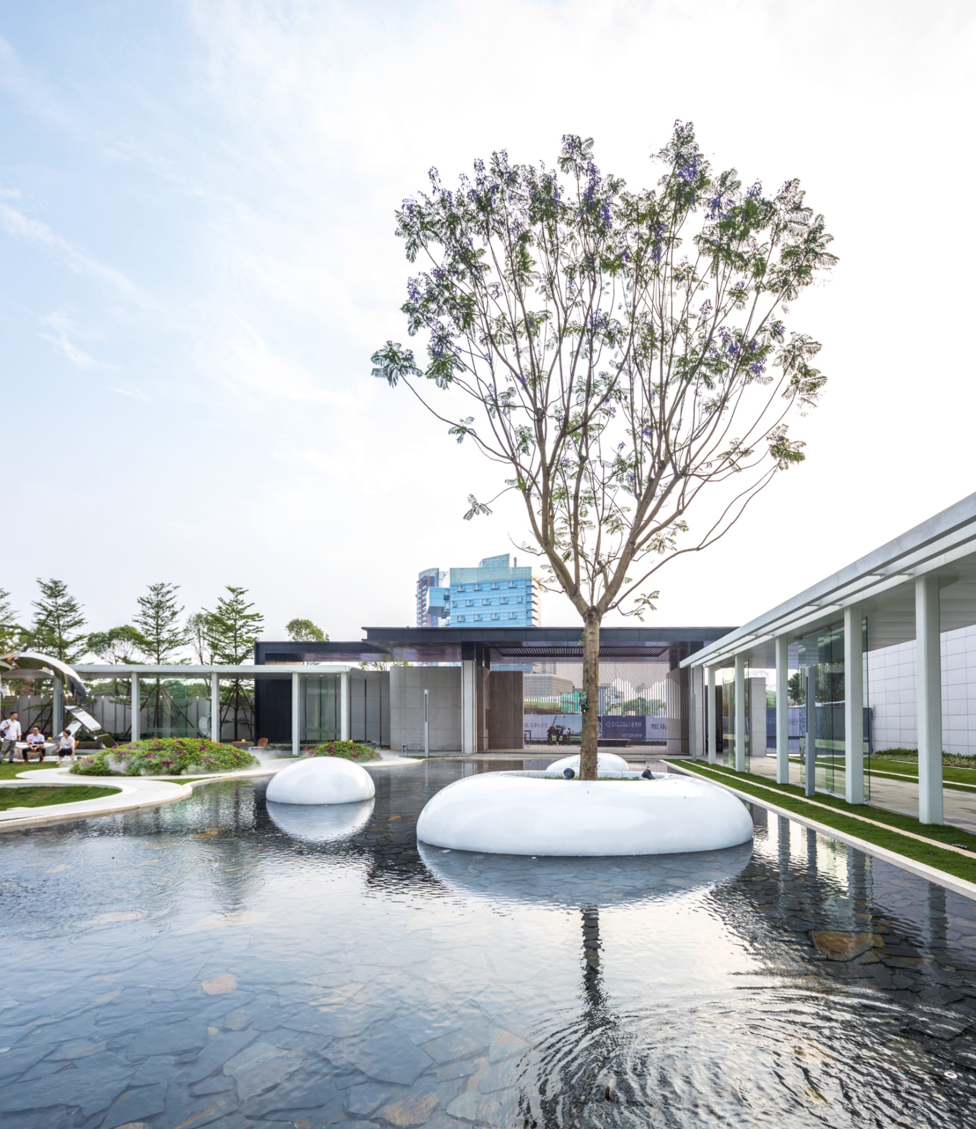
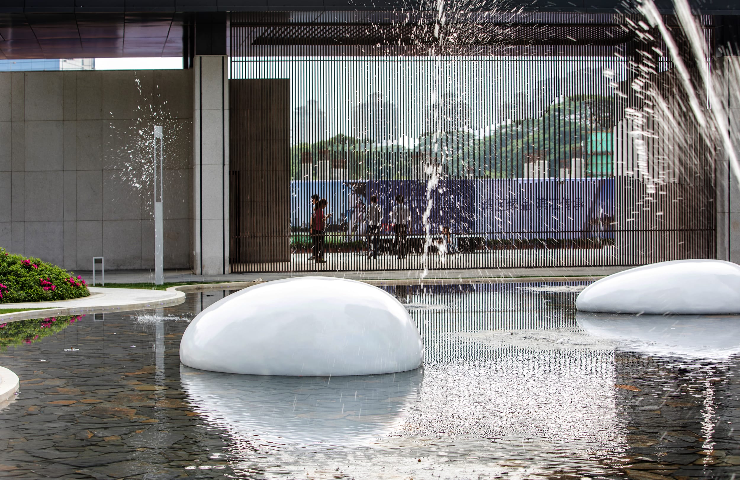
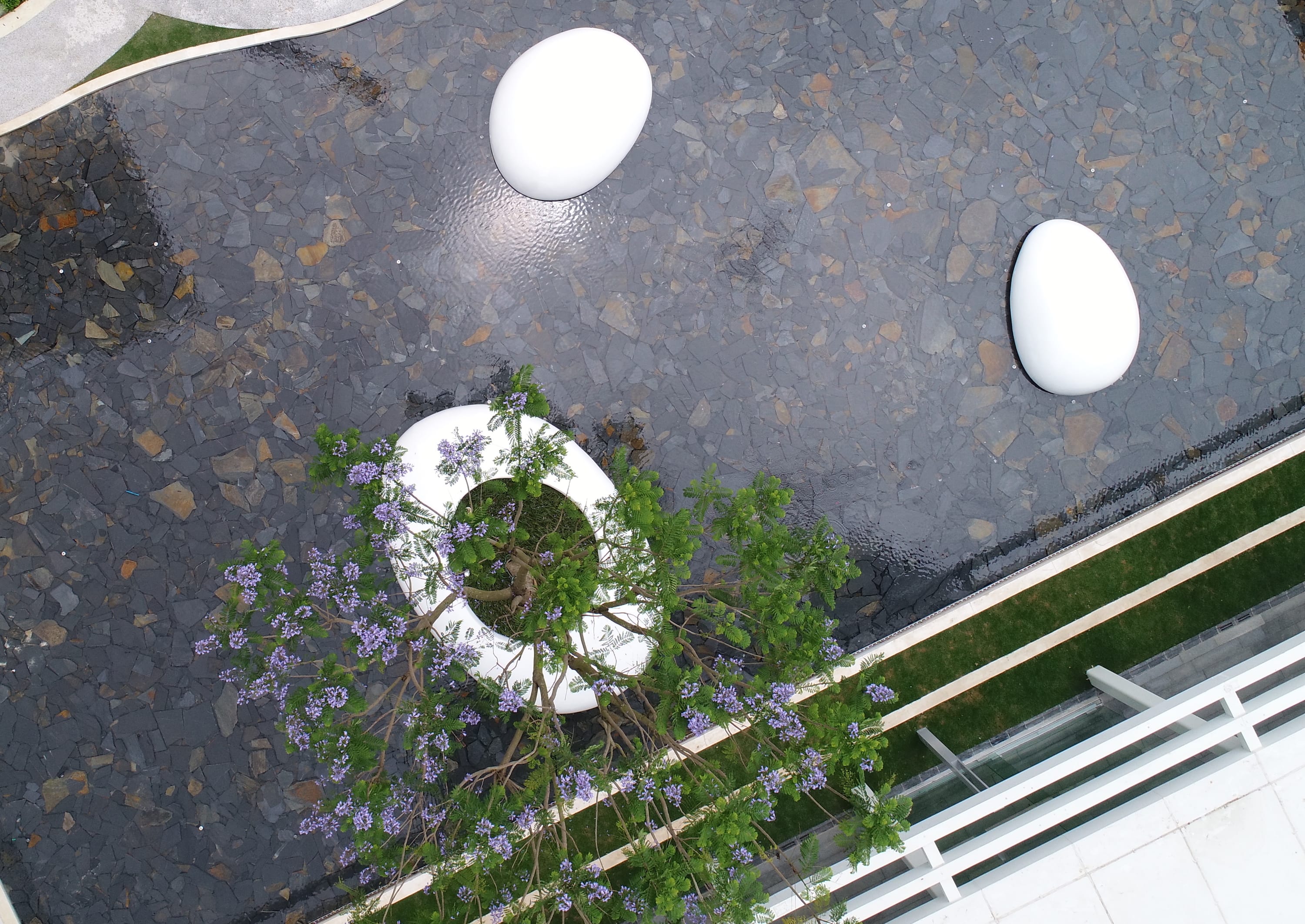
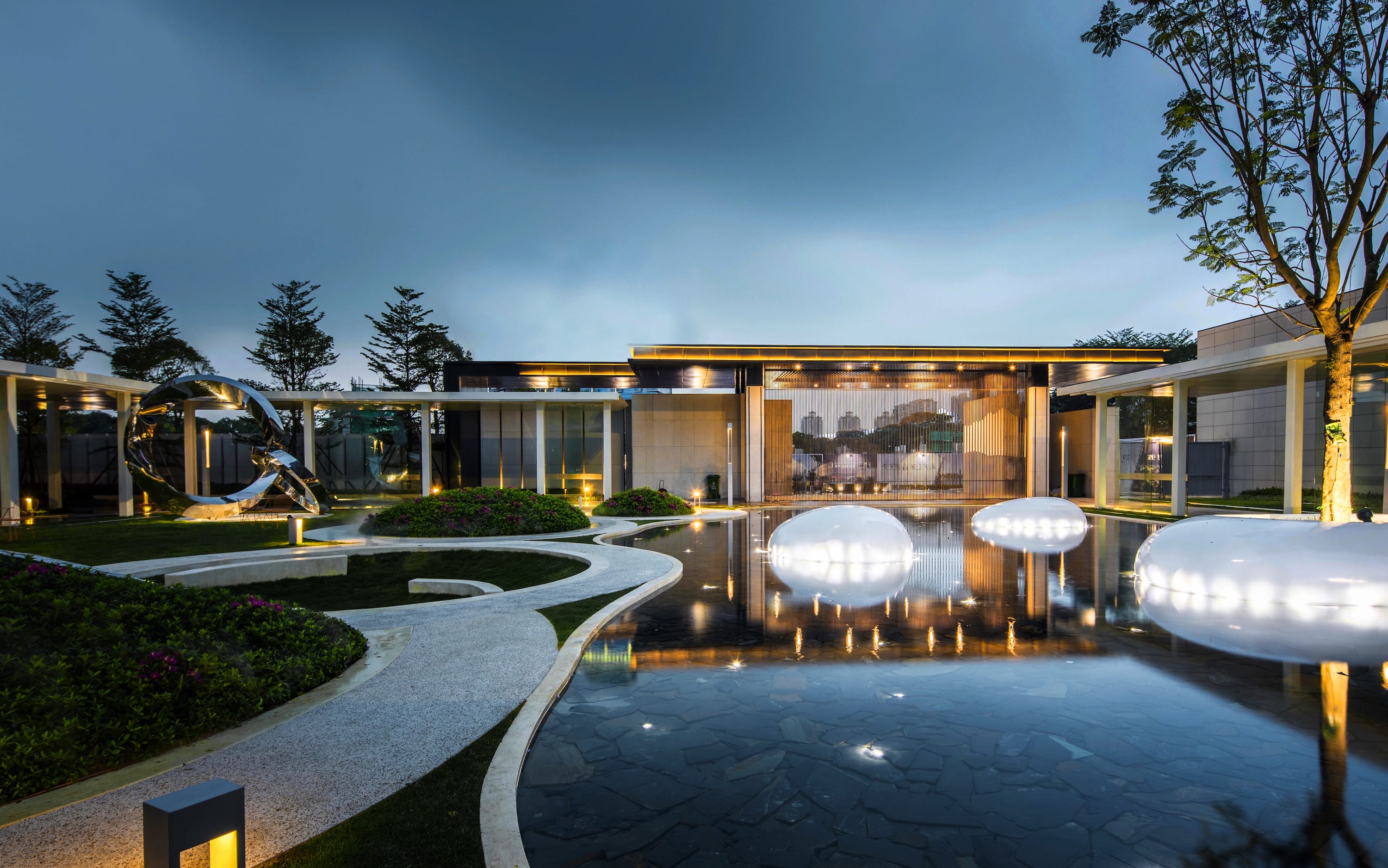
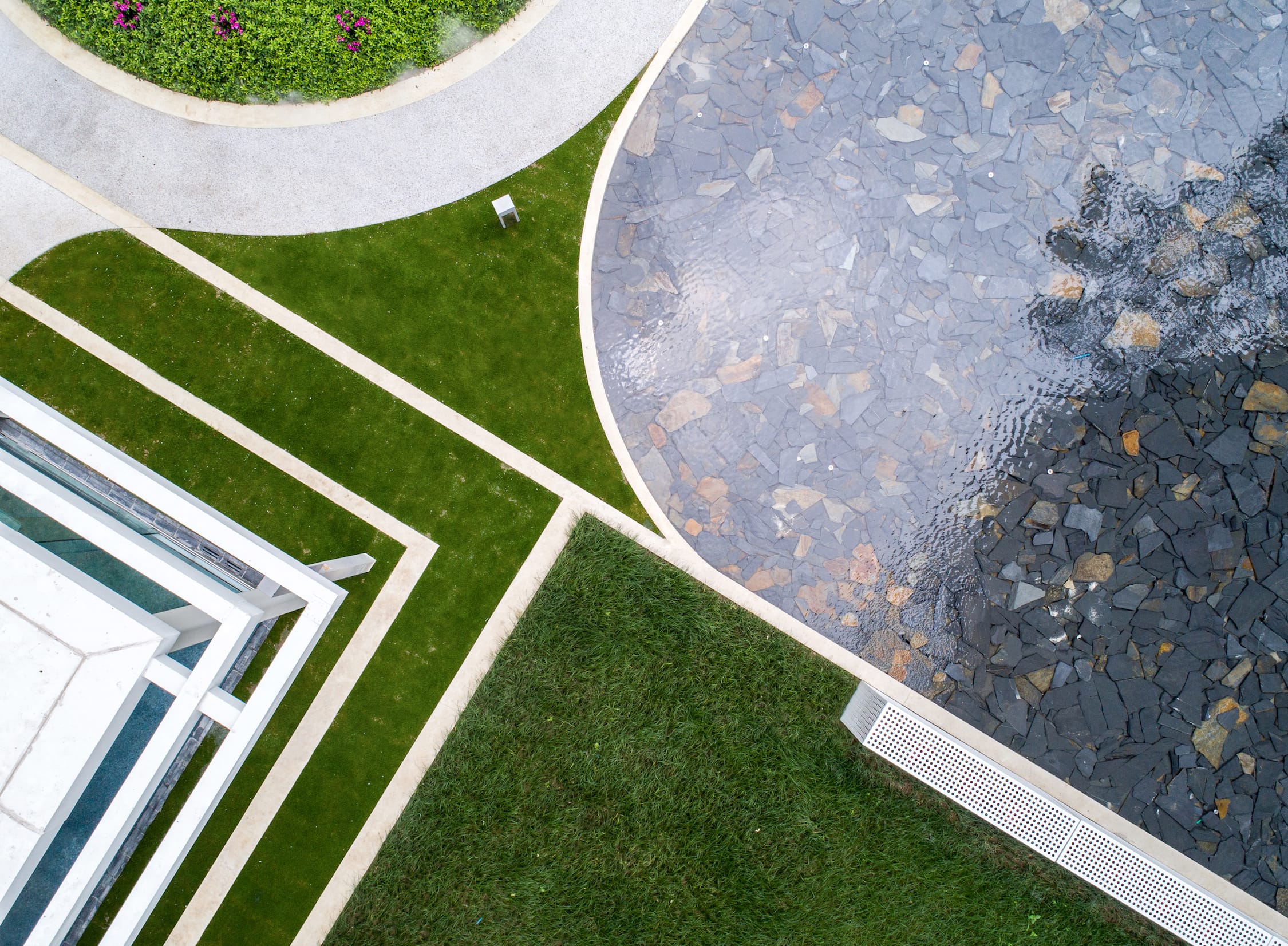
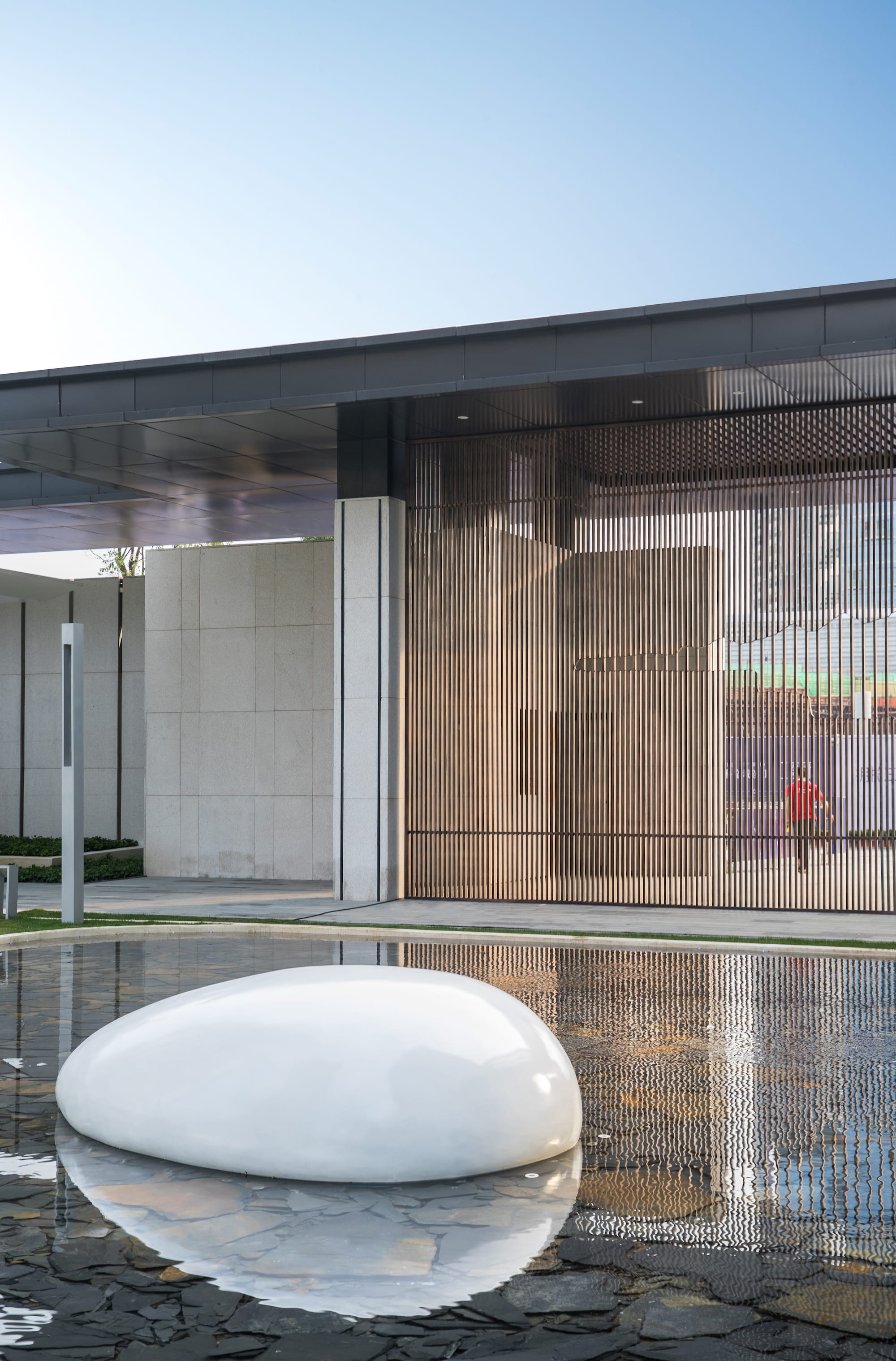
静水空间:镜子一般的水面无限延伸竖向维度,获得更立体的空间,并将归家的内心第一时间沉淀下来,映出瞬间宁静与安心,三个浮于水面之上的玻璃钢雕塑小品,也是是品质江景生活的浓缩写照,与此同时,时不时起跳的喷泉,给人们带来一丝惊喜感和期待。水景底部的深灰色片岩,让池底显得更为沉稳,让倒影感以及镜面效果更突出,同时,片岩天然的色差增加了一丝丰富性。
Space – Five Characters
The mirror-like pool captures what’s high above and give a moment of calm-down for people immediately after they step into the community.Three reinforced glass fiber sculptures appear to be floating on the water while the dark tiles of slate at bottom of pool creates a reflective background.

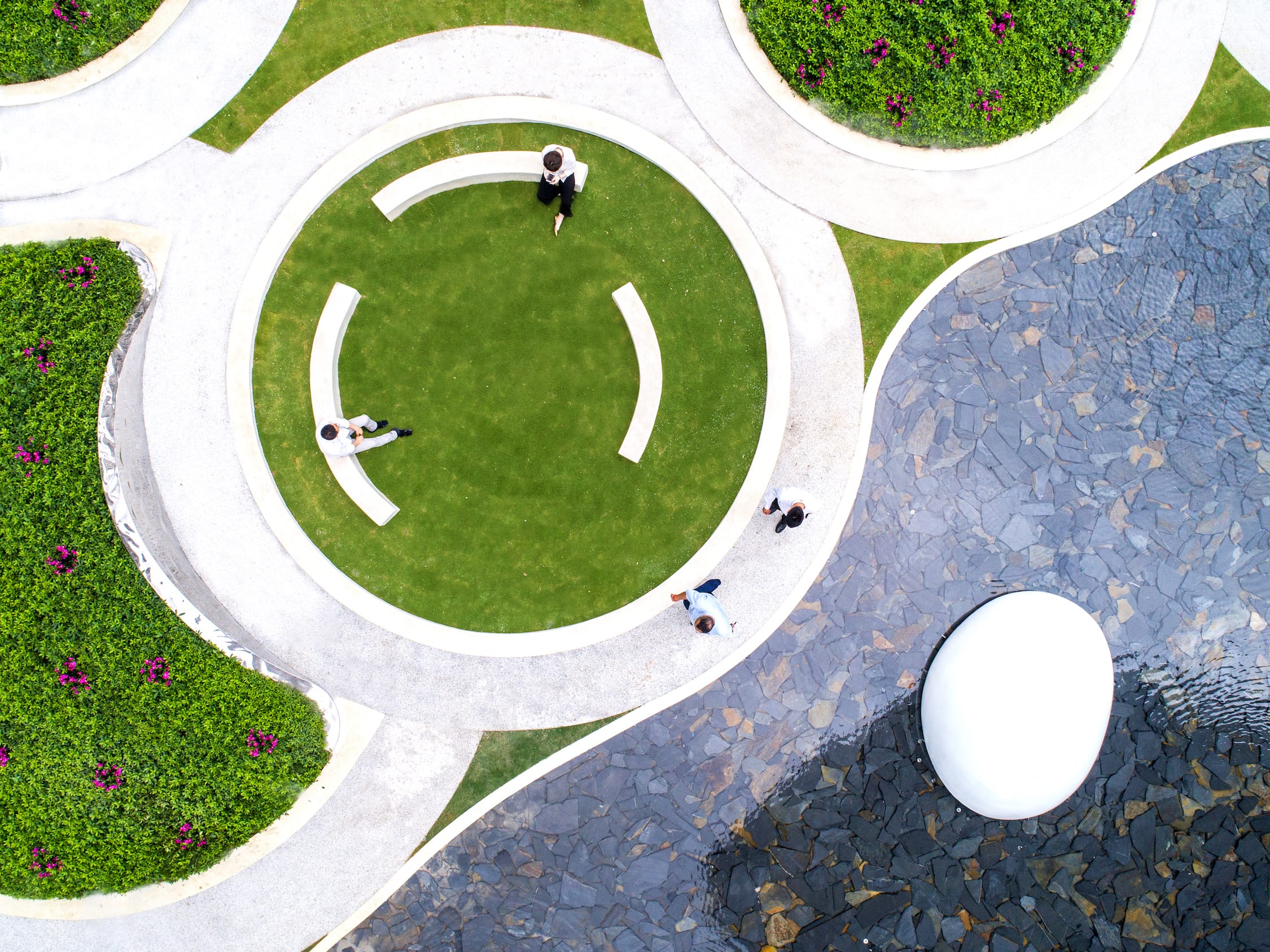
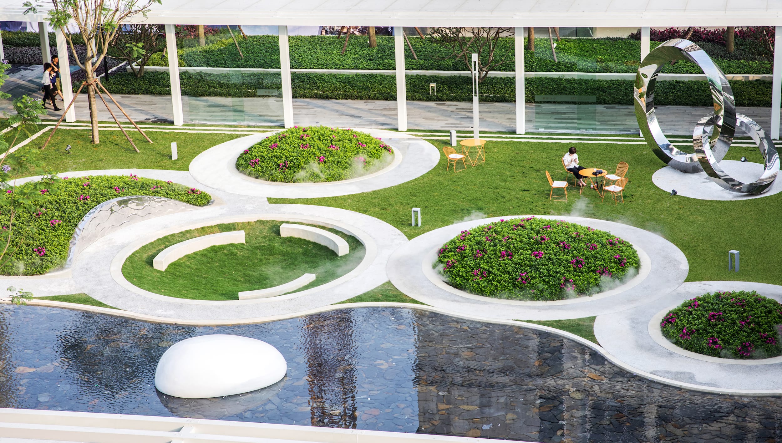
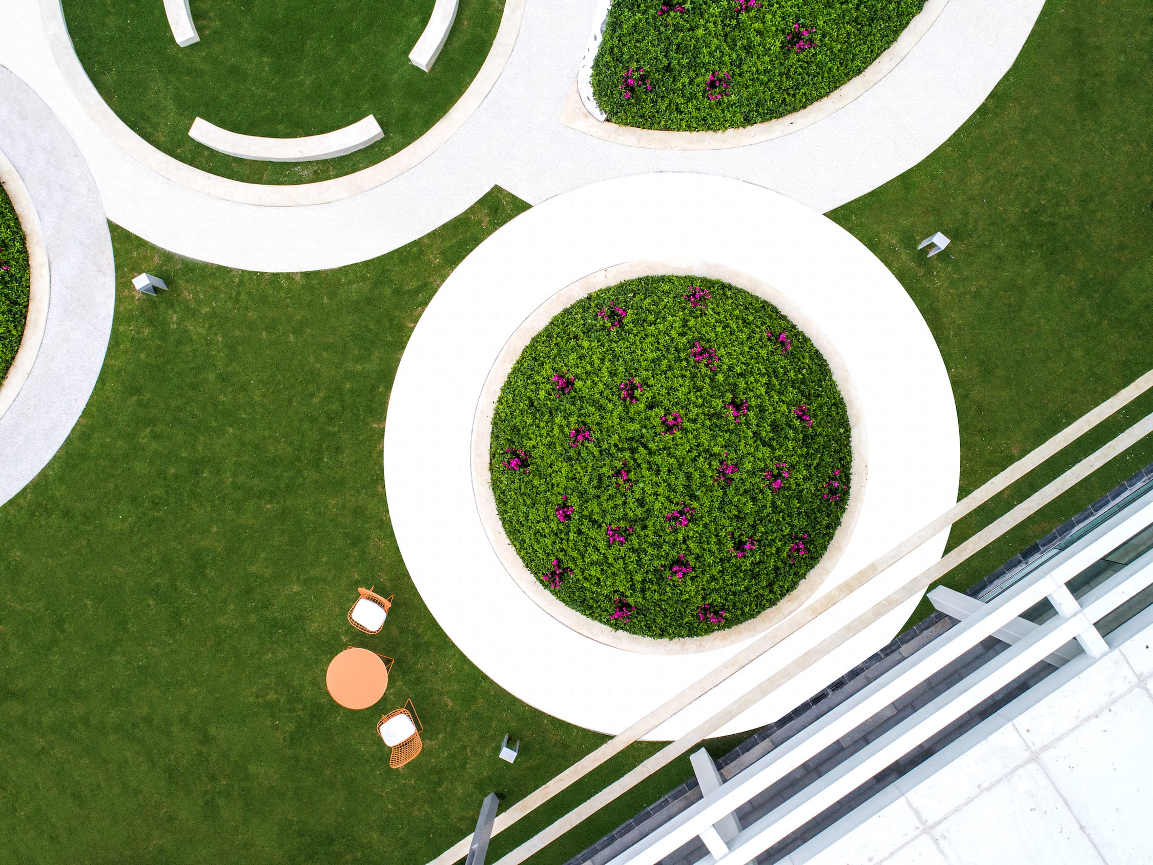
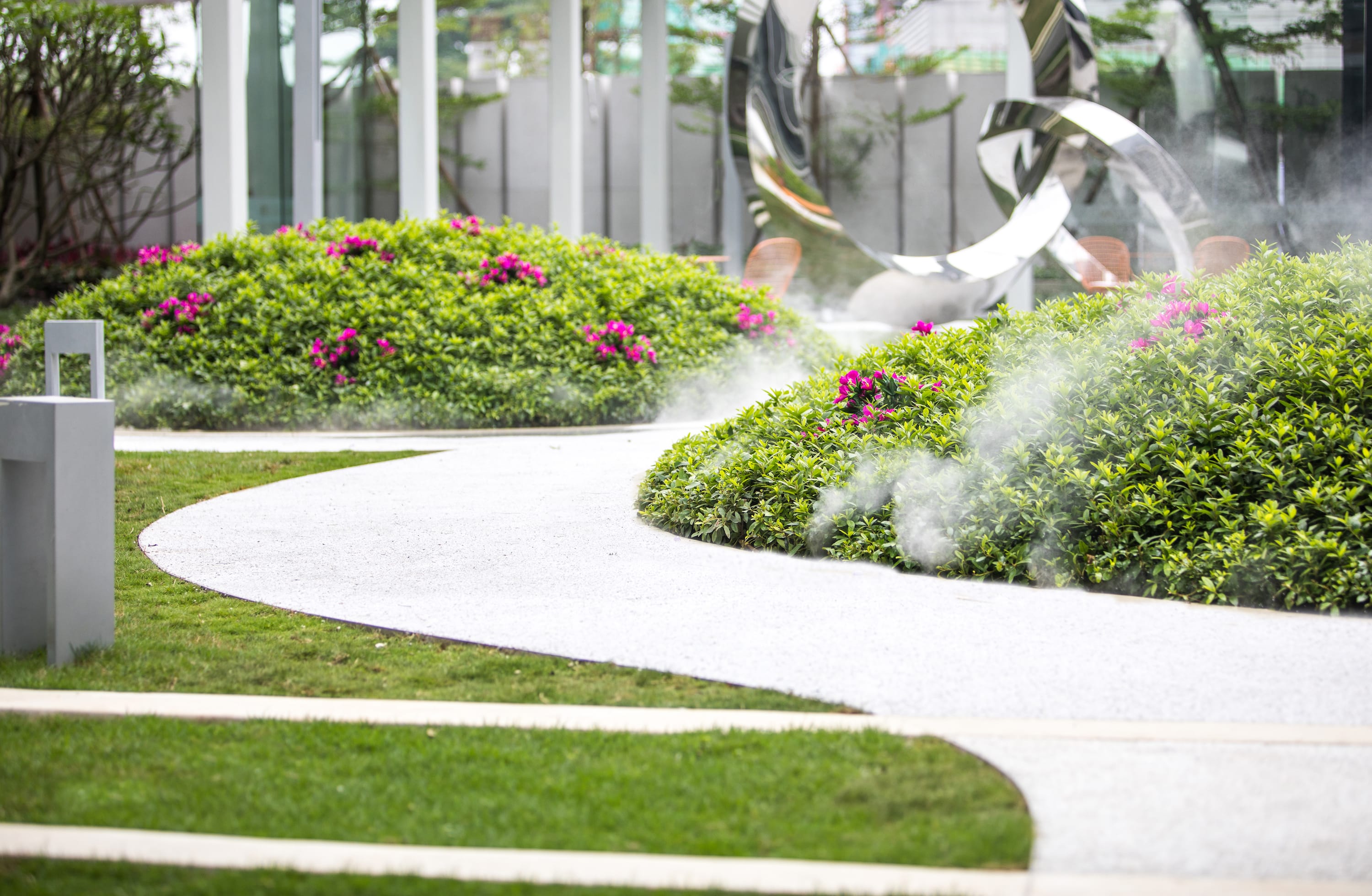
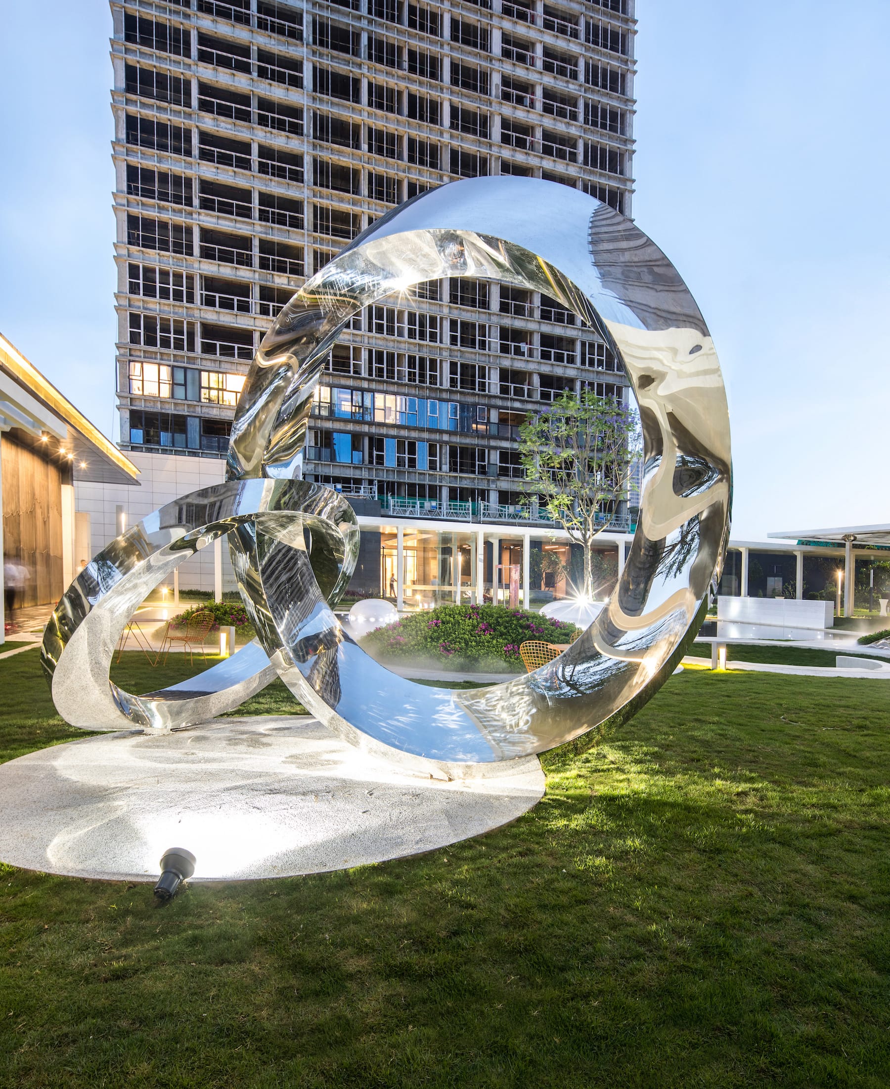
游园空间由四个球形种植(毛杜鹃)和一个下凹绿地组成,塑造出了有趣蜿蜒的散步休憩小径,设计想通过相对回旋流转的动线,变相地让人放慢自己的脚步,或驻足于水岸边凝望,或沉醉于毛杜鹃丛中的芳香和雾喷仙境中,或远望于双莫比乌斯环雕塑。
The garden is shaped by 5 spherical planting beds, whichintegrated with mist and Rhododendron. The circular paths intend to slow downthe pace of walk and to grab people into all these moments surrounded-contemplation, art, aroma, mist, etc.


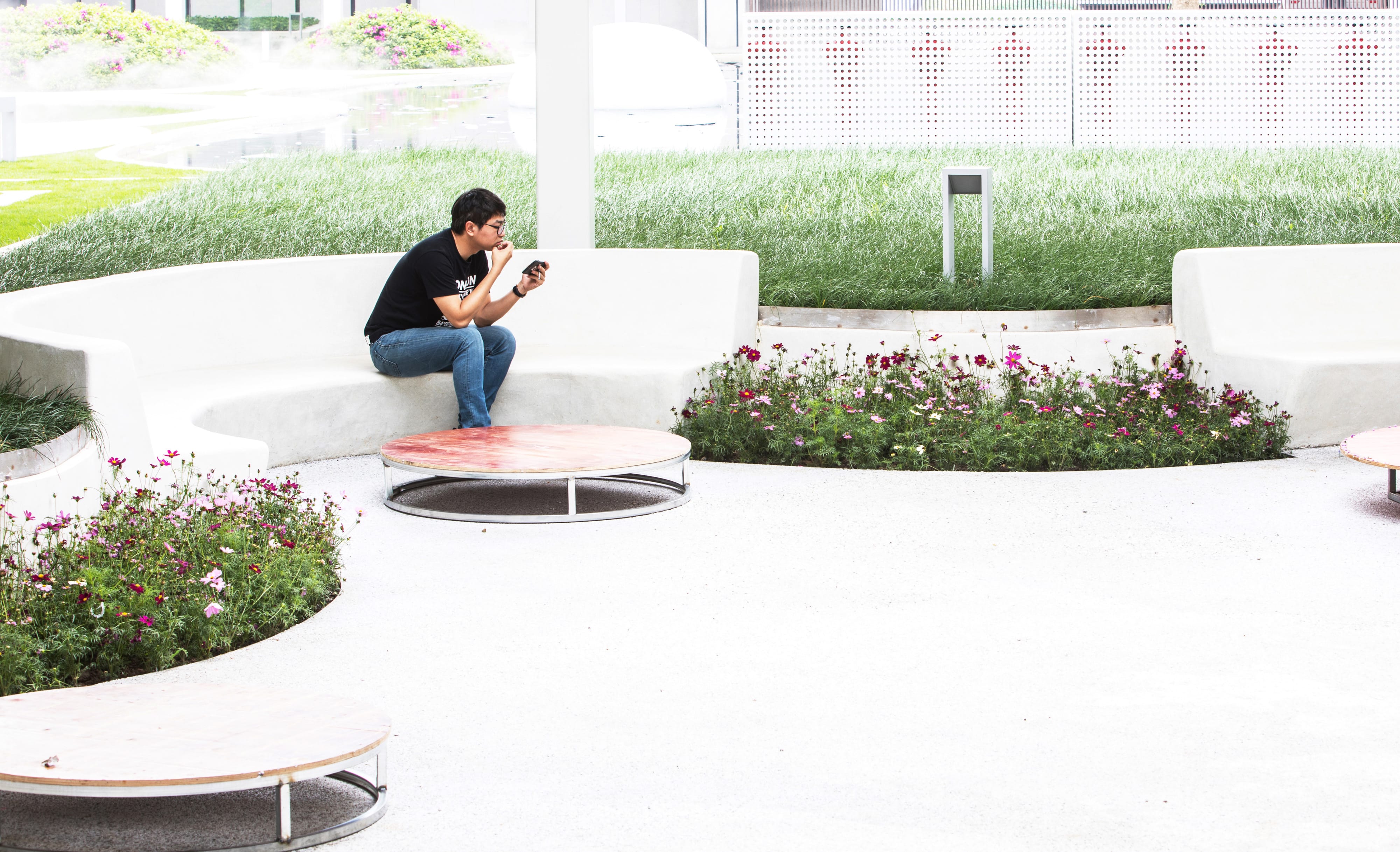
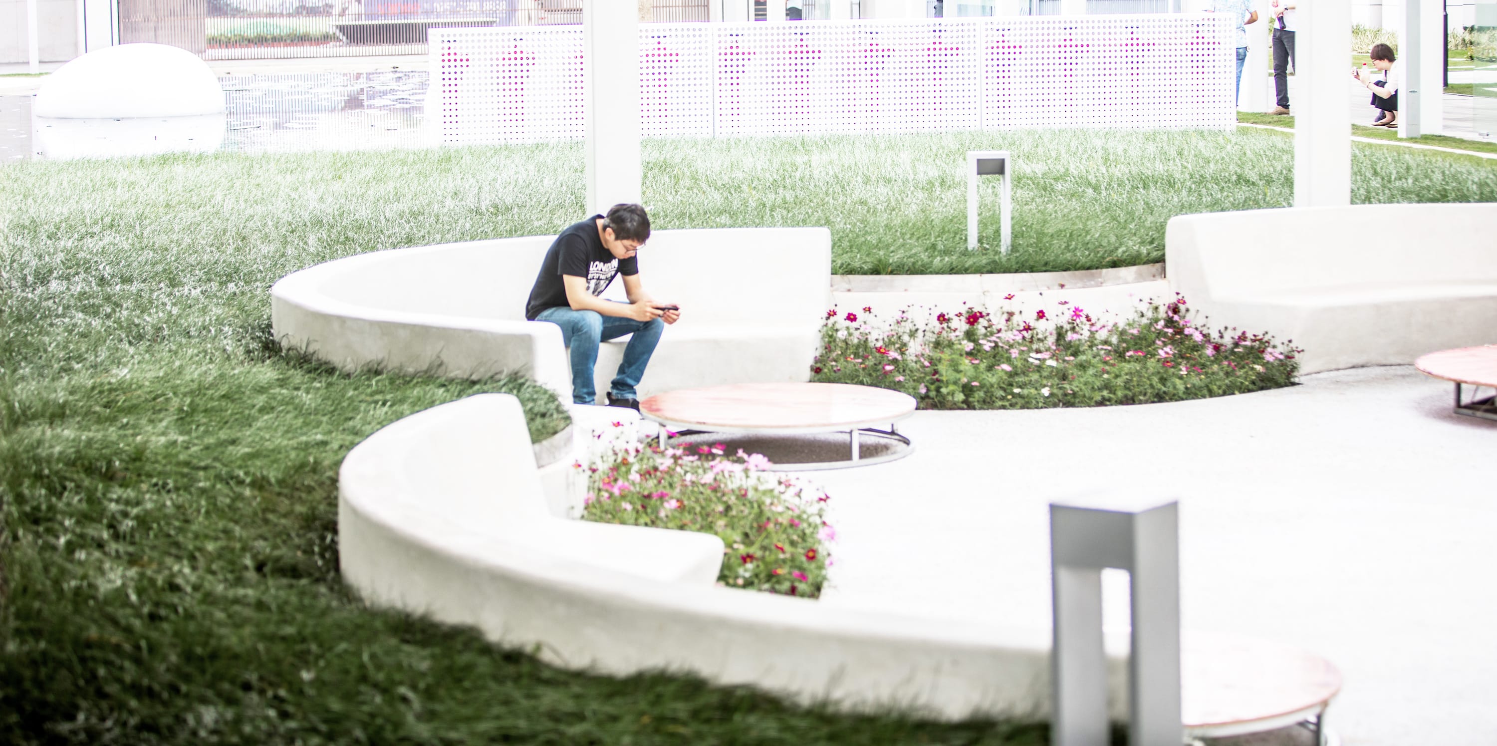
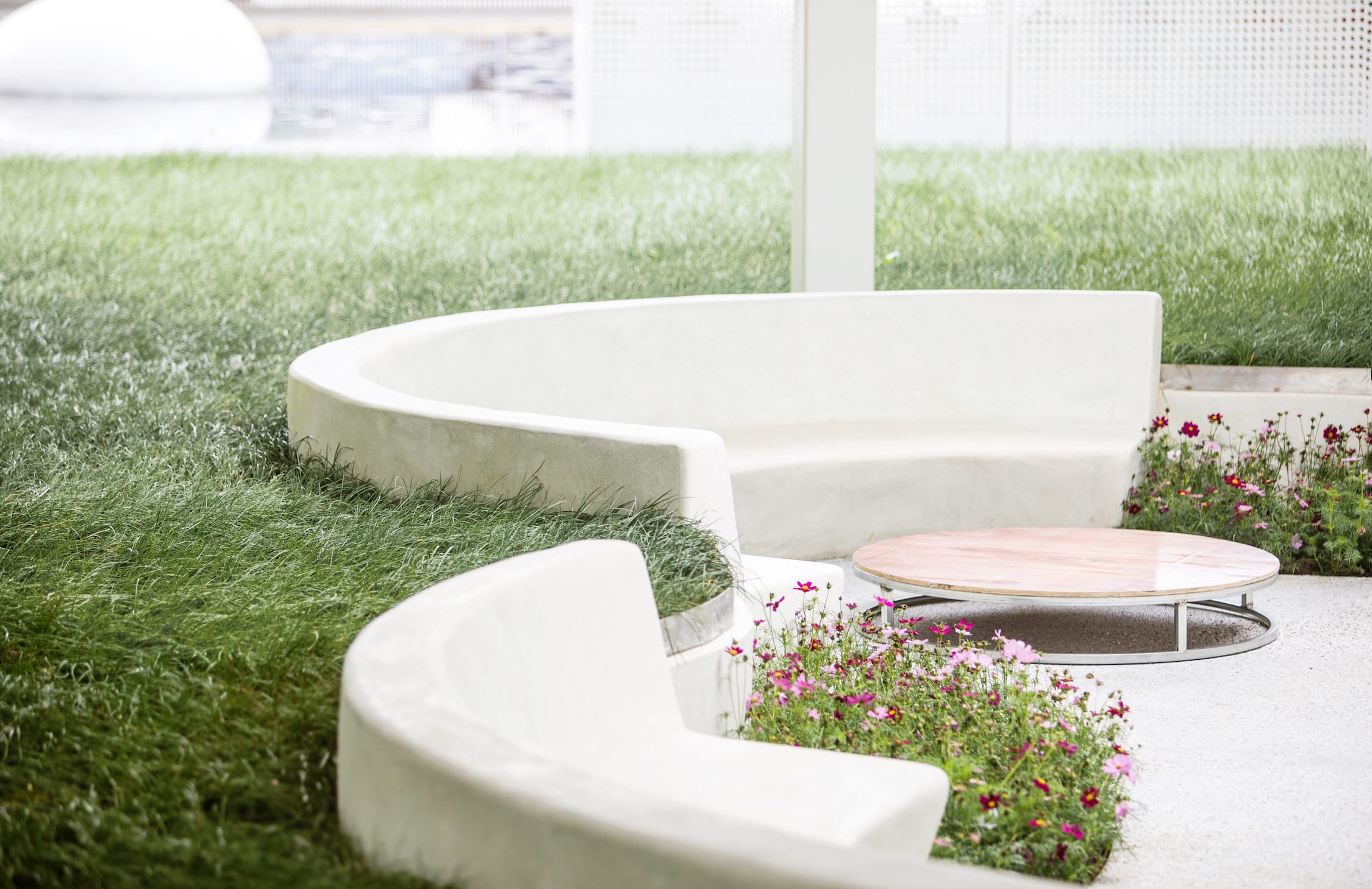
这是一个半下沉的交流空间,设计的灵感源于古时佛山被誉为“天下四大聚”-也就是今天说的经济枢纽城市, 设计通过四把弧形水磨石座椅,相互面对面地放置,潜意识中促进和鼓励邻里之间的社交。 这个空间的大小也可以作为一个小型活动以及社区会议进行使用。由于佛山气候炎热,为了提供更舒适更适合停留的户外环境,整个下沉空间由一个通高6m的方形廊架所遮盖,中间透空以获取更多天光,廊架底部为镜面不锈钢,使得空间感进一步放大。
The community common is inspired by the local history – the city of Foshan was oneof four cities for “Gather” in hundreds years ago. A city of “Gather” means that it was a regional economic hub for trading and business back to old days in China. We took that concept and develop 4 arc-bench made from white washedconcrete gavel. They face to each other so that in a way it encourages socialand interaction between neighbors just like hundreds of years ago the trade andbusiness took place. It’s also flexible enough to accommodate all different programs and activities in community scale.
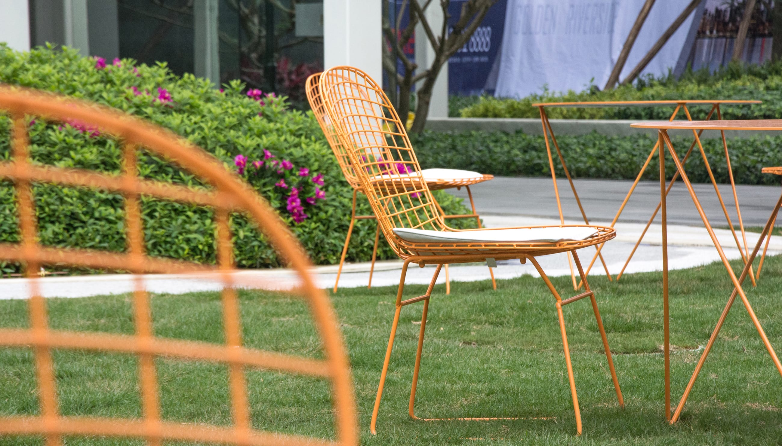
 △ 简约的色调 simple color palette
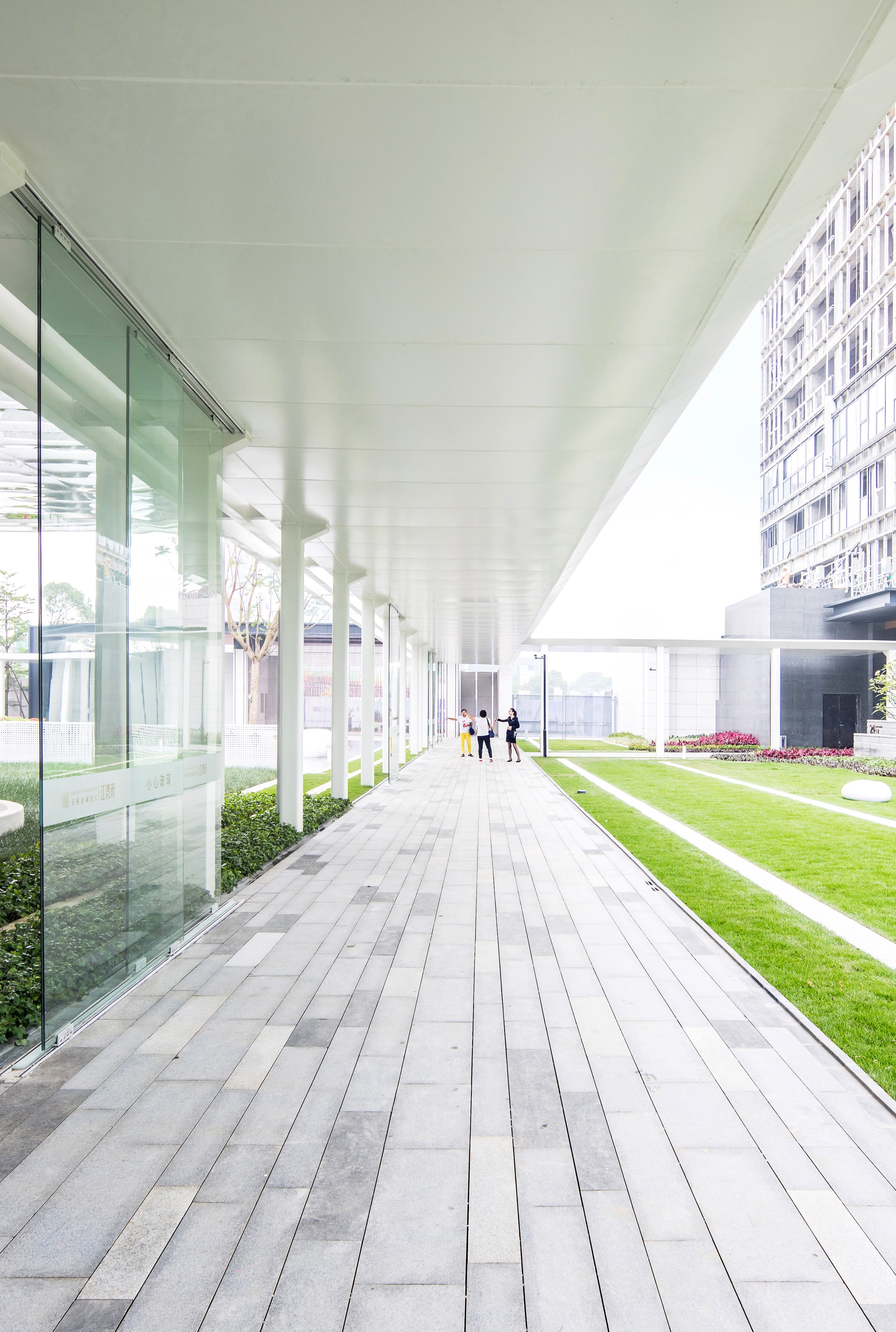
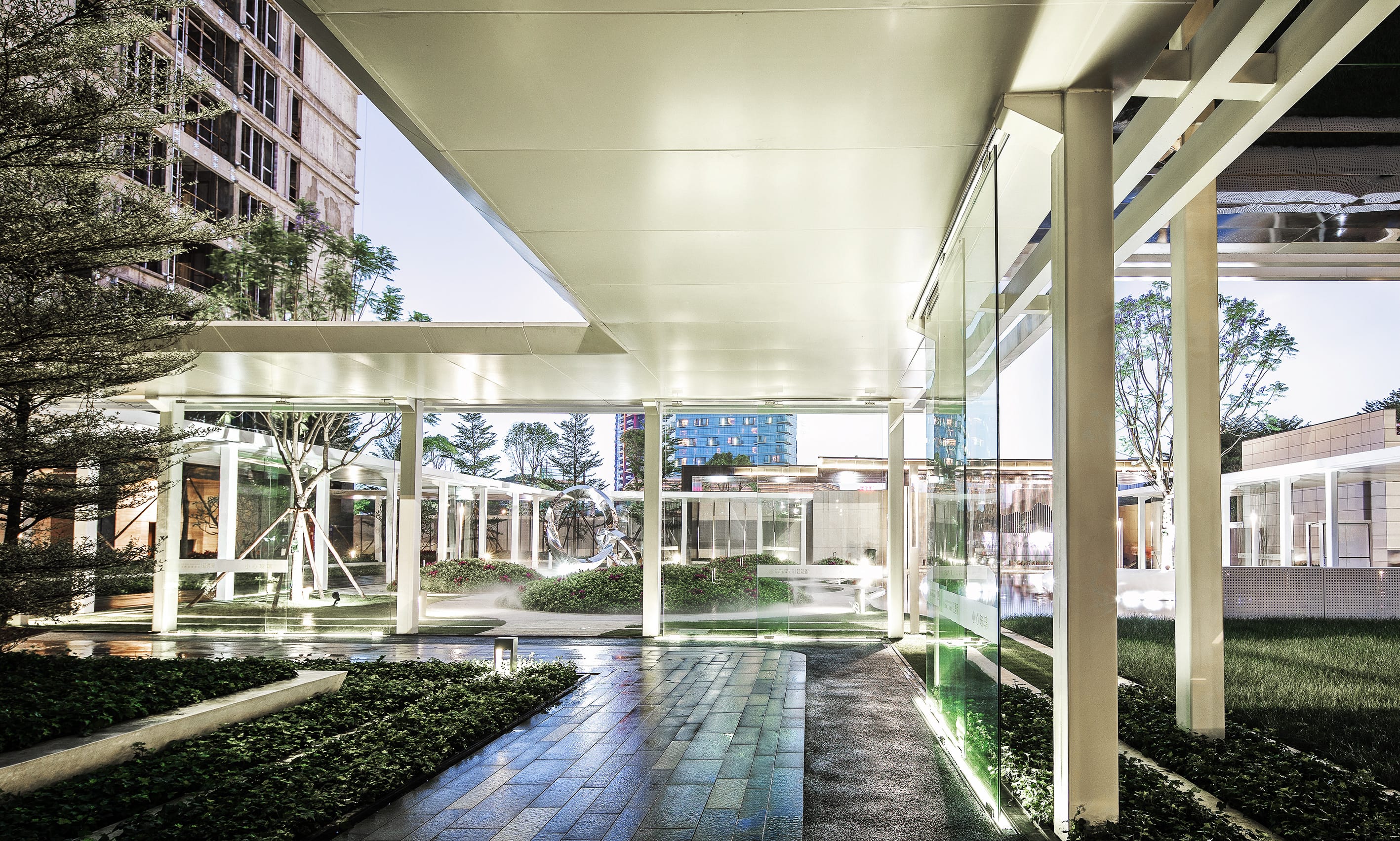
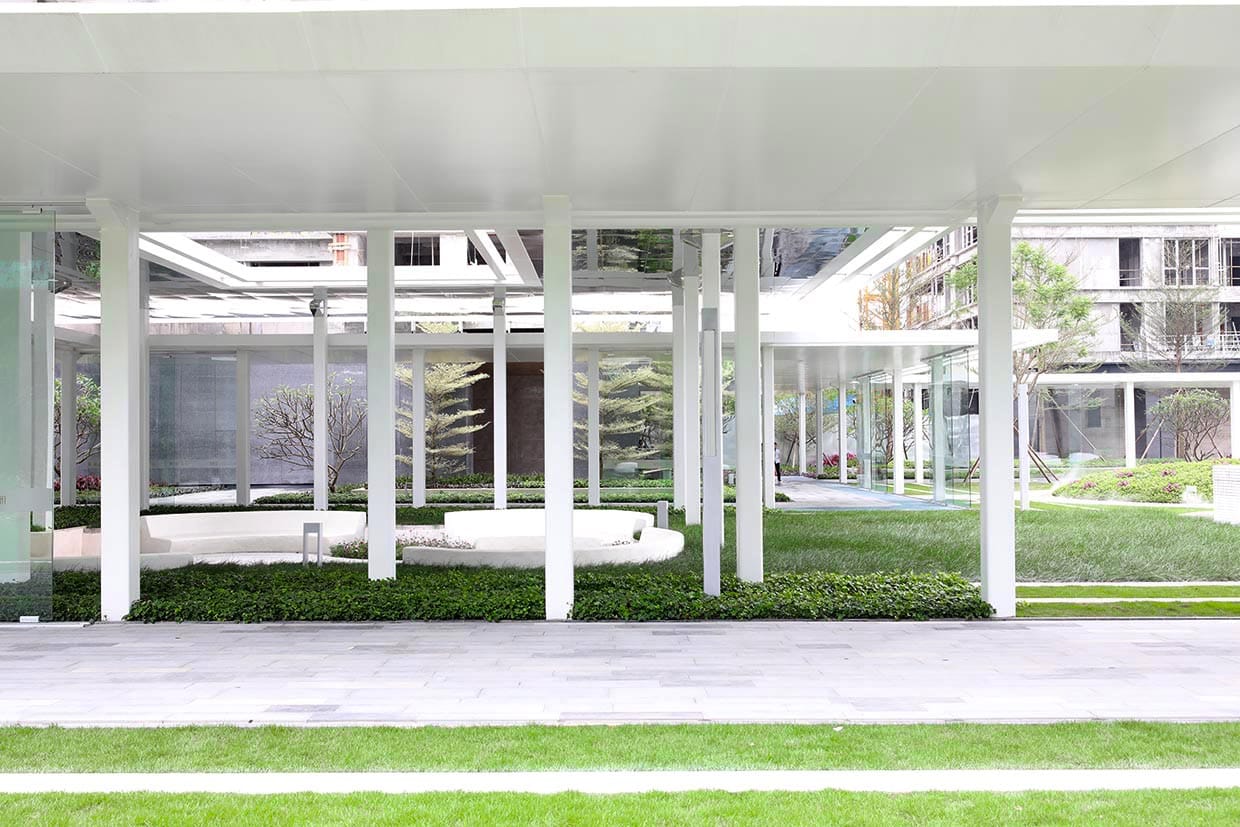
回廊空间将首开区的三栋楼的入户空间串联了起来,成为人们快速归家的便捷动线。4m高的白色单臂悬挑廊架增强了通透性和透光性, 减少了压迫感,同时将架空层空间与庭院空间从视线上连接了起来,又对整个中心庭院起到了框景作用,成为一个360度无死角的景观环廊。
The walkway navigates the quickest route to each 3 residential towers. It’s covered bya 4m high single-side cantilever structure with white aluminum panel coated. The structure not only allows 360 panoramas to the central garden but also mitigate the visual pressure from the heavy structure.
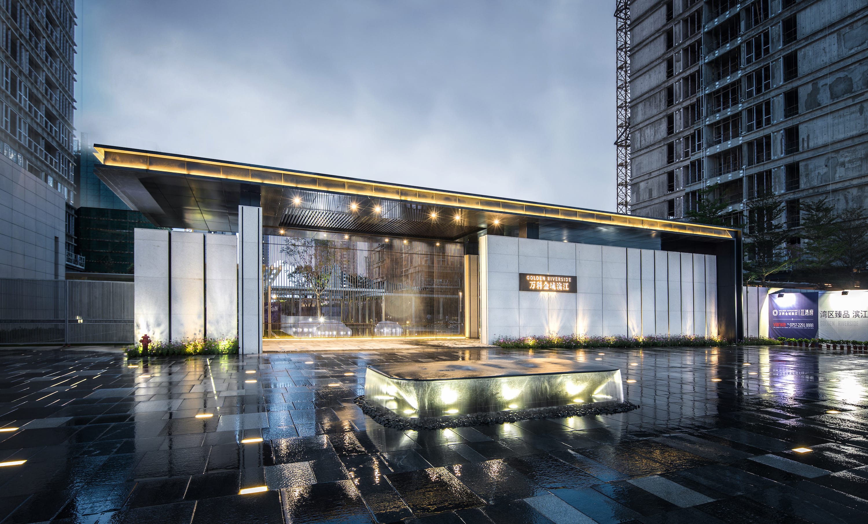
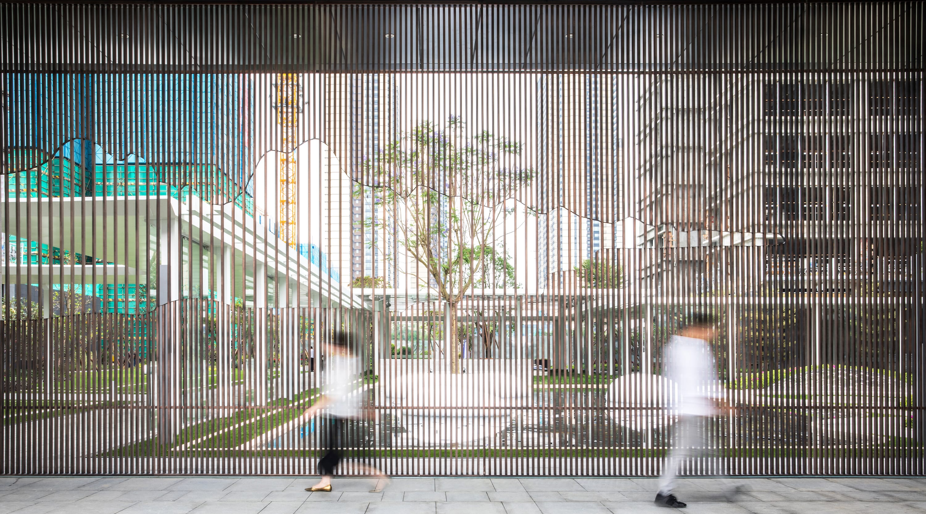
我们在入口空间的设计做了十分简单的处理,中心水景及马赛克渐变的铺装将落客区车行流线隐晦地勾勒出来,形成一个开敞有序的落客和到达体验。而大门与水景的对位关系,引导人们的视线向内庭院看去,透过半镂空的金属格栅,使得后面的园景若影若现,虚实相间。
The gateway anchorsan overflow water table in the center, which encompasses a generous drop-off infront of the entrance. Aligned with the centerline of entrance space, the waterfeature also leads your view towards the garden inside through a translucentstainless steel screen, which introduces the garden with a mysterious mask.

三种质感
由于注重纯粹性的表达,在材料选择上也是相对更为谨慎,避免常规经验主义,特别是避免材料种类的繁复,因此,在材料的使用上,我们最终选定了三种层次作为景观质感的表达:
Materiality
Due to the simplicity and singularity of this landscape characters, we were so serious about material selections including both hardscape texture and plantingpalette. There are 3 categories for our material selection:
1. 白色系:水磨石 + 白色铝板 + 玻璃钢(这些材料的整体感较强,不需要接缝或较少,更有助于表达白色的纯粹)
White series: washed concrete gravel+ aluminum panel+ reinforced glass fiber (these are materials could be in monolithic state so that we could have very few of joints and connections)
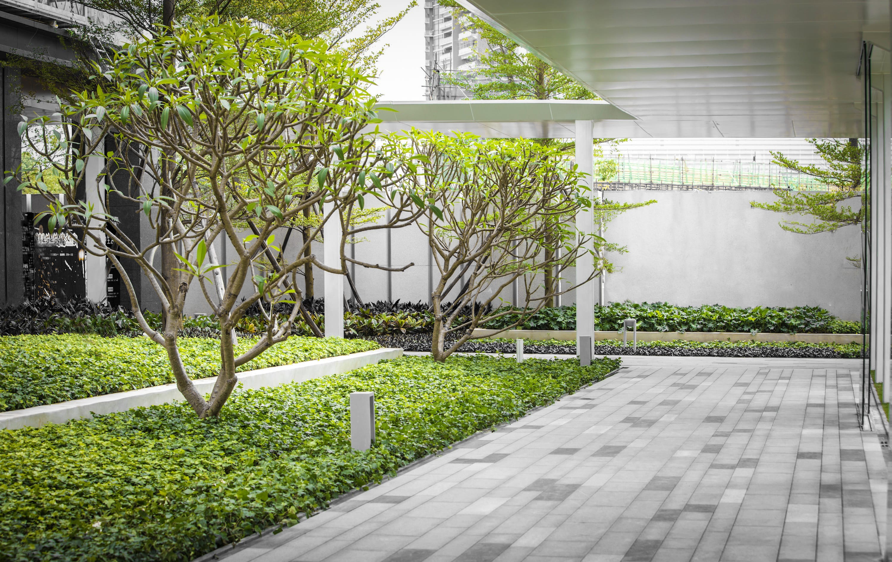
2. 绿色系(地被层):马尼拉草+洋常春藤+ 葱兰 +杜鹃
在植物材料的选择上,我们希望能运用地毯式的质感,也就是从叶子的大小,姿态都得是高度统一和完整,一眼望去便是一个整体,常春藤铺成一片的柔软感,细看每片枝叶又坚韧有角,对比强烈,葱兰的一体性佳,且随风舞动,更体现一种亲切感和舒适感。
Green series:The planting selection is key to the project. We chose Rain Lily,Rhododendron, and Ivy as they are perfect to deliver singularity of a carpet-like ground.

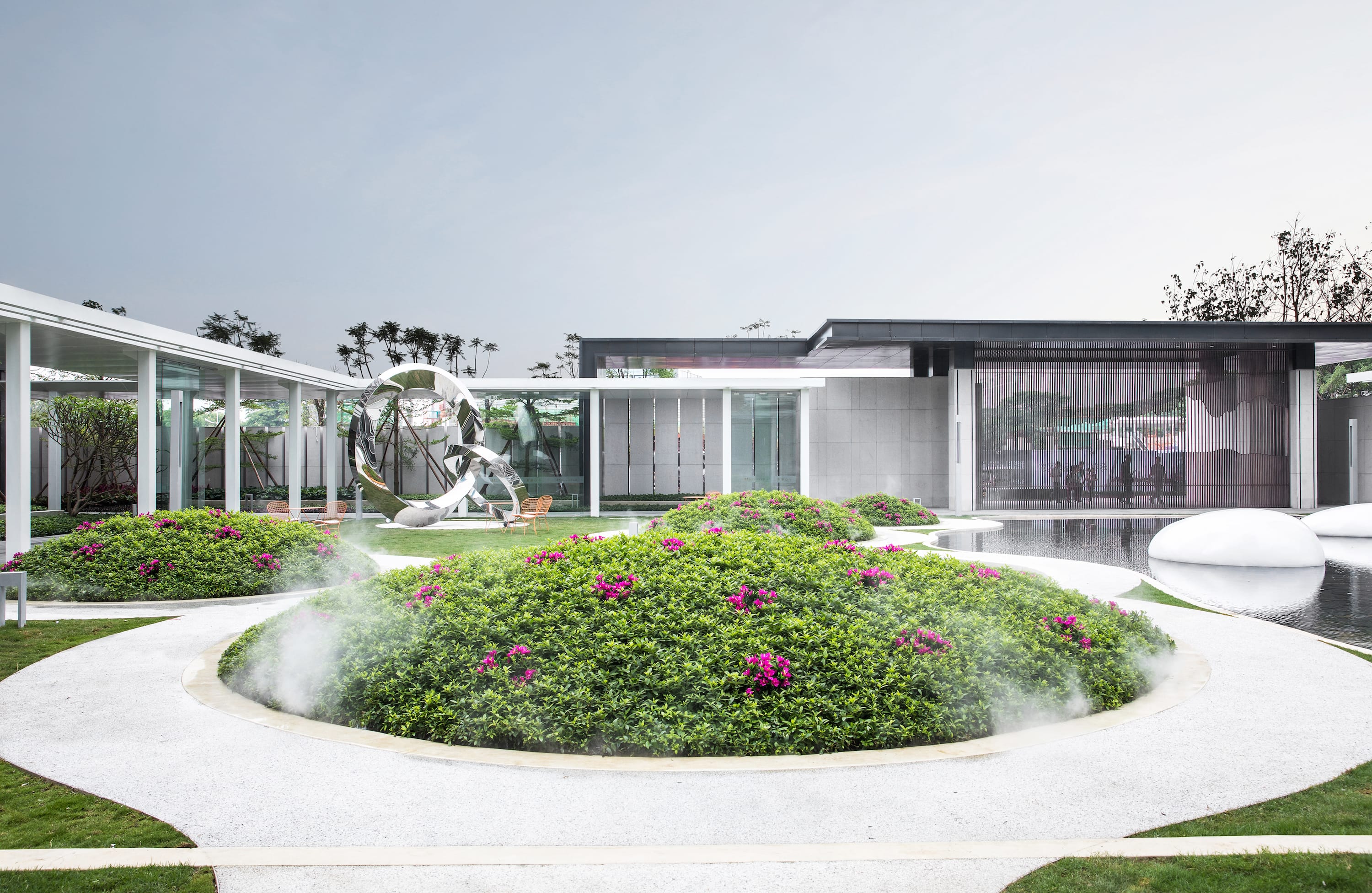
3. 反射材料:镜面不锈钢可以捕捉周遭环境元素,使得局部融为一体,同时镜面不锈钢作为一种可以跟人互动的材质,可以在空间里发生很趣味性的场景
Reflective material: polished Stainless Steel captures all things surrounded and give a sense of liveness. It also establishes interactions and reactions among people.

最后…
在近大半年的设计过程中,我们与业主一起探索和预判了未来景观如何去承载新的生活方式,以及新的社会作用,甚至它的可变弹性,同时,这里也包括施工过程中的合理性论证,以及材料样板和施工工艺的反复确认,保证了这个首开交付区的精美呈现,在这里非常感谢业主和施工单位对这个项目的共同努力与支持。
Last but not least…
Thanks for this collaborative effort by the client,construction team. It took us more than a year from the very first sketch to the last sweep on the site. There were lot more interesting ideas/ techniques emerged during this process, to explore what else could landscape do for human and maybe one of the answers is right here at Vanke Golden Riverside Phase I.
名称:万科佛山金域滨江二期首开区
类型:社区景观
地址:广东省佛山顺德区
面积:47560m²(其中首开区4300m²)
景观设计:IF本色营造
项目团队:楼颖 毛征 徐跃华 苏子珺 刘升阳 吴宪
设计时间 : 2017.3-2017.11
委托方:佛山万科
委托阶段:概念方案至施工图设计
施工单位: 深圳璞道
雕塑制作:广州璟灏雕塑
摄影:张学涛
Name: Vanke Golden Riverside Phase II Kick-off Area
Type: residential landscape
Location: Shunde New District, Foshan, Guangdong
Size: 4.7 ha. in overall w/ 0.4 ha. kick-off area
Landscape design by: Instinct Fabrication
Project team: Ying Lou, Mazen Mao, Yuehua Xu, Zijun Su, Shengyang Liu, Xian Wu
Design time : 2017.3-2017.11
Client: Vanke Foshan
Workscope: Concept to ConstructionDocuments
Construction by: Pudao, Shenzhen
Sculpture manufactured by: JingHao Sculpture, Guangzhou
Photography by Xuetao Zhang
更多 Read more about: IF本色营造


0 Comments