本文由 BOX盒子实践景观事务所 授权mooool发表,欢迎转发,禁止以mooool编辑版本转载。
Thanks BOX Studio for authorizing the publication of the project on mooool, Text description provided by BOX Studio.
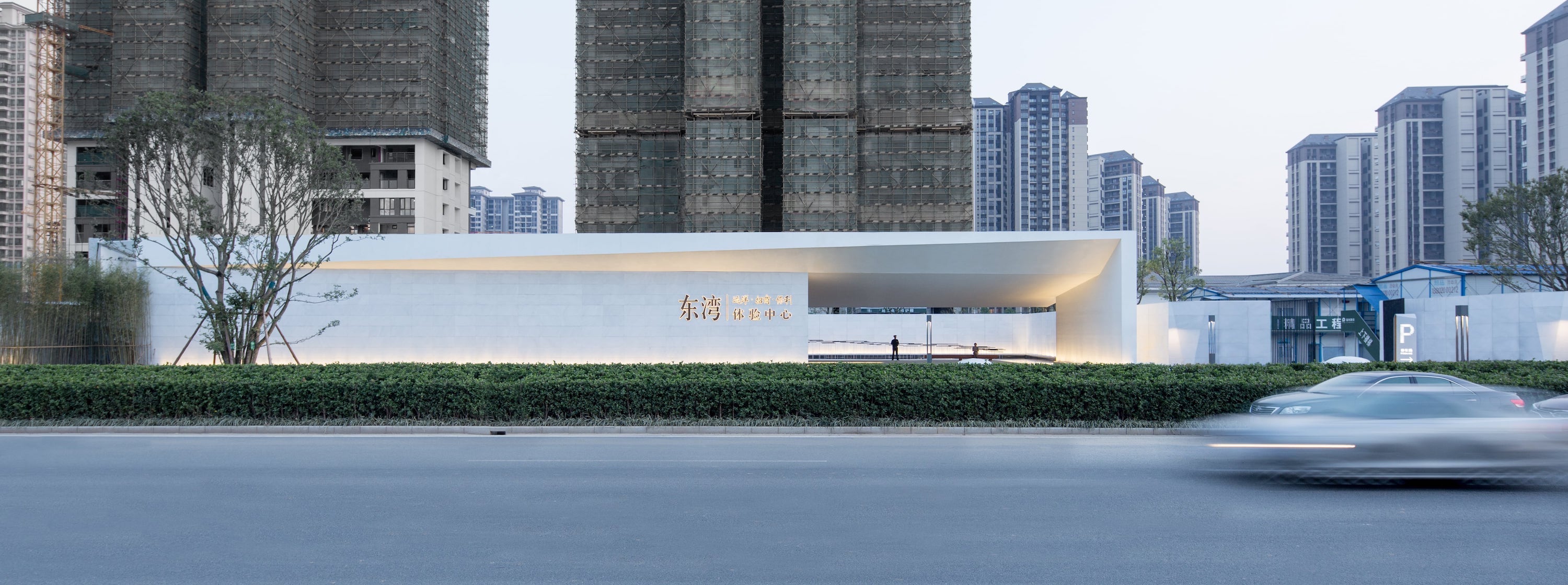
BOX盒子实践景观事务所:项目位于广东广州增城,朱村大道西南侧,广州地铁21号凤岗站东侧。北侧为富士康科技小镇,东南西侧为高层住宅小区。未来开通21号地铁线快线站,周边常住业主将会倍增。场地正前方是快速干道-朱村西大道。对这里的印象是工地噪音、疾驰而过大型施工车辆、尘土飞扬的马路,从疾行人们的面容里透露出的是不安与焦躁。
我们需要在特定的环境中寻找到空间的美,基于建筑场域的诗意解读,并结合材料的创新,给当地人们创造出一份宁静的体验。
BOX Studio:The project is located in Zengcheng, Guangzhou, Guangdong, southwest of Zhucun Avenue, east of Fenggang Station, No. 21 Guangzhou Metro. The north side is Foxconn Technology Town, and the southeast side is a high-rise residential area. In the future, the Metro Line 21 Express Line will be opened, and the number of permanent residents will double.Right in front of the site is the Expressway – Zhucun West Avenue. The impression here is that the noise of the construction site, the speed of passing large construction vehicles and the dusty road reveal the uneasiness and impatience from the faces of the fast-moving people.
We need to find the beauty of space in a specific environment, based on the poetic interpretation of the architectural field, and combined with the innovation of materials, to create a peaceful experience for the local people.
▼宁静的盒子 Peaceful Box
前期总有许多困扰的问题:工棚紧邻体验中心、塔吊堆料占用背景种植空间、市政电信箱无法移动、施工车辆需要共用客户车辆通道等……如何在降低施工场地对体验中心的影响?怎么在有限的场地呈现最好的场景?在有限的成本如何分配使用?BOX设计团队与建筑、室内进行反复讨论和相互提资建议。
There were always a lot of problems in the early stage. The shed is adjacent to the experience center, the tower cranes occupy the background planting space, the municipal telecommunications box cannot move, the construction vehicles need to share the customer vehicle passages, etc… How to reduce the impact of the construction site on the experience center? How to present the best scenes in a limited venue? How to distribute the use at a limited cost? The BOX design team conducts repeated discussions and mutual fundraising proposals with the building and the interior.
▼场地 Site
体验中心前场 Experience Center Front Court
空间用开场的形式以保证对外的展示性,以干净体块和线性作为主要表现形式,主张建筑、景观、室内一体化。在“少,即是多”达成相互共识。将设计元素融合建筑、景观、室内,创造积极的空间围合,相融共生。
The space uses the form of opening to ensure the external display, with clean body and linear as the main form of expression, and advocates the integration of architecture, landscape and interior. Achieve mutual consensus in “less, it is more”. The design elements are integrated into the building, landscape, and interior to create a positive space that blends and symbiosis.
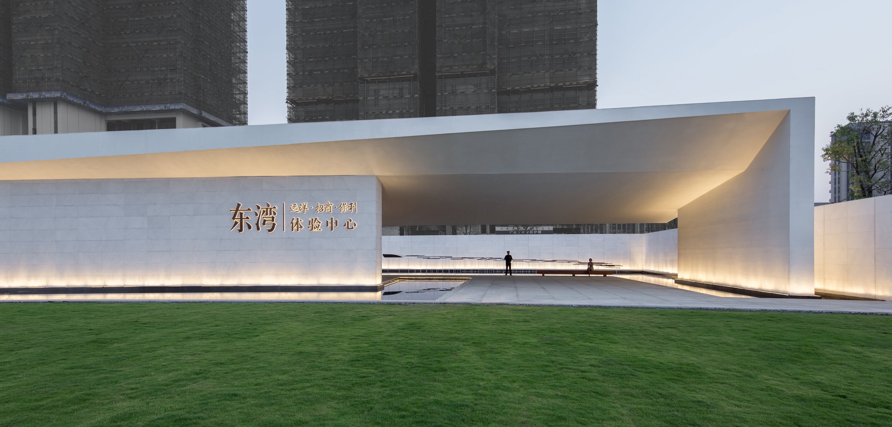
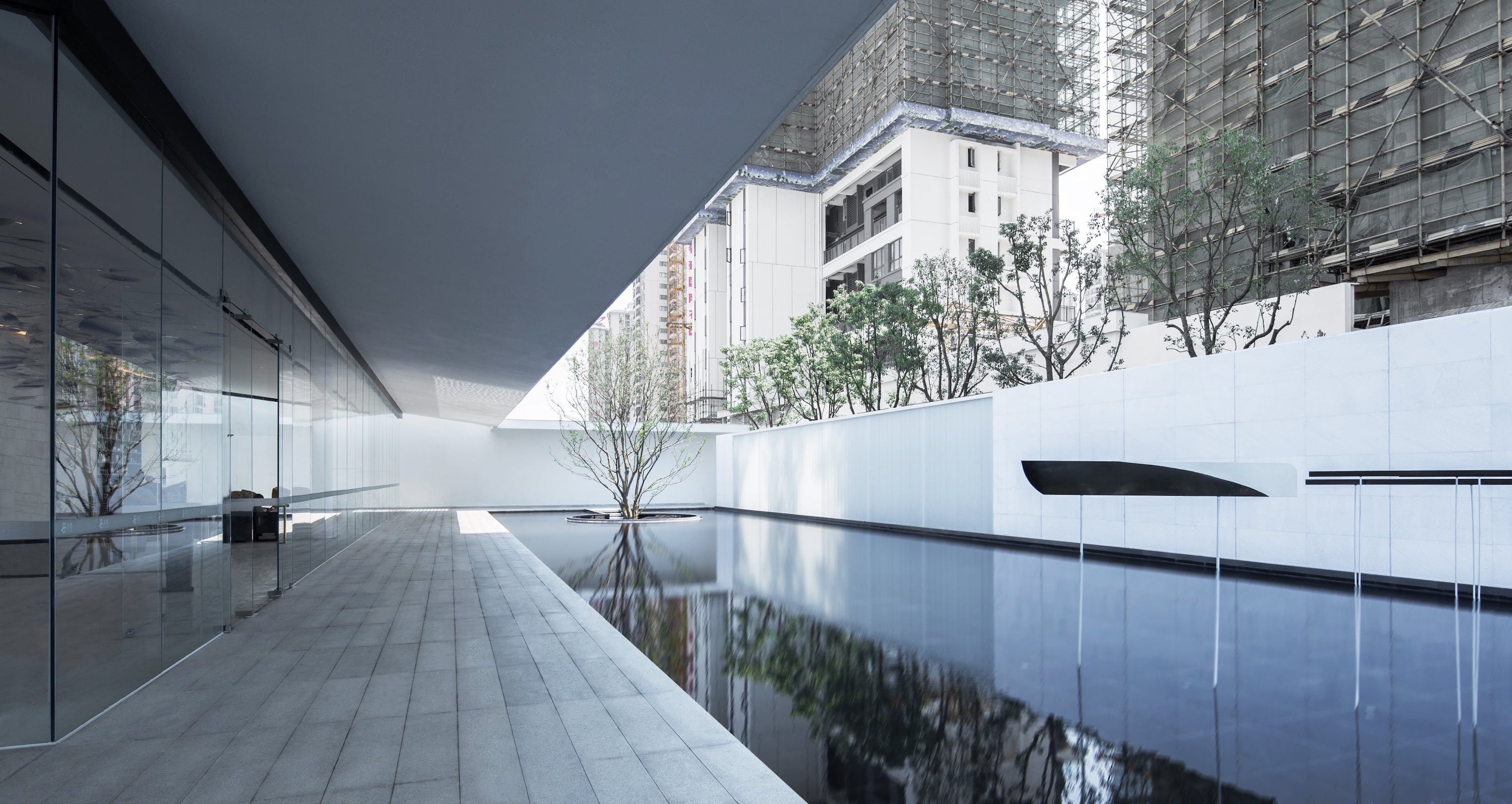
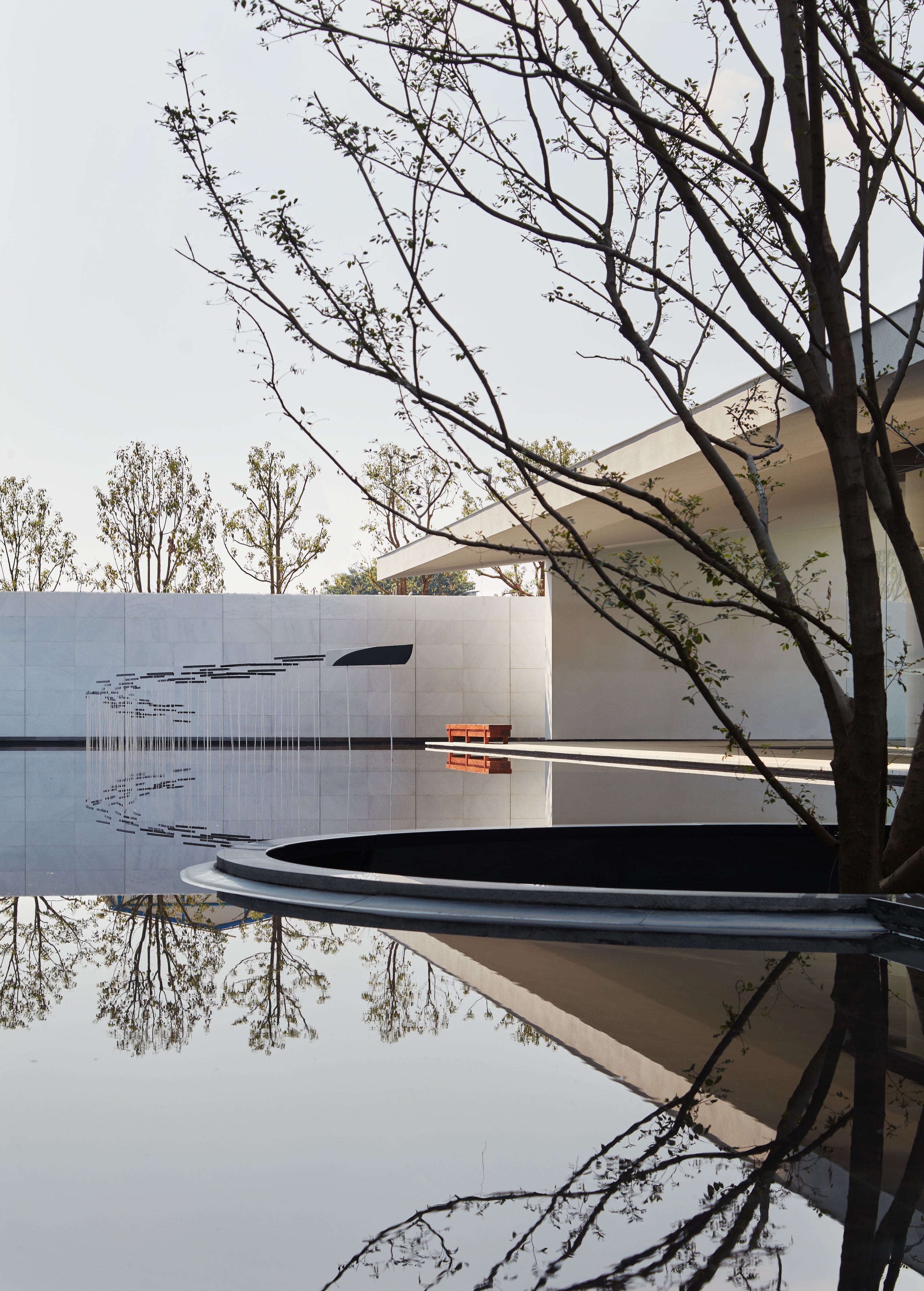
开场草坪衬托建筑形象,一株12米的多分支朴树作为空间的点睛之笔。静谧水景倒映着建筑,水体波纹经过折射赋予新的肌理,洗墙灯则强化空间层次及体块感。
The opening lawn sets off the architectural image, and a 12-meter multi-branched hackberry tree serves as the crowning touch of space. The quiet waterscape reflects the building, the water ripples are refraction to give a new texture, and the wall washers enhance the spatial level and body mass.
体验中心后场 Experience Center Backcourt
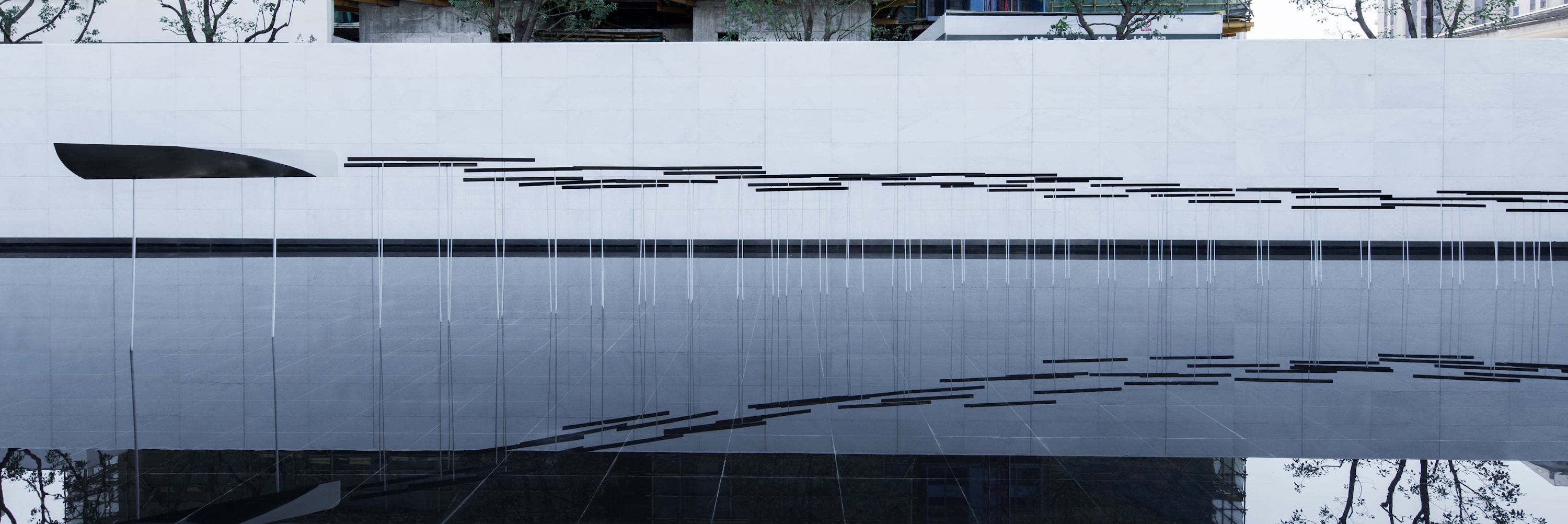
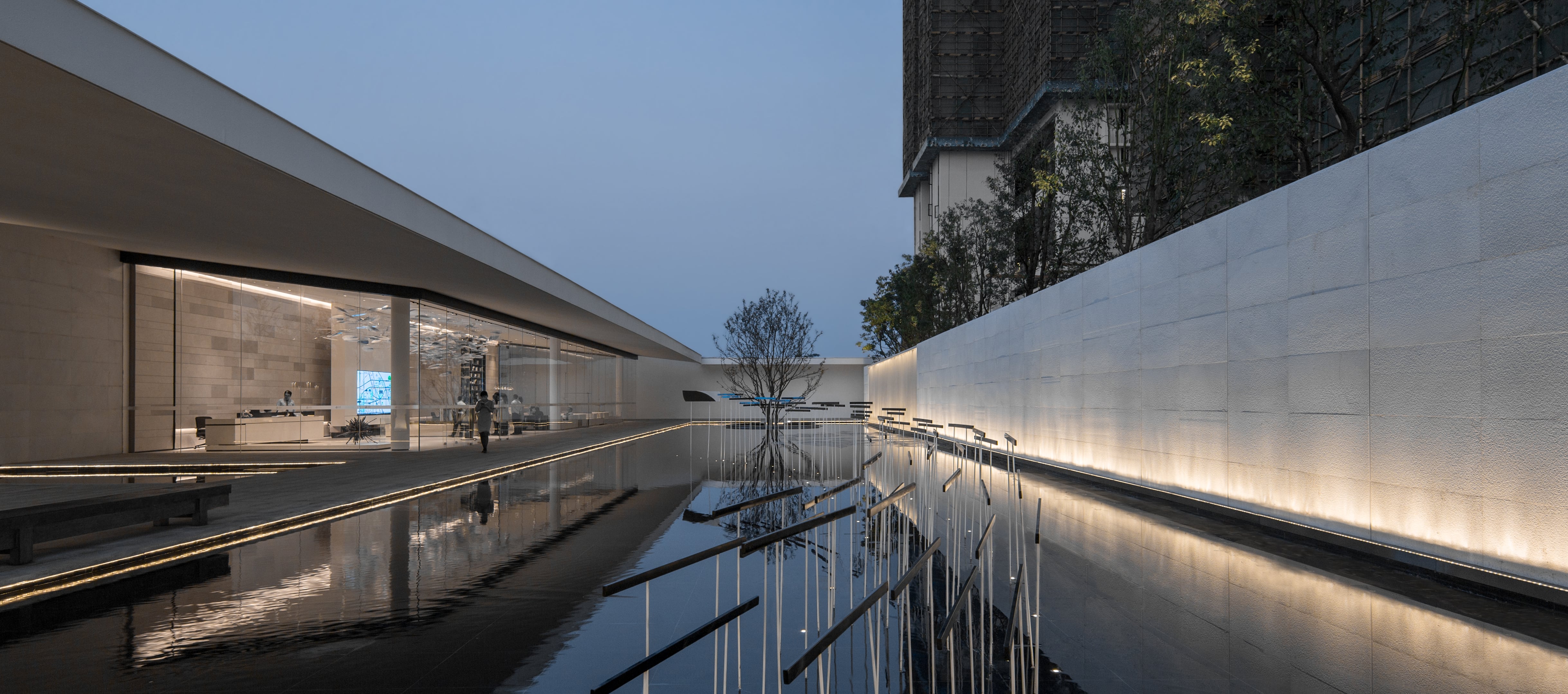
在前场与后场转折处设立对景雕塑,犹如起航的“游艇”在水面激起了浪花,划过安静的海湾空间。 景墙采用1200*600珍珠白让围合空间与建筑产生共鸣。英国著名建筑师理查德·罗杰斯说: “建筑是捕捉光的容器, 就如同乐器如何捕捉音乐一样, 光需要使其展示的建筑。
The opening lawn sets off the architectural image, and a 12-meter multi-branched hackberry tree serves as the crowning touch of space. The quiet waterscape reflects the building, the water ripples are refraction to give a new texture, and the wall washers enhance the spatial level and body mass.Richard Rogers, a famous British architect, said: “architecture is a container for capturing light, just like how musical instruments capture music, light needs to be displayed.
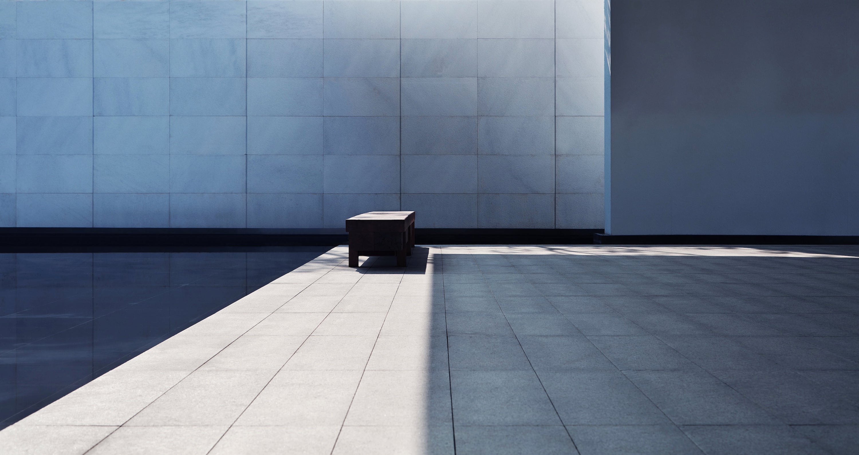
地面1200*300芝麻灰强调地面线性,结合雕塑的引导到达体验中心。一片静水、一颗冬青、一面墙,多一分宁静,少一分喧嚣。
The ground 1200*300 sesame ash emphasizes the linearity of the ground, combined with the guidance of the sculpture to reach the experience center. A piece of still water, a holly, a wall, a little more quiet, less than a minute.
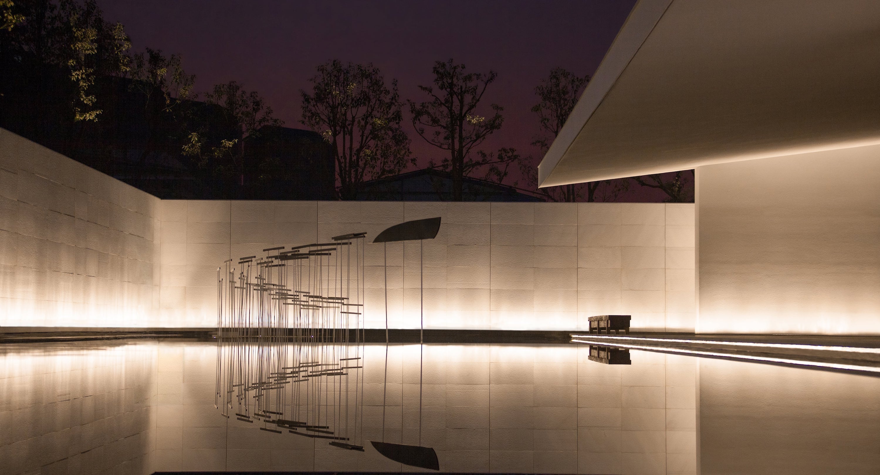
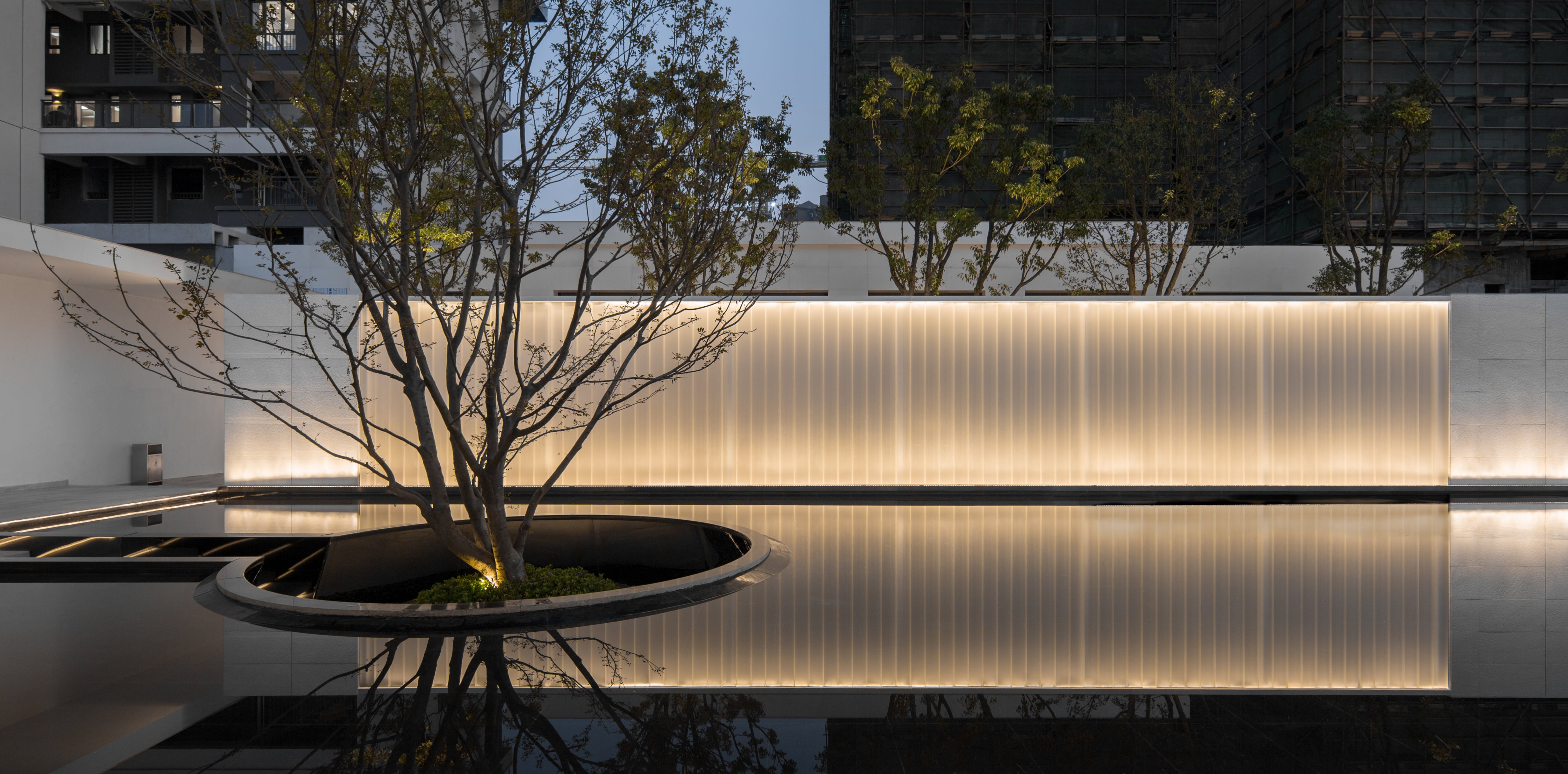
入夜,透光墙、静水、树影、下沉平台,犹如一副雅致的画卷,沿着室内落地玻璃展开。洗墙灯、水边灯带、透光玻璃、静水面,光与影成为了空间的主角。
The translucent wall, still water, tree shadow, and sinking platform are like an elegant picture scroll that runs along the indoor floor glass.Wall washers, waterside lights, light-transmissive glass, still water surface, light and shadow have become the protagonists of space.
▼夜景效果 Nightscape Effect
▼夜景效果 Nightscape Effect
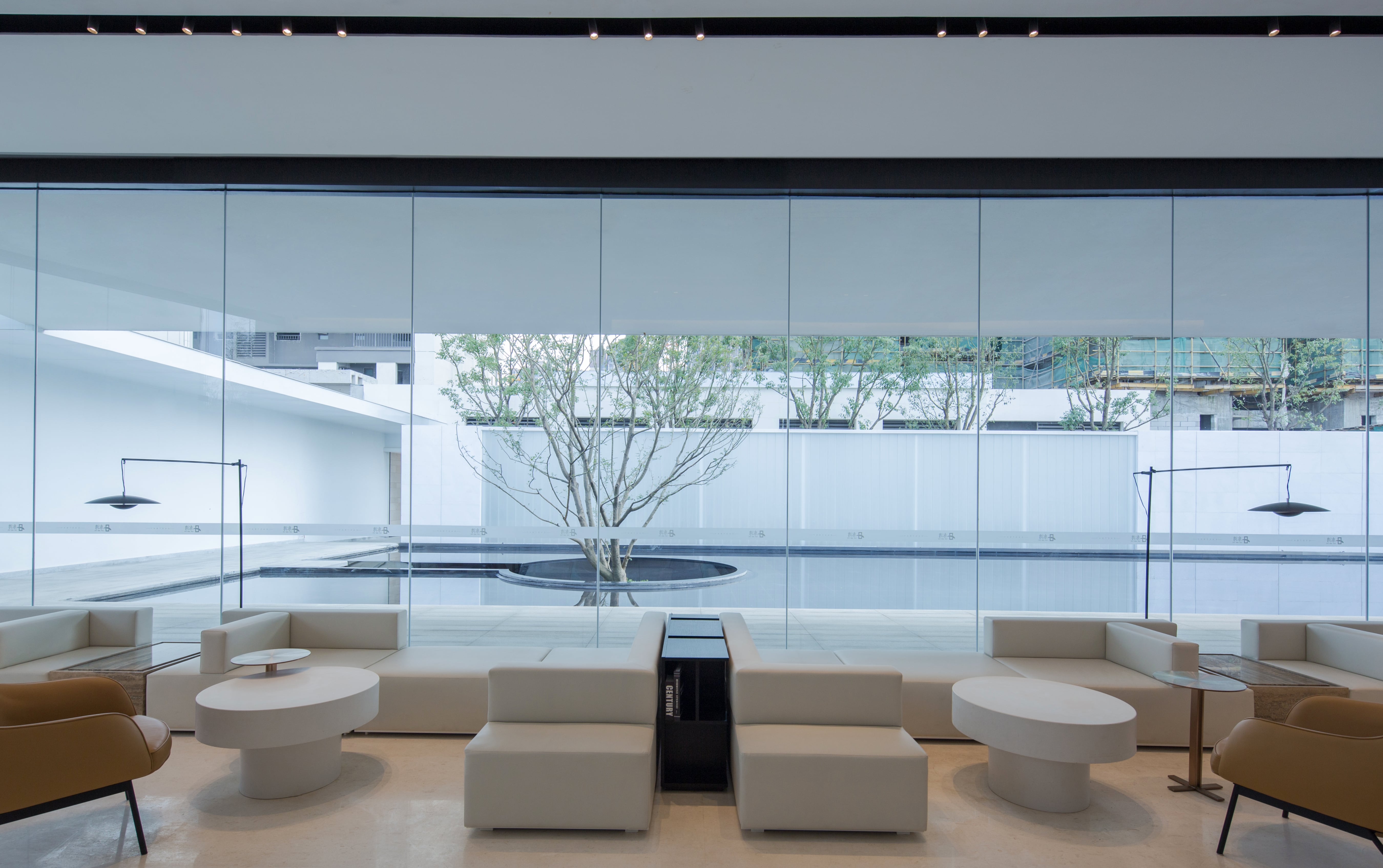
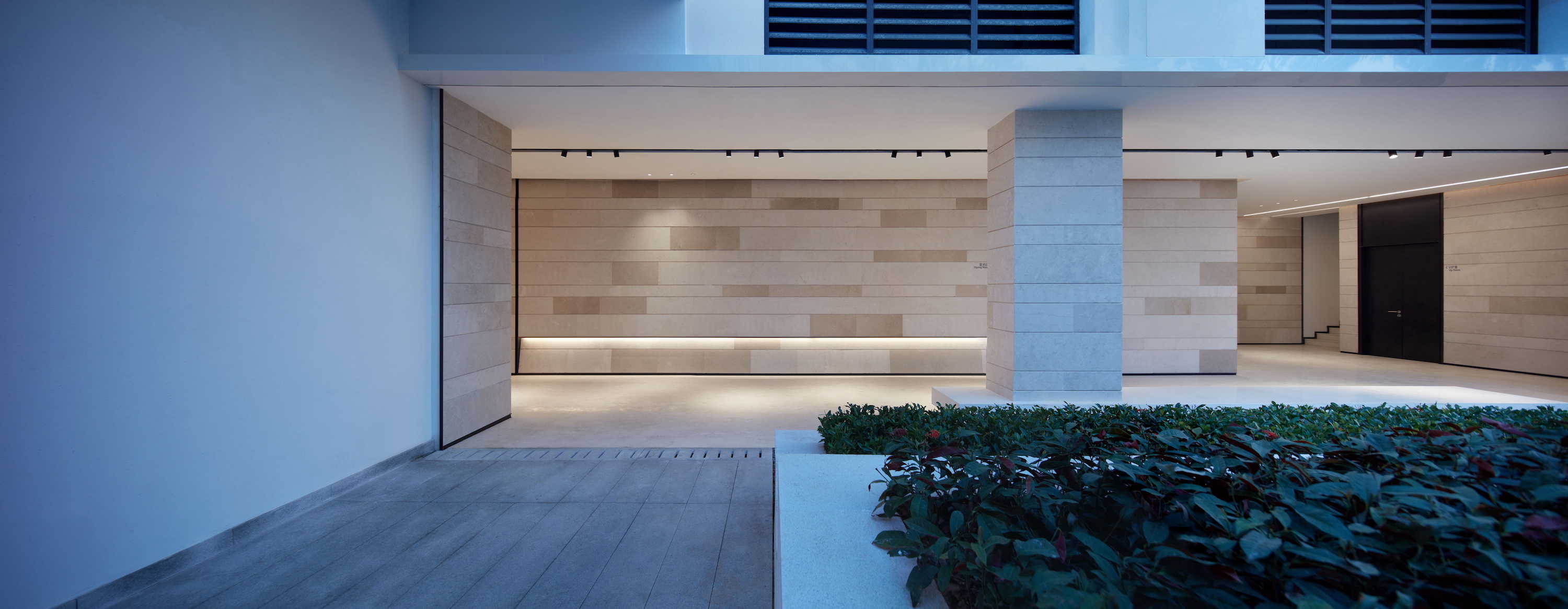
天空、U玻、跌级绿化、条凳,空间延伸至外,光影渗透至内。
Sky, U-glass, declining greening, benches, the space extends to the outside, the light and shadow penetrates into the inside.
项目名称:东湾体验中心
项目地点:广州增城
项目业主:远洋·招商·保利
业主团队:郭雷、郑棣升、郑俊伟、王辉、王磊、魏咬青
完成时间:2019.09
景观设计单位 :盒子实践(BOX博克斯林景观事务所)
设计团队:纪凤涛、刘样多、李海滔、罗瑜、林俊健、陈洁婷、王洋清、徐佳惠、常君华、陈晓丽
建筑设计单位:XAA建筑事务所詹涛工作室
室内设计单位:广州共生形态工程设计有限公司
室内陈设单位:广州内构筑设计顾问有限公司
摄影团队:前方空间摄影 罗志宗
Name:East Bay
Location:Zengcheng, GuangZhou
Client :SINO-OCEAN · CMSK · GPoly Group
Owner Team :Guo lei, Zheng Disheng, Zheng Junwei, Wang Hui, Wang Lei, Wei Yaoqing
Date :2019.09
Lanscape Design:BOX Studio
Design team: Phoenix, Wilson, Tao, Yu, Mark , Jie, Qing, Hui, Hua, Li
Architectural Design :Zhantao Studio of XAA Architecture Firm
Photography Team:Before Photography Ben
更多 Read more about:BOX盒子实践景观事务所







0 Comments