本文由Instinct Fabrication 本色营造设计事务所授权mooool发表,欢迎转发,禁止以mooool编辑版本转载。
Thanks Instinct Fabrication for authorizing the publication of the project on mooool, Text description provided by Instinct Fabrication.
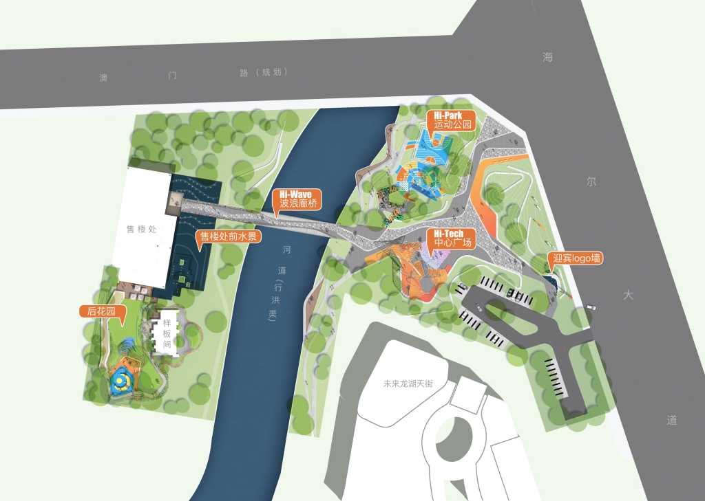
本色营造设计事务所: 体验区场地东侧紧邻市政路海尔大道,交通便利。整个展示区被规划河道分为前、后两个相对独立的地块,中间由一座步行廊桥相连。前场作为未来龙湖天街的一个永久性街角广场,我们将其定位为开放的公共活动空间,售楼处及样板间位于后场区域,其定位为临时性售楼处展示空间。
Instinct Fabrication:The eastern side of the site is close to Haier avenue, a municipal road, with convenient transportation. The planned river course of the entire exhibition area is divided into two relatively independent plots, the front and the back, with a pedestrian covered bridge connecting the two. Frontcourt is a permanent corner square of longhu tianjie in the future. we position it as an open public activity space. the sales office and the model room are located in the backcourt area. it is positioned as a temporary display space of the sales office.
基于项目整体定位,同时回应龙湖2018年提出的“空间即服务,龙湖要做人与空间的连接”发展定位,设计初期我们提出了创造“X”空间的理念,即引领未来的互联空间。“X”在数学中代表未知数,在空间中代表着神秘感与未来,也代表着人们在空间中的不期而遇。作为未来胶州片区全方位,多维度的未来生活体验馆,我们希望通过互动设施、艺术体验使场地充满未来感,通过空间组织形式增加人与场地、人与人的互动,形成渗透的互联活动空间。
Based on the overall orientation of the project and in response to longfor’s 2018 development orientation of ” space as a service, longfor to be connected with space”, we put forward the concept of creating ” x” space at the beginning of the design, that is, leading the future interconnected space. ” x” represents unknowns in mathematics, mystery and future in space, and also represents people’s unexpected encounters in space. As the future JIAOZHOU area’s all-round and multi-dimensional future life experience museum, we hope that through interactive facilities and artistic experiences, the venue will be filled with a sense of the future, and through space organization forms, people-to-site and people-to-people interactions will be increased to form an infiltrated interconnected activity space.
▽ X空间概念 | conception of Space X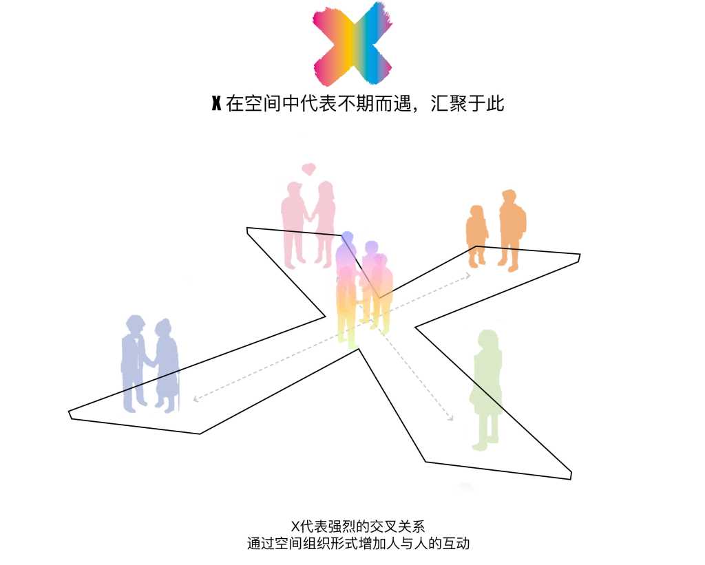
▽ X轴线关系及X空间穿插组成 | axis of X and X formation of space
为了创造一个充满活力与时尚感的公共空间,我们选择了橙色作为整个项目的主色调,将其应用到铺装、雕塑、构筑物、小品等多处细节,使项目具有很强的完整性。
In order to create a lively and fashionable public space, we have chosen orange as the main color of the whole project and applied it to paving, sculpture, structures, sketches and other details to make the project have strong integrity.
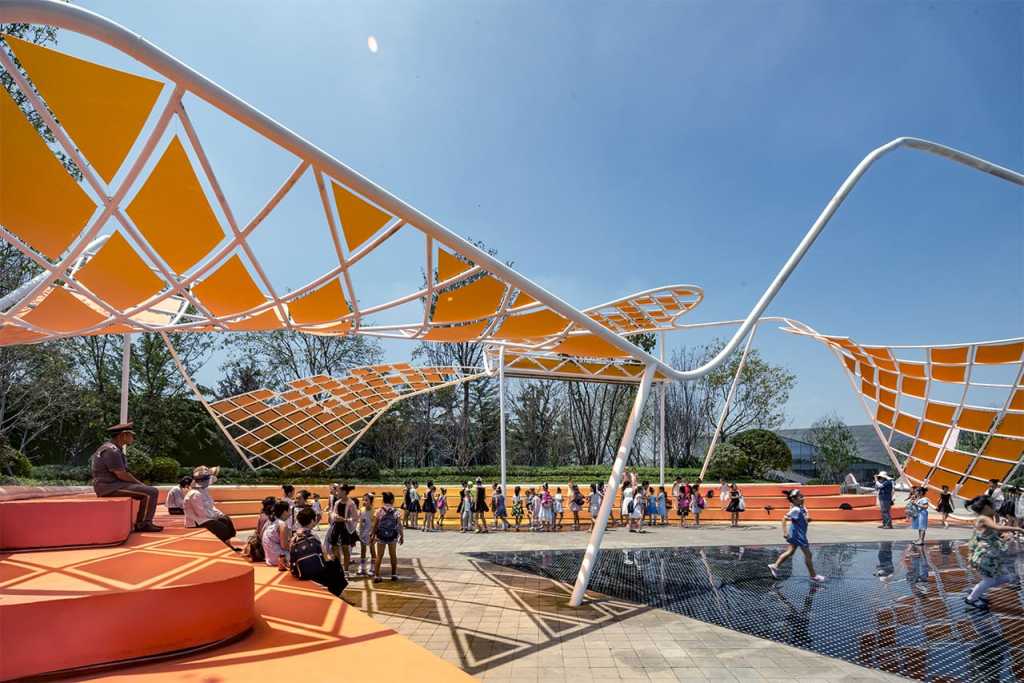
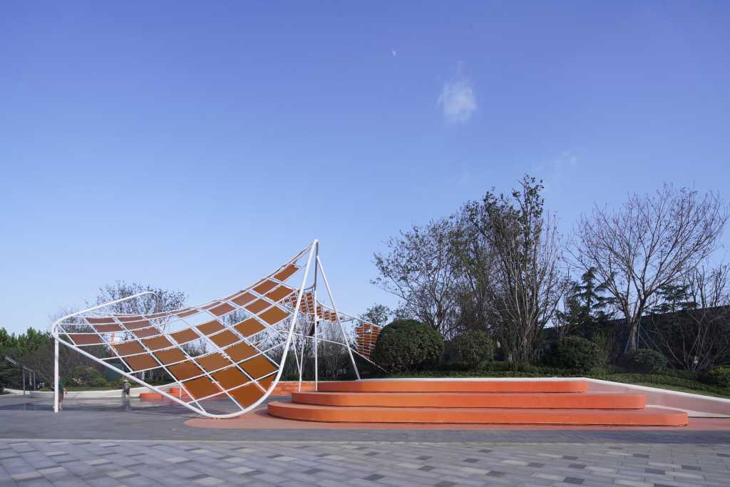
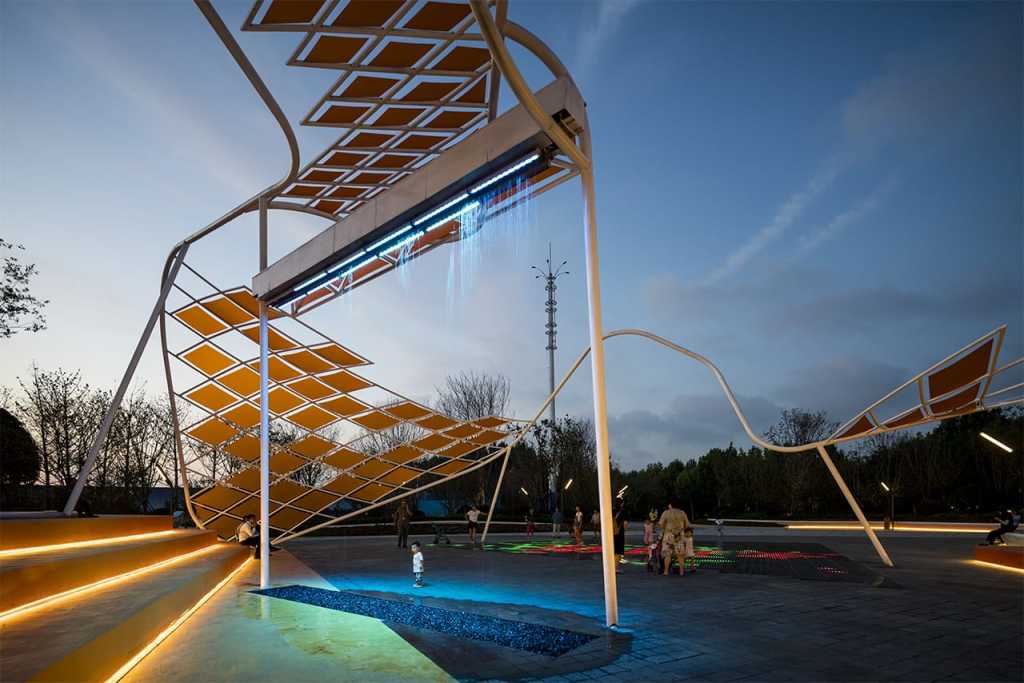
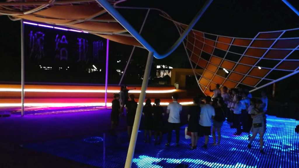
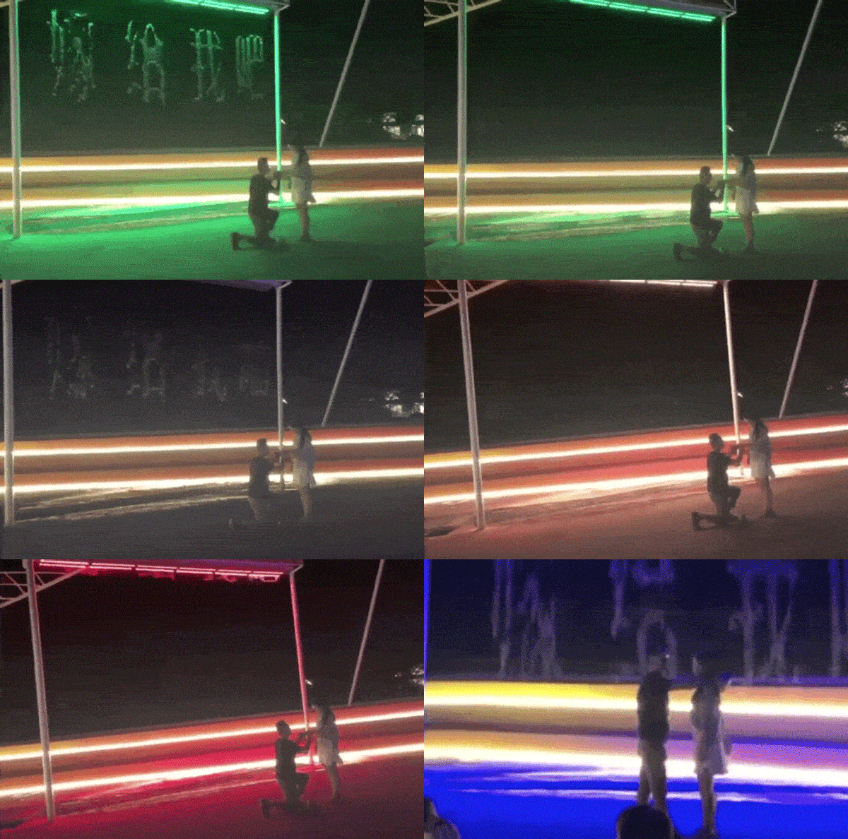
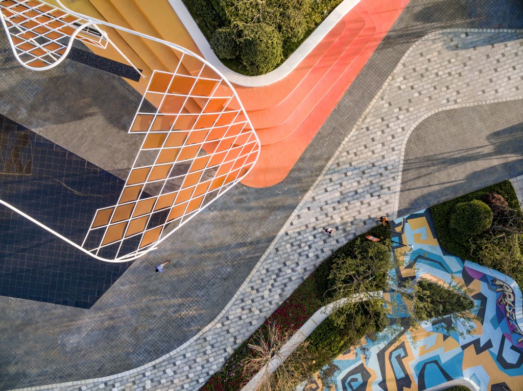
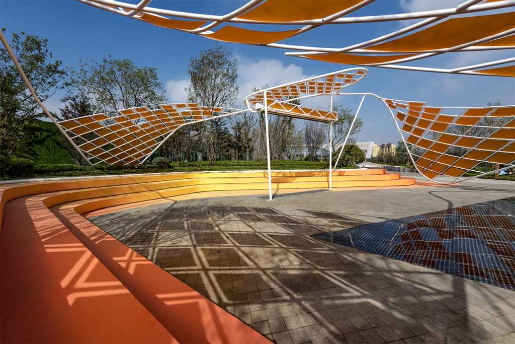
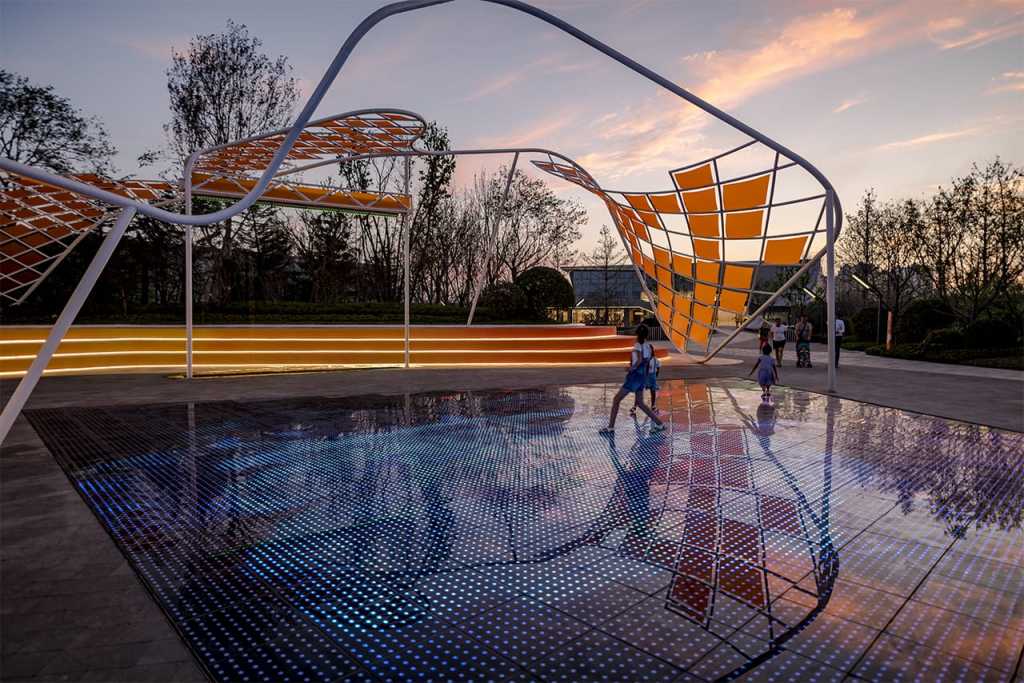
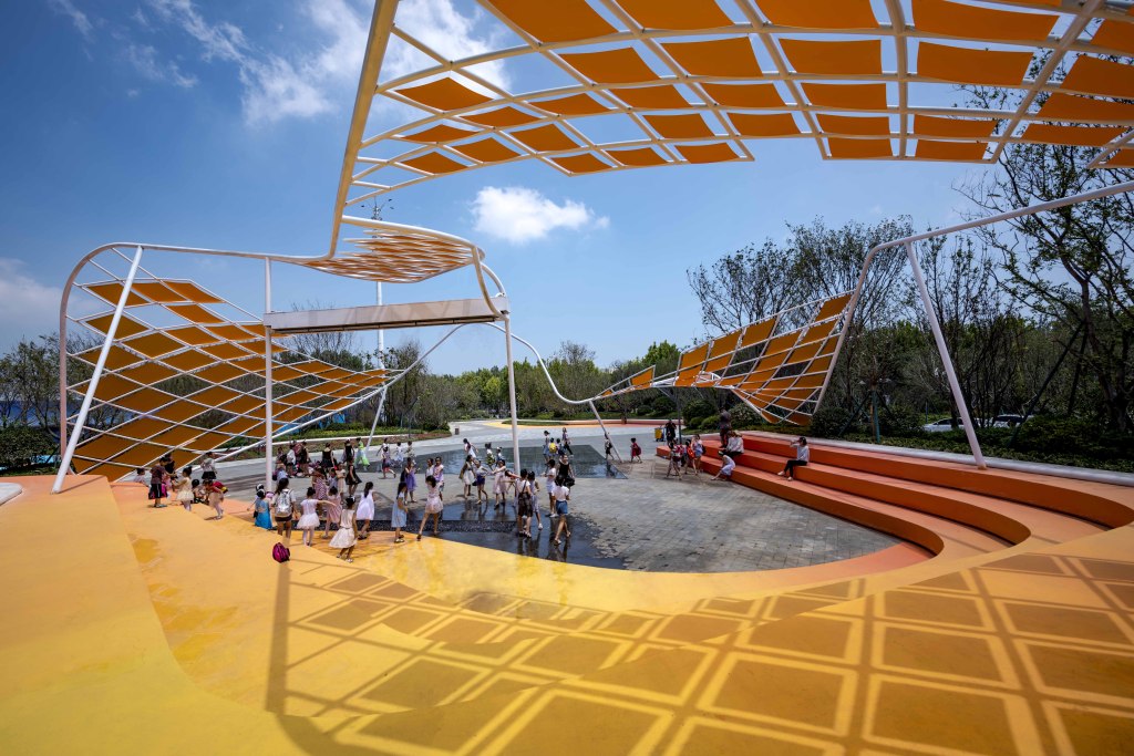
项目的核心活动广场由舞动廊架、数字水幕、光电地板、彩色看台四个主要元素构成,这里是功能活动叠加的复合节点,承载着互动体验,营销等人气活动,是整个项目对外的标志性展示窗口。伴随着这些景观元素的组合,在这你可以和小伙伴们自拍群嗨,节日狂欢,也可以与父母饭后闲坐于此观赏着那一幅幅生动趣味的光电影像,更可以结合数字水幕把一生中最重要的瞬间,凝聚在此刻华丽绽放,正所谓,空间即服务,设计的对象是空间,而使用空间的核心是服务。
The core activity square of the project consists of four main elements: dancing veranda, digital water curtain, photoelectric floor and color stand. this is a composite node with overlapping functional activities, carrying popular activities such as interactive experience and marketing, and is a landmark display window for the whole project. With the combination of these landscape elements, you can take a selfie with your friends here. hi, you can have a holiday party. you can also sit around with your parents after dinner and watch the vivid and interesting photo-electric images. you can also combine the digital water curtain to gather the most important moments in your life and bloom luxuriously at this moment. the so-called space is service. the object of design is space, and the core of using space is service.
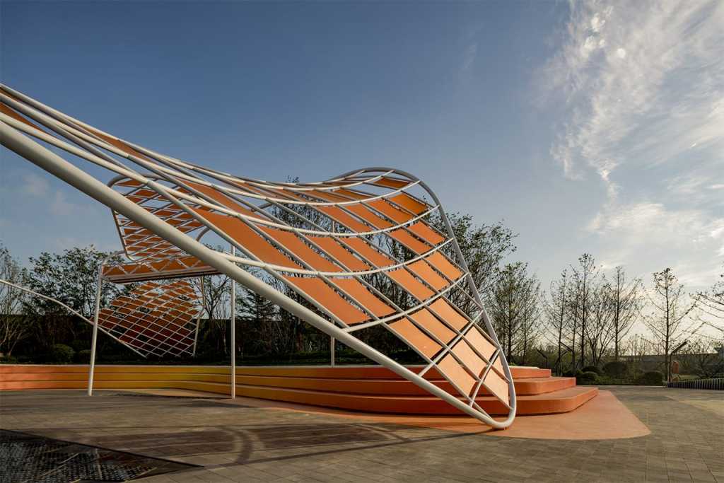
作为项目最核心的亮点,也是项目施工的一大难点,中心广场区域涉及钢构架、数字水幕、光电地板以及景观多专业配合。设计之初有几大矛盾点,首先我们设计初衷是由一条扭动的钢管成为廊架主体结构,造型轻盈,不额外设置立柱,这使结构支撑受到挑战;其次,数字水幕需要预留一个550x450x6700mm的箱体做出水装置,我们想要将其与廊架一体化设计,把水箱隐藏于廊架中,这与廊架本身造型轻盈的初衷是相违背的,加上水幕的额外荷载,对结构的挑战也就更大了;廊架下设置了光电地板区域,光电地板是由工厂加工完的500x500mm方盒子现场拼接组装而成,感应装置设于方盒子中,这样廊架的柱子就要避免落到约150平米的光电地板区域内,这是第三个难点;第四,水幕高约5m,水向下喷射的压力巨大,同时光电地板也不能长时间被水浸泡,并且水落到地板玻璃面上湿滑,有安全隐患,因此水幕位置要避开地板区域,虽有多方面难点阻碍,但并没有阻止我们将设计想法实施下去,经过跟各厂家多次的商讨,一次次的对廊架造型进行调整,最终廊架几近完美的呈现了我们最初的设想。
As the core highlight of the project, it is also a major difficulty in the construction of the project. the central square area involves steel frame, digital water curtain, photoelectric floor and multi-disciplinary coordination of landscape. At the beginning of the design, there were several major contradictions. first of all, our original intention was to make a twisted steel tube the main structure of the porch frame, with a light shape and no additional columns, which challenged the structural support. Secondly, the digital water curtain needs to reserve a 550 x 450 x 6700 mm box body to make a water device. we want to integrate it with the porch frame and hide the water tank in the porch frame. this is contrary to the original intention of the porch frame itself to be light in shape, and the additional load of the water curtain will pose even greater challenges to the structure. A photoelectric floor area is arranged under the porch frame. the photoelectric floor is formed by splicing and assembling 500 x 500mm square boxes processed by the factory. the induction device is arranged in the square box. thus, the pillars of the porch frame must avoid falling into the photoelectric floor area of about 150m2. this is the third difficulty. Fourthly, the water curtain is about 5m high, and the pressure of water spraying downward is huge. at the same time, the photovoltaic floor cannot be soaked in water for a long time, and the water falls on the glass surface of the floor, which is wet and slippery. therefore, the position of the water curtain should avoid the floor area. although there are many difficulties and obstacles, it does not prevent us from implementing the design idea. after many discussions with various manufacturers, the shape of the porch frame is adjusted again and again. finally, the porch frame almost perfectly presents our original idea.
▽ 廊架方案推演 | evolution of Waving Structure schemes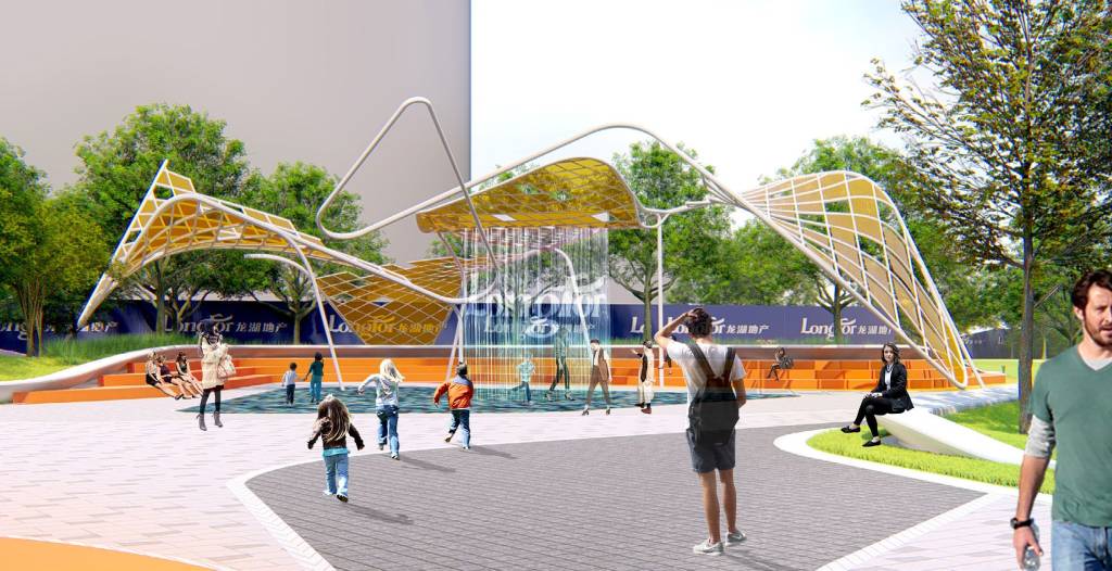

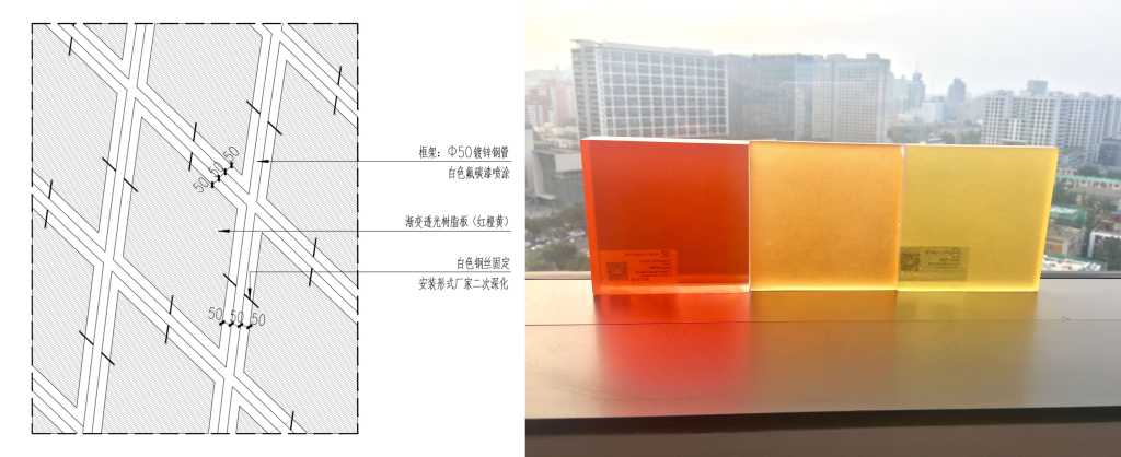
结合扭曲的造型我们创造了一定的遮荫面,面板材料为树脂板,这种材料颜色丰富,具有一定的透光感,可以形成趣味的光影效果。最初这些遮荫的面板是与白色钢管四边贴合,但由于整个廊架都处于曲面中,需每片加工定制,一旦有误差效果很难把控,我们将其四边向内收回约5cm,这样每片都可以做成平面,四边通过拉线的方式与钢管固定。
We have created a certain shade surface by combining with the distorted shape. the panel material is resin plate. this material is rich in color, has a certain light-transmitting feeling, and can form interesting light and shadow effects. At first, these shading panels were attached to the four sides of the white steel tube. however, since the entire porch frame was in a curved surface and needed to be customized for each piece of processing, once the error effect was difficult to control, we retracted the four sides inward by about 5 cm, so that each piece could be made into a plane and the four sides could be fixed to the steel tube by pulling wires.
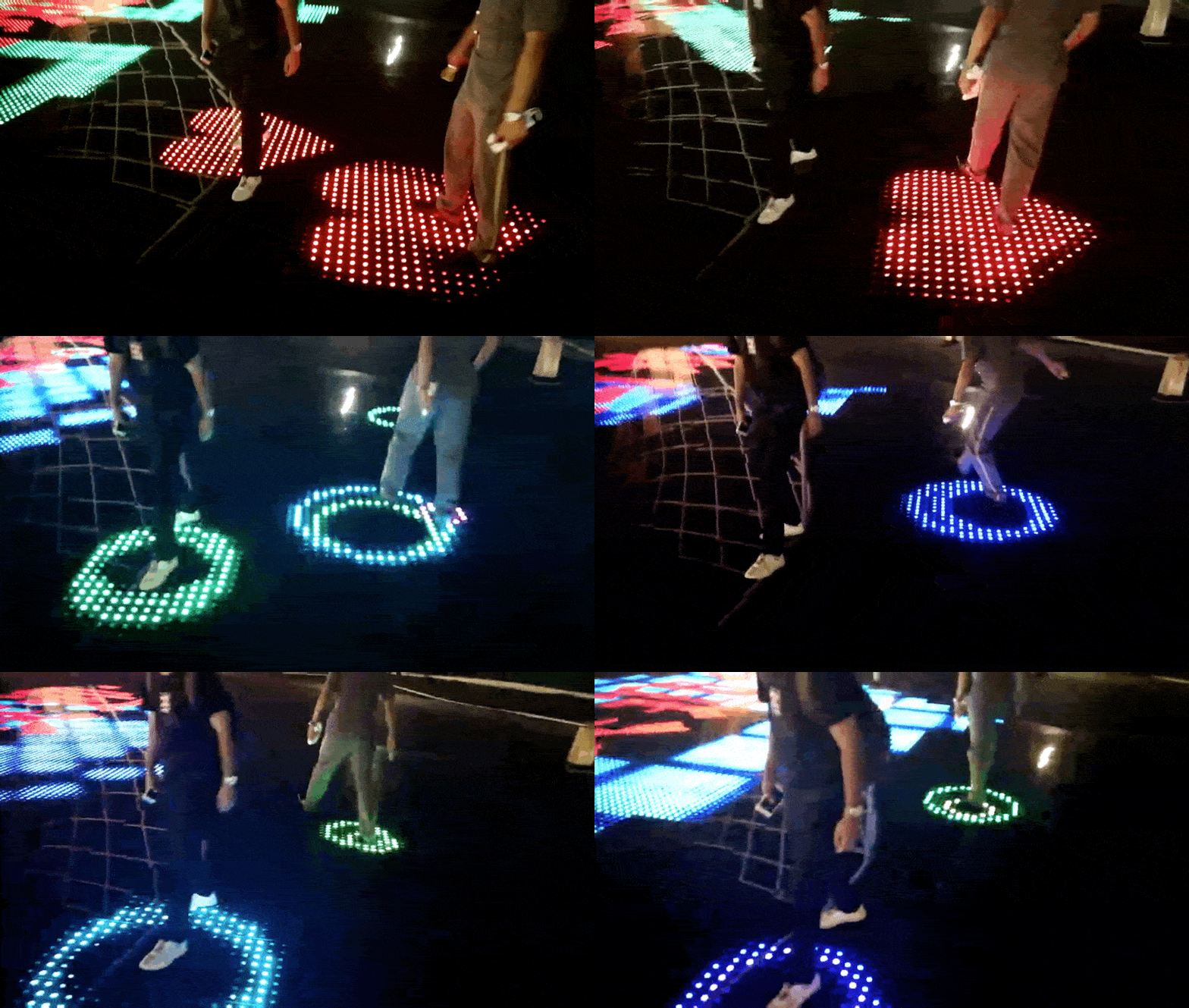
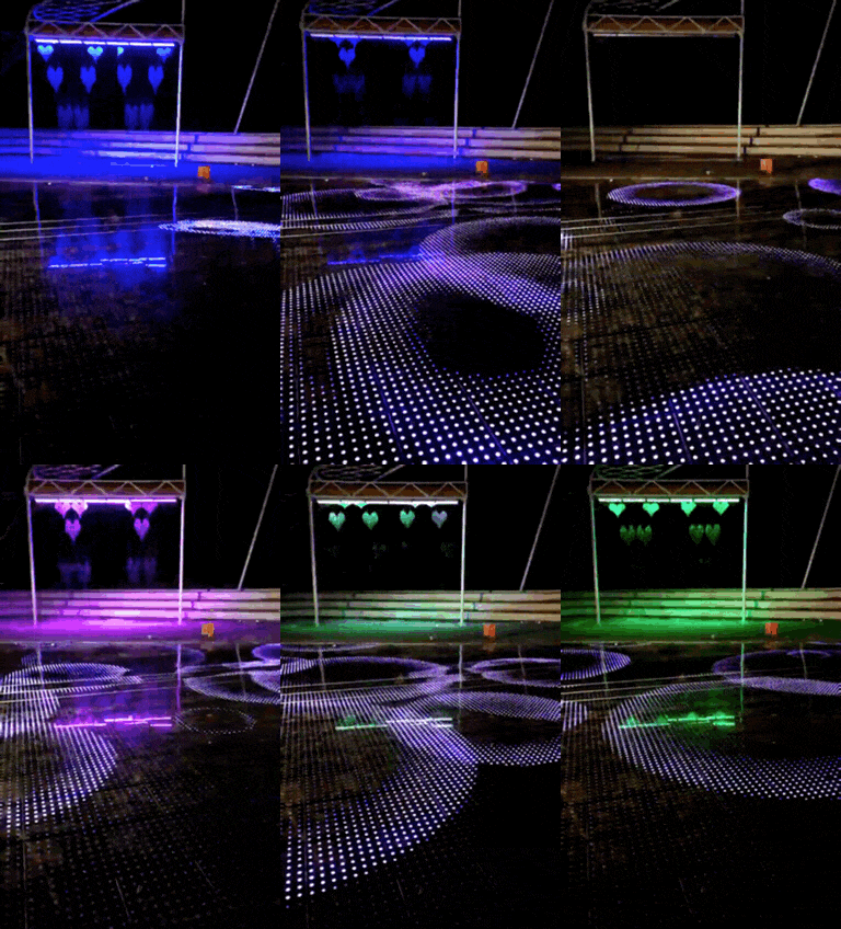
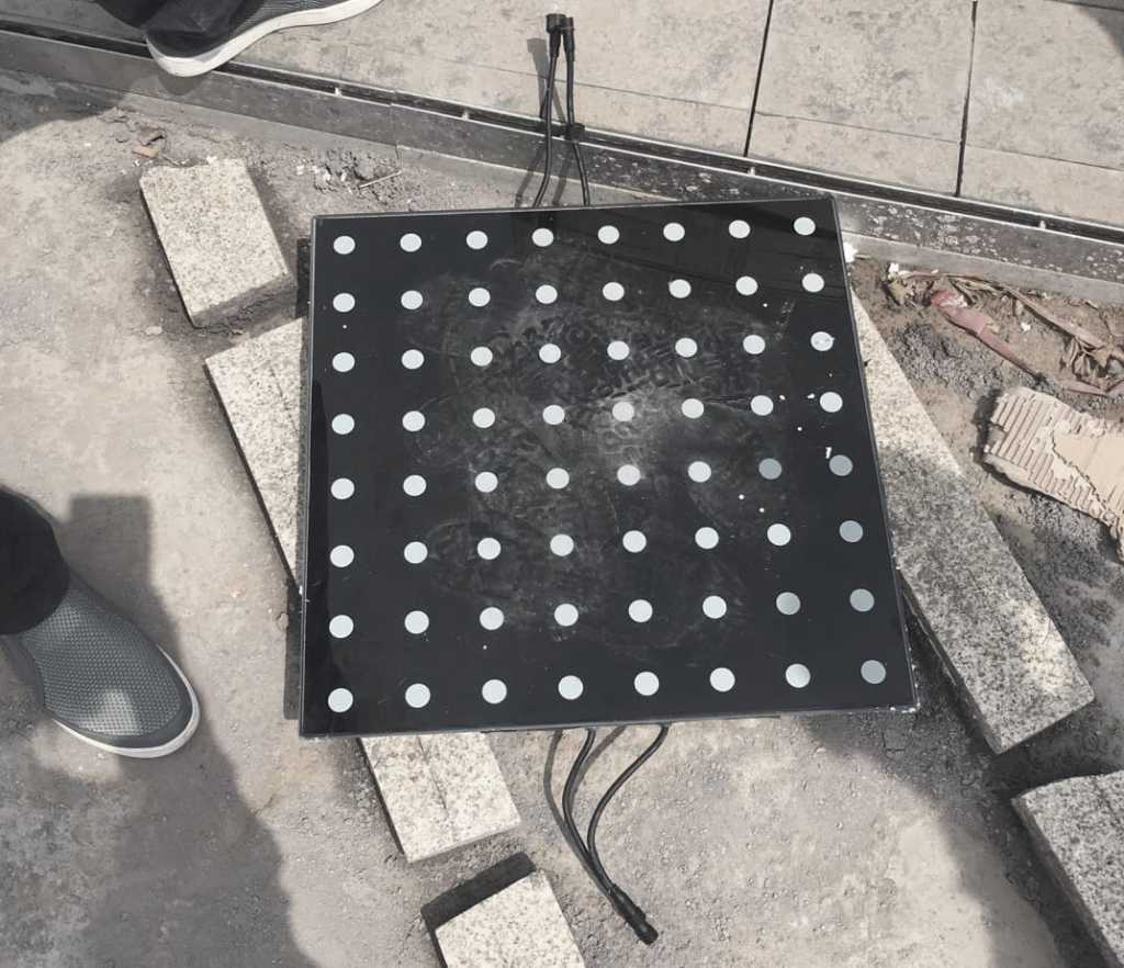
廊架下方设置了近150平米的光电地板互动区域,地板通过重力感应装置形成与人的互动。通常光电地板会采用白色玻璃做面层,但考虑到白天的观赏效果,我们定制了黑色玻璃结合白色透光点的形式做面层,这样,日光下黑色光面地板可以承接廊架的倒影,形成趣味的光影效果,夜晚来临,地板点亮,随灯光而变幻,随着脚步而移动,产生多种趣味变化,广场既是营销广告的区域,也人们互动活动的主要区域。
A photoelectric floor interaction area of nearly 150 square meters is arranged below the porch frame, and the floor interacts with people through a gravity sensing device. Usually, the photoelectric floor will use white glass as the surface layer, but considering the viewing effect during the day, we have customized the black glass combined with white light transmission points to make the surface layer. in this way, the black light surface floor can receive the reflection of the porch frame under the sunlight, forming interesting light and shadow effects. when night comes, the floor will light up, changing with the light, moving with the footsteps, producing various interesting changes. the square is not only the area of marketing advertisements, but also the main area of people’s interactive activities.
▽ 光电地板单体 | interactive glass panel with sensor module
彩色看台环抱于光电地板外围,提供人们停留、观看的场地,现今中心广场已经成为胶州热门IP,吸引当地大量的人流参与其中。
The colored stands surround the photoelectric floor and provide a place for people to stay and watch. nowadays, the central square has become a hot IP in JIAOZHOU, attracting a large number of local people to participate in it.
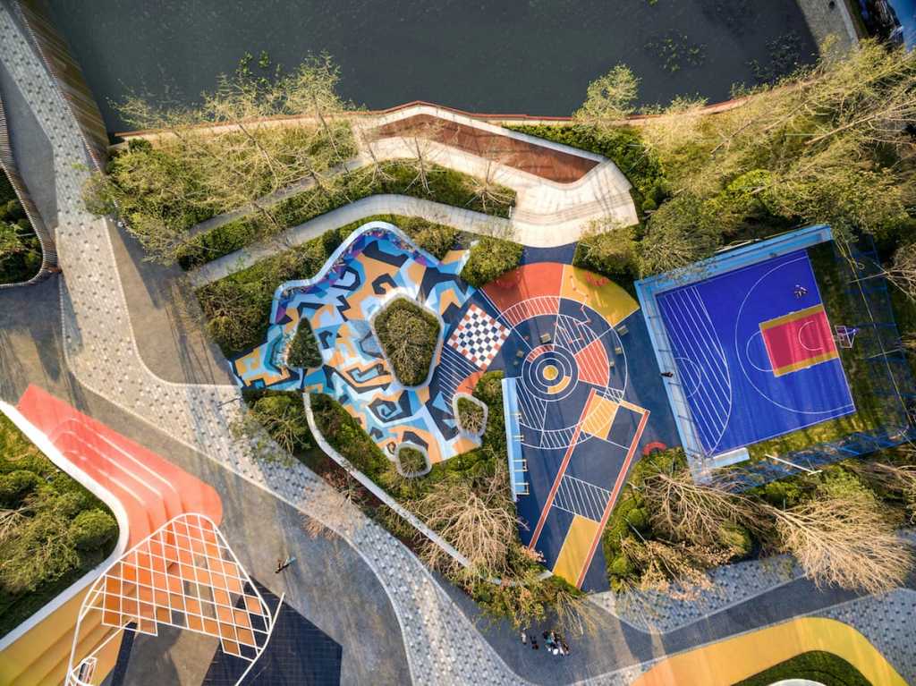
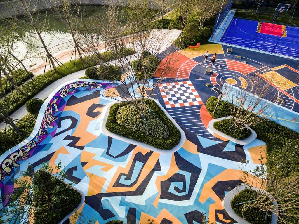
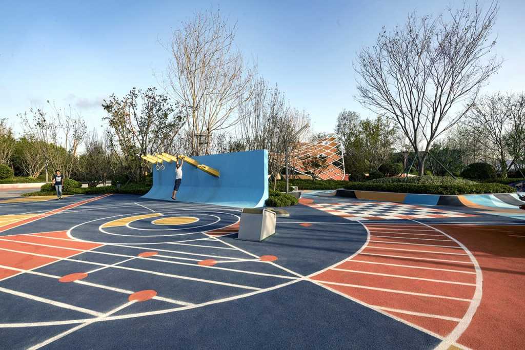
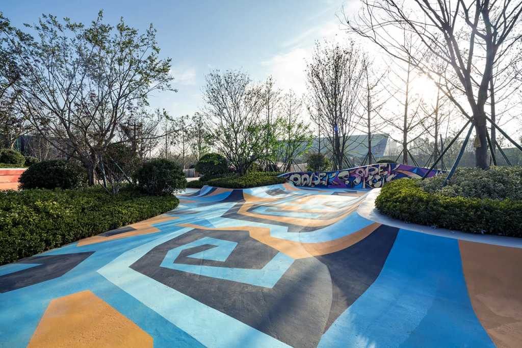
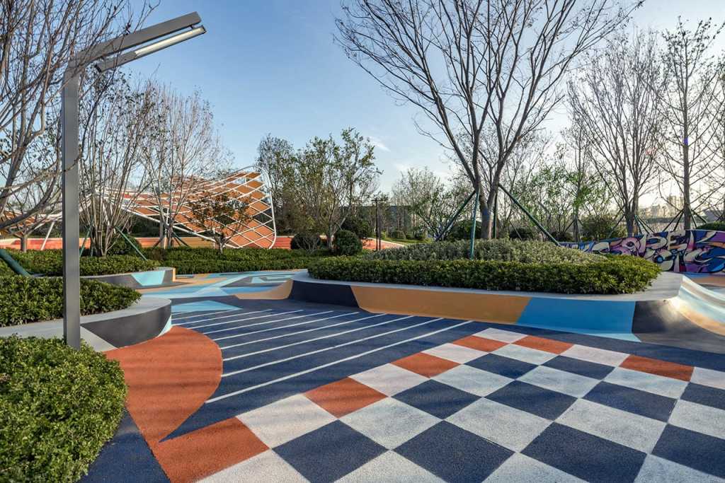
未来生活处处期待着更健康,更有机的生活氛围,在这个体验区里还提供了一个城市休闲运动的浓缩版,这个运动公园最大的特色是将视觉的冲击力作为运动的激发点,让人的精神和身体都能得到全新活力。场地由极限运动场、多功能健身场及半场篮球场组成,是吸引人气及展示未来大区健身生活的场所。我们通过地面涂鸦将三个空间串联渗透,同时涂鸦也增加了场地的识别性、赋予了场地更多的活力。场地以活力的蓝色为主要色彩,与我们项目的主色调橙色形成色彩对比,产生强烈的视觉冲击力。
Life everywhere in the future is looking forward to a healthier and more organic life atmosphere. in this experience area, there is also a concentrated version of the city’s leisure sports. the biggest feature of this sports park is to use the visual impact force as the exciting point of sports, so that people’s spirit and body can get new vitality. The stadium is composed of a limit playground, a multi-functional fitness stadium and a half-court basketball court. it is a place to attract people and show the future fitness life in the region. We penetrate the three spaces in series through graffiti on the ground. at the same time, graffiti also increases the identification of the site and gives the site more vitality. The main color of the venue is vibrant blue, which forms a color contrast with the main color orange of our project and produces strong visual impact.
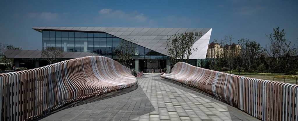
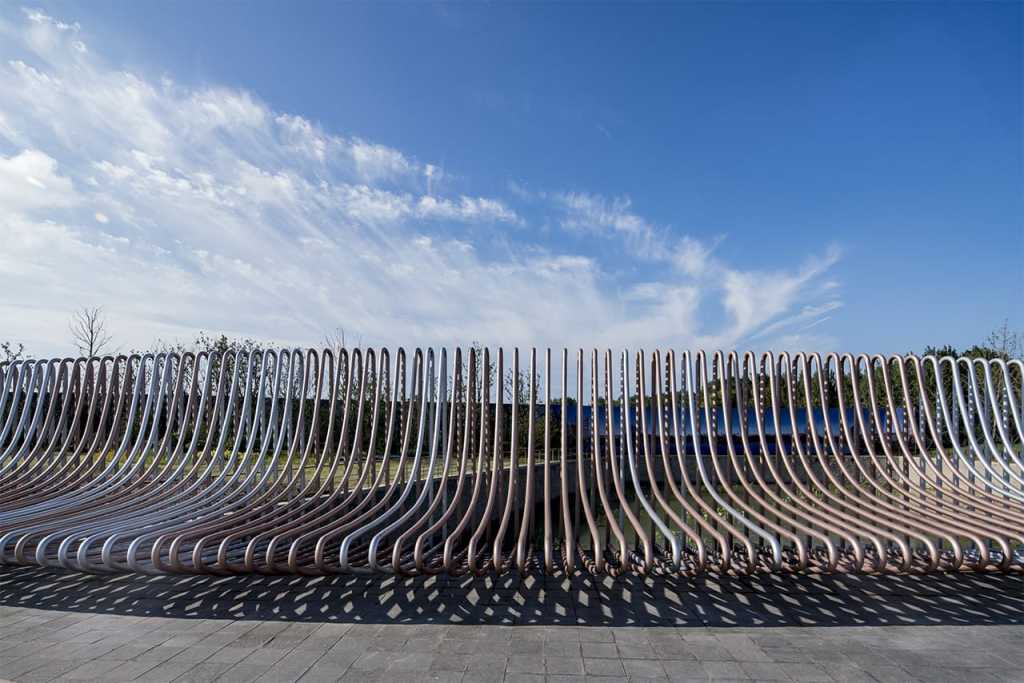
前后场空间由一座步行廊桥相连,是人群去往售楼处的必经之路。设计之初有几点考虑,首先廊桥本身通直并且正对售楼处入口,从上桥至进入售楼处动线约85米,我们想要打破这种通长缺乏趣味的到达路径,通过廊桥栏杆从立面到平面的延续,重新组织桥上的行走路径,使之弯折有趣;其次,我们想通过廊桥栏杆的竖向起伏,将视线聚焦由前场转向售楼处建筑,因此我们想到使用钢管做围栏,通过参数化的排列方式,规律中寻求变化,打造出这座独一无二的地标性的桥体。从不同视角下观看廊桥,会呈现出钢管既规律又富有变化的交叠效果。
The front and back yard spaces are connected by a walking porch bridge, which is the only way for the crowd to reach the sales office. At the beginning of the design, there were several considerations. firstly, the covered bridge itself was straight and was facing the entrance of the sales office. the moving line from the bridge to the sales office was about 85 meters. we wanted to break this kind of long and uninteresting path of arrival. through the continuation of covered bridge railings from the facade to the plane, we reorganized the walking path on the bridge to make it interesting to bend. Secondly, we want to focus our attention on the building of the sales office from the front court through the vertical ups and downs of the covered bridge railing. therefore, we want to use steel pipes as fences and seek changes in the rules through parametric arrangement so as to create this unique landmark bridge body. Looking at the covered bridge from different perspectives will show the overlapping effect of steel pipes that are regular and full of changes.
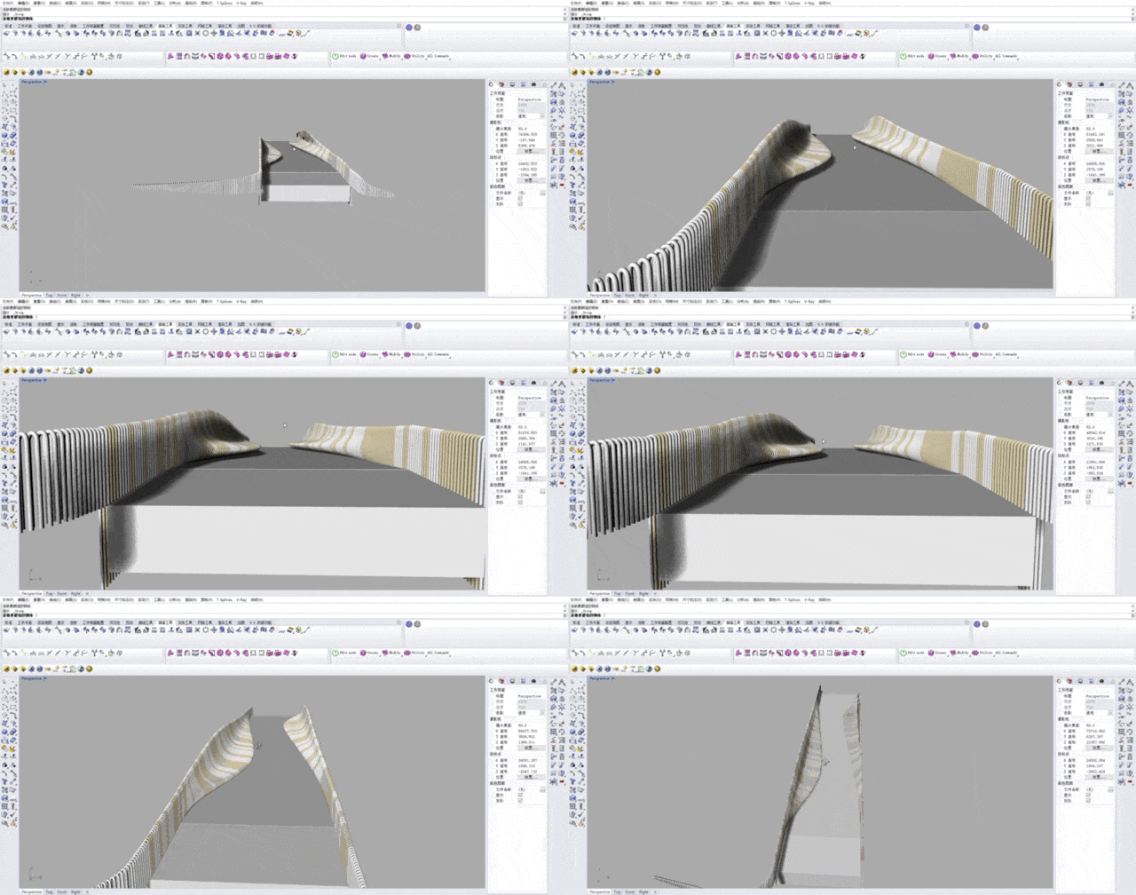
▽ 设计阶段廊桥参数化模型 | parametrical design for Hi-Wave Bridge
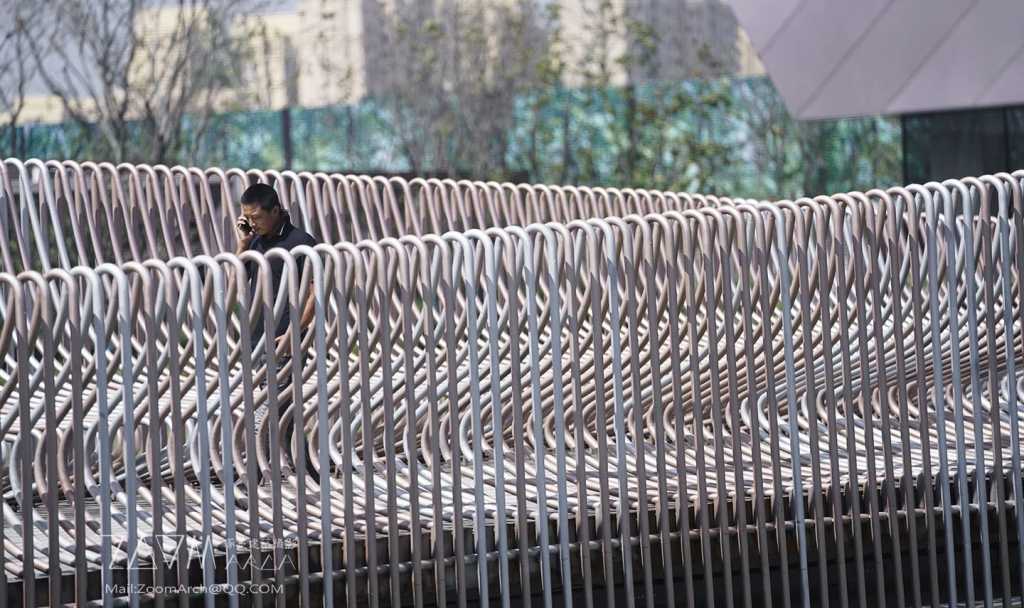
廊桥围栏感性的线条是参数化设计的产物,产生未来感十足的视觉效果。在施工中这些钢管的定制及实际排列是项目的另一大难点。首先我们输入数据生成三维模型,再对每一根钢管在图纸中进行尺度标注,工厂根据数据加工,运至现场人工逐根焊接、安装、打磨、喷漆,为了保证最佳效果,返厂了约千根钢管,最终才有了现在几乎完美的效果表达。
The perceptual lines of the covered bridge fence are the product of parametric design and produce a full visual effect in the future. The customization and actual arrangement of these steel pipes is another major difficulty in the project. First, we input data to generate a three-dimensional model, and then dimension each steel pipe in the drawing. according to the data processing, the factory sends it to the site to manually weld, install, polish and spray paint one by one. in order to ensure the best effect, we have returned to the factory about 1,000 steel pipes, and finally we have the almost perfect effect expression now.
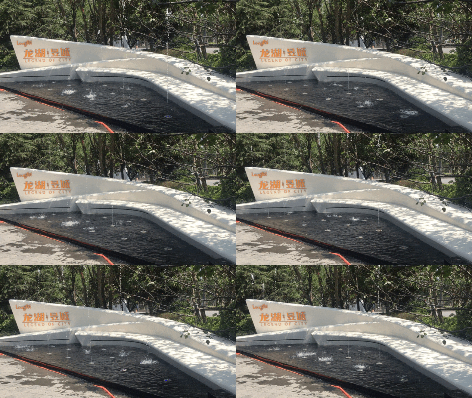
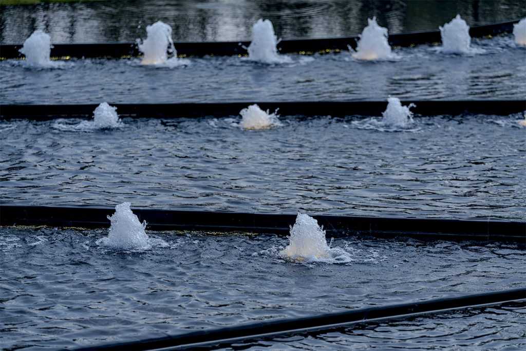
logo水景墙设于停车场进入场地的对景位置,其造型连接前场草坪上的白色矮墙,语言统一整体。由于水景墙造型弯转异形,在材料的考虑上最终选择了不锈钢板作为水景墙材料,水景采用程控喷泉,样式多变,趣味性十足。
The logo waterscape wall is located at the opposite scene of the parking lot entering the site. its shape is connected to the white low wall on the front lawn, and its language is unified and integrated. Because the waterscape wall is curved and turned into a special shape, the stainless steel plate was finally chosen as the waterscape wall material in consideration of the material. the waterscape uses program-controlled fountains, which are changeable in style and full of interest.
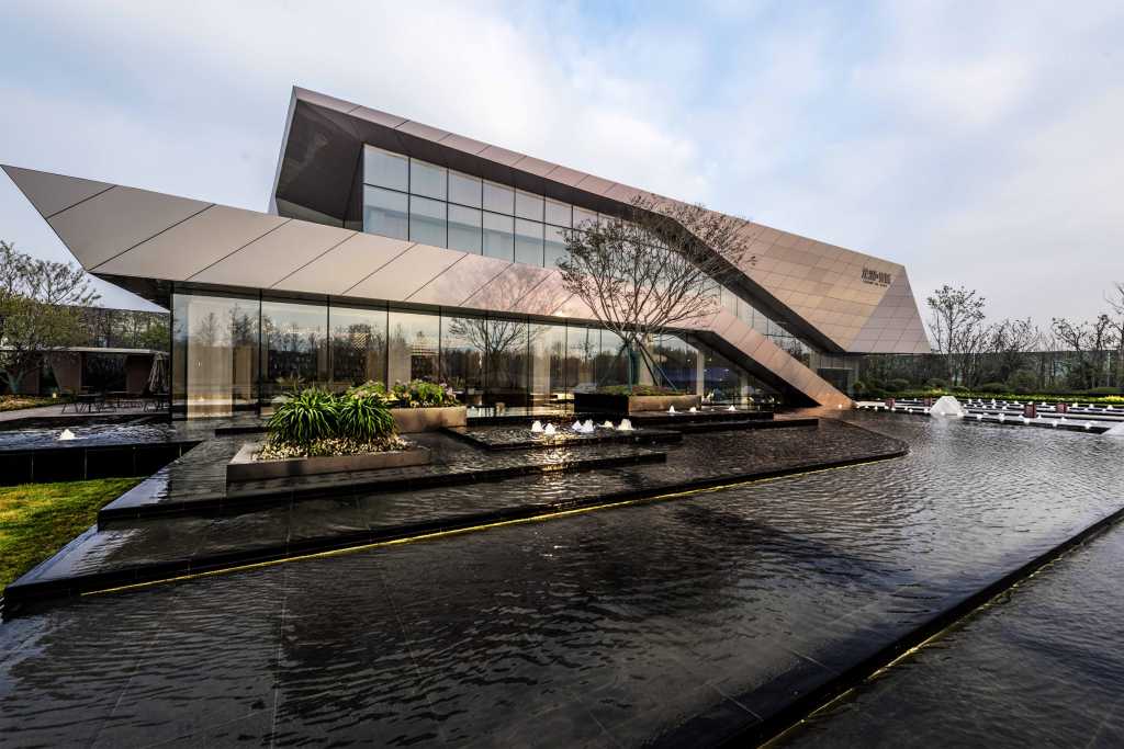
艺术廊桥引导客人进入项目的后场空间,走下廊桥,售楼处前道路正对建筑大门,两侧层层叠落的镜面水景打造仪式性的进入效果。考虑售楼处内洽谈区向外观看的效果,将其望向窗外的对景位置设为叠水的最高点,同时我们设计了点景树在最高点的种植池内,成为整个水景的点睛之笔。
The art gallery bridge guides the guests into the back yard space of the project and walks down the gallery bridge. the road in front of the sales office is facing the building gate and the mirror waterscape on both sides creates a ceremonial entry effect. Considering the effect of looking out of the negotiation area in the sales office, the opposite position of looking out of the window is set as the highest point of overlapping water. at the same time, we have designed a spot tree in the planting pond at the highest point, which becomes the finishing touch of the whole waterscape.
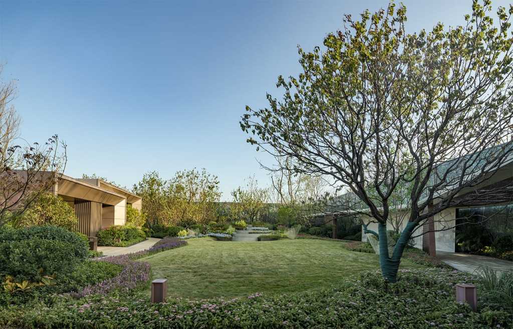
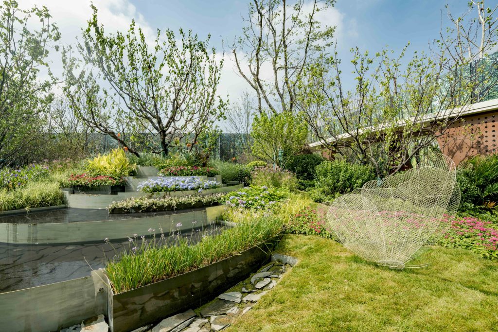
售楼处侧门连接着样板间花园,花园与前场的开放活动广场形成显著对比,我们将其打造为龙湖标志性的游园种植空间。侧门外是室外洽谈区域,也是观看后花园全局的最佳观看点。连接到平台的光影廊架将客户指引到我们规划的后花园参观流线中。
The side door of the sales office is connected to the garden of the example room. the garden is in marked contrast to the open activity square in the front court. we have built it into the landmark garden planting space of longhu. Outside the side door is the outdoor negotiation area, which is also the best viewing point for viewing the whole back garden. The light and shadow corridor frame connected to the platform guides the customer to our planned back garden tour streamline.
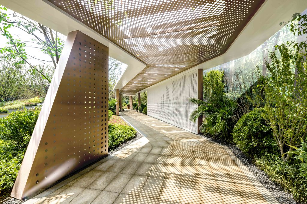
呼应未来大区的设计理念,廊架以光影为主题,顶面通过钢板打孔的形式结合项目案名logo,在上午及中午时段呈现趣味的光影变化。
Echoing the design concept of the future region, the corridor frame takes light and shadow as its theme, and the top surface of the corridor frame shows interesting light and shadow changes in the morning and noon periods through steel plate punching combined with the logo of the project case name.
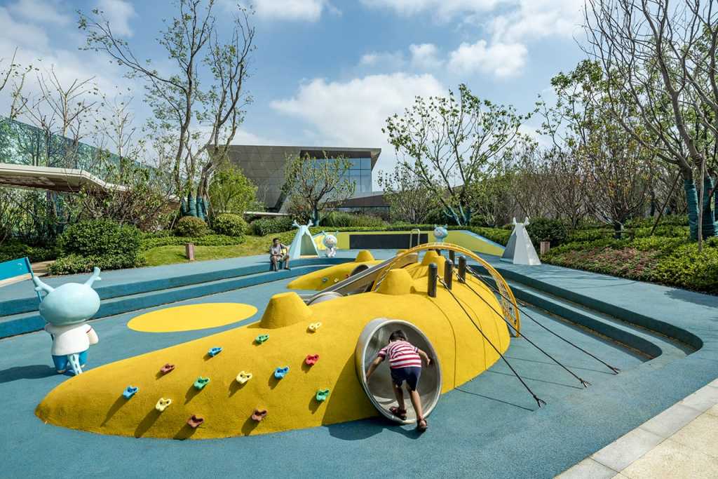
整个后花园的视线终点位置设置了一组层层叠落的叠水台,与种植池交错结合,成为后庭院的景观焦点,水景后隐藏了儿童活动体验区。儿童活动场地选用龙湖IP小龙人为场地主题,分为早教活动区与儿童探索游乐区两部分,结合了滑梯、爬网、攀岩、钻洞等儿童项目,让孩子们提前体验未来大区的游乐感受。
At the end of the sight line of the entire back garden, a series of cascade water platforms are set up, which are interlaced with the planting pond and become the landscape focus of the back garden. behind the waterscape, the children’s activity experience area is hidden. The children’s activity venue uses the IP Xiaolong people of longhu lake as the theme of the venue. it is divided into two parts: the early education activity area and the children’s exploration recreation area. it combines children’s events such as slides, crawls, rock climbing, and drilling holes to enable children to experience the amusement experience of the future region in advance.
结语
青岛龙湖昱城体验区不是单纯的传统体验区项目,而是以景观为媒介,引导人与空间交流的互动区。它既是胶州新商务片区发展的催化剂,也是未来天街商业的前奏,将推动区域的活力与发展,代表了未来空间模式的发展方向 – 以人为主体而展开布置的户外公共空间,通过空间的弹性和张力去满足和服务于人们不断发展和升级的活动需求,以及城市形态发展需求。
remarks
Qingdao longhu Yucheng experience area is not a simple traditional experience area project, but an interactive area that uses landscape as a medium to guide the communication between people and space. It is not only a catalyst for the development of JIAOZHOU’s new business district, but also a prelude to the future commerce of tianjie. it will promote the vitality and development of the region and represent the development direction of the future space model – outdoor public space with people as the main body. through the flexibility and tension of space, it will meet and serve the needs of people’s activities for continuous development and upgrading, as well as the development of urban forms.
项目名称:青岛龙湖昱城体验区
类型:公共景观 + 住宅展示区景观
地址:山东省青岛胶州区海尔大道与香港路交汇处
面积:20941m²
景观设计:IF本色营造
项目团队:楼颖 郭玮 宋英佳 苏子珺 刘升阳 李靖宇 党婕 洪丹
设计时间(Design): 2018.2-2018.7
委托方:青岛龙湖 (孙建伟 宫华慧子 王良杰 高鉴)
委托阶段:概念方案至施工图设计
摄影:琢墨ZOOM建筑摄影
project name: Longfor Legeng of City Demostration Area
project type: Public Landscape + Residential Landscape Demo
location: Jiaozhou, Qingdao, China
project size: 2.09ha.
landscape design by: Instinct Fabrication
project team: Ying Lou, Wei Guo, Yingjia Song, Zijun Su, Shengyang Liu, Jingyu Li, Jie Dang, Dan Hong
client: LONGFOR Qingdao
workscope: Concept to Construction Documents
photography by ZOOM
更多 Read more about: IF 本色营造
















0 Comments