本文由 Saunders Architecture 授权mooool发表,欢迎转发,禁止以mooool编辑版本转载。
Thanks Saunders Architecture for authorizing the publication of the project on mooool. Text description provided by Saunders Architecture.
Saunders Architecture: 项目位于挪威南部的萨普斯堡(Sarpsborg),这是一片地势平缓、景色宜人,使人身心平和的地方,也是来往瑞典的旅行者们的必经中转站。 2004年,挪威公路局与地方政府就该地区的一个新项目与桑德斯进行了接洽;这也是首次在没有预先明确委员会要求的情况下进行的工作。
Saunders Architecture: Sarpsborg is a green, flat and calm piece of South Norway and a traditional stopover for travellers on the route to and from Sweden. In 2004, the Norwegian Highway Department together with the Regional Government approached Saunders for a new project in the area; uniquely however, without having predetermined the commission’s particular needs.
桑德斯回忆说:“当时项目负责人虽然一直在跟进我的工作,并希望我在场地中做些什么,但是他们对想让我做的事情却没有一个明确的想法。在某种程度上来说,我需要自己想出整个计划,这是一个头脑风暴且富有创造性的过程”。 为了确定项目问题和机遇,桑德斯着眼于现场并确定其挑战和优势,同时与客户密切合作,不仅制定了最佳的设计方案,而且还确定了项目的任务简要。桑德斯解释说:“在讨论了各方需求后,架构就自然产生了”。 萨普斯堡(Sarpsborg)是瑞典游客来到挪威旅行的首个落脚点之一,因此对于游客而言,他们能够放慢脚步并花时间探索周围的自然环境是很重要的。当地的森林和海岸线是挪威美丽而又鲜为人知的部分。
The project leaders had been following my work and asked me to do something in the area, although they didn’t have a specific idea of what they wanted me to do, Saunders recalls. In a way I had to almost come up with the program myself, it was very free and creative. Focusing on the site and aiming to identify its challenges and advantages in order to define its problems and opportunities, Saunders worked closely with the client, not only to develop the optimum design solution, but also the project’s own brief.We discussed what we needed and the architecture came out of that, he explains. As Sarpsborg is one of the first tastes of Norway the travellers from Sweden experience, it was important for the client that they would be able to slow down and spend time discovering the surrounding nature. The local forest and coastline form a beautiful, yet largely unknown part of the country.
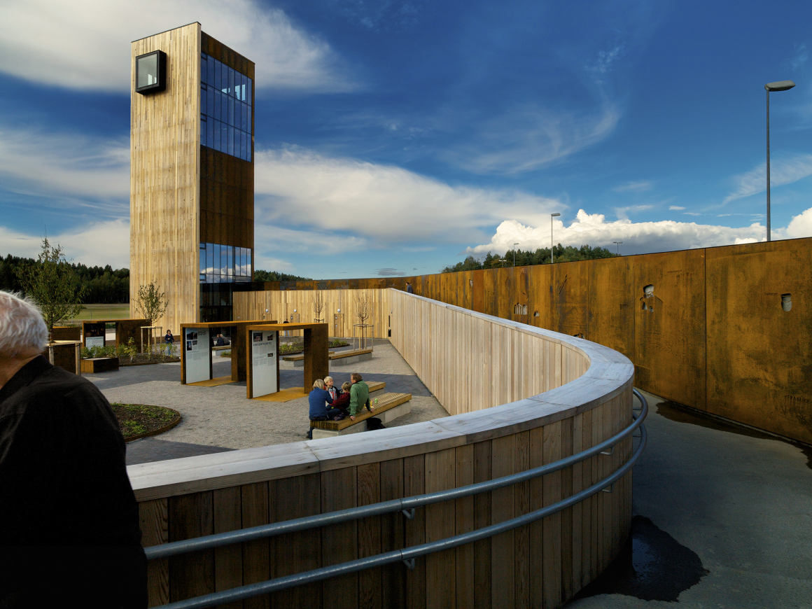
邻近高速公路的噪音使旅行者更需休息和感受自然的空间,因此设计师首要考虑了在场地中增添景观休憩功能空间。环绕休息区的一堵矮墙坡道,界定了2000平方米的庭院空间,庭院内种了春天开花的果树。 其中,桑德斯与平面设计师卡米拉·霍克洛夫特(Camilla Holcroft)合作设计了7个展示亭,向人们展示了青铜器时代的当地石刻作品,并在坡道的墙上做出了延续展览。
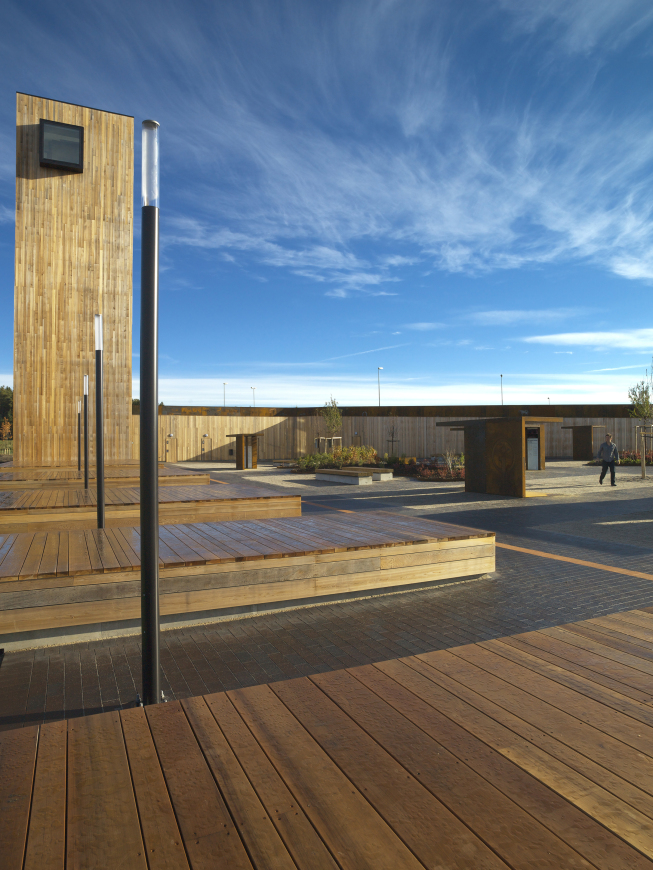
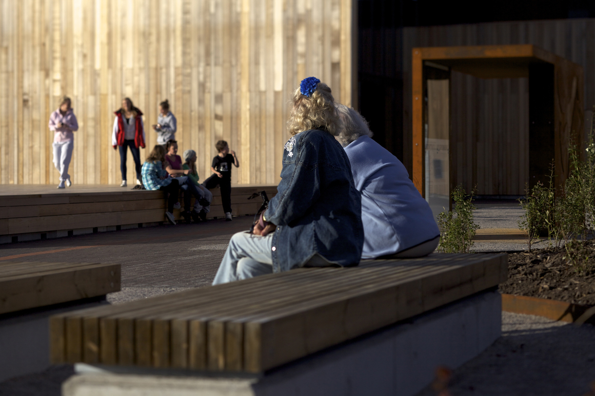
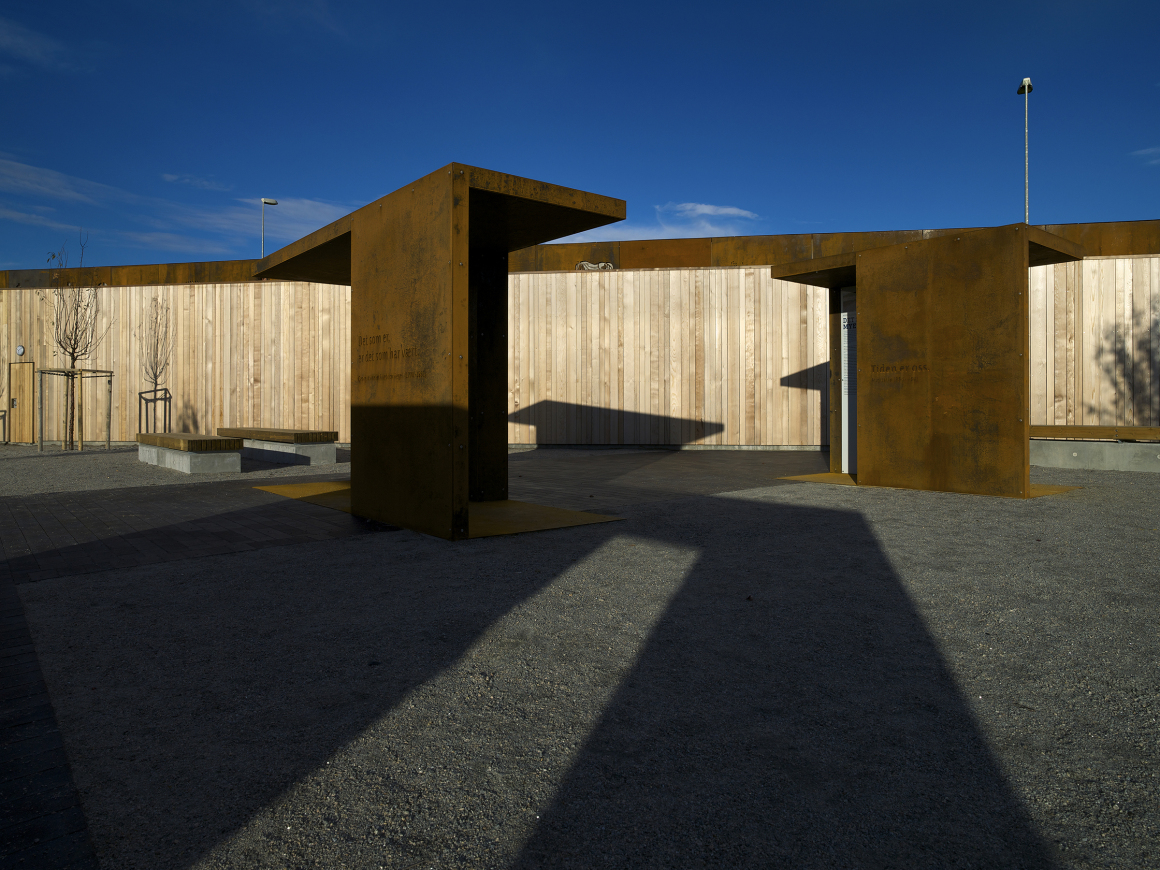
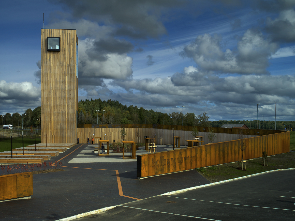
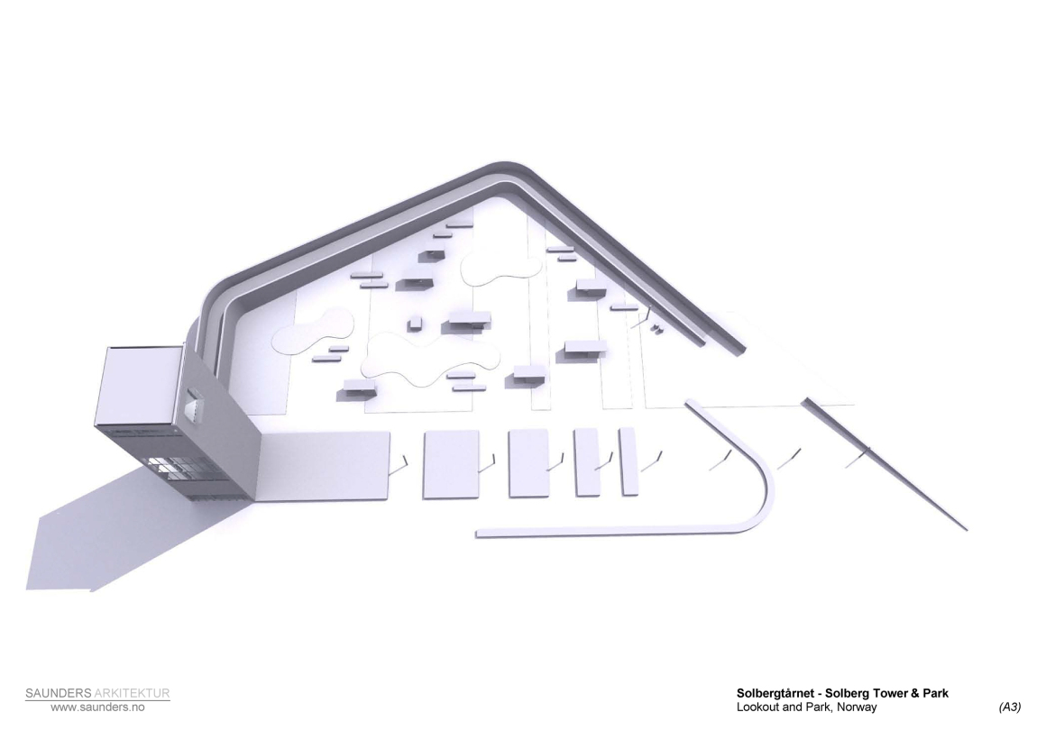
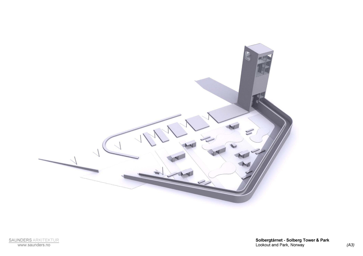
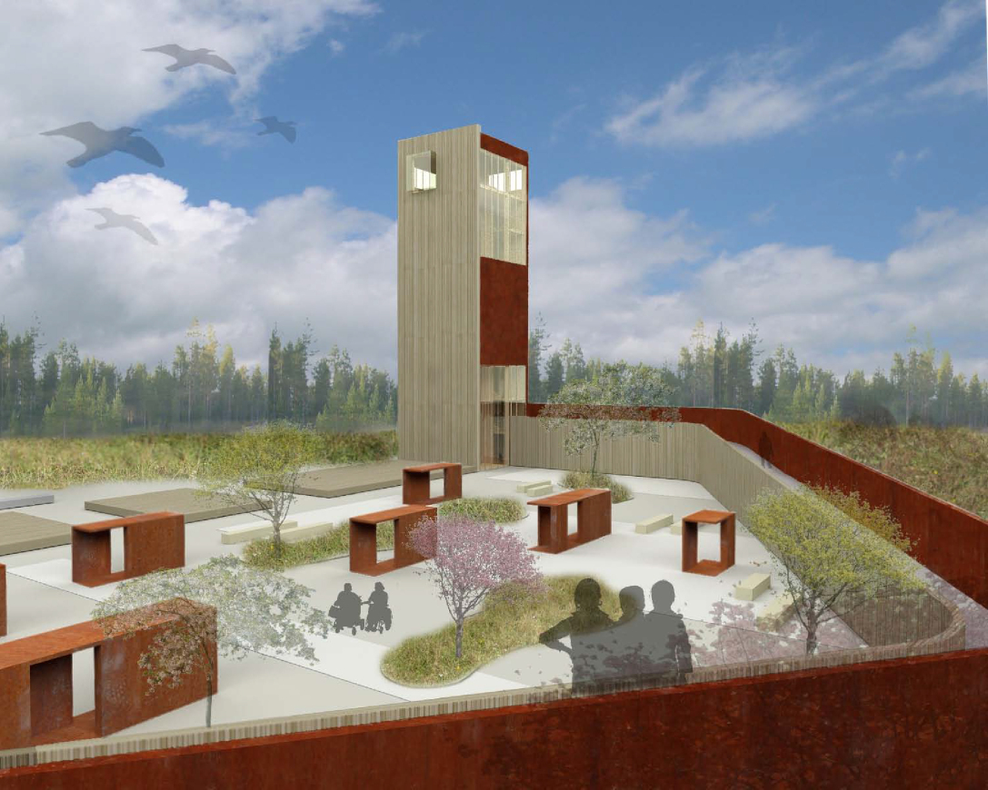
The neighbouring highway’s speed and noise only enhance the traveller’s need for a break and re-connection with nature, so a green resting space was on the top of the list. A low walled ramp spirals around the rest area, defining the 2000 sq m area’s limits, while spring-flowering fruit trees adorn the courtyard. Within it, Saunders designed seven small pavilions working with graphic designer Camilla Holcroft, showcasing information on the local rock carvings from the Bronze Age, an exhibition, which continues on the ramp’s walls.
▼休憩空间与7个展示亭 resting place & 7 pavilions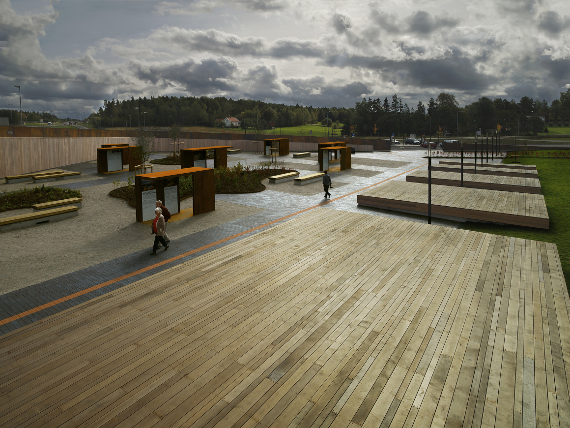 ▼休憩区 resting place
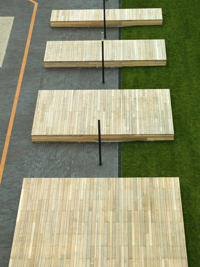
桑德斯说:“其实周围的森林中到处都是岩石雕刻,但无人问津,因为此处只是人们驱车前往奥斯陆途中的歇脚点而已”。 这些展示亭还能作为临时艺术家展览的空间。
The surrounding forest is full of rock carvings but no one knows about them because everybody just drives through trying to get to Oslo, says Saunders. The structures also offer the option for temporary artist exhibitions.
▼展示亭 pavilions
▼墙面上的展示 exhibition on ramp’s walls
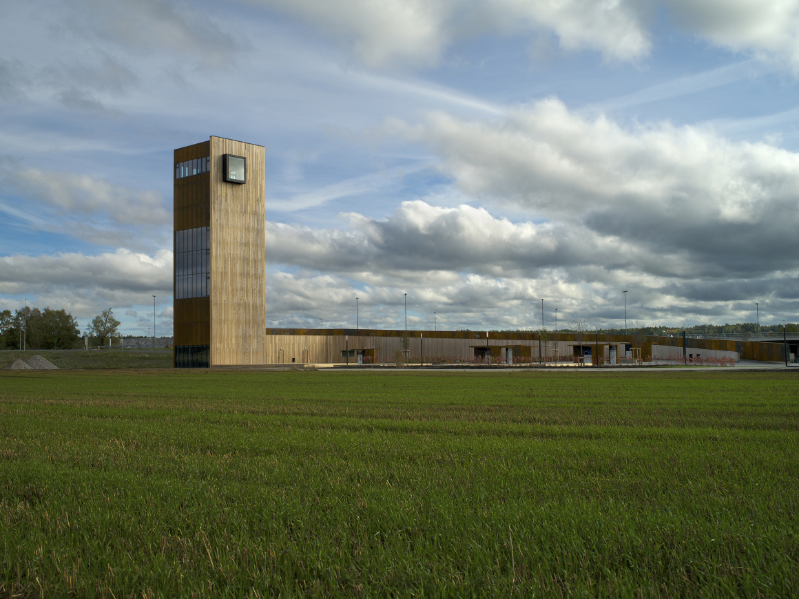
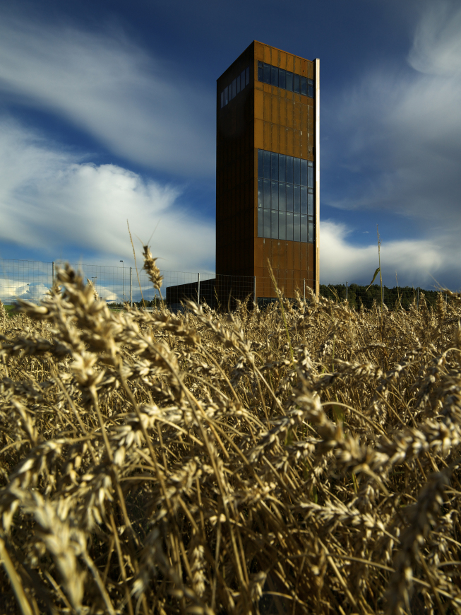
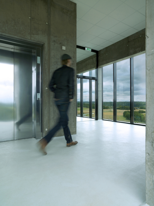
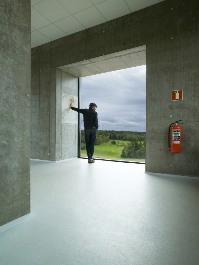
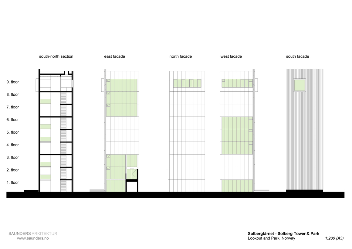
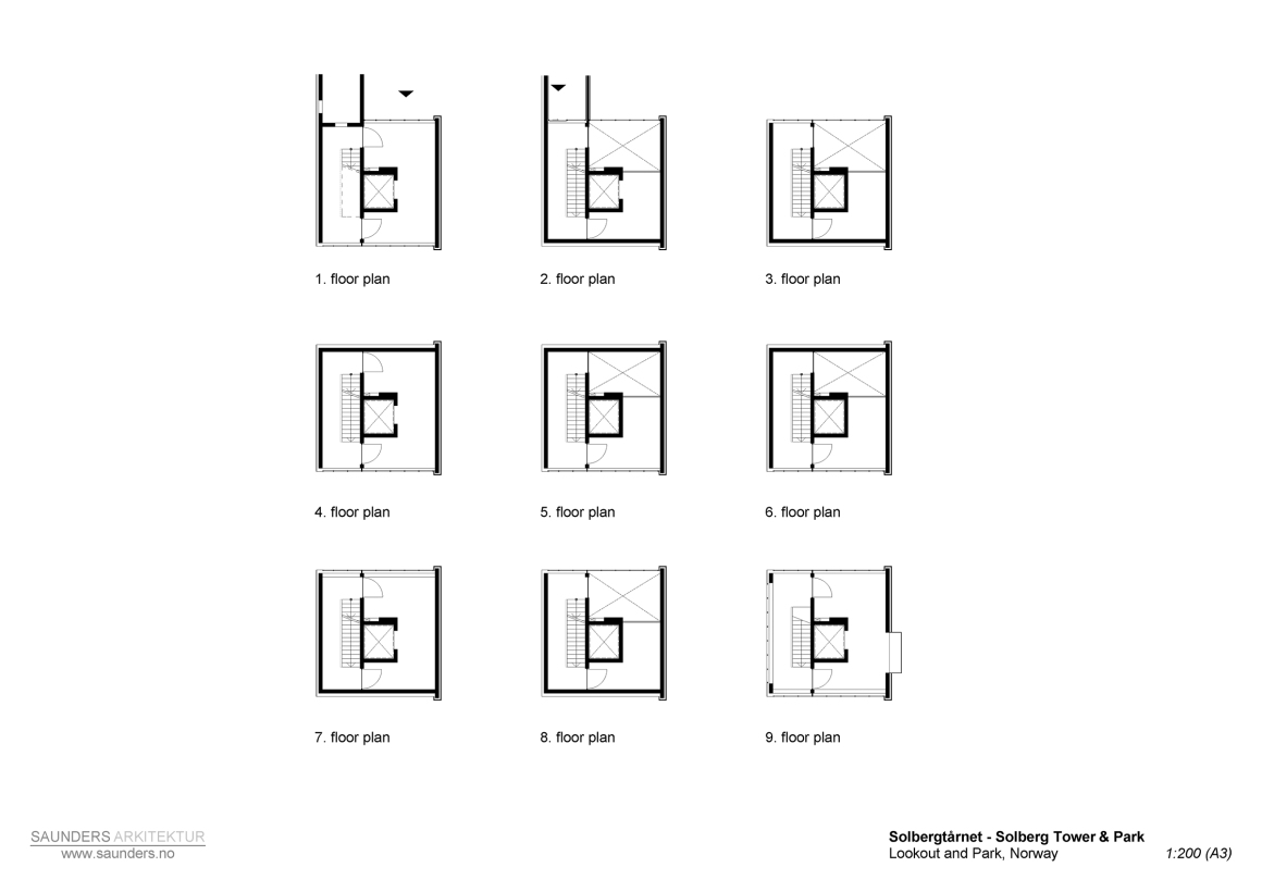
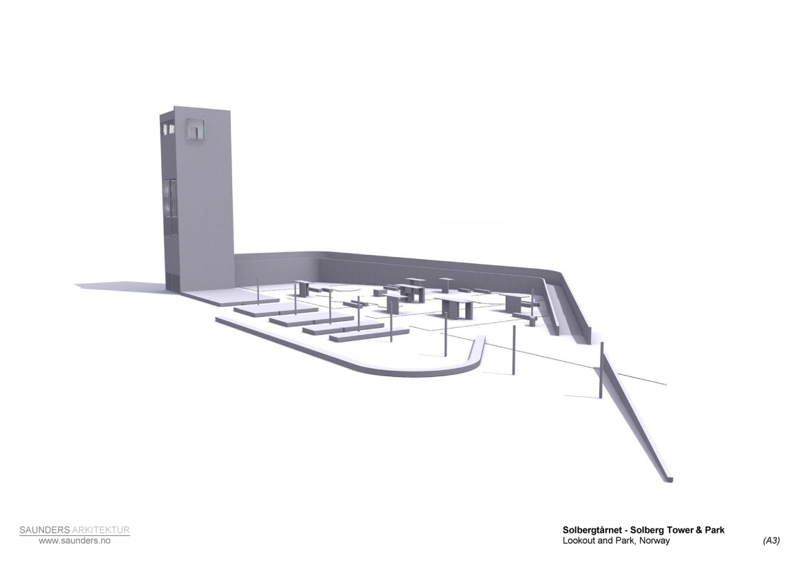
场地的平坦地势意味着观景视角是有限的,因此建造塔楼很快成为了任务简要的主要部分。 坡道两侧不对称的墙体,沿着地面逐渐升高到 4m,然后在场地北边形成一个9层楼,30m高仅包括楼梯和电梯的简单塔楼。这座塔楼名为索尔伯格(Solberg,意为“太阳山”),登上塔楼能俯瞰到附近海岸线和奥斯陆峡湾的浪漫风景。
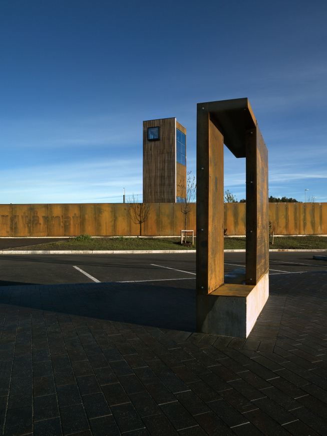
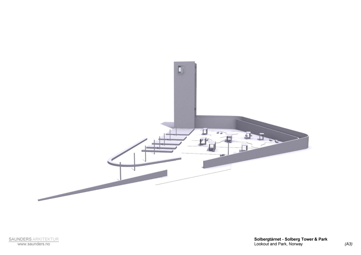
The flatness of the landscape meant that the beauty of the surrounding nature could only be enjoyed from a certain height, so the creation of a tower quickly became a main part of the brief. The ramp’s asymmetrical walls rise from 0 – 4m, then forms a 30m simple nine–storey-tall structure on the site’s northern edge, including only a staircase and an elevator. Named Solberg (which translates into ‘sun mountain’), the tower’s aerial views towards the nearby coastline and the Oslo fjord are truly dramatic.
▼站在塔楼处看庭院 the view of courtyard from tower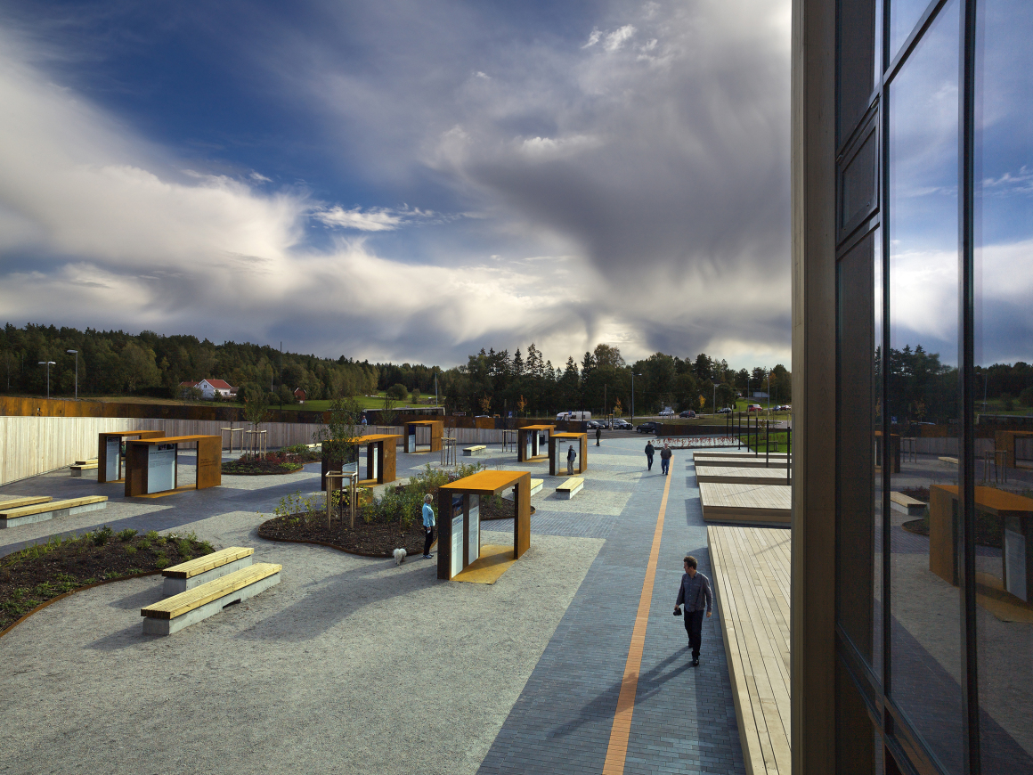
▼登上塔楼俯瞰 bird view in tower
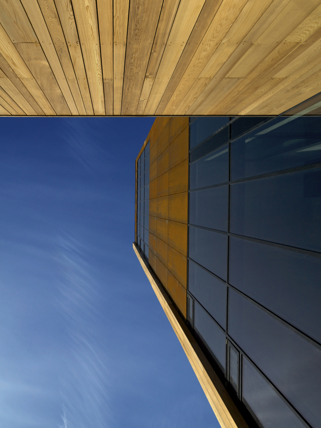
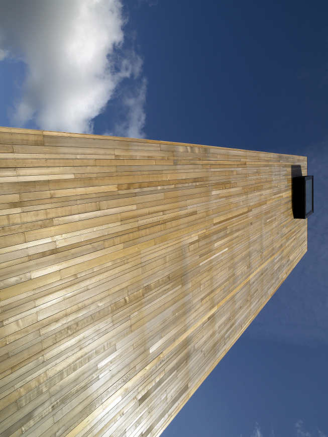
整体的设计风格和美学是与周围现有建筑相结合的;最终,设计师选择了对比当地农庄的更为传统形式,兼具有现代感的小几何形来打造。使用的主要材料有:用于外墙的精美做旧的CorTen钢、用于庭院的设计元素和信息点处的暖色调的硬木以及用于铺地点当地的石板和细碎石。
Finally, the design’s style and aesthetic was developed in relation to the environs’ existing architecture; minimal and geometrical contemporary shapes were chosen, contrasting the local farming villages’ more traditional forms. The main materials used were beautifully-ageing CorTen steel for the exterior walls and warm oiled hard wood for the courtyard’s design elements and information points. Local slate and fine gravel pave the ground level.
▼几何形打造 geometrical contemporary shapes
▼钢材面和木材面 CorTen steel for the exterior walls and warm oiled hard wood
桑德斯强调了该地区的自然和历史景点,并以强有力的建筑形式作为支撑,根据客户和场地的要求,设计了一个综合体。萨普斯堡项目于2010年夏季完成,由多个市政府、地区政府和国家公路局合作完成。
Underlining the area’s natural and historical attractions, supported by strong architectural forms, Saunders produced a complex, in direct response to both the clients’ and site’s requirements. A cooperation between several municipalities, the regional government and the national highways department, the Sarpsborg project completed summer 2010.
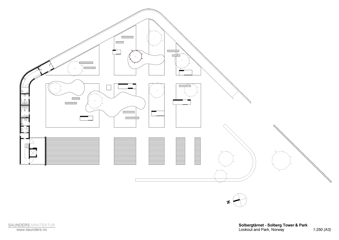
▼平面图 plan
▼塔楼立面&平面图 facade & plan of tower
▼项目模型 model
▼效果图 renders
项目名称: 索伯格塔楼和休息区
客户: Statens Vegvesen, Østfold fylkeskommune, Sarpsborg kommune og Fredrikstad kommune
建筑师: Saunders Architecture – 挪威,卑尔根
团队成员: Todd Saunders, Mats Odin Rustøy, Inês Moço Pereira, Mathias Kempton, Attila Béres, Joseph Kellner, Michaela Huber, Greg Poliseo
顾问:
总承包商: Veidekke ASA
施工管理: Sweco Norge AS, Karin Anja Arnesen
结构工程: Sweco Norge AS, Per Jo Treimo
电气工程: Sweco Norge AS, Bjørnar Isaksen
机械工程: Sweco Norge AS, Liv Normann
玻璃安装顾问: Saint-Gobain Bøckmann AS, Henrik Ronneberg Nilsen, Trond Karlsen
钢材料顾问: Jotne Mekaniske Verksteder AS、Terje Johannessen、Helge Thorsen、Vidar Larsen、Stein Aune
景观设计师: Kristin Berg,Statens Vegvesen
平面设计师 / 信息图形与插图: Camilla Holcroft
项目面积: 2000㎡
项目位置: 挪威,奥斯特福德,萨普斯堡
项目状态: 2010年9月完成
Project name: Solberg Tower & Rest Area
Client: Statens Vegvesen, Østfold fylkeskommune, Sarpsborg kommune og Fredrikstad kommune
Architect: Saunders Architecture – Bergen, Norway
Team architects: Todd Saunders, Mats Odin Rustøy, Inês Moço Pereira, Mathias Kempton, Attila Béres, Joseph Kellner, Michaela Huber, Greg Poliseo
Consultants:
General contractor: Veidekke ASA
Construction management: Sweco Norge AS, Karin Anja Arnesen
Structural engineer: Sweco Norge AS, Per Jo Treimo
Electrical engineer: Sweco Norge AS, Bjørnar Isaksen
Mechanical engineer: Sweco Norge AS, Liv Normann
Glazing consultants: Saint-Gobain Bøckmann AS, Henrik Ronneberg Nilsen, Trond Karlsen
Steel consultants: Jotne Mekaniske Verksteder AS, Terje Johannessen, Helge Thorsen, Vidar Larsen, Stein Aune
Landscape architects: Kristin Berg, Statens Vegvesen
graphic designer/info graphics & illustration: Camilla Holcroft
Size: 2000 ㎡
Location: Sarpsborg, Østfold, Norway
Status: Finished September 2010
更多read more about: Saunders Architecture











0 Comments