本文由 WTD 纬图设计机构 授权mooool发表,欢迎转发,禁止以mooool编辑版本转载。
Thanks WTD for authorizing the publication of the project on mooool. Text description provided by WTD.
纬图设计机构:这是一个充满力量感与视觉张力的场地。辽阔的原生坡地上,向下形成洼地,眼前的谷地和远处的山脊尽收眼底。半人高的野草随风起舞,石头经过风化后皲裂出漂亮的肌理。自带开阔的尺度感与柔和的地形曲线组合成动人的画面,唤起了我们对生命与时间的感知。在大尺度与无界、原野与谷、荒芜与诗的畅想中,我们希望呈现一个具有原生力量和自然肌理的空间,一个与自然对话的“原生之境”。
WTD: This is a venue full of power and visual tension. On the vast native slopes, depressions are formed downwards, and the valleys in front of you and the ridges in the distance are panoramic. The half-person tall weeds danced with the wind, and the stones chapped into beautiful textures after being weathered. The wide sense of scale and soft terrain curves combine to form a moving picture that evokes our perception of life and time. In the imagination of large-scale and unbounded, wilderness and valley, barrenness and poetry, we hope to present a space with original strength and natural texture, a “primitive realm” of dialogue with nature.
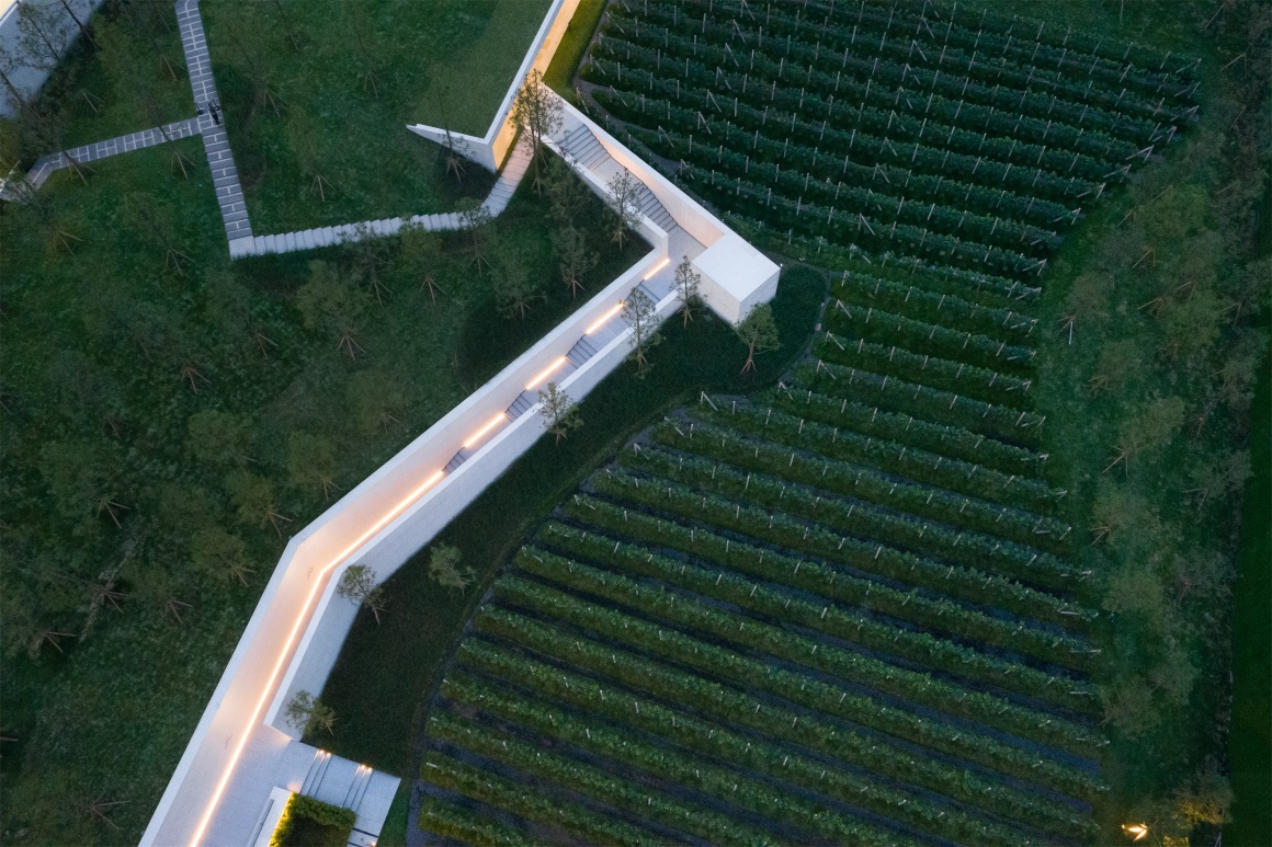
▽局部鸟瞰 Aerial view
一片原野,这是设计团队初见场地时的第一感受。
万科璞园在重庆中央公园北悦港大道两侧,示范区位于悦港大道东南侧边坡上,面宽约150m的场地以18.5%放坡率下降近20米高差,这样的地形条件成为设计主要攻克的难点。示范区大部分区域属于代征绿地,前场未来将作为未来市政公园的主入口。一条6.3%坡度的支路从中穿过,如此,也给设计带来一定制约。
A field, this is the first feeling of the design team when they first saw the site.
Vanke Puyuan is located on both sides of Beiyuegang Avenue in Chongqing Central Park. The demonstration area is located on the slope on the southeast side of Yuegang Avenue. The site with a surface width of about 150m has a grading rate of 18.5% and the height difference is reduced by nearly 20 meters. This topographical condition becomes The design mainly overcomes the difficulties. Most areas of the demonstration area belong to the expropriated green space, and the front field will be the main entrance of the future municipal park in the future. A branch road with a slope of 6.3% passes through it, which also brings certain constraints to the design.
▽设计难点是克服巨大高差 The design difficulty is to overcome the huge height difference
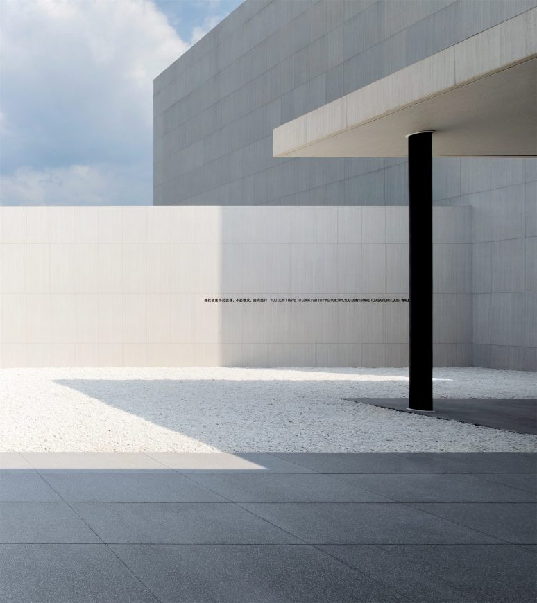
原生坡地结构给了我们以“原”作为设计主题的启发。我们以地形与线条的互动、自然与材质的交融作为创作原则,极简线条加以柔和的色彩搭配,呈现极致艺术美学的几何感和雕刻感。以最干净简洁的直线条与体块构成框架,切割光影、裁剪自然,展现纯朴的原生之美。
The original sloping field structure inspired us to use “original” as the design theme. We use the interaction of terrain and lines, and the blending of nature and materials as our creative principles. The minimalist lines are matched with soft colors to present the ultimate artistic aesthetics of geometry and sculpture. The cleanest and concise straight lines and blocks form the frame, cut light and shadow, and cut natural, showing the simple and original beauty.
▽极简的几何线条与原生自然场地互动融合 Minimalist geometric lines interact with the original natural site
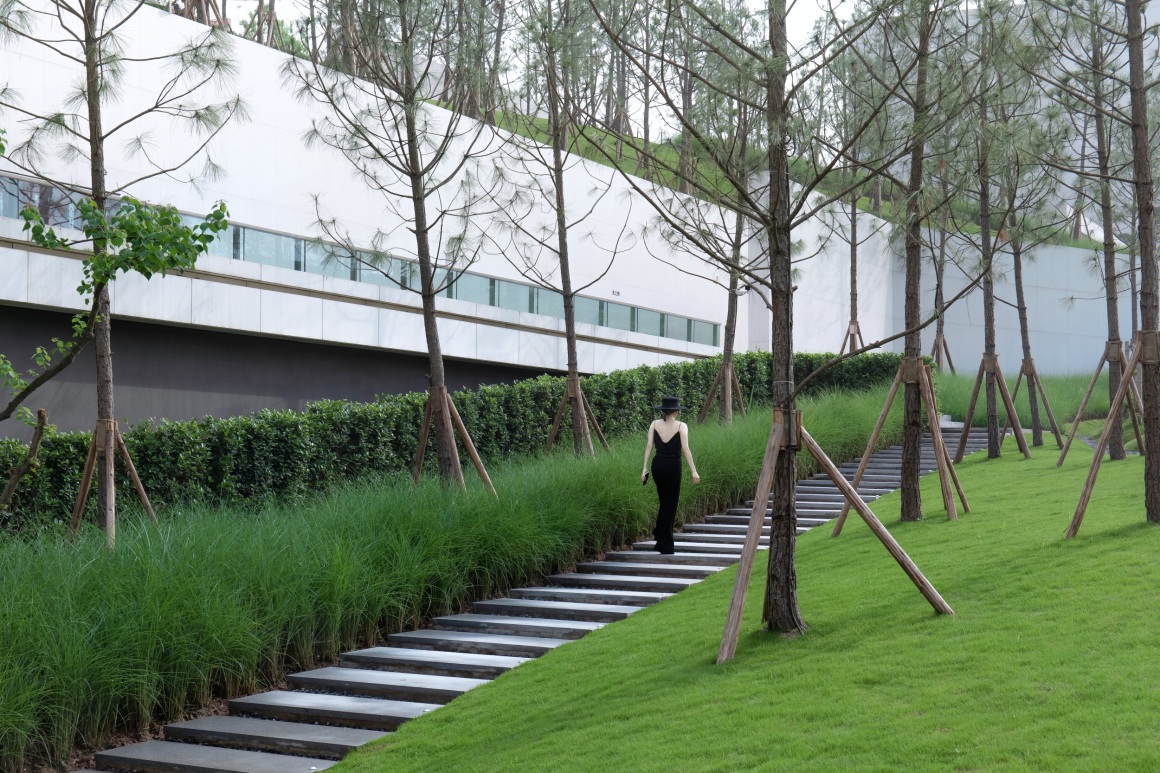
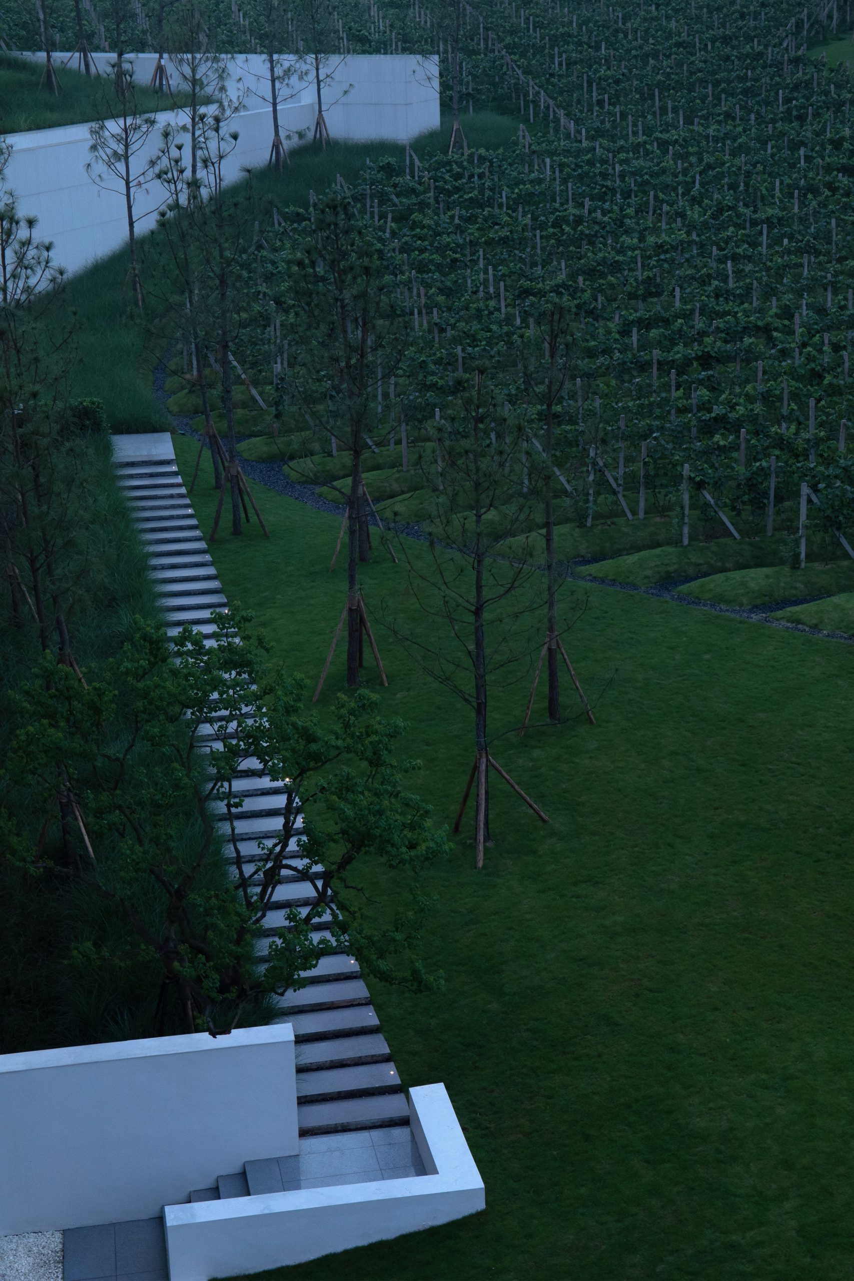
塑造场地气质之前,设计首先要解决高差问题,避免连续向下行走带来的疲劳度和落差感,提升行进舒适感。设计将20米的高差削减为三级台地,在不同的台地中通过不同手法削弱落差感,留出足够的平缓路段,结合视线规避,通过层层跌级形成强烈的森地人居空间。
Before shaping the temperament of the venue, the design must first solve the problem of height difference, avoid the fatigue and the sense of drop caused by continuous downward walking, and improve the comfort of travel. The design reduces the height difference of 20 meters into a three-level terrace. Different methods are used to weaken the sense of gap in different terraces, leaving enough smooth sections, combined with the avoidance of sight, and forming a strong forest living space through layers of falling.
▽层层平缓的阶梯 A series of gentle steps
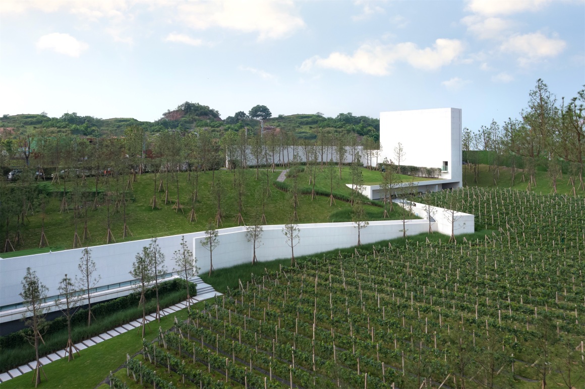
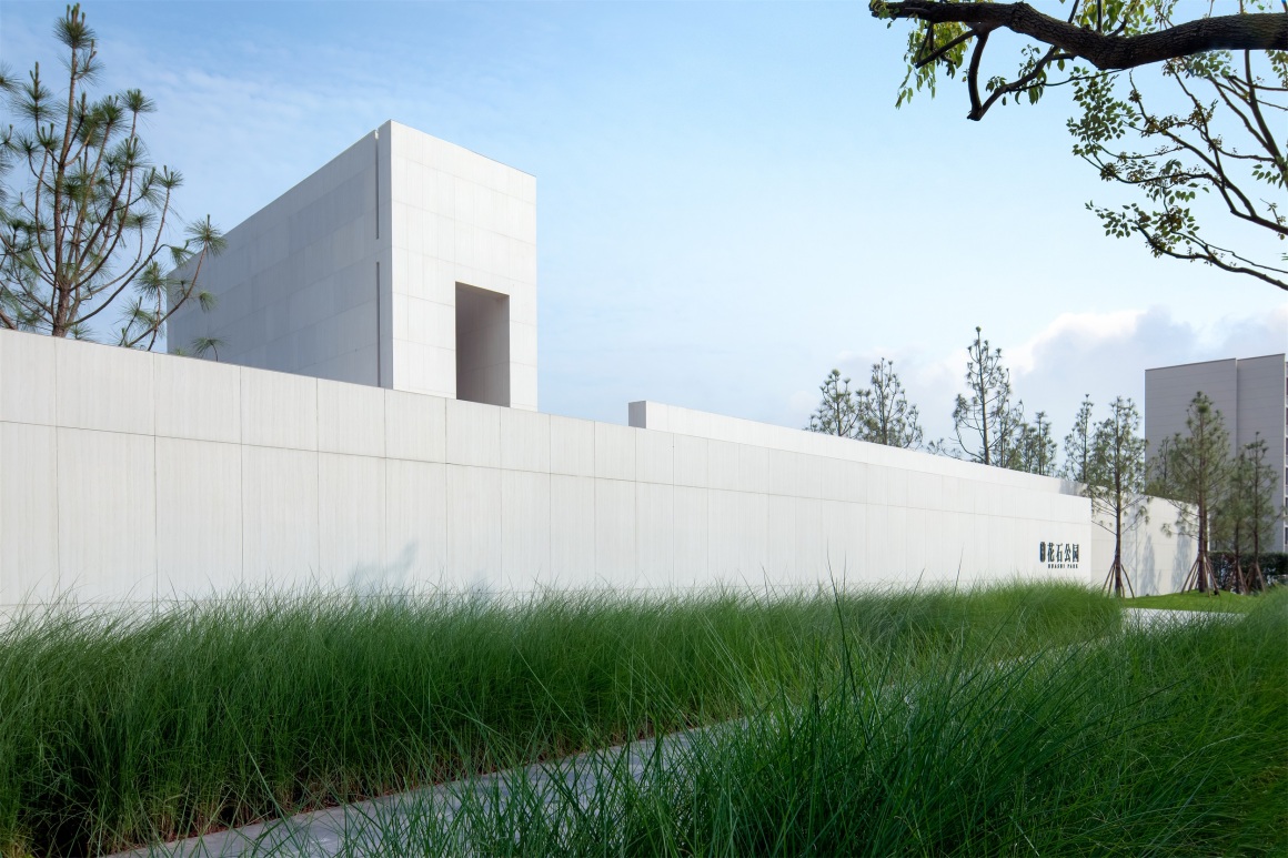
入口,设计用平行于市政道路的两道景墙作为入口屏障和一段引导路段,阻隔了车水马龙,让人们感受到空间的转变,也遮挡了向内的视线,无法一眼看尽场地高差,带来更多遐想。
At the entrance, the design uses two scenery walls parallel to the municipal road as the entrance barrier and a section of guide road, blocking the traffic, allowing people to feel the transformation of space, but also blocking the inward sight, and it is impossible to see the height difference of the site at a glance.
▽入口用景墙作屏障,阻挡视线 The entrance is blocked by a view wall
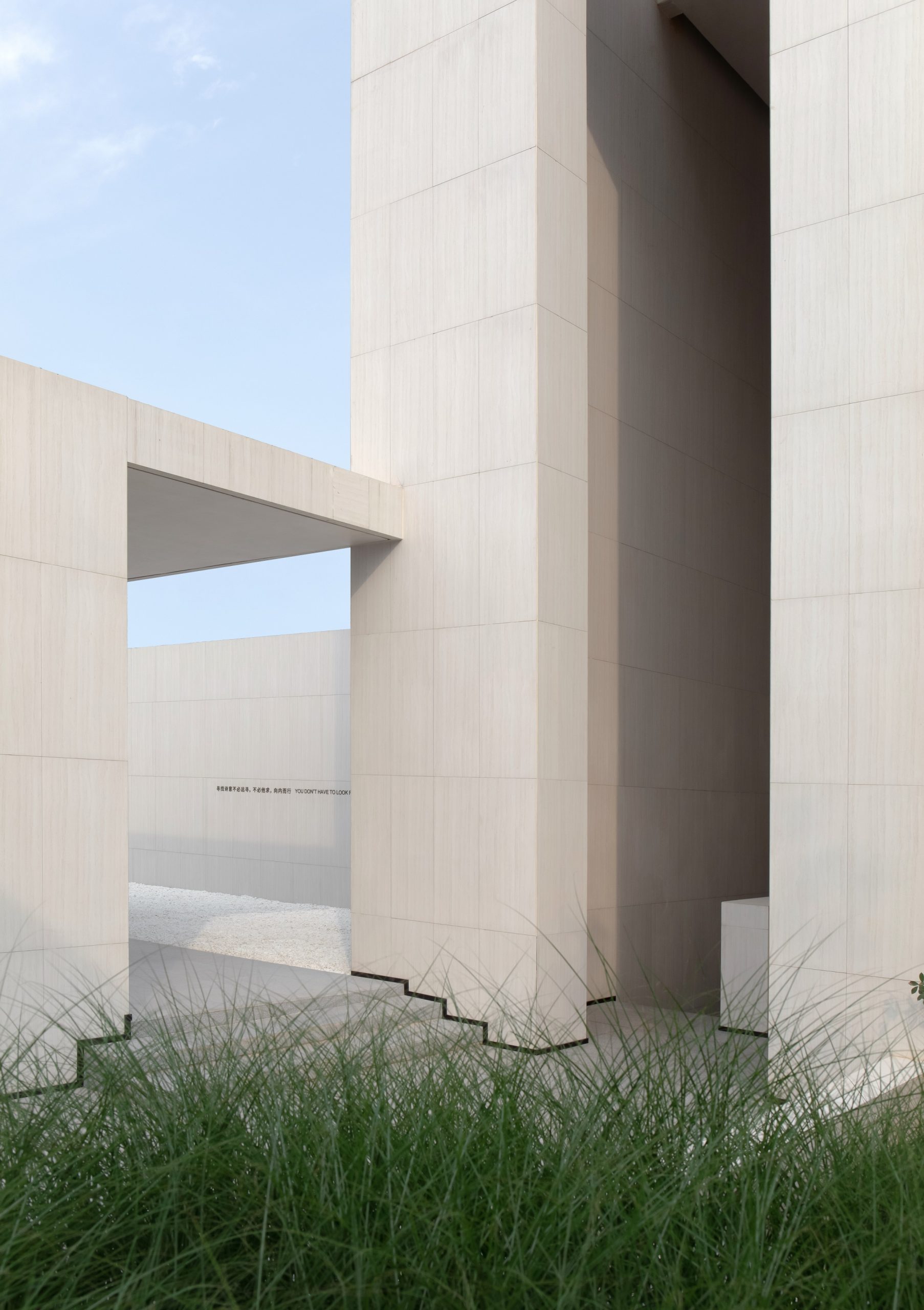
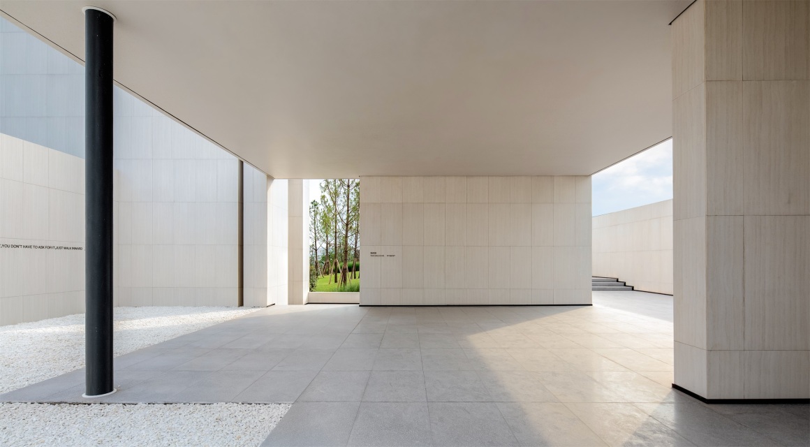
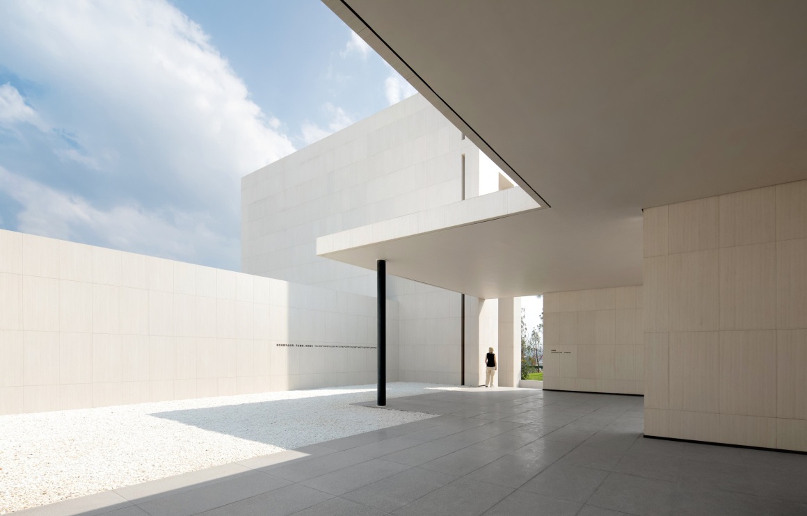
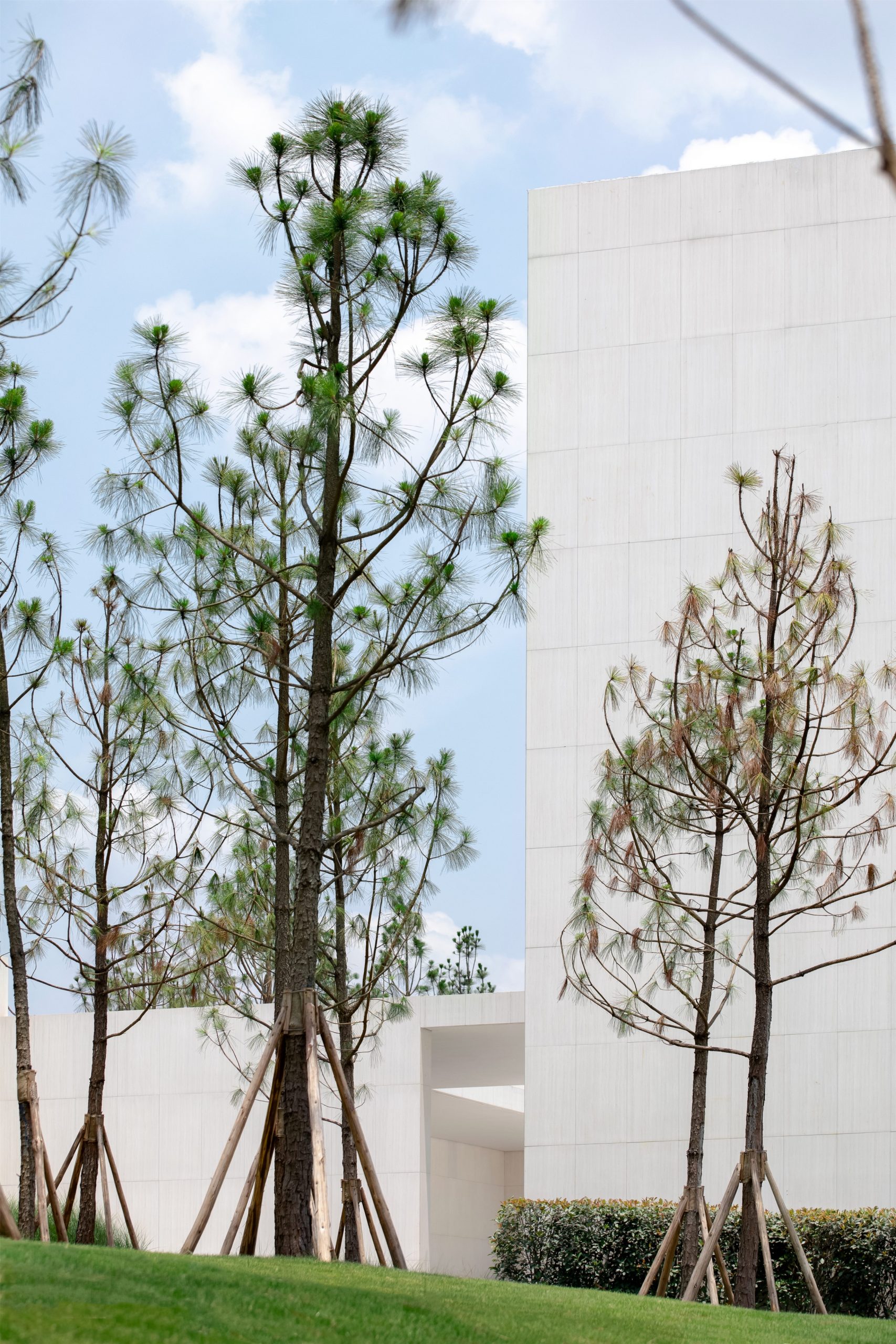
第二级台地通过楼梯与方形塔体转化高差,高塔在此也起到了规避视线的作用,塔外通过覆土填平,得到两层空间,上层草坪与松林带来穿行山林的感受,下层灰空间满足停留、休憩功能,形成更立体的景观。
The second-level terrace transforms the height difference between the stairs and the square tower. The high tower also plays a role in avoiding the line of sight. The outside of the tower is filled with soil to obtain two levels of space. The upper lawn and pine forest bring the feeling of walking through the mountain forest. The gray space satisfies the functions of staying and resting, forming a more three-dimensional landscape.
▽二层台地与上层平面形成更立体的空间 The second floor platform forms a more three-dimensional space with the upper plane
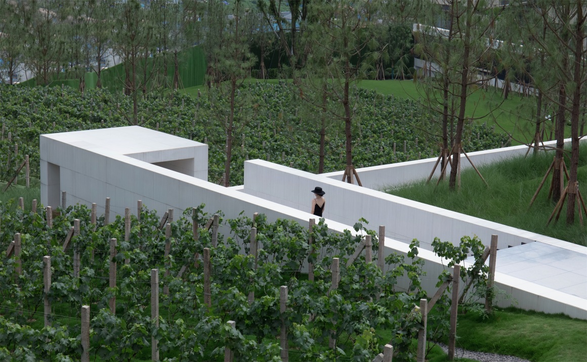
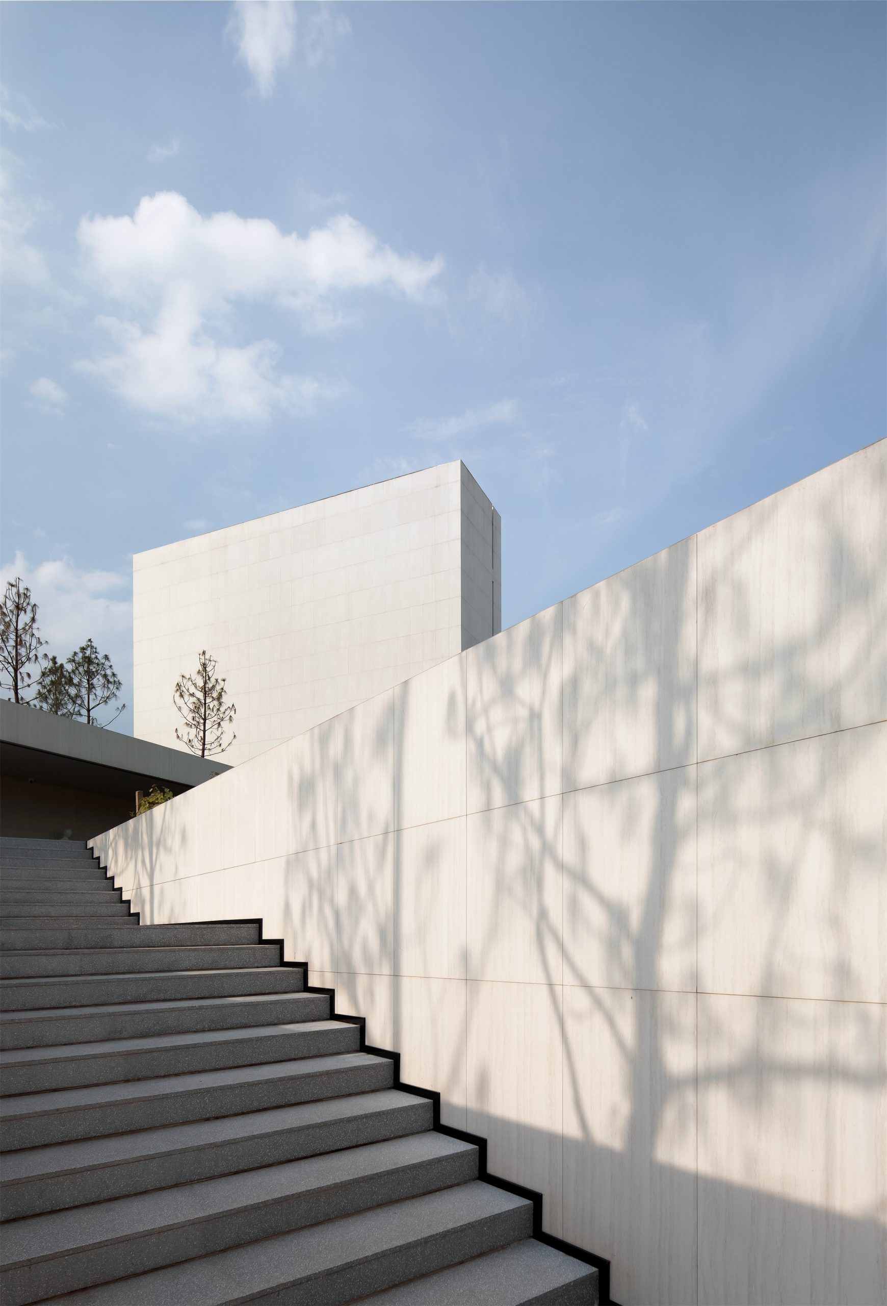
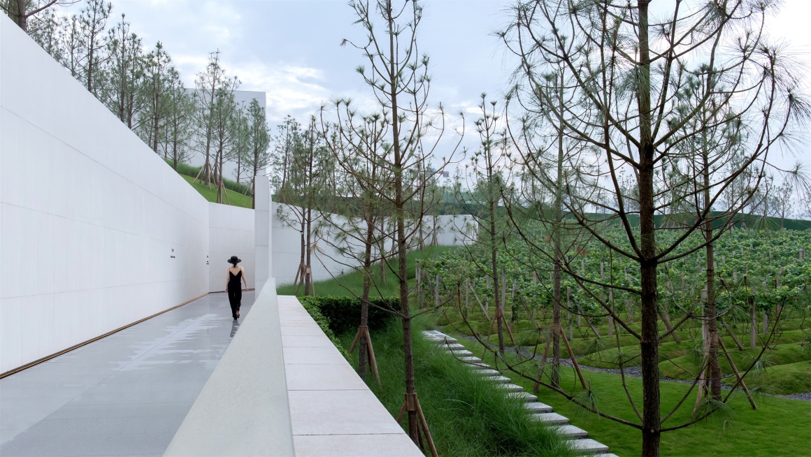
第三级台地则利用缓缓下降的艺术长廊将场地高差转化为一段安静、含蓄的寻心之路,慢慢通往内部场景。设计利用分段消解高差,同时利用灰白色墙体与折线去营造几何感和雕刻感,营造出一处纯粹而艺术的空间。这一手法也使空间在视觉上形成整体性,从外观无法一眼探其究竟。柔顺横向的舒展开的大地尺度感,极具艺术气息。
The third-level terrace uses the slowly descending art gallery to transform the height difference of the site into a quiet and subtle way of seeking the heart, slowly leading to the interior scene. The design uses sections to eliminate height differences, while using off-white walls and polylines to create a sense of geometry and sculpture, creating a pure and artistic space. This technique also makes the space visually integrated, and it is impossible to find out from the appearance. The soft and horizontally stretched large scale sense is very artistic.
▽去往售楼部的三级台地 Three level terrace to the sales department
空间如诗歌,也有其独特的节奏韵律。我们在设计中同样注重空间的开合关系,通过视线开合与人在空间中的行驻营造丰富的空间节奏,引人步步深入。
Space is like poetry, but also has its own unique rhythm. In the design, we also pay attention to the opening and closing relationship of the space, and create a rich spatial rhythm through the opening and closing of the sight line and the presence of people in the space, which attracts people step by step.
▽空间的开合关系,引人入胜 The opening and closing relations of space are fascinating
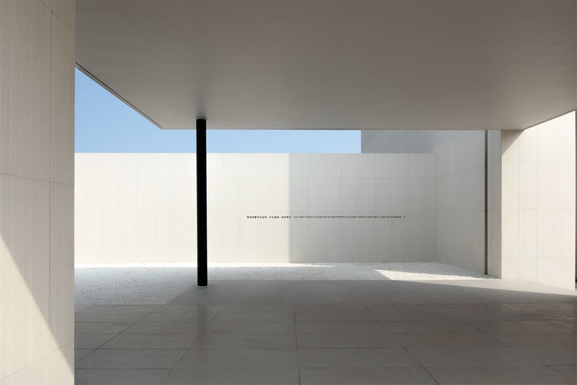
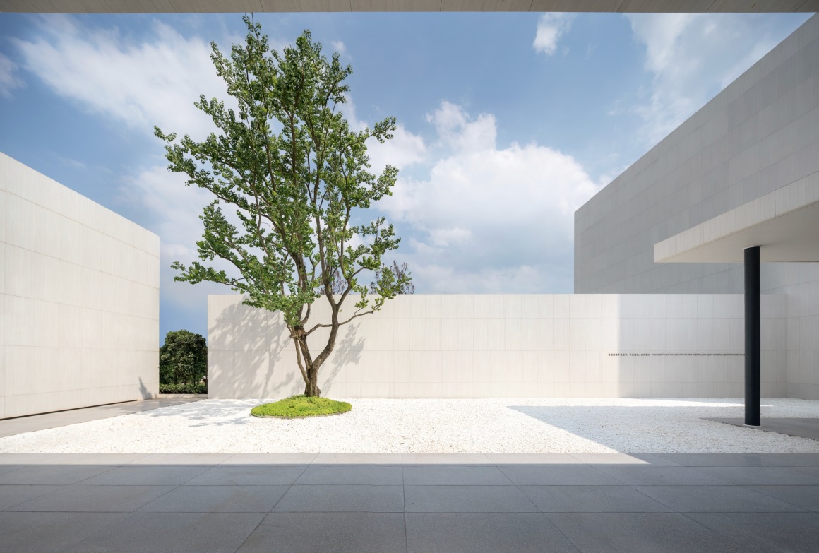
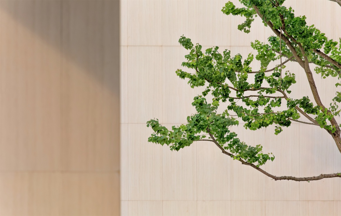
从遮蔽视线的入口引导段到一树之庭,是空间的第一个收放。干净、极简组成的庭院里,一颗向上生长的树冲破了围合的空间感,用于安坐的长椅则是另一种留白。
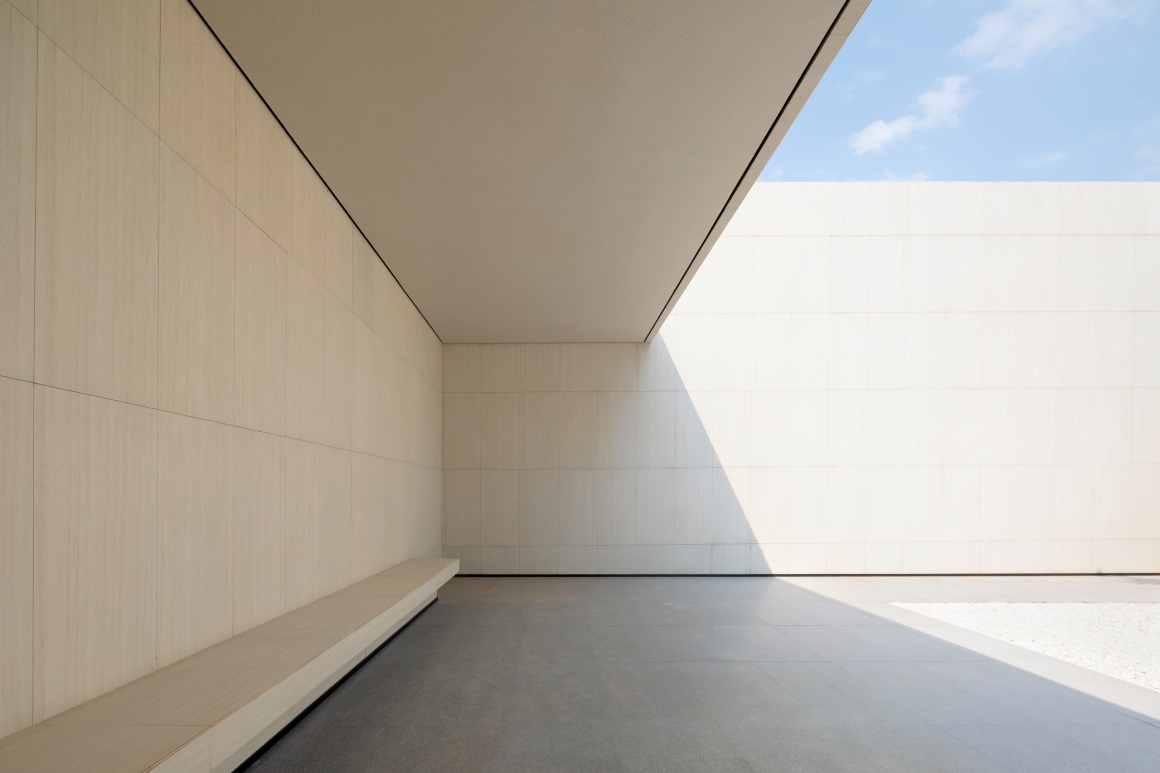
From the entrance guide section that obscures the line of sight to the Garden of One Tree, it is the first retractable space. In the clean, minimalist courtyard, an upward-growing tree breaks through the enclosed space, and the benches used for sitting are another kind of blank space.
▽简约的庭院,孤植乔木表现空间感 Contracted courtyard, solitary plant trees show sense of space
▽墙边的长凳也是另一种留白 Benches along the walls are another blank space
庭院旁耸立的高塔再次屏蔽视线,高高的墙体裁切出一丝光线,寻光而去,从高塔之下转而来到视线开敞的观景台,这是空间的第二个收放,在这里,同样留出了暂停、沉浸与思考的空间。
The tall tower next to the courtyard once again shields the view. The tall wall cuts out a ray of light, looking for the light, and turning from under the tower to the observation deck with open sight. This is the second collection of the space. Put, here, there is also a space for pause, immersion and thinking.
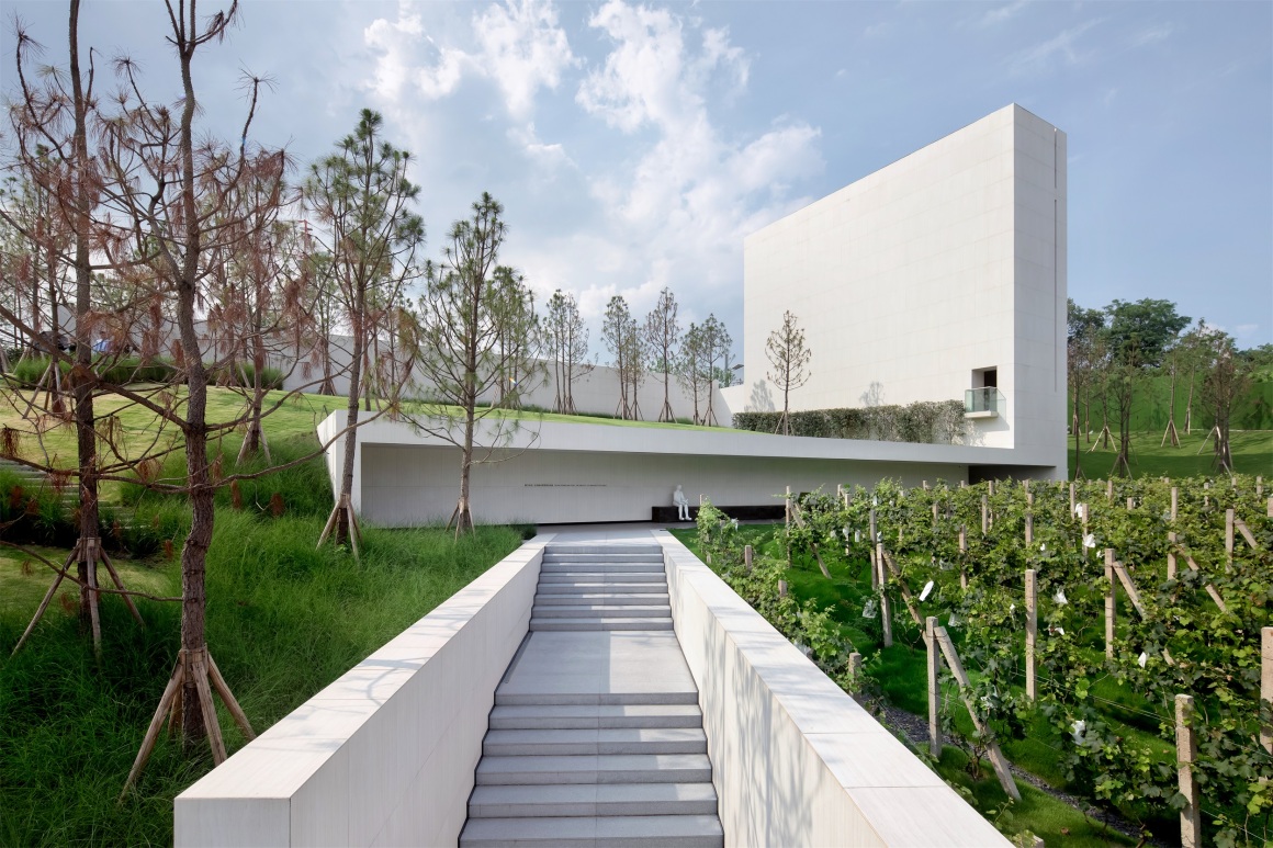
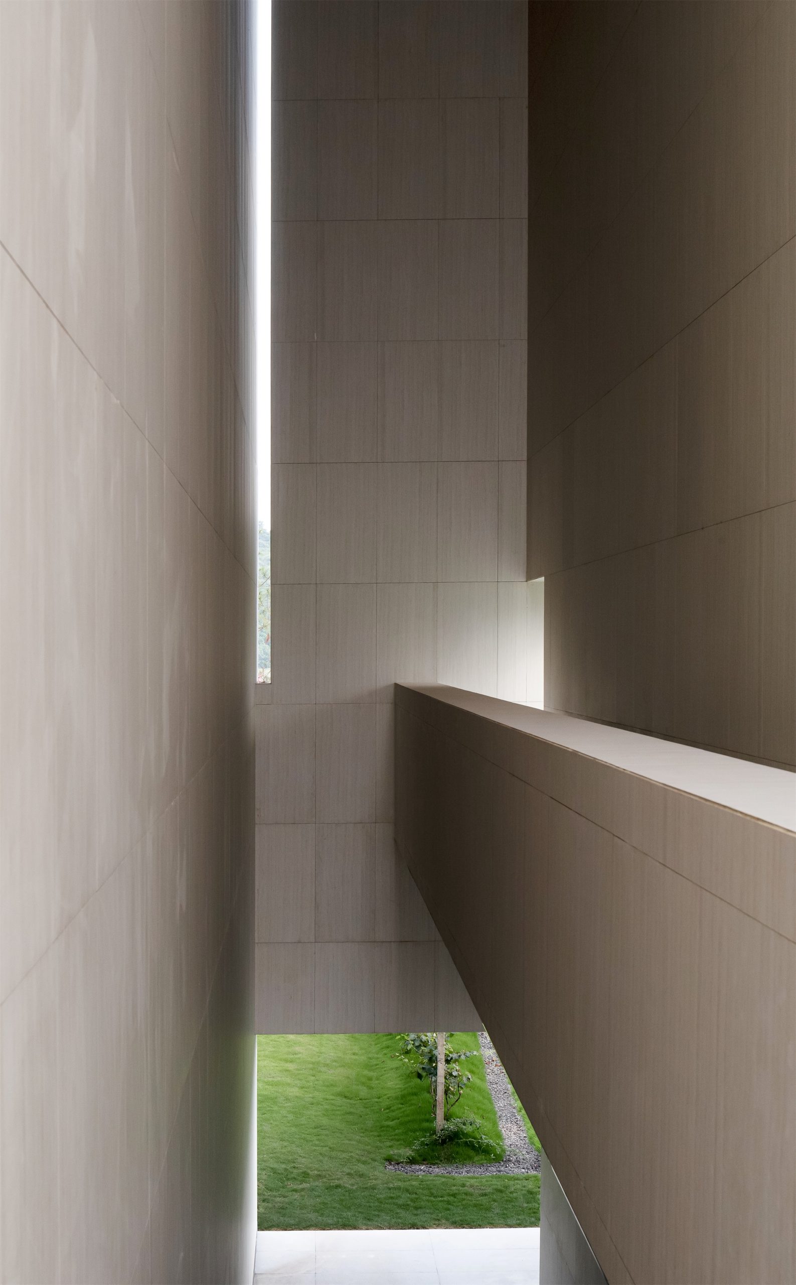
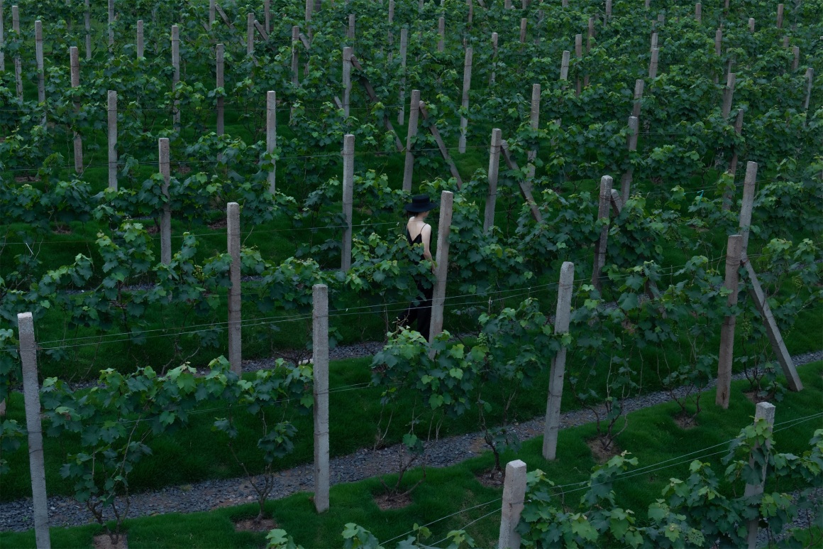
约4米的高墙屏蔽了艺术长廊两边的视线,长长的甬道越收越窄,忽而出现的葡萄园让空间豁然开朗,这是空间的第三个收放。
The high wall of about 4 meters shields the view from both sides of the art corridor. The long corridor narrows and narrows. The vineyards suddenly appear to make the space open. This is the third retractable space.
▽经过一段甬道之后,视线被打开 After a passage, the view is opened
在开与合的关系中,设计拿掉浮华的装饰,利用最简洁的线条,去裁剪光影与自然,形成或窄或宽,或近或远,或横或竖的景观视角,从而完成与场地的呼应。人们在视线的远眺与静观中,可以获得更为深远的思索。
In the relationship between opening and closing, the design removes the flashy decorations and uses the simplest lines to cut the light and shadow and nature, forming narrow or wide, near or far, or horizontal or vertical landscape perspectives to complete the site Echoes. People can get far-reaching thoughts in the distant view and quiet observation.
动人的空间,都是为更好的生活服务。设计的最后一个动作,便是通过场景感的置入将人们对精神世界的探索连接到生活。结合场地的山地人居特点,我们围绕山和林的故事,描绘舒适宜人的环境。
The moving space serves a better life. The last action of the design is to connect people’s exploration of the spiritual world to life through the placement of a sense of scene. Combining with the characteristics of mountain habitation of the site, we describe a comfortable and pleasant environment around the story of mountains and forests.
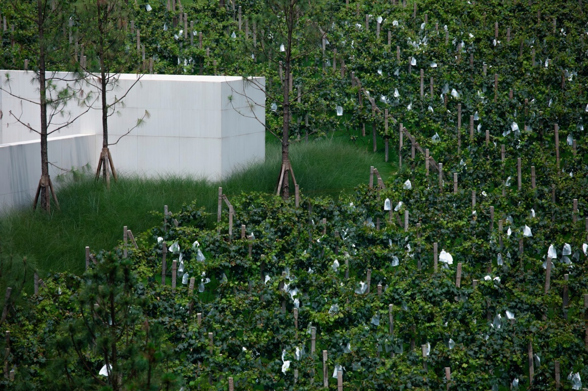
建筑、景观、室内相辅相成,共同营造悠闲的生活氛围,使整个场地散发出法式的浪漫气息。景观从荒原的理念中延伸出一片自然、开阔的葡萄园,既与售楼部的“酒窖”主题相呼应,又通过质朴而不失优雅的方式延续了视觉美感,演绎出温馨、休闲的生活方式。
The architecture, landscape, and interior complement each other to create a leisurely living atmosphere and make the entire venue exude a French romantic atmosphere. The landscape extends from the concept of a wasteland to a natural and open vineyard, which not only echoes the “wine cellar” theme of the sales department, but also continues the visual beauty through a simple and elegant way, deducing a warm and casual atmosphere.
设计在横向舒展开的大地尺度感上,塑造了一个具有艺术气息、与自然零距离接触的景观空间,人们可以在这个空间里面安静下来,向内而观,也可以放眼远眺,品味散去的晨雾、聚拢的晚霞,将一天当中最美好的光阴收入眼底,体会内心的充盈和生活之美,这便是我们的原生之境——用空间,回赠给原野的诗。
The design creates a landscape space with artistic atmosphere and zero-distance contact with nature in the sense of the horizontally stretched scale. People can calm down in this space and look inward, or they can look into the distance and disperse their tastes. The morning mist and the gathering sunset will bring the best time of the day to the bottom of your eyes, and experience the inner fullness and the beauty of life. This is our original realm-using space to give back poems to the wilderness.
▽在原生规则的葡萄园,与自然亲密接触 Get in touch with nature in a vineyard of native rules
项目名称:重庆万科璞园
业主单位:重庆万科
景观面积:20000㎡
项目地址:重庆市渝北区
景观设计:WTD纬图设计
设计团队:李卉 李彦萨 田乐 侯茂江 王璐 李丹丹 郭亚菲 陈奥男 潘宇杰 李理 王玥 于红燕 赖小玲 马俊 马利平 张书桢 宋照兵 姚淞骅
业主方设计管理团队:重庆万科产品策划部
建筑设计:梁黄顾建筑设计(深圳)有限公司
景观施工:四川蜀汉园林
建成时间:2021
摄影:xf-photography
Project name: Vanke Puyuan , Chongqing
Developers: Vanke(Chongqing)
Landscape design area: 20000㎡
Project location: Yubei District, Chongqing
Landscape design:WTD GROUP
Design team: Li Hui, Li Yansa, Tian Le, Hou Maojiang, Wang Lu, Li Dandan, Guo Yafei, Chen Aonan , Pan Yujie, Li Li , Wang Yue, Yu Hongyan, Lai Xiaoling, Ma Jun, Ma Liping, Zhang Shuzhen, Song Zhaobing, Yao Songhua
Owner’s design management team: Chongqing Vanke Product Planning Department
Building design: LWK&partners
Construction: Sichuan Shuhan Garden Engineering
Completion time: 2021
Photography: xf-photography
“ 在这里,感受与自然对话的原生态之境。”
审稿编辑 任廷会 – Ashley Jen
更多 Read more about: WTD 纬图设计机构












0 Comments